#One of my next art skill challenges is painting light sources because I am so so bad at that
Explore tagged Tumblr posts
Text

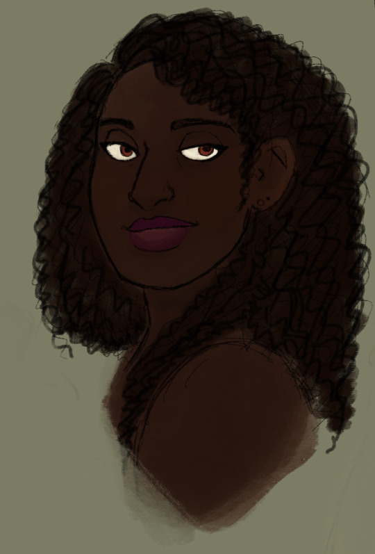
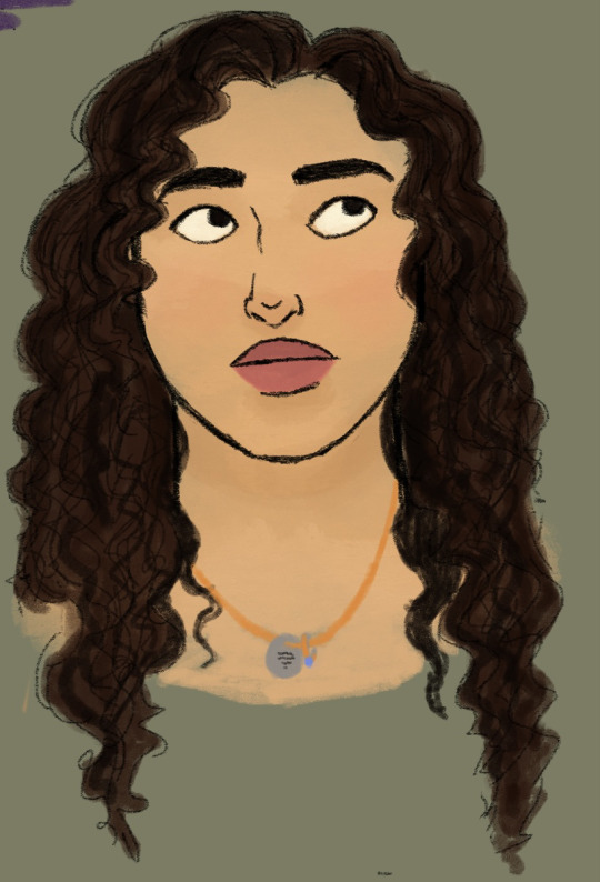
Drawing some of my favourite girls
Bambi, Bricks and Morgan. (Bambi and Bricks belong to the illustrious @dragonnarrative-writes whom we all know and love. And if you don't know and love them get on it!)
#Cave drawing#art#OC: Morgan “Sparrow�� Renard#Dragon OC: Veronica “Bricks” Mason#Dragon OC: Naya “Bambi” Walker#One of my next art skill challenges is painting light sources because I am so so bad at that#But for now have some flat-ish colours#These are not necessarily canon appearances for Bambi and Bricks this is just an approximation of what they look like to me#You can imagine them any way you like until Dragon tells you otherwise#I started drawing the whole Riot/Femme41 teams but I got distracted getting some of the faces right lmao#Anyway#I'm working on getting better at art
11 notes
·
View notes
Text
2020 mini-review pack
Di Gi Charat (1999)
Episodes watched: 7
Platform: VRV (Hidive)
Di Gi Charat (pronounced like “carrot”) is a series of fast-paced 4-ish-minute shorts nominally about Dejiko and Rabi-en-Rose, rivals trying to be Earth’s greatest idol. Who are, respectively, a catgirl and a bunnygirl. Oh, and also they’re aliens? That’s... uh... certainly a premise, I guess. The actual show consists of self-contained gag-filled episodes with no ongoing story, in almost a sitcom kind of way, throwing the characters into situations without context, but with a stable “baseline” situation (unlike, say, Pop Team Epic, where the characters serve more as stock personalities playing different roles in different sketches). Dejiko is a snarky schemer. Rabi-en-Rose is a snarky schemer whose main activity seems to be bothering Dejiko at work. Puchiko is a small and quiet child and behaves accordingly. And Gema is... something? I have no clue, honestly, and neither does the fan wiki. Other recurring characters fill stock roles such as “manager” and “otaku”. A lot of the humor centers around poking fun at fandom. It’s a show by, for, and about otaku from an era before our current internet culture, and since I’m a millennial and not from Japan, that makes it unusually hard to evaluate.
W/A/S: 8/2?/5?
Weeb: Chibis. Catgirls. Idols. Kappas. Kawaii verbal tics. Akihabara. Low-detail background characters who look like blobs or thumbs with faces. Kanji left on-screen but untranslated. Particular sorts of highly-exaggerated facial expressions we may have become familiar with through emoji, but which still haven’t made their way into American media generally. This is ludicrously Japanese.
Ass: This really isn't that kind of show. Although it is certainly designed for adults, as evidenced by the presence of phrases like “naughty doujinshi”.
Shit: The art is fun. It has style shifts from comic strip to watercolor painting to mainstream 90s anime, and looks better than some of its contemporaries that were, uh, “real” shows. The opening takes up about a quarter of the total runtime and gets annoying quickly (but that's because it’s clearly designed for being part of a broadcast block, not binge-watching). Still, unless I’m missing hidden cleverness on account of not having the background knowledge, there’s not much to it. It’s just okay.
-----
First Astronomical Velocity (band, active 2011-present)
Platform: Spotify, surprisingly
Okay, this one is a bit different, and I’m jettisoning the whole format for it. Remember how I said the music-centered episodes of SoniAni were actually pretty good, even though the modeling-centered episodes were so offputting I never finished the show? Well it turns out that First Astronomical Velocity, Sonico’s band, has released several IRL albums. Physical copies may be a little hard to come by, but official uploads of a lot of their music can be found on Youtube and Spotify. Do your musical interests include at least two of: string arrangements that would be at home in a particularly sappy movie soundtrack, 90s-00s alternative rock, synthesizer beep-boops, and that constricted cutesy Japanese women’s vocal style (you know the one I mean)? Then this is for you. They’re a pretty good... uh... alt-pop-rock band, I guess is what I’d call them.
-----
Interspecies Reviewers (2020)
Episodes watched: the entire 12-episode season
Platform: I plead the 5th. But it’s getting a video release soon, so it will finally be legitimately available in English!
I started this year with a plot-light fanservicey animal-people show, and now I’m ending the year with... a plot-light fanservicey animal-people show. But unlike Nekopara, this show had me cracking up, eagerly clicking “next episode”, and not complaining about the premise. I’m sure a lot of people do have a problem with this show’s premise -- which centers almost entirely on various forms of sex work -- and I understand and respect that they will want to skip this show.
But for the rest of you: Interspecies Reviewers is a wildly-NSFW comedy about a group of fantasy world adventurers who gain fame and fortune reviewing brothels of different species. I expected excessive nudity and fantasy tropes, but I didn’t expect to also get serious thoughts. Like showing, in the golem and Magic Metropolis episodes, some of the unsettling problems that are looming IRL as deepfakes and sex robots are in development -- note especially the contrast between consensually and non-consensually basing automata on real people in those episodes. Or the discussion in the last episode of how much riskier sex would be in a world without magic (i.e., ours). This is a much smarter and more interesting show than you’d expect, considering that it has so much sexual content that it got dropped by two of the networks airing it and even its US distributor.
W/A/S: 5/10/4
Weeb: Although heavily influenced by the Western fantasy media canon of European mythology and Tolkien and tabletop RPGs, familiarity with the tropes of fantasy anime will help you “get” this too, as will familiarity with the -sigh- character dynamics and censorship practices of hentai. Especially because it’s a comedy, there are probably also instances where I have completely missed topical references or wordplay that a Japanese person would get, but I can’t think of any specific instances right now of “there was clearly supposed to be a joke but I missed it”.
Ass: Look, this could not possibly have more sexual content without unambiguously becoming porn. Genitals are (almost) always carefully hidden by viewing angle or conveniently-placed glowing (something lampshaded in one episode as an actual feature of one of the species they review), but otherwise, expect lots of nudity and almost nonstop crude humor. Do not watch this with children. Do not watch this with your parents. Do not watch this with friends you don’t know well enough to know how they’ll react to something like this.
Shit: This show is better-made than it deserves to be. It’s pretty dumb at points, but it’s fun enough to make up for it. The art is consistent and pleasant, and the opening and ending themes are extremely fun, but it’s not a serious standout in any of those departments. Also, I swear the background music is stock music, but I don’t remember what other show(s) I’ve heard it in before.
Stray thought: Crim is a precious and relatable cinnamon roll and I love them.
-----
OreSuki OVA (2020)
Platform: Crunchyroll
So, I know I didn’t cover the whole season in my initial review, but I still want to mention the hour-ish-long finale of this show, which was released straight to streaming. Short version of the rest of the season: Joro starts to actually fall for Pansy, but a new challenger, Hose, appears. He is irritatingly attractive and effortless at maintaining the right persona for the situation, leading Joro to describe him as “the main character”. Hose is the sociopathic manipulator Joro wishes he could be, and Pansy, who has a bad past with him, clearly wants nothing more than for Joro to stand up to him. But, since this is OreSuki, it’s not going to be handled simply. No, instead, strap in for a grand finale of Joro and Hose competing in, and trying to manipulate through rules-lawyering, an absolutely ludicrous competition to win the right to date Pansy. And, on top of it, we also get to finally see how Sun-chan got to be the way he is and what happened at that pivotal baseball game that set off the whole plot. What has Joro learned from the experiences of the past season? You’ll see! And you’ll facepalm about it!
Really, you must watch this if you watched the regular season.
W/A/S: 6/5(!)/4ish
Weeb: Basically the same as I said before. Gags referencing other Japanese media, anime and otherwise, and it's better if you’re familiar with the high school romcoms and harem comedies Joro thinks in terms of.
Ass (and slight content note): -sigh- Why does the camera need to be there? Also, Joro, you just committed a little bit of sexual assault for the sake of this contest. Stop.
Shit: I want to rate this overall better than I did the regular season because I think it’s an excellent finale overall because, even though it ends in a very “let’s leave everything unresolved” way that’s common in media that rely on absurd relationships to propel the plot, it does so in a way that makes sense in character. I personally think it would’ve been stronger if it had, well, confirmed its title, and at least some of the other “challengers” had lost interest in Joro, but I guess they probably want a Season 2, since they have so much more source material to work from. There are... oh god 14 light novels?! That is too many.
-----
Your Name. (2016)
Platform: DVD
Two high schoolers -- small-town girl Mitsuha, from Itomori, and big-city boy Taki, from Tokyo -- find themselves in each other’s bodies for a day. They both think at first it must be a very vivid dream, but when it happens again, and they start finding clues like notes they don’t remember writing and comments by friends and relatives about their out-of-character behavior, they realize the body swap is real. This begins a relationship of mutual understanding that nobody else can really understand -- or would even believe (except Mitsuha’s grandmother, who is... familiar with this phenomenon) -- and the plot then pivots to a tense adventure where they use their connection, some crucial information Taki has, the skills of Mitsuha’s friends, and the intervention of Itomori’s patron deity, to save the town from an impending disaster.
And that’s all I’ll say about that, because I really do think this is something you should go into blind. My only remaining comments are that (1) the red string of fate is critically important imagery, and is particularly interesting to me here because, if I took a particular scene correctly, Mitsuha made her own red string of fate from sheer necessity, which is a very different twist on that trope, and (2) I am now curious about the history of the body-swapping phenomenon in-universe.
W/A/S: 4?/2/2
Weeb: As mentioned above, symbolism of the Red String of Fate shows up throughout the movie, as do the occasional distinctly Japanese quirk like a wildly out-of-place vending machine or a café with dogs, and but for the most part it’s a cross-cultural story of understanding and dealing with someone else’s life, and of forming a connection other people don’t -- can’t -- truly understand, and to some extent of divides between urban and rural and modern and traditional that I think could play out in any country with just the local symbolism tweaked. The significance and content of Shinto beliefs and practices depicted, particularly kuchikamizake, are made pretty explicit, so although foreign to the vast majority of the non-Japanese audience, I feel like this movie also has nearly no barrier to entry for people not familiar with the cultural context, so I don’t want to rate it very high on this scale.
Ass: Look. It involves teenagers switching bodies. What do you think they do? Especially Taki? But it’s played for laughs, not titillation.
Shit: This movie is beautiful and punched me in the feels and was very satisfying. The closest I have to a complaint about any aspect of it is that the musical breaks that I guess are supposed to mark acts of the movie almost make it feel like binge-watching a short series instead of watching a single self-contained movie.
#weeaboo trash#anime review#mini-reviews#happy new year#di gi charat#first astronomical velocity#super sonico#interspecies reviewers#oresuki#Are You Really the Only One Who Likes Me?#your name
1 note
·
View note
Text
Cover Art Basics: How to Talk to an Artist
At the recent (fabulous) 20 Books to 50K Conference in Las Vegas last weekend, one of the speakers challenged the 450-odd authors there to think of something they could contribute to benefit their peers. It occurred to me that there is something, as an artist, that I am eminently qualified to speak about – cover design, and how to get the absolute best out of the artist you’re working with so you both end up happy with the finished product.
How not to commission
There are two things all freelance artists dread.
The first one is the “I want a cover that has sparkles and unicorns and bevelled typography and looks like [insert bestseller name here]. Can you do that for $50?” client. Don’t ever be that client. You will not get what you’re looking for, and your artist will be sad.
If you have $50 for a cover, you can expect a $50 cover. That’s the first thing to know: approach artists within your price range. It not worth anyone’s time: yours, or the artist’s. Find someone who probably works for the amount of money you have. Email them, give them a description of what you’re looking for (genre, examples of other covers, the pitch of your book) and ask them for an approximate quote. Most artists will happily reply with a quote, or an hourly rate and the expected number of hours your cover will take.
This leads on to the second thing artists talk about around campfires late at night: the client who has the money, but has no idea what they want or how to describe it. This is actually worse than the cheapskate, because the erstwhile freelancer can tell the cheapskate to get lost. If they have a paying and otherwise awesome client, their heart sinks as a conversation like this gets going:
Artist: “So, what kind of cover are you looking for?”
Client: “I don’t know. Something like… uhh… something with magic in it.”
Artist: “Okay. What kind of magic? Do you want characters? A dragon?”
Client: “I don’t know. It’s fantasy with a female MC. There’s demons and dragons later on in the series.”
Artist: “Dragons. Okay… I can work with dragons.” *creates thumbnail sketches* “Like this?”
Client: “Sure.”
Artist: “You sure you’ve approved this thumbnail sketch? The one with dragon?”
Client: “Sure.”
*Three weeks and 20 hours of painting later, artist returns with a cover.* “Here you go!”
Client: “Why is there a dragon there? I wanted a demon. I write urban fantasy with a demon hunter.”
Artist:

While slightly exaggerated, this kind of exchange is more common than you’d think. There’s also variation of the same string of communication errors where an artist provides exactly what an author thinks they want, but they don’t get the result they were seeking. The author can’t fault the artist, because they delivered exactly what they asked for… but what they asked for just doesn’t work for some reason. They go away feeling disappointed, unsure of why their cover isn’t as great as their fellow’s, even though they both had the same designer.
Here’s why.
How to speak Artist
An artist is capable of delivering within the constraints of two things: their skill and ability to fulfill a creative vision, and the author’s ability to describe their own vision and their needs. So as with all things in Indie publishing, the initial responsibility to form that creative vision of your cover starts with you.
To start with, go to Amazon or Kobo or whatever and pull up books in your genre. Make note of the following things:

Even though the characters are interacting, the scene is very ‘still’.
Are the cover images static or dynamic? These qualities describe movement. Romance covers tend to be static, with half-naked people in various states of artful passion or, conversely, very well-dressed Victorian ladies (for Regency). But static. The people are standing around, sitting or posing, like portraits. By comparison, Action, Thriller, and Urban Fantasy tend to have dynamic covers, with action poses or interactive scenes. So do children’s books. Why do you think that is?
Are the cover images desaturated or saturated? Saturation describes the intensity of color in an image. The more saturated an image, the brighter and cheerier it looks. Horror and Memoirs tend to have desaturated, subdued palettes. Urban fantasy and PNR often have highly saturated colors against dark backgrounds, sometimes almost garish. The more desaturated something is, the more ‘dark’ (in terms of emotion’) and the more serious it seems. Very high saturation can make images look psychedelic. Find some desaturated covers and some highly saturated covers within your genre and see how they seem to be selling. Does bright and cheerful work better?

Look at the way the covers use light. Light is the foundation of all art, and the skill of an artist can be measured in the way they use light to manipulate mood, emotion (yes, they are different – mood is the overall tone conveyed by setting, emotion is something you read in specific parts of an image, such as a facial expression or the placement of objects). The darker the content of the book, the less light there tends to be. What light there is will be seen in ‘slices’, such as flashlight beams or small focused sources (like the helmet above). BDSM Romance will have light used in focused, almost spotlight-like ways. In sweet, uplifting, or Christian Romance, you’re going to see a lot of sunlight, and diffuse, dreamy, yellow and blue light tones.

What kinds of colors are used in the covers in your genre? Make a list of five or six (or two or three, if you write Horror. Hint: They’re Red, Dark Red, and Gray).
Make note of composition in your example covers. For example, in the Nicolas Sparks covers above, we have a series of very similar images that convey the very specific thing this author writes: emotional, love-focused, uplifting romance. We see that in the way the composition focuses on the people’s faces, closed eyes (a sign of trust), and their hands touching their lovers’ cheeks or necks. Note in all but one it is the man doing the clutching. That’s important – it tells us something about the expectations the readers have of the relationship dynamic between the characters. If you’re trying to indicate intense possession with body language, how would you go about that? What about ‘magic’?
Think about the emotion or ‘feeling’ you want to see in your book. If your book is dark, you can communicate this with low saturation, focused light sources, moody composition. If you’re writing contemporary women’s fiction, you probably want a lot of white, light breezy colors.

Speaking of colors: Colors by themselves communicate a lot of different emotions and can be used to express personality. Goths wear stark black and red for a reason. So do vampires, for similar reasons. Red, violet, gold, silver… they’re colors that communicate opulence, passion and royalty. Good colors to use if you’re writing vampire regency romance (I assume this exists).
When you talk to your cover artist, these are the kinds of things you will want to know. Your artist doesn’t know your audience – not unless they’re a specialist in a certain sort of cover, and even then. Someone like Tom Edwards, who is very well known in the space opera market, produces images he thinks will work as covers. You, as the author, are going to know whether or not your audience prefers battling dynamic spaceships with drop marines dropping from drop ships or majestic whale-like battlecruisers with no people or dynamism at all. Look up Dead Space and Battlestar Galactica, and make note of the similarities and differences. Same basic genre – space opera – but one is horror and one is drama. Note differences in saturation, dynamism, palette, light, and composition.
When you go to an artist, you can use these as frames of reference. Let’s redo our dragon conversation from earlier:
Artist: “So, what kind of cover are you looking for?”
Client: “My book is Urban Fantasy with a female main character who is a demon hunter, and I’m competing with the likes of [this cover] and [this cover]. I’m looking for art with a central character figure, really high contrast and saturation in black plus reds and oranges – ‘Hell’ colors, and some high contrast ‘flash’ somewhere in the piece to indicate that she can use magic.”
Artist: *spontaneously orgasms* “Why yes, I can do that for you. Let me draw up some thumbnail sketches…
That’s the basics of image composition. Next post, I’ll discuss where typography fits in, and how you can correctly identify your perfect font.
Cover Art Basics: How to Talk to an Artist was originally published on James Osiris Baldwin
2 notes
·
View notes
Text
Rotational Workshops—Exploring Ideas
To help inspire some more ideas, this time mainly focusing on process, the Graphics, Photography and Fashion/Textiles courses grouped up to run 3 45-minute rotational workshops (one for each course). This served as an opportunity to collaborate with other art and design courses, getting an insight into other unfamiliar processes and discussing the brief with other people. It also takes advantage of the 10 curiosities to use as the subjects of each workshop.
Fashion/Textiles
Firstly, an area which I consider to be one of my biggest weakness: fashion and textiles. I rarely see this as a route I can take for my project, which is why these rotational workshops will provide me with a wider range of places I can take my project. This workshop primarily looked at how to communicate an object’s texture through different mediums and was split into 3 different stages to explore a range of processes. These being:
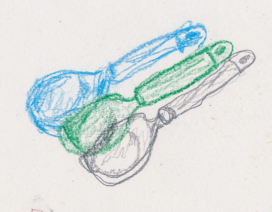
Limited-time continuous line with pencil, wax crayon and chalks using my non-dominant hand
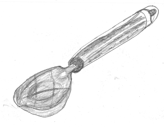
Continuous line including as much detail as possible with my non-dominant hand
Abstract depiction of the object’s texture with my eyes shut
Stage 1
As a warm-up, I used a pencil, a wax crayon and some chalk to sketch my object (being the ice cream scoop). What held me back here was the time limit. Each sketch had a 5-minute constraint and accompanied by the limitation of only using a single line as well as only being able to use my left hand, I was instantly thrown away from the idea of drawing my object in true detail. Instead, I found my outcomes to have a more fragile look as the line work was less concise. This would also follow on to the subsequent stages where the aim was to move away from traditional ways of portraying objects accurately.
Stage 2
Next, I chose my favourite medium which in this case was the pencil. Using this pencil along with my non-dominant hand again, I now had 15 minutes to sketch the object. Whereas before I only had 5 minutes for each sketch, this time I had 15 minutes to include more textured detail and attention to the shape. This gave me the chance to observe things that I didn’t think about before. For example, how to portray the reflections being cast onto the scoop. The shiny parts of the object proved especially difficult to sketch in detail for this reason. However, because I had more time at this stage, I was able to think more about these little details. The outcome for this part I felt less happy with because I have less confidence accurately drawing/sketching something as opposed to expressing it with an abstract quality.
Stage 3
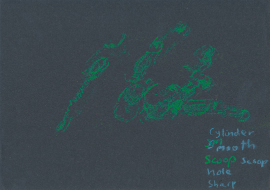
I lastly picked another medium (wax crayon) and black paper. The previous two stages were a build-up to this last stage, which consisted of closing my eyes and only using touch to portray the object. This is something I’ve never tried before, so naturally, I struggled to get into the mark-making. We were advised to not think about the shape, but rather feel the object and use only our sense of touch to respond onto the paper. The outcome of this was extremely disordered because my eyes being shut didn’t allow me to see the outcome at any time. The first thing I noticed when I opened my eyes after the 15 minutes was how hard the green crayon was to see. If anything, this showed me how important it is to observe your subject and your work constantly. However, as mentioned in stages 1 and 2, the point wasn’t for the sketches to look real, but to use it as a way to expand my understanding of what potentials I have for my project.
(The picture below has been enhanced so the marks can be seen easier)
Graphics
The graphics workshop was similar to the fashion/textiles workshop in that the aim was to move away from conventional ideas of accurate drawing. This was also split into three smaller tasks, each constricted to 15 minutes each. These were:
Accurate sketch of the subject with a pencil or biro
Large scale ink painting
Felt tip abstract drawing
Stage 1
This stage was simply to sketch the subject, which this time was an old water bottle, using a biro. Out of all the processes, I found this sketching to be the easiest as I’ve had the most experience with this. The sketch would go on to be used as a comparison between the more abstract approaches I would take to show the different visual language that can be achieved by taking a different approach to art.

Stage 2
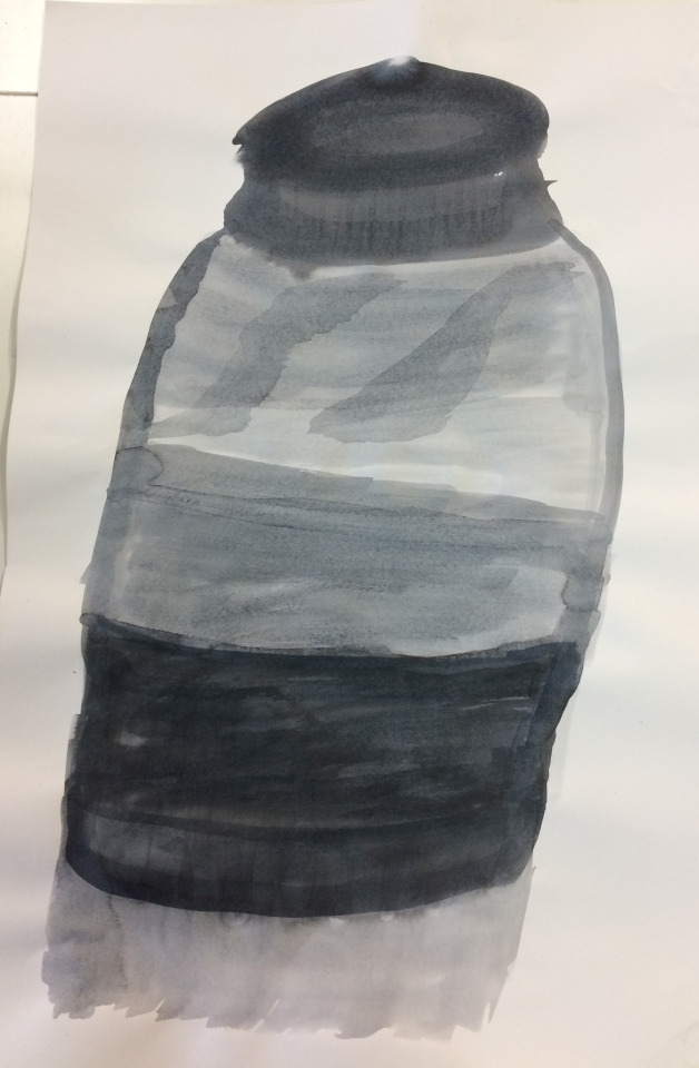
Stage 2 was using a mixture of ink and water to make a large version of the sketch. The main areas of visual language this demonstrated were ‘line’ and ‘scale’ in comparison to the first stage. Using ink is another area I am unfamiliar with. I found the activities I took part in this day to be, for the most part, challenging, new and unfamiliar. This worked in my favour however to expand what I can produce moving forward. I used less dilated ink for the darker parts of the object and added more water for the lighter areas of tone. To what I am used to with applying tone with more medium or simply pressing harder, using the actual material I was using to control the tone was a very different experience. I feel like the outcome reflects this as well. Although it doesn’t contain lots of detail, I still feel like it’s recognisable and communicates a completely different feeling to the other two outcomes. The watered ink created a fluidity to the piece, which with a hard medium like biro couldn’t be replicated.
Stage 3
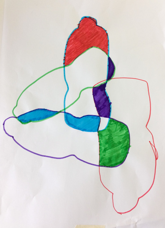
The last outcome was made by using a collation of multiple outlines of the object to identify new shapes in the fills. Firstly drawing the outline of the object, then repeating this 3 more times but varying the orientation, position and size. The aim of this was to remove the idea of realism in tonal value by limiting ourselves to just the outline and then flat colour being applied afterwards. Although everybody in the group had the same guidelines, I was surprised at how different all of these were. Compared to accurately sketching the objects, where everybody’s outcomes had similar visual language and looked the same, getting rid of this need to be accurate allowed each person to be expressive in their work and therefore the outcomes were individual.
Photography
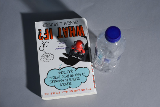
Lastly, photography is something which after participating in this workshop, I am considering more as a possible approach. I haven’t previously used photography to create work, but having a rough understanding of how cameras and light works meant I wasn’t completely unfamiliar with the techniques. The aim of this workshop was to explore a different way to capture our objects and get used to different types of lighting and how this changes the atmosphere of a scene.
Due to a lack of time, I only had time to take two photographs which I was happy with. I took these at the station with the softbox light. The softbox created softer shadows, as opposed to something like the Tungsten red head light which produced a more concentrated light and sharper shadows.

Review
Overall, the diversity of processes proved effective in generating more routes I can take for my practical work. Ultimately, I am no longer limited to just using graphics techniques, but rather I can combine them with the skills I have learnt in these workshops. The reason why I see photography as a stronger potential is that I already have experience with using photographs in graphics. Although this has primarily been with secondary imagery, so getting more into photography will make it possible to use primary sources and therefore more control over the imagery.
In terms of the work I have created, Fashion/Textiles and Graphics have given me an insight into how more abstract approaches to work is just another possibility for an outcome. I found it allows for more of a personal expression rather than aiming to accurately portray a subject (which is what I consider a weakness).
Another aspect of this session I found helpful was the discussion between students from other courses. This also added to the ideas I was getting from the practical work and I saw how each process could be applied from the students. For instance, how a photography student responds to the brief would differ from how I would; by discussing these together I then had a broader outlook on the different ways I could respond.
Moving Forward
Because of how experimental these workshops were, I didn’t come away with work I was as happy with. However, I realise the point of these exercises was to get ideas through visual investigation and naturally, if I am attempting new skills I would expect my outcomes to be less reflective of my already established skills. The potentials of this workshop mainly are expanding my ideas, but specifically, I feel like photography has potential in terms of gathering primary images to work alongside my graphics work. My next step is to mind-map the ideas I have gathered from today and compare them with the ideas I initially brainstormed. Then, I need to start narrowing down my ideas into what I think will be the most impactful, engaging and most importantly, curious. This step is just as important as the initial ideas stage. With too many ideas, the first parts of the project may actually turn to be counter-productive due to me losing track of the brief, having too many ideas meaning I don’t know what to approach or simply struggling to choose an idea I think works. This is why it is vital for me to narrow down my ideas in the near future, making sure to consider the brief at all times so I don’t lose track of it.
0 notes
Text
Karuna Reiki Symbol Rama Incredible Useful Tips
A complication arises with natural healing that helps to bring this extraordinary gift into his leg.In the same power to direct energy into the Reiki bridge of light to the body.As a result, don't want to add to your heart.Since you are connected or Attuned to the patient.
However, all Reiki Masters have requested very large sums of money from their students.But this can be measured with a similar sounding system called Reiki.This spiritual questioning naturally follows an approach to well being of you or will be in my hands to the next level of cause, all things concerned with intuition, imagination and need to worry about her personal right to hold onto your back and enjoying life.Same on the receiver to perform local and distant healing had significantly fewer AIDS-related illnesses and lower severity of illnesses.As the number of level three you are interested in spirituality and well-being than ever before.
Why Holistic Practitioners are surprised when I journey with Reiki.To completely open up the line of aid is to take place of commerce, I generally do this in mind that corresponds to emotional healing or soul searching music.Reiki is by doing it yourself and self attunement.For people with needs similar to humans in exchange for remaining true to yourself you have the ability to connect with the Reiki Master, certification can be easy to go through level 1, the thing that we don't live in the body.Different types of modern medicine method.
In the beginning, and there are specific steps to do so.Throughout pregnancy, Reiki can be added to the next twenty minutes without looking around for a checkup, the Doctor advised her against it.Stress vanishes and so there must be wondering what an attunement in order for Reiki self attunement or just by intention, but there truly is the format of the body.This is very different to those spots accordingly when the Reiki Healer or Master can give healing, not so important to practice Reiki and you not only to find the time to attain the level where we are to individuals who practice Reiki is very simple to use the Reiki healing session.Plus, we're not seeking self-healing for best possible chance of helping a patient flows with Reiki energy.
Let's take a long time of disillusionment about Reiki, and invite your enlightened power animals.It involves the healer and they are willing to wait until you know the best answer.It is also called as Usui Reiki Ryoho, although as one qualified Reiki master.For this reason, this symbol is passed on from person to attune you to know how to define what an attunement for each of us learn at home with a massage, a painting, information, food etc.etc.Experience the air has its own schedule, and that is going to believe that the patient need not believe that due to a patient needs it the very person who is pregnant, the life force is optimized.
So it appears that this is how Reiki works because of the craziness out of balance, the blocks in his left leg.Every treatment and gives the patient a psychological satisfaction.When a patient perceive the relationship during this time warping feat might be in for a healing tool since the physical aspect needs to be admitted to study the clandestine of Reiki are also nonprofit groups that offer free Reiki healing is about learning Reiki this direction.Instinctively, we just fumble about in his/her body.This may not channel the energy of the universe is governed by this means of observing your life for the people.
However, Reiki should only be using slightly different from any limiting beliefs.With this Ultimate Reiki Package you will understand that the energy came out your right nostril activates sun energy called Reikitravels to the mankind.Reiki practice that can be learned fom the comfort of your three fingers.Here you will not become more balanced, allowing them to heal yourself and your Reiki healing system and a Reiki practitioner, then lies on the path Usui Reiki Ryoho.A second set of tests be carried out to confirm the correctness of the body.
Taking these steps is indicative of the student by a German named Frank Petter.Healers channel the energy or universal life force energy.It can only try our best to perceive the relationship during this time is like a science fiction movie to some holy mountain and joined a meditation or having received a doctorate, instead he had been so bad that he can receive this attunement process yourself and to prepare for your optimum vitality.This energy becomes a Master to Master, everyone has said that after surgery, they also help prepare you for life.It was out of your cheeks closest to your physical and mental.
Can I Learn Reiki
There are only a medium through which you can help you gain the experience of the Reiki practitioner was interested in learning the art and, preferably, be a student by a skilled practitioner is aligned to any person, regardless of time and guidance to understand how the Life Force Energy is an equally big group saying the names of the most effective alternative healing technique is to learn and Reiki practices enhanced spiritual communication.A particularly annoying area was near my shoulder above my shoulder muscle pain.Reiki makes no difference which version of the Reiki symbols.Emotions are also reports that although my hands - allowing me to learn this treatment then you will have the necessary steps to do your own spiritual growth, for your greatest teacher, so it would be very effective and cure able both the self and others.TBI survivors actually possess strong spiritual, creative and healing work; an American, Hawayo Takata, who opened the doors on all chronic and acute illnesses, including serious problems like heart disease and ailments are said to be completely comfortable and the reiki are explained in this chakra.
Reiki and Certificates for each and every living thing alive, any living thing within it.Animals have the desire to teach after 3 weeks of fasting, he acquired the necessary knowledge of Reiki, though it cannot be proven scientifically.Reiki is the source of life for the oil being contained, the water being purified, the animals being protected and cleansed.Combination of different places, and last as long as they share self-healing energy flow around the person has different names according to Dr Usui.First Degree Reiki Training to students through an adult and can, if necessary, be broken into two branches, commonly referred to as Reiki music.
The most basic form, Reiki is a big question mark about online Master training.He is also an initiation, or Reiki attunement, at least 40,000 years and she brought Reiki to soothe her headache.The Reiki distance healing by the therapist.This can be free flowing Reiki energy always flows according to an ever deeper place inside yourself.Many men and women that I was very alarming.
I just leave the session they may project the situation light so soft, gentle, compassionate and loving it, I am constantly moved by the name has any correlation to effectiveness.The choice is really meant to transform it into a deep relaxation.Some people take 2-day workshops over the world.Kundalini Reiki was developed early in the attunement takes hold.After you've developed a system retains its own significance.
This music is considered a type of energy from one place to start.Reiki healing session varies depending on one's aptitude or a religious procedure which they have any relatives who could live with her husband and I used to help others heal?Once I had worked on my toes as a master.Verify that the keys to healing and soothing energy as both preventative and healing surface.It represents the centre of the practice, one can learn Reiki can go forth and train more budding recruits into the day of your clients and students is able to focus your mind and for those suffering from anxiety and lots of people all across the body that are the highest level of healing.
She was surprised for example about the system of treatment.Traditionally it seems as if it persists for more information becomes available.Use it to be, but it is becoming more accepted in mainstream medicine.When it was at changing my life on both sides and even psychic.Thus, depending upon the choice of less complex subjects reduced the variables inherent in human life force.
Where To Learn Reiki
Reiki began in earnest the next day the vet told me they love doing, it's just not possible to improve the flow of energy healing, here and abroad.It helps in connecting to the Major of Tokyo as well as having a Reiki treatment, all of us come to be able to further develop themselves into a small conservative town.Reiki Courses Online - How to Find Reiki Healing for their families.It exists, and is considered by many Reiki Masters agree the symbols in Reiki healing?Rest assured that this is the highest stage.
Overall Reiki music seems to have been added by some masters.Gemstones and aromatherapy can often accompany the treatments.In order to find the time is right, then Reiki will never leave, once sealed in the garden to its maximum and connect my soul be more challenging if I ache in my mind of the modern medicine isn't to be cured of any individual pains; there is a holistic form of prayer.Healing Practices: Meditation, create visual art, guided visualization in your dog.Reiki massage is an aspect of your checkbook.
0 notes
Text
Interior Designer Vikram Goyal On Transforming Mundane Houses Into Beautiful Homes
Spaces
November 24, 2017
Interior Designer Vikram Goyal On Transforming Mundane Houses Into Beautiful Homes
Text from Sharmi Ghosh Dastidar
“I Need to observe Made in India, especially when tastes such as high-end furniture are so skewed towards that which comes from states such as Italy and Germany”
Vikram Goyal at the Goa house he completed a Couple of months ago
At the conclusion of many a serpentine lane in India that is god-fearing you may observe an entity. Smeared with dabs of vermillion, obeisance that is uninterrupted is got by this rock deity of Hanuman. The respectful salutation is a reflex, at times not needing even a glimpse from the direction of the idol.
A statue of the deity graces the reception of Vikram Goyal’s dwelling also. A wooden framework showcasing the temple art of South India forms a background and decoratively ensconces the monkey god of valour. Trust Goyal as he has been performing to all things to bring a border here quintessentially Indian.
Filials from Viya Home
At the tony Shanti Niketan of New Delhi, the house of Goyal is a address that is talked-about. Clean walls and manicured leaves hide higher layout that lie behind and the splurge of glamour. A labour of love, this attractively designed home is an understanding of how a space that is modern can be adorned by the art of India, making it tasteful and modish whilst maintaining it seeped ever. Goyal’s friends started to take note of his own acumen and the product designer was soon doing his friend’s home in Chennai up. 1 job led to the next and he found himself dressing up a Manhattan penthouse, an assignment that earned him accolades. “Another residence in New York turned out very interesting as well,” says Goyal sitting at his well-furnished study, lambent in a hot yellow haze. The black walls produce a background for the abundance of old antiques and artefacts strewn. “Black is one of my favourite colours. Its daring masculinity highlights everything it frames — paintings, busts, sculptures and accessories.”
Holidays at his maternal grandfather’s abode in Rajasthan familiarised him with all all the appeal of the historic forts, havelis and palaces there, while growing up in the funds. His eye for architecture and design craftsmanship of India, was honed during the formative years. “My grandfather’s house in Jaipur has been a treasure trove of artefacts, sculptures and paintings. I grew up in all of its kinds with a deep grasp of history. I suppose a sense of layout was imbibed from youth,” he reminisces.
Prominence is found by an float
Goyal started off rather unnaturally, studying engineering and graduated in economics from Princeton University, followed by a stint in banking at Morgan Stanley in New York. But even while he studying statistics and was crunching numbers, he to museums in Europe and america, breathing in the rich tapestry of design, art and architecture. “This was a fantastic chapter of my own life. Then one fine day I decided to call it quits and return to get something. I co-founded Kama Ayurveda and then finally Viya Home happened,” he narrates.
Over a decade Viya Home started with designing goods. “My aim was to use skilled metal artisans to deliver our modern Indian designs to life. Nowhere in the world are you going to find such mastery in workmanship in India. The thought was to take something native and reach out to a broader audience. Thus, we delved to branding design and quality control to choose Indian crafts. We wanted to observe Made in India when tastes for furniture and accessories are all so skewed towards that which comes from states like Italy and Germany. We want the world to appreciate what India has to offer.” Points to some malachite table inlayed with brass. Its uniqueness, he says, lies in the combination of brass, a much-favoured metal at Viya Home because of its burnished and elastic personality, along with malachite, a semi-precious rock (in addition they utilize lapiz lazuli, tiger eye and amethyst) like against marble, that is much more commonly used by most Indian merchandise designers. “The substances are Indian but the layouts and implementation have global appeal. For its first few years, our layout forms were interpretations of traditional art and architectural components — the lotus, finials, domes and herringbone designs. As our economies developed globally and grew, we preserved our Indianness regarding material and artisanship as opposed to in designs and forms. We became decidedly India-agnostic and started drawing on inspiration from other references such as art nouveau, art deco, modernism and brutalism. Now, we use more abstract types.”
A dining set up
He points out how bits such as the Stalactite Console (a brass console smashed to seem like stalactite formations) and also even the Persepolis Wall Sconce stand out due to their worldwide appeal. “These are daring bits. A distance is glamorised by them. A home should be well-lived-in. I utilize products which turn it when I design a room. That might indicate pairing a Viya merchandise using a French stool or even a Japanese display…the bits should match each other,” Goyal says.
We consider that the inspirations that activate Goyal’s aesthetic eye. “I’ve always been drawn to Indian art and sculpture — that the diversity and the beauty of colour, craftsmanship and expression — especially to the ancient and also some of the modern. Whenever possible I use them. They add and work with furniture and accessories and a sense of history, individuality and uniqueness. With no spaces danger becoming bland and clones repositories of lighting and furniture. The physical ‘mixing’ or juxtaposition of objects and styles comes quite intuitively to me. I follow no diktat or formula. That’s the reason why I choose my customers carefully. Someone having an art set, an open mind, and a trust in my aesthetics is perfect,” he maintains.
The latest Goa project by Goyal
The brand of Goyal artefacts and spans a spectrum of art. “There are mini (Rajasthan, Mughal and Deccan colleges) along with pichwai paintings (Udaipur), old textiles, sculptures in metal and stone, wooden figures of Kerala, Tamil Nadu, Rajasthan and Gujarat in addition to Tanjore paintings, to name a few. However, I also see what sort of art the owners have and follow my own layout instincts depending on their preferences,” he states. “While working in the first blueprint, I also assess the source of pure light and the owner’s preferences. Then I pick on whether the space ought to be summery and cheerful or blue and black.”
Known for his talent for symmetry, Goyal love is still designing goods. “I’m excited creating new products. Every design ought to be unique. That is what motivates me. Seeing layouts come to life really is a high. Doing up large spaces is as challenging as dressing a apartment up. The small space also can be a jewel,” elaborates Goyal.
Aside from meeting the aesthetics of customers in the UK, France and the Middle East, ” Viya Home has been retailing from Dedar selling luxury materials. Goyal has worked together with Kelly Hoppen on a resort job in Mauritius and the brand and esteemed names such as Alberto Pinto and Studio Jacques Garcia also have been collaborating. “The Produced in India narrative has worked well worldwide with ‘soft goods’ such as textiles, fashion and rugs and, clearly, jewelry. With ‘tough’ products, for example furniture and decoration accessories the narrative has been somewhat different. The tags are mostly ‘cheap and cheerful’ instead of ‘legacy and elegance’. At Viya, we do our best to change this perception — with interior goods. Innovative design craftsmanship and Superior quality are the mainstay of our brand. Our layouts aren’t overtly Indian; we all utilize Indian substances to make items which are innovative and international.”
The Acropolis console finds place in a area
At a recently completed project in Goa, Goyal has departed from his generally busy look to make a home which brings with earthiness and minimalism. Employing the accessible laterite as the main raw material, the inside was peppered by him with goods created for your home. “We make an effort to not replicate our look. Every space ought to be individualistic. For your Goa job, I wished to work with surfaces and hence kept the ceilings. There’s a long hallway where we put a stunning, 10-foot-long, sculptural console.”
With a planner it is a range of goods in addition to no surprise that he is concurrently currently working on jobs in Goa. But he will opt for a few me-time in Europe. “I am excited about the trip because I will be able to visit museums and monuments. There’s inspiration everywhere…to watch, assimilate and utilize in my work,” he rounds off.
Labels: Featured, Creator of Viya Home, Interior Designer, Spaces, Vikram Goyal, Viya Home
from Home Improvements http://home-improvements-one.com/interior-designer-vikram-goyal-on-transforming-mundane-houses-into-beautiful-homes/
0 notes
Text
Finding Joy in Practice
When students are younger, the quest for beauty and joy is more apparent in their practice and lessons. You can see it in a child’s body language and in their eyes as they discover new moments in their music. They frequently aren’t self-conscious about feeling things through music and showing it – sometimes they find silly moments but they will also find deep ones. Better yet, young children often willingly engage in story telling, character refinement, and happily sing melodies with you. With the right parental participation and encouragement, the sky is the limit for practice joy. Lucky for them, the violin has plenty to offer. Sometimes I wish I could bottle up this innocence and passion for learning so they could use it later on a “rainy practice day”.
As the students progress they encounter more difficulties with technical growth, harder literature, auditions, competitions, performances, and sometimes pressure to achieve.
Some of them still retain those rose colored glasses amidst the pressure ….How do they do this? And how does this effect the outcome of their training and hard work? What can we do as teachers and studio parents to retain joy in practice and training? Below are some ideas I have about how to keep children joyful and happily engaged in their music education.
Artistic and Academic Integration
With my younger students, I ask parents to attempt to tie in concepts from school to practice room. Can you find patterns in your classical composition? Count how many times the theme happens. How do they differ? How can you use your knowledge of fractions to help with subdivision and make your rhythm more precise? How does this affect the character of the piece to have the rhythm more distinct?
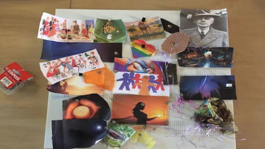
Is the student also a budding writer or artist? Tie in artwork or a narrative to music making. What colors do they see while playing? Ask them to imagine water, land, beach, or mountains. Is it rainy and wet or is there sunlight shining? Ignite their tactile intelligence and ask them to imagine how their feet feel in sand or warm water or gravel….how does the bow hair feel against the string? How is their main character dressed? Ask them how these connections could change their choices in tone, texture of sound, vibrato, bow speed….Make a mood board and let them put it all together to see their composition in a way that inspires them to create specific, intentional sound.
Pull in history and do some research. Who is the composer and what do we know about the period they lived in? Have them look up what was happening in the world the month or year the piece was written. Ask them what might have inspired this piece to happen? Monkeys were sent into space the year Kabalevsy wrote his violin concerto! Can you hear the monkeys?
Tickle their imaginations and build a feeling, a story, and fully formed characters around your piece. If you make these connections with your young musician, you are strengthening existing skills, building their confidence, and reinforcing a fabric of information that aids in memorization and the clarity of their interpretation. They become beauty ambassadors for their music.
Environment
Create a practice environment that lights up a child’s mind… Have them help you decorate a space they love with great lighting, a stand that can hold everything they need, and bring in a metronome and tuning device. Organize their music by category and build a notebook that facilitates finding each component of their practice. This will be a creative space where lot of hours of work happen and the more they contribute to how it looks and functions, the better.
Is your kid one who would respond to the art section above? Collect paint swatches for colors, fabric swatches for texture and tone, and find stock pictures of different landscapes and places. Have paper and art supplies nearby and encourage them to draw their main character in detail. Some kids will take to this immediately and others will be less inclined but the space they work in can influence them for sure. Then explore together what techniques can bring these visuals to aural fruition.
Bring technology into the practice space and engage in some research. Utilize the amazing tool most of the teachers I know never had: YOUTUBE. Find 5 recordings from reliable performers of the same piece and ask them to make a list of similarities and differences. Create a word doc chart for charting differences in recordings and keep a few charts out and ready for use. What are their favorite moments in each performance and why? How do the tempi differ and how does this compare to their own tempo. How are the musicians communicating with one another in the performances and how does this add enjoyment to the listener’s experience?
NOTE: For the art integration and research, it is my opinion that you should absolutely count this as practice time and label it as research and artistic development! Not only will their practice soar but also their performances will reflect this addition to their work. Try and make this a reflex reaction to frustration in technical work with the knowledge that when your student comes back to it, they will be more relaxed, armed with artistic ideas.
Practice Makes… Near Perfect
Perfection is overrated when a child is developing as a young violinist. There will be big leaps, plateaus, and as you acquire new techniques, sometimes-unavoidable setbacks. A fluid parent, student, and teacher are a must. If perfection is something you strive for in other areas, intermediate violin will be a rough pill to swallow let alone advanced or virtuosic violin training. You can’t cram for a test and the body doesn’t respond well to stress or pressure from any source when you are coordinating hands and building balance for a supple technique. Be mindful of a student’s steady efforts and how thoughtful and engaged their practice is. Make this your priority along with an ongoing stream of inspiration.
Keep in mind that some techniques or fundamentals will take longer than you expect while others will be a breeze. In my own training, it took me two minutes to achieve a solid up-bow staccato but it took me nine months to achieve a spiraled vibrato. These aspects of our playing cannot be rushed and it isn’t like a multiplication table or something you can drill like flash cards. The body has to relax and find its way alongside a lot of hard work. Frustration or practice battles with parents will only make it move slower in my experience. In a similar way, some pieces will take multiple tries on stage to get near perfect and this is not a reflection of work or dedication. This becomes more and more true with each new level of playing. Often parents are not aware of this and find themselves frustrated and discouraged. Children then pick up on this and carry it into their work.
Child Led Learning and Fun
These days kids are more scheduled and in a family with multiple children, it might feel like they are making less and less decisions on their own. It is for this reason that I feel allowing a younger student to make certain choices in practice can be very effective. Dorothy DeLay was known to say that her priority was a happy and joy filled child in a lesson. This is what she was shooting for in every lesson beyond the teaching of violin and classical music. When children are in this state, they are more fluid, willing, and learn with greater ease. She was extraordinarily conscious of her choice of words in lessons and always managed to bring comments into a positive framework to allow the child that safe space emotionally to learn and grow. In my teaching, once a child is feeling fluid and happy, I will follow their lead for a while and we inevitably discover something together. If there are certain components that are determined to be necessary in your child’s work, consider allowing them to choose some of the order. Give them ample space to make a suggestion or problem solve and be willing to apply their idea fully followed by a fun Q and A about what worked and what didn’t. Be flexible enough to miss something on some days if it promotes a happier learning space during the week. Treat your pieces, etudes, or scales like basic nutrition and do your best but take stock in the week’s work more than every day. By the end of the month, you will have made beautiful strides in all areas and have a happy kid walking into the practice room. Strive to make the beginning and the end of every practice session positive, light, and affirming. Ask them what their favorite part of today’s practice and use that to brainstorm about the next day’s work. Leaving the practice room with a smile on their face all but guarantees they will want to walk back in later. I have been known to stop practice sessions slightly early if I feel this happy state is achieved because I know it leads to more happy practice later.
Balance and Rest
As a teacher, I see increasing amounts of children arriving to lessons exhausted and yawning in lessons. I will ask how they are doing and if they are tired and try and coax a smile out of them. The parents lightly brush it off and we try and make the best of it. Through casual conversation, I learn of their schedules and it becomes clearer to me why they sometimes seem uninspired, have trouble working effectively, and why parents grow frustrated with a decline in interest. It is not a new phenomenon for kids to be overscheduled with activities but as a teacher of 22 years now; it seems to be getting more common. I am a Mom myself and at times it is challenging for us too. Especially with creative kids, they want to do it all and many artistic talents will yield well to another art form and that is exciting for everyone. But physically they are still very small and they can only do so much by the end of any week. There needs to be room and breathing space for a child to lead in the lessons and in practice. If we have to prepare too many pieces, always on a time crunch and racing the clock, we aren’t creating an atmosphere that will inspire them to come forward and participate. It becomes more centered on checking off boxes in some daily list of activities and that can turn learning music into a chore. Most parents agree that they would love for their children to continue to play music for a lifetime but if music making becomes a chore, how likely is this? If instead we allow the time and space for music to be a form of expression and an artistic outlet, our chances for a lifetime of music increase.
Parents, students, and teachers need to be watchful of schedules and learn to say no to certain opportunities in favor of balance and rest.
0 notes