#Not early at all… 👀
Explore tagged Tumblr posts
Visit Tumblr Blog
Explore Tumblr blogs with no restrictions, modern design and the best experience.
Last Seen Tumblr Blogs


Fun Fact
Mobile US users spent an average of 115.8 minutes on Tumblr app monthly.
Note

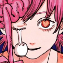
Trick or treat Smell my feet Give me something short, spicy, and Loki to eat... (if you don't that's ok I'll still love you anyway)
😈👹👺👻💀
LENAAA!!! Hehehe! Stawp, that is so cute! (And I love you, too! 🥺💕) Many thanks to you for choosing to stop by my humble home this Halloween!
Of course I'm gonna give you a treat! Here's a little something I cooked up, perfectly in season and just for you~
Tucked away in a distant room, away from the festivities, I shuddered as his cold finger trailed down my back, my dress of choice leaving it almost fully exposed to him. His path was only interrupted by the criss-crossed ribbon holding my corset together. Evidently, my costume had provoked him. Evidently, that was the plan... "And here I thought mother told me all there was to know about witches." He softly mused, his breath warm against the shell of my ear as he hooked a deft finger in my corset's ribbon. "Yet, I'd never heard stories of witches wearing dresses that revealed such enchanting forms-" His free hand trailed along the curve in my side, down along my hip. "-dresses cut so high, anyone could easily glimpse the tasteful underwear they picked out, presumably just for the occasion-" I softly gasped as his hand slipped under the hem, the other abandoning my corset to cup my breast as he pulled me back against him, pressing his hardening length to my ass. "-dresses so painfully tempting that the view becomes all-consuming, any attempt at remaining rational falling to oblivion." His breathing grew heavy as he teased my inner thigh, and I bit my bottom lip as a needy whimper escaped the back of my throat. "But, you are no witch of my mother's stories, are you? No... You're a temptress. A seductress, clothing herself in the fabrics of a witch to ensnare her prey. Serving as an intoxicating distraction to anyone who dares look her way." "Ah-" My voice caught as his fingers gently worked my cunt through the thin fabric of my panties, my arousal quickly wetting the material in reaction to his electrifying touch. "Are you satisfied, pet?" He growled. "Was this what you wanted? You've not only caught my attention, but the attention of everyone else in the room, parading yourself as an enchanting whore." "Please..." I mewled. "Begging now, are we?" He darkly chuckled. "Perhaps I'd be amenable to granting you what you crave... at my discretion." The hand that once cupped at my breast now moved to coax my chin to face him. "If you learn to remember who you belong to." "You!" I whined. "I belong to you!" A sinister smirk played at his lips. "Say my name." When I didn't immediately respond, he grabbed my chin, moving our faces until our noses barely ghosted each other. "Say. My. Name." I took a shaky breath before whispering the name I was sure I'd be screaming later. "Loki~" "That's my girl." He breathed, loosening his grip on my face before closing the gap between us with a kiss.
#Shhhh! I’m not posting this a day early#Totally not#I was being very patient and waited until Halloween day to post this#Not early at all… 👀#The Knight answers~#tumblr trick or treat#loki smut#smut
11 notes
·
View notes
Text

im a big fan of esper powers slipping loose in harmless ways when they're happy
#LETS GO LETS GO LETS GO i love this one so much i love them#rishou#ritshou#RITSU BEING A LATE AWAKENED HAS A WEAKER GRIP ON HIS POWERS SO THIS SHIT HAPPENS AND I XJDJCJ#and shou. he is very deliberate with his esp! that's um. upbringing and everything he went through#he has fun with them he experiments- absolutely! That's fanon. but they never slip out of his control#he thinks he'd freak if it ever happened (👀) so the fact ritsu's do sometimes and-#-how it ties to his emotions is a huge point of curiosity for shou#mp100#this piece makes me fuzzy im just so glad it came out as intended#the sketch (which was done.. 5 months ago) i edited to have this bad quality photo taken in the dark vibe and then chased it when rendering#but still had to brighten the end result cause Phone Performance idk how you guys have your settings so better safe i guess#but still!! i bet this looks super dark and indistinguishable to some even with max brightness because say they're out in the sun#and im scared of that!!#but man i sat on it long enough i wanna post And i won't sacrifice my vision this time. can't brighten a night till its not night anymore#its a long persisting issue of mine- drawing with full brightness on ipad and then transferring to the phone and going Why is this so bleak#Despair#it's why i grew to hate post production editing it's always so-.. degrading?? discouraging??#I'm progressively better at catching and fixing that problem early on#sketches will still be murky af but I'll copy paste the full image fix the curves and then either go back and switch all the colours#OR FUCKING DRAW OVER THE EDITED SKETCH LAYER WHICH I'VE BEEN DOING A LOT LATELY ITS SO WEIRD AND LOOKS KINDA COOL#and aaaall stems from laziness (read: time management) like bruh those 40+ layers? i aint going back there to fix every colour#mp100 fanart#mob psycho 100#mob psycho fanart#ritsu kageyama#shou suzuki#kageyama ritsu#suzuki shou#ALSO i deliberately tried to make esp blend with the environment; nothing dazzling and mindblowing. felt right for this piece
287 notes
·
View notes
Text

bonus for May issue of Lala magazine with natsume, tanuma and nyanko-sensei
#natsume yuujinchou#midorikawa yuki#is this a hint that we're getting a tanunatsu chapter next 👀 (delusional)#could also be a tanunatsu chapter in may when the bonus is actually released in the mag lol#they also announced may cover will be natsume as well#i didn't know they announced future covers so early#but it kinda makes sense#announce early so natsume fans will plan to buy it right away and all that#sometimes i forget how big natsume actually is in japan#anyways wanna hear an even more delusional take?#natsume is in the may cover bc they'll announce season 8 there#(ignore that last part i'm just desperate)
100 notes
·
View notes
Text

JR!! Brain said yes to art at midnight, so i drew this C: i plan on using it as a base to experiment adding and drawing apparel/clothes n stuff... i rlly need the practice. But uuuuggghh fabric is such a pain in the butt to draw, its simultaneously fun but makes you suffer along the way.
I actually used some arm/leg references because i discovered my knowledge of dragon anatomy is pretty different to humanoid anatomy and i need to work on that (the human anatomy refs i saved years ago are finally coming in handy now HEHEH)
*eyes the feet* i dont like the way im drawing the toes... the shapes not right but i cant figure out whats off >:C
#cimmerian1275#my art#digital art#tmnt#rottmnt#rottmnt jr#jr#oc#original character#i dont skip leg day when it comes to drawing them lmao#<- were all mature enough here to know theyre a turtle and dont need pants right? u better be 🤨#im such a nerd when it comes to drawing anatomy#idk the names of whatever muscles im drawing (and i probably never will xD) but i sure as hell love drawing them#✨LEGS✨#im improving so quick when it comes to learning to draw the tmnt 👀 if you go hunt down my early art the changes r super cool
52 notes
·
View notes
Text

babie🥺❤️ to "baby?"🤨👀

#dc comics#dc#batman#bruce wayne#fanart#my art#sketches#they got caught doing sth bad 👉👈#i just think the sheer dissonance between wittol 8 y/o bruce and beeg (pregnant 👀) mid 40s/early 50s bruce#is gonna one shot flashpoint thomas#thomas faces the devastating realization all kids with parents have to go through: his boy/their parent fucks 💀
59 notes
·
View notes
Text
i have a lot of new mutuals somehow 😳 and everyone seems to be way too cool to be here in different timezones but!!! if you see this!!! hi!!! 👋🏻 welcome, i’m kayleigh and i am a big fan of pixelated people and my blog is kinda all over the place ngl 😅 but i’m so happy that you’re all here (also! ☝🏻i see all of your selfships!! 👀 and i adore them!!! 🥺) and i hope we all have fun and get to know each other better!!! 🥹 💕
#٠࣪⭑kayleigh’s yapping.#can you. can you tell. that i am bad at introductions 😂#i am sooo excited to meet you all!!! 💗#and learn all about your selfships 👀 ✨#but alas it is VERY late (or more like early) where i am at and i work later so i am going to go to bed 😴#GOODNIGHT EVERYONE!!! 💤
22 notes
·
View notes
Text
Sorry for the terrible zoomed in screen grab but hello buck in a white tee yet again!! This is starting to get worrying and interesting in equal measure!

So white tee above from new bts but he’s also been in a white tee in every other bts non uniform costume we’ve seen - except 2
We have this one

This one

And this one

The two non white tee featuring costumes are this one

And golf Buck

First up - lots of white shoes - which means scenes about Buck and bucks journey to find happiness.
Then we have the fit of all of these costumes. With the exception of the golf one and sort of the vertically striped shirt one (and possibly the brown shirt one but as I can’t see much of it it’s hard to tell), they are all what I would class as loose fit and oversized. Which is not Buck at all. I wrote a lot about bucks clothes being intentionally too small in previous seasons - and how it represented him not fitting in his skin and being constrained and confined by his life. And that held true because as soon as his bisexuality was unlocked he was wearing clothes that fit him better and we saw him wearing jeans for the first time since season 1 (technically he was wearing jeans before but they were all coloured jeans - black or grey etc, but now we have him in proper indigo coloured jeans which is what I mean).
Now we’re in the territory of oversized and ill fitting. And that is pretty telling - especially in tandem with the change in colours we seem to be seeing for buck. The dark blue jacket and the greyish striped shirt are the most in keeping with bucks previous wardrobe we have seen. Everything else - including the coloured trousers is out of his wheelhouse.
Buck has pretty much always worn much bolder brighter colours - more in the jewel toned spectrum.
But now we have all these browns greens and tan colours and that’s very interesting to me. The choices made for buck for this season is starting to paint a picture.
The tan of the new bts and all the washed out and lighter greens are much more colours we associate with Athena and Eddie than Buck. They all point to the idea of conflict and combat as their colours associated with the military (which is why Eddie and Athena wear them - Athena because the police are a type of military in a literal sense)
Tan as a colour has several meanings but the two key ones that I think are most likely connected with buck are growth and healing. The lighter almost khaki greens - which have brown undertones are connected to blending in or going under the radar. There is also the meaning of growth, renewal and rebirth attached to it as a colour as well. These are all themes that seem to be likely arcs for buck this season. His bisexuality awakening g can be seen as a moment of rebirth and therefore it is fitting g to see him in these colours. Growth healing and renewal also fit with the idea of him learning about himself and because I have my theories about Tommy as a narrative device, healing seems very likely an important aspect of bucks story as well.
As for the oversized nature of the clothes - I’ve talked about it before, but it’s implying buck doesn’t yet fit in his new skin - he’s unlocked this new part of himself and now he’s figuring it out and what it all means for him.
The oversized choice is about growth - he’s got room to grow into who he is - it’s an extension of his too small clothes constraining him and I’m expecting to see a couple of things happen over the season with the oversized element of his costumes. From early on I expect to see better fits in places and around people he’s comfortable with - so around the firefam. But I also expect to see the oversized clothes when he’s uncomfortable or around people he is wary or not comfortable with- which means Tommy and possibly on some occasions around Eddie or even Maddie and Bobby. Buck doesn’t know Tommy so this is expected - especially as Tommy is connected to the newest part of buck he’s discovered. This also does fit with my theory about Tommy being a manifestation of parts of buck that buck needs to deal with - in order to live himself and embrace who he is.
The other thing I want to talk about is how so many people are claiming buck is stealing Tommys clothes or dressing like him. I want to debunk this as a concept, because it really isn’t the case at al and it creates a false narrative about bucks clothing. Tommy has worn a khaki colour way once. That’s right just the once - and it was his first non uniform costume of s7. All of his other costumes have been reds, blues, greys, or dark greens. Much more in line with bucks normal colour palette and nothing like the colours we’re seeing buck in right now. I remain convinced the first costume is also meant to be a red herring and as 7x04 is from Bucks perspective it means that costume isn’t necessarily a true representation of Tommy - it’s coloured by his jealousy.
What I’m really intrigued by and interested in is the amount of white t-shirts. Buck wearing white spells trouble in his life and to have so much of it is rather alarming! What form the trouble is going to take we have no idea - beyond Gerrard. But it seems season 8 is not going to get off to the happiest of starts for Buck!
And that’s not even going into the blue - green of it all - which I don’t have time to get into tonight but may pick up on tomorrow if I have the time!
#all the white tees got me 👀👀👀#it’s giving me conflict vibes - and that along with the army colours and oversized clothes makes me think we might be seeing#things not being all that great with Tommy fairly early on. there is of course the Gerrard stuff but that’s very interconnected with Tommy#I can’t wait for the season to get going so I can find out what direction we’re going with costumes and colour#but I’m beginning to wonder if the khaki green might be the colour of the season like the bright pink was last year.#it would fit - conflict and growth renewal and healing are themes that seem to have been set up for all the characters this season#we shall see!#Kym costume meta#911 costume meta#911 colour theory#911 spoilers#evan buckley#911 abc#anti bucktommy#anti tommy
47 notes
·
View notes
Note
Hi!! I just wanted to say that the way you draw characters/use colors in your art is an absolute dream, I've never seen anything prettier. Do you have a specific way you pick/use colors, or any advice for coloring? You inspire my art so much, and I'd love to learn how to color like you someday :)

@braventheninth gonna reply to both of you here hope that's cool!
aaaah thank you so much I'm really honoured to hear you both like it and that it inspires you anon !! ;v; I don't actually know much about art theory-wise, aside from very basic colour theory that I always forget so most of my choices are pretty instinctual and based on my own preferences!
i can do my best to explain my thought process though! uuh it is. lots of text though just as a warning.
one thing I tend to do with almost everything is pick what kind of colour mood I'm going for! usually, since I love orange and also warm feelings, I'll aim for some kind of warm tone and when doing that I try to slide every colour I pick towards the warm end of the colour wheel. Blacks and whites are especially good for this! As a general thing I almost fully avoid picking any colours along those edges of the colour picker

instead I'll move all my colour choices a nudge into the square for the colours towards the tone I want (in this case warm) (the white is there be warm too I just forgor to type it).

and since I wanted warm colours for this drawing I desaturated the blue of Brain's pants so it would fit in better. I once heard someone say you should always pick one main colour and saturate fully and the further away from it on the colour wheel you got, the more desaturated your colours should be. I don't really do that bc I like my colours to stay bright but I do keep it in mind to mess around with sometimes.
I'm not always great at keeping this consistent, but I think it usually makes for pretty decent results... Other things I keep in mind are that when I pick the colour for my shadows I always make a little slide on the colour wheel towards the opposite tone of what I based my main colours on. oh and picking the right base colours ?? no clue tbh I always put every colour on it's own layer and then I spend a couple minutes adjusting them all seperately until I feel like they go well enough together. I usually avoid the bottom to right section of the square fully, bc I find they often get oversaturated and muddy, but that's just a personal preference I guess.
also since I enjoy the way coloured lineart works for my stuff I tend to mess around with layer settings for my lineart! usually the end results will look something like this:

where the clipped layer is clipped on to my colours folder. lineart is the only place where I just use plain black since I'm gonna change it with these layer settings later. it often still shows up as black for darker colours (and especially blues?) but it keeps a slightly coloured edge that I enjoy. if the blacks of the end result don't look good, messing around with the layer opacity usually changes stuff up. sometimes I'll also erase part of the lineart from one of the layers as a way to adjust.
I think what might be more relevant though, is the way I've been picking my colours for most of my recent posts though, which is. very differently. and also quite dependant on the fact I've been drawing on Tegaki! Tegaki has a limited colour palette that looks like this

only the 6 colour slots next to the bottom greyscale can be replaced by your own colours. As shown here I only bothered to add something to half of them; mainly the beige-ish colour I like to use for whites, a brown that I never use bc it's ugly with everything else here and a purple? that I only Think I added. both the brown and purple suffer from being too desaturated for the rest of the palette, which makes them stand out in a pretty bad way when used tbh.
I have. absolutely no idea what I'm doing with colours on this site though ngl. I think it just automatically pushes you to be a little more chaotic with the choices? a simple example is the green I picked for Link's tunic here doesn't really have any good, easy choice for shading imo. most of the "darker" green tones just feel more saturated, and it sticks out pretty bad as a shading colour for the more muted green I picked for the tunic. Removing those, the choice was either a mossy green or a blue.

and while the mossy green is still green, it feels far too dark a shading colour compared to what I picked as shading for the rest of the drawing. The blue has the added bonus of being closer to the purple I used for the black-ish parts.
I think my point is that it's really easy to push yourself to make some fun new choices when the tools you're using limit you a bit in a way? Looking at it now, I'm also seeing that the hands were lined with very different colours. I remember just thinking that I couldn't be bothered to find the exact same purple I used for the first hand so I just went with the first thing I landed on, that being a pink. But now I think it works pretty well since the one hand is lifted a bit more into the light and that goes well for a bright colour like pink. happy accidents and all that right ?
I am fully just yapping at this point 🧍 but the point still goes for most things drawn on this site.

like there was no reason to add the blues or reds or pinks to the heather here but I only had so many purple shades to work with. it might be less realistic but I don't think it would've come out as well if I had stuck to only the purple shades from my reference photo.
This ended up way way too long and I have no idea if any of it made sense or was helpful at all, but it was surprisingly fun to reflect on my own choices a bit more! especially since I often just do whatever I feel like I think it's helpful to sit back and consider what instinct actually tells me it's the right thing to do.
in an attempt to do something actually helpful uuh I recommend messing around with 2 specific things and switching around with them a bit; namely limited colour palettes (like 1 or 2 main tones imo) and then just going absolutely ham and just using whatever colour for everything (make them orange! put some blue and purple on the bark! leaves can be blue if they want to! (go more ham than I did tbh))

I think just messing around does so much for making some kind of sense of colours even without Knowing how they work. it's easy to say we should all study, but personally I'm pretty bad at it and it's more fun to just trial and error it... errors do happen a lot though omg do they happen, but that's helpful for figuring stuff out too!
#ask#when I called myself Yappinator 2000 on bsky this is exactly what I meant shfdiuhsdf#feeling a little sick and should've probably slept early instead of figuring this out but it was rly fun and relaxing actully!#considering how bad I've slept recently ending the day with lots of quiet pondering might be just what I need haha#I should probably get the triangle colour wheel so I can lessen all those colours I don't like to use but I'm too used to it being like thi#too tired to have imposter syndrome too tired to overthink whether I make sense. it's quite nice actually#I hope at least some of it will be helpful or fun :)#almost started overthinking anyway I am pulling myself back by the scruff and off to bed#sleep well everyone whenever you do <3#also. totally no secret tegaki agenda here totally 👀 it's totally not like I think everyone should at least try that site haha no waay#it's only full of cool and nice people just like here and you can draw silly comments to each other#and also runs better on chrome than firefox wink wink......... spleepy time..........
28 notes
·
View notes
Text
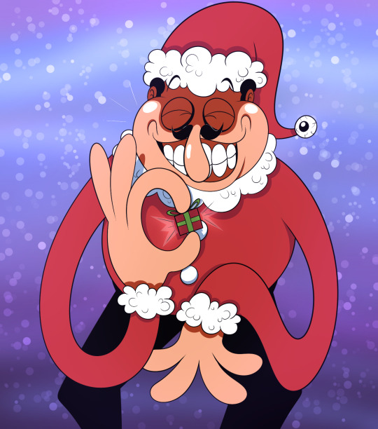
somebody's got a gift for yoooouuuuu!!!
(look at that i drew a normal pizza tower thing isn't that exciting!!)
#messing around with my new outline pen more heeheehee IT'S SO GOOOOD#WHY HAVE I BEEN USING SUCH THICC LINES FOR SO LONG#I DUNNO but enjoy the christmas fakey!!! i might do one more cute holiday drawing i dunno we'll see 👀👀#my art#pizza tower#pizza tower fake peppino#merry early crustmas to all y'all though ❤✨❤#*platonic smooch for all my mutuals*
130 notes
·
View notes
Text
60 years ago - on November 16th, 1964, the Animals recorded "Don't Let Me Be Misunderstood"!! 🐾✨️

#i have to hold off on posting my art for the time being since i was finishing up school assignments this past week but 👀#in the coming days....... something very cool will be finished....#aNYWAY. I LOVE THIS SONG I LOOOOOVE IT SO MUCH.#such a great cover and really demonstrates the animals' range when it comes to r&b#a great follow-up to 'i'm crying' because the lyrical/melodic progression of both songs are very similar#('boom boom' came out inbetween them BUT THE POINT STILL STANDS)#btw speaking of price-burdon the b-side is 'club a-go-go' by alan price and eric burdon teehee#THANK YOU MICKIE MOST. FOR LETTING THEM USE ONE OF THEIR ORIGINALS ON THE B-SIDE.#also this is The Song i think of when i think about how great of a drummer john is and how his jazzy style permeates through their music#i'M ALWAYS TAPPING ALONG TO JOHN'S BEAT IN THIS SONG#anyway aaAAAAA GONNA WORK ON MY PROJECT ALL DAY TODAY. SCHOOL'S OUT ANIMALS IN. DR PEPPER AND MIGRAINE MEDICATION: TAKEN.#the footage is from 'pop gear'/'go go mania' by the way!!! filmed in early 1965!!#since this song wasn't released until january of 1965 and alan has his SWOOPY BANGS#eric burdon#alan price#hilton valentine#chas chandler#john steel#the animals#classic rock#british rock#british invasion#60s rock#the girl can't help it#ICONIC MOMENTS IN ANIMALS HISTORY that i did NOT forget about this year!!!!!!#i have a running trend of forgetting about November 16th bUT MICKIE MOST HIT ME OVER THE HEAD AND I DIDN'T THIS TIME#alan also had a concert this week which kept me sane 🥹
26 notes
·
View notes
Text
It’s mind boggling to me to see people I graduated high school with getting engaged, married and having babies
Like guys cmon, we’re only 14…
(we’re 25/26 and graduated high school 7 years ago)
#✨h rambles ✨#growing up and watch tv and movies 25 is a perfectly reasonable age to do all those things but now that I’m here it’s like 👀#I can’t imagine getting married right now let alone having child woah#I think being queer and not dating till my early 20’s instead of my teenage years has something to do with it
19 notes
·
View notes
Text
Are you normal or did you use being attracted to almost the entire main cast as a reason when trying to convince someone to watch community
#fandom#community#community nbc#annie edison#britta perry#jeff winger#abed nadir#troy barnes#shirley bennett#literally sometimes it just blew me away watching it early on#that I get to look at Annie Abed Britta AND Troy all for free & the show is good too???#also Jeff’s not bad looking either he’s just totally not my type#mostly Annie & Abed are teehee 🤭#but then again BRITTA & TROY 👀#basically everyone besides Pierce is kinda hot lmao#blorbo high council
73 notes
·
View notes
Text
Méko’s experimenting with new brushes lately…
Examples are when he drew this, and also this, and now we have a new one of Candy in a cool ‘fit!

#bunny maloney#obscure media#partically lost media#suggestive#candy bunny#new brushes#It’s cool to see him try new things! I honestly should too art wise! 🔥#This is just a reminder of how hot Candy is dghdgcc#Clothes work so well for her she’s just sexy like that 😳#I also love her shoes!#The whole ‘fit gives those early 2000’s vibes 🔥#Candy vandalism!!!#She has a smartphone now! I wonder does she still have her flip phone? 👀🧐#Rabbit women we all say in unison and clap 👏🏾#Zing mention!#studio tanuki#mékolai
10 notes
·
View notes
Text
just a little psa to say if you’ve sent me an ask or a message i promise i will get to it very soon 🫶
i took some time off from my inbox over christmas and new year, and am only just getting caught up with things now. my chronic pain is also uh. not being kind to me at the moment, so i’m having to pace myself and take things slower than i’d like - but please know i haven’t forgotten you! i absolutely love getting to talk to people and answer the fun asks that get left in my inbox, it’s truly one of the highlights of being in this fandom 🥰

#thank you all for your patience 🫶#also… on a slightly different note but also not that different bc i’ve had a few asks about it:#you will definitely be seeing fic stuff from me again sooooon!#very excited about the things i have to share in hopefully the not too distant future now 👀#anyway#i have a cold on top of chronic pain and everything else so i’m going to go comfort watch some milex interviews#and then have an early night with my book#wishing you all the loveliest evening 😘#lulu posts
18 notes
·
View notes
Text


#muse#verse; sláimín nua péinte#listen i've had the armoured suit on my mind all day--#so i wanted to make a thing and head off the bed early#but also come plot things with me & mig using this suit? 👀#musings
16 notes
·
View notes
Text
Playing No Man's Sky, sending my little frigates out into the galaxy on expeditions, gathering resources to build fancy work stations for my freighter, going through and fixing the colors in all the corridors, working out a trade network: *happy little wiggle*
#no man's sky#i remember years ago when i got it#the worst reviews were 'all you do is gather resources and build bases and explore planets!'#and i was like 👀#i think i'm early mid-game? i used the ship cheat back when it worked so i have like 90k credits#but i've only unlocked three exocraft#having fun being a captain of a fleet tho#i get to name all the ships#shoutout to Soidora because it's an exploration vessel and that's how you say soy dora aka dora the explorer#did i say 90k i meant 90 million#i like having enough money in a game to buy whatever i want#nanites on the other hand?#ugh.
27 notes
·
View notes