#Nasta'liq
Explore tagged Tumblr posts
Text

An Ottoman Drawing of a Peri, attributable to Veli Can, Turkey, 16th century. Gouache heightened with gold on paper, depicting a seated peri before a bowl of fruit, with large feathery wings and leafy hat, inscribed 'perizad' above, bordered in gold, outer margins filled with large leafy outlines in gold, reverse with a text box with 8 lines of flowing nasta'liq script in black ink, sprinkled with gold.
100 notes
·
View notes
Text


sirius | they/them (non-binary)| 19 | intp | aquarius | slytherin | indian (marathi) | "im bi actually" | main: @siriusblack-the-third
.
a little about me~
Welcome to my side blog! I'm Sirius— a BA Philosophy student, bookworm and book dragon, science nerd, tharki and all round idiot. My native tongue is Marathi, and I can speak Hindi, Urdu, Gujarati, English and French. I'm a Fashion Girlie™ (gn) and obsessed with aesthetics and all forms of art.
I'm currently learning classical dance and teaching myself to read nasta'liq (people who can speak Urdu but can't read it raise your hand lol). I'm a feminist and proudly an LGBTQIA+ person.
.
Fandoms I'm part of~
BTS | Red White and Royal Blue | A Good Girl's Guide | Harry Potter | Bollywood music | Hozier | Fourth Wing | Percy Jackson | Billie Eilish | AC/DC | Agatha Christie | Sherlock Holmes (books) | BBC Sherlock | The Shiva Trilogy by Amish
.
DNI if you are~
Queerphobe, transphobe, bot, supporter of Joanne K Rowling, racist, anti-feminist, or any other type of narrow-minded nonsense. DO NOT DM ME UNLESS YOU ARE A MUTUAL BECAUSE I WILL NOT REPLY.
.
Tags~
if you want to read my fics/prose/poems: #amrut-writes for the old ones and #sirius-writes for the new
21 notes
·
View notes
Text

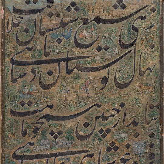
Page of calligraphy in nasta'liq script by the 16th century master calligrapher Mir Ali Heravi
1 note
·
View note
Text

A painting from the Impey Album, by the artist Bhawani Das: A Great Indian Fruit Bat, or Flying Fox (Pteropus giganteus). Calcutta, circa 1778-82. Pen and ink, watercolour with gum arabic, heightened with bodycolour, on watermarked paper, inscribed at lower left In the Collection of Lady Impey at Calcutta/Painted by [in Persian in nasta'liq script, Bhawani Das] Native of Patna, numbered 163 at upper right, framed. 457 x 687 mm. From Bonhams.
0 notes
Text
"The Conference of the Birds"
Illustrated by Mohammad Barrangi
2022
This book is one of the artworks that has greatly influenced me. This book has inspired me through its poetic and nostalgic illustrations, which seamlessly blend traditional Persian calligraphy and collage printing. Given that my artistic focus revolves around feminism, I also appreciate the shared theme of using women's portrayal as birds in the illustrations.
"The Conference of the Birds" is a literary work written in the 12th century by the poet and mystic, Attar. It tells the story of how the birds of the world come together on a quest to find a mythical king known as "The Simorgh."
In his illustrations, Mohammad Barrangi incorporates various Eastern elements and elements drawn from his memories, personal history, and the city of his origin. Notably, women take center stage as the primary characters in his artwork, and he utilizes collage printing and Persian Nasta'liq calligraphy to bring his creative vision to life.
The fusion of these elements in Barrangi's work enriches the interpretation of Attar's timeless narrative, creating a unique and captivating visual experience.
1 note
·
View note
Photo

Nasta 'liq
Nasta 'liq is one of the styles of Islamic calligraphy that was developed on Persian grounds by Persian calligraphers. The art of calligraphy has always held a prominent position in Persia, and its usage extends beyond the limits of the pages of books and documents to other fields of art such as architecture, pottery, metalwork, etc.
Continue reading...
37 notes
·
View notes
Link
If you were to walk down a street in New York City, you might encounter hundreds of fonts on a single block: everything from street signs to shop names take on distinct personalities. Urdu and its nastaʿlīq typeface, lagging in the digital space, are much more difficult to iterate on with existing technology. Where there are hundreds of thousands of Latin digital fonts — fonts so iconic that we know them by name, like Helvetica or Times New Roman — digital Urdu fonts are limited to a handful at most. The nastaʿlīq typography that you might see on the streets of Pakistan is most likely to be hand painted.
“We went on Google and typed “what are fonts, how do we develop them,” Zeeshan recalled. “We purchased software but sat on it for a long time because we didn’t know how to use it.” Produced in collaboration with a government technology board over the course of a decade, Mehr Nastaliq uses 500 characters, all handwritten by Nasrullah — a tiny fraction of the 20,000 glyphs Jamil so painstakingly wrote in the 1980s. The Mehrs are particularly proud of how light their font is: at 60 KB, it doesn’t slow down websites and renders quickly. You can elongate letters and add diacritics.
Their experience of developing Mehr Nastaliq drove home an important lesson: the need for close collaboration between the calligrapher and developer. “It is imperative that the calligrapher and developer understand each other,” emphasised Zeeshan. “Abbu understands programming too now, so he can offer a different solution when confronted with tech limitations.” Working with his parent comes with its own challenges, of course. “Sometimes, Zeeshan would say, This letter isn’t looking nice,” Nasrullah said with a chuckle. “And I’d get huffy and say, Are you the calligrapher?”
Unicode, developed in the early 1990s, is now a global standard for representing characters across language systems in computing code, which means if you write Urdu — in naskh or nastaʿlīq — on one computer, it won’t appear as a string of garbled symbols in another. But technological advances don’t automatically bode well for the digitization of non-Latin type languages. Nemeth notes that the proliferation of easy-to-use design software doesn’t eliminate the need for script-specific expertise. “Designers who are not willing or able to invest the years of learning and research necessary to master a foreign script,” he says, “are led to believe that their tools and some superficial ‘borrowing’ of design elements are sufficient for successful design.”
Read the whole article.
#linguistics#typography#urdu#fonts#typefaces#type#typesetting#unicode#naskh#nastaliq#nasta'liq#rest of world#technology#language tech#internet linguistics#language on the interwebz
529 notes
·
View notes
Text

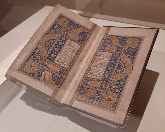
Spiritual Couplets (Masnavi) by Maulana Jalal al-Din Rumi
Kashmir, 24th December 1827
The sweet lyrics of Rumi are among the gems of world literature, and his Masnavi is one of the most well-known works of Islamic Sufism. This copy's small nasta'liq script, arranged in ornate horizontal and vertical verses and ornamented with vibrant blue and gold, was written by the scribe Ahmadallah, also called Hakim Masih al-Zaman, who was also the author of a medical treatise (Khulasat al-tibb).
#masnavi#rumi#kashmir#19th century#mine#aga khan museum#Islam#religion#sufi#nasta'liq#Ahmadallah#hakim masih al zaman#khulasat al tibb#history
39 notes
·
View notes
Photo

Nastaliq
Le nastaliq (parfois orthographié nasta'liq) est l'un des styles de calligraphie islamique qui fut développé sur des bases persanes par des calligraphes persans. L'art de la calligraphie a toujours occupé une place prépondérante en Perse et son usage dépasse les limites des pages de livres et de documents pour s'étendre à d'autres domaines artistiques tels que l'architecture, la poterie, le travail du métal, etc.
Lire la suite...
3 notes
·
View notes
Photo


Safavid brass Astrolabe, Tabriz, Iran, 1705-06 AD.
5¾ in (14.6 cm) high overall; 3⅜ in (8.5 cm)
Christie’s
#art#design#science#astrolabe#safavid#iran#tabriz#brass#Christie's#nasta'liq#engraved#azimuth#horizon#celestial#astronomy#instrument#object#collectors#inclinometer#calculator#style
236 notes
·
View notes
Photo

Nasta 'liq
El nasta 'liq es uno de los estilos de caligrafía islámica desarrollado en Persia por calígrafos persas. El arte de la caligrafía siempre ha ocupado un lugar destacado en Persia, y su uso se extiende más allá de los límites de las páginas de los libros y documentos a otros campos del arte como la arquitectura, la cerámica, la metalistería, etc.
Leer más...
0 notes
Photo

Woman with a Spray of Flowers - Unknown Artist (ca. 1575)
On this detached album folio created in 16th-century Iran we see a beautiful woman with a spray of flowers. The painting is set in gold, green, and blue rulings on a paper with floral motifs, marginal cartouches with two couplets in white nasta'liq script, and two marginal medallions with kneeling youths.
The verses in the border of this painting seem integral to the composition. They imply the yearning of the lover, represented by the two kneeling youths in the upper and lower corners of the folio, for the beloved.
“How long are you going to wound me with grief? Keep me wondering in the lane of separation? If in the end you will raise me from dust, Why do you cast me away like an arrow?”
(source: https://www.dailyartmagazine.com/)
#Woman with a Spray of Flowers#Unknown Artist#ca. 1575#nasta'liq script#Safavid period#iranian art#persian art#this
8 notes
·
View notes
Photo

Page from a manuscript in Nasta'liq with an illuminated border (1501-1600).
Ink, opaque watercolour, and gold on paper.
Image and text information courtesy The Art Institute of Chicago.
130 notes
·
View notes
Photo

Manuscript Monday!
Image description: Blue and gold floral motif against pale gold background. The central shape contains calligraphy. Ibrahim Sultan's Shahnama (Bodleian, Ouseley Add. 176), Image f. 12a: Shamsa Alternate transliteration Title: Shahnameh Translation Title: Book of Kings Firdawsi, b. 940-941/329-330 AH; d. 1020-1021/411 AH, Iranian [author] ca. 1430-1435 Place of production: Shiraz, Iran 468 folios, nasta'liq, gilt binding: Opaque watercolor, gold, and ink on paper 11 1/4 x 7 7/8 in Persian Islamic Style / Period: Timurid Repository: Bodleian Library, Oxford (Oxfordshire, England, United Kingdom) HOLLIS Number: 8001003129
#manuscriptmonday#manuscript#blueandgold#floralmotif#calligraphy#bookofkings#Islamicart#shahnameh#Firdawsi#fineartslibrary#harvardfineartslibrary#Harvard#harvard library#harvardlibrary#arabesques#shamas#floralpattern
115 notes
·
View notes
Photo

Title: Album Leaf of Shekasteh-ye Nasta'liq
Calligrapher: attributed to Mirza Kuchak (Iranian, Isfahan, died 1846)
Date: first half 19th century
Geography: Made in Iran
Medium: Opaque watercolor, ink, and gold on paper
19 notes
·
View notes
Photo

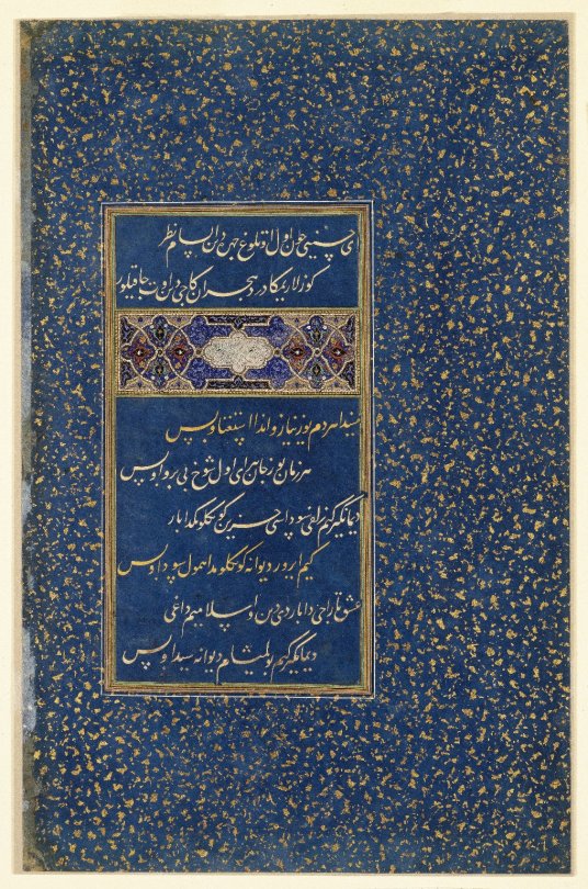
Folio of Poetry From the Divan of Sultan Husayn Mirza, Sultan 'Ali Mashhadi, ca. 1490, Brooklyn Museum: Arts of the Islamic World
These four couplets of poetry in fine nasta'liq script were not written with a pen. Instead, the letters were meticulously cut from colored paper and pasted onto the dark blue paper. This technique, known as qit'a, or découpage, is used on this leaf and other leaves of this dispersed manuscript of the Divan (Anthology) of Sultan Husayn Mirza (r. 1470-1506). Although we do not have concrete proof, this page has been attributed to the great master of calligraphy Sultan 'Ali Mashhadi on technical and stylistic grounds (Welch 1979, 170). A great-great-grandson of Timur (r. 1370-1405), Sultan Husayn Mirza ruled over the northeastern Iranian province of Khorasan from 1470 until his death in 1506. He was not only a patron of the arts, but also a poet of considerable talent. Along with his closest friend, Mir 'Ali Shir Nava'i (1440-1501), also a poet of great distinction, he was responsible for establishing Chaghatay Turkish as a major literary language (ibid.). The verses on this folio, from a ghazal, or sonnet, composed by Sultan Husayn Mirza himself, have been translated from Chaghatay Turkish into English by Professor Wheeler M. Thackston: O Husayni, when I cast a glance at the fiery countenance, fire catches in my eyes from the blow of the pain of separation. In me there are a hundred entreaties every moment; in him/her is nothing but disdain. Every moment I die a hundred deaths; that beauty is unconcerned. Say not that in your mournful heart is the melancholy over his/her tress, for in my mad heart is that same melancholy. My religion and Islam have been lost to love's plunder. Say not that I have only become mad for him/her. The word for "melancholy" (sawda) in the lines above also means "blackness," which accords with the blackness of the beloved's tress of hair. Other folios of calligraphic découpage from this manuscript are found in the Sadruddin Aga Khan Collection, the Freer Gallery of Art, Washington, D.C., the Los Angeles County Museum of Art, and in an album made for the Ottoman Sultan Murad III (r. 1574-95) now in the National Library of Austria (Vienna, Österreichische Nationalbibliothek Cod. Mixt. 313). [By Maryam Ekhtiar, from "Journey Through Asia" catalogue] Size: 8 7/8 x 5 1/4 in. (22.5 x 13.3 cm) Medium: Ink, opaque watercolors, and gold on indigo blue ground, with découpage and gold-flecked border
https://www.brooklynmuseum.org/opencollection/objects/57526
32 notes
·
View notes