#My screen works
Explore tagged Tumblr posts
Text
Funny things I found out playing with language setting in Netflix while looking episode 15:
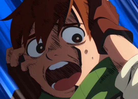
Chilchuck's scream sounds HAUNTED in brazilian portuguese. Give it a try if you can.
(You can hear it here)
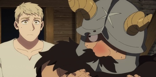
In spanish dub, Senshi says: "tocó mis senos de hombre", which means "he touched my man boobs" in Spanish. And I think that's the best dub line one so far.
#i love replaying certain scenes (usually screams) to see how they nailed it in other dubs#ive done it with Chilchuck & Mickbell screams because they're the funniest ones#give it a shot if you can#its really funny to hear certain character voices in other languages#for example. brazilian portuguesse gave both mickbell and chilchuck un-childlike voices (in japaneese both sound like little childs)#and they reused Chilchuck's japaneese screams for most of the other languages because he is so high-pitched and full of terror that it work#dungeon meshi#chilchuck#chilchuck tims#dunmeshi#delicious in dungeon#senshi#senshi of izganda#senshi dungeon meshi#idk how do you people screen record the episodes#if i knew how to i would put the shots here#my shit#thanks to the one that made the clip on Chil's scream im in love here <3
32K notes
·
View notes
Text


#tmnt#teenage mutant ninja turtles#rottmnt#rise of the teenage mutant ninja turtles#my art#rise of the turtles#rise of the tmnt#meme redraw#raph should be scolded from time to time#reminder they have one brain cell that ping pongs between the 4 of them like the DVD logo screen#april should start a tiktok where she casually mentions all the jobs she's had#and then makes an off hand comment on why she got fired#comments would be wild trying to piece together her work history
7K notes
·
View notes
Photo


# taking “undressing her with my eyes” to a whole other level
#yes YES i still haven't moved on from the first episode#detective au on the screen. just too good#''is it hot? are you?..'' well rio's barely restraining herself what do you think :]#agatha all along#agathario#aaaedit#tvedit#marveledit#marvelgifs#agatha harkness#rio vidal#kathryn hahn#aubrey plaza#agatha x rio#mcuedit#mine#my gifs#still think teen's incantation just loosened the spell rio was doing the real work <3
6K notes
·
View notes
Text
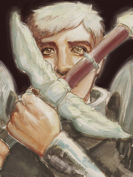
[insert clever caption that makes you think hard]
#delicious in dungeon#dungeon meshi#laios touden#art#digital art#my art#< i remembered#posting this now because if i work on it more i will ruin it#seriously missing csp after this i wish it was a 1 time purchase on ipad ughhhhhh#saying this like i don’t dtill have my drawing tablet but its sooo nice having a screen#we ball regardless
4K notes
·
View notes
Text
Still not over the head of cardiology, who said she wouldn't formally diagnose me with dysautonomia because she didn't want me to think of myself as disabled.
As if good vibes and a can-do attitude can stabalize autonomic dysfunction.
#chronic health tag#ableism in our medical system???#it's more likely than you think#I still remember having to inform the ER doctor that the reason MCAS wasn't in my file#was because the head of allergy for the hospital he worked at#'didn't believe in it'#this was one week into the pandemic#and this man touched his face out of exasperation#and muttered something that might have been 'dense mother fucker' under his breathe#anyway#there should be a screening process for people who want to go into medicine#if you think the only disability is a bad attitude#you should be jettisoned from your course and directly into the sun
5K notes
·
View notes
Text
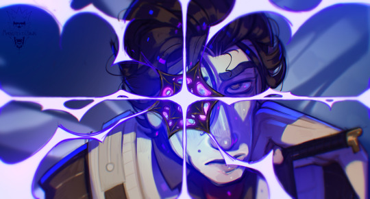
Becoming something Different
#viktor my babygirl where are you#waiting very patiently for riot to give us viktor content PLEASE where is he#viktor arcane#made this for that split screen twt trend but i’m unsure wether it’d even work here#viktor#arcane#arcane 2#arcane season 2#illustration#art#fanart#arcane fanart#viktor fanart#blue#purple#riot games#league of legends#i MIGHT be losing my mind a little help
2K notes
·
View notes
Text
there's something so poetic about coyote vs acme being the thing that causes wb's 'the producers' ass scheme of shitcanning movies for tax breaks to blow up in their face and cause them to turn to the camera, blink twice, and dissolve into a little pile of ash that their eyes fall down into with a little bounce
#to be honest. my partner keeps saying that movies that were canned for tax breaks should be public domain and i agree#we literally paid for them? they're ours now????#anyway i really hope it makes it out into theatres/streaming and i'm glad that the backlash worked#but also like. why shitcan a nearly finished movie that made it to test screenings when the industry's been at a standstill for a year?#where's you buy your intelligence? at the stupid store?
6K notes
·
View notes
Text
what is one thing you would really like to do this week?
you're under zero obligation to actually do this thing, but please comment something you'd really like to try working on/finishing
#me for example I really want to finish making my custom DND class I'm working on#and finish setting up my green screen but I think I'll be able to get that done tonight
2K notes
·
View notes
Text

Run boy run!! The sex monsters eat salmon!!
In which i arrive Fashionably Late to the fishssek party
#critical role fanart#critical role spoilers#click for better quality i did my best w what i haddd#caleb widogast#essek thelyss#shadowgast#critical role animation#look at him flop!!#no i didnt work an extra week just to get the flop just right what are u implying XDDD#all for the memes#alll for the meeeemesss ^^♡#u will not Believe the journey it took me i staryed animating traditionally until i had a badic run cykle#downloaded flipaclip and did some tweaks#two weeks later of getting shapes cobsistent and coloured and here we aaareee#t h e n i had to find a way to make a relatively high quality gif bc my first few attempts were a wash tbh#anyhoo i made it !! :33#and Yes i know its a bit late in the dayyy but IM IMPATIENT#* throws a salmon ur direction w gusto *#man i miss csp..... one day ill have a functioning computer screen
3K notes
·
View notes
Text

I had a caption for this but I lost it oops
#dragon age 4#dragon age#datv#dragon age veilguard#art#fanart#emmrich volkarin#emmrich/rook#OC: Artemis#suggestive#kinda#I legit dont know since this is meant to be just fluff#anyway im gonna go cry now#Drawing Artemis with her LI behind her hits different#She doesnt trust anyone at her back since she considers it her most vulnerable spot#so this takes a lot of trust#Im ok#artys work#I hate how this looks really nice on my drawing screen but the colors are TOO vibrant on my main monitor...
2K notes
·
View notes
Text
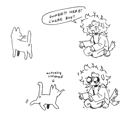
so fucking normal abt this cat
#I WAS DOING IT FOR GIGGLES BUT HE ACTUALLY DOES COME TO ME WHEN I DO THAT 😭😭😭#like I have to crouch and clap my hands and hold them out like ‘here boy!!! come here!!! 😊’ like with a dog#what makes this funnier is if I try this with my grandmas dog he ignores me so I really didn’t expect it to work#multiple times on top of that. my good precious boy my handsome boy#he was annoying Joey again by the side of the house so my mom went to break up the fight#the minute he saw her he ran to her even though he’s probably the one that started it lmao#he likes playing with the little rubber ducky in the backyard and rubbing his face on the screen door#Swiper#diary#doodles#sona#puppysona
725 notes
·
View notes
Text
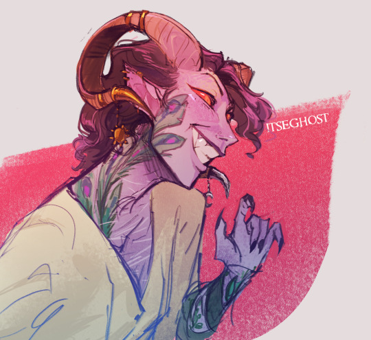

collection of some molly sketches :] im obsessed with drawing him smiling hugely looking mischievous
#mollymauk tealeaf#mollymauk fanart#critical role#critical role fanart#mighty nein#the mighty nein#critrole#m9#clip studio paint#id in alt text#artistic nudity#kind of? you cant even really see his ass bc of the tail so its pretty tame. but idk#anyways big smile screen right hand gesture is apparently my go too molly pose#ive been itching 2 color these for ages#im so swamped with stuff for school that its hard to justify fanart LMAO but i finished a lot of stuff this week so i gave myself a treat#YAYYYYYY#itseart#ALSO i think im realizing i dont work with purples as a base color that often???#but its rlly fun to paint purple skin
1K notes
·
View notes
Photo
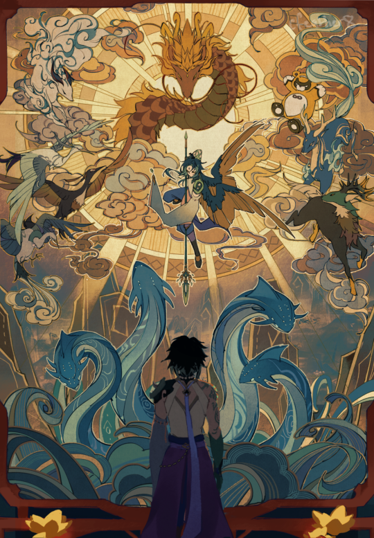
light upon the sea
#my art#genshin impact#xiao#i did this for liyuezine last year and now it has been freed from zine purgatory!!!!!!#yippeeee!!!!!!#the zine is doing leftover sales now on twitter#i liked lantern rite i like stories about turning remembrance into celebration#i stole the caption from one of the lantern rite quest names because hey#if it works it works#i like it when a phrase can have multiple interpretations#anyways#this piece is old now LOL and in retrospect there are some things i would have done differently but i like the art i did for the screen :)
13K notes
·
View notes
Text
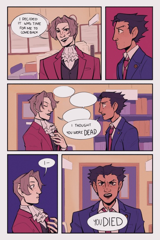
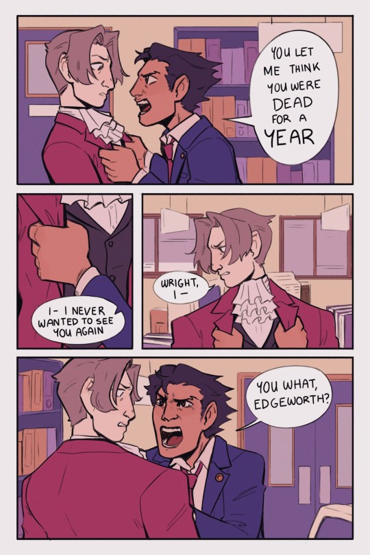
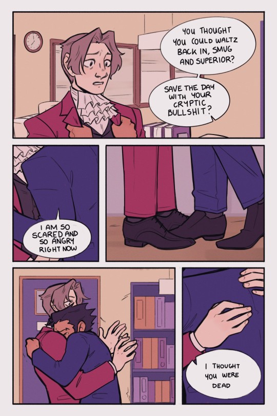
I've been meaning to do some kind of comic based on the events of Farewell, My Turnabout since I played it last summer, so here's something a little bit amped up from Phoenix's canon reaction to Edgeworth's return mixed with my own reaction to it (I was so relieved to see him)
[ID in alt text]
#phoenix wright#miles edgeworth#my art#ace attorney#narumitsu#wrightworth#i did actually screen record most of the process of working on this so i might try and see if i could put together a process video#it would be pretty long though comics take a while
10K notes
·
View notes
Text
I think 90% of my gripes with how modern anime looks comes down to flat color design/palettes.
Non-cohesive, washed-out color palettes can destroy lineart quality. I see this all the time when comparing an anime's lineart/layout to its colored/post-processed final product and it's heartbreaking. Compare this pre-color vs. final frame from Dungeon Meshi's OP.
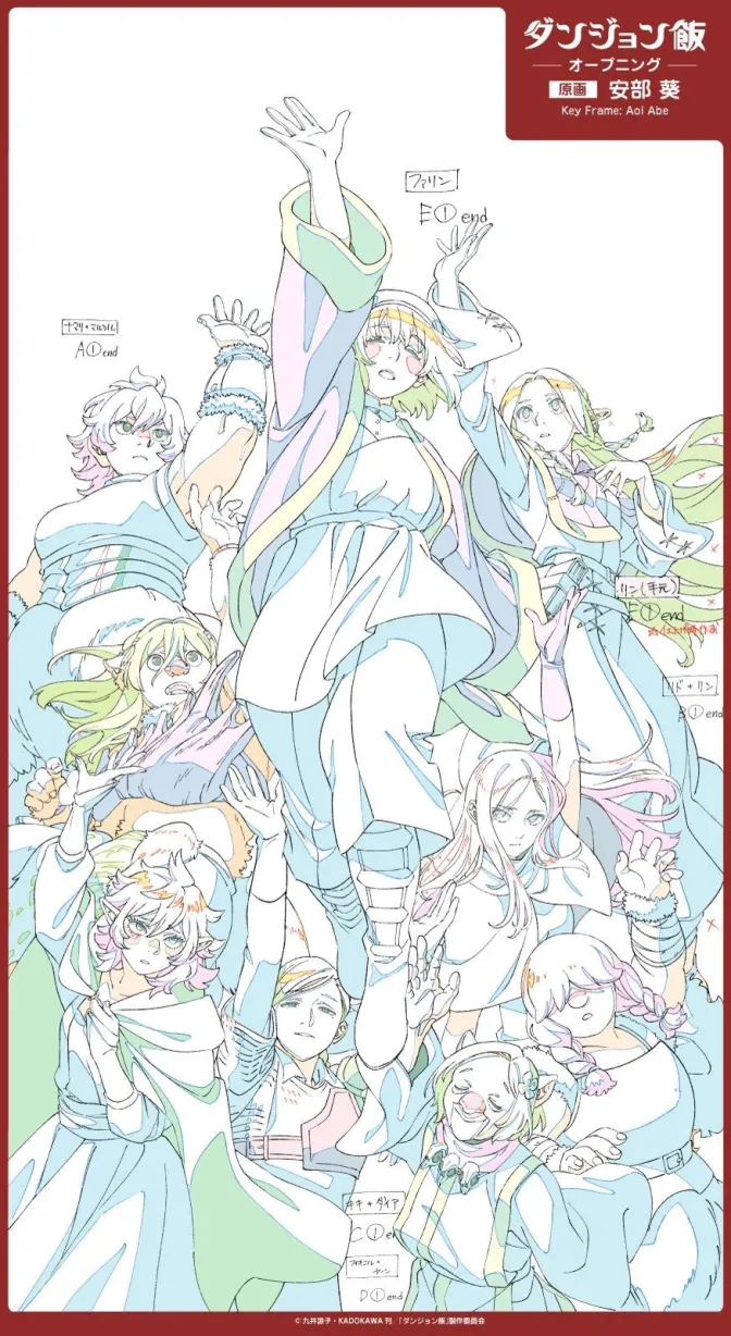
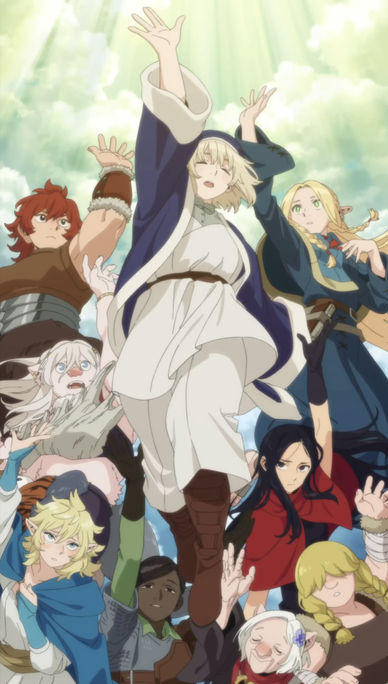
So much sharpness and detail and weight gets washed out and flattened by 'meh' color design. I LOVE the flow and thickness and shadows in the fabrics on the left. The white against pastel really brings it out. Check out all the detail in their hair, the highlights in Rin's, the different hues to denote hair color, the blue tint in the clothes' shadows, and how all of that just gets... lost. It works, but it's not particularly good and does a disservice to the line-artist.
I'm using Dungeon Meshi as an example not because it's bad, I'm just especially disappointed because this is Studio Trigger we're talking about. The character animation is fantastic, but the color design is usually much more exciting. We're not seeing Trigger at their full potential, so I'm focusing on them.
Here's a very quick and messy color correct. Not meant to be taken seriously, just to provide comparison to see why colors can feel "washed out." Top is edit, bottom is original.
You can really see how desaturated and "white fluorescent lighting" the original color palettes are.
[Remember: the easiest way to make your colors more lively is to choose a warm or cool tint. From there, you can play around with bringing out complementary colors for a cohesive palette (I warmed Marcille's skintone and hair but made sure to bring out her deep blue clothes). Avoid using too many blend mode layers; hand-picking colors will really help you build your innate color sense and find a color style. Try using saturated colors in unexpected places! If you're coloring a night scene, try using deep blues or greens or magentas. You see these deep colors used all the time in older anime because they couldn't rely on a lightness scale to make colors darker, they had to use darker paints with specific hues. Don't overthink it, simpler is better!]
#not art#dungeon meshi#rant#i'm someone who can get obsessive over colors in my own art#will stare at the screen adjusting hues/saturation for hours#luckily i've gotten faster at color picking#but yeah modern anime's color design is saddening to me. the general trend leans towards white/grey desaturated palettes#simply because they're easier to pick digitally#this is not the colorists fault mind you. the anime industry's problems are also labor problems. artists are severely underpaid#and overworked. colorists literally aren't paid enough to do their best#there isn't a “creative drought” in the anime industry. this trend is widespread across studios purely BECAUSE it's not up to individuals#until work conditions improve anime will unfortunately continue to miss its fullest potential visually#don't even GET ME STARTED ON THE USE OF POST-PROCESSING FILTERS AND LIGHTING IN ANIME THOUGH#SOMEONE HOLD ME BACK. I HATE LENS FLARES I HATE GRADIENT SHADING I HATE CHROMATIC ABBERATION AND BLUR
2K notes
·
View notes
Text
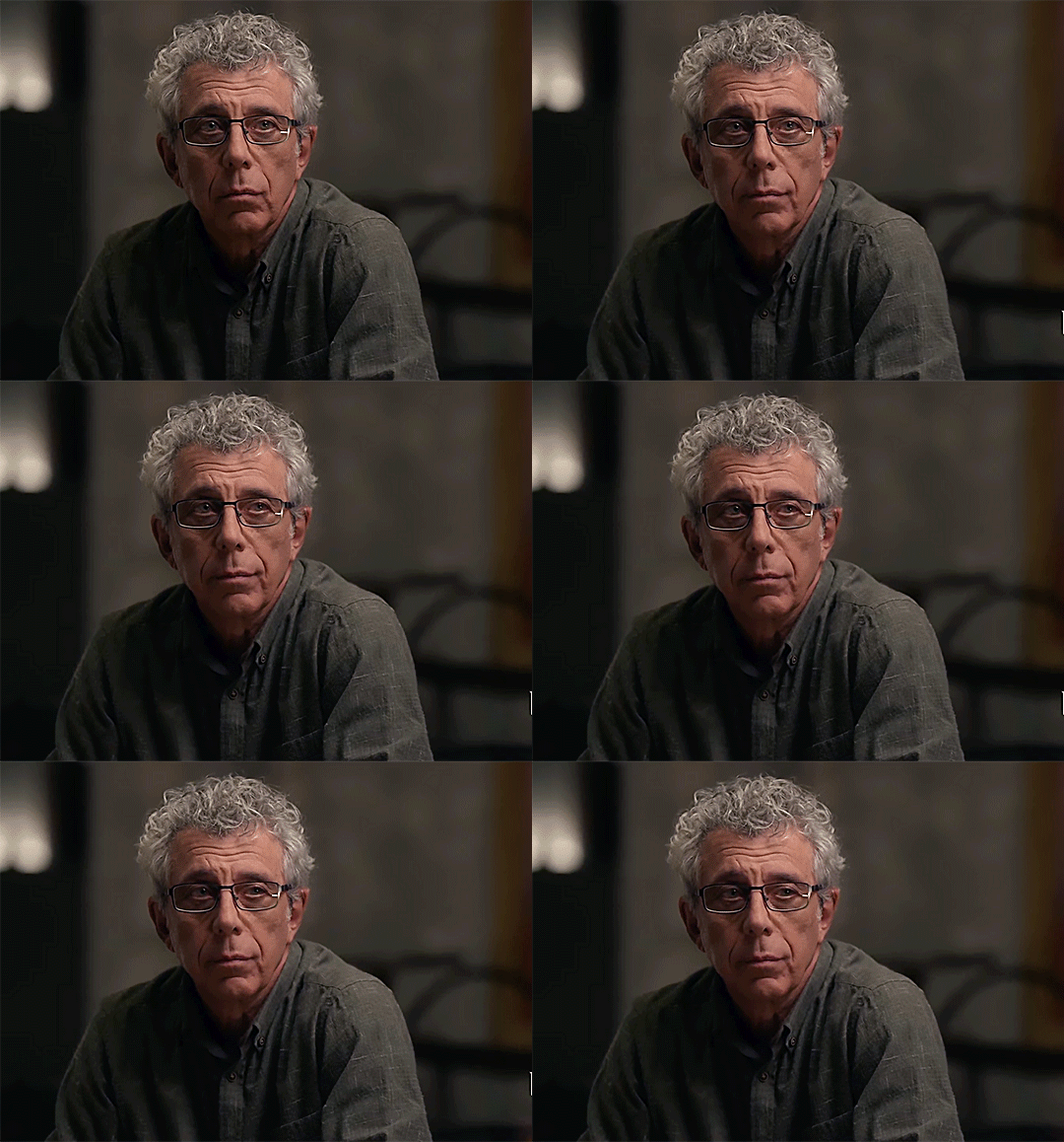
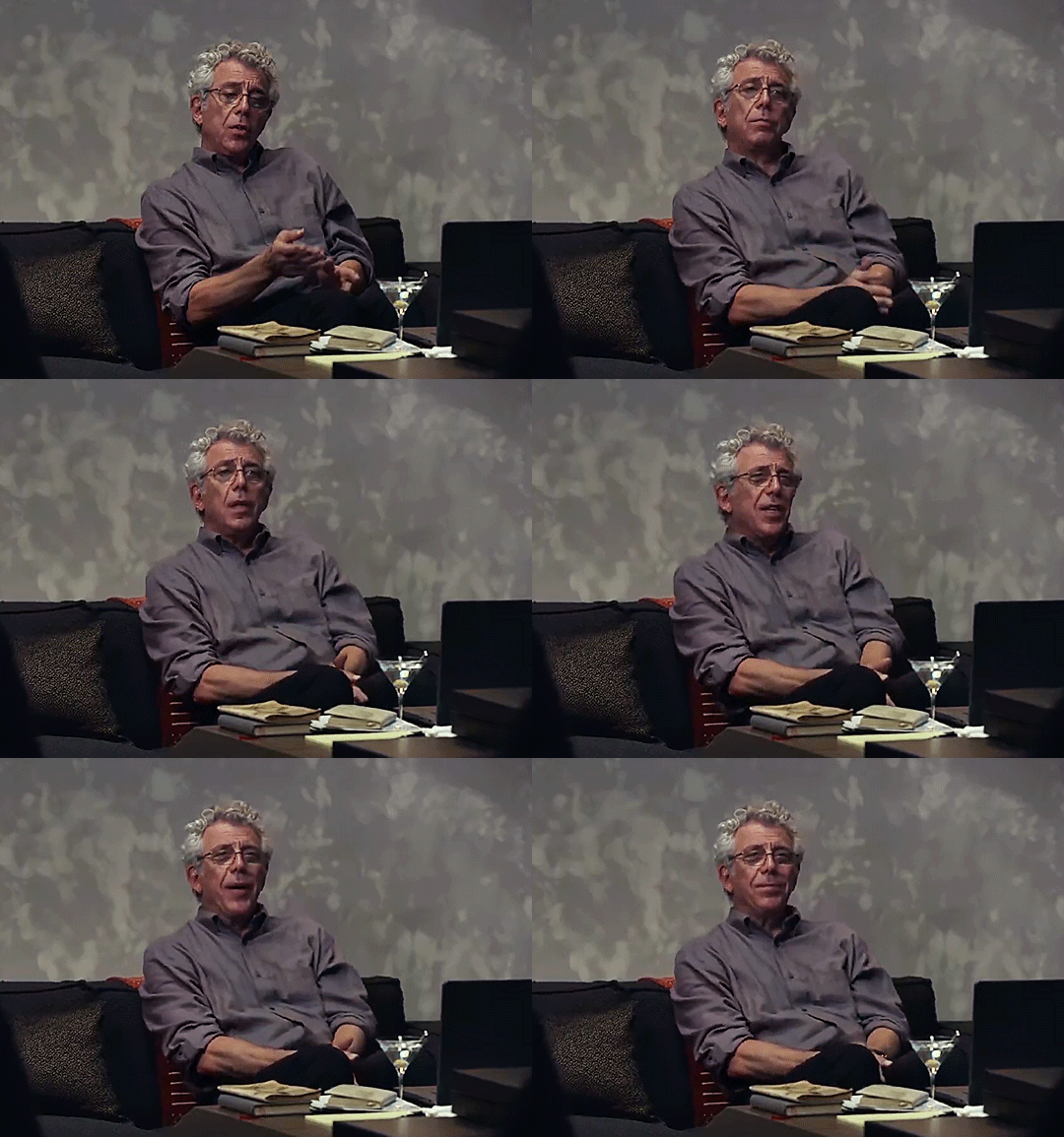
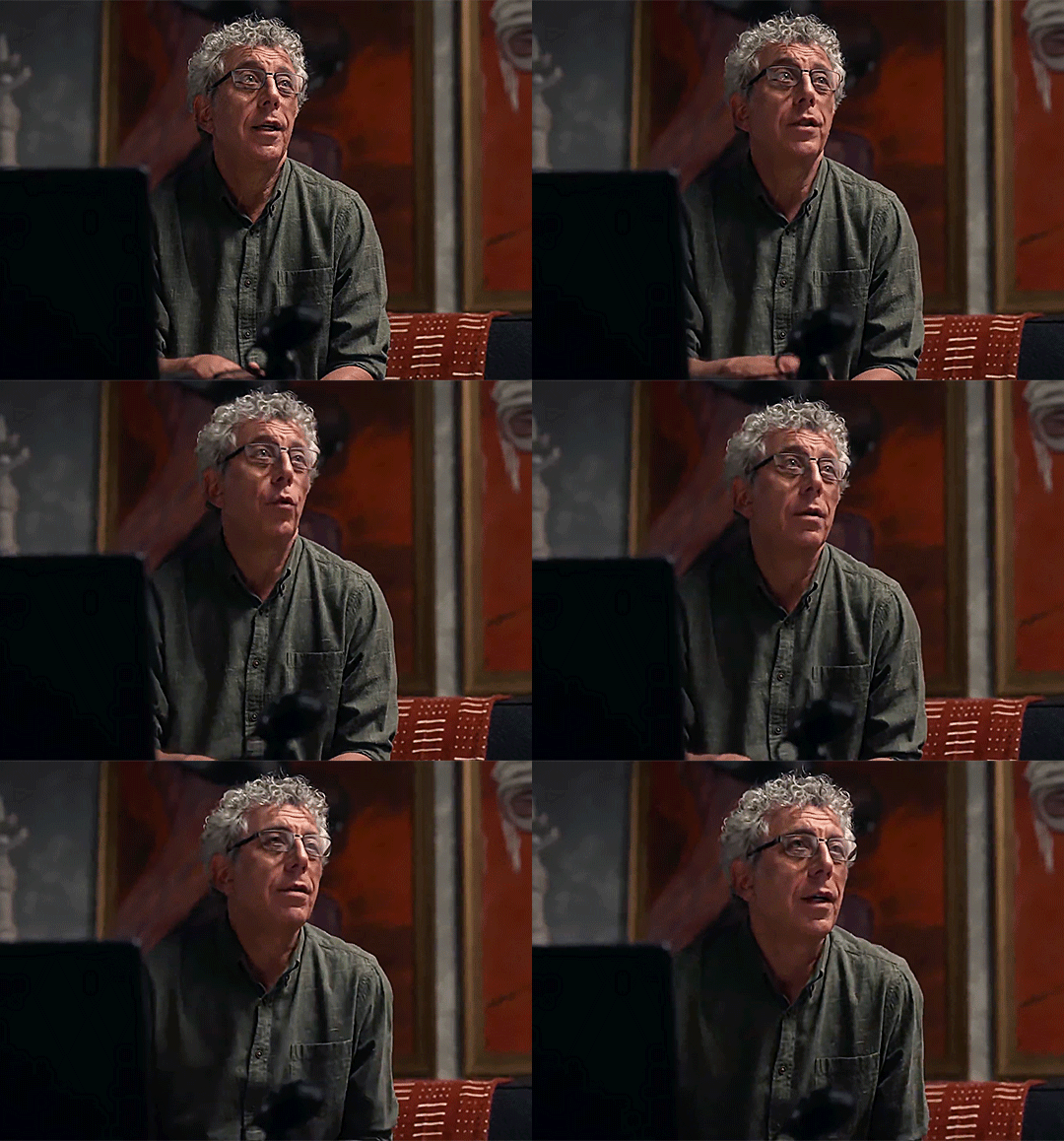
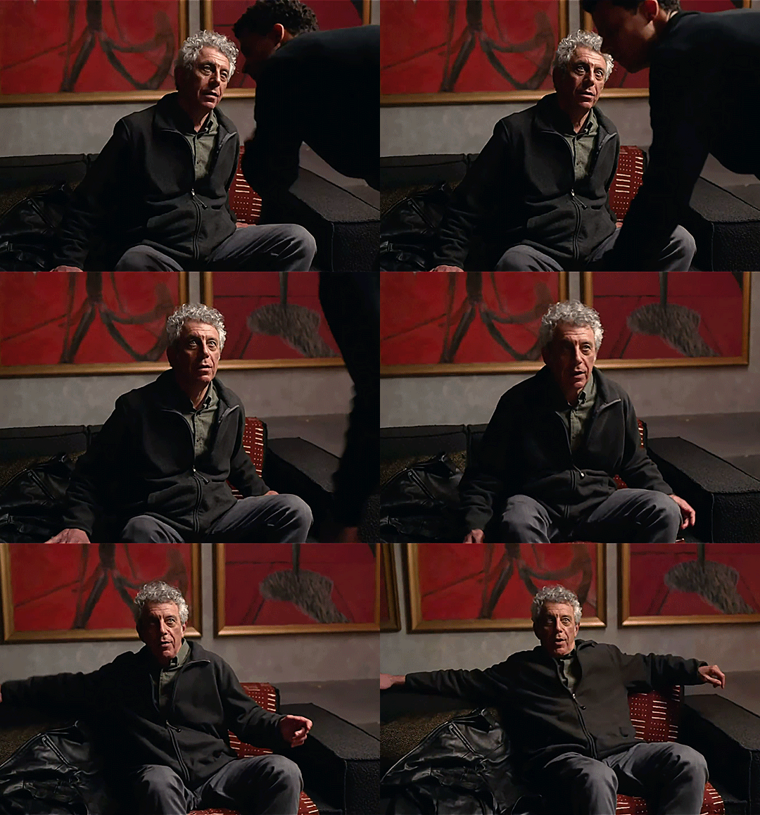

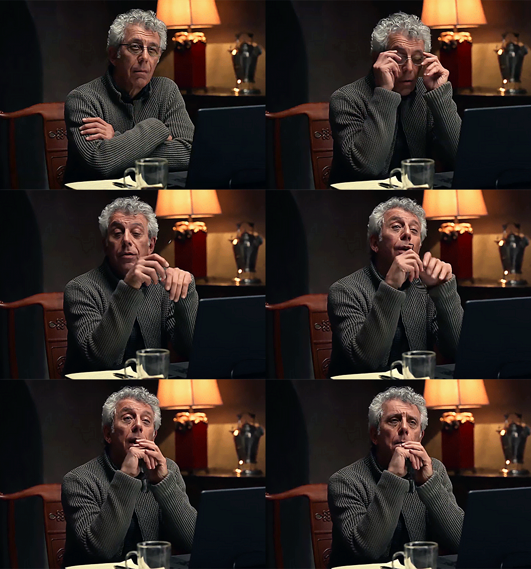
gay disaster peepaw aka daniel molloy
a treat for @fagcinating
#fun little gifset#tried to capture what i thought were peepaws gayest moments#obvs some iconic ones#then just a couple were i thought he looked extra cunty#whilst simultaneously fighting with my screen recorder and photoshop#gonna work out what’s fucking with the quality tbh - might be time to stop using my illegal photoshop#and swap to the up to date software i can get from work#iwtv#daniel molloy#eric bogosian#amc iwtv#amc interview with the vampire#interview with the vampire#megan makes
492 notes
·
View notes