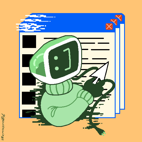
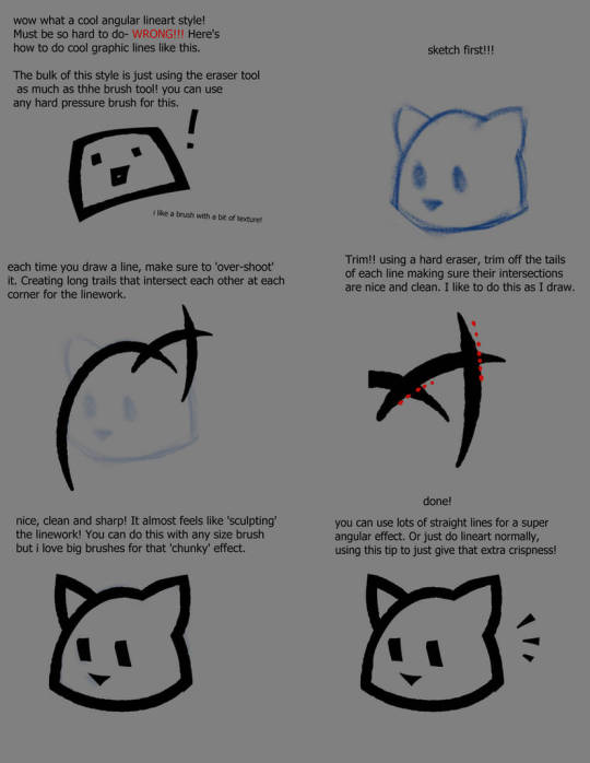
#Mostly because it's not really my usual style (for example this one has no lineart) but also because it's about 70% background
Explore tagged Tumblr posts
Visit Tumblr Blog
Explore Tumblr blogs with no restrictions, modern design and the best experience.
Last Seen Tumblr Blogs


Fun Fact
The KCSC sent more than 20K requests to delete posts related to prostitution and porn to Tumblr from January to June 2017.
Text
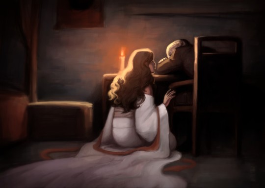
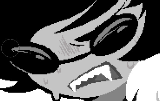
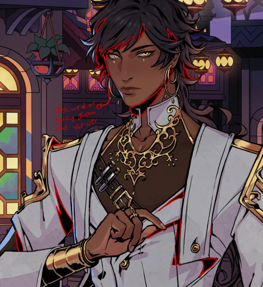
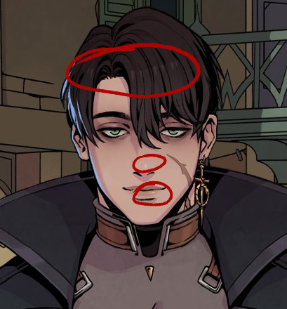
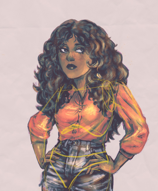
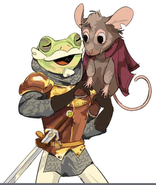
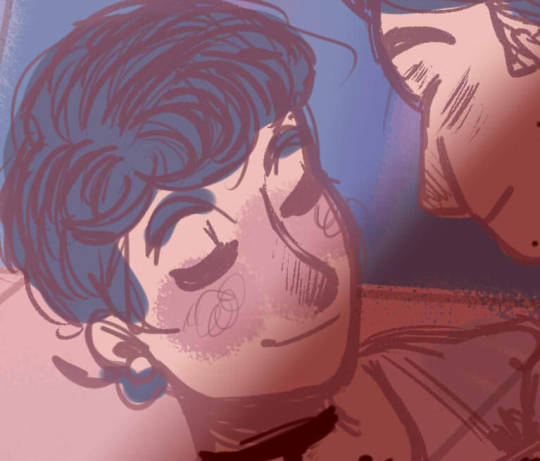
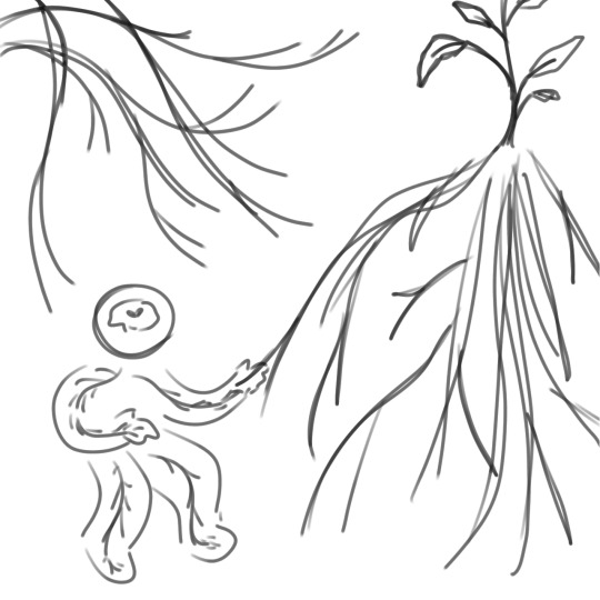
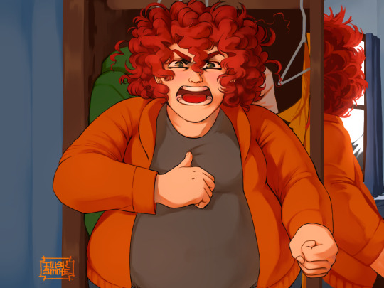
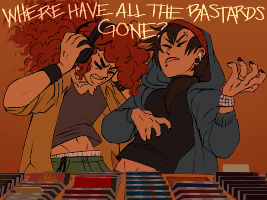
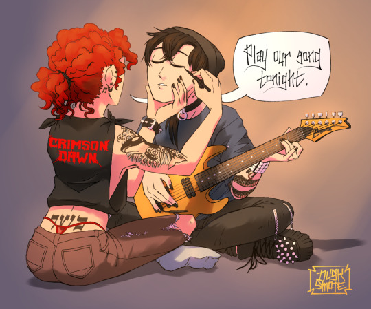
The Painted Lady stared at Zuko, eyes wild in deep focus, and sank into her knees next to him. Her pale, scarred hand reached out to meet him, but stopped short before making contact. Her voice was soothing and gentle as she asked, “Is that what you truly believe?”
Sometimes, it feels as if Izumi knows Zuko better than anyone else.
For our confidants and spirits (and those who are one and the same) is For the Spirits Chapter VI: Dream of You.
#zutara#atla#zuko#avatar the last airbender#atla fanart#prince zuko#zutara au#atla art#atla fanfic#atla fic#the painted lady#painted lady#atla izumi#izumi#Izumi of Jang Hui#for the spirits#Chapter VI: Dream of You#new gods au#spirit touched zuko#zutara fic#zutara fanfiction#atla zuko#zuko fanfic#zuko fanart#zuko art#ponytail zuko#This was simultaneously so fun and so painful to do#Mostly because it's not really my usual style (for example this one has no lineart) but also because it's about 70% background#And we all know how I feel about backgrounds#I wanted to draw this scene so badly so...here it is.
716 notes
·
View notes
Note
Hiii I really love your art and was wondering if you wouldnt mind showing what kind of brushes you use for your recent drawings thank you so much and i look forward to your future arts!
Of course! I've answered this a few times before but have never really tagged it properly, and I also realised that I've never actually explained what I use each brush for so I'll do that now!:
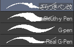
I'm gonna go through each of these brushes in order (and if i remember correctly, I'll link the top two since they arent default CSP brushes). (NOTE: almost all of these brushes have anti-aliasing turned off so that it can look more crispy and pixely!!! there is one exception to this that I will get into)
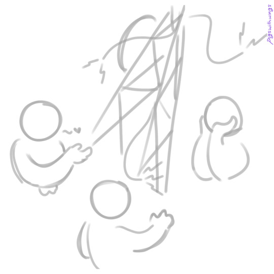
For this brush, I exclusively use it for sketching, it's advertised for inking digital manga panels, but with how the pen pressure is I feel like it adds form to my sketches
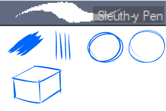

This brush, Sleuth-y Pen, is what I use mostly for MSPFA panels, mostly for lining, but sometimes for sketching too if I'm having a hard time with my usual sketching pen. It's really good if you want to replicate the homestuck style, and good for broad strokes on smaller canvases. The only issue is that the brush isn't great for that style if you use it on a larger canvas (ideally you would want 650 x 450) and can be especially messy if you're trying to get smaller details, such as open mouths, and certain facial details. I use another brush for that, which I will get into soon.
My second use for the sleuthy pen is for lineart on larger canvases in my usual artstyle! It has a texture to it that I like, as I like having my art appear a little rough around the edges, and the issue regarding small details isn't nearly as prominent of a problem
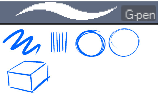
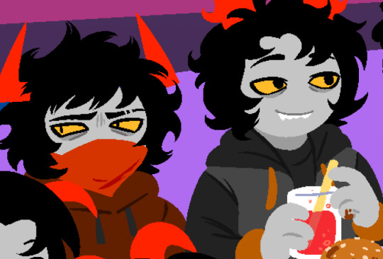
Almost done! Now we have the G-pen, a default CSP brush! This used to be one of my top 2 pens, along with its counterpart "Real G-pen" but nowadays I use it for two things: clean-up during rendering (usually getting those smaller details done that the sleuthy pen has difficulty with) and for doing SOME MSPFA panels (Vast Error, for example)
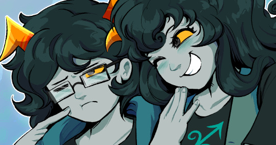
As you can see here, Liaaam's face is a little smoother than the rest of him, that's because I use the G-pen for those details, to keep things a lot cleaner! As for my other use, Vast Error's style from my understanding is a lot more "smooth" and "clean" which is why I exclusively use the G-pen for it, you can also make a lot of thick, juicy brush strokes with it which I feel works really well for the hair and folds in the clothes!
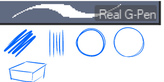
Finally, the Real G-pen, another default. This one is very similar to the last, its only differences are that it's slightly sharper and ever so slightly more messy. It's almost like a medium between the sleuth-y pen, and the g-pen.
I'll be honest, I don't use this pen much anymore, BUT, I still consistently use it for one thing and one thing only: Friendsim sprites. If you want to make friendsim sprites I highly suggest this pen, and making sure it's set to "weak" antialiasing. If you want to go the extra mile, I like to use a lasso-fill tool to block out shadows in all of my art, although if I'm using a rougher brush I'll usually do that manually. There's also other brushes I've been using more for rendering full pieces, such as a "rake brush" and a "design pencil" with low pressure to get details like blush down without making it too intense. That's basically it! I'll link the brushes below if I can find them: sleuth-y pen textured pen rake brush
177 notes
·
View notes
Note
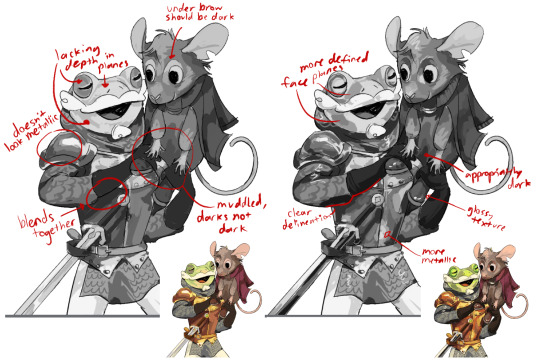
Don't wanna be a bother but I bumped into ur touchstarved oc stuff and do you have any pointers for drawing in the touchstarved style? I can't really nail it down 100% but you do so... pretty please?
Hii yeah ofc, it's no bother at all no worries! You sent me this at the right time actually jsdhksd I'm in the middle of redesigning Emma right now and I've been taking a close look at the art style again, so it's all fresh in my mind!
Assuming you already have your design ready and have found a pose or composition you like, replicating the art style will probably come down to getting the lineart and shading to look similar.
About the lineart:
Probably goes without saying, but you'll need a pen with the opacity turned off to get the clean, ink-like lines. If you use CSP I recommend the default textured pen, which I think has a similar look, but honestly any pen will do.
The thing you have to look out for the most when doing the lines is the darkest shadows. It's a bit tricky to explain, and I think a lot of it comes with practice, but you have to look for the places where the darkest shadows would be, or where the light could barely reach. Once you spot them, instead of shading them you create a sharp shape and paint them black, like so:
I also recommend varying the thickness of your lines, but not at random. Instead, try to keep lighting in mind while you draw them. You could draw one continuous thin line for something, and then only thicken it where it falls away from the light, or where it'd create an occlusion, or wherever you want a shape to stand out from another. A thick line will essentially either "push back" or separate things in space, while a thin line will pull it forward or make things look like they're closer together.

You can also exaggerate the shadows in order to create more contrast. Like in the case of Kuras' sleeves and coat, for example- you could argue that some bounce light could still get in there, but with the shadows exaggerated it creates a really nice, clean shape. You can also separate these shapes from other lines by leaving a small space between them and the lines.

The metal might look a bit different, but it follows the same logic as everything else- your darkest shadows will be pure black. It might look like it has more shadows but that's just because it's more reflective, so the light is usually concentrated on highlight and bounce light areas, so the tones around those areas will be darker.
About the shading:
From what I've noticed, it's all about keeping it subtle and simple. If you color pick the characters, you can see the variation between light and shadow is subtle and not all that contrasting. Most of the contrast is done with colors, not values.


The light source is usually from the top right, characters are pretty well lit, and there's a little bit of a blue backlight from the left that helps them stand out against the backgrounds.
The shading is mostly sharp, cel shading, rarely blended. Wherever there's blending, it's usually subtle or a gradient
They also use gradations to indicate color shifts, like the colors in Leander's coat. You can do this with the gradient tool or an airbrush.
I recommend picking 1 color for light, 1 color for shadow, and maybe 1 inbetween midtone to use sparingly in places where you want a very subtle shadow. You can go more fancy if you're trying to create something that looks more like the game's CGs, but if you're going for the same look as the sprites, it's better to keep it simple.
You can shade manually each part of the character, or you can try using a multiply layer. For multiply, I like shifting the color towards a warm or pinkish tone and keeping it light and desaturated to get a similar look as the sprites.
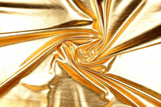
Highlights are used very sparingly, only on a few places like the nose, mouth, eyes, and a few on the hair. Maybe occasionally somewhere else, but only if necessary, like in the case of very reflective materials like metal, gold, glass and leather.
The characters also usually have subtle textures on their clothes, and you can quickly create something similar by using a textured brush and an overlay or multiply mode. Like so:
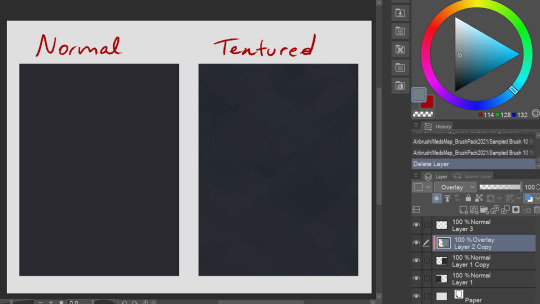
It's subtle, but makes a difference in my opinion! You can try this with a lot of different textured brushes to get the exact look you're going for.
That's all I could think of right now! If you have any questions or wanna know anything specific I didn't mention here, let me know!
120 notes
·
View notes
Text
How I draw: Proportions/sketching
The first response to a few art questions from @johnny-and-clyde :))
sketching:
So I honestly used to be a lot more…intentional about my sketching?? Up until a few months ago I would draw out actual sketches that I’d then cleanly ink on top of in a separate layer, like this:


I’d try to keep things loose and easy, but I’m not fantastic at that lol
I have a tendency to over complicate sketches- It’s not super obvious here, but I did semi-map out the anatomy under the clothes and fabric folds. That’s probably a good thing to do, generally, especially since I was and am still learning anatomy.
I don’t do it much anymore tho, because I often got caught up in little details that just wound up covered by clothes 😭 So I generally focus on mapping out the clothing shapes over the proportions/ anatomy. Definitely study anatomy anyway tho- this only works for me nowadays because I did and still do study anatomy a lot lol
These days though, I don’t r e a l l y sketch that much. I mean, I do- but instead of making another layer and inking it, I kinda just clean up the sketch the way I would if I were using pencil and paper. I don’t have a lotta example images of this, because it goes from the sketch to the final lineart in one layer?
tried to reverse-engineer it here on this Angela drawing. idk how helpful that is tho lol.

Idk, most important thing for me while sketching is remembering that everything has a 3D form, and also to FLIP MY CANVAS FREQUENTLY so that it stays balanced lol. -also- I almost always take note of the ribcage, the clavicle angle, and the hip angle when planning poses
-And I consciously try to keep things from getting stiff, and think of the pose as an intentional composition. I actually struggle most with plain standing/walking poses, because I very often can’t think of ways to make them look…idk, interesting? That’s why it’s taken me so long to finish pt.2 of my Outsiders character designs- I can’t find good dynamic-but-also-stagnant poses for them
proportion:
Honestly man idk I just sorta say “fuck it we ball” and hope for the best. I used to think a lot more about this one but as it’s become more and more natural to me I become less and less able to define/describe it?? I dunno lol.
My art style is semi-cartoony, and honestly kinda inconsistent in terms of proportions. I generally aim for the hands to be similar in size to the face, and for the shoulders/chest area to have enough space to fit the clavicle…but none of this is really a conscious decision? It just sorta happens. The heads/eyes of my characters are usually stylized, and so the hands end up a bit bigger to match the faces, and I tend to exaggerate muscle mass but not really muscle definition…And I also stylize things for characters to better contrast each other. For example, I’ve noticed I draw Steve Randle stockier/bulkier than he is to better highlight Soda’s slenderness.
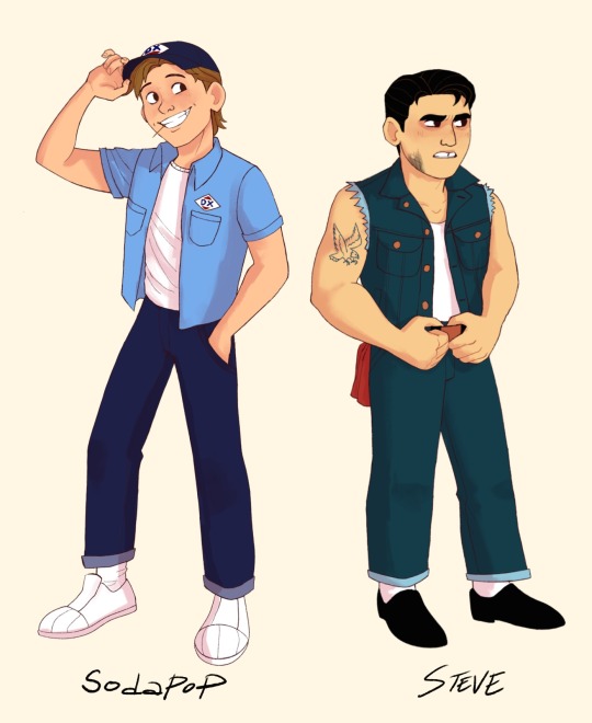

(see how they’re not as drastically different in build as I draw them? Steve seems bulkier mostly cos he’s shorter but has a similar amount of mass I think) (don’t quote me on that tho idk how to put this shit into words lol)
I have a pretty decent idea of how proportions are supposed to work from years of studying them, and I have no idea how to explain any of it. Just…do a lot of figure and gesture drawing, use a lotta refs, and it’ll make sense eventually 😭
#ask#how i draw#digital art#art tips#rambling#long post#< I mean not very long really but yk just in case
68 notes
·
View notes
Note
I absolutely LOVE the way you colour your work!! Would you be willing to show us how you do it/give any tips?
aww tysm!! it's kinda a newer style for me but i can give the rough overview haha
general tips:
-you've heard it a million times, but use references! this style specifically works best as an abstraction of preexisting colors + values, so you'll need a solid starting point to work off of
-keep colorpicking to a minimum (i personally keep my references on a separate device to stop the temptation). you'll never get better at choosing colors if you let the software do it for you all the time, and sussing out your colors manually will improve your color sense
-have a grayscale layer and full saturation layer handy to check your progress. if you can tell what youre looking at in grayscale and it looks sorta 3D, youre on the right track. a saturation filter is mostly a me-thing but i feel like it helps check for cohesion in the palette
-dont be precious. get real loosy-goosy with it; there'll be time to tidy up at the end when you're happy with colors, but for the meantime just zoom out and slap stuff down as you experiment. start big and narrow in from there, because theres a good chance youll change up big areas and undo detail work early on
more in depth/technical process below cut vvv
for references, id recommend using milanote (and to use my friend referral link to give me more space...please... *NOT SPONSORED!! https://www.milanote.com/refer/rcEZd79TldqRGqntPI ) or another tab/app to collect images
here's an example that has nothing to do with starkid lol:
the more the merrier. the colors i used for my starkid pieces were based on screenshots i took from the proshot. references are your friends!!
i use a real scrungly brush called "Fine Brush (Sumi Ink)" in the dogwater app i use (MediBang Paint) that doesnt have great control and helps me loosen up
after i get the lineart down i pick a base color that matches the "tone" im going for (yellow here because it's got a light, happy/jovial vibe), and then get reallyyyyy rough colors by eyeballing my reference (no colorpicking!! go for colors that work relative to the base color). perfection is not the goal here, only a starting point to improve upon
these are pretty drab and uninspired, so at this point i like to analyze the colors i chose by temporarily boosting saturation 100%. after considering how not cohesive magenta, orange, and lime green are, i chose to hit this piece with a low-opacity orange burn layer to unify the palette warmer-ish and bump saturation. layer modes are your friend here, and there will always be one to make your colors more interesting

then i start amending the colors, trying to match the references' relative values and colors but staying w/i the color context ive established (not matching ref exactly, just going cooler/darker/whatever in a similar way but with my colors instead)
ill flip on grayscale constantly and work out self-described problem areas
it's a lot of push and pull until im happy, and after tugging around for a bit ill merge everything and do some global changes with overlay, saturation, burn and sometimes divide layers. i have no process with this besides trial and error tbh
ill have a detail layer overtop usually to fix stuff that i couldnt be bothered with in the lineart stage and thats kinda it? it's really hard to articulate my process 1) because it changes every time i draw and 2) im constantly improving at art and 3) im me and not you and what works for one might not the other
also. i feel like you were asking how i got the painterly look and not the value choices i made? but the truth is i use an angry, scratchy brush and it comes out looking somewhat painterly. so uh go nuts
12 notes
·
View notes
Note
Hi Aixa! I'm not sure if you've answer this, but what drawing program/s do you use, and what pens? I love how textured the lining pens you use are!
Hi there! Thank you! I will do my best to reply to this, but the answer might be a little disappointing
First of all, I use SAI. It is pretty basic and it lacks some functions that would be very useful to have... but it was the first drawing program I came across when I started making digital art, and I hate change, so I'm very attached to it.
As for the brushes, they came with the program! I mainly use two, A basic paper texture one, and a spray one. I often mess with the density and edge hardness depending on how I want a specific line to look, but not by a lot. That being said, I mostly pick at random because, although you wouldn't usually be able to tell from my comics, my style has a very messy lineart! For example:
Here I used a regular pen with no texture at all. But it still looks kinda textured because I like to go over the lines multiple times and do it messily. The reason I do it this way is... simply because it's fun. It's the way I found to have fun and still end up with a result I don't hate. Here are some examples with the regular paper texture brush
I personally don't think the result is that different! Sometimes I skip the lineart part and just color over the sketch, like in that second example.
Whatever program you're using, you probably have similar brushes, so it's just a matter of finding ones that allow you to play with the lineart. If you want it to look very textured, I would advice thick lines, and to really have fun with it! I used to try to make the lines very neat and perfect, and I admire anyone who can. I was miserable the whole time, lol.
I'm sorry this answer is a mess (like my lines) and I hope any of this is useful or at least interesting!
13 notes
·
View notes
Note
Esparragoooo what's your coloring/rendering process? I've been trying to learn and I'm hoping asking other people what they do will help something click
oof i don't even know what the rendering process is exactly lmao. even if i did i couldn't probably descibe it at gun point. so i'm going to describe the color + shading process haha
Okay so what I usually do when I color is first do all the base colors and then add little complements
(look at all those little details, for example! i like adding details for clothes so they look a little scratchier and the blush on the face.)

Something that I also like to do is use brushes that can mix colors together a little, and aren't completely solid colors. It's easier to add details that way, and the colors don't turn out as flat as they would with the usual paint brush (though the pen brush can be cool too, just harder to use).
Then, on the shading part, I like to experiment with the layer types, but most of the time I just stick with the usual multiply/overlay.
This takes longer than the rest of the stages because it's when I usually add the most detail. This is a layered process because you need to do it over and over again for different effects. In simpler art I usually only do it once, but in the detailed ones I like to add many, MANY shading layers.
The first one is the basic shadows and lights, which are lighter but cover more space. Then I add a second shadow/light to accentuate spots I think should be darker. You can do this as many times as you wish. Then I add accents or details mostly for stylization purpose.
You should also consider the background to be the same as the character. I usually use separate layers for them, but you should probably use the same colors in the same way. After you can do the environmental details. I do that by adding some light/shadow over everything.
For example, this is how this artwork looked like without shading:
That's all flat colors except on Eurydice's face with the slight blush. The Fates are also not completely solid colors. They're blended together with a couple different tones (besides the lines) to give them a slightly more 3d look, and so they don't look as flat.
Here is the fist shading layer:

Eurydice has an extra layer that is just multiply over her whole body, but she has the basic shadow and light too, and so do the Fates. The basic shadow/light covers everything that should be in shadow. In this stage, it could be either diffuminated and not very detailed, or you could outline exactly where each shadow and light goes. Or you can do both at once too by doing each of those in a separate layer.
And here is the finished lighting for the characters:
(Here also goes the match aka the second light source. half of the lighting from it is what i consider the little details, though, especially the little red streaks on the Fates.)
And the environmental details (and what brings it all together imo:)
That way it looks a lot brighter and a lot more connected. The last details are the colors on top of the lineart and the watermark. (you can also change the color of the lineart to be closer and contrast less with the character and that looks good, but i'd say it can also be more of a style thing. A single color works perfectly well too).
I'm really bad at explaining my process and in general, so I hope this helps!! <3
5 notes
·
View notes
Note
since art has been brought up what is your process and brushes you use?
the gist of it is: i use my phone, my index finger, and the app IbisPaintX to draw! also my brushes are the Digital Pen and the Fade Watercolor (Opaque). my general process is making sketches and focusing on the energy of a piece, then sticking to that
long stuff and more detailed stuff under the cut... i put a bunch of images in there for reference
overall its not very fancy!! mostly i make art when i feel very inspired by something (which is to say, not super often). i usually start with a very rough sketch which helps me figure out how i want the art to feel. so for example this piece

was originally this sketch
basically the purpose of the super messy sketch is to outline ideas and stuff. i say "i think this would be cool, it looks cool in my head. this is what the finished product should emulate" and then i roll with that. also usually i have multiple sketches based on the same idea, but more often than not there will only be one sketch that i want to work with.
i tend to pick colours based on the feeling of the piece! so for me, the idea of plants gets the colour green, the "i have no mouth and i must scream" art gets a lot of red and orange. it's basically colour associations.
although very simple, my backgrounds tend to be developed around either the concept or the sketch. for the plant one above, i tried to use more flowing shapes in the background to emulate leaves, hills, and vines. for my first few "factory pomo" style pieces i wanted to get a sense of contrast, so i designed the background to be almost split into two colours/two parts, etc.
other examples


you're probably noticing how similar my sketches are to my final pieces. it's basically because i treat sketches like lineart. i pick a sketch and enlarge it so that it takes up most of the frame. then, i set it to a low opacity and draw on the layers underneath it. oftentimes i turn the layers on and off to get a sense of how the whole thing looks, and the finished product will not include the original sketch layer. but a work in progress for me usually looks something like this
it's a whole lot of going back and forth! zooming and out, erasing and redrawing and turning off layers and zooming out again. it can be messy sometimes but i stick to it and enjoy it a lot. i am not always faithful to the sketch, either; i usually add whatever i think looks cool. for the piece above i did Not originally intend to have glitching effects on my sona's body. but then i thought it would be cool to add some!! so i did :]
as for Brushes i work in IbisPaintX and i use this bad boy the Digital Pen (set to various thickness depending on whether i want very small and fine lines or just want to cover a Big Area). its basically just pixels so thats how i usually get very crisp lines!! also you can turn it all the way down to just 1 pixel if you want to be really precise. eraser tool and ruler tool are my best friends. also the Fade Watercolor (Opaque) that is right underneath the Digital Pen is what i use to sketch sometimes.

um hope this helps or satisfies your curiousity!! yeah. not a formal tutorial to my art or anything, this is just how i do it. which is in a silly way
24 notes
·
View notes
Text
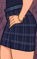
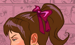
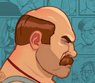
The Bully Artstyle
Am I the only one who really appreciates the official Bully artstyle?
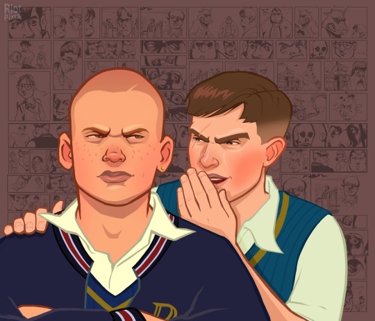
Though, calling it one style is technically wrong, since the images are made out of one front image and the comic background, both of which are made by different artists.
If you are wondering, the guy who did the main illustrations is Anthony Macbain.
If you look around his website, you will not only see his Bully art, but also that he also did some work for the GTA series.
The person who did the background illustrations is Stephen Bliss, who... also did art for GTA, believe it or not. I guess Rockstar only has that many artists that focus on semi-realism.
Obviously, since GTA is like, the most famous thing ever, his website does not focus on Bully that much. But if you scroll all the way in the Rockstar Games portion of his website, you will find the art that was used for the backgrounds! And it seems like he designed the logo too!
Now that we know who did it, I'll try to to a bit of art analysis.
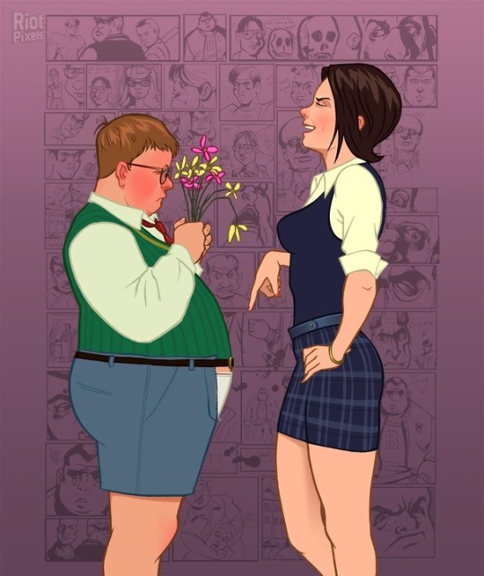
Similar to the GTA style, the style of Bully is somewhat realistic. Kind of stiff looking, to be honest. But the background illustrations kind of make up for that.
The lines are mostly the same unchanging width (except for some smaller lines for details). They do not taper much. The lines are also colored - their color is more dulled out than the colors they are containing.
The colors are also kind of dull in general (though this may only be because of my monitor.) Probably because the art is going for that realistic look. Of course, we could also look at it a bit more artistically and say that the colors are dull to fit the miserable atmosphere of Bullworth. You might also notice that there are no real whites - the shirts are either tinted yellow, or whatever color is around it. I think this is pretty neat. White fabric often tends to reflect the colors around it in real life.

The lineart is just a bit too chunky to convey true realism, so it is stylized in a cool kinda blocky way. The shadows are also quite blocky in general. They often tend to be interesting shapes by themselves. Look at those eyebags and the shadow under the mouth!
Besides the hard shadows, the art also uses some airbrush-like effects. Look at how it conveys the shininess of Pinky's belt and the softer shadow on her thigh. It is also used in Gary's hair to show the soft color transition.

The opposite of shadows, the hair highlights, are these cool zigzag shapes. I like it when artists make the hair highlight a bold shape like that. Speaking of the hair highlights, notice how they often have a similar color to the background. Like, look at this - these ones are actually a pretty bold purple, probably to mimic the way real hair can, just like fabric, reflect the color of its environment.
Now, let's look at the blush. A lot of the characters in these illustrations have this strong blush on their cheeks and nose. This is probably used to make them look a bit more alive. I wanted to say every character, but then I looked at the art again and found out that was just not true.
Look at these two, for example. Edna sort of has the blush, but it is single colored and blocky, making her look kinda sick, rather than more alive. The boy next to her also doesn't have the blush, probably because the brighter pink wouldn't work as well on darker skin.
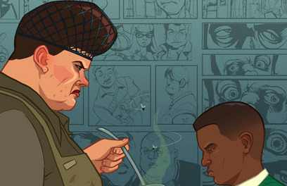
Mr Burton here also does not have the blush, because... I don't know, to be honest. Random stylistic choice, I guess.
Overall, I cannot quite name why I like the style of the main illustrations so much. It's just not the kind of thing that would usually appeal to me. I guess it's something about the realism combined with the cartoon stylisation and the slight blockiness of it all.
I have much less to say about the background illustrations. Don't get me wrong, I love them. It's just that they are only black and white, so we really cannot dissect the stylistic choices here. But also...
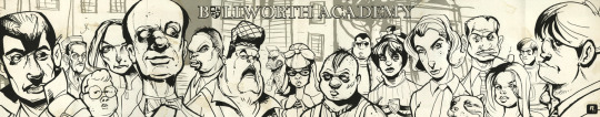
God, I just love the style of these. Just look at them. The caricature-ish style done with some bold inks is so cool. These have so much character, shame we never got a real comic in this style. And since they are black and white, they are as contrasting as a picture can be. Which means they are perfect for the backgrounds. And since the style is so exaggerated, it looks good even when the pictures are pretty small.
I wonder, were these done digitally, or with real ink? Both are possible, I think.
And that's about it for this post. If you have any other observations about these styles, I would love to read it. I just really like these illustrations!
#bully cce#canis canem edit#thoughts#Sorry if this is clumsily written I only wrote this in about an hour and a half
29 notes
·
View notes
Text
Throwup Thoughts: "More Than Anything" Poster
(If you want to see the time lapse, click here for the original post!)
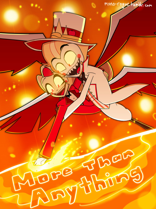
So you know how my usual art has a sketchy (and sometimes fuzzy) feel to them?

I decided to return to full on line art for the More Than Anything poster, partially because of Sam Haft's tweet, and partially because of Sam Haft's tweet (looking for poster-style fanart of Hazbin songs)
I probably wouldn't be as miffed if I didn't slave away a straight 9 hours (For comparison, that Rosie/Charlie only took at most 3 hours!), and the fact that I did not like to do line art at all... But you know what? Creating and posting art that didn't rely too much on cleanliness and instead focusing just on rough sketches and colors unironically helped me here, and it's really hard to explain how. For example, I was originally going for this shot as is:

Then midway through the sketch phase, my intrusive thoughts intruded: Why not shift the perspective? It would both serve as camera practice and to not just be a screenshot redraw (though you could consider it to still be one, depending on what you think it means)
I did also consider fully drawing both Lucifer and Charlie so I could have their own standalone renders, but I really only ended up doing that for Charlie since Lucifer's missing his right arm (his right leg... it's a perspective thing), and even then the way I did the composition wouldn't have worked for Charlie...
Adding in all the effects was fun though, figuring out what color treatment worked best (mostly linear dodge)! It just ends up becoming one big piece of eye candy. A very orange piece of eye candy. If you get orange diabetes from this, I apologize.
Angular Sharpness
I think one of the main issues I had with line art before was figuring out how to make angles appear as sharp as they appear, especially when considering the style of Helluva/Hazbin. I looked up how to make sharp lineart, and ended up on this short guide!
(Original DeviantArt post here)
I'm mildly conflicted now because now I feel like combining sketching and composition was already fun enough, yet now line art is actually fun. We'll see where this goes I guess?
Colors Are Weird
I noticed also Krita was exporting pics out as dull as Alastor's time, so I looked into a solution and the solution arrived:

So now colors should work the way I want them to be. Nice!
Off Topic Topics
I've been going back and forth on my post schedules a fair bit, figuring out what works and what doesn't. A couple early morning posts feels the most fitting for my style, so I might roll with that going forward, at least for a while
Hopefully I'm going to start to embrace the multifandom part of this blog and start making more of whatever. UT/DR? Lackadaisy? Who knows
The state of the Vox Alastor comic... it's in hiatus as of now. It's honestly that since the show was releasing at such a quick schedule that my initial ideas for how the comic would play out kind of got jumbled around? I don't know honestly, so for now it's on hold for now.
However, I got struck with an idea for another one...
2 notes
·
View notes
Text
Lesson [Anatomy Study]
So on Wednesday, I talked with Kyrstie and she brought up some issues with my style in terms of anatomy, mainly eyes and noses.

Most obvious here, she said that my eyes feel flat on the face, which is true. I struggled with these eyes a lot to make them look good and I had no clue how to make them feel more real.

And here you can see my noses, they aren't very detailed. I am aware my noses suck, I've been trying for ages to find a good style for them and I haven't yet. So Kyrstie tasked me with spending Wednesday finding a style and practising eyes and noses.
First, I found a few noses on Twitter that I wanted mine to be similar to.

I chose this one because I really liked the nose on the furthest right character and how the other noses looked real even without much detail.

I chose this one because the shading around the nose was really good, especially with how the scar on the right spread onto the nose and I like how there is little linework on the bottom but it still looks real on the face.

This last one I chose because it has very simple lineart and mostly utilises the animeish style of adding faint, thinner lines for detail. Keeping that in mind, it still is cohesive with the rest of the face so that's why I chose this art.
I also used one of the pins on my lanyard as reference. As mentioned before, I like Curly from Mouthwashing. So I bought a pin of him to take to College for company.

The one I bought is the top middle one, and I really liked how his nose was drawn so I used him for reference too.
Then I got ready to draw. To help me visualise things, I used the anatomy book I constantly keep in my backpack ('I'll need it one day at college' I said, lo and behold I was right.) and found the pages on facial features.


Here are both pages, which I had open in front of me to reference. It definitely helped me a lot.
Kyrstie taught me that the top part of the eye is usually thicker than the bottom part and she showed me a few examples. While practising this, I realised one of my style mistakes. Recently I've been drawing pupils wrong.

Pupils aren't so big that they are overlayed by both the top and the bottom. They're much smaller. So this day has already helped me improve my art.

Here is the first side of the page. Most of the top left is Kyrstie's examples, as well as a few chest examples from her to help me learn how to draw female chests better.


For me, the eyes were the easiest to crack, solely because I had experience with drawing only eyes. In the past I had a Udemy course on traditional art and all I would do is redo the first lesson, which was drawing an eye. So this brought those memories back and helped me make my eyes more accurate.


I also sketched some female faces, still trying to crack down on how to draw noses and the proper proportions. They weren't perfect but the eye tips were really helping make them seem more real.


Here are some bad noses, as well as some lips. I really struggled with the noses and kept looking at references to try to get them to look right, but I didn't know what I was missing. So I turned the page over and kept trying.

This page is all my work, although very slightly edited by Kyrstie. I focused more on noses but also added some more eyes to practise symmetry and consistency with them.

Here was my attempt at a male face. Kyrstie helped me edit the nose and I realised where I was going wrong. The bridge was always too wide. Noses may be big at the bottom, but they go up thin. So I worked on practising that.

Here is a side view I did, trying to practise eyes and lips from the side. I used the anatomy book to help work out how the eyes look, so I'm glad I had that. I still need to work on lips, but that can be another lesson of studying.

Here is my attempts with noses. Each wrong in their own ways, it was a struggle getting it right. Once I apply this stuff digitally, it'll probably be a lot easier to practise. But on paper this took so long. But I did feel like I was improving, slowly learning how to make them look better.

This eye reminded me a lot of my old outcomes from that Udemy course. Eyelashes, shading on the upper and lower lids and shading on the pupil. Most of my artworks won't be detailed enough for all these steps, but it was fun to remember all the details I could add to make a good eye.

And here is a pair of eyes. Since I was only drawing single eyes, I wanted to see if I could make a matching pair. And I think I pulled it off. Similar detail, realistic pupils (Yeah she's a little cross-eyed but maybe she's just looking up at something in front of her nose) and consistant shapes made me very happy I pulled this off. I'm most proud of these eyes and the photo above them, they were fun to make.
This lesson was hard. I really struggled getting started because of Executive dysfunction and my original plan was to design my characters, which was really intimidating. But Kyrstie's help with my style and telling me to study was much easier and I enjoyed it. It was difficult getting each part right but I enjoyed working hard to make my style better and I hope my future outcomes will reflect the skills I learned in this lesson.
0 notes
Note
How do you ink and color? Any tips? I love your art! 💜🖤
oh shit i got this ask months ago and forgot to answer
inking: god i hate lineart so much. the trick is to not do it 😂 unfortunately, i still find myself spending hours on lineart all the time @_@
the biggest thing i’ve found is making your lines varied in thickness. it adds to the interest. i also try to make my outside line thicker than my inside ones to break up the figure from the background. don’t be afraid to skips some lines and imply them with shading instead. i will color over my lines at the end to make them not as strong, but i’ve learned to still keep some lines black for extra emphasis.
^ here’s one of my older pieces that i’ve been considering redoing. it has very little line variation, ALL the lines are colored so there’s no solid black, and there’s very little hard contrast in shading values. overall, it looks flat and uninteresting and if i had the time i’d redraw this one.
this is a more recent example of lineart that i think works a lot better. the characters are really well defined with a strong outline, but the inside lines aren’t harsh and distracting. you can see i recolored the lineart in kyle’s hair to be a dark red, and in some places it blends with the shadows to imply areas with more highlights. stan’s pants don’t have and lines in them, just the outside shape and pockets.
you can see in this wip what the lineart looks like before i do all the shading and fancy stuff. stan’s pants look totally flat and straight until i start shading.
a lot of the time though i won’t even do lineart, especially if it’s a big scenic piece. the more zoomed out less detail you can convey, and lineart takes up a lot of space.
^ this piece is an example where i do both, lineart and no lineart. the mirror image of kyle isn’t the focus, and i honestly didn’t feel like going in and drawing exact lines because they’d probably look fucked up anyway. i typically don’t put hard lines in backgrounds because it would take FOREVER and just be distracting.
the one thing you do have to be careful of with lineless art is contrast. hard lines are good contrast that show you what you’re looking at, and without them your image can blend together.
here’s part of a painting i did last august, when i was first experimenting with lineless styles (full image on my NSFW twitter). can you tell what’s going on here? i sure as fuck can’t. there’s no contrast, and it makes all the skin tones blend together in an unintelligible mush.
contrast has always been one of my biggest weaknesses as an artist, so i’ve been trying to improve over time. here’s a more recent lineless drawing:
this one works because it had high contrast. the highlights are really bright and the shadows are really deep. you can still make out the facial features too, but there’s no ‘lineart’ layer’. everything was painted on in the same layer.
-
-
coloring: oh my god i love coloring. it’s my favorite part of drawing and the reason why shit takes forever. a lot of the same stuff from before comes into play, like contrast. you can also portray some really interesting moods based on colors if you’re being stylistic, but also pay in mind to your environment.
i always color my background first. in fact, a lot of the time i’ll do the entire background before coloring a piece. the environment establishes your light levels and light source, and it’s typically easier for me to tweak colors on a figure than the ones in the background. in the above example with kenny, the background is a mostly solid black with a beam of light from the left. i picked kenny’s colors to fit in this environment.
it’s also important to use references.
you can see in this wip i’ve got a reference image for how light from a TV looks against figures and the way their shadows are cast across the wall. it also helped me figure out what colors to use in this situation.
a lot of coloring is just trial and error to see what works. i usually start with a flat base color and add value to it. if you put all your colors on different layers it’s really easy to change them quickly.
here’s an example:
i got my base colors down and here i can see the skin tone is blending with the background, so i lightened it up for better contrast
i typically shade the skin first, then clothes. you can see here i did a dull skin tone with a bright colored shadow. this adds more contrast and interest. i always try to avoid doing dull shadows where you shift toward black. black shadows are really uninteresting and they can make your piece look muddy. i’ll typically shade with an orange, red, blue, or purple.
the final piece has a really bright highlight on it coming from behind. this just adds more visual interest and contrast. you can also see i’ve gone back into the pink shadows and added an even lighter, brighter peach value in places to show reflected light. this also gives the darker pink shadow an added outline effect, because it touches the base skin tone but looks lighter within.
^ this one’s a good example of light and shadow (full image on my NSFW twitter lmao). there’s not a lot of color because it’s dark out, so everything had to be conveyed in values. there’s hard light across the stomach and then a shadow over the chest, but there’s still light being reflected up into stan’s face that lets us make him out. the rest is deep shadow and unimportant, so it’s all black.
that’s the other part, color and value determine where your eye is gonna look, so consider that when drawing.
^ consider this piece i drew like a year ago. it has a lot of blues and reds, and originally i was going to make stan’s guitar blue. i don’t have the wips anymore, but it didn’t stand out and it didn’t look right with the image. after a lot of playing around i went with yellow because it’s bright, it breaks up the image, and it adds another color to the piece to balance it out.
the same thing happened when i was working on the cover image for What They Say About Us.
you can see in this really early wip that i’d blocked in the colors and butters is totally naked. for one, i was like “damn that kid is WAY too naked in this image” and he also blended in with stan and cartman. additionally, there was a lot of warm colors on the left, a lack of color on the right, and an overall lack of blue.
first change i made was throwing a shirt on him and it made a huge improvement. the image looks much more balanced now and he’s not super distracting with his naked-ness.
other than that, coloring is just picking your base colors, blocking in shadows, adding highlight, and cleaning it up. if you wanna improve, look at photo references. look at other people’s art and examine how they use color and value. practice practice practice. have fun with it. the most fun i have coloring comes from figuring out interesting textures like the pharaoh headdress or kenny’s leather jacket.

i find stock photos like this and study them to see how the light works
other than that, the rest is just playing around, seeing what works, and making things up as i go!
70 notes
·
View notes
Note
how do you make your anime edits?
Mm, going to try to reply as clearly as possible lol!! edit: this turned out to be a long reply i’m sorry lol i tried to cover my process in general and this is what you got
I use Photoshop (CC17) and Illustrator (which is a more recent development, I’m still trying to figure out a lot about it). I use AI mainly for 3D shapes and typography, because the end up a lot less blurry than in photoshop (basically I just do the shapes and typography and then place the file in my canvas as an embedded file, which gives me a lot of freedom when it comes to resizing bits and pieces as I go).
Usually the first thing I do is pick a subject (character or infographic mainly, I’ve never edited a specific arc of a manga or an anime yet) and then find stuff. Mainly, this is what I use:
concept art. Concept art is your friend lol. It’s easy to find, it can be storyboards (especially for ghibli, they are a lot of fun to work with) or character sheets. Most of the character sheets can be found on anime wiki or with a quick search, since several studios release them. I used concept art for this totoro edit for example.
promotional art. Movie posters or official art released ahead of the season, stuff like that. A little harder to find in good quality and a bitch to clean, but it can be quite useful. For example I used promo posters on most of my KNY edits like this one. I usually cut the background out, polish it a bit and then apply filters or turn it into lineart.
anime stills. These are literally the worst to clean up and they require a lot of filters and coloring for my style of edit but I have used them before. I used stills in both edits linked above, and in this FMA one. Again, it really depends on what you want to do, but I cut out the background, try to clean up the lines as well as I can without crying and then apply filters, colorings etc. I don’t use any pre-made psd though.
manga panels. I use a lot of manga panels. Usually once I’ve picked a subject I reread/look for some chapters I remember well and choose the scans I might need. I don’t clean all of them (lol), but I save many with different angles and then see what fits my concept. Also just in case, but by cleaning I mean that I erase/remove all the speech bubbles and panel lines, other characters etc. I usually avoid panels where I’d have to redraw like the plague for my own sanity. (idk if anyone needs this but random tip: if a character’s skin in the scan is very gray I’d try to create a layer mask, fill it with 50% gray and set the blending mode to divide)
so now for the actual how (consider that it takes me forever to edit lol): I look for a lot of graphic design posters and you know, actually professional work for inspiration. I like typography (which no one on tumblr seems to like smh) and 3d design and once I’ve found a concept I’m curious to try I just try to translate it to my own aesthetic and style. This is all up to you tbh, I like to mix up smaller and bigger fonts, I use a lot of pastel colors and lineart and, recently, I’ve been into trying to mix more organic elements and 3d shapes (for example a Shinobu edit I haven’t posted yet has a lot of butterfly/3d shape elements).
In general I suggest having a clear(-ish) idea of which aesthetic may fit the character you want to edit and then find a palette (I mostly use shades of the same color tbh, but if you want to find colorful palettes there’s plenty of online resources) and some basic concepts/quotes you want to include. And I’d always remember there’s a lot on PS besides basic functions: blending modes, filters, liquify, pixelate are all useful.
I’m not really sure how useful this is to be honest, but if there’s a particular edit or panel you want to know more about I still have all the files, so I should be able to walk you through the process.
11 notes
·
View notes
Note
Hey! Do you have any advice for people new to digital art!! I started recently but I'm having a really hard time especially with lineart and colors ;-;
Well digital art is such a huge and scary beast and it’s more than normal that you have difficulties with it. Tbh I still struggle with it a lot because I’m always afraid that i could do it better or that I should have been to choose absolutely another style for myself. Now my main struggle is a choice between more simple coloring with more sharp shadows and some kind of volume and more realistic lighting. I doubt very much now about all of this and wonder if my arts would be better and audience loved them more if I’d draw with sharp lineart and simple coloring.
Idk if I’m the only one who thinks that lol. I think that’s mostly because you have a really large amount of possibilities in digital art. Thousands of brushes, effects, instruments - all of this use to scare and make you confused. You don’t know where to start from or what you want from your style and how it should look like. And it’s normal, especially if you only started getting used to it. And you should be ready for that it’s gonna take a while before you finally feel comfortable with your style and digital art at all. However it all depends from the person.
So I would like to write some basic tips based on my own experience and thoughts and maybe it could help someone.
Find yourself a nice software you’d feel comfortable with. I wanted to make another post about my software but it’s for another time. I would recommend SAI or Sketchbook Pro for those who start. I still love them more than Krita and photoshop tbh because of simple interface and configurations.
Find tutorials for anatomy, expressions, all that stuff. Learn color theory, because that shit is really important in good illustration. Same goes to the laws of composition, lighting etc. Youtube has a lot of this things, also you can search on Pinterest.
Probably the most important tip: Don’t try to start from some difficult kind of drawing. And go to some kind of realism. Instead try to make a lot of pics with simple lineart and coloring, it will help you to get used to the pen and brushes and feel more confident. Many artists who only start try immediately to draw some very cool difficult idea with cool lighting and volume and details (trust me I was lterally that person) but I think it’s better to make just a lot of simple colored pics probably even with lineart + solid colors + blush for example instead of one big and “detailed’. I failed with that so much.
Make studies. Make a lot of studies. Of everything - poses, faces, environment. Just try to copy screencaps from shows or cool pics on Pinterest with trying to analyze how lighting and stuff works or which instruments are better for you. Plus studies often help to understand how color theory and composition work especially when you make them from someone’s already made pieces such as photos and movies. that’s just like in real life when you sketch smth or smb from real life, or make gestures drawings. It’s easier in digital because you can train yourself in coloring too without a need of thousands of coloring art stuff.
Make a lot of observation. Open an acc of your favourite artist. What features of their style do you like the most? Maybe they have a certain way of drawing eyes or noses, or maybe they usually add to line bright colors or make those good looking outlines with lighten color? Try to note these features and use in your drawings so you’d feel more satisfied with final result. Go watch their speedpaints so it would be easier to understand how stuff works. Don’t try to copy, just note some things you love the most about them.
Use references. It really can help with understanding what atmosphere you want from your piece, lighting, environment => it would be easier to imagine it in your head and I think that it’s already a half-finished work if you have a really clear imagine of the final piece in your head with poses, lighting and stuff. I always spend a while for imagining what I want from drawing, often while being on my way to university in a subway, listening to some themed music. Also I used references for my latest Halloween and autumn pieces. It’s not that you copy stuff - more like try to analyze how to make your drawing more realistic and detailed.
Use different modes of the layers. That’s honestly the best what the God of Digital Art could gift us. My leaders are definitely Glowing and Overlay. Also I would recommend to use rather Multiply mode for shadows than trying to draw them with just same color but darker. You can draw shadows with just purple or brown and than just use Multiply so the they would look more natural. The same goes to everything else - from backgrounds to lighting. These modes can become your true saviour in tough times.
Flip your canvas horizontally all the time to see the mistakes in anatomy, faces and stuff.
Don’t use too much texture brushes. Seriously they are good but sometimes you only need the most simple ones to create a decent piece.
And of course the very-very main advice. Without it everything I told above loses its sense completely. PRACTICE! Just practice-practice-practice, draw thousands of pics, sketches, try different styles, experiment. It’s the best way to get used to digital art and understand what is comfortable for you and what is not. Experience is really important in this field. Don’t expect that it would turn out immediately perfect and remember that with every piece you become better and more confident. Every finished drawing makes you closer to success and satisfaction from what you do. The most important thing is to not give up. Look for inspiration in songs, people, everything around you, try to make drawings of it, sketches, whatever. Just make a lot of that. Really a lot. Of course with analyze and permanent observation. That’s the only valid way to success.
These are very rough and maybe I forgot some important parts but tbh I wish someone told me these while I just started to draw digitally. Honestly a really good observation and practice make perfect and I understood it pretty good for these months.
80 notes
·
View notes
Note
I have a question but it's okay if you don't have an answer; how did you change your art style so quickly? I've been trying to alter mine for a long time but it either doesn't look good or it slips back into what I'm comfortable with, which I am trying not to do.
No, you’re good!
Developing style habits is really hard, and I definitely have tendencies that I slip back into (especially when drawing fan art; it’s hard for me to change my designs to fit whatever stylistic thing I’m doing atm). The way my style evolves is mostly picking 1 thing to add in/change, and making a really conscious effort to include it. For example, I’m currently trying to expand how I play with shadows on the neck/face, cuz I’m really awful at incorporating them. So until I feel comfortable with that, that’s like, The Thing I’m focusing on.
The last few drawings I’ve done have also been way sketchier than I usually like, for a couple reasons. One is that I was on a bus when drawing one of them lol. But also I feel more comfortable in sketches and tend to psyche myself out on lineart, so I’ve been playing with how sketchiness can contribute to the mood of a drawing instead of always getting rid of it altogether. So then when I do go fore hard lines or ink, it’s purposeful to the piece, instead of just what I assume I have to default to. Also I think sketchiness is good for developing skills because you can focus on some things while acknowledging that you’re not adept in every area, and that doesn’t have to hold you back on a drawing!
And I’ve also been really pushing myself to do different poses/angles. I get very comfortable in the ¾ bust trope, so when I do different things, my style naturally has to adjust. This also leads to me using photo references much more frequently. I take photos of myself for drawing references like, constantly now. And that naturally pushes me in a more realistic kind of style.
Hope this helps at all? It’s all really a facet of trying a bunch of new things and hoping some of them stick haha :)
1 note
·
View note
Photo
I’M SCREAMING
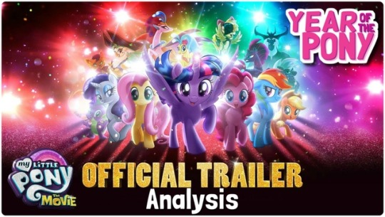
We’re 3 months away from this glitter-bomb and they gave us some stuff to scream about. I think I’ll do just that. I took my sweet time putting this together, I know, but there’s a fair bit to unpack and a lot to be excited about so, let’s go through it all!
Animation
Okay, so first things first: people are calling this a 2D movie and that’s not really that accurate.
It certainly has some 2D elements, like the backgrounds, but the style of animation only makes the characters look 2D, when in fact they’re 3D models.
You can tell in how they move. If I were to give you a still screen shot, you might guess that it was from a 2D animation, but in motion, you can tell what it actually is: cel-shading.
I had a hunch that’s what it was so I asked a storyboarder who worked on the MLP movie (and the show) if I was right and she said:
The program they’re using is ToonBoom, which does rigs with 2D toon shaders, among other things!
You know, I don’t often call things, but I fucking called it. Let me have this. Just to give you a quick definition from Wikipedia:
“Cel shading or toon shading is a type of non-photorealistic rendering designed to make 3-D computer graphics appear to be flat by using less shading color instead of a shade gradient or tints and shades.”
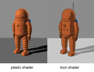
3-dimensional figure with cel shading, has the effect of making it look 2D. Typically seen with thick outlines on the outside and little to no outlines on the inside:
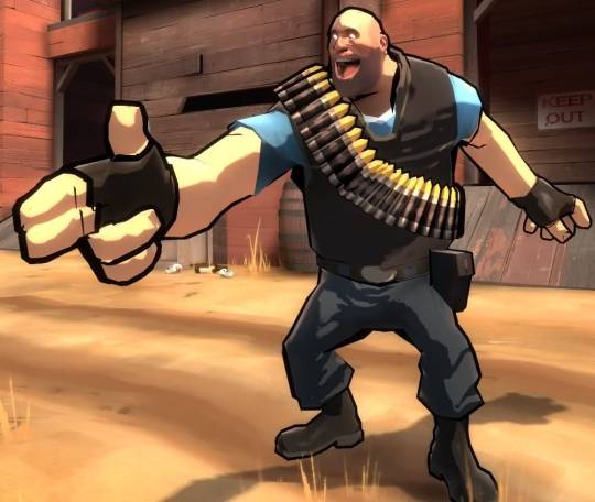
(Team Fortress 2 itself isn’t normally cel shaded, but that’s a great example a fan made of what cel shading usually looked like when I was growing up)
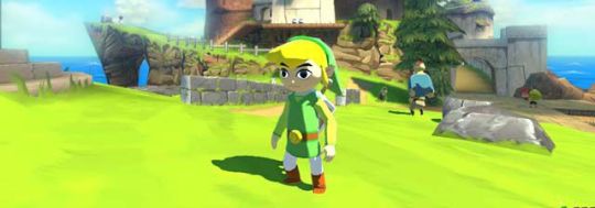
Cel shading without outlines, as seen in Wind Waker.
Like I said, just seeing this still image, it looks 2D, but watching it move, you can tell there’s a 3rd dimension to the character with the features and lineart mapped out onto the models to make it look 2D
Which by the way, is really unique for a major release! I don’t know about anyone else, but I was excited that MLP: The Movie seemed to be 2-D since there hasn’t been a domestic 2-D animated movie since Winnie the Pooh in 2011. 6 damn years! While I maybe would’ve ideally liked a completely 2-D animated movie, the backgrounds and the cel shading works in really neat ways, and it will definitely make the movie stand out
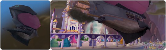
The purely 3-D objects seem unfinished at the moment (but that’s not out of the ordinary, CGI seems to be one of the last processes). It needs texture or shading or something, and I can tell because most of the ship looks too soft (too much like a model) to be metal. I really think this will be fixed for the final product, but that’s probably the most jarring part of the style at the moment
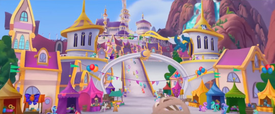
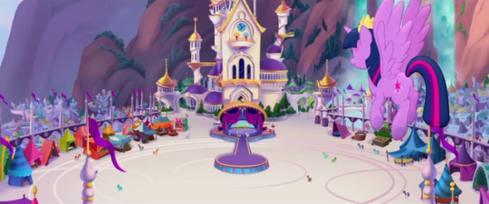
Not all of the 3-D looks unfinished, but the best looking parts are still the painterly, 2-D stuff (look at those towers; they’re really stylized, but you can tell they’re 3D in a more 2D environment)
THAT DIGITALLY PAINTED VERSION OF CANTERLOT THOUGH:
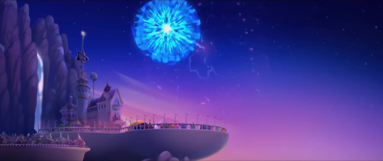
The light effects are definitely 3-D in the fireworks and rainboom
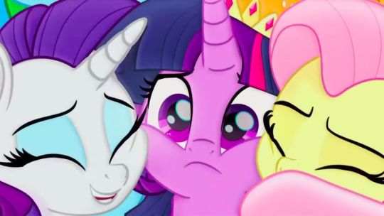
Oh, and speaking lighting, so much of it looks so pretty! There are one or two times when the colours are slightly off, but the majority of the time it looks freaking gorgeous
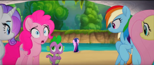
You can kinda see by looking at Rarity that the shading is juuust slightly off here (kinda like they were for the teaser trailer), but then you look in the background and see this BEAUTIFUL background and Twilight all upset and worried about this invasion, and it feels like such a nitpick to worry about what will probably still be cleaned up before it hits theaters
We also get some really great expressions, so they’re not really limited by the 3D models underneath (if I’m right about that)
Also, just as one last little note here, the style is detailed enough to see little things about the characters we didn’t know up until now, like the fact that the spines on the side of Spike’s head are translucent, or that the colours of RD’s mane aren’t 100% perfectly separated
Overall with the animation, I’m so impressed not only by how gorgeous it is,but by how willing they were to take a risk and incorporate a 3D element in the form of (I think) cel-shading. This only really matches the creative spirit of the MLP team, though. Whether or not you agree on how well they always execute everything, they always try to step up their game with every new season and push themselves to be and do better.
And while I will say that if some of the more 3D parts (yeah, I’m talking about the zeppelin/airships mostly) aren’t fixed for the final release, I would have a bone to pick with them, but I have faith that we’ll be seeing a much smoother integration of that 3D on the big screen.
Story and Character Details
I really appreciate that they didn’t outright spoil anything too big. It’s definitely a well-cut trailer! We basically only know about the same information we did before, with just a hint or two as to things like who the true villain is.
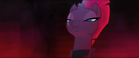
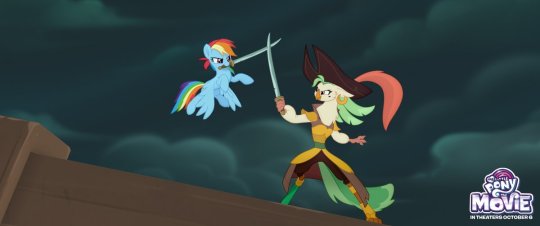
Just based on the focus given to these characters in the trailer (and what I know of the Storm King’s characterization in the first Movie Prequel comic that was just released), seems like he’s not as big of a threat as the commander of his fleet, Tempest.
It’s a kind of villain we haven’t seen on the show or even in EQG, and not only that, but
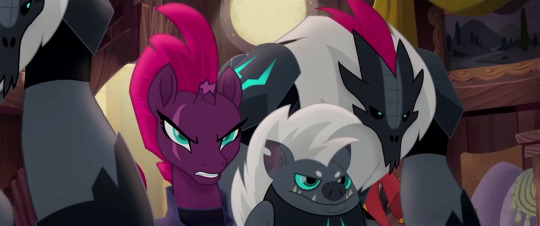
She’s got a fantastic voice actress behind her, so she can pull off the deliciously evil vibe well without, say, reminding us too much of Chrysalis or other powerful animated villains from Disney classics
Plus her design with the broken horn and her magic sparking up out of it is instantly intriguing to me: for such a powerful presence, it’s awesome to see her weakness (and most likely shady past) is always on display---especially for a commander character, that’s just really cool
Grubber seems to be pretty standard so far, nothing he’s done has really impressed me quite yet, but I’m hoping his best stuff is saved for the movie itself
The sky pirates (or skyrates) look like a lot of fun, and in context I can see how well the bipedal birb pirate blends with the universe (the bipedal designs were the ones I had the most trouble with)
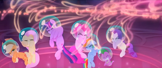
On top of that, we have sea ponies at last! And they’re far more adorable than I ever could’ve hoped
The original sea pony designs from G1 looked a lot more like sea horses, with curling tails and fins on either side, but I think the meraid-ish look is both more marketable for Hasbro and more appealing to look at (the original sea ponies always seemed like a joke in the fandom to me, I admittedly never understood why people would actually want it in G4)
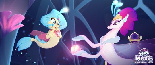
And a-ha! Good queens do exist! Poor Celestia and Luna. Always a princess, never a queen.
Oh, and Seaquestria? It’s freakin’ beautiful. I LOVE the rich blues and purples here. If you haven’t had a chance to check out the 360 image of the underwater palace complete with an excellent piece of background music, treat yourself.
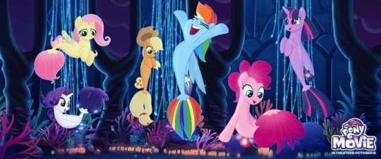
The Mane 6′s sea pony designs are pretty dang adorable. I don’t have anything interesting to say, I just like the cute water horses, okay?
Minor Details and Incidentals
I’ll start out by saying Twilight’s narration in the trailer is pretty standard, but still heartwarming (mostly because I already know and love these characters though). It sort of reminds me of the bits of narration from the How to Train Your Dragon movies, although those had a bit more character to them.
The what could possible go wrong? line, though. It just makes me laugh thinking of all the flashbacks we could have to the series.
I guess she’s talking about that festival specifically that she’s organizing, and in that way it’s a show of character development (in a similar way to the character development on display in A Flurry of Emotions, where Twilight is told she’s late and doesn't have a panic attack or worry about what could go wrong... too much), but it’s still hilarious to contrast the idea that nothing could go wrong in Equestria to... literally all of the show.
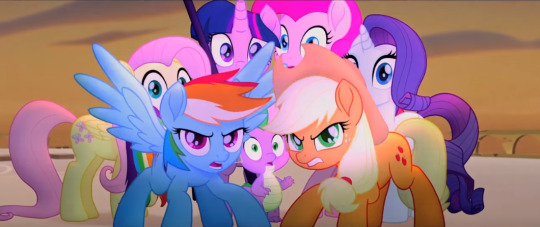
AJ and RD protecting their friends even before the others have gotten over the shock of whatever they’re seeing tho
Starlight and Trixie get a bit of screen-time together and it’s adorable. Starlight might be stuck in Canterlot for the duration of the adventure, but I’m glad to see her included. Characters like Discord who might be too hard to explain to new audiences are understandable losses, but even if Starlight’s cameo is brief, it’s good to see her role acknowledged
In terms of music, Sia’s looking adorable so far, and Lukas Graham’s as of yet unreleased Off to See the World sounds pretty catchy (it’s the song at the end of the trailer), so they’ve got talent behind the vocals!
Jumping back to little details, it’s neat how sea pony magic has a very distinct look from unicorn/alicorn magic. Also, the bubbles are really cute
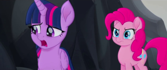
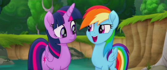
And, okay, I just wanted to take a minute to appreciate how serious this ponk is. Can we all just stop and take a look, because in this scene Twilight’s saying how she’s the one Tempest is after, and she should probably face this alone, which seems to be our Princess of Friendship’s big dilemma in this movie, and Pinkie’s clearly trying to tell her she’s crazy
Gotta love that they didn’t just go for hyperactive comic relief Pinkie Pie; they don’t seem to be boiling down these characters to just one trait (which is partially why I loved the moment where RD and AJ defend the girls; RD’s ego will no doubt be on display throughout the movie, but you’ll also see she’s ready to lay down her life for her friends)
And hey, lookie here! Canterlot got a make-over... and a contractor. There’s more pink than there typically is and it doesn’t necessarily match what we’ve seen of it in the show. Especially places like the throne room:
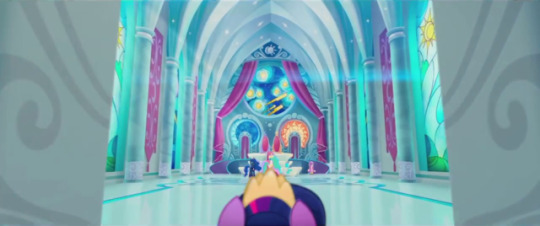
And you know, I’m a little torn on this detail? It’s beautiful, and I’m digging the starry night mosiac they’ve got going on back there, but it would’ve been nice to see the throne room we know and love rendered in this new style, you know? I’m gonna miss the deep magentas and the stain glass windows of the Mane 6′s accomplishments. I know that’s mostly the fangirl in me, but I like seeing continuity nods back to the show (like hey look: Cadence gets a cameo!)
Unless Canterlot gets destroyed and subsequently rebuilt in the season 7 finale, in which case I’ll shut my mouth
Speaking of which, I still have to wonder exactly when this will take place in the series, or if it exists slightly to the left of canon like the Equestria Girls movies (which, I mean, I consider canon, but still). I know there’s ties into the comics, but I wonder if/when the show will acknowledge the events of the movie... I guess only time will tell
And for now, I think that about wraps it up! All in all, I’m beyond excited to see this thing, as anyone could’ve guessed.
It should also be noted that a lot of kids movie trailers focus on the fun, comedic portions of the movie, so while I do think it’s mostly going to feel like this, I’m also looking forward to the more character-driven feelsy parts. As we well know, you can never get the full scope of a movie from just the trailer, but it’s usually especially true for kids movies.
Even just from what we have seen, it looks like we’re in for a ride. Can’t wait to get on.
Hey, if you’d like more MLP stuff, you can click right here to see my editorials or here for episode reviews. And if those links don’t look pretty enough, have the last three things I’ve done right here:
Parental Glideance Review, Celestia/Daybreaker Editorial, and LGBT+ Editorial
Year of the Pony
#year of the pony#yearofthepony#mlp the movie#my little pony the movie#mlp#my little pony#friendship is magic#my litte pony friendship is magic#twilight sparkle#pinkie pie#rainbow dash#rarity#applejack#fluttershy#spike the dragon#animation#animated movies#cartoons#mlp analysis#mlp articles#movie trailers
140 notes
·
View notes