#Monochromatic Plugin
Explore tagged Tumblr posts
Visit Tumblr Blog
Explore Tumblr blogs with no restrictions, modern design and the best experience.
Last Seen Tumblr Blogs


Fun Fact
70% of Tumblr users say the Dashboard is their favorite place to spend time online.
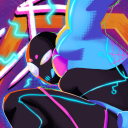
Text
N.M.E ‘boutta fuck around and find out

N.M.E is from @medics-secret-shipfic-folder
#artists on tumblr#my art#take back the fortress#N.M.E#Tf2#team fortress 2#shitpost#Monochromatic Plugin
19 notes
·
View notes
Note
They’re gonna be gossiping while giggling and kicking their feet like high school girls
I'm just gonna throw this random fact at you
Remember how Cmedic would braid his hair?
Luckily, Mono's hair has really long hair. As a result, Cmedic would just braid her hair as she starts talking abt her coworkers.
I can only imagine what crazy hairstyles Mono and Cmedic would come up with.
WAIT THAT'S SO CUTE!
Hair-braiding sleepovers
9 notes
·
View notes
Note
What is your secret image processing formula?👀
What website do you find such cool VHS effects on? Are these brushes and special textures?
A magician never reveals his secrets >:) ..... okay, I'm just kidding, I can tell how I do the effect myself! :3
These first steps I do in my drawing program after drawing and finishing my doodle (program being Clip Studio Paint in my case, though it doesn't matter much tbh what drawing program to use, jfkjklhlj):
A little bit of unsharpen mask to add some sharpness on the finished image, then a little bit of gaussian blur to soften that sharpness. Sounds silly, but somehow it works, lol
After that, slight chromatic aberration. Doesn't have to be too much, it can reduce the retro look imo if it's applied too much.
Then I add some (either monochromatic OR rainbow) noise as an overlay on top of all, which then I put to like around 10-15% opacity depending on how much noise I want on the image itself. I sometimes blur the noise a little too in the end.
Totally optional and this is just something that I like to do, but I also like to play around with different wacky colorful gradient maps, trying out different blending layer-styles and trying out different effects overall. I tend to experiment a lot sometimes, lol. Sometimes I lower the saturation a bit too.
Basically unsharp mask, light blur, noise and chromatic aberration will be your best friends whenever making the VHS effect, lol.
Then after doing all that previously told; I flatten the image, save it as a heavily compressed JPEG-file (anything below 50-60% compression is good imo), and then I open it in another program, this being a free open-source program called "ntsc-rs". It's the program I use for nearly all of my arts nowadays, since I can add the authentic VHS-look with it and it's really easy to use!
If I wanna add a CRT-look then to my arts (like eg. those PS1-styled arts I've done or models etc.), I use another free cool program called "ShaderGlass"; it's originally meant for emulating the CRT look and such for PC video games, or when emulating/playing old retro games on PC. But you can open images in it too, apply shaders to them and then save the result as PNG-files!
Of course, alongside that program, I've also used few other programs and methods of making the VHS-effect: Signal-effect for Adobe After Effects (though that one costs money). Then there's also been ntsc-qt, another free program which iirc is an older version of ntsc-rs, I used to use it but it's no longer being worked on/supported so I stopped. And then also a VHS-plugin for Blender etc.
There's a lot of ways for doing the effect, but the ntsc-rs program has been one of the best and easiest one to me so far!
Hope this helped at least a little bit! <3
26 notes
·
View notes
Text
Fancy Glowstick time!


well after several SEVERAL! months I have FINISHED the final feature of her rig! (Minus the skinning because my plugin I use is VERY broken and I loathe skinning overall) BUT WE ARE END GAME NOW because my girl can "Fancy Glowstick" ON DEMAND! wish I could have kept her UI colorful but because of my lack of ability to script and Maya's hard limitations on reference or template mode I'm forced to have a monochromatic UI for my sliders.
#siletreas workshop#siletrea#3d model#maya autodesk#crystarian wyvern#3d rigging#3d#set driven keys my beloved#I hate weightpainting#why is my plugin broooken! its not faaair!
5 notes
·
View notes
Text
Modding Resident Evil 5: Gold Edition (STEAM) with Albam x Blender (Tutorial)

Part 5: Texture Conversion (GIMP)
♡ Before we begin: (I recommend memorizing these Blender Keyboard Shortcuts compiled by Blender Guru. Although it is not a requirement, a [Mouse] makes modeling easy breezy, snag one~🖱️)
♡ Helpful Video Guides about Normal Maps.
♡ For this tutorial, a simple solid black texture will be applied to Wesker's [UV Sphere] using GIMP'S DDS Plug-In~🖤

♡ Open GIMP. (Did you know that the G added to -IMP is a reference to "The Gimp" from Pulp Fiction.~ ✦‧₊˚)
♡ Create a New Image: [512 x 512] > [OK]

♡ Diffuse Map:
♡ [Grab that Paint Bucket] > [Make it Black]

♡ Select: [Export As] > Name Image [paint_it_black_BM.dds] > [Select File Type] > [Select DDS Image] > [Export]


♡ DDS Plug-In Appears
♡ Select: Compression [BC3/DXT5] > [Generate Mipmaps] > [OK] ♡ [BC2] and [BC3] compresses the textures for Diffuse Map.


♡ Normal Map: Normal maps require alterations to the Red Channel to create a transparent pink image.


♡ Duplicate image [paint_it_black_BM] : [Image] > [Duplicate]

♡ On the upper panel, the first image in the row is [paint_it_black_BM.dds] and the second image is the duplicate. This duplicate will be the [Normal Map].

♡ Select: [Filter] > [Map] > [Normal Map] ♡ Normal Map Plug-in appears. Exact settings are unclear to me as of this time. For now select leave the settings on default. ♡ Select: [OK]

After converting the image to purple:
♡ Select: [Color] > [Components] > [Decompose] ♡ Decompose Menu Appears ♡ Select: [RBG] > [OK]


♡ [Duplicate Red] > [Move copy to the bottom] ♡ [Grab that Paint Bucket] > [Fill the original red channel in white]

♡ Select: [Color] > [Components] > [Compose] ♡ Select: [RGBA] > [Alpha] > [OK]

♡ Mhuahuahua . . . Look what has been wrought. It is too early to celebrate. There is more to be done. The final touches~🖤

♡ Select: [Export As] > Name Image [paint_it_black_NM.dds] > [Select File Type] > [Select DDS Image] > [Export] ♡ DDS Plug-In Appears. ♡ Select: Compression [BC3/DXT5] > [Generate Mipmaps] > [OK] ♡ [BC3] compresses the texture for Normal Map.


♡ Specular Map: (The image on the left is what a Specular Map looks like. Specular maps create definition to reflectivity on a surface. Specular maps are monochromatic. The brighter the white, the greater the shine.)
♡ Duplicate image [paint_it_black_BM] : [Image] > [Duplicate] Desaturate this image. (Even though it is already black, desaturating the diffuse map is necessary to creating a specular map. Follow procedure ~ ♥)

♡ Select: [Color] > [Desaturate] > [Desaturate] ♡ The image is now desaturated (Complete Color Desaturation?) ♡ Please note that this is an overly simplified example of how to create specular maps. I advise doing more research on the subject when creating textures for mods that are more sophisticated than this tutorial's example.

♡ Select: [Export As] > Name Image [paint_it_black_MM.dds] > [Select File Type] > [Select DDS Image] > [Export] ♡ DDS Plug-In Appears ♡ Select: Compression [BC1/DXT1] > [Generate Mipmaps] > [OK] ♡ Specular Map is born~!

Normal Map [paint_it_black_NM]
Specular Map [paint_it_black_MM]
Diffuse Map [paint_it_black_BM]
and [Mister_Wesker.blend]
Almost there ~ ʚ♡ɞ
INDEX:
Part 1: Installation Part 2: Albam/Blender x Gimp/DDS Plugin x Gimp/Normal Map Plug-In Setup Part 3: Importing Arcs with Albam Add-On (Blender) Part 4: Let's Get MESHY! (Blender) Part 5: Texture Conversion (GIMP) Part 6: Texture & Material Application (Blender)
꒰This is a image+text tutorial based on Resident Evil 5 Modding with Blender by Henry's_Craft on YouTube.꒱

0 notes
Text
What is Bootstrap: A Beginner’s Guide for Web Design Service

Are you a marketer who wants to get inspirational ideas for a responsive website? Not sure where to start with web design and development? Get a detailed guide on why responsive design matters in this blog. Then, keep scrolling to get insights on why the WordPress site is responsive and the building blocks.
This blog also covers media queries, Bootstrap responsive breakpoints and why front-end developers prefer Bootstrap for web design service. Let’s get started.
For a few years now, this has become an essential tool for front-end developers. But, unfortunately, for the rest of us, it’s just another coding buzzword we don’t understand.
Wondering what Bootstrap is?
So we know it’s useful, but what is it used for, and why it is the better option for designers that build websites in a web design agency.
And how does it help web developers?
1. Why is Bootstrap the go-to for Web Developers?
Let’s break the features into the responsive grid, responsive images, progress bar, and thumbnail.
1. Its Responsive Grid

No more spending hours coding your grid—Bootstrap successfully caters to the designing needs as per the current trends as defined guidelines of Google to offer the best user experience. It comes with its grid system predefined. Now, you can get straight to filling your containers with content, automatically resizing images based on the current screen size.
Let Bootstrap resize your images for you.
It can even change the shape of your images with the addition of classes like IMG-circle and IMG-rounded.
Not only is it a breeze to add incredibly excellent and responsive elements to your webpage, looks fabulous no matter the screen size or device used to view them. That’s a lot of ready-made functionality that eases the life of a designer and front-end developer right at your fingertips to get the best user experience using Bootstrap.
4. Its JavaScript
Still, not enough functions, and you think that you need more features? Bootstrap also allows developers to take advantage of over a dozen custom JQuery plugins. To incorporate interactivity, there is a complete library to take help.
offering up easy solutions for modal popups,
transitions,
image carousels
Updates your navigation bar as you scroll through a page.
5. Its Documentation

Simply put, Bootstrap’s documentation is the best thing that has ever happened for front-end designers. Not sure why it’s fantastic and super amazing? Because you will see every piece of code is described and explained.
Here is what you need to do.
● choose a component,
● copy and paste the code into your page,
● and tweak from there.
6. Its Customizability
One of the initial evaluations of frameworks such as Bootstrap is their size—the weight they throw around can slow down your application upon the first load. However, what it allows you to do to combat this is customize which functionality you want to include in your download. By simply going to their Customize and Download page, you can check off the features you won’t need for your application, trimming the weight of your file and saving your users the additional load time.
Customization is a critical feature that you get while using Bootstrap when an agency offers web design service.
Conclusion:
Given the importance of websites to most businesses, many marketers and developers aim to learn Bootstrap for building sites.
The truth is, half of the consumers think website design is essential in customer acquisitions. So it’s worth the effort to make responsive websites by a digital agency that implants bootstrap.
However, this doesn’t mean you need to scrap your site’s vision to engage visitors by incorporating other vectors and branded images. There are still many ways and multiple options to implement stylistic choices across the spectrum. Many Product Designers go either monochromatic in their SaaS offering.
To help you prepare for wherever the web design tide is, this blog offers insights on trends to keep a close eye on for responsive websites to tackle your web design projects this year with style.
Hop on a consultation call to book our web design service to have a delightful experience with Bootstrap.
4 notes
·
View notes
Text
7 Color Tips to Improve Your User Interface Design
Colors are one of the most significant components of any interface (along with whitespace and typography). They have a huge impact on how people perceive a digital offering. When it comes to user interface design, there are several things that must be done correctly in order for an interface to fulfill the demands of the target audience. Color selection is an important aspect of UI development.
Creating a color scheme for a product may appear to be a difficult task (especially in the event that you don’t think of yourself as a graphic designer). But, it’s not as difficult as most people believe. And there are a lot of techniques we can use to quickly generate a fantastic color palette.

In this article, I’ll define 7 color tips to improve your user interface design:
1. Analyze how colors work together:
Some colors complement one other nicely, while others conflict. If you don’t consider this, you’ll wind up developing UI that makes people uncomfortable.
Hopefully, there is an easy technique to achieve a pleasing color scheme. Traditional color scheme patterns like monochromatic, analogous, and complimentary will assist you in creating a scheme that works well for your product:
Monochromatic color schemes are composed of several tones, shades, and tints within the same hue.
Analogous schemes are made by utilizing three colors that are near to one another on the color wheel.
Colors from the opposing sides of the color wheel are combined to create complementary color palettes. These color schemes include just two colors in their most basic form, but tones, tints, and shades make it simple to expand them.
2. Conduct interface inventory:
One of the most prevalent issues for many UI designers is the use of too many colors in their designs. And the underlying reason for this issue is the way colors are structured. Many teams struggle with color organization. It is also advisable, to begin with, interface inventory when introducing a better way to deal with colors.
If you’re working on a website, utilize a tool like CSS Stats to determine how many different colors you have in your style sheets.
If you’re developing an inventory in Sketch, the plugin Sketch-Style-Inventory may be used to combine all colors. Similar-looking styles can be combined.
3. Define foundational colors:
Make your whites and blacks clear: When it comes to whites and blacks, it’s always best to avoid excessive color variations. White does not have to be completely white. Similarly, black does not have to be completely black. Depending on how precise you want to be with your color palette, you may want to incorporate a variety of tints (a color combined with white) and shades (a color mixed with black). But be careful! Having too many shades and colors might make the color-picking process more difficult for designers.
Look for a low-contrast neutral color: Neutral colors with low contrast are not good for components that need to be read, but they are perfect for elements like input fields. The most important thing to consider when designing such items is to keep them unique from the rest of the UI. Because input fields do not need to stick out too much, a low-contrast neutral color can assist you in creating the ideal UI container.
Limit the number of primary colors: A primary color is the one that appears the most on your app’s displays and components. There cannot be a lot of basic colors in a color scheme. You should ideally have a limited number of acceptable core colors (1-3 primary colors that reflect your brand) and a reasonable number of accent colors.
4. Consider color psychology:
Humans are visual creatures, and the colors we see may impact how we feel about a design. When we detect a specific color, our brain processes the information and sends messages to the body, and responsible for the mood and emotions to be released. As a result, psychology should play an important role in the color selection process.
5. Use the 60-30-10 color proportions rule:
A basic guideline known as ’60-30-10′ can assist you in achieving a good balance. This approach originated in interior design and is frequently used in home décor. The guideline is simple: to achieve balance in the composition, the colors should be blended in the proportions 60%-30%-10%. This guideline states that you should have 60% of your dominant color, 30% of your secondary color, and 10% of your accent color.
6. Limit the total amount of colors:
The use of color in design is heavily influenced by balance. In general, the more colors you use, the more difficult it is to produce a pleasing balance. That’s why it’s best to keep the number of colors in a scheme to a minimum. Some products, like mobile applications, may achieve spectacular results with only one primary color.
7. Don’t forget about accessibility:
The major objective of a designer while building a UI should be to ensure that everyone has a positive experience when using a product. It occurs when a design is usable by all user groups, including those with visual impairment. The color designer must be conversant with WCAG 2.1 standards and incorporate them into color choosing.
Every UI design should follow two fundamental accessibility rules:
When text appears on colorful backgrounds, it should be readable. The color contrast between components should be sufficient so that people with poor eyesight can read the content. Color contrast accessibility may be checked using special programs such as Web aim contrast checker.
Never rely just on color to convey meaning. The interface will be easier to use for those who cannot see color if there is accompanying text that describes what is happening.
0 notes
Text
Halftone effect affinity designer 無料ダウンロード.Affinity designer Brushes
Halftone effect affinity designer 無料ダウンロード.HalftonePro

Related products.Halftone - Halftone Print Simulation Photoshop Plugin
· How to Design Flat Icons in Affinity Designer. This course will step you through how to create flat vector icons in Affinity Designer. By the time you're done, you'll have created icons illustrating a shopping bag, discount badge, coathanger, shopping basket, dress, and cargo truck, all in colorful flat style · This Photoshop plugin will generate halftone patterns from an image. Halftone is a plugin for Adobe Photoshop that simulates halftone imagery through the use of dots. Halftone is a filter that can be applied to images or can be used to generate masks with. This version of Halftone is a greatly improved and simplified version from the previous ones 1, Best Affinity Designer Free Brush Downloads from the Brusheezy community. Affinity Designer Free Brushes licensed under creative commons, open source, and more!
Halftone effect affinity designer 無料ダウンロード.Affinity Designer - PC用ダウンロード無料
· 8/10 (42 点) - 無料でAffinity Designerをダウンロード Affinity DesignerをMacにインストールすれば優れた簡単な方法でグラフィックスデザインプログラムを利用する事が出来ます。. プロの結果を提供していますベクトル描画プログラムをダウンロードするための大規模な支払いのための必要はありません。4,4/5 Windows、Mac、iPadで使えるAffinity Designerは、デザインの世界に新たな業界標準を打ち立てた、受賞歴のあるベクターグラフィックスソフトウェアです。 Create beautiful halftone effects online by using this halftone maker that is customizable and very easy to use. Light Photo Effect. The halftone images below are just samples. They don't show all types of effects that can be created from a photo by using this software. The "Overall style" option is more useful with small halftone sizes
Halftone is a plugin for Adobe Photoshop that simulates halftone imagery through the use of dots. Halftone is a filter that can be applied to images or can be used to generate masks with. This version of Halftone is a greatly improved and simplified version from the previous ones. It has had most previous features stripped out and only the most important ones have been kept. It has been re-coded from scratch with a completely different algorithm that now handles antialiasing without the use of supersampling so it is dramatically faster.
Halftone converts an image to black and white, using the pixel intensity to define the dot size. halftone works on black and white images and also full color ones. Choose between halftone printing where the pixel intensity defines dot size or dot matrix printing where all dots are equal size. Control the print angle of all three channels together or each color channel independently like real halftone prints.
Halftone also now provides a feature where it can output a halftone pattern using a custom color for masks. The user can then use the mask for any number of applications as well. Halftone Dropdown : Specifies whether to use halftone printing or dot matrix printing.
In halftone printing, the pixel intensity defines dot size while in dot matrix printing all dots are equal size. Diamond Dropdown : Specifies whether to use diamond or square dot distribution. Diamond will distribute dots in a diamond formation while square will distribute dots in a square formation.
Monochromatic: When disabled, the pixel color of the image is used for the dot color while, when enabled, all dots are colored according to the specified swatch color.
Monochromatic Color Swatch: Defines the dot color when in monochromatic mode. This is disabled if monochromatic is disabled. Red, Green, Blue Angles: Specifies the print rotation angle for the red, green and blue channels respectively.
This will prompt you to save a. zip file on your computer. zip file and place the. For instance, to install for Adobe Photoshop CS6, place the.
You can make a sub-folder to keep your plugins organized, such as the one below. Please make sure 64 bit plugins such as these are placed in the corresponding 64 bit Adobe Photoshop plugin folder. version — or later , your Photoshop plug-ins are stored in a folder shared between all Photoshop CC versions shown below. If the filter is grayed out, it may not support your current image color depth. This software is compatible with the following hosts:.
Navigation About Blog Shop Cart Checkout Account Support Contact Return to Content. Halftone Released April 21, This Photoshop plugin will generate halftone patterns from an image.
SKU: Category: Freeware Tag: Photoshop Plugins. Overview Documentation Installation Compatibility Halftone is a plugin for Adobe Photoshop that simulates halftone imagery through the use of dots. Point Size: Defines the size of the halftone dots. Installing this software is easy and only requires three simple steps: 1 — Download the software by clicking on the Download Demo button located above on the software page.
This software is compatible with the following OS: Windows 10 Home 64 bit Windows 10 Pro 64 bit Windows 10 Enterprise 64 bit Windows 10 Education 64 bit Windows 8 64 bit Windows 8 Pro 64 bit Windows 8 Enterprise 64 bit Windows 7 Home Basic 64 bit Windows 7 Home Premium 64 bit Windows 7 Professional 64 bit Windows 7 Enterprise 64 bit Windows 7 Ultimate 64 bit Windows Vista Home Premium 64 bit Windows Vista Business 64 bit Windows Vista Enterprise 64 bit Windows Vista Ultimate 64 bit Windows XP 64 bit Windows XP Professional 64 bit This software is compatible with the following hosts: Any host capable of running Adobe Photoshop 64 bit compliant plugins Adobe Photoshop Version CS5 or higher, including CC 64 bit Adobe Photoshop Elements Version 13 or higher, including CC 64 bit Adobe Illustrator Version CS6 or higher, including CC 64 bit Computerinsel Photoline 64 Version 16 or higher 64 bit CorelDRAW Version X6 or higher 64 bit Corel Painter Version NET with the PSFilterPdn plugin 64 bit Serif PhotoPlus Version X6 or higher 64 bit.
Grid Generator. Carotid Function Fractal. Lens FX.
0 notes
Text
ReMarkable’s redesigned e-paper tablet is more powerful and more papery
It’s no secret I’m a fan of the reMarkable, a tablet with a paper-like display that’s focused on text and sketching rather than rich media and games. The sequel to the original, announced today, looks to make a good thing even better.
Designed for the creation and consumption of monochromatic content like long documents, ebooks, notes and sketches, the reMarkable set itself apart as a more minimalist alternative (or complement) to the likes of the iPad or Surface. The device was crowdfunded and has sold more than 100,000 units; meanwhile the company has grown and attracted a $15 million A round. One sees in retrospect that the money helped launch this successor.
Sony and reMarkable’s dueling e-paper tablets are strange but impressive beasts
The most obvious change is to the design. It has a bold asymmetrical look with a chrome band along the left side, indicating the tablet’s main use as an alternative to a paper notebook: Hold it with your left hand and write with your right. Sorry, lefties.
The new tablet is just 4.7 mm (0.19 in) thick, thinner than the iPad Pro and Sony’s competing Digital Paper tablets, both of which are 5.9 mm. Let’s be honest — at these levels of thinness it’s getting hard to tell the difference, but it’s an accomplishment nevertheless.
Probably the best thing about the original reMarkable, however, was how good it felt to write and draw on, and the company has spent the last few years improving that wherever they can. For one thing, the already very small delay of about 40 ms between touching the screen with the stylus and a line appearing has been nearly cut in half.
That’s an area where every milli-unit counts. The lag on a real pen and paper is zero, of course, and while the reMarkable was good, there was still a very slight lag, especially when making large gestures or lines. As ?????? explained to me:
The hardware to further push the latency down further did not exist, so we decided to invent the technology ourselves. We redesigned both the hardware and software architecture that controls the display through a completely new display controller that changes how the display itself is electrically controlled, down to the voltages and electrical currents applied in complex waveforms to each individual pixel, millions at a time. The result is a 20ms latency, smoother ink flow with less jitter, and a completely uncontested digital writing experience perfected.
I intend to investigate this myself once I get my hands on one of the new devices. The company worked with E Ink, the main manufacturer and investor in e-paper type displays, to accomplish the new display, which has the same specs as the previous one otherwise: 10.3 inches, monochrome, 1872×1404 resolution for 226 DPI.
Here’s the inevitable, yet well-executed, aspirational promo video:
youtube
The software running on the reMarkable has received several major updates since the product made its debut, adding things like handwriting recognition, a new interface, better performance and so on. But one of the most requested features is finally coming with the new device: saving articles from the web.
Unfortunately they didn’t answer my specific request of adding Pocket integration, deciding instead to roll their own with a Chrome plugin that sends a reformatted webpage to the device. Unfortunately I use Firefox, but I can make an exception for this.
The company is claiming a 3x boost to battery life, using the same 3000 mAh battery, based on performance improvements throughout and a more efficient (but more powerful) dual-core ARM processor. That means two weeks of use and 90 days of standby. This is welcome news, because frankly the battery life and power management on the last one were not great.
Lastly, the “Marker” itself is getting an upgrade I’ve desperately wanted since the first day I tried the tablet: an eraser. You could always erase by selecting that tool, of course, but now one of the tips of the stylus will activate it automatically, a feature borrowed from Wacom and accomplished in collaboration with them. Of course, the eraser-enabled “Marker Plus” costs $99, $50 more than the plain one. They both stick onto the tablet via magnet, though.
“We’ve worked closely with Wacom the last two years to create Marker Plus, the most beautiful pen we have ever made,” reMarkable co-founder and CEO Magnus Wanberg told TechCrunch. “In addition to premium materials and design, it features an end-cap eraser that works seamlessly with the reMarkable software. We’ve fined-tuned the eraser sensor in collaboration with Wacom’s engineering team to make sure it looks and feels like just a real eraser on paper.”
But overall you’re looking at a much cheaper package. The reMarkable, for all its merits, was not cheap at $700. The reMarkable 2 will sell for $399 if you pre-order, and comes with a Marker and a nice folio case. For anyone who was on the fence about the first one, the sequel may prove irresistible.
from RSSMix.com Mix ID 8176395 https://techcrunch.com/2020/03/17/remarkables-redesigned-e-paper-tablet-is-more-powerful-and-more-papery/ via http://www.kindlecompared.com/kindle-comparison/
0 notes
Text
Here’s MegaByte!

(MegaByte is a fusion between @medics-secret-shipfic-folder’s Heavy and Mono)
This took WAY too long, and imma take a break for a bit
#my art#take back the fortress#artists on tumblr#monochromatic plugin#MP Megabyte#<- MP means Monochromatic Plugin
17 notes
·
View notes
Note
*proceeds to Schadenfreude over N.M.E’s corpse*
N.M.E: Who the fuck are you?
Mono: Why don’t you fuck around and find out if you’re so curious?
N.M.E: *gets his shit rocked by Cmedic*
Mono: Smooth move, dicks-for-eyes! You sure showed me!
8 notes
·
View notes
Text
ReMarkable’s redesigned e-paper tablet is more powerful and more papery
It’s no secret I’m a fan of the reMarkable, a tablet with a paper-like display that’s focused on text and sketching rather than rich media and games. The sequel to the original, announced today, looks to make a good thing even better.
Designed for the creation and consumption of monochromatic content like long documents, ebooks, notes and sketches, the reMarkable set itself apart as a more minimalist alternative (or complement) to the likes of the iPad or Surface. The device was crowdfunded and has sold more than 100,000 units; meanwhile the company has grown and attracted a $15 million A round. One sees in retrospect that the money helped launch this successor.
Sony and reMarkable’s dueling e-paper tablets are strange but impressive beasts
The most obvious change is to the design. It has a bold asymmetrical look with a chrome band along the left side, indicating the tablet’s main use as an alternative to a paper notebook: Hold it with your left hand and write with your right. Sorry, lefties.
The new tablet is just 4.7 mm (0.19 in) thick, thinner than the iPad Pro and Sony’s competing Digital Paper tablets, both of which are 5.9 mm. Let’s be honest — at these levels of thinness it’s getting hard to tell the difference, but it’s an accomplishment nevertheless.
Probably the best thing about the original reMarkable, however, was how good it felt to write and draw on, and the company has spent the last few years improving that wherever they can. For one thing, the already very small delay of about 40 ms between touching the screen with the stylus and a line appearing has been nearly cut in half.
That’s an area where every milli-unit counts. The lag on a real pen and paper is zero, of course, and while the reMarkable was good, there was still a very slight lag, especially when making large gestures or lines. As ?????? explained to me:
The hardware to further push the latency down further did not exist, so we decided to invent the technology ourselves. We redesigned both the hardware and software architecture that controls the display through a completely new display controller that changes how the display itself is electrically controlled, down to the voltages and electrical currents applied in complex waveforms to each individual pixel, millions at a time. The result is a 20ms latency, smoother ink flow with less jitter, and a completely uncontested digital writing experience perfected.
I intend to investigate this myself once I get my hands on one of the new devices. The company worked with E Ink, the main manufacturer and investor in e-paper type displays, to accomplish the new display, which has the same specs as the previous one otherwise: 10.3 inches, monochrome, 1872×1404 resolution for 226 DPI.
Here’s the inevitable, yet well-executed, aspirational promo video:
youtube
The software running on the reMarkable has received several major updates since the product made its debut, adding things like handwriting recognition, a new interface, better performance and so on. But one of the most requested features is finally coming with the new device: saving articles from the web.
Unfortunately they didn’t answer my specific request of adding Pocket integration, deciding instead to roll their own with a Chrome plugin that sends a reformatted webpage to the device. Unfortunately I use Firefox, but I can make an exception for this.
The company is claiming a 3x boost to battery life, using the same 3000 mAh battery, based on performance improvements throughout and a more efficient (but more powerful) dual-core ARM processor. That means two weeks of use and 90 days of standby. This is welcome news, because frankly the battery life and power management on the last one were not great.
Lastly, the “Marker” itself is getting an upgrade I’ve desperately wanted since the first day I tried the tablet: an eraser. You could always erase by selecting that tool, of course, but now one of the tips of the stylus will activate it automatically, a feature borrowed from Wacom and accomplished in collaboration with them. Of course, the eraser-enabled “Marker Plus” costs $99, $50 more than the plain one. They both stick onto the tablet via magnet, though.
“We’ve worked closely with Wacom the last two years to create Marker Plus, the most beautiful pen we have ever made,” reMarkable co-founder and CEO Magnus Wanberg told TechCrunch. “In addition to premium materials and design, it features an end-cap eraser that works seamlessly with the reMarkable software. We’ve fined-tuned the eraser sensor in collaboration with Wacom’s engineering team to make sure it looks and feels like just a real eraser on paper.”
But overall you’re looking at a much cheaper package. The reMarkable, for all its merits, was not cheap at $700. The reMarkable 2 will sell for $399 if you pre-order, and comes with a Marker and a nice folio case. For anyone who was on the fence about the first one, the sequel may prove irresistible.
0 notes
Video
vimeo
V-Ray Next for Revit (4.00.03) .. (2015 - 2020) .. FULL + Crack + Material Editor with Material Editor _ Tested and Working ... % 100 Download Link (1). Media Fire ... ( Direct Download ) ... 860 MB https://ift.tt/394YsxB (2). Crack Only https://ift.tt/2s2xOos =========================================== =========================================== INSTRUCTIONS : 1. Install V-Ray Next for Revit. No need to install the License Server. 2. Copy and replace the .. V4RCore.dll .. to the V-Ray for Revit dir: ( C:\Program Files\Chaos Group\V-Ray\V-Ray for Revit ) 3. Copy and replace the .. cgauth.dll .. to the V-Ray bin dir: ( C:\Program Files\Chaos Group\V-Ray\V-Ray for Revit\Libraries\vrayappsdk\bin ) 4. Copy and replace the .. vray_BRDFScanned.dll .. to the V-Ray plugins dir: ( C:\Program Files\Chaos Group\V-Ray\V-Ray for Revit\Libraries\vrayappsdk\bin\plugins ) 5. Start Revit, .. Open any Project .. go to the V-Ray menu and click the "Acquire License" button. 6. With V-Ray enabled access the "Settings" menu click on the "Licensing" tab and enable the "Obtain License on start-up" option 7. Enjoy! =========================================== =========================================== How to Assign Materials .... from Appearance Manager 1. Right Click on the Material Tape ... It`ll Open Material Window ... Go to Material Directory ..... ( C:\Program Files\Chaos Group\V-Ray\V-Ray for Revit\materials ) 2. Go To The Same Material You`ve Clicked on ... But You`ve To define Material In Revit First To Be Read By V-Ray =========================================== =========================================== Who Can`t open the Rar file ... You Must Update Yours WinRAR _ 5.50 Activated https://ift.tt/2sX7cVC WinRAR _ 5.70 Activated https://ift.tt/396gD5I =========================================== =========================================== V-Ray Next for Revit (4.00.03) .. (2015 - 2020) .. FULL + Crack V-Ray Next for Revit, you can generate incredible renders of your Revit models from your earliest concepts to the final marketing materials with the highest level of realism. BENEFITS ACCURACY Analyze a design according to its actual lighting and the true reflections and refractions of its materials. SEAMLESS REVIT INTEGRATION All decisions live in the Revit project without altering the BIM database. All workflows are done within Revit — there’s no import/export. INTEROPERABILITY Leverage the V-Ray work done in other 3D tools like 3ds Max, Rhino or SketchUp for render-ready assets and reusable materials. CUSTOM ENTOURAGE Easily place custom 3D entourage in Revit without polluting your BIM database or impacting Revit’s performance. SCALABLE QUALITY Quickly make traditional, monochromatic studies with convenient material overrides. POWER Speed up workflow with multiple processors (CPU and/or GPU), harness networked machines with Swarm or use Chaos Cloud on demand. WHAT’S NEW Faster, smarter and simpler, V-Ray for Revit is now more powerful than ever. Boasting faster performance, new Scene Intelligence, improved asset management and simpler workflows, V-Ray Next for Revit is supercharged, super smart — and ready to take on your biggest projects yet. ACCURATE LIGHTING Simulate any type of natural, artificial, or image-based lighting.V-Ray automatically converts all Revit lights to V-Ray ones and further extends Revit’s lighting capabilities. ADAPTIVE LIGHTS This lighting algorithm dramatically speeds up rendering in scenes containing many lights. ADAPTIVE DOME LIGHT Render image-based lighting much faster with the new Adaptive Dome Light. It’s exceptionally quick for interiors and substantially speeds up your rendering. LIGHTING ANALYSIS Easily visualize real-world illumination values (lux) with the new Lighting Analysis render element. Camera Simulate photographic cameras from Revit’s native camera views. AUTO EXPOSURE AND WHITE BALANCE It’s as simple as point and shoot. The V-Ray Physical Camera can now set the correct camera exposure and white balance automatically. LENS EFFECTS Add that extra touch of photorealism with real-world camera lens effects such as bloom and glare. VIRTUAL REALITY Experience your designs at 1:1 scale. Create content for popular VR headsets with 6×1 cubic and spherical stereo camera types. DOF AND VIGNETTING Emphasize a particular part of your rendered model with advanced camera effects like DOF and vignetting.
0 notes
Text
What’s New for Designers, September 2019

While there aren’t as many new tools out there to play with right now, the ones available are a lot of fun. From tools to help speed up workflows and manage productivity, to creative gamification and funky typefaces, these new tools for designers will make you want to stick to your desk.
Here’s what new for designers this month.
Quark
Quark might not be exactly what you are thinking if you have roots in print design. This Quark, in beta, is designed to help you create projects in HTML, CSS, and JavaScript with native app capabilities. The interface is made for rapid development and prototyping so you can create apps fast.

Doka
Doka is an in-browser photo editor. You can perform all kinds of basic photos edits with this free tool, including cropping and resizing (even by aspect ratio). There are even a few simple filters. Get your photo ready to go and download it for use in projects. It’s one of the best simple photo editing tools out there.

Copy Palette
Copy Palette will help you create the most elegant monochromatic palettes. Pick a base color, number of variations and adjust the contrast on the way to making an SVG palette that you can use in Figma or Sketch with a simple copy and paste.

Summit Form
Summit Form is a drag and drop online form builder. Embed forms on your website or link through social media or email. It’s easy to use and there’s no coding if you want to build forms with ease. (This is a paid tool, but it is fairly low cost.)

SVG to JSX
SVG to JSX is a plugin that lets you copy SVG code as a react component for use in Figma. And it’s as simple as a right-click.

Tiler
Tiler combines small images to create a large image masterpiece. What’s different about this tool is mosaic squares aren’t just square. You can adjust shapes and size to suit your needs. Options include circles, lines, waves, cross stitches, legos, minecraft blocks, paper clips, letters, and more.

Can I Email?
Can I Email? Is one of those tools you don’t know how much you need it, until you use it. Fill in what you want to know into the “can I email” field at the top of the screen to see what elements are supported by which email clients.

UseAuth
UseAuth is a simple method of adding authentication to a React app. (Mostly because it takes care of everything for you.) It uses an AuthProvider component for configuration and shares states between components, including users, login forms, and redirects.

Fragments iOS Wireframe Kit
Fragments is an iOS wireframe kit for Sketch that you can use for mobile app development. It includes 370 layouts in 10 categories based on nested symbols and layer styles. Test it out with the free version – 25 ready-made screens – before committing to the full kit.

SVG Artista
SVG Artista simplifies the process of making an SVG animation. It was born out of the animation for animista.net. It animates the stroke and fill properties of SVG images with plain CSS and works best with paths, lines, circles, and polygon elements. This isn’t a full animation tool, but does work for quick elements.

The Most Dangerous Writing App
The Most Dangerous Writing App is a game that deletes your content if you get out of the flow, literally. Stop writing for more than 5 seconds and you lose all your progress. It sounds scary but is an interesting creative tool.

Abstract Illustrations
Abstract Illustrations is a collection of one-line vectors that you can use in projects. It’s a trending style that you can find in a lot of projects right now.

Day/Night Ambient Animation
Have you ever wanted to change your page content or aesthetic based on light level? Using the Ambient Light API, Many Moore shows you how. It works using the #enable-generic-sensor-extra-classes flag in chrome://flags.

Chart.xkcd
Chart.xkcd is a tool that lets you create hand-drawn style charts. All you need to use it is the script included in your website with a SVG node to render the chart. This tool makes your charts quirky and anything but boring.

Friend NDA Generator
Friend NDA Generator or frieNDA is a silly little tool that creates a non-disclosure agreement between friends so you can really share secrets. Sadly, this might be a necessary tool in the digital age.

Flying Pages
Flying Pages is a WordPress plugin that helps preload pages before a user clicks so they will seem to load faster and more instantly. It uses a tiny bit of JavaScript and preloads when the browser becomes idle. Plus, it’s designed not to crash due to too many preloads.

Terms and Conditions Generator
Terms and Conditions Generator can help you create a professional document with clauses and legalize for your website or app. Use it to help protect your interests and content. The tool is scalable for everything from simple blogs to e-commerce and works in 100-plus countries.

Camar
Camar is an art-deco style vintage typeface for display use. The font includes all uppercase characters, numbers, and punctuation with a funky feel.

Florista
Florista is an elegant script with clean lines and interesting optional tails. It includes upper- and lowercase letters.

Fox Cavalier
Fox Cavalier is a futuristic slab serif that can make for interesting display use. It contains only uppercase letterforms.

Leon Sans
Leon Sans is a cool geometric sans serif that’s entirely made from code. You can change weight dynamically or create custom font animations or effects in the Canva element of HTML 5. It’s a pretty cool example of creative coding.

Sporter
Sporter evokes feelings of the fall (American) football season with cool block letters that resemble what you’d see on a jersey. It includes all uppercase letters.

Source from Webdesigner Depot https://ift.tt/31J5N1F from Blogger https://ift.tt/2kRnEU5
0 notes
Text
Wordpress MMS Marketing Application

With the present headways in innovation and the developing prominence of shrewd gadgets, the portable promoting patterns of 2011 are bound to concentrate on PDAs and the combination of internet showcasing with versatile plivo sms plugin advertising systems. Cell phone showcasing is about the advancement and notice of items or administrations by means of a stage that can effectively change over versatile SMS into a high transformation promoting asset. In spite of the fact that this is a genuinely new idea in the business part, it as of now has a gigantic potential for progress, on account of its straightforwardness. Additionally, it is compelling at conveying messages to a particular target crowd.
Ending up increasingly more mainstream among entrepreneurs and advertisers alike, portable bulk SMS sender showcasing and advancement is a successful instrument that any business can use in advancing their items and benefits, and expanding their image mindfulness in the market. Albeit generally new and undiscovered, cell phone advertising gives a wide definition. In any case, it very well may be separated into a few classifications, contingent upon the focal point of the portable advancement strategy. Starting today, the focal point of versatile advertising patterns is for the most part on MMS Marketing promoting.
Wp SMS are generally financially savvy and offer a few advantages beside straightforwardly advancing your items or administrations to your business' particular market specialty. Also, with regards to mass informing, advertisers have a great deal to pick up. All things considered, with such an ease task, they can immediately interface with bigger gatherings of people - perhaps a huge number of them - at the same time.
Versatile advertising patterns are as of now concentrating on the rise of minimal effort advanced cells in the market that will enable buyers to have a progressively various strategy for correspondence. Since informing can be blended with Internet perusing currently, also, advertisers can now effectively join the intensity of wp SMS promoting with that of the Internet to make a considerably increasingly amazing showcasing technique.
Additionally, since monochromatic four-liner telephones have turned out to be out of date and supplanted with remote prepared advanced cells with bundle applications, portable promoting turns out to be much all the more intriguing and testing. The main thing advertisers need to concentrate on currently is to adapt better approaches for getting to this showcasing source and exploit the generally low challenge related therewith right now.
Utilizing uncommon applications and projects for cell phone advertising is one approach to pick up preferred standpoint among different marketeers in the field today. Along these lines, with the correct instruments, it is totally conceivable to take advantage of the biggest asset of potential customers since focusing on the correct market specialty is the thing that versatile showcasing is about.
0 notes
Text
ReMarkable’s redesigned e-paper tablet is more powerful and more papery – TechCrunch
It’s no secret I’m a fan of the reMarkable, a tablet with a paper-like display that’s focused on text and sketching rather than rich media and games. The sequel to the original, announced today, looks to make a good thing even better.
Designed for the creation and consumption of monochromatic content like long documents, ebooks, notes and sketches, the reMarkable set itself apart as a more minimalist alternative (or complement) to the likes of the iPad or Surface. The device was crowdfunded and has sold more than 100,000 units; meanwhile the company has grown and attracted a $15 million A round. One sees in retrospect that the money helped launch this successor.
The most obvious change is to the design. It has a bold asymmetrical look with a chrome band along the left side, indicating the tablet’s main use as an alternative to a paper notebook: Hold it with your left hand and write with your right. Sorry, lefties.
The new tablet is just 4.7 mm (0.19 in) thick, thinner than the iPad Pro and Sony’s competing Digital Paper tablets, both of which are 5.9 mm. Let’s be honest — at these levels of thinness it’s getting hard to tell the difference, but it’s an accomplishment nevertheless.
Probably the best thing about the original reMarkable, however, was how good it felt to write and draw on, and the company has spent the last few years improving that wherever they can. For one thing, the already very small delay of about 40 ms between touching the screen with the stylus and a line appearing has been nearly cut in half.
That’s an area where every milli-unit counts. The lag on a real pen and paper is zero, of course, and while the reMarkable was good, there was still a very slight lag, especially when making large gestures or lines. As ?????? explained to me:
The hardware to further push the latency down further did not exist, so we decided to invent the technology ourselves. We redesigned both the hardware and software architecture that controls the display through a completely new display controller that changes how the display itself is electrically controlled, down to the voltages and electrical currents applied in complex waveforms to each individual pixel, millions at a time. The result is a 20ms latency, smoother ink flow with less jitter, and a completely uncontested digital writing experience perfected.
I intend to investigate this myself once I get my hands on one of the new devices. The company worked with E Ink, the main manufacturer and investor in e-paper type displays, to accomplish the new display, which has the same specs as the previous one otherwise: 10.3 inches, monochrome, 1872×1404 resolution for 226 DPI.
Here’s the inevitable, yet well-executed, aspirational promo video:
youtube
The software running on the reMarkable has received several major updates since the product made its debut, adding things like handwriting recognition, a new interface, better performance and so on. But one of the most requested features is finally coming with the new device: saving articles from the web.
Unfortunately they didn’t answer my specific request of adding Pocket integration, deciding instead to roll their own with a Chrome plugin that sends a reformatted webpage to the device. Unfortunately I use Firefox, but I can make an exception for this.
The company is claiming a 3x boost to battery life, using the same 3000 mAh battery, based on performance improvements throughout and a more efficient (but more powerful) dual-core ARM processor. That means two weeks of use and 90 days of standby. This is welcome news, because frankly the battery life and power management on the last one were not great.
Lastly, the “Marker” itself is getting an upgrade I’ve desperately wanted since the first day I tried the tablet: an eraser. You could always erase by selecting that tool, of course, but now one of the tips of the stylus will activate it automatically, a feature borrowed from Wacom and accomplished in collaboration with them. Of course, the eraser-enabled “Marker Plus” costs $99, $50 more than the plain one. They both stick onto the tablet via magnet, though.
“We’ve worked closely with Wacom the last two years to create Marker Plus, the most beautiful pen we have ever made,” reMarkable co-founder and CEO Magnus Wanberg told TechCrunch. “In addition to premium materials and design, it features an end-cap eraser that works seamlessly with the reMarkable software. We’ve fined-tuned the eraser sensor in collaboration with Wacom’s engineering team to make sure it looks and feels like just a real eraser on paper.”
But overall you’re looking at a much cheaper package. The reMarkable, for all its merits, was not cheap at $700. The reMarkable 2 will sell for $399 if you pre-order, and comes with a Marker and a nice folio case. For anyone who was on the fence about the first one, the sequel may prove irresistible.
Source link
from WordPress http://justtoosilly.com/2020/03/17/remarkables-redesigned-e-paper-tablet-is-more-powerful-and-more-papery-techcrunch/
0 notes