#Mike Koppa
Explore tagged Tumblr posts
Text


Typography Tuesday
Typesetting on a Winter's Afternoon
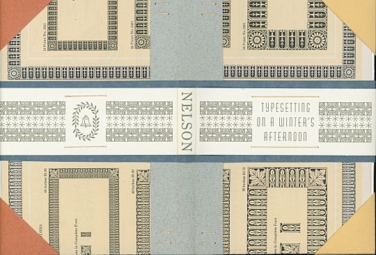
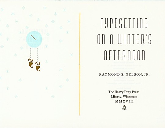
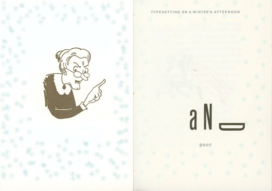
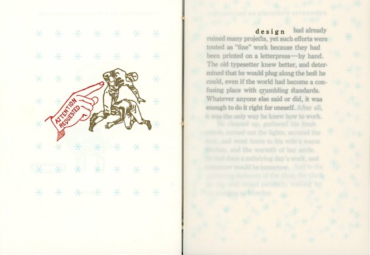
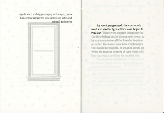
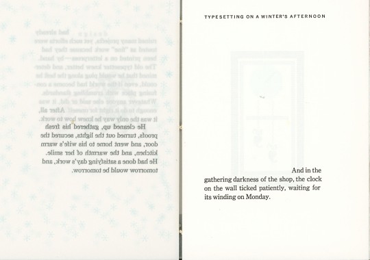
This week we present selected page spreads and cover from Stan Nelson's Typesetting on a Winter’s Afternoon, printed in Liberty, Wisconsin by Michael Koppa in 2018 at his Heavy Duty Press in a limited edition of 26 copies signed by the author and printer.
In the late winter of 2018, after a three-year effort, Mike Koppa completed printing the text of letterpress printer, type founder, and type and printing historian Raymond Stanley Nelson, Jr.’s lyrical essay Typesetting on a Winter’s Afternoon, with Koppa himself setting type, we're sure, on many a winter’s afternoon. Nelson's essay was originally published in Parenthesis No. 3, May 1999, but Koppa had received a copy of the text in a letter from Nelson in 1998, when Nelson was Curator of the Print and Graphic Arts Collection at the Smithsonian Institution.
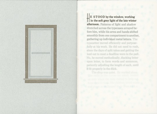
Nearly 20 years later, Koppa edited the text with Nelson’s permission, setting it in 10 pt. Century Oldstyle (designed by the prolific Morris Fuller Benton, a Milwaukee native, and one of Koppa’s favorites), with 4 pt. leading, and titling in 18 and 36 pt. Huxley Vertical. The text was printed on Zerkall Laid paper and a translucent Neenah Classic Crest UV/Ultra II. The use of the translucent paper offers a text block that cascades dimensionally through the book’s pages, mandating a particular cadence to the reading. The book also features subtle typographic prints representing recurring elements in the story: a window, a clock, and winter depicted as persistently falling snow using six-pointed asterisks printed strategically in ultra-ultra-light translucent blue on the verso of every page.
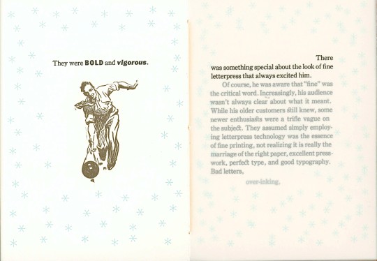
The book also includes three, not-so-subtle vintage cuts where certain emphases are required: “They were BOLD and vigorous”; “Bad letters, over-inking and poor design”; and “Attention requested.” The signatures were Coptic-sewn, and in the early months of 2019, Koppa created the 26 one-of-a-kind, non-adhesive covers that the book slips into. Each unique cover is made of pages from the 1923 Specimen Book and Catalogue of the American Type Founders Company, which included a specimen of the Century Oldstyle used in this Heavy Duty Press printing.
View other posts featuring the work of Michael Koppa.
View more Typography Tuesday posts.
#Typography Tuesday#typetuesday#Michael Koppa#Mike Koppa#Stan Nelson#Raymond Stanley Nelson Jr.#Typesetting on a Winter’s Afternoon#typesetting#Heavy Duty Press#Century Oldstyle#Huxley Vertical#Zerkall paper#Neenah Classic Crest UV/Ultra II
95 notes
·
View notes
Text
Cocobopros

Recueil “Les Cocobopros”. 4 volumes de collages par “The Heavy Duty Press”. Projet initié par Mike Koppa (US).
20 collages réalisés à huit mains se retrouvent dans le “Two do, Undo & do” avec Flore Kunst, Musta Fior, Mike Koppa et William Cody. 26 exemplaires de l'objet:
http://heavydutypress.com/les-cocobopros/?fbclid=IwAR21LwFdROYk9TuJnA70CY-
RnEeGqO2Ek6mUYVFzLRlCJW5CFdHRlCaQjaIhttp://misterkoppa.com/cocobopro-no-3/
10 notes
·
View notes
Photo

No. 272 Somewhere Between Norwegian Hollow and Irish Ridge
Handmade collage on Masonite by Mike Koppa 36 x 28 cm, 2019
prints available through Etsy
12 notes
·
View notes
Photo

Kolaj Magazine is the world’s only internationally-oriented art magazine dedicated to contemporary collage. Subscribe, order a copy, or collect back issues HERE
COLLAGE BOOKS
Thawt
by Mister Koppa in collaboration with 11 international artists. Thawt is a chronological collage of content, telling the story of a 60-day collaboration, between Mike Koppa and eleven artists and friends from around the world, during the thawing months of 2013. Thawt is a book about creativity, spontaneity, impulse, and action. The narrative is largely told through the correspondence between the contributing artists and the designer/ publisher, interspersed with contributed prose, poetry, photography, and collage. MORE
Are you getting Kolaj Magazine delivered to your door? Subscribe Today! U.S. & International Subscribers go HERE | Canadian Subscribers go HERE
#collage#collage art#collageartist#visualart#contemporaryart#cutandpaste#papercollage#analogcollage#collage collective#collagebook#kunst#art#artist#analogue collage#artmagazine#art publishing#art publication#art book#handmadecollage#collagist#collagista
4 notes
·
View notes
Text




Typography Tuesday
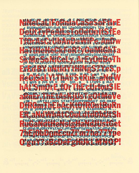
In March 2023, we posted about our friend, Wisconsin graphic designer, letterpress printer, stonecutter, radio personality, and collage and book artist Mike Koppa and his little adventure in type cleaning. He was engaged in bathing an entire case of 10 pt Franklin Gothic Condensed type, which led him to cleaning more cases of Franklin Gothic in different sizes, which led to him printing a book using every piece of type he had cleaned. The result is this book, Understanding This Book, or, Zen and the Art of Metal Type Maintenance, or, Let's See Your AI Do This by Augustine Maxwell Jones, a pseudonym Koppa has used in the past. The book was printed in 2023 at Koppa's Heavy Duty Press in Liberty Township, Wisconsin, in an edition of 18 copies. It is essentially a list of the 20 steps it took to the ultimate printing of this book. He writes:
When all my drawers of Franklin Gothic type needed to be cleaned, the mundane but necessary shop maintenance task turned into a book about the process. The result is a 20-page book featuring every last sort from nine California job cases of genuine ATF Franklin Gothic typefaces—maybe not older than the hills, but definitely older than me—in varying stages of wear, arranged according to a variety of strategies only likely to occur when composing individual metal types by hand. The final product of this very spontaneous and time-crunched project is a bold book conveying the frantic experience of creating it, while celebrating Franklin Gothic in a typographically jazzy manner.
We can attest to the great pleasure of exploring this typographic adventure. In the colophon Koppa states that the book is:
HanD seT In all soRTs of TRue ATF FRanklIn GoThIcs, In vaRyIng STaGeS of weaR buT SoakeD & ScRubbeD aS clean AS ThEy'RE GonnA GET, baREly pRoofED, AnD pRInTED on EnouGH HAhnEmuhlE BIbLIO, BuGRA, & InGRES TO yIELD 18 cOPIES.
A fine tribute to Morris Fuller Benton's Franklin Gothic!

View other posts featuring the work of Michael Koppa.
View more Typography Tuesday posts.
#Typography Tuesday#typetuesday#Michael Koppa#Mike Koppa#Heavy Duty Press#Understanding This Book#typographic noodling#typographic prints#artists books#letterpress printing#Franklin Gothic#Morris Fuller Benton#fine press#Hahnemuhle Biblio#Hahnemuhle paper#Ingres paper#Bugra paper#20th century type
74 notes
·
View notes
Photo
Typography Tuesday
MIKE KOPPA AT HEAVY DUTY PRESS
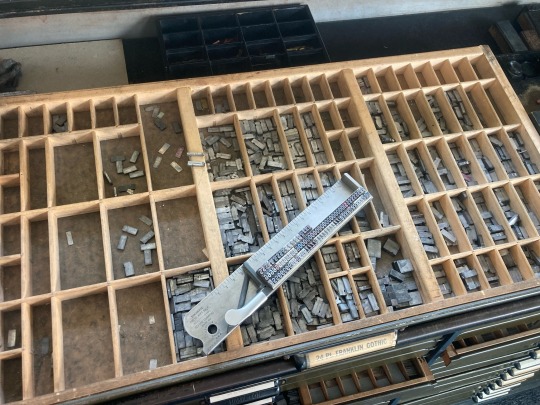
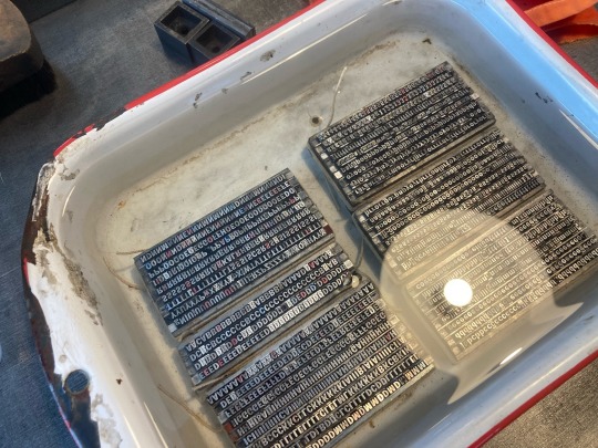
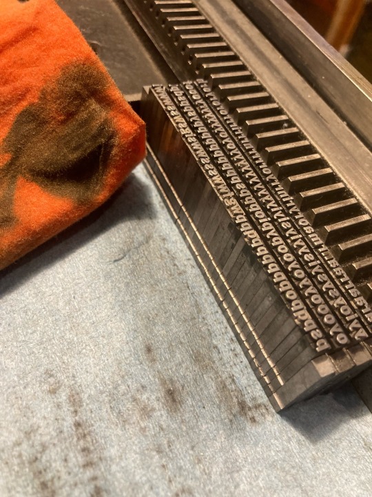
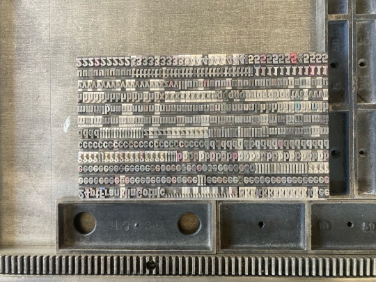
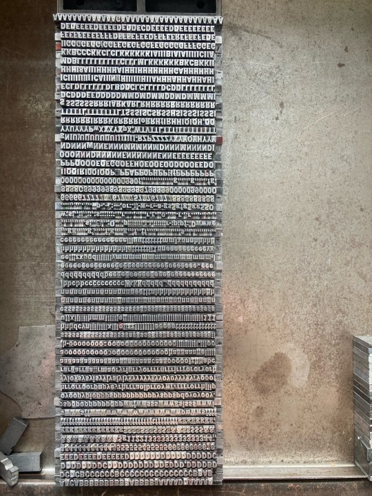
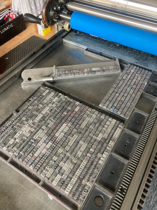
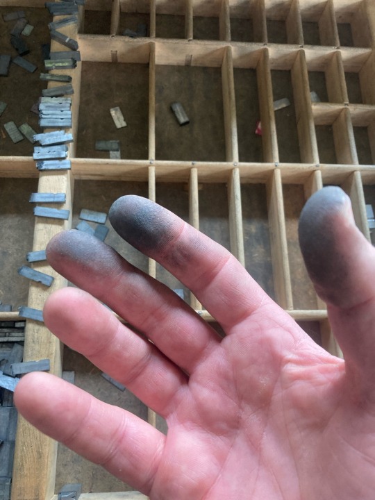
Do you ever wonder what letterpress printers do when they’re not printing type? Do they go fishing, play with their kids, hang out at the local coffee shop with friends, practice with the band? Yeah, many do. But sometimes when they’re not printing type, they’re also having fun cleaning and playing with their type!
Case in point: our good friend, Wisconsin graphic designer, letterpress printer, stonecutter, radio personality, and collage and book artist Mike Koppa has been posting on his Tumblr site @mrkoppa about the joys of just being with type. He writes:
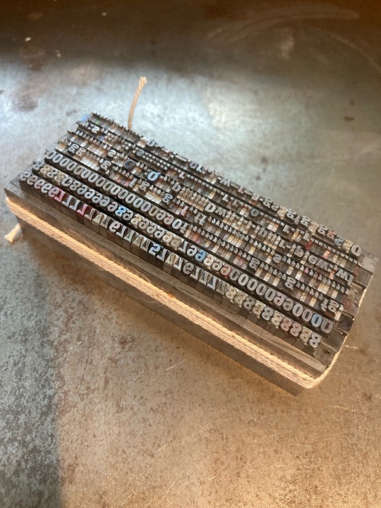
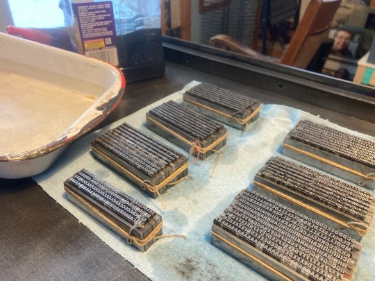
The process of bathing an entire case of 10 pt Franklin Gothic Condensed began a few days ago. . . . Used the old fashioned method of tying up blocks of type with string (something I have always enjoyed) and found that string holds up quite nicely when submerged in mineral spirits. . . . the type is not tied so tightly that the mineral spirits cannot sneak between the sorts, which leads to tedious line-by-line wiping down of type bodies before transferring it all back to the galley.
Quite an affair but worth the effort. . . . The type cleaning and organizing bug is infectious.
But this process leads to a book idea: why not print this type as it is and create a series of page spreads? Which leads to the next idea: “let’s get down to business and fill up the bed, and if the 24 pt doesn’t fill it up, well, then might as well clean and tidy up the 18 point, too.” What a type nerd!
Let’s not go licking those fingers now, Mike!
View other posts featuring the work of Michael Koppa.
View more Typography Tuesday posts.
#Typography Tuesday#typetuesday#Typography Tuesday#Mike Koppa#mrkoppa#Heavy Duty Press#Franklin Gothic#type nerds
141 notes
·
View notes
Photo


Typography Tuesday
This week we present our most recent acquisition, Viroqua, Wisconsin, graphic designer, collage artist, letterpress printer, and book artist Michael Koppa’s 2022 Heavy Duty Press book 8t Bags about the Natural World printed on Kitakata paper and hand bound in an edition of 88 copies.
This project began while drinking a particular brand of tea that included inspirational quotations by major historical figures printed on the tag of each tea bag. These quotes not only inspired Koppa to think about the world, but also to design and print a new book that not only included eight quotations from the tea-bag tags, but also the word “Bag” printed in all 80 fonts found in the Heavy Duty Press print shop. The numbers associated with each font serve as an index to be referenced in Koppa’s forthcoming book, Just My Type: Specimens. The remainder was printed in hand-set ATF Century Expanded, Oldstyle, and Schoolbook types, all printed on a Vandercook SP 15 flatbed proofing press named “Spiffy.” The book is slipped into a muslin fabric bag that was screen-printed by The Factory in Milwaukee. In the colophon, Koppa writes:
8t Bags was inspired by winters spent close to nature, a tea habit, time available to catalogue the type inventory held by The Heavy Duty Press, our not-particularly-religious but church-supporting neighbor routinely stating, “I don’t care where people get their moral code as long as they get it!” and living with the awareness that eight trillion (more of less) plastic bags are floating about the natural world in the 21st century A.D. Nature Deficit Disorder is a real thing. Reforest North America! Et cetera.
View other posts featuring the work of Michael Koppa.
View more Typography Tuesday posts.
#Typography Tuesday#typetuesday#Michael Koppa#Mike Koppa#Heavy Duty Press#8t Bags#American Type Founders#ATF#Century Expanded#Century Oldstyle#Century Schoolbook#letterpress printing#artists books
21 notes
·
View notes
Photo


Decorative Sunday/Milwaukee Monday
Our regular Decorative Sunday editor, Senior Special Collections Graduate Intern Sarah Finn, freshly returned from Rare Book School, is deeply enmeshed in her summer research on biological depictions in early Western books, which she will be posting on this week. So, we’re stepping in to help out with these collage pages from the Milwaukee grocery fanzine (”The Nation’s First and Only”) The Sphere by Milwaukee-born-and-raised Wisconsin designer, collage artist, letterpress printer, and book artist Mike Koppa.
Early in his artistic career Koppa started The Sphere (1993-95) to support his parent’s iconic East Side Milwaukee institution Koppa’s Farwell Foods and its very popular Koppa’s Fulbeli Deli. This brilliantly-designed zine, with its goofy cerebral humor fused with promotions for the grocery's produce, services, and wares, is literally a labor of love and includes several of Koppa’s early collage works that exhibit the social, political, and environmental commentary that would become the hallmark of his mature work. Of the zine, Koppa writes:
It is, maybe, a little ironic that I went away to college in pursuit of the skills that might lead to a career in graphic design, . . . only to return to the store and revert back to the crudest expression of graphic design: hand drawn ad sheets with disposable markers, just like my dad did when I was a kid. . . .
I took the role seriously, and honestly felt like I could use my art degree to help my dad turn the proverbial corner at his grocery store. . . . I made it my job to get the word out, and to give the store an image befitting its neighborhood. . . . I suggested to my dad that if we turned the handbills into multi-page books, they would become more interesting . . . . It would give people something to talk about. I didn’t know it was going to work that way, but I thought it might. And it did. . . . and all it took was for my dad to hear a little positive feedback from them to get fully behind it. . . .
Good thing the store gained popularity during this time and my dad was still willing to help pay for the more expensive issues. I’m sure he doesn’t remember it this way, but that’s definitely one thing he did do to show support of my creative spirit.
And we are thankful to Mike’s dad for doing so. You can view a fully digitized version of The Sphere at our digital collections and read Mike’s beautifully-written memoir of the zine.
View more posts on Mike Koppa’s work.
View more posts with collage.
View more Decorative Sunday posts.
View more Milwaukee Monday posts.
#Decorative Sunday#decorative arts#Milwaukee Monday#Milwaukee#Michael Koppa#Mike Koppa#The Sphere#collage#zines#fanzines#groceries#Koppa's Farwell Foods#Koppa's Fulbeli Deli#Milwaukee East Side#digital collections
43 notes
·
View notes
Photo

2019 Book Artist Series Lecture: Michael Koppa
Book artist, letterpress printer, collage artist, graphic designer, and stonecutter Michael Koppa will offer a discussion of his career, focusing on his process and his bookwork, on Tuesday, September 24, 2019 at 6 p.m. in the fourth floor Conference Center of the UWM Golda Meir Library, 2311 E. Hartford Ave., Milwaukee, WI. See the exhibition Michael Koppa: The Work of 30 Years in the library’s 4th Floor Exhibition Gallery, which opens tonight and remains on view through November 1.
Born and raised in Milwaukee, and a graduate of the art program at UW-Madison, Koppa settled in Viroqua, Wisconsin, and re-established his Heavy Duty Press at a studio dubbed “Der Klubhaus” in rural Liberty, Wisconsin. His presentation will highlight the development of his work from the artist’s zine series The Sphere, which he produced starting in 1993 for his parent’s grocery store, the iconic Koppa’s Fulbeli Deli on Farwell Ave. in Milwaukee’s East Side, to his latest 2018/19 Heavy Duty Press production, the exquisite letterpress artist’s book, Typesetting on a Winter’s Afternoon.
Supported by the Ettinger Family Foundation.
#Ettinger Book Artist Series Lecture#Michael Koppa#Mike Koppa#letterpress#collage#graphic design#stonecutting#events#spotlight
10 notes
·
View notes
Photo

No. 273 Little Britches in the Kickapoo
Handmade collage on Masonite by Mike Koppa 36 x 28 cm, 2019
prints available through Etsy
9 notes
·
View notes
Photo

No. 270 Three Orange Whips
Handmade collage on Masonite by Mike Koppa 25 x 20 cm, 2019
7 notes
·
View notes
Photo

No. 269 Once Upon a Pod
Handmade collage on Masonite by Mike Koppa 25 x 20 cm, 2019
7 notes
·
View notes
