#Mecanorma
Explore tagged Tumblr posts
Text
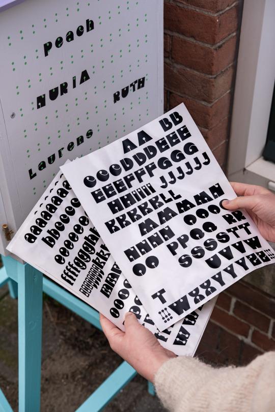
attracting attention to a street library
5 notes
·
View notes
Text
Technical/Drafting Pen Masterlist
This is more for myself than anything else but it's just a list of different brands and different kinds of pens they've made. I put a star next to the ones I’ve used before :] let me know if I missed any!
sorry my pen autism jumped out
Rotring (Germany):
- Rapidograph*
- Isograph*
- Micronorm*
- Variant*
- Varioscript
- Primus
- Rapidoliner
- Foliograph
- Tintenkuli
Staedtler (Germany):
-Mars 700*
-Marsmatic 700*
-Marsmatic 707/745/750/757 (there are a lot of number variants but I am unsure of what the differences between them are)
-Marsmatic 759 (Duraglide)
-Marsmagno
Koh-I-Noor (Czech Republic):
-Rapidograph *
-Acetograph
-Rapidometric
-Faber Castell TG (Germany)
-Reform Refograph (Germany)
-Centropen Centrograf 9070 (Czech Republic)
-Unitech Technical Pen (Germany)
-Keuffal & Esser (K&E) Leroy (United States)
-Herlitz Technoliner (Germany)
-Standardgraph Stano Pen (Germany)
-Skala Skalory Pens (Poland)
-Rystor Rapidograf (Poland)
-Kern Prontograph (Switzerland)
-Mecanorma Graphoplex MG1 (France)
-Markant Lin’s 9 Plus Pen (Germany)
-Erograph (Germany)
-Aristo Technical Pen (UK)
-Trident Desegraph (Brazil)
-Kokuyo Rota Graph (Made in Germany but sold in Japan)
-Cleo Skribent Technical Pen (Germany)
-Uchida Kent River Pen (Japan)
-Berol Turquoise (United States)
-Isomars (India)
-HERO (China)
Pens/Brands I have seen on Ebay but have barely seen anything about online anywhere else:
-Dator Duo-Graph
-Linegraph
-Copygraph (also called КОПИГРАФ but I couldn’t find anything when I looked it up) (USSR/Russia)
#axel.txt#pens#technical pen#rapidograph#isograph#drafting pen#sorry my pen autism came out#marsmatic#koh i noor#rotring#staedtler
19 notes
·
View notes
Text
0 notes
Video
youtube
Test 7 Çağdaş Yayıncılık Aykut ilter Tipografi I 7. ÇAĞDAŞ YAYINCILIK YazdırTüm Cevapları GizleMateryal Listesine Dön ________________________________________ Soru 1: II. Dünya Savaşı sonrasında Batı dünyasının önemli kültür ve sanat merkezi hangi metropol olmuştur? (Çoktan Seçmeli) Londra, Paris, ✔ New York, Roma, Berlin Cevap : New York, ________________________________________ Soru 2: Savaş döneminde askeri amaçlarla çeşitli karmaşık hesaplamaları yapabilmek için geliştirilen cihaz, aygıt veya donanım hangisidir? (Çoktan Seçmeli) Radyo, Televizyon, Teleks, ✔ Bilgisayar, Cep telefonu Cevap : Bilgisayar, ________________________________________ Soru 3: 1948’de bilgisayarların geliştirilmesini ve daha sonraki yıllarda bilgisayar çağının başlamasını sağlayan buluş hangisidir? (Çoktan Seçmeli) Radyatör, ✔ Transistör, Jeneratör, Formatör, Gladyatör Cevap : Transistör, ________________________________________ Soru 4: 1961’de kuru aktarım (dry transfer) yöntemiyle instant lettering (anında veya hazır yazı) ürünü ilk olarak hangi kuruluş tarafından piyasaya sunulmuştur? (Çoktan Seçmeli) Trinitron, Chartpak, DecaDry, MecaNorma, ✔ Letraset Cevap : Letraset ________________________________________ Soru 5: Adrian Frutiger tarafından ‘Univers’ yazı karakteri hangi yıl tasarlanmıştır? (Çoktan Seçmeli) ✔ 1957, 1958, 1959, 1960, 1961 Cevap : 1957, ________________________________________ Soru 6: 1960’ların sonunda görüntülük (ekran) gösterimi üzerindeki işlemlerde bir imleme – ya da belirtme – aracı olarak Douglas Englebert tarafından geliştirilen cihaz hangisidir? (Çoktan Seçmeli) Tablet, Computer, Printer, Plotter, ✔ Mouse Cevap : Mouse ________________________________________ Soru 7: Hangi dizgi teknolojisi “soğuk dizgi” olarak adlandırılır? (Çoktan Seçmeli) Linotype, Monotype, ✔ Typewriter, Intertype, Ludlow Cevap : Typewriter, ________________________________________ Soru 8: II. Dünya Savaşı ve sonrasında Amerikan grafik tasarımında iz bırakan ancak göçmen olmayan sanatçı/tasarımcı aşağıdakilerden hangisidir? (Çoktan Seçmeli) ✔ Joseph Binder, Herbert Bayer, Laszlo Moholy-Nagy, Herbert Matter, Ladislav Sutnar Cevap : Joseph Binder, ________________________________________ Soru 9: Aşağıdaki sanatçı/tasarımcılardan hangisi “İsviçre Okulu” tarzının temsilcisi değildir? (Çoktan Seçmeli) Josepf Müller-Brockmann, Max Huber, Anton Stankowski, ✔ Jean Carlu, Armin Hofmann Cevap : Jean Carlu, ________________________________________ Soru 10: ‘Palatino,’ ‘Melior’ ve ‘Optima’ gibi yaygın olarak kullan��lan en önemli yazı karakterlerini 1950’lerde tasarlayan ünlü kaligrafi ve tipografi sanatçısı kimdir? (Çoktan Seçmeli) Rudolf Koch, ✔ Hermann Zapf, Edward Johnston, Max Miedinger, Adrian Frutiger Cevap : Hermann Zapf, Tipografi,ÇAĞDAŞ YAYINCILIK,kültür ve sanat merkezi,New York,Transistör,dry transfer,kuru aktarım,instant lettering,anında veya hazır yazı,Letraset,Adrian Frutiger,Univers,yazı karakteri,görüntülük (ekran),imleme – ya da belirtme,mouse,“soğuk dizgi”,Joseph Binder,“İsviçre Okulu”,palatino,melior,optima,Hermann Zapf,grafik tasarım,tipografi dersi,test çözümü,soru cevap,öğrenci soruları,final,bütünleme,vize,ders notları,final soruları,vize soruları,test
0 notes
Text
#letraset #mecanorma #diy #punkzine


https://en.wikipedia.org/wiki/Letraset
32 notes
·
View notes
Photo

ILS ÉTAIENT DIX AND THEN THERE WERE NONE
Agatha Christie 1939. Traduction : Gérard de Chergé, Éditions Le Masque,1993.
Collection : Bibliothèque de Rue, Square Odette Séveur, Rennes, Fr. 2023.
Dry transfer Mecanorma PF 117.24 LN - PF 117.24 CN & Alfac 27 05C, typewriter, collage. Correction.
1 note
·
View note
Text
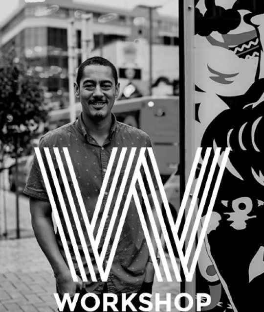
Joseph Churchward (foundry: Churchward Type) was born and raised in Samoa. He moved to New Zealand at age 13 and attended Wellington Technical College. There he concentrated on art and especially lettering. He then went on to work as a commercial artist at Charles Haines Advertising for 12 years before setting up Churchward International Typefaces in 1969. His first breakthrough was not long in coming. Berthold Fototype accepted several of his first typefaces for distribution and continued to add Churchward’s new designs to their catalogue for many years. He later went on to sign distribution agreements with D.Stempel AG, Dr Böger Photosatz GmbH/Linotype, Mecanorma-Polyvroom B.V and Zipatone. Churchward International Typefaces published a handful of original fonts in 1978 being the first and only company in New Zealand to publish original photo lettering. Now officially retired, he continues to create unique alphabets and has over 300 original faces to his name.
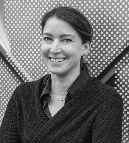
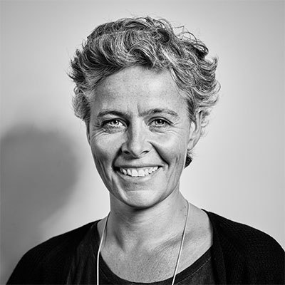
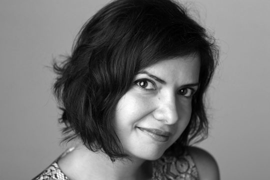
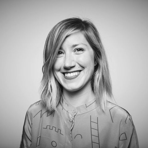
Verena Gerlach was born in Berlin and studied Visual Communication at Kunsthochschule Berlin Weißensee.
Shortly after finishing art school in 1998, she founded her own studio (fraugerlach) for graphic design, type design and typography. As well as all kinds of typographic print works and type design, Verena also art directed several video clips and worked on the typographic production for international contemporary artists.
Verena gives lectures and workshops about the type and graphic design all over the globe. She also works as a freelance book designer for different art book publishers.
1 note
·
View note
Photo

New Zelek Pro by Threedotstype:
Designed by Bronisław Zelek, the most popular Polish analog-era typeface is finally back and Pro, even though it never went out of fashion. Back in the days, New Zelek was commonly used in the only right advertising in communist Poland. Then it went international. You might have seen this typeface on some famous music album covers.
Bronisław Zelek, the legendary artist of the Polish School of Posters, is presently a painter – visit his website at bronislawzelek.com.
Originally conceived as a dry transfer for the French company Mecanorma in 1974, the font gets a digital adaptation consulted with the author after more than 40 years. Contains Latin and Cyrillic characters. An Arabic version will be released in the middle of 2018. The typeface has a large kerning table - more than 9000 pairs and many additional characters that were not present in the analog version. Connected and unconnected versions allow for creative solutions when using letters with diacritical marks.
11 notes
·
View notes
Photo
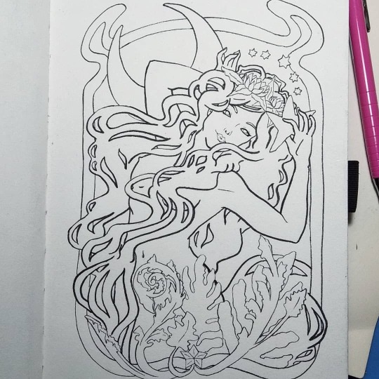
El último dibujo de 2019 y tocó estrenar cuaderno de bocetos de #Mecanorma y utilizar mis favoritos de siempre: mi portaminas #Orenz 0.5, mi goma #Hi-PolymerEraser y mi #Brush de @pentel_mexico El resultado de este día tan provechoso fue este pequeño dibujo estilo #ArtNoveau hecho pensando en mi amado :3 Espero que el año que viene pueda dibujar más y seguir practicando. (Por cierto, ya patrocíname por favor, Pentel) ;) . . . #Gacktzita #GacktzitasLife #PicOfTheDay #FotoDelDia #Drawing2019 #Dibujo2019 #Boceto #Sketch #DailyLife https://www.instagram.com/p/B6r6QpsDDQn/?igshid=5yj8hyf00d8g
#mecanorma#orenz#hi#brush#artnoveau#gacktzita#gacktzitaslife#picoftheday#fotodeldia#drawing2019#dibujo2019#boceto#sketch#dailylife
0 notes
Photo

Architecture, Mecanorma 6
94 notes
·
View notes
Photo


0 notes
Text
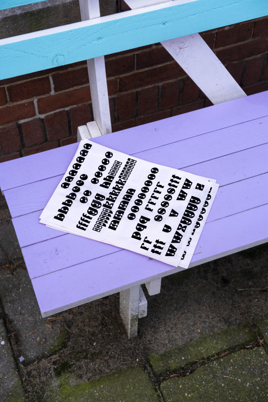
attracting attention to a sticker sheet
1 note
·
View note
Photo

::: From the archives :::
Sketchbook material from the 90s
#almanac of miscellany#Paul Richards#vscocam#vsco#sketchbook#1990s#masking tape#xerox#Mecanorma#Mecanorma catalogue
0 notes
Photo
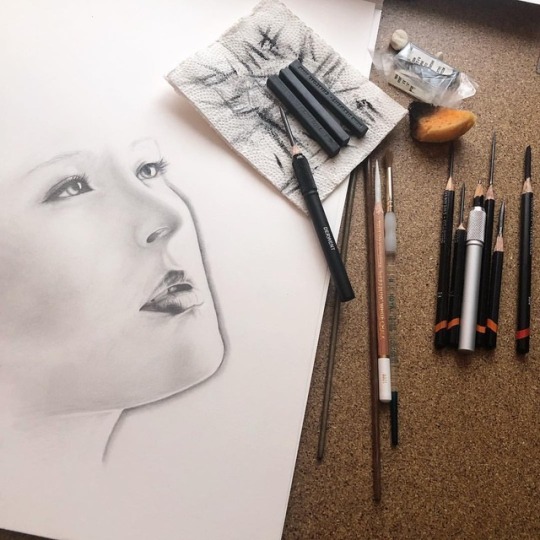
Los #ojos más #hermosos que he visto !!! #inspiration #mirada #cautivadora #carboncillo #charcolart #arte #amano #artist #artlife #art #art_realism_ #art_supernova #mecanorma #bhakta @duende_arts_help @arts_moonlight @derwentpencils @artsy.w0rld @pinceles_ahroyal @fabriano1264 @kohinoor_hardtmuth https://www.instagram.com/p/Bnq3qg8jxSk/?utm_source=ig_tumblr_share&igshid=5efwbq4gt6ba
#ojos#hermosos#inspiration#mirada#cautivadora#carboncillo#charcolart#arte#amano#artist#artlife#art#art_realism_#art_supernova#mecanorma#bhakta
0 notes
Photo

I have redrawn this rather fabulous 70's typeface, originally designed for #mecanorma by #hansdoner and #sylviatrenker
0 notes
Text
Photographs Used & Research
Joseph Churchward
Joseph established Churchward International Typefaces in 1969 and this was at one point New Zealand’s largest typesetting firm. With international clients such as Germany’s Berthold Fototype, Mecanorma-Polyvroom, and D.Stempel, Dr Böger Photosatz Linotype and Zipatone, Churchward Typefaces were soon in use around the globe.
Even in his late 70s Joseph continued to design typefaces by hand, and these are digitally distributed via MyFonts.com. In 2009 Joseph was the recipient of the Designers’ Institute of New Zealand John Britten Award for lifetime achievement and in 2010 he received the Queens Services medal.

Tobias Frere Jones
Mr. Frere-Jones received his B.F.A. from Rhode Island School of Design in 1992. In 2000 he began work with Jonathan Hoefler in New York. He has designed more than 500 typefaces for retail publication, custom clients, and experimental purposes. His clients include Martha Stewart Living, GQ, Wired, Nike, Hewlett-Packard, The New York Times, The Wall Street Journal, the Cooper-Hewitt National Design Museum, the Whitney Museum of American Art, Grand Central Terminal, the U.S. Census Bureau, Tibor Kalman, and Neville Brody. He has lectured throughout North America, Europe, and Australia, and his work has been featured in How, I.D., Page, Print, Communication Arts, Metropolis, Esquire, and Time. In 2006 he became the first American to receive the Gerrit Noordzij Award, presented by the Royal Academy of The Hague in honor of his special contributions to typography. He was appointed critic in graphic design in 1996.

Verena Gerlach
Verena Gerlach was born in Berlin West, and studied Visual Communication at Kunsthochschule Berlin Weissensee. Shortly after graduating in 1998, she founded her own studio (www.fraugerlach.de) for graphic design, type design and typography. Between 2000 and 2006, Verena also art-directed several video clips and worked on the typographic production for international, contemporary artists. Since 2006, she has been working as a freelance book designer for the Germany-based art book publisher Hatje Cantz. She started lecturing in type design, graphic design and typography in Berlin in 2003, and she now gives lectures and workshops all over the globe.

Nadine Chahine
Dr. Nadine Chahine is a renowned Lebanese type designer, presently working as the Arabic specialist at Linotype and Monotype Imaging in Germany. Motivated by her love for her native Beirut and a desire to improve typographic design, she was recently named as one of Fast Company Magazine’s ‘100 Most Creative People in Business’. Nadine studied graphic design at the American University of Beirut and has a Master’s Degree in typeface design from the University of Reading, UK. During her studies at Reading, she focused on the relationship between Arabic and Latin scripts and the possibilities of creating a harmonious relationship between the two.
Through her PhD research, Nadine focused on legibility studies for the Arabic script, with an eye to improving literacy in the Arab world. Her typeface Koufiya was the first to include matching Arabic and Latin parts. She has won numerous awards, including the Dean’s Award for Creative Achievement from the American University of Beirut in 2000, and the Award for Excellence in Type Design from the Type Directors Club of New York in 2008 and 2011. Other typefaces designed by Nadine include the best-selling Frutiger Arabic, Neue Helvetica Arabic, Univers Next Arabic, Palatino and Palatino Sans Arabic, Janna, Badiya and BigVesta Arabic.

Carol Twombly
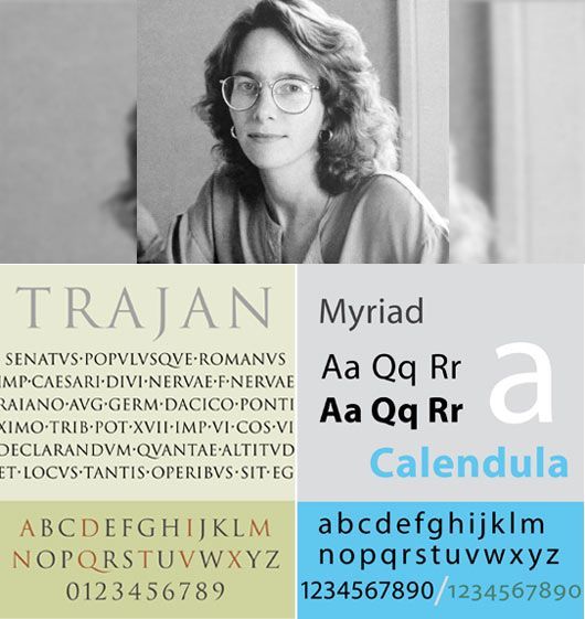
Carol Twombly is an American type designer, and calligrapher. She was born in Concord, Massachusetts, USA on June 13 in the year of 1959. In her earlier years, she went to the Rhode Island School of Design, originally for sculpture, but later graduated for graphic design. She also went to Stanford University, where she graduated with Masters of Science degrees in computer science and typographic design. About this decision Carol says, according to Adobe.com, “I discovered that communicating through graphics – by placing black shapes on a white page – offered a welcome balance between freedom and structure.” Though graphic design became her career focus, Carol hasn’t abandoned her other artistic pursuits, which include basket-weaving, drawing, painting, and jewelry making. In 1988, Twombly joined Adobe and designed Adobe’s first original display typefaces (Trajan, Charlemagne and Lithos), among several others. But in 1999, she retired and is currently an independent artist, specializing in drawing, painting on textiles, beading and basket-making.

Paula Scher
Paula Scher is a contemporary American artist and graphic designer best known for her posters, logo designs, and album covers. In her paintings, Scher portrays large-scale maps filled with intricate lettering that indicate political and societal connections between countries and regional borders. “The job of the designer is to make things understandable, usable, accessible, enjoyable, and important to a public, that involves the public,” she has explained. Born on October 6, 1948 in Washington, D.C., she went on to study at the Tyler School of Art in Philadelphia before moving to New York, where she worked as a layout artist for Random House. In the years that followed, Scher held positions at both Atlantic Records and CBS Records, during which time she received four Grammy nominations for her album designs. The artist later joined Pentagram, a design consulting firm in New York, where she continues to live and work. Today, Scher’s works are held in the collections of The Museum of Modern Art in New York, the Library of Congress in Washington, D.C., and the Philadelphia Museum of Art, among others.

Jessica Hische
Jessica Nicole Hische (born April 4, 1984) is an American lettering artist, illustrator, author, and type designer. She was one of the first of a new generation of letterers and the present-day flourishing of the lettering arts can in part be traced back to her emergence.
She published In Progress: See Inside a Lettering Artist's Sketchbook and Process, from Pencil to Vector in September 2015, which gives insight to her creative process and work she has completed as a hand-lettering artist. She has written and illustrated two New York Times best-selling children's books: Tomorrow I'll be Brave (2018) and Tomorrow I'll be Kind (2019). She has spoken at over 100 conferences worldwide.

Johnson Witehira
Dr. Johnson Witehira is recognized as an expert on Māori design. His practice focuses on how customary Māori knowledge and ways of thinking can be applied in contemporary settings. His writings on Māori design have been published in world-leading design journals and books including; Visible Language (University of Cincinnati), The Graphic Design Reader (Bloomsbury), Novum (Munich) and Monocle (London). As a practising designer Witehira has worked with Māori tribal groups, community organizations and Government agencies to instigate design solutions that effect positive change in people, practice and place. Within academia Witehira’s research focuses on decolonizing design education. He is at the forefront of developing bi-cultural and Māori responses to teaching design. As an artist Witehira’s practice combines three areas of interest; technology, identity and post-colonial theory. His digitally-focused artworks have been shown globally through a number of exhibitions, the most prominent being his Toi Māori x Times Square project which was displayed simultaneously on 36 screens in Times Square, New York. See some of Johnson's art and design projects at
www.johnsonwitehira.studio | www.idia.nz and www.waahiwairua.com

0 notes