#MFOMT
Explore tagged Tumblr posts
Text
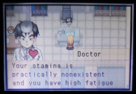
friends of mineral town intro (gba): you inherit the farm because you visited this sweet elderly man’s farm as a kid, had a nice vacation and met (future wife), when he died put you in his will
friends of mineral town for girls intro (gba): you are conned into buying a run down farm by asshole mayor. you immediately have the option to Murder Him
#girl version needs murder button that’s just how it works#wholly support this btw#bokumono#story of seasons#harvest moon#fomt#hm fomt#hm mfomt#mfomt#harvest moon friends of mineral town#god forbid women do anything
474 notes
·
View notes
Text
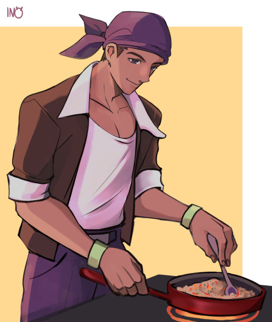
Another request! ^^ This time it's Kai, for the wonderful @0atchi this pineapple lovin' man could cook me dinner ANYDAY or night. Evenings work too. I just know his stir fry SLAPS
#harvest moon#story of seasons#fanart#more friends of mineral town#mfomt#kai#I'm sorry I'm snailin on these#I love doing them so much though#if only i could quit my day job
181 notes
·
View notes
Text

Happy Sweetest Day! Drew my OTP to celebrate 💖
Character Inktober 2024 Day 19: Cliff x Claire (Harvest Moon/Story of Seasons)
#harvest moon#story of seasons#cliff x claire#claire x cliff#sos cliff#sos claire#fomt#mfomt#mineral town#claire harvest moon#cliff harvest moon#hm cliff#hm claire#sosfomt#sos fomt#back to nature#hm btn#h#hm64#harvest moon 64#cain#kane#inktober#my art#otp <3#bokumono
51 notes
·
View notes
Text
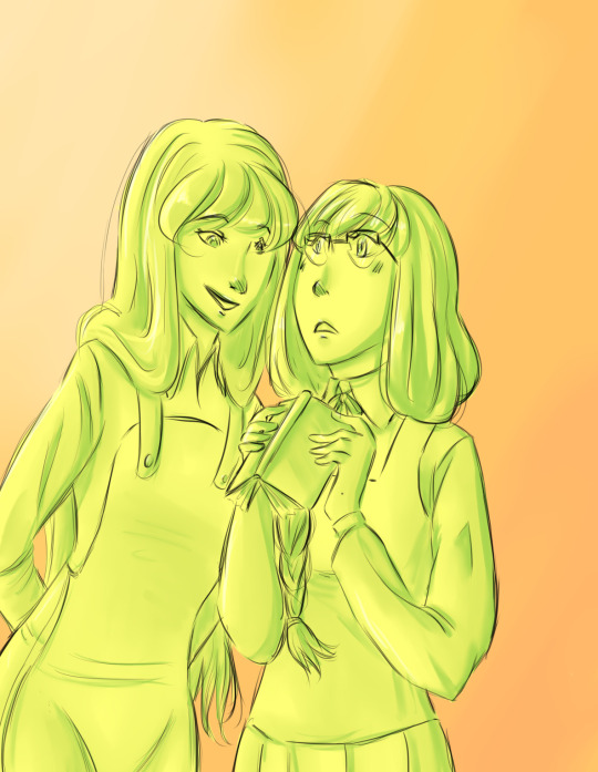

“What'cha reading there?”
2014 vs 2024
It was fun to draw Mary/Marie's old design again~
#harvest moon#story of seasons#claire#mary#marie#friends of mineral town#fomt#more friends of mineral town#mfomt
70 notes
·
View notes
Text
Hi @women-of-1000 I'm your gifter for the Summer @bokumonoexchange and I've got a little Claire/Kappa snack for you.
I couldn't resist exploring Claire/Kappa when I saw it was a favorite ship of yours. And I loved diving into the sensory experience of springtime.
I hope you like it!
#bokumono exchange#summer 2024 bokumono exchange#friends of mineral town#fomt#more friends of mineral town#mfomt#hm mfomt#harvest moon#story of seasons
19 notes
·
View notes
Text
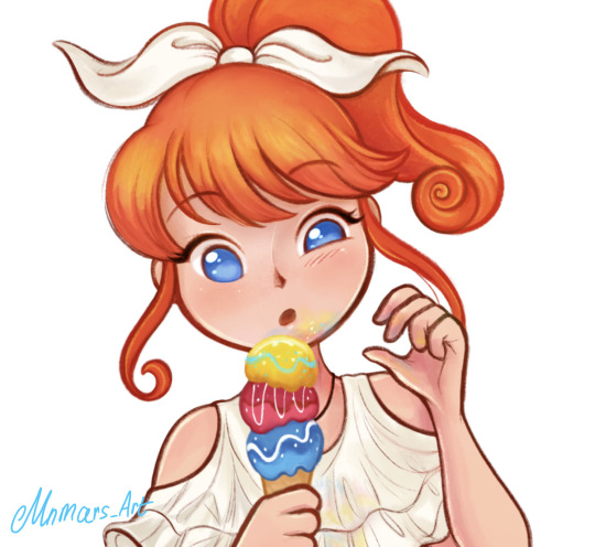

Ran I drew from months ago for a server event.
Also I changed my username here.
#sosfomt#friends of mineral town#Ran HM#Ann HM#Harvest Moon#Ranch Story#FOMT#HMFOMT#MFOMT#mnmars_art#mnmarsart
177 notes
·
View notes
Text


I love the dialog changes, she is adorable
35 notes
·
View notes
Text

[x]
@durotoswrites ahhhhhhhhhhhh LOOOK!!!!
#story of seasons#mfomt#more friends of mineral town#i can't believe they're making my girl!#i need many more
47 notes
·
View notes
Text
SoS: FoMT Priest Carter Redesign
DISCLAIMER: I am not saying I am “better” than professional character designers with my redesign. I am just trying to find a middle ground between what the fans want and what the designers want. This was made for fun for a game that came out 4-5 years ago. Additionally, I know that people are “passionate” about the character, so please do not make any inappropriate comments. It makes me uncomfortable. Without further ado, here is my character design analysis.
John 7:24 (KJV)
Judge not according to the appearance, but judge righteous judgement.
I joined the fandom of my old farming game love: Harvest Moon, or what is now called, Story of Seasons. After I had been informed about the Split, I went to Reddit and ended up reading about an old discussion surrounding the new character designs of Story of Seasons: Friends of Mineral Town. What ended up standing out most to me was that people did not like the redesign the designers made for the priest character, Carter.
Apparently, there was a considerable amount of people who used to think Carter was attractive and were pretty disappointed with the redesign. It is not a big deal, but then I went to TV Tropes and it had Carter under “Adaptational Ugliness”. It is one thing if a group of fans thought the design was ugly, it is another thing if it is so widely agreed upon they put it on TV Tropes, a website dedicated to listing tropes done by a certain media. Although, its accuracy is debatable.

Was the redesign actually bad? Carter’s redesign is pretty solid, and most fans agree. His old design had him in a Catholic priest outfit, which does not make sense in the lore. I like religious symbols as a religious person, but why does Carter look like a Catholic priest (and sometimes wears a cross) if he worships the Harvest Goddess? The old design seems to be the effects of Japanese media tending to use religious symbols with no further thought put into it.
Why was the redesign so different? The designers decided to rightfully change his design to better resemble the redesign of the Harvest Goddess, Gaia. In my opinion, they successfully achieved it as Carter shares a handful of design elements with Gaia.

However, they ended up changing his silhouette drastically. A character silhouette is the overall shape of the character design in solid color. This is a crucial part of designing as it shows the readability of a character. Carter’s new silhouette differs so much from his old silhouette. He no longer has his old bangs, nor does he have his shirt and pants, but now wears a robe and a hat with a whole new different hairstyle.
I personally believe that a redesign should resemble the original design as much as possible if the circumstances allow it. (This is why I have problems with Karen but I am not going into that.) In Carter’s case, they sacrificed his recognizability with world-building accuracy, and again, this I agree with. He looks essentially the same anyway, just that he has new clothes, longer hair, and has gotten thinner. This makes sense to me personally, because unless the residents of Mineral Town have been consistently providing for him, I doubt this canonically broke priest, whose one of his self-proclaimed “luxuries” is being able to freely eat the mushrooms that grow in the back of the Church, would be able to eat as much. He still has his signature facial expression, his closed-eyed smile. I adored that, as someone who likes character designs, Carter is still recognizable by his expression alone even if he had changed so drastically. However, I’d argue that the old design would still work if it was tweaked a little. I will go into that later.
On the Harvest Moon wiki, I learned of another priest character, Chester from Hero of Leaf Valley. I thought he looked like a combination of Carter’s old design with his new design. Then I learned about Nathan from Harvest Moon DS: Island of Happiness, Harvest Moon DS: Sunshine Islands, and Harvest Moon: The Tale of Two Towns. His design seems to be the basis of Carter’s redesign.
I think the original design of Carter was the basis of both of these priests’ character designs, then those designs were used for Carter’s redesign. Chester, who has a similar-sounding name and brown hair, looks like a fantastical Catholic priest. Nathan, on the other hand, has similar clothes as the original and even a similar pose. Carter’s redesign seems to be a combination of their designs but with a leaning of Nathan’s.
He accidentally became my favorite character then decided to try and redesign him.
First off, I do not think that Carter’s design is “ugly,” just the way he was drawn. All of the adult male characters, with the exception of Basil for some reason, were drawn cartoonishly compared to the bachelors. If Carter was drawn in a similar way as the bachelors, I think he looks pretty decent, as shown in an official comic panel. (I edited out the other characters.) Here is my redraw and edit:


I traced a bachelor’s head and used references of different bachelors to mimic the game’s art style and there is a clear difference. The bachelor’s proportions are much more realistic compared to the villagers’. Additionally, I made Carter’s hair push out more to look more natural. It seems he had absorbed Rick’s adorkableness.
I tried to mimic the game’s art style, and I learned that while the art was done digitally, it was colored/shaded as if it was done traditionally. I can see what looks like brush strokes. Combined with the art of Pioneers of Olive Town, it seems the Harvest Moon/Story of Seasons franchise creates digital art that looks like it was partially created by traditional mediums, and I love that direction.
Still have no idea why Basil was spared as I can not find any patterns, maybe the designers just like Basil more. Who knows.
For the redesign, as said before, I think his old design could still work if the appropriate changes and justifications had been made. I drew my redesigns in my own art style to make it easier for myself, and here is my 1st redesign:

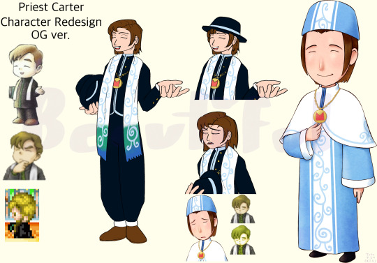
I leaned heavily on the Catholic priest influence but used the priests’ and the Harvest Goddess’ designs so it would still make sense within the lore. I tried to keep his old silhouette as much as possible and drew him in his old pose to add to his recognizability.
I gave Carter a hat that Catholic priests wear called a cappello romano because I had thought his sprite had him holding one. It was apparently a green book according to his character art, but it seems to be slightly inaccurate though, as his polo shirt was drawn as a green stripe down his shirt. He was consistently drawn holding a book either way.
For his hair, I just combined his old and new hairstyle which worked surprisingly well.
The dark shade of color for his clothes was color-picked from Chester’s clothes but changed to blue. It is not actually black, it was a deep shade of violet. True black can be found on Alice, another character in Hero of Leaf Valley. I gave him white cuffs on his sleeves and pants based on Nathan’s and Carter’s official design.
If Carter were to wear dark clothes he might stand out among the characters, but Harris wears predominantly dark clothes so I do not think it is a problem. Additionally, if Carter wears dark clothes that look almost nothing like what the Harvest Goddess wears, it would still make sense within the lore.
The games keep mentioning tidbits of information that Carter has no idea what he is doing, he himself admits that he is not a real priest. Carter wearing clothes that do not resemble the Harvest Goddess’ would make sense as he is not a real priest, further solidifying that fact.
He’d be more similar to Chester, who was described as being shady, than Nathan, who seems to be the only real legitimate priest of the three.
Speaking of color, my redesign was originally supposed to be green because I thought that he was lacking his Harvest Goddess’, Gaia, signature color. The aforementioned priests have their Harvest Goddess’ signature color, or so I thought.

I color-picked Chester’s stole and Marina’s, his Harvest Goddess’ name, hair. It turns out that Chester’s was a deep shade of purple while Marina’s was a light shade of pink. However, when color-picking Nathan’s scarf and the Harvest Goddess’ hair, it was a similar shade of green. If that is the case, why does Carter not don the signature color of his Harvest Goddess? He and Nathan worship the same Harvest Goddess, after all.
I later noticed that Carter has a saturated shade of blue on his amice, which is a similar shade to Gaia’s new design with her gradient hair. But that would mean if Nathan were ever to appear in a game entry that would mean he would forego the green in his design.
It is also possible that the design element, in truth, has no significant meaning, but I would like to treat it as if it has one for this instance.
As said before, I was planning to have Carter wear green but changed it to blue to further suit the character. I still, however, kept the green on his stole. His stole started on the bottom edges with a blue color that gradients into green, then white. In relation to Gaia, this was supposed to mimic her hair and to keep her signature colors. Additionally, I did this to keep his old design and when his would-be character portrait appears, the white of his stole can only be seen exactly like his old portrait.
I made it have an added meaning too, that while Carter is religious, he is not faithful. Chester may or may not have the signature color of Marina’s but there is no doubt that he devotes himself to her. The definition of “He a little confused, but he got the spirit”. Nathan has the signature color of Gaia and he has dedicated his life to her. But Carter has expressed trying to find a higher purpose in his life. Having the stole fade from blue to white was my way of representing that listlessness.
In addition to that, I had placed the vine-like markings on his stole and used that same color of blue, and included it on his shirt and hat. The medallion is supposedly the symbol of the Harvest Goddess as Nathan also has one so that design element is crucial.
Added some buttons on him, and I noticed that in his original design, his hair is the same color as his shoes so I incorporated that. That is all for now about my 1st Priest Carter Redesign.
Here is my 2nd Redesign:


I took some design elements from his official design but changed it to lean more on Chester than Nathan. If Carter’s official design leans more on Nathan, then this redesign leans more on Chester. Still kept him in his old pose but instead of holding his hat, he is holding his medallion similar to his official design.
I have a similar thought process with this redesign as before.
For this one, I used black with dark blues to still have him resemble Gaia. The dark blue came from Chester’s design as well, just changed to blue. In addition, the curled-up ends of the cincture or sash, which is fully green with a blue gradient this time, and the three scapulars are supposed to callback to Gaia’s curly hair and layered dress.
I still drew him in my redesigned hair style but it is possible the reason why the designers just chopped off his bangs was because it would be difficult to draw Carter with a hat. Not impossible, just difficult. He does look more like a stereotypical priest with his hair on the official design, and it was the designers’ goal to make him more comical.
Speaking of which, for good measure, I drew Carter’s expressions using my redesigned versions. I actually like how the redesign made him much more expressive through his posing. The most expressive sprite he had, the one on the bottom left, was cut in the switch to the GameBoy Advance. Yes, Carter may be a generally calm guy so his expressions would not be that extreme. However, the most expressive he has been is changing his expressions while looking straight ahead or his body turned slightly to the left.
For some touches, I made his medallion longer so the black color would not be as distracting. His scapulars and amice have the same vine-like designs from his official design. Lastly, his scapulars have similar patterns as his hat.
I honestly would love to have Carter as a bachelor, even with his design right now. If the developers were to remove someone like Bon Vivant for example; I do not really think people would complain. They were able to do it by promoting Gordy to bachelor status. Maybe in the Harvest Moon DS: Cute remake, we could marry his descendant or something like in the original. Crossing my fingers that he appears in a game and becomes a bachelor for some reason.
Anyway, I am excited for the next installment of Story of Seasons!
I hope my redesign did not come off as prideful, as I said before this was made for fun. I hope people will like my takes though, so I would love to hear some feedback. Thank you for reading!
#God#Christian#Christian artist#Christian creative#Christian art#beautiful#story of seasons#harvest moon#bokujou monogatari#Redesign#character study#character art#harvest moon friends of mineral town#story of seasons friends of mineral town#sos fomt#hm fomt#more friends of mineral town#friends of mineral town#Filipinoartist#artph#harvest moon carter#Illustration#Cozy game#mfomt#fan redesign#fan art#I want him to be a marriage candidate because I think its funny
4 notes
·
View notes
Text

when it gets warmer out i plan to take this out for a shoot!! a dear friend of mine made the corset for me and i couldnt be happier with it
#popuri#popuri harvest moon#harvest moon#story of seasons#friends of mineral town#more friends of mineral town#hm fomt#sos fomt#mfomt#cosplay
70 notes
·
View notes
Note
For the Harvest Moon ask game, ☀, 🌾, and 🎁!
☀️ - What was your first Harvest Moon game?
My first game was harvest moon DS cute! It's a lot like AWL but has characters from both AWL and mineral town (if you have both cartridges in your DS) I soon got more friends at mineral town after. I was a little kid when I started playing.
🌾 - Crops or livestock?
I like crops more because I love having the big fields and organizing them. I don't like the mini games for the livestock cause they get repetitive after a while. They need to make them fun or not include them. I do enjoy the petting games though.
🎁 - Favorite NPC?

I would have to say Carter because he's so funny and he tells all these long ass stories. He has depth like many of the mineral town characters and a difficult relationship with the religion. I don't like the redesign it makes him look like a goofy youth pastor rather than a man who struggles with his faith but cares for his community. He also has a secret mushroom forest behind the church. I also like that he helps out Cliff when he comes to town all alone.
My other favorite is Gotz! He also has a sad backstory that a lot of people miss out on. His wife and child died on Mother's hill (I think they were attacked by wolves) and he can be pretty grumpy and standoffish at first. But if you befriend him he gives you a recipe for pancakes!
I honestly love all the mineral town characters cause even the NPCs have really deep backstories and relationships with eachother. It's such a charming game and I'm so disappointed that marvelous remade it with barely any care that it deserves. They rushed it to cash in on the Stardew hype and it feels very unfinished. The modding community also was unable to access it which stifled it's success (Stardew's success can also be owed to it's huge modding community) and I think it's only recently that someone was able to get into the game files (there is ONE mod on Nexus right now).
Sorry for the rant I just freaking love that game. I'd play it whenever I got sick and on snow days when I didn't feel like playing outside.
3 notes
·
View notes
Text

Not sure how I feel about this, tbh lol
2 notes
·
View notes
Text

Happy Halloween!
#harvest moon#story of seasons#sosfomt#fomt#mfomt#my art#hm claire#durotos#koro#sos claire#halloween#happy halloween
43 notes
·
View notes
Text


I found some old doodles, so now you may contemplate on how cute this pairing is~
#story of seasons#harvest moon#fomt#mfomt#friends of mineral town#more friends of mineral town#elli#elly#cliff
31 notes
·
View notes
Text

CLAIRE CLAIRE CLAIRE CLAIRE
2 notes
·
View notes
