#Los Angeles architecture
Explore tagged Tumblr posts
Text

#art deco#1991#90s#90s aesthetic#film grain#architecture#architectural photography#Getty#Getty Photo Archive#archive theory#shadow archive#the shadow archive#museum without walls#the invisible college#analog photography#classic photograph#great photograph#classic photography#nature's pencil#dancing about architecture#art deco architecture#los angeles#los angeles architecture#los angeles psychogeography#los angeles history#i love l.a.
281 notes
·
View notes
Text

Jonas Wood (American b. 1977, lives and works in Los Angeles), Schindler Apts., 2013. Oil and acrylic on canvas, 132 x 112 in. | 335.3 x 284.5 cm.
#art#artwork#modern art#contemporary art#modern artwork#contemporary artwork#21st century art#21st century modern art#21st century contemporary art#American art#modern American art#contemporary American art#American artist#Californian artist#LA artist#Los Angeles artist#LA art#Los Angeles art#Jonas Wood#Los Angeles architecture#LA architecture#apartments#Schindler apartments#urban landscape#LA living#California Dreaming#Made in LA
14 notes
·
View notes
Text
Navigate through the city's architectural gems and discover what sets the best apart from the rest. From iconic landmarks to hidden gems, Los Angeles boasts a myriad of architectural wonders. This exploration unveils the structures that have earned a place as the best, showcasing design brilliance that captivates and inspires. For more info on Los Angeles architecture visit this website.
0 notes
Text
Bringing Dreams to Reality Through A Luxury Architect in Brentwood, CA
Brentwood, California, in the heart of Los Angeles' westside, is a community known for its lush landscapes, upscale living, and thriving cultural scene. It's no wonder that residents of this affluent neighborhood often aspire to transform their dream homes into architectural masterpieces. This is where the role of a luxury architect in Brentwood, CA, becomes paramount.

A Vision of Luxury
Luxury architects are, in many ways, dream weavers. They are the visionaries who translate a homeowner's aspirations into tangible designs. With its opulent homes and sprawling estates, Brentwood is a canvas for these architects to create living spaces that epitomize elegance, functionality, and individuality.
Customization at Its Finest
Luxury architects are renowned for their ability to provide bespoke designs. In Brentwood, homeowners often have specific desires and requirements for their homes. A luxury architect's role is to transform these unique ideas into blueprints that cater to every need. Whether it's a private art studio, a state-of-the-art wine cellar, or an open-air entertainment area, luxury architects ensure that no detail is overlooked.
Seamless Integration with the Environment
Brentwood boasts breathtaking natural beauty, and luxury architects in the area are adept at incorporating this beauty into their designs. They consider the surrounding environment and the land's topography to create homes seamlessly blend with nature. Large windows that frame scenic views, gardens that flow into the landscape, and outdoor living spaces that take full advantage of the California climate are all part of the package.
Incorporating Modern Technology
Luxury architects in Brentwood recognize the importance of integrating cutting-edge technology into their designs. Smart homes are a growing trend, and these architects are skilled in incorporating automation systems, energy-efficient solutions, and sustainable design principles. This enhances the convenience of daily living and aligns with the community's eco-conscious values.
The Collaborative Process
Luxury architects in Brentwood understand that the homeowner-architect relationship is a partnership. They work closely with their clients, collaborating on every design aspect. This ensures that the final product truly reflects the homeowner's dreams, values, and lifestyle.
Navigating Regulations and Permits
Like many exclusive neighborhoods, Brentwood has stringent building regulations and permit requirements. Luxury architects are well-versed in navigating these complexities. They liaise with local authorities, ensuring the design adheres to all zoning laws and construction regulations, allowing the homeowner's dream to become a reality without unnecessary delays.
Luxury architects in Brentwood, CA, play a pivotal role in shaping homeowners' dreams. They combine artistic creativity with technical expertise to craft homes that are not just structures but living, breathing works of art. From incorporating the natural environment to utilizing state-of-the-art technology, luxury architects bring dreams to reality, making Brentwood a place where luxury truly knows no bounds.
#Luxury architects in Brentwood#Brentwood#Brentwood California#California architect#los angeles architecture
0 notes
Text

The Los Angeles House: Decoration and Design in America's 20th-Century City, 1995
#vintage#vintage interior#1990s#90s#interior design#home decor#decorating#kitchen#dining room#Mediterranean#tile#beamed ceiling#fireplace#Los Angeles#California#Italian#style#home#architecture
3K notes
·
View notes
Text

La Brea Tar Pits at sunset, 1970.
(LAPL)
886 notes
·
View notes
Photo

Modern Powder Room - Bathroom Minimalist powder room photo
#organic#los angeles architecture#laguna beach architecture#warm modern#modern fixtures#modern plumbing
0 notes
Text

Cabana and Pool (1958) of the Brown Residence in Los Angeles, CA, USA, by Candreva & Jarrett. Photo by Julius Shulman.
462 notes
·
View notes
Text


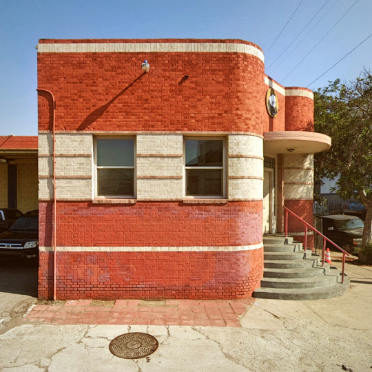
Los Angeles's Chili Bowl (circa 1935) was demolished in February 2022. Source
428 notes
·
View notes
Photo

Palette restaurant, Los Angeles, 1984.
#art#design#architecture#palette#restaurant#1980s#los angeles#LA#photography#u#exterior#interior#santa monica
362 notes
·
View notes
Text

Walls / Wilson Street, Los Angeles, California.
664 notes
·
View notes
Text

zenith tower. designed by maxwell starkman, opened 1972. los angeles. october 2024
© tag christof
330 notes
·
View notes
Text

Heading into
Downtown, LA, CA
#downtown#la#los angeles#socal#palm trees#skyscrapers#architecture#Contax TVS iii#point and shoot#kodak ultramax 400#street#city#film#analog#filmisnotdead#ishootfilm#35mm#photographers on tumblr#asgard
239 notes
·
View notes
Text
Exploring Los Angeles Architecture
Immerse yourself in the architectural tapestry of Los Angeles, where a blend of styles creates a visually stunning and culturally rich urban landscape. For more info on Los angeles architecture then visit this website.

1 note
·
View note
Text
Behind the Scenes at the River Lane Architecture Project
We love to share our design projects with you, and often you just see the finished product. This time we want to let you peek behind the curtain of one of our recent projects, the River Lane architecture project.
The homeowner, Ron, has been a dear friend for many years, so this project holds a special significance to us. Of course, you know that we lean heavily into indoor/outdoor design, and our architectural and interior design had amazing outdoor space to work with, designed by Scott Zucker of Zucker Design Associates. We all recently got together to discuss the project.

Outdoor Landscape Design
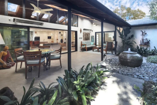
Actually, the beautiful landscape Scott had already installed was really the impetus for the entire design. We ended up opening up the whole house and added a brand-new sliding door system onto an existing loggia that the client used a lot. I know because I’d had many a beautiful dinner or lunch out there. And part of what we did was try to unite the two rooms more than they were before.
We asked Scott about his inspiration for the design and he said, “We wanted to do something that was more tropical in nature from what was here. Knowing Ron as well as I did and do, I knew that he wanted to kind of stand out in his neighborhood. To be something that was a little bit different than what everybody else did. So I started thinking outside the box a little bit about what we could do for the front And it turned out better than I actually anticipated.”
Ron added, “We wanted to do something that would highlight the art and the art would become the centerpiece and build around it. I wanted a woodsy feeling. where I was out in the woods and I didn’t want a lawn.”
You can see looking out from the loggia that the yard is full of mature trees and shrubs, very private. The courtyard has various plant beds, surrounded by concrete walkways around a center filled with round stones. In the center is a spherical stone fountain. The whole effect is peaceful, cool and woodsy. You get the feeling, even from the kitchen looking out into the loggia and courtyard, that you could indeed be in the middle of a forest.
The front yard also has a lot of mature trees and grassy areas. It’s just a beautiful design.
Scott added, “I don’t often get a chance to come back to client’s house, especially 20 years after it was installed and see how it’s grown in and changed so. And then we’ve worked together on additions and changes through the years it’s been a work of love.”
Kitchen
As mentioned we have been friends with Ron for many years, so I had the pleasure of being at the house many times and had many wonderful meals cooked by Ron. He is an amazing chef and I must admit when he asked me what I would do to remodel his house I had no idea. Because what happens is, like most architects we end up putting blinders on. We just can’t sit and notice everything. Once I did have a chance to do a deep dive and really land on a solid direction, I knew we had to create a kitchen Ron could work in.
Some of the biggest changes we made was of course opening it up. The previous kitchen did have an opening but it was much smaller. The beautiful stone, which is called Picasso, which I loved considering Ron’s art collection, is the fact that it helped us create a center that relates all the way to the new sliding door, the loggia, and the fountain beyond. And that became the basis for the organizational principles. I was curious about the real life feel so I asked Ron what is it like to cook there?
“This kitchen?” he asked. “Unbelievable. Everything rotates around a professional kitchen. I can stand here in this extremely large sink, which is 36 inches across! Big sink. It’s very deep and we have two dishwashers but I can turn and grab utensils easily, there is instant hot water if I need it to mix anything with some hot water. The kitchen has a lot of counter space that is easy to clean and which was important. There’s counter space everywhere. There’s a big gas stove and the oven is by Wolf and is very rapid-works perfectly.”
This level of appliance, a professional Wolf range, was new to Ron. His kitchen previously had appliances from the 80s, complete with a twist timer! In addition to the range, Ron went all out and chose a built-in refrigerator and freezer system and built-in coffee maker. We also extended the cabinetry right into the now open dining room. The old dining room was my least favorite room of the old house because I love light and airy spaces, and this room was dark and small with only room for 4 people. Considering Ron’s cooking we needed to fix all that so was so glad to hear the kitchen was working out for him. He added, “It’s fun-like working in a professional kitchen like I used to 50 years ago.”
It is a neat experience working with friends. Even after knowing him for decades, I learned that Ron actually went to culinary school for a year to study French cooking!
Primary Bedroom
Art is a big part of Ron’s life and he has a big art collection. When we started the process, we learned that he actually had 48 pieces of art hanging throughout the house. We had to think that out a bit and I asked Ron and Jason to select pieces for the bedroom that were meaningful to both of them.
They chose one that was done by Ron’s mother. He said, “This painting was done by my mother in 1987. It’s cubism and it’s the style of Picasso which my mother painted in. She was a highly prolific artist that sold hundreds of paintings. The colors in this painting are fantastic and all the different sizes and shapes of heads, and the symbolism throughout the painting is just fantastic to me. I see a lot of my childhood in it”
For such an important painting we recomposed the entire wall, and we used a lot of colors from the painting in the rest of the room. However, we let the green color that was one of Ron’s favorite things about the painting, stand alone. We just let it BE on itself.
My interior designer Liceth handles a lot of the materials and material selections for us and she had a big part in this project.
Liceth told us, “I knew I needed something warm. I was going to look not just at the art but also at the frame because we wanted the bedding and everything to highlight the art. We didn’t want to pull too much attention from it. We wanted the art to just shine and that’s why we picked all the colors that we did.”
In fact, I thought she nailed it from a textural standpoint which I love. There’s not a lot of color going on in the room, and you can see the direct relationship of the colors and the painting. I think the way she brought these different textures into play is amazing.
You might think that the uniqueness and thought that went into the River Lane architecture project was because we were doing it for our friend. But we treat every project as an opportunity to create an exceptional space and experience that is unique to the client and the site. If you are looking to remodel or build and you want something exceptional and “you” contact us for a consultation-we would love to talk to you.
Contact Dean Larkin for Exceptional Contemporary Design in California
Dean Larkin Design was established in Los Angeles in 1999 and this modern architecture firm maximizes the intrinsic potential of a location, including its available natural light sources. Dean Larkin is very familiar with both historical and contemporary design in the entire Los Angeles area, and the firm endeavors to achieve a complexity that is multi-layered with an effortless elegance. For a design that is modern and innovative, unlocks your location’s innate potential by making specific use of light, views and more, and uniquely designed for the way you live, contact Dean Larkin for a consultation.
Blog is originally published at: https://deanlarkindesign.com/behind-the-scenes-at-the-river-lane-architecture-project/
It is republished with the permission from the author.
0 notes
Text

The Los Angeles House: Decoration and Design in America's 20th-Century City, 1995
#vintage#vintage interior#1990s#90s#interior design#home decor#entrance#eclectic#quirky#artistic#obelisk#garden#pathway#landscape design#Los Angeles#California#pool#Moroccan#style#home#architecture
3K notes
·
View notes