#List Post
Explore tagged Tumblr posts
Text
After six (very slow!) years of writing, Hallo, Aro comprises eighteen short fiction and creative-non-fiction pieces about allosexual aro protagonists--all collected on my website, Patreon or Tumblr.
Stories include:
Unspoken
Leaving
Friendship
Lucky
Attraction
Existence
Neuronormative
Loveless
Monstrous
Pressure, Side One
Pressure, Side Two
Abrasive
Question
Antagonist
Witch
Hunter
Pillar
Tomorrow
Please expect fantasy and fairy tale motifs, trans and multisexual characters, a dash of autism, a great deal of amatonormativity, and a pervasive struggle for recognition by family, society and community.
#fiction#aro writing#alloaro writing#aromantic#alloaro#hallo aro#links#aro words wordpress#amatonormativity#fantasy#short fiction#original fiction and prose#contemporary#amatonormativity feels#alloaro feels#aromantic and trans#aromantic and autistic#list post#k a attempts self promotion#tagged so that folks can block these sorts of posts#as I'd like to get better about making them#aro worlds patreon
70 notes
·
View notes
Text
My Master Rankings Least Fave To Most Fave
[Of The masters I've seen enough material I think I got a good vibe for the character]
9) Roberts!Master
He just doesn't compel me on a fun level, on the idea he's complex nor does he feel menacing. His main story just doesn't give him enough to work with. The lack of getting to really act makes it so hard to feel for him. And I haven't listened to his EU stuff yet so I don't have good wider vibes yet. But I just don’t get a lot to vibe with. Also why the slug, just why slug?
8) Decayed!Master
Love the theory but kind of boring in practice. Just didn't get super fun vibes from him, maybe just too restricted by the virtue of how his whole story is done.
7) Child Master
Only there for a short amount of time but like damn do I love this sinister little kid. Terrifying in the best way. The right kind of creepy. Very top Master in the way he messes up his own timeline. Yes we don’t get much to read here but i just feel so much more for this character over Roberts and The Decayed.
6) Simm!Master
Okay don't hate me, but I just don't think he's that good okay? Like not John Simm he can fuck it up but like i don’t think it’s written that well. He just makes me uncomfortable in a way that's not that fun to watch. I love very specific scenes but not enough of the time. Like I love the way he plays off ten in very specific scenes but so often he's being just so ~wacky/crazy~ it's no longer any fun. Yes the master is strange and extra but they aren’t like this out of control!! And the drums make his villainy less interesting. I hate this. The rest of The Masters get to be evil without this strange head screwy reason done by the big old time lords. But whatever, okay. And also why does he eat people? Why did we do that? And why does he have laser beam hands? Like I prefer when The Master’s villainy is more in doing things, not just being weird. So many questions!
5) Jacobi!Master [including EU]
I love him for being legitimately scary. Like maybe I've seen Simm take over planets but this guy would kill me while staring into my eyes with a truly coldly terrifying expression and I'd say thank you. Love that for us. He throws people out of TARDISES!! I mean even in his moment in the show the way he kills Chantho? Love it. Peak actually threatening Master.
4) Ainley!Master
Part of my rating this guy higher is just how long this Master lasted. Like Ainley, my king being The Master for so many Doctors. Also though a very versatile Master. In more kinds of TV stories than many Masters. Got a Doctor kill in there too good for him. Good at being over the top, has a good enough report with The Doctor to make watching them face off enjoyable. And him getting this way by stealing a body is downright awful and shows a deep cruelty in The Master I do quite enjoy. The Rani making fun of him for being obsessed with The Doctor? Love it. Being punched by The Brig? Awesome. He’s delightfully evil if not scary in the slightest after the whole body snatching. Also he becomes a cat person? The image is quite funny.
3) Dhawan!Master
Handles over the top erratic behavior in a better way then Simm. Because he doesn't EAT people. The dancing and convoluted plans work well. I don't like that he wears a Nazi uniform that feels out of character for the Master, they are way too regimented and a banal kind of evil filled with human hate and bile and vileness when The Master tends to find more enjoyment in bombast and intrigue of larger than life villains. But overall Dhawan just puts in so much life into the character it makes him often the best thing in a scene. Making the monologuing and talking at the audience of TTC worth getting through if you're not super invested in the whole big meta lore. I also like that he is definitely trying to die a little in series 12 and destroy himself in the special, like falling apart? interesting. Wish there was more connective tissue explicitly done between Missy & Dhawan!Master. Like sure you can work it out. But I still think Missy would want to destroy parts of Galifrey explicitly for The Doctor, angry because the time lords hurt their best friend vs. Dhawan being mad The Doctor is a part of him ya know? The Master and The Doctor have considered themselves inextricable from each other forever.(I have a whole AU story here but i'll skip that)
2) Delgado!Master
The OG has to be this close to the top! I love this guy, everyone. The way he and UNIT are like enemies in the most gentlemanly way possible. You buy that Delgado and Three were friends and I love that about them. The start of the "only i can kill The Doctor" idea that carries for many of the Masters. He wants to take over earth, sure but he also wants to pick fights with The Doctor. No he swears it's necessary for the plan he has to call The Doctor first. Dumbassess. Love that about them so much. He's also the most distinguished silly man ever. He always made me want more. People say he is overused, But it made those seasons feel kind of like a sitcom with an annoying neighbor who uses mind control. Also has a catch phrase! The way the brig is just so done with his shit, and like honestly UNIT kind of stops viewing him as a real threat lol.
1) Missy
I love her because she just wants her friend back. I love that she loves The Doctor. Sure she's still chaotic and out there making all kinds of evil for most of her run and thinks humans are funny and small, but she doesn't want to be cruel and cowardly anymore by the end. She wants to learn kindness. I think that's freaking beautiful. She will never really undue what she has done to planets full of people, but she isn't asking for their forgiveness, she just wants to stand with The Doctor. And that's so heartbreaking. She was going home to her friend, the long way round. Honestly I wish this had been the end of The Master's timeline. Sure she died, and was killed by her past. But that's okay, can they really have a happy ending? But she dies bravely! Without hope, without witness, without reward, she was The Doctor's friend. She stood up to her past self and to stand with The Doctor and she fell.
#fandom:#dw#doctor who#Character:#The Master#missy#roberts!master#jacobi!master#delgado!master#dhawan!master#ainley!master#simm!master#Child master#decayed master#The Doctor#type:#txt#my post#topic:#meta#list post#ranking
12 notes
·
View notes
Text
What Are You Grateful For: A Staff Article
Here are some things we are grateful for at Real Women of Gaming

View On WordPress
#gratitude#gratitude post#list post#positive post#Real Women of Gaming#staff post#Thankful#thankful post
2 notes
·
View notes
Text
Ranking all the Driver logos of the 2023 F1 grid
My ranking of the logo designs of the grid, doing main drivers only. Ranked based on the graphic design quality. A good logo is simple and recognizable.
Not bringing any driver biases into this, if your logo sucks you're on the bottom.
Starting at number 20 and counting up to 1! Let's go!
20. Kevin Magnussen It's hard to find his official logo, but this seems to come up the most. While initials with driver number is a good idea, the font kills it. Having a brush-like font makes it too complex and messy. It doesn't look bad but it's not logo material

19. Esteban Ocon
I'll be honest I don't even know what's going on in the middle there. But this is more of a simplified signature, that isn't what you want in a logo. If the E and O were bolder with that swoop we might be on to something, but instead we have this mess.

18. Zhou Guanyu
This logo is at least clear, however it is still burdened by being a little too complex. Plus it reminds me of Monster Energy font which isn't helping. The split in the Z is lost when viewed at a distance. This could be good with a little more polishing but for now it's trying to do too much.
This is an example of having elements that don't add anything, this would be the same or even improved without the border lines.

17. Lewis Hamilton
Getting controversial here. While this is a nice logo, and there is thought put behind it. This could be anything. There is nothing specific to the driver here. It's too abstract. Now as a 7-time world champion he can make this logo synonymous with himself. But this logo feels impersonal. This could be a car or computer logo for all I can tell.
Additionally the excess of lines in the detailing makes it unnecessarily complex.

16. Fernando Alonso
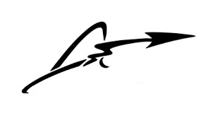
This logo suffers from a lot of the same problems as Esteban's. It's better because that bold arrow is distinctive and makes it stand out. But it's over doing it with the excess of squiggles. I think if it were just the A with the arrow making the line through this would be a top 10 design, but it tries to do too much.
15. Nico Hulkenberg
For some reason it's really hard to find what this man's logo even is. Some sources have it as just his name in block letters. Regardless just the driver number is lazy. It's fine, however it really has no thought put into it.
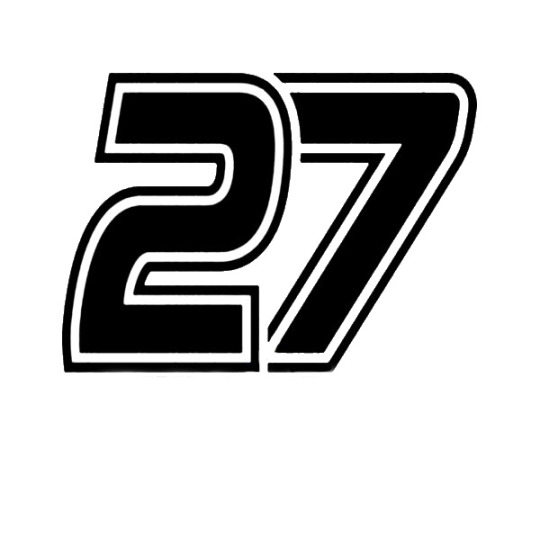
14. Carlos Sainz
Another number logo. This one beat out Hulkenberg just a bit because there is more stylization put into the numbers. The sleek design looks like a track. So for a number logo this one is the best, but it is still just a number logo.

13. Logan Sargeant
It was really hard to find a high quality image of this one. I don't dislike it. The logo is clean. I like the way the letters run into each other, but it feels a little lazy for an initials logo. The font is also something that I could probably find on any PC so it lacks that customization Furthermore it is without an element of personalization. This is basically doing the bare minimum for an initials logo.

12. Yuki Tsunoda
This one is similar to Dani's. It has bold blocking which makes for a good clean logo. It's inspired by a Japanese symbol for luck. Simple, clean lines, recognizable at a distance, this is a pretty good one.

11. Daniel Riccardo
Don't get me wrong I do like this one. It's unique and definitely stands out from the rest. However it suffers from a little too much abstraction. Yes if you look closely you can make out a D and an R, but it isn't clear. So good logo, but went a bit too far in some areas.
I feel like some people might disagree with me here, but just because it looks cool doesn't mean it's necessarily a good logo.

TOP 10!
Beyond here I think all of these are great logos, it's just a matter of nitpicking.
10. Valtteri Bottas
This one is just sleek. The single line ending in that nice curve is so good. The V blending into the lowercase B is so smooth. A lot going on in such a simple design. It's on the more abstract end for initials but it's not pushing it too far. The looping effect it has for directing the eye is really effective.

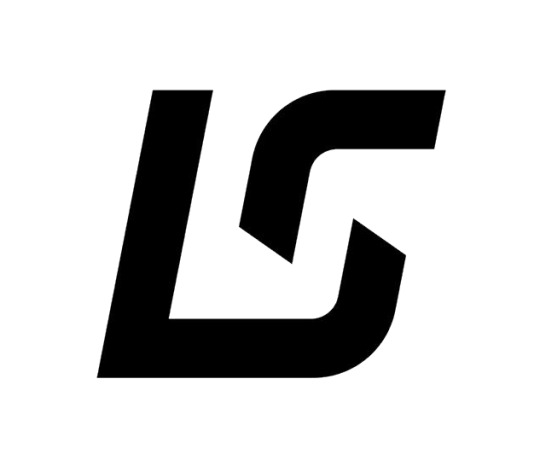
9. Lance Stroll
This is really good for a clean initial logo. Simple, bold with a little bit of stylization. It's doing a lot more than Logan's(same initials) The only thing that bothers me about it is the gap, I like it, but it seems a little off in my opinion. But over all this is a good example of a nice initial logo.
8. Oscar Piastri
Another one I had a really hard time getting a quality image for. This is another good example of an initials logo with a personal touch. Love the simple lettering and the dashes connecting the two letters. This has way more custom touches which is why it stands out compared to Logan's.

7. Alex Albon
Now this is just satisfying to look at. Double initials really work here. It's about what I'd expect from a double A situation, nothing super innovative, but they made something really nice with it. The use of blank space between the letters also creates a nice through line for the eye.

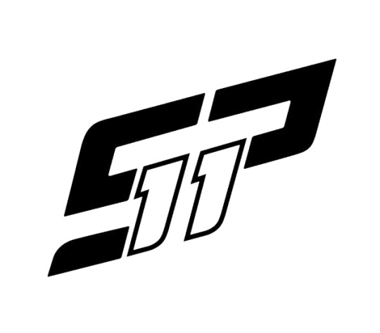
6. Sergio Perez
This one is a little complex but it makes up for that fact because it does something that a lot of logos struggle with. It incorporates the driver's number(there are better examples higher on the list).
I am happy that someone saw the potential to sneak the driver number into the initials, that's easy to do with number 11 and it's pretty effective here.
If the 1's weren't hollow this would be even higher, remove the serifs and fill in the 1s and this is top 2 easy, but for now it's number 6.
5. Max Verstappen
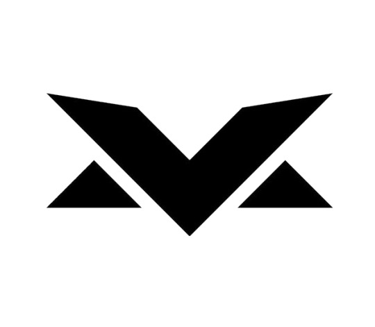
This is a really clever combo of Max's initials. M and V sharing similar design elements really lends itself nicely to this concept. The logo takes advantage of that perfectly creating something simple and recognizable.
The symmetry is also very satisfying in this one. It's a really good example of how lettering can be combined with geometric shapes to great results.
4. Pierre Gasly
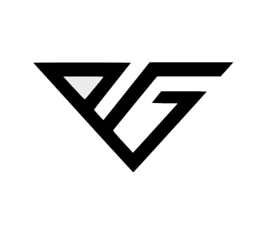
This is just a great design. The simple letters that are connected fitting within an invisible geometric shape, beautiful. This is just satisfying to look at. It's simple, has the letters that are obvious, has a high level of custom appearance and is a really sleek design.
This one is essentially tied with the number 3 spot. I had a hard time choosing because they are both such good designs. The reason this is in number 4 is only because it's a little less pleasing to the eye but that is subjective. So it's effectively a tie.
3. Charles Leclerc
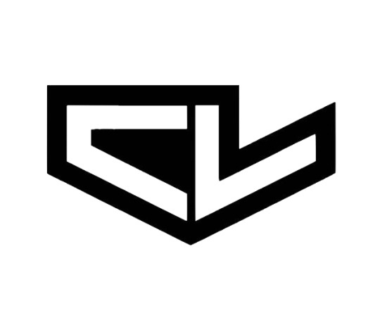
This is fantastic logo design. It's helped by the fact that the letters get to mirror each other in a really nice way. It does a similar thing to Pierre's having a simple geometric shape outline the whole thing.
The negative space mirroring the positive space is what set it a part just a little, that's a really sophisticated design choice and is visually satisfying. It helps create a nice flow that compliments the lettering.
It's sleek, bold, the letters are clear, this is what a logo should look like. The bold outline helps it stand out even more while not overly complicating the design.
2. Lando Norris
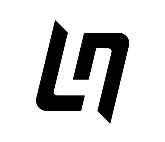
At first glance Lando's is very similar to Lance's, however it is so much better. It almost mirrors itself and has nice motion to it almost creating a swirl.
However the real genius of this design comes into play with the negative space between the initials. It creates the number 4! A super clever way to incorporate the driver's number into the initials as well. Making use of all the space in a logo while only using 2 lines, now that is just good design work right there.
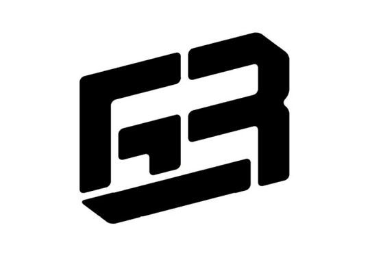
1. George Russell
There were a lot of close ones on this list, but George's is the clear winner. This is a logo where I see it and I'm just impressed. It's so simple but they somehow managed to combine his initials with his driver number. Brilliant! This is the kind of design that not anyone could come up with.
Sometimes you see just the number, sometimes it's the initials. Either way it works, they almost created an optical illusion in the best possible way. This is beyond clever and is such a good example of what good graphic design can do.
That's my list! Hopefully you had fun reading.
8 notes
·
View notes
Text
holy shxt, we have so many requests. yall are awesome. gonna make a list for our own sake. -❤️

DRAFTS (oldest to newest):
- level 2 high cleancore • halfway (re-doing)
- 2x level 3 mizurio & mori kei alters • halfway (stuck)
- 2x level 4 bowser archivist & bb protector • started
- level 4 queer Christian • barebones
- 2x level 4 prince and his knight • barebones
- level 2/3 “other” layla & awake layla sisasystem • barebones
- 3x level 3 tawog characters • barebones
- level unspecified sou hiori yttd • close to done
- level 3 orange soda • barebones
- scifi themed headspace • halfway
- dsmp headspace • started (stuck)

INBOX (oldest to newest):
- headspace for prince & knight pack, 2-3 locations w pastel theme • not started
- level 1.5 (include moodboard) hivemind • not started
- galaxy/ocean headspace • not started
- level 1 opal themed headmate • not started
- homestuck themed headspace • not started
- forest themed headspace • not started

6 notes
·
View notes
Text
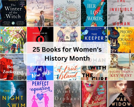
25 Books for Women's History Month
Hello readers! Happy International Women’s Day to all readers. As we celebrate International Women’s Day, I’m thrilled to recommend 25 Books for Women’s History Month. It’s been a while since my last women’s fiction recommendation post and I have come across some compelling and remarkable books featuring strong women, written by women authors that sure needs mention to mark the occassion. This…
View On WordPress
#25 Books for Women&039;s History Month#Book Blog#book blog feature#Book blogger#book recommendation#book recommendations#books by women writer#books for women#books for women by women#Books for Women&039;s History Month#Books Teacup and Reviews#Eclectic Book Blog#Indian Book Blogger#List post#recommendation post
2 notes
·
View notes
Text
List of things I learned writing chapter 20:
All my friends think I'm crazy
I have gained the ability to find any sentence in this chapter in under a second(new super power unlocked woooo)
The timeline can live in my head and everything is still fine(see Syl)
This was a reasonable thing to attempt
I might be getting a handle on this whole smut/omegaverse thing
Should be a fun update tomorrow XD
#Robert Jordan (may he rest in peace) and his 300 page last battle chapter would be so proud of me#I'd Lie posts#Luci rambles#list post
4 notes
·
View notes
Text
I got bored and typed Bjork's albums like they were PokeMon
• Debut - Normal • Post - Electric • Homogenic - Flying/Dragon • Selma Songs - Normal/Dark • Vespertine - Ice • Medulla - Dark/Water • Drawing Restraint 9 - Dark/Steel • Volta - Fire/Fighting • Biophilia - Rock/Electric • Vulnicura - Ghost/Poison • Utopia - Bug/Fairy • Fossora - Ground/Grass
anyway that's just my interpretation, critique or change around whatever you want
#bjork#pokemon#debut#post#homogenic#selma songs#vespertine#medulla#drawing restraint 9#volta#biophilia#vulnicura#utopia#fossora#pokemon types#list post
6 notes
·
View notes
Text
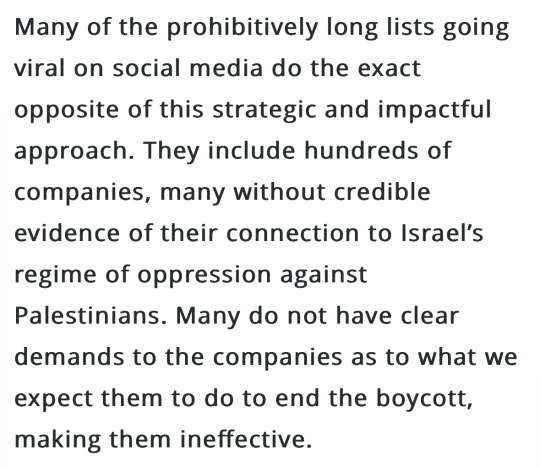
BDS added this section to their boycott page and I think people really need to read it:
[source]
please remember, pushing unorganized boycotts without carefully fact-checking every company in the list can be actively HARMFUL to the boycott movement.
#a reminder seeing that people were tagging that BDS post with companies that aren’t on the list#if you want to personally avoid a certain company the fine#but STOP promoting grassroots boycotts over the actual boycott list!!!!!
33K notes
·
View notes
Text
Character Index
This is an index for human and other non-monster characters. It will update as they are posted.
Swapped Pokemon (Pocket World)
Aki and Pikamon
Collin and Koffimon
Faye and Ekanmon
Hailey and Psymon
Hector and Onixmon
Kellen and Eeveemon
Swapped Digimon (World of Digimon)
Sammy and Agufry
Amber and Biyodee
Craig and Tentomushi
Keith and Gabello
Rachelle and Palmish
Trent and Gomafu
0 notes
Text
Floored by the fact that not feeling like shit really does boil down to just eating well and drinking lots of water and keeping screen time to a minimum and making lists and not obsessing over any one thing and reading books and like not putting things off and letting them fester forever. Self help books will never tell you this but sometimes it just is that simple
9K notes
·
View notes
Text
I thought Trans Day of Visibility a good time to mention that I have a post collecting my stories with trans aro protagonists. I often feel disconnected from the aro community in that the (albeit very limited!) representation we celebrate and bond over largely depicts cis aros. Characters who seldom encompass, because they are cis, much of how I experience being aromantic.
In order to be seen as aro, I must push my transness into the shadows. The reverse is true in trans-centred fiction, where acceptance--by ourselves and/or others--is often demonstrated via a character's experiences of romantic relationships and love. Time and time again, I must choose which part of me to celebrate and which part to ignore: I can only be transgender or aromantic in the stories about which my communities express delight.
So this is a list of aro stories about gender and trans stories about aromanticism, because we deserve recognition as trans and aro.
#trans day of visibility#tdov#aromantic#transgender#representation#aromantic and transgender#link#aro worlds wordpress#fiction#short fiction#aro writing#aro and trans feels#aromantic and trans#undescribed#text in image#list post#representation feels#aro community#most stories are about trans alloaros#alloaro writing#aspec#fantasy#fairy tales#alloaro and transgender#aro community feels#aro feels#aromantic feels#ciscentrism
70 notes
·
View notes
Text
I'll block a bitch on letterboxd I'll block a bitch on airbuds widget I'll block a bitch on goodreads I'll block a bitch on microsoft teams
7K notes
·
View notes
Text
Wow, this "gender free" fashion brand sure doesn't have any AMAB models.
#If you can't put someone with a beard in one of your skirts you have failed as a queer brand#My punishment for dkbefafely clicking on an ad#OK I did find exactly one in the infographic about their big and tall coveralls#But they weren't in the actual product listings for the products.#Fashion#Queer fashion#Nonbinary#Women and femmes#Genderqueer#And I do mean AMAB. I didn't see any trans women either#post o' mine
36K notes
·
View notes