#LOOK I MATCH MY HEADER
Explore tagged Tumblr posts
Text


💜🪦 tomb sweet tomb 🪦💜
#was so so so so happy to be home#forever foolishly mortal#I miss her so much already 🥲#LOOK I MATCH MY HEADER#the haunted mansion#haunted mansion#Disneyland#me#selfie
33 notes
·
View notes
Text
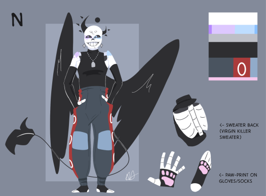
Okay, this was long overdue tbh 😔🙏(N Lore (?) Under the cut!)
I've been meaning to make N a new ref for a bit, so here we are! Since she's my skele-sona I kinda want to do a quick rundown on her design elements for fun, then her in-universe lore!
(Note: I refer to her a lot with she/her, she is technically a she/they/he/it genderfluid kinda girly, but I made her before gender tomfoolery registered in my brain so I default to 'she/her' out of habit-)
Design:
Her Halo/Crescent/Horns were initially inspired by wanting her to have metaphorical horns instead of slapping points onto her skull. She's also a shape-shifter, so her human form uses the crescent like a hair clip! Also based on the moon a bit.
The wings/tail are things I ended up w/ in the long run. The wings used to be optional + usually based on specific birds, and the tail was thicker w/ an end piece that looked like a fountain pen tip, but the long windy one abd the black wings were more fun to draw/animate!
Virgin Killer sweater used to be a Grey sleeveless turtleneck, but I just like the aesthetics here better.
Arm Gloves/Leg Socks are half because I hate drawing arm bones, abd half because I thought it brought more dynamic shapes into the design! Also... kibty... (inspired by gloves/socks I own)
Pants: She's always worn snow-pants in her design, and they used to have hanging suspenders, but I removed them. Why they're amarica colored I couldn't tell you... I just like the color combo 😔
Cracks on her face: The forehead crack is inspired by when I tripped and smacked my forehead onto a stair corner as a kid (blacked out, don't remember the hospital trip that followed?). Chin crack inspo is a random scar I have on my chin!
Color on Bones: I actually just added this, but my skin gets blotchy when I'm nervous or embarrassed, and I like the visual that N's magic does that to her Often lol. So! It's like blush! (It's also on her collarbone but you can't normally see it, haha-)
Blue + Purple: I actually don't have symbolism here. Just that I had another oc (B) who was my *other* skelesona insert oc, and *her* colors were blue and purple. N used to have white eyelights I think? Silver? But N and B traded off some traits in a point where I tried to combine them, and the result was this current version of N! Actually...
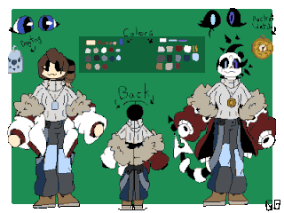
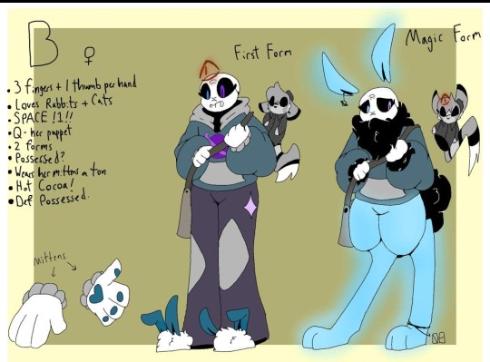
Old Art jumpscare...
So, I stole the pattern from her jacket and put it kn her pants, stole the crack in B's forehead and gave it to N, her Halo kept tilting further left, and I revoked shoe privileges?? Idk man, it's been a wild ride.
Oh! Her hands *do* still have holes in them too.
Lore:
N is less like Me and more like a bossy little minion I custom-made to go harass my ocs. She exists anywhere, anytime, and is only restricted my universal laws if it makes a situation more interesting. Very much a mary-sue. Meant to play almost a 'narrator' role!
She has beef specifically with Ichor (because I put hin thru so so much in the early days-) and is very chill with Phishbone and Pretender. She loves to chill in different aus with different people, but she adores just being obnoxious to my ocs specifically. Objectively, *not* a good person 🙏
And yeah. She looks different in has new clothes everytimr I draw her, but this is a good basic design base!
#utmv#utmv oc#oc#my art#spot!drawn#N#skelesona#ref#N is awful#also this is canon -> hella flat-chested#fairly broad ribcage that sometimes looks like a chest from the front but there's nothing but bone---#please ignore if I do ever draw her w/ that stupid bump from a side view lmao#no magic cleavage here 🙏#I also revoked her eyelash privileges#idk when they disappeared but I'm glad they did hehe-#that yraditional piece I did made me want to do a quick ref for her. only like 45 minutes total!#OH#and everuone ignore my horrid handwriting on B's ref. she uhh. she's beloved#but also very much been placed into my pile of retired ocs unless I get inspired <3#okay that's all!#(ignore that N doesn't match my profile header-)
27 notes
·
View notes
Text


#i drew the thing on top bc#i wanted it to match that pic#as i changed icons on discord but lmao#i can’t use my own pics for headers if i don’t pay#so#🫡#maybe i should be thankful that looks like#post#cameron monaghan
10 notes
·
View notes
Text
I am loving my Luz pfp !!!!!! I love her !!!!!!!!!!! she is in my pocket !!!!!!
#owl house mutual pfp mutuals I think there’s like 3 of u we are matching now and there’s nothing u can do about it hehehehehe#also my header. everyone go look at it#the owl house
9 notes
·
View notes
Photo


ART TELEPHONE!! WAHOO!!! idea based on this post :D. basically it starts with a human and the next person draws that human’s fursona, and then the next artist humanizes the fursona w/o seein the first one, etc etc
I ran onea these a few years ago and it was fun so thought id do another <3 almost a completely new cast of artists too lmao
speaking of! artists in this include: 1.) me <3
2.) @emeraldfox11
3.) @echnobii
4.) @officialgleamstar
5.) @aroaceacacia
6.) @mochimemes
7.) @ghostpajamas
8.) @noodlepuppie
9.) @kishdoodles
Thank yall for takin the time ta participate in this lil thing of mine :D!! twas fun <333
#my art#original#ocs#art telephone#art collab#sorry for starting w/ a cringe fail white girl she got cooler like Immediately#the absolute pain of bein the person ta start it is i kept wantin ta change little things bout the starting design cause im not the happiest#w/ it but i CANT cause thatd be ILLEGAL#truly fucked up#anyway i actually used photopea this time insteada the weird combo of like. gimp and sai like i did last time ajwerkj#i actually used befunky for the text like i do for my cover art cause the way text works in photopea pisses me off <3#completely unintentionally the backround colour of the header and the colour of the text match the clothes and hair respectively on both one#no one but me cares but the font for the urls is Indie Flower <3#i love watchin like. specific peices of the design as u look through the art#like the socks go on a Journey#ive got an idea for Another art telephone game so if u were an artist in this. watch out.#sorry for dropping this mid m cc i have cyans pov in a popup as ive been edittin this LMAO#for future ref its on sot atm <3
118 notes
·
View notes
Text


reaction memes for you before bed
#i neeeeeed a silly icon and header but im too attached to cute joel and ellie#i love how they match the game in my header#and if i get a silly icon i'll need a silly header#and its all too much work#but in looking for a silly version of my layout i made you some content
42 notes
·
View notes
Text
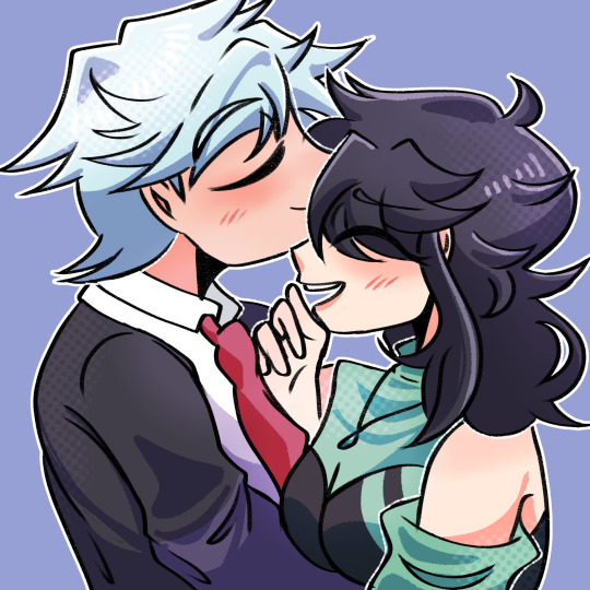

more nicey bday art from my friends (xelle + @ lovinglin) 🥺 (i helped color the first one and i like coloring anyway :]) i feel immense comfort looking at these and i will cherish them forever 💚
#im not too sure if i should tag xelle's blog since its quite inactive but hey! worth mentioning her at least ^^#will probably use them as pfp/headers/banners soon nyeheheh#there's a nice feeling in my heart when i look at redjaide and stevaide's accessories#they're all matching and with deeper meaning to them. makes me warm and whole. also steven's eyes#💚 for me#lara tag#xelle tag#💚 memoryshipping#💚 appleshipping#jaide (mangaverse).insert#jaide (gameverse).insert
12 notes
·
View notes
Text
Thinking of changing my profile pic to a really good pic of Ambrose Kenny-Smith, but would anyone recognize me? Do I care??
Also my blog’s color scheme would have to change. Lots to consider. (Picture under the cut because why not)

It’s just such a perfect picture of him
#August talks#honestly what makes me the most hesitant is having to change my blogs colors#And header to better match#but idk what I would change my header to and I still really like it and the colors#I could also just change my profile pic and not change anything else#but then it wouldn’t look as nice!#lots to consider haha
4 notes
·
View notes
Text
#i recently realised that me header for my sideblog which is transparent to match the background color#just looks white in the desktop version#and i wanted to know if i should fix it or not bother with it if everyone ust used the mobile version anyways#poll#text#tumblr#idk what the 3rd option could be but i wanted to keep the options open
5 notes
·
View notes
Text
Now with THAT outta the way tho I'm gunna rework my pinned post and maaaaybe get a new banner and header???? maybe. idk we'll see
#xero says things#i know i have some silly images i could make my pfp#but also the purpley solar flare is everything 2 me..... and matches my theme#i Could just change the header a bit and maybe shift some colors n stuff????#idk im just getting that 'make ur space look new' feeling but i dont wanna change TOO much#if i do change my pfp i'll probs give it the same color scheme to avoid confusion. yk?#heavy 'if' tho
2 notes
·
View notes
Text
hey besties!! i've finally caved and starting today (saturday, 15. july) i'll slowly but surely (more surely than slowly) post things from other media as well 💔
everything will be tagged w the media name + the #not sh (that geniuely nobody has blacklisted but it's for me), if there are any triggers etc pls let me know so i can tag accordingly!!
this also means that my sideblog @deemacs will no longer be active bc anything that would've gone on here will now be on main
also this itty bitty change will be accompanied by tiny little changes in my (v faithful) icon and header (these aren't actually related, it's just good timing honestly)
thank u for reading and happy tumbling!!! 🩷🩷🩷
#txt#saskia talks#not sh#i'm mainly changing my icon bc i got a new laptop a whole back and i'm so so bothered by how the skin colour looks on there#and i'm bothered by how the legs disappear in the purple in the header#and how the colours of the icon and header don't match#so it's mainly those things changed i'm taking the opportunity#bc i kind of identify w those things on here so they're staying akdjsksj#the multifandom change is bc i'm more on here again and idk now i kinda want to enjoy it fully on the blog i love the most??#and not just sideline that enjoyment if that makes sense#like the shadowhunters content will he tagged the same it's still the main thing#but i want to have the full fun with the rest as well#and idk i'm just not feeling the side blog life for other fandoms anymore#i first wanted to do this on august 6 bc that would have been my 11 year anniversary on this webiste#but i don't want to wait also it's ridiculous bc it's not actually a big event or anything lmao#but yeah!! now the second week of may isn't as special anymore (kidding it still is the most special week of all)#+ explanation for the change: i just feel like this blog has become more personal to me again (?) (due to being more on here probably)#and it just feels right to make it more personal with current interest as well#shadowhunters is so deep in my heart tho i'm not getting rid of that#but i want to share other things as well idk i'm probably repeating myself nvm good night#not good night i drafted this at like midnight few days back but meant to post it much earlier today but uh here we are!!#new icon and header drop in like an hour ig i gotta go cook & eat and watch wwdits
11 notes
·
View notes
Text
cant pick an icon somebody kill me
#like okay it’s been a while so do i switch to leo now#or do i keep ney cause i kinda post ab leo a bit more#or do i make it both#or a complete curveball and make it pedri#but that wouldn’t match w the theme bc my header would look so cute w an icon paired w it#aghhhhhh#decisions decisions
4 notes
·
View notes
Text
I WANT TO DO A GHIBLI THEME SO BAD!!!!! I WANT IT I WANT IT!!!


#imagine just how soft#how cute#my blog would look with a ghibli theme#with matching headers!!!!!!!!!!!!#so much color and stillshots of the movies#🤭🤭#I’m gonna do this#idc if my blog is new#or if my hwr future posts won’t match#i want it!!!#.makispeaks
9 notes
·
View notes
Text
new layout raghhh
#it was. surprisingly hard to find a matching header for this pfp???#i love shenhe <3#i changed my discord pfp to match with my friend so i didn't have shenhe as my pfp anywhere and it made me Sad#how do we feel about the shiny rocks#i cant figure out how to make them less zoomed in :(#they look normal is the editing screen or whatever
2 notes
·
View notes
Text
im buying a weiss figure specifically so that i can buy an as-close-to-matching batman figure as possible for my true endgame ship to end all ships: icebat
#shitpost#them: whats your otp#me: weiss schnee from rwby and bruce wayne#anyways the ice queendom goodsmile figure is such a prime look 100% using that for my dc-universe vigilante version of weiss#anyawys. i have two figures of weiss already so this will be 3#im excited tho b/c i can sooo match this one with a batman#sadly cant match a rwby batman with her so i need a different than usual angle to get a good match going on#even tho i LOVE LOEV LOVE LOVE LOVE rwby universe bruce wayne#points to my mobile header which is the two of them#there IS a crossover comic and i LOVE it. bat fawnus bruce is literally everything okay
6 notes
·
View notes
Text
((Things I said in the replies that I want to add as a caveat while reblogging this:
Your interaction in the new layout is almost definitely still being logged (as opposed to being considered the old dash) for analytics purposes (the A/B testing they’re doing to see how people interact with Tumblr differently with the new layout), so if you care about what they’re seeing in the analytics, note that they’ll probably still see it because there’s basically no way either XKit or a CSS style could do anything to touch that kind of logging. (EDIT: XKit probably CAN send information that causes an A/B test to disable (because apparently JS is capable of doing that under certain circumstances), but its settings probably DON'T here. CSS, on the other hand, is basically completely incapable of doing something like that though.)
The number of people in the reblogs and replies calling this a script are making me want to pull my hair out. It’s a user style, which uses CSS and is basically the web equivalent of rearranging furniture (special code that’s active all the time but doesn’t really “run”), rather than Javascript (what userscripts use, special code that usually only runs on page load (unless you do some funky stuff), the web equivalent of... IDK, running a Roomba?). It’s a semi-important distinction: Stylus cannot run JS user scripts (only user styles), and most user script extensions (TamperMonkey, ViolentMonkey, etc.) cannot natively run a CSS user style (AFAIK) without it being converted to a script that does nothing but implement the CSS code slightly differently.
The More You Know, and all that nonsense.))
i got the old tumblr dashboard back T_T
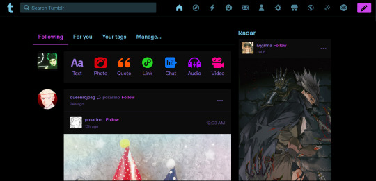
i got the old tumblr dashboard back T_T i used the xkit rewriten options in this post and installed the firefox application called stylus and installed this script through it for the old tumblr layout <3
(psst reblog and spread this so it can get to who needs it )
update :hi besties both xkit rewritten and stylus are available for chrome too!
#props to the person who coded the style though#i attempted writing CSS myself (with no special XKit handling) and I only got it partway adjusted#it looked ugly and had severe bugs i hadn't figured out how to fix yet#and just a few hours later one or more css classes had changed just enough that THE ENTIRE STYLE BROKE#so i gave up T_T#my version would have been the UserCSS protocol and provided options to hide the buttons that got pulled from the user menu into the header#(the domain and ad free options)#it also reordered the items visually to match the old order#looking at the current version of the style some of the code seems really similar to mine#makes me wanna take another crack at figuring out what screwed up (also because i like my reordering solution slightly more but#that one is just preference on my part so if i can get it working then...)
16K notes
·
View notes