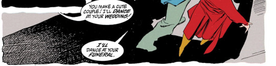
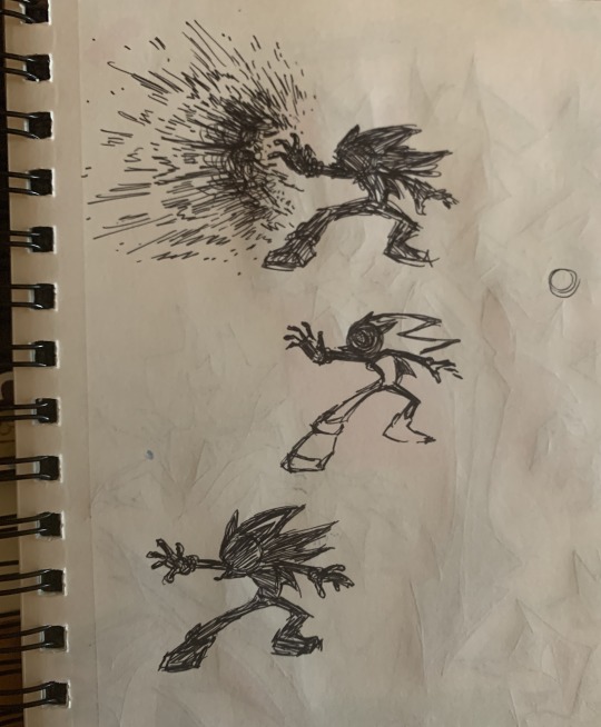
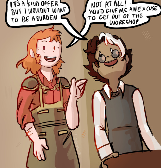
#It's no a comic but like 2 panels so technically?
Photo

Brothers who love each other very much :)
#Kick Buttowski#brad buttowski#my art#Kick Buttowski suburban dardevil#kb brainrot strikes once again#It's no a comic but like 2 panels so technically?#comic
166 notes
·
View notes
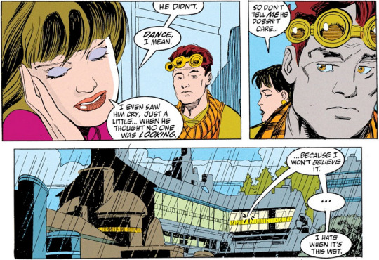
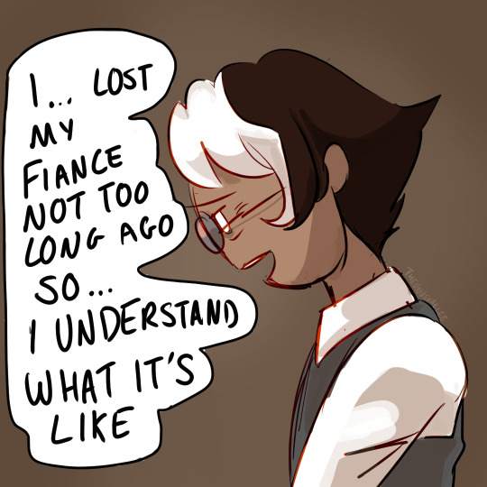
Text


#Mass Effect#Garrus Vakarian#Hello I just finished the first game again#The Legendary Edition cleaned it up SO WELL#IT'S LIKE A REAL VIDEO GAME NOW#This is unrelated to the picture but I'm having emotions about this comic#but I don't want to post the final 2 pages just yet#I'll save that when I actually get to the scene in the 2nd game#Castis Vakarian#He's not on panel but he's technically there#inside your mind~
240 notes
·
View notes
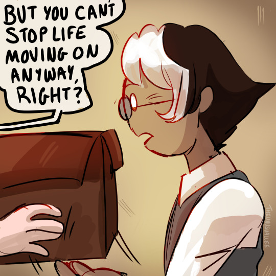
Text
Read L -> R
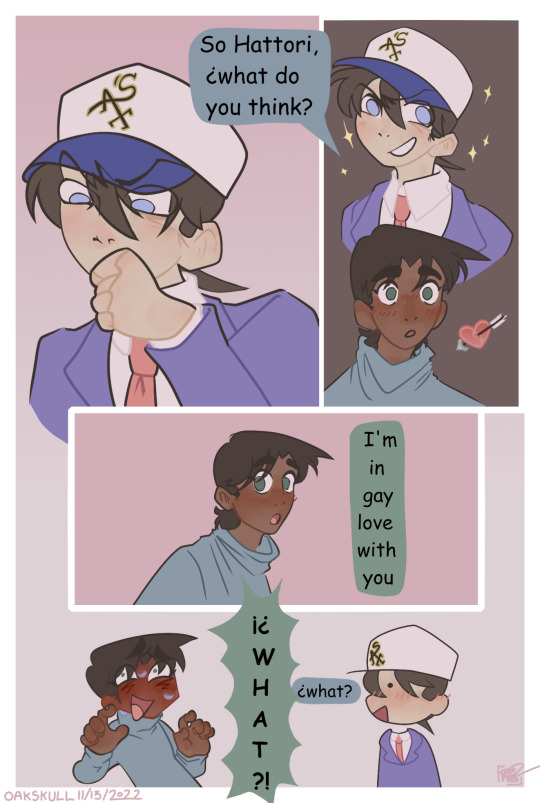
#hattori heiji#heishin#kudo shinichi#oakskull art#dcmk#detco#its gay people baby#the colors are kind of drastically different on my phone vs on my tablet so im not sure how it will appear for the masses#i really hope this is readable bc the original sketch was horizontal and i think you can tell#this comic went through development hell for like 2 months#but its done now and im posting this because there is no one else posting heishin on tumblr and i have to provide for the people#anyway i will probably hopefully maybe be drawing more now that i dont have this wip taunting me#not today though i have to go to my adult job where i make adult money 👍#also if u see any mistakes no u dont ❤️#constructive critism is fine but i might just not respond lol#also heiji speaking vertically and shinichi speaking horizontally was mostly accidental but the shapes just fit better#fit better w/ my vision#technically the middle panel could have had more horizontal text instead of one word per line but then it would be inconsistent
500 notes
·
View notes
Text
can i ask.how u guys practice ur creativity <3 how u practice ur imagination or like.. how u experiment with ur art, how u come to ideas and how u develop them.<3 pretty please <3
#smthing i have always struggled w.is feeling like i can only draw things that r handed 2 me.#as in.an idea or concept that already exists#chara or conflict that already exists.Scene that alr exists.#and i think it can be soo limiting bc when i have that sort of creative desire but nothing 2 reflect off of it#i feel like im unable to do anything/get anywhere bc im unable to do that mental legwork myself ykwim#like comic artists r SOOO JAW DROP INSPIRING TO MEE bc not only are u envisioning ur own sequences/situations#but u are able to imagine even the most MUNDANE interactions within those scenarios u know#like the transitory panels and the quiet moments and the every day stillness#and i feel like.its not even a poor attempt on my behalf its like.i cant Even attempt it.like my brain is soo empty#and soo static and noiseless that i am like gauhh......#i can practice lines all day long and practice colors and practice anatomy or Whatever bc its something concrete#and its in front of me and i can pry apart the physical technicalities until i understand it better#but my MIND???ABSTRACTION>? THOUGHTS .ough its so hard#and i really want to push past that but i dont know how and its so .. demoralizing to think that ill get there One Day but i feel#one million and two days away.and not making active process towards it.#i know the first step is to build ur visual library and i feel liek. idk i FEEL LIKEEE theres more 2 it that im missing#but also im depressed as hell n my job is killing my creative drive and the seasonal stuff isnt helping#so maybe i just need 2 give it time (true) but i also like.man i dont know. i want 2 do something w my hands#but everything ive been doing so far has felt soo .hard and fruitless and i definitely dont want 2 turn art into such a stressful thing#fruitless as in like.i dont get any personal satisfaction w it.idgaf abt monetization or algorithms or any of tht#but smtimes thats just what happens and i have 2 weather through and know ill be more equipped 4 this some other time#SAWRYYY IM ALWAYS GOING ON AND ONNN im nromal im normal<3 i just rly like art and it sucks balls whn it feels out of reach#sigh cry fart scroll.(:salute:)
48 notes
·
View notes
Text
Thanks to this post on Reddit, I realized when one (1) unreliable narrator Jason Peter Todd was born. Is it any surprise that it was when he died :)))))))))
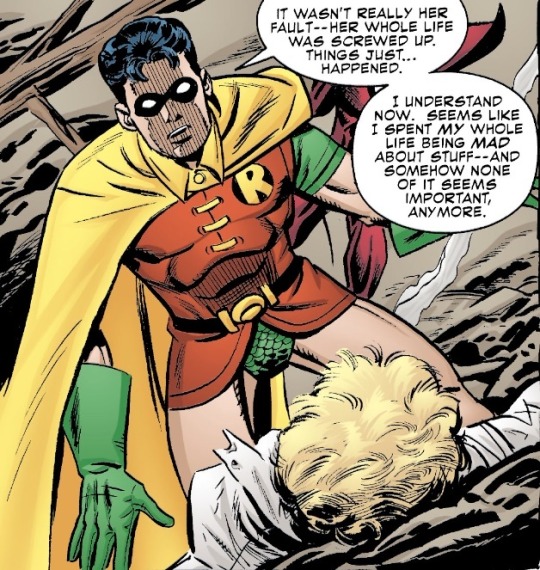
Your whole life??? I can count on one hand the number of times you got angry. Right now you’re hoping Sheila will make it to Heaven after she got you killed,

And you still consider her your mom. You lived and died an angel.

You had no clue what was going to happen. You were a child who never should have been left alone by his parent.
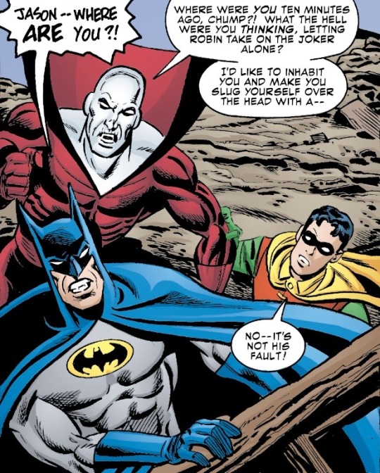
You and me both, Boston.
Deadman: Dead Again issue #2
#I can see now this blog is just documenting my descent into madness#by issue 5 Jason Hal and the others are set free and it’s confirmed later in green arrow v3 issue 7 that Jason made it to Heaven#as far as I know Jason and Deadman only have a total of 3 interactions (2 technically since Gotham county line was Bruce’s hallucination)#but they absolutely should have more#jason todd#robin jason#boston brand#deadman#dc#comic panels#my post#there’s that popular theory that the clothes you die in become your ghost outfit#but in my mind Jason’s ghost is dressed as robin because it gave him magic and it truly made him so happy to be able to help/save people#because I like being miserable and going insane#it also fits with what he was doing in green arrow (just a tiny baby boy happily swinging around Heaven going ‘wahoo!’)#the world didn’t deserve Jason Todd but he came back anyway#in regards to the last few posts abt batkids and anger#this here is also why I think comparing anyone to Jason is holding the other to an impossible standard
93 notes
·
View notes
Photo
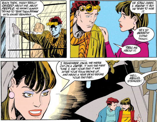
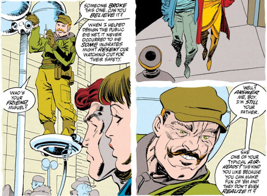
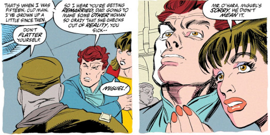
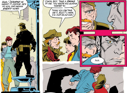
miguel is constantly telling people not to call him “mr. o’hara” in the comics, because that name was his father’s... (from an in-universe perspective) i wonder if he was planning on just taking dana’s last name when they got married, or anything similar
#talking tag#spider-man 2099#spiderman 2099#miguel o'hara#gabriel o'hara#dana d'angelo#george o'hara#marvel#comics#comic panels#cuz like i Could very genuinely see mig just dece#*deciding it is a good quote-unquote Fresh Start. a good simple easy way to not have 2 be miguel ohara anymore. technically.#but they broke up! they called off the engagement before they ever even set a date. so. Who Knows.
66 notes
·
View notes
Text


I couldn't figure out which smoke I liked better, so you get both!
Sort of a redraw of this panel:

#idk where it came from but there was a VERY annoying white line at the top of both versions. so these are cropped#sp comic#scott pilgrim comic#ramona flowers#ramona flowers fanart#scott pilgrim Ramona#scott pilgrim fanart#panel redraw#sp comic panels#comic panels#art#fanart#reblog#we may see me revisit this but Different some time. we'll see#(either like w a different brush/style or maybe over on kitpine)#this has technically been done for a minute i just. 1) smoke dissatisfaction 2) was debating More Shading (but it's my enemy so I Declined)#ooc
6 notes
·
View notes
Text
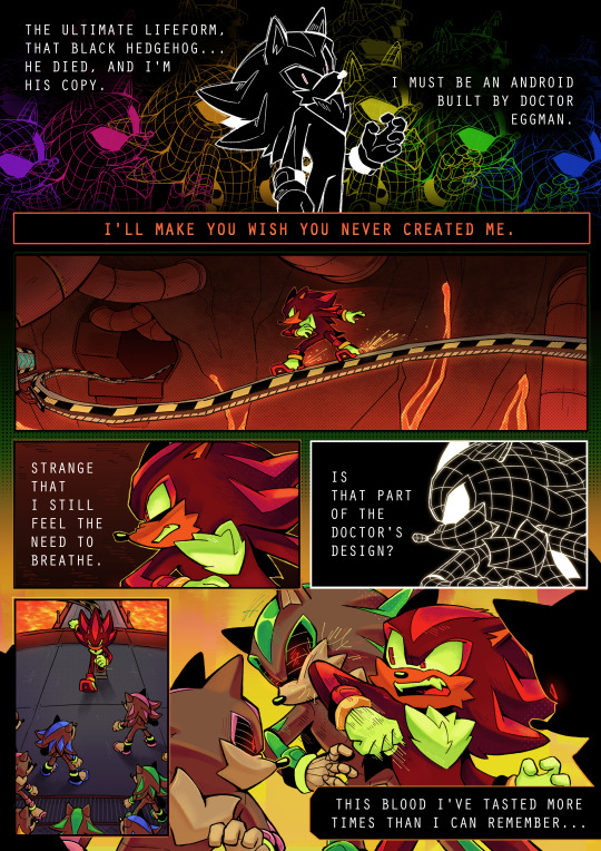

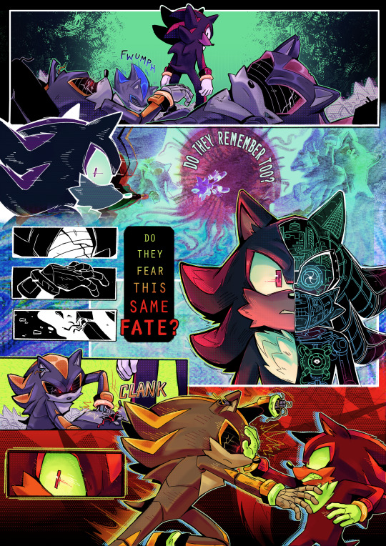

my comic from the @neverturnbackzine! truly one of my favorite zines i've been a part of :]
some extra insight/fun facts about the process of this piece below the cut 💥💥💥
posting pieces from collaborative zines is always something i struggle with because i look back and think of how i would do things differently now, but i learned a lot working on this comic and even developed some style techniques that i still use!
Fun Fact 1: the panel where shadow Fucking Disintegrates That Guy is technically traditionally drawn! i couldn't get it right in clip studio so i just started frantically scribbling in a notebook and got it eventually lol
highly highly recommend scribbling stuff out in a notebook, scanning it on your phone, and then dropping it into a canvas to edit later if you ever have trouble sketching something.
Fun Fact 2: a lot of the overlay/background effects were made in Kid Pix Deluxe 3D. i created a whole collection of various textures/abstract effects for this comic that i've been using in my art since last year. you can even find them scattered through my team dark zine lol. here's a few of them:


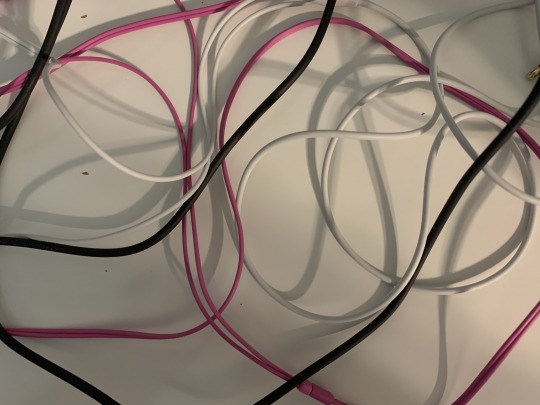
similarly, the background at the bottom of page 2 is actually a warped photo i took of a bunch of headphone wires. this is the original:
Fun Fact 3: i made this comic during a very busy and wild period of time last year so this is what the final panel looked like for a while before i fully finished it LMAO

ok yay thanks for reading bye
#ah yes the comic that i kept showing to my friends for notes and asking “hey guys is this even REMOTELY comprehensible”#very fun to work on! learned a lot :] for context i finished this in july of last year#fern's sketchbook#eyestrain#sth#shadow the hedgehog
3K notes
·
View notes
Text
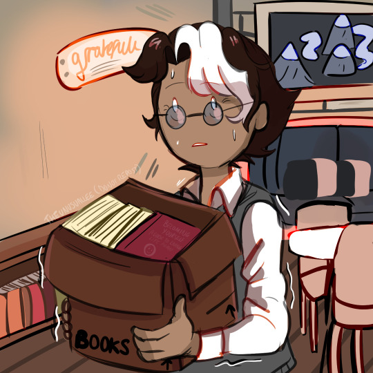


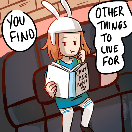
PART 2 -->
OKAY SO!
This is officially part one of my comic, "Getting Back Out There" which is going to be about Simon going on his first date since Betty. The other comic I originally posted will technically be part 3, and part 2 is all sketched out, I just have to find it in myself to colour and shade 18 more panels (The things I do for Simon smh)
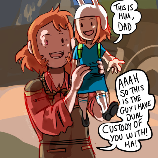
Also I named her Dad Erik Finch, both names seemed to be pretty popular, but Finch was a little too close to Finn for my liking, so boom, last name. Also Astrid in that last panel is a reference to that other thing I drew
PLEASE DO NOT REUPLOAD TO OTHER WEBSITES (Chances are I've already posted it to all of them, I want the algorithm to be kind to me, I've put a lot of work into this so far :) )
Let me know what you think so far :)
#fionna and cake#simon petrikov#adventure time#art#my art#comic#getting back out there#astrid fionna and cake#Erik Finch
1K notes
·
View notes
Text
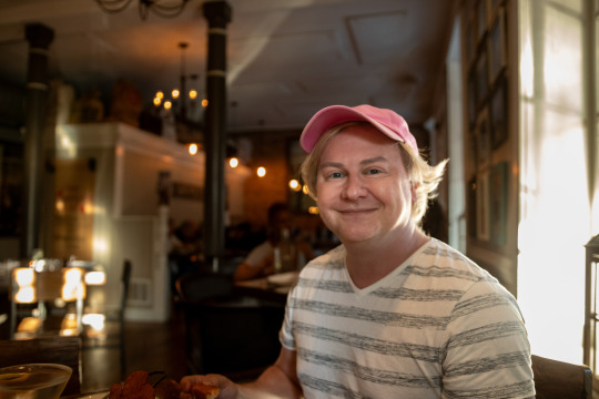
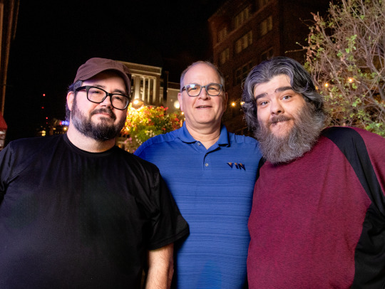
Meeting my longtime artist and good friend, Chris, IN REAL LIFE!
So, I hadn't been to a restaurant in over a decade. I can't even remember which restaurant since it was so long ago. But in the past few weeks I've now been to TWO restaurants.
I am becoming a social butterfly.
And it is exhausting.
But also good.
First I reconnected with my high school best friend, John.
And that went great.
But then the opportunity to see my friend Chris (a.k.a @whosthewhatnow ) came up only a few days later. And this close proximity of social events scared me a bit, but I have been feeling much better since they figured out my heart thing, so I decided to try and do both things even though they were only a few days apart.
The key to this was strategic resting. As soon as I got home from seeing John, I got in bed and I didn't get out of it until it was time to see Chris. And that was just enough recovery time to pull this off. Typically a short outing requires 2-3 days of rest after.
I had never met Chris in real life. He has done nearly all of the artwork for my website and comics over the past decade. And he was a main character in my CRAPPRnauts series.
We know each other so well and it is crazy that we've never seen each other with our very own eyeballs.
He is such an amazing artist. He works fast and he adds so many cool extra details that you can stare at his comic panels multiple times and catch a new joke or easter egg each time. He is a dream to work with and my Corg Life series was only successful because he did such a wonderful job bringing Otis to life in comic form.
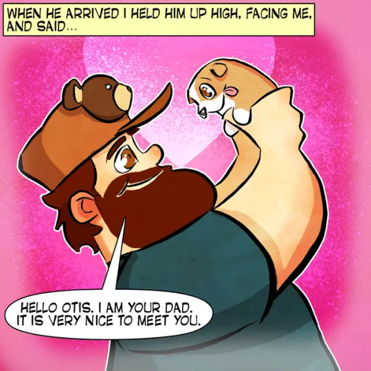
So we decided to meet up at a restaurant with his friend Michael and then I was going to take a nice portrait of him after dinner. Chris had never had a professional photo taken of himself and I decided to fix that.
I told him I had a mobile photography setup. Which, in reality, is a trunk full of lights and stands and other various camera gear that I definitely won't need, but bring anyway. It's "mobile" in that it all fits in my car if you are good at Tetris (which I am).
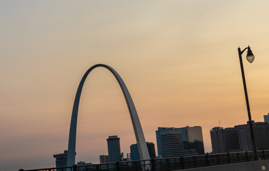
The restaurant was downtown and I had visions of St. Louis's famous Gateway Arch in the background of Chris's portrait. I thought that would be such a cool shot. I could see it in my head and I even dreamed about it.
So I got in my car and headed downtown and my GPS told me to exit at 249B. But I kept looking and I couldn't see the sign for 249B.
This is how much road I had left when I finally was able to see the exit for 249B.

So I ended up taking 249A and going straight to East St. Louis.
Which, if you believe the headlines, is not a place you ever want to be.
Google Maps and I have been having issues lately. They also tried to get me to take the spooky way home that night, but thankfully I actually knew the non-spooky way back from when I used to go to Cardinal games with my parents as a kid.
My short term memory was trashed by shock therapy. And so was a lot of my long term memory. But it finally came through in a pinch and remembered something useful.
I only had to loop around and cross a bridge so I didn't really do anything but touch the edge of East St. Louis. I was mostly concerned about being late for dinner more than its scary reputation. Usually those news stories about a place being "dangerous" are actually just racist and hurtful to people stuck in poverty. I mean, technically my house is in a "dangerous" neighborhood, and we do have trouble with petty crime in some spots, but aside from a few dinged-up mailboxes, I've never felt unsafe in my home.
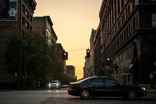
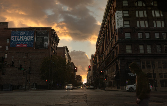
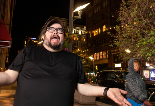
On the way back to regular St. Louis I could see the Arch on the horizon at sunset and it was kind of magical. And I wasn't able to get a good shot of it, but it sure looked pretty from my point of view.

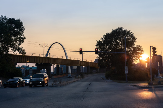

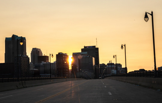
My photos kind of remind me of the beginning of movies like Training Day where they are trying to show you gritty, dutch angle shots of the city out of the car window to give you a sense of the location.
As I approached the restaurant I invented a new genre I call "stoplight photography." The sky was orange and the streets of St. Louis were just asking to be photographed. But I wasn't willing to die to get neat photos, so I just took them at every red light.

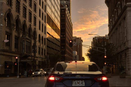
The big trick was trying to edit the dark area at the top of my windshield out of the photos to make it look like I didn't take these pictures from my car.
After a 15 minute detour through Illinois I arrived at my destination—a Mexican place called Rosalita's. It had a beautiful sign, so I took that literal sign as a metaphorical sign it was a nice place to get a quesadilla.
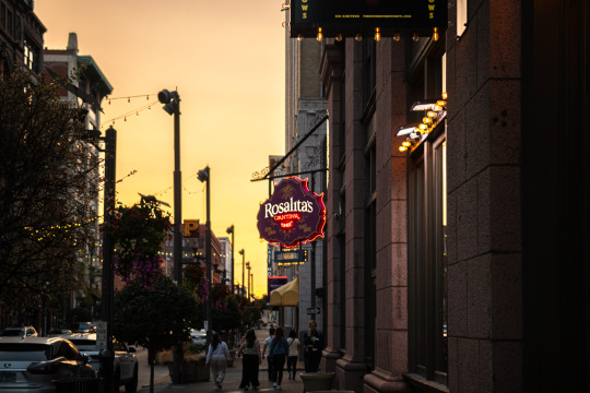

Dinner was great. Both signs were right and their quesadilla was very tasty. Chris and I both got one, so we are quesadilla twins. The waitress was one of those "I can remember your order without writing anything down" types. And I am one of those, "I get anxiety when things aren't written down" types. And, to her credit, she did not forget our orders. But she did forget to give us silverware and napkins. So I still feel like my anxiety was valid.
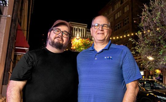
We told sad stories of the pups we lost. But we also had a lot of fun and laughed and I got to meet Michael who turned out to be an absolute mensch. I sometimes have trouble meeting new people with my social anxiety, but he was very affable and made me feel comfortable with his presence almost right away. He was a fan of Otis and mentioned he still has a Super Otis shirt. I always get choked up hearing that Otis is still loved. Hopefully we get to meet again.
Dinner ended and it was picture time.
I asked Chris if he wanted the high effort photo or the low effort photo. Either we figure out how to get to the Arch or we find a spot near the restaurant and just take his portrait there. Chris and Michael had a driver because they were coming from a big conference and getting to the Arch would have been complicated. So we decided to go with the low effort option.
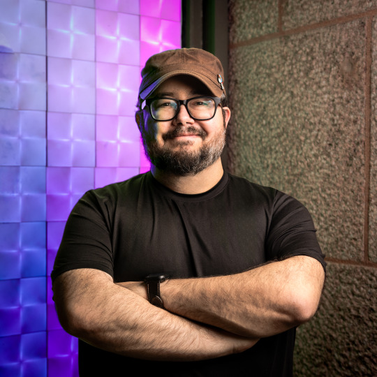
I found a cool shop nearby that had an LED wall that changed to all sorts of different colors. And I thought that would make a neat background and give a colorful edge light on Chris's face. I pulled my car near that spot and started unloading my trunk full of photo gear.
I think Chris and Michael were a little overwhelmed when I started pulling camera gear out of my trunk like a clown pulling an endless handkerchief out of his mouth. But as far as photo setups go, it was actually pretty minimal.
Light, giant battery, light stand, umbrella, tripod, camera, rolling walker with seat.
My dad's old rollator came in clutch because I wanted to shoot from a low angle and it is hard for me to bend down. In fact, I think I'm going to look into getting an all terrain version so I can do more outdoor photoshoots.

I started shooting in the middle of a downtown sidewalk. And I was super anxious. I could not focus (my brain, not my camera). I was very distracted with all of the people walking by and staring. I was not sure if any of the photos were turning out. I wasn't even sure if they were in focus (my camera, not my brain) because I had not yet had my lens calibrated. But down the street there was a guy with an old school boombox playing random music. His music helped to drown out the ambient noise and gave me some comfort.
I had no clue if the photos were any good, but when I got home and checked them on my computer, I realized I have 12 years of experience and muscle memory built up. I probably should have just trusted myself because the photos all turned out great.
I think Chris can now officially say he has had a professional portrait taken of himself.
This photo has been officially loved by Chris's girlfriend and mother.

There is no greater seal of approval and I am honored.
I was able to comp in any of the colors the wall displayed from other shots in case Chris is feeling a little more green in the future.
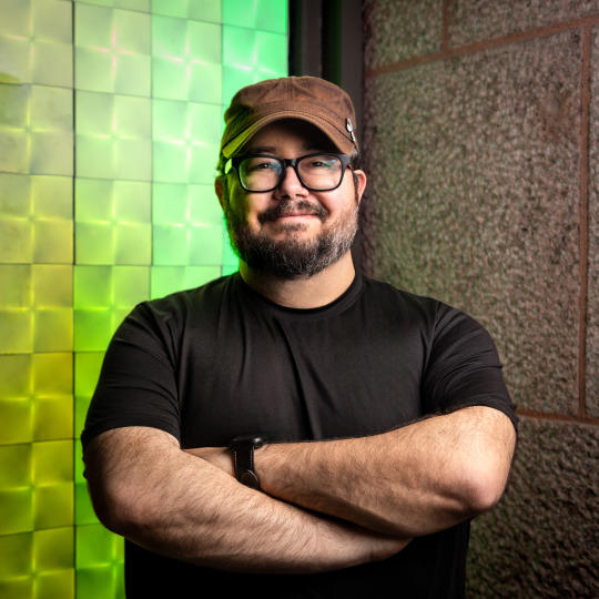
A literal rainbow of options.
I also liked this one, though it is a little more "environmental portrait" than regular portrait.
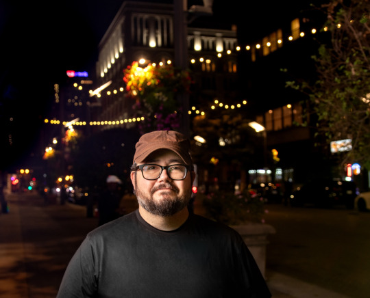
And I got some nice photos of our little group to help us remember the night.
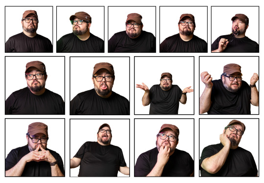
And I got a bunch of photos of Chris making silly faces like Calvin at his school photoshoot.
I love this woman's reaction to our little impromptu sidewalk photo shenanigans.
After we said our goodbyes and I gave my friend a hug, I was a little bummed I didn't get to photograph him at the Arch like I had dreamed.
But then I realized I had my own car and it was capable of taking me places. (I actually haven't gotten used to that after not driving for nearly 15 years.)
So I decided to drive a few blocks over to Kiener Plaza—a park with a view of the Arch.
TO BE CONTINUED...
235 notes
·
View notes
Note
Hi sunny :D I’m a tad nervous to ask questions but you’re one of my favorite artists soo… 😞😞
I was just wondering if you have any tips regarding making a comic :,3
thank you‼️🫶
heey thank you so much! 🙈 I'm sure I've responded to this multiple times before but I can't even find the asks on my own blog so here we go again dksjd
this is for a shorter type comic, for comics that are a lot longer like many hundreds pages it's more complicated!
1 - write down the plot with main things you want to have happen and divide it into scenes revolving around these things, expanding on what should happen in each scene with dialogue, notes etc. This helps making sure each scene connects well to the next and also gives you a general idea of how long the comic is gonna be
2 - sketch out pages as rough draft (thumbnailing) so you will know how the action will be distributed across the page, I usually sketch all the pages in one scene at the same time so you can know in advance where a scene is gonna end it's not gonna be 2 panels into a new page if u don't want it to
3 - when figuring out how a scene plays out you can sorta imagine it like a movie in your head and you choose angles you like or that make the scene flow nicely! (as for panel shapes and other technical things I suggest looking at tutorials or looking through comics or manga you like to see how they do them)
4 - this is just if you want to carry out a comic from start to finish! never underestimate how long it takes to make comic pages, so if you want a finished comic I suggest trying out doing something shorter of a few pages to see how you feel about that first, find a way to draw and color them that's comfortable for you! I think around 50-60 pages is manageable, if it goes in the hundreds it's gonna be a long haul (I kinda never want to go there again lmao) so imo avoid spending too much time on full coloring/details/backgrounds in every panel, it can look good but ur gonna get burned out SO fast (a lot of comics get dropped for that reason) most long running comics have simpler styles and assistants to help with coloring, adding text etc
hope this helps!
252 notes
·
View notes
Note
Hi there! I apologize for taking up your time, I am just so curious: When you tackle a comic, what does the process behind it look like?
Asking because I found myself scrolling through your blog once again and couldn't help but marvel at all the beautiful effects you use, at how flawlessly the structure guides the viewer's eye across each page, how the graphic weight seems to always be in just the right places…, and wonder how you learned doing this. Everything you put out looks incredibly professional and I aspire to reach your level of skill 😌❤️
Thank you Finz!! You're no bother at all, I'm an open book.
This is such high praise for a guy that really doesn't have a set process, I feel like a hack. Ha. Rest assured my style is still developing. Besides the referencing of the linework and composition of official comic books, (practicing by redrawing panels for fun), explaining the process makes me feel like a serial killer but I will do my best.


(WIP Riddler panel, scrapped Scarecrow composition)
My comics usually stem from a single panel or concept — I like to focus on/emphasise particular panels of my pages, the heavy hitters, the main piece that catches your eye. I know I'm not a profoundly technically proficient artist so I prefer visually interesting elements and formatting, i.e. drawing characters outside their frames, negative space, notation, perspectives etc.

(Kung Fu Panda 4 sketch god I hate Kung Fu Panda 4)
I like to establish 'main focus' panels, the bits of the comic that really, well. make people want to chew on it. This is where the technical effort is concentrated, really, and the rest of the comic is generally build around these concepts.


('Restaurant Balthazar' focus panels)
Textures and effects are done on individual panels first, then the entire page as a whole to even out the unity. Generally, blocking in shadows, hatching for visual interest + middle tones, then textures/half-tones, then highlights.

(Script excerpt WIP)
I'm not a writer per se, but having a vague 'script' in your pages helps with pacing and direction. Comics are a versatile story-telling medium. I only really do scripts for comics longer than 2 pages. An optional but recommended strat is to send your script to a friend for a second opinion.

(Script excerpt — 'Restaurant Balthazar', annotated by @vincepti0n I don't know why he drew a face in the middle)
With the script crudely slapped together, I rough out the thumbnails and composition with the text, prioritising coherence and clean integration of previously mentioned 'main focus' panels.
Settling on a composition sucks the hardest. Drawing is fun, thinking makes brain hurty. Variety is good! Close-ups, wide shots, visual metaphors. Every panel is its own artwork.
The text bubbles are usually added in post, yes, but I'm just one guy and I don't have a writer to call me a good boy for doing things correctly. Bite me.


(Early 'Restaurant Balthazar' drafts)
In addition, keeping the text graphics in mind help create a sounder composition wherein even if the panels don't read cleanly left to right + top to bottom, the text can stagger and create the same reading order effect.


Panels and concepts are constantly tweaked, and my comic process is still highly experimental. A lot of industry standard comics aren't illustrated to their full potential due to deadlines and such — I strive for visual epiphany by treating each panel as its own artwork, and every page as a a bit of a mural.


(Old art hurts the soul)
Constantly experimenting allows you the insight of looking at your current art in comparison to your older works. In more recent works, I've been blocking in more shadows wiht lineart with thinner lines and more line weight, and learned to integrate the subject characters with less plain, abstract backgrounds.
TLDR: I have no idea
#creaman-answer-sheet.pdf#art process#vinegarclown#creaman#fanart#digital illustration#jonathan crane#riddler#wip#comic process#creaman talks to drywall
173 notes
·
View notes
Note
Hello! I’m just here bc I’m a little confused on what you meant by Smythe drawing out “each individual asset” when she was making comics? Now, granted, I can see that it made her file ginormous, but me personally as someone who knows nothing about making online comics but is really wanting to get into it (and also as someone who has a ‘too many layers’ problem myself), is there a way to avoid using too many layers?
My current way of making comics has been to draw the panels individually and then format them (which I know is terrible management wise and also messes with the quality) but I honestly have no other idea of how to do it properly, and seeing how stunning Lore Rekindled looks, I don’t know how you would manage to put all that lighting effects and little details on the same layers. (But also I may be thinking of it wrong so I’ll let you talk qwq)
Ah I can actually give you a visual breakdown of what I meant by that!
So in this you can see there are a TON of layers, and not even all of them are visible because some of them are stuffed into FOLDERS that have been left closed. BUT if you look REEEEALLY carefully-

^^^ These layers right here? That's specifically Minthe from this panel in Episode 61:

(the unique pose here makes it real easy to tell that this is the corresponding panel, you can see the matching body shape with the dark shading that's clipped to the base layer below it!)
So what this means is that Rachel didn't draw all her characters on one base layer, she drew every single character in every single panel separately. Now of course, she could merge all these layers together as working on separate layers helps make it easier to work on elements that collide separately (like one character being 'underneath' another character like Hades is here) but because she has all of those clipping layers with the shading already added in, she likely didn't merge them afterwards because that would actually create MORE problems (because if she merged the Minthe layer in with Hades, then the shading for Minthe that she painted outside of the lines would show up on Hades and then she'd have to erase it which is just a bunch of extra work).
You can also tell all these characters are on their own layer because the layer thumbnail EXCLUSIVELY shows those characters. A layer will show as much canvas length as it needs to cover what's in that layer, so if the thumbnail is only showing one character, that means there's NOTHING ELSE on that layer. If there were more elements on this layer than just Minthe, the layer thumbnail would look more like this:

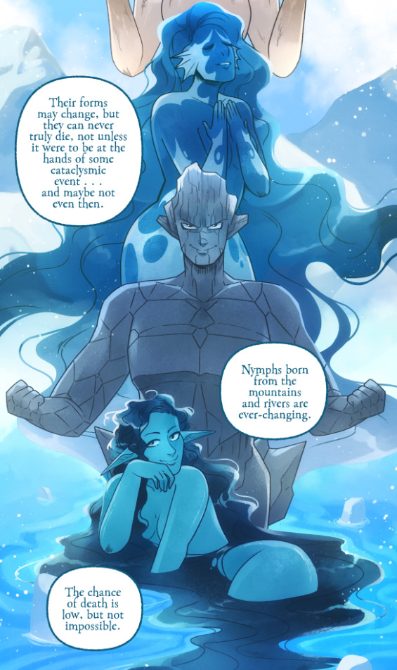
Now let's compare it to Rekindled's layers! I'll use a completed page to make it fair as we use a lot of extra layers in the post-production phase where we add the texture effects and glow and all that fun stuff, plus I'll even make it a more complicated page like that big nymph explanation spread from Episode 51:
So I'll break it down to make this make more sense:
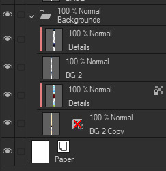
BG 2 Copy (technically this is supposed to be BG 1) - Basically the panel shapes, what I'll do is mark out the panels with flat blocks and through that we'll add background elements in a clipping layer (usually done by Banshriek). Often times they'll do multiple layers to make the process easier and then merge them all together in the end. With these shapes operating as panels, it means I can just auto select the whole layer, invert the selection, and easily erase whatever's outside of it (such as the lineart and base colors that I put down afterwards). I could just use masking layers like I did in [AFTERBIRTH] but I find this way works better for the process of making Rekindled.
BG 2 - This is where we add objects / foreground elements. So stuff like furniture, interactables, anything that needs to be kept separate from the larger background to make it easier to work with. This can also include "floating" panels that need to be above other panels, such as this:

All of the backgrounds are then nested in a folder for organization purposes (we also sometimes use clipping layers on top of those folders to apply extra effects over anything contained within that folder without affecting other folders, that's a common technique that Banshriek applies)
Then we get into our Characters folder:
BASE - This is where I do the majority of my work, all the characters in every panel on a page are flatted into this layer. Sometimes I do have to create separate layers to, again, make it easier to work with overlapping characters, but usually those layers will be merged before I go into the shading process. I simply shade on a single layer by using the lasso / magic wand tool to select my area for painting, the flat colors make it really easy to do that. Sometimes I need to create a secondary shading layer if I've put down dark colors that start to bleed into the lighter colors, but again, I merge when I'm done into a single shading layer. We also sometimes employ an Add (Glow) layer into the clipping set if we need a glow effect that's exclusive to the characters and doesn't travel outside of their base colors.
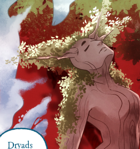
There's a (leaves) layer here that I used for the dryad because I needed the leaves to be above the base layer, after that I selected the leaves elements so that I could erase the lineart in the layer above it where needed.
LINEART - It's lineart, enough said haha That said, I do think Rachel actually uses clipping layers for her lineart in places, it seems to be visible in some of her process videos where you can see the lineart present in a clipping layer, and that would explain why there are panels where the lineart suddenly 'cuts off' and doesn't travel outside of the base layer, like so:
GLOW - This is where we do an Add (Glow) layer that isn't restricted to the base layer, it's where we add all the fun lil' glow and sparkle effects over the characters !
The CLOUDS layer is, like the leaves, a background element that needs to be above the base layers rather than constricted to the background.
Above the Characters folder you can see what I mentioned earlier where Banshriek has added more post-production effects that are exclusively clipped to the contents of the Characters folder. This means the effects / blend modes do NOT affect the background layers or anything above it.
The BLUR (Overlay) layer is something we just started doing over the past several episodes, it's a technique I actually picked up from 66 of City of Blank where I merge all the layers into a new visible layer which I then apply a Gaussian Blur to at around 60% and then set to Overlay (and then I adjust the layer opacity until it looks right, usually around 25-35%), it gives it a bit of a softer "dreamier" vibe in the final colors and really helps unify everything!
CANVAS - This is an Overlay layer which is also set to an opacity of 25-35% where I go over the panels with the Add Canvas brush from the Kyle Webster set, unlike the Canvas overlay texture in CSP I can actually choose the colors I want to use which means I can match the canvas texture color to the mood and environment of the scene (ex. I'll use a very light blue for scenes in the Underworld). Not only does it give it that signature texture from S1 of LO, but it also helps balance out the effects of the BLUR layer.
The SKETCH layer sits on top of everything and gets turned off once all the base layers and lineart are down, and ofc the SPEECH folder is just where all the text is kept.
I know everything I just laid out is a LOT but ultimately it's how we operate, it works for us! But it also begs the question of why Rachel operates the way she does because a lot of it seems extremely unnecessary and more likely to bite her in the ass (the more layers there are, the bigger your file size gets, the risk of drawing on the wrong layer increases as well as the risk of posting a panel that's missing elements because the layer was left turned off by mistake, etc.) And it's more so concerning with how she operates with her assistants because if she's still using this many layers when collaborating with other people, hooo boy. Though based on what I've observed of what her assistants contribute, I get a lot more of the sense that she circumvents this by having the artists do the flats separately and then importing them in as separate assets that she then just imports into the page and places them where they need to be. Still not a great workflow IMO because it's what's led to a lot of the issues of characters "floating" rather than feeling like they're actually in the environment-
-but that's still an issue that could be solved by Rachel just taking more time to actually flesh out the backgrounds and lighting to give more of an impression of the characters actually existing in the space. Like that Hestia panel could easily be fixed by just giving the background a bit more detail and putting actual shading underneath her (and lighting from whatever direction it's coming from).
Either way, regardless of whether or not Rachel's process is productive or not, I hope that breakdown helps explain how we do it in Rekindled! Learning how to manage layers is definitely a skill that can be tricky to harness, but once it "clicks" there's a lot you can get away with. Ultimately how you do it is up to you, but my best piece of advice to offer is to just be open to other types of workflows because you don't know how much you might be shooting yourself in the foot doing things the hard way when there are often way easier and more efficient ways to get the same job done. That's basically the vibe I get from observing Rachel's workflow, it seems like she's still using methods that she thinks are working for her (and probably did work just fine for her when it was JUST her) but could be vastly improved for her and her team if she'd just get over the initial hump of stepping outside of her comfort zone. Would probably make for a better comic too LOL
I hope that helps! Good luck! ( ´ ∀ `)ノ~ ♡
#ask me anything#ama#anon ama#anon ask me anything#lore olympus critical#anti lore olympus#lo critical#lore rekindled#webcomic advice
151 notes
·
View notes
Note
Hiii i love your comic the pain is so fun woe!!!! I hope its ok to ask some technical questions!
1. What software do you use for putting together the pages?
2. How do you decide where panels go? Do you write everything out first and then make the art?
3. Do you have any general tips for someone who wants to work with a similar format?
Thank you!
I use Google Docs to write the stories and Medibang Paint Pro for art and compiling everything.
Everything is written and then I decide how to format it after that. Here's a post where I go more into detail: https://www.tumblr.com/barrenclan/726280092590997504/im-not-sure-if-youve-answered-this-before-but?source=share
Leave yourself notes in your writing so you don't forget about a cool visual, if you want to include it, like so. Don't just trust that you'll remember something later.
Leave lots of room for text on your pages, even if it's tempting to cram it. Too much text makes a page look cramped and hard to focus on, especially if there's art on it as well.
Mix up the formatting of your text, where it starts at the top of each page and how it flows through the whole page.
The art and the prose compliment each other. If you can show something rather than tell it, do that. If you don't think you need to draw something out, it can just go in the writing.
106 notes
·
View notes
Text
Battle Against Lancer
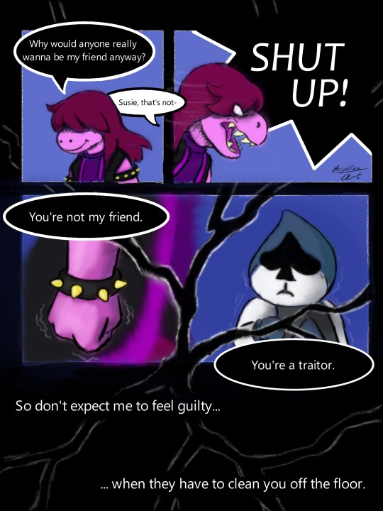
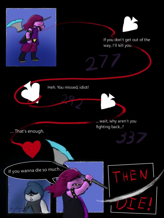
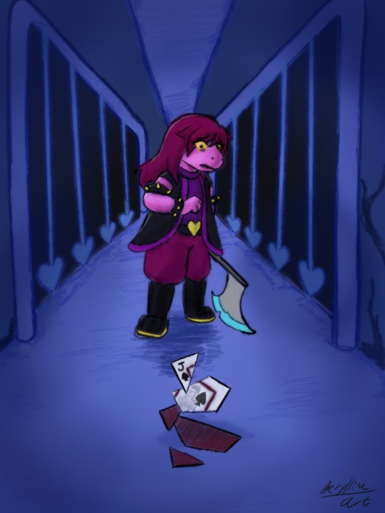
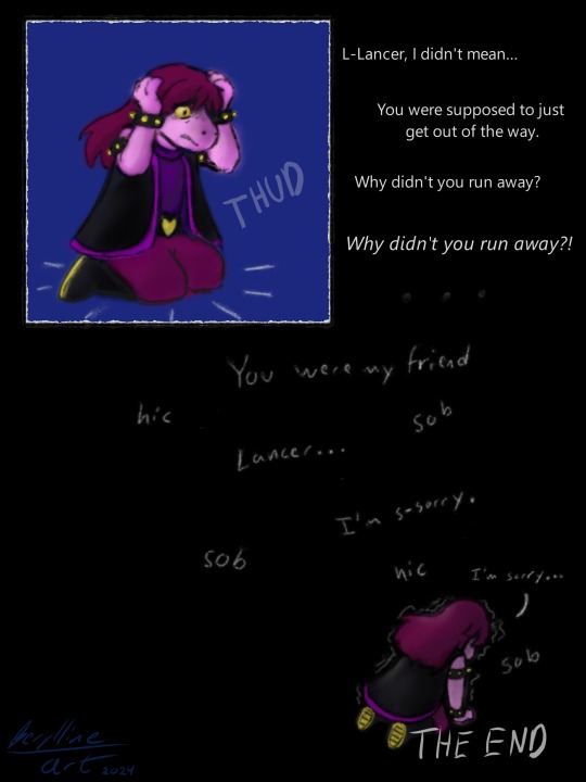
... Oh dear... That wasn't supposed to happen...
Deltarune belongs to Toby Fox
Ok, little headcanon here, I think it would be cool if Darkners turned into the object they are in the Light World if they die in the Dark World. Hence, Lancer turning into the Jack of Spades when Susie kills him. She has no idea what just happened, and even though she didn't get any LOVE or anything, she knows that Lancer is definitely dead, and it's her fault. And the player can't do anything to stop it because they can't control or stop Susie.
Anyways, with Ralsei, his robes would cover up the object he really is when he reaches 0 hp, but it wouldn't be damaged like Lancer's card is because it's not a permanent death unless the whole team dies.
But come on, turning into the object could have a whole lore behind it, because the Angel is worshipped by the Light and feared by the Dark, right? So what if it is because light doesn't mean death, but death means light to the Darkners? Like, when a Darkner dies, they are brought to the Light and forced into that form, permanently. It makes sense in my head, ignore my ramblings.
Anyways, I'm not sure how my headcanon would work for Chapter 2 Darkners, but come on, I wasn't going to miss the chance to draw a card sliced to bits with a traumatized Susie looking on. You can tell that I cared about that page because I added a background. Also, I realize that the soul on page 2 comes from Susie when technically it should come from Kris, but I liked the way it looked (and totally didn't notice where it was spawning from when I played the game.)
Comics are hard, but I had so much fun playing around with the panels on the first two pages. My pacing might be a bit off though... Also, it's so so hard to draw the same character over and over in different poses, so sorry if Susie looks a bit different than she should, I did my best. And sorry for the ramble, but that's why I put the keep reading thing up above. If you read through my brain dump, good job! Get yourself a cookie.
#deltarune#deltarune comic#comic#my art#susie deltarune#lancer#lancer deltarune#is that a background?!#this took a long time#comics are hard
77 notes
·
View notes
Text
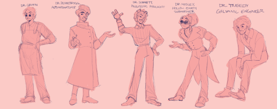
More Lodgers! I think Mosley is my favorite of this batch, both pose and design-wise. I'm drawing them in order of introduction, and it's almost like a cool little Easter egg hunt looking for different angles and full-body panels of characters that don't show up a ton.
(Edit! I updated the drawings, it not matching the other set was bothering me)
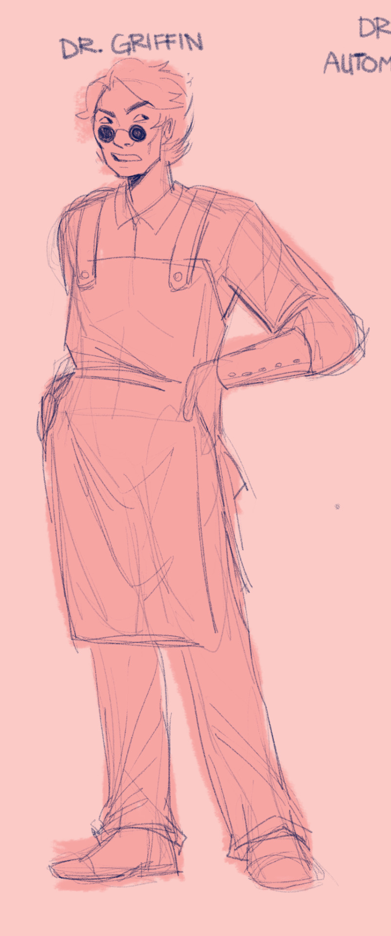
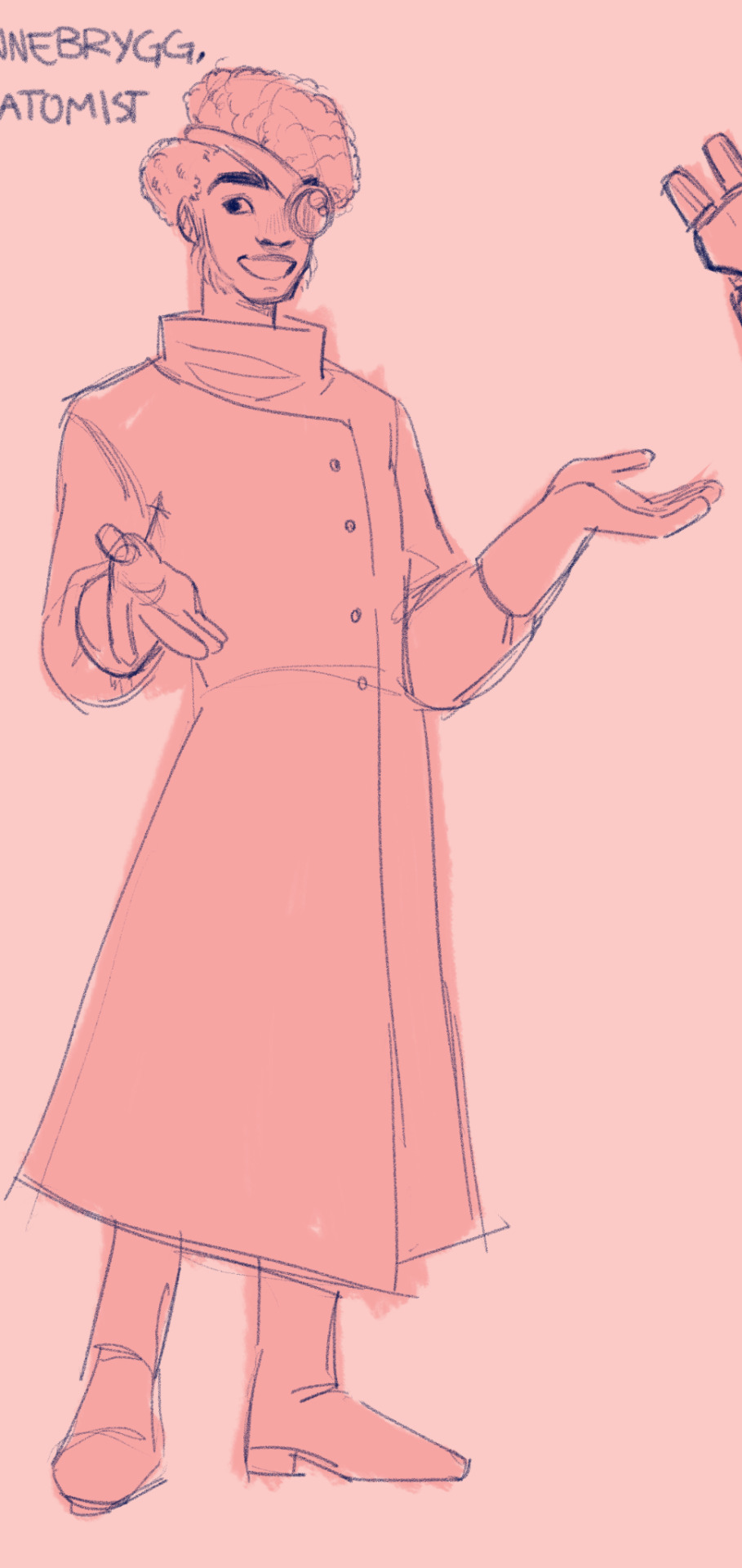
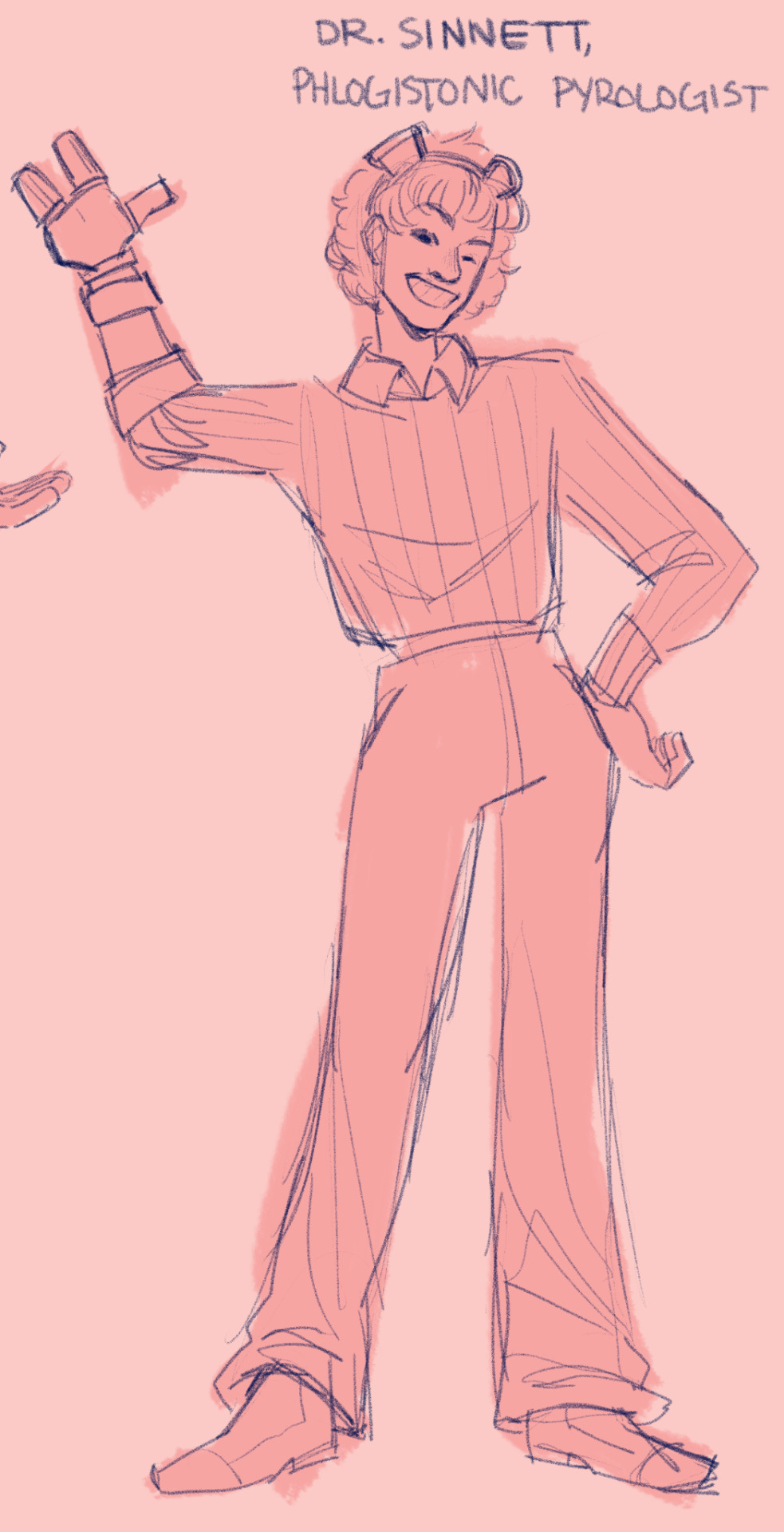
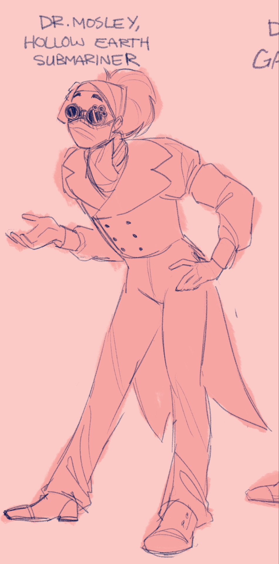
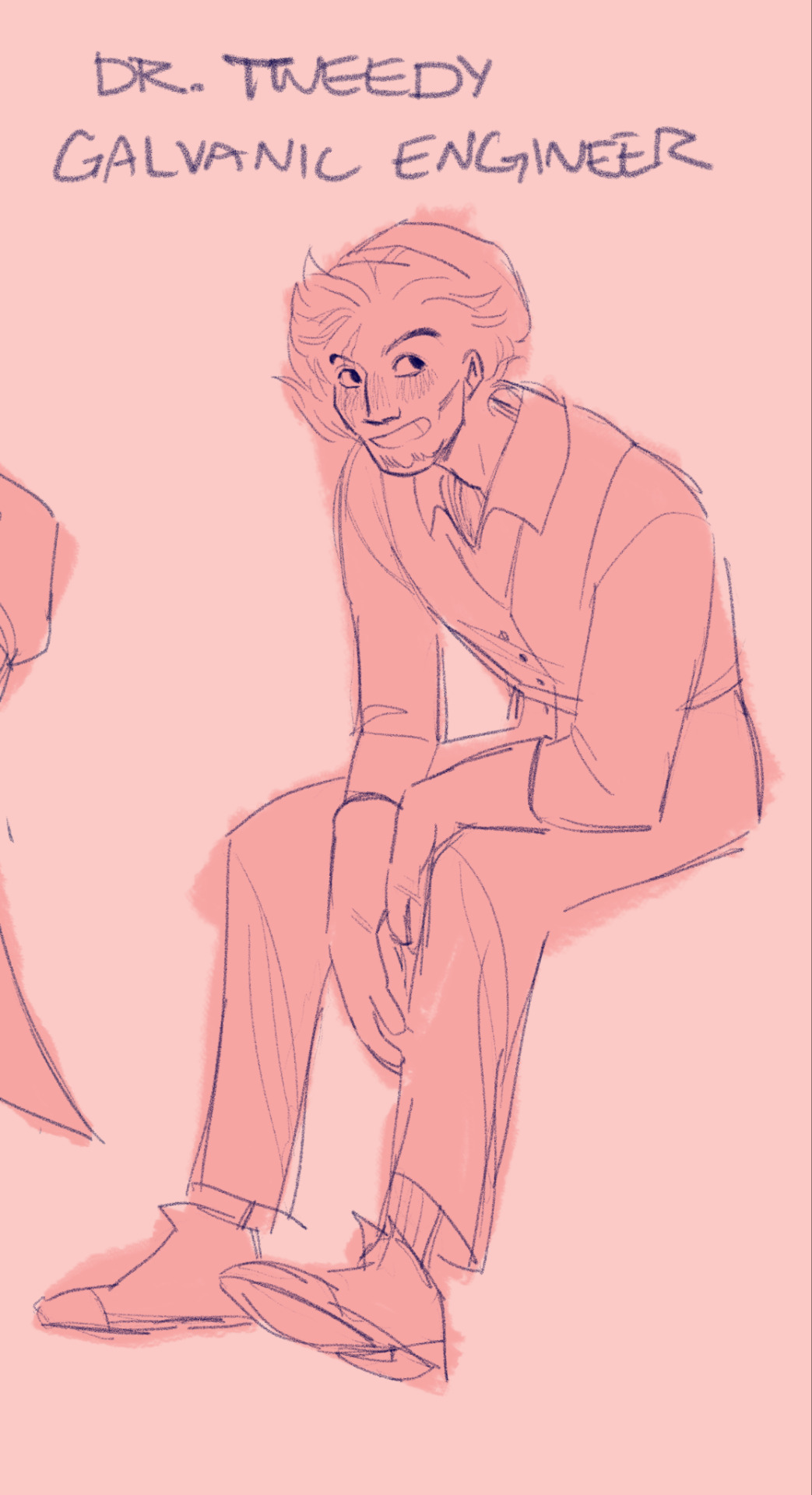
Thoughts under the cut again
Back at it again with the goggles and gloves! Except for Mr. Griffin which is interesting. Could be for lots of reasons, like pulling descriptions from The Invisible Man, or maybe his work doesn't require a lot of physical risk, or maybe they just didn't want all the Lodgers to feel too samey. He's still aligned with the Lodgers aesthetically through the apron, which Bird also wears. Neat! I'm very entertained by the different types of eyewear too. Some have goggles, some have binoculars, and some have layers of magnifiers like jeweler's glasses (of course I always think of the Toy Story 2 scene). I'm sure some of them have super specialized equipment too, like Maijabi probably has some sort of spectral filter lens or something.
God what I would give to pick Sage Cotugno's brain about some of these designs because I am fascinated by Mosley. They technically didn't have to go through and give each lodger such a strong sense of personality but I adore that they did! Mosley in particular reminds me of Mole from Atlantis, with the scarf and the multi-layered goggles and the digging. And Helsby wouldn't be out of place at the Benbow Inn! Know that I mean this as incredibly high praise, I could talk about the designs in Treasure Planet for days. Point is that both those movies have an incredibly strong visual identity, primarily through the character designs and architecture, and this comic feels the same way to me.
My personal favorite rogue scientist is next up! I love her design so much and I'm so excited to draw her. Also, how in the hell do you end up with "make spy bugs" as your job?? And where can I sign up?? Miss Flowers please
Mosley has my favorite pose but Griffin has my favorite face. Look at him. Grouchy bastard
I realize that I've been labeling all the Lodgers as "doctor" but it's entirely possible that some of them probably don't have doctorates. Y'know. The thing that makes you a doctor. Then again Frankenstein dropped out of college and we all call him "Dr" so I don't see why these fine people shouldn't get the same respect! Dunno if this applies to Victoria Frankenstein though. She's crazy enough to have also finished college while all the other shit was happening.
(yes I know that Frankenstein technically had all the knowledge and the expertise and was miles ahead of literally everybody else and only dropped out because he was busy proving that death is merely a temporary state and God means nothing in the face of human ingenuity and all that, but the bastard still didn't graduate and also he's an asshole so I'm gonna pick on him)
129 notes
·
View notes
Last Seen Blogs

crappy-snaps
crappy snaps

k-to-the-gravity
Record-scratching and liner notes

bluehandbag
The Blue Handbag

bigcocknate84
Untitled

mnchrm-market
mnchrm·