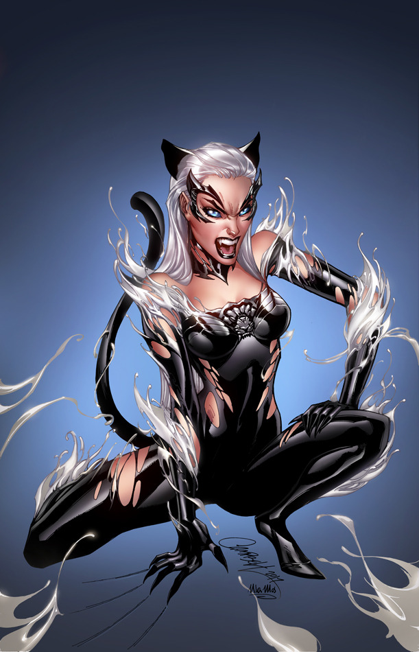
#It's fun drawing in the 90's style
Note
✌️ html good buddy!

#“You are so early 90's”#It's fun drawing in the 90's style#Back when they didn't whitewash Larry yet /j#Bob the Tomato#Larry the Cucumber#VeggieTales#VeggieTales fanart
33 notes
·
View notes
Text

partners
#dgs#mine#is it giving 90's anime romcom. god i hope so#i miss them everyday *draws them everyday*#i had a lot of fun rendering the hair. i need to study the 90's cel animation style more. soo good AURGHHH
224 notes
·
View notes
Text

They look like they’ve seen a ghost…or maybe they got caught looking like friends? “Shoot! How annoying!”
You didn’t think I’d draw an 8/6 piece without involving Takeshi somehow, did you? Happy 8/6 day! 🖤🤍
#my first full piece would be a meme piece lol#first time drawing other characters as well LETS GO#and a car!!!#the background was so much fun to draw omg#I really wanted to capture that 90’s vibe/first stage style with this#takumi being oblivious as always#takeshi nakazato#shingo shoji#takumi fujiwara#ae86#initial d#initial d fanart#night kids#my art#I’ve wanted to make a meme drawing for the longest time lol#🐇
85 notes
·
View notes
Photo

Catch all-new episodes of Monster Fantasy VII on Saturday morning at 7/8 CST ⏰👾
Only on Chocokidz™TV
#final fantasy vii#ffvii#ff7#pokemon#pokemon style#pokemon crossover#zack fair#rockruff#pokemon trainer au#crisis core#90's style#vhs art#zimidrawz#my art#I had way too much fun with this!#I was like 'draw pokemon trainer Zack' 'what if make like 90's tv resolution?' 'YES'#I made myself nostalgic for indigo league 😂
9 notes
·
View notes
Text
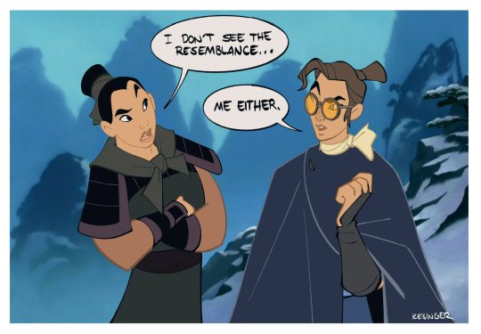
Mizu & Mulan
By Brian Kesinger, the lead character designer on Blue Eye Samurai, & an artist for Disney animation
“Before Blue Eye Samurai came out, there were a lot of comparisons to Mulan (which I get on a surface level) but now that the show is out, I think people have seen that it’s a little different. That said, it was fun to try to draw Mizu in a 90’s Disney animation style.”
3K notes
·
View notes
Note
If possible, would you be able to show us what does your colored Molten Freddy look like and what AU / design you gave the animatronic ? also I love you art style, it’s like cabbage patch dolls and it’s a good representation of the 80’s/90’s mixed together !! :3
GREAT NEWS! Colored Molten Freddy is on the way..
I plan on making proper drawings for all the Funtimes + scrap animatronics at some point!
A fun fact about my Molten Freddy + Scrapbaby, they are made of not only parts from the Funtimes but old prototypes of the Funtimes that William dumped somewhere. Hence why they have pieces that are not apart of the initial animatronics.
They also are made of general garbage though of course like in the source material.
#art#digital art#my art#fan art#fanart#fnaf#fnaf fanart#five nights at freddys#fnaf art#five nights at freddys art#fnaf pizza sim#pizza simulator#fnaf 6#fnaf 6 fanart#fnaf 6 pizza simulator#fnaf pizzeria simulator#molten freddy#fnaf molten freddy
508 notes
·
View notes
Text

I tried my best to draw the FE Engage cast in the 90's anime art style. Not sure if I even hit the classic vibe of what is old anime, but it was so much fun to draw the lineart nonetheless!
2K notes
·
View notes
Text
I was cleaning up some broken links on my old silly Pokemon fansite, the Neglected Pokemon Lovers Unite (NPLU), and I realized that it has now been open for 25 years. TWENTY. FIVE. YEARS. That is an ASTONISHING amount of time for a site to stay open! Even if the last substantial update was like back in 2009 lol. The world around it has changed so much, but I think it's still valuable as a time capsule of a certain time on the internet. I wrote up a new essay about it on the site and did some general clean-up here and there.
Anyway to that end, since so much of the fic and art there is so old, I decided to compare Radic's oldest form to his newest! Radic was always a human boy but I just couldn't draw humans at the time so I made him a furry lol. Eventually I figured it out.
I also thought it'd be a neat challenge to mimic my own style back when it was really wonky and bad. And it was! It was kind of fun actually. I don't have too many shots of Radic from back then (it was hard to get art on the internet in the late 90's-early 00's), but I do have a few - hugging Kitsune, two old kiribans if you want to compare. I had a lot more old shots of Parasects though to reference unsurprisingly, they were very triangular lol. I think I did a pretty good job of matching what my art used to look like. I had a clear see-through Gameboy back in the day if you can't tell what Radic is holding lol.
("Isn't Radic the faceless avatar of your gamer self as depicted in Handplates-" yes, but Pokemon!Radic is the only one that actually became his own character, all the rest are shells)
If you do go poking around the NPLU, please keep in mind that almost everything there is very old and most of the fic and art is pretty bad (and shockingly violent). Plz do not judge me! My younger self was a cringey weeb but she was trying very hard. :<
[patreon]
#pokemon#z art#radic#callima#parasect#man i haven't drawn a parasect in ages i forgot how fun it is#my crabshroom babies#i always get tempted to just delete all the links to my old art but people always tell me not to#they like seeing it?? which always baffles me but i'm trying to accept that there's something worthwhile about them lol#radic is blind so he's not using the switch he's just holding it#maybe for red? idk#there was this odd stretch where i was using dot eyes#then switched to big anime eyes#then smaller anime eyes#then back to dots again#time is a circle...#i also used to use ^_^ CONSTANTLY#thus the ^_^ by old radic there#i've seen a lot of old web trends get revived but not hit awards/kiribans#for some reason#hit counters sure webring sure affiliates sure awards and adoptables sure#but celebratory things for reaching a hit marker? haven't seen a lot of those lately
215 notes
·
View notes
Note
hi jez!! i'm a tad kooky and go crazy over anything involving art studying, and finding out how the artists i look up to are able to achieve their effects in their artwork BECAUSE TO ME IT'S SORCERY!! HOW CAN SOMETHING BE SO BEAUTIFUL? I WANT TO KNOW MORE!!! sort of thing haha, but I noticed to me the most prominent thing that stands out from your artwork is the way you draw hair, are you able to describe how you get those beautiful curls and liveliness in your brushstrokes? i'd love to know!
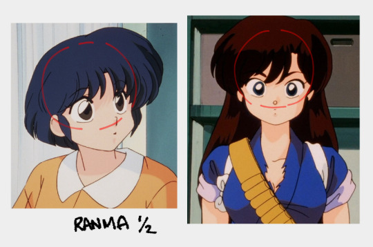
i think the main way is how i exaggerate volumes. i draw hair more thick-looking than they’re supposed to be. visual aid:
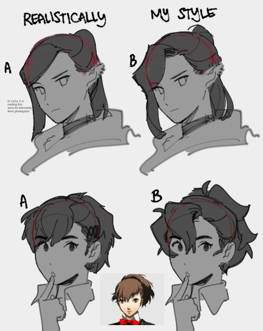
realistically, keva’s hair sits and falls like A, but in B i exaggerate the volume and flow in my style. same thing happens to hamuko when i draw her. this is mainly influenced by 90’s anime i like, especially in ranma ½, it’s very obvious how exaggerated the volumes are which help it look even fluffier or poofier.
aside from the volume, i tend to use more curves than sharp lines and edges in the way i draw hair, but i also like to mix it up with a “rounded corner:”
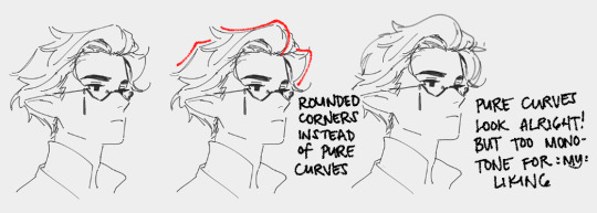
i have no further explanation for my choice for this aside from it just looks more visually appealing to me.
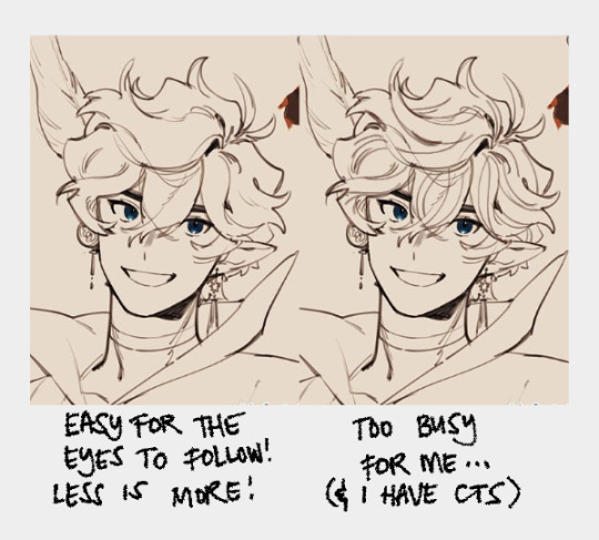
another thing i often do is draw locks of hair in “clumps” rather than drawing every strand. not only is drawing every strand of hair tiring as hell, it also is too busy for my liking. this is also easier for me with my art style where i tend to use colors more than lines, so drawing too many strands like that ends up being lost anyway.
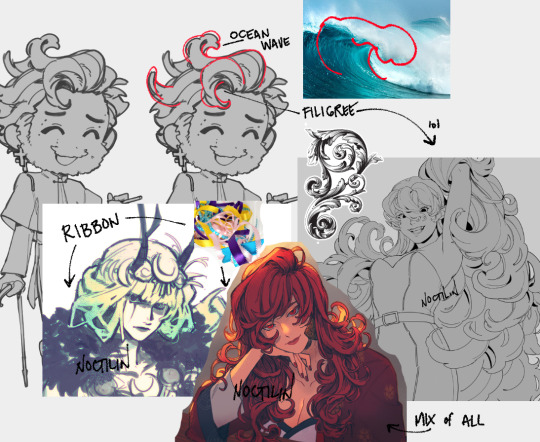
last thing i wanna say is i see hair as a mixture of ocean waves, ribbons and/or filigree. it’s not the exact same but i loosely follow it to give the hair i draw more life. always flowing and moving.
that’s all i can think of to share LOL hopefully this is helpful in some way bc this killed my brain. i am not made for teaching. all in all, hair is fun to play with! go crazy!
ocs used belong to me, @honshew, @hirumashadow, and @tsam__p
499 notes
·
View notes
Text
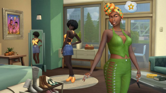
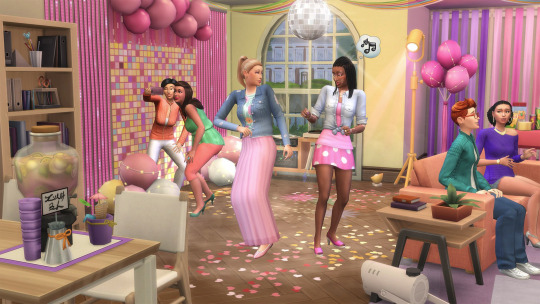
“Urban Homage” and “Party Essentials” Kits Announced
After a small leak yesterday, The Sims 4 officially announced its next two kits: Urban Homage and Party Essentials.
The first one comes in collaboration with @Ebonix, and is said to bring inspiration on 90s and 2000s fashion from London, UK. The other one, as its name suggests, focuses on party decoration, including a disco ball and a fog machine.
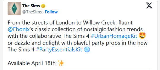
Both kits are coming out next Thursday, April 18th, so we can expect a patch on the 16th. Read the full blog announcement below.
On Point Looks and New Party Vibes
The Sims 4 Urban Homage and Party Essentials Kits Are Coming to The Sims 4
The party is just getting started! Step onto the scene in the trendiest threads and set the stage for unforgettable celebrations this season in The Sims 4.
With The Sims 4 Urban Homage and Party Essentials Kits, players can style their Sims in Simmer and gaming content creator, Ebonix’s favorite London city-inspired fashion and deck out party venues with festive decor for electrifying celebrations that will get Sims buzzing.

90s Vibes and Vibrant Motifs
Dress to impress with The Sims 4 Urban Homage Kit, created in collaboration with multi-award-winning gaming content creator and DE&I advocate, Danielle “Ebonix” Udogaranya.
Turn heads and make your Sim stand out as the ultimate virtual style icon with looks that offer a fresh take on nostalgic London city-inspired 90s and Noughties (a UK expression for the years between 2000 to 2009) fashion trends, with lively patterns, vibrant graffiti motifs and eye-catching accessories. These modern looks are bold and unapologetic, inspired by a time and place near and dear to Ebonix.
With striking ensembles and statement pieces such as iconic overalls, butterfly tops, eye-catching layered jewelry and glamorous new nails, Sims can confidently strut in style and express their individuality in more ways than ever before. Advertisement
“When I came up with Urban Homage, the pitch [to Maxis] was paying homage to the 80s, 90s, and 00s,” says Ebonix. “[The Kit] is inspired by the urban chic culture which highlights the innovation, diversity and vibrancy that city life fosters which I very much embrace as part of my day to day wears. So with that said, I wanted to bring to life some timeless pieces that tap into eras that we draw inspiration from and are still the blueprint of fashion innovation to this day, with a variety of outfits that are dynamic and vibrant, traditional and contemporary, and rich with cultural trends!
Fun fact: The numbers on the basketball shorts are actually the birthdays of Ebonix’s mom (24), dad (18), best friend (16), goddaughter (14) and her own (10)! She felt this would be such a beautiful, personal touch to commemorate and pay homage to the people who mean the absolute world to me.”

Celebrate with Flair
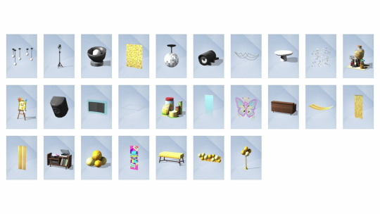
Amp up your festivities and make your epic parties unforgettable with The Sims 4 Party Essentials Kit!
Whether your Sim is hosting a lavish Landgraab luncheon or a raving rager for the Roomies, The Sims 4 Party Essentials Kit has everything you need to make your next celebration the talk of the town. Advertisement
Dazzle and delight with playful party props, including eye-catching streamers, an entrancing fog machine and a versatile bar that can stick around after the party. Add some drama to everyday decor with lively and unique new items like a mesmerizing disco ball. Set the perfect vibe with coordinated party decorations or mix and match to set the mood and make memorable Simstagram posts pop.
Form your group and let the good times roll in style. Shpansa!

The Sims 4 Urban Homage and Party Essentials Kits will be available on April 18, 2024 on PC via EA app™, Mac® via Origin, Epic Games Store and Steam®, PlayStation®5, PlayStation®4, Xbox Series X|S and Xbox One systems.
The Sims 4 Urban Homage and Party Essentials Kits require The Sims 4 base game, available free to download with all game updates. See minimum system requirements for the pack.
30 notes
·
View notes
Text
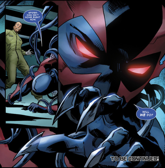
SPOILERS FOR SYMBIOTE SPIDERMAN 2099: ISSUE #1
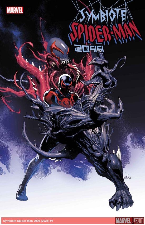
I will be discussing my thoughts and opinions about the recently released Issue of Symbiote Spiderman 2099 which will include MAJOR SPOILERS.
You have been warned.
Tbh I don’t have much to say at the moment since everything is only getting started lollll
This is all my own opinion 🦈
Not what I expected yet left me pleasantly surprised. Tbh, I had expected the symbiote issue to pick up after Dark Genesis and got whiplash when we were taken all the way back to Issue #43 of the original run.
I was never a huge fan of the flooding plot so I’m glad it wasn’t focused too much upon in this issue, fingers crossed for the rest of the series!
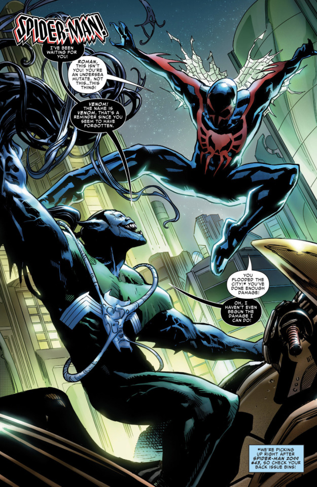
Now, the art. Mixed feelings. It seems that there may have been some miscommunication between the art and story teams because who tf is this blue eyed, non-cunty, straight haired Miguel????? (Like aren’t comic Miguel’s eyes always red and even if they weren’t his eyes were green pre-spidering??) Also they didn’t draw his talons right. Where are his high waisted pants >:(
HOWEVER
Roge Antonio absolutely rocked every panel with the symbiotes (which makes sense considering his work with Carnage)! The action scenes with the Venom were wonderfully fluid and creative and I’m especially excited for what Miguel’s fighting style will look like with his new symbiote.
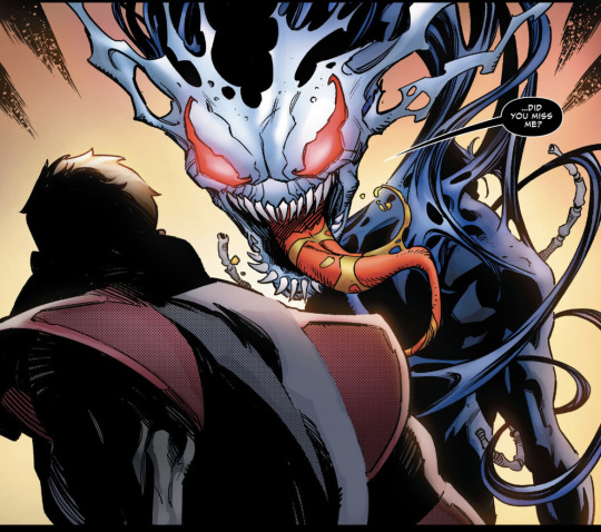
Oh yeah, Miguel is also hosting a new unnamed symbiote??? The setup for that seems like fun and I’m excited to see what they do with the next issue.
Now, Kron…
I’m actually really hoping we get some more characterization of Kron in this series, we delve too deep in this issue but I am surprisingly intrigued by Kron where I wasn’t so much in the past. David seems to be showing a more sympathetic side to Kron and I’m looking forward to see if that is expanded on further.
In summary: pretty solid first issue! The beginning was a little awkward due to the flood plot but once that was done the story picked up. I’m definitely gonna reread the last couple of issues of Miguel’s 90’s run to make sure I don’t miss anything ;). Let’s hope Peter David doesn’t pull a Steve Orlando.
Excited for more, fingers crossed for some existentialist Miggy content :)
#miguel o'hara#spiderman 2099#comic miguel#spider man 2099 comic#spider man 2099#miguel o’hara#spiderman2099#symbiote spiderman 2099#symbiote spiderman 2099 comic#comic spoilers#spoilers#symbiote spiderman 2099 spoilers#symbiote 2099
40 notes
·
View notes
Text
i have no idea what to call this au, this is just my excuse to post lil guys
au where Fatbear and Springbonnie are foster parents and raise a bunch of boogers who I had so much fun drawing, huge inspiration from 70's-90's clothing/hair styles
anyways i death


#fnaf#five nights at freddy's#freddy fazbear#plushtrap#foxy#bonnie#chica#fredbear#springbonnie#fnaf au#i feel so nervous posting this plz dont bully me#also ignore how my art style is different in this plz#i dont draw chica ever
72 notes
·
View notes
Text

Wanted to capture that 80’s/90’s anime goodness in an anime screen shot .✨
Was a really fun style to draw in! ☺️
#art#doodle#artist#sketch#drawing#artoftheday#ff7#gamer#fanart#ff7r#ffvii#squareenix#ittybittypixel#finalfantasy#sketching#cute#tifa lockhart#tifa ff7#aerithgainsborough#ff7 aerith#aerith final fantasy#tifa final fantasy#tifa fanart#aerith fanart#ff7fanart#ffvii fanart#ff7r fanart
345 notes
·
View notes
Note
Who is your favorite Arcane artist?
Oh lord.
Arcane has such an insanely talented array of artists - I legit wouldn't know who to choose, if I could choose at all.
I'll just dump love on 'em<3
@aromansoul is to artwork what Mozart is to symphonies - every single piece feels like a fantasy epic and will give you shivers with the sheer incoherent-making awesomeness. Just... the colors, the composition, the frames. Everything is drool-worthy.
@goathag has a wonderfully detailed style that's reminiscent of old Lemony Snicket illustrations but also so beautifully zany and unique (and in equal turns hilarious and heartwarming). I re-read their Jinx and Silco comics and go 'Aww' everytime.
@shahs1221 will knock your socks off with their brilliant use of coloring, and make you go Va-Va-Vooooom at the crisp linework, impeccable body language and stellar facial expressions. Shahs takes smoking hot characters and makes them smolder.
@iseutz has a style that makes you feel as if you've walked straight into an animated epic from the golden Don Bluth era of cinema. Every gradation of color makes your jaw drop and gives you butterflies. Also did I mention it's dizzyingly pretty? *_*
@silcosentropy is my absolute favorite for gritty linework, staggering levels of detail, and bold coloring. They also never 'filter' the lines, scars and wrinkles that are so intrinsic to a unique character design (and to the human experience) and the results are nothing short of breathtaking.
@dcartcorner will make you feel like you're in a 90's arcade with the poppy colors, fresh compositions, adorable expressions, and general atmosphere of whimsical nostalgia. Bonus: they do rarepair artwork and their AU's are loads of fun.
@captaincapslock takes the crown for the most awesome Saturday Morning Cartoons style. Their 'Welcome to the Lanes' comic makes me feel like a kid tuning in to watch my favorite show way back in the 90s, and the energy is sharp, zippy, and bold, with ingenious use of frames.
@frenchublog is a feast for the eyes and I cheer every time they post. Their mastery of dynamic poses, off-kilter angles and lively character expressions all pack so much personality and punch. Also their Silco & Jinx pieces break my heart.
@pluviofleur has the most fun and fantastic twists to each character. Their sheep!Silco and monkey!Jinx are delightful and full of so much drama and personality. Also they do ponies. So many ponies.
@zkyfall does fabulous line drawings and monochrome works that have such a classic Bond-era vibe. Their Silco also looks deliciously scrunkly and full of Tired Dad energy.
@perfectlywingedart takes the cake for artwork that makes you feel like you are EATING cake. The textures have such a smooth finish and the lines are so sleek and the colors are so yum. Very lickable artwork :3
@revewrites does delightful doodles with lovely pastel colors and a fabulous caricature style like you'd see on old school Victorian-era comics. Silco's ears hehehe...
@lipsticksandmolotovs would not call themselves a fanartist - but their gif designs, manips, graphics and web layouts are absolute eye candy and deserve all the kudos.
These are just some of the artists whose works I enjoy - and whom I can recall off the top of my head. This fandom has many, many, MANY awesome artists and each of them deserve all the praise and hugs.
Thank you for sharing your talent and making the fandom brighter 💗
#arcane#arcane league of legends#arcane silco#silco#arcane jinx#jinx#arcane sevika#sevika#arcane vi#vi#arcane mel#mel medarda#arcane caitlyn#caitlyn kiramman#arcane fanart#arcane fanartists
89 notes
·
View notes
Note
Who is your least favorite spider-man writer and artist and your most favorite artist and writer of spider-man?
Picking favorites feels surprisingly tricky, not because I can't but because Buscema edges out Romita on art but Conway edges out DeMatteis on writing (by dint of spending thirty straight years + 20 more off and on kicking my ass and how when he falls on his ass it remains fun for me), and these names next to each other are nothing. This is a stupid combination. Really highlights how superhero comics are made by teams and a single dude cannot guarantee quality if they're not vibing with the rest of the carpool. But if I'm picking a team the seventies beats the nineties, and it's sooo disingenuous to try to narrow down one pair of names when that era was Lee/Romita bleeding into Lee/Conway/Romita into Conway/Romita/Kane, also every few issues Mooney dips in to push the Peter having pretty eyelashes agenda and then leaves. Like some of the best art in this era had Kane doing pencils and Romita inking, and I like their combined style more than Romita penciling his own work if we're talking the period where he was still a full time illustrator, but I midkey dislike Kane's pencils inked by everybody else. I looked up who was illustrating 90's Web with Conway on scripts and it turns out the art I like best is a penciler and inker team and the quality takes a dive whenever either of them takes a month off and leaves the other one in a substitute's hands. You know! Team efforts! Anyway here are some iconic combinations in no order cherry picked to cut out overlap and sneak more people in.
Yes Please:
DeMatteis/Buscema
SSM #180
There's a rhythm to this team's work I've full stop never seen anywhere else.
Lee/Romita
ASM #83
The Vibe.
Conway/Andru
ASM #145
The number of times Gerry Conway has kicked my ass. u_u With Romita Sr. and Andru the most distinctive art trait is the faces - Andru's were never as doll-perfect as Romita's, and that's kind of the best thing about them?
Now guys I hate on the other hand. Way less complex. Debated whether to answer this because I try not to go on about who in the industry sucks at their job but this is not because I couldn't.
Please No:
Spencer/Otley
ASM (2018) #30
It should have been difficult to outdo the preceding run, but writing that was simultaneously nonsensical and insulting, deflated pacing where each issue achieved about as much as a single newspaper strip, a teeth-first art style where every face sports a pained grimace and the meandering composition always scores a D-, and the finishing touch of colors that I can only describe as Averaging Out to Oatmeal...combined to create some of the worst comics I've ever seen. Spencer and I appreciate so many of the same comics and his understanding of what makes them good is so poor that it's almost like receiving a personalized hate letter.
Slott/anybody

ASM #546
He can write well which just makes it worse. I don't even know where to start enumerating his crimes. Like do I just pick one anecdote? When there are so many?
Land (the porn trace guy)
Symbiote Spider-Man: Alien Reality #2 but I could have opened anything and found a bad traced yelling face
You know. The guy. Who traces from porn. That guy. He remains gainfully employed despite being known for this. Does he have dirt on an important executive?
Campbell (yes he watermarked the one on the left two separate times AFTER signing it)
ASM (2018) #2 variant, Renew Your Vows #11 variant
If you're distant from the recent comics scene it's hard to convey how omnipresent this guy is. He's like the comic sans of artists. After having the way he draws women ripped to shreds by social media over a decade ago, Campbell doubled down and has since then drawn hundreds of pinups of identical women in invisible high heels making the exact same face. Singlehandedly a huge factor in how people visualize MJ becoming "skinny carrot top with a pointy chin and freckles". He's proud of this.
#letting the negative explanations get longer because with the good ones i want people to go see what the hype is for themselves!#not with the bad ones lol. lmao. i'll take that bullet for you.#asks answered#anonymous#spiderman#marvel#spidey
46 notes
·
View notes
Text
2025 week two songs review
i forgot to do last weeks lol, i'll get around to it. This is a good week
Vogue: April's back! Love that the mentioned her by name in the teaser. This time shes left the 80s behind and is now in the 90s lol. She does look a bit more mature in this one, probably to reflect that the song is a 90s song as opposed to IWDWS being 80's. Even with how the store she's in has changed now selling more cds. wonder if any other coaches will appear in the background like they did. I kinda want to draw April now. They have temporarily privated the preview lol, probably because it said it was the ballroom version by accident.
Vogue (Ballroom): At first i thought the lighting looked weird but then i watched it again and it looked normal. Do we know who the dancer is? i'm guessing either one of the choreographers or its someone whos apart of a collab. I know nothing about the vogue style of dance, but this looks like its going to be sore on the arms. I find it weird when there's an actual human in the games because i'm so used to seeing the regular coaches that when the likes of Ava Max or annother real person show up, it throws me off.
Something I Can Feel: They said on twitter that this one incorporates sign language into it as the singer is deaf. It's really cool to look at, dance looks fun as well. At first i thought that this could be the forgotten queen before the events of human, but the more that i look at it the more it looks like the dancer is performing to an audience. Its nice when we get songs like this. I also really like the jump they do, its just satisfying to me.
Yeah!: This ones so funny to me for some reason. Like he's trying to be serious, but he isn't and comes off as more cute than anything. Looks really fun though. Love how he goes into the ddr machine for the chorus. The more i watch it the more adorable the dancer looks and the more he looks like Tyler from Sk8er boi, maybe it is him but we probably won't know until Just Dance tells us his name or posts a meme tomorrow. Can't wait to get the gold move to get a YEAH on YEAH!
ranking:
1 Something I Can Feel.
2 Yeah
3 Both Vogues
Last week i felt that they chose the most random points to cut the previews off at, where as this week it feels like they chose the right parts to end so you still get a good idea. This is a fun week
I love how the coaches that have been returning get updated looks. Like lady citrus from last week is so vibrant and The bride's original look is so clean looking now. Even April, who first appeared last year, now looks like shes adapted to the change of the 90s. Honestly i really like how coaches have been returning as it makes them feel like actual characters. Its also really funny when they bring the most random coach back like did anyone know that Captain Crimson was the coach from Jump in the line before it was mentioned in his lore video, then you go and check and it is the same guy, only more ravaged.
They still haven't updated the 2025 playlist wth this week's and last week's songs.
9 notes
·
View notes
Last Seen Blogs


bg-audio-oppenheimer-2023
[BG-Audio]▷ Опенхаймер (2023) филм Бг Ауди