#Intuitive button layout
Explore tagged Tumblr posts
Text
Hex Gaming Ultra X Controller For XBOX One
!
Designed with precision and innovation, the Ultra X Controller from Hex Gaming promises to enhance your gaming sessions with its sturdy build and premium components. Today we’re looking into the features, tech specs, and overall performance of the Ultra X Controller. Hex Gaming Hex Gaming have established themselves firmly in the gaming peripherals market, by delivering high-quality products.…
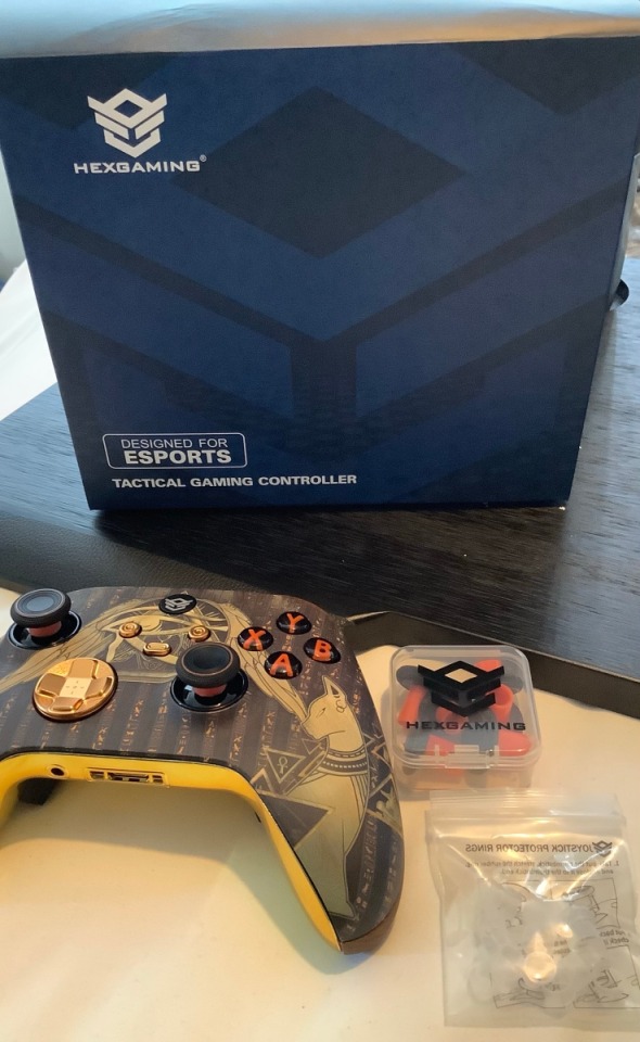
View On WordPress
#Advanced haptic feedback#blog#Compact controller dimensions#crazydiscostu#CRAZYDISCOSTU.COM gaming blog#Custom button and casing choices#Customizable button mapping#Customization options#gaming#Gaming sessions enhancement#geek#Hex Gaming design options#Hex Gaming peripherals#Hex Gaming reputation#Immersive gaming experience#Interchangeable textured thumbsticks#Intuitive button layout#Lightweight gaming controller#Luxurious gaming experience#On-the-fly profile switching#Paddle remapping profiles#Premium gaming components#Responsive triggers#review#reviews#Sturdy build controller#Tech#Ultra X Controller#USB-C charging port#Vibrant controller colors
0 notes
Text
WHY DID THE CHANGE THE LAYOUT OF AN APP THAT APPEALS MAINLY TO NEURODIVERGENT PEOPLE WAAAAAA I DON'T LIKE THIS
#neurodivergent#adhd#actually adhd#ice speaks#caps#my. my task manager D:#the new layout is so bad i don't get it it's not intuitive i have to read every button i don't know where things are
43 notes
·
View notes
Text
i Hate this new layout Please let this just be a test this is terrible. it's so condensed, way too much information on one page, i don't want this. why in the world would you want to copy twitters layout Now of all times???
#i talk#i dont even know where to look its really overwhelming#and the create post button on the bottom left thats just the worst location?#what were they thinking??#this layout is not intuitive at all and its not to new users either and im already seeing everyone in the staff and update tag hating this
11 notes
·
View notes
Text
Mastering Flutterflow: Tips and Tricks for Aspiring App Developers Why Every App
In today’s fast-paced digital world, app development is more crucial than ever. With millions of apps available, standing out is a challenge for aspiring developers. This is where Flutterflow comes into play. Imagine being able to design and build beautiful applications without the steep learning curve of traditional coding. Whether you’re a seasoned developer or just starting your journey, Flutterflow offers innovative tools that can simplify the entire process. What if you could create mobile apps with minimal effort while maximizing creativity? That’s the magic of using Flutterflow as your go-to platform. It's not just about building an app; it's about mastering an art form that blends functionality with stunning visuals. If you're eager to dive into the world of app development and want to make waves in this vibrant ecosystem, let’s explore how Flutterflow can elevate your skills and help you become a proficient Flutterflow App Developer!
Benefits of Using Flutterflow for App Development
Flutterflow revolutionizes app development with its no-code approach, making it accessible for everyone. You don’t need extensive programming knowledge to create stunning applications. This feature empowers designers and entrepreneurs to bring their ideas to life quickly. The platform’s drag-and-drop interface streamlines the design process. It allows you to visualize your app in real time, reducing the back-and-forth typical of traditional coding methods. You can see changes instantly, enhancing creativity and efficiency. Another key advantage is the built-in integration with Firebase and other services. This means developers can add backend functionality without hassle, saving valuable time during project execution. Collaboration is seamless too. Flutterflow enables team members to work together effortlessly on a single project, ensuring that feedback loops are short and productive. With these benefits combined, it's clear why so many are choosing Flutterflow as their preferred development tool.
Designing Your App with Flutterflow
Designing your app with Flutterflow can be a seamless experience. The platform offers an intuitive drag-and-drop interface that simplifies the design process. You don’t need to be a coding expert to create stunning visuals. Start by exploring pre-built templates tailored for various industries. These templates provide inspiration and save time, allowing you to focus on customization. Utilize the extensive widget library available in Flutterflow. Widgets help you craft unique layouts while ensuring responsiveness across devices. From buttons to complex animations, there’s something for every vision. Pay attention to color schemes and typography; they define your brand's voice within the app. Consistency is key when it comes to user experience—ensure elements align well visually and functionally. Harness real-time collaboration features if you're part of a team. This ensures everyone stays aligned without losing creativity during the design phase.
Adding Functionality with Actions and Interactions
When it comes to enhancing your app’s capabilities, Flutterflow shines with its intuitive approach to adding functionality. The platform allows you to incorporate various actions and interactions seamlessly. Widgets are the building blocks for interactions in Flutterflow. You can easily set up buttons or gestures that trigger specific actions within your app. Whether it's navigating between screens, triggering animations, or launching external links, everything is straightforward. One of the standout features is the ability to add backend functionality without needing extensive coding knowledge. With just a few clicks, you can connect APIs or databases directly through Flutterflow’s interface. This opens up a world of possibilities for data-driven applications. Moreover, integrating third-party services like authentication providers is simple too. Set up user logins or social media sign-ins efficiently and securely using pre-built options available in Flutterflow. Testing these functionalities is equally hassle-free; you can preview changes instantly as you build your app. This iterative process helps refine user experience right from the start. Exploring these actionable elements will undoubtedly elevate your skills as a Flutterflow App Developer while also making your projects more dynamic and engaging for users looking forward to their next favorite application.
For More Information :
Flutterflow Application Development
Develop AI Apps in Flutterflow
Flutterflow Web Development Company
#In today’s fast-paced digital world#app development is more crucial than ever. With millions of apps available#standing out is a challenge for aspiring developers. This is where Flutterflow comes into play. Imagine being able to design and build beau#Flutterflow offers innovative tools that can simplify the entire process.#What if you could create mobile apps with minimal effort while maximizing creativity? That’s the magic of using Flutterflow as your go-to p#let’s explore how Flutterflow can elevate your skills and help you become a proficient Flutterflow App Developer!#Benefits of Using Flutterflow for App Development#Flutterflow revolutionizes app development with its no-code approach#making it accessible for everyone. You don’t need extensive programming knowledge to create stunning applications. This feature empowers de#The platform’s drag-and-drop interface streamlines the design process. It allows you to visualize your app in real time#reducing the back-and-forth typical of traditional coding methods. You can see changes instantly#enhancing creativity and efficiency.#Another key advantage is the built-in integration with Firebase and other services. This means developers can add backend functionality wit#saving valuable time during project execution.#Collaboration is seamless too. Flutterflow enables team members to work together effortlessly on a single project#ensuring that feedback loops are short and productive. With these benefits combined#it's clear why so many are choosing Flutterflow as their preferred development tool.#Designing Your App with Flutterflow#Designing your app with Flutterflow can be a seamless experience. The platform offers an intuitive drag-and-drop interface that simplifies#Start by exploring pre-built templates tailored for various industries. These templates provide inspiration and save time#allowing you to focus on customization.#Utilize the extensive widget library available in Flutterflow. Widgets help you craft unique layouts while ensuring responsiveness across d#there’s something for every vision.#Pay attention to color schemes and typography; they define your brand's voice within the app. Consistency is key when it comes to user expe#Harness real-time collaboration features if you're part of a team. This ensures everyone stays aligned without losing creativity during the#Adding Functionality with Actions and Interactions#When it comes to enhancing your app’s capabilities#Flutterflow shines with its intuitive approach to adding functionality. The platform allows you to incorporate various actions and interact#Widgets are the building blocks for interactions in Flutterflow. You can easily set up buttons or gestures that trigger specific actions wi#triggering animations
0 notes
Text
y'know how the EU forced tech manufacturers to all start using The Same type of port for their charging cables to be more consumer & environment friendly
we should do that but with like the button layout on xbox & switch controllers
#WHY IS SWITCH UP X LEFT Y RIGHT A DOWN B#WHILE XBOX IS UP Y LEFT X RIGHT B DOWN A !!!!!!!!!#eurghhhhh#i hate having to make my brain re-adapt and fucking up my inputs whenever i go from one controller to the other#like i have a xbox-style one for my PC and then the pro for my switch#especially with games like ttyd like. bro my action commands ;_;#shit should be intuitive tf#fuck it All controllers should be fucking identical entirely#unless your shit has some very particular gimmick feature that is 100% required why do you bother making it different#it's not like this is still the ''we're trying shit out before finding what actually works'' era like#yeah we got stuff like the n64 or gamecube controllers that were ~unique~ but that's not the case anymore#companies know what people expect & want a controller to look like & the button layout it should have#so.... please.......... put the ABXY buttons in the same place all of you Please......#playstation you keep playing with your little shapes ok? here have a fruit snack
0 notes
Text
Reasons Discord's New Mobile Layout Update is Bad
The reply function is redundant, as most people are used to just holding down and tapping the reply option at the top. If they're going to change it, they shouldn't have gotten rid of the member list for this functionally bad option. It also doesnt line up with any other platform in terms of swipe direction.
The member list is gone from easy viewing
It doesnt auto open your last group chat/DM making multiple simultaneous conversations far more difficult and longer
It's already broken my app once (Locked all channels including other servers' to one channel. I could not access anything except that and my DMs.)
You can not see images that have been pinned in the pins tab.
The search function was fine before. Where did your before, during and after date search go??
All of Discord's individuality is disappearing.
Getting used to a mobile format actually impedes usage of the desktop format and likely discourages people from multiplatforming discord because theyre so used to the "intuitiveness" of the new "tailored for mobile" experience
There is no way to CHANGE IT BACK. This is like Tumblr rolling out Tumblr Live without any Disable button At All.
Why are they marketing midnight mode as Something fucking ENTIRELY new??? It has always been a feature on Android as the AMOLED theme???????
DARK MODE IS NO LONGER LOW CONTRAST AND DISCORD IS DEVOLVING INTO AN ACCESSIBILITY NIGHTMARE
Disable swipe-to-reply by activating full-screen Launchpad in Advanced Settings
Discord’s new layout is apparently permanent. Keep sending feedback and rating it one star on all appstores; if you get redirected to the advice article, double tap gove feedback.
If you, too, dislike the theme, head to settings (you can double tap your account picture) and go to Appearance, scroll to New Layout and Send Feedback.
Overall, what they've done is disorientate every single current user on discord, and you cannot avoid it unless you've not updated to the latest discord because this is not an update. It is a feature that has already been on the latest update and is being slowly rolled out, like Tumblr Polls.
Good Luck, and may we send as much feedback as possible and have them make it optional or at the least, revert it. I've already sent in at least seven complaints to discord, commented on their instagram post about the layout and I'm about one star review it on google play and app store.
This isnt just the appearance and vibes being off like the new (ish) app icon, this is a matter of functionality.
11K notes
·
View notes
Text
my proposal for a new, no-nonsense standard in videogame controller face button layout
there are currently three competing standards for the arrangement of four buttons in a diamond. each of these standards has an X button in a completely different place, belying the arbitrary nature of their development. herein i propose an intuitive and easy-to remember button layout standard

the X and Y buttons correspond to their familiar orientations on the cartesian plane. the Y button can be used to confirm selections, standing for Yes, and likewise the X button can be used to cancel, or "canXel" selections, which will be obvious and intuitive for gamers across the globe
the Z button represents the depth axis used 3-dimensional matrices, though of course not at an angle usually used to signify 3-dimensional space on a 2-dimensional layout. its placement at the bottom can also be remembered because it is at the bottom of the alphabet. the Z button can be used to undo selections
the W button represents West
1K notes
·
View notes
Text
alright i'll put this in the post and not just keep it in the tags but basically idol mobages have to have some sort of gimmick to differentiate them from the others on the market. enstars has 3d mvs for all of its songs that you can put different characters into with different outfits, d4dj uses a dj booth layout for its game along with allowing for medleys of its various songs to be played, hypmic does like a record scratch thing as well as theming itself around rap battles. project sekai's gimmick is very obviously vocaloids and it uses this a lot in its marketing and such.
however, i think project sekai is trying too hard to be multiple things at once rather than focusing on what makes it different from the other games. they have 3d videos for some of their songs like enstars does, but because the bar layout for the game grays out the background by default, you don't see the video very well while you're playing. ensemble stars, to get around this problem, makes the lanes transparent against the video background so you can see the video while you play (and some beat maps do play on visual cues as well as audio ones if you play with the 3d mv on). ensemble stars is also meant to be easy to pick up since it was made with beginners to the rhythm game genre in mind, but it does have its own special beat maps that break several rules in map design that keep it interesting.
d4dj is another straight lane game that doesn't have music videos, but they have a gimmick with how their lanes are set up. you have the normal tap notes like you see in project sekai, but instead of flick notes you have the faders and disks which change the sound of the song as you play, which adds to the experience while you're playing. project sekai just has simple tap, hold, and flick notes and while the notes can vary in width, it doesn't really impact the game itself so it seems like an odd choice to make with their game design?
and hypmic is probably the most different from project sekai but it still has its own gimmick that it plays into. rather than a small game cut of the song like some of these other games, hypmic splits the songs into parts so you can play the entire song over 2-5 parts. they also utilize a ring style layout but have two different types of hold notes, yellow and green. the yellow ones are simple holds and green ones rotate the entire map to where the note goes, adding depth to the game play.
i've tried to play project sekai a few times and it just doesn't know what it wants to do. it has 3d mvs like ensemble stars and it has a straight lane layout which. those two don't really mesh. anything you can find in project sekai you can find it better in another game. d4dj does the world interactions and also just has the best live 2d of any of these games (in my opinion. its very very smooth), you can do office or club decoration in both d4dj and ensemble stars, d4dj has a more creative and inspired straight lane layout and ensemble stars has better 3d mvs in general and knows how to utilize them with its layout, and while hypmic doesn't really have any of these things, it does still manage to hold its own with its rap battle gimmick and the drama tracks and manga for the story. project sekai leans very very heavily on that vocaloid theming and doesn't really put any effort into actually making the game like. enjoyable or unique.
having thoughts about what makes an interesting idol rhythm game
#srb#i just think project sekai could remove the 3d mvs and it would probably be the same#or make adjustments to allow for them but only some songs having them also feels weird#i hate the ui for proseka too tbh. even though theres no english version of hypmic i have still figured out#what all the buttons do because its pretty intuitively designed even if you dont speak japanese#anyway. these are my expanded thoughts#im thinking on how the proseka map layouts could be better#i mean like. d4dj does the thing where chibis of the characters you have in your lineup are in your club while you play#they could definitely do something like that (though i did not pay attention too much to the background of any of their things)#and i just. could not figure out anything about card leveling and uncapping and shit. unintuitive as hell game#idk its not my job to like design a game i just think as someone who has played multiple idol mobages#post love-live sif like. proseka just did not do anything to make its game play stand out and be unique#anyway.
27 notes
·
View notes
Text
This has been bugging me a bit so I might as well make a note of it, since Tumblr seems to be making it harder and harder to do this.
Anyway, if you pay attention to urls, you might notice that when you link to someone’s tumblr blog, there are two options. This affects how the post appears in your browser! Let’s take this cute Ace Attorney comic as an example. If you click the “share” link on a post, it gives you a url that looks like this - https://www.tumblr.com/leaping-ocelots/718922746931904512/minart-was-takeni-started-spirit-of-justice?source=share
And this displays in the Tumblr dash view, like this.
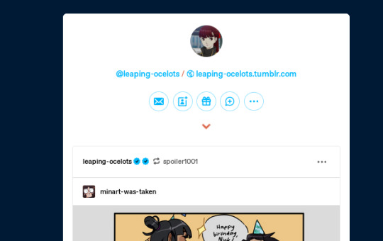
HOWEVER, if you change the url to the way that urls here used to work, with the username in the front - https://leaping-ocelots.tumblr.com/post/718922746931904512/minart-was-takeni-started-spirit-of-justice
You see the post as it’s meant to be seen, with the Tumblr’s layout properly in place!

Why does this matter? Well I like to link to the post with the user’s theme in place since that makes it easier for people who don’t have a Tumblr to see it. You used to be able to right click on a username to get the direct url by going to “copy link” (they used to let you click the top right corner of a post to get the link as well, it seems like they’re just cutting off more and more ways to do this).
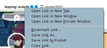
However, in the last day or so Tumblr’s changed it so if you copy link as before, it’s just the base Tumblr url, not the link to the post - zarla-s.tumblr.com instead of zarla-s.tumblr.com/numbers/posturl for example. This makes it annoying to share the post without using the “share” button, which always directs to the dash view. After some poking around, I eventually found the direct link again. It’s not in exactly an intuitive place though.

It’s here. If you click the dots then go to the date it was posted, you can copy link from there to get the right link to the direct post on the person’s tumblr. It also shaves off the extra “share” bit from the url - https://www.tumblr.com/leaping-ocelots/718922746931904512/minart-was-takeni-started-spirit-of-justice?source=share
See that “?source=share” there? That’s not necessary. Actually, if you ever see anything on a url that has a ? in front of it, you can just cut it off the url and it won’t change anything. It tidies up the link nicely! Just for reference if you’ve got a super messy link or something or if you just don’t like those url additions on principle.
Anyway I don’t know who I’m making this post for! It was just bugging me!!
956 notes
·
View notes
Text
post for @wuggen asked to see the code i wrote for simulating a realistic car engine so here
its built in godot btw

the script extends rigidbody3d cus im actually just moving an invisible sphere along the ground with a car basically stapled to it

did you know car engines put out different levels of torque at different rpms which affects like basically everything about the car. the torque curves are actually way more complicated than this, they kind of look like ramps with a hump in the middle followed by a dip followed by a bigger hump. but im just doing something that looks more like a perfect mound here. it works fine

i found the equation power=torque*rpm/9549.3 online from a forum where some guy posted the results of a dyno run on his porsche. the number 9549.3 is definitely specific to that porsche, so its probably a variable id want to be able to change later i guess

theres 2 big scary chunks of code here written by someone else which youre looking at in the pic above. i dont know shit about rotating and transforming 3d shapes so yea thanks guy on youtube

^this is basic shit but let me say one thing having the layout of accelerating with up on the right stick and braking with down on the right stick makes racing games so much more intuitive to play because suddenly it all just becomes one button that like the player understands in their mind as just "movement" and say for example when the player is coming up on a turn and they point both the steering and throttle joystick towards the turn whats happening is that they steer towards the turn of course but also they decelerate because the right stick is no longer pointed fully up in the Y direction, its Y value is now something like 0.7 instead of 1.0 because of the angle the stick is pointed in, that extra 0.3 went to the X direction , meaning the player automatically decelerates the car based on the angle of the turn without even having to think about it. if the turn starts to become more hairpin the angle is so great that the Y starts becoming negative and now braking is happening instead of acceleration automatically. its actually beautiful how simple and effective it is

^heres my cool function that does basically everyuthing related to the rpm. different gears rise and fall at different rpm speeds and it even simulates the effect of engine braking caused by releasing the throttle when shifting gears. it has so many fucking magic numbers from me just fiddling with it for like years trying to get the acceleration and shit to feel just right

^this ones mad complicated i commented every line

awesome gear shifting stuff its so fucking yummy because if u look closely in the video at the top u will notice i never use the brake to slow down. i downshift gears which causes causes the car to lose speed because the power it was giving out is less efficient now due to the lower gear ratio which also means the rpm jumps up to redline speeds which lets me instantly shift back up to retain some acceleration i cant tell u how satisfying it is to drive this thing and it feels like a real car

^and thats it thats the last function. 212 lines of code honestly pretty small tbh. theres still stuff missing like for example when a car is turning the rpm starts increasing at a slower rate due to things like centripetal force traction rolling resistance weight transfer weight load engine load steering angle friction but im probably just gonna end up calculating it only based on velocity * steering angle or something lol. if anyone made it this far i contratutle you i dont think anyone who isnt as obsessed as i am with this stuff could ever read this whole thing so thank u
39 notes
·
View notes
Text
Hello, all! Thank you for the patience at the later update! It's my goal to get them back on track with updates on or near the 10th. We waited this month for two reasons:
1. A few artists went on short hiatus, leaving less to show on the art side.
2. We're focusing a great deal of manpower towards the Cat Creator, including hand-selecting every color and its accents for each gene, balancing the wheel choice in our new system, and full steam ahead illustrating coverage and patterns you all are familiar with on new poses. We are MIGHTY proud of our work, and feel all the effort going into colors and genes will pay off, but there's not a lot to show off until the huge update (aside from a very extensive and colorful spreadsheet. We are drowning in hex codes!) Our wheel is truly like no other in its aesthetics, but it is taking a healthy amount of effort.
It was for this reason that we chose to wait until there was a bit more content to show. Next months update may be smaller as we get back on track to the 10th of every month.
We have great news on what we have completed!
First, let's look at some art!
New Fauna
More backer sponsored Fauna!
Starchaser
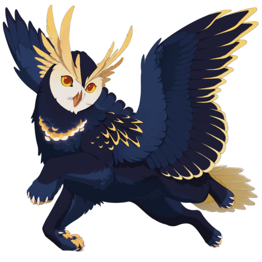
Sponsored and concepted by J. Tazer Pones, designed and illustrated by Hydde
Irimar
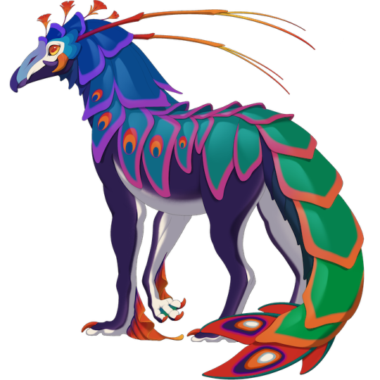
Sponsored and concepted by Isb, designed and illustrated by Hydde
Glasswing
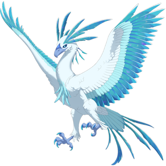
Sponsored and concepted by SolsticeStar, designed and illustrated by Hydde
And here is a peak at what's being lined currently!

Icons
How about those icons? We think they're coming out quite charming!
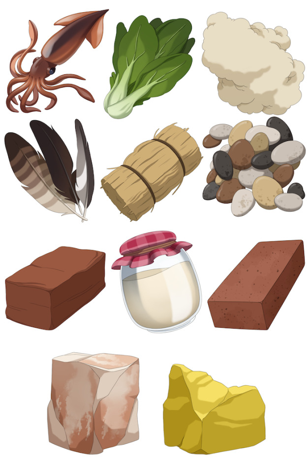
Squid, Bok Choy, Wool, Feathers, Hay, Pebbles, Clay, Cream, Brick, Salt Lick, and Sulfur, illustrated by Remmi
Backdrop WIPs
We're chipping away at backdrops! Here are a few work in progresses!

WIP Luna theme header by Runeowl and Mirko

WIP Harvest theme header by Runeowl and Harriertail
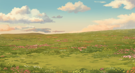
WIP Flower Meadow by Harriertail
UI Updates
Next, we're pleased to share what we feel is a fantastic final for our UI layouts.
Cat Creator
The cat creator went through the industrial meat grinder of testing and iteration. We had several prototypes working, all with pros and cons. A lot of consideration went into user experience, including:
Ensuring the least amount of clicking to see all the options, while still categorizing the content intuitively
In tandem, best utilizing the space to show the most amount of content at once, giving as many options as possible
Help the user best understand the relationship between what is being clicked and what is changing on the cat, with ease of navigation between each option
Give the user an easily accessible "summary" of each trait, color, and pattern that was chosen for the cat
Find an intuitive way to express the "Saturation / Luminosity" relationship on each color choice while not overwhelming the screen with jumbles of words
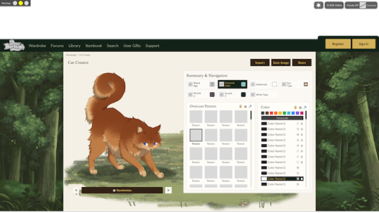

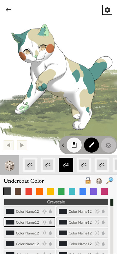
We are still toying with colors and superficial visuals, but this is the final layout being built!
The "Summary & Navigation" section will showcase what traits the cat shown is sporting (ex. Ragdoll Adult, Orange Solid, No White, Traditional Eyes.)
On mobile, the trait summary is represented by a third icon option the user can click. Otherwise, a mobile user can toggle between color and pattern for each section.
You also will see a color navigator with buttons for every hue, and symbols for "saturated," "dark," "medium," and "light."
Some of these options may seem incongruent from the current creator. Most notably: two accents!
It may seem like a damning choice. Really, more colors to worry about?
As a reminder, we will be grouping colors to allow for a larger chance at complementary colors (we are not ridding the chance at full randomization, just weighing it more equally against a large number of coordinated options.)
Furthermore, we are adding both line-breaking accents and very, very minor accents like ear fluff (we figured out a way to group it with mystic breeds), skin colors, or freckles on the skin. This was the best direction for both creative freedom and restriction among these options.
The largest worry we had when considering this decision was user pressure to utilize every slot on the cat. This was at the forefront of our minds all throughout PB's concepting!
As a solution, we are taking a design approach which will encourage users both to use and not use accent slots, depending on the character they are building. We have a reward system in the works which incentivizes both routes! As a character building game with focus on your characters and near limitless possibilities, we are designing a system which values cats and rewards the player not necessarily by abundance in design, but direction and creativity.
Simply put, building a cat the way you like it will be rewarding. This system will be unveiled at a later date, but it's great addition for the casual, creative, and breeding side of the playerbase! All of this combined made the most sense for a second accent.
Cat Profile
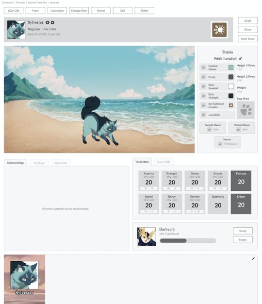
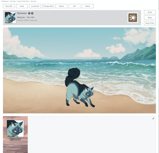
This is halfway built on the front-end, and will be done very soon!
Breeding
Big news, generative breeding functionality is done!
We wrapped up the breeding logic, and banged out what I believe is an excellent UI. Everything is fully functional!
Users can view not only a rotation of offspring previews, but view all the colors available to the offspring in each slot.
As well, users can choose what Borough their cat nests in as a premium feature. This includes a "traveling" option which randomizes the Borough for each potential kit!
Also in the preview is the nest tending page. Nests are tended to with items, and users can add midwives to forego the need to manually give said items. This mechanic is being built out!
I realize these previews might look abysmal. We want to be transparent on what we're doing and show "the sausage being made" per se. What's missing from these deployments currently is final pattern assets (previews are dummies for function testing), theme assets, icon placements, and hex codes; all things that aren't actually slowing down development on the technical side. They are very quick inserts once completed, and while it looks like a mess, this page is 99% done!
It's one step closer to a live update on the website!
We're working next on finishing the cat profile build, the customize functions (scene building, outfit building), and the daily item garnering mechanic!
Thank you everyone!
To Summarize: We shared new Fauna, icons, backdrop work-in-progresses, the final cat creator UI, the cat profile UI, and a look at our completed breeding functionality.
What to expect next month: Further asset renderings, outfit/scene building design, further functionality previews of what we are working on next.
73 notes
·
View notes
Text
okay so I'm watching this video explaining button layouts on video game controllers. and it's basically going over that once the four button layout was decided on, the most comfortable button was the bottom one, so that was made the "select button"
that's why Xbox has A on the bottom, and it's also why Sony eventually changed X to yes and Circle to no for the Playstation in the US. (no, it's not because Americans are stupid and thought X ment yes. although I wouldn't put it past us to believe that.)
and like, yeah, I agree that it's the most comfortable button to press. I play a lot of platformers where running or attacking is the left button, and I can easily jump with the bottom button by just rolling the lower part of my thumb. it's intuitive and basically second nature to me at this point.
but why does that mean it should be the "select button"?
maybe I'm just Nintendo brained, but to me, the select, confirm, yes, dialog, move-through-menus button will always be on the right. it just makes far more sense to put it there.
like, on a Nintendo controller, whether is snes, ds, classic controller, pro controller, or switch controller, they've all had the same layout of buttons since the 90s. and that's what I've been playing for literally my entire life. every time I try to use an xbox, I just get confused and mess up with the menus.
and like, I'm sure xbox players feel the exact same way with a Nintendo controller.
idk. I don't really have a point with this post.
I think the main thing is that I'm so used to the games I play having Y be a general attack or run or button you're gonna press a lot, B being a jump or some other button you're gonna press just as much, A being a simple interact or dialog or select button, and X being for menus. and even though A isn't the most comfortable button to press constantly, I still think it's fine enough to press often when you need to. it's not like it's actively uncomfortable to press. the most I would have to do is subconsciously shift my hand when I know I'm about to talk to someone.
was there a point to this post? no. I just wanna complain how I'm a Nintendo bitch and xbox and playstation controllers scare me.
20 notes
·
View notes
Text
The Role of User Experience (UX) in CRO: Why Design Matters
In today's competitive digital landscape, businesses are constantly seeking ways to enhance their websites and drive higher conversions. One of the most effective methods for achieving this is Conversion Rate Optimisation (CRO), and at the heart of any successful CRO strategy lies User Experience (UX) design. But why does UX matter so much when it comes to improving conversion rates? Let’s explore the critical role of UX in CRO and how focusing on design can make all the difference.
The Importance of User Experience
User Experience encompasses the entire interaction a user has with a website, from the moment they land on a page to the completion of a desired action, such as making a purchase or signing up for a newsletter. A seamless, intuitive, and pleasant experience ensures that users can navigate a site with ease, ultimately leading to higher conversions.
When the importance of user experience is overlooked, businesses run the risk of alienating potential customers through confusing layouts, slow load times, or poor mobile optimisation. In contrast, a well-designed website can dramatically enhance user satisfaction and increase the likelihood of conversions, making UX a vital element of any CRO strategy.
The Role of User Experience in CRO
So, what role does UX design play in CRO? At its core, UX design is about reducing friction points—those moments where users experience confusion or frustration. CRO aims to optimise these moments to increase the chances of users completing a desired action.
Here’s how UX directly impacts conversion rates:
Ease of Navigation: A clear and simple navigation structure enables users to find what they’re looking for quickly. If visitors have to dig through multiple pages to reach their goal, they're likely to abandon the site.
Mobile Responsiveness: With more users accessing websites through mobile devices, ensuring that your site is fully responsive across all devices is crucial. A mobile-friendly design enhances UX and can significantly boost conversions.
Visual Hierarchy: The way content is presented matters. By guiding users' eyes to key areas such as calls-to-action (CTAs) or important information through strategic design choices, you can improve user engagement and increase conversions.
Page Speed: Slow-loading websites lead to user frustration and higher bounce rates. Optimising UX involves reducing page load times to keep users engaged and on track to conversion.
Trust and Credibility: Well-designed websites build trust. Elements such as clear messaging, professional design, and easy-to-find contact information contribute to an overall positive user experience, which, in turn, increases conversion rates.
Design Matters for CRO Success
When CRO and UX come together, the results can be powerful. For instance, simply improving the placement and design of a CTA button or reducing form fields can result in a significant uptick in conversions. This is where the expertise of a specialised CRO agency in Australia comes into play, offering tailored strategies that combine data-driven insights with exceptional design to optimise user experience and drive business growth.
At a CRO agency, professionals understand that UX is not just about aesthetics; it’s about understanding user behaviour, analysing data, and implementing design changes that resonate with your audience. By partnering with experts, businesses can ensure that their website is optimised for both usability and conversions.
Conclusion
The importance of user experience in CRO cannot be overstated. Good UX design is essential for keeping users engaged, guiding them through the conversion funnel, and ensuring they leave your website with a positive impression. Whether you’re aiming to reduce bounce rates, increase sales, or grow your subscriber base, focusing on UX design is the key to unlocking higher conversion rates.
If you're ready to elevate your website’s performance through enhanced UX design, consider reaching out to a CRO agency in Australia that can help you optimise your digital strategy and drive meaningful results.
5 notes
·
View notes
Text
“Navigation is hard, it’s not intuitive.” - I keep hearing this.
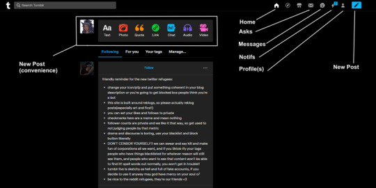
If any twitter friends have questions, I would love to answer any to try and help make using Tumblr easier for you, if you choose to use it. It’s honestly very simple and has a ton of creative features.
(More below!)
A big big big thing I want to stress - Tumblr is NOT a quick consumable metric chasing website, it’s not built to be. I would recommend Instagram if you want to chase metrics and consume media versus focus on the artistic or RP building atmosphere of it.
Don’t worry about the “layout” so hard. If you want to make one, there’s free layouts out there but it’s a legacy thing, so I wouldn’t make a priority. Unless you give someone your NAME@tumblr link versus tumblr.com/NAME link, they’ll never really see it (you’ll never see it). Focus on that later.
Asks: A built in CuriousCat/Telloynm
Messages: DMs
Conversing/Interacting:
Lovenotes in tags (People write comments in them along with the actual proper tagging when reblogging - not required but it makes people’s days and will inspire them to do the same for yours/others)
Commenting (self explanatory - comment on an image and we can reply back)
Re-blog commenting (If you make a text post, we can reblog and add our own text to it - can make it a back and forth chain but I wouldn't recommend unless it’s RP or questions or intellectual debate)
(Hey look, I don't have a 280 chara limit) (This baby can fit so much text customization)
Asks: a great feature to ask questions or submit reblogged writing prompts for RP. Comes with Anon feature (togglable).
Reblogging is exposure. Likes are personal and do not populate on dashboards like on Twitter. People can still access them from your page but odds are they aren’t going to do that. You can make your Likes private for only you to see if you wanted as well.
You can upload an array of things from Text, Photos, Quotes, Music, etc. as shown on the easy access post bar at the top of your dashboard.
Tumblr has an Archive function, so if you want to search everything you tagged with XYZ, it will show you everything you uploaded with that tag. No blackhole like Twitter.
Already mentioned but don’t censor tags. They aren’t used as weapons here. You don’t get punished for using the full words, it’s for the protection of others to use the correct terminology when tagging so they can add it to their Blocked/Muted Words list.
Yes you can post nsfw here again.
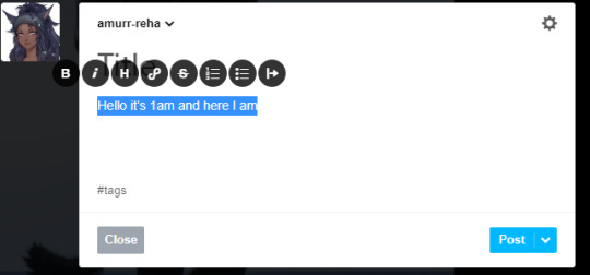
Posting text - if you highlight your word/sentence, a bar will pop up with some text customizations. You can also use keyboard functions CTRL B/CTRL I. To undo it, click on the icon again so it goes from (on) blue to (off) black.

Omg what’s that? An EDIT button? We can edit our posts after posting.
All in all - click the post photo button, upload photo, write caption, tag and post. That’s literally it.
If not getting 100+ likes instantly honestly and truly bothers you (that's called social media addiction btw lmao), go to Instagram. Best wishes my friends - may the blue bird rise and fly with it’s one remaining wing again ♡
#its extremely easy lol#we just get complacent in current ways#anyways most of twitter people will go to insta for the metrics#give it time if you want to learn tumblr#everything takes time#have patience and keep an open mind willing to learn#ffxiv twitter refugees#ffxiv twitter#tumblr is a great space for artistic posting and building characters with aesthetics and writing
54 notes
·
View notes
Text

Finally switching over to a new keypad for drawing. I was worried this would feel weird to hold but its actually super intuitive?
I’ll miss my little “calculators”. The Aoiktye keypads are genuinely great but after upgrading to the second gen I developed some really clumsy input habits I could never kick with the new button layout : P
2 notes
·
View notes
Text
Spacing and Sizing in Web Design 📐✨
Understanding spacing and sizing is crucial for creating an intuitive and visually appealing web design. Let’s break it down!
1. What is Spacing?
Margin: The space outside an element. It controls how far apart elements are from each other.
Padding: The space inside an element. It affects the space between the content and the element’s border.
2. Why is Spacing Important?
Readability: Adequate spacing improves text readability and overall user experience.
Hierarchy: Proper spacing can help establish a visual hierarchy, guiding users’ attention to important elements.
Aesthetics: Well-spaced designs look cleaner and more professional.
3. Sizing Elements
Fixed Sizes: Set dimensions that won’t change regardless of the viewport (e.g., width: 200px;).
Fluid Sizes: Use percentages or viewport units (e.g., width: 50%;) for a responsive design that adapts to different screen sizes.
Responsive Design: Combine fixed and fluid sizing with media queries to ensure elements resize appropriately on various devices.
4. The Role of Interior Spacing
Example: Buttons: The size of a button is influenced by both its width/height and its padding. A button with too little padding may look cramped, while excessive padding can make it appear too large.
5. Best Practices for Spacing and Sizing
Consistent Units: Use consistent units (like rem or em) to maintain scalability across your design.
Grid Systems: Implement a grid layout for balanced spacing and sizing, making the design more predictable and user-friendly.
Whitespace: Don’t underestimate the power of whitespace; it enhances focus and reduces clutter.
6. Testing and Iteration
Regularly test your designs on various devices to ensure spacing and sizing work well in all contexts.
Gather feedback from users to identify areas needing adjustments.
Quick Tips:
Aim for a harmonious balance between spacing and sizing.
Use design tools or frameworks that offer predefined spacing/sizing options.
Be mindful of touch targets; ensure buttons and links are large enough for easy interaction.
Mastering spacing and sizing will elevate your web design, making it more functional and visually appealing! 🌟
----------
What marketing strategies are you excited to try this year? Let’s share ideas and inspire each other! Visit Our Web Design Blog!
4 notes
·
View notes