#Interface Design
Explore tagged Tumblr posts
Visit Tumblr Blog
Explore Tumblr blogs with no restrictions, modern design and the best experience.
Last Seen Tumblr Blogs


Fun Fact
Tumblr has 16.74 million mobile monthly users in the US.
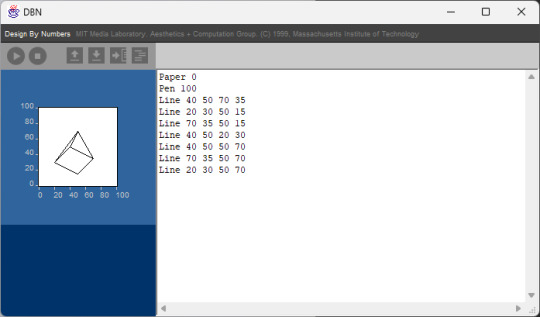
Text
[gamedev:part 3]
My menu starts to have some functionality. I’m pretty hyped about this content scaling feature that Godot has. Also the changes made to the preferences are now persistent. Not much longer and I have to actually work on a story >.<
Thanks so much to @harsh-noise-scalies. Without their patient explanations I and help, this menu would probably only be able to open and close.
#godot engine#interface#interface design#typedesign#typeface#screenshot saturday#gamedev#indiedev#visual novel
7 notes
·
View notes
Text
I’ve come to the next iteration of what I am doing, so let me write those things down.
I’ve worked through my digital library of graphic design pdfs. These pdfs were all acquired during my graphic design study, some even afterwards. All of these books (leaving out the ones I could neither obtain legally as a pdf, nor as a book, without seriously paying way too much) came from study material during my study.
And I have worked through three‑and‑a‑half semesters of reading material in preparation for what is next: me reading all these books.
To make this work in a way which helps me become the best graphic designer I can be, I have used Adobe Bridge to add keywords to these pdfs, with each class having its own keyword.
And there are books which are far more often referred to as in‑depth reading material than others: these I see as either very basic or very important, a difference which at this point makes little sense to make, I confess. Some of these books have four to six classes referencing them, while most belonging to one or two.
And what I think is fairly unique about my study at my alma mater is, that some books are required reading material, with sort of like a guide of which chapters to read. So I’ve marked those in Adobe Bridge with a rating of five stars, in order to easily find them.
With having said all of that, the next few weeks will be spent a little differently than the ones before this what I now realize is a milestone for me: now that I have created the order I need, I will spend more time on reading and applying the knowledge read, which in turn makes me return to an older system of keeping track in public of what I am doing—to post less often.
I expect to change how I use my social media accounts in the future as well: to treat social media as a serious marketing tool for my own work. I think that will come with how serious I treat this process ahead of me.
And, you ask, what are these books I have mentioned?
They are about working scientifically, entrepreneurial management, online marketing, a book about visual information and communication, screen and interface design, a book about digital photography, media design, and finally a book about design foundations.
I think you can mix your own post‑degree study with these bits of information.
And sure enough, it has been a year since my degree, this is just the next thing I need to do in order to become an entrepreneur.
See you next time!
#graphic design#code and canvas#creativity#marketing#design is entrepreneurial#media design#digital photography#screen design#interface design#visual information#visual communication#online marketing#entrepreneurship#design foundations#scientific writing#design by numbers#graphic designer#graphic designers on tumblr
3 notes
·
View notes
Text
“Every generation has its burdens. The particular plight of Gen X is to have grown up in one world only to hit middle age in a strange new land. It’s as if they were making candlesticks when electricity came in. The market value of their skills plummeted.”
#freelance#web developer#job#gen x#digital#marketing#advertising#career#programming#digital marketing#work#webdesign#logo#interface design#app#ux#ui#web#user interface#user experience#typography#graphic design#interactive#digital art#social media#ai#mobile app#creative#art direction#branding
2 notes
·
View notes
Text
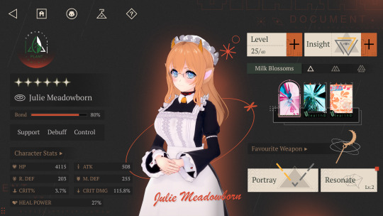
Julie Meadowborn - Reverse 099 An artstudy-recreation of the Reverse 1999 UI in Illustrator (no game assets used!), as a portrait of my oc. I changed up some things here and there and added a few easter eggs too! ;)
#reverse 1999#digital art#artists on tumblr#interface design#user interface#original character#cow girl
12 notes
·
View notes
Text


Outlasted Omen (Visual Novel Game Idea)
There is a Idea of a Visual Novel i had in mind and thought maybe i draw some fake mockups for later showcases. First Picture: Captain Graham: Highwarden of the guards from Antlermoure, a truly miserable job where she has to keep an eye on any new arrival there. Of course in behalf of the royal family far away from this forsaken place. I started drawing more backgrounds and playing with the interface design. More is following soon. Second Picture:
Ancient knowledge held by a wizard apprentice or the experiences of a shapeshifter from the north. Which of them could you help more on the dungeon below the town. I thought in my next mockup I could emphasize that decisions are one of the focal points of a game which doesn't exist.
#outlasted omen#comic#art#artist#dark fantasy#fantasy#comic art#comic artist#artwork#fantasy art#dark fantasy art#visual novel#game idea#character art#character illustration#interface design#roleplay design#roleplay games
5 notes
·
View notes
Text

#vitanov#art#ui#madebywater#jordan vitanov#brand identity#branding#product#visual design#minimal#design#interface design
3 notes
·
View notes
Photo
i kind of like the last one


Unpleasant_(interface)_design
213K notes
·
View notes
Text

Looking to improve your website or app? Collab Softech specializes in designing clean, easy-to-use interfaces that keep users engaged and boost conversions. From concept to final design, we focus on every detail to make each click count. Let’s collaborate and create a design your users will love.
#UI design#UX design#user interface#user experience#clean design#app design#website design#Collab Softech#conversion optimization#user engagement#interface design#digital design#creative design#product design#intuitive design
0 notes
Text
[gamedev:part 4]
This week I added a few new things: First was the implementation of FMOD—which is always a struggle, because the plugin is very specific in its needs, but a bit opaque on what those are. The second was loclization support. Menu and dialog can now run in German as well as English.
I also wrote some music. What is audible in the snippet is only part of the song. There is also a funky D’n’B intro, and I want to extend the song to work as one piece with several distinct parts that change during various moments in the game. I had the idea to add a low pass filter when entering the pause menu. Switching it on and off worked after a while, but I wasn’t able to add a transition (haha) for that effect. @harsh-noise-scalies came in clutch again and helped me write a very clean tween method. Now there is this phaser-like effect, when entering the menu—which I think is pretty sweet.
Another new addition is this dithering shader. It just got uploaded about a week ago and is everything you could wish for with a dithering shader. The colors get defined through a LUT. At first I tried out a few from the recommended website, and later made my own color scheme. For me dithering is the digital equivalent to riso printing. This shader is soooo cool. You can find it here:
#godot engine#interface#interface design#typedesign#typeface#screenshot sunday#gamedev#indiedev#visual novel#3d game development
3 notes
·
View notes
Text
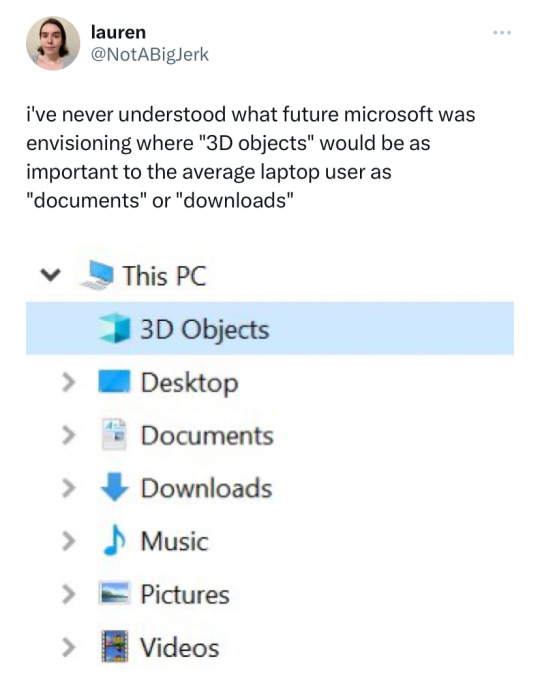
Okay so this is gonna be a big rant. I didn't check my sources, I'm going to say things that are wrong. You're going to have to live with it.
Around the time of windows 8 Microsoft tried to reinvent itself. It was tired of being the stuffy, skeuomorphic machine you were assigned at work. They wanted to be cool. Part of this vision was a complete redesign of the interface
And I don't know, call me crazy, I think this visual design fucks. I mean look at this. It's simplistic but gorgeous. The rest of the industry was running away from skeuomorphism towards simplicity via rounded bulbous corners. This was distinct, it was colorful, it had contrast, it was sharp. It literally looked like a bunch of windows in a pane.
At the time, Microsoft was also launching a windows phone (much to late to make a difference. They missed the boat but they didn't know it yet) and were designing a new Xbox that would have architecture near identical to that of a PC. The idea was that they were expanding beyond just stuffy PCs, there were a lot of new product categories and they wanted a universal version of windows that could handle all of them. You could build a "Universal Windows Platform" app that would run on any version of windows on any device. This was achieved using the C# virtual machine that us CS people tentatively affectionately call "Microsoft Java".
The future that Microsoft envisioned would be that there would be a new walled garden of software that you would run on all your pretty new windows devices. They would all share and sync and be perfect and pretty, and the same app on your phone could be played on your xbox, pc, and holy shit AR GOGGLES?
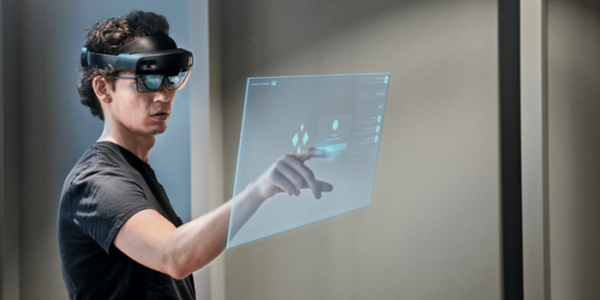
Yeah these fucking things. Microsoft bet big on the idea we'd like to start doing shit with holograms. They made this cool-ass device that used projectors to shine shit into your eye so you could see holograms and poke them and move them about. These were Windows devices that ran actual full-on windows, but that meant that Windows' identity had to grow to accommodate them. All the UIs had to work in a world where you'd see them on a touch screen OR as a hologram. All of the first party software had to have that in mind.
MS paint? Nah that shit's ancient. We got PAINT 3D and it's the most dogshit thing you've ever used
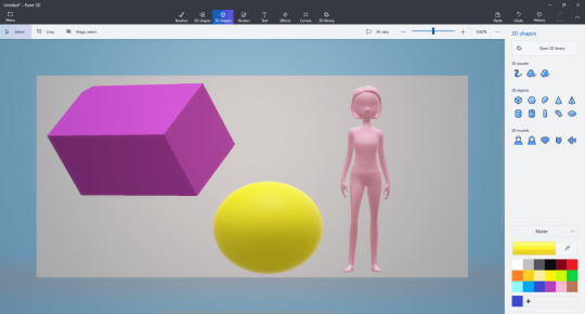
All the sloppy jank of MS paint but now you can put horrible fucking 3d models in it. I'm holding back my full Paint 3d thoughts for a later post that's still being worked on in the drafts, but here's a sneak preview.
Paint 3d allows you to dip into a catalogue of 3d models and plop them into your regular MS paint canvas. There's still no layers, no vector support, but hey at least you can add transparent backgrounds. Paint 3d let you export your horrible janky creations both as a regular png/jpg but also as a 3d model.
that's your short answer. They added that 3d models folder because of paint 3d. If you want to leave now you can... but this post keeps going as you can see.
The idea would be that as more of our tech moved to AR and VR you would be acquiring 3d models at a similar rate that you do other file times, so it made sense to have a built in folder. Maybe you work at one of those offices in an microsoft ad where I guess people just email each other .fbx flower pots for some fucking reason? Maybe you're downloading them from the metaverse (we weren't calling it that back then).
Your friend using a hololense would make a 3d model and then send it to you, you'd add some shit to it in paint 3d using its kafkaesque interface, then send it back. Wow. The future is so much fun.
You could even stick your 3d models in your very own VR start menu. Yeah. To go along with the AR goggles they released some dogshit (well they were good for the time and also cheap compared to the competition) VR goggles. These things ran on the SAME uwp platform as everything else, so theoretically I could make some abomination in paint 3d and then send it to my dad who works at the flower pot factory or some shit and he could put it on his virtual desk in his virtual cliff house start menu where he would virtually alt tab between a hovering window of Microsoft word and some freaky VR porn that his boss couldn't catch him watching because it was all in the headset.
That didn't fucking happen. We don't do that. And it's not just because it was a terrible idea but also because Microsoft wasn't committed to the bit.
See this house of cards came crashing down for a lot of reasons. The first one being that it wasn't backwards compatible. This cool 3d virtual, cross-device future wasn't with the win32 api, but the new UWP api. Devs had to remake their software in a less performant programming language and format just so it would run on all windows devices... but windows for PC still ran the win32 style apps that already worked. So you were expecting devs to port their windows app to... to windows... so it could run on windows... even though it was already running on windows. Oh yeah, let's just rewrite our whole accounting software stack so that bill can use it on his windows phone because phones are definitely for doing accounting and not playing fucking candy crush.
xkcd 927
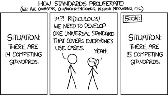
UWP added the functionality of "It works on xboxes, vr googles, windows phones, AND computers but just a little bit worse than the other ones and you have to remake it from scratch". It was just one more competing standard, and the use case of cross platform didn't really help that much.
The windows phone died out early on because it was too late and it couldn't cross the app gap (even though it's UI totally fucked and you play a halo twin stick shooter on it). The hololense died because it cost them ONE THOUSAND dollars just to build the screen assembly for one eye, you needed two of those + an onboard computer to run AR + a fuckload of cameras + proffit. No one was ever going to spend that kinda of cash just so they could pinch and zoom semi transparent holograms in a tiny 40 degree feild of vision in for two and a half hours because yeah the battery life was shit too. Developers never made software for it because there would never be any install base because something that superfluous can't ever be that expensive while we're all getting poorer.
Now, the VR headsets on the other hand, they kinda sucked... but they were cheap and they were competent. With a bit of elbow grease you could make them be just as good as the pretty boys, and they were the first to market with inside out tracking which was legitimately freeing back in 2018. Microsoft could have integrated it with the Xbox to compete with PSV but they just didn't for no fucking reason even though they both ran UWP apps and were on the same appstore and used all the same ports and the Xbox was just about powerful enough to play some games in VR. Yeah they just didn't commit to the bit and abandoned their VR headset line because it didn't instantly become a monopoly despite them putting very little effort into it.
So windows phone died, windows VR died, hololense died, and now regular windows 10 is full of the corpses of this cross platform vision. We have the 3d objects folder even though nothing really uses it anymore. Windows 10 never fully upgraded to the metro theme. It's like... half metro but some settings require you go to the old XP control panel. Some windows are in metro style but then when you right click on them there's just a standard win32 dialogue box that's ugly and white. It's been that way since 2015 and rather than finishing windows 10 and making it pretty they stuffed it full of bullshit and ads and then said "FUCK IT, WINDOWS 11"
And windows 11's whole thing is being ugly and simplistic and rounded corners and wasted space and designed for a touch screen because even though the windows phone died at least the 2 in one windows tablet market was doing okay.
Windows is a collection of good ideas, followed by a bag fumble, followed by an admission of defeat and a retreat to the familiar.
And somewhere along the way we got a new folder for 3d objects, and if you really want you can use paint 3d to make this shit I guess:

#Quohotos' unhinged rants that no one asked for#Microsoft#Windows#paint3d#paint 3d#rant#UX design#UX#interface design#graphic design
109K notes
·
View notes
Text
Uma visão sobre interfaces de linguagem natural usando como base do argumento a velocidade de transferência dos dados. Argumento muito interessante contra essa ideia de que simplesmente tudo será substituído. Pensar mais como um complemento, leva tempo até entendermos onde usar o que.
Esse é o trabalho das pessoas de design e produto nos próximos anos.
0 notes
Text

"We made painting feel like typing, but we should have made typing feel like painting."
#freelance#web developer#digital#marketing#advertising#programming#digital marketing#webdesign#logo#interface design#app#ux#ui#web#user interface#user experience#typography#graphic design#interactive#digital art#social media#ai#mobile app#creative#art direction#branding#responsive design#WordPress
0 notes
Text
Web Design Services: Elevate Your Online Presence

Introduction:
In the current digital landscape, possessing a well-crafted website is essential for both businesses and individuals. Your website frequently serves as the initial point of contact for potential customers with your brand, and a professional, user-centric design can significantly impact their perception. This is where Web Design Services become invaluable.
The Importance of Web Design Services
A thoughtfully designed website enhances user experience, increases engagement, and drives conversions. Here are several key advantages of investing in professional web design services:
Improved User Experience (UX): An effective design facilitates easy navigation, prominent call-to-action buttons, and quick loading times, ensuring visitors remain engaged.
Enhanced Search Engine Optimization (SEO): A well-structured and coded website can achieve higher rankings on search engines, leading to increased organic traffic.
Mobile Responsiveness: Given that a significant portion of internet users access sites via mobile devices, a responsive design guarantees that your website appears appealing on all screen sizes.
Brand Identity and Trust: A visually attractive and cohesive design fosters credibility and reinforces a strong brand identity.
Higher Conversion Rates: A strategically designed website directs users toward desired actions, such as signing up, making purchases, or reaching out for inquiries.
Essential Features of Quality Web Design Services
When selecting a web design service, consider providers that offer the following features:
Custom Website Design: Personalized designs that embody your brand’s character and objectives.
User-Friendly Interface (UI/UX): Intuitive layouts that enhance the overall user experience.
SEO-Friendly Design: Well-structured coding and optimized components that contribute to improved search rankings.
Mobile and Cross-Browser Compatibility: Ensuring consistent functionality across various devices and browsers.
Rapid Loading Speed: Optimized images and coding to minimize page load times.
Ongoing Support and Maintenance: Regular updates, security enhancements, and performance optimizations.
Selecting the Appropriate Web Design Service Provider
When searching for the ideal web design service, take into account the following factors:
Experience and Portfolio: Review their previous projects to determine if their design approach aligns with your requirements.
Client Feedback and Testimonials: Seek out positive reviews and detailed case studies.
Customization and Scalability: Verify that they provide adaptable solutions to accommodate future expansion.
Cost and Budget: Evaluate pricing options to identify the best value for your investment.
Conclusion
Investing in web design services is crucial for establishing a robust online presence. A well-crafted website not only enhances user experience but also boosts search engine rankings and increases conversion rates. Global Technosol delivers expert web design solutions customized to fulfill your business objectives, ensuring a visually striking, responsive, and high-performing website. Enhance your brand with the professional web design services offered by Global Technosol today!
0 notes
Text
Cognitive Load as Currency
So I was reading this Atlantic article the other day about the fact that labor as the fundamental economic building block of society is being supplanted by "attention". You know: You need to pay attention to Facebook, Twitter needs some too, But wait...TV and newspapers used to exist, etc. Perhaps it was because I have at least 3 jobs and a kid that I felt a certain pang of empathy for our common plight in that moment so I actually read the whole thing. Nice work.
But then it got me thinking: In that economy - people who have a naturally-higher cognitive load capacity than others will have a competitive advantage. It's like being the big, strong labourer vs. the spindly little guy. In an economy which consumers labour, one of those fellas is a lot more hirable. That said, it won't be as obvious at first glance - so what other advantages will it bring? Maybe additional resilience vs. cognitive hijacking by omnipresent ads? (I'm looking at you, Keiichi Matsuda.)
All this is just a little tangent in reference to what kind of screen time I should allow my kid. Most parents don't even know that "screen time" isn't a monolith, so that's how far behind this new economy we are as a proletariat. Good luck, everyone. < 3
#virtual reality#augmented reality#interface design#screen time#heady#mixed reality#extended reality#spatial interface design
1 note
·
View note