#In a show that’s so particular about color
Explore tagged Tumblr posts
Visit Tumblr Blog
Explore Tumblr blogs with no restrictions, modern design and the best experience.
Last Seen Tumblr Blogs


Fun Fact
The Tumblr app for Google Glass was released on May 16, 2013.
Text
An (incomplete) list of moments from the show in which Perry the Platypus was gay as fuck:
1. This outfit.

The colors. The shapes. The button down. The teeny-tiny cactus hat. Need I say more?
2. Signing off his text messages with a personalized platypus emoticon. (Not to mention the horrendous grammar.)
3. This.

3. The entire soap opera scene. Not because straight guys can enjoy soap operas (they can and they do) but because it takes a special breed of gay sass to change the channel ON YOUR BOSS just because he’s interrupting your self care time. Absolute cunt. A straight man could never.
4. Matter of fact, every single time he rolls his eyes at monogram.
5. Whatever the fuck this was. (Sometimes I still think I hallucinated it.)

6. The boomerang throwing sequence in primal Perry. Again, he just does it with such a tasteful amount of sass.
7. His coffee order in OWCA files (oolong tea). Actually, everybody’s coffee order in that episode was gay, but his was like, pretentious-scarf-sweater-coffeeshop gay in particular.
8. I was on the fence about this disguise but I think the pose sells it for me.

9. The “krkrkrkrkrkr” “yeah I know, what a dip right?” moment in Minor Monogram. (It’s giving judgmental gay so hard and I’m here for it.) (Also Vanessa is Bi and she and Perry would totally bond over that. We love a supportive parental figure.)
10. While we’re at it, the dramatic gasp at the end of minor monogram too.
11. The quote from Agent P’s guide to fighting evil in which it says that he enjoys “horseback rides and long walks on the beach.”
12. He sings opera
#there’s so many more but I have to go to bed#“can we give the platypus a girlfriend?#my dude#have you SEEN the platypus??#phineas and ferb#perry the platypus#agent p
92 notes
·
View notes
Note
babysitter anon back because you gave a green light!!!
this is a bit more puerile compared to the previous scenario, but i feel like if oliver and reader were the same age (19) and she were to be his sister's babysitter, he would randomly start showing up earlier from practice in order to hang around and get some attention from her,,,maybe walk around without a shirt even in cold weather just so he could flex his muscles and impress her (it's not working. she might be giggling, but it's only because he looks so ridiculous and dorky).....
i just know oliver's little sister puts together some devious plan where she purposely begs their parents to bring her to one of oliver's games—knowing full well that they can't that particular weekend.
which means you somehow get suckered into bringing her to the game instead. wearing one of oliver's jerseys because his sister insisted you had to dress up (as you blankly asked what you should even wear to a football game) (and oliver was naturally close enough to hear, so he tossed one to you on your way out the door that night with a wink).
and the thing is, you never take oliver's flirting seriously because you know enough about his dating reputation.
—which is why you're prepared to die on the spot when he rushes the stands after the (winning) (very important) game (bypassing the various screaming fangirls waving signs with his name on them) not only to high five his little sister, but to pick you up and spin you around like you're his goddamn girlfriend or something.
girlfriend. that's what the tabloids call you in their ultra zoomed in front page shot of the two of you.
his little sister is coloring the newspaper in with hearts while she sits at the kitchen table eating cereal the next day.
oliver's humming under his breath when he slides by you to get to the fridge, murmuring in your ear, "girlfriend, huh?"
84 notes
·
View notes
Note
You made me obsessed with colors. Now, I cannot watch any piece of media without trying to figure out the colors. Why did you do this to me?? I love you for it, but WHY?
I don't know if you ever read The Giver, but (SPOILERS) I remember the exact moment when the book revealed the whole world was devoid of color by having the main character notice the red color in the apple as it was moving through the air because it made me feel sick. Up until that point, I was just going through the required reading with mild interest because I thought it was a regular oppressive world with colors, but the second I realized it was an oppressive system IN A COLORLESS WORLD, I was horrified!
And I think I'm that moment for some of y'all.

I don't think I am The Giver. I think I'm that WTF moment that happens in midair which makes you question everything because you think all is normal while you're watching your shows until the exact moment one of my post points out that you were missing something that has been there all along. And the thing is, you were perfectly fine without knowing that one specific thing existed, but now that you know you were missing that one particular detail, you can't ever go back to not knowing because it changes how you move forward.
You can't live in darkness once you know colors exist.

Knowledge be like that sometimes. It haunts us even when we would rather return to a time when we didn't know. It lurks around corners and when we least expect it, we are confronted by it and forced to notice the visuals we once easily ignored. Like how I'm trying to watch a funky little vampire show yet one character keeps appearing in all white.


Because in a show where all the vampires like their darkness and black outfits and the only color is red for the blood they drink to show they are vampires,


It's interesting that we've been shown that some vampires with powers have different colored eyes.


But Thara's are almost golden.

Because it means the show isn't presenting Thara merely as a leader, but as a god.

And it makes me wonder how a vampire becomes a god among immortals.

Yeah, so about them colors . . .

You can't unsee them.
#my golden blood#spoilers#maybe? but who knows#it could just be a wild theory#but colors don't lie#people do#or in this case‚ vampires#I thought I'd give you a little treat so you could be more upset at me#I should say sorry#but if I have to live here so does everyone else
39 notes
·
View notes
Text
Replacing Jaune?
Jaune: Nice work, Huntsman~!
Oscar: You, too, Huntsman!
FNDM: HEY! YOU! HUNTSMAN!
Jaune: I don't need to explain why that's confusing.
FNDM: You! The original one! Don't you see what's going on?!
Jaune: The US is crashing out?
FNDM: NO! I mean, yeah, but NO! With the other guy! There can't be two Huntsman! That doesn't make any sense!
Oscar: Dude, there's already huntsmen and huntresses, and they've been around way before any of us.
FNDM: Oh, come on! Can't you see it? You're being replaced!
Oscar: Really?
Jaune: Alright, let's calm down here. I'm not being replaced.
FNDM: Yes, you are! You're being replaced and you're just letting it happen-
Jaune: (Chuckles)
Jaune: (Whispers) Hey! Hey!
FNDM: Huh?
Jaune: Shut up!
FNDM: But- But I'm just saying that-
Jaune: Listen to me. He's not replacing me.
FNDM: Okay, but he-
Jaune: I'm replacing me... with him.
FNDM: ...W-What?
Jaune: DON'T YOU FUCK THIS FOR ME.
FNDM: But- But why?!
Jaune: BECAUSE I'M TIRED MAN! I've been doing this shit since the first Volume! I've been the male lead of this series since Monty Oum was still voicing Lie Ren!
FNDM: Okay, fair, I guess, but-
Jaune: All these years and you know what it's gotten me? DEATH! Everyone I've ever known and loved has either died, come back, and then died again! I'VE DIED! I'M MORE DEATH THAN MAN!
FNDM: Shit, man...
Jaune: I mean, this is my one and only ticket! Do you have any idea how rare it is for someone to just show up at your door, just as clueless about Remnant as you are, with the exact same dreams- Like, not just made up as a fucking angst sponge or a self-insert- I mean, this is my one and only shot here, man!
Oscar: Whoa, whoa, whoa! You completely left that part out!
Jaune: Fucking shit! See what you did? You're scaring him away!
Oscar: You said it would just be punching bad guys and killing monsters. I don't want to see people die!
Jaune: Oh, so now you don't want to see your loved ones dying right in front of you? Then do you even WANT to be the Huntsman?!
Oscar: Nah. Imma do my own thing.
Jaune: ...What are you doing?
Oscar: What I said I was. Imma do my own thing. That's, like- That's like a thing I say. It's something I say.
Jaune: Yeah, but that's something everybody says. Like, is this your catchphrase? Because if it is, then we definitely need to work on it.
Oscar: Oh, yeah? And what's your catchphrase?
Jaune: Y'know, it's- It's go forward.
Oscar: That's not a catchphrase.
Jaune: It's totally a catchphrase!
Oscar: No, it's a mantra. It's not a reactionary phrase.
Jaune: What, and "Imma do my own thing" is?
Oscar: Yeah, but like- I do my own thing.
Jaune: Yeah, and I go forward.
Oscar: Yeah, but everyone goes forward. It's how people walk.
Jaune: True, but not everyone can go forward so easily. There's sometimes limits to what you can do.
Oscar: Oh, yeah? What kind of limits?
Jaune: Well, my dad used to say-
Oscar: Oh, don't you fucking start with your dad- I swear to the Brothers!
FNDM: ALRIGHT, ENOUGH! You can have a replacement all you want, but just look at this guy! He's all wrong!
Jaune: Any particular reason you feel that way?
FNDM: What, do I have to spell it out for you? HE'S COLORED!
Oscar: WHAT?!
Jaune: THE FUCK?!
FNDM: The Huntsman is supposed to be White and Black!
Oscar: ...Oh.
FNDM: I mean, no offense, but we all remember the last time you had color in your outfit, with all the Rusted Knight bullcrap. Everyone knows a Colored Huntsman is a Bad Huntsman!
Oscar: ...
Jaune: ...There are a lot of layers to why what you just said is wrong.
KRAKOOM!
Jaune: Tyrian?!
Tyrian: Well, well, what do we have here? Sorry for the dramatic STING, Huntsman~!
Oscar: Not this guy again...
Tyrian: I'm especially glad to see you two, because I have a new friend I'd like to introduce you to. Meet the new Callows on the scene; my sister, THALIA CALLOWS~!
Thalia: Sorry for the dramatic STING, Huntsman~!
Tyrian: N-No, hon, I just used that pun already.
Jaune: That's, uh...
Oscar: What?
FNDM: AGH, C'MON, DUDE! Really?! A friggin' chick?! Don't you see you're being replaced!
Tyrian: ...I am? (Stabbed through the chest) AGH! (Dies)
Thalia: (Cackles)
Jaune: Okay, that time, you were right.
Oscar: Yeah, that was clearly her plan from the start.
Jaune: 100%! I mean, they were even wearing the same outfit!
Oscar: Just red flags everywhere!
Jaune: Definitely!
Oscar: Man, the lengths people will go to just so they can be the only one.
Jaune: Right.
Oscar: ...
ZAAAP!
Jaune: OW! WHAT THE FUCK WAS THAT?!
Oscar: Sorry! I was just checking!
Jaune: CHECKING WHAT?!
#rwby#jaune arc#oscar pine#solid jj#tyrian callows#hey look one of my ocs is back#my oc#my ocs#thalia callows
31 notes
·
View notes
Text
So so tempted to rewrite/restructure Seasons 3 + 4 of Carmen Sandiego to give them the 10 episodes they deserved
#when Sen is not quiet#Carmen Sandiego#carmen sandiego 2019#im#ughhhhhhhhhhhhhh#im so so so so so so normal about this show#the ending had so much potential but was so rushed#Also V.I.L.E.!Carmen’s outfit should’ve had more green accents beyond her tech#Like a green sash around her hat or green ends of her jacket#In a show that’s so particular about color#The fact that Carmen’s red wasn’t accented with a bit of green during her V.I.L.E. era is criminal#pun intended#ALSO#ALSO ALSO#CARMEN GIRL GO FIND GRAY#GO GIVE A PROPER GOODBYE TO ZACK AND IVY#I have so many thoughts#Also my mom felt robbed over Redcrackle not being canon#My dad’s jealous of Shadowsan#As he should be /hj
31 notes
·
View notes
Text
Actually it turns out I had more thoughts about that post that I forgot about lol
Would Nightmare actually give up his boys? Yes and no
If it was just a black and white situation of they're miserable, they don't wanna be here, they have somewhere better to be, then yes. He would leave them out to wherever they needed to be despite his own feelings and very quickly realise afterwards just how much he'd gotten used to the noise and company. I think he would get a little clingy with Dream about it, which I'm sure Dream would find very weird after everything but not unwelcome, he did miss his brother after all.
(If he couldn't attach himself to Dream's side for whatever reason, I think he might just sit in his castle and go insane. Or maybe he'd just spend all day at Ccino's trying really hard to project that he just likes the atmosphere and isn't lonely as hell)
But the thing is, most of them don't have somewhere better to be. Horror has his au, and Nightmare would keep up the supply of food even if Horror said he wanted to quit at this point, so he would understandably let him return home. Killer, Dust and Cross effectively don't have aus anymore though, and they tend to get into self-destructive habits when they're left to their own devices. (Obviously bringing Color and Epic into the mix to make sure Killer and Cross are taken care of eases matters, but Dust doesn't really have any friends outside their group he could go stay with - that Nightmare knows about at least).
The flipside of this is that his boys may not necessarily want to be given up. I think if Nightmare got really in his head about this he could easily end up convinced this is the right thing to do without ever asking them if it's what they want, with potentially terrible results. He's established such a pattern of always returning to find Killer when they get seperated, that if he never showed up Killer might just keep sitting there and waiting for him greyfriar's bobby style, refusing to leave because he's certain his boss is coming back.
#UTDR#UTMV#Dadmare#Horror and Dust might take it slightly better but I think they still wouldn't appreciate being rehomed out of the blue with no discussion#Don't get me started on Cross he has such a bad track record with people not showing up for him as it is#If Nightmare left him to live with Epic one day Cross would spend the rest of his life thinking he did something wrong#and wondering what it was that he wasn't worth keeping#I do think the idea of him getting glued to Dream's hip must be funny for Blue tho#''Yes this is the being of all negativity in the multiverse. Don't mind him we're holding hands because he gets seperation anxiety''#I feel like a lot of this could come from Color's suspicion of him. because he's very much on Killer's side from the beginning#And Nightmare wasn't good at the beginning so it's understandable. it's hard to take Killer's word that he's changed because#Killer /would/ say that whether it's true or not y'know?#But I think Color shining a light on how things began makes Nightmare reflect a lot on their situation#Not to say that Color's the bad guy or anything obviously. He's respecting Killer's decisions while also keeping a good level of suspicion#about how Nightmare treats them when he's not around#It just makes Nightmare uneasy because he's made a lot of mistakes in the past and he's still learning#He is - for now at least - very very aware of just how mortal they are#And he wants to do right by them. even if it means giving them up to better places#I need to finish my fanfic... Anyway.#Luckily for him - in this particular case - this is where they are all best suited c:#Alright I let this cook in my drafts for about 3 days with some edits it can be posted now lol
138 notes
·
View notes
Text
REVAMPED DESIGNS FOR THE ANTI-CIPHER SOCIETY!


Click for Quality!
Special PANTS version for the ladies under cut….↓

#I wanna do a post going deep into my design inspo for each of em#those of y’all in the Anti Cipher Society Discord allready saw a bit of that#but I wanna go REAL in depth#I put a lotta thought into these designs#plus I realized Jessamine has an even better reason to be that particular shade of green besides it being for my ‘fiddleford ancestor’ hc#me when I go into the history of pigments and color and find a golden symbolic theme in its history#aria draws#digital art#digital drawing#fanart#gravity falls#gf#tbob#the book of bill#horace broadshoulder#abigale blackwing#father tinsley o’pimm#tinsley o’pimm#thurburt mudget waxstaff#thurburt mudget waxstaff iii#jessamine delilah gulch#also the pants versions for the ladies wouldn’t be a usual thing#abbey wears hers around the bunker but never in public#Jess wears hers under her dress so that when she rides for the western show she’s not exposed#also I’m still not sure about tinsley’s height#cause I don’t want him to be as short as he was when I designed him first but also I dunno if I fw tall tins#we’ll see#in love with Jessamine’s cowboy boots btw#anti cipher society
49 notes
·
View notes
Text

Realized I never actually posted my outfit for Red Rocks so uh. I switched out the jacket for the Stargazer one I got at the bazaar later that day but I still looked good as hell (shirt by @mayakern )
#lmk if you want me to remove the tag just thought I’d give credit for a banger skirt design that matched the band’s vibes#dani speaks#yeah that’s Johnnie’s bandana what about it#bought it forever ago and finally had the chance to use it#nails were done in vide noir colors too#had all the albums represented wahoo#the skirt (lonesome dreams/long lost) the jacket (strange trails) the nails (vide noir) and the bandana (strange trails/vide noir/long lost#necklace could be all of them. the moon and the stars are brought up a lot#the necklace isn’t anything in particular but it’s moon/star themed and was made locally so I wanted to show that one
85 notes
·
View notes
Note
DO YOU REMEMBER THE THING IS SAID WITH THE LIKE CURSOR SYMBOL THINGS. Like with Victim's loading circle halo thing, I mentioned the hourglass, but you didn't know which character would have it. I present to you UNTITLED_3 WITH THE HOURGLASS BECAUSE TIME TRAVEL BULLSHIT!!!
OUGH!!!!! FUCK, SO TRUE
#tommy's foolery#i think it'd only show in very particular circumstances#such as when he's using his lasers or just very pissed#but you're so right!!!!!!!!!!!!!!!!!!!!!!!!! god!!!!!!!! i love that!!!!!!!!#speaking of lasers i've been thinking of making his bluescreen colored for a while#i just haven't decided on it#since a while ago i saw something about the lasers being color coded to the person each hollowhead is closest to#(chosen red‚ dark black‚ and as recently confirmed‚ SC green)#so i've been considering them being orange as well
13 notes
·
View notes
Text
This is such a stupid problem to have and unique to a small corner of my little microcosm here but I really wish people would stop adding sluttiness to the theme of their dance parties like if you just had a theme!! People would dress slutty anyway!!! If they wanted to!!!!!!! But since it’s inherent to the dress code I will stick out horrifically if I dress in any of the clothes I own!!!!!!! So now I can’t go at all!!!!!!!!! The grinch down in (w)HOville is a fucking hilarious theme and I’d like to watch my friend DJ but probably I will stay home and feel bad about myself and listen to in rainbows and take one more permanent step down the path of loneliness and alienation that is my ultimate destination in this life... God
#like I already stick out so much in this particular crowd and then it’s like oh you’re wearing sleeves#?#lmao no way#and it’s the kind of shit where if I asked about it they’d be like omg nooo wear whatever you want we just want you there!#and then you show up and everyone else is in their holiday colored underwear#this is like. it’s my fault. but like…sigh#it’s just these two or three people doing this but it makes me so sad and feels so fucking high school
16 notes
·
View notes
Text
i think the ahsoka show is rly suffering from animation not translating to live action. hera and sabine just don’t fit into the grungy desaturated aesthetic the show is going for. this show should have been animated in the first place, but if they were set on live action they should have went for a more vibrant aesthetic and style!!
#hera in particular looks wild#those contacts…choices.#and sabine’s hair just looks so out of place!#they’re going for realism in a show that’s about aliens and magic and light swords and green spooky magic#this isn’t andor. this is a fantasy space adventure. live a little#this REALLY isn’t andor 😭#if they were utilizing bright colors and filters and fun lighting the more colorful characters would look realistic#within the show’s own universe within the shows own reality#WHERE IS THE CAMP!!!#sw#ahsoka show
7 notes
·
View notes
Text
And it's not like I don't understand that frequently women are looked down on both for being not feminine and pretty and concerned with their appearance enough and for being "too" feminine - shallowly obsessed with makeup and their looks and whatnot.
And it's not like there isn't a bit of a hyperfeminine mean girl trope in media to reflect this at times.
But also. I CAN'T TAKE THIS
#I gotta kiss Lottie's white ass because she associates with a black women#I'm not a woman so maybe it's not my place to say this#But I often notice that people's idea of “femininity” centers so hard around being pretty and really nothing else#Lottie doesn't even show a particular affinity for makeup or hairstyles or things like that. She likes princess dresses#and wears pink once. That's about it.#just it kills me sometimes when people talk about women being feminine and powerful#and their idea of feminine is THE most shallow conception possible and THE most extreme example of like. Consumerism.#which is why Elle Woods is always brought up.#And part of this rant is being colored by posts I've seen in the past about characters not being “feminine” enough#because idk they don't wear makeup or read magazines
1 note
·
View note
Text
Creamy or Crunchy
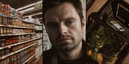
Pairing: Avenger!Bucky x Avenger!Reader
Summary: Bucky joins you grocery shopping to everyone’s surprise.
Word Count: 3.7k
Warnings: Bucky hovering; Bucky knowing his favorite people; little bit of protective!Bucky
Author’s Note: I don’t know what this is but I was in need of some silly fluff. Hope you enjoy! ♡
Masterlist

He’s been trailing after you since you left the tower, stuck to your side.
Not in an obvious way, not in a manner that would draw stares or second glances, but in that ever-present way of his - like a second shadow or an old instinct that never really shuts off.
You’ve barely gone five blocks to the nearest grocery store, and Bucky has stuck close the whole time, keeping pace without a word.
It caught everyone off guard when he volunteered to come with you.
He had been slouched in his usual spot at the kitchen counter, cradling a cup of coffee he never seemed to finish, and looking like he had nowhere in particular to be. So when he had straightened, eyes trained on how you pulled on your shoes and muttered a gruff “I’ll come with you,” there was a moment of pause in the conversation between Natasha, Steve, Clint and Sam lounging on the couch in the common room.
Even you had blinked at him, thrown off by the suddenness of it.
Still, you didn’t argue.
Normally, grocery shopping isn’t something that interests anyone in the tower. It is a mundane, civilian thing - something of a life most of you had long since left behind.
There are people who handle it, services that deliver whatever you need at the touch of a button. But you aren’t looking for efficiency. You are looking for something real - something that can make you feel like a human being again.
You’d just gotten back yesterday from a month-long solo mission in Vorkuta, Russia. It was rather harsh. You spent those weeks in the cold, in silence, every step a deliberate calculation, every breath rationed as if you weren’t entirely sure when you’d be allowed another. You operated alone, only allowed to talk to Tony once a week for updates. It was the kind of quiet that made a person feel less like a person and more like an echo.
So you need something normal now. Something unremarkable.
No mission, no intel, no carefully rehearsed exit strategies.
Just a trip to the store, because you want to pick out your own food instead of eating whatever shows up in the tower’s stocked fridge. You want to grab things impulsively - maybe a bag of chips you don’t need or a carton of juice just because it looks good.
You want the simple, stupid pleasure of choosing something, just because. Of standing under the fluorescent hum of grocery store lights and deciding between brands of cereal and coffee creamers like it actually matters.
And Bucky, for all his presence, says nothing.
He just walks with you, hands stuffed into his pockets, eyes darting between the sidewalk and the people passing by. He is relaxed, but only just. There is tension in the way he moves, like he is running an assessment every few steps, tracking details of things you don’t care about at the moment.
The doors to the store slide open with a mechanical hiss, spilling warm, artificial air onto the street.
Inside, there is that familiar smell of waxed floors and cold produce, the sounds of shoppers, the beeping of registers.
A cart squeaks somewhere to your left. A child giggles near the bakery section. A bored-looking cashier stares blankly at the register screen. A tired-locking employee is restocking shelves.
It’s nothing special. But it feels real and humane in a way you need.
Bucky steps in behind you, scanning the store out of habit, then looking at you as if waiting for direction.
You grab a basket and move forward.
He follows without a word.
You walk through fruits and vegetables in bright, and glassy colors, stacked in neat abundance. The air smells like citrus, earth, the scent of misted greens, and something fairly plastic all slightly overwhelming your senses after a month of smelling mostly cold air.
You extend a hand toward the lemons, fingers brushing the textured skin of one when you feel the weight of the basket shift.
Bucky’s hand curls around the handle, pulling it from your grip and holding it himself.
Your gaze snaps up to him, but he isn’t looking at you. Not directly. His eyes are fixed on the rows of produce in front of you, his brows drawn together just slightly, his mouth set in that endearing little frown.
He stands close. Close enough that you can feel the warmth of him. Close enough that, if you shifted just an inch, the fabric of his sleeve would brush against yours.
It’s not intentional, this proximity - it’s more like a habit. He doesn’t seem to realize he’s doing it, doesn’t notice the way his presence expands to fill the space between you until there’s almost nothing left.
He exhales through his nose, shifting his weight slightly, eyes sweeping the fruit display as if it’s something to be figured out rather than casually shopping through.
His metal fingers whir slightly as he flexes his grip around the basket handle.
“This is a lot,” he murmurs, almost absently.
You keep glancing at him. It takes you a second to realize he is speaking at all, his voice being so quiet, a thought that accidentally made its way out.
“What?” you ask softly.
His eyes fall to you briefly, then back to the fruit. His mouth tightens, jaw working, debating whether to explain it or just let it drop.
“Back then,” he says, still not quite looking at you. His eyes scan the apples, the oranges, the rows of neatly stacked avocados and kiwis and papayas flown in from places he never got to see. “You had your basics. Apples. Pears. Some oranges, if you were lucky. But this?” He tilts his head slightly. “This is a lot.”
He doesn’t say it with wonder. He says it with assessment, categorizing this excess, measuring it against whatever memory of the past lingers in the spaces of his mind. Like he is trying to decide if this abundance is a good thing or just another shift in the world that changed without him.
For a second you wonder, if he is talking to you at all - or just thinking out loud, caught between time periods, a man stretched across decades that won’t quite line up.
Your fingers brush the lemons again, grabbing one and carefully putting it in the basket Bucky is holding. “Well,” you mumble, keeping your voice light. “You should see the cereal aisle.”
Bucky huffs out something that’s almost a laugh, something genuine and his eyes land on you again.
You move and pluck what you need. Apples, zucchini, a handful of bright bell peppers. A bundle of fresh basil, its scent still on your fingertips - something Wanda has been asking for. Some mangoes, ripe and golden, the kind Sam offhandedly mentioned craving the other day.
Bucky watches.
He doesn’t reach for anything himself, just keeps his grip on the basket as you fill it and trails closely after you.
His eyes track every motion - the way your fingers test the hardness of an avocado, the way you turn a tomato in your palm, the way you pause just a second before deciding on a bunch of grapes.
He simply observes.
You step over to the plums.
Their deep purple skins glisten under the lights, some nearly black, some streaked with dusky red. You pick one up, pressing it lightly with your thumb, feeling the faint give beneath your touch. Satisfied, you reach for more, slipping them into a paper bag one by one.
Bucky doesn’t say anything.
But you feel him.
The attention he gives you.
His face is unreadable, expression carefully neutral, but there is something behind his eyes - something considering, something caught between memory and recognition.
You don’t know if he realizes you are getting them for him.
You don’t know if he remembers, or if it is just something subconscious, some buried instinct nudging at him in a way he can’t understand.
But you remember. You remember the way he stared at the heap of plums on the kitchen counter weeks ago, the way his fingers had twitched with a want to take one, but he hadn’t. And the way he watched Wanda as she used them to make a pie he didn’t end up eating.
“Do you want some more?” Your voice is casual, warm. And when you glance up at him, he is already looking at you.
Then, almost abruptly, he clears his throat, dropping his gaze. The fingers of his metal hand flex once around the basket handle. He shifts his stance slightly but does not move away from you. When he speaks, his voice is low, almost careful, almost bashful.
“S’ fine.”
But you catch the almost-question in the way his eyes move around, how his fingers tighten and release.
So you grab a handful more and drop them into the bag without a word. Then you fold the top down and place it into the basket.
Bucky doesn’t look away this time.
And he continues wandering along with you through the aisles.
The plums sit among other products and you catch him glancing at them once or twice.
You reach for a carton of eggs when there is a shift.
Not in the air, not in the store itself, but in Bucky.
His posture tightens, his grip on the basket adjusts slightly. You don’t immediately know why, but then you turn your head and see a man standing a few feet away, watching you.
It’s not overtly threatening, not enough to draw attention, but something about his gaze lingers too long, too deliberate. His eyes trace the shape of you, moving slow, assessing. He isn’t leering, isn’t smirking, but the way he looks makes your skin prickle.
He seems to debate if he should say something. Waiting for an opportunity.
You barely have time to move away before Bucky does.
He doesn’t make a sound, doesn’t say a word, just shifts seamlessly into place - between you and the man.
It’s not a dramatic gesture. No sudden motions, no confrontational stance. Just his presence - him planting himself in the way, broad shoulders squaring, jaw setting, scowling.
That man takes his brown eyes away from you and meets Bucky’s gaze, and whatever he sees there - whatever lives behind those icy blue eyes - is enough to make him rethink his interest. He looks away, scratching the back of his head, shuffling back a step, and seems suddenly far more interested in bread.
You exhale softly. Bucky doesn’t move.
He stays right where he is, a silent wall between you and whatever attention you haven’t wanted. His scowl lingers for a second longer before he glances back at you, eyes sweeping over your face as if he is making sure you are fine.
You tilt your head, offering a small, gentle smile. “Everything good?”
His lips twitch, almost like he wants to say something but doesn’t quite know how to form those words.
“Yeah,” he mutters, swallowing.
But his stance is still slightly stiff, his fingers can’t stay calm around the basket handle. And he glances, just once, in the man’s direction - making sure he stays gone.
Something warm fills your chest.
You missed him, while you were gone.
He’s always such a grounding presence at your side.
You missed his dry, reluctant commentary whenever the team does something ridiculous.
You missed walking into the common area with him brooding in his usual chair, pretending not to listen to conversations he’d eventually grumble his way into.
He was there when you stepped off the jet yesterday.
It wasn’t necessary for him to be there, it was six in the morning, after all, but he was.
He hadn’t said much - he never says much - but his eyes ran over you in a way that told you he had been waiting. That there was something heavy underneath that furrowed brow and the almost too casual nod he gave you. Something like relief. Satisfaction. And something much more profound.
You remember how he was when you left.
Standing off to the side of the hangar, arms crossed, jaw pressed tight as you made your final checks. It also wasn’t necessary for him to be there, but, again, he was.
He said goodbye briefly, wished you luck, but in the way you felt him watch you board the jet it seemed there was more he wanted to tell you.
And when the engines had roared to life, when the ground beneath you had begun to shrink, you caught the last glimpse of him - standing stiff, pensive, his mouth pressed into a thin line.
Now, he walks beside you, trailing just a half-step behind, his grip steady around the basket that should be in your hands, watching you more than anything you’re planning to buy.
Maybe that’s why he came with you.
Maybe that’s why he hasn’t strayed, why he hovers close, why his eyes find you like he is memorizing something he doesn’t want to lose track of again.
Maybe he missed you, too.
He is not grumpy, but there is still a tension in him. Something wound too tight in his shoulders, in the set of his jaw, in the way he glances at you like he wants to say something and then doesn’t.
You can’t have that.
Your eyes scan the shelves as you walk further along, knowing that Bucky will follow.
“What kind of soup does Steve eat?”
Bucky’s brows pull together at your casual question, as if he can’t believe that’s what you asked. “Soup?”
You nod, dead serious. “Yeah. I mean, does he have a favorite? Chicken noodle? Tomato? Something tragic, like plain broth?”
Bucky exhales sharply, almost a laugh and something in him relaxes ever so slightly. He tilts his head back a little as if this is the most absurd thing anyone has ever asked him, but he humors you.
“Steve doesn’t eat plain broth,” he says in that low rasp that sometimes sends a shiver down your spine. Now is sometimes. “He’s got more sense than that.”
You hum thoughtfully, reaching for a can on the shelf, inspecting it like it holds the answer to some great mystery.
“So what is it, then? Something classic? Or does he secretly go for the weird gourmet stuff?”
Bucky steps closer, peering over your shoulder. The fabric of his jacket brushes against your back.
You glance up at him, arching your brow.
“You don’t know, do you?”
Bucky rolls his eyes, but his face is soft. The scowl has faded. There is a tug at the corner of his mouth. “Of course, I know.”
“Uh-huh.”
He huffs, reaching past you to grab a can from the shelf, fingers brushing yours briefly. “Clam chowder,” he utters. “There. Happy?”
You blink, genuinely caught off guard. “Wait. Really?”
Bucky smirks, just a little, just enough to be real.
“Yeah,” he says, voice a bit quieter. “Really.”
“Well, then,” you quip, taking the can off his hands and putting it in the basket. “He shall have it.”
Bucky huffs out an amused laugh.
You walk a little slower now, Bucky falls into step beside you. He seems lighter now, his face softened as he watches a little boy excitedly run off to a certain aisle while his mother calls out for him.
You plan on keeping him that way.
You spot a ridiculously, colorful display stacked high with an array of different kinds of peanut butter.
“Creamy or crunchy?”
Bucky blinks, turning to look at you. “What?”
You gesture toward the display like it’s obvious. “Steve. What kind of peanut butter does he eat? Creamy or crunchy?”
There is a beat of silence. Then, something seems to turn alive in Bucky’s expression. His lips twitch as if he suppresses a smirk and doesn’t want to give you the satisfaction.
“You serious?”
“Deadly.” You fold your arms, tilting your head. “I feel like he’s a creamy peanut butter guy, but I could be wrong.”
Bucky is hovering again, looking at the shelves like this is suddenly a debate worth considering. His arm brushes against your side, but he doesn’t move away.
“You’re wrong.”
You glance at him, eyebrows raised. “Oh?”
“He’s a crunchy guy,” Bucky says, reaching for a jar with his flesh hand and inspecting it like proof. “Says the creamy stuff’s got no texture. No character.”
You snort.
Bucky hums, still holding the jar, rolling it absently in his hand. He looks at ease. The basket dangles from his metal fingers as if it weighs nothing, even though it is filled with products.
You watch him.
The tension in his shoulders is practically gone and you know you should probably leave it there, but you don’t.
Because you want more.
More of this, more of him, more of that unguarded space where he forgets to be closed off.
So, you bite your lip and tilt your head at him before asking carefully. “What about you?”
Bucky glances at you, a small crease forming between his brows. “What about me?”
You gesture vaguely. “What kind of peanut butter do you like?”
For a moment, he just stares at you, like the question has never occurred to him before. Like no one’s ever bothered to ask.
You can almost see the gears turning in his head, his fingers tightening slightly around the jar. The hesitation is there. He doesn’t know how to answer. Perhaps he doesn’t know if he has a preference. Or it’s just been a long, long time since someone cared enough to ask.
You wait, patiently.
Finally, he lets out a cough, looking back at the display as if searching for an answer among the shelves. “…Crunchy,” he mutters. “I guess.”
You gin. “Yeah?”
He shifts his weight, looking rather uncomfortable but not in a bad way. Just unsure. This is unfamiliar ground for him, not knowing what to do with the attention.
You reach forward and pluck the jar from his hand before he can second-guess himself.
“Alright,” you say, dropping it into the basket with a decisive little thud. “Crunchy it is.”
Bucky observes you do it, something shimmering in his expression - something soft, a little hesitant, but warm. Like this tiny, seemingly meaningless choice holds a weight to him.
His jaw flexes slightly, as if he is about to say something, but he just exhales through his nose and shakes his head. “You’re ridiculous.”
But there is no bite to it.
And this time, he is the one to start walking, making sure you come along, staying just a little closer than before.
You are nearing the checkout registers when Bucky suddenly stops walking. It’s so abrupt that you almost keep going, but the absence of him beside you makes you pause.
You turn, finding him standing in front of a shelf, scanning its contents with a strange kind of focus, considering something.
You wait, watching the way his eyes search the options, his brows furrowing slightly. There is no tension in his posture, no obvious reason for the sudden stop - just deliberation.
Then, without a word, he reaches out, grasps a familiar-looking package, and drops it into the basket.
A soft thud.
Your gaze falls down, and your stomach does something strange when you realize what it is.
Chocolate-covered almonds.
The ones you always grab when you’re wandering the tower’s kitchen late at night, mind still wired from a mission, too awake to sleep but too tired to focus on anything real.
The ones you mindlessly snack on when you’re curled up on the couch, half-listening to, half-joining a conversation, or watching a movie.
The ones you didn’t even realize you had a thing for until you see them sitting in the basket between his plums, Steve’s soup, and the peanut butter Bucky prefers.
Your lips part slightly, surprised, searching his face. “You- Why’d you grab these?”
Bucky doesn’t even hesitate.
“Because you like them.”
Matter-of-fact. Simple. As if it’s obvious.
Just a fact.
Like it’s something he has known all along, something he has cataloged somewhere deep in that careful, quiet mind of his without ever making a big deal of it.
The realization unsettles you - not in a bad way, but in the kind of way that makes your chest feel suddenly too full.
You swallow, the corners of your lips twitching slightly, trying to ignore the warmth creeping up your neck.
“How do you know that?”
The words leave your lips lightly, bright with curiosity, playful in their demand. But beneath it, there is something you don’t quite let slip.
Something about the fact that he’s been watching.
That he’s noticed.
That he has paid attention in a way you didn’t think anyone has.
His grip on the basket adjusts for the hundredth time, but not because it’s heavy, he just seems to need something to do with his hands.
He schools his expression into something nonchalant, something careless, but it’s betrayed by the hint of warmth dusting across his cheekbones.
“You’re always munchin’ on ‘em,” he says, a teasing edge lacing his voice. He tries to sound smug, like it is an observation, just a simple fact, but there is something softer beneath it. Something like fondness.
You don’t even know if it’s been that obvious. If you truly eat these things out in the open that often.
Or if he just really is that observant.
That realization settles deep in your chest, warm and startling all at once.
So you just huff, pretending like your heart isn’t skipping beats, like his answer isn’t winding around something tender inside you.
“Well,” you remark, nudging his arm as you start walking again, “now I feel self-conscious about my snacking habits.”
Bucky lets out a soft chuckle. And when he falls into step beside you, he leans in slightly, voice just low enough for you to hear.
“Don’t.”
“The most sincere compliment we can pay is attention.”
- Walter Anderson
#bucky oneshot#bucky barnes fluff#bucky barnes x you#marvel bucky barnes#avenger!reader#bucky barnes one shot#bucky barnes x reader onshot#bucky barnes x reader#avenger!bucky#bucky barnes x y/n#bucky x y/n#bucky barnes x reader fluff#bucky x you#bucky x reader#bucky fluff#bucky fanfic#bucky barnes fanfiction#bucky imagine#avengers bucky#bucky marvel#mcu bucky barnes#james bucky barnes#avenger reader
4K notes
·
View notes
Text
@mx-mister


roxy and y/n having a spa day!! 💗
#i’m so normal about her#she totally gets all particulars about her nails and makeup#eyeliner adjustments at will and often#new nail color every show
4K notes
·
View notes
Text
i'm going to listen to the album of the artist you like even though he's not really my vibe. i'm going to read the book you suggested even though it's not a genre i usually enjoy. i'll watch the show. i will try the recipe. i will play the video game, or at least watch a deep-dive youtube explaining the really-long lore so i have some idea of what's happening. the movie you suggested is too scary for me, but - i mean, the wikipedia page is kind of interesting - look at the length of the section Controversy.
this is not a burden. i think maybe "burden" and "love" might be oppositional, the way sometimes "love" and "hate" are not opposites. a burden is a dragging. i love you because you brought me to the water, and it is the horizon of your heart. i love you because of your nervous pacing around the edges of the rabbit hole.
often you are right. some songs on that album remind me of the spark in your eyes. the book was really thought-provoking.
more i just want to understand enough that you can talk to me. that you can explain, in depth, why it matters that wheat has shallow roots. i love you, even platonically - your love of this thing leaks into me. i watch you, cautious and dancing, the shy desire for you to smear the colors of this thing into my life, too.
they are your colors, though. of course i want them here, in the marginalia of my life. you matter to me. i want them to crowd the little moments of my day. i want your fingerprints scattered throughout the rooms of my heart.
one time i spent about six months reading and researching a particular author, just so i could talk to one of my friends about him. i never got the chance. she betrayed me, broke my trust, and sided with her abusive ex-boyfriend. standing in the sodden floodplain of what she left over, some bitter part of me asked - isn't that tragic? you have all this knowledge and nothing to do with it.
but i did have all that knowledge, though. when i reach for it, i still feel it glow.
#warm up#spilled ink#writeblr#this ended darker than i meant but really it's about listening to mac miller w/my gf
3K notes
·
View notes
Text
Super Eater—Nicholas Chavez x Fem!Reader


summary— nicholas loves eating your pussy, anywhere and anytime. based on this request.
warnings— oral(f receiving), overstimulation, praise kink, pussy worshiping.
a/n—the title is actually sending me LMFAOAOA. working on the requests slowly but surely <3
Nicholas had a devotion to your pleasure that was almost relentless. Every so often, he’d give you this look—a mix of awe and pure need, and you’d know exactly what he wanted, to eat you out. It didn’t matter where you were; he was completely undeterred by anything. He did not care. All he cared about was his tongue in your pussy.
One night, the two of you were driving back from a date, winding down a quiet road surrounded by trees. Without warning, Nicholas pulled over, his face determined and eyes gleaming. “Nick, what are you doing?” you asked, your laughter mingling with excitement.
He gave a sheepish grin before his voice dropped to a murmur, filled with that familiar intensity. “You know I can’t wait, I need to taste you now.” The night proceeded with your legs in the air in the backseat of his car, and him not caring about the slight uncomfortable position he was in as his tongue sucked on your clit.
Then there was that afternoon while out shopping. The two of you had barely stepped into a dressing room when Nicholas gave you a look that you recognized all too well. “We’re in public,” you whispered, but he only shook his head with a playful smile.
“No one will hear,” he reassured, already leaning in. “I just need to show you how much I love eating your pussy.”
At a family gathering, Nicholas found a chance to slip away with you upstairs, where he gently pulled you into an empty bathroom. You let out an incredulous laugh, whispering, “This is not the place.” But he just gazed at you, completely unbothered, his cheeks flushed with his usual sweetness yet edged with that fierce determination.
“I don’t care,” he murmured, his voice reverent. “I need to feel you cum on my tongue.”
As usual, you gave in to his need and ended up with your own panties in your mouth as Nicholas lapped at your juices. Your taste was better than anything his family had cooked that evening.
Another time, the two of you were at Cooper Koch’s rooftop party. The music thumped in the background, people mingling just outside the stairwell where you both slipped away. He had that look again, and you couldn’t help but giggle as he pulled you close. “Here? Seriously?”
With a soft, unbothered grin, he whispered, “I just need a few minutes to eat you out baby, you drive me insane.”
After each of these spontaneous moments, you couldn’t help but ask him. “Nick, I don’t get it. You love doing this more than anything. Why?”
He chuckled, a hint of a blush coloring his cheeks, before looking at you with complete sincerity. “I don’t know if I can put it all into words. It’s fucking everything about you,” he said, voice reverent, “the way you smell, the way you taste, I love watching you lose yourself, how you get all squirmish.” His voice softened even more, gaze affectionate yet intense. “I just want to make love to you like this. Make love to your pussy, show you how much I fucking love it. It’s about you and making you feel good, that’s all I fucking need.
His words though so dirty, left you feeling adored, with no doubt of just how deeply he cared about your pleasure. He absolutely worshiped you, especially your pussy. He always believed women when they would talk about the power of the pussy due to how much power yours had over him. It was like it was tethered to him, like it called out to him. Like it craved his skillful tongue the way he craved to taste and savor it too.
One night, a particular premiere you attended was packed, the energy high, and the atmosphere electric. You and Nicholas had just snuck into the bathroom for a quick breather when he turned to you, eyes filled with a familiar look of lust.
“Nicholas, no,” you whispered, laughing softly as he stepped closer, his hands wrapping around your waist. “We can’t, not here.”
“I need to,” he murmured, almost pleading, voice husky and low as he licked his lips. “Please, I can’t wait. I know you’re aching to have my mouth on that clit.” His lips ghosted along your jaw, and before you could say no again, you felt yourself giving in.
The way he touched you was always more than gentle—it was worshipful, his mouth leaving you breathless and gripping onto him for support as he’d make you feel like you were the only person in the world. His skillful movements had a way of knowing exactly what you needed, drawing out every little sound until you couldn’t think straight.
When you finally left the bathroom, both of you were trying not to laugh, cheeks flushed and pulses racing. You caught a knowing smile from Cooper waiting outside who must have heard, and Nicholas just pulled you close, grinning as you both walked away, hands intertwined.
“That was risky,” you said, breathless and still tingling.
He just smiled, leaning close to whisper, “Worth it. That pretty fucking pussy is worth every second of it.”
He loved when you were in the comfort of your own home, how he could bend you over anywhere, and anytime—not that he couldn’t and didn’t do the same thing when you were out. It’s just that being at home made him able to savor you even more. There was no one to interrupt, no reason to look over his shoulder, no reason to make it quick.
If you were in the kitchen making something in those tiny little booty shorts, your coils free and just one of his t shirts draped over you, he’d hike it up, pulling down your little shorts and burying his face in your plump ass, his tongue darting to lick your pussy from the back. You’d be standing up convulsing, your hand gripping the counter as he knelt down behind you, absolutely ravishing you like a man possessed.
He would not stop until your legs turned to jelly and you’d fall to your knees, but he was relentless.
On this particular night, something feral awakened inside him. He was always feral but there was something different. Maybe it had to do with you being out of the country with your girls for the week and not having any physical contact. Whatever it was, it had Nicholas worked up the moment you left and the moment you called him to pick you up from the airport.
He hugged you tightly, placing your bags in the trunk and you immediately noticed that familiar glint in his eye. You sighed internally, knowing this would probably lead to a session on the side of the road but you were shocked when he just drove straight home. Though, his hand remained on your thigh the entire drive, moving to your clothed pussy and rubbing periodically.
“Fucking hell you tortured me,” he began, “one whole fucking week without your pussy in my mouth.”
You rolled your eyes, staring out the window as you pulled into the driveway, not knowing just how serious and feral he was.
You barely finished your long, relaxing bath when Nicholas appeared, sweeping you into his arms before you could even catch your breath. His lips crashed against yours, desperate and needy, his hands trailing over your still damp skin as he pulled you close.
“I missed you,” he murmured, his voice thick with longing. “I missed your taste, your scent, the way you’d writhe under my touch, scream my name, fucking everything. I need that pussy, now.”
His intensity left you breathless, and before you knew it, he was leading you toward the bed. “Sit on face,”he whispered, eyes dark with anticipation. “Let me show you just how much I worship this pussy.”
You felt a shiver run through you as you settled above him, and he looked up at you with a grin, his hands holding you close as he murmured, “Perfect.” His movements were filled with a fierce, passionate need, each touch and kiss a reminder of how much he’d missed you, his hands steadying you while he worshiped every inch.
The feeling was like ecstasy, you were high in the clouds from the way he lapped at your juices, his tongue flat against your pussy then curling and flicking exactly where you needed it.
His little moans of content had you shivering and holding on to the bed frame for support.
You gasped, overwhelmed by his intensity, and he looked up, grinning as he said, “Don’t hold back, I want it all.”
You couldn’t hold back if you wanted to, his tongue was practically penetrating your hole as he shoved it inside, sucking and licking everything that came out of you.
“I love this pussy, you’re amazing, everything about you,” he groaned.
Your cries grew louder and more desperate, each time you felt like you were on the edge, he’d slow down his movements.
“This pussy is heaven, I’d die if I couldn’t have my mouth on it.”
“God, mm- this fucking pussy has me in a chokehold.”
“So tight, you’re just clenching around my tongue.”
“You’re so perfect, this pussy is perfect in every single way.”
“I could have you on top of me for the rest of eternity.”
“Grind on my face, rub your pussy all over my face, give it to me baby.”
His words had you sobbing in pleasure, and he kept you on edge so you could get even more sloppy and needy for him. Your pussy practically soaked his mouth and was dripping down his chin.
“Please Nick, I really need to cum,” you pleaded.
“Just a bit more baby, I need to have you soak me a little bit more.”
Nicholas had you on the edge for what felt like forever, teasing and taking his time, his mouth moving over your pussy with a focus that made every nerve in your body come alive. He looked up at you now and then, that glint in his eye as he paused just when you were about to fall over the edge, whispering praises and reassurances.
“Fuck, I’d do anything for you, you have me under your spell,” he murmured, his voice warm and low, sending another shiver through you. “So perfect for me, every single part of you.”
Every time you felt yourself getting closer, his pace would change, drawing you back just enough to keep you in a state of dizzy anticipation. The way he looked at you, like you were all he ever wanted, made you melt as he made love to your pussy and worshiped you.
Finally, when he decided you’d had enough, he held you steady and whispered, “Let go for me baby, I want you to squirt all over my face, I’ve got you.”
At his words, the dam inside you finally broke, and the release was overwhelming. You trembled beneath his touch, feeling completely lost in the intensity of it as he held you, anchoring you through every moment. You soaked him, your orgasm spraying from you as his face and chest was drenched in your juices. His grin, proud and gentle, was the last thing you saw as he lifted you from on top of him lay you down and kissed you softly, murmuring, “Perfect. My perfect girl.”
#nicholas alexander chavez#nicholas chavez#nicholas chavez x black reader#nicholas chavez fanfiction#nicholas chavez smut#nicholas chavez x reader smut#nicholas chavez fic#nicholas chavez imagine#nicholas chavez fluff#nicholas chavez x reader#nicholas chavez x female reader#nicholas chavez x fem!reader#nicholas chavez blurb#grotesquerie#father charlie mayhew#charlie mayhew x reader#father charlie mayhew x reader smut#father charlie grotesquerie#father charlie x reader#father charlie smut#dr charlie mayhew#charlie mayhew#charlie mayhew smut#dr charlie mayhew x reader#grotesquerie smut#charlie mayhew x y/n#nicholas chavez x you#nicholas chavez x y/n#f
3K notes
·
View notes