#I've always loved designs that make me feel like I Could Draw That haha
Explore tagged Tumblr posts
Photo

She’s only a little thing! (Patreon)
youtube
#My art#Villainsona#Just Desserts#I had to make at least one vector of WOY!Charm before calling it quits - she's too cute and the style is too fun#Although admittedly I did step away for too long and forgot how quick and simple these were supposed to be lol#I kept looking at everything in place as intended like ''But surely there's more?? What's the next step??''#Nope I'm done! That's it that's all!#So deceptively simple and easy!#Gosh she's cute#And her hair swirls were quite fun for a change actually!#The fact that they just follow the larger shapes in her hair makes me very happy haha#It's all segmented so fun!#I'd really like to make a simple animation of her in this style - I feel like I could do it! She's very simple shapes#Very easy to digest - no pun intended lol - to the eye#I've always loved designs that make me feel like I Could Draw That haha#Like obviously I have and I did but you know the kind - the ones that are designed for small hands to confidently make shapes towards#I feel like WOY is just good for that in general hehe <3 It's so fun to pull characters down to their base elements#Also makes remembering what the most important parts of a design are too :D What has to be included to make sure they look right!#Fun fun ♪
8 notes
·
View notes
Note
Hey Mod, I don't know what's going on that hurt you, I feel like I missed something that's happened, but I can tell from what I did see that it didn't just hurt you, but scared you and made you feel a Lot of doubt. I've also seen a lot of messages pouring in with support, and I want to share mine.
I have hypermobile type EDS, fibromyalgia, and a whole bucket's worth of faulty wiring in my brain. And I've always had stories to tell but I never felt I was good enough to share them. If it's because I can't focus enough to get through nanowrimo, or because I can't manage the focus and time towards drawing as a hobby, or the fact that an excessive amount of either for me leads to my hands wanting to shut down. But you? You *inspire* me. Your stories, all the ones I've seen, read, experienced in some way or another, they're so good. And you're open and honest with your fans about your own health, and of course, we support you and always would rather you rest and feel as best you can, instead of pushing out something and working yourself too hard. But all of this is to say that. I think I would have given up on my own stories if I hadn't found you and yours.
I hope whatever is going on sorts itself out, I hope you're able to keep telling your stories. At your own pace, in your own way. I think you deserve to be happy. If there's anything we (your fans, especially those of us too awkward to come off anon, whoops,) can do, to help in some way? Even if it's silly videos or cute cat pictures or whatever it is that could just help you smile. We're here. We love you.
woof. I woke up to so many messages I can't even read them all in one go I'm getting too emotional- I do feel I owe an explanation so I'll explain what happened under the cut but all you guys need to know is I'm okay, I got through it, I love you, and you're so important to me and I'm so grateful for all the messages that have asked me to stay.
tw for suicidal thoughts and all that
yeah so I have the bad morning of all mornings: was introduced to the fact there's this one character (Mr Puzzles) on a very popular youtube that. resembles RGB. incredibly strongly. like. I don't want to link to it just look if you want to. Anyway at the time I thought it had just dropped (seems to have been around for 6 months actually), and having commented on it I immediately got an inbox full of hate mail.
My website, meanwhile, had locked both me and my web designer out of it, and- already in a bad state of mind- I went into full on panic/paranoid spiral of 'they have hacked it, and they are going to delete any proof that I was here before them.' This of course wasn't true, and we have since recalimed control of the site (don't know what happened there but hey. it's fine???? haha. ha.)
On top of this my father has terminal cancer of the pancreas, which is horrible for everyone already but it means that- at some point this year- I am going to be the only person with an active income in my house. I am disabled, do not make a lot of money, and the cost of living is skyrocketing. Combine that with months of Despair at the world right now, with the multiple wars, genocide, corruption and AI and the loss of control any of us have over our IP or lives and I just decided it was time to end it all.
I somehow remembered this was a bad idea to act on immediately (hard during a period of entirely irrational thought) and instead went for a very long walk, crossed the bridge I could have jumped off and during that I came out of the worst of it. I then came back home to so much love online I felt deeply ashamed for ever contemplating it, and I cried a lot. My nose is still puffy and now my feet hurt! lmao
Anyway. Yeah. There's your context. I am not going to stop hoping, making, or living. I am prone to moments of weakness and this was one of the worst of them and I am still here, thanks in a large part to all of you. I might need you in the future to defend me against this, or people who take our ideas, but I hope you know that I will do the same for you. We need each other, and to be there for you I need to be here at all.
also fuck Mr Puzzles
#context for mod's little (massive) mental breakdown yesterday#you don't need to read it but I felt folks are due an explanation#tw suicide#ask to tag#mental health is wow!!!! a thing
261 notes
·
View notes
Text
The Boy Wonder #2 by Juni Ba rambling about Gotham's fearsome hunter

added Jason to this issue's collage since it was mainly from his perspective!
ramble for issue #1 here!
starting with the cover again, but now in contrast to the first:


Dick and Barbara are presented as statues in the bg for the first cover where they’re established heroes in a secure time in their lives, and Damian is obviously the highlight! For #2's cover, the autumn leaves motif returns, but this time featuring Jason!! Apparently, Damian isn’t the only one to go through a “season of change” in this series, as Jason takes his own steps forward by the end of this story 🥺 also the literal layers on Jason - his angry Red Hood helmet and the beaten down Robin head...

The issue opens with Joe the robber and his hostage "Merle"! The glasses feels like a giveaway that this is Carrie(??) narrating Damian's story, so the final issue could end with her perspective for where Damian currently is in his journey as Robin and where she plays a part.

Jason as the "hunter" of this fairytale is such a cool concept, especially upon his introduction pages!! He's surrounded by his recent "prey" with a nice contrast of their fancy jackets, pinstripe pants, and dress shoes to Jason's own tattered hoodie, pants, and sneakers.

Just like the past issue (or just Ba's work in general lol), THE BACKGROUNDS ARE SO LOVINGLY DRAWN. Makes Jason's stroll through inner Gotham so enjoyable from the bustling activity of the people, shop signs, and advertising to the quieter area of the cemetery. It's so lived in, especially feels like each citizen in the bg has a story to tell!


some bits of interest to me: is that scaly lil arm reaching for the rat supposed to be Croc LOL; just neat visual of old Joker posters leering over Jason; the name of the cemetery a nod to Kevin Conroy? and from T. Wayne - Thomas Wayne?


Despite showing how much of an intimidating and hardened exterior the Red Hood has, there's plenty of suggestion that he has soft edges! from his act of revenge for a beloved member of the community, his familiarity with the people even greeting him, and down to his chocobar...
might be my overthinking but the layers of that close up shot of the chocobar really got me 😭 it's like such a piece of innocence when seen in his scarred hand, especially when "Wayne Sweets" is visible - is it more emphasis of Jason clinging to a safer time and Bruce Wayne himself?? or is this brand just his favorite lil treat
EITHER WAY, incredibly funny to me Jason seems to hide it once Damian shows up

Seeing Ba's storyboards has me even more curious about his process with O'Halloran - like, it's a small detail but the traffic light in the foreground being red! added emphasis on the red theme this issue, or a warning for these two to Stop heading into a trap? ANYWAY DAMIAN HESITANTLY ASKING ABOUT HIS MOTHER I'M THROWING UP AWWGH
also love critically acclaimed animated film "The Cheetah King" haha! ALTHOUGH, Jason's story does line up with Simba's - a lost prince that feels like he's failed his father. Even believed to be dead for a period of time lol


Rok the demon's design is so slick!! Seems to take after a peacock with how fanciful he is, plus his tail details in his other form! A dapper demon definitely ready for the gala!

A GLIMPSE OF BA'S HEAVIER ACTION ART!! THE POUNCE!! the Robins being entirely made up of motion lines, even the details for Jason's helmet; and i'm always a sucker for those light streaks from the eyes!! THE PUNCH!! the quick panel of Jason's fist before arcing into that POW!!
and i say a glimpse, because in just the two other books i've read from Ba so far, he draws so much more action. lil Monkey Meat promo BUT LOOK!! have i mentioned how much i love his sfx lettering...that "AAAH" getting motion lines when closer to the camera...crazy...


dropping another small element from one of his books, Djeliya! just a really cool visual of casting magic!!

I love this sequence leading up to the Joker vision! The shapely flames that dwindle into the shape of TEARS!! We don't get the extent of how deeply the Joker affected Jason until this moment and the man is terrified.

First thing Damian does after getting shot is insult Jason, DAMIAN IS SO FUNNY. Also absolutely love the wiggly woggly lines of EVERYTHING in this panel.
Considering what Damian said earlier: "We both know you'd rather not have to explain your failure to father if anything happens to me that you could have prevented." As if Jason didn't already feel like a failure before this!! of course he'd turn into jiggling jelly realizing what he's done.

After 27 pages of a narrow-eyed Red Hood, including an early tease of him about to take off the helmet for his snack, this full page of Jason unmasking himself is such a heavy reveal. Adding the aching piece of dialogue?? BRUTAL
Damian responds in kind to the vulnerability with his own confession and something Jason really needed to hear after burdening himself for so long with the idea of being a failure.

After Damian leaves, the camera pulls back to show The Door in the dark of the room. Damian quite literally presents Jason a window of opportunity to face his past, and it goes so hard. Just like the buildup of frowning mask-to-face reveal, Jason's few expressions have mostly looked sad. So the shadowed eyes before the glare of determination makes this quiet moment feel extra epic!! also reminiscent of the Red Hood mask he wears!!


Beyond the door of Jason's "past life" is complete darkness. Jason has been hoping for Batman to pull him out of it (as further suggested by the newspaper clippings), but in the final page, the door is leaking light!! Jason finds his own way forward :')


The first issue introduces the Robins with specific labels, and so far the narrative either delves deeper into those claims or challenges it. Damian is unimpressed by "kind and brave" Dick and even forms some kind of rivalry. By the end, Damian’s learned how those simple traits are essential to becoming the person and hero Dick has become and gains a newfound respect for him.


#2 deviates from #1 by following “brash and rageful” Jason's perspective! Damian is under pressure from the legacies of all the Robins before him, and even if he relates to Jason the most there's still tension. This time around, while Damian does learn what lies behind the mask, he's the one to impart some knowledge to his fellow Robin.
ending ramble with a panel of the small beans

"Look Damian, everything the light touches is our kingdom."
TBH this ramble took forever to start because after reading Djeliya and Monkey Meat, i was so floored by how much MORE Ba has to offer. Everything i raved about from the first issue of The Boy Wonder...Ba's done it all in his previous work and MORE SO?? on top of writing, whimsical paneling and lettering, fun action scenes, deliberate coloring, kickass character designs and worldbuilding... the man does it all?? 😭
Monkey Meat 🐒
Djeliya: A West African Fantasy Epic ✌️
Mobilis: My Life with Captain Nemo
The Unlikely Story of Felix and Macabber
i may save the last two books for after The Boy Wonder ends because imagining the end of the series makes me so sad LOLL orz i may cave just because Mobilis is a pleasantly giant book...praying for DC to give the collected edition of The Boy Wonder this treatment...his pages are brimming with energy they deserve to be blown up with an oversized printing 😭
#rambling#might sound even less coherent bc i'm sick again but this issue is So Solid oh my god#it's such a complete and satisfying arc for Jason in this one single issue my mind is blown#this series is so good for anyone to read on an entry level or avid fan#it's basically fantastic storytelling for any but the inclusion for fans is an extra 'this is kinda why i love this character!'#but yeah cannot emphasize enough how much of what makes Boy Wonder a stunner is done in his own projects#a lot of themes of legacy and family like. who better to have made a Robin fairytale than this guy??#the boy wonder
120 notes
·
View notes
Note
dude you drew it ages ago but the motorized wheelchair design with the arcade claw game in it made me nearly cry in public. every time i think about it i go insane. its the exact level of unrealistic design i've always wanted to see mobility aids in fiction have. it's not the only design of yours that makes me happy like that but it was the first one that really stuck with me because you rarely ever even SEE power chairs, let alone ones like that. i know its sort of silly to thank someone for their art as though its like, a personal gift to Me or whatever, but seriously. thank you for drawing that, and thank you for continuing to draw cool unrealistic mobility aids. you're awesome.
This makes me really happy!!
I’m currently really ill, on antibiotics, pain meds etc, so please bare with me if this makes no sense haha.
Hearing from so many disabled people truly is such a big deal for me, it’s truly my sense of community and I wish I could interact with everyone much more than I do. I’m glad my contributions can cause strong positive emotions, and make people think about designs and accessibility or whatever just from one of my silly designs.
While I love drawing realistic mobility aids — there has always been a pushback from (often able-bodied) people in fantasy settings about adding accessibility or disabled people into their genre, and if i’m able to help people think of cool and unique ideas to make them want to actually try — that’s the greatest thing I could hope for.
I don’t have a lot of “community” IRL. In fact, I talk to only 1 person, who is my partner and caregiver. I have them and no one else. I don’t know how to make a community even though I so desperately want one.
But comments or asks like these reminds me that I am not alone, what I’m making doesn’t just affect me, it affects so many more people. It reminds me that there IS a purpose to what I’m doing even if i feel like i’m wondering around with no goal in sight.
I guess what I’m saying is that what I draw definitely makes me feel like I have some sort of purpose….
Thank you so much for liking my art, I’m so glad I can give you art that makes you feel positively.

50 notes
·
View notes
Text
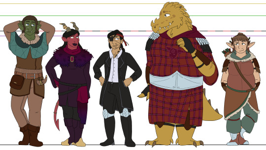
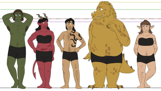
i was gonna wait until i finished the bitd and deadlands line-ups before posting these, but i'm not gonna get those done before the final season starts, so might as well bite the bullet now XD woohoo, oxventure d&d designs! i'll go into further detail below the cut for all of my thoughts on these designs and reasoning for smaller details, but for now, just know that i will never draw a cape. i simply cannot do it. hoods and weird draped fabric or nothing XD
okay i put like. waaay too many thoughts into a lot of these small details so im gonna allow myself to geek out here X3 firstly - though they're way too small to read properly, i did the little symbol eye shines i used in my first art for them! dob gets music notes, prudence gets fire, corazón gets hearts, and merilwen gets flowers. i usually draw egbert's pupils pretty thin to resemble a reptile, so he just gets normal eye shines, but i probably could have given him some here... he would get suns if i thought of that
dob - muscular in a wiry and dehydrated way, lol, hence having a more defined stomach/hips despite not being as strong as prudence or egbert. he has sad/down-turned puppy dog eyes at all times because i think the big-eyed endearing look is fitting for him, though i do make them darker blue than his canonical baby blues because i just... like how dark blue eyes look, lol. i'm pretty sure he canonically has the stomach scar, and obviously his facial scar has always been there, but i gave him a couple other ones just to show that hes pretty reckless. and he gets freckles because even though they arent mentioned in the dragon dogma's video, i noticed luke added some and. i like freckles a lot
prudence - i've said this before, but i love the thought of pru getting muscular after the werebear bite <3 i just think she should be a little bit hench. as a treat. once again, the heavy stomach scarring comes from the dragon dogma's video, because i found their design choices in that really fun. i change prudence's outfit the most out of any of the characters, just because her canonical outfit confuses me. i'm really bad at understanding/drawing fantasy wear as is, but her fit... i'm lost entirely XD so i free-balled a bit. her inner sleeves that hook around her fingers are based on jane's various prudence looks, and then the looser outer sleeve is just because i love prudence with a dramatic sleeve. originally the colors were closer to her canon outfit, but it just looked messy without all the details of the original, and then i tried red like jane's prudence looks but it didn't contrast enough with her skin. so i restricted them to just deep purples and black with pops of gold and dark magenta!
corazón - what can i say besides. transgender. LMAO honestly though, besides adding the top surgery scars, i just really like his canon look. i simplified the details, obviously, but i really love his big coat and his tall boots and the earrings and the black-on-black-on-black of it all. i didn't particularly feel like drawing hats when i was doing this, lol, so i stuck with a red bandana instead. the beads that are strung from it are black, red, purple, green, and yellow to match their guild's canonical color associations/the colored name plates they get in later seasons :] because corazón is the sentimental sort, even when he won't say it. also he gets a little cateye for his eyeliner, i dunno if i've ever said why i do that before haha
egbert - egbert my dearly beloved. literally just his canon look except he has la vache mauve on his tunic instead of fire! and the nose spikes i give him, i guess, but i forget those aren't canon. i actually usually draw him in mike's egbert get up, with the black robes and the golden dragon sigil, but i kinda wanted to move away from that to lean more into the end of legacy of dragons, where egbert fully commits to never going back to the dragon d'or. also i just love drawing little cow heads <3 also! i like the idea that rather than typical scar tissue, dragonborns grow thicker scales over places where they've been injured. so the thicker patches of small scales on egbert's body are meant to be scars! including his kidney scar, lol. the larger scales and the ones on his face were always there though, that's just dragonborn biology baby
merilwen - if i said i based merilwen's body on cartoon bears, would you forgive me... i just think it's cute LOL tummy <3 for the final dragon dogma's video reference, that's where her freckles and tattoos come from. ellen was right, merilwen with floral tattoos fucking rules. who am i to deny it. as a hairy woman myself, i also like making merilwen a hairy woman. she's a hippie, she would NOT shave. i also really love the red earrings she wears in her canon art, so i tried to carry that through to some other small parts of my drawing for her, and landed on the bands she has on her pants as well as the odd feather for her arrows. fun archery fact, for those who may not know - in modern archery at least, you usually will have a differently colored feather (or for my arrows, rubber fins lol) that indicate how youre meant to string the arrow! so i took advantage of that to give merilwen some more red, hehe
#oxventure#dob the half orc bard#prudence the tiefling warlock#corazón de ballena#egbert the careless#merilwen the wood elf druid#I really wanted to post all the line ups at once but I have fallen ill XD#and I’m busy tomorrow. so drawing is not in the cards for a bit#I’ll try and finish those soon 👍
37 notes
·
View notes
Note
Poppin in for the first time in a few months— I’ve been following your art on and off for like two years now, and I just want to say that your art style is still one of my favorite art styles. It’s unique, I love you draw noses/mouths/eyes (gods i love the way you draw mouths and teeth and facial expressions in general, am trying to learn from how you do this because it’s SO GOOD) in a really detailed way while still maintaining stylization, and the grittiness of a lot of your art really inspires me!
Also, your armada of trans characters (happy early pride, btw!) are wonderful. Umami in particular is my beloved (to be loved is to be changed indeed, she’s wonderful, and I think about that particular post all the time). Gender stuff’s been funky for me over the past few years, and your peeps have been something of a comfort for me as I figure myself out. Especially because a lot of your characters don’t adhere to strict gender norms— they just exist in their gender, whether that’s dude or woman or nb or something else, and it’s been helping me figure out that I can just exist wherever I’m at, too. I’m not sure if that makes sense, but yeah, it’s appreciated.
I also just really appreciate the diversity in your character designs in general, especially as someone who struggles with variation in character design. I might be rambling here, but even amongst all your fantasy stuff (I’m not quite sure what warhammer is, but you make it look epic), your people just look like they’d be regular people. Like no shade on other artists!, but at the same time, the same anime-esque small nose round/oval face different hair different eyes athletic build for everyone’s favorite characters gets samey after awhile, and i don’t know a lot of people who look like that in real life, y’know? While like your characters like Lyell and human Umami (off the top of my head) and your less obviously fantastical designs in general look like people I could run into while, like, I dunno, grocery shopping or something. They’re unique, but they’re also grounded. It’s definitely something I want to bring to my own art— it makes me feel like I could connect to the character designs more because of it.
I hope this all made sense, but basically your art is really really cool, and you’re character designs are top notch! wishing you a wonderful Pride and a great rest of your week
I've just been looking at this ask every now and then like :] wahhh, thanks!! it's always nice to get an idea of what it is people See in my art these days, since it just kinda looks 'normal' to me haha. Never really think of it as being all that stylized until I realize oh wait, most people are out here drawing much more reasonably sized mouths, oops, and i love regular people! Truly some of the best inspiration for interesting character designs to me are usually out buying corn nuts and a beer at the gas station and whathaveyou...regular people are great, i recommend jotting down any interesting folks you see as fast as you can, like a monk frantically scribbling down a vision from heaven
#i may not perfectly remember the beige fit fairy#or the front-toothless hottie telling us about the bimbo drag show where they lost said teeth#BUT I DO REMEMBER THEM /ENOUGH!!/#answers to questions#happy pride to thee in turn#as for the gender#i mean you got it#just existing as fuckin whatever? rules
33 notes
·
View notes
Note
EXCUSE ME I RECENTLY DISCOVERED VOCALOIDS AND IMMEDIATELY FELL IN LOVE WITH OLIVER /p
thank you for blessing us with ur Oliver art <3 he needs more love fr. and more happy songs.
i just got here so im not sure if you've mentioned it before, but do you have a fav Oliver song? :3
I'm glad you like my art of him! I've been drawing him for 9-ish years now, but it's always nice to hear other fans of his also like my art! I don't actually talk to a lot of Oliver fans haha.
I always really really admired Dappleback/Lawlietlk's designing skill, and I had a whole presentation how much I appreciated his character design and how it lead back into why I think as a vocaloid he has one of the best designs.
Like don't get me wrong, Vocaloid (and other synths) have really good designs, just sometimes they aren't necessarily as good as Vocaloid designs y'know?
Like hear me out, I feel like the biggest appeal of vocaloid mascots is this: They can be whatever you want. Now on one hand you can argue that 'no mascot' is even Moreso freedom and should have worked better than mascot, but what's missing is the intrigue. There is a breeding ground of creativity hidden beneath restriction.
Like, often enough what people need most in order to create something is just a guideline, and for me that's what Oliver offers. Like, sometimes, too much canon is a bad thing, and people need to remember that.
The #1 selling point of Oliver's design is the intrigue his design offers. There's so much of it that once changed loses that 'space of expression.' And yet, no matter how much you are able to change, he also is able to maintain that 'constant' that lets you know that yes, that is still him, even if you change it. I don't have it anymore but it's been years, but I had a whole chart explaining it.
Over the years Oliver has gotten a lot of motifs and concepts assigned to him, that only derive from smaller aspects of his designs, for example: His bandages.
While you may argue it's not entirely unique, that is exactly the beauty of it. It's because of that so many different concepts stem from it.
One of the biggest themes correlated with Oliver is a monster/horror theme and you have the bandages to thank for it. The amount of concepts I've seen born from the sheer mystery of his bandages were so vast it's crazy. Whether it's because he's a cryptid/monster/cursed or otherwise, people are forced to make an effort to use that "why?"
And on the flip side, there is other mysteries people find from his bandages that aren't horror, they're instead going for something else: A poor waif, a vigilante, a witch, and etc. Through the simple [why], Oliver becomes limitless.
And while we're still discussing his bandages, there is elsewhere you can find beauty in his design. I know a lot of his fans are or were children when they became fans of him, and I know for a fact that some of them related to his design. It's not like he had much to go against them in thinking that-- and it's not just because of his song. For me as a child I projected onto him as a (character) as someone I could relate to. That's uh, probably why a lot of people tend to use him for horror or darker stuff. I know that some people are... unsavory, but that's why I don't really like when people hate on horror content made from him. I know a lot of people are weird about him, but it's a form of self-expression all the same.
Even aside from his bandages, his design still manages to offer intrigue. While Miku allows herself to be a blank canvas (being a mascot with very little ties, a digital idol who represents exactly that) Oliver is more like... a puzzle? Except there is no wrong answer and every time you put it together, it's always different.
There was a lot of misconceptions around his design, but Oliver was based off choirboy outfits-- not that everyone knew that. A lot of people interpreted it as a sailor outfit with nautical themes. That's why you can often see Oliver with sea-themed artworks or songs and/or if it's still around, sea-side waif depictions of him. But on the other side, there were quite a few interpretations of Oliver as a time-traveler- a noble- or hell: a literal bird boy.
Had he been given a more generic design, a more modern one, a more idol-esque version of himself, most of these interpretations of him would not exist. There would be less incentive for people to create that answer without the "why."
I don't really have a proper ranking on a more 'objective' ranking of designs as vocaloid specific mascot designs, but I feel like it's somewhat similar to... actual popularity?
Like... If i had to separate them, there's three categories in a venn diagram: Just straight up Good design (though I'd argue a lot of the other two would still fit in here), Fill-in the blank design, and blank canvas design.
I would say the OG Miku fits in all 3 categories but has been erring into just good design or her own category: too engrained into pop culture to fail.
Fukase is a good example of a Fill-in design, because he also has the classic "why" to his design. (Why is his coat like that? why does he have scars? is he human? is he a robot? Is he circus themed? Who knows?) You can see a lot of exploration of his character through that.
Vflower I feel like is primarily in the blank canvas design, because she more-so encompasses a certain fashion style and is able to attract the blank canvas of gender expression as well.
At the moment, to be honest, I can't really think of someone who only fit's in the straight up good character design but doesn't offer any mystery or fluidity, but that might just be my personality.
To be entirely clear, this venn diagram is probably closer to just a single circle instead of 3, but I'm mostly talking about which part of their design they align most with. (and the most common consensus of how to interpret them.
To be honest this is probably why I feel a bit like a Fake Oliver fan, bc I care more about his design more than his voicebank itself. (Sweats as I look at the vocaloid editor on my computer)
Man. Favorite Oliver song is tough.
Favorite Usage
I'll only be mentioning the publicly released songs using him, since it's a bit unfair if I recommend you something you either have no access to or I'm unable to find again.
To be honest I'm not a huge fan of some of Oliver's most known producers, mostly because I know they're not great people and refuse to support them. It's none of my business if you still listen to them, but I'd rather not. But, It's nice going down my old masterlist of Oliver originals.
I really like Rawbeans-P, if you ever heard her usage of Oliver, it's crazy stunning. Probably some of the best usage of him you'll ever hear.
Cat in a raincloud I know is relatively popular among my friends that I've pushed Robyn's music onto.
I feel like high up there is also Corasundae, who is honestly has a pretty refreshing (?) song-making style. I'm really not a music guy- meaning I never learnt a lot of terms properly and can't describe a lot of things to you, but I really like the general sound that corasundae uses in her works.
I think T.V.V.S is a pretty iconic song, but I'm emotionally attached to Other Side.
One of the songs I see people rarely talking about is Requiescat in Pace- I get it's probably because it's an older song, but I've always liked how it sounded and was a staple for me as a kid (and still fairly fresh into Vocaloid.) I don't think PARADIGM really released much else, but this song is sooo cool, I think about it a lot!
I'm not sure if you don't like horror, or just disappointed that it's a majority of his songs, but I don't think it's leaning too much into horror? It's really good though!
youtube
Another one of my favorite Vocaloid producers (the one I bought a keychain from as well!) is Veran Kuriensu! I found them originally from their original Lay, and it's possibly still one of my favorite Vocaloid Oliver Originals still to this day. While it's my favorite, I do know that they've improved drastically and their other works with Oliver is crazy good, but Lay has a special spot to me and makes me feel especially Nostalgic.
I've always liked how the lyrics sounded as well. I think otherwise my second favorite song from them is 星をあつめに. It's really good I Promise. Please please do give their stuff a chance!!
youtube
youtube
I feel like another producer I'd recommend for similar reasons to Rawbeans-P is Baggagelizard. He's always forever been kind of a legend to me! He's a super cool guy, and he has really good usage of Oliver's voicebank as well. One of my favorite songs he's done is Song for the forgotten, which was even my Oliver Collab piece back in like... 2016? That's honestly a bit crazy to me seeing how long it's been.
Baggagelizard tends to have such a special sound to the music he makes, I think it's kind of... a morose wistfulness? If you're into this one, I genuinely hope you check out his other works as well!
youtube
youtube
Actually I'm adding this one, because I really like the atmosphere of it! It's called Tavern and it's a really fun song using Big Al, Oliver, and Kaito and I think it's such a fun song! Apparently other Oliver fans I've recommended it said it wasn't their cup of tea though (′д`σ)σ.
youtube
OH and how could I forget: Childhood Bye-Bye is honestly borderline a classic for me! I think it's a really iconic song, but it always surprises me that it's not as popular as I think it is. The producers other works are also really good!
youtube
Oooh, another Producer I can recommend is Compasscat! They use Uni, SeeU, and sometimes Oliver (maybe other vocaloids but I'm actually writing this in class (lol). You should try checking them out! I think I enjoyed it but I've been told the things I like are... different from how other people like things.
youtube
Actually, on the thought of not-so dark songs using Oliver, I hardly see any Oliver fans (or Yohioloid) fans talking about Yellow Card. I hadn't listened to it for years, but I still think it's pretty fun to this day, you could try checking it out if you feel like it. While we're at it, I'll add a bunch of special mentions for songs I knew were fairly liked enough when I was deeper into vocaloid but never see people talk about anymore as well. To be honest, I'd have a lot more to add to this list, but a lot of Oliver Originals I really liked are deleted or missing.... I understand it's at the producer's own discretion, but it's a little sad.
Unfortunately, A lot of the Bilibili/Niconico songs that I really liked were deleted or really really hard to access/find, but I'll reblog if I find them again.
youtube
youtube
29 notes
·
View notes
Note
Hi! Sorry if you've already said and I've missed it, but do you do commissions? And if so, do you draw only game's characters or people's Tavs/Surges too?
And unrelated, what inspired your Durge character? She's a great blend of cute and mental!
I love your style and storytelling so much, it's so unique and real!
Hi there! I do any kind of Commission, so always feel free to DM me and we can discuss everything! Thank you very much for your kind words, I'm glad you've been enjoying it! I think the monkDurge character came about because I wanted to try out a new class, which happened to be a monk. Surprisingly, I found myself enjoying the roleplay aspect immensely. I'm a big fan of contrasts; they help to emphasize opposites even better. For example, if something is inherently 'evil,' I like to portray it as cute and 'good,' blurring the lines between the two, but also make the characteristics stand out a lot more. While both monks and paladins represent goodness, I perceive monks as wiser characters, despite their shared desire to always know better, haha. I thought it could be interesting to create a character who strives to distance themselves from dark thoughts - particularly those associated with weapons designed to kill. Instead, their weapons are their own hands, which can lead to very different outcomes depending on the situation. So yea, Overall, I thoroughly enjoyed the roleplay experience and thought, 'I want to draw about a monk!' Thank you again!
27 notes
·
View notes
Note
for the ask GAMEEEEE 💥🌻🤩🤔
HI MELODY!!!!
💥 What is one canon thing that you wish you could change? Sonic would be trans /j. I guess if there was one thing I would change it's Silver's whole deal, like don't get me wrong I love that he's from the future and it works well with his character but like... I wish there was some kind of explanation. I'd personally change it to maybe the time stones having something to do with it or Gaia/some other powerful force designated him as the timeline's guardian (extra juicy if he's not aware of that/it's against his will). I just feel like there is a lot of lost potential with Silver which I hope IDW will address a lil more since last we saw was him and Blaze just chilling out.
🌻 How often do you read your own fics? Not that often tbh. I think I reread my team dark fic like... last month? but that's really it. I'm a one and done kind of person. Once it's posted I don't wanna see that again!! Unless I'm specifically looking for something to make sure details stay the same between chapters.
🤩 What led to your interest in the fandom? Tbh I think I was always interested in Sonic since I was a kid but ya know, Sonic was kinda cringe and I was trying very hard to not be a cringe kid. So once I got super into Prime I thought to myself... hey fuck it! Cringe is dead! I'm gonna go draw Sonic fanart even if it's bad!!! And holy shit did that open up a whole new world of possibilities. This is the first fandom I've become active in and it's been really nice so far!!
🤔 Would you ever want to write something canon if you got the opportunity? Oh man... I don't know if I could to be honest. I would love to write something for cannon tbh, like a lil miniseries following the Chaotix or some other side characters or put some characters together that don't get a lot of interaction. So I guess the answer to this is yes haha. It's a pretty intense pipe dream honestly but I would love to work a little with Sonic Team whether it was a game or a comic.
Ask game is here!
12 notes
·
View notes
Text
Development of the RMN Series
A recent ask got me thinking about how I developed my set of Robot Masters over the years, which ones were made earliest, which ones came later, design elements that changed over time, etc. So figured I could compile some of that here.
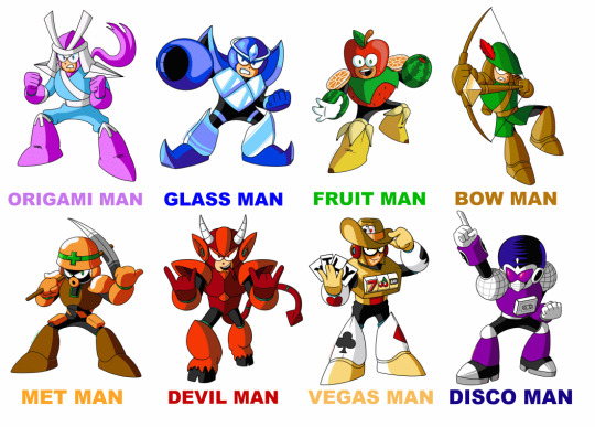
High School Era
The earliest one I made was Vegas Man. I've always had a bit of a fascination with playing cards, so I wanted to theme a Robot Master around that sort of idea, I definitely wanted to make card suits part of his design (I don't think I'd seen RM&B by that point, so I was unfamiliar with Magic Man). His design changed a bit over time, gaining some slight western theming, as well as a change to his weapon, the Casino Shield. The earliest version was an actual physical circular shield he wore on one arm, designed to look like a roulette wheel.
Next up was Bow Man. I think I was somewhat inspired by RMs like Knight Man and Yamato Man that were equipped with solid "real" weapons. Sword Man might have been on the list by that point as well, come to think of it. I figured an archer robot could fit right in. My mind immediately went to Robin Hood as a design base, an overall medieval look. It took some time to come up with a design that carried that feel but looked "robot armor" enough, but I'm fairly pleased with the current iteration.
Third in order was a very early version of Glass Man. I had the overall design elements, and solid idea of how I wanted his weapon, the Shatter Shard, to work. Earlier versions were more solidly based on more colorful stained glass, but I could never really come up with a solid design that I liked, they all just came out looking too complicated or just an overall shape I didn't like. As such, design for him kind of sat on the bench for awhile.
Fourth was Met Man. This one seemed like an obvious design to go for, as I always liked the Met / Metool / Metall enemies from the series, a longtime favorite. His design is probably the overall least changed from conception to current iteration. Earlier designs had the usual line and + mark on his shoulder pad "helmets" as well. The artist who drew the usual reference art I show for my RMs, Alex, drew him without those markings on the shoulders, and honestly I think that looks better, less cluttered. (I know I just recently posted his art of my RMs, but I put it up above at the start of this post for easy reference, and hey, I love the art and was honored to receive it, so I like showing it off, haha) I think the biggest change Met Man got was getting armed with a pickaxe, a design that came about when I started getting into the MMBN series and wanted to get a bit of Mettaur virus design in there.
College Era
While at Full Sail, my habit of doodling in the margins of my notes continued, and along the way, more custom RMs were born.
Fifth up and starting this period was Devil Man. I wanted a fiery volcano stage, but wanted to go with a less standard fire based idea. I had the idea of an RM using a grappling hook to get around the dangerous volcanic tunnels, and that idea ended up taking the form of a sharp, pointed devil-style tail. I didn't really have a solid personality in mind for him, though the actual visual design came along fairly quickly. Alex again gave me something that I adopted as canon for this RM, in his drawing of Devil Man, he was depicted "throwing the horns," so now I imagine him to be a major metalhead, headbanging on the job as he listens to his favorite heavy metal music.
Sixth in line was Origami Man. Origami is an art form I always liked, my mum had a lot of books on the subject, with step by step instructions for various creations. I knew I wanted to do something with that. The overall design gave me trouble, figuring out something that truly looked like origami armor. The pallet was something else that gave me trouble, but in the end, I opted for a softer pastel pallet, largely for some visual contrast from other RMs I had, a good number of which were already on the warmer side of colors.
This was also the period of time where I largely had Vegas Man's finalized design pretty much down, as well as the redesign of his weapon.
YouTube Era
For lack of a better term of time frame, I didn't really think too much about my custom RMs for awhile after Full Sail, until I had started making videos on YouTube and hanging out with various friends. One conversation with a group of people I used to hang out with involved the idea for a Mega Man fangame, and so, we set to designing RMs. While I did think of my older designs, I also decided "why not try making some new ones?"
Seventh on the list was Fruit Man. Our overall designs for the RMs for this game were more on the silly side, so I decided to go wild with his design, making him a mascot character for an orchard, and thus fully theming him on various colorful fruits. In keeping with the sillier ideas, I made his weapon a pun, the Pineapple Grenade.
The eighth and final design was Disco Man, or as he was originally dubbed, Groove Man. His original design was a bit less solidly themed on one genre of music, instead he was sort of build like an entertainment system featuring tape decks, a CD slot, speakers, etc. I was playing around with visual designs for the head, and the one I ended up liking most had a sort of disco ball afro design. Thus, he started leaning more toward a Disco design, with the disco ball motif migrating to his shoulders, the mixtape taking over his chest, chill shades, platform boots, and a more refined afro design. What can I say, I'm a sucker for disco aesthetic (bring back Miror B. you cowards).
This was also around the time I finally came up with a solid visual design that I liked for Glass Man, and thus, the family was complete.
The Mystery 9th Robot Master...
Technically speaking, back in the High School era, I did have one more RM I had been working on. In true order, he was the fifth design I was working on. His name was Quartz Man. He was going to be a time based RM, armed (literally) with a wristwatch device that gave him time control abilities. However, it was a case where a) I couldn't come up with a visual design I liked enough, and b) I couldn't really think of a solid way to give him time powers that felt unique enough. I think about the only solid part of his design aside from the watch was I think I wanted him to have glasses, I felt it would give him a sharper, more "intelligent" look. I think I had it in mind that he was sort of a strategist type, using his time powers in clever ways to gain the advantage. (EDIT : One further detail I remembered was his color pallet, I wanted him to have at least some sort of bright teal-ish green in reference to the "glow" function of digital watches.)
And so, that basically wraps up the ol' design process I went through over time for the RMN series. Hope you enjoyed this bit of personal history.
14 notes
·
View notes
Note
Hey! I’ve been following you for a while and I really love your art, it’s absolutely stunning and I love the way you paint and capture anatomy. I know this is a bit of a broad question but I was wondering if you had any tips on getting better at painting digitally and studying anatomy, maybe more specifically blending, colour picking, and structuring anatomy in a way that looks somewhat realistic?
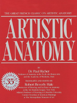
Thanks and I'm glad you enjoy my work long enough to be following me for this long! I definitely love drawing a naked body that's for sure haha. In terms of tips for getting better there's a few things I can mention but it's going to fall broadly in the general answer of "study", because this is the most sure fire way to be able to understand what it is you're trying to emulate in your art. There are different ways to study, and they teach something slightly different. For example, doing studies from life (live drawing classes) help me understand movement in a way studying from a photograph cant, simply because you're seeing the same model in different poses in real time, you can see how the fat and muscle moves around as they shift to different positions. So they're not technically moving the whole time, but you're still seeing some movement there, and understanding what sticks to what while it rotates and bends. Studying from photographs can help give you time to do some real deep dives and investigate where different bones/muscles sit while someone is in a particular position. There's also the opportunity for understanding how shadows may be formed by the body as typically photographers are more conscious of how the subject may be lit than what may be available in a live drawing class. Beware though, as more things are photoshopped than you realise, not all photos represent reality. Especially glam and fashion photos. It doesn't mean its bad to want to have these effects on your work but just be conscious they might not always be anatomy accurate if that's what you're striving for. I sometimes make a conscious decision to go against what is anatomically correct for a certain effect myself. A book I have been recommending for years for anatomy is Dr. Paul RIcher's "Artistic Anatomy". It's great for understanding muscle structure intimately - it's designed specifically for artists, but with the idea of trying to stylise the diagrams as little as possible for the sake of understanding the human form. There's a lot of great info and detail in here, but beware, there is not a lot of variety in body structure (at least not in the edition I have which is missing female anatomy I think already so I'm not sure what else I don't have in here). So you'll be able to understand function a lot from here but you wont be able to learn a lot about fatter body types sadly.
Colour picking is probably the most difficult for me to explain easily, as I have spent a long time winging it, then studying it, then being really experimental with it. I could write a lot a lot about this but to spare making this post any longer I'll refer to another fun book just for getting started on some frequent and common terms called "Color and Light" by James Gurney.
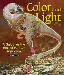
I also love that he uses like, dinosaurs for everything in here lol. It's a great starting point that can give you some go to ideas that you can then experiment from there. It's not very authoritarian (or at least that's what I feel), and doesn't push anything forward as a hard and fast rule, just showing what affects some colour combinations might instil in someone.
As a whole, I've gotten better at painting digitally by studying traditional painting techniques. They theories are basically transferrable one to one with some few exceptions. I tend to blend my colours by simply using a soft round brush in Photoshop with a low opacity. Much the same way I would with a real canvas, with a large round brush and diluted colour. I hope this answers your questions in some way. I tried to be not too specific only because this answer would be at least another 30k words lol because this is something i think a lot about! I love technique! If I ever stream again, feel free to pop in and ask more questions where I might be able to show some stuff in real time! Not sure when that will happen though!
Also the way i do stuff isn't a "correct" way either. I like painting from imagination so this is how I make that work. Some people like to only work with references for every piece, and that is a completely legit way to create stunning art as well. Good luck!
72 notes
·
View notes
Photo
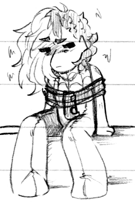

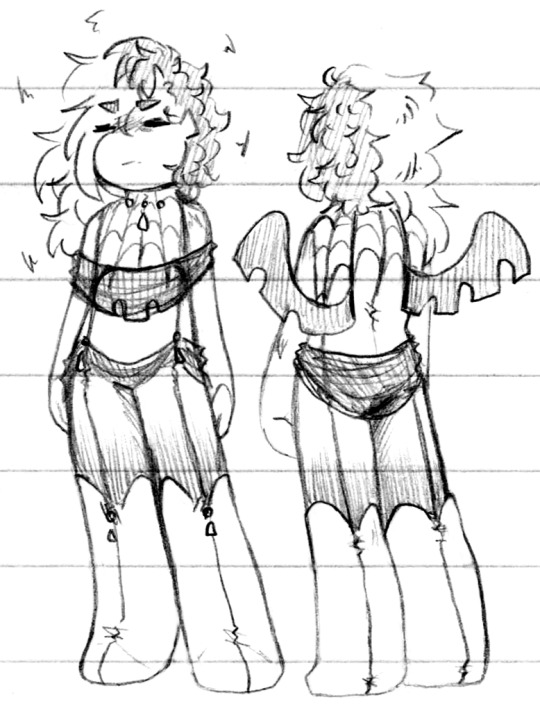
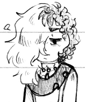
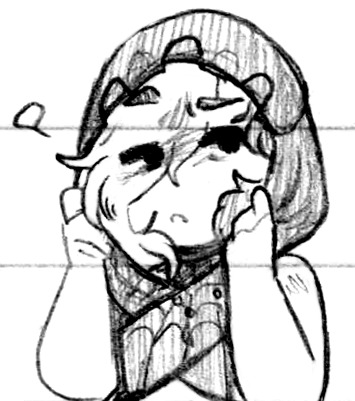
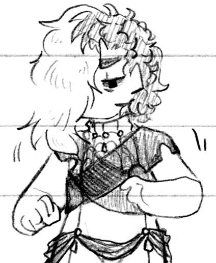
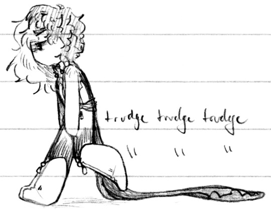
Getting closer, getting really close now I swear (Patreon)
#Doodles#Just Desserts#Villainsona#True Villainy AU#Just ignore how many times I've said that up to this point lol - I'm serious this time!#I always feel so bad designing TVAU outfits because Charm is always so miserable as a model haha#Could this be a contributing factor as to why it's taken so long?? No I enjoy drawing her like that lol#Made some design notes about the important elements of what I want for her True Villain look - more than just ''Her but Kaiein influence''#I'd still really like a nod to dragon scales of some kind but honestly her classic design is more that#Always going on about her spider theming how to make it dragony! It's the one thing I'm still hung up on lol#As for the rest I think it's Really getting close :) I got to actually turn her little ''shawl'' - I always knew it was Kaiein-related -#Into something that properly mimics his shape! It's all controlled by her tho it's not a part of his body - just magic-infused matter#Made to look like him so there's still that creep factor but it's more her body than his - she can control its shape :D#And I got to keep the jewels! Yesss - made it a motif! Now it's also on her hips and knees to break up her visual space yes very good#It's drips :) Y'know - like ink :) Finally figured that one out lol good job setting up my own symbolism me#And then some elegant drapey bits to match her ''shawl'' and continue to break up her space!! Yes! Good!!#I still haven't decided on a colour palette I think black and white is too obvious and too Kaiein but hmmm - she has a lot of colours#Lots of options to pick from but which is the Correct one - her hair would stay pink so maybe some of her pinks or purples#I'll play with some digital swatches later :)#I'm also so glad I could implement the hood design from one of the scrapped outfits ah <3 I love her in a hood she's so cute#I'm rather pleased with the way the spider web design breaks up her form as well - it's more subdued than the full bottom/shoes stripes but#It's also not very clear here lol the long ones that all the way down to her feet are the third from the center ignore that second one#The second lines out from the center host her wings! Very important!#Kinda reminds me of my holosona in a way actually :0 They /are/ both Evil-aligned hmmmm#All the more reason to colour palette! Differentiate the colours in my head#Really do feel like I'm approaching it now fdjsklafd getting close now!!
13 notes
·
View notes
Note
Hii! This is my first time messaging any fanfic author (I'm an extremely anxious person and tend to be more of a lurker LOL) I'm so sorry but this might be a long one lmfao
First of all, the way you write in general? Absolutely phenomenal!! The way you characterise and describe scenes is honestly so incredibly immersing. I've always had a relatively easy time imagining scenes in my head when reading, even with relatively little detail, but the way you word everything puts the scene straight into my head and it's such a wonderful experience!
Your characterisation of Gojo (in all your works!!) is probably my absolute favourite out of any fanfics I've read of him (trust me I've read an embarrassing amount :sob:). The way you actually capture what he feels like in canon, without making him feel super mean or cold, but still retaining that side of being emotionally repressed is absolutely chefs kiss!!
I also really love y/n in both kickoff and ihm so much. I relate to both of them in different ways, but probably more so ihm reader personality wise (might also be because I'm around the same age as her lmao). As someone who is very emotionally repressed due to trauma (especially of loved ones leaving you), the way you've portrayed those sides of reader in ihm is VERY spot on!! And I would like to add that I, for one, LOVE slow burn, so I don't mind the pace ihm is going at right now personally!
Chapter 12 of Kickoff?!?!? Holy shit I was literally sat there blushing, kicking my feet and giggling. It was absolutely hilarious and super cliché in the absolutely best way possible (I absolutely love clichés if they're well used!)
I could honestly wait years for anything you write. Never feel any pressure to churn out your writing and take it at your own pace!! My genuine first thought after finishing the latest chapter of Kickoff was that it was sooo worth the wait haha.
Personally I have an extremely hard time writing anything but angst, because I like making myself sad I guess who knows LOL But I'm sooo excited about your next work!! I absolutely love the song you're basing it off of <3
AND did I also see some talk about a potential Spider-man Gojo fic in the future??? Cos I would honestly probably scream (in a good way lol) if you ever did that, he's my alltime favourite superhero!!
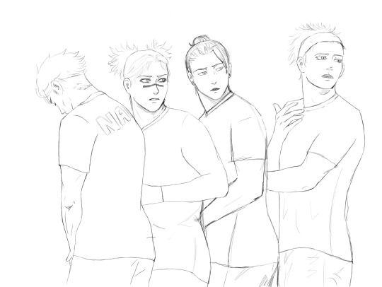
Okok this is getting really long, but I found this photo of four football players a bit ago and thought I absolutely HAD to draw them as Gojo, Geto, Choso and Nanami from Kickoff (adding the art at the bottom)! But I haven't gotten around to colouring it yet (or cleaning it up considering it's just a sketch lmaoo) cos I'm stuck on how to do the jerseys. So I have two questions! I know you've explained the colours of their jerseys, but do you have any particular idea in mind of what the design on the jersey itself looks like? As in where the colours are placed specifically etc? And we know Gojo's signature jersey number, but do you have numbers for the rest of them too? (I may or may not also have a wip of a drawing of just Gojo from Kickoff too!)
I'm sorry there's A LOT of different plot points in my message??? The most important part was just to convey, hey, I love the way you write and you should definitely give yourself some more credit cos you are genuinely a really good writer!! <3 (Though I know us artists tend to be our own worst critics LOL)
hi love i’m so sorry this took me a sec to respond to!! first off thanks you so much for sending me such a sweet ask :’’’) i literally gaspeddd when i saw it
aaa i’m so happy the scenes feel immersive!! and that you enjoy my characterization of gojo aaa i’m so happy to hear that. and yes i totally relate to ihm reader’s suppression of her emotions due to trauma and lack of trust so it’s been very…cathartic yet challenging to write for her, but i wouldn’t have it any other way hahah
i’m so glad you enjoyed kickoff ch12!! i totally agree that chapter was so cliche, honestly it made me cringe while i was writing it because i typically hate cliches esp when they’re corny rather than on-the-nose, but i posted it anyways bc i figured maybe i just hate it bc i’m the author xd but it seems my readers enjoyed it so :’’0 perhaps i made the right choice
oh you are too kind. i really appreciate you looking out for me <3 tbh i’ve been feeling really overwhelmed lately, and it’s been really hard to deal with the emotions, but coming on here and seeing sweet works n ppl interacting w my stories brings me lots of happiness n i can’t thank you enough :’’) yes i will definitely take my time bahahha that i can assure you LOL and i’m so happy to know you’re looking forward to more of my works!! you’re so right about artists/authors being our own worst critics. i swear no one has been as mean to my writing as i have LMFAOOO but alas i think i’ve gotten better in trusting my direction n kinda choosing what i think is best soooo. progress i suppose? hahah
ok. now. i can talk about. THE ART?!?!?!?!? HELLO!!!!!!! OH MY GODD?!?!!?!?! ok i KNOWWW that’s it’s just a sketch so far but tell me whERE MY PANTIES HAVE GONE?!?!?!? WHERE MY CLOTHES ARE AT?!?!??!
the expression on kickoff gojo’s face has me reeling he looks so focused n sexy and THE HEADBAND PUSHING HIS HAIR UP OUT OF HIS FACE YES YES YES 100% THAT’S HOW I PICTURE IT WHEN I WRITE AAA and kickoff geto’s expression too pls i could cum (sorry i hope this isn’t weird to say lmfaooo i am also very respectfully looking at your artwork as well aaa) nanami’s hair looks so nice too
as for the uniforms hmm i know i said like gold and blue colors, i believe actual real-life UTOKYO has more of a yellowish color but i actually like gold better hence why i chose gold. but…i can imagine the whole jersey being blue and then with gold accents then white numbering?
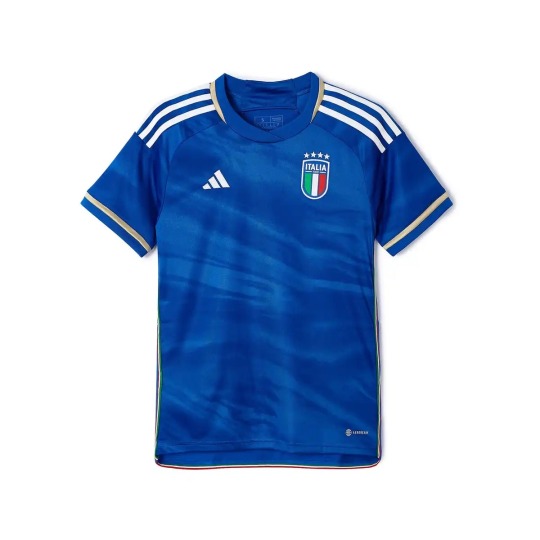
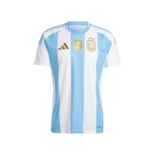
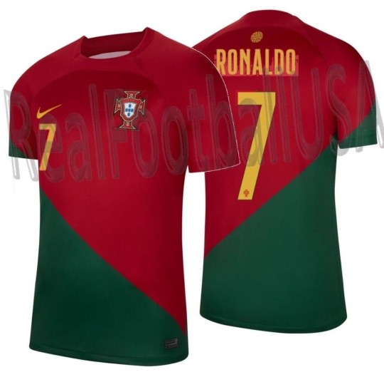
here are some options!! like w the first one, probs sky blue fabric with the white stripes as gold instead, and then the numbers/brand sponsors or whatever are in white? they would probs have like “UTOKYO” in large print somewhere too, maybe underneath their numbers or sumn. tbh i think the middle one is the nicest, i can picture the stripes of blue and gold, and then accents in white. but the third one also works too!!
as for numbers hmm. ok yes gojo is #10, geto is #7, choso is #4 and nanami is #24 :0 that sounds…about right! LOL i hope i don’t have it somewhere in the other chapters that they are different numbers although i don’t think i’ve assigned the other boys numbers before
BUT I HOPE THIS HELPS AND THANKS SOSOSOSOSOSO MUCH FOR DRAWING FANART INSPIRED BY MY FIC!!!! I AM SO HUMBLED BY YOU AND I’M SOOOO EXCITED TO SEE THE FINAL DRAWING BUT ALSO NO PRESSURE AAAAAAAA
so much loveee <333
18 notes
·
View notes
Note
👕 & 🍽️? For the trek ask game
Heheh thanks for Asking Meg!!! All aboard another long winded ramble about my wife ST: Voyager!!!!!
👕 Character whose fashion you like.
While I answered in the last one, I think I'll add to it by saying I love the Ds9/Voyager Uniforms--Infact I'm a HUGE sucker for them--At least to me, they feel like THE signature trek costume rather than TNG or TOS ones. Plus, they are fun to draw! I love how they look on the actors with the structured upper half, and loose, high-waisted pants that give everyone the illusion of height.
Those that are dressed in the uniform are portrayed with a respectable heft and a pleasant, overall shape. I know it's not the case, but they look like they are really practical. This is fully intentional as the lead costume designer said they wanted the suits to appear modular and have advantages in different environments. That's why sometimes they are unzipped or twisted around, depending on the narrative.
I could go on and on about them. I act feral over how they look when when all the actors stand together, turned in various ways, posing so that that folds pucker on their joints, or when subtle differences in their body sizes take up screen. It just looks so cool! I'm a big fan of squad-based, colour-coded uniforms and clean silhouettes.
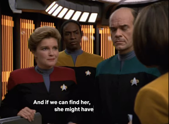
Most importantly though, it gives them all BODY-ODY-ODY!!!
youtube
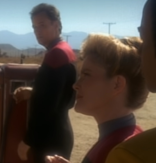

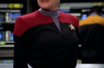
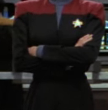
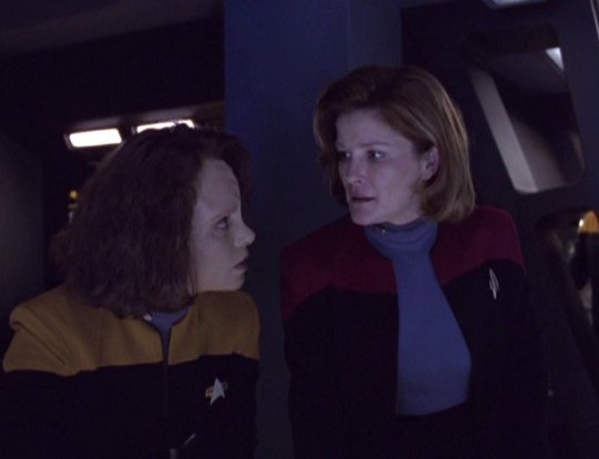
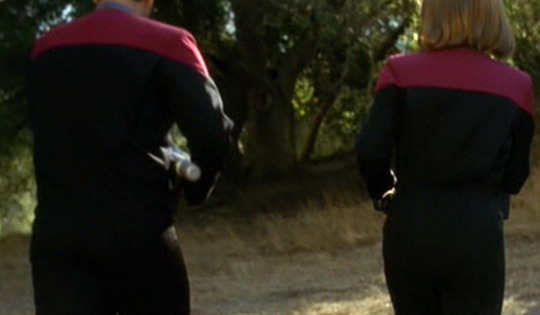

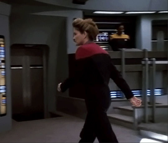
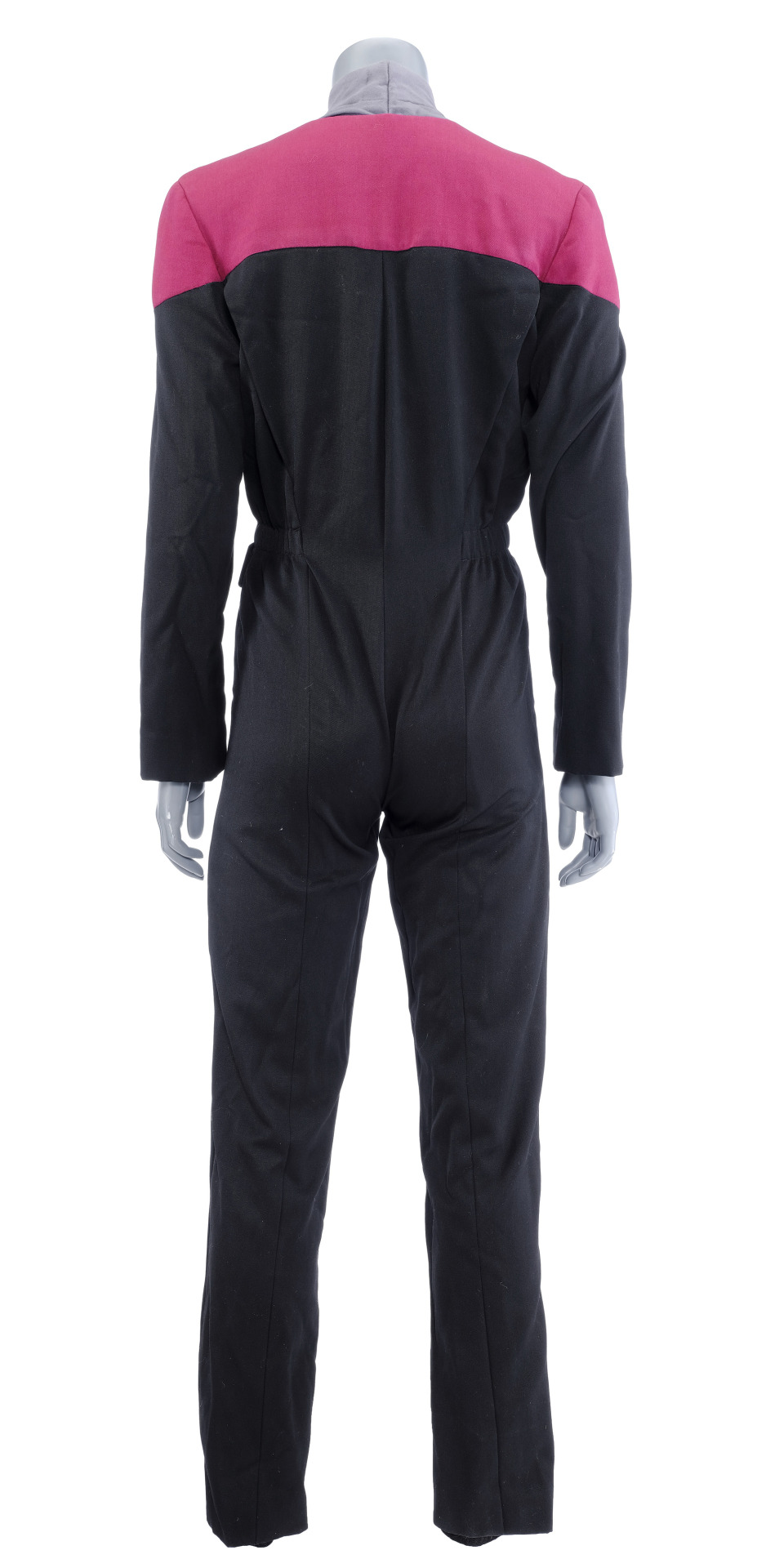
AYO WHICH LOCATION THEY AT??? CW: GORILLA DUMPIES!!! 👀👀👀 😳😳😳😳
🍽️What alien food/drink would you want to try?
I wish I could find the video but I've seen bits and pieces about how they designed the food on the sets and I think it's super charming!
Lots of effort went into considering the cuisine. It just about decorates every set and It was important to the show. Voyager engaged in a lot visual gags, or dialog discussing food. It was in a comforting way that would present the characters with their personal ideals of home.I find that subtext of world-building really endearing.
Many scenes involved characters bonding in the mess hall, socializing around food, or isolating with it to gain a sense of self. In contrast, it's used as a device for diplomacy, or to make settings seem more alien, unnavigated and removed from regular comforts. It's even incorporated into main plot points, such as with Tuvok in ''Riddles'', when he gains a newfound skill around cooking after a serious accident, and he solves the plot by decorating a code on a cake. Through food, we saw a lot of what it could be like to be a crew member on the ship, and live inside their Universe. It wasn't always pretty but they made it work.
We have a really rich food bowl and diverse food-culture In Australia, I love noticing exotic food that are used as set decoration of as props--I am used to seeing tropical fruit or Asian ingredients around my community, so it's fun to see it transformed. And much like the characters in Voyager, I relate to the comfort and the charting of new territories when it comes to seeing/ eating food.
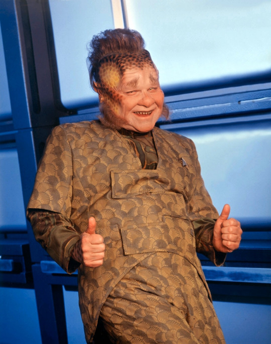
I suspect being a chef / working in hospitality would be an interesting occupation in Trek. Everyone complains about the lack of authenticity from replicated food, so I'm sure being a good Chef would be worth your while.
I genuinely want to try Old-mate Neelix's cooking. He seems so creative and passionate about what he plates up, and he CLEARLY (they all put on weight haha) kept the crew well-fed. ''Bitches make do'', but you can tell he cares by the questions he askes everyone, or the detail he places into his recipes. I'd like to see what all the fuss is about with Leeola Root Stew. I bet it's not that bad! (I like bitter food) Or better, serve me up a Jimbalian Fudge cake! It's so quaint how there is an evolution to his work as he gets more integrated with everyone.
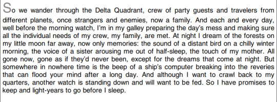
(crying over this ^) Neelix Nation Rise Up!!!!
#SOBBING I LOVE STARTREK VOYAGER SO MUCH!!!!!!#thankyou if you read my thoughts again lmao the other one is popping off hahaha#i did not proof read this at all so sorry if it's a fucking mess (not much unlike my other textposts lolololol)#now i just want to redraw frames of the body music video with the command crew lmao#i think about this stuff & how it's so underrated in the way that the the REAL subtext behind the characters is right there but y'all slee#instead people are busy infighting or making up stuff little truth behind it when it's actually alot of sincere material is available#dont mind me being a FREAK over their visual language and body dimensions idk#i fucking love just SCANNING the frames and being like YUM A CURVE ON THEIR ARM or a WOW THE SHAPE OF THEIR WAIST#TY MEGGG I HOPE THIS ISNT A BAD RESPONSE IM SO BAD AT PROSE LMAO#neelix#kathryn janeway#chakotay#tuvok#star trek voyager#startrek voyager#st voyager#SORRY ANOTHER BIG TEXT POST#theartmeg
17 notes
·
View notes
Note
Hey, just wanted to say that I thought you handled the whole Terry Jr being black post very well and very civilly. Even while faced with backlash about your design, you responded politely and respectfully.
I also didn't know it was confirmed on the aftershow that Terry and Samantha are black, not having access to the patreon, though I happened to headcanon them as black beforehand anyway. Personally, I think it's unfair to expect someone to know what has or hasn't been confirmed by the creators when the information is behind a paywall.
Also, there's nothing wrong with having different ideas than what "the fandom has decided". The whole point of fandom and diversity means people interpret things differently. While I understand how your designs along with the character's individual stories could be easily misconstrued, and that should definitely be taken into account, you haven't done anything wrong by interpreting a character a certain way, especially when they barely have any confirmed physical appearance on the show itself.
You said you're working on a redesign for Terry, but you shouldn't have been bullied into it. I understand that the original post was mostly a vent about personal experiences and feelings, and that's valid. There was probably a more respectful way to handle to situation though.
To end this tirade, let me just say that I think your artstyle is adorable
Thank you, that's honestly very gratifying to hear. The whole situation was unfortunately pretty stressful, maybe just because I'm a very anxious person, but it was really eating away at me.
I said this before in the post, but my first experience with a podcast was the adventure zone where designs were fully up to interpretation, so it was maybe my bad coming into dndads with that attitude. I've seen fanart of pretty much all the character in all different races, including Terry jr as white, so I kinda just took that as confirmation that this was the case.
The thing is with the patreon paywall is that I AM a patron, so I would totally be able to look up the talking dads episode if someone directed me to it, but no one has yet. and the op never responded to my request for it. Even though I will be changing Terry's design regardless, I would still like to see what Anthony said since I've never seen someone say it was confirmed before.
I also fully agree about not loving the whole "the Fandom has decided" thing. There will always be exceptions to the rule. I've seen plenty of people draw the characters in plenty of ways and that, to me, the fun part of podcasts. That there is no ONE design. And mine was just an ingredient in the pot of the Fandom. People who don't draw and just enjoy fanart have the ability to basically shop for what designs they like best. They can choose one person's Lark and Sparrow designs, and another person's nick design. It was maybe small minded of me to assume that people would just keep scrolling if they didn't like my designs. The op called me a popular artist in the post and I've never been a popular artist before, so it's also possible that my work might me kinda hard to avoid if it's near the top of searches. Especially with how much I DO draw Terry and with the unintended message of "good dad = white guy" which was obviously never something I was trying to convey.
In regards to changing my terry, I do have to admit that I am sad to see the old design go, and I don't feel awesome about how we got here, but I do really like the new design and hopefully you guys do too. I didn't change too much since I still like alot about the old design and changing how i see him in my head isnt gonna be a fully new design, just necessary tweaks on the template, but it'll hopefully be a good change.
I never imagined I'd be at the center of something like this, and it really didn't feel great, haha. Especially when looking at the comments on that post of people saying they've been avoiding my art because it makes them uncomfortable, something I NEVER wanted to happen. I just really hope I can turn it around and the people who avoided me before will understand that I really didn't mean any harm.
But genuinely thank you for this, sorry I'm kinda just using it to get out the rest of my feelings regarding the situation before moving past it. It feels a bit better to know that people like you had similar feelings to the situation as I did as the whole thing felt a bit isolating. Obviously it was probably also stressful for the op so I don't want to insinuate that I'm the only one who was affected by this whole thing. I'm really thankful for the support. Or at least the reassurance haha
And thank you for saying my artstyle is cute! Honestly with all the crazy talented people in the dndads community I'm really thankful to have gotten the following and attention that I have. Despite this experience, maybe not leaving the greatest impression, this fan base is one of the most kind and supportive communities I've been in. =]
#txt post#not tagging this with the fandom tags because the wider communinty does NOT want to read the essay i just basically wrote
7 notes
·
View notes
Note
Hi I'm back again!!!!
I'm haply to know that I'm not alone in the "ship has to be sometimes realistic or I die" boat. Though it's not like I can't consume unrealistic stuff. I just have to be in the mood for it.
I assume the daughter that looks like Aventurine would be the oldest, right? And then later come the other two. I would love to hear about what you came up with!!! (I would also like to draw them, but I don't think I'll do your vision justice...)
In comparison, the fan kids I made aren't all that fleshed out, haha. It's not that I've never thought of them having kids, but my brain feels like it has to build the relationship first before jumping into it, if that makes sense. Like I first have to think about how a ship got together, how the relationship progresses, what struggles they face, whether they would get married, whether they want kids, etc. Whatever I create has to stem from those conclusions. That might be weird, idk. But having someone to bounce ideas off of certainly helps!!!!
Back to the kids, for me I would envision them to have two daughters. They both would have blonde hair, but then the youngest later on dyes it similar to Ratio's, just a bit lighter. The oldest would have Ratio's eyes, and the youngest would have Aventurine's. When they're raising them it's sometimes a jumpscare when Aventurine sees long blonde hair.
I like to think that the eldest daughter eventually gets the fashion sense of her papa (flashy, reference to an animal, excessive amounts of jewelry, etc). Though I'm mostly thinking of those sunglasses Aventurine sometimes wears. They take shopping trips together. Though she'd be the type that just likes what looks good on her, even if it's not designer or whatever.
In contrast, the youngest unfortunately gets one good look at Stelle and it shapes her little brain forever. She looks at Ratio and tells him "I wanna be like them when I grow up!!!!" and it's just a picture of them after they finished dumpster diving. There is no hope to be had. He tries to sit her down and tells her that looting for trash is frowned upon in society and can get her sick. She starts crying.
(Somewhere in the distant universe, Stelle feels a profound sadness in the air. March and Dan Heng tell them they're crazy.)
As for jobs, I like to think one of them becomes a pastry chef, and the other a teacher. But I haven't decided who gets what. Or, like what level of complexity the job would be.
Also thank you for the kind words!!!! We are giggling and kicking our feet together!!!!! I was thinking of making it worse, but then decided against it. I wasn't sure if it was going to be a bit too much if i did.
I love this little universe we're making too!! YAAYYYY !!!

ok ok so here's their designs (always subject to change). fitia is the oldest amongst the three and is a phd holder in archeology and anthropology. she's currently busy with research into her family legacy, more specifically she's interested in the avgin (both for her sake and bcs she grew up with aven talking abt his clan). fitia is a mild mannered person with a sunny disposition and a meticulous approach to her work, which means that she's not very good at taking care of herself. one can either find her nose deep in work or passed out on the floor with several mugs of coffee near her. fun fact, her nickname fi is a play on phi often being used in maths.
selene is the middle child. she's a pro racer and is just about the most reckless person you could meet. an adrenaline junkie at heart, she often makes her family worry. selene is a rebellious one, being very independent even as a kid. she's an avid lover of all things vehicle related and when she's not busy crashing them, she's seen tinkering with bits and bobbles. selene is a yapper, something she inherited from both her parents, and often annoys her two quieter sisters with her talking (they don't mind tho).
cassea is the youngest and quietest of the bunch. she's currently studying geology and is running a blog where she talks about gems. she's more of a listener than a talker, but her tongue is sharp whenever it needs to be. she is quite sweet, but she has taken after ratio's blunt nature. if she's not studying or indulging in her work, she's often seen walking along beaches combing for rocks and pretty shells. cassea has a habit of picking up trinkets and gifting them to her family (selene has a whole lot on her keychain). cassea's name is (might be inaccurate) the romani version of the name keziah.
nooo i love ur two girls they sound so lovely. i like the 2nd one dyeing her hair like her dad's, she's so real for that!!! who wouldn't want to look as good as he does?
oooh do you think that whenever they go on their shopping sprees, that they both legit take hours because they take so long choosing good pieces? i can just imagine her sitting in front of the changing room and waiting for him to come out so they can nitpick every single thing wrong with the article. i can already tell that their closets are full of stuff.
the youngest is a lost cause fashion wise, but god do i love her already. has stelle influenced her in other aspects of her life or just the dumpster diving fashion? huhu please tell me more about both of them, i desperately need to know more!!!!
sorry anon it took me so long to answer, but i've been in ddne land + i have been feeling really shitty lately, but whatever. haha it seems you have transferred the angst onto me :,D
3 notes
·
View notes