#I'm still getting used to coloring and shading in this style too lmao I'm a realism/semi-realism artist not a cartoon artist 😅
Explore tagged Tumblr posts
Text

juzt fineshd a werkout 😎 satan mite b an ashole but he nos how 2 rihgt a exersize progrem holey fuk
#ic#blitzo rp#my art#was this an excuse to draw a blitzo thirst trap ft emberlynn?#100% it was yes#I'm still getting used to coloring and shading in this style too lmao I'm a realism/semi-realism artist not a cartoon artist 😅#stylized cartoon art is fun but harder despite how much simpler it seems 😂#I think I need to draw a stolas next#after some more horses probably
15 notes
·
View notes
Note
hello it's me again! Your biggest fan (LMAO) The one who asked for tips on coloring...
Another question has came up on me while I was coloring (finally aughhh). How do you shade hair? Without it looking unnatural?
Thank you for your help before!!! 😊
Hello and welcome back! I'm glad my previous advice helped! That is a difficult question as I do admit it is a bit challenging to me as well. It is guesswork + studying references, adjusting tid bits until it looks right, my own process relies on a trial and error approach.
Therefore, I suggest you pick some pieces you like where you find the hair gorgeous, and figuring out how the artist does it, or how might they do it, per active learning principles. Try to deduce it. While the following guide can be good for your starting concepts too, it's important to adapt it to your style and preferences. And I even encourage you to go against it, as creativity thrives on experimentation.
That said, I'll guide you through my own thought process, however. (With a quick Ratio sketch, because I really love to shade his hair; fluffy hair is very forgiving.)
Let's start off here (I'll be skipping the black and white part for simplicity's sake from the previous guide. I'll also be using a white environment with a pale overlight):

For highlights, I begin laying down a Glow Dodge layer with a hard brush that doesn't have full opacity, and draw a halo-like shape. After that, I refine the shape by erasing parts of it with a rough eraser to get the desired effect.
Alternative to the Glow Dodge layer, you can use pure white, or other layer types such as Lighten, Screen, Add and Overlay, etc.
In the following pictures, note that I adjust the layer's opacity freely.


Above, I simply blended it a bit to my own liking.
With an airbrush I softly start introducing shadows (Multiply layer, dark purple/blue color).

Then, I start introducing sharper shadows in a separate layer.
You can use a lasso tool for this to map out a jagged like shape which should remind you of mountains. You can blend this out too at certain segments.
(Sidetrack: if you feel like, I suggest reading up on the balance of hard and soft edges in painting, the topic is very interesting and I am still trying to grasp it as well, yet I find it immeasurably useful. This can come in handy upon rendering principles. A very skillful master of it is the artist Yuming Li.)

Furthermore, I add reflections. I've used a Lighten layer with a subtle blue color. As this is subtle, I want to point it out that it appears on the lower parts.

For a final touch, I pick out the skin's color and airbrush, shift the picked color to a more saturated one and apply it near his face/to the bangs, with an airbrush.

For the fundamentals of hair shading I usually wrap it up here and go off to rendering. I use a painterly brush to do this and pay attention to the jagged shape I mentioned earlier. The brush I use is already tilted, so it's easy to manipulate to make such shapes.

Additionally, I experiment with Overlay, Multiply (or any!) layers with either airbrushes or hardbrushes— as I said there isn't a specified way of doing this. Go wild; for such is the nature of hair. Add any shapes or lines you find appealing, introduce new colors from the environment nearby too to make it moredynamic and interesting as well.
EDIT: An addition! On Rendering tips and advice
(apologies on leaving this out initially! I only realized I should include this now )
Including astray curved lines to simulate how hair flows also builds to the hair-like quality. I also prefer to use it closer to the silhouette of my character as it adds further detailing and a fluffier look in the end!
Attempt to render each strand according to this diagram in mind, note the parabole-like(?) shape for the light, and note standard 3d spheric shading for shadows.


#also!! watch speedpaints! slow them down and follow them#do i even tag this with ratio. no i'll spare you ratio fans the art guide#art tips#art guide#thanks for the ask!#asks#art tutorial
102 notes
·
View notes
Note
I'm sorry if this is too personal but did you had/have any art trauma caused by art teachers in school? And by trauma I mean some aversion to try learning one thing, because art teacher was just a dick. I have something like that with shading and it still holds after 6 years as a adult and I want to break it, but I cannot force myself to try it again and this holds my proggres as a ,,artist" and that's make me smad. I'm sorry once again if this is too personal or too hard to answer
Yup I did! Tho idk if I can call it "trauma" tbh
Oop I kinda went on a rant sorry lol
I studied ceramics in uni but I did have nude art classes and classes that required detailed art projects.
Although most of my uni time was wasted thanks to covid, I did get harrassed by a few of my classmates and my teacher in my last year.
My classmate had said that my art level wasnt good enough to be in this uni and my teacher yelled at me in the middle of class for like a week or two because I refused his ideas for my projects (he had given me the ok on the design before he changed his mind 180 and started pointing and laughing at me with my classmates while i worked on my ceramic project)
I eventually had to give up resisting because I wanted to pass the class and let him do whatever he wanted. (He legit just put clay on top of my design, smoothed it out and that was it in fact here is the design he gave me the ok to, the middle of my project and the way he stopped me)
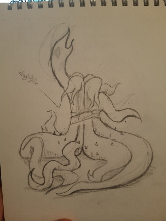
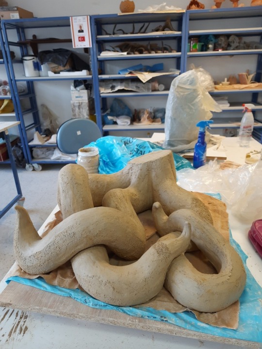
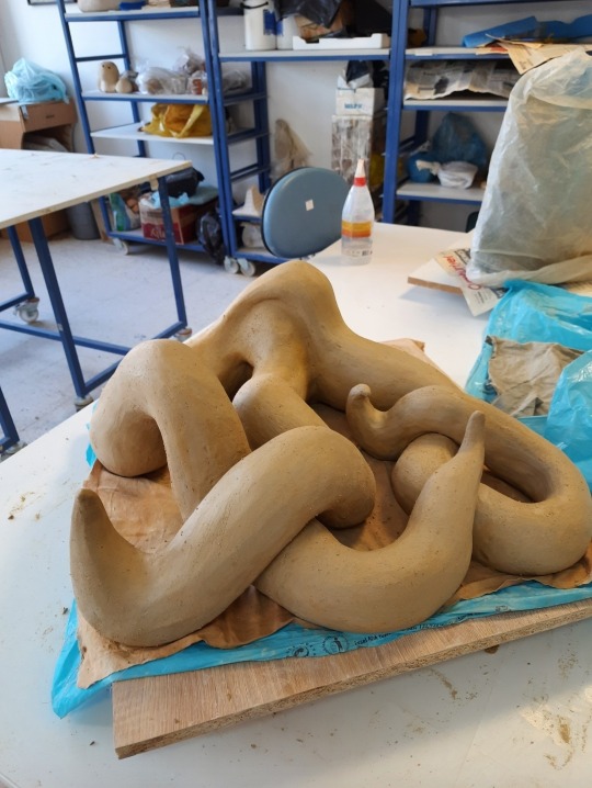
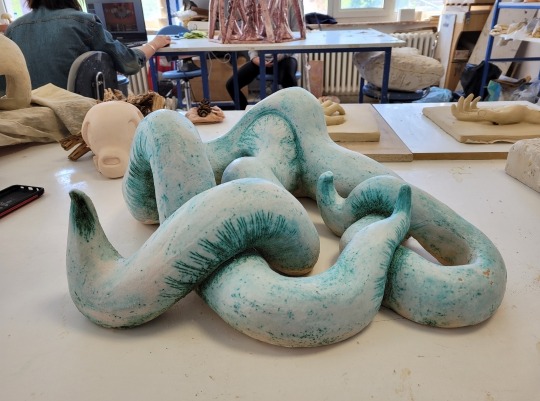
After this I basicly didnt do anything more for his class, minimum effort. My days in Uni weren't all bad thank god but I was extremely unmotivated.
After I graduated, I didnt really draw or create much until my love for drawing rekindled with Cult of The Lamb! I love this game and Narilamb too much lmao-
But as for something similar to your experience I would say that I used to play the bass and electro guitar in highschool and we had to perform one day which I chickened out from that resulted in the music teacher getting angry at me. I dont play the guitar anymore :/ But my love for music hasnt died and I am using my love for art diffrently!
I would say that even if certain experiences deviates you from some topics, branches of art or people, dont let it kill your whimsy and ideas. You can always try out diffrent things to find something fun like diffrent styles of drawing, shading or no shading, diffrent mediums like digital or traditional, new or old techniques, weird colors or designs. You can always try out whats popular to see if you like it or not as well. You can also consume a lot of art media, educational or entertainment.
There is so many creative things you can try out, you dont have to be stuck on the past and that one shading idea your teacher tried to teach you ır tried to force onto you. I think you can go back to it after trying out many diffrent things to see if it was the technique or the teacher that ruined it for you.
If it was the technique, there are many MANY diffrent ones that you can enjoy!
If it was the teacher, Im not a therapist so idk what would be the right thing to say but healing takes time, sometimes the things people say never leaves you and sometimes you forget it 5 minutes later. You are a person with the ability to change, learn and grow. The only thing that is in your way is your 'will'. If you are willing to change, even if takes a long time, you will change! But if you dont want to, then no one can force you.
Healing and moving on is hard but not impossible. Dont let an asshole teacher get in the way of your growth ❤️
42 notes
·
View notes
Note
Hihi!! So so sooo sorry if this is a random question, but ur art style is so insanely inpirijg and beautiful to me, so do u have any tips on how u learnt? Like any specific stuff u tried to learn first, specific websites u used, etc? If ur not comfortable with answering this im so sorryy😓😓 YOUR ART IS GORGOUS!!
i don't mind answering, dw!
my learning process is very random to be honest, i usually get a little obsessed with trying to learn one particular thing and end up focusing on that for a bit. the most recent one was trying to learn how to draw better clothing folds :P
the general journey i took isn't really much different from what looks to be what most people do tbh, you can never go wrong with figure drawing (there's many people who can explain it better than me but it's just drawing from reference — preferably in-person, but i've never done that LOL — in short amounts of time trying to get the key elements down. the big website for this that i know of is [line of action])
i also use [these] [websites] for references, i think it's important to know at least the gist of how the human body actually works, how the muscles stretch etc, but you will affix all of that information in your brain much faster if you actually see them in action. for proportions and such i think 3D models are completely fine (and i use them. so much) but when it comes to drawings muscles or fat you will have a much easier time if you've actually seen how they work and look. it'll make you better at shading them too!
there's a bunch of resources for anatomy but my favorites are the [anatomy for sculptors] book (they post tidbits of it on social media, they're geared towards 3D artists but that's just a plus for me imo because you can understand the form you're trying to achieve much better) and the famous morpho: fat and skin folds book (i don't have a link but just like. google it it's the first one that pops up)
i alsoo tried studying color theory a lot but honestly it's rare that i find something i like enough to share KSJDKSJ once you get past the basic "what is an analogous, complimentary, tertiary palette" stuff it gets a little harder to find meaningful stuff online, but if i were to offer any advice it'd be to study light-dark values bc a lot of the time the hue doesn't matter, it's the contrast that does
relatedly (at least for me), for composition i'm still getting the hang of it (orz) but what has worked the best for me so far is this [youtube channel], he's a traditional landscape painter and yet i still find his insight very useful :P i also really like his book on composition but i dunno how available it is.. but essentially any source on composition will just tell you it's an arranging of shapes, the tricky part is how to construct those shapes (via color, contrast, etc) and how to make them convey what you want them to convey.
speaking more broadly and not just what websites/books i use, what i like to do is to save any and all images that look appealing to me, even if i don't feel like doing anything with them at the moment... i do this with pictures, paintings, literally any image that i like lmao pinterest is an easy place to do this in but you could do it wherever, i also have a pureref file full of just Cool Images That I See Online. whenever i feel like i'm stuck i look at the things that inspire me and usually i get the spark to try to do something
i also do this with poses i find in the websites i mentioned earlier, makes it way easier to find a reference for what i want ^^
you'll notice my "style" sometimes fluctuates a lot and it's usually because i saw one particular artist / style of illustration that really inspired me and i wanted to try something similar KSJDKSJ for example the more painterly stuff i've been posted is heavily inspired by aleksander rostov's art for disco elysium!
also i would feel like a liar if i didn't mention this. using "cheats" is completely fine LMAO it's very common that i do some more complicated angles / structures / lighting in 3D with blender to heavily reference them afterwards 😅 i also like environment texturing so in a few cases for my backgrounds i'm painting over a render i made. but you don't have to go that far LOL i'm just saying there's nothing wrong with stuff like that so long as you're not stealing from someone else.
and if you struggle with motivation for studies i'll just say, you can cheat a little and make the studies about something you actually like LMAO like when i was trying to get better at clothing folds i just drew a bunch of naruto characters and paid more attention to the clothing. it's silly but it works :)
#asks#advice#?????#im kinda all over the place sorry LOL but i hope at least the websites r useful#theres also a bunch of art channels on youtube so you might find something good there too#i dont really mention anyone specific (other than the one guy) because i dont watch them as much and also they scare me a little bit.#why are they always fighting.#ANYWAY good luck to u anon :)
15 notes
·
View notes
Text

art by em year in review 2024!
i find myself surprised i drew much at all this year considering the circumstances (completing a bachelor's degree. concerts. international trip. starting a phd. general state of world.) however, for the fifth time i am happy to present my yearly retrospective.
as always, reflections under the cut.
jan: i feel like my weakest pieces always happen in january 😭 this was definitely one of those where concept > execution; some of this feels woefully flat and i wasn't too enthused about how herc looked. oh well. that was literally one of the only things i drew in january
feb: one of the developments that came about this year in my drawing was that of my cartoon/comic style, because i wanted to have a record of all the funny shit that happens in my music life. i've continually been surprised at the reception of it online haha. tita conductor is OUR internet microcelebrity now i guess
mar: ah, the douglas seventh wheels the hercolyn wedding fic i've been saying i'd write for almost two years. well, that actually got written and will go up later this week. but anyway, Hurt That Old Man!
apr: in which some professor of media studies with a slide whistle chose to examine a 160-year-old novel through the lens of an intergenerational relationship, and i took it personally. i was not drawing a lot during this time, so i was naturally falling back on my favorite subjects, namely. herc and linda. so much for branching out this year LMAO
may: a pen test for my graduation gift to tita conductor (finished version here, which she loved so much she couldn't stop talking about it when we next saw each other in september). someone once said to me 'it's weird that you can draw her from memory.' i replied 'looking at her is kind of part of the job description.'
jun: drawing theresa is probably one of the ways through which i measure my art progress, given that out of all the character designs i have (bar one, which i don't share on this blog for Reasons) hers is the one that has stuck around the most persistently. the grey is here to stay‼️
jul: i drew this one while having stomach problems in the philippines 😭 but something about the philippines (and like. being around people of my ethnic background on a daily basis) made me think a lot about my character designs for the soft-shoe-shuffle trio, so i wanted to do something with them a bit
aug: for all i talk about martin i sure never draw him, ever 😂 it's probably not obvious, but i was trying painting an base layer rather than an overlay (which i've been using pretty consistently since last year). in the future, i want to experiment more with coloring: i think i've not been eager to touch that part in my art and that needs to change. also pour one out for what i almost captioned it:
if i got onto a plane and i saw a twink in that mfing pilot seat i'm jumping off 😐🤚🏻‼️
sept: the piece that got the most attention this year i think. i'm not sure how well it came across that douglas is supposed to be ever so slightly horny in this one. oh well. it was funny.
oct: i think it was this piece that made me start to realize that i have kind of developed a problem with making everyone's faces super long. which. i don't really know how that happened. anyway this is really cute still. read the theresa-becomes-a-pilot fic.
nov: omg guys remember when i was obsessed with the theresa-maxi dynamic. well it came back for a blazing second of glory in november. maybe it'll come back to me again for good. we'll see
dec: again, familiar subjects during a tumultuous time. not much of note here, except i have noticed myself getting very lazy with lighting recently. also i wrote a fic about this.
overall: going into the new year, i think the whole 'making everyone's faces look super long' thing needs to be addressed; otherwise, as stated earlier, i really should start experimenting with coloring and base layers and shading and lighting.
thank you everyone! and a happy new year to all!
7 notes
·
View notes
Note
MOD AZUL LMAO HOW ARE WE FEELING ABOUT TWST GOJO?✨️✨️✨️
LMFAO Iove that you guys have just taken to asking me about every update as they come out because of my low activity due to canon events right now. I genuinely fond out when stuff drops in TWST JPN pretty much as soon as you tell me. /srs
Some card spoilers below the cut!
Honestly, I know you made the comparison to Gojo but I look at him and I see beside from a goth Beatles cover band. 💀 Definitely excited to see what the event entails though! Fun facts about Mod Azul, the first Disney movie I watched as a child WAS Nightmare before Christmas, so this actually has me very excited for obvious reasons. I do love the design, but my man looks like an absolute SHITHEAD - I fully expect this event is going to be meddling. I know people are speculating he may be twisted from the Mayor, because of his pupils, and that wouldn't surprise me at all. To be honest, I almost wonder if he is twisted from the general concept more so than any one character. I see more indicators that he was twisted from Jack than anyone else in his design because it's very skeletal - though I do wonder if Oogie Boogie will be making an appearance in some way.
The new cards look super cool - I feel like the costume and hair designs lean even further into Yana's previous work on Black Butler than pretty much everything we've seen so far! I also think it's pretty cool that the Halloween even is actually using a notably different color palette and style than past Halloween events.
TWST has always had a very saturated color palette, even in the Halloween events, so it's super cool to see them play with the actual color language itself. I've pulled Jade's halloween cards to compare them for you to illustrate the differences:
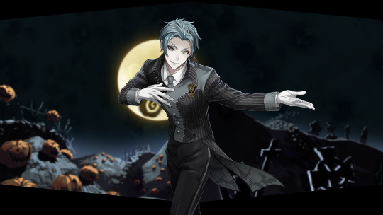
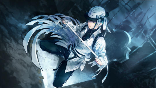
Particularly in the hair - you can see how Jade's hair has been desaturated and sort of greyed out, which I think is a super cool way of incorporating the Tim Burton style into the game. ALSO
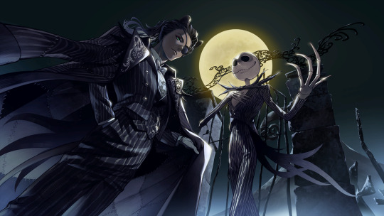
LEONA'S REGULAR CARD IS HANDLED WELL. I'm trying not to get my hopes too high, but even with the desaturate palette so far, he is still able to maintain some depth to his skin while still looking paler to match with the style. Now I am certainly hoping I don't eat crow - I know how things went with the Kings Garb card, but I'm going to hold out hope that we will get a really cool Leona SSR. Aside from the Fairy Gala, we haven't really had a "formal wear" Leona card, and I'm really hoping that the SSR looks good!
To give some clarification what I mean - when you are desaturating a color palette, specifically for darker skin tones, you want to mute the saturation of the color without losing the depth of the color. When we are speaking about skin tones, human skin is made up of a mix of colors - primarily yellows and reds, though we also get some blue as well. When you're working with a dark skin tone. In that sense, you don't want to add grey, you want to neutralize some of the warmth with blue tones and even fully dip into blue tones in shadow, which this artist has done. I have actually color picked this palette and put it against a white background to show what I mean and wow this is a gorgeous color palette!!
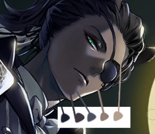
It definitely depends on the monitor and the brightness settings, but on the monitor I have calibrated to do illustration on - those colors are Navy Blue, A dark lipstick Mauve, a soft violet, and then some brighter orange brown and yellow brown where the moonlight is hitting. Even in the shadows, those cooler colors (the purples) are warmer shades of those colors that make sense with his skin tone. It's a beautiful palette using a ton of gem tones and cool colors and I'm holding out hope that the groovies keep with this trend, especially considering we have both Leona and Jamil getting much needed SSRs this go around.
So far as other thoughts - in Japan the event has been called "Lost in the book with Tim Burton's The Nightmare Before Christmas", which leads me to believe this will be similar to the Stitch event where the boys end up in a book in an entirely alternate world and will likely wake up not knowing what happened. I'm also guessing given the track record with the Halloween events and the fact that Nightmare before Christmas is a musical that we're likely going to get more Twistunes with this Halloween event. I don't know if we're going Masquerade levels with it, but I certainly hope we get to hear Leona and Sebek sing, and we know that Jamil can!
Also this event includes Vil, Leona, AND Malleus, so I fully expect at some point these three are going to beef because you can't put these three drama queens in a room and have them NOT devolve into arguing. I eagerly await that.
Also I don't know if they are keeping any of the Christmas theme of nightmare before Christmas, but if they do I cannot wait for the boys to ILLEGALLY DETAIN SANTA CLAUS.
#not writing;;#twisted wonderland#answered;;#twst#event thoughts;;#I also hope they get kneecapped by Lock Shock and Barrel#'which one?' all of them
8 notes
·
View notes
Note
I said something similar on my blog but I feel I didn't word my thoughts better:
The newer phases' art styles feel too polished for me, from the lineart to the boring shading and saturated colors. (Especially with phase 6) I miss the messy feel of Phase 2, 3, and even 4 because it still kept the feeling of the older phases. Phase 5 I'm iffy on because imo it still looks fine with the colors but still has that modern Gorillaz art style I dislike but it still sorta felt experimental in a way?-. On it's own the art styles are...Alright, but for Gorillaz I just don't think it fits, I love the cartoony art style from the earlier and find it more charming and memorable. I don't think I'm saying this out of nostalgia (I joined the fandom during 2018, lmao) I think it's just because of my own preferences
I saw someone say that it's like Jamie is trying to make the characters more conventionally attractive and I couldn't agree more.
hmmm ..... ive heard many people say this but i have mixed thoughts on it.
the tone of gorillaz overall taking a turn towards being more brand-friendly is definitely a factor, but i dont think its the only one. i really do think jamie gets bored and its not just me speculating, apparently he said he was "fucking bored of drawing those characters" in 2008, yes, since BEFORE PHASE 3. i do still think he has a lot of enjoyment in drawing them (otherwise he'd probably quit) but you can really tell when he's drawn something just because he felt like he had to. that's why gorillaz promotional art seems to be increasingly lacking in personality, imo. something really changed around song machine era where stuff was just getting pushed out as fast as possible and predictably got rushed. because ive brought this up before, if youve seen his art in the gorillaz artbook it's an entirely different vibe than promotional artwork cause thats the stuff where he does whatever he wants and is free to experiment. but that level of experimentation that he wants to do is very non-commercial, and it would've been in any phase. (that semi-realistic murdoc rasputin picture freaked people out when it was released but thats the kind of thing he really wants to do!!)
it's not only got a lot more personality and life to it but it's retained that edge that earlier gorillaz art had, despite using brighter colors and overall more poppy visuals. there's a murdoc shrunken head ffs. i really like it. i hope we see more of that kind of stuff in phase 8.
here is the edgy 2d everyone's been asking to make a comeback, in the 2020's:

personally i dont mind the brighter colors and overall more clean and lighter vibe. it doesnt resonate with me quite as much, but i dont think its neccessarily a sign of becoming more commercial. it can look that way and have edge at the same time as seen in the artbook.
murdoc becoming neon green is an eyesore often times but i think it's made up for by the fact that it's really funny in an ironic meta way. some day he will just transcend the color spectrum visible to the human eye probably....
i dont see how the characters have gotten more conventionally attractive. for example noodle had her whole eyebrow shaved off on the meanwhile ep art. theyve always been ugly and to get rid of that youd have to change their designs and personalities to make them unrecognizable. plus i think murdoc's actually somehow managed to get uglier... his face looks more misshapen as he's aged.
one thing i dont like in newer gorillaz art that i havent seen anyone else point out is how much jamie's horniness leaks into it. maybe i have just noticed it more than everyone else. dont get me wrong i think its totally fine if he draws that stuff on his own time of his characters if he wants to but when it gets into official gorillaz stuff its just plain weird and unneccessary and makes me uncomfortable 😭 like wtf ....
8 notes
·
View notes
Note
Your art is very beautiful! May I ask what brushes you use? I'd love to get the same effect with my art! (Oh, and I use Clip Studio Paint! Not sure which you use, but hopefully I can still find the same or similar brushes. Lol)
thank you very much!! Yeah for sure, here's pretty much all of the main brushes I use. I also use clip studio paint!
lineart/sketch brushes:


firstly, most of my stuff uses cy's grease pencil from this pack. it's funny bc i downloaded it years ago and didnt really like it at first. but when i tried it again a couple years ago i was like wait... this is SO good. i use it for sketching and lineart (first image). there's also csp's default "flat marker" which im apparently obsessed with (second image here). it's good for shading too! lastly (third image) i'll use the stumpy pencil pack here, this one i pretty much just use for lineart but it's by far my favorite clean lineart brush. i'll be honest i had to do weird conversion to get it to work in csp and i have no idea what i did at this point BUT ! if u search up how to convert it im sure The Internet can aid you as well. i think
Coloring:


when it comes to coloring i mainly use this water color pack and then this gouache pack (which doubles as what i use for my semi-lineless painting style- the second row here). if you see any coloring that looks more painter-like and textured it's most likely me using the gouache pack. sometimes i like to do the solid/base colors with an opaque brush and then use the water color to shade bc i like the textured look :P
side note: when i shade using another layer set to multiply, i'll either use the flat marker or cy's watercolor brush (both in the entry above this one)
Additional Stuff:
both of these for certain background help
this set of overlays (not a brush, but i figured i'd add it since it definitely helps adding texture to my work)
these textures (again, not a brush. i use these so that my backgrounds arent just Blinding White- mostly for myself bc plain white is hard on my eyes lol)
-
As You Can See I'm like. constantly messing around with new brushes. I actually have well over a hundred that I've downloaded LMAO. If you ever see a piece by me and want to know what I used, please let me know!! I'm usually able to remember the brushes I used, at least some of them :P especially more recent stuff, I've been experimenting a lot with painting methods and various new brushes
7 notes
·
View notes
Text
God, I'm probably going to rewatch the entirety of Hazbin for weeks, something I occasionally do with Helluva. Again, both mostly just passive interests away from my blog... until the actual show dropped and my absolute hyperfixation mode went haywire
Say what you want about the plot and designs themselves, I understand if it's not someone's cup of tea (Personally, I don't particularly like South Park, Family Guy, or Rick and Morty (anymore)), and the fact that it's pretty rushed, a fact I'll certainly agree with, but it is a fucking ACHIEVEMENT
I LOVE the busy designs and saturated colors, even if most are shades of red (If I had a show, it'd be mostly green and purple, lmao). I love the hand drawn and more cartoony style with fantastic VFX animation and backgrounds. I love the concept of Heaven vs Hell with demons and angels where angels can suck and demons can be good. I actually like that Adam was an entitled asshole because he didn't have to try for his wives, they were made FOR him
I don't go around looking for adult animation anymore because there's so many fucking Family Guy and Rick and Morty repetitive ass shows that use rigging and the same goddamn adult animation art style formula. Brickleberry, Paradise PD, American Dad, so on and so forth. Episodic drivel that KIND of teases a plot to keep you watching but it's the television equivalent of empty calories that you put on in the background. I stopped watching Rick and Morty after season 4 because it was just keeping the carrot on the stick way too far for me to care enough to keep watching (that and the whole Justin Roiland fiasco)
There's good adult shows, don't get me wrong, but almost nothing ANIMATED that's substantial and fun. There's a few, but it's smothered under Family Guy copycats and horribly stiff rigging that's cheap and bland by this point, and some are just downright depressing (Sorry Bojack and Tuca, I just couldn't handle you, I'm already sad half the time). To be honest, I almost didn't watch Inside Job because of the style, and even though it was mostly episodic it was fantastic!
Why can't I, for the decades of life I presumably still have past 18, have life in an animation made for adults? Charm? Pizzazz? Plot and color and FUN? Fucking anything more than the capitalistic weeds that choke the market just to turn a profit for the companies involved. I get it. Companies need to make a profit or they'll go in the red, lose money, yada, yada
But, in an already bleak fucking world where it's only getting bleaker and some corporations want to replace NINETY percent of an animated film/show process to AI eventually? I'm choked and burnout and everyday feels like there's no point in trying to make anything because the fucking programs will do it for us anyways, probably by stealing MORE from people who try. I don't need to see Meg from Family Guy get farted on or abused for no reason, or the Family Guy rip off equivalents that do it for shock value. I don't need copypaste stale material or IP revivals that beat over original ideas because they're safe and nostalgic, inevitably fucking up most of the time
Hazbin Hotel is far from perfect, but it got greenlit. It got picked up. It got to be written and MADE. I can almost guarantee you that Amazon only gave them eight episodes to start with, without certainty on whether or not it would be continued with them. I can almost guarantee you they had SOMEONE keep an eye on Helluva Boss's reception on YouTube to see if it would be profitable enough to continue Hazbin (After all, similar target demographic, right?) and the team wasn't informed until halfway through full production of season one that they'd get a second one. There may have even been the chance of them dropping Hazbin if Helluva's numbers didn't stay up
I love Hazbin and Helluva with so much of my heart because they're small oasis's in the corporate world that would prefer people work the warehouse and not the arts. Yes, I know Hazbin is on Amazon and 'Amazon bad', but if it's not encouraged by viewage (Which I'm sure it's doing well in right now) then original works will continue to be looked over in favor of shitty reboots or live action recreations
Ugh, anyways. I'm not sure how to end this. I just had to get my thoughts out
#cinntalks#unnecessary ramble#i love these two fucking shows#like way too much#cry happiness kind of love#didn't mean to talk this much again#long post#hazbin thoughts
14 notes
·
View notes
Text
Okay I’m STILL procrastinating watching s15 bc I’m SCARED so here’s my extremely biased ratings/opinions on the episodes of s14 to help me procrastinate (episodes which are multiple parts of a single story will be condensed into one slot)
Room Zero: SO cute and good, I LOVED the animation style, it was simple and short but really well done with great colors, fun alien designs, and fluid animation, and I just like seeing the guys go on missions like that. It's a shame that the animated show never got picked up bc I would've adored seeing more of it. 10/10
From Stumbled Beginnings: Very cute and funny origin story for Simmons and Grif, and I love that they were p much always together since they enlisted lmao makes their dynamic rlly good and the humor actually got a couple laughs out of me. 8/10
Fifty Shades of Red: Sarge's humor never quite landed with me like is has for some people (my boyfriend lmao I literally have to pause episodes sometimes so he can stop laughing. Anyway) but it was a very humorous and in character origin for him as well. 5/10
Why They’re Here: Less interesting than the previous two, obviously just meant to fill in plot "holes" and to also show us the origins of the other characters. Also I am completely ignoring that one line from Tucker in the interview, just gonna chalk it up to the "edgy" humor it does not exist to me. 4/10
The Brick Gulch Chronicles: WONDERFUL stop motion, very fun and cute and entertaining, very wholesome and still in the vibe with what the show itself is. I appreciate the willingness to do stop motion for most of it. 10/10
Red Army Unit FH57’s Adventure: It was kinda interesting and kinda funny but I found myself kinda tuning it out cuz it just felt kinda whatever. The combo of the different animation styles was cool though and I thought the ship misunderstanding them was funny. 5/10
Locus and Felix: Okay I'm gonna be a black sheep for a second and say that I rlly don't care that much about Locus and Felix. I don't think Felix is a secretly deep sadboi whom I'm gonna spend an unnecessary amount of time thinking about, I don't think Locus as secretly good all along, and I don't care that much about their partnership and what they were like before Chorus. That being said, the animation here is absolutely gorgeous, this is probably my favorite animated story in the whole season, it looks awesome. The plot is nothing special but who cares like I said it's beautiful, 6/10
Fight the Good Fight!: VERY funny and well-executed propaganda video, short and sweet and nothing more to it. It does its job. 5/10
Meta vs. Carolina: Dawn of Awesome: Another one I really don't care for because literally everything leading UP to the fight between Meta and Carolina is a waste of time. Maybe some people really care about their weapons and stats, but I don't. And even then, you kinda know Carolina is gonna win the fight, the question is just how. 4/10
Grey vs. Gray: I don't know or care about the Game Grumps and the entire thing felt like a short gag that went on for way too long with a predictable ending. 2/10
Caboose's Guide to Making Friends: Again, ADORABLE art style and very cute having a story be told from Caboose's perspective. 7/10
Head Cannon: Kinda funny I guess. I wish we'd gotten it spread out more equally among the heads Omega jumped into. Ik he didn't spend equal time in there but who cares. Whatever, still funny. 5/10
Get Bent: I LAUGHED PROBABLY THE HARDEST AT THIS ONE AND THAT'S MOSTLY BC OF LESBIAN DONUT IT CAUGHT ME OFF GUARD AND IT WAS HILARIOUS (also hello, bisexual church?) 9/10
Red vs. Blue: The Musical: it was fine. it was creative. The dancing was well animated. Enjoyable. 5/10
Mr. Red vs. Mr. Blue: I haven't seen Reservoir Dogs but Kaikaina was in this which automatically boosts it to a 8/10 (I also like that they have movie nights it's cute)
RvB Throwdown: Fine but mostly forgettable. 3/10
The Triplets Story: REALLY interesting concept (y'all know I love the freelancers) that felt like it dragged on too long and only gave Ohio something to do. 4/10
Immersion: The Warthog Flip: I loved the costumes and the actual Warthog and it got a couple laughs out of me. 5/10
Red vs. Blue vs. Rooster Teeth: This was made for the fans/themselves. As someone who is neither, none of it was funny and I just kinda waited for it to be over. At least the animation of the armor irl looked rlly good
11 notes
·
View notes
Note
parrying the fandom ask game back at you. 3 and 15 to you too, with a side of 22 for v2
wow we bounce eachothers attacks around just like ultrakill.....
3. Notp?
I have a couple, which are mostly just ships I don't see the dynamic for and think are kinda overrated. Red Velvet x Pastry from Cookie Run: Kingdom is my least favorite for sure. I love the characters separately but there's no way I could see them kissing. Something about Pastry fundamentally hating Red Velvet for being part cake and not really questioning that hatred makes me go bleh.
15. Have you noticed your style change over time?
ohmygod yes. I've been doing digital art since 2018 and uh. I sure have gotten better. Here's the earliest digital art I still have:

My word. Who let me touch an art tablet. I couldn't even color inside the lines T-T The airbrush, the misused gaussian blur, the god-awful cell shading, this is the embodiment of a beginner artist on DeviantArt.
Ironically all the techniques I used with that are ones I still use. cell-shaded characters with 'painted' backgrounds is still how I draw, I'm just considerably better at it. Here's some recent-ish art that uses the same methods! (+layer masks and filters. I didn't know what a clipping layer was in 2018 lmao) I definitely haven't posted before no sir.

and for writing? Gah. I don't even want to open my early fanfics they are SO BAD. I'll find a snippet of one of my early warframe works, but I apologize in advance for spelling/grammar I was a twelve year old with dyslexia. Here's two very similar scenes (an unconscious, dying character who isn't really aware of where they are being comforted), one is from a 2018 warframe fanfiction and the other I wrote recently. It's uh. A little bit of a difference. (other then that Solar lives and V2 doesn't)


22. Give us a headcanon for (V2)
Another? Alright then! Even in the canon events of Ultrakill I don't really think V2 is that aggressive. Look they run away crying with their head in their hands. They bow politely. That robot wants to curl up with a blanket but unfortunately hell says its time to kill 98420934 people.
I also think V2 has better hygiene then V1. Just in general. I think they try to keep themselves mostly clean and smelling nice. It didn't like greed because the sand got stuck in its armor and started getting caught in pistons and such, and there wasn't anywhere to wash it off. Plus a couple layers of blood and the poor thang just feels nasty.
5 notes
·
View notes
Note
‘Twas both 👁👁, but yeah honestly I’m very interested cause damn- (sorry if I seem awkward I’m not good with online interaction 😭😭 LMAO)
NAH no worries you're doing fine!!
It's a pretty wide array of topics but touching the surface of it, I'll go into my art process.
Here's a short thread where I went into this similarly!
I pretty much follow the steps of what I mentioned there, but it varies a little bit based on the style I go for too: painting whole illustrations or design or more simple fun things.
I could describe what I did in each frame of my process gifs which I've posted before but I would need some time. With big pieces, the steps I go by (read slowly, it's a pretty dense text):
thumbnailing -> sketching with bigger shapes to get the line of action/feel (that is, I'm just blocking out the composition) -> refine that a bit -> hide BG, draw the characters (lineart) and add the base colors of them. (then merge & rasterize a copy of it for later) -> put them back in the environment (unhide BG), make them grey -> add shading in greyscale style (multiply layers, glow dodge layers, you name it) -> get that previous rasterized layer back and put it on color mode -> those characteristic shiny parts get a new layer with overly saturated + high brightness colors -> color BG with a new color layer -> then rendering/refining for concerning amounts of time -> add effects and change color/brightness/contrast curves + gradient map -> profit???
For software, I generally use Paint Tool SAI (I adore blending/painting here), I use Clip Studio Paint for the 3D posing library/sketching/lineart, and Photoshop for final effects. (Update: I mostly do all things in CSP now)
(if you have CSP, try out this brush... it saved my life)
As for improvement:
I experiment, watch a lot of youtube videos (I personally like the ones which analyse an artist). I suggest thoroughly understanding how something moves and works (for anatomy I can recommend the book 'Anatomy for Sculptors'), I also study and jot down important pieces of advice or insights to a collective document, rather than saving them to my device where it is highly likely to be forgotten.
I believe if you put great importance on colors and composition, that can cause the most noticeable, 'fastest' improvement, at least if you view it from the lens of social media. (While online environments provide significant reassurance, it must be engaged with in moderation, as it is easy to fall into a lot of negative mindsets, taking the enjoyment out by perfectionism, comparison, or seeking validation, etc.)
Another improvement technique you can try is to slow down a speedpaint video of your choice and follow along with the artist. Extremely useful, I recommend, put your artist under a microscope.
Of course I don't do all of these things every single waking hour, it's just a side hobby to my unrelated studies in real life. Even if you don't actively draw your visual library and knowledge can improve passively, I find that so fascinating. I don't touch a paper for months and there's a sudden jump, like damn what. (Not saying you should do this, active learning is still better ofc) Either way my point with that is, that improving does and did take a lot of time for me as well.
Apologies if this goes all over the place, I tried to touch upon every subject that came to mind at the moment, in not too much in detail, overall I hope it makes sense
If you have any specific questions related, feel free to ask! Or if there's any specific problem you'd like to tackle but find yourself lost, same applies!
#i wrote this before sleeping so it might all be chaotic/nonsensical#thank you for the ask!#asks#art tutorial#art tips
13 notes
·
View notes
Note
I'm happy you've transferred a bit to tumblr, only because of the anonymity ask feature. I'm far too shy about interacting with my favorite artists. Your artwork is like super inspiring to me to try and progress and get better. Whenever I see any comics posted I *sprint* to go and buy them lmao, the art is beautiful 🤌
I feel like every artist gets asked this, but how'd you get so good at anatomy? Or what's your advice on how to study/draw it? Same thing with the really dramatic shading/coloring you do. Your art is just so nice, I apologize for the long ask lmao.
no apology needed! this is such a sweet ask, thank you so much 😭 i, like most people tend to look at my older work and go "man i could have done this so much better" but knowing that it encourages other artists makes me glad that some of it is still out there, even if im no longer happy with it.
here's how you get really good at anatomy-- literally have reference right next to you at all times LOL seriously, whenever i do a really good pose you can be sure that 99% of the time, i had a 3d model or a photo reference for it on a window right by it. when you get over the idea that you need to be able to draw everything from memory, your life and work will improve so much! you will find yourself stylizing and improving your own reference material anyways, and now that you dont have to crack your skull trying to figure out how a pose works from x angle, you can use that time to actually make your stuff look more interesting by adding your own touches to it.
as for lighting/heavy shading, i would suggest the same, plus looking at how other artists stylize their own shadow-work, finding what you like, and seeing how it adapts to your own style. Trying to recreate shadows from a real life picture is helpful, but you will find that it doesnt always translate well to your art.
i recommend checking out Jason Shawn Alexander ( my favorite artist!), Frank Miller, Sean Murphy (of Punk Rock Jesus fame) and Marcos Mateu-Mestre for examples of artists that do incredible work with dramatic light and shadow!
15 notes
·
View notes
Note
I think you have some really good anatomy when it come to humans and pokemon, and really good skill when it comes to colors and lighting and even backgrounds!! I think something to work on however is consistency, i’ve noticed that your style can be super detailed one minute, or a different style the next, which is totally fine depending on how much time you have! That or it could be one rendered panel and the others are colorless. Some advice could be mayhaps simplifying coloring some asks if you’re worries about putting them out on time, or taking some extra time to ensure a style is consistent across a sequential set of panels? put your efforts into a style you can easily use for asks and save that detailed style for more important panels you want to emphasize! I hope this didn’t sound too confusing, art is hard, but don’t forget you’re doing great!! its all a journey!
You're so right. I constantly change my style. It's mainly because I'm not satisfied with how I draw now so every time I draw I try to change things up in a way I might like. I'm currently going through a "what do I want my style to be" kind of phase so things have been very all over the place. That's honestly why I'm asking for feedback OTL I really want to love my style but I get bored with it after doing the same one a few times lol and admittedly, I use this blog as a way to try new ones out.
I've only recently been testing waters with lighting. I used to only do clean line art with flat color and simple shades but It became boring to me. Now I've been trying messy lines with more detail coloring. I am quite fond of it but there's still a lot more I need to figure out.
I tend to do colorless sketches as a quick way to tell more story without taking too much time. And throw in a detailed piece when there's more of a tone I want to set. It may seem lazy but I really don't have time to color all of my sketches. And honestly I lose stamina after coloring one piece lmao. I haven't really stepped back and took time on this blog because I'm trying to tell a story within this decade haha I'm not very fast at drawing so I cut corners when I can.
But you're completely right. I need to focus if I want to improve. Find a simple style for asks that I can do consistently and experiment on the side. Thank you for your feedback!
#bluetalks#dl#munday#ask#i hate that i get bored with my stylr#or i see one#and im like#oh i wanna try that#then do it once and like nah#not for me
5 notes
·
View notes
Note
Lmao np <33 I always enjoy drawing Yandere's as pathetic lil meow meows hehe (funfact: I actually drew Rory first but after I finished his lineart I was like, wait shit I don't have a full color reference- and then I hyperfocused on drawing jay instead lol)
Also, you 🤝 me: jayce + jack o' lanterns = stonks ✅ ✅ ✅
Also also, ngl if Darling were self-aware she'd def hate me, because I always try to speedrun the Bad ending first lmaooo
Also^3, every time I hear baggy pants, I can't help but remember the boys I went to school with a few years ago, who wore the most ugly, most a t r o c i o u s pairs of baggy pants I have ever seen 💀💀
For Reference: https://imgur.com/a/fZsHsF7
This is what I'm talking about^^ like pls,, just sTO P-
About the blue reference, the paragraph I meant was the one about how I only liked EJ so much because of his BLUE mask 😔 young me truly set the bar too low (maybe it's because of him that I'm attracted to most fictional mad scientists/doctors with no morals now, damn this bastard 😒)
Oh, and the OG mikey myers Movie is the 1978 one! ^^
And finally about the Christian Gang /hj (every holiday Yandere of yours has/used to have strong Christian influences but these three are still considered extra Christian to me so I'm just gonna start calling em that lolololol)
Gonna be honest, when you revealed that one of them was gonna be Christmas, I immediately headcanoned him as just some guy in Christmas elf costume- thank god that's not the case though (I say, even though I know damn well that I'm still gonna draw him in that costume the nanosecond you drop a ref for him, because he's a lil skrimblo who needs to get a reality check via me shitposting him into humility)
Also ofc the twins are ginger 😒🙄 /derogatory /j okay but fr, whenever I see a fictional ginger online I'm like ....Ed Sheeran??? 😱😱 (coughcoughchildecough)
-Ren'py anon
OKAY OKAY I'LL DROP A SMIDGE OF RORY SPRITES SO U CAN COLOR IT BBG
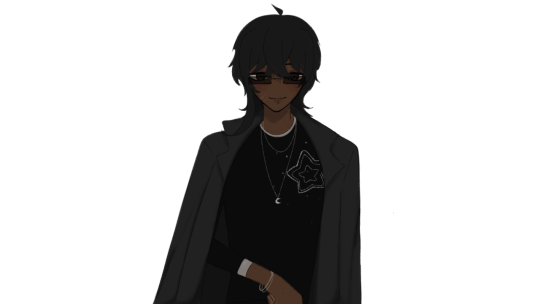

He only wears shades outside lol
HEHEHE YES JACK O'LANTERN STONKS GO UP IN THE BRAIN CELL ACTIVITY
Eh, I mean, its always fun to get the bad ending first though. Just to see then get all angry and violent 😍 good shit tbh
MC would def hate you, but I feel like it would take a bit to get the bad bad ending yk? I don't have the obvious, good/neutral/bad choices most of the time (although there are some choices that will obviously lead to negative consequences lol)
JAYCE ONLY WEARS THE ONES IN STYLE RN NOT THOSE LMAOOOO
Though they can look good if done right, those boys at school were definitely not doing it right 💀
Now I understand the blue reference! Ugh how did I MISS IT SO BAD 😭 gosh you were going crazy abt him and the color blueeeeee
I understand how that all kick started ur obsession with fucked up men. We are one in the same 😎
Hehehe thank you for the confirmation! I will be watching Myers stand there menacingly as I look up fics of him 😍
It's so funny that you call them the Christan gang, but it's not gonna have all the significant original values and whatnot. It's just a global holiday thingy that everybody does regardless of religious background (Though I'm glad you still see their origins and acknowledge their important purpose to many other people!)
GOD HELP WHY? I ONLY WATCHED LIKE 10 MINUTES IF THAT ELF MOVIE WHEN I WAS IN 6TH GRADE DURING LUNCH? WHY WERE THEY PLAYING IT DURING LUNCH YOU ASK? BC OF CHRISTMAS OR SMTH IDK, BUT IT WAS OKAY IG
It would be very funny to see him as an elf that works at the mall as a side 😇 He needs it anyway
Regarding the Twin's, THEY HATE IT WHEN PEOPLE MAKE GINGER JOKES, SO BAD. THE MINUTE SOMEONE SAYS ANYTHING ABT ED SHEERAN AROUND THEM, THEY EITHER ZIP OUT OF THERE OR FIGHT. NO IN BETWEEN.
Typical gingers 🙄 so sensitive dude
Childe is one of the only gingers I can tolerate. If these two didnt have a life and played Genshin, they would favor Childe so much.
3 notes
·
View notes
Text
look at my oc boy

[rambling + extras under the cut. it's long. be warned.]
HOOLLLYY SHITTTTT THIS TOOK AGES AND I CAN SEE AFTERIMAGES OF IT WHEN I CLOSE MY EYES. I HAVEN'T HYPERFIXATED ON DIGITAL ART THIS HARD BEFORE . I AM A GOD
mk but in all seriousness i'm super proud of how it came out??? i did a lot of things differently and i think i've got the hang of it now tbh. i actually like the pose and the proportions aren't as bad as most of the digital stuff i've tried, and the folds in the clothes ended up looking okay!! color scheme isn't super coherent but oh well
no, i did not use a reference for the prosthetic, i know it looks weird but this took more effort than it should have. shading looks a little weird, and a lot of the details got fucked up [you'll se why] but hey!! i'm riding the high of success
timelapse nd shit:
observe!! the chaos of my drawing process lmfao. this is 6 hours and like. 15 mins. of pure motivation. i did the math. each second is about 30 minutes of work. three hours per minute. kill me
closeups:
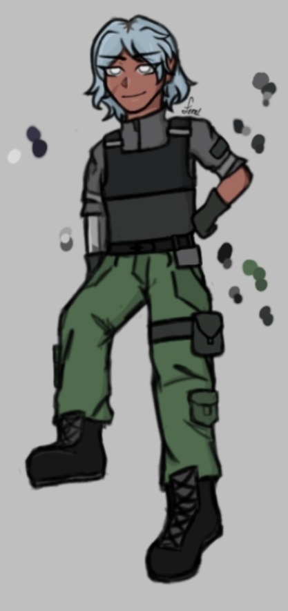
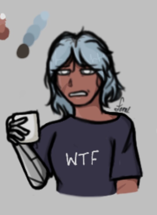
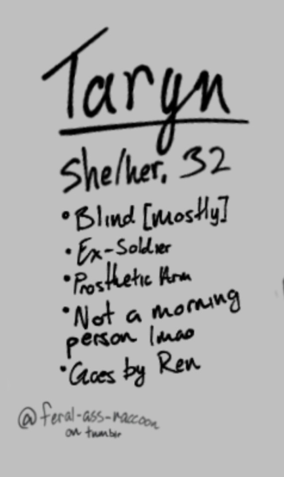
tumblr killed the quality but it was already dead. turns out using the lasso tool and moving them makes the details blurry. oh well
sketch:

i actually likd the lineart for this lmao. i'm definitely a fan of the sketchy/uneven style and the brush i use is semi-transparent so it's fun to work with
original/references:
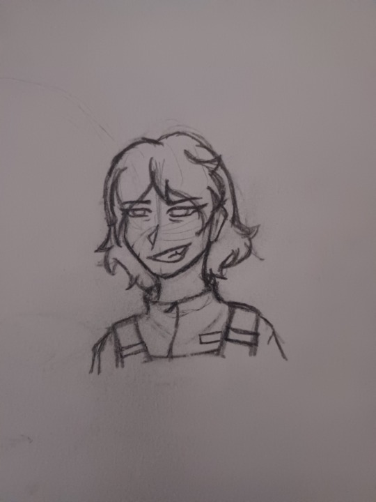
^ the headshot i posted a while back, made at midnight in like 20 minutes. still like this one so y'all get to see it again.
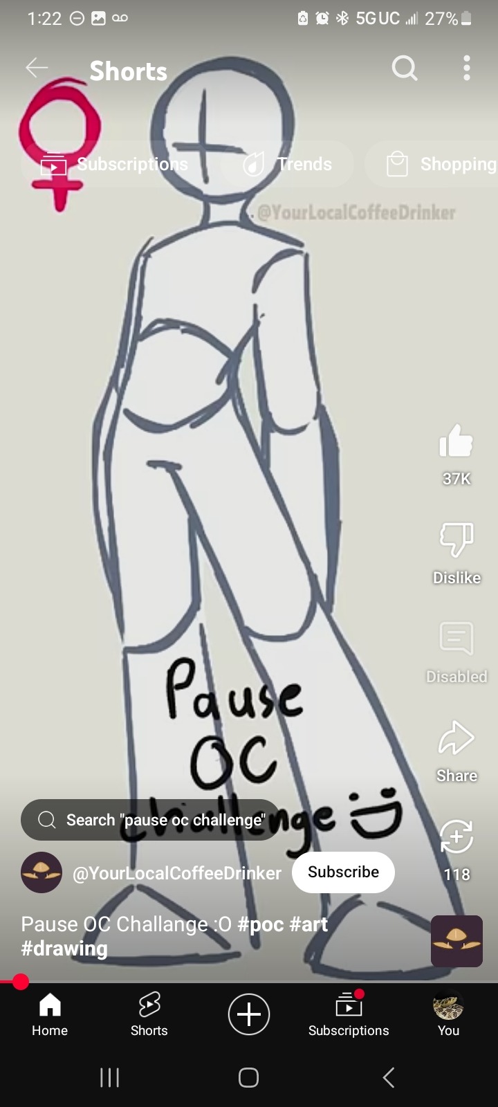
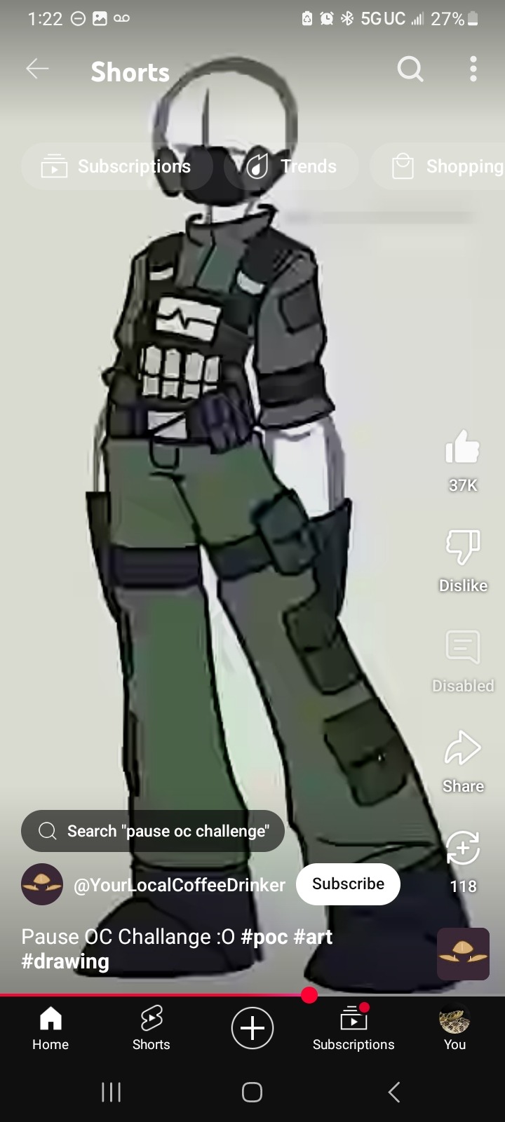
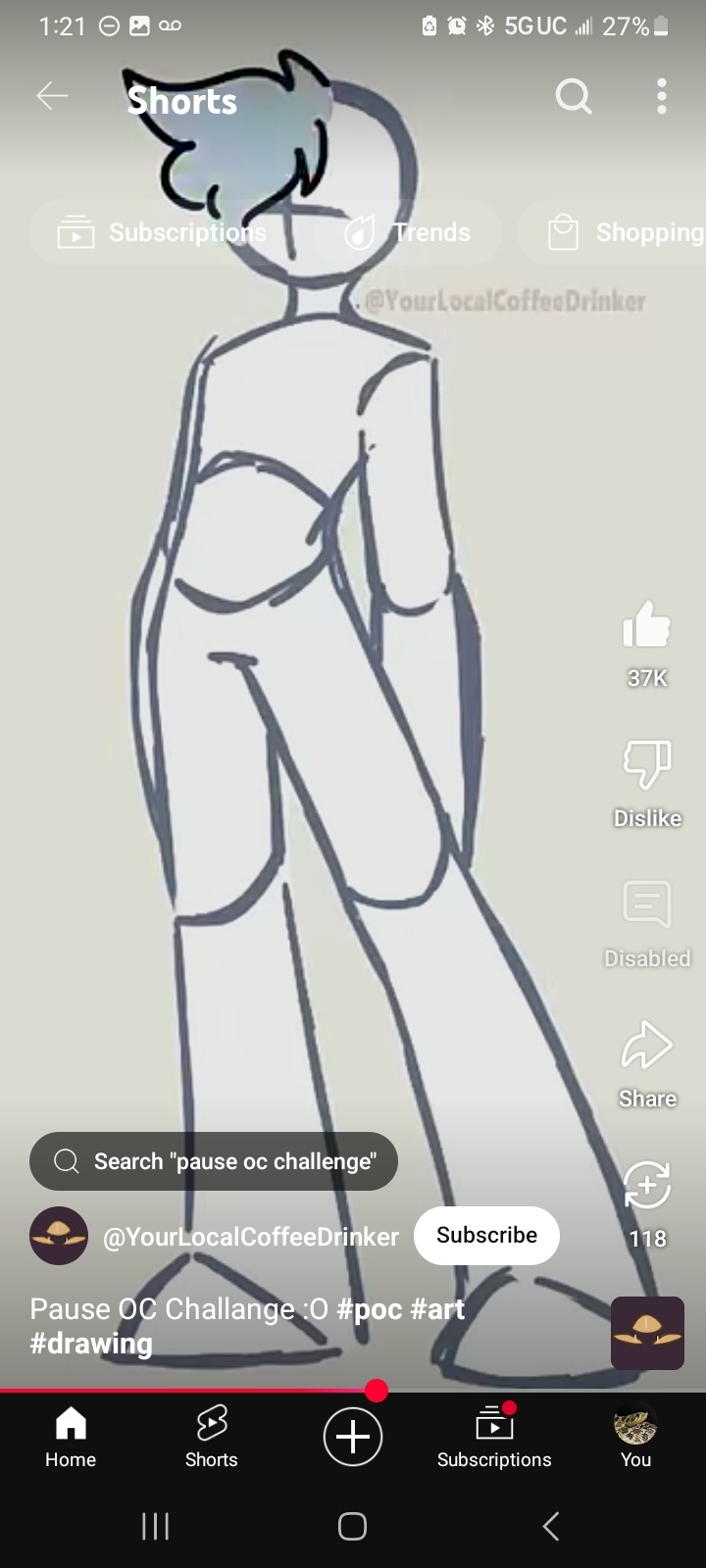
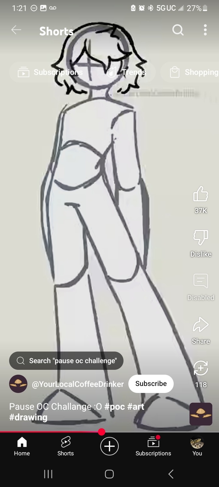
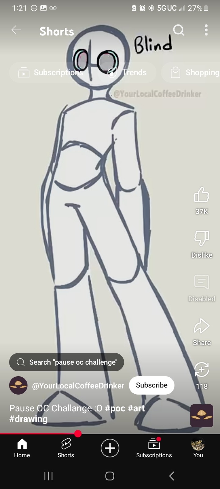
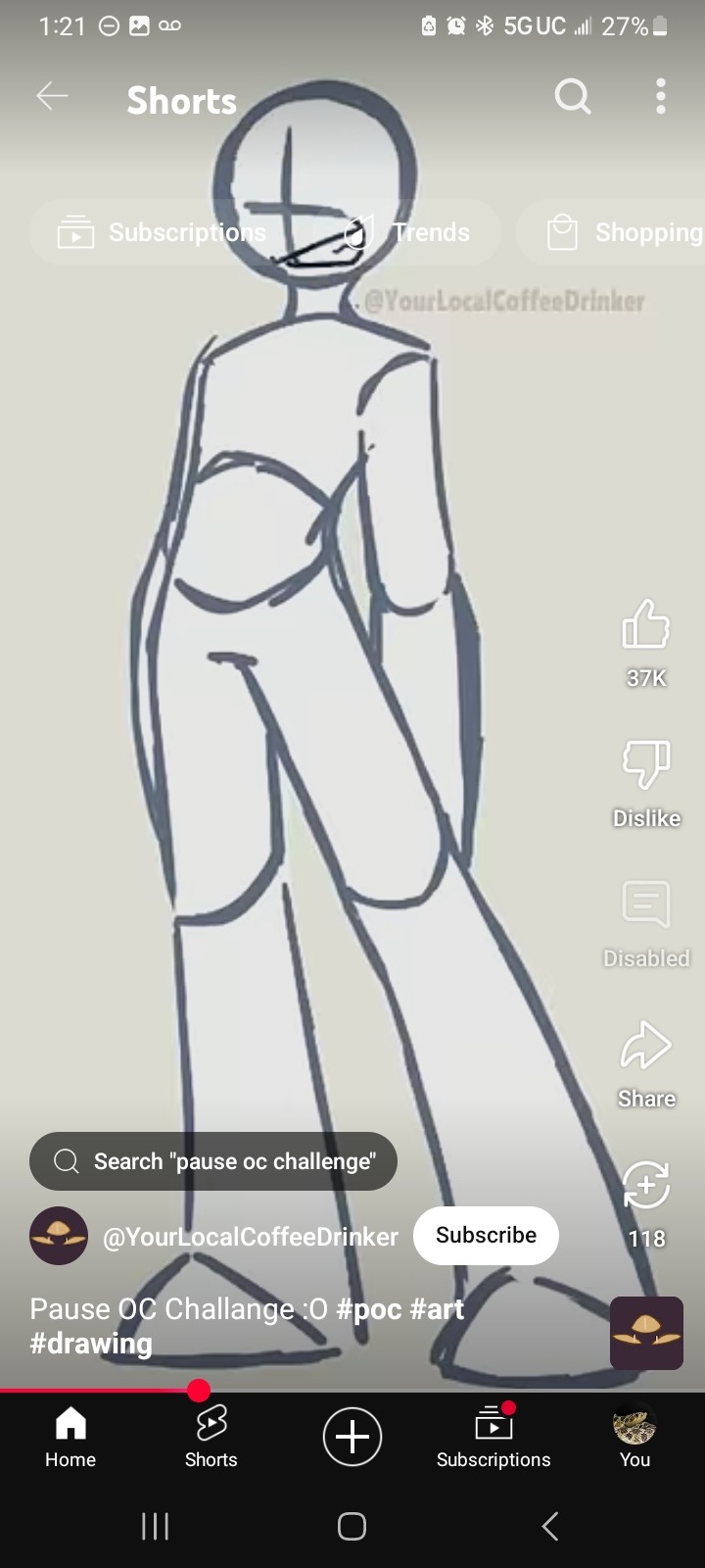
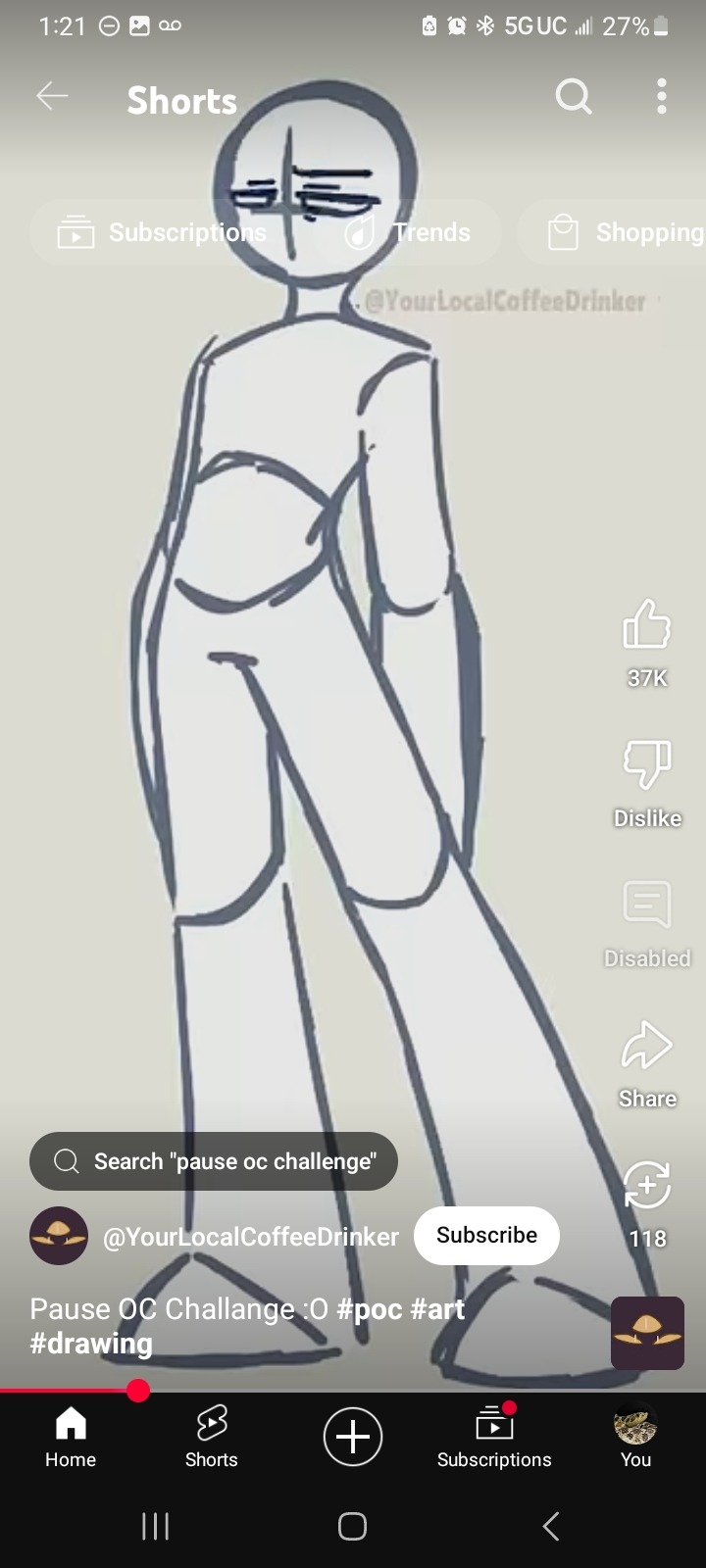
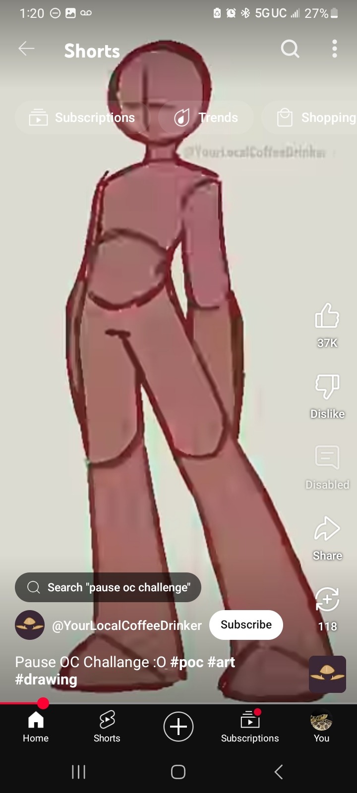
and, of course, the pause oc challenge that i used!!! credits to the creator, obviously, and shoutout to the gas mask that i fucking forgot about lmfao. no the tactical vest doesn't get details because there are Too Many Pockets on those things.
also everbody say thank you @specss00 for triggering this. i would NOT have made this otherwise but her blorbo ask reminded me i never made a reference sheet [or name] for this guy and it turned into 6 consecutive hours of drawing so. thank you specs i owe you all the cheese in the world
#raccoon's thoughts#raccoon's art#drawing around the hole in my phone screen protector is a BITCH#also. my hand hurts. ouw#i have 0 plot for this woman btw.#i just know she's a little shit and the self-proclaimed best friend of The Other Guy#[still need a name for him LMAO]#anyways. yeahg. i'm shaking rn this scared me#how did i do this#oc: taryn gray#bonus fact: she has a service dog!!!#didn't draw him but he does exist. his name is luke and he's a german shepherd/belgian malinois mix because i said so#and i didn't want to make him a holden retriever lol#i'm going to be incapable of drawing for the next 3 months aren't i#anyways uhh do not repost don't use for ai blah blah blah
0 notes