#I'm doing a new style for the background
Explore tagged Tumblr posts
Text
Everyone meet

Paige Elizabeth Paver, 16
Clever, Persistent, Patience Rebel
Louise Daniella Paver,11
Bold, Active, Cheerful, Quick-Witted Kid
A small request from @crazycartoonfan1011 and @jokerislandgirl32
#wild kratts#wk ship kids#paisley x rex#paige paver#louise paver#digital art#villain x villain#I'm doing a new style for the background#i like it#really good
13 notes
·
View notes
Text
2024 Tumblr Top 10
1. 11,390 notes - Sep 3 2024
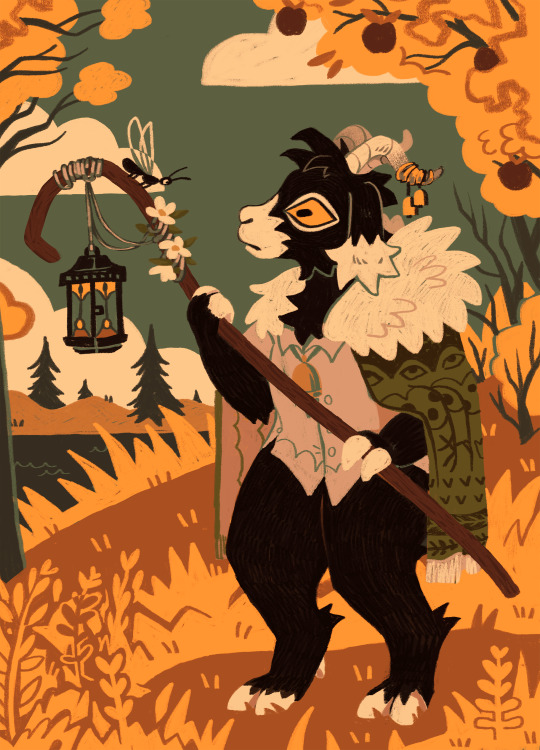
2. 3,349 notes - Nov 5 2024
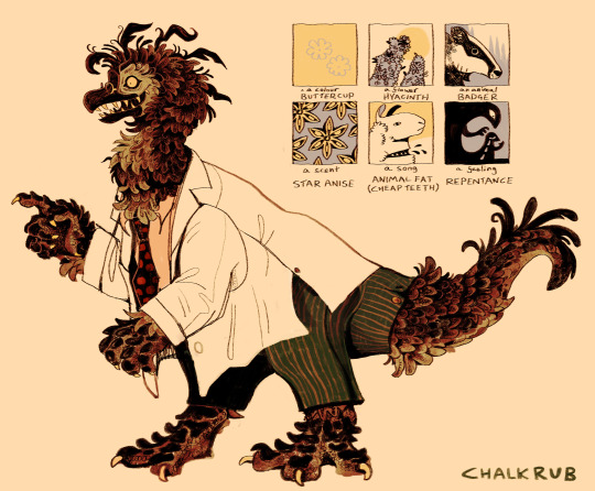
3. 2,299 notes - Dec 16 2024
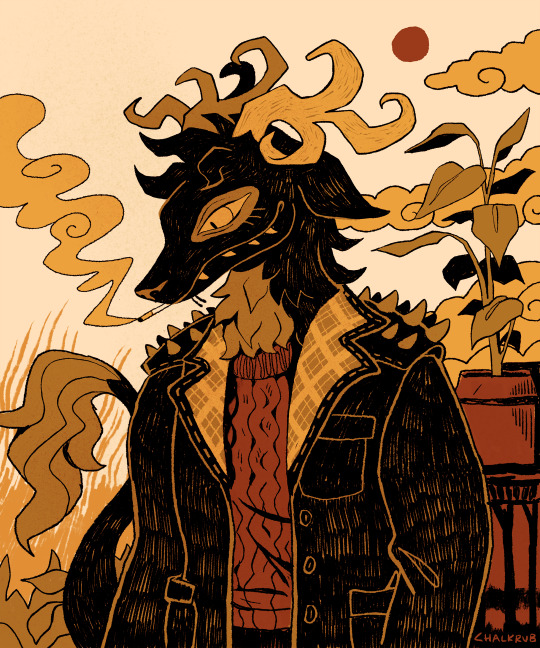
4. 2,109 notes - Nov 6 2024

5. 1,806 notes - Jun 1 2024

6. 1,579 notes - May 29 2024
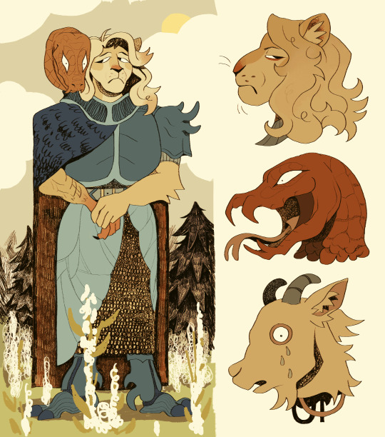
7. 1,254 notes - Aug 15 2024
8. 1,250 notes - Oct 22 2024
9. 1,223 notes - Jul 12 2024
10. 1,114 notes - Feb 9 2024

Created by TumblrTop10
waow 2024 is almost dead!!! gone too soon. feels like it’s been a big year for me art-wise for many reasons, BUT. i’m making 2025 bigger.... hopefully....i’ve made some art goals for next year which i won’t explain in detail but they boil down to 1) do more studies 2) tackle my weaknesses (backgrounds, dynamic poses/angles, uhhh lots of stuff i am a one trick pony right now) 3) get into drawing comics, all of which are in preparation for 4) take my story ideas more seriously and get started on one of the many graphic novels living in my head. i have one in mind i HAVE to complete in my lifetime or i will die, but firstly i’m gonna mess around with some little standalone svanhildr comics perhaps. goat fans rejoice.
anyway i wasn’t meant to ramble so i’ll just say THANK YOU for the support as always!!! i’m very flattered all of these have more than 1000 notes.....crazy. thank you. muah
#tumblrtop10#my art#looking forward to 2025 i really really REALLY REALLY want to get stuck in with my story ideas.....#my main passion project i'm more and more leaning into not even sharing i cannot lie. it's very personally made for ME to love and enjoy#and i suck at a lot of what i'd need to draw for it (humans interior backgrounds and an art style that's at least a little gritty)#GOD it's been taking over my mind so much i want to gnaw on it but it's in my head#so maybe i'll just do a first draft for me and me alone and when i'm in my 30s and maybe better at those things i can draw it finally#actually one of the characters for that features here hiii mockley!!! coming in at number 2 most popular of 2024 i'm so proud of her#her design's come a long way i'm kind of super happy with her as always <3 i love you my repressed old woman dinosaur#ALSO i'm SOOOOO excited about a character i made recently i can't wait to share her with the world#she's been a LONG time coming....my goirl.....#i will hopefully show her off in the new year#ALSO no one will see this i'm sure but thank you to my commissioners for the patience#i have now finished my break and will continue drawing
126 notes
·
View notes
Text
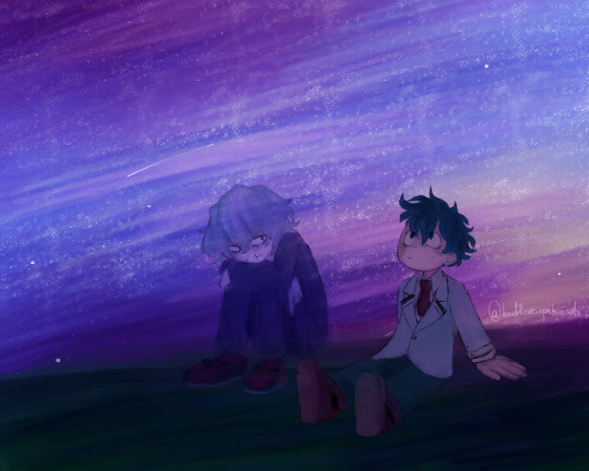
Always wanted to draw something like this
The sky at least
Still figuring out stuff after recent chapters, but it's better
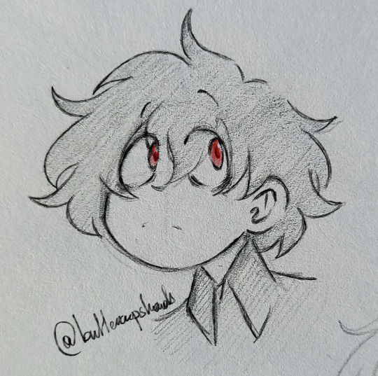
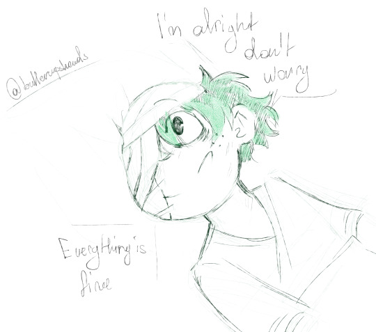
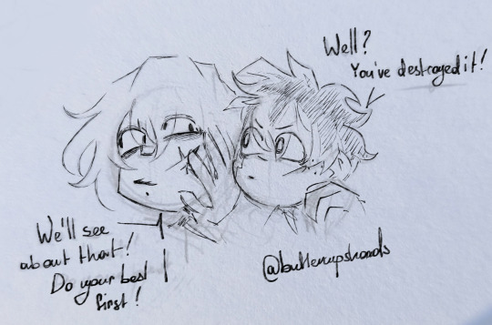
Also some park sketches + a sketch-warm-up before the first one
#fanart#sketch#my art#bnha#shigaraki tomura#tenko shimura#midoriya izuku#izuku midoriya#bnha manga spoilers#bnha spoilers#Izuku counts#stuff with Tomura is like an AU in which he literally haunts Izuku now#not like a vestige but really a ghost of sorts#I imagine Ochako having Toga's ghost following her for fun now#otherwise they're chilling#also the funny thing about the first one I drew the background and them separately#but I decided to combine them for fun#it turned out great I think#Tenko's sketch is the only one I decided to not change the opacity of traditional layer of#I struggled to sketch him for days before that#mind blank and all#I have no opinion on the new hairstyle of Izuku it's neat and I took some time to figure it out for my style but otherwise... eh don't care#I might've tagged this as a ship but I'm not sure about this so it's ambiguos#I do love both of them tho so seeing Izuku suffer makes me sad seeing Tomura's last page made me sad too :(
43 notes
·
View notes
Text
Okay now for one of the actual reasons why I tried out a new cheeb style:
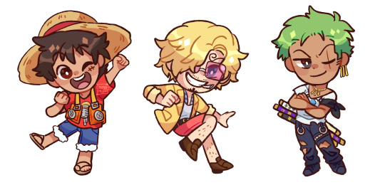
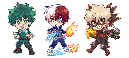
Asking bc of commission and shop related stuff LOL I have a lot of charms sketched out but only a few fully colored, so I was curious to see if one chibi style was more preferred than the other <3
#Also surprise I'm showing off the Big Three charms I designed ages ago and never shared. LOL#They had more details but I took a lot of them out for this#Bc like. I'll have the background effects and stuff when I do charms. But I didn't for the OP ones#Bc those were just test/trial runs?#IDK DO I SOUND INSANE? SORRY LMAO#My thought process is. Coughs. Anyway#Polls#Poll#Shima speaks#All of the chibi comms I've done up til this point have been in the style on the right#But this new one is soooo fun...and SOOOO cute...#Anyway please let me know your thoughts <33333 Ty!!
42 notes
·
View notes
Text
I'm like also really mad that they legit killed Chess and Horn off screen, that is just so disrespectful to their characters. Everything in this chapter felt disrespectful to the Tiddy Squad.
#They try to tell me crowley didn't know where his girls were#that horn and chess were killed off screen???#when??? and why the hell would crowley not notice???#when he was with them all the time before the whole progenitor meeting thing with the underground city going down#also horn wasn't drawn too badly but look what they did to my girl chess#and crowley#just#some angles were weird and others were good??#this new style is just not it#and the story they just did doesn't make sense???#crowley had a lot of stuff going for him#a light novel a meaningful background and connection to the group#and they just do this??? for no purpose other than shock value#that is such a waste and so disappointing#now if you'll excuse me i'm rewriting my canon#the tiddy squad doesn't deserve this
16 notes
·
View notes
Text
Tired

[Image ID: a pixelated close up drawing of a anthropomorphic dog girl clavicle up colored in light purple with pink edge light. The girl has tired eyes, long wavy hair, floppy ears, thick eyebrows, and a slightly visible adam's apple. She wears a collar and a loose shit. The background is a pixelated photo of a tree branch behind a twilight sky /end id]
#okay okay okay like....#EXTREMELY happy with this I'm gonna talk about it in the tags but like#idk I tried alot of things new here from using a kinda pixel arty style (no anti analyzing)#AND trying to use some found media from my phone as a background#idk I think doing that is really cool and I want to collect some more found media to do more of that I'm really really fond#kat sketches#furry#furry art#dog girl#furry anthro#anthro#artists on tumblr#image id#image described#also hi still trying to get back into writing image descriptions with art again if anyone has any resources I'd love to read em#all of my old ones are hard to find#kat's art
13 notes
·
View notes
Photo
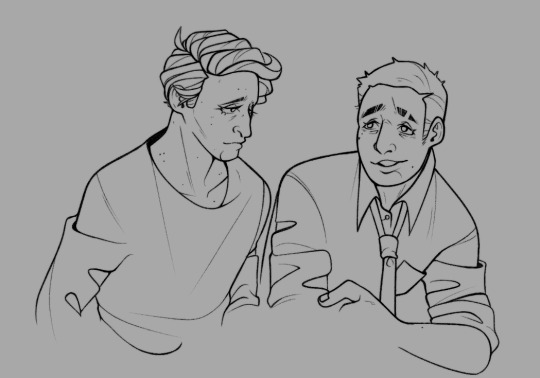
wip / I promise I have not forgotten about them
#so hopefully I'll have something to post later today#though I'm already annoyed it is not turning out the way I want to as most things I do with backgrounds do#but no one but me knows what it was SUPPOSED to look like so. it's fine#anyway yea even my temporary distractions cannot give me as much mental illness as they do so#now octo is close because originally this was an octo blog and the new game is destroying me#but I can multitask#and so much of my art style came from drawing art of deadprem in particular I cannot get away from it
8 notes
·
View notes
Text


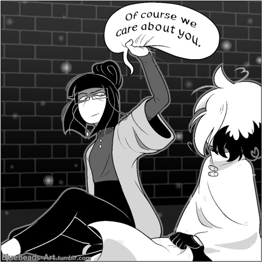

2024 September 14th
Do you ever wish you could beat into a character's head that they're loved? Because I sure wanted to beat Siffrin during my first playthrough of In Stars and Time. Then I thought about that figure of speech too literally, laughed at my own joke, and now here's me using Odile as a proxy to do just that. :)
I absolutely adore Odile's "you will be safe and happy and that is a threat" approach to emotional support. Her and Siffrin's dynamic in general is just chef's kiss.
Sorry about your hat, Siffrin, but it was destroying my panel composition when I tried to put it on your head.
----------
For being rusty with art I'm really happy with this! That last panel in particular was very new territory for me but I think it came out good! I'm happy with the movement between panels in general. And look at me! Drawing backgrounds!! Wahoo!!
I drew these panels incredibly out of order, so you can see my art style and amount of effort fade in and out as you read, lmao. I tried to stay authentic to the game's style, but sort of gave up and let my style bleed through on the action-y panels. It just felt right. Gives it emphasis. :P
I'm new to writing screen reader image alt text, so feedback is welcomed. Sorry again to Siffrin because I forced myself to he/him them only to avoid confusion, but it felt bad! My fellow they/he, I have wronged you.
Time spent working on this comic was...... 33 hours and 18 minutes. I blame the rust, learning how to draw these characters on the fly, and figuring out the perspective on those bricks, oh my god.
Have some close-ups of my fave panels as thanks for clicking the read-more, mwa

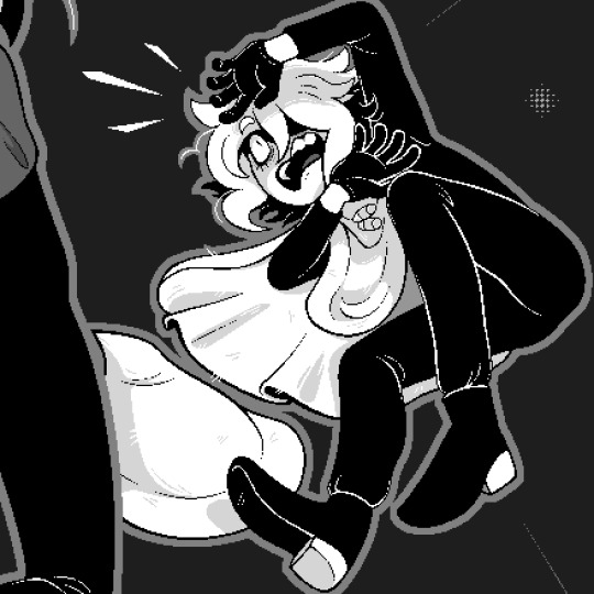
6K notes
·
View notes
Text
The Lara-Su Chronicles: Beginnings review

The day has finally come. Many, understandably, thought we'd never get here. Maybe we shouldn't have gotten here. We've been through so much. Lawsuits, reboots, redesigns, unreleased NFTs, empty legal threats over the fact that movie Knuckles has a dad, an attempt to license out Scourge the Hedgehog to fans that immediately got canceled (in both meanings of the term), and many, MANY idiotic Twitter controversies. But now, here we are.
Thirteen years after first announcing it in the middle of his legal battles with Archie and Sega that changed the American Sonic comics forever, former writer Ken Penders has released the first part of his new series: The Lara-Su Chronicles.
Yes. I had to buy the book. I had to take one for the team. Look at the fucking URL of this blog, a blog I've been using to talk about the American Sonic comics for nearly a decade while the specter of this book loomed in the distance. The one time I've actually been paid to write an article about anything in any professional capacity, it was an article about the Penders lawsuits. I'm cited on his Wikipedia page. There was no way I was going to skip reviewing this, and there was no guarantee that scans would ever turn up online given the incredibly small audience for this trash. (Only 166 people preordered this, and even that number feels way higher than it should be.) No, I had to preorder it to ensure I could get a copy and cover it for the blog... even if that meant my name would be forever immortalized in the list of "supporters" in the back of the book. These are the sacrifices I must make as a woman who stumbled ass backwards into being an amateur Archie Sonic historian.
So, what exactly is in this book? How much of it is new? How bad is it? How did we even get here in the first place? How can this exist without Sega pursuing legal action? What happens next? And, most importantly... why are there multiple depictions of an Archie Sonic character breastfeeding in this book?

I'm here to answer those questions as best I can, and in agonizing detail.
First, for those just tuning in to this decades-long saga or those who maybe don't know the full story, here's a refresher on the background info.
"What the hell is this?"
The Lara-Su Chronicles is Ken Penders' long-dreaded long-awaited continuation of his 1994-2006 run on Archie Sonic, ignoring everything written after he left by other writers like Ian Flynn. In particular, it picks up from the cliffhanger ending of the 2003-2004 arc "Mobius: 25 Years Later," which was set in what Ken considers the definitive canonical future of the series. It stars Knuckles' daughter from that future era, Lara-Su, among other new and returning characters. The project was first announced near the start of Ken's legal battle with Archie in 2011, and he's been posting WIP previews online for about a decade. Now, after all this time, a Lara-Su Chronicles book finally exists.
We'll get to the actual contents of that book in a bit.
"He can do that without getting in trouble with Sega?"
Believe it or not, yes, he can.
Thanks to the outcome of Archie Comics' woefully mismanaged lawsuits against Ken (yes, they sued him after he started filing for copyrights, not the other way around), he now has full legal ownership of every story he wrote for Archie Sonic and every character he created for the series. This was explicitly granted to him in the terms of the settlement between him and Archie (acting on behalf of Sega). He can even reprint his old Sonic material as-is to his heart's content. The main catch is just that he can't write new stories featuring Sega characters or trademarks, and his new stories also have to be distinct from Sonic at a glance to avoid confusing readers. As such, reprints can't use Sonic iconography on the cover, a few Sega characters (mainly Knuckles) have been renamed and slightly redesigned in the new stories, and the art style has been changed to less closely resemble Sonic. But otherwise, he can do whatever he wants with his own characters.
All of this is because Archie lost the original copy of Ken's work-for-hire contract that signed over the rights to his work. Without that (or any alternative that was considered permissible in court), his comics and characters are the property of their creator by default. Yes, those old comics are full of Sega stuff, but Sega doesn't automatically own the copyright for every drawing of Sonic in existence. And Sega put their stamp of approval all over those comics and let them get sold at retail for decades, even though (in the eyes of the court) there was no legal paperwork granting them ownership of any of it. It's almost like they were unwittingly distributing a fan comic for years and declaring it a fair use of their property, and now there's no takesies backsies. It's a strange and unique copyright situation. Again, they worked all this out in the settlement. And, yes, fans have long speculated that Ken stole and destroyed his own contract to regain the rights to his work, but frankly Archie was so incompetent throughout the lawsuit (it went so bad that they had to fire and replace their lawyers midway through) that I completely buy the idea of them just losing important legal documents.
Also, in case it needs to be spelled out: while Ken's a weirdo, it's ultimately a good thing for creatives everywhere that Archie lost their lawsuit against Ken. We do not want to live in a world where corporations can claim ownership of peoples' work without the contracts to back it up. That would be an incredibly dangerous legal precedent to set. And more comic creators, and artists in general, should own their own work! Corporations are not your friend! They'll delete your work for a tax write-off in a heartbeat! It's just bewildering that this guy, of all people, was the creator who ended up successfully getting his shit back, and that this is what he's doing with it.
"What about his old collaborators? Are they involved? Is he paying them?"
Ken is mostly doing The Lara-Su Chronicles solo, though he has, in fact, talked about compensating the artists involved in any material he's reprinting. The ones who give enough of a shit to get paid for a small scale reprint of something they did 20 years ago, anyway.
On the subject of his collaborators, it's also worth pointing out that Ken's wasn't the only contract that was lost. Most of the early Archie Sonic writers from before Ian Flynn's time seem to be in the same boat as Ken, with the ownership of their stories and characters defaulting back to them. Again, Archie fucked up big time. But like I said, most of them don't really seem to give a shit. For most of them, Sonic was just a random temporary gig they took to pay the bills while Marvel was busy going bankrupt in the '90s, not the thing that defined their entire careers.
The only other Archie Sonic contributor who's tried to do anything on the level of what Ken is doing was writer and editor Scott Fulop. In 2016 he attempted to sue Archie for the unauthorized use of what are now retroactively considered his copyrighted characters and stories, and he even announced a standalone comic about his most famous Sonic character, the recurring villain Mammoth Mogul (sort of a pastiche of DC's Vandal Savage and Marvel's Kingpin, with wizard powers added for spice). However, Fulop lost his lawsuit because he didn't put together a particularly compelling case. Since then he seems to have wiped all traces of his ill-advised Mammoth Mogul comic and his company, Narrative Ark Entertainment, from the internet. For now, this leaves The Lara-Su Chronicles the only project of its kind.
"What about those other Archie Sonic reprints he just announced?"
At the time of writing, Ken is once again claiming that he's trying to get the band back together to reprint all of Archie Sonic, now under the bad new banner "Floating Island Productions: MOBIAN LINE" that I can't imagine he consulted literally anyone else on.
So, like, look. As we've established, Ken can reprint his own stories. And if he can work something out with the other contributors whose contracts were lost, he can print their work, too. But there is no fucking way he's getting his hands on Ian Flynn's run, which Sega undoubtedly holds the copyright for. Even if they don't, Ian needs to maintain a good working relationship with both Sega and IDW if he's to keep his job, so he'd never go for this. Not to mention that Ian and Ken just... don't get along! Ken's whole plan here seems to be predicated on IDW going out of business (a thing he REALLY wants to happen) and freeing up the Sonic comic license, after which he knocks on Sega's door and goes "hey I've still got dirt on you guys," blackmailing them into giving him the Sonic license back so that he can reprint the later comics. Every step of this plan is ludicrous. It's never gonna happen.
He's been saying he wants to reprint the whole series for a few years now, though. This isn't really anything new. And despite his lofty plans that set Sonic Twitter ablaze, he quickly backpedaled. The only specific things in the works right now are a "two-volume omnibus" of all of his Knuckles stories and a collection of artist Scott Shaw's work on the very early Archie Sonic issues, since they're on good terms with each other. I have no idea how Ken plans on packaging these when he can't put any Sega characters or the Freedom Fighters on the covers, but these projects are small enough in scale that there's a decent chance they'll see the light of day. Scott Shaw only did like five issues. But anything beyond that? I'll believe it when I see it.
Or, y'know, this could've all just been a publicity stunt for his new book. I wouldn't put it past him. Let's just focus on the book that actually exists.
"So he finally did it? He made a whole Lara-Su book? It's out? He finished it??"
Yes and no.
The book that's out now is The Lara-Su Chronicles: Beginnings, a prologue for the series of seven graphic novels Ken somehow plans on making, even though it's taken him 13 years to put out literally anything new. I don't know whether or not this counts as book one of seven, because it only features 30 pages of new comics. 30.5 if I'm being generous.
Most of the book is actually just a reprint of his infamous Archie Sonic storyline "Mobius: 25 Years Later", which ran from issue #131 to #144 in 2003-2004. (Again, yes, he can reprint this, he just can't put Sonic on the cover.) Why's it infamous? Well, Ken had been building anticipation for this future era of the series for basically his entire run. We kept seeing King Sonic and Queen Sally from the future. Knuckles' entire backstory hinges on his dad having a vision of this future. Several years before Silver the Hedgehog was created, it was Lara-Su who was Sonic's equivalent to Future Trunks, the cool-looking child of one of the main characters who traveled back in time to try and prevent a dark future. Believe it or not, yes, there was hype for Lara-Su. And then we finally got M25YL, and none of that cool stuff happened. Instead it really ended up being about how unbearably boring the middle aged Sonic, Knuckles, Sally, and co. are in this peaceful future where Robotnik is dead and they're all married with kids, forced into traditional nuclear family gender roles. Lara-Su is present, but she mostly just does generic teen girl stuff and complains about how Knuckles won't let her do anything even though she REALLY wants to be the new Guardian of Angel Island, like, super bad! Come on, dad!!!
In its original printing, this meandering arc ended on an abrupt time travel cliffhanger that Ken was never able to follow up on before he left Archie in 2006. This new printing slightly changes that ending, using the unresolved timey-wimey shenanigans as a convenient excuse to alter the entire timeline. This creates the slightly different world of The Lara-Su Chronicles, where the few relevant Sega-owned characters have been replaced and everyone is ten times uglier.
After this, we finally get two short new stories picking up where M25YL left off: "The Storm," starring Acorn Kingdom super-spy and known creep Geoffrey St. John, and an early release of the first chapter of The Lara-Su Chronicles: Shattered Tomorrows, the first full TLSC graphic novel.
And now that we're all on the same page about what we're looking at, let's actually talk about the book!
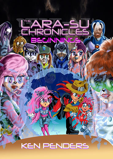
The cover
Let's start by beating a dead horse. The cover art: it's still bad! But why is it bad?
The cover is, of course, based on Patrick Spaziante's cover from Archie Sonic #131, the start of the "Mobius: 25 Years Later" arc. (Ken did the layout for that cover, though, so in the eyes of the law he's the original creator who owns that cover.) That cover was, itself, a tribute to the iconic cover of Giant-Size X-Men #1 by Gil Kane and Dave Cockrum, the issue that introduced the version of the team with Wolverine, Storm, Nightcrawler, etc.
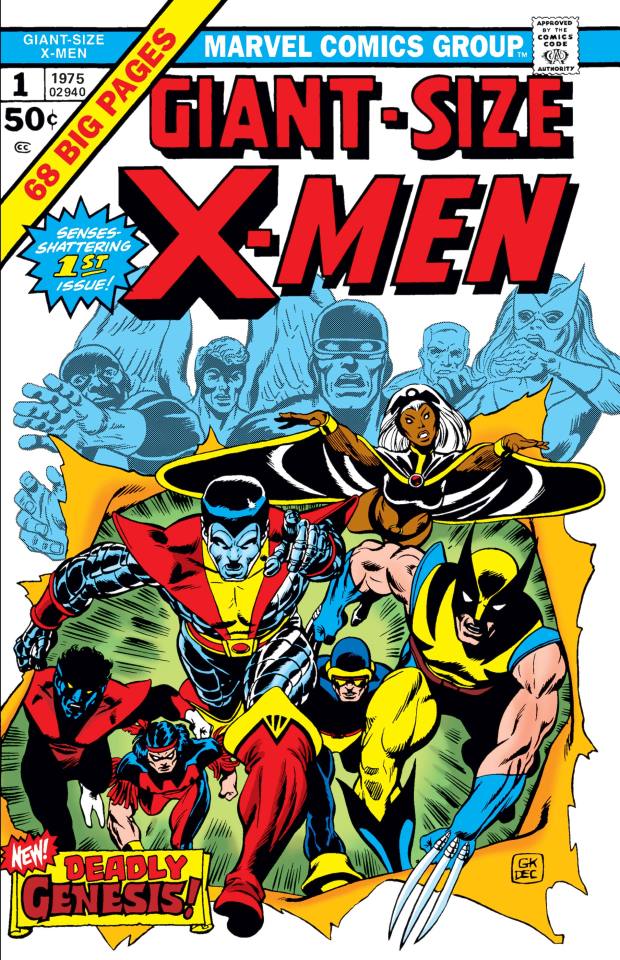

Ken seems to have forgotten that the point of both these covers was to hype up the arrival of a new cast of characters. The new guys are supposed to make a dramatic entrance front and center. That's the focal point. Meanwhile, the cover for Beginnings has the old timeline versions of the cast from Archie Sonic dramatically bursting out of a shattered crystal ball, while their new counterparts look on in mild bemusement - if they're even bothering to look at all, since most of the characters here are just copied and pasted from their profile pages. That's just not how you do this particular homage! The point is supposed to be "out with the old, in with the new." And why are they using a crystal ball to view the past? Hell, why are they even using a crystal ball at all? The original arc was presented as a magical vision of the future courtesy of Tails' uncle Merlin (don't ask), but the new story leans all the way into being futuristic sci-fi.
Of course, there is no real artistic intent at play here. The old versions of the characters are placed front and center in the crystal ball simply because Ken traced over Spaziante's original art of Lara-Su and Julie-Su (the only two characters on the Sonic cover he owns) and threw out the rest, ruining the composition in the process. Look at the awkward empty space where Sonic, Sally, and Rotor once were, and the new drawing of The Character Formerly Known As Knuckles who's no longer properly centered between his wife and daughter. Even if Ken can claim ownership of the cover because he did the original layout, this all just feels scummy and lame.
And, yeah, if it needs to be said, the new characters and Ken's new rendering style look like absolute fucking dogshit. Putting new Lara-Su directly next to old Lara-Su does her no favors. The shattered glass effect looks absolutely atrocious. I could go on, but we'll have plenty of time to talk about the art style when we see how bad the stories inside look.
Changes to "Mobius: 25 Years Later"
Overall, 99% of M25YL is presented identically to its original printing. Sonic, Sally, Knuckles, et al. are still present with no changes to their names and no tweaks to the art. Even the original cover for issue #131 is included only a few pages into this book with its Archie, Sonic, and Sega logos still intact and everything. Again, because of the weird copyright situation described above, these preexisting comics can be released without any changes.
There is exactly one bizarre change to the art, though, where a hand drawn shot of Angel Island is replaced with an unfitting photo background and the ugly Floating Island photobash that Ken has been using as his personal logo for decades. I think he only did this as part of a test for his motion comic app that nobody asked for. I don't know why this had to make it into the print version. It's like the book is firing a warning shot for what's to come if you keep reading.

The new content begins on the final page of M25YL. In the original wet fart of a cliffhanger ending, Sonic and co. accidentally alter the timeline with an old time machine of Robotnik's and Lara-Su begins to fade away. Then, after everything goes white, we just cut to the present day heroes going "gee, you ever think about the future?" In this new printing, that last bit has been cut, and the rest of the page has been awkwardly shrunk down so that Ken can fit in a new panel. We now see the hands of an off-screen villain, seemingly named "Override," proclaiming that "the Praetorian" (Knuckles) has messed up the timeline again and that they'll finally get their revenge.

Who is this Override? I have no fucking clue. The new stories in this book make no mention of them. You have to buy the next book to find out.
My confusion over the identity of this villain overlaps with another big problem: name changes. So many names and nouns have been arbitrarily changed in The Lara-Su Chronicles, even ones Ken didn't have to change for copyright reasons, and I only know what half of them are replacing because Ken's been tweeting about this shit for years.
The echidnas are now a totally original alien race called "the Echyd'nya." Even in flashbacks to events from M25YL attempting to mimic the old art style, if it's on a new comic page, they're gonna call themselves "Echyd'nya." Evil echidna faction the Dark Legion is now the "Cyberdark Dominion," hailing from the "Cyberdark Colony." The Brotherhood of Guardians is still the Brotherhood of Guardians, but now the main guardian is called "The Praetorian." Angel Island is still called "The Floating Island," like it was in the older Archie comics, but it's ALSO sometimes called "Avion"? When I read this I wasn't sure if he had randomly renamed Albion, the other echidna city from the Archie comics. But no. Now we have an Albion AND an Avion. Sally is mentioned simply as "Princess Acorn," while Sonic is referenced once as an unnamed "blue-spined Erinaceinae," using the scientific name for hedgehog to make it sound more sci-fi. In an incredibly ballsy move, Ken even mentions Robotnik as "the Insurrectionist Kintobor," retaining his original surname from the Archie comics that's just "Robotnik" backwards. Guess Sega never trademarked that one.
Aside from every name change being a downgrade, this leads to confusion when you're not sure if something is supposed to be new, or if it's just an Archie thing you're supposed to recognize despite having a new name and design. Is "Override" someone I'm supposed to know already? Am I just supposed to have read a fucking tweet from Ken where he said he changed the name of some existing villain to "Override"? The answer is no, but I had to term search his Twitter just to verify this.
Moving on!
New story #1: "The Storm"
If you've been following the WIPs, this is that story about Geoffrey St. John that Ken's been posting previews of for almost a decade. The title page copyright dates it to 2015, and that absurdly long gestation is probably why the art is so inconsistent here. Even the style of speech bubbles and the font change between pages two and three.
This is a problem when there's supposed to be a deliberate and noticeable change in art style here signaling the moment where the time travel stuff alters the timeline, replacing the Archie Sonic world with the Lara-Su Chronicles world. If you don't already know that's what's going on, the idea isn't conveyed clearly at all. It just goes from one hideous art style to a slightly different one with no explanation.

The main problem here is that Ken has hitched his wagon to a franchise about anthropomorphic animals when he can't draw furries to save his life. (Though a bit later in the book we'll also begin to wonder if he can even still draw humans.) He's shifted away from the cartooniness of the original designs and given them more human proportions and facial features, but this just ends up making them look incredibly uncanny and lumpy and gross. With some designs he's trying to lean into more of a Star Trek alien vibe, but then he still insists upon retaining the giant Sonic eyes on most characters even though he has no idea how to make them emote.
The rendering of these godawful designs doesn't do them any favors, either. Ken's going for more of a painterly look now, but it almost seems as though he's shading everything with Photoshop's burn and dodge tools that are designed to darken and lighten select areas of a photo. The result is a muddy, smudgy look that makes it feel like the color layer has been smeared in vaseline. And it only looks worse after coming off of 14 chapters of M25YL that have way more palatable art.

The backgrounds, too, are a complete mess, a jumble of low res jpeg photo elements (sometimes with extremely noticeable pixelation), stock textures, and smooth digital gradients. There's no real sense of place here, and it gives everything a surreal, dreamlike quality when you can't really tell where anything is supposed to take place. This first story is seemingly set in a high-tech stronghold below Castle Acorn called "the Bunker," but it could just as easily be confused for the bridge of a spaceship. This whole story features characters speaking to each other over floating video displays and hologram projectors from three different locations, but without a hologram effect and without a clear sense of where the characters are it often feels like they're just in the same room as each other. Characters will be in one location on one photo background, and then the camera angle changes and they're in a completely different place, because Ken just uses mismatched photos off of the internet. It's been like 25 years since he first tried using photo backgrounds in the Archie comics and he hasn't gotten any better at it.
When I had my boyfriend read the book to see if it made literally any sense to him (it didn't), Anthony said this: "This is the kind of shit I'd see linked on a Second Life world that hasn't been touched since 2004." I think he really hit the nail on the head. Now, there's actually a contrarian part of me that thinks that might theoretically almost be kind of cool, in sort of a messy counterculture way. I love weird indie shit. I was a Homestuck reader! But this isn't a scrappy mixed media zine, or experimental outsider art from someone just messing around with Photoshop, or a loving throwback to weird old internet art, or even something intentionally bizarre and offputting like Xavier: Renegade Angel or a PilotRedSun video or whatever where the fact that it's weird and ugly is part of the humor. This is supposed to be a sincere sci-fi epic drawing on Star Trek and Jack Kirby comics, made by a guy who's been drawing comics professionally since the '80s. This is supposed to look good. This is supposed to compete with mainstream comics that are on sale right now. He thinks any day now IDW's gonna go out of business and Sega will come crawling back to him so that he can stamp the Sonic logo on shit like this. It just doesn't work.

But, okay. It's ugly. We knew it would be ugly. But that ugliness would be much easier to accept if it was in service of an otherwise genuinely good story. So what about the writing? After all this time, how does Ken choose to kick off this new saga? Well, credit where credit's due. "The Storm" feels like a proper continuation of Ken's writing style from M25YL.
Because it's eleven pages of characters standing around and talking while nothing fucking happens.
Here's the synopsis: A dog woman named Brownie, an ensign in the Royal Secret Service fresh out of training and the only character who's almost cute, walks up to Geoffrey to deliver a report. He's immediately suspicious of her, asking who let her in and if she's a spy for Elias (Sally's brother, if you're new here) or Alicia (Sally's mom). The art style suddenly shifts when the timeline is altered, but the scene continues uninterrupted. Geoffrey points a gun at Brownie when she won't say whose spy she is. Geoffrey is distracted by a call and proceeds to have a conversation via a mix of holograms and video screens with Remington (head of Echidnaopolis security), Spectre (Knuckles' great great great great great grandpa, the one with the helmet who always looks evil), and a new scientist character named Dr. Zephyr/Zephur. (The spelling of this character's name changes multiple times throughout the 11-page story, because I guess nine years wasn't enough time to spellcheck this shit.) They say a bunch of made up technobabble nonsense about how it looks like the timeline was just altered and Knuckles and co. seem to be involved. It's complete drivel that I'm not even going to try to make sense of. Everyone decides to investigate further, and the conversation ends. Brownie tells Geoffrey she's his spy, then walks out and implies she's actually Alicia's spy in her inner monologue.
To be continued!!!
Yes, that's it. It's really just a bunch of technobabble where some characters talk about how it seems like the timeline has been fucked with. That's it. The whole time Geoffrey doesn't even get up out of his damn chair, which he's of course sitting in backwards to show how cool he is. It's just 11 pages of Geoffrey sitting in a chair and talking to people and looking uglier than he's ever looked. Nothing happens. Nine years for this.
I'm also struck by how meaningless all of this is to anyone who hasn't read Archie Sonic. The added context from M25YL may help a little, but "The Storm" focuses on characters who weren't in that arc, and the story does very little to introduce who any of them are. Brownie could've been super useful as an inexperienced point of view character who's only meeting the others for the first time here, but instead she's really just a passive observer who's here as part of some kind of 4D chess game between Geoffrey and Alicia, an off-screen character whose motivations in this era of the story are completely unknown to even returning readers. Who are the good guys and bad guys here? What are the conflicts and the stakes of the story moving forward? What do these characters want? Basic questions like this aren't really answered. I can't imagine a new reader being able to make heads or tails of this. Hell, I can't really imagine a returning reader who hasn't been following the last decade's worth of Ken's tweets about this story making heads or tails of it, either.
...Maybe more will happen in the next story?
New story #2: Shattered Tomorrows preview chapter
After another message from Ken, the story of The Lara-Su Chronicles proper begins with the redesigned Lara-Su walking along a jpeg photograph beach at sunset and crying while thinking about how Knuckles - sorry, his name is K'Nox now - is dead.
Yep! Straight into the dad stuff!

Look, I'm the last person to complain about writers getting super personal and drawing from their own baggage in their writing, but Ken's just no fucking good at it. There's no nuance, nothing interesting to say. He just keeps writing mediocre-to-horrible dads whose misdeeds are always justified by their "good intentions," and then sometimes they die and their kids are like "we may have fought but actually you were the bestest dad ever and I'll miss you forever, I'll never be able to fill your shoes!"
This is the only part of the new material here that feels like it has any heart behind it, because I know how much his complex relationship with his late deadbeat father means to Ken (there's an author's note in this outright saying as much). But the guy died 42 years ago, and it doesn't feel like Ken has had any new thoughts about this part of his life in those four decades. He's just not an introspective or self-aware enough artist to actually mine his personal baggage for anything beyond "father knows best."
Anyway, so then it jumps forward in time(?) and now we're following this human guy who looks like this.

Previously, Ken got a lot of shit for literally just using the likeness of Anthony Mackie for this guy, based on his IMDB profile photo. Ken has thus redesigned the character... and by that I mean I think he looks more like Ernie Hudson now? Ken's clearly just working off of photo references (if not straight up tracing), given his face is the most detailed and realistic-looking thing on any page where he's present.
But you may be wondering: who is this, and why is he here? Well, for one, he's here to run around in front of some low res space photos while making trite references to things like Planet of the Apes and Star Trek. Haha, he makes a joke about red shirts! Original!! But beyond that, Commander Mykhal Taelor (yes, that's really how he chose to spell it) is a human... from Earth! Archie Sonic readers are probably confused, because in those comics Mobius is Earth in the distant post-apocalyptic future. Well, despite being a Planet of the Apes fan, Ken always hated that particular worldbuilding decision from Karl Bollers, always preferring to think of Mobius as a separate alien planet. And now he gets to make that canon in his own stories and throw out Karl's ideas. So Mobius is basically just, like, a Star Trek planet now, with its own alien creatures that sometimes just so happen to look like anthropomorphic Earth animals.
Also, at one point Taelor wonders if the inhabitants of the dead Mobius might have been human, and the alien ally he's talking to over the radio says it's unlikely. "I don't understand why your kind has a problem understanding you're a minority within a minority." Perhaps poor wording for a line said to the only Black character in the story.
Anyway, Commander Taelor here seems to have discovered the uninhabited husk of Mobius after the vague time-space cataclysm everyone was worried about in M25YL has come to pass, and he finds an audio log from Lara-Su that I presume will explain what happened. I guess those are the titular Lara-Su Chronicles. In theory this flash forward establishes some sense of pressing danger, but when the threat to the planet is so unclear and technobabble-y it just kind of lands with a thud.
It doesn't take long before we get back to Lara-Su being sad about her dad. A good little chunk of the chapter is spent with this new timeline's Lara-Su recalling moments in her life, including echoes of the original Lara-Su's memories from M25YL, which feels redundant coming hot off the heels of a straight reprint of that entire arc. And boy, for anyone who read the later Archie Sonic comics, the protagonist having vague memories of the old version of the series from before a lawsuit-related timeline reboot sure does sound familiar, huh?
The art inconsistency somehow becomes even worse in this story, with Ken flip-flopping on whether or not he wants to use outlines, with the no-outline art managing to look even worse by relying entirely on Ken's awful rendering. By this point in the book, readers are also likely to start noticing how often Ken reuses art from previous panels. This is a shortcut that tons of comic artists use, of course. Invincible famously did a joke about this. It's often understandable. But, again... it sure does stand out in a book that took 13 years to make with only 30 pages of new art. Amusingly, Ken even manages to combine his inconsistency and recycling problems by reusing the same art with and without outlines. And, of course, any time Ken tries to draw the Archie era designs it's just... the worst.

And, yes, it's in this dreamlike montage sequence of Lara-Su's life that we get...
The uncomfortable family nudity scene, followed by the dual timeline Julie-Su breastfeeding scene.

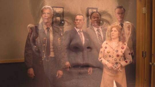
Yeah, you might have heard about this one already. If this incredibly eerie presentation of Lara-Su's hazy memories of the two different timelines make it hard to tell what's going on, don't worry. There's another, clearer version later in the book as part of Julie-Su's character profile, because I guess Ken was just so proud of it.

(I censored these myself because I'm not playing Russian roulette with Tumblr's inconsistent nudity rules and risking getting banned lmao)
Like, okay. Is a mother breastfeeding her child really that shocking of a thing to see in a story? No, not at all. But, like... when it's two characters who you previously created for an officially licensed Sonic the Hedgehog comic for 7-year-olds... and some of those officially licensed Sonic the Hedgehog comics for 7-year-olds are reprinted in the same book... and when it's drawn like this... yeah, it's kind of a shocker.
It just looks so unnatural. Julie-Su is posed very deliberately so that you'll see both of her breasts, and in the new timeline version she's barely even holding Lara-Su so you can really get a good look at her supermodel body, showing zero physical signs that she just gave birth. Most people will immediately jump to this being Ken putting his fetishes in his work (a type of criticism that I'm incredibly tired of - it's 2024, all the cool artists are blatantly putting their fetishes in their work now). And my immediate response is that, no, this is probably just Ken trying to come off as really mature on a surface level, a thing he's been obsessed with since the Archie days. Free from the shackles of writing a licensed children's comic, of course he's going to jump immediately into depicting some nonsexual, artistic nudity to try and prove he's A Real Mature Artist For Grown-Ups who just thinks the human body is beautiful and breastfeeding shouldn't be a taboo etc. etc.
But then, like. You look at some of the other character designs. Like Espio's daughter Salma, who's now this horrifying alien lizard person who's always nude, and her scale pattern puts scales exactly where her nipples should be. Or you look at his comments about the Echyd'nya age of consent. Or you look at how he keeps drawing Lara-Su in this. Like, does the shuttle really need this, like... reverse chaise lounge thing in the cockpit? So that we can keep getting these shots of the 16-year-old Lara-Su lying on her stomach and posing with one of her legs kicked up, her naked ass in plain view?

The vibe isn't great, is what I'm saying!
I'm not going to try to ascribe authorial intent here. I don't know. I'm not a psychic. Given his very blatant reliance on photo references elsewhere in the book, it's entirely possible he just referenced some figure drawing photos that were maybe just a little too sexy. And also, he's an American comic book artist, and a boomer one at that. Those guys tend to draw women a certain way, even when it's not supposed to be sexual. I don't fucking know. It just sucks. I'm not gonna make some hyperbolic statement about how this makes him a literal pedophile who should be in jail, but it is deeply offputting and objectifying.
But if you already knew about the nursing scenes and were hoping there was some other really shocking stuff in there for me to talk about in this review, sorry to disappoint, but nope. That's the only shockingly weird new thing in here. Once again, not a lot happens in this story, and what does happen is pretty boring.
Once we get past the recap stuff and the human guy, the plot developments boil down to this: The timeline was altered at the end of M25YL... but not as much as you might think. In the new timeline, Knuckles ("K'Nox"), Cobar (now looking significantly younger), and Rotor (now a rhino just called "The Emissary") still traveled via shuttle to go find a time machine in the Badlands and fix the time-space continuum, like in the climax of the original arc. This time, though, Sonic wasn't there, and Lara-Su came along without having to stow away. Lara-Su watches the ship while the grown ups go deal with the time machine, and then after a couple panels Not Rotor comes back with Cobar and is like "Hey, Cobar got hurt, we gotta leave. Dunno what happened to your dad." And then they just, like. Presume that Knuckles must have died. Even though we have no idea what happened to him. And then they just fly away. And then Lara-Su is sad that her dad died.
And that's pretty much it!
This is supposed to be a really emotional sequence - it's literally the scene where Lara-Su learns that Knuckles is dead - but instead it comes off as unintentionally funny because of how poorly it's portrayed. Not showing Knuckles' actual disappearance is a huge misstep, for one, making his uncertain fate more confusing and anticlimactic than dramatic. But also, Ken keeps just using the same two drawings of Rotor for two pages, so he doesn't really seem to be emoting at all, and he's in this spacey hazmat suit that honestly just makes him look like fucking Moltar from Space Ghost. So the whole time I'm just reading his dialogue in Moltar's deadpan voice as he's like "I dunno. We did what we could. Anyway, let's leave."

After this, we get a two-page spread previewing the rest of the story from Shattered Tomorrows. It's basically like a trailer in comic form. It has one of the most mystifying layouts I've ever seen in a comic book. I have no idea what order I'm supposed to read this in.

Yeah, I kinda have a feeling this is the full extent of what Ken has drawn for the rest of that book. I'd love to be wrong, but I fear that I'm right.
Bonus material: Data files
These are mostly very dull, recapping a lot of events shared between Ken's Archie run and the new Lara-Su Chronicles timeline. It seems like almost his entire run is still considered canon to the backstory of the new timeline, just with some names changed, and things only really diverge at the climax of M25YL. But I'll share the interesting stuff here.
Lara-Su
The main thing you'll notice in Lara-Su's profile is the massive, unreadable wall of text where Ken felt the need to list the entire Knuckles family tree, split across both pages.

This is literally so long that Lara-Su's personal history has to awkwardly cut off mid-sentence and be continued on the final page of the book, after the rest of the data files.
Also, please note that this list gives Julie-Su's mom's full name as Mari-Su of the House of Atrades. Incredible on all levels.
There's also a reference to the dark timeline Lara-Su was originally supposed to come from. You know, the one where Julie-Su is the leader of a rebel movement fighting against a Knuckles who had gone mad with power? The timeline that would have been way more interesting than the one in M25YL? Here it seems to have been written off as the result of another "timeline disruption." Lara-Su allegedly has vague memories of this timeline, in the same way that she has vague memories of the M25YL timeline.
Geoffrey
Geoffrey's bio mostly recaps events from the Archie comics, which means the Sonic/Sally/Geoffrey love triangle has to be alluded to. His rivalry with Sonic is described like this:
"He would later resurface when Kintobor was transporting his latest hi-tech weapon, the Dynamac-3000. It was during that mission he discovered a rival for the Princess' affections. Whereas the Princess would be one of a line of conquests where St. John was concerned, the blue-spined Erinaceinae who protested doth a bit too much regarding his affections for the Princess for St. John's taste would prove to be a source of great sport and amusement."
Yes. It's gross. Saying that Geoffrey saw Sally as "one of a line of conquests" is gross. Ken writing this and then still treating Geoffrey as the coolest badass ever is gross. The "Princess Acorn" is also first on the list of Geoffrey's "female relationships" elsewhere in his bio, though I suppose how much of a "relationship" they had is left vague. Honestly, at this point the fact that Ken didn't explicitly confirm that Geoffrey took the underage Sally's virginity in the book comes off as a display of restraint. The bar couldn't be any lower, I know.
Remington
His bio is, frankly, shockingly long for such a minor character, though I guess he does get a large portion of the word salad dialogue in "The Storm." There's a lot of stuff here about how the identities of his biological parents are shrouded in mystery, a plot point that fans have long speculated Ken just straight up forgot about in his time at Archie. (Ian confirmed that Kragok from the Dark Legion was Remington's dad, though, so this isn't really much of a mystery.)
Lien-Da
She gets a bio even though she's not present in the two new stories, just so we get to look at her awful new design and compare it to how Steven Butler drew her earlier in the book:

Commander Taelor
We get to see two drawings of him with the same exact Ernie Hudson face side by side! That's fun.

Julie-Su
She gets a list of "known friends," but the only character listed is Knuckles' mom. Poor Julie-Su.
Also, Ken feels the need to reiterate that Knuckles and Julie-Su are still distant cousins. He made a whole new timeline where he can change whatever details he wants, but THAT had to remain canon. Thanks, Ken.
And then after the data files we get the special thanks page, listing everyone who preordered the book and/or bought TLSC merch from Ken.
With my name on the list. Because I had to buy a copy to cover it for the blog.
My name is on the very next page right after the breastfeeding panel in Julie-Su's data file.
Yep. He got me.
Is it at least a well put together book? Like, in terms of manufacturing quality?
Its physical quality is... fine. It's a nice, sturdy hardcover. The print quality seems fine, though mine does have a bit of smudging from some sort of printing error on one page. The pages don't seem like they'll fall out on me. The image quality is crisp. The colors are vibrant. This is a low bar, but this is one of the few places where I'm able to give this book anything resembling praise.
The formatting and graphic design work, on the other hand...

(I didn't crumple those page corners, it came like that.)
For one, the placement and sizes of the M25YL pages is inconsistent, largely due to the fact that the book doesn't actually match the proportions of a comic. A lot of pages aren't properly centered vertically. Some pages go all the way up to the top edge of the paper, while others leave a visible gap of about half a centimeter. Every page has a 1cm gap to its left and right, which is sometimes filled in with a solid color or gradient that doesn't quite match the page it's surrounding. I have to assume Ken didn't have any sort of source files or original artwork to work off of, as those ideally would've had more generous bleed to account for slight shifts in printing. It kind of seems like he just got the highest resolution versions he could find of the digital releases online and printed those. The colors are a dead ringer for the digital versions, which have always looked slightly more saturated and pastel than they did in print.
I can't say this bodes well for his further plans for Archie Sonic reprints - sorry, Mobian Line reprints. If they ever come out, please, for the love of god, do not buy those. I don't care how much you love Archie Sonic, they aren't going to be good reprints. For comparison, IDW's similarly priced hardcover Sonic collections have none of these formatting problems, because they're made by people who know what they're doing with access to the actual source files.
The book also has its fair share of text-focused pages, split between the data files and messages directly from Ken about the history of his career and this project, and these are formatted in the most amateurish way possible. Just massive walls of Arial text over either plain white backgrounds, simple gradients, or faded photos. I've seen school yearbooks with better graphic design. Even ignoring my subjective feelings about the art and stories within, this book does not feel like it's worth $36 USD.
It's frankly shocking how shabby he let this thing look considering it's supposed to be his baby. And doesn't that really sum it all up?
Closing thoughts
Obviously, I did not expect this to be any good. But I'm still left kind of dumbfounded by it.
I think what really strikes me about it is that Ken had a blank check to do whatever he wanted here. He got an opportunity many writers would kill for when he gained complete ownership of his most famous work. He's free from the limitations of a monthly licensed comic book for children, free to make whatever creative decisions he wants without editors or other writers or Sega to worry about, free to completely reinvent the series to his heart's content and finally tell the story of his dreams. And with that opportunity and 13 years of his time, he made... this. A direct continuation of "Mobius: 25 Years Later" that barely changes anything about the characters or world beyond their awful new designs, even though much of the word count is spent rambling about how the timeline has changed. A story that makes zero concessions for new readers, or even returning readers who don't already have the last decade's worth of Ken's tweets explaining his creative decisions burned into their memory. 30 pages where nothing really happens and the story barely moves forward an inch despite the decades-long wait - but maybe something will happen if you buy the next book!
Who is this for? Maybe this really is a project for no one but Ken. Maybe he just really, really wants to finish the story he started, a story that's personal to him due to the family history it evokes, and the number of people who enjoy it or buy it beyond that is irrelevant. I think that many of the best artists are incredibly self-indulgent ones working with that exact mindset, artists whose enthusiasm for their own work jumps off the page or screen. So, if that's the case, then why the fuck isn't he telling the damn story? What's stopping him? Why is he still spinning his wheels? Where is that passion for his own work? Because it sure as hell isn't there on the page. There's a huge part of me that really wishes I could say "Man, what a weirdo, but you do you, Ken. You tell your weird little story." But there's barely any story here. It's like he loves styling himself as a storyteller, but he's terrified of finally having to actually tell a story after all this time. He's still stuck in the exact same mode of writing he was in almost 30 years ago when he was doing 6-page backup stories about Knuckles, just killing time and stringing readers along until he's eventually able to truly realize his vision. If not now, then when, Ken?
Even the back cover blurb is mostly just a dry recap of the history of this thing. It was a Sonic comic, the original arc was published in these issues, it went unfinished, Ken left Archie, the lawsuits happened, now he's continuing the story. There's nothing about why anyone should give a shit about this as its own story, even though Ken has spent years trying in vain to convince people TLSC is its own beast that shouldn't be judged as a Sonic story. I think deep down he knows that there's no pitch for this beyond the novelty of it originating from Sonic. And that's why, despite declaring that he'd leave the site, he's still on Twitter riling up Sonic fans. It's the only attention he gets at this point.
Maybe this is too harsh when those 30 pages of new comics are just intended as a preview for the "real" book. But the elephant in the room is that we have no idea if that "real" book will ever actually come out, let alone the entire series of seven graphic novels that will supposedly complete this saga.
Ken is undeniably a complete jackass and all around unpleasant, vindictive person who's rightly become an industry pariah. He's a self-proclaimed paragon of progressive values who'll send Comicsgaters after his successors for the crime of not worshiping the ground he walks on, and then turn around and announce he's going to reprint their work without even consulting them. He's a sore winner who already won his copyright battle on a level most comic writers would never dare to dream of, and yet still won't truly be satisfied until he sees an entire major comic publisher go out of business, putting god knows how many people out of work, because he thinks this would get him back the license to a video game franchise he doesn't even like.
But I still have to pity him.
As an artist, the trajectory of his life is my nightmare. I think all of us fear dying before we can tell all the stories we want to tell. There's simply never enough time to do everything. And here's Ken in his 60s, talking about how he's still planning on making his magnum opus all by himself out of stubbornness and pride, despite demonstrably proving he can't handle the workload, and also talking about how if he dies before the project can be finished he'll have to pass the torch on to his kids and get them to finish it for him. It's so grim. Even just typing that sends a shiver down my spine. It took nine years of his limited time on Earth to finish and release an 11-page comic about Geoffrey St. John sitting backwards in a chair.
This is a purgatory of his own creation. And yet... I'm not sure he's ever been prouder. One must imagine Sisyphus happy.
I guess if I want people to take anything away from this review, it's this:
Lesson one: If you're an artist or writer of some kind, or an aspiring creator, don't wait around. No one else is going to tell your story for you. Start writing that novel. Start drawing that webcomic. Start making that game. If Penders can put out this damn book that no one asked for after 13 years of work, then proudly proclaim that he's still going to make six or seven more books and also reprint hundreds of comics he doesn't have all of the rights to, then show up to cons with that foul Lara-Su Chronicles: Shattered Tomorrows banner and sit in front of it beaming with pride, fully aware of his critics but saying "fuck 'em, I know I'm hot shit," then you can do fucking anything. Tell the weird, sincere, cringe story of your dreams. If Ken Penders doesn't have imposter syndrome, then nobody should.
And lesson two: Don't buy Ken's books.
6K notes
·
View notes
Text
I'm in thatttt
New multi-animator project drops December 27! Our biggest one yet!
#lmk#lmk reanimated#lego monkie kid#hahahahaha it took half a year but it was so fun this is the first time i didn't feel lost at a discord server (they scare me oops)#also i can make a full and FULL animation (oh god i hate it) gonna stick to my beloved storyboard or rough lineart from now on#(me who signed up for a gravity falls reanimated one day after sending my parts) ... not gonna lineart again... sure#but it's so awesome#UGHHH i love the lego style i love flying bark so much they're so insane#and the people on the MAP are insanely talented GUSH i need to eat some of those parts YUM YUM#i have never in my life been interested with learning after effects before seeing what some ppl do#my and my 5 minutes computer time every weekend only🥲 miss computer time no fair I'm not with it all week🥲🥲#anywho YEAHHHHHH#making something part of bigger something it's way more fun sometimes#i forgot to post wips anywhere but I'll do like a presses video because I'm so proud of my backgrounds and the lineart is good :P :)#it was just such a pain to do I'm a slow drawer with lineart#animation sketch? that i can do#well time to go back to not drawing ever (buuut I'm working on a project with a friend so that will be cool in a few months hopefully)#I'm doing a lot of animation side quests this year#it's fun#well#art side quests actually;; i made so much random new shit this year#sculpting is incredibly fun#coloring is my enemy#I'm way off track these are not my hours#lego monkie kid animation#!!!!!!!!!!!!
144 notes
·
View notes
Text
The Great Trans Girl Exodus Commission Post
Hello once again! To make a long story short: My darling wife and I are trying very hard to be able to move from Texas to Colorado ahead of how bad legislature is getting here. We have savings and a plan but its shaping up to be a very expensive and stressful finding a place to actually move in to. Our lease here is up at the end of June so we're starting to really crack down on trying to find places to apply to. I'm making this post because we would really appreciate some extra funds to add to what we have saved to make this move possible and if its an option: comfortable. We're a pair of trans lesbians trying so very very hard to make a life for ourselves in this country that hates us. Below I've attached some basic pricing and examples of the type of pixel art I do as well as some of my writing as I'm A-Okay writing for other folks if you like my prose or brand of article jank. If you have any questions about anything here please feel free to send me a DM on here and we can talk more about what you want and what I can do for you. Thank you so much if you end up commissioning anything or even if you just share this post. Examples and pricing below the cut:
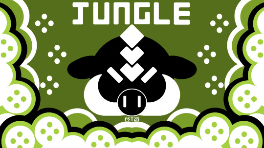
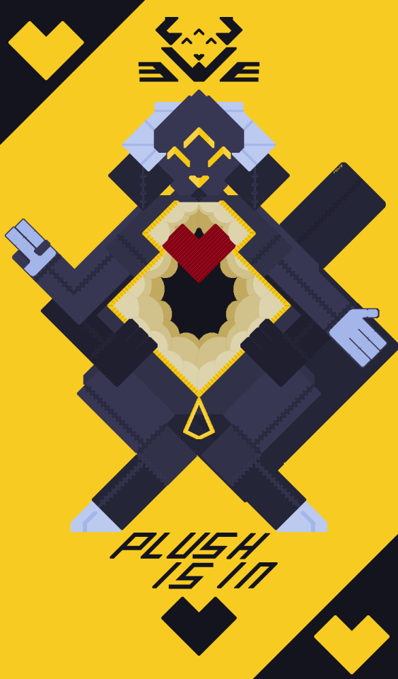
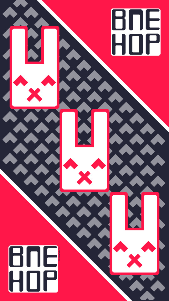
Y2K Stylized Piece: $50+ (Price can range based on piece complexity desired)
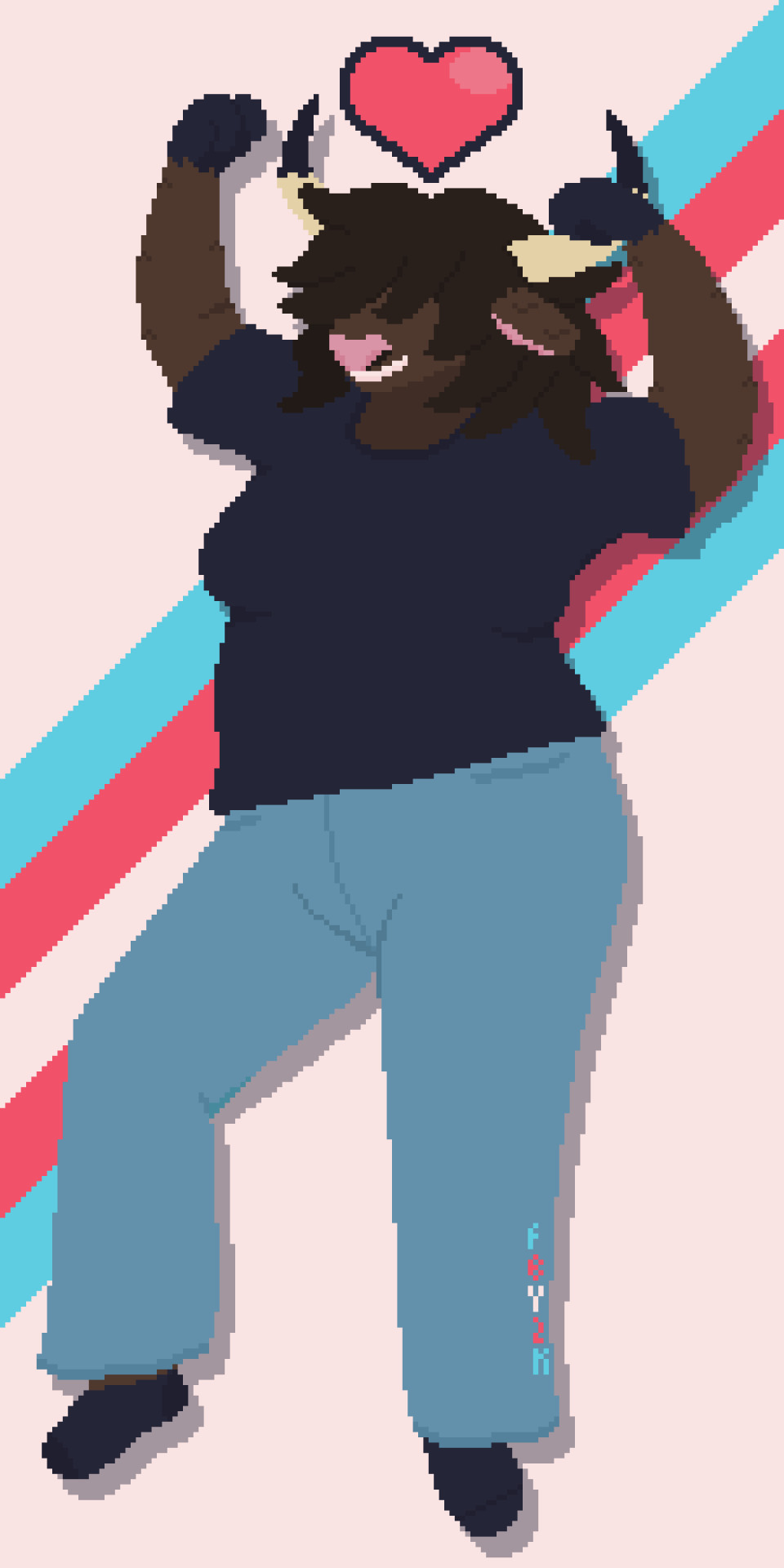
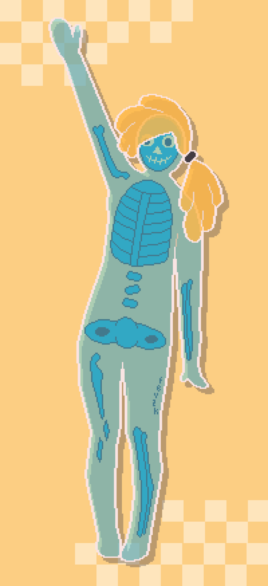
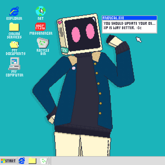
Flat colour piece w. basic detailing: $60+ (Price can range based on number of characters desired and background complexity, basic BG is included in piece)
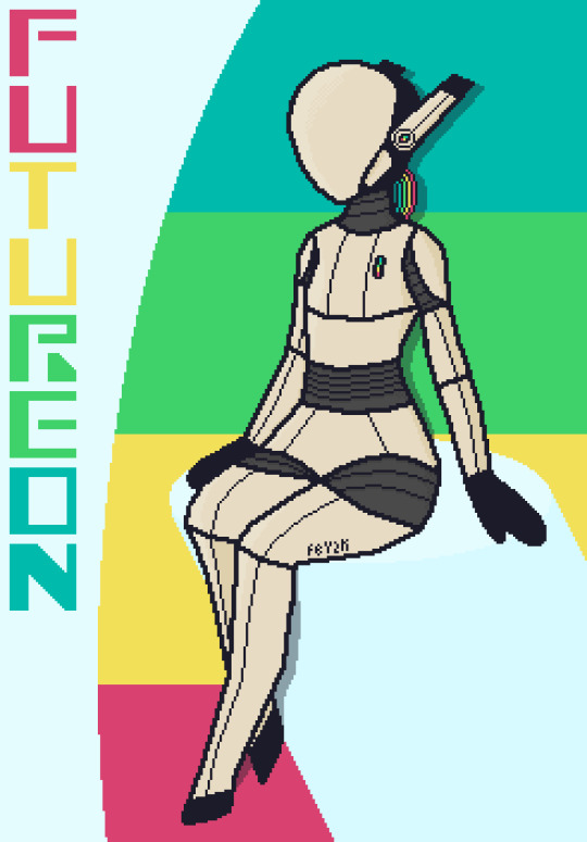
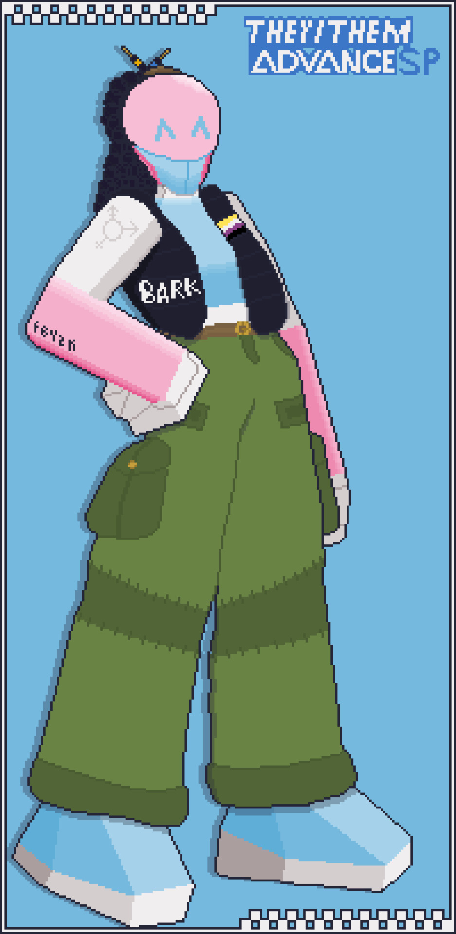
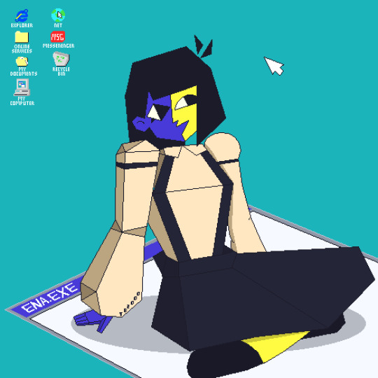
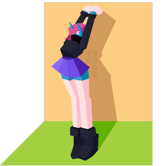
Detailed/Low-Poly Style piece: $75+ (These ones take the longest due to the by-hand editing needed to ensure the style is cohesive or detailing is done on the whole piece. Price can range based on complexity desired.)
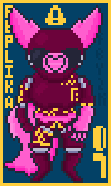
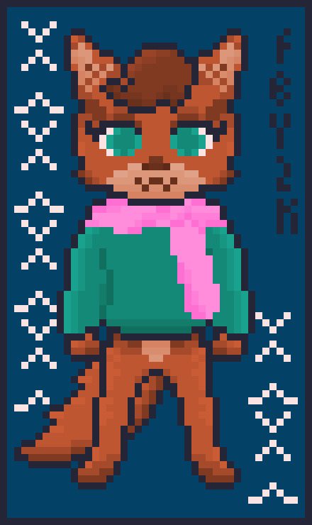
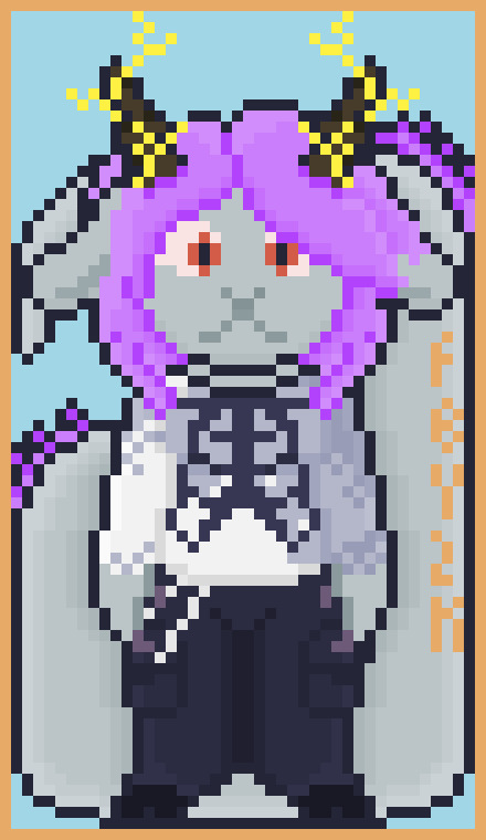
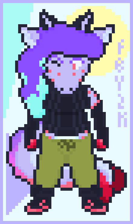
Pixel Chibi: $20 (Pixel Chibi pricing is locked at $20)


Emote Suite: $35 (Price covers up to 9 custom emotes sized for usage in Discord and other messaging use cases)
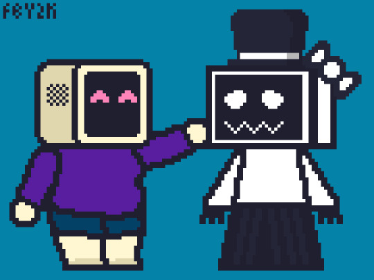

Doodle: $25 (A flat simple piece with a simple concept done on a small canvas)
WRITING EXAMPLES:
Fiction: Tactile Sensations, a Sci-Fi short story Article Writing: Bloodborne PXS: One of the best fanworks on the web Writing prices start at $30 and can fluctuate upwards based on piece length. Thank you so much for checking out my work and/or sharing it. We're trying to start a new life for ourselves in a safer place, and we really do appreciate any help. Thank you!



#my stuff#pixel art#my art#digital art#art#commissions#trans#mutual aid#moving help#commission post#commissions open
2K notes
·
View notes
Text
Batkids playing any kind of board game but make it extra competitive because whoever wins gets to choose what Bruce wears for the next gala.
Bruce, in a sparkly top and skinny jeans:
Reporter: Ah, who chose your outfit tonight, Brucie?
Bruce: That'd be my eldest, dear!
Dick, behind him, full into the gala persona: Flattering, isn't it? He should wear it more often, don't you think, sweetheart?
Reporter, flushed: Oh, absolutely.
Bruce (to Dick): Get a new fashion style. Please.
Dick: Never.
Reporter: Who would be responsible for your wardrobe tonight, Brucie? It's certainly a statement.
Bruce, head to toe in a pink suit and Hello Kitty accessories: Gorgeous, isn't it? All the credit will have to be given to Jason, though, I'm afraid.
Reporter: Your second son, if I'm not mistaken?
Bruce: The very one.
Jason from across the gala hall, trying to not cough up his drink with laughter:
Tim, next to him: He's pulling it off, though. Little spins and everything.
Jason: Still ridiculous. That's Batman right there, Timbo.
Tim, snickering: The Dark Knight, huh?
Bruce, dressed in a collared white shirt, sweater and skirt, looking like he just came out of a light academia novel:
Reporter: Wow, Brucie. Who do we thank for that wonderful outfit choice?
Bruce: Ah, flattering, is it not? Tim's choices when it comes to fashion are wonderful, if not a bit simple.
Tim, nodding from behind him: Only the finest satin skirts. Charming, right?
Tim, to Bruce: Don't call my style simple, Mr. all I wear is black.
[Jason handing Dick $10 in the background because Bruce does, in fact, pull off a skirt.]
Reporter: Oh lord, what a gown! Who influenced your fashion choice tonight, Brucie?
Bruce, in a long green and black gown with gold accessories, nothing short of royal-looking: I fear only one person I know could choose an outfit as gorgeous as this one.
Damian, proudly next to him, in a smaller, matching gown: Only the most exquisite. You lot in this flimsy country cannot compare.
Bruce: Yes, Damian has a fine taste in fashion. He gets it from his mother.
Damian, quieter: Well certainly not from you.
Bruce, dressed in an elegant white dress shirt, long black pants and a corset with red accessories, a fan in his right hand:
Reporter: What an entrance! Anyone to give credit to for the wardrobe, Brucie?
Bruce: That'd be my daughter, she certainly shines with her choice of clothing.
Cass, grinning with a matching fan: Very pretty.
Bruce: Thank you, Cass.
Reporter: Woah, that's certainly new. Any reason for this choice of clothes, Brucie, dear?
Bruce, in a snapback cap, loose jeans and a band t-shirt, complete with rings and a chain around his neck: Well, all of my children are creative, but... Duke might just take the cake for this one, love.
Duke, losing his absolute shit next to Jason, Dick and Tim: You look great, B.
Steph doesn't usually go to galas, but she participates in the game nevertheless. If she wins, god help Bruce, because it's a gamble with her. He either ends up wearing a gorgeous outfit with eccentric and trend-setting accessories or literal checkered pyjamas. Worst yet, he has to say he picked it himself, since he can't directly blame Steph.
#batfam#dc comics#batman#wayne kids#batkids#bruce wayne#dick grayson#jason todd#tim drake#damian wayne#cassandra cain#duke thomas#stephanie brown#wayne gala#Steph: hey b#guess who won mario party#bruce: oh god no#steph: thats right. get into the silk bath robe brucie boy!!
2K notes
·
View notes
Text
Ever see a depiction of St. George and the Dragon? It's pretty fair to say if you've seen one, you've seen them all: Georgie on a horse stabbing a flailing dragon creature, princess piously kneeling in the background, vague landscape alluding to the homeland of the artist's patron.
The most varied part is the dragons. No one had a real definition for the thing, it seemed. For your pleasure and entertainment, I have ranked some medieval depictions based on how impressive George's feat seems once you see the dragon.
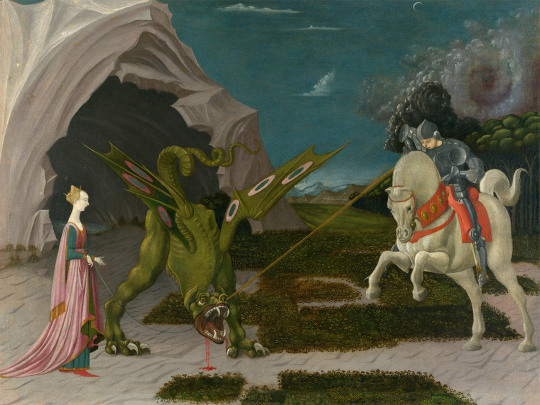
Paolo Uccello, 1456
This is a terrifying beast. The hell is that. Uccello was one of the first experimenters with perspective, so the thing also looks surreal, like it's taking place on Mars, or a Windows 95 screensaver. I would not want to fight that, I would not want to be tied to that. (Sometimes the princess is tied to the dragon for some reason.) 10/10
Horse thoughts: Maybe if I look at the ground it will be gone when I look up
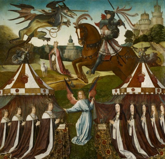
Unknown artist, c. 1505
This is a rare change of form for the dragon; it's the only one I've seen actually flying (or at least falling with style). It doesn't look particularly deterred by the spear through its throat, either. Also, George looks appropriately nervous. On the other hand, it hasn't got teeth, it seems to be fuzzy rather than having scaly armor, and George is bolstered by his army of Henry VII and his children, most of whom definitely didn't actually die in infancy. Still, wouldn't want to fight it, wouldn't want my pet sheep near it. (Sometimes the princess has a pet sheep for some reason.) 9/10
Horse thoughts: I am so glad I wore my mightiest feather helmet for this
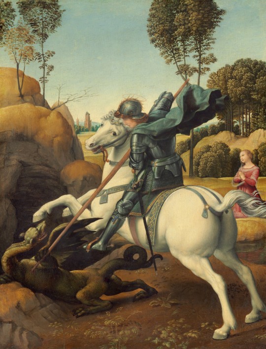
Raphael, 1505
We are coming to Dragons With Problems. This guy looks about comparable in size to George, and does have wings, but doesn't seem to be using these things to his advantage (and has he only got one wing?) And how does he deal with the neck? He does have a comically small head, but holding it up with such a twisty neck seems complicated at best. But most egregiously, he is doing the shitty superheroine pose where he is somehow simultaneously showcasing his chest and his butt, with its unnecessarily defined butthole (more on this later) (regrettably). 8/10 bc it's Raphael
Horse thoughts: AM I THE BESTEST BOI? AM I DOING SUCH A GOOD JOB? WE R DRAGON SLAYING BUDDIEZ
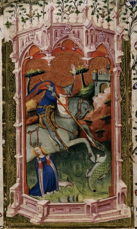
The Beauchamp Hours, c. 1401
We had a spirited debate about this one at work. Again, the dragon has gotten smaller, and this one hasn't got even one wing. He's basically a crocodile. So the debate became: would you want to fight a crocodile if you had a horse and a pointy stick? Would the horse trample the animal, who can't get on its hind legs, or freak out and throw its rider? Would the pointy stick be enough to pierce the croc's thick hide? In this case, George seems to be controlling his horse and putting his pointy stick in the dragon's weak spot, so we can be impressed by his skill and strategy. However, his hat is dumb. 7/10
Horse thoughts: Dehhhh
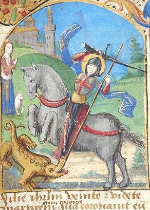
Book of Hours, c. 1480
Here we have the same kind of croco-dragon, but George's focus on his strategy has gone out the window. He's flailing around, not even looking at his target, he's about to lose his pointy stick, he hasn't got a hand on the reins, and his sword seems to only be poking the invisible dragon over his shoulder. All he's got going for him is that his hat is slightly less dumb. 6/10
Horse thoughts: Yay, new friend! Come play with me, new fr- what is happening
Final dragons put behind this Read More for your safety:
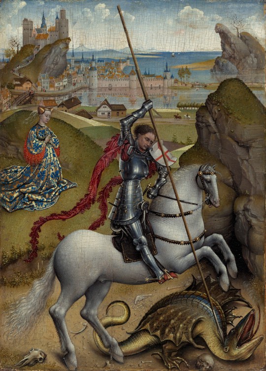
Rogier van der Weyden, c. 1432
I'm thinking this guy is at least semi-aquatic. Webbed feet, wings that seem more like fins, bipedal but top-heavy, jaws that seem more for scooping than biting. Maybe she's crawled up here from the nearby body of water to lay her eggs, and this is all a big misunderstanding. Moreover, George's dagged sleeves seem entirely impractical for the situation. 5/10
Horse thoughts: i got my hed stuk in a jar and now it is this way forever
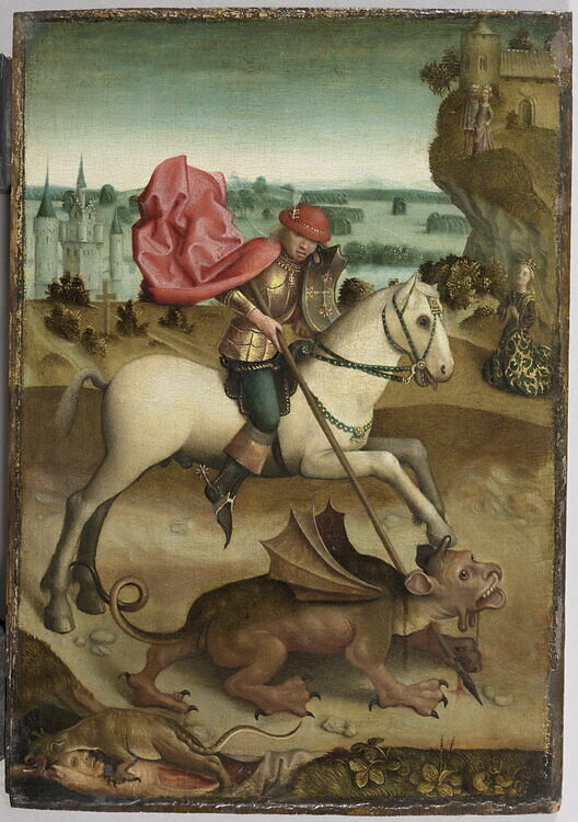
Unknown artist, c. 15th century
I hate this. I hate everything about it. Why has it got human eyes and teeth. Why is its nose melting. Why has it got a dick on its face and balls under its chin. The fin/wings are back but they look even more useless. Also, George is shifty as hell, schlumped over in his saddle with his bowler hat thing over his eyes. The baby dragon at the bottom eating some hapless would-be rescuer is kind of metal. 4/10 at least the thing is gonna die
Horse thoughts: I Have Smoked So Much Crack

Book of Hours, c. 1450
Remember what I said about the buttholes? First, sorry. Second, yeah, we're back to that. I'll admit this one is less about the danger from the dragon itself than the very specific choices the artist has made. They didn't need to do that. It's a lizard. They don't even have. And it's like they had an orifice budget and they skipped an exit wound for the spear to focus. Elsewhere. It's so detailed. And George had an even dumber hat. 2/10 take it away
Horse thoughts: I Have Smoked So Much Weed
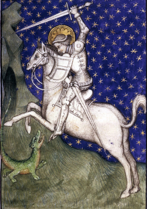
Book of Hours, c. 1415
This is just bullying. There isn't even a princess. That is clearly an infant. Look at that smug look on George's face as he swings his sword that's bigger than the whole little guy. This is the equivalent of when DJT Jr. hunted those sleeping endangered sheep. 1/10
Horse thoughts: ....yikes
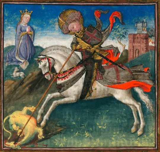
And this is the previous one, but now the baby dragon is cute. He's chubby. He's got toe beans. He's Puff the Magic Dragon. His eyes have already gone white, implying that George is just kicking its corpse around for funsies. What's the difference between the dragon and the lamb in the background? That the dragon is dead, like our innocence. This George is truly deserving of the dumbest hat of all. 0/10 plus one more butthole for the road
Horse thoughts: Perhaps it is we who are the buttholes.
#art history#nonsense#hot takes#I am doing a St. George painting and have been wading through reference material#manuscript#fuck me I didn't notice van der Weyden managed to sneak a butthole in his too#the definitive list#when knighthood was in flower#dragons georg
9K notes
·
View notes
Text
So, from a worldbuilding perspective, wizards have schools, right? It's an easy 1:1 to go from the idea of people who gets their magic from study to the cultural touchstone of academia, and that helps us figure out what institutions and cultural norms are like in our setting.
Correspondingly, clerics have temples, place where their connection to the divine was fostered among a community of fatihful who share their devotion if not their magical gifts. If you were in a d&d world and needed someone with cleric skills, you'd head toward a temple.
But what do Sorcerers have? They're usually presented as one off oddballs or magical oddities but if power exists it's a logical consequence of worldbuilding that there's going to be institutions dedicated to preserving and refining that power.
I'm going to argue that Sorcerers have dynasties, an extended family who share the collective potential for inheriting the magical gift of their powerful ancestor(s). Dynasties would likely be closely tied to the reigning power structure, extended privileges and patronage the same way that noble families are in exchange for their marital support. If you were a ruler in a d&d world, having Battlecasters on hand to shore up your powerbase is just as important as having cavalry and footmen, so you want to make sure the people who are capable of passing down their magical gift are having kids so that their heirs can support your heirs.
This puts a sorcerous dynasty in an interesting position depending on how people in your world think that magic is inherited. Is the gift recessive? Do you breed for it or follow your heart? Are you having too few children or too many? How does that factor into material inheritance? What do you do with all the children who don't show signs of being able to do magic? What if the gift skips a generation or two one of THEIR children show signs of sorcery? Can you let them marry into other families knowing you might be giving away some of your power? Could you use that as a political bargaining chip? How do you handle bastards? What's your stance on monogomy? How do you handle fertility issues? Is the magic waning over time or is it just diluted or are none of your heirs just not living up to your potential? Is there some unadvised ritual or alchemy or dark pact you can make to restore greatness to your line or awaken dormant potential? Does intermarriage with other magical practitioners of different disciplines strengthen or weaken the chance of inheritance? Is there a way to bend politics in your favour to ensure you get this infusion of new blood? Is that baseborn adventurer with the sorcerous gifts a threat to your power or a potential spouse for your firstborn?
All these are brilliant adventureseeds that I don't think I've seen explored all that often. There's only a specific type of player and a specific type of adventure that are concerned with court politics/brigerton style affairs of the nobility, but making those nobles into spell-slinging-sorcerers make them FAR more relevant characters for the background of an adventure.
2K notes
·
View notes
Text
How I save time on backgrounds as a full-time webcomic artist
Hi! I make webcomics for a living, and I have to be able to draw a panel extremely fast to keep up with my deadlines. I draw about 50 panels a week, which gives me about 45 minutes per panel if I want any semblance of a healthy work-life balance.
Most webtoon artists save time on backgrounds by using 3d models, which works for them and is great! but personally I hate working in 3d... I went to school for it for a year and hated it so much I completely changed career paths and vowed never to do it again! So, this is how I save time without using any 3d, for those of you out there who don't like it either!
This tactic has also saved me money (3d models are expensive) and it has helped me converting my comic from scroll format into page format for print, because I have much more art to work with than what's actually in the panels. (I'll touch on this later)
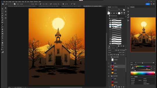

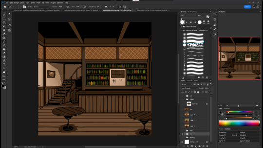
So, first, I make my backgrounds huge. my default starting size is 10,000 x 10,000 pixels. My panels are 2,500 pixels wide, so my backgrounds are 4x that, minimum. Because of this, I make them less detailed than I could or that you might expect so it doesn't look weird against my character art when I shrink portions of it down.
I personally find it much easier to add in detail than to make "removing" details look natural at smaller sizes, but you might have different preferences than I do.
I also make sure to keep all of my elements on separate layers so that I can easily remove or replace them, I can move them to simulate different camera angles more easily, and it's simple to adjust the lighting to imply different times of day.
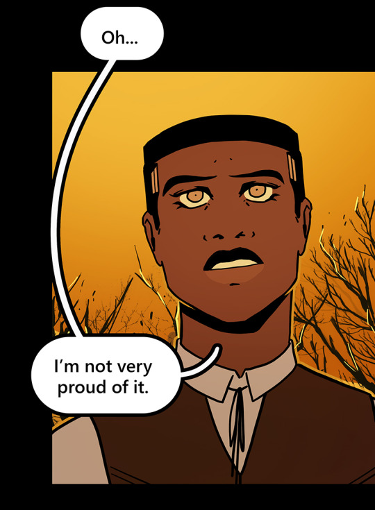

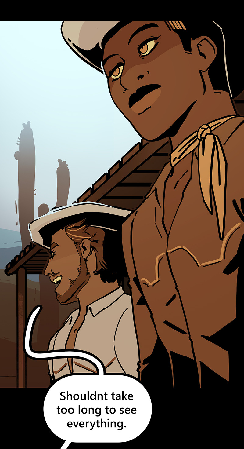
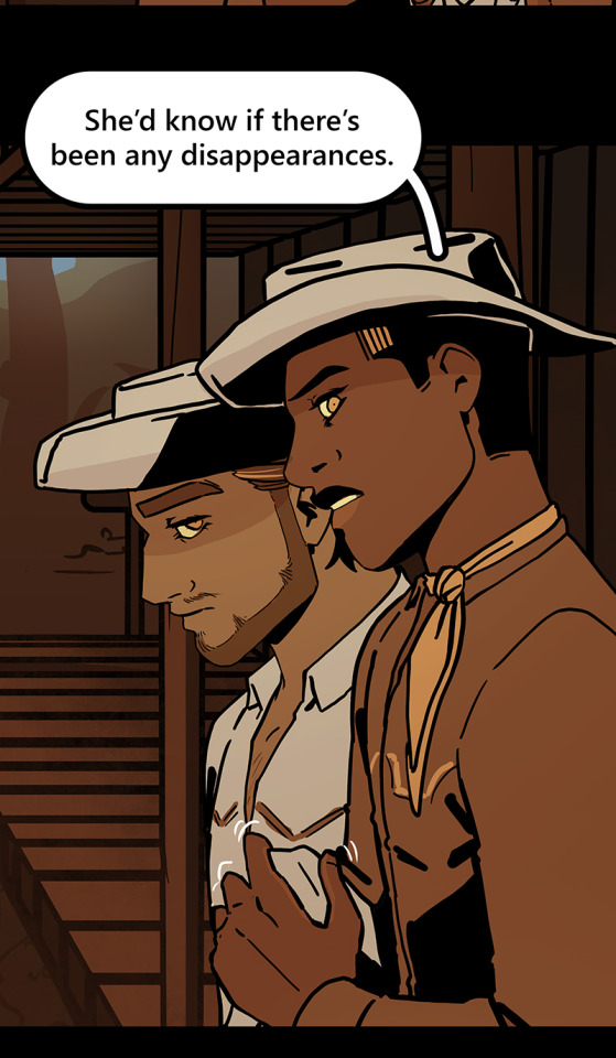

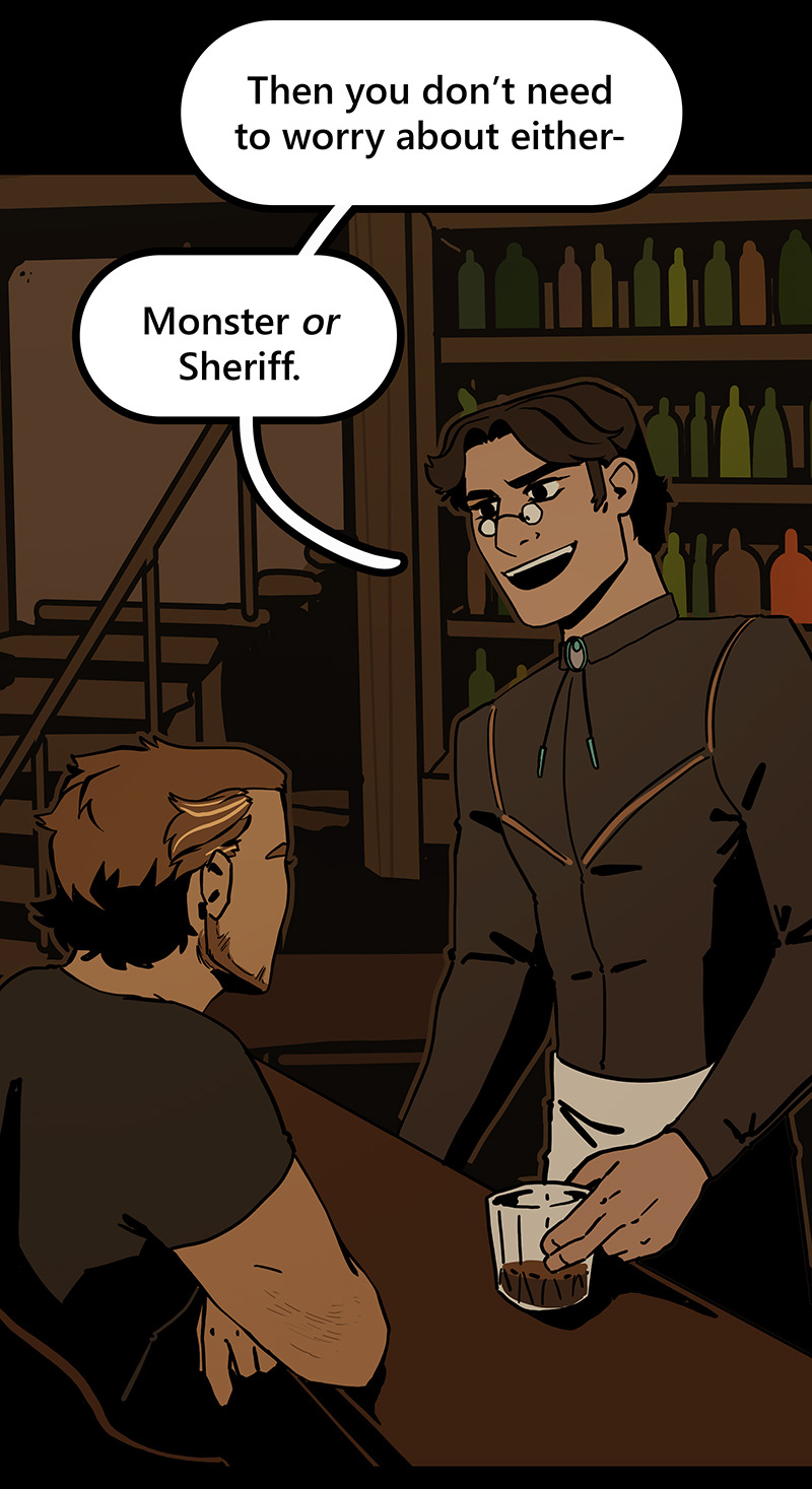
Then I can go ahead and copy/paste them into my episodes. I move the background around until it feels like it's properly fitting how I want.
Once I've done that in every panel, I'll go back through the episode and clean up anything that looks weird, and add in solid blacks (for my art style) Here's a quick before and after of what that looks like!
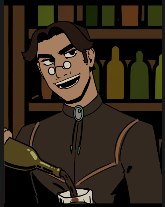
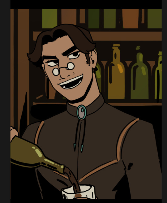
This makes 90% of my backgrounds take me just a few hours. This is my tactic when I'm working in an environment that an entire scene, or multiple scenes, will take place.
But many panels will inevitably have a location that's used exactly once, and it would waste time and effort to draw a massive background for those. So in 10% of cases, I just draw the single panel background in the episode. I save all of these, just in case I can re-use it later (this happens more often with outdoor locations, but I save them all nonetheless!)
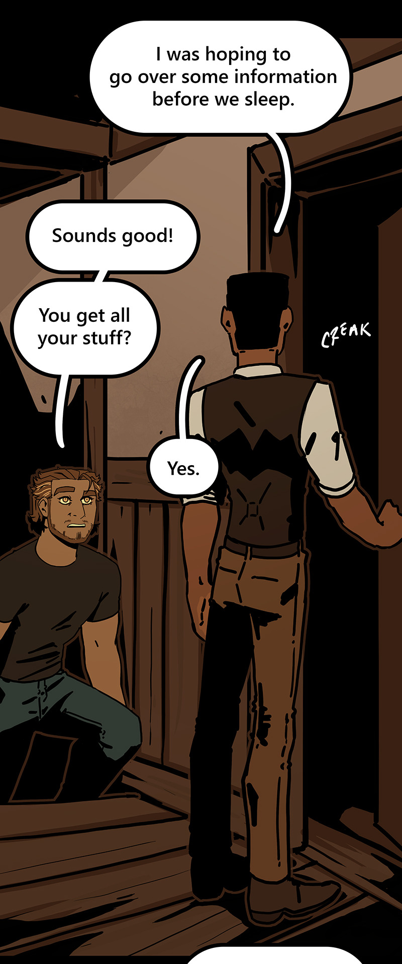
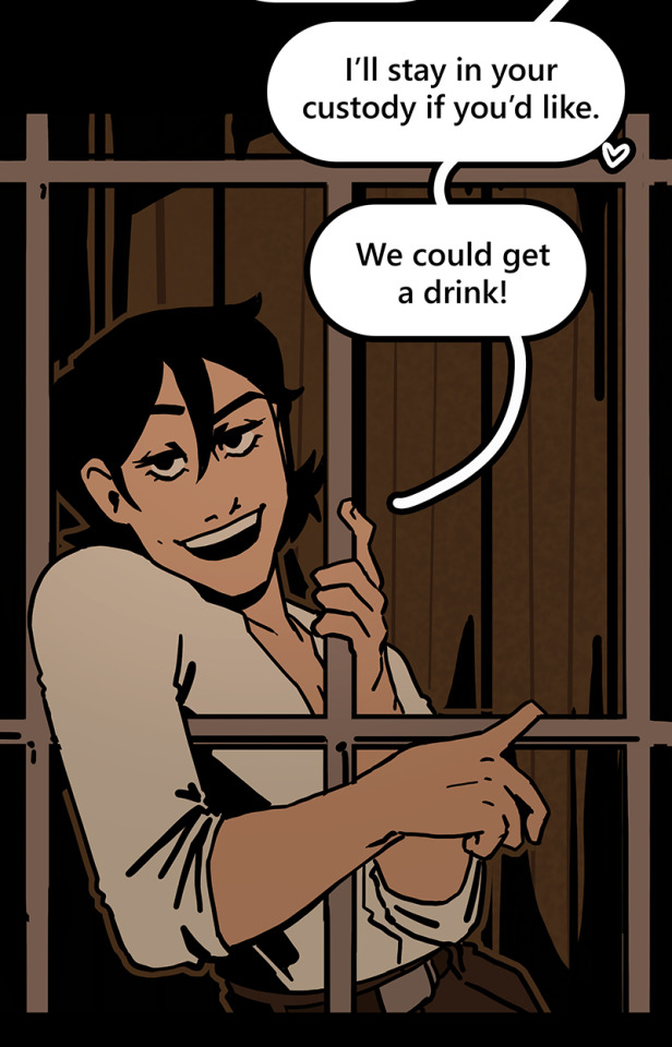
I generally have to draw about 2 big backgrounds per episode, and 3-5 single-panel backgrounds per episode! At the beginning of an arc/book the number is higher, but as the series is continuing and I'm building up an asset library of indoor and outdoor elements to re-use for the book, the number generally goes down and I save more time.
My series involves time travel and mysteries, so there's a lot of new locations in it and we're constantly moving around. If I were working on a series that was more consistent in this aspect, this process would save me even more time!
Like I said earlier, this also saves me a lot of pain and gives me a lot more options as I'm converting from scroll format to print format!
panels that look like this in scroll format...

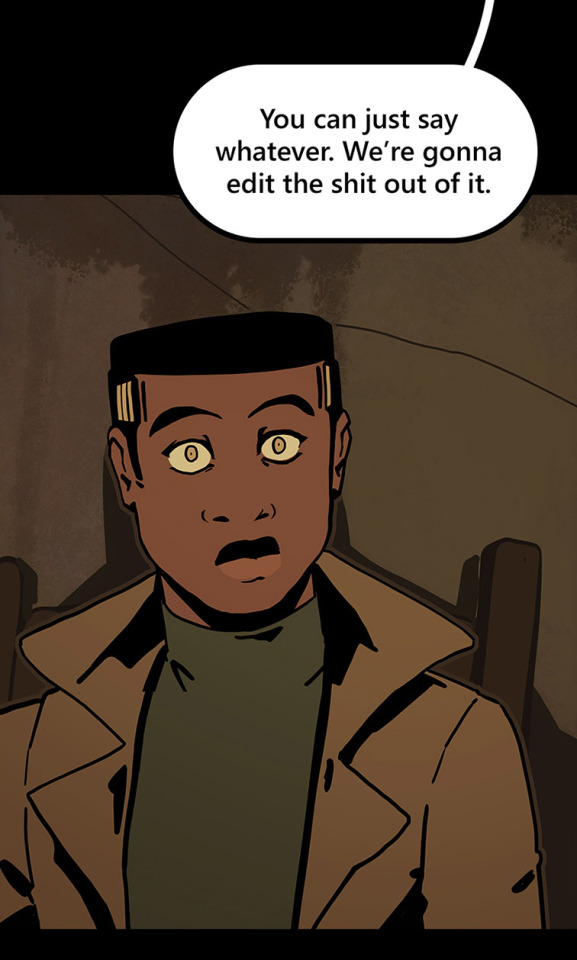
can look like this in print!

because I drew the background like this, so I didn't need to go through the additional effort to add in the extra detail to expand it outwards at all.
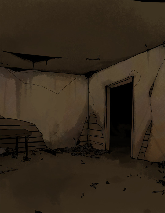
Anyways, I hope this helps someone! As always if it doesn't help, just go ahead and disregard. This is what I do and what works for me, and I feel like I only ever see time-saving tips for comics that involve 3d models and workflows, which don't work for me at all! I know there's more people like me out there, so this is for you!
Enjoy!
Also obligatory "my webcomic" if you want to see this in action or check it out!
#webcomic tips#webcomic making#comic tips#comic tutorial#art tutorial#art tips#time and time again#my ocs#digital art#ttawebcomic#hmmmm....#longpost#yeah it's a long post#I'll claim this one#lots of images#I hope this helps#I'm always worried when I make some kind of guide or tutorial people are gonna get mad at me lmao#I'm not saying 3d models are bad to use!!!#I just dont like them!#my brain doesnt work like that and it feels SO so so so tedious to me#TO ME PERSONALLY!!!#plenty of people see 3d models as a total lifesaver#and that's perfectly fine!#but yeah I don't see tutorials about saving time in comics that like... dont... mention 3d models...#like what about me and the other extremely particular girlies who hate 3d#anyways#yeah#just hoping this helps#nothing against 3d at all#I mean. ok personally yes against it cause it sucks for me to use
1K notes
·
View notes
Text
In celebration of reaching 900 followers!
Ever since I started playing the Globetrotter challenge by @moonfi; I've been creating a collection of UI Widget style templates. This collection includes 20(ish) different templates for you to use in your gameplay screenshots. I'm hoping I did my best to make this as user-friendly as possible; but if you have any questions or notice something off - don't hesitate to message me or send an ask!
[Terms of Use] Do: Use & edit as much as you want and/or know how to. Don't: Reupload & claim as your own. Do: Link back to this post if asked where they're from.
[You Need] Fonts: April | Lemonmilk | Kids Handmade TS4 Icons: deathbypufferfish | w-sims | TheSimKid (I've had L'Universims' icons before they were hacked but as far as I know they've moved to a new website so download from there at your own risk.)
DOWNLOAD (SFS) 66.3mb **FIXED** (Missing moodlet)
ALT DOWNLOAD (Mediafire)
[Tips & Hints]
Open the awkwardwhims psd collection file in Photoshop, then drag & drop the folder or group of templates onto your image.
The photo album template was inspired by @folkbreeze (definitely check out their resources, they're all so nice!) & other various examples I saw online.
Resize the template by selecting the folder as a whole; resizing individual layers may makes things unaligned.
Feel free to change background colors/fonts/etc as much as you want.
The text message template has 3 styles: sender, green receiver & blue receiver. There are also reaction icons & a separate reaction bar.
For the to-do list template I didn't include every aspiration icon (I was trying to keep this file as small as possible) but you can download this pack by @deathbypufferfish that has all the aspiration icons you'll need. However, it may be missing some of the newer aspiratons.
When adding photos (album cover/recent photos/etc) use a clipping mask.
The weather template includes all the different weather icons, so be sure to hide/unhide the one that applies.
For the new transaction template, make sure to only change the number of the price otherwise the Simoleon symbol will get changed to Times New Roman.
The notification message template is for life events, bad events & default game notifications (ie: legacy player, etc).
DOWNLOAD (SFS) 66.3mb **FIXED** (Missing moodlet)
ALT DOWNLOAD (Mediafire)
@alwaysfreecc @maxismatchccworld
2K notes
·
View notes