#I'm designing an embroidery file
Explore tagged Tumblr posts
Text
twitch_live
today's challenge: Goncharov
#sbs games#except not really#this is not gaming#so much as it is...programming?#graphic design?#I'm designing an embroidery file#to use on my library's machine#join me if you want
16 notes
·
View notes
Text
I usually don't post about music or cosplay on my main, but check out this mask I made to see the Ghost movie in. The theater doesn't allow face paint or costume masks, but allows PPE, so I made this!


I think that if I made this mask again, I would size down the embroidery file on my machine and I would place the pattern for the mask a little differently over the embroidered fabric.
It easily fits over an n95, which is great since I'm attending a sold out showing.
#ghost bc#the band ghost#rite here rite now#sewing#I've been costuming a lot recently#which makes me happy#I'd hit a rut a while ago and I'm getting back into it with smaller projects#I had so many issues designing the embroidery file for this too#but it turned out great and I think it reads quite well
8 notes
·
View notes
Text


Since it's now @raposabranca's birthday and they've opened it, I can now share this Josephine embroidery I did for them! I'm pretty happy with how this design came out, even with some pretty small sections :) Once I've cleaned up the file and written a tutorial I'll eventually add it to my embroidery patterns for sale too.
#dragon age#dragon age: inquisition#dragon age embroidery#embroidery#my embroidery#josephine montilyet#josephine#dragon age art#FanFriDAys#my stuff#my art#ramblings
172 notes
·
View notes
Text





World Champions | Artwork for World Champions by TheDefenestrator by TheDefenestrator, art by Blurb_brain
Fandom: The King's Avatar | 全职高手
Rating: Teen And Up Audiences
Category: Gen
Words: 71 944
At the end of season 4 of the Glory Pro Alliance, the government finally receives the information it has been waiting for: The other players have caught up. Or, In which Glory has been a government recruitment ploy for remote-piloted mecha operators all along.
About the Book
FONTS: Mundo Serif, Azonix [dafont], Segoe UI Symbol
IMAGES: Illustration by Blurb_brain [AO3]; cover image by NASA ID: 440611 [Rawpixel]; Planet Earth background ID: 6331593 [Rawpixel]; Circuit lines background ID: 3117935 [Rawpixel]; endpapers' image by Eric Eastman [Unsplash]; Swoksaar, Desert Dust, Lord Grim, Vaccaria, and Cloud Piercer [The King's Avatar Wikia]
MATERIALS: regular printer paper (8.5"x11", 96 bright, 20lb), 80pt bookboard, Iris Bookcloth (colour: Black Pearl), Neenah cardstock (8.5"x11", bright white, 65lb), waxed linen thread (white, 30/3 size), embroidery floss (shades 3750, 350, 3845, 370), leather cording (1.9mm diameter), Reeves’ acrylic paint (Mars Black, Phthalo Blue, Titanum White), Americana acrylic paint (glow in the dark), ph neutral pva glue (Books by Hand)
PROGRAMS USED: Typeset in Affinity Publisher, cover/title page/endpapers designed in Affinity Designer/Photo, QR codes generated with LibreOffice Writer, PDF arranged for printing with Bookbinder-JS
BINDING STYLE: quarto, case bound (slightly rounded, with oxford hollow, forgot to use tapes)
.
Fenes' "Glory's tech isn't handwaved" AU. This was great! Funny and creative, and I'm both amazed and full of admiration for Fenes' ability to juggle so many characters.
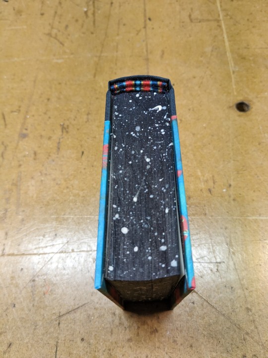
I was feeling excited and ambitious with this one. Tried some new fun things (double core endbands, painted edges) and used some new equipment (a lying press).
The Text
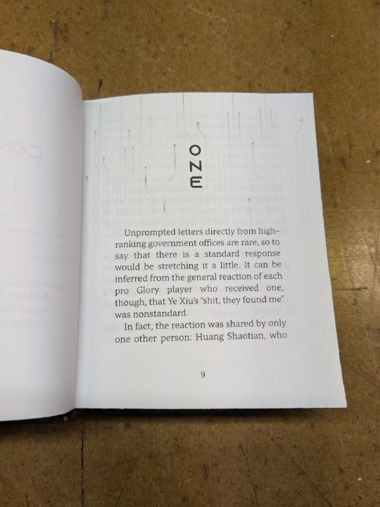
TITLE/HEADINGS FONT: Azonix says 'SciFi' to me, it's a bold, non-serif, sleek font.
BODY FONT: Mundo Serif, it's a decent serif body font I haven't used before. Felt like it worked with Azonix.
SCENE BREAKS: a special character in Segoe UI Symbol of a black & white icon of Earth, the globe showing Asia.
TYPESETTING: Finished typesetting the fic, left document open on my laptop, laptop's battery failed, file now crashes immediately upon reopening, issue persists with copied versions of file (; ̄Д ̄) . Thankfully I had a backup file for the typeset with the barebones of the text, so I didn't have to restart from scratch...
Title Page
My thinking: it takes place in space, the world's at stake, and it's the dawn of a new horizon for Earth. Glory and the titular champions are represented by Swoksaar, Desert Dust, Lord Grim, Vaccaria, and Cloud Piercer – the captains of what I'd call the 'big 5' teams. A circuitry board background element hints at the tech/mecha nature of the story's competition. It may not match Blurb's art, but I hope I was able to convey some of what the story is about.
The circuitry image is used as decoration throughout the book. I only used the avatars of the top five teams' captains because too many silhouettes would lessen their impact and readability. (Removing the backgrounds was tedious, but worth it.)
Here's what it should have looked like. The test prints for this and the BB art were fine, but I think my inkjet started running out of ink just when I printed the final copies and I didn't reprint them. (Too impatient, really wanted to finish up and read the book)
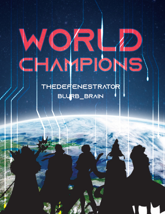
The Cover
World Champions is another Big Bang fic, and once again I based some of my design choices off of the accompanying artwork. The dominant colours of Blurb_brain's illustration are red and blue-green.
COVER PAPER: For the decorative cover material I used NASA's ASTER image of Poyang Lake. NASA has some really interesting photography some of which remind me of marbled paper, thought it could be interesting. I chose this image of Poyang Lake because 1) it's in China, 2) the colours were similar to Blurb's awesome illustration (fate strikes again, dropping matching images and artwork into my lap!), and 3) NASA is tangentially relevant to the fic, which takes place in space.
BOOKCLOTH: Verona bookcloth in the shade Black Pearl, a lovely dark navy blue colour. Thought it suited the cover paper and title page. (Bought it for this fic specifically, but the colour goes well with almost all of my decorative papers so it should see a lot of use in the future!)
Endpapers
The final decision that held this project at a standstill for two months. In the end I drew inspiration from the matchups against the final opponent in the story. The image I used is a little chaotic and a little too unrelated to identify why I picked it without an explanation, but this book is for me and I know why, so there. (Note that I played around with the colours and cropped the photo.)
Endpaper inspiration: the maps for the matches against the Infilhites
"a long bridge through an enormous tube-like hall, where light seem to come from every side through stained glass windows. It was visually confusing, limited lateral motion" "a warehouse, crates stacked on and beside metal racks that went all the way to the ceiling." "a house of mirrors, fully enclosed to be sure the Infhillte couldn’t fly out of it." "like a volcano, rivers of lava moving sluggishly down a slope, occasional vents of overheated air nearby." "a series of overlapping bridges between halls and stairways, level after level layered over an open abyss."
Trimming & Painting the Edges
Going all out, a 2-for1 deal: the opportunity to use my lying press for the first time and learn a new technique!
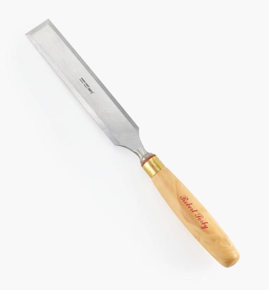
TRIMMING: Used a paring chisel and lying press.
CHISEL: The 1.25" wide paring chisel I used was form a modern manufacturer. (Vintage paring chisels are very thin, enough so that you can bend/flex the blade. But don't do that.) It's long and wide blade made it easier to register against the surface of the press for consistent cuts. Looks like this one below from Lee Valley.
LYING PRESS: My dad's project. Solid black walnut, hand carved screws and internal threads — he even made the tools to make the threads too! The jaws of the press are each 3 7/8" wide. It's big and heavy (though much smaller than full-sized professional ones omg), but there's enough of a flat surface to register the chisel against. A thicc boi, much like this one below from Bookbinding Supplies.

PAINTED EDGES: The idea was to have dark navy edges, speckled with white stars. I used acrylic from a tube to paint the edges — tutorials recommended it over liquid bottled acrylic, and I had an old set hanging around. Had to water it down because otherwise the paint just flaked off.
My test of trimming and painting went well. Then the trimmed book itself came out slightly crooked, the paint required significantly more watering-down than before, and the white paint did not want to be both opaque and speckle-able. Unfortunate, but still book-shaped! And now I have an idea of what to do differently next time.
Also, did not like the glow-in-the-dark paint. Looked too translucent in the light when compared to the white acrylic, and needed a thicker coat to be visible in the dark. (The thickness combined with the translucence and base colour kinda reminded me of boogers... Ended up scrapping most of it off, so there's not much left to glow.)
Endbands
Still in the mood to have fun and go all-out, I attempted double-core endbands for the first time.
TUTORIAL: YouTube @ BookbindersChronicle: Bookbinding 101 Sewing Headbands Session 2. Also watched @ DAS Bookbinding's Double-Core Endband // Adventures in Bookbinding, but I personally found Chronicle's closeup video easier to follow.
I used embroidery floss from a 100pk of assorted colours off Amazon, wrapped around a core of 1.9mm leather cording from Michaels. I drew from Blurb_brain's art for the general colours, choosing a dark base, with red, blue-green, and gold. The specific shades were picked to go with the cover.
#World Champions#TheDefenestrator#Blurb_brain#qzgs#tka#the king's avatar#fanfiction#bookbinding#fanbinding
103 notes
·
View notes
Text

You did not break me. I'm still fighting for peace
Text on a picture as well as a title of a work are taken from a song “Elastic Heart” by Sia. Although strangely enough, while I like an original version, I think a rock cover of it by Written by Wolves suits this pairing just as well)).
For a better resolution of a picture (since Tumblr tends to lower quality of big files) follow this link to DA.
Figuratively speaking, I always tend to jump in a last car of a departing train and this time is no different (I started working on this picture when there literally were two weeks left till a deadline). So, I really hope that I was on time to post this entry for @pastelpaperplaness DTIYS challenge, heh. If not, this work can be considered as a gift.
I am a huge fan of TFA and fan works based on this show in general. It’s always so inspiring to look at so many original ideas and concepts people create around such awesome (and well aged) projects. Hence why I tend to follow artists and their AUs in order to see their interpretations of beloved characters. And Pastel’s Thorns and Thrones AU is no exception. I mean, cmon guys, a fantasy AU about TFs - what else to add here))?
Such challenges as this DTIYS are fun to participate in since it’s a nice opportunity to try new techniques, especially when people are given freedom in such matters.
Umm,.. I kinda got carried away as you can see, heh.
In the end I tried to combine characters’ designs with a realistic approach to drawing metal, skin, clothes and etc. + added just a couple personal details such as an embroidery on attires. But I hope that Pastel won’t mind that since she’s given people an opportunity to “stylize to their heart's content and be as creative as they want”.
Coming back to an idea behind Thornes and Thrones AU and how I tried to show it in this drawing:
It’s always very delightful to see Megatronus and Sir Orion being flirty, hugging, kissing, simply spending nice time with each other. But what personally I value behind this relationship is a sheer impossibility of such love, the tragedy of these two men falling for each other under such unfair circumstances. Both characters are dedicated to their causes and none of them can easily break rules of a cold world they live in.
In the end of a journey, all that’s going to be left is a suffering caused by unspoken truths. This consuming feeling of a betrayal is akin to shrubs growing around and through a soul, stabbing it with thorns and permanently scarring it…
But if both can just try to “fight this war” with themselves and their desires “without weapons”, to finally raise a white flag,..
… one will see how such pure love is capable of blossoming as a marvelous flower, freeing characters from pain in their connected hearts.
If only this love’s given one chance of becoming true.
P.S. All in all, Pastel, thank you very much for an opportunity to participate in this challenge of yours. Happy 10.000 followers, you deserve it!
#pastelplanesdtiys#GN projects#transformers#transformers animated#optimus prime#orion pax#megatron#megatronus#megaop#fan art
121 notes
·
View notes
Text
Now that most big dates have passed, I'm excited for the summer :)
It's always so interesting, the feeling of 'I'm done with the school year so I can start learning now' ^^' But it's so much easier to be healthy and curious on my own. Wish they'd just let me do whatever + the freedom to bother teachers as much as i wanted, and give me a degree based on the quality of my portfolio lol


For the rest of june, I've been challenging myself to wrap some stuff up, so I can start fresh on the next chunk in july!
✔ rough schedule for july
✔ finish drawabox lesson 3
✔ finish Duolingo Hebrew/Chinese units
✔ finish Korean book chapter
✔ deep clean my room ✧ the kitchen ✧ my files and images
✔ sew on previous embroidery project and set up the next
✧ wrap up the modeling and texturing part of my 3D model, ready for rigging ~
✔ watch/read only 'watch later' videos and posts
Here's some of the video essays from channels I overall recommend! These long form vids sometimes take me like a week to get through lmao but it works well while doing tasks like this week.
> Kawaii: Anime, Propaganda, and Soft Power Politics Moon Channel
> how dark mode killed good design Answer in Progress
> Analyzing Every Torture Scene in Call of Duty — All 46 of Them Jacob Geller
> Bardcore : Neo-Medieval vs Actual Medieval Music Farya Faraji
✧ respond to asks and tag games finally
✔ make the most of the rest of free trial hip hop dance course lol
11 notes
·
View notes
Text
An absurdly and unnecessarily over-the-top and thorough breakdown of using my embroidery machine for a cosplay piece.
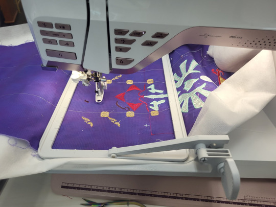
Part 1) The piece:
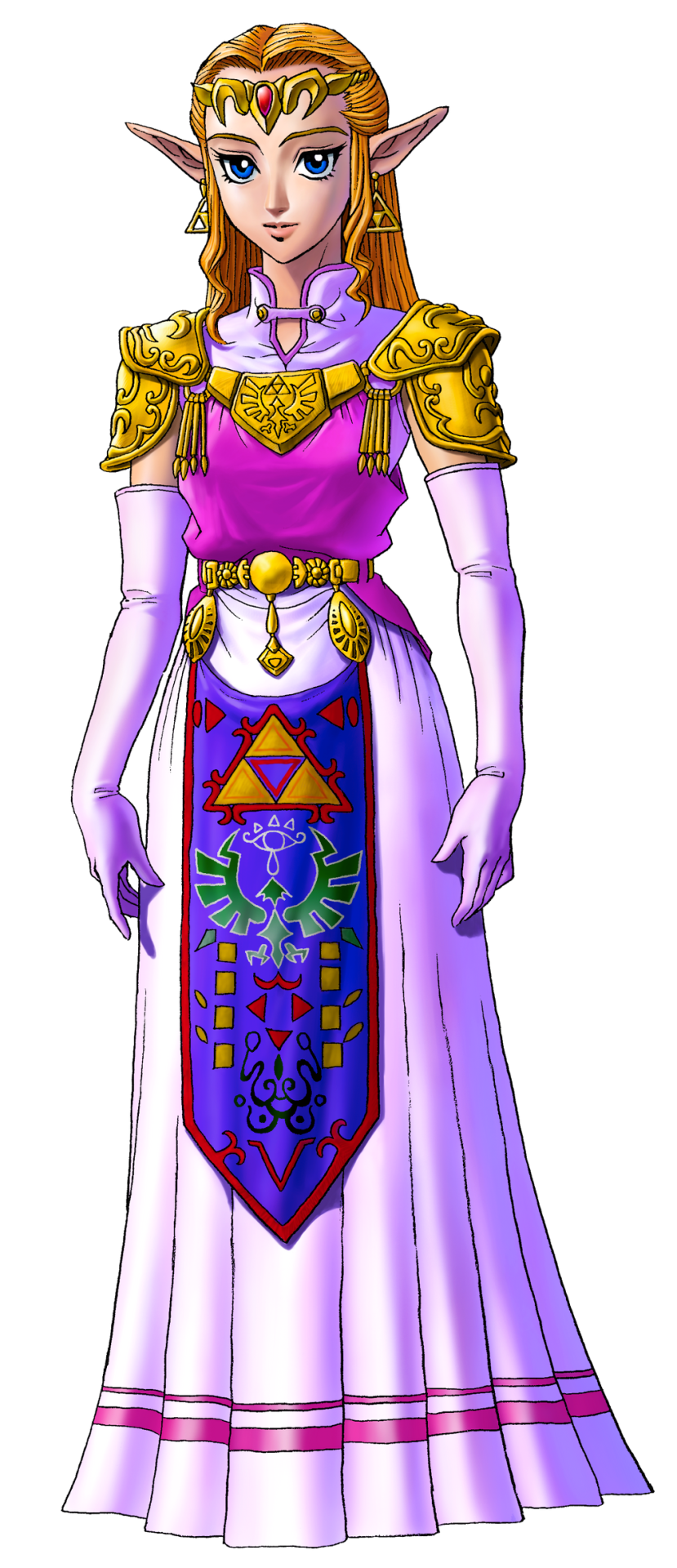
Many iterations of Princess Zelda from the Legend of Zelda series has this tapestry front piece. I've looked for a technical name for this piece as well as extant examples of it from our history, and my research is indicating that it's just a fantasy piece and doesn't have a name.
So we're calling it an apron. IDK. "Heraldic apron," sounds fancy enough.
One of the things that's been a bitch through all cosplay of all time is custom textiles. Since the early days of cosplay, we've been looking for ways to handle this at home. Back when I got into cosplay and took it really seriously, Worbla hadn't been invented, there was no Friendly Plastic, Wonderflex had to be purchased in 15-yard lots, the Glowforge and home 3D printing was just a fantasy, and Cricut machines ran off cartridges and couldn't design from your computer. Also, when I was cosplaying seriously, I was a college student with no job and a $100/month allowance for food (which I spent on cosplay, mostly). We didn't do fancy shit. You know what we did?
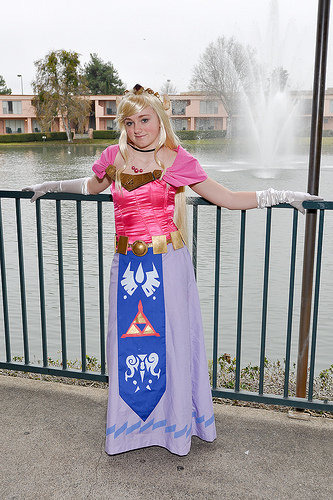
We had fuckin' hand-traced and hand-cut stencils. Mother fuckin' freezer. Paper. Stencils. Now, this version of Zelda that 2009 Me is cosplaying up there does have a much simpler heraldic apron than Ocarina of Time Zelda does. However, since I've gotten access to embroidery machines, I've had this great need to remake this sort of concept with adult me's current budget and skill set.
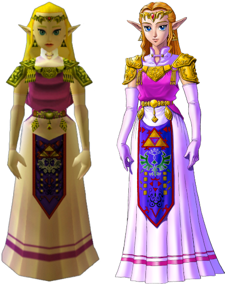
Now, there's a few issues from the start about making this. The notable one is that the in-game textures for the apron do not completely line up with the official artwork. When you start looking at the 3DS remakes, they re-textured the apron, giving us yet a third canonical way that this thing might be laid out.

Obviously, the easiest thing to do is to get several references, and then to slap them next to each other and compare. I've got GIMP pulled up here, and have several versions here. I adjusted color levels until the pattern in the garment was as clear as I could make it. There's horizontal guide lines going across to divide the apron into sections. We'll call those sections thusly, top to bottom: Triforce, Eyeball, Bird, 8 Rectangles, and V.
***
This is going to be long and boring. I have my reasons for writing a long and boring post, but sadly, I'm not able to share them without becoming un-boring, thus defeating the purpose of this work.
***
I forgot to label them, so that reference image is, from left to right: N64 screenshot, 3DS screenshot, N64 character model, small inset at the bottom is 3DS, official artwork that was released alongside the N64 game, a heraldic tabard, some official rendering of the Hylian crest, and another 3DS screenshot.
Some are pretty self-explanatory, and some are more open to interpretation. Notably, let's take a look at the Bird section. The official artwork and the 3DS remake both distinctly have the Hylian Family Crest there. The N64 version has a very distinctly different bird thing.
So, I had to decide, which one do I put on my apron? I had to consider several things, but one of them was the process of how game textures from the N64 era were made. Textures for this game were very small image files, smaller than your 2009 cosplay.com forum avatar. The reference art would be made and then other people would be in charge of turning that art into a usable texture file, so there was artistic license involved in adapting that. This game was released before the Hylian crest had been used in multiple places across several games. Therefore, we can justify making the assumption that the texture artists didn't have an understanding of how important it was to keep this part the exact shape it was, and turned "stylized bird" into "stylized bird" in a way that would read clearly on screen at 45x100 pixels. We can assume this to be the case, because, when Grezzo did the 3DS remake, their texture artist used the Hylian crest instead of the OoT bird thing.
***
Sorry for all the embroidery stuff in the past few days. I've attracted the attention of a couple people online and embroidery seems to bore them, so we're doing that for a little bit until I stop being interesting.
,***
Cosplay has a spectrum of screen-accuracy to full-nonsense. In some things, you can do screen accuracy very well. Screen-Accurate Princess Leia from EpIV is pretty easy to make look good. Sometimes, you can do full nonsense pretty well, too. Princess Leia, but in if Star Wars was steampunk, also pretty easy to make look good.
Some things aren't as easy to make look good when you're doing screen-accurate. Sephiroth's hair in most of the Final Fantasy games stands up off his head by like 30% the height of his face. If you math that out, you have a wig with 5" antennas swooping up in the front. When you put that on a head, it looks silly. Do you want your Sephiroth to look silly? No? Then you need to do something about that hair.
My cosplay rule that I try to stick with is this: If you need to make a decision between what is "accurate" and what looks good, you pick what looks good. As long as the character reads as the character when you're done, it's better to look good than to be accurate.
And this is why, instead of just tracing any of these aprons in my embroidery software, I broke out a pen and drew the whole thing out.

Actually, I drew half of it out. The left half to be specific. I know that I'm going to mess with this later on my computer, and I know that I want the thing to be symmetrical, so let's save everyone (mostly me) some trouble and just do half of it.
Why was it important to me to draw it full size? Remember, that texture we're referencing is less than 100 pixel wide. The final piece is going to be full size, so there's a lot of things that just don't scale up easily. We're basically going from a texture the size of my thumb nail to something that has to be more high-def than 8K. This basically meant that I needed to redraw it from scratch to get that resolution. Lots of little details are going to have to be added, and I'm much better at adding them with a pen than I am just guessing while I'm digitizing the file to embroider.

So, I took it, pulled it into GIMP, and made some adjusting. I mirrored it so that I have both a left and a right side to work with. I changed the contrast so that I could see the lines better. I didn't like the Hylian crest that I drew so I just plopped the official SVG onto it and dragged it around until it fit.
And then, and this is kind of important, I cropped the image so that it's the exact proportions that I want the final thing to be. My whole design is in this file, and there's no outside image. This is important, because I'm going to use this as a template to trace in MySewnet, and the easiest way to get the background to behave properly is to pre-set it to the exact size you need in another program. Good thing this software isn't stupid absurdly expensive, or else the fact that you needed to do that would be really annoying.
The digitizing process:
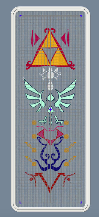
Okay, so the first thing that I do is to make a custom hoop the size of the finished project. There's no way that I can actually stitch this out this big, because a 25" long hoop doesn't exist anywhere, but it's way easier to design all of it and then split it up than it is to design in pieces and then fit them together. I open the hoop in the digitizing software and load my template as the background.
Digitizing from a technical viewpoint is really simple: you click points all around the area you want to make a shape, and then you hit "make this thing", and then it renders the thing. You can then give that thing a different kind of fill or line. Easy.
So instead, I'm going to go into the art part. Because yes, I've already drawn this whole template, but I haven't figured out how to fill each of those shapes. This isn't like a coloring book where I can just fill a shape with color. Embroidery means that I have to pick how exactly I fill all those areas.

First up, I have the legendary Golden Triumph Forks. The Magical Eating Utensils. I wasn't super sold on how this was rendered in the official art. We can vaguely see how, in the game art, it looks a little more like a red outline with corner flourishes, rather than what we got in the artwork. I probably should have looked up some historical flourishes from time periods in world history where technology matched the apparent technology of the world of the Legend of Zelda, but I just kind of picked a random frilly shape.
The Triforce is one of the most important symbols in Zelda, so I knew that I wanted it to be a bright shape. This meant that I wanted to fill the shape with stitches in such a way that none of the purple backing is showing through. In embroidery terms, this usually means either a full pattern fill, or an applique. I picked applique, because this is an easy shape to applique. I knew from the start that I was going to use metallic tissue lamé. Lamé's great for a lot of things, but it's weak and shows creases. To avoid that, I wanted to put in a fill stitch to support the fabric and prevent damage, as well as hiding any big creases. I picked a big and open motif fill that will still show a lot of the applique fabric.
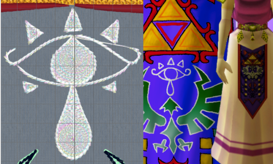
Eyeball:
So this is, specifically, the Sheikah Eye. It's an important symbol in the series. The Sheikah stick this eye on pretty much everything. However, it's not a fancy, gaudy, ostentatious symbol.
I grabbed a motif line at random from the list of motif lines, and happened to like it. It's a very heavy stem stitch that goes over each stitch 4-6 times, making a big, raised area. To make sure the eye was visible, I filled in the iris, teardrop, and eyelashes. I picked an opaque spiral fill, because it's a circle and these general shapes are circles. A while back, I bought some metallic white "iris" thread, and thought that a subtly-iridescent white would fit nicely.
Those little eyelashes at the bottom that aren't there in the art? Well, there's there in the game render juuuuust a little bit, and also they fall into "if it looks better that way, it's the correct way" mentality.
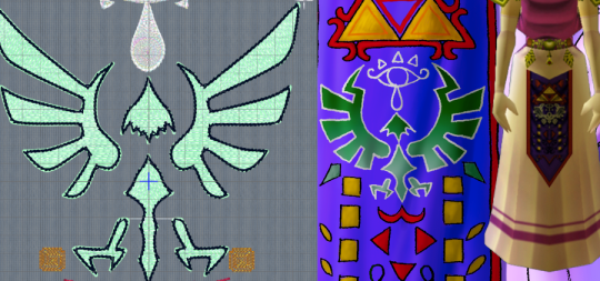
The Hylian Crest.
Fuck this thing.
All you need to know about this is two things: 1) I just traced the SVG that I found on the Zelda wiki, and 2) I didn't plan on stitching it out with black outlining. That black outline is just there to confuse my software into doing what I want.
Since this is as important as the triforce, I knew I wanted to do it in silver lamé. That means all of this is an applique. Quick tip: if you're going to be breaking a design into smaller segments, don't do any applique so big that it has to be spread over two segments.
Ask me how I know.

I originally had this filled with the same chain stitch that I used on the Triforce, but it made things look very samey and very mushy. I later switched it to a triangle-shaped spaced fill. I selected the triangle as the correct shape by clicking every shape one at a time and seeing what they looked like. Since this was going to be a running stitch on a shiny applique background, the fine details don't really matter. You actually can't see them normally, which is why I had to change the color here.
The outline there is the same stem motif that I used in the Sheikah eye. I found that it's wide enough to cover an applique edge without having to look like a satin stitch.
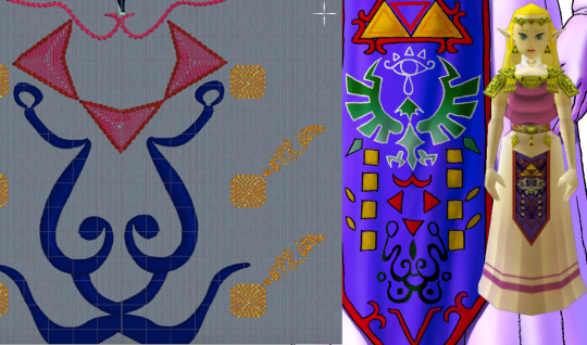
Squares, Triangles, and the Face Thing.
I have no idea what that face thing is supposed to be and apparently neither did anyone else on the internet. Since it just kind of looked like a scribble, I just rendered it as a scribble. I used a satin column so that it could have line weight similar to a drawing with a paint brush, and the shiny satin line would look like wet ink. Also known as phoning it in.
The triangles are filled with a contour fill that just traces the edges of the shape. I left some space between the lines so that the purple background can show through. This gives is sort of an optical illusion of movement. The outside of this was originally that same stem motif line from before, but after I stitched it out, I realized ti was too heavy. The final version had the same motif, but smaller, and with fewer repeats of the stitch.
I'm so damn proud of those fucking gold boxes. Okay, so, let's look at the design. Why are there gold boxes? What do they do? What do they mean? Do they represent the eight dungenons in the original game? Nope, because there were nine dungeons in the original game. Are they the eight sages? No, because there's seven sages. Is it what happens when you average the number of dungeons and sages out? I don't know. Anyway, they looked stupid just being little gold boxes, so I gave them blunted corners. I did another contour fill because I wanted them to lie flat on the finished apron and not draw any attention to themselves. As for the little tail, folks, I discovered a technique and I'm FULLY READY to abuse the heck out of it. So, I traced the lines with a satin column, ready to try to mess with the spacing to see if it'd lie flat with enough work. I hit "convert to tapered motif" by complete accident, and it was kind of cool. So, then, I went through the various motif options, found some cool looking scrolls, hit "fit to line" and slapped those in there. And I think that the little tails being written in some weird language I can't understand is SO COOL. I love how this part looks and I will not be taking other opinions on it at this time.

The V.
I didn't like how either of them looked in the original, so I just kind of winged it. I was getting bored at this point so I took a pattern fill that was supposed to be linked chains, and then I twisted it around until I was the least bored I could be with it. Again, I went with the smaller stem stitching on the outside.
Those little tails on the circles there are also filled with the scroll as tapered motif thing. If you go for this, don't forget to run the "delete short stitches" filter or else there'll be like 1100 unnecessary tiny stitches in your motifs. Ask me how I know.
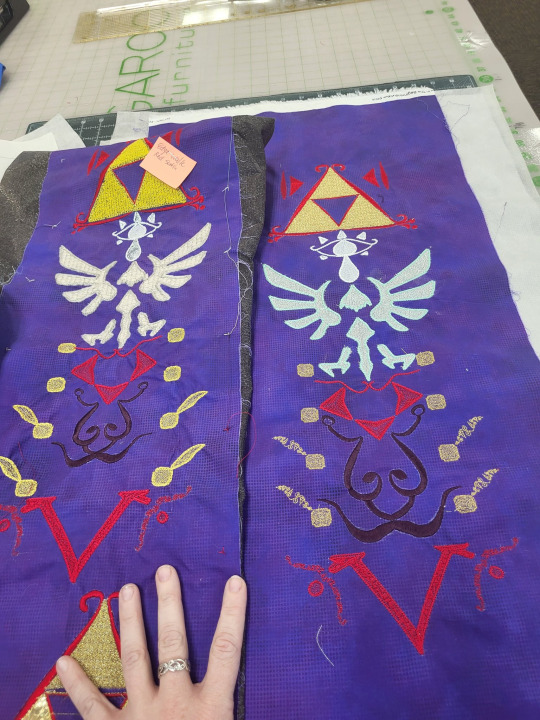
Now, we learn by making mistakes, and the best way to make mistakes is to just jump in and wing it. On the left, we have the first version of this that I tried. On the right, we have the second version, which is the one I'm going to use. I've made a couple of adjustments to the file since that final version, so if I make it again, that'll be just a hair better.
So, for starters: backing fabric. I liked the movement and texture on this subtle dot tonal better than a solid purple, so i used that for both my test and my final project. The main drawback with using a printed tonal instead of a dyed solid is that the back of the printed fabric is still white. On some things, specifically the area around the satin stitching on the ink face thing, you can see subtle white haloing where the stitching's displaced the background. I don't like it. No one else seemed to notice or care.
I knew that I'd be doing this in my endless repositionable hoop, but I hadn't taken into account that I'd be doing it in the endless hoop sideways. The endless hoop expects you to go from top to bottom, and my design goes left to right. This means that I have to fight the fabric around the clamp of the hoop. The endless hoop also doesn't hold things as tightly as a regular hoop does. Because of the way the fabric is moved through the hoop, a fusible or sticky stabilizer has to be applied to the fabric before, instead of being hooped with the fabric. All of this meant that I just didn't get the support that I needed on the first go around. You can see this in the way that the fabric has bunched up around the 8 boxes. For the first round, I used some fusible no-show mesh stabilizer. It wasn't wide enough, so I had to cut it in chunks and apply it sideways. For the second round, I used two layers of Power Mesh (same stuff but different brand) as well as a layer of light+tacky paperless sticky tear-away. I really hate that light+tacky stuff so ti's exciting to finally use it up.
My first trial was mostly to see if I could make the endless hoop work like I wanted it to. In this trial, I learned a lot of things. I kept the computer nearby to make changes as I noticed them. When I was done, I looked at what I'd made. I didn't like all the proportions in all of the design, so I dragged some stuff around in the file. This was when I realized that the heavy stem stitch motif everywhere was looking clunky, and reduced or removed it from several places. I changed the fill of the Hylian crest to the triangular fill. shout out to anyone from That One Anonymous Message Board who made it this far in this post to try to prove how deranged I am. You've got a lot of time on your hands, don't you? I completely changed all of the instructions to tell the computer how to do the applique on the Hylian crest (which I STILL got wrong), and added some aligment stitches to help with the applique process. This was when I changed the color of the outline in the software. Ideally, you should now be able to lay the applique down as one fabric, let the machine sew the whole thing, and then trim it. This is important, because that applique spreads out over two hoopings, so it's kind of a mess. The secret to making this work is for hooping #2 (eye and top half of crest) to stitch out the eye BEFORE the applique, so that the whole fabric can be placed over the completed eye. We learn.
Once it was all combined and digitized, it's important to render all the digitized elements as stitches, and then do a bit of cleaning up.

Notably, I really needed to take those tapered motifs and run the stitch optimizer program. The stitch optimizer's job is to remove stitches that are too short to stitch out nicely. When looking at the 3d views in the software, I can't tell which of the samples is the before and which is the after. If I zoom up really close in illustration mode, I can see it, but remember that this is like a 1" wide strip of stitching. The basic rule is that any time the software wants to remove 3300 stitches and you can't see the difference in the stitch-out, you REALLY WANTED to remove those 3300 stitches. That's not 3100 stitches from all over the design, BTW. That's just 3100 stitches from that one section.
I go over my test swatch, section by section, and make sure there's nothing that I forgot to put into the software. I also just delete every jump cut and then make the software add them all back in. The program that adds cuts automatically tends to be more judicious wit them than the digitizing program is when you make the design, so it's a way to make a design stitch out a lot smoother with just two clicks.
So, once all of that is done, we can just run the design splitter program. The design splitter says it has "intelligent splitting" settings, which is an absolute joke, but I use inteligent setting anyway. It's not necessarily any better at picking where to split than a straight line is, but our eyes are trained to see straight lines. The allegedly-intelligent splitting does at least split at random points, making it harder for your eyes to pick out what's a splice and what's a continuous line.

So, in addition to "intelligently" splitting the design apart, the program adds two color blocks to each split piece. One is before the stitches, and it's four stitches long. This just does one stitch at each corner of the design area.
The second block it adds is at the end. This block stitches a corner marker at each corner in the design. In this picture, the before line is green and the after line is red. I offset them by a little bit so that you can see what's going on, but they do happen directly on top of each other.
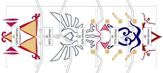
This is important, because you're trying to lay your design out so that every section of the split design lies perfectly next to the other ones. When you re-hoop your fabric, you can step through the first four stitches. If you've placed your fabric correctly, then those stitches should perfectly touch the markers that were sewn in the previous blocks. If they don't line up, you can just re-hoop over and over and over and over until it lines up.
In theory, you can line up an entire design just using these markers and the alignment stitches. You can just keep rehooping forever until it lines up. It's great. On the other hand, if your embroidery machine has literally ANY KIND of design placement setting onboard, that can help a whole lot. The astute observer will note that, on that picture way up at the top, that machine isn't my Topaz 50. That's because the T50 has some nice basic design positioning that will let you place within a certain range, but it won't let you tilt the design if you hooped it crooked. I did the first attempt at this on my Topaz, and it was fine, but there was a lot of re-hooping. So I might have taken this to work, to do this on the machine that's a step up from mine. (While I was there, I used a sit-down Bernina longarm to "hand"-baste the stabilizer on. That's not the intended use of the machine, but if you set stitch regulation to like 1 stitch per inch, and then you just pull the fabric straight through from the side, you get perfectly straight basting lines. If you're not feeling like dedicating an entire room in your house to having a free-motion machine just to baste straight lines, most mid-tier sewing machines have a fake hand-basting setting in them somewhere). Anyway, if you don't already have a bunch of hoops from HV, you can get that kind of positioning setup on Brother and Baby Lock for much less than the cost of the machine I was working on. If doing big multi-hoop projects like this is a priority for you, ask your salespeople about machines that make this really easy.
You now also have the great trade-off: the smaller the hoop, the tighter the design will hoop, and the less stabilizer you'll need. However, the bigger the hoop, the more you can shift the design around in the machine without hitting the edge. The tighter the hoop grabs, the less stabilizer you need, but the harder it is to shift the fabric that's already being held in the hoop to get it where you need it to go.
I handled this by just fucking throwing a shit ton of fucking stabilizer at it like there was no tomorrow. There's three layers on this bad boy.
You might be saying "Why didn't you just use a heavier cut-away?" and you'd be right, except for two things. 1) if I use two lighter layers, then I can trim the stabilizer away in layers, avoiding the stabilizer showing through and 2) my store didn't have any wide fusible cut-away in stock so
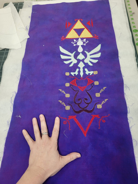
Anyway, here it is, time to make it into the actual apron. I'm very excited for this project. I'll probably break out the repositionable hoop again to do a border on the outside of the completed project, but I don't know for sure exactly what that'll look like.
#long post#really long post#zelda#legend of zelda#cosplay tutorial#machine embroidery#not lolita#i did this instead of doing a thing i don't want to do
116 notes
·
View notes
Text
Finally moved and settled into my new place and now I can get back to sewing!
This project was more embroidery than sewing. It's a recreation of the extant regency reticule from the Rijksmuseum.
I know Sewstine on Youtube has made this reticule before and sells the machine embroidery files on her Etsy, but I'm choosing to recreate the pattern myself and do all the embroidery by hand. The photo on the museum website is super high-def so it was a piece of cake to replicate the embroidery design. The brown vine border was originally done in tambour, but since I neither own a tambour hook nor know how to use one, i did the tambour parts with a chainstitch instead.

Sewstine also recently put out a video where she visited the museum and actually got to see the reticule, and she learned that it has 4 sides, and the two side pieces have different embroidery that isn't featured in the museum photos. Super grateful to her for getting video footage of the hidden sides!


#sewing#hand sewing#embroidery#historical costuming#regency fashion#historical fashion#tricia sews (kind of)
14 notes
·
View notes
Text

This took me a long time but it's finally done and I'm proud of the result! Embroidery files for Astarion's origin jacket, for either your embroidery machine or as PDFs for hand embroidery. By far the most complex design I've done yet! Now I'm off to actually beat the game :)
23 notes
·
View notes
Note
hi!! where do you get yoshi’s vests from?? or do you make them yourself? and if so, literally how? is there a particular pattern you use? they’re honestly gorgeous, and i’ve been looking for something similar for my girl
😭 literally the nicest compliment ever I made it myself!!

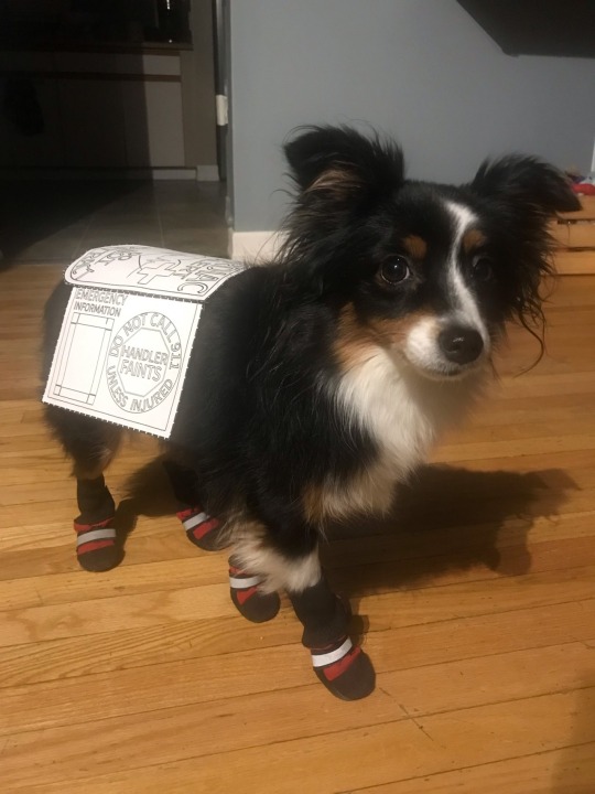
I was disappointed with a vest I had purchased from a maker, quickly realized that most makers don't specialize in little dogs and as a result the gear isn't legible/ there's a lot of wasted space which is a big deal when you have limited space to work with on a little dog already! So I made my own to maximize usable space instead.
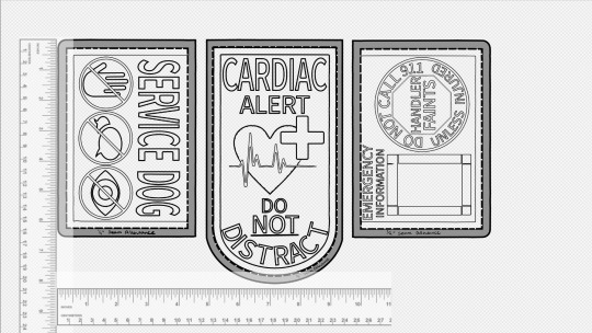
I'm sure there's patterns you could buy out there but I made mine from scratch (and it's not too complicated to figure out!). What I opted to do was measure her first, get an idea for how large the side panels and centre panel can be. I used a free art program (medibang) and dragged some rulers in there and drew things out to scale relative to the rulers. This way you have an accurate scale to work with to decide what can actually fit in the space. Print out the design (I put each panel in to a word file and printed that way) and check the size on your dog, make adjustments as needed until the paper printout sits how you'd like it to and your designs are legible! Word programs should have a ruler on the top of the page which allow you to see the exact measurement of each of your panels so it's easy to align them/ change the size as needed accurately.
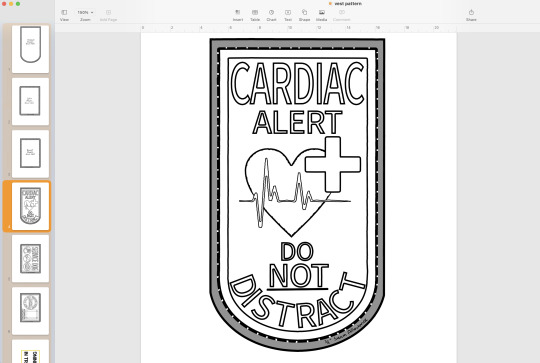
There's lots of ways to make a vest, with or without webbing, multiple panels, one piece of fabric. Take a look at vests online and see what aspects you like and what you don't! I opted for webbing to stiffen the edges to prevent wear but it's not necessary! You can just stick two pieces of fabric together and call it done!
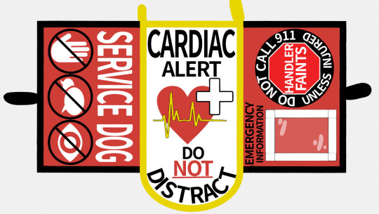
I colourized it on the computer first so I could ensure that the scheme would work and that all the fonts would be legible at their smaller size/ contrast well.
Embroidery will be the first thing you do once you're set on your design and it takes the most time. You CAN do it by hand! but it takes a long time and if you use a thick fabric it'll hurt! If you have a standard sewing machine you can embroider with that as well (which is what I did!). I literally bought my first personal sewing machine for this project, I used machines in middle school and to make a couple plushies like 7 years ago but that's it for my experience. You can absolutely do it if you're limited on experience! It's often referred to as 'free motion embroidery' which there's tutorials online for!
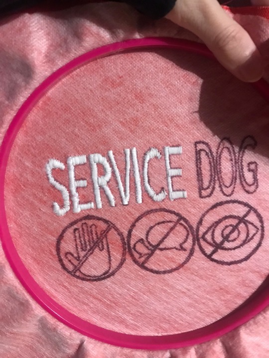
The basics of embroidery are to print out your design, you can sew right over the paper and follow it like tracing but paper will be stuck under the embroidery so if the set gets wet soggy paper will happen eventually! The better alternative is to get 'soluble embroidery stabilizer' which is a see through material that washes away with warm water! You can trace your design on to it with a pen, pin the stabilizer to your fabric, then simply trace the design with your thread!

I used a zigzag stitch (#4 on my machine), think of it like drawing with a thick marker, you want the stitch to be wide enough to fill in the whole shape if possible. your machine will have two settings you can change, the width of your zig zag (thickness of your marker) and the amount of space between each stitch (opacity), so you want the zig zag to be as wide as the shape and the space between stitches to be as small as your machine will go without getting tangled ( I sit at 0.2)
Freemotion embroidery tutorials will tell you to drop the feed dogs down, don't do that. You'll break a lot of needles. Letters are just straight lines so you can leave them up, let the machine help guide the straight line, it'll be a LOT easier for you! Curvy letters like C and S will be hard the first few times but it gets easier, it's helpful to take it as a bunch of short straight lines instead of trying to turn with it. Fills in the shape better.
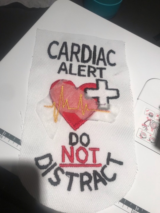
You'll end up tracing each letter 2-3 times at minimum to ensure it's nicely filled in and the fabric underneath doesn't show through. Don't forget to sew back over your ends to keep them locked in place otherwise it'll just unravel!
Once that's done the rest is EASY in comparison! 😂
When you're happy with your embroidery you can cut out each of your panels, be sure to leave a minimum 1/4 inch gap around the edge for the seam, you can leave more space if you want! if you think you'll be a bit wavy/ struggle to keep the needle near the edge then more seam allowance is better!
Attach the panels together (lay them together with the 'nice sides' together and sew along the edge)
You'll want a second fabric piece to be your underside, this makes the vest more sturdy, protects the embroidery, and makes a soft smooth surface for your dog! Once the top panels are all attached to each other you can cut out one big piece for the underside, a mirror copy of the shape of your top panels all sewn together!
The "best looking" way to leave a seam I would say is by folding the edges in and sewing around the outside, keeps the edges crisp and compressed. I would do it this way if I was leaving the edges of the vest panels exposed.
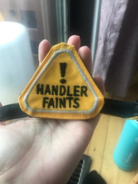
If you're going to put webbing along the edges anyways then you can do it a quicker way, just lay the two pieces (your top panels and your underside) together with the nice sides facing in and just sew quickly around the edge. Be sure to leave a space unsewn so you can flip it inside out again. This will be easier to do but leaves the piece looking a bit more bubbly and the corners will be a bit puffy/ not as crisp
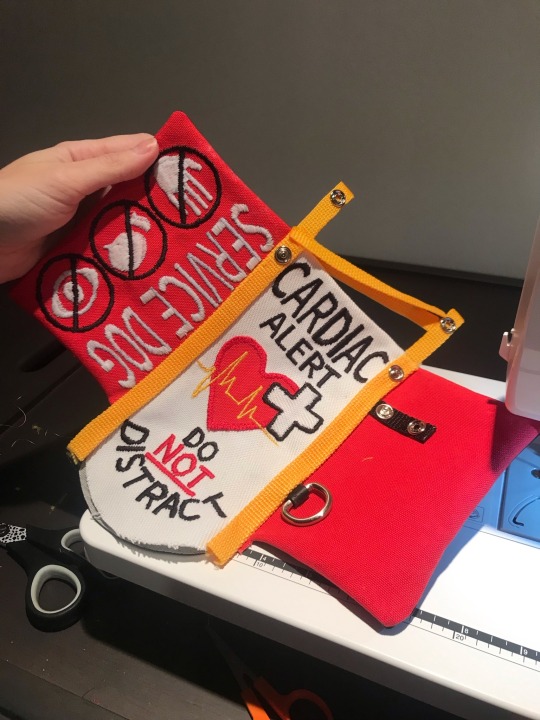
You can opt to put your buckles/ attachment points in now while you're sewing the top and bottom together or you can wait and attach it with the webbing. If you do it now you'll have to do the webbing as two separate pieces, if you do it later you can fold the webbing over the edge instead. I found two separate pieces (top and underside) to be cleaner and easier to work with on this tiny scale
From there you can seal up the little gap you left to flip it rightside out by hand stitching a 'invisible stitch' and attach your webbing to the edges. I learned the hard way that you should do the side panels first (the outer edges) and the centre panel last. You want the edge webbing to go underneath your centre panel's webbing so that it's a smooth transition when it flops down and bends at that joint! Otherwise the fabric ends up visible underneath when it bends there. So side panels first, centre panel last.
And that's it I think. it's a lot of trial and error as you gradually realize what order to do things in, what works and what doesn't.
If you do try it keep in mind that it's just thread! if you make a mistake it CAN be undone! cutting the threads is tiresome and redoing stuff sucks but it's nice to know that mistakes aren't permanent. If you're really happy with a panel and screw up an icon at the end it can be saved and you can try again without having to redo the whole thing!
Last note is that large fonts are easier than small ones. tiny font showcases every waver in your pathing, making shaky wonky letters: exhibit A my first try vs a few days later

So to avoid frustration I would stick to larger fonts at first. To go along with that try to allow the machine to go quickly, if you move really slow on a straight line it'll show every time you moved and turned it, letting it move fast on straights keeps them smoother and straighter!
For small fonts to limit frustration I would design your vest so they can be detached and you can work on them without having to change the whole panel while you work on your skill. You can make patches!
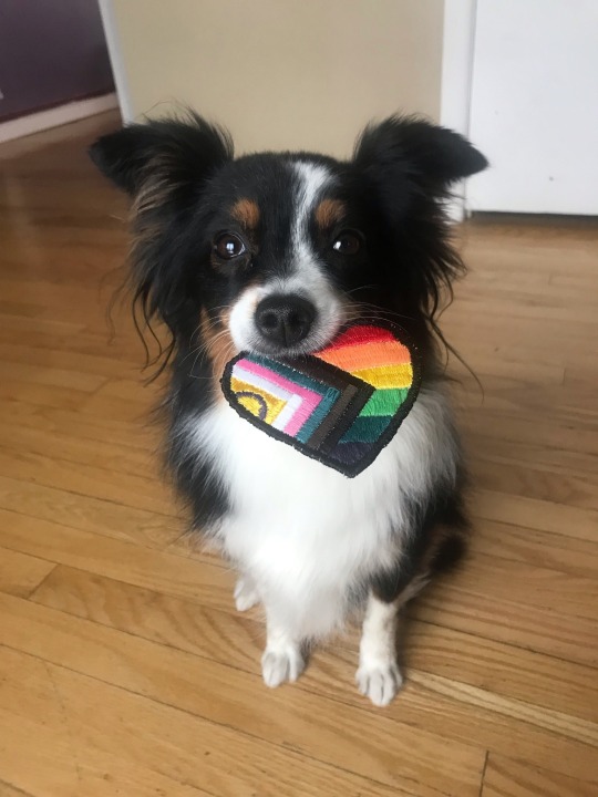
Same scrap fabric, do your design, and then cut it out right close to the shape and just do that exact same zig zag stitch around the edge. it'll be lined up so that the left of the zig hits the fabric (at whatever thickness you want your outline to be) and the right side of the zag is not hitting the fabric at all. this will cause the thread to wrap around the edge and give a clean look! the more passes you do the cleaner it'll be (above is just two or three quick passes, if I tried harder it could be way smoother). Then you have a patch you can tack on with thread, stick heat n bond on the back for iron-on, or secure velcro or make a little hanger. dealers choice really on that one.
Anyways this is a bit of a mess of information but I hope it gives you somewhere to start. If you want me to demo anything let me know I'm more than happy to help!

oh and feel free to take my pattern up there if you need somewhere to start! I just ask that you change the design up a bit so it's not a carbon copy
13 notes
·
View notes
Text
Dream Cast Ons
aka if I had infinite time, money, and energy~~
These are probably my least likely to be cast on, but they seem fun and interesting and a brain puzzler (I'm expert solvem probler and love fucking with my brain more than necessary).
I think I'm not going to dive into the whole "dream yarn for each project" aspect, because that might get sad fast... lol
Lil Guys
Look, I'll be the first to admit there's really no purpose to these guys other than. Joy. (But clearly joy's not in the budget right now.)
Raccoon by Claire Garland I feel like this guy would be great motivation for working on my abysmal tension issues. Plus he's cute.
Yahahaha! by Seth Mungons Partly to have my partner's nemeses on hand, partly inspiration to learn/work on embroidery. 🤷
Accessories
Hexisocks by Natalia Moreva I cannot say whether this would be difficult or not, but the construction seems intriguing. (But also, who knows if it would be comfortable enough beyond its gorgeous design...)
Scarf Dryad by Svetlana Gordon I'm not huge on neck accessories, but I do love the look of this pattern and feel like it would be an interesting challenge. Finding yarn that would suit it, on the otherhand...
Things for the Wardrobe
Librarian Vest by Tomomi Yoshimoto I love this. I dream of this being in my wardrobe. I have no idea if I'm "a vest person." (I think that's partly why it's on my "unrealistic queue list... One day I'll fix my other vest and see if I like wearing it more....)
DNA Pullover by Andrea Cull I recognize that cables aren't difficult, that this piece altogether is totally within reach, and as much as I love producing something as large as a sweater, it's hard to rationalize buying a sweater's amount of yarn, haha.
X-files I Want to Believe by KT Simmons-Uvin The ultimate knitting flex. (I mean either this or the "This is Fine" sweater. I know it's doable, but who knows when I'll have the energy/money to do it... For now I'll just look wisftully on.
Howl Cardigan (self-drafted) (AKA Howl's Jacket from Howl's Moving Castle.) This has been on my want to knit for literal years. I wanted to try to make it with entrelac, I feel like that would create a really interesting texture that might be more reminiscent of the book's repaired cardigan version.
Other Stabby Insights:
Dream COs for Wardrobe | Dream COs for Skill | What's Actually on the Docket?
2 notes
·
View notes
Note
Quick question and please don't feel obligated, but would you mind if I asked how you printed patterns on interfacing like that? I've been wanting to get into making my own clothes and adding little embroidery flair to collars and sleeves, but my stitching is pretty amature, and I'm not super confident about my ability to snag your patterns on a restock, considering how rapidly you've been selling out. (Alternatively if you don't want to share the process which is totally valid if you could stock your cottagecore pattern plentifully I can just take my chances on Tuesday)
You've got a lot of options! (Especially since I had to return the interfacing I got on Tuesday, and the new stuff won't be here until Saturday, and I am quietly dying of agony with the delay)
The simple answer is, I bought a pack of "printable self-adhesive water soluble interfacing" online. They're available on Amazon in US letter-sized sheets of 12, and I could put them in my cheapo inkjet printer and tell my computer to print my computer files onto them. I didn't experience many hassles that way. (Well, until I ordered the 6m roll, which was... an Experience from beginning to end.)
You can also just trace or draw a pattern onto the interfacing with a pen. Or skip the interfacing completely, and draw your pattern onto your fabric. I often cheat and use a pencil, because it might not wash out of the fabric completely, but if it's covered with embroidery, who cares? But there are all kinds of pens and pencils and paper and chalks and dyes you can use, depending on what you need and what's available to you.
I know that some embroiderers work spontaneously, making it up as they go. I wanted to be that person for a long, long time, but the truth is, I find it way less stressful and more artistically satisfying to have a pattern to follow. There are a ton of embroiderers who spend their entire careers stitching other people's patterns and not even feeling the need to make their own. There's a ton of artistry and craft just in the act of embroidery itself.
In other good news, Etsy has a lot of other people selling embroidery patterns with stick-and-stitch designs. What got me started on this track is buying a stick-and-stitch pack from Florals and Floss, which has lots of really cute little designs that fit really easily into modern clothing. The content of our embroidery patterns is centuries apart, but the materials we use are the same.
Its artist has also published a book, The Embroidered Closet, that sounds like it would be right up your alley. (For people worried about shipping, it's also sold as an ebook and is available to many libraries on Hoopla Digital.)
26 notes
·
View notes
Note
Do you sell versions of your embroidery designs? I'm obsessed with your Solas patterns and would love to try them!
Hello!
So, short answer is yes, while the first digital mockups I made were designed just for my own reference and as color guides for transferring the designs painstakingly by hand, I ended up going back to them and turning them all into digital vectors. This means they can be printed onto transfer paper or directly onto stabilized fabric for stitching, which is MUCH easier than drawing by hand. Lots of people asked me if I could sell the designs so I figured this part out and was able to test it myself--the tower embroidery was an example of printing the vector directly onto the fabric and worked out great!
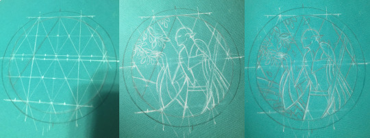
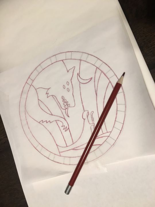
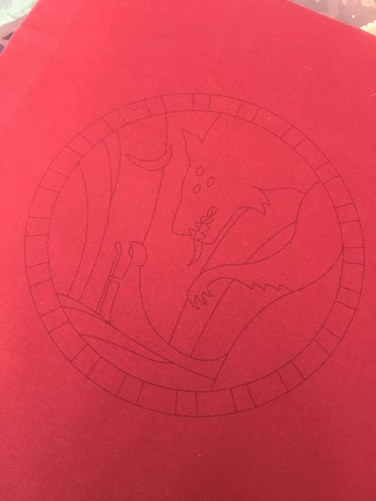
(above: tedious hand-drawing process for the Hierophant design, vs my failed attempt at transfer pencils that did not work at all for the Tower, vs printing directly onto fabric which did work in the end)
Long answer is after I did that, I uh, never figured out how or where to list them for sale online. Or what all to include with them--like what level of written instruction to include, should i also make notes on the thread colors I picked, should I include my colored-in-versions as color guides or just let everyone free-for-all it, in the case of the Tower embroidery i also hand-dyed a lot of grey thread that was crucial for it coming out how i wanted it to look--is it deceptive to sell a pattern when other people can't necessarily recreate it the same way because of that? Should I list in general the dye instructions if they wanna recreate it, or for people who want some of my extra thread or for people who don't have an inkjet printer so can't print the design onto the fabric themselves, should i think about selling full "embroidery kits" that include the printed pattern sized for a display hoop and the thread needed? etc etc etc
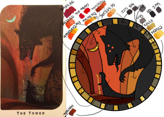
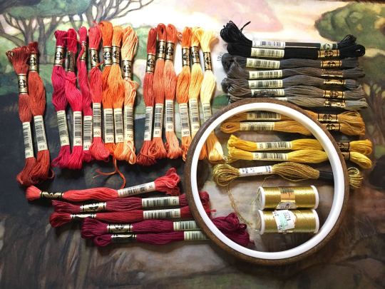
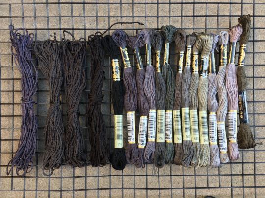
(above: photo of the color guide I made myself with tentative thread color selections (warning NOT the ones I actually ended up using), photo of my pile of threads I picked from, and photo of some of the threads I ended up dying myself to get closer to the design I wanted)
Anyway that was all a lot of thinking and work to do, so i put it off!!! and uh here we are 2 years later and I have still not posted them anywhere. I really gotta get around to all that still...
But in the meanwhile, if anyone reading would like a pattern, just let me know directly what you're looking for and I can save the versions of the files as needed for your plans and send them over. like for a digital only version (so no threads or me printing for you) i would probably make a zip file with a transparent png of the design (so you can put it in a word doc to print at whatever size you desire), as well as a pdf with a few copies of it already pre-sized for a display hoop for ease of printing or transfer, the colored-in version i used based on the tarot cards, photos of my finished versions, etc (note to self i must remember to include the design both normal for direct printing and horizontally flipped for anyone who plans to use transfer paper for it since those are mirrored...). Oh and a quick explanation of how i managed to get my fabric through a standard printer if you wanna try that.
But yeah i'm happy to work out something with kofi or paypal or venmo and sell the digital ones for like $20 each or something for now, if you don't mind not having written step-by-step instructions accompanying the patterns and example photos. Or if anyone has suggestions on where to host them for sale, for someone not interested in maintaining a dedicated storefront like etsy or storenvy long term. Maybe Gumroad? If i stuck to digital-only sales something like that might work. I'm open to input for sure. If you want something more than digital like a pre-printed fabric (since it's kind of weird to do yourself), I'm still open to trying, it just would be a little more $ to account for the fabric/stabilizer and cost of shipping, and probably take me a few more days to do.
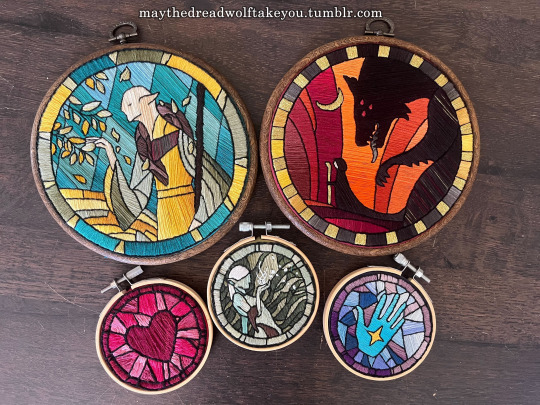
(above: example of finished DA themed embroideries)
But regardless, thank you for your interest at all!! I'm so glad people have enjoyed my embroidery series :) While I'd love to make lots of copies to sell to whoever wants one, I simply don't have the time, and they are SO labor intensive to make it really is like 80-90% of the cost is manhours. I spend anywhere from 5-15 hours making the patterns and vectors, but the stitching and rest of it itself is easily the bulk at 40-100 hours depending on complexity and number of threads used. So WAY more feasible to sell the patterns than make more to sell myself, and then anyone willing to put in the time can have one too :)
#ramblings#my stuff#my embroidery#dragon age embroidery#dragon age#replies#sparrowposting#dear tumblr PLEASE do not eat this one as i post it 🙏
26 notes
·
View notes
Text
I don't usually post business shit on here, but uhhh, I'm queer and have an embroidery machine and know hoe to digitize designs, soooooo, anyone wanna buy some patches (or the digital file to make them?)

9 notes
·
View notes
Text
Recent adventures of "somehow graphic design is the only thing that brings Xander any modicum of happiness" has me making embroidery files for stuff my sisters and I can wear to Back to the Future on Broadway next month.
BUT it occurred to me that we're also going to see Hadestown in Philly in April and I figured:

Please give me positive reaction because I'm super happy with this design.
5 notes
·
View notes
Text
I'm going to tell you how I made Michelangelo's cape!
In case you don't know Michelangelo is @weird-profiterole's oc. And we decided to send each other goodies from our country. Well I decided that as a surprise I'm making her Michelangelo's cape!
This is what I have to go off of. I would add a pic directly but I respect wifey and won't repost her art. But that post gives details about her oc and details of the cape.
At the time of starting it she didn't have the back designed at all. Just constellations that Michelangelo embroidered himself onto the cape.
SO WHAT DID I DECIDE TO DO?
The whole arctic circle

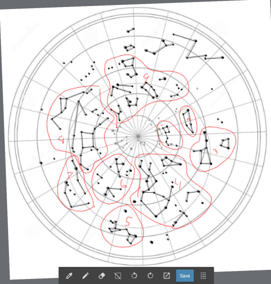
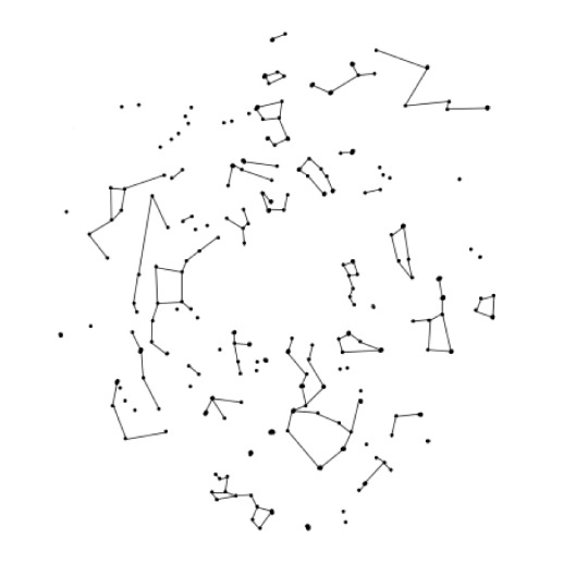
I divided all the constellations into 10 manageable sections. Anything in the most inner circle wouldn't fit however. I did move the Big Dipper down to be able to add it however.
Side note: Michelangelo's cape is NOT A CIRCLE CAPE. But since there wasn't a back to the cape, I had to make a creative decision, and since I didn't want Marine to know about it, I couldn't ask questions. But I figured it wouldn't be too much of an issue. He has more than one cape after all.
So I make all 10 sections into embroidery files. I draw them out myself with the template above to get all the placement correct. I even pulled out my astronomy notes from 11th grade to look at my star chart and relearned how to read it and everything.
Then I got the fabric. Just a white polyester satin. Something light with a nice drape. But here came the fun and time consuming part. DYING IT.
Now I love to dye fabric. LOVE. But a dark blue to a bright yellow with a minimal amount of green? I knew it wasn't going to be easy. So I cut out my circle like you would a circle skirt. The diameter being about 50 inches. Then I start with the the yellow.

Great, looks good. Then I wash it to get the excess dye it and it becomes a pale yellow. I need something vibrant. So I do it again. And again. And again. And again. And again eight more times. Finally I get it tot he point where I'm good with so I flip it around to do the blue. Well guess what I discovered. Blue dye is really purple. I knew black dye was purple, but I didn't know blue dye was.
Keep in mind I'm using Rite Dye Synthetic. I've never had luck with this dye but I gave it the benefit of the doubt. I shouldn't have. I have All Purpose Rite Dye in a few shades of blue and I do a small test. Those are all purple as well. Now I've already dyed the "blue" part about 4 times at this point and I'm wondering if it just won't take any more dye. But I know that's not the case. I've dyed enough fabric to know that's not the case.
My process is that I dye it for around an hour or two, moving it in the pot about every 15-20 minutes to make sure to get an even gradient. Then I hang it up to dry it, next day I wash it by hand in cool soapy water to get the extra dye out, and then it comes out too pale.
I made a few oopsies along the way, like forgetting to wet all the fabric , meaning the blue went too far into the yellow, ruining the yellow, so I then had to redye the yellow. I once washed the blue three times and then on the fourth washed the whole thing at once (I only wash by hand) and the yellow got a green ting to it.
A month and a half go by and I'm repeating the dye-dry-wash-dry pattern everyday. Then I finally realize I'm going to have to use IDye Poly. Which I knew I should have used to begin with.
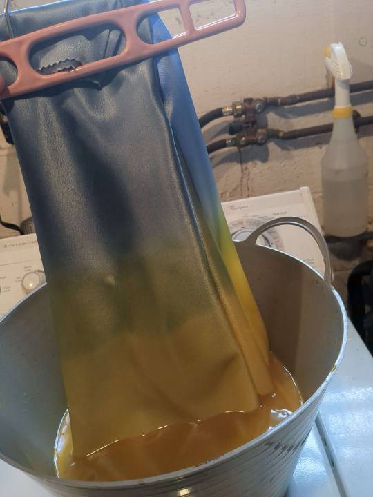
Side note: the lines are a lot harder on camera than irl.
IDye Poly is what I recommend using when dying anything. The color is EXACTLY what it is on package, but its a powder, so you have to use all of it, and it SMELLS. Oh fuck it smells. They say to use the stove top method but I just put boiling hot water in a metal pot then put the fabric in. I dyed the yellow twice and it was the perfect shade.
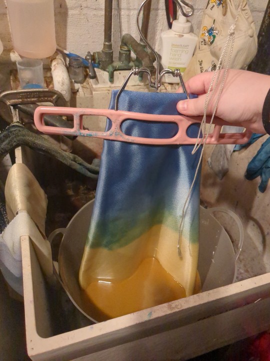
Now for the blue. I knew the blue was really a blue and not a purple. I used that blue before. But to make sure it was as dark as I wanted it to be, I put half the amount of water in and the whole packet of dye and stirred it up. The lines were harsh at first but while dying I also run water over it to clean up the lines. The blue took about four dye rounds and it was finally at the point where I could be happy with it. I wish it was a little darker, but the transition is just how I want it. Because even thought its an ombre, I need a minimal amount of green.
TWO MONTHS LATER and I finally get this
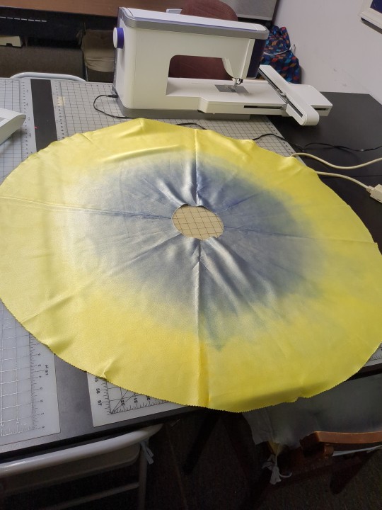

There was some messy party once I unfolded it all but I told myself ITS FINE. REMEMBER ITS THE FUCKING RENAISSANCE. The blue is darker irl than int he picture.

So then I cover it in interfacing to draw out placement lines. This is when I remembered that I haven't even tested my embroidery files yet. I could have been doing that while I was dying the fabric. But I think part of me was scared that this was going to fail and I didn't want to get too deep, even though two months of dying a single piece of fabric is a little deep.
So I got out a Pfaff Creative Icon 2 and uploaded my files and started embroidering.
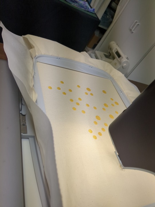


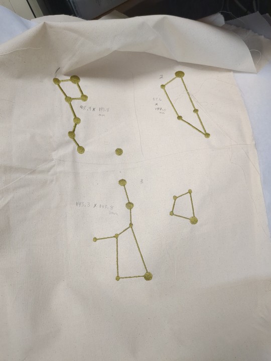

I then cut them out, laid out the cape and started placing them. I knew I was going to have to make some of the files bigger because I wasn't quite sure what I was doing when making them, but I knew I was going to test them so it was okay.

There are only four that really need to be enlarged, but I did make all of them bigger to fill in some gaps. The harsh line in the front is where the opening is going to be.
So after fixing the files and a seven hour day at work it is all embroidered!
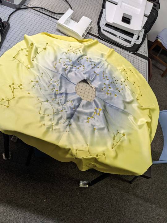
Each dot takes about a minute each, plus then the lines connecting all of them. There are some awkward empty spots and I was going to fill them in with stand alone dots/stars, but I decided not to since they weren't on the star chart.
Now I had to rip all the stabilizer off and trim all the threads. Kiki decided she wanted to help

I decided to line it with a pale yellow broadcloth to encase the edges, stitched along the edges to keep it from turning over and then I had the white strips in the front to add. I just used the same fabric since I had extra and since it was white.
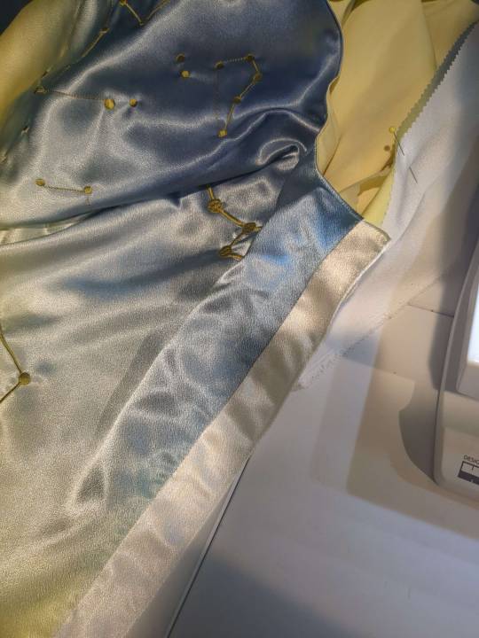
You can't tell on camera but after ironing the fabric the color in some areas got darker. It's fairly subtle but I tried to iron the whole thing lightly to even out the color, luckily it darkened the color rather than lightening it.
Now all I had was the tassels and rope. I got it laid out how I wanted it but then didn't have a clue how to attach it, plus the ends of the rope kept fraying and burning the edges gave it a burnt look, plus it was untwisting. So I wrapped a gold embroidery thread about it, and then coated that in a fabric glue so there wasn't much of a chance of it coming undone. I put a button on the back of the cape so that it wouldn't pull at the fabric when I attached it.
AND THEN ITS DONE!

I think the file is too big, but I have a video of it that I will link to show you a 360 look of it.
AND IF YOU READ THIS FAR THANK YOU.
(at the time of writing this I'm praying the package get's to Marine safely)
~~
Shoutout to @lulu-the-smol-floof @legalize-arson @ivoryclive for dealing with all the picture spams and ranting about how worried I was through this whole project
#ikevamp#ikemen vampire#ikevamp oc#ikevamp michelangelo#astrology#fashion#costume design#fashion design#long post#sorry its so long#i really didn't think it would end up being so long#but there's also a lot of pictures
41 notes
·
View notes