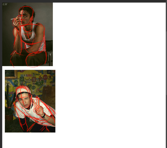
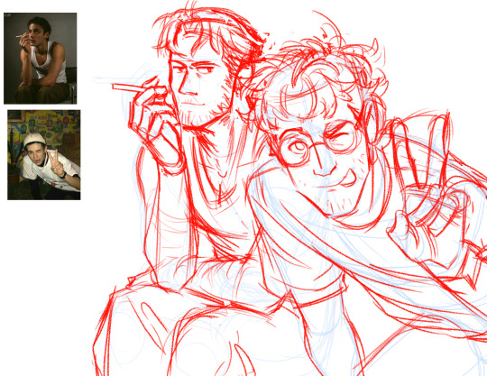
#I was gonna add the pose ref I used
Explore tagged Tumblr posts
Text
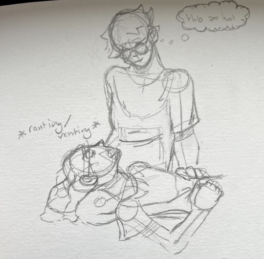
Jmart doodle :3
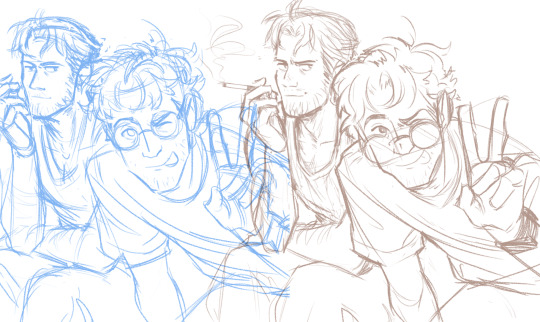
#I need fluff rn#So this is how I like to imagine Jon did the statements n shit in s5#Bc#fluff :3#Ahh anyway they're so adorable I need to draw them more#I was gonna add the pose ref I used#But I lost it I cannot find it#tma#the magnus archives#tma fanart#tma jmart#tma jon#tma jonathan sims#jonathan sims#martin blackwood#tma martin#jmart fanart#jon x martin#Oh also ignore my shitty hand writing please#They tried to teach me cursive when I was 8#And I have never recovered from it
21 notes
·
View notes
Text
My Droid design minus his parts that can be taken off/ dissipate aka just a damn guy


Thinking of getting twitter but idk if people will fuck w/ me but whatever
#yeah some things can improve but ngl referencing him but not really using the pose of the refs helps get his features more in my brain#also adding piercings and an eyebrow slit just adds more... and makes him look kinda fruity lmao#kiesha's canvas#frouse#clooless podcast#clooless#elasticdroid#elasticdroid fanart#TECHNICALLY there's the other 3 clooless but I ain't gonna#...............there's also sodabot but you gotta look closer and I want NONE of you looking at me.
63 notes
·
View notes
Text
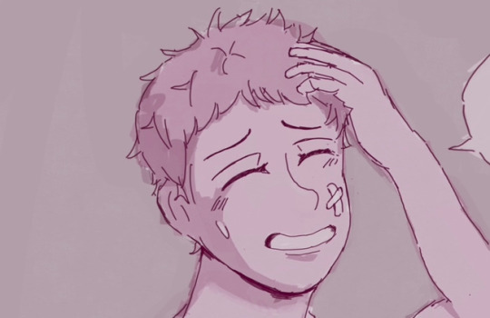
new wip
#ao no exorcist#shima renzou#my art#work in progress#most random art ive created#I originally had a diff idea for Renzou..#but noticed I was doing the pose wrong but I was too lazy to change my trajectory and thought would be okay might as well continue#since I wanted to apply what I recently learned in art and ahaha… I was happy with my progress and was like. okay lets do more cleaner drawo#drawover… then I found myself trying to shade it… which was hard since ahaha I haven’t at all really prac that… and then… I was like. okay#I have this what am I supposed to do with it?!#and tried to make some kind of idea but hard…#it turned into this yukishima idea now LOL#it’s kind of thinking idea for it but also my god I spent hours adjusting the colour/brightness cuz my god why does everything I draw#intially be so dark…. pls….#and was exhausted as heck after that session like lol the AMOUNT of adjusting I kept doing after I thought I was finished with it is sooo#crazy. but coming back after leaning it for like hours with fresh eyes was good cuz I was like. OH I like this#like I did before but also it was tained by exhaustion cuz the amount of adjusting….#I was just gonna leave it as it is but now I wanted to add another page to it that fleshes out more of a story and that’s gonna be a pain#to do LMAO since my brain is like “this is already a finished piece” and now I have to do another page and somehow make it look like they’re#both apart of the same story…?!#since I’m terrible with consistency but eh whatever!!! we’ll see how it goes!!! kinda excited for it… it will be fun<3#probs ages before I get to it tho ahaha#also I have to say I’m most proud that I was able to draw that hand despite how it’s not a perfect hand I WAS ABLE TO DRAW IT!!!!!!!!! WITH#NO REF!!!!!!! when I fumble a lot with hands.#it’s a struggle but I feel like I’m slowly getting. absorbing into my head. IM SO HAPPY#I think an issue I have with my art lately is the finishing… cuz I’m so used to doing rough sketches. when I have to make an art look more#finished I’m like… what am I supposed to do with it now….?! ahahah……….#so probs why I struggle a LOT in that phase. djkdkdkd#something to work on……#anyways excited about this! <3 man I have so many wips and ideas…… I started like what. 2 wips yesterday…
7 notes
·
View notes
Text
Ok! I've finally decided to put together a (somewhat) comprehensive tutorial on my latest art~
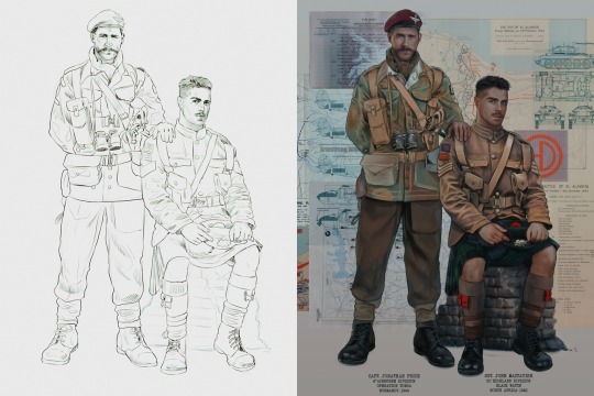
Please enjoy this little step-by-step 💁♀️
First things first--references!
Now I'm not saying you have to go overboard, but I always find that this is a crucial starting point in any art piece I intend on making. Especially if you're a detail freak like me and want to make it as realistic as possible 🙃
As such, your web browser should look like this at any given point:

Since this is a historical piece, it means hours upon hours of meaningless research just to see what color the socks are, but...again. that isn't, strictly, necessary 😅
Once I've compiled all my lovely ref pics, I usually dump them into a big-ass collage ⬇️
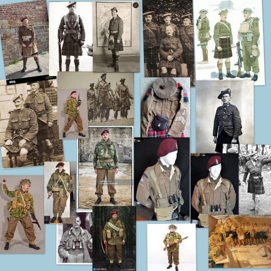
(I will end up not using half of these, alas :'D)
Another reference search for background material, and getting to showcase our models of choice for this occasion~
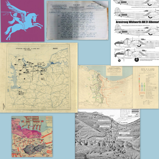
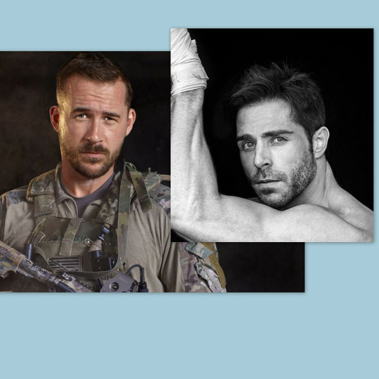
When picking a reference for an actor or model, the main thing I keep in mind (besides prettiness 🤭) is lighting and orientation. Because I already kinda know what pose I'm gonna go with for this piece, I can look for specific angles that might fit the criteria. I should mention that I am a reference hound, and my current COD actor ref folder looks like this:

Also keep in mind, if you're using a ref that you need to flip, make sure you adjust accordingly. This especially applies to clothing, as certain things like pants zippers and belt buckles can be quite specific ☝️
Now that we've spent countless hours googling, it's time to start with a rough sketch:
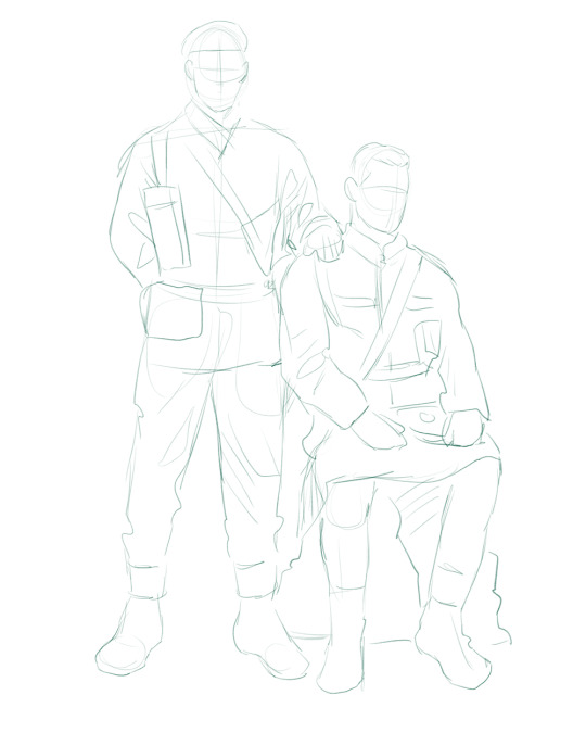
It doesn't have to be pretty, folks, just a basic guideline of where you want the figures to be.
The next step is to define it more, and I know this looks like that 'how to draw an owl' meme, but I promise--getting from the loose sketch above to below is not that difficult.
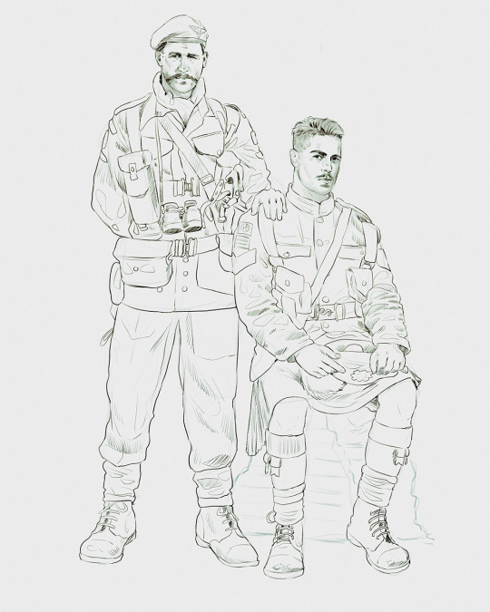
Things to keep in mind are--don't go too in-depth with the details, because things are still subject to change at this point. In terms of making a suitable anatomically-correct sketch, I would suggest lots of studying. This doesn't even have to be things like figure drawing, I genuinely look at people around me for inspiration all the time. Familiarize yourself with the human form, and things like weight, proportions, posing will seem a little more feasible.
It's also important at this stage to consider your composition. Remember to flip the canvas frequently to make sure you're not leaning to one side too often. I'm sure something can be said for the spiral fibonacci stuff, which I don't really try to do on purpose, but I think keeping things like symmetry and balance in mind is a good start ✌️
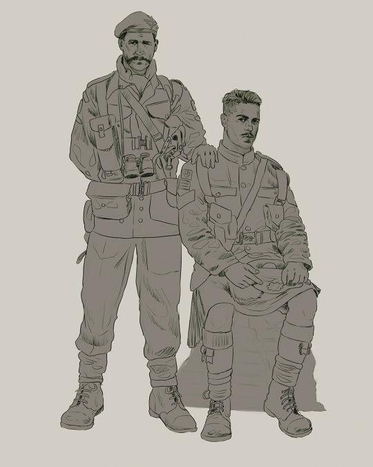
Next step is just blocking in the figures. Standard. No fuss 👍
Now onto the background!
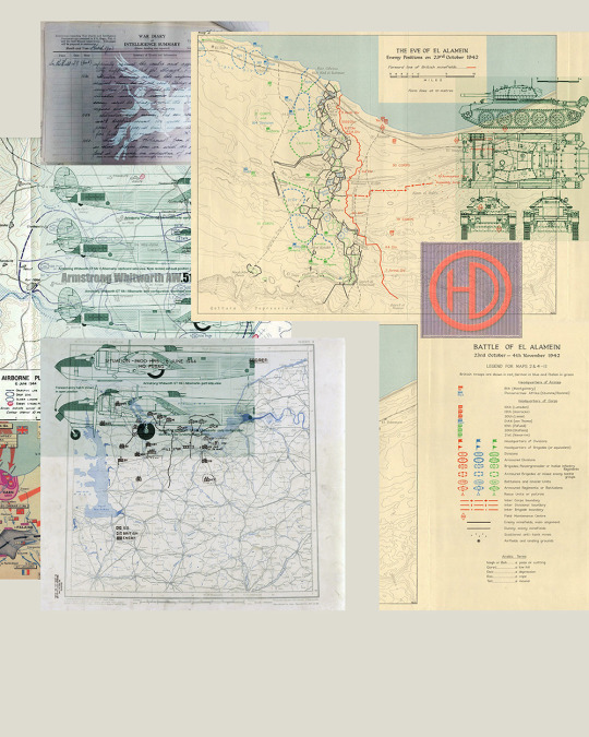
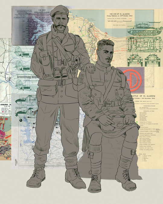
It's frankly hilarious how many people thought I was *hand-drawing* these maps and stuff 😂😂 I cannot even begin to comprehend how insanely difficult that would be. So yeah, we're just taking the lazy copy and paste way out 🤙
I almost always prepare my backgrounds first, and this is mostly to get a general color scheme off the bat. For collage work, it's really just a matter of trial and error, sticking this here, slapping this there, etc. I like to futz around with different overlay options until I've found a nice arrangement. Advice for this is just--go nuts 🤷♀️
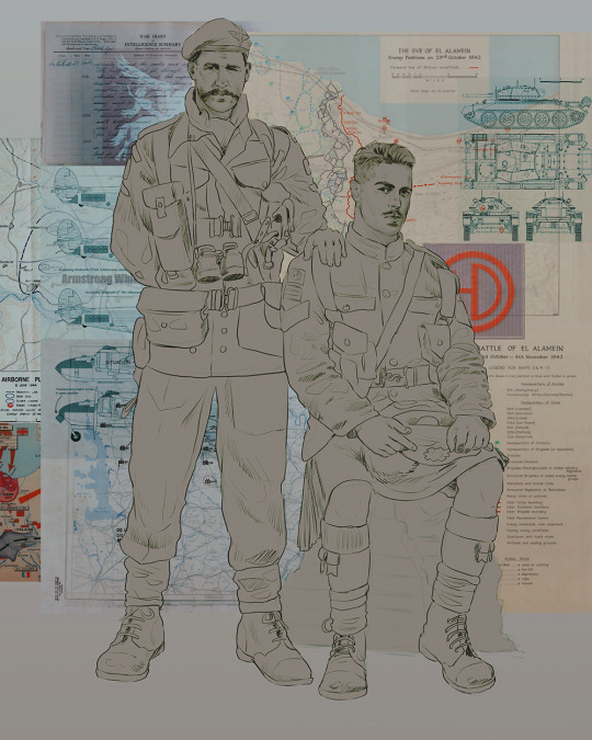
Next, I add a few color adjustments. I tend to make at least 2 colors pop in an art piece, and low and behold, they usually tend to be red and blue ❤️💙There's something about warm/cool vibes, idk man..
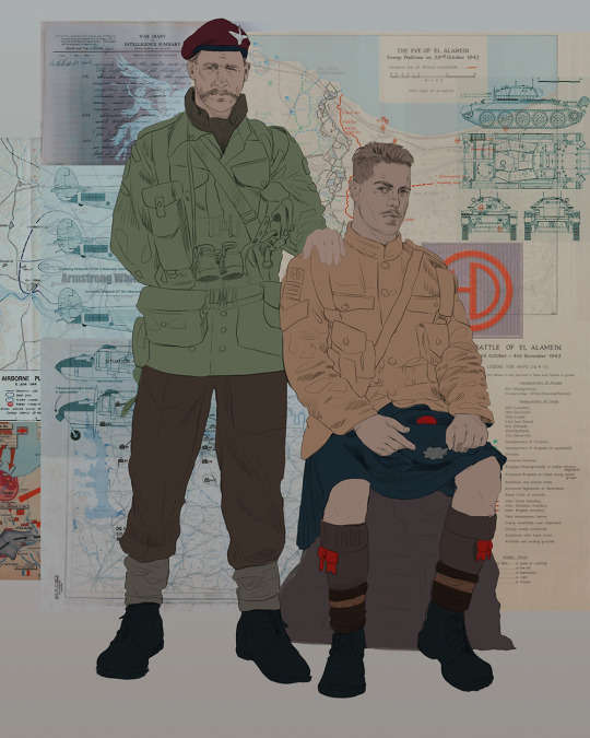
Now we move on to coloring the figures. This is just a basic block and fill, not really defining any of the details yet.
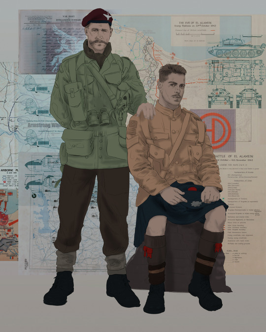
Next, we add some cursory values. Sloppy airbrush works fine, it'll look better soon I promise 🙏
And now--rendering!
I know a lot of beginner artists are intimidated by rendering, and I can totally understand why. It's just one of those things you have to commit to 💪
I've decided to show a brief process of rendering our dear Johnny's face here:
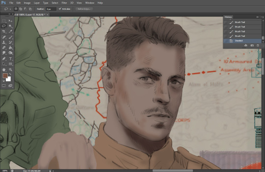
Starting off, I usually rely on the trusty airbrush just to get some color values going. Note--I've kept my sketch layer on top, but feel free to turn it on and off as you work, so as to not be too bound to the sketch. For now, it's just a guideline.
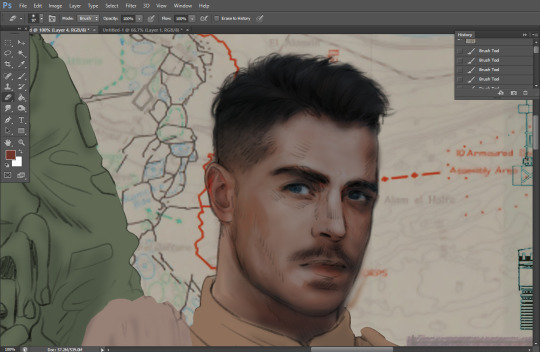
This next stage may look like a huge jump, but it's really just adding more to the foundation. I try to think of it like putting on make-up in a way~ Adding contours, accentuating highlights. This is also where I start adding in more saturation, especially around areas such as ears, nose and lips. Still a bit fuzzy at this point, but that's why we keep adding to it 💪
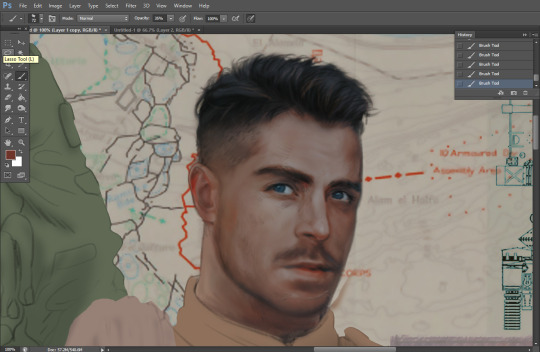
A boy has appeared! See--now I've removed most of the line layer, and it holds up on its own. I'll admit that in order to achieve this realistic style, you'll need lots and lots of practice and skill, which shouldn't be discouraging! Just motivate yourself with the prospect of getting to look at pretty men for countless hours 🙆♀️
I'll probably do a more in-depth explanation about rendering at some point, but let's keep this rolling~
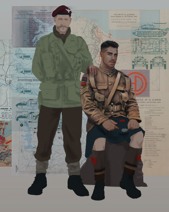
Moving forward is just a process of adding to the figures bit by bit. I do lean towards filling in each section from top to bottom, but you can feel free to pop around to certain parts that appeal to you more. I almost always do the faces first though, because if they end up sucking, I feel less guilty about scrapping it 😂 But no--I think he's pretty enough to proceed 😚
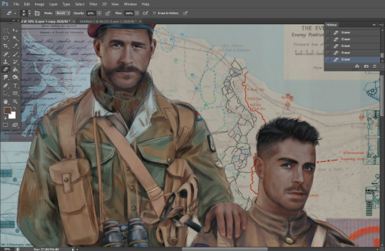
They're coming together now 🙆♀️ Another helpful tip--make sure you reuse color. By that, I mean--try to incorporate various colors throughout your piece, using the eyedropper tool to keep a consistent palette. I try to put in bits of red and blue where I can
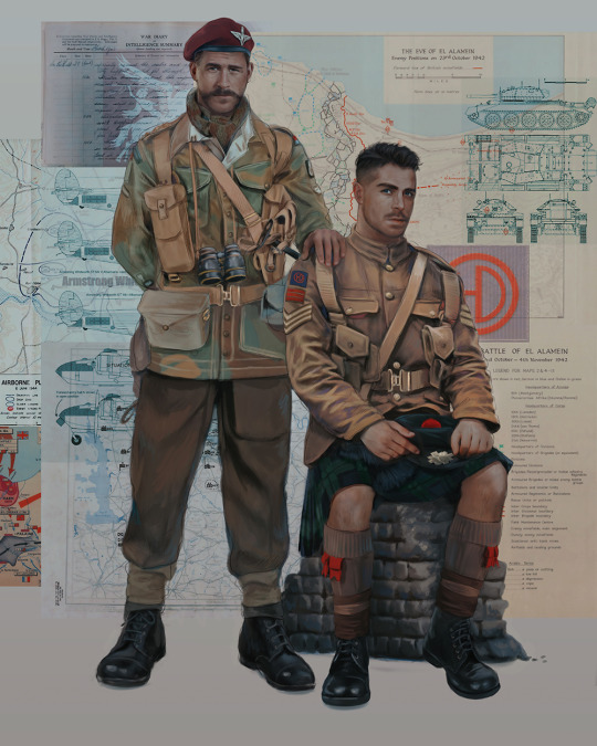
Here they are fully rendered! Notice I've made a few subtle changes from the sketch, like adjusting the belt buckles because I made a mistake 😬 Hence why you shouldn't put too much stock in your initial sketch~
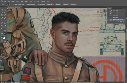
The next step is more of a stylistic choice, but I usually go over everything with an outline, typically in a bright color like green. Occasionally, I can just use my initial line layer, but for this, I've made a brand new, cleaner line 👍
And the final step is adjusting the color and adding some text:
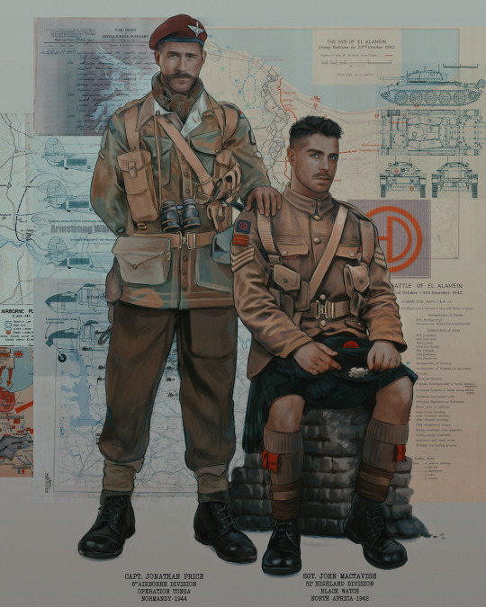
Tada!! It's done!
All in all, this took me the better part of a week, but I have a lot of free time, so yeah ✌️
I hope you appreciated that little walkthrough~ I know people have been asking me how I do my art, but the truth is--I usually have no clue how to explain myself 😅 So have this half-assed tutorial~
As a bonus, here is a cute (cursed) image of Johnny without his mustache:
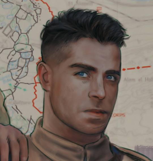
A baby, a literal infant child !!! who put this wee bairn on the front lines ??! 😭
Anyway! peace out ✌️
#tutorial#my art#art tutorial#since people have been asking#I remembered to save my process from this latest work~#enjoy 🙆♀️
1K notes
·
View notes
Note
You’re in art school right? Do you have any tips for making digital paintings like yours? They’re both hyper realistic and have a dream like quality to them that’s so amazing (also super excited for your prints, just ordered some!)
I graduated last year/that was my second degree :D!
A have a few things I can run down-
Photo reference. There are things I legit cannot get down right that I need photos for so my family ends up being my reference for things/I get photos from them doing poses I sometimes need.
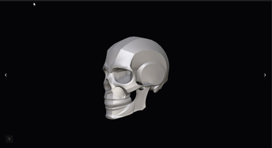
If you can't get photo refs you can always use 3d models too to help with shadowing and where light should hit!
There's posemyart justsketchme -
Also anatomy4sculptors has some free photo scans and 3d models of the body

2. Pureref
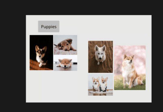
Feel like no one talks about pureref enough but I like to make little refs and inspo boards before I draw! Plus it's like free
3. Thumbnailing
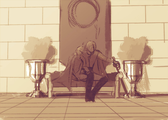
Omg please thumbnail. Like it's honestly a lot of fun cause you're not showing them really to anyone unless you need help picking but they're scribbles and doodles for you to know what you want your composition to look like or what the mood is gonna be
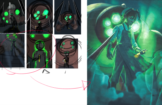
Again they don't have to be anything special could be stick-figures or whatever but it's to help you plan
4. Post-Work
I play around with curves and blurring so much like there's a lot that happens even after I finish comes sometimes I'm like "no I don't like these colors" and end up playing around with them more with curves and color balance

I made a tutorial about curves here! I also talk about the darken and light layer here too cause they're legit my favorite layer modes to play with and not a lot of people talk about them. I can't find my one talking about blurring+ noise(if anyone finds it please link it over :D)I might have to make a new tutorial on those- I think one of the things that gives it that dreamy feeling is the blur I use-
I like to keep things I don't want so much attention on blurred out/ and keep things I want you to grab your attention more in focus

also like using textures are fun too to add over art sometimes. It also makes like the art feel less sharp+ adding noise gives it that fuzzy look to it
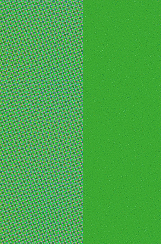
I like make my own to add over or use some I got over the years! They're fun to slap on and have as overlay
5. Bug your friends lmao
I have bugged @chrispypapas in the middle of the before to ask him for help/to give me a second eye on things cause 1. Sometimes there's something you don't catch your friends do and tell you what to fix or 2. You're being overcritical and it's fine
I hope this helps :D!
168 notes
·
View notes
Note
Hello Botanica I admire your art so much ❤️ do you mind giving tips on how you improved your art over the years? I would also be delighted if you could show us what your drawing process is like a little bit, if not thats cool too🤗 have a great day!!✨
Hey there! (*waves*) Thank you so much for the love <3 I'd be happy to share some insights on the topics you mentioned! (Sorry that it took a while.)
I think I’ve been drawing for almost 20 years now (Whoa!). Honestly, I don’t even know how I made it through, but ever since I was a kid, I knew art was a necessary part of my life. Looking back now, I’m just glad I stuck with it!
This piece is like a visual timeline of my art evolution. It’s wild to think I went from those super basic kid doodles to the style I have now. Growth is real, y’all!
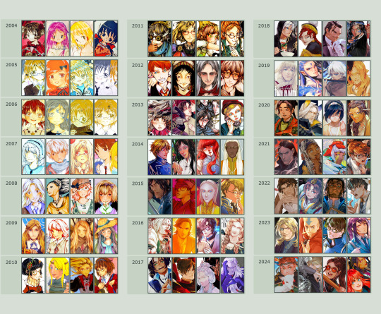
So the tips! (They are mainly for those hobbyist artists, since I don’t have the luck to make it as my career.)
Keep your eyes and mind open to learn from different fields. It’ll spark fresh ideas and enrich your art, but always double-check when diving into unfamiliar territory.
Find tutorials that vibe with you, and collect references IRL.
Use primary sources to avoid distorted or AI-altered refs.
Take your own photos as ref.
Use 3D websites like Sketchfab, Blender for 3D assistance, and posing apps or manikins to help with your art.
Practice consistently. Balance your time between quick sketches and more polished pieces.
Accept where you are now and improve from there. Don't let others' opinions or other artists’ activities throw you off your path.
If art’s your hobby, the goal is to have fun! No pressure to push boundaries unless you’re feeling it.
Let’s move to drawing process. I’ve been doing hand-drawn art for more than a decade, but had to fully switch to digital media after 2016. Now I usually use Procreate for sketches and lines, then use Clip Studio Paint and Photoshop for colors and adjustments.
I’m gonna share two sets of process. One is for generic character art, and the other one is for pieces influenced by environment.
So character art is like:
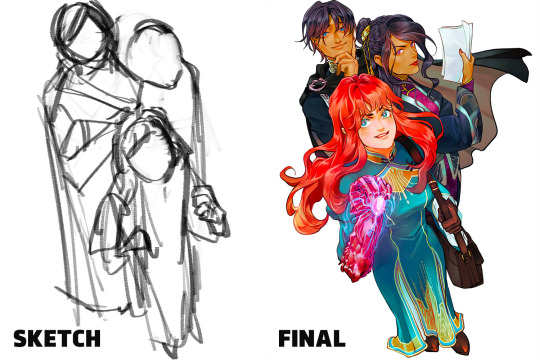
(More under the break.)
Do some (very) rough sketch to locate the characters → Line art
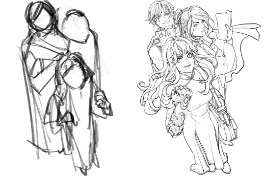
Define coloring section → Do flat basic colors, adjust the tone via gradient map, change line color
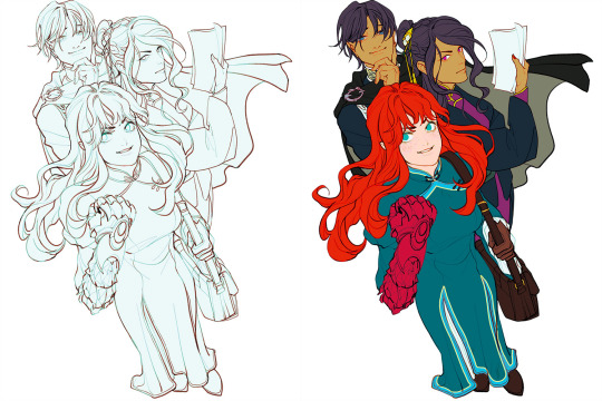
Add more details, use airbrush to shape the volume → Rendering (layer mode: multiply, linear burn)
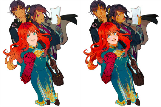
More rendering (layer mode: screen, overlay, soft light) → Post effects
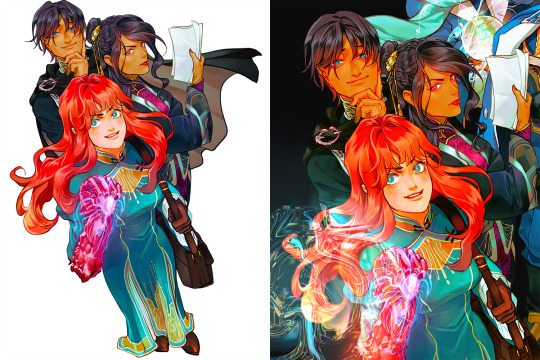
Done!
The next is art influenced by environment:
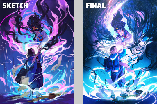
Make a color sketch to set the general tone → Line art
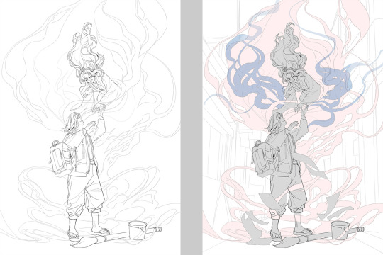
Flat basic colors (background & characters) → Darken the art (layer mode: multiply), add more details
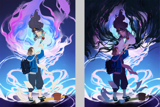
Add more details and begin rendering → More rendering, lighten some parts (layer mode: screen)
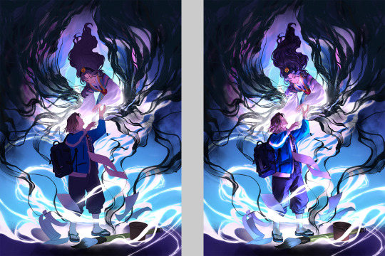
More rendering, use gradient map to adjust the tone → Post effects
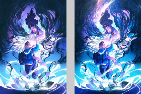
Done!
Wow, this turned into a long post! Hope you found something useful here! Thanks for sticking around till the end! 🙌✨
41 notes
·
View notes
Note
Very much love your take on the new looks for Orym and Ashton! I saw a bit of your post about how Liam and Tal give feedback... would you be willing to share any information about how the back-and-forth process works between you and the actors as you work on their stuff? (I just love hearing HOW the awesome happens, not just the end results.)
Yeah okay. Lemme think, here. Alright let's so this as a numbered list-
1- Actor sends description of character. This is pretty broadly interpreted, in my experience. It's something between a brief paragraph, an annotated pdf, and multiple pinterest boards.
2- I send back a Pitch. This has taken multiple forms in the past, but it's generally settled into a few pages, that kinda go- a- Poses and Vibe Sketches- This includes little portraits, attitude poses, a couple sketches showing extreme dynamism or movement. I try to suggest outfits and weapons or accessories, here, but I don't spend a lot of time fleshing it out. b- Outfit Poses- usually on a turnaround or one fairly lowkey pose. I try to include 3 or 4 serious attempts at outfits and maybe a couple of backs, if it's important. c- Color- I usually just pick an outfit at random and try to give it a few different palettes. If the actor is absolutely sure what the palette is, or if it's a character I've worked with before, I might just make one palette and briefly color each of the outfit sketches from b in that palette d- Accessories, Weapons, Other Important Stuff- if the character is carrying around like a book or a bird or a really specific weapon, I try to address that in its own space, though sketches for all of those things may exist on other pages. This has been known to be very pretty or a bit boring.
3- There is some form of back and forth between me and the actors (and a producer, who are all lovely and don't step in on creative things but are always working against a schedule and need to know how things are going. I just want to be clear that every producer at CR is a secret angel who eats deadlines and shits magic and every one of them totally Gets It. They are all One Of Us). The back and forth is always individual and based on the actor but it can be- a- Actor picks from menu, usually via complex "circling" system (also all sketches are numbered, so they can just ref numbers). b- Actor sort of picks from menu, while moderating and adding further references. c- Actor just sends a bunch more shit and I narrow stuff down based upon what they seem to be getting at.
4- There's this bit of finding what the pose is gonna be, marking in all the necessary accessories, getting that last email about adding a scar, can we add a necklace? etc. What you are left with is something that the Producers call "pre-final." If it hasn't already been with the modelers and painters this whole time, this is when the modelers and painters get the design and start their magic.
5- I go away into a cave for a time period of quiet reflection with my Gods. I refer to this period as "rendering." I cannot be reached by the reason of man and spend a lot of time bitching to my friends while I try to figure out why shading a cape is suddenly the most difficult thing I've ever dealt with in my life.
6- Done!
#i hope this is what you were asking for#and i didn't just write out a really boring list of chores lol#what's important is that the whole process feels private#even though I know it has the eyes of a LOT of people on it#including sensitivity consultants and friends and family of the actor#i consider that a Good Thing#it takes a village to raise a dnd character
296 notes
·
View notes
Text
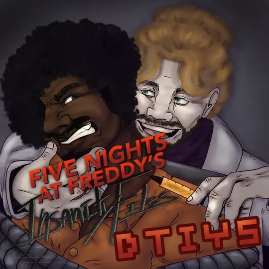
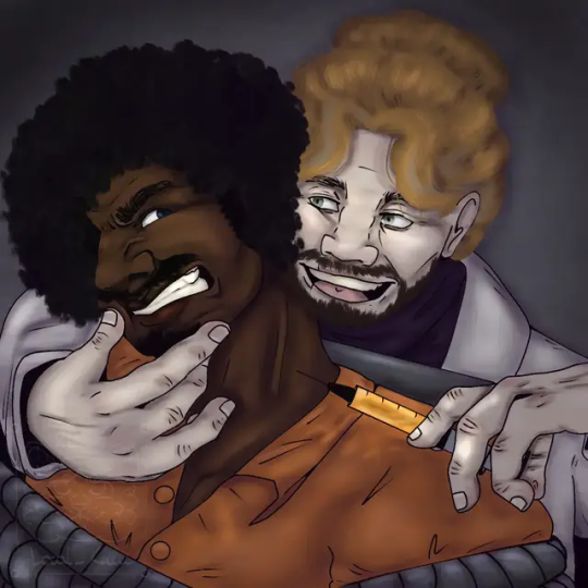
WILLRY DTYIS‼️‼️‼️‼️
Made this for 300 followers on insta but I am posting it here too :))) Please join if you want!!!
Its William and Henry having a lovely time together (William holding Henry hostage and experimenting with remnant on him) (Information secret to instagram is that Henry is totally into it)
〔R U L E S〕
•You may alter the pose or the clothes a little bit!
•Adding gore is allowed!
•Do not add anything inappropriate/+18/changing skin colour of characters
•Tag me in your post if you're gonna take part in it or use "#yourlocalkiwi dtyis" hashtag :)
‼️‼️DUE DATE IS 19TH OF OCTOBER‼️‼️
〔PRIZES〕
•1st place gets a rendered halfbody
•2nd and 3rd get a rendered "bust"shot
•Everyone who participates gets a traditional headshot! :)
HAVE FUN!!!
Under the cut ver. Without the text and color refs

#fnaf#henry emily#william afton#art#local kiwi art#artists on tumblr#willry#fnaf art#five nights at freddy's#dtyis#yourlocalkiwi dtyis#I am so unwell about them#I love these normal men#crazy scientist at heart#I want to kiss them on cheeks and blend them in a blender#draw this in your style#dtyis drawing#dtyischallenge
24 notes
·
View notes
Text
Kamen Rider Drive episode 39,, as I vibe to the intro I will say that my brain is still very much filled with Kabuto (<- just came back from reading about 6 paths in buddhist cosmology bc of it lmao,, fun thoughts)

ik this is serious and I also don't agree with what he's saying BUT he used the word "bukkowasu" which made me think of the opening (the lyric "heavy-na pressure bukkowashite"),, I love the op so my brain went "!!!!!!!!!!!!!!"

Chase is so cute 😭


LMAOOOOOOOOOOOOO both the fact that Chase is in the process of obtaining a lisence & Gou's judgemental look as he said that ARE FRYING ME 😭😭😭
also his "EEEEEEEEEEEH?" gave very strong Kazumi vibes /lh

cat.

cute 😭

HELP FOR A SECOND I DIDN'T EVEN RECOGNISE THEM

man I love his henshin pose sm...(also chanting "say it say it say it say it" abt the catchphrase after he transforms)

Ok "Kazama Daisuke" /jjjjj

HELP I'M SORRY it's probably the moustache or smth (?) but he looks like RDJ......
LMAOOOOOOOASHGFDGASKFDGSKJHFGHJDSGFHJKDSG

AWWWWWWWWWWWWWWWWWWWWWWWWWWWWWWWWWWWWWWWWWWWWWWWWWWWWWWWWWWWWWWWWW T---------T (audibly went "awwwwwwww" btw lmao)

I BURST OUT LAUGHING LMAOOOOO THE OMINOUS TURN...Banno you're not supposed to be here 😭

NOOO KING DON'T CALL HIM DAD-


is that-
...
🦗🦗?!?!??!?!?!?!?!?!
But also he didn't even say that </3 I mean in English yeah he did bc that's the expression but 😔 I was fooled by the translation for a sec </3 the reference (in my head obv) still stands (even if he did say hikari it wouldn't have been an actual ref)

Damn...I was (still am..?) hoping Medic would be the 3rd one- though I've been wondering why she's not in the intro so </3 didn't/don't have any expectations, I'm just wishing atp.
And the 4th would make sense to be Chase..? if he can even reach that evolution but idk, it makes the most sense in my head 😭 also adds a lot to the potential story development on an emotional level
Tbh I wasn't gonna say all of this as it's just silly thoughts I've had for a while but Heart had to bring the topic up so /lh /hj

Gou 😭 he's so cute,, he sounds so excited waa </////3
Tornado shut up and don't "wow.." . stay BACK

that was cool,,
AAAAAAAAAAAAAAAAAAAAAAAAAAAA Mach helping out Drive...NOOOOOOOOOOOOOOOOO Tornado is on the loose......KIRIKO,,,,,,,,,,,

this calls for

Banno :((((((((( which leads to -> GOU </////////////////////////3
Eugh don't tell me the 3rd one is 004 and not Medic </3 who tf even is that /j
6 notes
·
View notes
Text
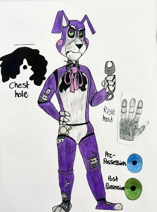
Yeah so I decided to update Susan's ref sheet because oh my god it's so fucking ugly-
But yeah, I'm much more satisfied with this one because I've developed my style for drawing these fuckers a lot better and the pose radiates more personality.
Old ref: https://www.tumblr.com/magewolf-the-artist/743345425139040256/on-this-episode-of-walten-files-brainrot-heyyyyyy?source=share
Here's her bio with a couple add-ons:
Apparently she's British (Her accent is still a mystery to me but I've seen a couple people say this so ehhhh). So my headcanon is that her family immigrated to the US when she was four, so while she does have an accent, she doesn't really say any slang. Occasionally she might call someone a twit (affectionate) or a twat (derogatory), but that's about it.
At some point during her fun little maze adventure, the neck cables that held up the animatronic head snapped due to the constant pressure of Susan's broken ass neck forcing her head to loll to the side. While at the facility she found that she can use metal ties to hold the cables upright. She has to tighten them constantly though or else her vision will be forced into portrait mode
Ashley fixed the cable while she, Kevin, and Hilary were there and Susan is forever grateful to her
She probably accidently breaks it again through something stupid like bumping her head against the door frame or something and boy oh boy was she PISSED
On that topic, she tries her best to upkeep her and everyone else's bodies but there's only so much she can do with limited tools and slightly worse motor skills (imagine doing a task that requires very precise movements through winter gloves and you'll pretty much get the idea)
She refuses to repair Bon though and tells him to figure it out himself.
She's become way more snappy, short tempered, and easily frustrated after her death. Trauma, baby!
Susan kinda acts as a shoulder to vent to whenever anyone needs to talk. She can’t really offer much in response or comfort since A, she’s the type to push things away and compartmentalize, and B… well, she can’t exactly promise everything’s gonna be okay, now can she? Still, sometimes it’s nice to just talk
Some days though she just kinda… shuts down emotionally. Just kinda lays on the floor and can’t find any motivation to get up or do anything. Thinking about everything and nothing at the same time, staring blankly into space
Charles usually stays with her during these episodes and depending on the day, he either just sits with her quietly or rambles about random shit like he did when they were alive
Her sleep schedule was super fucked up when they all came to the facility because she was used to being up and around at night. It's gotten better but she still sometimes wakes up buttfuck early and has come to appreciate the serenity of the nights (RETCONNED)
Probably the most casual about her death, as opposed to Rosemary's crying and Charles desperately trying to change the subject
She walks with a very distinctive shuffle, something she picked up from her fun little maze adventure because the weird shuffle walk helped lessen the pain she put herself through and conserved energy. It used to be a lot more pronounced but it's faded slightly overtime
Usually hangs out with Charles
Is constantly exasperated by Charles' antics
To pass the time she either plays card games with Charles or organizes the tools in the maintenance closet
She tried to talk to Rosemary when they were first brought to the K-9 facility but only got silence in return. She's kinda just given up now and mostly leaves her alone
Is the most familiar with Bon's abilities and didn't even bother trying to escape the facility because she knew it was futile
Helps coach everyone but Rocket on how to move
When helping Ashley figure out to move she probably made an off-handed comment like, "if you think that's hard, imagine having to learn how to do this while being alive" and only realized Ashley had no context for that when she gave her a very confused and worried look
Hates Bon's guts and is usually annoyed/angry with him
She also hates Felix's guts, but everyone does so it's not anything special.
#the walten files#walten files#susan woodings#twf fanart#twf banny#twf susan#the walten files fanart#Domestic K-9
26 notes
·
View notes
Text

New icon justdropped. I'll clean up the sketching later but I wanted something just cause I could have it.
I used a pose ref but am having trouble finding it. If anyone recognises it and knows, let me know so I can add. gonna go hunting later!
#I've got so many animatic ideas as well as drawings.#Just deciding what to do is a nightmare#( ^ᵕ^)⊃✎__#self shipping#selfship#self ship#yumeblr#yumedanshi#yumeship#self insert oc#ᛝ🍹💌🥥 ᛝ Confess I loved you from the start ᛝ#ᛝ 🎨🕹️ ᛝ an artists devotion ᛝ
3 notes
·
View notes
Note
Ur strength is definitely color and line work. Something I would say needs some work is definitely your full body drawings and poses. Your poses are always static and rigid and (especially when in motion) it takes me a moment to figure out what the character is supposed to be doing. Your anatomy is fine, its the stiffness of the over all pose thats the issue. It makes your pieces lack energy and any real umph. Your beautiful use of color and line usually covers for this but for me (someone who also struggles with this) it pops out like a sore thumb.
To practice, id suggest doing gesture drawings (1 minute sketches of action poses) to really understand how the body moves fluidly and to practice capturing that energy. Id also suggest doing 5-10 minute studies of full body figures in which you specifically observe how the pose affects the distribution of weight. How the torso curves in relation to the pose (your torsos are often very vertical and stiff) and how their muscles, fat, and clothing stretch, bulge, or fold depending on the pose.
Try to keep things loose during these studies and focus on capturing the energy of the pose over perfect anatomy. Focusing on anatomy can often be a distraction and can actually detract from capturing the fluid movement of a pose when you are first learning. You dont want to be thinking about anatomy during a 1 or 5 or 10 minute study if that is not what you are trying to learn.
While doing gesture drawings, its important that you move fast and dont get hung up on details. Get the line of action in there and the general shapes of the figure. Focus more on the movement of the figure over anatomy or details. Feel the rhythm in the pose and do your best to capture it. Id suggest doing 10 or 20 of these at a time. Sites like Line of Action are great for studies like this.
For 5-10 minute studies you want to build on the rhythm you developed during the 1 minute studies. Again, you want to focus on the movement of the pose over the details. Keep shapes simplified and force yourself to think in the abstract. A vibe i get from looking at ur art is that you get focused on the small details while losing sight of the big picture (might be wrong bout this but its something i also struggle with lolol) so during studies its important to keep ur mind on the bigger picture. Focusing in on small details adds to the stiffness of a piece as instead of one singular piece, it’s made of many smaller pieces. Idk if that makes sense lololol. Id do 1 hour of these 5-10 minute studies.
But yea id say this is really the main thing holding you back right now. Once you figure out how to capture the rhythm and energy in a pose id say ur golden lololol good luck! I hope this helps XD
oh gods yeah I need to whip some referencing for poses and specially dynamism, I tend to make things a bit too stiff. I think I cornered myself into making very static poses since I do a lot of character ref oriented work, and showing the design and outfits is a priority over the dynamism, and like, I need to get working on that.
It sucks to realize how I've let social media performance guide a bit on what I draw and I practice. People like their fullbody character designs with a grey background, and I've let a lot of What Isn't That fall apart, and it's bad! I gotta get better!
I need to find a way to maybe get a way to do these practices and still post it, bc even when I've done them, they stay in a folder and never get to see the light of the day. (Also, I saw the other ask and I'm gonna check that one soon! I struggle so much finding good refs for that!)
13 notes
·
View notes
Text
WHAT A DAY TODAY WAS!!! VERY FULLFIED N HAPPY N PROUD N ALSO MIX OF I WANT TO GET BETTER AHHH….. :’
— I got back into ft and was doodling characters and then had sudden urge to draw a more finished piece… and i decided this time to use a ref. it helped with idea and giving a base base for the male but I didn’t want to copy the pose one to one so I changed stuff and ahaha well. it wasn’t easy. and by god, the LEGS. Legs really a Big Weakness of mine. this one was soooo hard to try to get right. the struggle… at one point I was really just gonna crop to hide the legs but I didn’t want to do that.
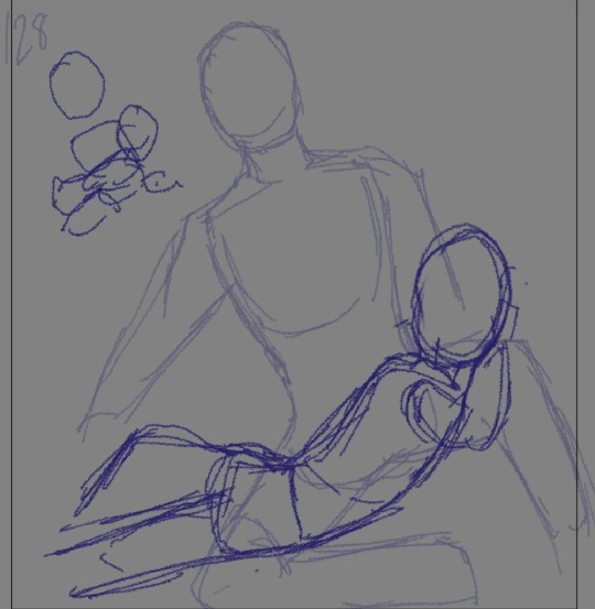
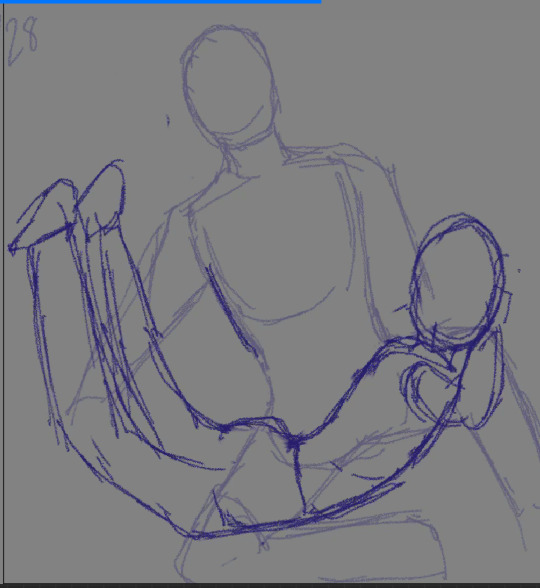
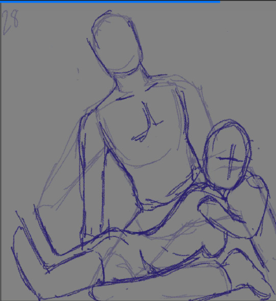
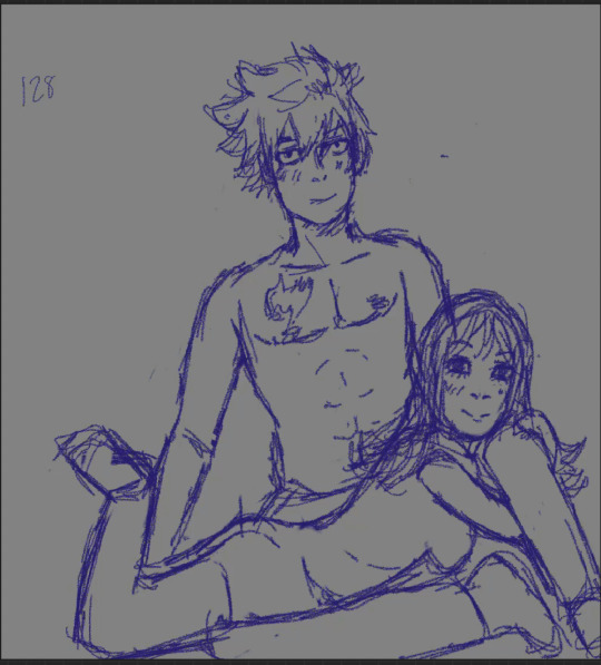
— also as you can see from the last and before last pic… I also realised another thing that “felt” off was lol that the entire pic was tilted… another thing I’m realising that I have a problem with my works. I tend to tilt stuff. so something to work on. I feel like there’s some kind of tilt…. still…
— I’m not completely satisfied with the legs and also my god. the arms was very hard too…. :’ BUT MAN. FORGETTING ALL THAT!!!! It’s so. So. Satisfying to look at this omg. I’m sooooo happoyyyy. And can’t believe. I really do want to more finish this piece… I honestly don’t have more finishing pieces which is what I want to have. Like disappointed prev I only have doodles and figure prac stufd to look back at. That’s why I have this goal to do more “bad” finished art. So that I can look back and clearly see my progress also just. There’s this endearness in having seeing your old art that you worked hard one :’
— anyways man after riding this high I needed to create more shit!!!!! so I DID. I had an idea and went right into it:
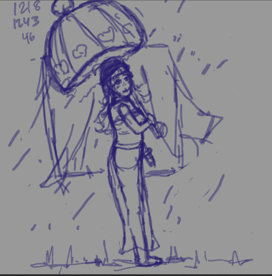
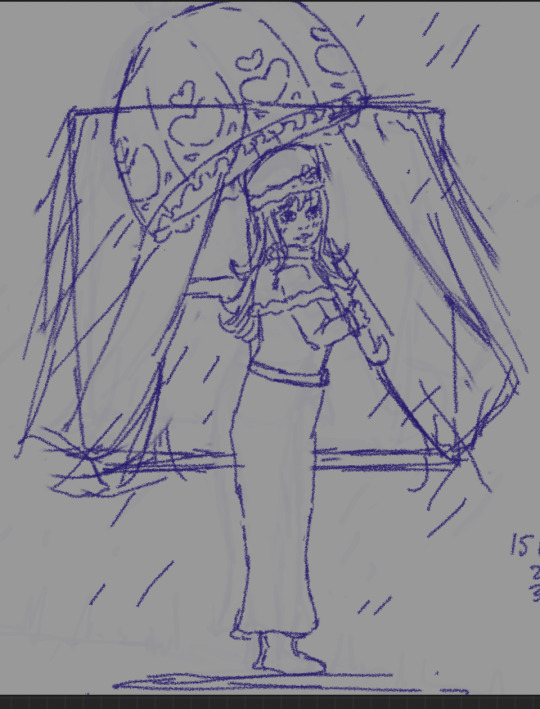
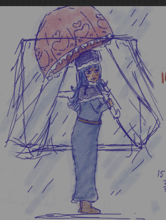
—and let me tell you, I seriously felt like crying when I drawing the more cleaned up version because my gosh, it’s so so so nice to be able to have this image you want ONTO THE PAPER. it’s something I struggled so hard with and now HERE I AM. oh my godddd. it feels SO FREAKIN NICE. I’m so happyyyy so so happyyy SO UNBELIEVABLY HAPPY :’ :’ :’ this is also another reason I want to create more finished pieces ahhhhhhh
— also lmao I didn’t realize while trying to clean up the initial sketch but oh wow when I utilized the canvas flip, I was like wtf? Why is the drawing so tilted and omg seeing them beside by beside lolololol.
—also initially this one was meant to be a simple character holding umbrella up… but I’ve been watching fixing art videos lately and composition ones and learned some stuff and thought it would be fun to incorporate and oh man it’s been so fun as I builded up the illustration. thinking about the beside it. first I was gonna go with flowers framing but I felt like it was too much circly stuff especially with the umbrella unique shape… so I went with curtain blowing… and ahaha I have this whole cool idea to add in when…
— I realized wtf, curtains aren’t on the outside but inside.., sIGH. I would like to ignore that and continue to draw it but :/ unfortunately I can’t 😭😭😭 it’s gonna BOTHER me. but I think I got an idea to still keep the initial idea. Also I do want to make changes still… the og sketch composition feels so much better with the curtain blowing… also as I was drawing I did realize wtf I don’t know how to draw curtain fabric… so I went hunting for refs and. Ahhh I do really like that part of process — I don’t know. It just feels more fun. Like I feel like a proper artist if that even makes sense…
— in middle of all that, ahahah, I really had this sudden urge to add color and so tried. and yeah, I suck at it but also it did help greatly with the what I felt like clothing lost…. like with the wrinkles/folds 💀💀💀 soooo hard to find any side ref for it I was losttt and I do like what the colour adds even if it’s not the best… there’s a lot to change n add to this piece and I do hope I get around to it…
— also a shame but I feel like with the trying to keep the tilt the right way, I lost some of the dynamicness the og sketch had awww. and honestly cba to try and change stuff around. who knows MAYBE I will get to. but honestly looking back at other wips I have from dec ahahahab. I Doubt it. But whatever.
— and of course after this I wanted to CREAT MORE STUFF!!!! And I did had this idea and well….
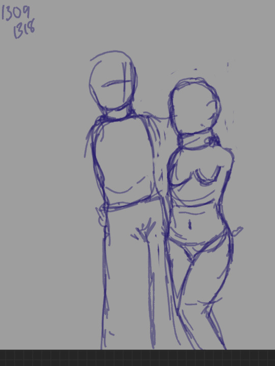
ahaha yeah. Didn’t go so well
— the problem was. well. I rushed too fast into it. I mean, yeah. I did have idea in my head into what I wanted but it’s another thing trying to get it onto paper. the last one was diff since it’s a just side pose that I practiced a lot so it wasn’t a struggle to get down. the struggle was mostly the clothes n stuff. but this one is more complicated and I just had a image. I should have sketched out roughly and also considered the hands more. like a issue I noticed I have is that: I think of the one hand that’s doing something but then the other one I have noooo. clue to do with
— anyways after that I just couldn’t bother to proper with this one and left it, like going back to it some other time ahahah.
— next one up 💞💞
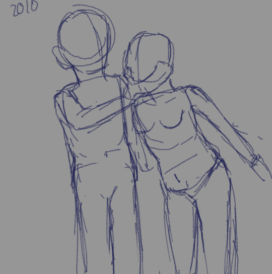
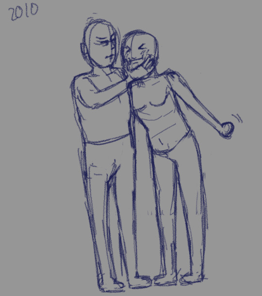
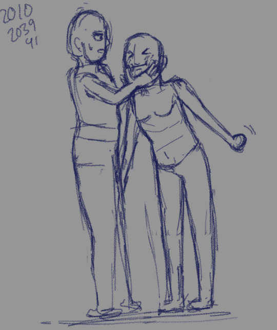
—this time I went back to refs, and saw this one and wanted to draw and ahahah I changed it completely. the only thing I took from was the way they were close and the way the guy was grabbing the girls’ face. everything else. real estate world.
— and ngl I was loosing some hope/feeling disappointed n sad around here n frustrated too… like sighhhh I did feel like I forgot shit but I’m realizing now I really didn’t…? More like my structure to starting sucks. The foundation ain’t strong. But I was completely changing the ref and challenging myself, since the ref they were sitting and I struggled with trying to get them to feel they were interacting
— bring the girl closer didn’t really do anything… other than make the pose weirder and I did want to be able to see more of her arm then I had a revelation: what if I made the guys body more side profile. haha I did felt a bit fhdjjdk erasing n changing the position of guy completely but it was kind of fun in a way. made me feel like a real artist heheh heheh. and OH BOY IT MADE THE PIECE SO MUCH !!!!!!! like LOOK!!!! the DIFF!!!!
— it made me get excited for it more…. and lol the legs again… I felt like it would be boring to make it too straight but don’t really know how to make it diff…..
— but anyways right now very happy with how it’s coming along and kinda dreading having to add clothes and do expressions. for the guy anyways. the girl’s expression is already down ahaha…
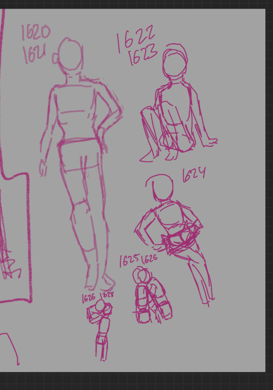
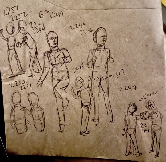
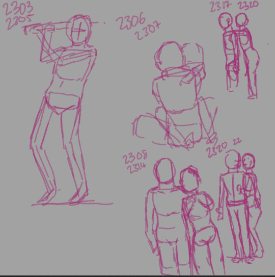
— as you can see at this point, I didn’t really do at all. or more I didn’t at all do any figure parc and honestly I didn’t even want to…. It pales so much to how much fun this stuff is but I did feel like I needed to get back to it. Cuz my foundation also I need to work on gesture and look at the legs more closely as I draw and the arms too..,,.
— and I did have this new idea for another piece to do and this one will def will be a challenge. but one thing i started to be consciously be aware of even as I was picturing this new idea: is to think of how the other arm would behave and the space and how the characters are turned towards each other and the space they hold…. This one will be quite ambitious since loolol they will be four characters 💀 and HOPEFULLY will add in a background too…. I have some idea in my head about the space n the poses…
— while doing the figure pracs, I did doodle an general idea of how I wanted the first two characters to be interacting and ahahah yeahhh it didn’t come out greatttt. but I thought it would be a lil better than that so it was honestly disappointing but it’s okay…. I can practice also did help to realize to not put a lot of expection into how this turns out but that’s also a kind of struggle since ha….. I already have this nice image in my head 😔😔😔 gonna be so disappointed if comes out So Badly. But also not surprised since after all this is a very ambitious piece for me… ahahah………….
#art journey#6th jan#also hehe did this sketch of character i do want to draw for my goal in feb and my gosh i lined it and it came out so well?!#but well it was only the face so 💀#BUT I USUALLY DISLIKE HOW SHE COMES OUY IN MY DRAWINGS SO VERY HAPPY…..:’#January
0 notes
Text
Just gonna add it here-

ALRIGHTY!!
Here's everything y'all will need to know for this 70+ follower DTIY
For your contributions for this, make sure it's similar enough, no need for the same pose or background!! It just has to have Blue in it!! And you don't need to do any background if you don't want to!
And here's the color palette of her:
Plus the white of the eye was just the background I had, but just use a white color if your background isn't white

You can put what you made under this tag and @ me! Wanna make sure I don't miss anyone's
There will be no winner or prizes or anything of the sort, just have fun with it!! But there is a deadline for this: December 1st!!
And I'll add the sketch ref I've done so far so you have a basic understanding of all the markings

The thigh stripe does go up more now, so it looks better, up to where the elbow is!!
I GOT THE COLORS DOWN!!! :D
Plus a minor tweak to one of the markings :P so it doesn't look weird
Hmmmm I'll add a basic background then when that's done I'll post the DTIY!! With the taaag... #dtiysol💚
12 notes
·
View notes
Photo


Some trollcall card poses for those who want to trace over them! no credit required they are completely free. for free Aleph Null card templates and backgrounds that can also be used look here: https://clockworkreapers.wixsite.com/alephnullau/downloadable-content
#anyone can use these idk im not gonna copywrite a pose#these are just for people who need a lil help to trace over#i did most of these on stream taking requests#i may add more or do more at another time#bases#fantroll#fantroll bases#pose ref#pose bases#homestuck#hiveswap#trollcall#art stuff#art ref#free to use
276 notes
·
View notes
Note
Just wanted to ask (and feel free to not answer), but how do you draw so much so quickly? I'm always impressed by how fast you doodle or paint. Also, wanted to say that I appreciate your Barok and DGS art as a whole.
and with this ask i have finally reached an artist milestone 😭
Well theres a short answer and a REALLY long answer (which ill put under cut when i get there).
short answer: practice + refs
which.....can be an annoying thing to hear. And as someone who studies art and has bought a LOT of online courses trying to figure out how industry people can just churn out work like nothing. it feels like a let down every time i find out their big secret. just practice and photo refs. Every. Single. Time.
LONG ANSWER:
its how you studying your refs. heres how i do mine
sorry if this is rambly. but ill try my best to at least be clear. BUT THIS is the EXACT way i taught myself how to be quicker.
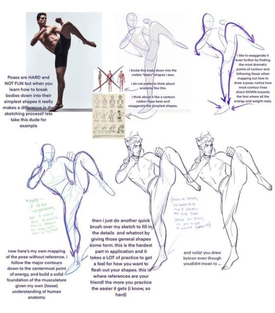
I do not know if youve taken any art classes but essentially one of the ways to study gesture drawing is by first tracing ur photo ref to get a sense of the flow/proportions of the body. youve probably seen a billion of these tutorials floating around:
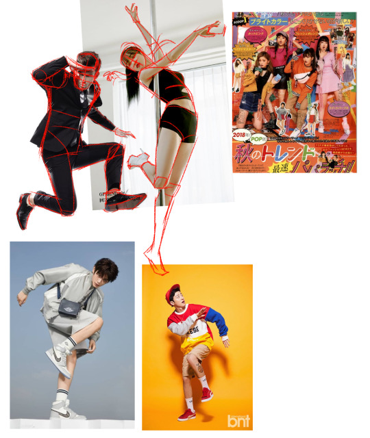
So last year around hmmmm june/july? i was NOT looking to get better at my anatomy or gesture. i was actually trying to get better at clothes. but my problem was it took me so long to draw out a figure (which i was fine with cause i liked how my people looked at the time) that i could never really just focus clothing part.
So i told myself look. ur not looking to draw in this style like this forever. so for now SIMPLIFY SIMPLIFY SIMPLIFY!!!! I WANT THE BAREBONES OF A HUMAN HERE TO MAKE A MANIQUIEN FOR CLOTHES OK
but how do i do that....
Im gonna use this piece as an example from my rise and yosuke fashion palooza month. FIRST u see i got all my photo refs together. i like those poses on the right and i want to switch out the clothes for the other ones i picked out. i trace out my poses. kind of like the tutorial up top but since this is about draping i was focused the exact places their waist/arms/legs/etc would bend.
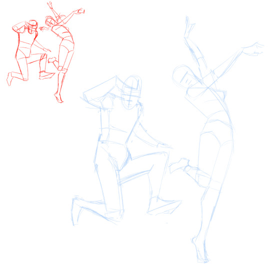
and like the tutorial u turn off the photo ref and do a drawing based off that traced piece.
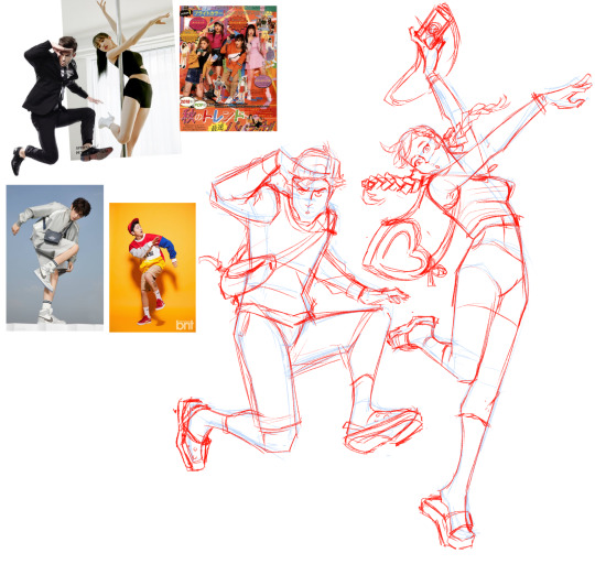
then i would turn on my refs and add on my clothes
And after a month of just doing that over and over and over. i was surprised to find that figures and poses were so much easier to understand when i would break them down like this. and once u get familiar with them the faster and more confidently you'll draw them.
I and still do this btw. heres my otasune from the last week

i used photo refs for all my sketches. if i cant find anything online to match what i want i just take photos of myself. and some might say well arent u just relying on reference TOO much?
AND AGAIN take it from someone who has spend a lot of money buying classes from their fav artists in the industry. The Secret of how they churn out so much cool work so fast always turns out to be this. practice and photo refs.
Every. Single. Time.(tho this is omitting a lot. im not getting into like they way they stylize their art work. that actually the fastest and funnest thing to do once u have ur base down)
Now PAINTING
The thing is, i dont actually post up all my work on this blog. So theres a ton of stuff you havent seen me do. These are some paintings i did 2 years ago for a class.
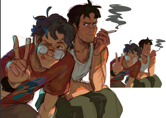
I already know how to pick my values and set up lighting. When you see me painting my figures now. i am not focused on learning these basics im actually just honing a technique.
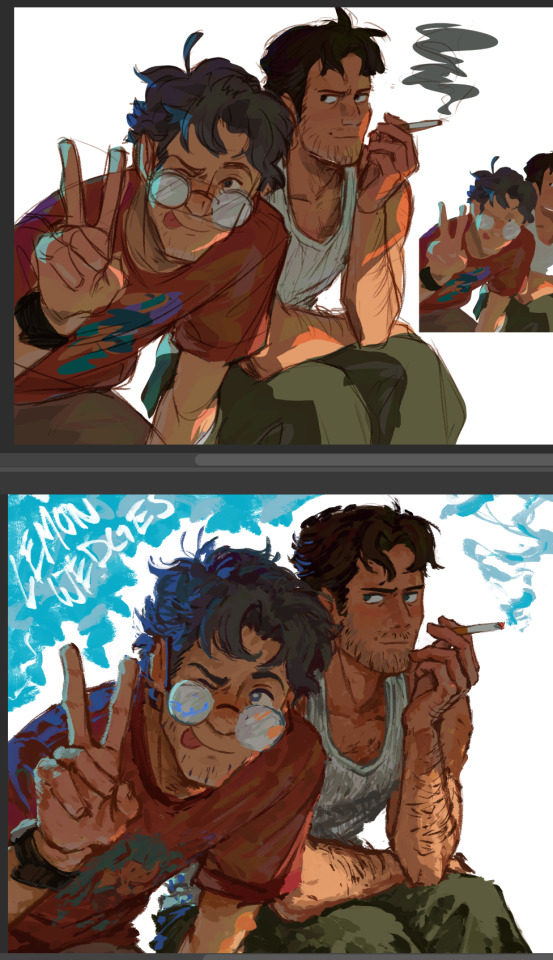
you might see me post readmores with these kinds of wips. I lay in all my colors and lighting with the lasso tool. ALL THE MAJOR DECSIONS ARE DONE HERE
(the little miniature i add on the side basically tells me what the overall feeling is going to be when i blend in the lineart to be cohesive with my colors) ( also if you had any questions on my prepainting process tho. feel free to ask!!!)
and if you compare this wip to my finished piece youll actually find that i dont stray that far from what i've laid in.
everything happening at THIS stage is about feeling out how i want the textures to blend with one another and getting funky with some brush strokes.
and thats it? im not sure if any of this is helpful but if anything. i hope you come away from this feeling like what ive been doing here is nothing special. "THATS IT???? THATS ALL THERE IS??? well i could have done that :T"
exactly man. you can do ALL OF THIS aND MORE!!! I BELIEVE IN U :D
but ill let this be the last thing i leave u with my friend: my barok sketch and the refs i used for his boobies
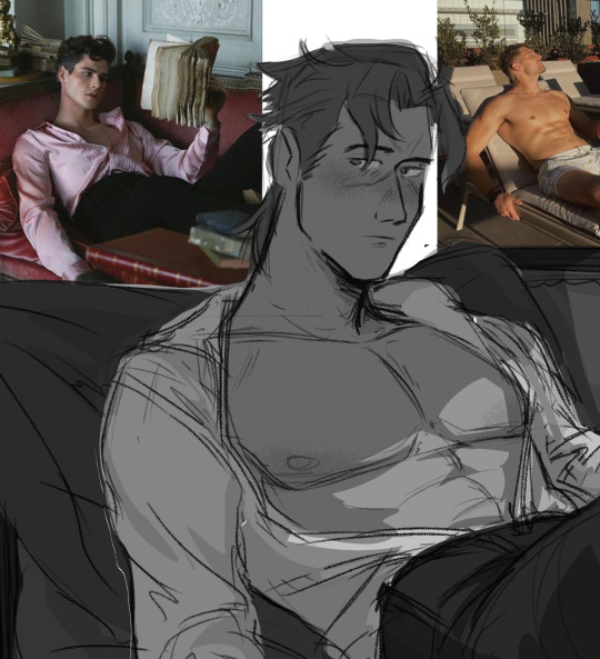
76 notes
·
View notes