#I was going to clean this up a bit more but my photoshop file got corrupted 🥲
Explore tagged Tumblr posts
Text

Eclipse.
#infinite the jackal#gadget the wolf#infidget#rookinite#sth#sonic the hedgehog#sonic#sonic forces#soup art#I was going to clean this up a bit more but my photoshop file got corrupted 🥲
73 notes
·
View notes
Note
sorry to bother but i have a few questions! curious if you ever used other art programs besides sai and more about art things
- have you ever used sai 2? i think its still being refined
- whats your art program “progression” if you ever used a program before sai exactly, like ex: ibispaint -> fire alpaca -> sai
- are you a many layers artist with a seperate lineart layer and color each individual spots like skin, hair, eyes and etc in different layers? or do you combine the lineart and colors and just paint over it? or maybe you have multiple ways?
- do you use references a lot? or do you “wing” how stuff looks like? (which could honestly show te growth when it looks so right which you do always! your art is amazing?)
i still have so many questions but i dont want to bother by making this ask too long, sorry about that!
ooh this is interesting
i have sai2 downloaded, but i think i got the wrong version (the one that has a time trial thing and stops you from saving the files after a certain period of time). and i kinda just never bothered switching to it amd looking for a normal version? i know sai2 has a lot more options and textures and what not, but i like my old sai1 more for some reason.
for the art program progression, hmmmm. it's pretty much all sai1 i think! i have fire alpaca installed and still use it to make gifs and animations or to import text to sai / manage files / edit minecraft textures / etc, but it was never my main program. i drew some stuff in ibispaint as a kid before i had my computer, but i think back then i also mainly drew on paper, ibis wasn't my "main". never got into photoshop, never used any other programs.
for the layers. i do use them a lot, but like, for testing mostly? for example, when i want to change something in the sketch, i copy the layer and then compare the old and the new versions, deleting the one i don't like. i color and shade on one layer, but when i want to check how it'll look with different colors, i make a new layer and then compare them. when i want to fix something, like redraw the eye or clean up the sketch a bit or see how the character will look in a coat intstead of a vest, i make the new layer on top and just paint over everything. and eventually merge all the layers together and keep adding on top. so, i make a lot of layers, but then i also delete/merge a lot of them.
i used to use a lot of references and put all of them in the backgrounds of my drawings with low opacity to create this effect of busyness but also so i didn't haveto switch tabs constantly. but i stopped doing it for some reason. i do still use references, mostly for things that i don't have much experience drawing or want to be accurate. like armor, muscle structures, certain clothing elements, instruments, background elements, etc. and i wing things like poses, anatomy, expressions, clothing, lighting, composition, whatever else. i also recently find myself looking at a lot of art of other artists for inspiration, but not necessarily as references? like, the specific way that one artist drew hair poking out of the bandana, or the specific way that other artist drew a shadow on the glasses, or the specific way that other other artist drew a tail, its inspiring and i go "huh, i never thought of that" and i try to implement it in my art. well, i guess kind of like references.
i feel like you've answered all your questions in your ask, so this wasn't very helpful, but uhhhh...... yeah! thank you for this ask and thank you for the kind words, it was a lot of fun! and feel free to ask anything else
28 notes
·
View notes
Text
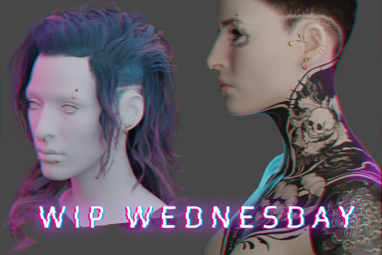
WIP WEDNESDAY - 21/06/23
(I mean it’s technically Friday now between timezones and spoons but have this otherwise I’ll keep forgetting) My first WIP Wednesday! Thanks @theviridianbunny for the tag! I’ve been really getting stuck into modding - as well as falling into my usual mod habit of ‘start like six project at once and end up with a million WIP files' but I guess I’ll talk about the major ones.
Graphic design is my passion ...
(Long) rambling about mods I'm making + things I've learned below the cut~
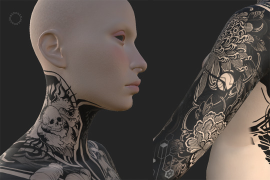
My V’s tatt project is still ongoing, and I’ve (somewhat begrudgingly) been trying out Substance Painter to work on bits of it, mainly polishing seams between UV maps. It’s definitely got a lot of benefits, especially for graphic placement in really tricky areas (like anywhere in the entire head mesh region for example) but I still think a lot of the heavy work will still be done in Photoshop so I’ll probably be writing up both experiences with them when I do that tutorial I keep hinting at for complex tatt work. I’ve started drafting a tumblr tutorial but I wonder if that’s the best format, maybe a PDF? Google doc? Github wikis look cool? (tho I think I need to pay for that) - if y’all got suggestions for tutorial formats pls let me know!
As for the other arguably overly-ambitious-project-where-I-bit-off-more-than-I-could-chew ...
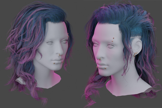
H A I R.
Hair has been the bane of my existence for about the past week( ... weeks? Maybe two?), most of it involving cursing, a lot of reverse-engineering game meshes and smashing my head against blender. But if not already evident from my monowire post - I am a stubborn bitch with too much time on my hands so even though there were at least two moments where I wanted to curl up on the floor under my desk and just stay there - we got there.
This all started because my favourite hair mod which I cannot split from my V’s identity was acting funky and the shape of it had been altered since a physics update. It wasn’t her anymore. So I needed new hair. I tried editing the existing hair. I tried importing the old hair mesh. I tried so many things and they didn’t work out one way or they threw a million errors or there were an obnoxious amount of verts.
I even tried looking for replacement mod hair. None of them fit, all of them felt too ‘clean’ for my V. So I just concluded: FINE. I’ll make my own damn hair. From scratch. At least then I’ll actually KNOW what’s going on with the mesh, right?
Problem with hair is tutorials are very limited in respect to Cyberpunk, so I had to learn a lot of this by myself and looking at other processes used for building game hair. I’ve had a previous stint in game design at uni but it was very introductory and more broad-strokes concepts not specific stuff like what ‘real time hair’ is and how you actually go about placing hair-cards (there’s a million different ways btw) but after another 3 days smashing my head against blender I finally got shit to work to a satisfactory level using hair tools for blender and the particle hair grooming system (not the 3.5 blender system, maybe more on that at some point).
Putting together the hair cards I was 120% convinced this was going to blow up in my face, primarily through vert count. But this hair tool plugin? Alarmingly efficient. I was frequently checking my work against Alt's hair mesh (one I was planning on rigging to) and here's the final-ish stats -

This is with only Alt's hair mesh selected (no cap) and then only my mesh(s - lots of layering to build it up), and by comparison I felt I'd built up the density of a chinchilla. This is not a brag, this is mostly genuine confusion over how efficient this plugin is, all I did was smack around hair curves. It did all the UV mapping junk on the fly.
Although structurally complete, I still consider this a WIP (yes I know there's a reeeeal fun vert funkiness in that second render, it's been fixed) since I'm having to go back and fine-tune some of the UV's the plugins mapped that I'm not happy with and generally figuring out my density problem because if anything, after putting it in-game it felt too dense.
Because yes, somehow I got it in game.
WITH. PHYSICS.
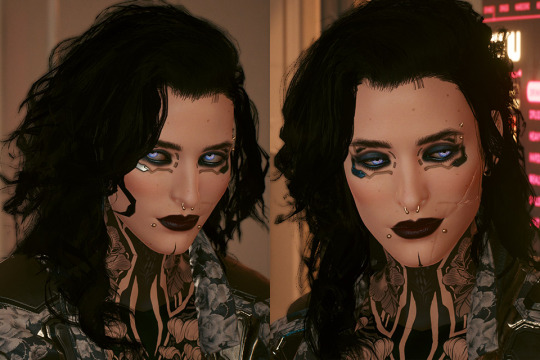
This may have driven me absolutely up the wall between having to learn blender from scratch then what the heck real time hair is and how that works etc. etc. but ... god, seeing her move back from the mirror and just feeling that instant catharsis of 'IT'S HER!' made it so. Damn. Worth it.
It looks too thick - this might be because I chucked in the 'doubled' feature Wolvenkit comes with because I hadn't spent any time doing backfaces. But it also might be because it's black? That's going to need investigating.
The physics need a lot of work too, I did a pretty rushed weight painting job last night on a merged version of the mesh because I was worried whether it was even viable and I'd already dumped an insane amount of hours into this between trying to salvage the old hair and building a new one (with some more bells and whistles. Mainly - curly). That wasn't without it's issues -
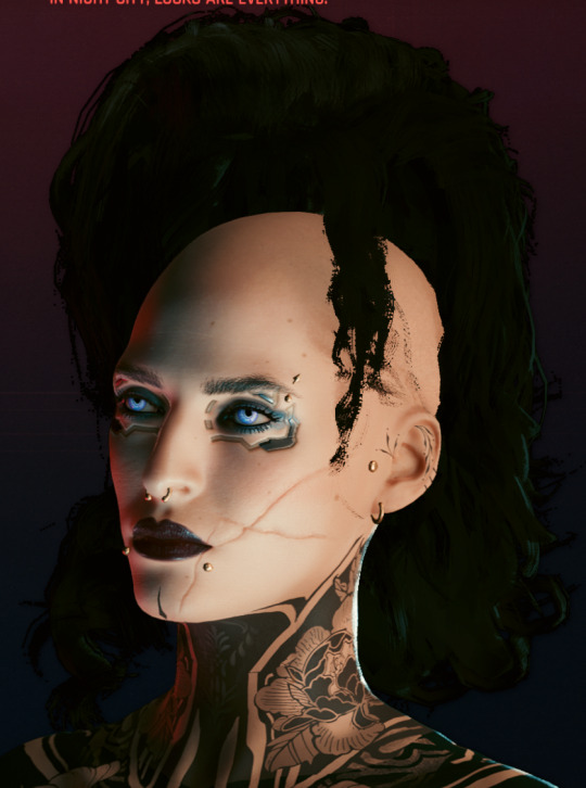
This almost fucking cracked me, given this was one of the issues I was experiencing before trying to fix an existing mesh mod. Turns out I was just being dumb and forgetting to export the armature, which I'd thought I wasn't supposed to do after having blender throw a bunch of errors on other hair attempts. I gave it a try after one last shot and boom. Worked. (I dunno what those errors were about man but now I know armature? very important).
Will I release this hair? no damn clue, depends on if I can get it to a level I feel is 'releasable'. I already know what I'm calling it though - Venatrix her side-handle I've decided on.
I look forward to adapting it into maybe a comb-back version, as well as a tied up version, so I can show off both her undercut + have the option of NOT hiding every damn tatt I've obsessed over placing on her neck haha.
In other news -
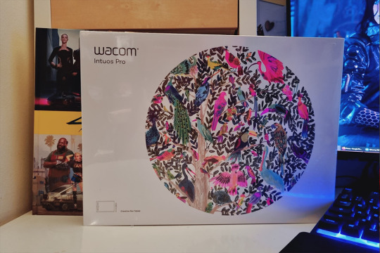
My much-needed wacom tablet replacement arrived (as well as other things I was looking forward to 👀) meaning my Wacom Cintiq, workhorse of ten years can finally enjoy her retirement. Her controls were getting funky, she had a few dead pixels but man. I'm convinced they won't make them like her ever again. Either way she's done unfortunately - upgrading my monitor to 2k made this painfully obvious. I don't think it's even running in full HD, it's that old. And with Phantom Liberty coming out this year? I'm probably going to need a new videocard and DVI compatibility isn't really a thing anymore.
So for future I think I'll just stick to the basic tablet set up, invest in screens. Also now I FINALLY know what her hair is gonna look like and with the tablet here, I can get back to work on the tattoo bodysuit.
Anyways, that's it for now! (Jesus Christ did you really read all of this? If you did you're a fucking trooper). Sorry for the extended ramble but MAN I did a lot, I needed to yell.
Till next time Chooms! Thanks again @theviridianbunny for the tag~ <3
Oh shit wait, have the blender renders before I forget because hahah I figured out how to do that too lol -

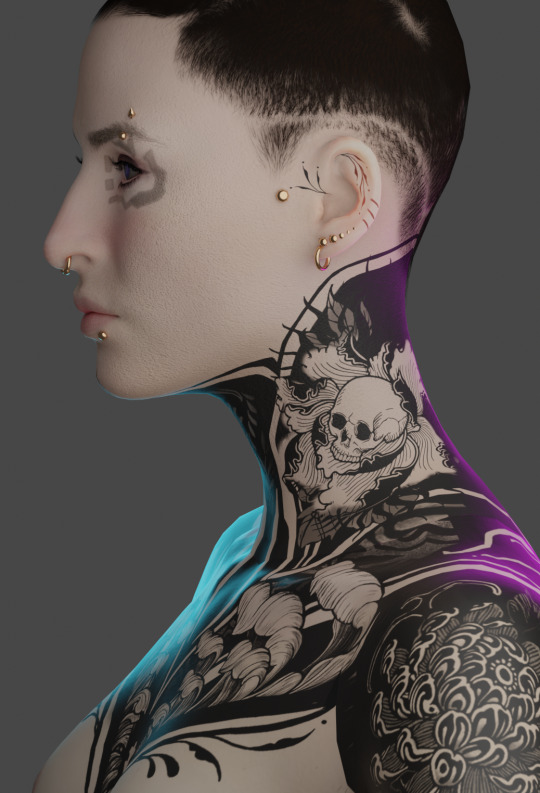
#cyberpunk 2077#my mods#wip wednesday#kerytalk#god I am sorry this is a fucking essay but I had a lot to talk about I guess#one can do a lot in a week with nothing but the power of autistic hyperfocus and the love for one's OC blorbo ok#cp2077 mods#cp2077 modding
34 notes
·
View notes
Text
Photoshop Composite Images and advanced selecting, Day 6

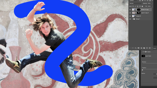
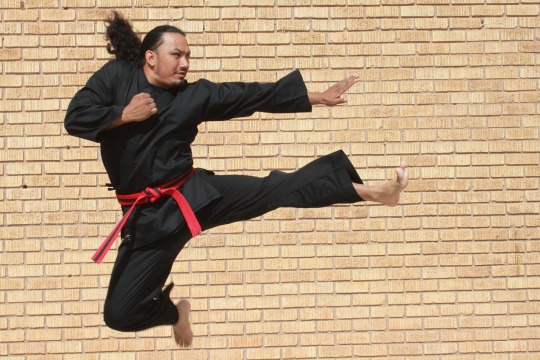
Today we started looking into image compositing, I have this image of a guy jumping in front of a busy background. He has come clear edges and some blurry edges like his hair that is making if difficult to remove him from the background.
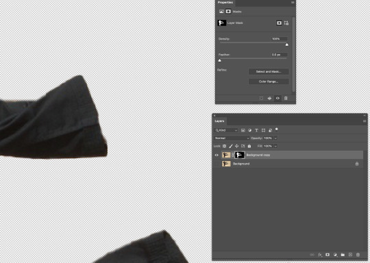
We started by duplicating and locking the background, we are going to be using the background copy as the layer to work on. Using the object selection tool to select most of him off the background. We created a layer mask from this so we can easily add/remove areas from him to help get a clean separation.
Between the background layer and the layer mask we created a solid background for easy distinguishing when we tidy his edges up. To do this we created a new layer above the background and selected a nice easy to work on contrast colour for me this was green, we then used command + delete to fill the background of the layer with this colour.

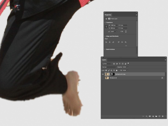
Now when we toggle the layer visibility of the background we can see what areas we need to tidy up on him. The underside of his body where the shadows sit are clean lines this is because of the contrast between them and the background. But the spots around his pink skin and light highlights are rough because of how close the colours are to the background.

Here I have tidied up his legs and arms, I started by creating another copy of the background layer and adding at the top of my layers naming it overlay, this was I was able to lower the opacity of it and see the areas that I might need to add back into my mask. Using the pen tool, I went around the guy and tidied up his edges, using the option + delete and command + delete I added and removed the areas in my mask I wanted using black and white (black being invisible and white being visible).

Here I used a new tool by going select -> colour range -> selecting the colour off the background I wanted to isolate and changing the fuzziness I selected the colour pieces to help get clearer hair, I then went in with the brush tool again on my layer mask and added/unadded sections I liked.

I found a cool background of a road and replaced my background with it.


Here I created an Illustrator file, I started by creating a grey background and a backwards S shape using the pen tool. Going back into my photoshop file and going; file -> placed link -> selecting my snake.ai file -> okay, I linked a live version of my snake into my photoshop file so any work done on it in illustrator will be reflected into photoshop. Back in illustrator I added a stained glass effect, to do this I used the pen tool with a white stroke and no fill. I roughly drew the outline of the shape with straight lines, as well as a rough centre line inside. From the points on the outside lines connecting the inside points.
Using the pen tool with no stroke and a colour fill I created coloured panels to go inside the gaps. Using the colour window to change the colour of these shapes and the stroke window to lower the opacity of them to 40%. Saving this updated it in photoshop.


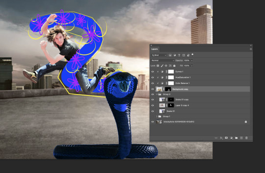
I duplicated the snake link layer placing it above my jumping man and created a layer mask on the copy. I control + clicked on my background copy layer to select the outline of my man, then on the snake copy layer mask using the brush tool in black (removing the foreground) I removed the snake sections where I wanted my jumping man to be in front of. At the end I added curves adjustment layer to make the image a little bit brighter to match the background more.

This is my finished image, I am very happy with how this turned out, I feel like I got my head around the tools and actions pretty quickly much quicker than Illustrator. I feel like I could have picked a better background with more light shinning from above to match the light source bouncing off the jumping man.
0 notes
Text
COMPOSITING HOMEWORK
FIRST IMAGE: GREEK GOD FROM JASON AND THE ARGONAUHTS

Firstly, placing the image down in the project, and giving it an overlay of itself so I can see what I'm adding/erasing.
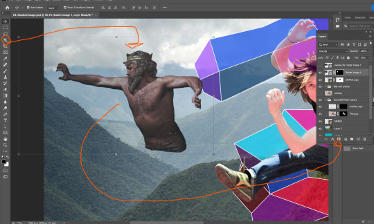
Here, using the easiest tool first. The Object Selection Tool to get a simple outline of the God, then turning it into a selection using the Work Path (alt + click on the box beside the Work Path text). After that, we just make a mask of the selection.

I want him back behind these hills. That'll involve erasing some of him so he isn't in front of the hill.

Here I've moved him behind the hill, and also behind the vector snake. But I've got some edges to smooth out.

I've cleaned up a lot of those lines using the soft brush brush tool, making the lines less defined makes it so he looks further back in the image. I also lowered the opacity of the God layer, just to make him look further back.
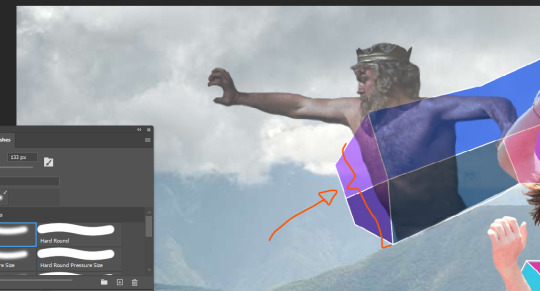
I felt the parts of the God's body behind the vector snake were too present, so I went in with the brush tool at about 3 transparency and made those parts more transparent.
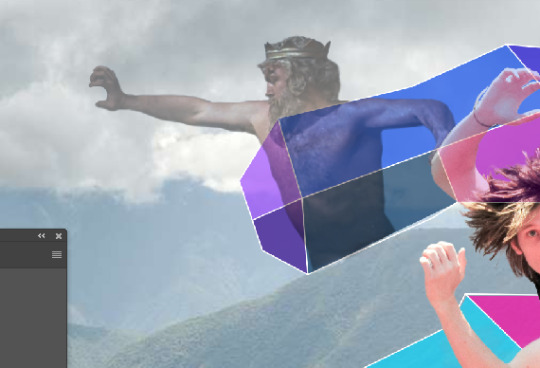
Decreasing the opacity of this layer again, just makes him look like he's right back.
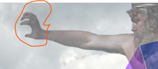
I went in with a small brush as to fix up the weird hand as a result of him holding onto a rock in the original image.
SECOND IMAGE: RINGO

Next I wanted to try and incorporate a small image into my work, so I decided that RINGO STARR would be a funny guy to place in. I went for this black/white photo to place, mainly because I wanted to try and incorporate that into the composition.

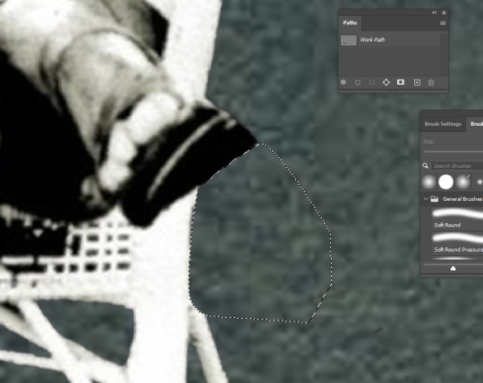
Pretty much applying the same formula I did with the Greek God, using the object selection tool to take Ringo and his chair out. The trouble is these small bits around here, so I just used the Pen tool to draw around this parts and then converted that into a selection, and filled that selection with black pixels on the mask layer.

The trouble now is how to hide that cut foot.

So I just placed him behind this bush, more specifically I removed his leg so it looks that way.

There he is, right in the back, looking on.
VECTOR IMAGE ONE: THUNDER
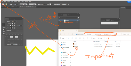
Unfortunately I forgot to document the creation of this file, but I made sure to open the whole photoshop image in illustrator (flattened), found where I want my thunderbolt, took an outline of it (the yellow squiggle), and then saved the file to this IMG folder. Making sure to keep it in that IMG folder.


Next, going into file and then place linked, just going to place that squiggle in place, then I can start editing it. Not skipping out on changing that setting circled in red to Media Box.
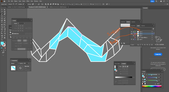
Here I'm taking a very similar approach to how I made the other vector image, but now I can explain it. First, I make two more layers, the top most layer being this white skeleton that outlines the bolt, and then a second layer for the colouring of the body. Also adding this gray background to make life easier in seeing the skeleton, but make sure to have that invisible when I save.

Then I go in and diversify the colours.
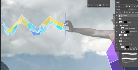
Here it is.

Making sure to place this bolt under the Greek God layer, I now go in and clean it up by creating a mask, and erasing all overlap with the hand (due to the transparency of the Greek God layer).

There it is.
VECTOR IMAGE TWO: Simple S
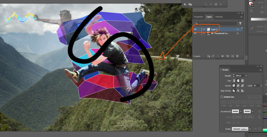
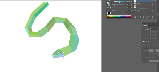
Pretty much following ever step as the previous vector object. I wanted to add another S behind the original, not sure why but I thought it'd look cool.
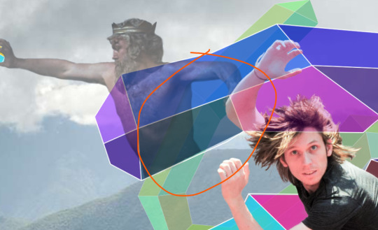
I need to add some more transparency to the Greek God as two layers are now overlapping him.
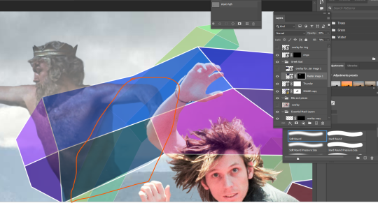
Just going in with the transparency turned to about 3 and a soft brush to lighten this pare up a little.
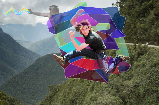
Finally complete, the full image.
Reflection:
I definitely stressed a lot while making this, and also cutting it close to the deadline doesn't help (just struggling to manage time at the moment). I completely forgot about the skeleton/body method when it came to making vector objects, so just went back and inspected the first one I made for this image. So, I wish I documented that process originally. This definitely helped build my skills, but it also stressed me the hell out, but that's life I suppose.
ALSO AN EXPLAINATION FOR WHY ALL THE IMAGES HAVE A GOOGLE LINK: I found Tumblr to be an annoying way to store screenshots, so I just chucked them into a google doc, turns out taking those images from the doc and placing them in links them as an image from google drive, I'll make sure not to do that again as it kinda annoys me.
here's the doc link: https://docs.google.com/document/d/1LazwekuUFVEyU9cOZBdAik50wVuxgqdyPpAmv9W9FjM/edit?usp=sharing
0 notes
Text
Fundamentals 1: Week 6
29th March
In this week's class we learnt about compositing by using Photoshop and Illustrator together. We were given this photo seen below of a man jumping in a karate action position. Our goal here was to use our skills and selection tools to create a mask and cut the man out of the photo.
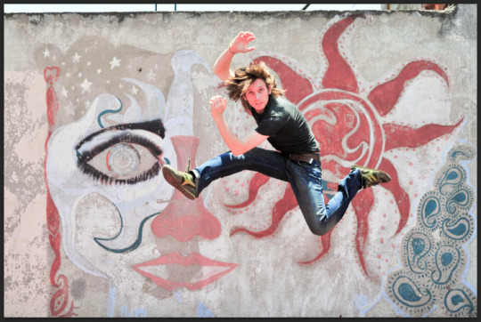
Already I could tell that this was going to be difficult from looking at his hair. But we started just by getting a basic selection around him to create the mask and then we can erase/ blur out necessary parts later.
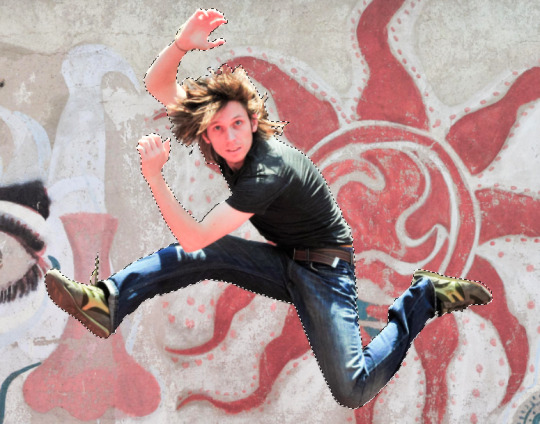
I decided to use the magnetic lasso tool as I thought it was quite handy for getting around awkward edges. It was definitely a slower process than others but it is definitely more accurate which saves me time in erasing parts that I don't want. As you can see above I managed to get quite a neat and tidy selection around most of the body. The hair was a bit of a messy selection but we'll fix that up once we've created the mask.
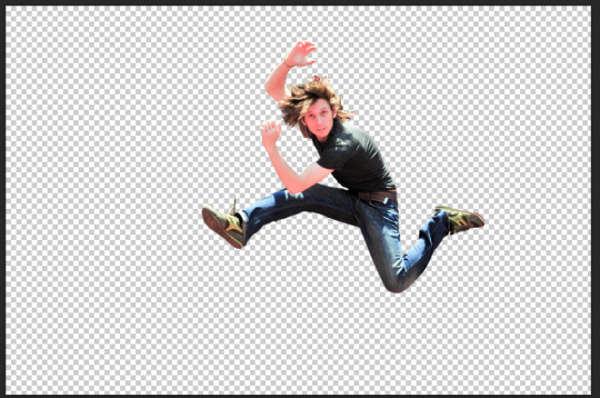
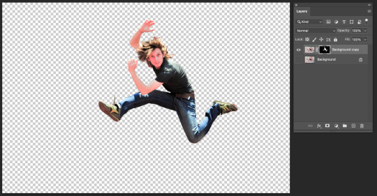
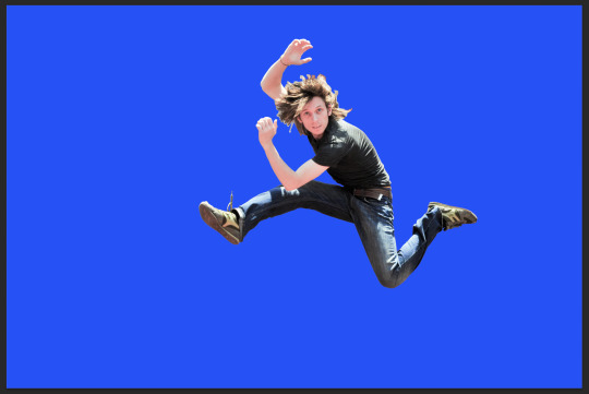
I created the mask and got rid of the background and added a layer of dark blue (or purple apparently once I put it up on Tumblr) to help me see what parts in the outline I needed to erase or blur out so that I could get a clean finish and it would help me create a realistic end result. The image above is what the mask looked like once I had finished erasing all of the excess light and colour around the mask. I was pretty happy with this as we moved on to the next task. Toby asked us to open up Illustrator and create a thick squiggle line vaguely following the one that he drew himself. Here's what mine looked like:
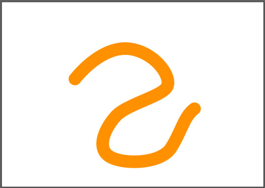
We saved this as a normal file on Illustrator onto our desktop. We then opened it up on Photoshop by choosing the option "Place Linked" from the file menu. Through that we placed the squiggle onto the file with the mask of the jumping man. Toby then showed us that through the linked image, if we made any changes to the file on Illustrator it would then update and change the file shown on Photoshop. Here is where it got a little bit tricky as Toby explained that we would make the squiggle appear to be wrapping around the man.
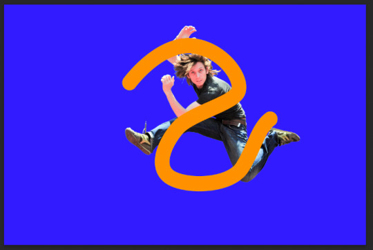
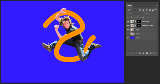
What we did was create a copy of the squiggle layer and make sure that the order of layers had a squiggle layer underneath the jumping man mask and a copy of the squiggle layer on top. We then used the lasso tool to select the area of the squiggle that was covering the middle of the man's body and turned that into a mask. You can see in the image below how the layers are set up and even how the mask of the top squiggle layer is cut so that only that part of the squiggle is covering the man's body. (I actually thought this was a really cool edit to do). After that I got rid of the coloured background and was left with this man and some squiggles.
Next, Toby asked us to find an image that we could then place this on to. I decided to go with a sandy beach photo as it seemed like a legitimate place that a man would be jumping (not sure if that actually matters). After using the image I realised that the lighting on the man and the lighting in the beach photo didn't quite match up but at the end of a long day I was pretty happy with how it looked.
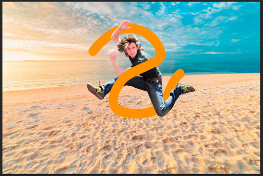
I really enjoyed this class as I learnt how to make quite a fun photo edit by using both Photoshop and Illustrator, and learning about how those two softwares can work together with interchangeable files. It also started to give me more confidence in my photoshopping abilities when it comes to cutting out an image and making it look tidy so that I could place it into another photo where it would look realistic as if it belonged there. I'm really enjoying learning some more advanced techniques and I feel like I have come a long way from the beginning of this Fundamentals class where I didn't even know how to get around Photoshop or Illustrator. I'm happy with the progress I have made over these six classes so far and I'm excited to see what we do next!
0 notes
Text
Week 6! Jumping man and compositing images
We took a quick visit back to the fruit bowl and added a couple of new tools to our belts.
With the pen tool you can hold down space and it will allow you to reposition the path (mind blown emoji) super duper helpful when mapping out a path and correcting as you go. I also had a bit more practice with broken points here and finally feel like I got the hang of it.
The other tool which was also a new discovery for me was the clone stamp tool. This cam in handy removing a seriously pesky blemish on that lemon.
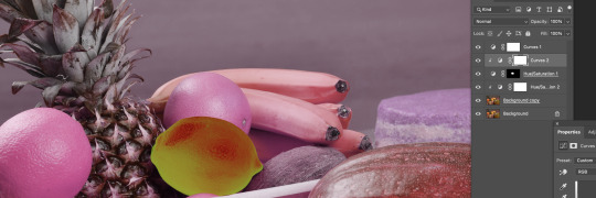

Just a little bit of experimental colour in the above pictures.
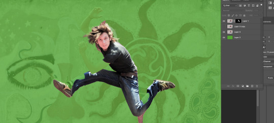
This fella, he was tricky to select! The challenge with an image like this is that the background has some very similar tones and colours to the figure and the object selection tool had a difficult time differentiating the two.
So to achieve a clean cut we had to employ multiple different techniques to add to the mask. I used a mix of the pen tool and the brush/eraser. the hair was extremely challenging. I don't think I quite nailed that one, but I can always go back and fix it

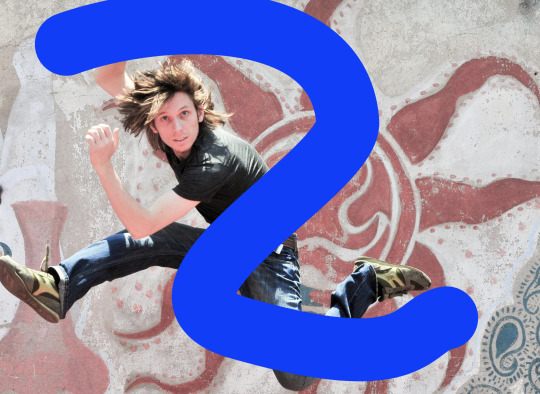
The next step took us over to illustrator, where we drew this squiggly line. It might have seemed random but the line needed to cover specific parts of the figure in order for the next element to work (we did this by bringing the jumping man over from photoshop to illustrator, once happy with the position we didn't need him in the illustrator file any more.
The next couple of steps I am still struggling to get my head around. The squiggly line we shall call "snake" from now on was then placed in photo shop as a linked file - this is pretty great to know - what you edit on the linked file in illustrator is then also edited in photoshop once you save (command s)
We created another selection mask over the snake and the body to give the illusion that the snake is wrapping around jumping mans body.
I went ahead and added a whole bunch of doodads to the snake just for fun. The last step was to add a background for jumping man and the snake.
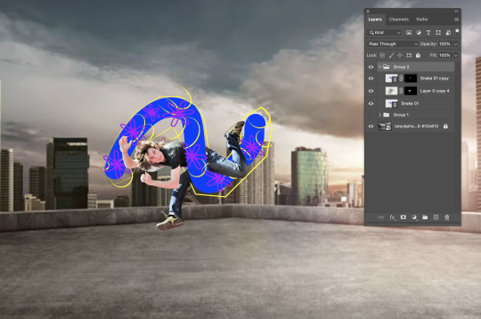
Its a wild world for the jumping man and his snake
Below is week 6's homework task. I had a hard time finding images with similar lighting and background so I made some psychedelic changes and chose some comical objects to add in. The snake was very straight forward to select, I found the clone stamp tool very useful to touch up the bottom where the gravel meets its body.
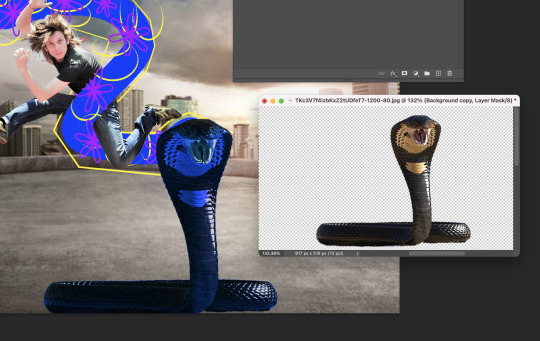
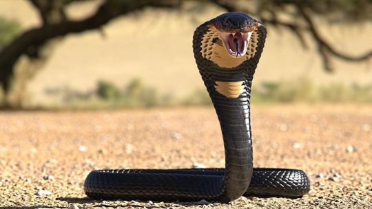

Using the object selection I was able to get MOST of the second jumping man. I had to fix some bits that were left out of the selection. I used the pen tool and the brush tool to achieve this.
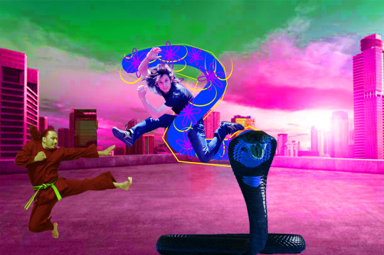
The result of playing around!
0 notes
Photo


HAHAHA GUESS WHO FINISHED THEIR MINECRAFT SKIN.... ITS ME
here’s the winning reference from my design sketchpages i whipped up for this

#minecraft#nomakuposts#nomakuart#'it's finished'; i say#mostly i just got sick of trying to touch it up pixel arts hard but i think i'm satisfied enough for now?#now i have to start workin to correlate it with 'me' when i play minecraft lol#i. don't change skins often i've used less than 10 in my years of minecrafting#probably more like less than 5#anyway i guess i technically cleaned up/redid the colors a bit on the ref doodle there#i had quite the process of slappin stuff down on the raw file in photoshop and tranferrin it to the site editor to edit on the model#and go back and forth n stuff#easier to get nice color mixing done with pshop brushes than pixel by pixel ya dig#but i also can't really tell what's going on in the flat version lol#anyway whatever i made it work considering i haven't really made any mc skins before let alone do pixel art in general for the most part#nomaku's mc skin design
38 notes
·
View notes
Note
what program do you use to do animations? ive been wanting to get into it but im not sure how and i know you draw in photoshop which i do too. thanks!!!
it really depends!! for longer stuff, i use adobe animate, just because photoshop tends to start chugging if i do animations longer than like, 20-ish frames. I do all the compositing and tweening for my animation memes in animate as well.

in addition to roughing frame-by frame stuff for my animation memes, (such as tirona's dance for the fortnite one haha) i like to do sketching/doodly animations, like this lil kitty, in photoshop, since it feels most organic drawing-wise to me. BUT, photoshop animation is a bit tricky, and deff opaque to anyone whos never done it before. heres a basic guide, under a cut cuz it got long LOL
create a new canvas. you can do whatever resolution you want but keep in mind, larger canvases will lag more. i do 1920x1080. if you select window>timeline, a new menu will pop up at the bottom of the photoshop interface
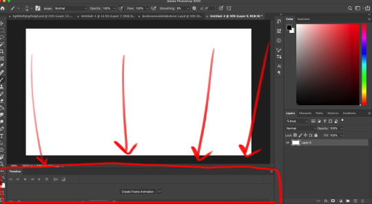
you'll notice a dropdown menu, that has two options: "create video timeline" and "create frame animation". i use create frame animation , just because it's more fitting for what i do.
selecting that option will give you a timeline with frames and everything! each frame's delay can be chosen individually. during playback in photoshop, it will play a little slower than the actual speed when exported as a gif, so keep that in mind

i would advise you to think of layers (or layer groups, if you plan on cleaning up and coloring) as frames for this. a layer's position, visibility, and style can change from frame to frame.
pay attention to these following options, they will appear over your layers menu on the far right once you create an animation timeline.
Unify: can be applied to position, visibility, and layer effects. it will change all the other frames to match what the layer is like in your currently selected frame.
Propogate frame 1: if this box is checked, any position, style, or visibility changes made to a layer on frame 1 will be applied to all the frames. unchecking it disables this.

editing a layer with the eraser or brush (or any other tool) will apply the changes to every single frame. so to create the next pose, you will have to go to the next frame, hide the first layer, and draw the next pose on a new layer. I've colored the layers in 2 different colors here for clarity.
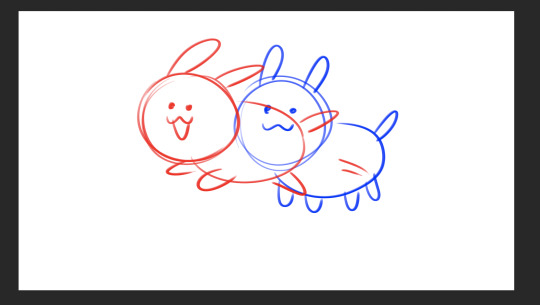
the blue is layer 1, and the red is layer 2. on the first frame, i will make layer 2 (the red pose) invisible and leave layer 1 (the blue pose) visible, and then on the second frame i do the reverse. You kind of have to do this manually for every single frame, so it gets a bit arduous if you have more than like 7 or 8 poses.
AND, exporting as a gif is also ridiculously silly and opaque too. go to file > export > save for web (legacy)


that will bring up this menu that is super complicated. the only stuff you really need to pay attention to is near the bottom, as everything else will work just fine on default settings (i've never messed with them in the 9-10 years ive been animating in photoshop, lol)
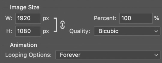
down towards the bottom you can change the export size, which is useful if you drew it on a big canvas but dont want the gif file to be enormous. also, you can choose how many times it loops. i usually just keep it on "forever", so i can watch it over and over again lol
and finally, make sure you click "save" and NOT "done". if you click done.. it does not export the file. i will not tell u how many times ive been in speed mode and click "done" and then get frustrated when the file dosnt appear in my folder. i am not smart.
anyways hopefully this is helpful.. ive been using ps so long i have extreme tunnel vision re: mentally filtering out all the useless extra stuff in photoshop's interface so i have no idea if this is confusing or not to someone who's never done it before. if you have more questions just let me know!!
76 notes
·
View notes
Text
A Case for Scanners.
Non-artists often assume that once a drawing is completed, the art process stops. As most professionals will tell you, that's not the case! Capturing an image for reproduction, and making sure that it represents the original work well, is oftentimes an art form of its own. Since this topic isn't something that has been given a lot of air time on here, I thought it would be fun to ask some folks who do a lot of non-digital work, with (seemingly little) processing, if they had any hard-earned advice on how to get a final image!
I hope everyone is having a nice summer, and that you all are making lots of art! —Jane
Roz Chast
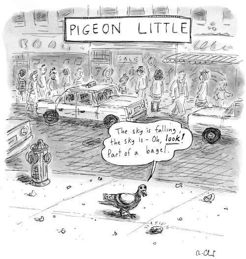
Find this print here!
How do you get images of your work? For reproduction, I use a basic Epson scanner I got on Amazon a few years ago (my old Canon one died). Cost maybe $175. My only complaint is that it only goes up to 8.5 (maybe 8.7) by about 11.5 inches. If the image is bigger, I scan it in parts and put it together. The Epson scanner is excellent. You can scan up to 1200 dpi which was useful when I did drawings that were 9 by 12 inches and they were blown up 9 by 12 feet, and they looked FAB. I was amazed. I also once scanned an embroidery that the NYer used on a cover and it worked fine.
But for just sending someone a quick pic of something, or posting to Insta, I use my camera. Oh, and for pysanky eggs, I use my camera. LOL, wouldn't be good to smash them flat in the scanner.
What are your best tips for getting a good image? If the item you want to scan is a little rumpled or wrinkled, press down hard on your scanner lid before scanning. Also, I use Photoshop to optimize the image--mainly brightness and contrast and to remove patch shadows etc. And for embroideries and pysanky eggs, I use my camera and photograph them in natural light outside. Not in bright sunshine or dark shade-- in between.
Does your method differ when capturing a colorful image vs something black and white? Not really. But I do adjust for brightness and contrast with Photoshop, no matter if it's in the scanner or the camera, b & w or color.
Joe Dator
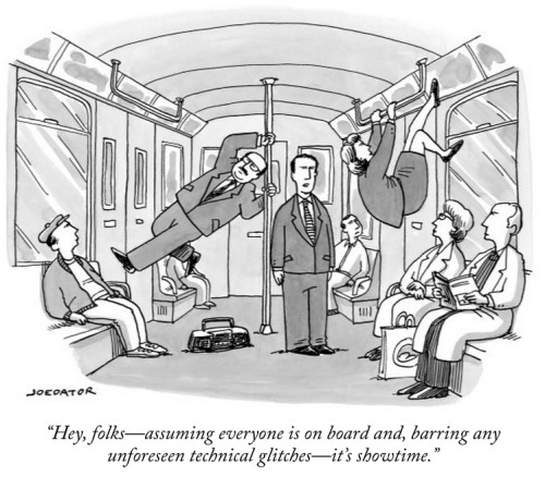
You can find this print and more here.
How do you get images of your work? I scan my images. Ever since The New Yorker stopped accepting original artwork, the cartoonists have had to scan their own work and send it as a digital file. It's been a source of some frustration for me, as I used to rely on the top-of-the-line scanners at Condé Nast's imaging department, but now the quality of my published work is dependent on whatever modestly priced scanner that I can afford to have at home. For a while I was using a Brother and then an Epson all-in-one printer/scanner, though neither were very good at capturing the nuance of wash shading. I've now got a Canon 300, which is a dedicated scanner, and is somewhat better, though not by much. It's adequate for its very low price, I suppose. All of this has led me in some cases to scan my work as line art and then add the grey or color areas digitally, or sometimes to bypass scanning entirely and just create digital art.
What are your best tips for getting a good image? It's always better to go a little bit darker and then lighten the image after the fact, because that way you've captured the information that is there. You can subtract information if there's too much of it, but you can't add in formation that wasn't captured in the first place. I always take a very high resolution scan, 600 dpi, and then adjust the image in Photoshop, mostly with the Levels feature. I'll also go in very close to the image and go over it with the eraser tool, removing any dirt or blotches that I see. This is made much easier if I remembered to Windex the glass before scanning! Best tip: clean the glass first! I have wasted hours of time cleaning up images because I forgot to wipe the glass clean before scanning!
Does your method differ when capturing a colorful image vs something black and white? No difference in how I capture the image from the scanner, but the way I will clean the image up in Photoshop differs slightly, because for a color image I will use the Levels as well as the Hue/Saturation and Color Balance features.
Amy Hwang
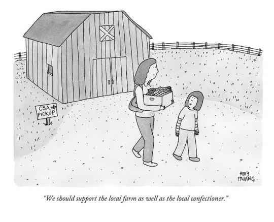
Find this image here!
How do you get images of your work? Flatbed scanner
What are your best tips for getting a good image? I used the photo setting to scan my work. For watercolor paper that isn't completely flat, I'll weigh it down with a stack of copy paper and place a heavy hardcover book on top of that. I'll also weigh the sheet down with my hands as the scanner bulb moves under it.
Does your method differ when capturing a colorful image vs something black and white? No.
Ivan Ehlers

Find this print here!
How do you get images of your work? If it’s a work of ink on paper, I’ll usually do the ink drawing first and then scan that just to be safe in case I screw it all up with the wash/color. If I screw it up, then I will do a digital wash/color pass in Photoshop. If all goes well, then I’ll scan the drawing again and adjust digitally as needed.
What are your best tips for getting a good image? Take the time to figure out your scanner and to learn which values will get lost in the scan and how to deal with that, either preemptively on the drawing itself or digitally after it’s scanned.
While scanning, if it’s a black-and-white image, scan in black-and-white. You’ll get more of what you want without the scanner trying to make sense of random color information that may exist on the paper. And the higher the resolution, the better the image (and information within the image) will be.
Once you get that image imported, throw it into Photoshop and hit Command-L to mess with the levels. This is where you’ll find the sweet spot of making the lines/wash darker, the mid-tones lighter (if you want to erase the background) or darker (if you want to show the wash/paper more) and your contrast (again, if you want to make the background paper ‘disappear’).
Also, depending on how the work is showcased (digitally, printed small on newsprint, professionally printed on expensive materials), you will learn what matters and what really does not. If people are just going to see the image on their cell phones, it doesn’t matter if the image doesn’t look absolutely perfect when zoomed in 6000%. If it’s for print on newsprint, there’s a limit to how much detail will show and how much color information will transfer. It's easy to get lost in a spiral of saying "It doesn't look exactly like the original!" Look at photos of original paintings, then go see them in real life. It never looks the same!
Does your method differ when capturing a colorful image vs something black and white? Black-and-white images are much easier to capture/edit in that the amount of information is dramatically lower than that of a color image. When working with black-and-white images, your concerns are mainly with levels (see above).
When working with color images, you still have to deal with the levels but add to the equation a step of color correction (or color mixing for those who consider the term ‘correction’ inherently pejorative and indicative of an error).
Getting color right is the hardest part. It’s like trying to find the simultaneous determination of position and momentum of an electron—You can either get a good line quality and contrast, or you can get good and true color, but you can’t get both. (This is of course me being dramatic. You can get both, but you better have a much better scanner than most of us can afford.)
If you need to ask how much a really good scanner is, you can't afford it.
Carolita Johnson
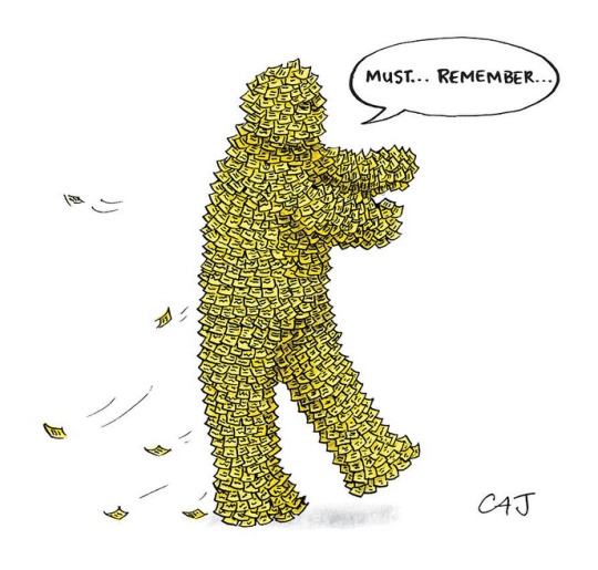
Find this print here!
Scanners are great for flat work without ripples. I flatten my stuff under two very thick, heavy pieces of plexiglass and with a piece of paper on either side of the original against the plexiglass after a very light fine misting with water if it’s too rippled.
Otherwise I remember Andy Pilsbury at TNY used to take photographs of fine color art — especially if it had a lot of texture— in his special studio.
Jenny Kroik
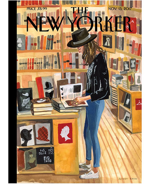
Buy this print here!
I use an Epson scanner. Mine isn't great, so I have to do a lot of Photoshop tweaking for color precision. I've been meaning to get a better scanner for ages! Get a nicer one, and you might not need to do as much color-correcting. (I got the cheapest one for like $70). Scan stuff at at least 600 DPI.
Also, my laptop has a retina display. I think they all do that now, I'm not sure.
Navied Mahdavian
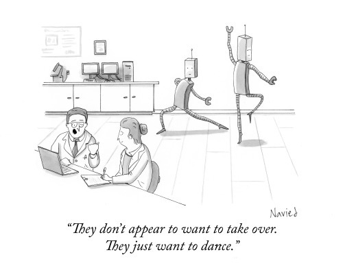
Find this print here!
How do you get images of your work? I use an Epson V600 Photo scanner. I've used a few scanners and it's my favorite.
What are your best tips for getting a good image? I usually scan at 600 dpi for finished images. I use Photoshop to clean up an image and adjust black and white (make whites true white etc.).
Does your method differ when capturing a colorful image vs something black and white? I usually do black and white, so I'll use the greyscale scanning setting. If I do use color I just switch it to color. Otherwise, all the same.
Michael Maslin

Find this print here!
How do you get images of your work? An Epson V550Scanner....probably 5 years old, still works well.
What are your best tips for getting a good image? Don't have tips. I just make sure the image on the screen looks as close as possible to the original piece. As I'm dealing with a simple ink line with some pencil added on, it's not a complicated replication. Rarely have to do anything with/to what comes up on the screen.
Does your method differ when capturing a colorful image vs something black and white? For me, it's fairly simple as the drawing is an ink line with a small amount of pencil added. I've noticed that color pieces invite messing around with "saturation" and those other tools. I almost always end up liking the "adjusted" image better than the original.
--
If you enjoy this blog, and would like to contribute to labor and maintenance costs, there is a Patreon, and if you’d like to buy me a cup of coffee, there is a Ko-Fi account as well! I do this blog for free because accessible arts education is important to me, and your support helps a lot! You can also find more posts about art supplies on Case’s Instagram and Twitter! Thank you!
#how to scan art#how to draw new yorker cartoons#roz chast#joe dator#navied mahdavian#carolita johnson#jenny kroik#michael maslin#amy hwang#ivan ehlers
15 notes
·
View notes
Text
So, as some of you might know, one of my GIFs was recently featured on the Tumblr Radar - which is pretty cool! I was fairly happy with how that one turned out, especially considering that I made it rather last-minute on a whim to acknowledge Valentine’s Day. It understandably received a lot of attention as a result of this, and I’ve loved reading through all the comments and tags (especially all the ones about how people want to eat the heart containers from TP); however, I wanted to clear up a bit of a misunderstanding surrounding the creation of that GIF, as there were additionally a lot of tags along the lines of #3d art or #artists on tumblr in that influx of reblogs. I don’t want to take credit for something I didn’t do, even accidentally, and so allow me to be perfectly clear: the heart container GIF is not something I modeled and rendered myself! It is the original in-game model, recorded in-game using the Dolphin GCN/Wii emulator, with very little done in the way of post-processing in Photoshop. If that sounds impossible or confusing (which is perfectly understandable, for those of you unaware of what Dolphin is capable of), I’d like to take this opportunity to give you guys a bit of a “peek behind the curtain,” as it were, to show you guys exactly how I made that particular GIF, as well as similar ones I’ve made (such as those in my #items tag).
I didn’t take screenshots of my initial process (nor did I save the edited textures I used), so I’ll be recreating it from the ground up for the sake of demonstration, but that shouldn’t be a problem.
First thing’s first: finding a heart container! For this particular GIF, I wound up using the one that spawns after the Morpheel fight at the end of Lakebed Temple. I’m sure many others would work just as well (I think, at the time, this one just happened to be the most accessible to me), but let’s use the same one for the sake of it.
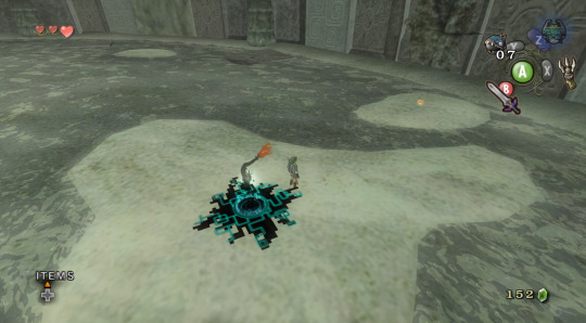
Morpheel: defeated. And I didn’t even need Zora Armor! (Seriously, we do that in the speedrun. But I’m getting off-topic.) Of course, we’re going to need clean, close-up footage of the heart container rotating in order to do what we want to do, so let’s shift into first-person mode and and get a bit closer to the thing.
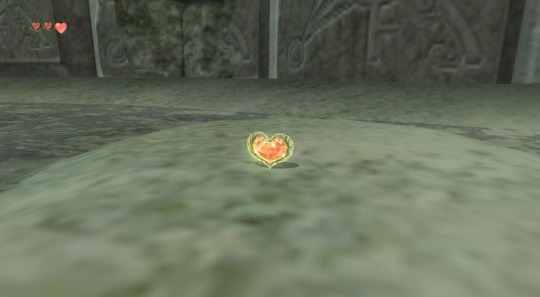
Now, because the only UI-element in this shot is Link’s health (and it’s in the corner and relatively non-obtrusive), removing it isn’t strictly necessary - but I’ve already made a texture pack that removes UI elements as part of my Text Free TP project from a while back, so let’s load it anyway, for the sake of being thorough. This shot is also still a bit too far away, so next we’ll be utilizing Dolphin’s free cam feature (which can be accessed by going to Graphics > Advanced > Free Look and checking “Enable” in Dolphin) in order to get the heart container in a more central position. Now we’re left with this:
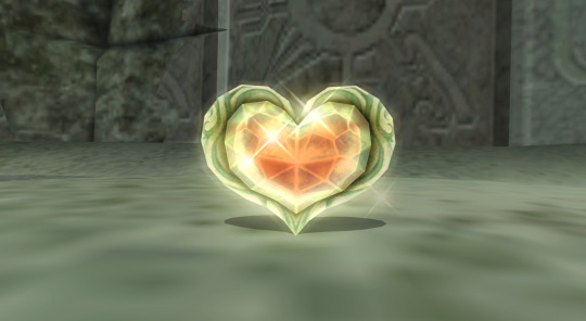
And we’re already looking well on our way to making a nice, solid color background GIF. But how do we get the solid color? Well, that’s where more texture editing comes into play - and here I have to give credit where credit is due, as this is a trick I picked up from 186px, after wondering how they were able to make this GIFset of Link fighting Ganondorf in The Wind Waker in a great, black void. (Seriously, shoutouts to them, their stuff was and still is amazing.)
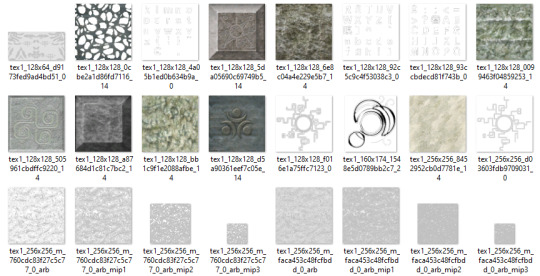
But, very basically, we’ll be using Dolphin’s texture dump feature in order to find the textures that need to be edited so we can replace them with pure black ones. Texture dumping can be enabled by going to Graphics > Advanced > Utility and checking “Dump Textures,” and the file path for these dumped textures by default is Documents > Dolphin Emulator > Dump > Textures > [Game ID]. (In the case of Twilight Princess, the Game ID is GZ2E01). After dumping the textures in the Morpheel arena, my GZ2E01 folder looks like this:
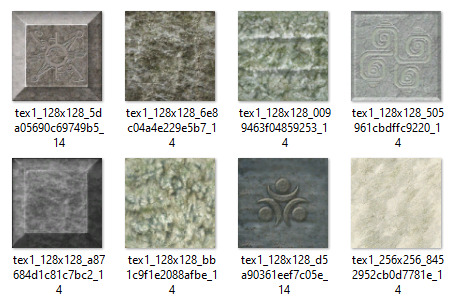
When editing textures, sometimes you’ll have to endure a bit of trial and error until you find the correct ones. Luckily, in this scene, the textures making up the sand floor and the stone walls are rather large, so let’s isolate the ones we’re pretty sure are responsible (plus a few others that are obviously environmental, just to be safe).
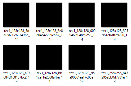
Now, when loading custom textures, it’s important that the file name you’re trying to load matches up exactly with the original texture that you’re trying to replace. I have a plain, black, square PNG that I keep on my desktop specifically for this purpose; I copy the file names of the textures I’ve isolated, then rename and drag and drop the black PNG into the folder where custom textures are loaded (Documents > Dolphin Emulator > Load > Textures > [Game ID]). Like so:
And now, to refresh our custom textures by disabling and reenabling them in Dolphin’s graphics settings:
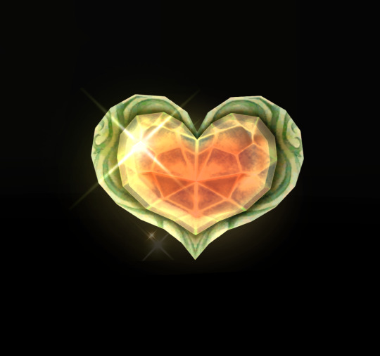
And voilà! We have something that very nearly resembles the GIF I made (well, a still of it, at least). I skipped over a few details, such as the fact that TP has a pretty significant amount of bloom surrounding just about everything, which I’m fairly certain I disabled using cheat codes when I made the original GIF in order to give it an overall cleaner look. It’s hard to tell from this still, but TP’s heart containers also sparkle considerably in a way that’s random and not loopable; I found the texture responsible for this sparkle and replaced it with a transparent 1x1 PNG, in order to remove it entirely (as well as the texture behind the “glow” of the thing). After that, it was as simple as recording the game with OBS, dumping the MP4 into Photoshop, cropping and cutting it to make it loop, and adding some adjustment layers for contrast and color. So...yeah!
I hope this has served to clear up any confusion about some of the things that I’ve made in the past. I’m not a 3D artist - just a person with an emulator and way too much free time on their hands. This stuff is really, super simple, and also lots of fun, so I would highly encourage anyone with the means to mess around with emulation on their own some time to see what they can do! (Even if you don’t have Photoshop and can’t make GIFs, there are always edits, such as this one I made of Midna.) For Twilight Princess in particular, I also highly recommend checking out TPGZ; it’s a patch you can apply to a clean ISO of the original game, designed with the purposes of helping folks learn and practice the speedruns (yes, I had to bring up speedrunning one last time, kill me), but it’s got nifty features like built-in savestates, cheat codes, and HUD removal, as well as the ability to freeze actors while maintaining the ability to move the camera freely, among other things (all things that are very useful as far as making unique graphics go). Sorry this post got as long as it did, but I at the very least hope that some of you found it educational and/or interesting. Cheers!
#uhhhhh i don't even know how to tag this#not like it will show up in the tags anyway because i've linked five billion things#twilight princess#long post#tutorials#i guess????#resources#myposts*#i didn't intend for this to be a tutorial i just wanted to explain that i'm not a 3d artist lmfao#OTL
72 notes
·
View notes
Photo


ok so i guess i’m gonna. talk. a little bit about what i’ve been up to? since. idk i have nothing else to share right now haha, editing and re-lettering book 1 of my comic has just become My Life at the moment, uh
Stuff on the left is old, stuff on the right is new.
I just noticed in that last set I forgot a balloon tail, oops, uh.
Anyway, I’m trying to clean this mess up a little bit. Going through these old files has kind of been... a trip. I have a lot more patience for detail now (I was diagnosed with ADHD in March and got medicated and that has made everything... so much easier to deal with) and going through these pages that I built 2+ years ago is... kinda depressing. I can tell by the quality of my own work that I was struggling when I made this. There are a lot of weird, careless mistakes that just scream, “I’m exhausted but I can’t stop,” and it feels nice to go back and fix that. It’s like I’m extending a hand to my past self, if that makes sense. I dunno.
I’m also using Illustrator to do the lettering, instead of Photoshop. So I’ve learned a new program, I guess. Lettering there instead of in PS is... a vast improvement, I have more control over a lot of things and it’s easier to make changes if something needs an adjustment.
I’ve done 10 out of 104 pages so far. I don’t know how long this is gonna take, but I’m trying to take my time with it and do it right.
2 notes
·
View notes
Text
Was it worth it
Summary: Based on the movie "Don't breathe" But with Yandere Jack Morrison/ soldier 76
Warnings: Rape, death (not you), murder, swearing, impregnation, messed up logic, blackmail
You remember your first meeting with him, it was pleasant. He was a nice blind ex military man who had just moved after the death of both of his children. Rumour said it was a drunk driver, but you didn't want to preye on anyone's trauma. When you first interacted with him it was when you had made him a house warming give the day after he moved in. It was an apple pie, you figured nothing could go wrong with apple pie. Your Parent(s) had said it was rude not to give a welcoming gift to your neighbour, it was a bit old fashion but you didn't mind.
The apple pie was warm to the touch as you knocked on Mr Morrison's door. It didn't take long for the man with white hair and red glasses to open the door. "Good Morning sir, My name is (Y/N) (Y/L) and I live next door." You realized quickly it was maybe best to say the number so he knew which side. "(N/H). Anyway I baked an apple pie here to welcome you to the neighbourhood. I hope you like apple pie?" You started to get nervous he was handsome. Scars litter his face and he was buff for an old dude. You started to blush thinking about him working out trying to keep fit. You pulled yourself out of your fantasy quickly as you realised he probably had a wife.
"It smells delicious." His voice made your heart jump it was smooth but had a rough undertone. "I'm surprised though not many people welcome new neighbours these days." He shifted on his feet before holding a hand out in your direction. "Especially someone so young."
You giggled, hoping to giggle away your nerves as you handed him the pie. "You're right with that. But I guess I'm just old fashioned."
Mr. Morrison was stoked to have you for a neighbour not that you knew. He thought you voice was angel like, he could listen to it all day. So he quickly tapped his red glasses to unblock his vision. He was using the glasses for training and to appear to be a weak blind man to be less suspicious. Looking at your hair looked smoothed to the touch. You were Beautiful he thought. Not to mention you said you enjoyed the old fashioned ways, something tightened below and Jack had to ignore for the sake of continuing the conversation. When you handed him the pie he felt your soft hand brush against his.
A cold shiver went up both your spines, Jack mumbled something that you couldn't hear. "I hope you enjoy, and if you need anything I'm just next door."
Jack could think of many things he could need you for, one included you on the floor right now letting him fuck you. He sighed knowing a pretty thing like you probably had someone who would take care of you. Hell if Jack was younger or not pretending to be blind he would absolutely have pouched on the opportunity to care for you. "I'll do that then."
_______________________________________________________________________________
Months had passed since Mr Morrison had first moved in and other than his dog's loud dinner bell it was peaceful. You only visited a few times mostly to bring him some food if you made too much, which he appreciated. You enjoyed the small moments with Mr Morrison despite it feeling like you would prefer him to your current boyfriend. You seemed to be comparing them a lot and you all too quickly thought Mr Morrison was a better man in general.
Andy wasn't a bad boyfriend but you did question his choice of friends. You knew two of his friends were low key thieves that stole from houses. But they never took too much Andy had said. Only enough to survive since their families kicked them out. You felt sorry for the two but all ways had a feeling there was more to the story then they let you believe.
After many days deciding where or not to break up with Andy you decided you could do better. Besides, you didn't want to involve yourself in what his friends were doing. They always seemed to be up to something. It would be quick and hopefully he would move on.
You were trusting, Mr Morrison had said so as well. When you broke up with Andy he did not take it well. He yelled and screamed and begged and when that didn't work he blackmailed you. You don't know when he took it all you knew was disgust. He had take a photo of you naked which was weird since you hadn't even had sex with him yet.
You were scared and when you asked what he wanted your heart sank. He wanted you to help him and his friends rob Mr Morrison. He figured you would be good at cracking the safe he had as you had shown off at a party when you met him that you could crack nearly and safely. You wished you hadn't learnt that skill, you wished you hadn't fallen for his tricks. Andy just wanted you to get money.
You felt physically sick but once he said he could tarnish your clean record you caved. He threatens not only the naked pictures but photoshop pictures of you doing drugs. So you agreed, despite how nice Mr Morrison was you had no choice. You were too trusting.
__________________________________________________________________________________
Entering the house was harder than anyone of the four of you thought. Ken who had got a spare key to Mr Morrison's house somehow was deemed useless immediately as there were more locks and keys then the one Ken stole. So Hugo had to pick each lock carefully. Andy had told you that Mr Morrison had well over $500,000 because of the drunk driver killing his kid. Andy had told you that the drunk driver had killed Mr Morrison's wife and unborn child and in order to get out of jail their parents paid a lot of money to the court and Mr Morrison.
You feel worse knowing you were robbing Mr Morrison because that accident landed him with money. But it was too late to back out once you were in. "Take off your shoes they'll make to much notice." Ken whispered, "If his is blind his hearing will be better."
The whole group take off your shoes and leave them by the back door. You were especially quiet. Hugo walks up stairs toward Mr Morrison's bedroom. He has a hand made sleeping gas bottle ready to puncture and gas Morrison room. You see Hugo disappear as everyone waits in the lounge room for him. After about 2 minutes he returns. "All good?" Andy asks while whispering.
"Yeah, just he seemed to toss and turn once I punctured the bottle. But he's locked in the room now with the gas."
You don't say a word as Hugo and Ken walk straight towards the basement door that has a lock on it. Hugo gets out his lock and picks again and starts to unlock the door only for Morrison to show up on the staircase. Morrison is wearing his cloudy looking red visor glasses, a tank top and some sweatpants. He heads to the Lounge room, Hugo looks to the group and pulls out a gun. "What are you doing here?" Morrison tills his head a little as you cover your mouth with your hands. You can't be caught now.
"I just walked in dude, I might have had too much to drink." Morrison steps closer to Hugo and Hugo panics shooting near him, "Stay back and I won't hurt you." But Morrison does the opposite and moves quickly towards Hugo. Before he can even shoot Morrison disarms him and holds the gun in his hand.
You stand frozen as Morrison points the gun in Hugo's face and calmly asks. "Who else is with you?" Ken bolts for the door only for Morrison to hear him and shoot him straight in the head. You want to cry, scream anything but you force yourself to be quiet. Hugo apparently didn't know that Ken was most definitely dead.
"Just me and my buddy." Hugo is staring at you, just before the guns goes off in his head. You and Andy stay quite. Morrison rushes to the front door and locks everything before moving to the back you and Andy move upstairs. You move into his study, your shaking but you manage to keep yourself quite. Your crush just murderer two people, he was worse than Andy.
Andy points to the desk which has a safe on it. He moves towards you. "Open it, we have time to get it and leave."
"He just killed two people what if." You cut your whispers short, as Andy points a gun at you. "Okay," tears fall silently as you open the safe to find at least $5,000 in there. You help Andy pack his bag with it.
"I bet there is more in the basement," Andy's greedy eyes stare at you before opening the study door silently. "Besides there is probably a window you can exit from there."
You follow slowly carefully, scared to make a single sound. You make it to the lounge room, seeing Morrison dragging Ken's body into his mud room near the back door. When he comes back Andy accidently makes a squeak against the wooden floor. Morrison stares towards you both. His red cloudy visor seemed to glow in the dark room. You steady your breath as he walks closer. Then you hear Hugo's phone go off, startling Morrison so much he shots it. Silence fills the air as Morrison sighs before grabbing Hugo's body and moving it.
Once he moves out of the room you both head to the basement. A dim light fills the basement, and you move quickly down the stairs. The room is filled with shelves, most of the shelves have boxes on them or file-like books. You move towards the dim light to find a fridge with a few benches around. There is a turkey baster on the left side of the fridge.
While you investigate the fridge Andy is looking at the shelves. "What the fuck?" Andy whispers but you're too busy opening the fridge. A strange liquid in a large container is the only thing in there. Andy moves to your side, " I'm finding a lot of military stuff, but also baby books? What the hell does he want with that." You point to the fridge container and Andy shuggs.
You decide to move towards this open space light area before you notice the lights turn on in the basement. You freeze before you stop. The lights are hanging over this Woman who is lunging at you. She is in a patted semi room and she has a harnse like a dog on her. Tears are falling down her face and you move your way towards her.
___________________________________________________________________________
Meanwhile
Jack was having a bad night, he has to get rid of two bodies. Two idiot robbers decided to try and rob him. Although he was annoyed at first he's glad now having got to experience to kill while blind folded. He can't wait to rub it in Reyes face that he can kill with his eyes closed. But knowing Reyes he might just train himself to do the same.
Cleaning up the bodies was the worst, god he wishes he was doing anything else. Thoughts of you smiling at him thanking him for protecting the neighbourhood and then giving him a special reward help him get the job done quicker. This wasn't the only time he used you to help him through his tasks. He honestly wished you'd help him normally, but you were always distant. Maybe it was your stupid boyfriends fault, god he hated the man. He would enjoy killing him the second he got a chance.
Jack heads to the back door making sure it's locked, before tripping on a shoe. Jack freezes before bending down and feeling around four pairs. Which means, Jack grabs one of his shotguns and heads to the basement. He hopes they didn't set the bitch free. Jack then hears the bell ringing from down stairs. "God damn it"
_______________________________________________________________________________
You set her free of her harness using a knife and she gives Andy a newspaper clipping. Andy's face falls as he reads. You pull off her gag and she silently weeps into your shirt. She clings to you before steading her words. "He said since I killed his kid I needed to replace it. He....he.....he," She is staring towards the fridge and turkey baster.
You feel sick but you pat her head before whispering, "Lets go quickly." Andy nods his head, apparently he didn't want to look for any more money. You pull her out of the room only for a bell to ring, you look behind her and see her leg is still tied to a wire. You assume pulling the wire pulls the bell. You quickly pull out your knife as her face pails. Once you cut it you all rush for the basement door.
A shotgun sounds and you become imobie as you watch the girl fall over. Andy grabs your arm and heads back towards the shelves. Morrison carefully checks the girl's body. "Shit," Morrison seems pissed. "All that wasted effort." You watch him tap his glasses and the cloudiness seems to clear. Andy is hiding you both behind some shelves. "One of you is a women right?" You hold Andy's shoulder tightly. "How about you give me the woman and you can go free?"
Morrison is moving up and down the shelves, his posture has changed. He doesn't seem to need to touch anything with his hands. He's different. "I could just kill you both, got plenty of women nearby to replace that bitch." Jack thinks of you, god he wishes he could tie you to him.
Morrison reaches for a remote in his pocket and presses a button and all the light gets out. Andy grabs out his phone and sets the volume to max, he then plays a video from his phone and throws it across the room. It just so happened to be a video of you singing a nursery rhyme. You both hear Morrison let out an audible groan.
"Fuck," Jack regonises that voice anywhere, "(Y/N) boyfriend right?" God, Andy was dumb. "I think I'll enjoy killing you and your side whore." The video ends just as Morrison picks it up, you are slowly getting to the stair when another video plays.
"Fine, I'll do it." Your voice again plays, "Just don't, Don't show anyone those photos"
"Got it, wouldn't want (Y/N)'s reputation ruined by false rumors and a nude." Andy's voice was mocking. But you could hear your tears clearly even with the phone's shitty quality. Morrison all but grows before turning the phone off.
"You forced yourself on her." Jack was pissed, apparently she hadn't touched the dickless jackass sexually so he was forcing her. Jack was pissed. Jacke turned the light back on. Cat and mouse was over. He wanted him dead.
Morrison rushed over to where your legs were. The shelves may have hidden your bodies but not your feet. You ran for the stair as did Andy, but Andy wasn't fast enough as you heard him scream in pain. "Fuck," You didn't look back and contunid running for the stairs only for an arm to grab your leg and pull you uside down. Your head was facing his knees as you wiggled and started crying. Your whimpers filled the room, but you stopped the second you heard Morrison groan. You looked up at him and noticed his hard on. You wanted to scream but when you saw his face you did otherwise. He was holding his other hand over his mouth. He seemed to be mumbling something, you could see a slight blush on his face.
You panicked, "I'm so sorry, I'm sorry. He made me. He said...he said....'' Your rambles were cute. It seemed to ground Jack, so that's what the black mail was for.
"Have you had sex with him?" Jack needed answers.
"I...I..." You fumble over words, "No, we never..."
Jack pulls you right side up and smiles, "good." He walks over to the padded semi room and gently puts you down in the middle. You notice Andy moaning as he crawls to the staircase, his legs are bleeding. Morrison pulls out a pistol and shoots Andy quick in the head, seemingly too busy to deal with him. He walks over to one of the selves and grabs a box to bring over. You know you should run but you're scared. Plus you know you won't make it to the door, Morrison is too fast and strong.
Jack opens the box and reveals a brand new harness. He brings the harness closer and you move away backing up into the room. "Come now sweetheart don't be difficult." He slowly approach low to the ground, little approaching a rabbit. "Please sweetheart," He gently grabs your arm and you freeze. You keep screaming at you body to move to run but you can't. "That's it" He all but coos in your ear as he starts to put the harness on you. "That's my good girl."
Jack clips in the locks and chains making sure you won't be able to escape. He looks down at your fearful eyes. They all but glow a bright (Y/E) in the light of the room. He can't wait, he thought he could but not anymore. He slowly moves to a pulley lever and somehow you find yourself in the air off the floor.
"You know she killed my kid right? I had always wanted a family and the 'wife' was expensive. I only wished for the kid to make it but my kid was killed by that 'bitch'." He hisses 'bitch' like she was poison on his tongue. "I decided she would have to give me a kid to make up for the one she killed." He looks over to the turkey baster. "I never touched her, never wanted to. But now she's dead." He looks you in the eyes and you notice he somehow got scissors and you freak out. You wiggle as hard as you can. "I'm glad he forced you to rob me. Do you know why?" You refuse to speak and keep wiggling trying to get out of the harness. "Baby," His hands are on your ass rubbing it slowly, tenderly. "When I ask a question I want you to answer." The threat was clear, so you swallow your pride.
"Why?" More silent tears,
"I wanted you, and now I have a good reason to keep you chained to my side. Don't worry too much once I trust you we can have you out of the basement. Once we move of course." His hand moves and he brings the scissors to the front of your pants. "But let's start by making a family." You wanted to scream but only a squeak came out of your mouth as he removed your pants with the scissors. "Adorable," He chuckled before moving to cut your shirt off.
"Please," He stops for a second, "stop." Jack leans forward pulling your hips towards his painfully erect clothed cock. He hums before kissing your forehead.
"Don't worry baby, I'll be gentle." He smooth voice runs a chill down your spine. God no, you wanted to wiggle and you tried but his voice stops you. "Baby, stop trying to ryell me up I won't hold back otherwise."
Jack starts with your clit, rubbing it till you start squeaking and moaning. He enjoys himself too much seeing you like this. He knows he's going to be addicted to this, to you. But he can't help it, he starts kissing your lips hoping to comfort you a little. He all but melts into the kiss, it was just so sweet and soft.
You feel fireworks at his kiss, you hated this you kept telling yourself. You didn't want this, but the longer he stayed there kissing you and playing with your clit the more your reason seemed to slip. You decided to just enjoy it and worry later.
Jack waited until you relaxed a little before entering a finger in your hole. He groaned into your ear as he did it slowly. You were so tight, he was a little worried. He started pushing it in and out and you started falling apart moaning louder and crying less. Jack wanted to enter you now, but he had to be patient. "Please?" Your lusted out look broke his patients.
"Sorry princess." Jack pulled his finger out and quickly stripped. He then aligned his penis in front of your hole. His left arm wrapped around your waist as he moved his mouth next to your eye. His right hand took off his glasses. Beautiful blue eyes greeted you with lust, you looked away towards his member. His dick was big, that you knew. He dick's was leaking and the veins looked angry. His right hand stabled his dick as he slowly pushed in, moaning into your ears. You screamed it was painful, he was too big and you weren't prepared. You started screaming for him to stop, that he was a liar, anything you could to get him to stop but he didn't listen. At least not till he was all the way into you. "Good girl, good job princess. Such a good girl for daddy."
You kept crying as he kept praising you. You learnt quickly that Morrison was just going to do whatever he wanted without your consent. After a little bit Jack decided to grab your waist with both arms and slowly push out. He hissed as he pulled out your tight warm hole was too welcoming, too comfortable, it was heaven. He had to get back in the moment he was out. He started to fuck you faster and your screams didn't stop him or put him off. He honestly loved your screams although he wished you were moaning instead. So Jack moved his right hand to your clit as he managed to wrap his left arm around your body to keep you close. Your tits kept rubbing against his chest as he pounded into you.
Soon enough once you felt your clit being rubbed you began to moan. Pleasure and pain where combining and god you just wished it over. You were beginning to enjoy this horrible experience. Jack's lips found yours again and this time his tongue invaded your mouth. You thought he might slow down his pace but no. He was able to kiss you, rub you just right and pound into you. "Please," You all but moaned as you realise the white tingling feeling builting to your climax. Jack was all too happy to pick up the pace. You felt bruises forming on your hips with how he was gripping them.
"come on baby, Princess cum, cum on my fat cock." His speed seemed to stagger, "Cum on daddy's cock." You feel His cock twitch inside you just before your overwhelmed and moan as you cum. You pussy tightens around Jack and he can't hold back, "(Y/N)" He growls as his warm sperm spills into your abused hole. He pants on top of you for awhile before calming down.
"Finally I have my perfect family."
134 notes
·
View notes
Text
Tu... torial? Pt. 5.
Final part of my tutorial! This is a little all over the place, because that’s how I am in this stage of editing. Also I didn’t proofread this...
Open this in dashboard for best view of the screenshots.
Disclaimer: I have no formal training for any kind of graphics stuff, I work in an office as a receptionist - I serve coffee for a living. I am absolutely self taught and while I consider myself pretty comfortable with photoshop, that doesn’t mean that there isn’t about a gazillion of other things that can be done that I have no idea about. There are people far superior than me in the Sims community. This is just how I do it, with techniques I have picked up through the years. Some things I go over in these will be pretty basic, some things a little more unorthodox. Disclaimer 2: My edits take time. This is what I do to relax, one edit takes several hours for me. Sometimes days :))) Disclaimer 3: My photoshop is in Swedish, which is my first language. I tried my best to find the English translations for every step that I do.
Tools used: The Sims 4, Adobe Photoshop 2020, One by Wacom Pen Tablet (very basic and unfancy).
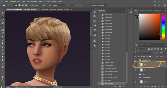
It´s hair time baby! I very much enjoy drawing hair on sims. I make a new empty layer on top of my base Sim layer.
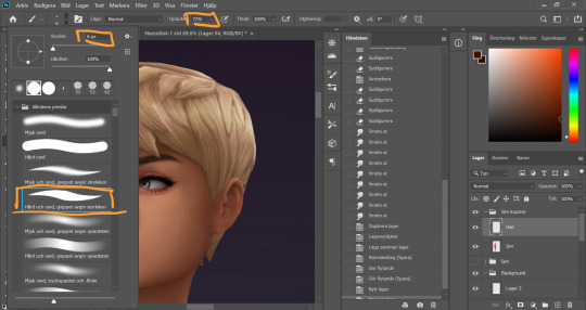
This is where having a drawing tablet makes a huge difference. We need the brush to be sensitive to pressure to get the effect of hair strands. I chose a hard brush, small small size (how small depends on the picture size of course, but I usually land somewhere 6-9 px)
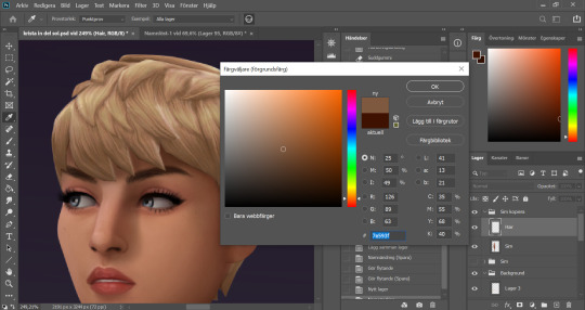
I pick up a color from the hair, I usually starts with a medium light color.
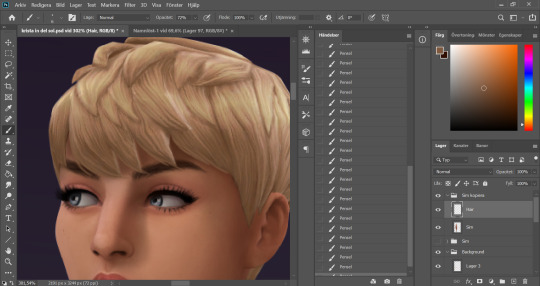
I start by drawing strands around any tips of the hair so they don't look quite so solid. I do this part with both short and long hairs. Hot lazy tip: straight unlayered hairs is the absolute easiest. This is a layered hair so I start with the bottom and work my way up. I pick up different colors from the hair as I go along, to add dept.
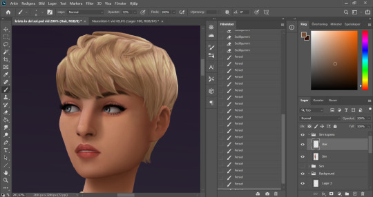
Continuing up in the hair and add strands to the pointy bits.
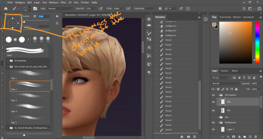
When I feel like the pointy bits have been softened I select one of my hair brushes. I use these ones by Para Vine.
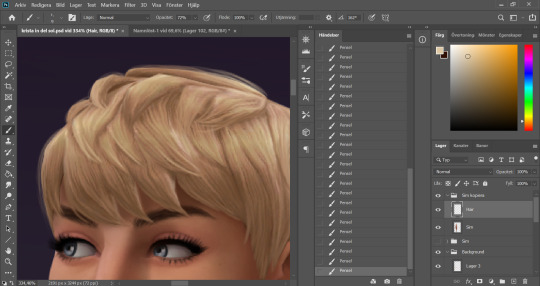
I start painting "around" the hair with one of the lighter colors picked up from the hair, changing the direction of the brush every once in a while for a more natural result.
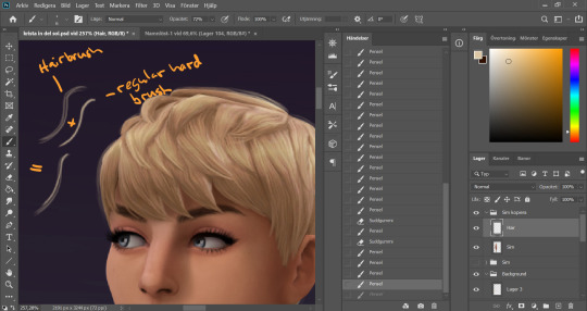
After this the hair is looking a little fuzzy, so I'm going to go back with my small harder brush to fill these parts out.
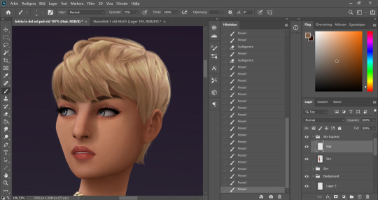
I don't add a lot of them, just small bits here and there for filling.
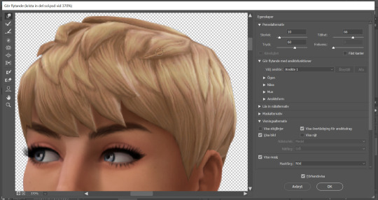
This is a little overkill but... now we have some of that "squary" thing going on in the hair as well that are still showing through our painted layer. Now we could paint over these, but painting can actually be overdone and I wan't to keep the hair recognizeable because the creator put a lot of work into it! So I go into liquify and smooth over any wonky lines still showing, just slightly.
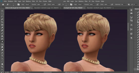
A comparison of before and after hair. Still recognizeable, but softer.
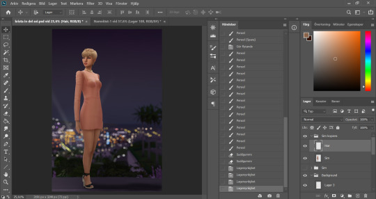
This is our result so far. We've come a long way, but we're not done.
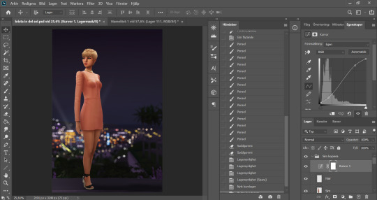
At this point (or actually sometimes sooner) I add an adjustment Curves layer, this will not end up in the finished image, this is just to give me an idea of what the image might look like with more contrast (which we will add later). I keep this at the very top of the layer panel and turn this on and off as I go. Very important to have it turned off if we are going to eyedrop a color and use that to paint, since it would pick up the wrong hue if we have it turned on.
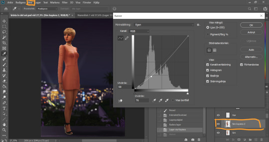
Now I still want the front of my sim to be a little darker to fit my lighting, but I don't want to go over with any more shadow. So I duplicate my Sim layer, and go to Layer -> Adjustments -> Curves. This will only change the active layer, as opposed to creating an adjustment layer down in the Layer panel that will change all layers below it. I drag the curve down a bit to make my new Sim layer darker.
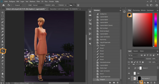
I add a layer mask to my new Sim layer, and bucket fill it with black color so the new layer gets hidden.
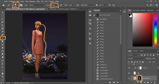
I chose an absolutely HUGE soft brush, with medium opacity, and starts painting white on the areas where I want the new darker layer to be showing. And blend by going back with black where the line is to harsh.
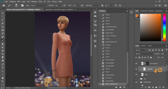
Time to add some highlights. I create a new empty layer between my two Sim layers, and add a clipping mask by holding Alt and hovering on the line between the new layer and my bottom sim layer, until the little square with the arrow symbol comes up and then click. This will make whatever I do on my new highlight layer, only show up on the areas where the layer underneath is filled.
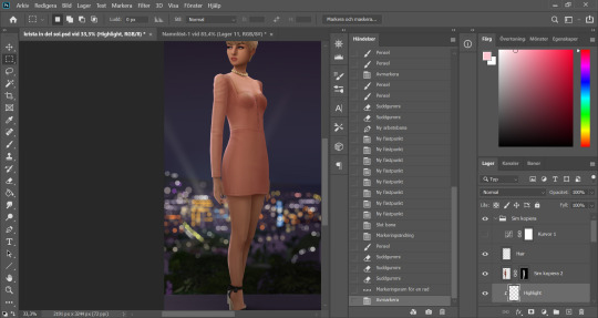
Time to paint. I disable the curve adjustment layer for this. I choose a bright color, in this case a light pink because I didn't want a contrasting color for this picture. I go with a big soft brush around the edges where I want my highlight to hit. In this case, the arm, the hand, the arch of the back and the calf. I didn't add anything to the face in this picture because I didn't like the way it looked, but usually a little highlight to one of the cheeks is just *chef's kiss*
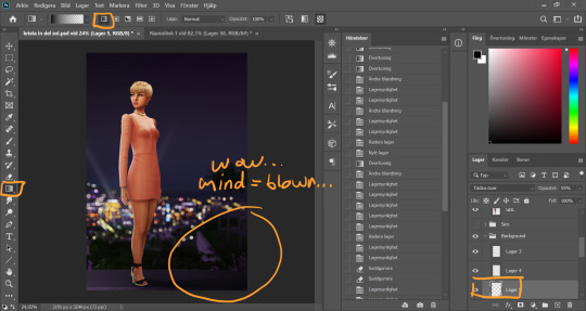
And somewhere around here I got really stuck and really struggled to follow with this tutorial. I felt the picture was lacking something and I tried several different things. I added light rays, tried creating different light sources, there was a moon at some point. But I ended up with just a simple additional gradient shadow down in the right corner (on a new layer down in the Background layer group). Life changing…
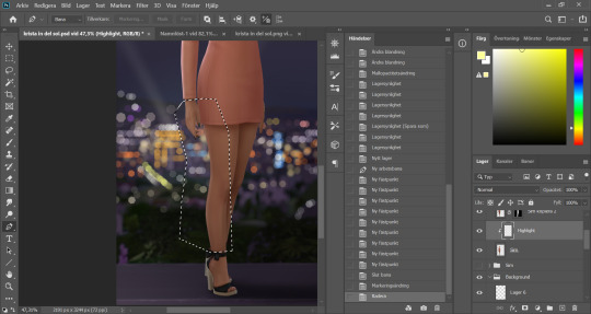
And then I didn't like the pink highlight on the skin (sigh, this is how I work, but it’s not recommended to be this indecisive) so I removed that and added a more beige-yellowee highlight instead. And forgot to take a picture after the highlight was added....
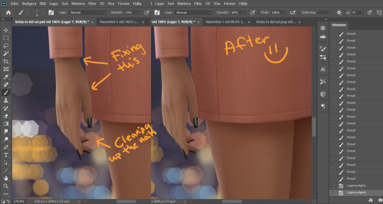
And now I go into nitpicking mode. I add a new empty layer on top of my Sim layer, I add it under the highlight layer so it automatically takes on the clipping mask of the Sim layer, I name it Clean-up Crew and go in to refine anything slightly wonky. Picking up colors with the eyedrop tool and going over flaws with a tiny brush.
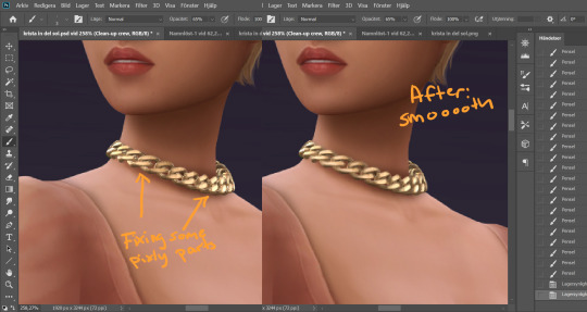
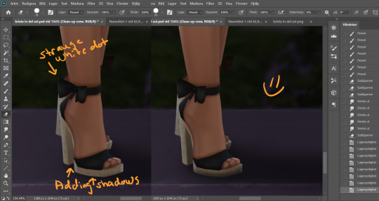
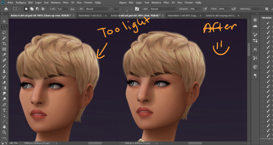
When I fixed this little light area on the back of her head I left the Clean-up Crew layer and went to my Hair layer instead, because I still have that separate and it's above all the other layers.
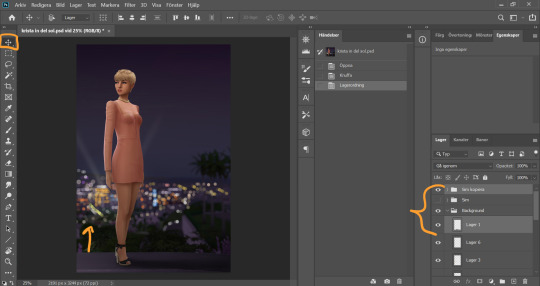
I thought my sim was a little too far down in the picture so I moved her up by selecting my whole Sim layer group and the layer on which I have her ground shadow, chosing the move tool and pushing them up. This will move all the layers in the Sim layer group as well as the ground shadow layer equally.
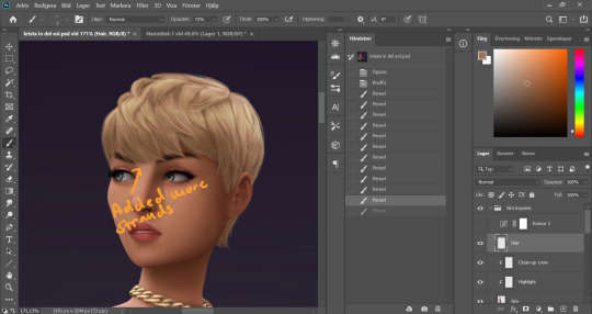
I'm telling y'all, nitpicking mode could go on forever. Added more strands to the bangs.
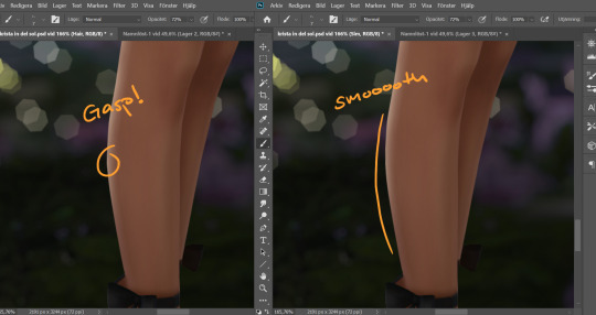
Noticed a little pointy part on the calf, so I wen't into Liquify on the base Sim layer and smoothed that out. Since the highlight layer has a Clipping Mask corresponding to the Sim layer, the highlight stayed in place.
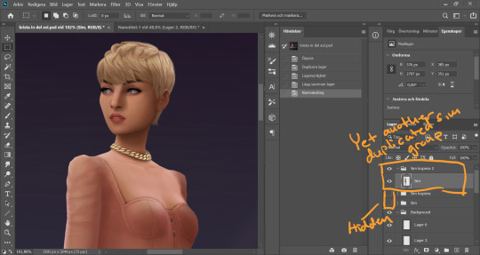
I duplicate my Sim layer group once more, and merge the layers within this group. So now the Hair, Highlight and Clean-up Crew is all merged onto the Sim layer. I hide the previous Sim groups.
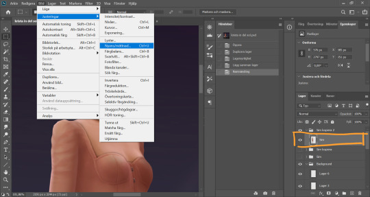
With my new Sim layer selected, I go to Image -> Adjustments -> Hue/Saturation. I want to make my Sim a little less bright so it will match the background a bit better.
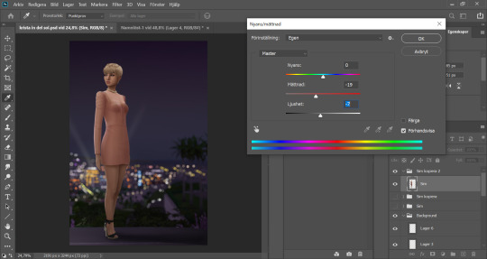
I drag down the Saturation and Brightness slider a bit until I like what I see. After this I save my whole image as a PNG-file because from now on I want to edit the whole picture but still want to keep this psd-file as it is for anxiety purposes. Important: I disable my curves layer before saving this as a picture, I don’t want that brought with me into the next steps because I will be adding new curves there.
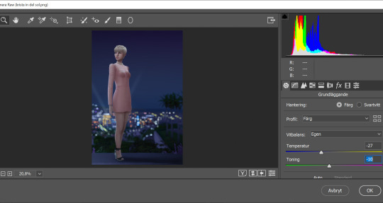
I open my new saved PNG-file. I go to Filter -> Convert for Smart filters. This will allow us to go back and change any filters we add to this layer. I go to Filter -> Camera Raw Filter and for some reason this window opens up humongus. I start by dragging down the temperature. How much depends on the picture, usually more if it's nighttime.
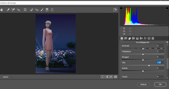
I pull up the Whites a bit for a cleaner look.
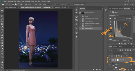
Now I add a Curve Adjustment Layer. Now you can add Contrast in the Camera Raw Filter as well, but I prefer the curve layer because I like to control the different levels. This way I can make my darkest parts a little brighter, giving just a little washed out flair to it all.
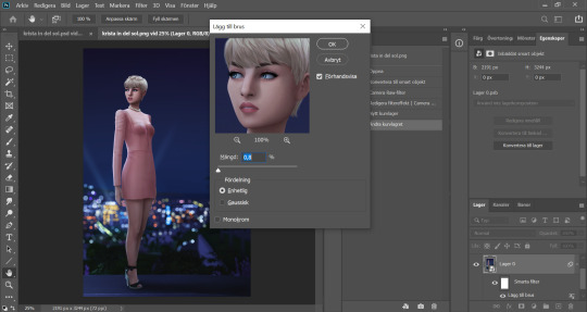
I select my background layer again and go to Filter -> Noise -> Add Noise and choose a level that I think looks good. This just brings the picture together a bit more. Also vintage vibes :)))
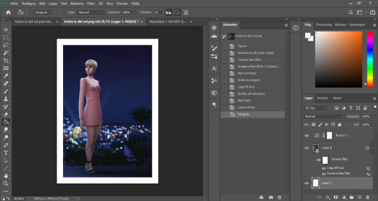
I add my frame (because it´s my aestethic and I think it looks cool on tumblr) by resizing my workspace and adding a filled white layer underneath the background layer.
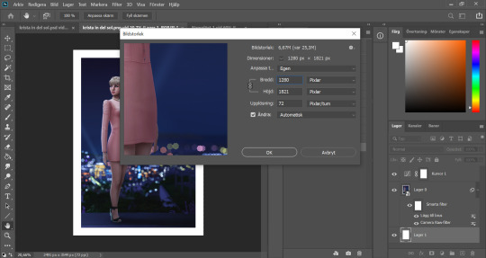
I resize my picture (Image -> Image Size) because we don't need it to be huge.
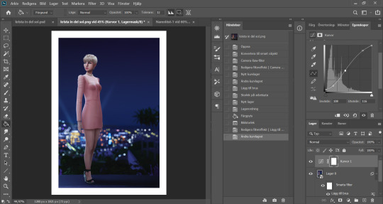
And they I just fine tune the Filters and Curves until the end of time :’)))
And that is that my friends! That’s the end of the tutorial! I hope you could follow somewheat and that someone found it useful. Thank you for reading and never be afraid of contacting me if you have any questions :) I’m very friendly.
62 notes
·
View notes
Text
#showyourprocess
From planning to posting, share your process for making creative content!
To continue supporting content makers, this tag game is meant to show the entire process of making creative content: this can be for any creation.
RULES - When your work is tagged, show the process of its creation from planning to posting, then tag up to 5 people with a specific link to one of their creative works you’d like to see the process of. Use the tag #showyourprocess so we can find yours.
sabrina @lanwangiji tagged me to show how i made my zayn’s birthday edit! check out her explanation on this mesmerizing zayn’s edit
1. PLANNING
It’s Zayn’s birthday, I ought to make something because so far I have made birthday posts for Louis, Niall and Liam. I didn’t participate in his birthday challenge so I had more time to create something for his birthday. I saw this post by @spaceniall and instantly fell in love with it. It's so clean, so neat, an amazing edit. I had that post tagged for inspo and because my Louis’s birthday edit was a bit “grand”, I thought I should make something simple.
I went to look for some photos of Zayn everywhere. Literally e v e r y w h e r e. I saved every photo I found beautiful and there were a LOT. I asked my friends for adjectives that describe Louis best and added them on my Louis’s birthday post, and I followed that approach for this edit. I asked several friends what they think of Zayn and collected the adjectives.
This was a time where I haven’t used trello board, so I put all the adjectives in a google doc. Seriously I swear by trello board, they make my life easier.
After I had all the photos and the adjectives, I went to pinterest to look for the color palette. I forgot how and why I came up with this color scheme, but I believed I wanted something pastel and muted color.
I had this idea to make an evergreen birthday post. I didn’t want to state any “happy birthday zayn” or his age on the graphic. I didn’t want to make all the edits to have his face because I wanted to showcase my graphics and typography style lmao. So I came up with 2 pictures with Zayn’s face and one central picture with his name. And I’m obsessed with space stuffs so this birthday edit is space themed.
2. PROCESSING
This is one of my earliest edits that I made in Illustrator, though I used Photoshop as well.
2.1 REMOVING PICTURES BACKGROUND
Remember I saved a LOT of Zayn’s photos? Yeah? Well I had a hard time choosing the right one. I asked Sabrina to help lmao. After I agreed with myself which photos I would use, I opened Photoshop and prayed it won’t crash after 5 min.
I uploaded the 2 photos and then I used selection on Zayn and then clicked inverse and deleted the background. Recently I found this website who can delete your background in 1 min, tbh that’s a life saver. I recommend using them, if you hate removing backgrounds with Photoshop.
I saved the backgroundless Zayn’s photos as png. And we’re moving on to the next step
2.2 THE TYPOGRAPHY
I only used Photoshop to remove the backgrounds. Now onto Illustrator. Always pray it won’t close by itself every 5 min.
I don’t really remember which dimension I used, but I suspect it’s 600x700 px. I made 3 artboards and loaded the color palette I found from Pinterest. I made 3 rectangles as the backgrounds for each picture and filled them with my desired colors, 2 pink and 1 green. Green being the standalone was put in the middle.
A bit of excursion based on my experience
When you open an artboard in Illustrator, you’ll see a white background. When you save the file you’ve worked on, it’ll actually be transparent. That’s why I always draw a rectangle as a background so it has a solid color.
I focused on ZAYN (middle pic) first because I wanted that to be the main focus. I don’t remember the font I used and I already deleted all files. I followed this tutorial to make the text. Basically you write your text first and choose effect > 3d > extrude and bevel > isometric top. Changed the colors according to my color palette.
I moved on to the first picture, Zayn and the adjectives. I uploaded his photo to the artboard and put it in the middle. I wanted the adjectives to encircle him. I just followed this tutorial on how to make the effect. I made that text effect because that reminded me of the saturn ring lmao.
2.3 THE GRAPHIC DETAILS
Once I got the typography done, I made stars and moon to make the edits merrier and more space themed.
For the stars you can follow this tutorials. For the moon I made 2 circles, one of them was bigger. I put the smaller one in front and click minus front (I think). For the saturn planet, I made a circle with filling and an oval with stroke only, putting the oval infront of the circle and delete the back part of the ring (I hope this makes sense).
I have these lines around Zayn, my intention was to make Zayn pop and kind of crown him or give him a glowy effect sort-of.
All I did was follow this tutorial and delete the lines at the top, because I didn’t want it to be too crowded. Then I put some stars and planets at the top to balance it.
2.4 FINISHING TOUCHES & EXPORTING
I rearranged some things, zoomed out the artboard so I could see everything as one post and picked and deleted some unwanted things. After I was satisfied, I added my watermark and it was my old url, I just typed louistomlinboo. (Now I made a logo-ish and use that as my watermark and the logo is not dependent on my url)
Ok I lied I used Photoshop again… so I had these adjectives in 2.1 that encircled him right but some parts of the texts are above him. I exported my Illustrator file as a psd, uploaded it on Photoshop and used layer mask magic to delete the texts that were above him to create an illusion that the texts went around and under him you know. See the picture below, some texts are beneath him.
For this picture I exported the png file from Photoshop, the rest directly from Illustrator.
This was when I learned I needed to scale up, because on Illustrator they all look good in terms of quality. But when I posted it, the quality was reduced. That time I just exported as big as the dimensions and I was disappointed with the quality when it’s on tumblr.
3. POSTING
I uploaded the 3 pictures I have on tumblr and chose “happy birthday zayn” with star symbols/emojis to keep up with the space theme.
So I always write out what my caption will be with the “rich text” option.

Then I go to this color html website to add the gradient color in the caption and remove the “;” with “ “ in here. Once I have everything, I change rich text to html so I can put the text with color in html mode.
Put some tags related to Zayn. (self promotion time lol. i have compiled tags for 1d creators check them out here)
I finished I think a week earlier before Zayn's birthday so I saved it on draft. I posted around midnight (my timezone is CET), because oh boy it is a competition with birthday post lmao. That’s what I feel like at least. You know, everyone wants to make a birthday post, I feel I have a better chance If I post something first. Whenever I have something done earlier before a certain due date, I either save it on draft or schedule it so it’ll be posted automatically.
Yeah that’s it! It’s not as detailed as before I think because the files are deleted sorry!
i’m tagging:
@spaceniall for this wonderful niall’s birthday edit
@she-fearlesss for this magnificent louis’s birthday gifset
@finewalls for this mesmerizing animation
@louitomlinson (i know you’re not that active but if you want and can!) for this amazing edit
and @tomlinsun for this cool edit
21 notes
·
View notes
Note
hey aisha! how did you do the swirly thing in the igtys edit?
hello lovely harry! this got a bit long so i put it under the cut. also hope you don’t mind my replying publicly, i thought other ppl might also like a tutorial?

so if you want to see how i did the swirly doodle thing, then keep reading!
1. make your background layer with all your psds + text etc and stick it in a folder (this just makes everything easier to deal with)

2. make a new layer and draw a loose squiggle on the object that you want the doodle to “wrap around.” i use the brush tool + my settings are: hard round brush, size 2px, colour white.

3. then use the eraser to erase alternating “lines” of the squiggle so it looks like the line is going in front of and behind the object. you can also clean up any other lines and such. this will be the final frame of your gif.

4. i then make a “doodles” folder and duplicate the layer with the doodle on it (Layer 1). i renamed it “1″ for ease and used the lasso tool to remove most of the doodle. this will be the first frame of the gif.

5. i basically keep doing that (duplicating Layer 1) and removing less and less of the doodle so that “2″ has more of the doodle than “1″ and so on, till the last layer has the whole doodle.


6. in this case i had 10 layers. i then went to timeline > create fame animation to make it a gif.

7. i then duplicate the “background” layer 11 times in timeline, making sure none of the doodles are visible (you can toggle visibility with the little eye icon next to the layers)

8. i then click on the timeline frame 1 and make doodle layer “1″ visible. then click on timeline frame 2 and make doodle layer “2″ visible. then click on timeline frame 3 and make doodle layer “3″ visible and so on till the full doodle is visible on frame 10 (timeline frame 11 has no doodle on it).


EDIT: create frames from layers (found in the three parallel lines, top right of the timeline window) will basically do steps 7 and 8 for you, but i have a photoshop crack from 4 years ago and that feature decided to stop working so i kinda forgot abt it!
9. as personal preference, i then set the frame delay of the two frames with the full doodle on and with no doodle on it (in this case frames 10 and 11) to 0.4 and the rest of the frames to 0.1 because i think it ~flows~ better. you may have to play around with this a little though because tumblr tends to speed up gifs a little (when compared to ps timeline).

9. then hit the play button, and voila! your doodle gif is done! just file>save>save as gif and you should be good to go!

#hope this helps!!#let me know if you have any more questions !!#kazz#answered#edit help#photoshop#prev. @annalightwood
104 notes
·
View notes