#I should really use my watercolors more often
Explore tagged Tumblr posts
Note
do you have any mod recommendations for morrowind?
i don't use an awful lot of mods tbh. i highly recommend using openmw instead of the base engine, first of all. but here's some mods i do use:
1.) all the official plugins
2.) check out the pb mods, they're all pretty neat
3.) true lights and darkness to make torches and stuff like. not useless
4.) some kind of backpack mod for extra carrying capacity! i use "adventurer's backpack" which does unfortunately use up a shoulder slot but it's worth it imo
5.) juniper's twin lamps for a revamped (ie more complete) twin lamps experience
6.) hospitality papers expanded, which makes it actually necessary to get the hospitality papers to do stuff in sadrith mora
7.) "dark brotherhood attacks once - delayed" is a MUST HAVE for me tbh
8.) book rotate for if you like decorating and hate the way books place!
9.) a mod that increases the store chance on projectiles (basically whether or not you can pick up your arrows/bolts/throwables from bodies or not). i use one that increases the chance to 100% but there's a lot of options
10.) blight bounties! you can collect rewards for killing blighted monsters/animals at ghostgate! you might also want "blighted animals retextured" to go along with this, so you can tell them apart better
11.) bloated morrowind! actually adds bloat plants to the world; in the base game bloat is only an ingredient that you can buy, not gather
12.) solstheim rumor fix (akin to the dbh attacks mod), it restricts how often "latest rumors" will tell you about solstheim. i think it restricts it to certain npcs or something, you'd have to look into it
13.) diseases restored! it fixes some inconsistencies with which animals carry which diseases and what they do etc
14.) oblivion style vampires for a more forgiving mw vampire experience
15.) julan is a great companion mod!
16.) gnisis arch replacer! it puts one of mehrunes dagon's arms hanging from the arch in gnisis :3
17.) red wisdom is a fun ashlander themed quest/dungeon mod!
18.) skyrim: home of the nords is great! and you might also try project cyrodiil, which i hear is also great!
19.) there is a texture replacer called watercolored morrowind, which i really enjoy! it "muddies" the textures a bit to look more, well, watercolored. it still matches the vibe of the og textures but gives it a more stylized spin
20.) there should be a mod that changes plants from containers to simple pickups like it is in oblivion and skyrim. i think it's called harvestable flora? i don't see it in my content list but i know i have it installed, weird
21.) zesterer's volumetric clouds and mists for openmw is a GAME CHANGER esp if you use a higher view distance (openmw supports pretty high view distances, although you might have to fiddle with some .ini files to unlock them)
that sounds like a lot but it's really not. no huge gameplay changes or even graphical ones (aside from the volumetric + view distance). i prefer a pretty vanilla experience tbh.
25 notes
·
View notes
Text
Spoilers of Natsuyuu Sp.23
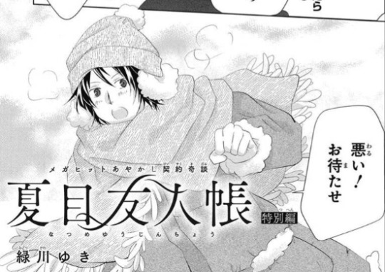
Only 8 pages special chapter for this month, so it's almost a summary...
I am not a native English speaker, and I used Google Translation mostly (from Chinese to English), I hope the translation is not difficult to read.
Spoilers under cut.
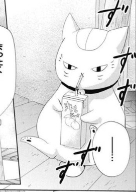
At first, Sensei was drinking juice and waiting for Tanuma with Natsume, complaining about waiting for so long (Natsume: It's only three minutes late, Sensei) Sensei said that three minutes was also fatal. What if the new dumplings are gone? When Natsume was wondering why Tanuma was late, Tanuma finally arrived (it felt like the scene in Ch.117)
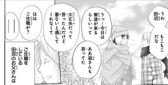
Tanuma was late because of a cold snap, so his father forced him to wear more clothes.
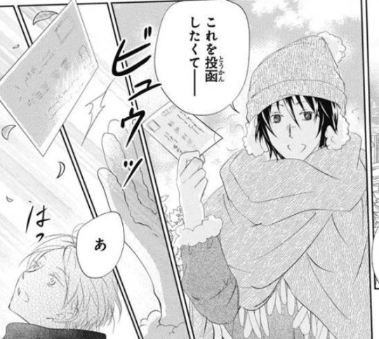
When they were finally ready to leave, Tanuma said that he wanted to take a detour to find a mailbox because he wanted to mail a postcard. Suddenly a strong wind blew the postcard away. Natsume immediately chased after it and saw some pattern on the postcard.
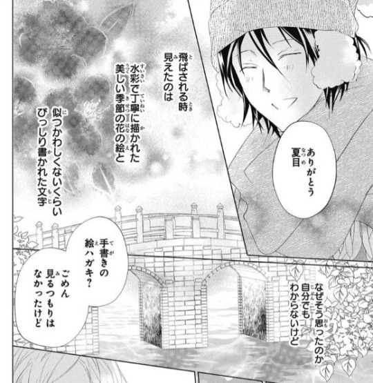
When the post card flew up, what Natsume saw was: beautiful seasonal flowers carefully painted with watercolors, and densely written words that did not contrast with them. Why he thought this way, he himself didn't know. "Is it a hand-painted postcard? Sorry, I saw it by accident..." But it looked like a love letter.. "Oh, this is a letter my father wrote to my mother."
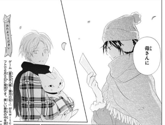
Natsume could only look at Tanuma, think that his friends didn't usually ask about his family, and he didn't often talk about them. The same was true for Tanuma.
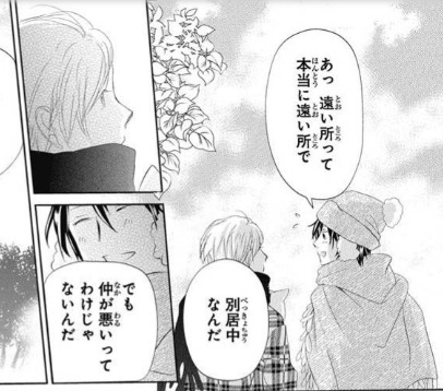
"Mom is far away. Oh, far away really means far away, they live separately. But they don't have a bad relationship. ──How should I put it? My mother never seem to be in good health. After she was with my father and gave birth to me, her health deteriorated rapidly... Her health improved slightly after she was admitted to the hospital. But when my father happily visited her, her health deteriorated again. Because the cause was unknown, the doctors said that maybe meeting dad caused her some stress. And there was a period of time when we had a bad relationship with my mother's relatives... Dad decided to live separately because of mom. However, mom was quite against it and made a fuss about it. Although my mother is recuperating now, she sometimes comes to visit me as long as she feels better. "

Natsume remembered that Sensei once mentioned that Tanuma's father was possessed by a youkai with divine power, and that the youkai was very powerful. But it may be jealous of the people around him. (Vol.16 Ch.66, this part was deleted from the anime) (The Youkai I see can sometimes be very unreasonable...) "So my father writes letters occasionally." (It's just like a love letter.) Because she is important, they cannot meet. Because they cannot meet, he put his heart into it──

Natsume could only say Tanuma's name helplessly, and then Sensei asked: "Hum, did you write a letter then?" Tanuma put his hat on Sensei's head. "Eh? Me?... I did write to her, but it's hard to make a reply lately..." When Natsume asked why, Tanuma said his mother had wanted him to send photos because he unintentionally mentioned something in the letter. "Photos...? What did you mention by accident?" Tanuma thought awkwardly for a long time, and finally said:
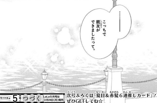
"...I made a best friend here."
+
We finally know about the situation of Tanuma's mother. I am glad that he did not grow up in a single-parent family... But maybe Tanuma's mother is also sensitive to youkai? That's why she met her husband? I believe how these two people met and interacted can be a good story LOL
Also, for Natsume's first "like a love letter"... did he actually think that it was written by Tanuma (Huh? Natsume's second "like a love letter" might be referring to the feelings of those unreasonable youkai who want to monopolize the people they value...
128 notes
·
View notes
Text
Chapter 4
Chapter 1 / Chapter 2 / Chapter 3
Steve arrived home to Robin anxiously pacing.
“Steve! Oh my God. I thought you died.”
“Robin, I literally talked to you an hour ago.”
“You could’ve died in the last hour!”
He smiled at her dramatics. She had his location the entire time, and she easily could have called him any time in the last hour if she was that worried.
She wrapped him in a hug, which was shocking enough on its own, but Steve couldn’t help his confusion when she also kissed the top of his head.
She held him for over a minute and Steve started to wonder if someone had died and she didn’t know how to tell him face to face.
“Robs?”
“Dingus?”
“Is everything okay?”
“Are you okay?”
Steve realized Eddie had probably told her everything. Oh for fuck sake.
“I am begging you to never bring anything of this up to me ever. Like, even if you think it’s okay to talk about it, assume it isn’t. I am never going to talk about this with you. Not ever. Not even on my deathbed. Not even when I’m drunk.”
“Eddie said you should.”
“I will. With Eddie. Not you.”
Steve turned to walk to his room and ignore Robin for the rest of the day, but he could hear her footsteps following him.
He sighed and turned around.
“I’m fine. Eddie took care of me. I’m going back there tonight so we can talk. I’ll keep my location on and you can check in with both of us, okay Mom?”
“Wait wait wait wait. You’re going back there tonight?” Then, she seemed to remember how he even ended up with Eddie. “WAIT! Your tattoo! Show me!”
Steve could do that much at least. He’d been talking about this tattoo for so long and he was really excited about how it turned out.
Eddie had unwrapped it and done the first round of cleaning and moisturizing, making sure Steve was paying attention so he could do it by himself today.
He hadn’t been able to look away from it for nearly ten minutes, the colors more beautiful after the redness of his irritated skin went away.
He held his wrist out to Robin, unable to keep the smile from his face as she looked at it and smiled up at him.
“He did great with this. Will is gonna flip.”
“I hope he likes it. He has an appointment with me tomorrow so I’ll be able to show him.”
Will was one of his best kids. He never had to actually worry about his future, Will knew exactly what he wanted, got good grades, had nearly perfect attendance, and worked towards his goals without any help from Steve. He’d been through a lot though as a child, and his mom had insisted that he regularly meet with Steve just to talk.
He came to appointments once a week, but him, along with his two best friends Dustin and Mike, would often spend their lunchtime in Steve’s office. They weren’t exactly popular, and bullies targeted them often for their size and their interest in more nerdy things. Steve let them, even though the principal had told him he was setting them up for failure in real life. Steve always said this was real life and feeling safe wasn’t a failure.
But this tattoo would really mean a lot to Will. He hoped so, at least.
“When are you going to Eddie’s?”
“7.”
“Bring protection.”
“Nothing’s gonna happen.”
Robin just gave him a look and walked away.
Nothing was gonna happen. Eddie said so.
– – – – – – – – – – – – – – – –
When Steve got to Eddie’s place, he was already home, and…cooking?
“Something smells good.”
Steve made his way into the house, brushing past Eddie and looking around. He hadn’t spent much time noticing things earlier, but now he could.
There was a lot of art on the walls, but none of it looked like what was at the shop. This looked more abstract, with a few random watercolors sprinkled in. He noticed pictures frames along the shelves and bookcase that held more records than books. The coffee table looked cluttered, mostly books and sketches spread out along the top.
The couch was old, but looked comfy, and the armchair in the corner seemed mostly unused. A few hats hung from the corner it was placed in, none of them looking like anything Eddie would wear.
Did he have a roommate? Is that how he could afford a house?
“You can set your stuff in my room if you want. You remember where it is?”
Eddie’s voice being so close behind him startled him, but he immediately relaxed when he felt a hand on his hip.
“I remember.”
Eddie squeezed his hip once before letting him go, walking towards the kitchen instead of following Steve.
Steve took in the pictures hanging up in the hall, but didn’t get a close look at any, already rushing to get back to Eddie so they could talk. Robin had given him another look before he left that said there’d be more than talking happening tonight, but he really trusted Eddie when he said they’d be taking it easy.
He dropped his bag on Eddie’s bed, smiling to himself when he saw that the bed was made.
Eddie didn’t seem like the type of person to make his bed, so maybe he was trying to impress him?
Steve shook the thought away. Nothing is happening tonight. He may not even want you in his bed after you talk.
He made his way back out to the kitchen, where Eddie was closing the oven door and placing a casserole dish of something that smelled like heaven on the stove.
“What did you make?”
“Breakfast casserole.”
“Breakfast? For dinner?”
Eddie smirked. “No laws can hold me down.”
Steve resisted the smile he felt trying to creep onto his face.
Eddie really did a number on his whole “I don’t smile for anyone” exterior.
“What’s in it?”
“Well, normally I do a french toast one that has fruit and maple syrup, but you didn’t seem like the type to enjoy that.”
“Excuse me? That sounds amazing,” Steve crossed his arms across his chest and stared at Eddie.
“We can have that next time.”
Next time, next time, next time.
“This one is hashbrowns, cheese, eggs, and bacon with biscuits as the base.”
“That sounds…heavy.”
“We can eat heavy. We don’t have any physical activity to commit to later.”
Steve couldn’t help it, he started pouting.
A small part of him had hoped that maybe after they talked, something would happen. Not necessarily sex or even subspace, but some making out, maybe some handjobs? Yeah, he’d hoped.
But he recognized the boundaries Eddie was setting, and he respected him for sticking to them, even if he really wished he didn’t.
Eddie poked Steve’s bottom lip playfully.
“No need to pout. If our discussion goes well, maybe next time?”
“Promise?”
“You’re gonna be trouble, aren’t you?”
“I dunno. Am I?”
“And a brat. Noted.”
Steve had never, not even at peak spoiled rich kid, been called a brat. Not even jokingly. He was a little offended, but he could see the hint of a smirk on Eddie’s face letting him know that would be part of their discussion.
“Are we gonna talk during dinner or after?”
“That’s up to you. I’m happy either way, sunshine.”
Steve felt warmth spreading in his chest at the nickname. He’d never been called sunshine either. Being terminally grumpy since your teenage years kind of eliminates that possibility.
“I have some questions so maybe we could start there during dinner?”
Eddie nodded and turned to grab plates and forks for dinner.
“Before you start though, I wanna make sure you know that I will always be honest and do my best to answer your questions, but there are some things I don’t know. I’m not a professional. I’m certainly experienced, but there may be things you want to know that I’ve never done. I don’t want to mislead you, so if there’s stuff you still need to know after this, I have contacts who can probably help.”
Steve felt so out of his depth here. Eddie had fucking contacts for this.
“Stevie? You okay?”
Steve shook himself out of his thoughts. He couldn’t let himself feel nervous about this. Eddie was kind and wanted him to understand and wouldn’t expect anything of him. He could do this.
“Yeah, I’m okay. Sorry. Just feels a little overwhelming.”
Eddie paused mid-scoop and glanced at Steve. He set the serving spoon in the dish and walked the few steps over to Steve, wrapping his arms around him gently and hugging him to his chest.
Steve quickly found his spot, nuzzling against his collarbone like he belonged there.
“That’s why we’re taking this slow, having discussions first. You can’t go into all of it the way you did last night. It’s dangerous.” Eddie rubbed his back slowly and Steve fought back the noises trying to escape from his chest. “I won’t feel comfortable doing anything at all with you until we’re both comfortable, okay?”
Steve nodded against his chest.
Eddie pulled back and tilted his chin up to look at him.
“You have to use your words, sunshine.”
“Okay.”
“You understand what I said?”
“I understand.”
“Good boy.”
Steve couldn’t contain the whine he let out. Jesus Christ, what was happening to him? He’d never been like this. He’d never made that noise before in his life.
“Alright, sunshine. Let’s eat.”
Steve didn’t want to separate from him, but Eddie didn’t go too far. He made sure Steve was right next to him as he grabbed their plates and walked to the table, setting them down next to each other instead of at the chairs across from each other.
“Don’t want you too far,” Eddie said with a fond smile.
Steve hated the way his heart skipped a beat. Eddie was going to send him into cardiac arrest if he kept this up.
But he did his best to ignore it, take a deep breath, and sit down in the chair.
His anxiety was high, and he was worried he may not be able to even eat, but Eddie took a bite and looked at Steve expectantly.
Steve picked up his fork and took a bite.
“Damn, this is good.”
“Thanks, sunshine. It’s hard to fuck this one up, but I’m glad you like it.”
Steve smiled at him and took another bite.
Where to begin?
He knew Eddie would let him lead, acting as more of a guide for the conversation than anything else, but Steve suddenly didn’t know where to begin.
“Um. I guess I kinda wanna start by saying something?”
Eddie nodded, smiling softly at him and showing him that he could be patient with whatever Steve needed to say, even if it took him some time.
“I’m not, like, a virgin. I mean I know when it comes to this stuff I kind of am, but I’ve had a lot of sex. With women and men. I mean, I almost got engaged once. I’m not new to that.” He ignored the amused look on Eddie’s face and continued, though his voice wavered. “And I’ve seen some stuff in porn or whatever. I’m not completely oblivious to how this works.”
“I don’t think you should go off of what you’ve seen in porn.” Eddie cleared his throat. “Sorry to interrupt, I just didn’t want you to think that’s accurate at all. Most vanilla porn isn’t even accurate, let alone any type of BDSM stuff. I don’t want you to think I have a dungeon or something with whips and chains attached to the walls. That isn’t what this is about for me or most anyone, really.”
Steve felt himself flush.
He’d said he wasn’t a virgin, but he’d never talked so openly about sex with anyone. He reminded himself that Eddie was still very much a stranger to him, and this kind of talk is something that close friends or significant others might have.
“What is it about? For you, I mean?”
There. That was a good start. Learning more about what Eddie did might help Steve understand what he was trying to accomplish.
“I mean, for everyone it’s about power and control or submission. But everyone has different ways of accomplishing those things and things they’re comfortable with.” He took another bite and chewed while he seemed to think of his answer. “For me, it’s about being in charge of someone’s release, whether it be sexual or not. Making someone feel good in a way they can’t experience on their own or with someone else. Having the power to know exactly what they need and give it to them or hold back. Find what makes that person tick and use it to make them feel better than ever.”
“That’s what you like? Seeing someone else get off?”
Eddie let out a small chuckle.
“I guess in a simplified way, sure. But that doesn’t always happen. You didn’t get off last night did you?”
“No, but I was dropping apparently.”
“Before that though. You still got to subspace, and you stayed there a while, even though you never got sexual gratification from it. You just felt good. Sometimes feeling good just means a plateau, not a peak and then fall, ya know? I like to help someone maintain that plateau as long as possible.” He took another bite and nudged Steve to do the same. “I love helping someone peak, too. But that isn’t always on the table.”
“What if I want it to be?”
“Getting ahead of yourself, sunshine. How about you have a couple more bites while I talk?”
Steve nodded and took another bite, watching Eddie as he formed his thoughts.
“Sex is obviously a part of this. I won’t say it doesn’t end that way most of the time. But there are parts of this that aren’t sexual at all that are still just as good. Your tattoo wasn’t sexual at all, right?” Steve shook his head. “Exactly. But you got there. Sometimes, it’s more just giving up the control. Some subs don’t even like the sex parts, you know. They like someone to give them rules and tasks to follow and punishments for when they don’t. I have a friend who is a sub who doesn’t even take off his clothes during his sessions. It’s different for everyone and it’s usually trial and error. That’s why safety and trust is such a big part of it.”
Steve felt like his head was spinning.
“Is that why people use safewords?”
“Yeah or the stop light system, or in some cases, just physical signs. That has to be agreed on before you ever go into a scene, even if it's someone you’ve done scenes with before and trust. You may love being spanked until you bruise on Saturday, but end up hating it on Monday if you’re not in the right headspace for it. It’s not just the sub trusting the dom with everything, it’s the dom trusting that the sub will use their safeword if they can’t keep going. Sometimes that’s hard for people to understand. It goes both ways. Both parties have control, just in different ways.”
“You know a lot about this.”
“I’ve been in a few serious relationships with the dynamic and all my friends have been part of the scene for years. What I don’t know firsthand, I’ve heard plenty about.”
“Okay, but what if I do want the sex stuff to be part of it?”
“If you do, then you have to be open about hard limits before you start. You have to have a safeword and use it if things start to go bad. You have to let yourself test the waters, but not jump into them if that makes sense.”
Steve nodded. It did make sense. He was probably jumping the gun a bit, but he felt like maybe he could trust Eddie to find and test his limits.
“So you wouldn’t wanna do that with me?”
“I didn’t say that, Stevie.” Eddie turned to him and placed his hands on his knees, massaging them lightly. “I’m not a jump right into anything kind of guy, even with just plain vanilla sex. But I’m really careful about starting with sex stuff right off the bat. Oh, stop pouting, sunshine. I’m not saying no.”
“But you’re saying no now.”
Steve knew he was still pouting, and maybe being a bit unreasonable. He normally took things slow too, at least when it came to more than random handjobs or blowjobs at the club. It still made him feel like Eddie might not be interested in him the way he was interested in Eddie.
“I’m saying not yet. There’s a difference. I’d love to be able to do that with you. But you need to experience more first.”
“Like what?”
Eddie studied his face for a moment. Steve felt like he could see right through him, which would have alarmed him more if he wasn’t certain that Eddie was going to be able to make him float again.
“You like to be praised.”
It wasn’t a question, but Steve nodded. He’d figured that much out at least.
“That’s a good start. You can be praised for a lot of things. Sometimes just being told to sit still and being told you’re doing good can make a person float, you know.”
Steve didn’t think he could do that. He certainly believed some people could, but he figured it would take a lot more for him.
“I don’t think I can do that.”
“Do you want to try?”
“Now? I thought we weren’t doing anything tonight?”
Steve was suddenly overwhelmed with nerves again. Despite the fact that he’d wanted something to happen when he first got here, he was now wondering why the hell he thought that was a good idea.
“It doesn’t have to be now. But it would certainly be a good start when you’re ready. Simple, non-sexual, easy to safeword out of if you get uncomfortable, unlikely to drop from it. It’s just an idea. You can always say no.”
Steve didn’t want to say no. He was nervous, sure, but he wanted it. He wanted to try. He wanted to make Eddie proud.
“Could we try tonight?”
“If you finish your supper and we talk about a safeword, yes.”
Steve took three more bites and ignored Eddie’s laughter at his clear excitement.
“So, what can we use for a safeword?”
“Up to you, sunshine. Mine is Metallica.”
“Can I use yours?”
Eddie thought about it for a moment.
“For tonight, yes. But you should have your own in the future.”
“Don’t like sharing?”
Steve smirked at Eddie, who rolled his eyes but smiled fondly back at him.
“More like you may not want to keep doing scenes with me and having your own safeword is best.” He got up and brought their plates to the sink while Steve waited patiently in his chair. “You can go sit on the couch. I’ll be there in a couple minutes.”
Steve sat on the couch with his hands folded in his lap, trying to push away any nerves he had over what they were about to do. If all went how he hoped, he’d maybe go to subspace again. Eddie sounded like he could get him there, but he didn’t know exactly what Eddie would have to do.
He didn’t have to wait long.
Eddie came into the room and sat down next to him, wrapping an arm around his shoulders and pulling him into his side.
“Alright. We’re gonna relax for a few minutes first. You’re tense and you won’t be able to just go right into it.”
“Oh. Sorry.”
“Nothing to be sorry for, sunshine. Just let me hold you for a few minutes, okay?”
Steve wanted nothing more than to never leave Eddie’s side, his arm wrapped just tight enough around him so he felt like he couldn’t escape, his body warming him up just enough for comfort.
He didn’t know how long they stayed like that, and he didn’t really care, all he knew was the next time Eddie moved, he had to open his eyes.
“Alright, sunshine. Gonna move you a little so your head is in my lap, okay?”
“Mhm.”
Eddie adjusted him so he was laying with his head in his lap and his legs out along the length of the couch. He had a hand in Steve’s hair, scratching at his scalp gently, while his other hand was tracing circles on his arm.
“Mmmm. ‘S good,” Steve mumbled against Eddie’s thigh as he let his eyes slip closed again.
“Good.” He felt a gentle tug on his hair and his eyes shot open. Eddie was smirking down at him, but went back to gently scratching at his scalp. “Just testing. You remember the safeword?”
“Metallica.”
“Good boy. You use it the second you feel like you have to.”
Steve ignored the flutters in his stomach at being called a good boy again.
It went on like this for a little while, nothing new happening. Steve started to wonder if Eddie understood what the purpose of this was, when he suddenly felt Eddie stop all movement.
He whimpered, then felt Eddie’s hand tug at his hair harder.
“You have to stay quiet, sunshine. Keep being a good boy for me.”
His tone was different. Not quite stern, but not as soft as before either. Steve didn’t have to know him better to know that he should listen to him.
“I’m going to watch a show. You just sit right there for me and look pretty.”
Oh. Jesus Christ.
Steve was already hard. From that? Really Steve?
He managed to stay quiet this time, but he knew the second Eddie touched him again he would moan.
But Eddie didn’t touch him again.
He turned on the tv and casually looked for a channel. When he found one, he watched with his hands by his sides, not even resting against Steve’s skin.
Steve knew this must be part of it or they wouldn’t be doing it, but he felt himself growing frustrated at not getting any attention.
Minutes passed like that. Steve wondered when Eddie would acknowledge him again, but didn’t want to risk saying something.
Then a hand was in his hair, playing with the ends as if Eddie had never stopped.
Steve let out a content sigh and closed his eyes again.
“Being so good for me, sunshine.”
Steve smiled to himself, keeping his eyes closed so he could relax fully against Eddie’s lap.
The noise from the tv turned distant, but the fingers in his hair felt like fire. Or maybe ice. Both? Could be both. They just felt nice.
Steve drifted, not realizing he was going until he was already gone.
Eddie knew the moment it happened’ Steve’s entire body relaxed entirely against him and the couch, and he let out a sigh that could’ve been held in for years with how loud it was. He didn’t open his eyes, but Eddie didn’t need to see them to know they’d be glazed over.
“So perfect, Stevie. Feeling good, huh?”
“Mmm.”
Eddie smiled down at him, even though he wouldn’t see it.
He wouldn’t let him stay down for long, just for the rest of the show.
Not that he was watching the show.
Not when he had Steve in his lap, floating away because of his gentle touches and words.
Chapter 5
TAG LIST: @invisibleflame812 @inmoonywetrust @captain-daryn @carlyv @lillemilly @spectrum-spectre @raisedbylibrarians @estrellami-1 @gregre369 @mightbeasleep @imhereforthelolzdontyellatme @bornonthesavage @loguine-linguine @bejeweledbaby @bisexualdisastersworld @eddiemunsonswife @sadcanadianwinter @messrs-weasley @i-write-stories-not-sins-bitch @maya-custodios-dionach
#steddie#steve harrington#eddie munson#stranger things#chapter 4#grumpy sunshine trope#tattoo artist eddie munson#guidance counselor steve harrington#dom/sub#dom eddie munson#sub steve harrington
572 notes
·
View notes
Note
Hiya! Hope this message finds u well :3 I absolutely love your art; found you from insta! Quick question also; I’m not sure if you’ve answered this before, but which brushes do you use for ur digital art? I love the textures they’re so crunchy (endearing)!! Have a lovely day!! :D
hello!! here's a little brush tour ft. this half rendered martin.
also, a great app for ipad artists who really want to dig into texture is art set 4. i swear by it and i've been using it for about two years. none of my more recent art uses it, but that's just because i'm experimenting with my process rn
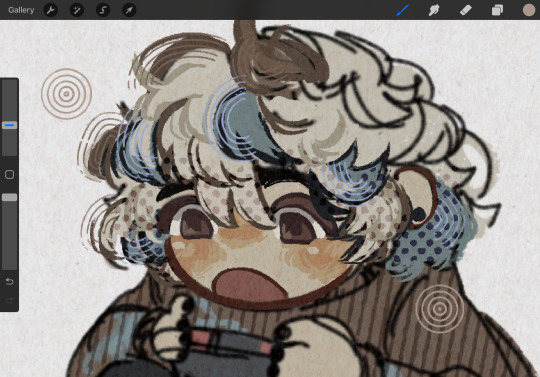
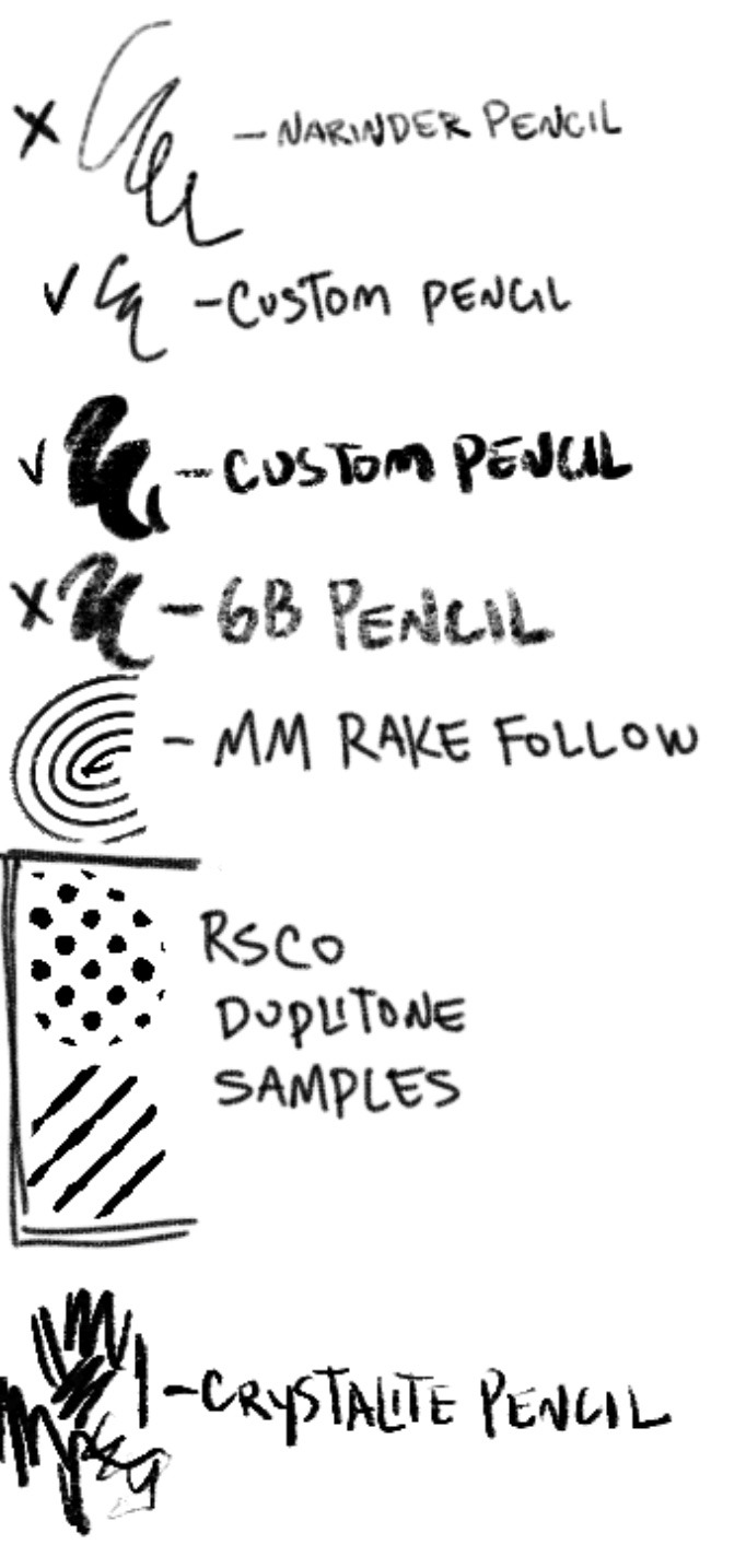
so here's a list of my most used brushes lately, and there will be links to all of them at the bottom of this post.
the two labeled "custom pencil" are both my own personal modified pencils (both sourced from the 6b pencil) but the narinder pencil and the vanilla 6b pencil are both very similar to them. i use these two for sketching and flat color specifically, and if you do specifically want these two brushes then i'd be happy to upload them somewhere for you to download, but they're not really necessary for texture
i also use G&B halftone brushes sometimes! but i greatly prefer the RSCO sample pack, and i cannot find the link to the G&B brushes no matter how hard i google, and pretty much any halftone brush set will do the same job
and here's what they look like in practice!
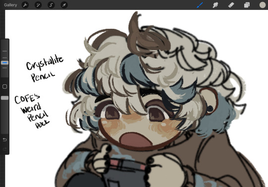
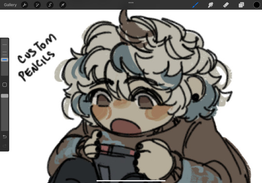
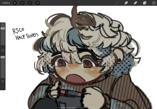
(i like to set these halftones to color burn. color burn is my most used blending mode, even for shading)
and then i hit "copy all," paste, and duplicate it. so you should have two layers of just your entire canvas. then import a paper texture
i'm partial to the set i'll link down below, my favorite is #5. you should absolutely check out the rest of the free texture packs on their website if you're wanting to diversify your texture process btw, all of their stuff is fantastic.
to use that texture, your layers should look like this!
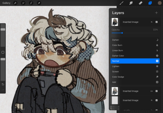
on the layer set to the linear burn, i also like to go into the adjustments menu and bump up the brightness until all of the colors are at similar values to what they were before. and the normal layer on top is just to control the intensity/opacity of the paper texture!
after all of that, sometimes i'll go in with brushes like MM rake follow, or more from COFE's weird pencils, on top of all of those layers for finishing touches.
definitely play around with it, try new free brushes all of the time (i heavily recommended subscribing to Manero. they have a lot of free stuff and it's all fantastic) and see what works for you <3
here are the links to the brushes in this post, as well as some extras! some of them are paid and some of them are completely free. + it wasn't mentioned here, but i use the tatyworks linen fabric brush for blending! for any of the paid brushes, i'll try to link some free alternatives
paid brushes:
alternatives to paid brushes:
free brushes:
extra goodies:
#procreate art#procreate brushes#art tutorial#artists on tumblr#digital art#digital artist#art recommendations#art resources
72 notes
·
View notes
Text
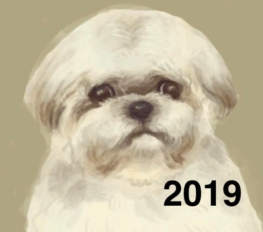
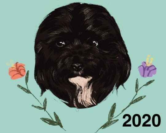
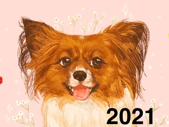
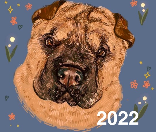
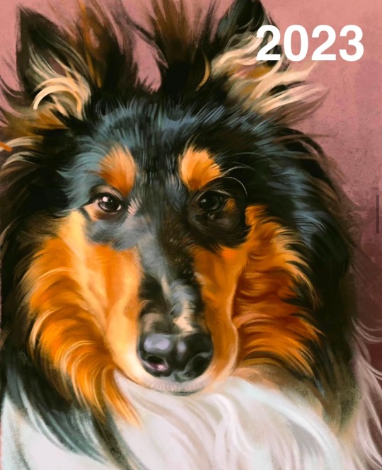
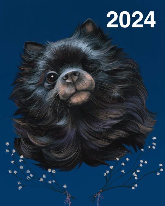
With the new year right around the corner, I wanted to take some time to reflect on my journey with art, and pet portraits in particular.
When I was younger, I often tried to draw animals but always felt like I struggled with it. I didn’t begin attempting to draw and study them until I began working as a dog groomer, which really opened my eyes to how beautiful and unique each pet is. I would draw the pets of friends and family, and post studies of dogs I saw in my feed now that I was in the animal professional world, and it gained a little bit of traction with this wonderful, small corner of social media. I began taking my first pet portraits commissions probably around 2020 or 2021, and from then on I put drawing humans on the back burner. In a way, I still have- it now feels a lot more alien to draw humans to me, which makes me laugh because I never would have thought I’d take a turn like this. I was used to doing commissions here and there, drawing portraits of people and often couples, but suddenly I felt like I really needed to lock in and improve my skill. A lot of the pet portraits I do are memorial pieces. I lost my childhood dog in 2018 and I know the horrible pain of it. The last thing I would ever want is to give someone a piece of their pet that they don’t love, and paid for too! (Which reminds me, I should do a portrait of him soon- it’s been too long!)
I also took about 8 months off of art during this time. It allowed me to pause and reflect on my relationship with art. I was quite prolific back in the day, and it felt like my calling in life. After dealing with depression and a myriad of other things the last decade or so, I lost that vision and felt lost in general. When I started drawing again, I channeled a lot of my energy into drawing animals. I felt like I had lost a lot of my creative energy which was a little heartbreaking, but slowly I built momentum, and am feeling very comfortable with the progress that I’ve made.
This next year, I would really love to reconnect with physical media again- I love painting digitally, but watercolor has always been my first love. I don’t think I will offer watercolor portraits for sale for quite a while, if at all (partially because shipping scares me, but also because I have a lot of learning to do!)
I would also like to do more human portraits as well. It’s a muscle I need to move more, and a great palate cleanser for when I’m feeling burnt out on pet portraits.
I’m proud of how far I’ve come, and I like looking back on my old work because it warms my heart how much people believed in and loved my work back then, even when I wasn’t very confident. I am a firm believer that no one is ever 100% perfect in any skill, and I still have a long journey ahead of me as far as improving my work goes! I would like to also focus on studying anatomy and backgrounds more, and perhaps offer those as an option for commissions in the future 🖤
All this to say, I’ve come a long way and still have a long way to go- but I’m excited and looking forward to it! Thanks for sticking with me, supporting my work, and watching my progress. Here’s to 2025!
17 notes
·
View notes
Text
Why the Minecraft Movie looks so bad
Okay, let’s see if I can make this work
Hi, I’m Watercolor, currently a student learning animation and visual effects. I’ve got some more technical explanations for why exactly the trailer looks god awful
I’m gonna do my best to explain this in simple terms, but if I don’t explain something very good, let me know and I’ll explain more. Alright, this is gonna be a long post
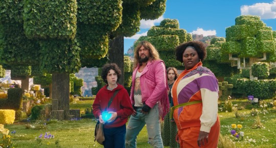
Starting off with the obsession with backlighting. See how it doesn’t really match the environmental lighting? That’s one of the major things that makes it look so weird to a lot of people. It could have been done to better distinguish the actors from the background, but it does that a little too well and makes them look way too out of place. The environment has a very nice constant (most likely singular) light source, which is most likely an HDRI.
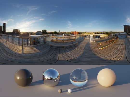
An HDRI (or high dynamic range image) informs the animation software on how the scene should be lit, and is often a weird panoramic image of whatever physical area you want to replicate.
In a reverse case, adding a CG character into a real set, you could take an HDRI of the physical set, and use it to apply similar lighting. Adjustment will most likely have to be hand adjusted by the lighting team (and tbh they add a lot of extra lights in anyway. It just needs to look right) but it’s a fantastic starting point for the compositing and lighting teams.
However, the McM’s live set has way different lights set up then what is seen in the environment.
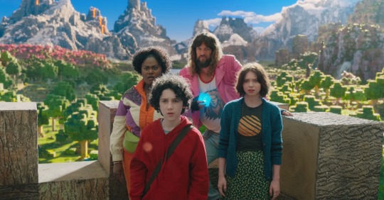
Here, for example, the live set is most likely being lit by standard 3 point lighting, which are not only the wrong color (the lighting on the environment is much more yellow) but also washes out any shadows that would help define the actors. If this movie wasn’t obsessed with backlighting, you could fix that by lighting the actors and environment from the front, but because the sun is in the back, they have to make the front of the actors unnaturally brighter to see them more properly. I have a slight idea on why the kid in red looks especially “photoshopped” in, and it’s mostly because his hoodie doesn’t have a similar reflectiveness to everyone else’s outfit, and his hair is a more neutral color, causing the highlight to be even more washed out. Also, while we’re here, the cube is a physical prop, but it was not lit up during filming, and all the light output was tossed on after. And it’s really inconsistent and honestly, lazy. For the most part they just hit it with a blue blur effect in post, it doesn’t actually cast any light.
Another major issue is the color difference between the actors and the environment. The color balancing on the actors is particularly garbage, they’re somehow desaturated while also being too saturated, I don’t know how they managed that. But the technical issue on why it looks odd, is because the physical camera cannot physically pick up the same vibrancy as the “camera” in the CG world. You might have seen an example of this when trying to take a photo with your phone, especially of a very colorful event like the sunset. It’s also why “ugly sonic” looked particularly out of place, he was 10x more saturated than anything else around him.
Having the actors on a very low effort green screen stage also completely ruins any chance of getting the proper ambient light or ambient occlusion.
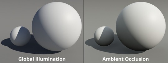
Ambient occlusion is basically the bounce light from other objects in your scene, gamers might know this as a form of ray tracing (ray tracing is live changes in ambient occlusion, games without ray tracing bake in ambient occlusion to get a similar result)
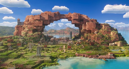
When everything is CG, (again art style aside) looks pretty darn good actually!
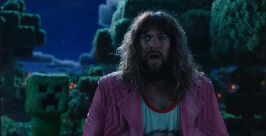
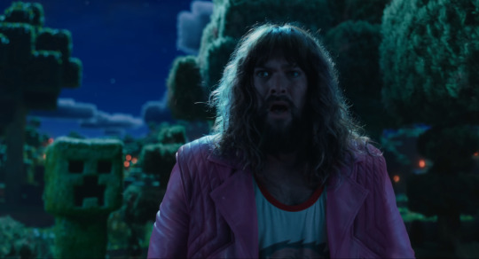

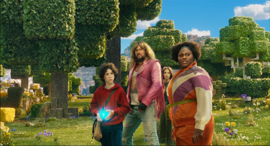
I attempted some edits to see if anything could make it look better (left is original, right is mine), and I don’t think proper lighting or anything could actually fix what this movie has wrong with it. They should have made the whole thing animated, I don’t think any amount of bullying would fix this, the studio basically has to scrap the actors, and make new CG characters from scratch in the same style as the rest of the world.
All of this is not the fault f the animators, or any of the vfx team, they did their absolute best with what they had, this is 100% the fault of the higher ups on this project. I have no idea how this good this far into production without ANYONE saying that it was a bad idea (Either that, or a lot of people got fired, which is unfortunately a likely possibility)
19 notes
·
View notes
Text
The Stethoscope Sponsorship - Jenson Button/Andrew Shovlin
(with light Mark Webber/Sebastian Vettel/Jenson Button)
So I came up with a headcanon that Jenson is a cardiophile (I wrote about it here) and after @watercolor-hearts did this amazing drawing for me, she sent me a message that Jenson in his Brawn suit would look great with a yellow Littmann. And after some nice feedback from @landoisokay who informed me that I made him levitate and he wanted more about this idea, I wrote up my thoughts on how the team would benefit from some sponsorship from a stethoscope company...
Brawn used to give sponsors a deal for individual races to get as much money as possible, so what would happen if Jenson manages to get a deal with a stethoscope company? The team don't want to go with it but Jenson is very enthusiastic about it. Shov tells the team that it probably would be good to promote Jenson's commitment to health, but he knows the real reason; he's seen all the stethoscopes Jenson has at home. And Jenson couldn't turn down such a sponsorship deal with a company he uses so often, and the team couldn't afford to turn down such a big deal.
Jenson loves the photoshoot the most because he can show off his kink in a "covert" way, right under everyone's noses. He models lots of stethoscopes for a campaign about heart health and since he's known as a merchant of chaos off track, it's really useful in earning him a reputation as someone that really loves health (despite all of the alcohol and drugs).
Rubens also really enjoys it too, he didn't think he'd enjoy all of the different styles and how it suited him. But Rubens' favourite thing is seeing Jenson so excited about it. Jenson did try to keep it down low but it's really hard for him when his kink is so out in the open.
Jenson's so excited that he tells the director about which stethoscopes would look better on Rubens and which ones would be best to promote, even making suggestions for each member of the team.
He makes a passive joke about how the team should promote them too, Nick decides to try it one, but then Shov takes the one from Jenson's neck and tries it on, Jenson almost collapses from the sight of it and Rubens just grins knowingly.
It's not particularly liked by other sponsors - Richard Branson thinks it's a load of crap but he gives in when he sees the money coming in.
Being part of an overall health campaign (like the recent ones with Heineken) is good for the teams rep but the best thing is that Jenson becomes a brand ambassador. He does interviews where he talks about it and people think that he's just a health nut after he got so far into a healthy eating campaign and changing opinions after that one interview where he's very obviously high.
Shov loves that everyone is seeing the Jenson that he sees at home, so openly enthusiastic. And it's not like Jenson could hide it from Shov anyway, it's practically impossible to hide them that amount of stethoscopes and he's walked in on Jenson unwinding before bed with his eyes closed and listening to his chest. Shov actually encourages it because he thinks it might help Jenson calm down quite a bit. They don't use it in bed, but Jenson doesn't need to because he uses it in his time with Mark and seb.
Christian dislikes Brawn as the season goes on so he certainly doesn't want Mark and Seb associated with that, but they do an unofficial photoshoot with Jenson the "leaked" photos get so popular that the team can't turn down the PR opportunity.
Jenson is somehow still going stealth with his kink (he doesn't know how no one's worked it out yet). That is until he's in his driver's room before a race using the stethoscope to get into the zone - definitely important based on how the second half of the season is going - with his race suit pulled down and fireproofs pulled up. He's so focused he doesn't notice that people walk in. They ask him what the hell he's doing. He starts to panic because he has no idea how to explain it. Luckily Rubens walks in and grabs his stethoscope. He gestures to it, saying how the company asked them to test it so they could get real opinions on it. He then comments that Jenson would get a better idea if he moved it further to the left. The people shrug, satisfied with the explanation, and leave them to it. Jenson thanks Rubens for intervening, but he's curious about how Rubens knows about auscultation points. Rubens admits he knows nothing about it and only said it to get the people off his back. Jenson points out that Rubens was directing him to a different auscultation point and offers to show Rubens.
Rubens agrees because he's really curious. He'd embraced the stethoscope endorsement but he hasn't really used them beyond what they were required to do in photoshoots.
Jenson lets Rubens listen as he moves the stethoscope around his chest and explains the advantages of each auscultation point and exactly what he can hear. Rubens gets his own stethoscope and tries his on himself. He has to admit it's really interesting and it's nicer than when a doctor does it. Rubens admits that he's curious about what it sounds like when a doctor listens to someone's breathing, so Jenson offers to let Rubens try on him. They both enjoy it a lot.
However Rubens can sense something is wrong so he asks Jenson and Jenson says that he wishes that Shov would listen to him in that way, he'd like to get a check up. Rubens convinces him to ask when they get home, and if it came to it with all of Jenson's resisting, he would ask Shov for him.
Jenson doesn't bring it up to Shov, he can't bear asking since Shov seems a little reluctant especially after Shov voices his opinion that free stethoscopes are a bad idea because Jenson already has too many. He does say that there's nothing wrong with Jenson having so many but there's not enough space in their apartment.
Shov comes around eventually when Jenson gets excited about which ones he might get, so they have a conversation about which ones would suit them best, flipping through the catalogue and circling them like 2 children with an Argos catalogue at Christmas. So Shov buys display hooks for them to hang in the living room. Jenson is so overjoyed that he buys shov the stethoscope he was interested in. Shov loves it, he puts it round his neck and watches Jenson try to dampen his natural reaction at seeing his partner do something he so obviously loves.
Jenson looks at him with slight confusion as he puts on his glasses with a stern expression. Shov gets immense enjoyment when he informs Jenson that he needs a checkup and can't escape it. Jenson goes wide eyed - Rubens must have told him - but his heart starts racing at the mere suggestion of a checkup from his favourite doctor. Jenson had daydreamed about this so many times and to have it finally happen makes him think he's dreaming.
Shov enjoys it too, inspecting him very thoroughly and listening intently at every auscultation point, before offering stern words of advice that he must slow his heart down, he needs to be functioning at his best so he'll do well in races. He smiles because he knows that it's his fault Jenson's heart is racing, but he can't resist giving him a little playful telling off.
#i hope you like this!#formula 1#jenson button#andrew shovlin#shovson#cardiophilia#mark webber#sebastian vettel
16 notes
·
View notes
Note
Recently bought some watercolors but i have 0 experience and i really like your style, so can i know your secrets?
Oh I'm flattered that you asked me! Watercolor has become a medium I’m super passionate about, so I’m more than happy to talk about my process. (Putting a readmore bc it’s pretty long)
TL;DR: I like to layer my watercolor and use it in a graphic style, which I learned partly through experimentation and partly by watching other people's speedpaints/process videos.
Technique/Basics
3 years ago I suddenly thought to myself, “Wait, can’t you layer watercolor?” and my artistic life changed…
I’ve taken some simple process pictures to explain what I mean by that as best I can:


Step 1: Putting down the base color. Have fun letting different colors mix on the paper instead of in the palette while the paint is wet - I have a theory that this is the best way to get hue variation with this medium…
Note: Sometimes I have to repeat this step a few times if it’s not as dark or saturated as I want it to be. Usually, you’ll get a smoother area of color if you gradually build up many lighter layers instead of trying to fill a large area with a high concentration of paint in one go. Remember not to paint over areas that you want to stay light.
Step 2: After waiting for the base layer to dry, add general areas of shadow. Often, I can drop my shadow color directly onto my base color. Sometimes I reverse this process and I’ll put the shadows down before the base colors - this is usually for things like clothing folds or very large gradients.
Step 3: Adding texture/fine details. Hatching with a small brush can be a nice way to build up value (darkness) without disturbing the layers of paint underneath, but I like to reserve it for areas of high detail/focus.
Step 4: Outlines - I used to use colored pencil for this, but lately I’ve liked how it looks when I use watercolor on a small brush.
I have a few videos up on my Tiktok and Youtube where you can see this process in action.
*worth noting: I painted this demo on cellulose paper. Cotton rag paper is definitely the best for maximum layering and color vibrancy, but you can do a lot with cellulose too, so don't underestimate it for practicing.
Learning/Improving:
Watercolor technique
I didn’t actually watch very many “how to” instructional videos, but as a disclaimer I have had experience with other physical media and art classes before (charcoal, oil, acrylic).
I mostly learned watercolor techniques by finding artists who use watercolor in the same style I like and watching their speedpaints. (Apologies if not all of these have English subtitles; most are in Japanese, one is in Vietnamese - seeing the painting technique is the most important part though)
Mokumoshieru: Really great examples of underpainting to determine the color gamut of a piece
Yukorin: Wet into wet technique, still very graphic style, lovely hue variation
P..Potato: (afaik they really just call themselves potato) - Great examples of underpainting shadows
So Kimura: Variety of techniques for a very graphic/cel shaded style
Color Theory/Fundamentals
The book Color and Light by James Gurney completely changed how I approached painting, regardless of the type of paint. I usually work with a limited palette and try to do some underpainting to keep my colors harmonious.
Bonus: Setup/Tools

1) Paintbrushes
My first set was an inexpensive nylon set from Amazon, and it works just fine. As long as the bristles hold a point when wet they should be okay. It’s more useful to have larger than smaller ones; the smallest size I use is maybe a 2 or 4.
I recommend looking into Japanese or Chinese calligraphy brushes instead of quills if you need a larger brush because they’re cheaper and they hold a lot of water. I bought mine from Sekaido (Japanese art supply chain), but I think the brand Yasutomo exports them internationally.
2) Painting Rag
Very important! I use this constantly to control the amount of water on my brush. By the end of a painting session it’s usually totally soaked. If you don’t have a rag, you can use some paper towels.
3) Water cups/holders (plural)
Also very important: You need one cup for clean water and one for dirty/brush washing water. Because water is the carrying medium for the paint, it needs to be clear or the colors will mix together and get muddy. I also put a brush cleaner in the dirty water side to help get more of the paint out before I switch colors.
The process when you’re painting is: dip brush in clean water -> add paint, paint on paper -> wash brush in dirty water cup -> dry/swipe off dirty water -> dip again in clean water and repeat
4) Watercolor Paper and Backing Board
Taping the paper to a board with masking tape is optional, but will help the paper dry flat, especially if you plan to use a lot of water. Technically the right way to prepare paper is to completely soak it, let it dry, and then tape it down but… I’m too lazy so I just tape it and it’s usually okay. XD
5) Paint palette
I have several, including one that’s actually a plain ceramic tray from the dollar store. Ceramic is nicer than plastic because the water will bead up on plastic and it will be hard to get the paint off of your brush for mixing.
6) Paints
Whatever paints you have is fine… One of my favorite palettes is an old eyeshadow palette that I cleaned out and put paint in. I usually like working from dry paints, even if I bought them in tubes. Random tangent, Holbein paints are nice but it absolutely kills me how they get marketed as some sort of luxury expensive high end paint overseas cause they're pretty affordable in Japan lol,
Also, I've noticed (although this is just personal opinion) that paints made in East Asia (I have paints from Japan and China) seem to be more aimed at graphic art/character illustration: the paints are less granulating, but some trade permanence for saturation/vibrance. It's not necessary to get super expensive paints starting out, but eventually you'll get a feel for the difference between super cheap chalky craft paints, student grade, and professional grade.
And that's it! I love love working with watercolor, although sometimes I wonder if I'll have to migrate to something opaque like gouache for certain painting techniques or getting my values to be more cohesive. For now I'll continue to see how far I can push this medium on its own. I hope you have fun on your painting journey!!
9 notes
·
View notes
Note
Hey there! I've recently decided to start practicing Hellenism with Ares as my deity. However, as I've never been religious at all until recently, I'm very new to it all and was wondering if you had any advice? Any specific things I should be doing? I've been researching, but would love some insight (especially since Ares devotees are tough finds, it seems)!
WE’RE NEW TOGETHER POOKIE 😭
I was the same way. I was an atheist almost my whole life before I started practicing Hellenism. I do have some advice though!
You don’t have to buy wildly expensive and new things for your altar, and your altar doesn’t have to be extravagant. If you can afford to buy things, and you have the space for an extravagant altar, good for you!
My altar for Ares is a statuette I bought of PRE Hellenism, a dog statuette thing I’ve had since I was seven, Kuromi (because she gives off Ares vibes), random jewelry, a candle, and a nice spelling spray I spritz for him sometimes!
Try to pray as often as you can. I pray every night, or at least try to. The gods understand that life can get busy.
I really recommend travel altars if you want to pray more often! Mines an old watercolor tin,but lots of people use Altoid tins!
Theoi.com IS A LIFESAVER! THE GODS MUST’VE SENT IT DOWN FOR US. OH MY GODS-
You said you’re starting on Ares, which is amazing I am too. But, Hellenism is typically a polytheistic religion. Currently, I’m a devotee of Ares and Thanatos. There is no limit to how many gods you can be a devotee of!
Some general thing you could do are:
Make your wallpaper Ares
Make him a playlist
Learn about different wars in history
Support your local veterans
Exercise (if possible)
THANKS FOR THE ASK! ♡♡
#greek mythology#ares#greek myths#ares greek god#ares deity#ares devotion#ares devotee#hellenic polytheistic#hellenism#hellenic polytheism
9 notes
·
View notes
Text
You guys already know I love spreading my akekita besties agenda
I saw someone post a video about a little porcelain figure they found and it was a crow in a big straw hat and a sweater and behind the crow was several different easels. The person filming the video dubbed the porcelain figure 'vincent van crow' so you see where I'm going with this. (Btw this is an AU where Akechi lives and he works with the phantom thieves because they can see he needs help and they're going to give him that help whether he wants it or not. Canon be damned.)
Akechi and Yusuke walking around different shops because yusuke needs new art supplies and guess who they find sitting on a shelf tucked away behind some miscellaneous items like mason jars and small vases of different dull colors. Vincent Van Crow. Akechi saw him first and thought Yusuke would appreciate the little porcelain figure, unaware of the artist's terrible spending habits. Yusuke would feel the same connection to Vincent Van Crow that he did with his lobsters and abandon the original mission just to buy him, insisting it was destiny. A crow that was a fellow artist, the only one on the shell and who better to point it out to him but Akechi himself.
Despite Akechi's protests that Yusuke's funds are limited and he should focus on finding the supplies for whatever new piece he was working on (it was a watercolor painting, several paintings, of the various different places in the backstreets where lebanc resided) Yusuke insists on buying him. Akechi doesn't quite understand how Yusuke can have such a sentimental attachment to an object he doesn't own yet but he can't afford to argue any longer because he'll lose his cool.
It isn't until they've finished their shopping and are walking back to the train station that he starts to really get it. Not because he had given the porcelain crow any thought but because Yusuke declared that this small, breakable and frankly unimpressive (to akechi at least) figure was a sign of their bond. A representation of different facets of their personalities and how despite the fact that nobody really understood it, Yusuke and Akechi made sense together.
On paper it was strange, an aloof artist and the famous detective prince but looking past the surface gave a glimpse into why they worked so well together. Yusuke was honest, brutally honest he never censored himself because he didn't see the point in doing so, he looked for a deeper meaning in everything which made sense since all art has some meaning behind it. It's second nature for him to evaluate everything he saw on a deeper level. Akechi appreciated having someone like Yusuke in his life because he never worried that Yusuke was using him like everyone else had. Yusuke's unrelenting honestly was a breath of fresh air for akechi, and no matter how hard he tried to convince himself in the beginning he could never fully believe that Yusuke's honesty was an act. He was too genuine and his perceptive abilities made him see past the act Akechi would often put on.
In turn Akechi was very critical, he had to be as a detective, and he was constantly aware of his surroundings. He always kept a look out for any danger and covered all his bases to make sure he could keep himself safe. Which was something Yusuke appreciated because he would often get lost in thought and wander off to various different places because they piqued his interest, he couldn't stay on task like Akechi could.
They helped each other and the time they spent together was time well spent, numerous discussions of various topics being viewed from two different lens. But they still managed to consider the other's position in their discussions, Yusuke would consider the analytical mindset that Akechi had and Akechi would pay more attention to the finer details and emotional aspects of a situation like Yusuke did. It was an odd but wonderful friendship they had.
So on the train ride back to their homes, Akechi considered the porcelain crow and his porcelain easels, the shine of his feathers and the way his beak twisted into a sweet smile and he felt a small warmth fill his heart. Warmth at the thought that his friend, his real friend that he had made on his own, would keep that small crow on a shelf or a table and think of him whenever he saw it. Warmth because he wasn't alone anymore, he was wanted by the people around him. Wanted enough for his friend to buy an insignificant trinket that put an extra expense on his limit supply of money just because it reminded him of the detective. Warmth because he was loved.
Your honor that's their son, they coparent him for tax benefits
#kitagawa yusuke#persona 5#persona 5 royal#yusuke kitawaga#yusuke p5#akechi goro#akekita#goro akechi#akechi p5#headcanon
31 notes
·
View notes
Note
Need advice, I feel extremely stupid and insecure about my art. Feel like I never progress and don't know how to draw from down below the chest cause when i do it seems really static. I've been drawing for years now and it keeps looking exactly the same, I'm an adult and my drawings look like made by a 14 years old. What should I do?
You need to study some fundamentals.
"Years" is unfortunately too vague for me to really deduce where you "should" be at, but I also want to emphasize that everyone grows and learns at different rates and you really should be patient with yourself. If you're an adult and the amount of "years" you've been drawing can be described as "a couple" or "a few", then don't beat yourself up for drawing "like a teenager". Most teenagers that draw the way they do have also only been drawing for a few years.
That's step one. Be patient with yourself. Like bitch all you want, honestly, please do that, because it helps get the frustration out if your system, but then take a deep breath and do your best to remind yourself to be patient. It's all part of the long process of refining your skill.
Next step, based on what you seem to be complaining about, is to study anatomy and realism, and do so loosely (I mean this literally, loosen up your wrist and you'll get much more fluid drawings). Sketch with pens, or colored pencils, stuff you can't erase and just have to roll with the punches when using. Layer your sketches - when I was doing figure drawing for my animation class, I would get the rough shapes down in a light orange and then add more detail with blue. You might also want to consequently work with paper that can withstand that, like multimedia or watercolor paper.
If you're a digital artist, try drawing traditionally to get the wrist movement down. If you're a traditional artist, try using a different drawing tool to exercise with different utensil weights. If you feel stagnant then you need to switch something up!!
I don't know you so I don't know your style, but since you came to me, specifically, I assume you have some degree of interest in cartoons. I regret to inform you that you'll build a better foundation if you study realism first, at least the basics of anatomy, because Shape (literally how something is shaped and the silhouette it creates) and Form (how something moves) are the two most important elements of cartooning, and you'll get that foundation from studying anatomy and real life. Line weight is another very important element of cartooning, so you'll also have to learn to balance that and what you want to go for.
Also? Don't be afraid to just change your medium. If you're feeling impatient with yourself (often what's going on when people describe themselves as "feeling stupid") then maybe your brain will pick up on a different medium faster. Papercraft, pixel art, sculpting, painting, 3D modeling, fucken, I dunno, wood carving!! There are many ways to create visual arts and a lot of ways to find fulfilment as an artist!! None of these are "easy" persay, but you might be able to learn some mediums faster than others depending on how your brain works, that's all.
I wish you good luck. I know how hard it can be (I mean, hell, I was literally just complaining about being out of practice drawing humans, and so I'm slowly crawling my way out of that hole). I hope I could be of some help.
#Faq#<putting it in that tag because I feel it might be worth returning to at some point#And I have no other clue what to tag it as#People come to me for art advice a lot anyways. So putting it in the faq might be worth it.
6 notes
·
View notes
Text
WATERCOLOR COMPARISON/REVIEW POST
provided by this dumbass
!!!!PLEASE READ FIRST!!!!
these are MY PERSONAL OPINIONS and you can feel diffrently about these paints and i actually encourage that you voice your own opinions in the comments/reblogs. Same with brands that you yourself recommend. I am restricted in the paint brands i can get my hands on due to my location so i cannot speak for other countries really so i hope by this post may encourage other people to speak out about their favourite brands That being said please reblog this if you found it helpful i wanna help as much people to make an informed purchase since watercolor isnt cheap and it pains my heart when i people loose their money due to buying an overpriced shitty set
!!!!INFO!!!!
- this is based after usage on both very good watercolor paper (100% cotton 300g/m^2) AND a "decent" sketchbook (sakura/talens sketchbooks, which arent made for watercolor)
TO THE ACTUAL COMPARISON/REVIEW
1. WINSOR AND NEWTON - COTMAN (+one professional) Personally i feel like its one of the best options available for beginners and more advanced artists. Here where i live its one of the most easily available watercolors and i consider it the "safest" option It can be rather expensive with one half pan costing around 2.8~ euros and 8ml tubes going for around 4.8~ euros but i can assure you that they come a long way like most watercolors (and you can often find them cheaper) POINTS TO TAKE INTO ACCOUNT IF YOU BUY (PTTIAIYB) - you dont need to buy a full set unless it really comes out cheaper and you plan on using the full range of colors - i recomment buying tubes instead of halfpans if you are on a budget and want to take this seriously. it will get you far more paint especially if you manage to find them on sale. YOU CAN BUY HALF PANS SEPARATELY - if you dont have a box dont worry! make one yourself and tape the halfpans inside it with something like nano tape 2. RENESANS - EXTRA FINE WATERCOLOR This one is a mixed bag for me. The value is amazing as they cost ~1.3 euro per pan and are very pigmented but they are mostly only available in poland and are rather thick. I would say they are person specific and you should give them a try if you can PTTIAIYB - INTENSE AND EF ARE NOT THE SAME PAINTS there are no tubes for EF. only pans 3. SAKURA - KOI WATERCOLOR
if you have no other watercolor supplies and you plan on taking your set places this is a great place to start imo. you get everything you really need and its really nice. the watercolor can be a little grainy at times compared to COTMAN for example but its still very good Its a very good student grade watercolor if youre just starting out! (they will fade in sun after some time as they are not as lightfast as the brands above from my research) PTTIAIYB - if you finish a color refills are hard to get and are more expensive than what its worth. try finding a nice tubed paint that is similar instead :) 4. NEVSKAYA PALITRA - SONNET These are great paints in my opinion, very smooth and nice to paint with and you get a lot of paint in the set. They are student grade and some colors will fade after a year in the sun PTTIAIYB - these paints are russian and i know some people would rather not buy any russian products at all due to world events. from what i gathered the best substitudes for them are Ukrainian ROSA watercolors and paul rubens student grade colors [i was not aware of either of these existance before buying the SONNET watercolors] - no refills available from what i gathered 5. KURETAKE - GANSAI TAMBI Personally i dont vibe with these at all. they are hard to work with, they are weirdly glossy and come out patchy on less luxurious paper which i know is a pain to get cheaply. they arent very cheap either! >:[ but they are definetely special compared to other paints! if you like them maybe give me some tips! PTTIAIYB - only available in pans BUT you can buy them separately - pans are VERY BIG. might be hard and inconvenient if you 6. DERWENT - INKTENSE
I have the biggest love-hate relationship with these ever. On one hand they are something way diffrent than what any other watercolor can offer, they have some colors not available in other sets and are generally weird af BUT ON THE OTHER they are very hard to work with and dont really hold up on the promises made mostly the "pernament when dry" claim That is kinda bullshit ngl. even my swatches which have been drying for like 6 months at this point still lift up from the paper IMO unless you REALLY want them and get yourself educated on them DO NOT BUY. Especially if youre just starting out PTTIAIYB - get educated on pros and cons - technically NOT watercolor (rolls eyes)
That was the last set of better watercolor i own heres a picture of all of the sets mentioned and how they look in action! (scanned and in picture)
GUIDE ON HOW TO READ
spread test
blend test
test to see how easily it reactivates with the layers below
on top of pen and pencil
eraser test
and then little faces painted with the watercolors
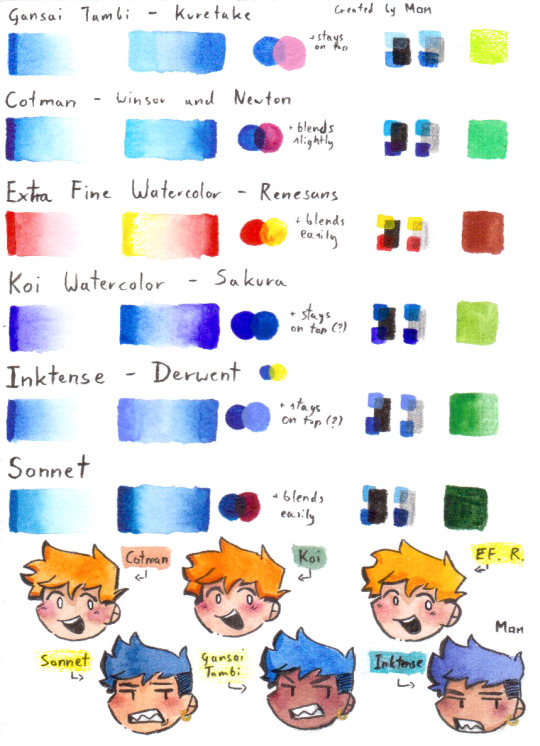

IF YOURE READING THIS
know that watercolor is not for everyone and you might not like it, but in some cases if you dont have the correct supplies you might get discouraged early :( please dont give up but also dont force yourself to do something you dont want to (i for example will not pick up a pastel ever lol) no matter on what art level you are your art is special so feel free to share your watercolor paintings and thoughts on paints that you use in the reblogs i will try my best to see all of them :) Have a great day and have fun creating Mistake of nature
#art#watercolor#art advice#paint#watercolour art#watercolourpainting#artistshelpartists#art tips#art help#art resources#artists on tumblr#artist#traditional art
17 notes
·
View notes
Note
since art has been brought up what is your process and brushes you use?
the gist of it is: i use my phone, my index finger, and the app IbisPaintX to draw! also my brushes are the Digital Pen and the Fade Watercolor (Opaque). my general process is making sketches and focusing on the energy of a piece, then sticking to that
long stuff and more detailed stuff under the cut... i put a bunch of images in there for reference
overall its not very fancy!! mostly i make art when i feel very inspired by something (which is to say, not super often). i usually start with a very rough sketch which helps me figure out how i want the art to feel. so for example this piece

was originally this sketch
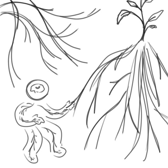
basically the purpose of the super messy sketch is to outline ideas and stuff. i say "i think this would be cool, it looks cool in my head. this is what the finished product should emulate" and then i roll with that. also usually i have multiple sketches based on the same idea, but more often than not there will only be one sketch that i want to work with.
i tend to pick colours based on the feeling of the piece! so for me, the idea of plants gets the colour green, the "i have no mouth and i must scream" art gets a lot of red and orange. it's basically colour associations.
although very simple, my backgrounds tend to be developed around either the concept or the sketch. for the plant one above, i tried to use more flowing shapes in the background to emulate leaves, hills, and vines. for my first few "factory pomo" style pieces i wanted to get a sense of contrast, so i designed the background to be almost split into two colours/two parts, etc.
other examples

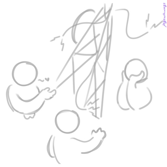

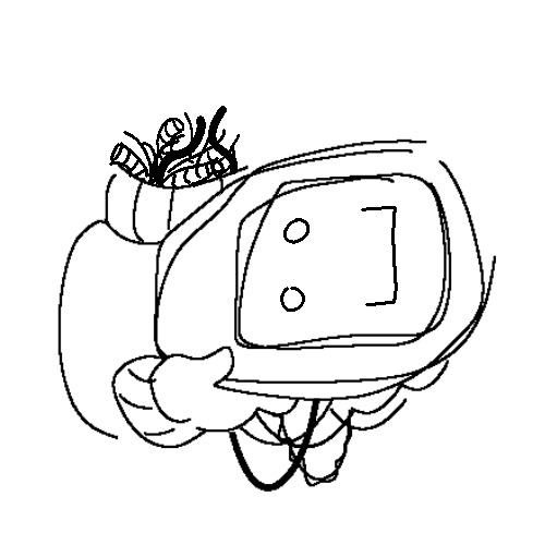
you're probably noticing how similar my sketches are to my final pieces. it's basically because i treat sketches like lineart. i pick a sketch and enlarge it so that it takes up most of the frame. then, i set it to a low opacity and draw on the layers underneath it. oftentimes i turn the layers on and off to get a sense of how the whole thing looks, and the finished product will not include the original sketch layer. but a work in progress for me usually looks something like this
it's a whole lot of going back and forth! zooming and out, erasing and redrawing and turning off layers and zooming out again. it can be messy sometimes but i stick to it and enjoy it a lot. i am not always faithful to the sketch, either; i usually add whatever i think looks cool. for the piece above i did Not originally intend to have glitching effects on my sona's body. but then i thought it would be cool to add some!! so i did :]
as for Brushes i work in IbisPaintX and i use this bad boy the Digital Pen (set to various thickness depending on whether i want very small and fine lines or just want to cover a Big Area). its basically just pixels so thats how i usually get very crisp lines!! also you can turn it all the way down to just 1 pixel if you want to be really precise. eraser tool and ruler tool are my best friends. also the Fade Watercolor (Opaque) that is right underneath the Digital Pen is what i use to sketch sometimes.

um hope this helps or satisfies your curiousity!! yeah. not a formal tutorial to my art or anything, this is just how i do it. which is in a silly way
24 notes
·
View notes
Note
please tell me about the pigments i would love nothing more than to hear you talk about that one shade of red you like and the process it took too recreate it
... oh, op. you have no idea what you've unleashed.
alright. here we go.
OKAY SO THE RED PIGMENT. pr206. my beloved. my dearest friend. it was an absolute bastard to find because there are so many of these. however many you think there are, there are MORE, and that's only if you don't count the many many scenarios where colors are known to be multi-pigment mixes, usually varying in tone/shade/intensity depending on the brand and manufacturing style. some colors are more consistent than others, but there are situations where a color can be named the same and contain the same pigments and STILL look wildly different depending on the ratio, binder, and paper you use. and that's not accounting for the way the pigment is processed. some pigments (like pv19 for example) can come in so many shades it's frankly kind of ridiculous.
anyway, my quest begins when i am, admittedly, in an edgier phase. i want a blood red, but not specifically because of that—no, i want it because it is THE IDEAL COLOR (to me) for a perfect, warm, slightly muted but still intense shade to add to a muted autumn watercolor palette. and... if you look at my whole theme, you probably know how much i love warm colors. i want to paint mushrooms. i want to dim down some of the brighter greens to make them autumnal. i want the perfect red to put as an undertone.
the search starts in earnest.
the immediate issue is this: reds (and purples and pinks) have horrifically bad lightfastness. not all of them, mind, but many are NOTORIOUS for fading under uv light, which means they will also fade if exposed to sunlight even in passing should it happen often enough. and—in especially bad cases where they're essentially working with dye and not pigment—they can even fade inside your notebook. inside of a drawer.
so not only are we working with an unfortunate pigment base (i'm simplifying here, there's way more nuance to this but shh) but we are working with one that skews heavily toward floral pinks or oranges. the red i'm searching for is warm, but not orange. dries dark but not brown. is transparent, not opaque. that last part is agonizing, because i also desperately do not want a color that will fade on me or generally destabilize, and most of the stable dark red pigments are EARTH pigments like red ochre (pr101) or the like. which, while fascinating because of their historical usage in things like pottery and even cave paintings that last to the modern day, are VERY OPAQUE. this is an issue with my preferred style of watercolor painting specifically, because opaque pigments tend to lift easier off the page and limit layering.
the search continues. pigment after pigment breaks my heart for one reason or another, drying too close to the cooler purpleish-red tint of wine at best. i think i find it in perylene maroon, but the drying shift (the difference between how a color looks wet vs after it dries on the paper) is so extreme that it loses the luminosity AND it's more opaque than most. i languish.
for a while my search turns to creation. i try and mix as many of my single pigment colors as i can into something that vaguely resembles what i'm looking for—so i take quinacridones and mix them with napthols, with nickel azos, with dashes of ultramarines and burnt sienna. everything turns out either just a bit too opaque, just a bit too muddy (that happens with multi-pigment mixtures, and is why so many people swear by single pigment colors. it's personal preference, really, great art can be made either way.)
still, nothing works. failure haunts me. i sit before a pile of used up watercolor paper that is literally covered edge to edge in nothing but similar red squares with various gradients and blooms as evidence of when i tried and failed to convince myself my efforts were close enough. i admit defeat.
in the meantime i shift my focus. i try and appreciate different color palettes and profiles, experimenting with things like fully transparent palettes (personal favroite) to fully opaque ones that function more like gouache. but despite finding appreciation for it, i still think about the damn red that i could never recreate. it kills me.
and then one day, a youtube video. a pigment is being discontinued, and the watercolor community is distressed. this happens a lot, because pigments are actually not always popular because of artists—sometimes beloved colors are put out of production because larger markets like car companies no longer find them popular enough to invest in. this time, the casualty is pr206, aka brown madder, aka quinacridone burnt scarlet.
let me tell you a little about quinacridones. they are genuinely remarkable colors. they have their own cult followings because of how bright and abnormally stable they are under uv light. they're transparent. they're luminous. they come in mostly shades of red and pink and purple, though there are a couple oranges and yellows in there. (there are no quinacridone blues, as far as i'm aware, but the phthalo blues have that category covered.) they also rewet beautifully, so you can put them on your palette and let them dry and not worry about it turning into a useless little rock of color that you can't get any pigment from anymore.
quinacridone magenta (pr122) is probably the most popular of these, the most often used besides maybe quinacridone violet (pv19). a few years prior we suffered the loss of quinacridone gold (po49) and since then people have been On Alert when it comes to losing these colors. i am one of them, because i never got the chance to even see po49 in person, and now the tubes are so stupid expensive that even the student grade versions go for Ridiculously High Prices on ebay, and the professional brands are being hoarded like (ironically) gold by anyone lucky enough to have a tube left over.
but back to our main character. not me, the pigment. pr206. i have legitimately never heard of this one, which to be fair is probably because i try to limit the random colors i fixate on since the hobby can easily get VERY expensive if you aren't careful. but it's a quinacridone, and that catches my eye.
i open the video.
now, i'm sure any artist out there will be familiar with the fact that screens don't display color consistently. it depends on your device, but most can agree that something that looks cooler on one may be warmer on the other, it's just what happens. but i see this color being swatched, and my brain implodes.
it's almost a perfect match.
it could work. it could. years of thinking that same thought have left me bereft and mistrustful of this specific quest marker, but the thought refuses to leave me. probably because the 'discontinued' label flashes like a neon sign.
i resist for about six months, and then i cave. at this point i have genuinely been trying and failing to find this color for upwards of five years. i am desperate, and the color might not be available anymore soon anyway, and apparently i am weak to sales pitches. (note: the color IS now unavailable in some brands, but others bought a decent supply and should have it available for at least a little while, alongside po48 which is quinacridone burnt orange, a favorite of mine and probably one of the only oranges i use regularly. both are discontinued officially, but they'll still be on sale till those supplies run dry.)
the color arrives. i grab my favorite brush. i pull out my stash of paper that i save for special occasions.
it's almost perfect.
i mix it with quinacridone burnt orange.
the result is, i swear, a perfect match for what i have been searching for.
it's warm. it dries dark but not dark enough to look brown. it keeps its luminosity (thank you quinacridones). it's fully transparent (thank you quinacridones). i genuinely feel the urge to weep, but i don't because i am clinging at last to the dredges of my sanity and also salt makes watercolor pigments behave differently and i will not risk this glorious moment. finally, after all these years, bill cipher has a gun i found the goddamn COLOR.
i mix it with warm yellows and with my favorite blues. with the pinks, just to laugh. life is beautiful and i am painting its sunsets, and i do not care if they look ridiculously messy. i have won.
the moral of the story is to never give up. or maybe it's to remember you never actually know everything about even the fields you love the most, because this color totally blindsided me despite being much more common than i expected. or maybe it's that i seriously needed to chill out for a while.
but yes. that is the tale of one (1) of the colors that has taken up residence in my soul. i hope you don't regret asking now lmao.
#ney's art tips (art questions)#ney's chatter (ask answers)#so also i said that a good alternative to pr206 is pr175#but i'm actually not totally sure about that because i've never tried it myself#watercolor is an expensive hobby and that's part of why i swapped to digital orz#BUT! from comparisons i've seen they are at least similar enough to scratch the itch#ironically i think i still USE po48 more than i do pr206#but that one is also In Discontinued Limbo where you can buy it but supply is indeterminately limited lmao#still a gorgeous color though.#... wow. this was incredibly niche and probably barely coherent i am so sorry LMAO#but thank you for indulging my color madness. it was the only hobby i had for *ages*.#long post#very very long post#good god is this my longest text post? aside from maybe a hive story?
21 notes
·
View notes
Note
What brush do you use for your artwork? I’ve been trying to create texture on my paintings, but my circular-tipped brushes just have more an amateur looking, grade school swoop.
Also, do you know any good guides on mixing paint to make better colors?
Ok so the basic answer is: you will usually get more texture with square brushes, while the round one give a more blended look-
Though I’ve found that when it comes to brushes, the most essential part is not the shape, but the texture! The ideal texture will vary depending on the medium and personal preference, but for the ones I use:
For acrylic: now with acrylic, I like to have a brush that has a bit of body to it, while still being supple and not as rigid as an oil paint brush - my absolute favourite model are the Snap! Brushes by Princeton, I’ve found that they truly have the perfect consistency for me - they also come in a wide range sizes including very fine ones for detailed work!

For watercolor: for watercolor, you’ll want a brush that has more of a flow to it, a brand I really like are the Windsor & newton Cotman brushes, though a lot of brushes will do, just look for something that is labelled as suitable for watercolor!

Finally, for gouache: I like to have more body than even my acrylic brushes with this medium (while still not as rough as an oil brush); now I have Himi gouache, so I use the brushes that came with the palette I bought, but for finer details I use these Raphaël brushes!

Overall there’s no right answer, I recommend just trying different types of brushes/texture, and you’ll find what works best for you! I also think that if you have the option, buying brushes at in person art stores where you can touch the bristles is the best way to do it! Getting a feel of the brush, it’s much easier to tell if you’ll enjoy working with it rather than just blindly buying something hoping for the best -
Good tools can be so essential when it comes to producing artworks you like, before I figured out my brushes were the problem I HATED acrylic paint, so hopefully you’ll find something that works for you!
For mixing colors, unfortunately I don’t really have any tutorials to rec :( I have been winging this shit for as long as I can remember LOL - one piece of advice I’d give is;; if you’re using a reference, stop trying to mix the color you think you need, and instead, actually LOOK properly at the colors - we often have erroneous preconceived notion of what things look like! Looking out for undertone is really important as well!
Speaking of - an important tip I wish I knew earlier is to put a color wash on your canvas! Gives a glow from underneath the color that gives a really nice effect + getting good colors is much easier when you’re not working on blinding white!
also an unpopular art opinion of mine would be: don’t listen to the people who tell you would should only ever use the primary colors and bla-bla-bla;;; that can be a good way to learn mixing, but if it frustrates you to the point of getting discouraged, what has been gained, really?
also these people always forget to mention one crucial thing: saturation! One thing to know about mixing paint is that the color out of the tube is the most saturated you can get - every time you mix up colors, you will lose some saturation; that can be a very good thing if you want a more natural and organic palette; but it’s important to remember it’s impossible to, for exemple, mix up an orange that’ll be as bright as one you’d get from a tube
There’s also some pigments that can give really interesting results, for exemple, making this portrait, I used this color while mixing the skin, and while it is pink, it has a really interesting purple undertone, which I think gave super cool results!


Anyway, this was a really long winded answer, but I hope you’ll find it somewhat useful! Good luck on you art journey, friend! 💕
9 notes
·
View notes
Text
Hello. Today is my 30th birthday, and I am in bed recovering from surgery. To entertain myself, I wrote up a list of 30 things I'm glad I learned before I turned 30, and now I'm sharing it with you. Take what resonates, leave what doesn't.
30 Things I'm Glad I Learned Before I Turned 30
You can decline to be weighed at the doctor's office. Seriously. Unless they're dosing meds or need to report it to your insurance for something, you can say no thanks. And if they have to weigh you, you can request that they don't tell you the number.
Fed is better than not fed. There are days when my stomach won't tolerate anything except cheese puffs, so I eat the damn cheese puffs, without judgment. Feed yourself the best you can, and know that this will look different every day
Eventually, people will always tell you who they really are. Believe them the first time (this one comes from my mom).
Not living up to family expectations is very often a good thing. Your life needs to make you happy. You are your own person with no obligation to be what they want you to be.
Having a creative hobby that you're not "good" at is important. For me, it's watercolors. I do them because they bring me joy, not because I'm trying to be good at them. That's not to say that I don't love what I paint - I do. But there's no pressure for it to be anything other than fun.
Your job doesn't have to be fulfilling - it can just be a fundraiser for the things in your life that do bring you fulfillment.
Mental health is every bit as important as physical health. Don't neglect either.
When you have nothing to be sorry for, say thank you instead. Thank you for listening instead of sorry I bothered you, thank you for helping me instead of sorry I needed help. I'm not always good at this one.
Throw away the clothing with holes. You deserve clothing that doesn't have holes.
Your clothes are meant to fit you, not the other way around. Your body is the thing that carries you through your life. Clothes that don't fit are just scraps of fabric who aren't meeting their performance goals.
Everything is figure out-able. This one also comes from my mom.
Laziness doesn't really exist; it's almost always a response to something else (burnout, low self-esteem, etc).
Being your most authentic self is scary. It's also 100% worth it. Life has gotten better every time I've been even a tiny bit more myself.
There is no timetable for when you should hit certain milestones. You are not behind. You are on your own time.
Femininity means whatever I want it to mean, not what society tells me it means. Everything I do is feminine because I say it is, and no one can tell me otherwise.
Your job doesn't care about you. If you disappeared from the face of the earth, they would replace you immediately. You should bring them the same energy. You're the only one who will look out for you.
Use your PTO. Every damn second of it. When I started my current job, I was told that no one used all of their time off. I do. Every year.
Dieting literally does not work. Scientifically. Reading up on the Minnesota Starvation Experiment, Famine Response, and why BMI is literally sexist, racist bullshit changed my life.
Doctors might be experts in their respective fields, but they are not experts in what it's like to live in your body. Whenever possible, find one who makes you an active participant in your care plan.
Wear whatever the hell you want. Life is too short to worry what other people will think.
Live theatre, good meals, and beautiful tattoos are always worth the money.
Anger isn't inherently bad. Most of the time, it's your signal that something is wrong. This is the most impactful thing my therapist ever taught me as an ex-vangelical who grew up hearing that anger was a sin.
Don't put down the things that bring others joy. If they're not hurting you, themself, or anyone else, why waste your energy?
You cannot miss out on the things that are meant for you. If you miss it, it wasn't meant for you, and you should probably be grateful you missed it.
If I'm too much, go find less.
You are always responsible for your actions. Diagnoses, negative life experiences, and the like might explain bad behavior, but it doesn't excuse it. You are responsible for you.
Your feelings are always valid, but they are not always correct.
Go outside. Every day if you can. Even if it's for 30 seconds. Go get some fresh air on your face and look at a tree. If you can't make it outside, open a window, even just for a minute. Your brain will thank you.
You can leave. Hate the fitness class? Leave. Party too loud? Leave. Doctor not listening? L e a v e. As the famous tumblr post goes, if it sucks, hit da bricks!
You need nothing days. Days where you intentionally do absolutely nothing and feel zero guilt for that. Sit in bed, binge a Netflix show, eat some snacks, and don't think about all the things you're not doing. Let yourself rest, dammit.
17 notes
·
View notes