#I read that it's good to have both alt text and body-text for the ID so we're switching to that
Explore tagged Tumblr posts
Visit Tumblr Blog
Explore Tumblr blogs with no restrictions, modern design and the best experience.
Last Seen Tumblr Blogs


Fun Fact
Premium Tumblr themes are available from anywhere between $9 to $49.
Text

Gideon Nav can take a compliment so so well, guys.
[ID: A six paneled comic with three scenes from Gideon the Ninth, showing Gideon becoming more and more flustered from compliments. The first shows Aiglamene saying "If she satisfies you, you must let her go," to which Gideon lightly blushes, looking bemused. The next scene shows Dulcinea saying "Oh, singular" as she examines Gideon's eyes, to which Gideon is blushing furiously. The third scene shows Harrow looking at Gideon fondly and saying "You are something else with that sword." This compliment appears to break Gideon, who is blushing so hard it melts her paint, and she has steam exploding from her ears. End ID.]
#gideon the ninth#the locked tomb#tlt#gideon nav#harrowhark nonagesimus#dulcinea septimus#cytherea the first#aiglamene#my art#I read that it's good to have both alt text and body-text for the ID so we're switching to that#anyway#this is the hottest Harrow has ever looked it was completely by accident#so we're just gonna say this is Gideon-vision
321 notes
·
View notes
Text


Hey ! I’m Sol, Juno, Chip or Art, whichever you prefer, and you can use he/him, eon/eons, myr/myrrh, hy/hymn, it/its and masculine terms for me. I’m a paradox, I don’t abide to labels and stuff like that, not in the way that I don’t use them, more in the way that I just go with what feels right in the moment, without forcing myself to stay static. Right now, I’m an anarchaqueer, biaro man, but I’m fluid, so don’t get attached too much ! I’m also québecois and not shy about it; feel free to talk to me in french or english.
SHOP & DONATIONS [LINK] | I AM POOR AND ENJOY EATING THANK YOU

more pronoun options [link]
read CROSSTALK [link]
art collection sideblog : @solsanctae
Working towards being an editor professionally, so open to beta for fics or other stories, just DM me !

I’m currently trying to cut back on political commentary on here, both in reblogs or in my own posts, because it triggers my moral OCD. Please note that you cannot extrapolate how much activism someone partakes in based on their tumblr activity.
I’m for the liberation of Palestine, against antitransmasculinity (as not being so would betray my own life experiences), for the independence of Québec, against antisemitism, for a kind of aspec solidarity that includes non-aroace aspecs and respects the differences in our experiences, against the police & the current psychiatric system, for the destigmatization of kinks, fetishes & ‘scary’ mental disorders, against exclusionism & label policing in the queer community, for the exploration of complex topics in fiction (including in ‘lowbrow’ medias like fanfiction), against both gender & sex essentialism & binaries, for LandBack, against the criminalisation of (all) drugs & sex work, and passionate about much more topics than those included in this short list. I believe that morality is not determined by your thoughts but by your actions, and that what kind of bigotry you’re affected by is not determined by your identity but by how & if it is perceived. If you’re planning on harassing me about any of these beliefs, I’d recommend simply blocking me instead, as I will not answer any questions I don’t believe to be asked in good faith.
I’m 21 so keep that in mind. There should be little NSFW stuff on here, pretty much only artistic nudity & jokes.
Please note that I do have a separate (appropriately tagged) NSFW account, and that if you go looking for it, it’s your fault for seeing things you don’t want to see. Bringing here what I post to that account, or ‘exposing’ it to others with the goal to judge or mock me is sexual harassment. There’s a reason those accounts are separate.
I’m fully fine with (appropriately tagged) NSFW topics being explored in fandom, including JRWI (as those same things are explored in the source material). I believe the council’s boundaries are to not do RPF and to not show them porn of their characters. Feel free to block me if that makes you uncomfortable.
I’m not going to tag every time I talk about my own experiences with abuse, addiction, SA, C-PTSD, pure O (internal OCD, in my case moral), P-DID and stuff like that, so feel free to block if that’s something that could trigger you. I don’t talk about it often though, and will tag it if it’s too graphic.
I am the host of a system, this account should be mine & mine only but we’ll see. The way I see my plurality is not the generally agreed upon way in the plural community (e.g. I am my body; the others are at best symbiotes, at worst parasites), so don’t think I represent anyone else but myself. Don’t ask me to have an opinion on endogenic systems, I don’t care.
If you tag me in stuff where you have to tag your friends and then they tag their friends, I enjoy and appreciate it, but I most likely won’t tag other people cuz it makes me anxious !
I usually do PTs, IDs and/or alt text on my flags and userboxes but I don’t always have the energy that requires of me, so sorry about that.

Flags : No credits needed, except if put on a wiki or pinterest, in which case credits are needed (preferably a link).
Userboxes : No credits needed, but reblog the post you got it from.
Visual arts : No reposting, but can be used as pfp/banner with credits.
Poetry : Reposting is fine, but with credits.


#solsart#<- tag for art (including webweaves music & more)#solsthoughts#<- tag for me just talking about stuff#solanswers#<- tag for me answering asks#useful shit#<- tag for useful shit#solshoard#<- tag for my hoard of MOGAI stuff#solcoded#<- tag for things that are just like me fr#for writing#<- tag for writing tips#crosstalk#<- tag for my tidalwave prequel fic#solsflags#<- tag for the flags i made
21 notes
·
View notes
Note
Hi there, I would love some advice for describing images please! Firstly, is there a preference for it to be in the body of the text or in the alt description? (This is for when I'm OP). Secondly, is there a preference for how quotes are given? I've not used a screen reader so don't know how they read punctuation marks, and quotation marks in particular (I guess this might vary too). I've used - The title reads: "Example article title". I can appreciate there won't be a way that's perfect for everyone, but I'd like to know what will make it more accessible for as many people as possible!
This is going to get a little long, so I'm going to put it under a read more. However, as usual, I invite people who use screen readers to share their experience in regards to both of these questions.
The preference varies a lot, to be honest. I personally prefer either having the full description in the alt text if it's short and sweet or an overview of the description in the alt text that ends with some form of "see image description in body of text for full details" if you can't describe everything necessarily in 200-300 characters or less. In those cases, you would then put the full ID as an image description in the post. This allows someone using a screen reader to get an idea of whats in the image and be able to decide if they want to hear more about it.
I tend to stray away from only using an image description since multiple screen reader users have told me that they will simply skip a post entirely if the images don't have alt text.
Of course, my preference isn't by any means the rule of thumb. This poll about length and placement of image descriptions gives some idea of the variety in preferences among Tumblr users. I think it is also worth noting that, as far as I know, some screen readers will not let you navigate alt text the same way you can text. It's very possible that some screen reader users will need to listen to alt text on a single image all at once, and then listen to it all again if they miss something. This makes long detailed alt text less than ideal for those users. Of course, that might not be as true with Tumblr since alt text added via the default editor is accessible as an image description as well, but it's still something to keep in mind.
There is also some evidence that Tumblr's alt text is not fully accessible to some users, though looking at the comments of the post, it seems like the majority of people answering that way actually mean that the presentation of alt text is less than ideal for them, such as the text being smaller than they'd like or the Alt Text button not being as obvious as they'd like. The expandable image description feature is not fully compatible with some older blog layouts either.
In terms of your second question, you're right that punctuation varies from screen reader to screen reader! I know that, at least with JAWS, quotation marks will be read as "left quote" or "right quote" if the verbosity settings are set to high, but otherwise they are not read. Using something like VoiceOver, quotation marks won't be read regardless (unless there is a way to navigate character-by-character like there is in JAWS and I just haven't discovered it yet, then it's possible that VoiceOver might be able to read it too). I'm not sure how NVDA handles it, but since JAWS tends to have the most user customization options of most screen readers, I think there's a good chance NVDA doesn't call them out either.
I'd say if the quotes are very important to the meaning, you might want to consider replacing them with text, such as saying: "this program is [quote] accessible [end quote], but what does that really mean?" You'll notice that I used quotation marks there too, and that's because I think it helps visually, even when it's not essential to the meaning. Adding a colon or comma before the quote can also force the screen reader to pause, making it more apparent to screen reader users where the quote functionally begins since that tends to be how we indicate it in natural speech.
Check out Why Don’t Screen Readers Always Read What’s on the Screen? Part 1: Punctuation and Typographic Symbols for more information one how screen readers deal with punctuation and other symbols.
15 notes
·
View notes
Text
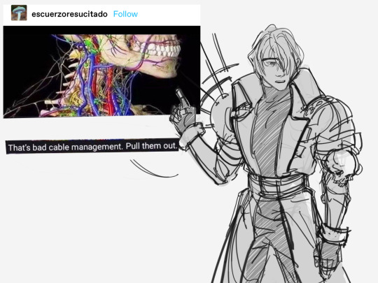
[ID copied from alt:
A black and white drawing of Legato Bluesummers from the knees up next to a cropped screenshot of tumblr user @escuerzoresucitado’s text post, made to look like his dialogue. He wears a solemn, jaded expression and points to the picture in the screenshot which is an anatomical depiction of the veins on the neck and jaw of a skeleton. Below the picture reads as his dialogue: “That’s bad cable management. Pull them out.”
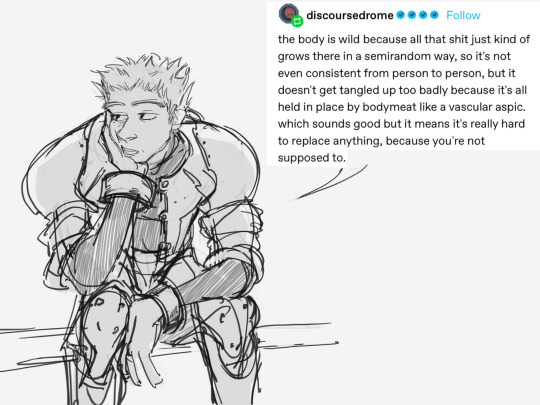
A black and white drawing of Knives Millions sitting slouched forward with his right hand propping his head up. He looks off to the left side with a bored, half-lidded expression. His dialogue is the rest of the textpost screenshot, which is a reply from @discoursedrome: “the body is wild because all that shit just kind of grows there in a semirandom way, so it's not even consistent from person to person, but it doesn't get tangled up too badly because it's all held in place by bodymeat like a vascular aspic. which sounds good but it means it's really hard to replace anything, because you're not supposed to.”
Slightly more simplified sketches of Knives and Legato facing each other with Legato’s back in view, Knives still sitting and looking up in thought, three dots beside both their heads. Legato has subtle blush marks around his cheek while they pause for silence.
The same drawing of Knives and Legato, except Knives’ expression is redrawn with his eyes closed, eyebrows raised, saying the last part of the text post reply: “it's just another example of how planned obsolescence encourages waste” Above Legato is added written dialogue which reads, “I have feelings for you—“ End ID]


yeeeIKES …
#GOING FUCKING INSANE. KNIVES I ALSO HAVE FEELINGS FOR YOU#op i LOVE them this is so good#and tysm for providing alt!!! i just prefer plain text ids on my blog :)#trigun#described#sent to me
2K notes
·
View notes
Note
sorry if this is a dumb question, but in terms of image ids, does putting stuff in alt text do the same thing? i’ve assumed it does but should i do both?
Not a dumb question at all.
Alt text is good, but it isn't perfect. Tumblr sometimes eats alt text, meaning some screen readers don't pick it up even though it's there.
IDs in the post instead of alt text are also beneficial for people who aren't using screen readers. Some examples:
Some people with vision impairments don't or can't use screen readers.
Sometimes tumblr is slow to load an image, so you check the ID to see if you want to wait for it to load.
IDs on videos are useful for anyone who can't play the video, for a range of reasons (audio processing, deafness, vision impairment, migraines, being around other people without headphones etc).
Image quality can make it difficult to read all the text.
Understanding a meme or gifset or photo. If you don't know an actor or a reference or a show, often an ID will explain it, or give you the name of the meme or characters to make it easier to google.
People get used to seeing IDs, so they're more likely to reblog IDs
My recommendation for tumblr is to put IDs in the body of the post, rather than alt text. (if you put both and the alt text works, people with screen readers will have to listen to the same information twice which isn't very accessible)
There's many posts and blogs out there that give advice on how to write IDs, you can also look at IDs that already exist to get an understanding if you're just starting, or reach out to someone and ask. There's also whole discord servers where people can ask for IDs and other people volunteer to write them.
The best way to get good at writing image descriptions is to practice
#hope this helps#I've been wanting to make a post like this for a while#I'm sure others exist#but I've not seen them circulating recently#image described#image id#useful#advice#accessibility#aleck writes#ask#ughtwigs
102 notes
·
View notes
Text
If we had a nickel for every time two highly skilled transformer warriors with back stacks experienced medical malpractice from a high ranking antagonist that changed their physical form we’d have two nickels but it is super weird that it’s happened twice.
And even weirder when you consider that the old forged form of the canonical trans woman’s one is based off the 1980s reformat design of the g1 iteration of the character who went through this in 2003...
A bunch of trans folks including us talk with good reason about how Jhiaxus forcibly assigned trans gal Arcee her first lanky bot mode and car shape including her alt mode based on his idea of what a woman was (and not entirely her own wants) and with unnecessary procedures while conscious. As people who read our stuff like Addendum know we think it’s interesting when we account for the intentional 2012-2018 writing of Arcee as a sapphic trans woman to navigate a unique parallel lens on transmisogyny, medical gatekeeping, androcentrism, imperial progressivism and so forth...
But did you know that in 2003 Starscream forcibly inserted a new alt mode into big thigh Megatron in Dreamwave Armada and it was painful?
WTF Starscream. Internalized transphobia is not a good look for you dear. /j Nor is medical malpractice.
The image in question, this came up during some comic reading with some friends today (please note we use she/her pronouns for Dreamwave Armada Megs because that was the only way our brain could respond to the text with a laugh. Like, years of one of two of Arcee’s canon trans iterations as of 2022 on in our thoughts for years is why probably lmao):
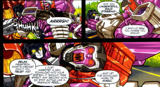
[[ ID: Armada Starscream stabs something into Armada Megatron from behind with a SHHHK! sound, and Megatron screams with an “Arrrgh!.” She turns around and grabs a fearful Starscream by the throat and says: “Why you ungrateful, back stabbing- I should kill you where you stand!”
Megatron reels back in pain, still holding onto Starscream’s neck, who smiles calmly saying: “Relax Megatron. What’s wrong? Don’t you trust me? I just inserted a new download into your system. It should take effect any second now, so stop acting like a paranoid fool... ...and let the download work it’s magic.” End ID. ]]
Anime Armada Starscream was super cool but oh my gods this particular comic Armada Starscream goes on our list of truly the worst.
The weirdest thing is before reaching this panel we were joking about how Megatron is drawn with large thighs and said “...is Megatron on estrogens or was [she] just forged this way?” And then we read this.
Also for added ridiculousness IDW1 Jhiaxus and Armada Starscream share a body type. Like yes we could be talking about the autonomy violation of how Aunty en masse assigned modes for infiltration on Earth in G1 but at least- least the bots on both sides were unconscious for that.
If we ever get an Armada Megatron toy we are giving her two swords and that is that. It feels extra weird because we grew up with the anime and had no clue that this was happening separately.
Why Megatron x Arcee fanfics aren’t T4T we have no idea /lh /the psychic damage of dreamwave armada at least it’s not g1 dreamwave /wtf
It’s really really nice that later parts of IDW1 along with the whole of IDW2/IDW2019, the Transformers TTRPG, and Earthspark embraced a body autonomy narrative for alt mode that the three in their own ways (Earthspark the most blatantly, closely followed by IDW2) describe as an aesthetic realization, but that kind of reflection is something that crops up much earlier in transformers (a story for another time) while other related things were still being struggled with, that is, gender writing, which we personally think the growth of helped to inform how alt mode writing currently is.
Anyway, that’s another pluralsword ramble.
#transformers#maccadam#megatron#arcee#starscream#jhiaxus#transformers armada#dreamwave armada#dreamwave#idw1#idw2005#trans arcee#wtf dreamwave#she/her armada megs is the only way we can deal with this#alt mode#medical malpractice#this might be a#squick#for some folks#psychic damage#definitely not the same as spotlight but since we draw the comparison we'll tag to help people avoid#transphobia#pluralsword rambles
17 notes
·
View notes
Text
Hi! Thanks for tagging me. I don't know what a rentry is, but I assume it's a kind of informational post? I'm always happy to see information about accessibility be shared!
I use a screen reader part-time due to disability, but I'm not blind.
Some common issues are:
lack of image description/alt text
forms or interactive elements without accessible labels
Links with unclear names (for example three links in a row all named "x")
pop-ups/overlays that are "above" the regular content and my screen reader somehow can't manage to go in there? It only reads the content "below" that is hidden behind the overlay. Don't know what's up with that, but it sucks
Tumblr specific: When you repost a tweet from twitter, tumblr now automatically adds alt text, which is great! However, the automatic alt text doesn't contain a description of the attached images. Imagine someone tweets a screenshot from a news headline and says "This is shocking information! Anyone should know this!" Well, I won't know what the tweet is about, sadly, because that information isn't contained in the alt text.
When I don't use a screen reader, I use large text. Some issues with that are:
Website or app won't allow magnification
Magnification or zoom causes content to be cut off
Font too small or illegible
Bad contrast
Screen shot of text instead of actual text (if there's no ID/alt)
Tips for image descriptions:
Any ID is better than none! (See my pinned post for more on that)
Convey the main message or purpose of the image (this can be difficult for art, but many other images are straightforward)
If there's text in an image, transcribe it
If it's not possible for you to create a full description, try to identify the image instead. (For example, if the image is an illustrated guide on how to tie a complicated knot, you might not know how to describe each step so it makes sense without the images. In that case, your ID can be something along the lines of "illustrated guide on how to tie knot so-and-so")
In cases where you do know how to describe the image: You can put a short identifier as described above in the alt text, and then add a more detailed description in the main body of the post. (More on using both alt and main body IDs here)
On the topic of plain text: This is not an official word you'll find in accessibility guides. In general, text on websites is already accessible to screen readers with very few exceptions.
These exceptions inlude
Copy paste fonts (these generally read as gibberish to a screen reader)
Text with alternating upper case and lower case letters (like in that one Spongebob meme)
Rainbow text in the web/browser version of tumblr causes problems (This is specific to tumblr. Rainbow text in general is not a problem and can be implemented in accessible ways. It's even accessible in the tumblr apps.)
Images/ screenshots of text
Stuff like small text, big text, italics, fonts, and colored text, are not an issue for screen readers. I have never heard of a screen reader user having problems with these, and no official accessibility guidelines have restrictions on these.
You do not need to provide plain text versions of formatted text for the sake of screen reader users. I do not know where this myth comes from, but it's untrue.
However, there are cases where providing plain text makes sense. For example, when reblogging a post with small text, I generally copy it in normal font size in my reblog. This is not for screen reader users. This is for people who sight-read who cannot read small font. Providing plain text versions of colored text is also often done for the sake of people with migraines or eye strain. It is good to make posts accessible to people with migraines, but it help no one to incorrectly conflate this with screen reader accessibility. These are two separate accessibility issues.
I've been meaning to make a post about plain text for a while, so this was a welcome opportunity!
Also, I think some people are under the impression a screen reader passively reads text and nothing more? That's untrue. A screen reader can be used to fully navigate websites and apps (if they're well build and accessible.) You can open apps, browse the internet, set a timer, read your emails, make an Instagram post, etc. using a screen reader. You can also change your position on a page, scroll, skip to a certain heading, etc. Screen readers are great!
As for links to resources, check out my pinned post.
I hope that covers all your questions! If not, feel free to ask. I wrote this post with tumblr bloggers in mind. If you're a web developer looking for tips on accessibility, I'd suggest checking out WCAG.
I want to make a rentry about screenreader accessibility!!
Why do you use a screenreader? Is it due to a disability?
What are common inaccessibility issues you come across?
What information would you like to see in an informational rentry or carrd about screenreaders, plaintext, and image descriptions?
Feel free to link to resources in your reblog for a resource masterlist as well!
Pings: @mightyoctopus @accessibleaesthetics @accessible-tumbling
36 notes
·
View notes
Text

[Click on the image for the image description. I'm not actually sure how the alt-text works on tumblr though, so let me know if I should add the ID in the body of the post]
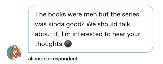
maryam here is gonna have me spilling every thought in my brain and then watch how fast the cancel police comes after me. @aliens-correspondent take responsibility for your actions!!
anyway to be honest this is something i'd had in my drafts for a while, because like i said, i have very many thoughts. i thought i'd make a separate post instead of reblogging the ask and adding to it though, it felt more sensible.
i really do enjoy both the book series and the tv show, but very differently!! when you read the book series though, you can actually tell that the author is starting out, especially when you compare it to six of crows. it's got those standard YA writing tropes, a chosen one, interplays with dark and light, weird love triangle with an obvious right answer, one (1) cool and fun girl who is inexplicably mean to the main heroine; you know, the usual things. the book is inoffensive in the way it pulls of these tropes, kinda meh at times. i think the problem with the book lies in the central character, or more importantly, in her framing in re grisha racism.
bardugo actually does something cool with the grishaverse, in that she doesn't try to explicitly frame racism against grisha people along the same lines as real life racism. she makes it clear that the grisha are alternatively deified and vilified, and some of the patterns of discrimination repeat themselves. i've always always ALWAYS hated depictions of magical discrimination that do the "this is a parallel to racism" because it never makes sense. real life racism has no reasons for it to exist whatsoever, but if i met someone who could control water and lightning, i'd be scared. i'd think of them as a superhero if they were good, but i'd very much be a little scared. these representations (things like x-men, or superhero universes) lean very hard on parallels to immigration, homophobia or family friendly racism to make their point, and its always stupid. i like that grishaverse leans harder on witch-hunting parallels instead, its far more logical - this has played out in real life as well. bardugo also weaves some amount of neurodivergence coded traits into her grisha characters - again, things that make sense, given the history of neurodivergence connected to witchcraft and otherness. and it works! the grisha are hunted like witches, and eventually assimilated like gods or saints.
what doesn't always work is alina, actually. bardugo did something super weird with her, with people like mal telling her she should be queen because she would be able to represent the common people. but that's the thing - even within the world of the first book, it doesn't hold up. a lot of the grisha come from small families, and there's this argument that they forget their parents but even that isn't true! zoya goes for the trips across the fold so she can meet her aunt! a lot of them remember their brothers and fathers and sisters. even alina chose the orphanage over life at the little palace all those years back didn't she?
the grisha are supposed to be elite army of witches, glamorous and gorgeous. however, even within the world of the novel everyone who makes up the army are orphans and peasants, and everyone in the country is tested for grisha powers. in fact, the world the darkling has created was explicitly done because he saw how the grisha were hunted and abused. he made them indispensable to the king, made them strong and a powerful faction in the country.
alina's character really suffers thanks to the weirdness in this framing. she's supposed to be the orphan from keramzin who can really reform the army - but she isn't the only one who was lonely and orphaned even within the army. moreover, it's never actually clear what she would like to do with the grisha army - beyond the superficial changes of seating arrangements. there was this one moment where she sees the first of nikolai's flying ships and thinks "yeah this is what i want. magic and tech to work together!" but you don't actually find out how she wants to do it. nikolai does have a vision, and he has ideas to execute it, but alina really doesn't. plus i just. i just never got the sense that alina enjoyed being a grisha.
don't get me wrong, i know her whole thing is about the price of power and how much she starts to hunger for power, but i just. never saw her having fun with her power??? show alina does tho, and that's something that's really cool, but i'll get to her in a moment. here's the bottom line: it never feels like alina has consistent motivations or clear character foundations. i don't even get the sense that she is that committed to ravka really, just that she wants to defeat the darkling because it also means a slow rise of power for her. she just doesn't feel as realised a character because there are hints of what she wants and dreams of but it all gets really overshadowed by the angst she has over not belonging and then by feeling like she's becoming a more terrible person thanks to the entire power thing idk.
which is the second problem. y'all know why people don't like mal? no for REAL do you know? not because he's a teenage boy who's entitled with his crush, that's nothing compared to how manipulative the darkling is. the REAL reason this is such a debate is because the writer fucked up! barudgo kept framing the love triangle as a choice between more power and living a normal life, and that's the whole problem!!! mal himself is at best a little irritating, but no worse than other love triangle heroes. but because this is a YA story where the choice given to young, presumably female readers is to give up your cool powers because your boyfriend feels like its taking you further and further away from him - or unaccountable power, terrible power even with a hot villain to boot. which would you choose? i know which i would and i am fully cognizant of how manipulative the darkling is. that's literally why it doesn't work, because alina has to make this ridiculous choice and it feels stupid even to outline it!! why couldn't she have kept her powers?? unlike the darkling, they were actually natural and not a result of dark magic.
it's really sad because i 100% believe this whole problem is the reason why people seriously overlook how well leigh bardugo wrote the darkling as a VILLAIN. as a love interest, sure, but she just wrote one of the most menacing villains on page and we all forget about it because everyone's busy writing think pieces on whether mal is worse than the darkling. from the beginning, there's this sense of power that the darkling evokes every time he's on the page. the first time he meets alina he acts as an amplifier to bring out her power, he commands people, he commands armies. and the more time you spend with the book, the more bardugo rations his presence: appearing at the right moments, never pushing the boundary and becoming an active villain. yet there's this malcontent about him that's so much in the vibe of the man. he's called the darkling and he promises to rid the world of the fold. he thinks alina is the answer but would rather use an amplifier on her. i think about halfway through, before baghra's reveal - i just knew this man was trouble.
she did such a good job with him!! the darkling we meet is someone who's already at the end of his "you either die a hero or live long enough to be a villain" arc. he was a hero! he saved the grisha, but eventually his quest for power has made him hungrier, with less morals and fewer reservations. he's much crueler in the books, much more manipulative, so much more FUN. the show really missed out, because they focussed on making the darkling human and real - and they really fucked up, because even tho ben barnes did a really good job he was missing a lot of the edge and sharpness of the darkling. naming him early is just one of the problems, giving him the most basic back story is just another. i think the closest he felt to the book!darkling was when alina was attacked by fjerdans, and theres that out of focus shot of him coming with the cut. absolutely chilling. we stan. but thats the last we see of this darkling right up until he makes her the antler necklace and that panty dropping line, "make me your villain." generally i think both kaz and the darkling are a bit softer in the tv show, which is strange but i was so pleased with the changes to alina's character and the casting of inej that i let it slide.
the show does a really good job of giving alina proper characterisation!! i like that they made her half asian (they could have toned down on all the racism a little tho). and the worldbuilding done with the world war era inspired posters was really good!! at least this way all of alina's angsting has a reason. plus they retconned her to make her someone who fights more, against the world she's in and it makes sense. it really feels like even the adult alina just wants to be free. plus MAL, my beloved!! you can actually see his character development from a more timid young boy to someone who has dedicated his life to alina, to making the world a love letter to her specifically. the show fucked up on a bunch of lore things, but on the whole i think the bones of the book were good enough that they could pull of a really GOOD tv show.
the last thing i love about the tv show is how it lavishes attention on things young girls like reading. like it really leans into fantasy fiction in that sense. i never cared much for tolkien but in the last few years i have latched onto female written fantasy like a burr (side note, everyone please read Sword of Kaigen). its nice to see people care so much about women as a primary demographic in consuming fantasy fiction. increasingly, fantasy fiction is becoming more and more mainstream tho, which means i have to suffer through my friends (wrong) opinions on shadow and bone tho.
anyway all i want to know is who is going to be cast as nikolai. please hes my favourite character and he was already ignored so much in his own duology.
#shadow and bone#grishaverse#shadow and bone tv show#shadow and bone book#fandom meta#hello void this is ridiculosity#try not to take me too seriously im just vibes you know#just putting my english lit degree to some use#malyen oretsev#alina starkov#the darkling#general kirrigan#i talk about books for the hundredth time like its a new thing
29 notes
·
View notes
Note
Howdy! Couple Image ID questions: is it true that, when adding image descriptions to posts, it’s better to not put them “under a cut” I. E. You have to click a link to see them? Also, if there’s a plain text AND an alt text ID, is that annoying or ok?
Howdy-doo! First off, thanks for the questions! Its always great to hear from people interested in accessibility, so thank you!
Okay, so I would say it’s better to make IDs as easy to find as the images themselves. So unless you have to click a link or a “Keep Reading” to find the image, then the IDs shouldn’t be either. So yeah, what you are saying is definitely true. Bottom line, accessibility is about more than just making an add-on or modified version, it’s about making sure that those who need it can find it just as easily as an able-bodied person can.
Secondly, many people think, “If one accessibility feature is good, then more is better,” but that’s not exactly the case. Since both plain and alt text IDs serve the same purpose, it’s not necessarily the best idea to put both. If the ID is a couple words, such as “An orange cat sitting by a window,” hearing it twice is only a minor inconvenience, but if you’re describing a comic or something...you can imagine how that might get frustrating. If you’ve done this before, don’t worry. Most screenreaders can skip by line, sentence, or paragraph, so we can just skip it, but I would still say to just choose one or the other.
Tip: In my experience, Tumblr’s alt text feature hasn’t worked all that well, and I’ve heard that some people with low vision or even ADHD benefit from plain text IDs because they don’t use screenreaders but they might still need help comprehending a picture. So I would recommend using plain text IDs on here.
81 notes
·
View notes
Text
[ID in alt text]
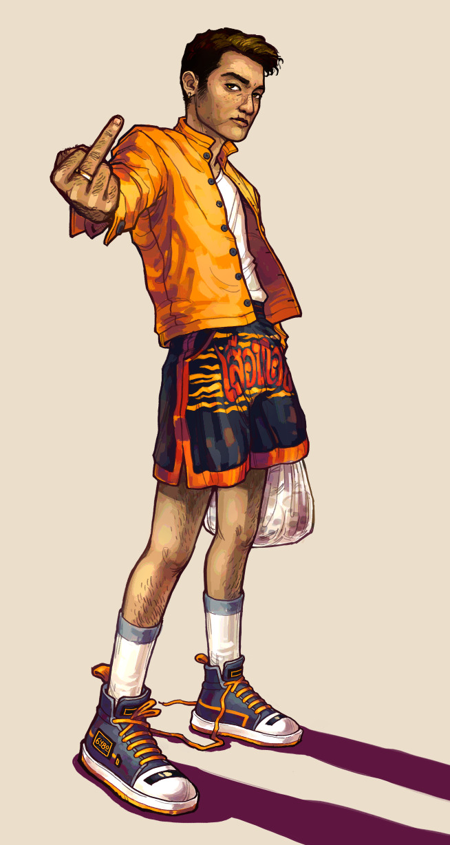
Just finished this art of my OC, Jira! He’s my main OC and sort of serves as my persona in many cases, so I’m super excited to be able to share this drawing. Since this is my first time posting him on this blog, I’m going to talk about his history and share a *bunch* of drawings under the cut (as well as WIP images from this drawing).
Text on his shorts says เสือทอง, or “golden tiger”, and he’s carrying bagged soymilk with tapioca, which is a common way to get soymilk in thailand!
The idea for this drawing is one I’ve had in my head for a few months, but wasn’t sure I’d be able to pull off since I don’t have a lot of practice with perspective shots. I sort of wanted to give him a “casually defiant” look, as well as taking the opportunity to design a fun outfit based around colorful muay thai shorts. Unlike myself, I envision Jira as someone who primarily wears shorts (often with an incongruous top like a long coat), so I love designing his outfits because of the unique balance shorts give.
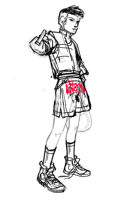

[ID: Two sketches from previous stages of the first drawing, one being a rough full-body sketch and the other being a refined sketch from the torso-up. end ID]
(^ I like his face in this sketch better than the final, lol…) I’m super happy with how this drawing turned out, especially the coloring and shading. I normally have the instinct to put my shading and highlights on another layer (borne from years of drawing art for petsites…), but I painted all the colors and shading on one layer and I’m really happy with how it turned out. I also added some sort of clip studio filter which gave everything a slight amount of color variance, which looks really cool!
Now, about the character himself: I made this guy back in about 2016 when I was getting back into Animal Crossing for the second time. I needed a secondary character for storage, so I invented Jira (who at the time was named 6480 since that was the username I was starting to switch over to), and gave him a connection to my then-main character (plum/Clove, who I’ll post about later) by way of a sort of flirty friendship. I thought it would be cool if they were like, friends who had houses on opposite sides of the same river and waved to each other and ate breakfast together and held hands and like….. yeah 🥺
Jira is super important to me for a ton of reasons, mostly because he developed as I grew up and the transition I made towards using him as my persona instead of Clove represented a lot of changes in my life and my personality. As he developed and I needed to name him, I decided to make him Thai (he started out inadvertently white cause there was only one skintone in ACNL… cringe), which marked a point in time where I became more invested in my cultural background. When I made him a trans man, it represented that I had become more comfortable and proud of my transness. His personality, which was more casual and open than Clove’s, marked the change in my own personality and growth in confidence. And I was able to explore my own ideals of relationships through the one he had with Clove.
Now, it’s 2020 and my new Animal Crossing game has him as my main character and Clove (as well as a couple others) as my alternate! I’m super glad to be able to look back on this and mark the ways I’ve changed over the years, and it’s really interesting that both of my personas since 2014 have been because of the AC franchise.
Here’s some sketches (I haven’t actually made formalized art of him until now, except for one drawing as an anthro monkey which I will not be sharing rofl):
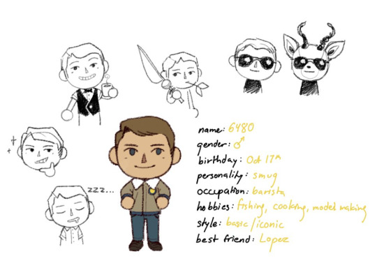
[ID: Digital reference sheet for Jira in Animal Crossing style, in various different poses. He has tan skin and light brown hair. Text on the image says: name: 6480 gender: [male symbol] birthday: Oct 17th personality: smug occuption: barista hobbies: fishing, cooking, model making style: basic/iconic best friend: Lopez end ID]
Section of a reference sheet I made for my four ACNL characters, set inside the universe of my AC island.
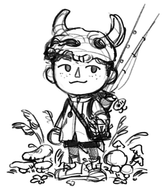
[ID: Black and white digital sketch of an Animal Crossing character. He’s wearing a long coat, black shorts, and a cow skull on his head. He’s surrounded by a bunch of small mushrooms and weeds, and he’s carrying some fishing poles in a bag. end ID]
Drawing of my ACNH outfit as it was in April (autumn on my southern hemisphere island)
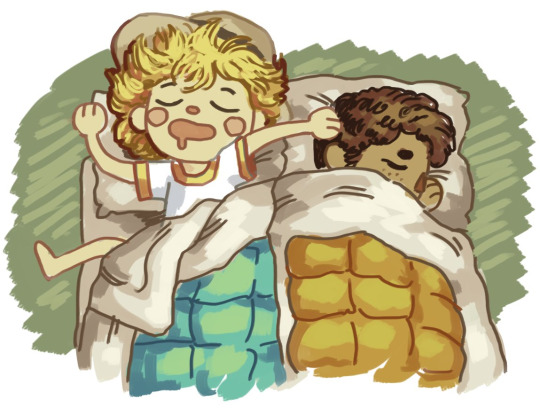
[ID: Colored digital sketch of two Animal Crossing characters. They’re sleeping in neighboring futons. One has pale skin, short yellow hair, and a sunhat, while the other has light brown skin and short brown curly hair. end ID]
Drawing of my ACNH character and my best friend’s :-)
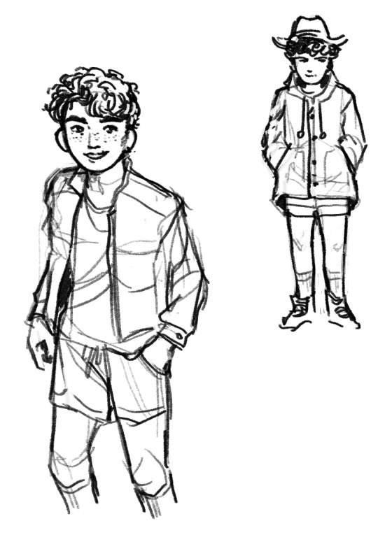
[ID: Black and white sketches of Jira with more realistic proportions. In one he’s wearing a very similar outfit as the first image in this post; in the other he’s wearing a raincoat, a cowboy hat, and shorts that almost reach the hem of the coat. end ID]
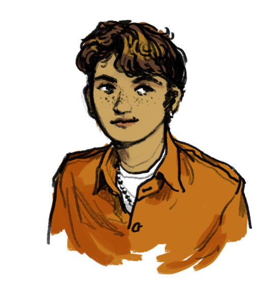
[ID: Colored bust sketch of Jira in an orange shirt. end ID]
Aaaaand I think that’s all the good art I have of him. I’m not expecting anyone to have read this far but uhm THANK YOU if you did… you’re my number 1 fan… Don’t judge what I said in this post too harshly, *so what* if I base my personality around a character that only exists in my own head? 😭 Anyways, have a great day, and thanks for reading my rambling!
#my art#digital art#design#original character#oc.jira#drawing#outfit design#casual wear#illustration#fashion#outfit#clothing#thai#artists on tumblr#in-depth
49 notes
·
View notes
Photo
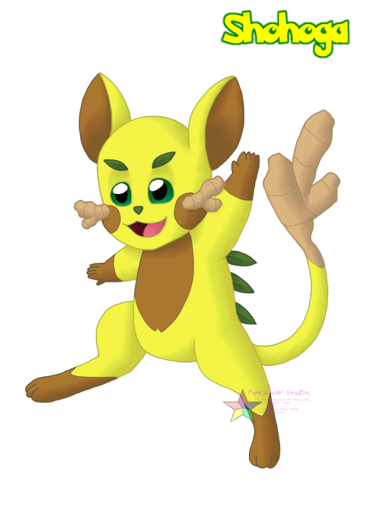
[Image Description: A fan-made Pokemon resembling Pikachu, based on a meadow jumping mouse. It has a yellow body with brown cheeks/inner ears/belly/hands and feet, and large green eyes. Beige ginger roots grow from its cheeks and the end of its long tail, and small green leaves grow from its eyebrows and back. Yellow text outlined in green on the top right of the image reads "Shohoga". End ID.]
-----
Shohoga - Ginger Mouse Pokemon The ginger sprouting from its cheeks and tail help give this Pokemon energy when times are tough. It grows best during periods of abundant resource availability. / Shohoga’s ginger growths are packed full of energy, which it will gladly share with others whenever possible. Humans have been caring for Shohoga for centuries for both the ginger and their companionship.
More Cantessy with the regional Pikachu knockoff! Every region has its own alt Pikachu, it's tradition at this point. Shohoga's an electric/grass lil friend based on a meadow jumping mouse but with a peculiar twist: ginger. It's covered in ginger, just because :3 Okay, well not just because, it was partially inspired by a regional ginger ale drink. And yeah, one could probably argue that said drink is more citrusy than gingery and a citrus-themed Pokemon would make more sense for the reference alongside the trend of citrus battery science projects, but 1) I don't think we have a good climate for citrus, and 2) I literally just checked a bottle that Dad has in the fridge and ginger is listed in the ingredients list BEFORE citric acid so HA! Still ginger! >:3c
Also if anyone wants to suggest moves for this guy to learn and stat distribution and such, feel free to throw ‘em at me :3 A link to their profile page will be provided in the replies!
💖🐶 Check out my pinned post for ways to support my artwork, among other things! 🐶💖
~If you like, please reblog to show your friends! Likes are appreciated, but reblogs let more people see my content! If you have something to say, feel free to give feedback in tags/comments/replies as well!~
Pokemon and related concepts © Nintendo/GameFreak Shohoga, the Cantessy region, and artwork © PuppyLuver Studios
2 notes
·
View notes
Text

[image description: tags that read, this is how i feel a lot about the image IDs on here!! i know they're useful for some people but they're very distracting to me, also you should put them in the actual image, you don't need to post them in the actual body of the post. End ID.]
hi so that last part isn't true. not everyone that needs image descriptions used a screen reader, in which case they do need the description in the body of the post. it's honestly good practice to put them in both locations, but alt text alone isn't a great solution.
I've also noticed that the last couple days of reblogs on this post don't seem to....be understanding it? I'm getting a lot of tags like this or that are like, "yeah i don't like subtitles either" and i feel like a lot of people are missing the point here.
in a case of personal annoyance or distraction vs entirely not having access to something, the latter should always be weighed more heavily. that was my point.
people on tumblr learned the term "conflicting access needs" and decided that it means "my needs take priority over everyone else's"
4K notes
·
View notes
Text
✰ * º ❛ more popular text posts ask meme. ❜
‘ if i’m ever murdered i hope they make the chalk outline of my body hot ’ ‘ i hope you end up ok ’ ‘ i’m crying my best ’ ‘ how fucked up would it be if an astronaut was coming back to earth and everybody hid for a bit ’ ‘ some kid just skateboarded down my street crying ’ ‘ do you ever get in an “i don’t know” phase in your life. where you literally don’t have a solid answer to anything. you. just. don’t. know. ’ ‘ i guess at this point i should just consider dating myself ’ ‘ which of the three pillars of modern music is your favourite: burnin’ up by the jonas brothers, beautiful soul by jesse mccartney, or lucky by britney spears? ’ ‘ you know my name… and also my story cause i overshare 24/7 tbh ’ ‘ @ all of u that hate mint ice cream: what happened ’ ‘ there is no doubt in my mind i’m really that bitch ’ ‘ after you hit 21, you start forgetting your age cause ain’t nothing else to look forward to, besides sweet death ’ ‘ why am i not currently in the italian countryside with a fruit plate wearing a light linen dress? unacceptable ’ ‘ hands are weird because one of them can do absolutely everything without a problem and the other one can’t even hold a spoon ’ ‘ remember to drink a fucking shit ton of water every miserable day of ur life ’ ‘ what the fuck is a good day ’ ‘ sleeping pattern: ??¿?¿??¿¿¿?¿ ’ ‘ is he………you know…….*makes football throwing motion*….straight? ’ ‘ does anyone else have a resting bitch face™, but kinda enjoys looking intimidating ’ ‘ i’m not like most girls [rips off sunglasses]… i like most girls ’ ‘ time flies when u take a 2hr depression nap in the middle of the day ’ ‘ roses are red, i’m going to bed ’ ‘ u know when ur hairs greasy and it makes u feel so so so bad about urself. and ur entire life. everything is awful bc my hair is greasy ’ ‘ i’m just so glad the word “ugh” was invented ’ ‘ just another day of loving with all my heart and believing in the universe ’ ‘ you know when dogs sit outside with their face turned towards the sun and their eyes closed and they look so relaxed and when you pet them they’re warm that’s how I want to feel always ’ ‘ come into bed and listen to the rain with me ’ ‘ i hope all my girls out here r safe n being loved ’ ‘ people are so petty and then here i am, me, an angel, ’ ‘ i want to have angel wings and be kinder, braver and more tender ’ ‘ concept: a really nice italian restaurant but it’s spelled “spagooter” on the menu and the waiters won’t take your order unless you pronounce it like that ’ ‘ i want kids but i’m scared they’ll blame me if they’re ugly ’ ‘ does anyone have any tips for not thinking about it ’ ‘ “what’s a queen without her king?” well, historically, better ’ ‘ i want something that doesn’t taste like alcohol but has a lot of alcohol in it ’ ‘ i’m alive out of spite ’ ‘ the beatles wouldn’t even fucking exist if big time rush hadn’t paved the path for them so shut the fuck up ’ ‘ a bad person? who, me? that would be correct, ’ ‘ you hate me? wow u think ur hot shit and original huh well i hated me first so u can go grab a number and wait ur turn ’ ‘ my heart does a little “!” when I see you ’ ‘ i just want to say from the bottom of my heart i didn’t sign up for this shit ’ ‘ i deadass lost interest in everything. im just cruising on autopilot rn ’ ‘ still got love for some people i know i’ll never talk to again. ’ ‘ my mitochondria clearly aren’t working because this bitch has NO FUCKING ENERGY ’ ‘ y’all i get attached to people so quickly wth ’ ‘ i wonder how many strangers hate me bc of how someone else described me to them ’ ‘ for the 80th year in a row, the song of the summer is Everytime We Touch by Cascada ’ ‘ it’s weird to think that people who are 5 ft are only 5 subways long ’ ‘ in alcohol’s defense i’ve done some pretty dumb shit while completely sober too ’ ‘ man this has been the worst life of my life ’ ‘ having “feelings” is ruining my reputation of being a heartless bitch ’ ‘ I Have To Be Dramatic. I Have To ’ ‘ forgive and forget?? haha no resent and remember ’ ‘ “you’re obsessed with yourself” and you’re not??? sad. tragic ’ ‘ are people becoming more annoying or am i becoming more angry ’ ‘ do my dark under eye circles and unwashed hair turn you on ’ ‘ KIDS REACT TO existentialism and the inevitability of death ’ ‘ remember to do your best to be positive with a clear mind and believe in aliens because those motherfuckers are real ’ ‘ personality: I DON’T GIVE A FUCK ’ ‘ ��my gender is “pretty boy” ’ ‘ what others call a rebellious phase i call the sudden realization i don’t deserve to be treated like garbage ’ ‘ what is a sex drive? where is the sex going? does it even have a license? ’ ‘ i don’t want to look “pretty” i want to look otherworldly and vaguely threatening ’ ‘ i’m not interested in being polite or heterosexual ’ ‘ do re me fa so done with you ’ ‘ ctrl alt delete feelings cause i can’t do this shit no more ’ ‘ i may seem like an asshole, but deep down i’m a good person and even deeper down i’m a bigger asshole ’ ‘ should i go back to school tomorrow or should i fling myself into the ocean ’ ‘ am i too judgemental or is everyone annoying: an autobiography by me ’ ‘ are we gonna fuckn hold hands tonight or what bitch ’ ‘ i love drunk me but i don’t trust her ’ ‘ has anyones crush ever actually worked out for them or is that a myth? ’ ‘ i say “fight me” a lot for a girl who is 5′3″ and has a hard time opening some doors because they’re too heavy ’ ‘ if i had a dollar for every time someone called me ugly i’d have 0 dollars bitch u thought lmao ’ ‘ my last words will probably be sarcastic ’ ‘ i used to be a straight a student. now i’m not even straight ’ ‘ ever wonder how different your life would be if that one thing never happened ’ ‘ single and ready to find aliens ’ ‘ it’s very important that i am both cute and powerful ’ ‘ i want to make friends but at the same time no ’ ‘ there’s a special place in hell reserved just for me, it’s called the throne ’ ‘ hi i’m here to ruin everything ’ ‘ i’m glad dogs can’t read the ‘no dogs allowed’ signs so they don’t feel sad and feel left out ’ ‘ we’re all better and gayer people than we used to be ’ ‘ every time i speak i am reminded why i should not ’ ‘ every machine is a smoke machine if you operate it wrong enough ’ ‘ i don’t know what i’m feeling but there is a lot of it ’ ‘ the rumors are true: i’m soft and i just want to be loved ’ ‘ i’m like a hexagon: all my hecks r gone ’ ‘ we all know that one person you get sexually frustrated just looking at ’ ‘ i wonder what it feels like to know what the fuck is going on ’ ‘ my kink: not having to set an alarm for the next morning ’ ‘ on the bright side, at least i am not addicted to cocaine ’ ‘ they called me stupid?? well joke’s on them i don’t even know what that means ’ ‘ i might get a lot of shit for saying this but i think it’s fun to enjoy things ’ ‘ i’m the nicest, sweetest, most rage-filled person i know ’ ‘ assert your dominance by calling your friends by their student id number ’ ‘ there she goes again, being over dramatic and by she, i mean me ’ ‘ if u don’t know how to respond to something just say ‘how dare you’ ’ ‘ um that’s u’re* not ur ’ ‘ i wonder what it feels like to know what the fuck is going on ’ ‘ so sick of looking at my purse and not seeing $20,000 ’ ‘ literally want to be rich for the clothes ’ ‘ me??? upset???? yes constantly ’ ‘ a good gender neutral term to use is ‘fool’ ’ ‘ today’s schedule: suffer ’ ‘ my middle name is actually $$ ’ ‘ don’t u hate it when u wake up and ur awake ’ ‘ i want someone who will light a fire in me ’ ‘ i want someone who will light me on fire ’ ‘ i’m too cute for 90% of the shit i go thru ’ ‘ who needs therapy when you can Realize™ things about yourself alone at 1 am ’ ‘ why is there so much blood in my alcohol system ’ ‘ no offense but i am a blessing to this earth ’ ‘ haha oops i care about you ’ ‘ they call me calcium because i give everyone strong bones ’ ‘ do you have that one person that you can’t look at when you’re trying to be mad at them because they’re so cute?? ’ ‘ hi i’m here to ruin everything ’ ‘ one day i’m gonna say ‘fight me!’ and someone’s just gonna fuckin deck me ’ ‘ me? a jealous hoe? absolutely ’ ‘ it’s raining but it’s not men so what’s the point ’ ‘ i think i may be gayer than i originally planned ’ ‘ i can’t hang out tomorrow i’m too busy doing nothing alone sorry ’ ‘ me? overreacting? shit probably ’ ‘ i would like to publicly announce that i have no idea what i’m doing ’ ‘ is there a scholarship for trying ’ ‘ me?? using sarcasm as a defense mechanism??????? what????? ’ ‘ i don’t know what i’m feeling but there is a lot of it ’ ‘ i require a lot of attention or you get a lot of attitude ’ ‘ “what the fuck” is an emotion now and it’s the only one i have ’ ‘ you’re important to me, you piece of shit ’
#rp meme#ask meme#indie rp#sentence starters#rp sentence meme#inbox meme#inbox memes#rp inbox meme#sentence starter meme#rp sentence starters#starters#rp ask meme#rp ask box meme
2K notes
·
View notes
Text
Two Weeks With Flutter
For the two last weeks I've been playing around with Flutter which is a framework for building Android and iOS apps (it also has Web/Windows/Mac/Linux/ChromeOS support in development). And I really like it. I mean, I didn't always like it. When I first picked it up I thought it was needlessly complicated and frustrating. But as I started to learn what the things actually did I started to think it wasn't so bad. It might even be fun. But I guess that's the way with most programming frameworks.
So Flutter makes Android and iOS apps. How'd you expect it to do this? Probably something like HTML, right? Nope. Flutter uses Dart. The way it knows what to build is you have to override the the build() method and make it return your entire UI. The entire UI in one method. Yeah... that's going to get messy fast. Just take a look at one of my build() methods.
Widget build(BuildContext context) { return Scaffold( body: SafeArea( child: Stack( children: <widget>[ FutureBuilder<list>>( future: DatabaseManager.getAllTasksAsTasks(), builder: (BuildContext context, AsyncSnapshot<list>> tasks) { if (tasks.hasData) { return ReorderableListView( children: createWidgets(tasks.data), onReorder: (int start, int current) {}, ); } else { return Center(child: CircularProgressIndicator()); } }, ), Container(color: Color.fromRGBO(0, 0, 0, 0.4)), Hero( tag: "TaskCreate", child: new AlertDialog( title: const Text('Create Task'), content: new TextField( controller: textController, autofocus: true, ), actions: <widget>[ new FlatButton( onPressed: () { Navigator.of(context).pop(); }, textColor: Theme.of(context).primaryColor, child: const Text('Create'), ), ], )), ]// This trailing comma makes auto-formatting nicer for build methods. ) ) ); }
Yeah, I tried to move some things to their own methods (or classes which is more performant but you really only have to worry about that once you call setState()) but there's only so much you can do and so much you have time to do. If some normal person saw this they would probably say it's ugly. And to be honest when I first saw something like this I thought it was ugly too. It's even more messy if you try adding something to it. Paste your text, watch the entire thing go red, then try to add the end bracket in just the right spot (although a better way appears to be cut the old code, create the old container, and paste the old code). But as I got to know how it worked there was something actually pretty elegant about this.
It's sort of like designing something with Legos. You have your root UI, your scaffold, and that can have a child which is a list view and a floating action button. Only instead of Legos they're widgets. There's widgets for almost everything: list views, cards, centered content, images, text, etc. And if you can't find a widget that serves your purposes you can find one on pub.dev or code your own.
So apart from Widgets there's scenes... no views... I mean routes. OK, different frameworks call them different things. Basically just a page of your app. In Flutter they're called routes. In Unity they're called scenes. And the way Flutter handles routes is pretty interesting. It's like a stack of routes. When you go to a new route you call .push() and when you want to go back or if someone hits the back button .pop() is called.
It's pretty simple. But the code to create one of these routes is not. Like look at this:
class TaskRoute extends StatefulWidget { TaskState createState() => TaskState(); } class TaskState extends State<taskroute> { ... }
Every single time we want to create a new route/widget class. Why do we need all this boilerplate? Why do we need Stateful/State/Stateless (not pictured). I think it's for optimization or something but it's still annoying.
So now I should probably talk about the language Dart. Oh, Dart. It's not a bad language. Not as bad as Javascript anyways. The best way to describe Dart is to say it's a modern COOL (C-like Object Oriented Language) similar to other COOL's like C# and Java. Emphasis on modern. So as languages mature there's a tendency of adding random syntactic 'sugar' that no one really needs or asked for that only serve to alienate newcomers to the language. Like take C++. C with classes, right? Nope. Now it's this giant behemoth of a language that takes ages to compile. And I've noticed the same thing with C#. In fact most of the newer syntactic sugar additions to C# are in Dart. Almost as if the Dart team is copying from C#. Hmm...
And this is a particular sore spot for Dart which has a million ways to do everything.
So take typing. There is static typing which means the compiler knows the types of everything at compile time and can alert you of any problems. Then there's hipster typing which means you're going to get a nasty surprise when you run that line of code you haven't tested yet. So which one do you expect Dart to choose? Trick question, Dart uses both. And different tutorials use one or the other. It can make it seem like a tutorial is written in a different language.
And it's not even like some dedicated keyword. This is the difference between static typing and hipster typing in Dart:
// Statically typed; will not compile var myVar = "Hi"; myVar = 5; // Hipster typed; will compile var myVar; myVar = "Hi"; myVar = 5;
Also: allocating new object. You can define new objects (oh, and by the way everything is a reference type in Dart) using the new keyword. But you don't have to use the keyword. It's completely optional. Which, why even have the keyword? Also it's possible to define a method that returns something without actually returning. I mean, you get a warning if you do that but it'll compile just fine. There's also a bunch of weird syntax like Dog({this.id, this.name, this.age}). This is basically the same as saying:
Dog(int id, String name, int age) { this.id = id; this.name = name; this.age = age; }
And there's a large amount of using functional map-like syntax instead of for loops. You know, the standard syntactic sugar stuff.
So syntactic sugar isn't in and of itself bad. The problem is when you have so much syntactic sugar it gives you syntactic diabetes meaning the language gets so inconsistent that it is difficult for new comers to learn. This is definitely a problem for Dart: one tutorial might use the new keyword and explicitly type all their variables. Then the next tutorial might not do any of that and it gets very confusing very fast.
But it's not all bad. There are a few neat things you can do in Dart. For one there's no public or private. To make something private by starting it with an _. It sort of reminds me of Python where you make a function by just indenting. I think it's pretty neat. Also you can have named constructors. It's pretty cool as you can name a constructor something like FromDatabase(Map<string dynamic>) if you just read from a database.
There's also two type of exceptions: error and exception. Error is bad, you should not be getting errors. Exceptions are, well, exceptions. So just catch them normally. I don't really know the difference between these two though. There are assert which is only called in debug builds. Oh, yeah, Flutter compiles to a debug build by default but there are also release and profiling builds.
Also when defining a list, which you'll do a lot in Flutter, every element can end in a comma, even the last one. This is something I've been thinking about whenever I code outside of an IDE. Adding a comma when there shouldn't be one results in a lot of compiler bugs (or in the case of hipster languages runtime bugs). So I think putting a comma after every item, even the last item is the way to go.
Lastly there is Future and async. A function signature that implements these is something like:
Future<list>> getTasks() async
and then you call it like:
tasks = await getTasks();
This is a major thing in Flutter. The main way I use it is when I push another route. I say something like await push() and that stops executing until the route being pushed calls pop(). And then I can do whatever management I need to make sure the data is saved.
Another way this comes into play is I can use an async method to load a database.
Although, to be honest, I sort of think this feature is a little superfluous. Especially in the database example. Reading from the database is so fast that stopping the whole app as the database returns its results is likely good enough. And the poping of pages could be done with a callback instead.
So how is it to actually develop for Flutter? Pretty good, actually. The first major feature of Flutter is the hot reload feature. Everytime you save your app it is instantly recompiled and sent to your phone (if it is already plugged in and the app is started) so the app updates faster than you can turn your head to look at it. It's pretty cool. It sure is a big shift from Unity's builds that can take minutes just to get an APK that you then have to install. Although it can fail sometimes. Usually when you rename something, but that rarely happens. I should probably mention here that I use my phone to test. You can also get a virtual device but that's like a 1GB download and I don't want to do that.
As for debugging instead of crashing flutter will give you a red screen of death.
Which, I mean, looks pretty ominous. Couldn't they have put a smily face on it or something like Windows?
There's also the call stacks when you get an error. They're not as compact as Unity and there's a lot of scrolling and they usually contain tons of information about Flutter's internal calls I don't care about before and after the relevant parts of the callstack. But I mean it's serviceable. Better than not having a callstack at all or a callstack that rarely points to the right thing like... some other languages.
Now there's Android Studio. It's basically a less good version of a JetBrains IDE. There's no telling you how many times something is called, there's no refactoring tools, it doesn't tell you to import packages to fix errors, it takes an extra click to get into the search all screen (Ctrl+N vs Ctrl+T), and it doesn't alert you if something isn't used. And it still takes more RAM than Chrome. Like, what are you doing? But at least it supports the Material theme I'm using on Rider. Like, it doesn't matter if the IDE sucks, as long as it looks good, right?
The only thing it really has over Rider (which I was using for Unity C#) is that it automatically inserts a comment telling you that this end brace corresponds to a particular widget. Which given the nested nature of build() method is quite useful. Not useful enough to get me to not jump ship to IntelliJ though.
So last but not least: the problems I have with Flutter. And there are a lot of them. The biggest one is the documentation. You know, for something made by Google that is almost 3 years old you'd think it would have better documentation. But no. You still see things like: "Enables the form to veto attempts by the user to dismiss the ModalRoute that contains the form." In all fairness this is the exception rather than the rule. Most of the commonly used widgets do have good documentation. But when you click to what a class is you still get this nonsense.
And there are a few bugs still. I encountered one where if you use Navigator.pop() it does not trigger the onPop callback. You need to use Navigator.maybePop() instead.
So all in all Flutter is a fine framework and pretty fun to program for. The foundation is pretty solid, it's just some of the documentation that is not quite up to snuff and some things can be hard to do due to not having the proper widget. Two problems that I'm sure will be solved soon. And once they are I think Flutter has a pretty good shot at being the most popular framework in the world due to its ability to run on Android, iOS, Web, Windows, Mac, Linux, and ChromeOS with an identical experience on all platforms.
0 notes
Text
anonymous: my opinion definitely isnt top priority seeing as im just. someone with reading glasses who doesnt wear them all the time. but id's under the post can be better for people with issues processing images in the first place or if theres text in the image
terriblelizbians: personally when i write ids i put them in the body bc even tho it’s mainly for screen readers there are other people who could benefit. like i generally don’t need ids but occasionally if im very brainfoggy it’s easier for me to process images if there’s text i can read alongside. and there are visual impairments where people don’t need/use screen readers for text but still have issues with images. is there a way to see the alt text someone puts? i feel like there must be but i don’t know it
both good points, thank you two!! i'll switch back to having ID's below the image next time i post, then.
i know there USED to be a way to get the alt text without a screenreader here- it used to be that if you clicked the image to bring it into fullview, the alt text would be underneath it. now i think the only way is to right click-> inspect accessibility properties? which obviously isn't ideal. i don't know why they removed that in the first place.
anon #2: i don't need id so i can't answer your question but related to it, more people might want to know that xkit rewritten, the new xkit successor, has an accesskit feature that gives you the option to show alt text under every picture like a caption, which i think is neat. also useful to see how few of them are described 😬
oh thats super good to know! thank you :]
for any of you who use image ID’s- i wanted to ask, does anyone prefer whether the ID goes in the alt text or in the body of the post below the image? i’ve been using alt text since the character limit for it was expanded recently, but wanted to get opinions on that.
24 notes
·
View notes
Text
Inspired Design Decisions With Max Huber: Turning Mundane Subjects Into Exciting Visual Communication
In this ninth issue of Inspired Design Decisions, Andy Clarke will explain how studying the work of Max Huber — one of the less well known but most distinguished Swiss designers — will teach you how to turn mundane subjects into exciting visual communication.
Years ago, I wished I could work on advertising projects for household names because I thought that above-the-line work would bring creative satisfaction. I’ve been lucky to work with many well-known businesses and charities, but looking back, my smaller projects were the most satisfying creatively.
Often, big brands have already established guidelines which mean there’s less room for me to experiment and exercise my creative muscles. I’m not saying brand guidelines are unimportant, but I prefer to work on projects where I feel I add the most value and a little of myself.
These days, product companies seem more interested in refining interfaces and simplifying user experiences. I value those things when I use a product, but I find working on these projects less rewarding. Well-known clients still have a certain allure — and having logos in my portfolio has been good for business — but I now look for projects which offer me the freedom to develop my creative interests.
I’m fascinated by how design can tell engaging stories about products and services, even those which might be considered mundane by some. I enjoy exploring how images, layout, and typography can be used to communicate messages in visually distinctive ways. Above all, I love using my experience and interests in art direction and graphic design to help businesses, charities, and sometimes individuals, who might otherwise be exposed to them.
“I do not attempt to speak on behalf of the machines. Instead, I have tried to make them speak for themselves, through the graphic presentation of their elements, their operations and their use.”
— Giovanni Pintori
Even highly regarded, well-known designers spent time working with mundane subjects and produced iconic work. After moving from Switzerland to the United States, Erik Nitsche for magazines including Harper’s Bazaar, Life, and Vanity Fair. But it’s his work for General Dynamics which became his most recognized. In his five years as an art director at the aerospace and defence company, Nitsche developed an information design system which resulted in annual reports, posters, technical data, and Dynamic America, a 420-page book tracing the company’s history.
Italian designer Giovanni Pintori worked for business products manufacturer Olivetti for 31 years where the simple style and geometric shapes he applied to advertisements, calendars, and posters developed into the company’s design vocabulary.
1 & 2: General Dynamics design by Erik Nitsche. 3 & 4: Olivetti designs by Giovanni Pintori. (Large preview)
Born in Switzerland, Max Huber also spent most of his career working in Italy. While his portfolio contains work for many leading Italian brands, his food labels and wrapping paper designs for La Rinascente supermarkets are fascinating too.
What these three designers, and plenty more like them, can teach us that even the most mundane subjects can offer exciting opportunities to communicate through design. And that’s something I try to remember every day.
Read More From The Series
Inspired By Max Huber
Although less well known than many of his contemporaries, Max Huber was one of Switzerland’s most distinguished designers. Born in Baar in 1919, Huber moved between Switzerland and Italy until the end of the Second World War.
In his early career in Milan, Huber worked at the studio of Antonio Boggeri where he was influenced to mix media, including illustration, photography, and typography. From 1950–1954, Huber worked for the high-end Italian department store chain La Rinascente and won the first of its Golden Compass (Compasso d’Oro) awards in 1954.
In the 1940s, Milan was the centre of Italy’s avant-garde movement. While there, Huber mixed with artists, designers, and intellectuals. This mixture stimulated Huber, and he experimented blending creative work from many disciples.
Huber never took these influences at face value. He manipulated photographs, cut subjects from their backgrounds, and mixed them with blocks of color and shapes. Colorful strips add movement to Huber’s designs and his poster designs for Monza Autodromo — Milan’s famous race track — are as exciting as the races themselves.
Huber often used flat shapes — arrows, circles, and swirling patterns — and overlapped them with monochrome and duotone photographs. His record cover designs and the cases he made for his own jazz collection, swing with energy.
While not always recognized for his skill as a typographer, Huber’s work is filled with inspiring typography. He effortlessly switched between modern serif and contemporary sans-serif typefaces and seemed comfortable when using both. While the Swiss style is most associated with Neo-grotesque sans-serif typefaces, Huber’s work with serifs is equally inspiring.
Huber defined grids to emphasise text alignment, then used large headlines followed by text in a strict hierarchy. But he was also unafraid of playing with type, setting it at unusual angles and experimenting with perspective.
From the 1960s until death in 1992, Huber worked on a variety of commissions including a brand redesign and a jazz-based wallpaper design which featured Louis Armstrong, which he called Rhythm. His client, Oscar Braendli, commissioned Huber to design exhibitions.
Huber also designed for Adriano Olivetti and embraced these projects with the same enthusiasm for experimentation. Both are clear examples of how distinctive design can turn even the most mundane subjects into exciting visual communication.
They prove that synergy and trust in a relationship between client and designer can bring extraordinary results which can last for decades.
Although his signature style developed throughout his lifetime, Huber’s commitment to experimenting remained. Even he included individual elements of his style — bold blocks of color, iconic shapes, photographic manipulation, and strong typography — throughout his lifetime, Huber built a portfolio of work which is remarkably varied. In later life, Huber taught graphic design in the southern Swiss town of Lugano, which coincidentally is where I stay when I work in Switzerland. He died in Mendrisio — where my Swiss office is located — in 1992 and there’s a museum dedicated his work in nearby Chiasso.
There’s been only one book on Max Huber and you should find space for it on your bookshelf or coffee table. “Max Huber” (2006) by Stanislaus von Moos, Mara Campana, and Giampiero Bosoni. It’s a thorough catalogue of work from throughout his career written by people who knew Max Huber personally.
From left: Rivoluzione Industriale magazine, 1960. Imbalaggio magazine cover, 1955–65. Electroacoustic Radio and Television: Electronic Parts catalogue cover, 1969. 12th Contemporary Music International Festival poster designed by Max Huber, 1949. (Large preview)
Identifying Old Style (Humanist) Typefaces
The periods where design changes often go step-by-step with advances in technology. What’s true of the web today — and how developments in CSS affect what’s possible online — was also the case with early typography developments. Some early typefaces were Humanist because their origins were in handwriting from the middle of the fifteenth century.
But when steel punchcutting techniques — the metal blocks used for typesetting until the nineteenth century — became more precise, typefaces became more refined.
This precision allowed type designers to add flourishes to what we now call Old style typefaces.
Left: Jenson Pro (Humanist) Right: Garamond Pro (Old style). (Large preview)
Whereas Humanist typefaces commonly include a lowercase “e” with a slanted crossbar, Old style typefaces introduced a horizontal crossbar.
Stress in a typeface is the angle drawn between thinner parts of a letter. In typefaces with vertical stress, this line is drawn vertically from top to bottom. In typefaces with a diagonal (Humanist) stress, the line between the thinnest parts of a letter is drawn at an angle.
Old style typefaces continue in the Humanist style of diagonal stress, but have more contrast between their thickest and thinnest strokes. Old style typefaces are frequently bracketed as they have curves which connect their serifs to a stroke.
Left: Garamond Pro Right: Jenson Pro. (Large preview)
Left: Minion Pro Right: Palatino. (Large preview)
Baskerville was designed in the 1750s by John Baskerville. His typefaces have remained popular, and there are many modern interpretations. Garamond-style fonts remain popular in print design, and Monotype Garamond is bundled with several Microsoft products.
Old Style Type
Left: My large-screen design, inspired by Max Huber. Right: A Trabant emblem remains circular while filling any available space. (Large preview)
Despite its unconventional layout, I need only four conventional elements to develop this old-style design. A header, banner division, paragraph, and footer element:
<header>…</header> <div id="banner">…</div> <p>…</p> <footer> <svg>…</svg> </footer>
As I’ve shown in past issues, my process begins by adding foundation styles including this Old style typeface:
body { background-color: #6e2838; font-family: "old-style"; color: #f7eed7; }
A Trabant header dominates my design on even the smallest screens. This header blends two images. The first is a scalable SVG Trabant logo mark. To hide this presentational image from assistive technology, I add an ARIA role and set its hidden attribute to true. Then, I add a different ARIA role of img to the second image, a picture of what’s been called “the worst car ever made:”
<header> <img src="header.svg" alt="" role="presentation" aria-hidden="true"> <img src="header.png" alt="Trabant" role="img"> </header>
I need the large Trabant logo to remain perfectly circular whatever the width of its parent element. An aspect ratio is a ratio between an element’s width (x) and height (y.) A 1:1 ratio for squares, 1.618:1 is the golden ratio, and 16:9 for widescreen media.
A popular technique for maintaining intrinsic ratio was developed in 2009 by Thierry Koblentz, and it uses padding-top applied to an element or a pseudo-element inside it. Different padding percentages create different ratios:
1:1 100% 4:3 75% 16:9 56.25%
This logo is circular, so the box it occupies should always remain square. I add a :before pseudo-element and set its top padding to 100%:
header:before { content: ""; display: block; padding-top: 100%; }
I now have three elements inside my header. By placing the pseudo-element and my images into the same grid area, CSS Grid makes stacking them easy:
header { display: grid; } header:before, header img { grid-column: 1; grid-row: 1; }
To centre these images horizontally and vertically — no matter how wide or tall they might become — I align and justify them both to the center:
header { align-items: center; justify-content: center; }
Finally, to blend the photograph of my Trabant and its SVG logo together, I add a mix-blend-mode with a value of overlay:
header img:last-of-type { mix-blend-mode: overlay; }
My banner division contains a large two-tone headline followed by three short paragraphs:
<div id="banner"> <h1>Sparkplug <span>with a roof</span></h1> <p>VEB Sachsenring Automobilwerke Zwickau</p> <p>Manufactured in East Germany</p> <p>1957–1990</p> </div>
I align this headline to the right, then tighten its leading to complement its large size. Then, I apply an accent color to the span element inside which adds the two-tone effect:
h1 { font-size: 4.875rem; line-height: 1.1; text-align: right; } h1 span { color: #f85981; }
To de-emphasise the banner’s second paragraph, I use an :nth-of-type pseudo-class selector and reduce its size:
#banner p { font-size: 1.424rem; } #banner p:nth-of-type(2) { font-size: 1rem; }
With those foundation styles in place for every screen size, I introduce layout for medium-size screens by adding a three-column symmetrical grid with three automatically sized rows:
@media (min-width: 48em) { body { display: grid; grid-template-columns: repeat(3, 1fr); grid-template-rows: auto auto auto; padding: 4rem; } }
The header and banner division both fill the full width of my layout. I place the banner into the first row, even though it comes second in my HTML:
header, #banner { grid-column: 1 / -1; } header { grid-row: 2 / 4; } #banner { grid-row: 1; }
Adjusting type sizes to maintain a balanced hierarchy is one of the most satisfying aspects of developing designs across screen sizes. It’s also one of the most challenging. I increase the size of the headline and two paragraphs by moving them up my typographic scale:
h1 { font-size: 8rem; line-height: 1.1; text-align: center; } #banner p { font-size: 2.027rem; } #banner p:nth-of-type(2) { font-size: 1.266rem; }
My header dominates a large screen by filling half its width, and I balance its visual weight with the remaining content, including the oversized headline. Although this design appears asymmetrical, it’s grid is symmetrical and contains six even-width columns:
@media (min-width: 82em) { body { grid-template-columns: repeat(6, 1fr); grid-column-gap: 2vw; grid-row-gap: 2vh; } }
The header covers the first three columns and all three rows in my layout:
header { grid-column: 1 / 4; grid-row: 1 / 4; }
I need to place the banner’s headline and division onto my grid, and not the banner which contains them. I change the display property of that division to contents, which effectively removes it from the DOM for styling purposes:
#banner { display: contents; }
I place the banner’s child elements opposite my header using column and row line numbers. Next, I increase the size of my headline again, then place the division and paragraph of running text, leaving the column before them division empty. This creates a space for my footer:
#banner h1 { grid-column: 4 / -1; grid-row: 1; font-size: 6.5rem; } #banner div { grid-column: 5 / -1; grid-row: 2; } body > p { grid-column: 5 / -1; grid-row: 3; }
Finally, I place the footer alongside my running text which adds to the asymmetric look of this Old style design:
footer { grid-column: 4; grid-row: 3; }
Poster for Museum Bellerive by Max Huber, 1969. (Large preview)
Fusing illustration and photography with bold shapes and clear typography was a defining aspect of Huber’s signature style. By choosing contemporary Old style typefaces and using today’s technologies — including blend-modes and web fonts — we can follow Huber’s example and create modern-day designs with a classic feel.
From left: Garamond Pro, Jenson Pro, Palatino. (Large preview)
Transitional Typefaces
During the 17th century, The Age of Enlightenment was an intellectual movement which rejected traditional art, literature, and philosophy. In 1692 Louis XIV commissioned a new typeface which was based on scientific principles rather than calligraphy. The result was Romain du Roi, a typeface with letters based on a grid of 2,304 squares.
Romain du Roi was more precise in its design than most previous typefaces and featured strokes with a sharper contrast between thick and thins. It influenced now-famous type designers John Baskerville, Giambattista Bodoni, and William Caslon. Their work removed all traces of Humanist calligraphy to create Transitional (neo-classical) typefaces which took advantage of new inks and better quality papers.
In transitional typefaces, lowercase letters have vertical, or almost vertical, stress. The head serifs on ascending letters including “b,” “d,” “h,” and “l” are usually more horizontal. The ends of many strokes are marked by ball terminals in place of angled or blunt or serifs.
Mrs Eaves. (Large preview)
Times New Roman. (Large preview)
Contemporary transitional typefaces are popular, including Cambria which was designed by Jelle Bosma in 2004 for Microsoft’s ClearType Font Collection. Cambria was released with Windows Vista. Georgia was designed by Matthew Carter in 1993. Designed by Zuzana Licko in 1996, Mrs Eaves is a Baskerville variant and was named after Sarah Eaves, John Baskerville’s wife.
Identifying Modern Typefaces
While Old Style and Transitional typefaces heightened the contrast between thick and thin strokes, Modern typefaces took this characteristic to the extreme. The term Modern can be misleading as the first typeface in this style was designed in 1784 by Firmin Didot. Didot was the son of François-Ambroise whom several typefaces including Ambroise and, of course, Didot are named after.
Giambattista Bodoni gave his name to Didone style typefaces with a sudden change in contrast between thick and thin strokes. These typefaces also feature unbracketed serifs with sharp angles between thicks and thins, vertical axes, and small apertures in open letters, including the lowercase letter “a.”
Left: Ambroise Std. Right: Cabrito Didone. (Large preview)
Left: Didot. Right: Moderno FB. (Large preview)
Modern typefaces are often seen as elegant and stylish choices. This is why, when you browse shelves full of fashion magazines, you’ll find they often use Didone typefaces for their mastheads.
But those same characteristics — extreme contrast, smaller apertures, and vertical axes — are also found in modern typefaces with very different personalities.
Left: Blenny. Right: Dedica. (Large preview)
Left: Ohno Blazeface. Right: Lust. (Large preview)
Modern Typefaces
Left: My large-screen design, inspired by Max Huber. Right: A blended background adds depth to this design at all screen sizes. (Large preview)
I need just three structural elements to implement my next Huber-inspired design; a header which contains the two Trabant logos, a banner division, and my main content:
<header> <div><svg>…</svg></div> <div><svgv…</svg></div> </header> <div class="banner">…</div> <main> <ul>…</ul> <p>…</p> </main>
These foundation styles add personality to every screen, whatever its size. They add a modern high-contrast typeface and a background blending an outline of the Trabant with a linear gradient to adds depth to this design:
body { background-color: #34020B; background-image: url(body.svg), linear-gradient(180deg, #6E2838 0%, #98304D 21%, #34020B 99%); font-family: "modern"; color: #fff; }
I position the Trabant blueprint half-way horizontally, while the gradient repeats across my page:
body { background-position: 50vw 2rem, 0 0; background-repeat: no-repeat, repeat-x; }
The banner includes a large headline. I add explicit line breaks to my HTML and a span element to add color to specific words. Then, I group the paragraphs in my banner into a division. This will allow me to alter its position within my layout on larger screens later in the process:
<div id="banner"> <h1>The worst <span> car ever made</span></h1> <div> <p>VEB Sachsenring Automobilwerke Zwickau</p> <p>Manufactured in East Germany</p> <p>1957–1990</p> </div> </div>
The position of my blueprint background image leaves room for a large headline. To make sure it doesn’t escape the space I’ve allowed for it, I restrict this headline’s maximum width to half the viewport width:
#banner h1 { max-width: 50vw; }
Then, I add color to the span element and size the banner’s type, increasing the headline size and reducing its leading to create a solid block of text:
#banner h1 { font-size: 4rem; line-height: 1; text-transform: uppercase; } #banner h1 span { color: #f85981; } #banner p { font-size: 1.424rem; } #banner p:nth-of-type(2) { font-size: 1rem; }
This design includes a list of Trabant specifications; its fuel capacity and consumption, plus the car’s price, which was defined by the East German government:
<li> <h3>Two-stroke fuel tank</h3> <p><b>6.3</b>gallon</p> </li> <li>…</li> <li>…</li>
This HTML order makes sense when reading without styles, but I need the headline and paragraph combination reversed visually to form a tighter block of copy. I flip the order of my headline and paragraph by specifying list items as flex containers and changing their default direction from row to column-reverse:
li { display: flex; flex-direction: column-reverse; } ul p { font-size: 1.802rem; } ul p { color: #f85981; }
Numeral design is an important consideration when choosing a typeface. Your choice might depend on clarity and readability when the type is set at small sizes. The numerals in many characterful modern typefaces have distinctive curves and other characteristics which can contribute to the personality of a design when used at larger sizes.
I want to make a feature of the numerals in this design, so I oversize the bold element. And while I wouldn’t normally advocate altering the tracking of any typeface, increasing the letter-spacing of these numerals helps to accentuate their character:
ul p b { font-size: 4.5rem; letter-spacing: .05em; line-height: .8; color: #fff; }
The price in my list of specifications also includes a span element which contains the East German currency code, DDM:
<li> <h3>Official state price</h3> <p><b>7,450</b> <small>DDM</small> </li>
To me, every typographic element — no matter how small — is an opportunity to experiment with interesting type treatments. The tiny footprint of this small element makes it perfect for rotating into a vertical position so it sits neatly alongside the large numeral:
ul p small { font-size: .889rem; text-align: right; transform: rotate(180deg); writing-mode: vertical-rl; }
This level of typographic detailing might seem excessive for foundation styles, but I put as much thought into designing type for small screens as I do into a layout for larger ones.
Before implementing any design, I make a simple storyboard to demonstrate how my elements will flow across a selection of screen sizes. (Large preview)
It also means I need only make minor adjustments for medium-size screens, first by changing the color values in my CSS gradient background and repositioning my Trabant blueprint to the centre of the screen and 30rem from the top:
@media (min-width: 48em) { body { background-image: url(body.svg), linear-gradient(180deg, #6E2838 0%, #98304D 20%, #34020B 100%); background-position: 50% 30rem, 0 0; } }
Introducing layout to medium-size screens involves little more than placing the two header logos at opposite sides of the screen. I add two symmetrical columns to the header and align the logos to balance their centre lines:
header { display: grid; grid-template-columns: 1fr 1fr; align-items: center; width: 100%; }
I align the first logo to the left and the second to the right:
header > *:first-child { text-align: left; } header > *:last-child { text-align: right; }
Supersizing a headline is a fabulous way to showcase the intricate details in many modern typefaces, so I increase its size and utilise the whitespace I added to my HTML to split its words across three lines:
#banner h1 { white-space: pre; max-width: 100vw; font-size: 8rem; }
Whereas on small screens, the banner’s paragraphs follow the headline as they do in the HTML, I want to combine them with my headline to create an interesting typographic element.
I use absolute positioning to move the division which contains these paragraphs into place. The text-based top and left values allow these paragraphs to stay in the correct position when the headline changes size:
#banner { position: relative; margin-bottom: 25rem; } #banner div { position: absolute; top: 8.25em; left: 20em; }
For my final medium-size screen adjustment, I turn my unordered list into a flex container and set its items to occupy an even amount of available horizontal space:
ul { display: flex; } li { flex: 1; }
Adapting a design for several screen sizes is a challenge I really enjoy. To make use of the extra space available on large screens, I apply grid values to the body element to create three symmetrical columns:
@media (min-width: 82em) { body { display: grid; grid-template-columns: repeat(3, 1fr); grid-column-gap: 2vw; }
Elements in this design don’t overlap, so I use grid-template-areas for their simplicity. This design has nine grid areas, and I give each one a name which reflects its content; header, banner, data, and main:
body { grid-template-areas: "header header ." "banner banner data" ". . main"; }
Burattini, marionette, pupi poster designed by Max Huber, 1980. (Large preview)
I place those elements using area names which allows me to change where they appear in my layout without altering their position in my HTML:
header { grid-area: header; } #banner { grid-area: banner; } main { display: contents; } main > p { grid-area: main; } ul { display: block; grid-area: data; }
From left: Cabriro Didone, Didot, Lust. (Large preview)
Spotting Slab Serif (Egyptian) Typefaces
This final serif typeface classification first appeared in early 19th-century advertising posters and — with its blocky letterforms — was designed to capture attention. One defining feature of a Slab serif is an often unbracketed serif which meets the stem at a 90° angle.
Left: Archer. Right: Clarendon URW. (Large preview)
Left: Jubilat Bold. Right: Lexia. (Large preview)
Clarendon isn’t just the name of a typeface but of a style of Slab serif typefaces. While the letterforms in many Slab serifs have an even line width, the Clarendon style breaks convention with a more pronounced difference between the thickest and thinnest strokes. Unlike other Slab serifs, Clarendon has curved brackets.
Archer’s ball terminals give it a distinctive look which is popular with designers in print and online. Sentinel, also by Hoefler & Co., was used by Barack Obama in his 2012 reelection campaign. Like Archer, it comes in a variety of weights and includes an italic.
I chose ITC Officina Serif by Erik Spiekermann and Ole Schäfer for my first book Transcending CSS, even though at the time I wasn’t well-versed in typography design. FF Unit Slab, also by Erik Spiekermann, comes in several weights, italics, and support for 107 different languages.
Dalton Maag is the type foundry whose fonts I use most often. I’ve chosen their Lexia for my most recent book covers, and I love the personality of its thickest Advertising weight, especially in italics. You should be familiar with Mokoko, also by Dalton Maag, as I chose it for the headlines and titles in this series.
While Barack Obama chose his Slab serif from Hoefler & Co., fellow democratic candidate Bernie Sanders chose Jubilat by Joshua Darden for his 2016 presidential campaign. Jubilat is one of the most versatile Slab serifs and comes in 11 weights with matching italics.
Left: Mokoko. Right: Rockwell. (Large preview)
Slab Serifs Demand Attention
Left: My large-screen slab serif design, inspired by Max Huber. Right: A graphic introduction on small screens. (Large preview)
Developing my final design requires very few structural elements, despite its visual complexity. The elements I chose should seem familiar because I’ve used them already in several combinations.
The header again contains two SVG images, a banner division includes the headline and stand first paragraph, and an unordered list which displays Trabant specifications. This time, I also include two SVG elements. One for the massive 57 numerals, the second for the decorative text which follows a curved path:
<header> <svg>…</svg> <svg>…</svg> </header> <svg>…</svg> <div id="banner">…</div> <div id="content">…</div> <ul>…</ul> <div id="curve"> <svg>…</svg> </div>
Bringing three of those elements together forms a graphic introduction to this design. I start with foundation styles which include color and introduce the slab serif typeface:
body { background-color: #8a8988; font-family: "slab"; color: #f7eed7; }
I limit the width of my header to 220px and centrally align its content:
header { margin-bottom: 2rem; width: 220px; text-align: center; }
To give me accurate control over their appearance, and to enable them to scale to fit the width of any viewport, I developed my oversized numerals using SVG. This scalable graphic includes two paths and to ensure it communicates its content to everybody, I add an ARIA label and a title element to my SVG:
<svg xmlns="http://www.w3.org/2000/svg" viewBox="0 0 750 690" role="img" aria-label="1957. The year Trabants were first produced"> <title>The year 1957</title> <path d="…"/> <path d="…"/> </svg>
The two numerals in this SVG overlap, so to add depth; I lower their opacity, then use a blend-mode to mix their colors:
body > svg path { opacity: .75; } body > svg path:nth-of-type(1) { fill: #f5e3B4; } body > svg path:nth-of-type(2) { fill: #ba0e37; mix-blend-mode: multiply; }
The final component in my introduction graphic is the vertical word “Duroplast,” the fibre-reinforced plastic used to make Trabant bodies. You can look for this element in my HTML, but you won’t find it, because I generate this content using a pseudo-element. I position the generated content, change its writing-mode to vertical, then rotate it by 180 degrees:
body { position: relative; } body:after { content: "duroplast"; position: absolute; top: 2rem; right: 2rem; font-size: 7rem; transform: rotate(180deg); writing-mode: vertical-rl; }
As this pseudo-element effectively follows the flow content, it appears above it in the stacking order, making it possible to blend it with other elements and add extra depth to this design:
body:after { mix-blend-mode: overlay; }
The number of Trabants produced during its lifetime is developed using a lower-level heading, followed by two paragraphs:
<div id="content"> <h3>Units produced</h3> <p>1957–1990</p> <p>3,096,999</p> </div>
The visual order of these elements is different from that HTML, and I use Flexbox to change their order within their parent division. First, I change the flex-direction from the default row to column:
#content { display: flex; flex-direction: column; }
Then, I use the order property to reorder the three elements, placing my headline last:
#content h3 { order: 3; font-weight: normal; text-transform: uppercase; }
Finally, I increase the size of my second paragraph to match the list-item numbers below. This gives the impression this content and the unordered list which follows are part of the same element:
#content p:nth-of-type(2) { font-size: 4.5rem; }
Space on small screens may be at a premium, but that doesn’t mean we can’t be bold with our typography. As screens become larger, there are even more opportunities to be adventurous with typographic designs.
I introduce layout to medium-size screens by applying grid values to the body element to create six symmetrical columns and four automatically sized rows:
@media (min-width: 48em) { body { display: grid; grid-template-columns: repeat(6, 1fr); grid-template-rows: repeat(4, auto); } }
Then, I place my header and banner division into the first row using line numbers. My banner occupies the first three columns, while the header fills the last three:
header { grid-column: 5 / -1; grid-row: 1; } #banner { grid-column: 1 / 4; grid-row: 1; }
I place the now enormous numerals onto my grid and lower their z-index value so they appear behind other elements in my layout:
body > svg { grid-column: 1 / -1; grid-row: 2 / 4; z-index: -1; }
I replace the previous :after pseudo-class positioning with grid values and increase its font-size to fill more of the space available:
body:after { position: static; grid-column: 4; grid-row: 1 / 3; z-index: 1; font-size: 10rem; }
Despite being built on a symmetrical grid, leaving some columns empty creates an unusual asymmetrical design:
#content { grid-column: 2 / -1; grid-row: 3; mix-blend-mode: difference; } ul { grid-column: 1 / -1; grid-row: 4 / -1; }
I then increase the size of my type overall to make a big impression on medium-size screens:
#content h3, #content p { color: #31609e; } #content h3 { font-size: 1.75rem; } #content p:nth-of-type(1) { font-size: 3rem; } #content p:nth-of-type(2) { font-size: 8rem; }
SVG Text On Path
Text which follows a path is one of the most exciting reasons to use SVG. (Large preview)
One of the most exciting reasons to use SVG for rendering text is so it follows a path, a design device which isn’t possible using CSS alone. My curvy SVG includes a rounded path, plus a text element which contains my content. I enclose this text within an SVG textPath element and use its href attribute value to link it to the ID of the path above:
<div id="curve"> <svg viewBox="0 0 750 700" xmlns="http://www.w3.org/2000/svg"> <path id="curve-path" fill="none" stroke="none" d="…"/> <text> <textPath href="#curve-path">…</textPath> </text> </svg> </div>
I don’t want this curve to appear on small screens, so I change its parent division’s display value to none in my foundation styles. Using a min-width media query, I then revert that value to block to reveal it for medium-size screens, placing it onto my grid and increasing its z-index value. This brings it forward in the stacking order:
#curve { display: none; } @media (min-width: 48em) { #curve { display: block; grid-column: 1 / 6; grid-row: 2 / 4; z-index: 2; transform: translateY(-1.5rem); } }
With this text in place, I use familiar font-size and text-transform styles, followed by SVG fill and text-anchor properties which sets my text from the start of its path:
#curve text { font-size: .889rem; text-transform: uppercase; fill: #fff; text-anchor: start; }
My confident typography choices demand I’m also courageous with my choice of layout for larger screens. The six symmetrical columns and four rows I chose earlier offer the potential to place my elements in any number of ways.
With all my typography styles already defined, all that remains is to move my elements into new positions which place the header, banner division, and unordered list alongside my now gigantic numerals:
Voices and Images of 1958 record cover designed by Max Huber, 1958. (Large preview)
@media (min-width: 64em) { body { grid-column-gap: 2vw; align-items: start; } body > svg { grid-column: 1 / 5; grid-row: 2 / 5; z-index: -1; } header { grid-column: 5 / -1; grid-row: 1; } #banner { grid-column: 5 / -1; grid-row: 2; } #content { grid-column: 1 / 4; grid-row: 4; } #curve { grid-column: 1 / 5; grid-row: 1 / 4; } ul { grid-column: 5 / -1; grid-row: 3 / -1; display: block; } }
From left: Mokoko, Jubilat Medium, Ohno Blazeface. (Large preview)
NB: Smashing members have access to a beautifully designed PDF of Andy’s Inspired Design Decisions magazine and full code examples from this article. You can also buy the PDF and examples from this, and every issue from Andy’s website.
Read More From The Series
(ra, yk, il)
Website Design & SEO Delray Beach by DBL07.co
Delray Beach SEO
source http://www.scpie.org/inspired-design-decisions-with-max-huber-turning-mundane-subjects-into-exciting-visual-communication/ source https://scpie.tumblr.com/post/618896237178028032
0 notes