#I originally wanted to draw a full out illustration but the proportions looked a bit off in my first sketch +
Explore tagged Tumblr posts
Text
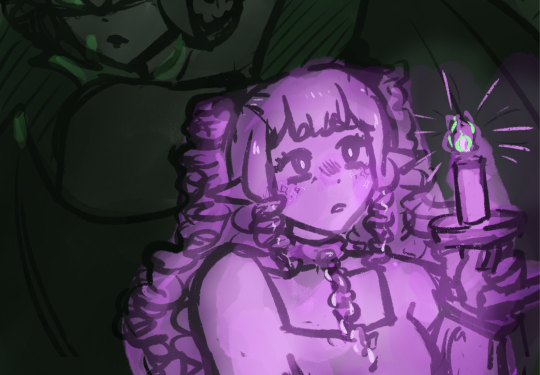
It has been Lightkeeper's first birthday this week!!!
I drew this little sketch to celebrate UvU
Working on this game was so, so much fun and I learned a ton during that time, so I treasure this game a lot 💖💖 A big thank you to everyone who played Lightkeeper <33
Also.... a lil bonus doodle:
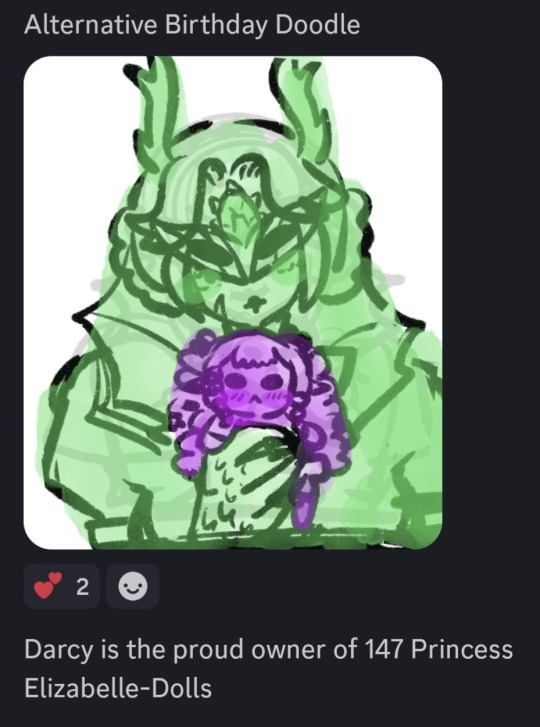
#I originally wanted to draw a full out illustration but the proportions looked a bit off in my first sketch +#I dont rly have the time for it rn (homphobic </3)#my art#artists on tumblr#doodle#wlw#lesbian#rpgmaker#yuri#art#game#indiegame#lightkeeper#lightkeeper game#sapphic#rpgmaker horror
33 notes
·
View notes
Text
Another Sillie had been added :D
process thoughts below cut- (WARNING- they long lol)
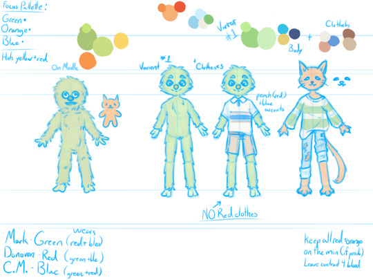
Has this barely changed from the wip I posted earlier????
not really but i need to talk about character design for I am FERAL so L moment i guess
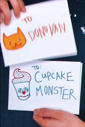
SO my personal favorite brand of character design has been, for as long as i remember, drawing more complex designs from simplified mediums. Think Minecraft or roblox skins, and some chibi avatars. Hand me something that is blurry and up to interpretation and i will simply go buck-wild. Mark is of course the only character to truly appear on camera. We see both his drawing of himself and his [puppet?] form. Now you only ever see donovan and cupcake monster as drawings, which leaves their appearance more up to interpretation.
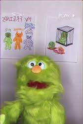
When i first translated Marks design, i tried to stay as accurate as possible. The second iteration is more of my own twist on it, elongating the body, trimming down the fluff for a clearer shape,and adjusting facial proportions slightly. Note: this isn't to throw shade at marks original design. He's a puppet irl and he looks like one, i just suck at making puppets look like they have any life behind their eyes, so design tweaks it is. Mark is adorable and its a me problem that i struggle to recreate that.
Now my Mark design is obviously based off of the puppet, (his actual self,) as opposed to the way Mark draws himself. In the drawing, there is a bit less fluff on his body, compared to the real thing. This is important as it affects some of the decisions I made for Donovan.
Donovan caused a few hurdles when i tried to work on a design for him. First, I'm working with very little information, so creative license time. Since I don't have much to go off of, I started with a real simple drawing, similar to the one from the drawing in the show, just to try and capture the vibe. The most notable things about Donovan from this first doodle, was that he had a slightly smaller nose than Mark and that it was triangular and that his eyes were slanted. This gives me two prominent facial features to work with.
Following this, i started on a more detailed design. I began by plotting his proportions out similar to marks. To make him more cat like, I tried to make him a little taller and thinner[better for slipping out of cages], so that he had an elongated appearance, and to capture that sly you-cant-contain-me- cat energy that meow meows have. I wasn't sure how cat i wanted to go originally, but then i gave him paws....
I went full anthro cat on Donovan, adding in whiskers and a tail [still questioning that decision] even though they weren't present in my reference. Now is a good time to note that all these designs are pre-Billy, so no scars or anything. I bring this up because I gave Donovan claws, and I image Billy would have at least tried to declaw Donovan.
The next problem came with Donovans eye. So Donovans eyes are two slanted lines, very simple. Since these are one of Donovans few unique canon features, I wanted to keep them. I wasn't sure how to keep them simple yet still allow emotion. Playing around with this idea, i felt i could effectively convey emotion just by changing the relative direction of the eyes. However, I changed the eyes to be more tear-drop shape as well, partially to add more interest to the face, but also so i could add more detail to the iris of the eye if desired.
Finally, all my Mark and Friends designs have the characters wearing clothes, because I work at a clothing store and see too many damn clothes every day. [everything i know about fashion is against my own will] So since this canonically takes place in 1997, my designs are based roughly off of children's clothes at the time. For the monsters clothes, I want them to all have a somewhat fun shape, flare outs, wrinkles, cuffed sleeves and pants etc.
This is where i really struggled. Not so much with the actual design of the clothes, but with colors. As you can probably tell my this illustration as compared to the reference image, I am allergic to bright colors [they hurt my eyes :,(] So i shifted most characters to a more muted/pastel pallette. Now i really wanted each of the three friends, Mark, Donovan, and Cupcake Monster, to have the others "colors" per see, present in their outfits. Mark is obviously Green coded (lol), Donovan is orang, but outlined in red, so my boy gets a red association cause primaries of light. This leaves Cupcake Monster with Blue, the color they are outlined in.
I really wanted three designs to flow together, and though i haven't finished Cupcake Monster yet, I think the first two go nicely together. By giving each character a main color, I let them stand out from each other, but by adding bits of those colors back into the others outfits, it lets them flow together better in group images and keeps anyone character's pallette from feeling out of place.
Marks outfit is mostly cream, but with accents of Blue, and Red. Donovan's is about 1/3 cream 1/3 blue and a 1/3 blue. I struggled with the color distribution on donovan, as the reddish orange and blueish green i had chosen contrasted a lot more than i wanted. The light blue and cream worked as a nice base though, and making only the stripes green [the shirt is specifically cream with green stripes] it lets the green not overpower Donovan, which was another problem I was facing.
But yeah, this are my current designs for the sillies, if you read all this thank you! have some pie :]
7 notes
·
View notes
Text
One of the things that I love the most about the Classic Mega Man series is its artstyle. It's very anime-esque with a slight twinge of toon, and there's a surprising amount of detail that goes into each art piece drawn by Mega Man illustrator Keiji Inafune (Such as how robot masters and characters like Mega Man and Roll have different pupil types and the infamous 'Capcom hand').
Naturally, ever since 2015, I've been trying my hand in seeing how accurately I can replicate the Mega Man artstyle, and considering I mentioned planning to make a full Famicom styled box art piece for Mega Man Ultimate, I decided it was about time to dive back in to researching Mega Man's artstyle to make said art piece as 1:1 to official artwork as I can!
And where better to start with the centerpiece, Mega Man himself? Back in December of 2020, I drew a Classic styled Mega Man in honor of his 33rd anniversary, and while it was decent enough in its own right given my skillset at the time, this time I wanted to go all out in drawing a full-body Mega Man while keeping a lot of Inafune's art choices in check...

... which resulted in the best Mega Man I've ever drawn!
Looking at a character like Mega Man, you'd think he wouldn't be too difficult to draw, and design wise, he's not. The simplicity of his armor and few colors actually make him— in theory— pretty easy to draw.
But when you're attempting to match the actiony grandeur that is the key artwork for more recent Mega Man games on top of keeping an eye on proportions, shading styles, and shaping everything just right... then it becomes a tad hard.
So, when I sat down to draw Mega Man, I made the decision to start with arguably the most important part... the head.
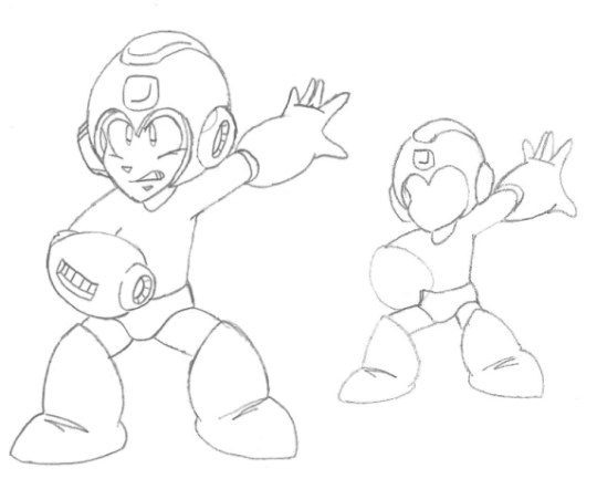
To me, if you're going after a stylistically accurate Mega Man, his head is detrimental in getting just right. This is easier said than done, because his helmet isn't just a circle; it's more ovular and widens toward the top, leaving the base of the helmet to be a bit slimmer.
Above, you can see two preliminary sketches I whipped up in preparation for the digital outline phase. While they look fairly similar, each one has a focus: the leftmost sketch was primarily focused on getting the head to look nice (Which took about forty-five minutes by itself!), as well as drawing a good buster.
The righthand sketch was more focused on Mega Man's pose, explaining the placeholder head and buster. I was originally going to jump right into taking the left sketch and digitalizing it, but when I felt like the hand and legs could be drawn better, I made an additional sketch to merge with the first.
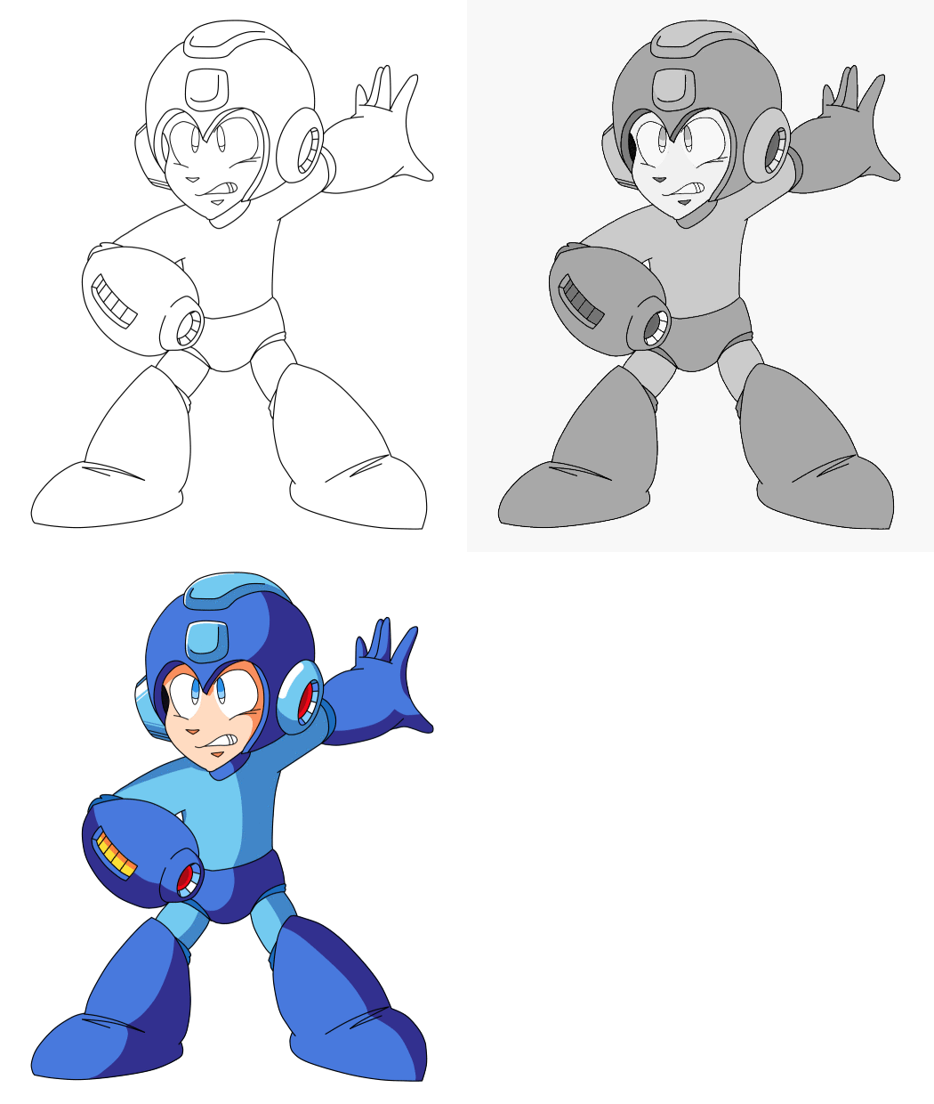
Woah! Here's something new: just like how I've begun showing the spriting process for some of my sprite works, here's the process I went about when digitalizing my Mega Man sketch after I had finished reshaping everything in my drawing software: from outline to flat color to the end result!
Interestingly, when I first got done drawing Mega Man, I thought it looked great... but I wasn't a fan of how he looked proportionally, as I thought his arms and legs looked a little short. When I had been searching for reference images to base my sketches on, I noticed that Mega Man's legs especially are a bit lengthy, so I redrew 45% of my then-final result with these changes in mind, which resulted in the version shown in this post.
I'm really impressed with myself on how great I got this piece of Mega Man to look, since shading and posing aren't my forte— it feels nice to have one of the tougher aspects of MMU's eventual box art drawn, and I hope you've enjoyed both the art and reading the process behind it!
#Mega Man#Rockman#Mega Man Ultimate#Rockman U: The Renegades Rise#Star's Art#Coolness#Say it with me now#SUPER FIGHTING ROBOT#ME-GA-MAN!#Putting this piece next to a Mega Man I drew in 2015 is both surreal and highly satisfying#It really shows how far I've come in both drawing him and my artistic skill overall#With that said... let's talk some more specifics that I didn't mention in the post!#I wanted Mega Man's pose to take after two inspirations: his iconic MM1 pose and his pose on MM3's box art#A lot of people who've made their own Famicom styled box arts for their fangames have Mega Man in ridiculous poses#I wanted mine to both be faithful to the source material and modest much like the blue bomber himself!#The most fun part about drawing this was both coloring it and drawing Mega Man's expression#If there's one aspect of the Classic style I can say that I have down-pat it's drawing the faces.#Thankfully drawing the Synth Legion shouldn't be nearly as tough since I have sketches of them drawn already#Though I have my sights set on drawing their leader first since he'll play a big role in the box art... 👀
37 notes
·
View notes
Text
Mob Psycho 100 Interview Translation - Character Designer Kameda Yoshimichi - Otome Visual 2017
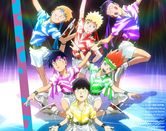
Summary-style translation for Character Designer Yoshimichi Kameda’s 4 page interview from Otome Visual 2017, regarding elements in the creation of Mob Psycho 100 such as: what inspired this cover art, the influence of fan art in the anime’s creation, Tsubomi’s design, the process behind the package art for the DVDs, and more. Includes some genga. Under read more;
[TN: The reason why I elected to summarise this interview rather than do a full write up is because a lot of the information given gets covered in December 2016′s Animestyle010, in “The Making of Mob Psycho 100.” I typed that one out in full over on twitter but that’s a long interview, and I don’t have the time or energy to reformat it for Tumblr, but if you’re interested in a very in-depth look into how Mob Psycho 100′s anime came to be I’d really recommend checking it out. Direct quotes are given in “” here. Enjoy!]
---
*~The genga illustration for Otome Visual’s cover~*
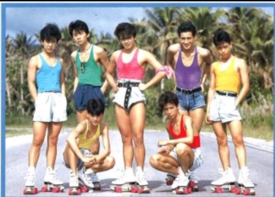
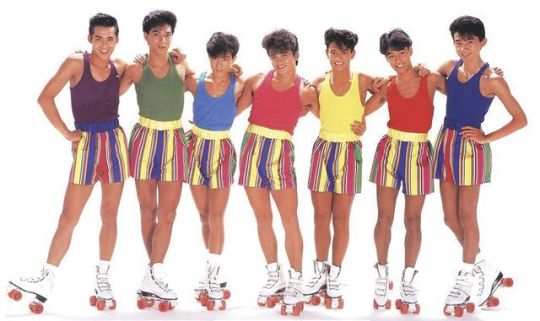
“With the recent popularity that Skating Anime has had, what’s this - a Shouwa idol collab?! It’s all in the little details in their clothing - their wrinkled shirts, white trousers, black belts - both around their waists and arms.”
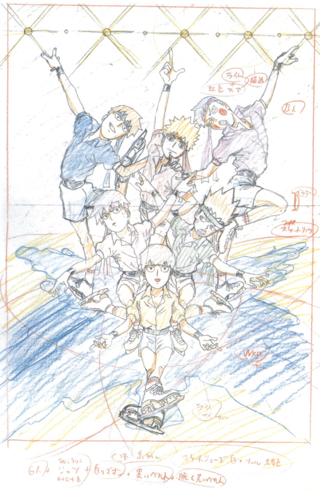
*~Kameda’s comments~*
“Can you heaaaar me!! I am currently speaking directly into your braaaain!!! What I’m grateful for with this commission is I was able to design the cover in any way I’d like!! A cover is a reflection of current times, so, of course, I went for ice skating! You wouldn’t be able to find this kind of amazing content in any time period other than now! That’s what I first thought! Like, Mob Psycho 100!! If there’s not a certain Mob Psycho 100-ness present in the art then what’d be the point, so, the characters are being very serious but they’re also pretty laughable. I tried to create a piece of art from which you could hear their voices!!! What’s with it being Shouwa-esque?? Being lame is incredibly cool!!! Huh? Does that describe Mob Psycho 100?? Can’t answer that if you ask!!!! Please feel the amazing Paradise Ginga x Mob Psycho 100-ness here!!!!!!”
---
Kameda describes how he wasn’t sure how best to adapt the manga into an anime format at first, since from the art he was shown he immediately knew it to be very unique - the idea of using Flash to animate the show was raised but quickly shot down
Originally, upon being asked about the show, he based his thoughts on what a web image search for Mob Psycho 100 gave him rather than having the actual manga in hand. “For the most part, the results that came back would be fanart (laughs). It’s a bit strange - at that time, it was difficult to find art uploaded from the manga. If you could find anything, it’d just be art from the covers. So for the most part, an image search of Mob Psycho 100 would just bring you back fanart. A lot of that fanart would be… a shounen in a cool pose wearing a school uniform with smooth bobbed hair & sharp cat-like eyes, sort of like Hiei’s eyes (from Yu Yu Hakusho). Very different from the manga’s art. But when I looked at that art, I thought; this could work. Fanart is, fundamentally, ‘fans drawing what they like’, so I thought, ‘the anime having this kind of art would make the fans happy.’ Well, it didn’t work out that way, obviously. I was told the anime’s art should resemble that of the manga. (Laughs)”
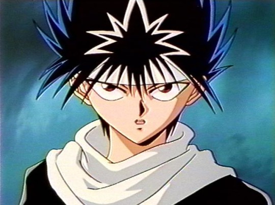
He hadn’t read the manga so all he had for reference was art from volume 1 and the fanart he found online. “But I like things like spirits and urban legends, so seeing Dimple - a floating supernatural fiery ball - and being told the manga touches on the occult caused my interest to soar.”
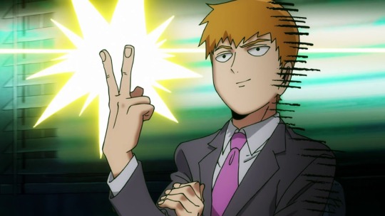
Says that Teru is the easiest character for him to draw. “He’s overflowing with confidence, so it’s easy to put him into some cool poses. Mob and Ritsu in comparison, not so much. [...] With Reigen, he has a lot of poses that are like, he’s trying to look good. He takes a solid stance. I suppose Spirits & Such has such a shady air to it, and you have to hide that somehow, right? So, Reigen injects confidence into how he presents himself. A model-like stance.”
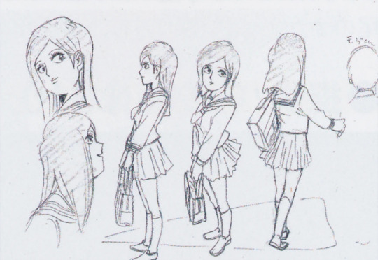
“The anime is faithful to the manga… ah, actually, Tsubomi-chan was changed with a ‘let’s make her more like a heroine’ conversation. So, I did so, but reading recent events in the manga I can’t picture her in her anime form (laughs). The manga’s Tsubomi isn’t much like a heroine, so I’ve found myself wondering, if we animate up until this part… just how will we approach it? The anime’s Tsubomi is so bright and sparkly, so she wouldn’t have snot hanging from her nose (vol.13 of manga), would she…? (Laughs). Perhaps we went a little too far with making her a heroine. Maybe, if we do season 2, we’ll turn her back into a normal girl (laughs). Well, Tachikawa-san is clever; I think he’ll find a way to make do with her current design.”
---
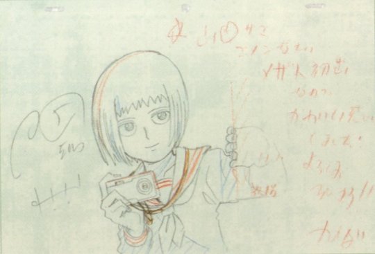
Picture text: "This is Mezato's first appearance, so I decided to make her cute!! Thank you in advance!!"

Picture text: "That girl was telling me such a stupid story this morning... aidzuchi* isn't easy, you know... I'll just ignore her tomorrow..." [* sounds made to indicate that you're listening to someone speak]
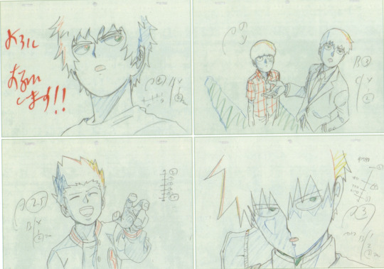
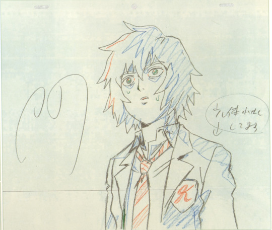
---
Asked about his favourite characters; “I love Mezato Ichi from the Newspaper Club. When I drew her in her character sheet in that pose where she’s holding her camera, I came to see her as being quite cute. So now I focus on her a lot; in fact, when I draw genga I sneakily choose the cuts that have her in them (laughs).”
“I also love Mob. Reigen stands out the most so your eyes naturally jump to him, but I love the balance that Mob has. His heads tall ratio... or rather, his face, and the way his body is proportioned? It makes him lovely. Ritsu is around the same height as Mob, but, how can I put this - the cuteness that Mob has, is lacking in Ritsu… due to the latter being quite standoffish, I suppose (laughs).”
Ritsu’s hair changing through the first season is discussed, and how it is purposefully shortened during the latter half. “I paid attention to making sure his hair was long especially while he was being possessed by Dimple. So it’d resemble thorns.”
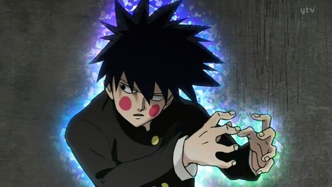
“I feel Teru-kun is the most ‘yang’ of all the characters. The rest are more ‘yin’ in nature. Because of this, it’s easy to play around with his expressions - he’s fun to draw. Speaking in terms of Dragonball, he’s kind of like Mob Psycho 100’s Vegeta (laughs).”
“In episode 9, Dimple possesses one of Claw’s security guards, right? I don’t really understand why that security guard is so popular.” Q: What do you mean? “Because he’s just some middle-aged dude (laughs). He doesn’t even appear for long…”
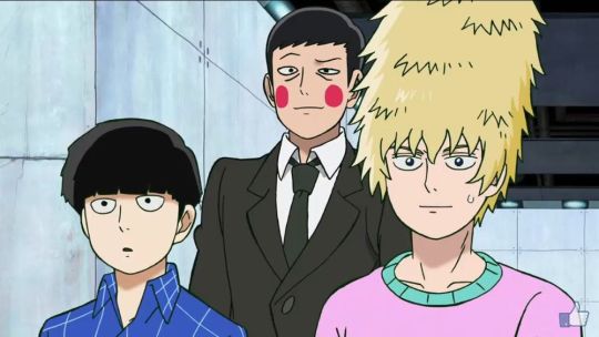
After discussing the huge amount of SG!Dimple commissions received: “Unlike SG!Dimple, I don’t really get asked to draw Shou-kun. With this commission I thought to myself, I /have/ to include him here, and so I added him in. The initial brief excluded him.”
Asked about moments that stuck with him; “When Teru chokes Mob in episode 5. [...] Mob’s pained expression as he’s being choked is good, but Teru-kun’s face shows us… envy, jealousy, distress, anxiety.”
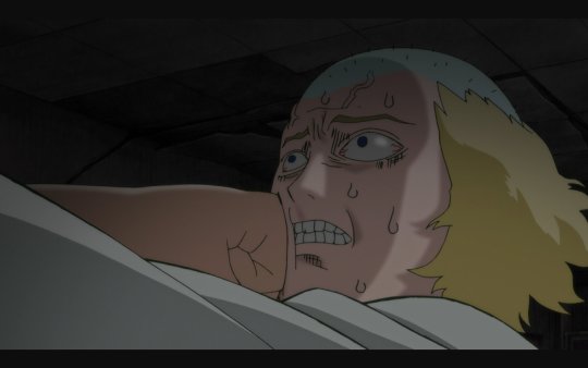
“Also, the ‘super real Reigen’ sequence from episode 12. The tension between Reigen and Sakurai is funny, but the art itself has had me laughing since production. It’s funny no matter how many times I look at it!”
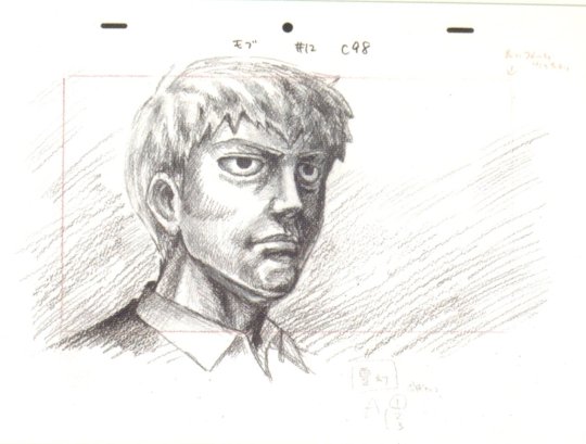
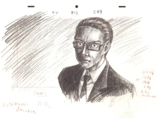
Kameda’s idea to have the characters make number shapes for the volume art came from him watching ‘Tonneruzu no Minasan no Okage deshita’, specifically the ‘Mojimoji-kun’ segment of the show (where they try to make numbers from their bodies)

Volume 6’s cover art was first planned to have a whole ensemble of characters, but Kameda changed his mind on this - “if we do a second season, we can leave that for volume 12 (laughs).”
Volume 4's cover was originally planned to feature only Onigawara and Gouda, but Kameda found himself wanting to include the rest of the body improvement club
Regarding the pose we see on vol 6’s package art, “My original thoughts for that cover were to have Reigen and Mob in a ‘hell wheel’ pose, like, Mob pulling Reigen’s legs and arms… but that wouldn’t be very fitting for the final volume.”

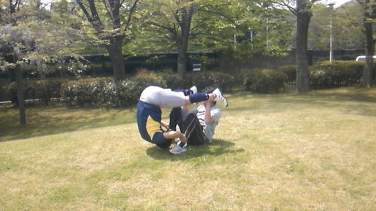
His message to the readers; “Thank you for your support! With sales, the ‘this is popular!’ message gets conveyed, and the more support you give us, then there’s no doubt we’ll be able to produce season 2 and season 3!! Season 2 relies on your support. It’s in your hands - thank you!!”
---
Crossposted on twitter here.
188 notes
·
View notes
Photo

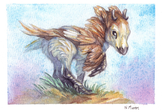
January/February commissions are now open! Feel free to ask any questions!
Commission site for more information and size examples. Please read the full tos before ordering.
Small postcard watercolour paintings for a flat rate of £55 GBP. Textured cold press or smooth hot press, and semi realistic or stylized. Includes edits to the sketch stage.
Three slots!
I'm just offering these small watercolours this month to keep things simple as its been a while and I don't want to overwhelm myself. I might open for other options like sketch sheets in the next few months and if I can get a bit more consistent and confident with digital paintings I might open for those as well!
More info and instructions under the cut
No price difference for stylized or semi realistic styles. But if you go for a semi realistic style it might only be a half body painting! If it’s a character like a little garden bird or a mouse I’ll be able to fit them in. But if it has humanoid proportions it’ll just be half body. If its something with longer/bigger proportions it may be even less. Feel free to ask about what I can fit in!
Backgrounds - Depending on how much space is left I'll include some simple background detail and colours to place the character more. Please let me know if you don't want any background colours or details!
Shipping Price - Tracking included!
Uk - £4
Europe - £7
USA, Canada and everywhere else - £8
Process and Edits
You’ll get a chance to check the rough sketch for the basic pose and proportions. Once that’s approved, I’ll finish the drawing and I can make smaller changes digitally.
You'll get two rounds of changes for the rough sketch and the finished sketch stages, four in total. If more adjustments are needed I will have to start charging extra. Once the final drawing is approved it will be transferred onto the postcard and there can be no more changes to the drawing.
Once its transferred and painted I can’t make changes to the original but I can make small corrections or simple colour adjustments digitally.
Upon completion I will send you a high resolution file of the painting.
If you've paid for shipping I'll send the postcard reinforced with sturdy card and kept waterproof with cellophane, and give you your tracking number.
Will draw:
Any animal/creature, anthro or human character. Android/cyborg's to an extent.
Original and fan characters.
Fan art (results will be better if I'm familiar with the franchise)
Won't Draw:
Although I draw human characters I'm not comfortable with drawing real life people. Its a bit too personal for me and I'll be terrified of accidentally offending someone. So unless its "draw me as an animal" or something similar please don't ask me to draw you or a friend/family member.
Complex machinery, very complicated and detailed armour. (Might be able to do a simplified version)
Extreme gore (blood and small wounds are ok).
Nsfw, most fetishes and anything discriminatory.
I won’t heavily reference/copy another artist's, character, art style or pose.
By ordering a commission you agree to my tos
Please read the full tos before committing to order a commission.
If you would like to order one please fill out the form an email it to me at [email protected]
First come first serve to those ready to pay. Payment up front via paypal invoice. I’ll invoice you once I know what you want and when I'm ready to start your commission.
If you take a slot and don’t respond after a week (before payment) I’ll have to remove your slot.
Please tell me if somethings come up/you’ve changed your mind about the commission.
Commissions are non refundable.
Watercolour Postcard Commission Form
Username/s
Paypal address
Character name
Character species - If the character is a mythical or made up creature please note real animal inspirations as well. Especially if you have a stylized reference.
Character info – Just a few notes on their personality.
Character refs – Please link or attach your references. If you don’t have any refs please include a description with photos and/or inspiration images. Please note, its in my tos not to copy or heavily reference someone else’s style or character design. These are just to give me an idea of the kind of look you want. (If you are looking for a final, finished design these aren’t the best commissions for it! But they’ll be fine if you just want to explore some ideas.)
Preferences – Poses, expressions and the general mood of the painting. Please note that these are just small illustrations. Complex ideas and scenes wont work with these.
Paper - Cold press or Hot press
Style - Semi realistic or Stylized
Want the original shipped?
If yes please include your address.
Any other relevant info?
If this is a birthday gift or something similar I can refrain from uploading the artwork until a specified date.
19 notes
·
View notes
Text
Inktober reflection! Late!
Woops lost track of time.... Let's play catch up!
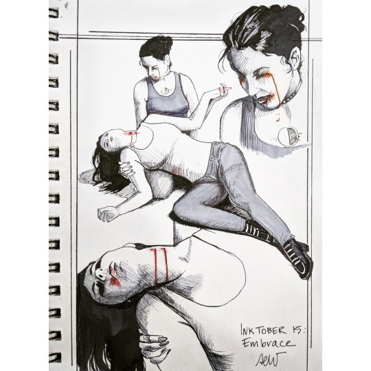
Inktober 15: Embrace
Didn't really have a plan for this one going in...just knew that I wanted to illustrate something different. I figured a lot of the narratives about the Embrace we're going to be ah! Surprise bite! In nature. Instead I turned a bit more tragic and focused on the thinbloods- who might not be able to embrace.
I think I could have gotten heavier with my shading. I also think the blood tears are a little messy, but they convey the right point. This one was done without a good reference image. But, the proportions are very good.
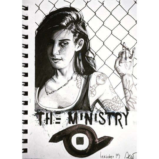
Inktober Day 16: the Ministry
I actually don't know a lot about this new clan. I have the book and the passage on them and read through it a couple times. The thing I learned here was that my ink can be watered down and make nice gradations. I also learned the chisel tip pen I bought was not water proof and a little blue! I went to shade and the ink just started running. Lesson learned: read the ink pen labels

Inktober Day 17: Blood sorcery
Ooooh this one was so good. The expression. The shading. I love the sharp shadows and I can't wait to digitally color this one!
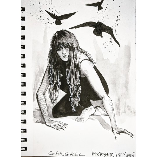
Inktober Day 18: Gangrel
I was at a loss for inspiration and asked our favorite Hound of the Isle of Lewis if I can capture her likeness. I think the important thing I wanted to convey was the beast marks. Her claws and body hair were really fun to draw.

Inktober day 19: Anarch hideout
I'm currently the ST for a chapter based chronicle set in Richmond Virginia. Having lived in Richmond, Byrd theatre is definitely home to some vampires and it ain't the toreadors. I love how dark the ink got and the shadow shapes were precise. I wish I had done this bigger, I could have captured more of the details of the photo.
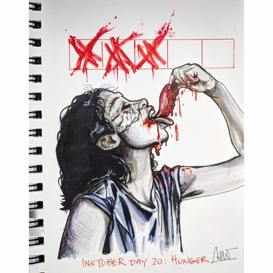
Inktober Day 20: Hunger
Was chatting with a friend on insta who is known for her tzimisce cosplays. I love watching how her work and makeup skills have improved over the last few months. So I dedicated this fledgling organovore Tzimisce to her.
The composition of including the hunger tracker was a good choice. The red ink was sweet here, I just think I should be more careful with my copics. My warm tone and my cool grey are very different colors and this piece showcases it.

Inktober Day 21: Presence
I was torn for what to do in this piece. I was also in a heavy brain funk and just drew Elif. I clearly learned my lesson from the previous drawing and kept the copics separated. The shadow shapes are crisp. Her expression is cool. And the touch of violet in her eyes was a good choice
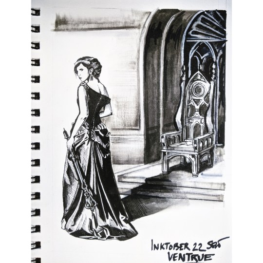
Inktober day 22: ventrue
I reached out to one of the more prolific Ventrue mun's on this site and got some awesome inspiration.
My critique for this piece had to be that I needed to plan my environment a bit more advance. I had the reference for the dress and pose ready- I thought o I can whip up an elaborate throne no problem. No. No. Find. Reference. The stain glass behind the throne had the potential to be way more powerful. And way cleaner. Her casting her shadow on it is a nice touch - the narrative in this single frame is quite interesting and open to a lot of interpretation.

Inktober day 23: True Faith
I originally wanted to draw Alia and the npc with True Faith from the Gehenna Wormwood chronicle. I ended up sticking with the chronicle and put three players in the church, and read the passage about the mark of immortality upon their foreheads. I dig that imagery. I was a bit more subtle with the christian allegories in this one- cuz I want to smack the church with heavy and blunt objects- I put a cross in shadow over their face.

Inktober 24: Frenzy
Okay okay this is a high note to end on. This one. Is so good. The lettering trick I did with the Malkavian (day 7) worked again- but I need to buy more masking fluid. This one was done with my new india ink and it is so nice to have new materials. The shadow shapes are superb. I am so pleased with this.
Reflection:
As I am approaching the end of this process I'm focusing less on technique and more about composition. I feel more comfortable with the ink and am glad that I get to experiment with it. I am also experimenting with that splatter technique- something that is starting to become a calling card ... I just love the way it looks.
I usually hide this info, but I have been working on the 31st drawing all month. It's taking all the techniques I learned and discovered and trying to make something really extraordinary. It is a self portrait- since the final prompt is yourself as a vampire. So I'm going full Toreador. Vain, covered in paint, and willing to kill for some windsor newton products. And you'll see it when it's done!
6 notes
·
View notes
Text
Welcome all!
If you’re reading this, I’m assuming you’re familiar with my work as either an artist, cosplayer, writer or any of the other creative things I do. Recently, I had been asked about some of the work that I do, and I thought a fun way to just that was to fill out a few questionnaires. Here I talk about some of the high and low points of doing what I do, what inspires me, and my process of creativity.
For those who are only interested in certain segments, I’ve broken the article into the following sections for you to easily maneuver your way throughout the piece: Art, cosplay, writing, and questions asked by you.
I know I’m no professional and compared to a lot of others I don’t have as outstanding an amount of followers, but if this article can help inspire at least one artist to try something new or learn something they didn’t know, well, that’s good enough for me! I hope you enjoy!
Art
When did you get into art?
I’ve been drawing as long as I can remember, but I do recall middle school in particular being the time that I really started pursuing art. I had to choose between volleyball and art club after school, and guess which one I picked. It wasn’t just academics either. My notebooks were full of fan art of mostly Link and Zelda, but you could find some Kirby, Pokémon, and Naruto scattered in there as well.
Show us your oldest piece of art you have on hand.
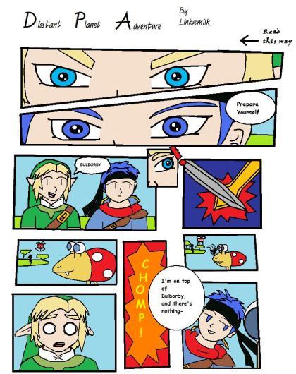
Yeah. It’s… Something.
What defines your artistic style?
I think the faces of the characters I draw distinguish my art. I always have a certain way of drawing the eyes, ears, and other features. I always give my females more prominent eyelashes than males as well. Certain clothing as well �� The way I draw capes and hoods are distinct. Not to mention when designing my own clothes, I tend to use similar patterns.
Do you practice other styles/have you tried other styles in the past?
I occasionally dabble outside my comfort zone. I’m not necessarily a huge fan of the “Cal-Arts” style, but I’ve tried it every now and then, especially when creating fan art for shows like Steven Universe, The Amazing World of Gumball, and Amphibia. I don’t really do it too often, but I’ve made a piece for my portfolio mimicking several art styles from a variety of different shows just to demonstrate that I can do it if I’d like to.
What levels of artistic education have you had?
Honestly, just high school. I thought I was going to college for digital illustrations but it turned out communication/graphic design was totally different. I actually got into that because I could draw when not many other people in that field could. Of course, I’m always interested in learning outside of school. I learn through watching other artists on social media, seeing how they create their work. Just watching a speed draw can help so much! The way I learn the most, however, is just by doing. Practice, practice, practice!
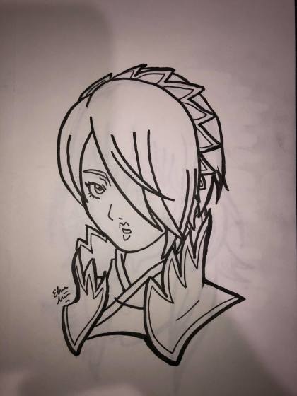
Show us at least one picture you drew or sketched recently that you did not put on a public site.
I’ve been doing a lot of Fire Emblem doodles for my new sticker line, so here’s Setsuna. Honestly, I just like drawing bust portraits like this.
What is your favorite piece that you have done?
I can’t just pick one! I’ve drawn over 900 things since I first joined DeviantArt (and I’ve been drawing even before then), you want me to pick just one? Haha, I’ll narrow it down to three of my favorites (in no particular order):
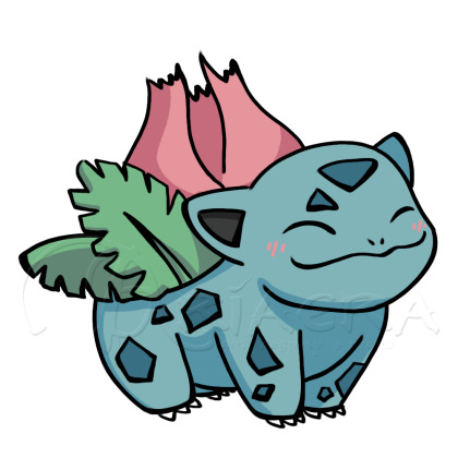
I love this one because it was like the first cute drawing of Ivysaur I’ve ever done. Ivysaur was always a tricky pokémon for me to draw, but this was the first time I feel like I nailed it. Ivysaur also happens to be one of my absolute favorites, so that’s a plus.

This is Minerva, a Guardian from my fantasy stories. Every time I drew her prior, I could never quite get the look I wanted. This was the one that I really liked and so I colored it and am very happy with how it turned out.

I don’t know why I just love this drawing I did of Dimitri from Three Houses. I think its the eyes and hair. And the color contrast — especially in the original ink sketch (that I hung up over my craft table.) I just love it.
What is your least favorite piece that you have done?
Again, you want just one? Haha, too many failures. I’ll be fair, though, and post three of those as well.
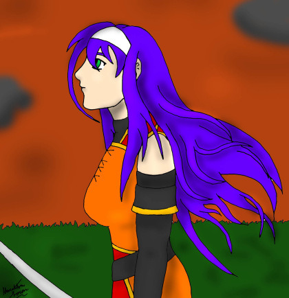
Here’s one from my early days. I was trying so hard to get the hair all detailed like and instead it came out looking like gross looking veins. Not to mention how atrocious the proportions were. Oh man, I’m sorry past me, I know you tried.
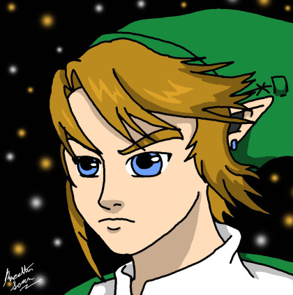
Here’s one I was so proud of: I copied the official art for Twilight Princess and thought it came out amazing. So amazing I titled the piece “Awesomeful Link.” Yeah. Um. Nope.

Here’s a more recent one that I’m not too pleased with. I was so excited about the latest batch of Steven Universe episodes (which I would later learn were a big bunch of filler episodes and that didn’t make anything better) I drew Pearl reciting her ‘big line’ of the trailer. I tried to mix styles and I tried something different with the eyes and all in all it just came out… Meh.
What do you like most about your art?
I like the faces that I draw. They’re always the most fun and I think they come out the best. I especially love the eyes, I go into so much detail on them (even though they’re usually so small when I print them.) I’ve had issues in the past where I made all of my characters look like they had the same face, but I feel I’ve been doing a lot better at individualizing the face of each character and that makes it all the more fun as well.
What do you like least about your art?
The hands. Sometimes I draw them well, but I still struggle hard and sometimes it really shows. For chibi drawings, I don’t really care as much, but on my more “serious” art, I get a little bummed when I’ve got a wonky hand hanging off their wrists. Feet also sometimes give me a bit of trouble, but usually only when I do poses that involve more movement, which is why I sometimes make my art stiffer and I don’t like doing that either.
Have you ever considered taking commissions?
I do take commissions. In fact, I’d love to take more if it were possible.
Are you looking to pursue a career in art?
I do it part-time right now. I’m satisfied doing commissions and artist tables at local conventions. I think I’d like to pursue writing more than art, but I do love art just as well, so part-time is perfect for me.
What do you like drawing the most?
As I mentioned before, faces. I love drawing facial expressions, I feel like it’s the very core of a character. It’s the first thing I notice when I look at anyone’s art, so I always go all out on my own. I also like drawing hair and wrinkles in clothing. I used to be really obsessed with wrinkles and it would always look like my characters didn’t iron their laundry, but I’ve definitely toned it down since then, haha.
All in all, I like drawing human characters the best — or humanoid. Elves, fairies, merfolk; I love them the most. I like drawing animals too, but not as much as people.
What do you like drawing the least?
Once again my answer is hands. They are still as difficult to draw as the day I started.
Backgrounds are also not enjoyable for me to draw. It’s an important part of a piece, but I get so bored drawing anything that’s not a character — which is why you’ll probably notice in a lot of my art that I do a lot of very minimal backgrounds. I’ve been trying very hard not to just take stock photos anymore (with the exception of my Mythical Month art as they’re meant to be stickers,) and I’ve been using games like Skyrim and Breath of the Wild as inspiration with their gorgeous scenery.
Do you draw more fanart or original art? If fanart, what fandom do you draw the most of?
I post a lot more fan art than original — at least I used to, but I also think I have expanded in sharing my original art more and more with my Mythical Months/Mondays. I guess maybe I’d say about half and half.
What medium/program do you use the most in your art?
Digitally I always use Photoshop. Always. As for traditional art, I’ve been using Copic knock-offs (I’m still learning, so I’d rather not waste the money) and the Sakura Micron pens for my ink sketches. I’ve really been enjoying them, actually, it’s very therapeutic. However, no matter digitally or traditionally, I always, ALWAYS start with a pencil. I like mechanical pencils, I don’t like traditional #2 pencils anymore. The thin lead helps me keep control better.
How would you rank your art? (poor, mediocre, good, etc.)
I always say I think my art is “above average.” I know it’s not bad, but I think it could always use improvement. I don’t know if I’ll ever get to a place where I think my art is phenomenal, but I’m content with it, it makes me happy, and that’s all that matters.
List at least one of your “artspirations.”
My art style was greatly inspired by Naruto, Fire Emblem, and Zelda. I always liked more proper body proportions with that hint of anime inspiration. I like bigger eyes on my characters because they help convey emotion so much better, but I also don’t like the oversized baby eyes outside of the occasional chibi style. Avatar: The Last Airbender was also a great influence since the creators did exactly what I like to do and execute it wonderfully.
What do you think you could stand to improve on?
I feel like I can always improve on everything that I do in my art. There are things I’m good at, but I don’t feel like I’ve mastered anything in particular. Then there’s hands and feet again which I definitely need to work on. Lastly, motion. I want to be able to draw more fluid character motions. I’ve been working on it with my original art that I don’t post online, but hopefully I’ll start incorporating it into all my work.
Do you have a shameful art past? (recolor sprite comics, tracing art, etc.?)
Ugh, yes, YES! I admit I was so bad at first, but I also think that’s just how we learn. I used to do a lot of tracing. I started first just full-on tracing images off my computer — That’s right, I’d put the paper up to the computer and trace it like that. Then I started using bases, which was better because at least I had to draw all the details like hair and clothing by myself. Then I finally worked up the courage to stop using them completely. I’d use references, but I would force myself to figure it out by eye rather than copy it straight from the source. I’m happy to say I haven’t been tracing since my late middle school- early high school years.
Cosplay
How many years have you cosplayed?
My first cosplay was when I was fourteen, and I’m twenty-five at the time of writing this article, so eleven years now. Wow.
How did you get into cosplaying?
I honestly don’t know. I was invited to a convention where I heard people dressed up and was like “hey, I want to try that!” I guess it was because I didn’t really do Halloween as a kid and I was so deathly terrified of costumed characters as a toddler that I never took an interest until high school.
How many cosplays have you done?
That’s funny, you want me to remember how many cosplays I’ve ever done. A lot. According to my photo collection, I’ve done about 60 different cosplays (59 exactly if I’m counting correctly.)
What was your first cosplay and why did you choose it?
My first cosplay was Osaka from Azumanga Daioh in her blue summer uniform. Azumanga Daioh was my second ever manga series and my cousin and I were so obsessed with it. She even went as Yukari with me to the convention (though only, like, two people knew who we were.) Tomo is probably my favorite character, but I related personally more to Osaka, being the air-head that I am. I also didn’t have to really style my hair (because that was an era before I used wigs.)
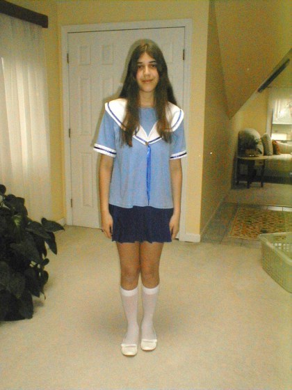
What is your favorite cosplay you’ve done so far?
It’s a tie between my Trainee Link (Hyrule Warriors) costume and my Royal Guard Link (Zelda: Breath of the Wild) costume. Both are alternative costumes for one of my all-time favorite characters that I hand made all the really detailed pieces all from scratch. Link has always been a special character for me to cosplay, but these two are my favorites.
What is your least favorite you’ve cosplayed?
Rapunzel (Tangled). I was obsessed with her at the time which is why I wanted to cosplay her originally, but my dress was not the best and I didn’t look good as her. At least I think so. It was the only costume that made me feel insecure.
What cosplay is the most uncomfortable or troublesome?
Okay, I love this costume and character to pieces, but my gosh the struggles I go through for Pearl (Steven Universe). Blue Diamond (Steven Universe) is the worst in terms of how long it takes me to put my makeup on, but Pearl is right behind her at about 2 hours being my best time. However, the thing that makes Pearl more troublesome to wear is one thing and one thing alone: armsocks.
They look great and prevent you from having to dab makeup all over your body, but I literally couldn’t even hit the home button on my cellphone and it’s not like I could just take them off like gloves. They’re attached at your middle and putting them on is a hassle on its own. Getting your fingers into each tiny socket is so time-consuming. Now imagine this while also being coated in body paint. Plus, having white be the color of the stockings, you have to be conscious of everything you touch because it will stain and show. Because of all this, I refuse to use the restroom dressed as Pearl, and while that is “in character,” it is not healthy and totally NOT recommended you do that.
What is your most comfortable cosplay?
During the winter, Ravio (Zelda: A Link Between Worlds) for sure. It’s like wearing a giant snuggie. However, in summer, it does get hot very quickly (which is why I literally only wear biker shorts and a tank underneath if I ever do take it out on a hot day), so I only wear it in summer if I know there will be AC. Heatstroke is a real thing. Miss Frizzle (Magic School Bus) is probably the best all-year cosplay in terms of comfort. It’s just a dress, stockings, and a wig really.
But in all honesty, most of my cosplays are relatively comfortable. There’s really nothing that I’ve been so uncomfortable that it’s made my physically ill or scarred me physically. My health is important to me, and should safety should always come first.
How do you research the cosplay before you make it?
I look up lots of reference images. I need an image of the front and back, though if it’s not available, I just improvise based on the images I do have on hand. After that, I kind of just wing it.
Do you sew your cosplays yourself?
A good majority of them, yes. There are a few exceptions to this, though: My Disney princesses are all bought since I use them in performances and want them to be durable if children come and tug on the outfit. Pearl, also being a performance cosplay, I did buy as well. For her second reformation outfit (the sleeveless with the ribbon) I got specially commissioned to look and fit me just right whereas her movie/future appearance (jacket and mom-jeans) I literally found at a thrift store. I also love to find costume pieces at thrift stores. Whether I use them as is or make alterations, they make life so much easier when you make a good find for a cheap price. Leni Loud (Loud House) is probably my favorite thrift/sew hybrid. I found a base dress, altered the top and added strap sleeves, put lace around the edges, found a blingy pair of sunglasses, bought earrings and painted them, and made bows for sandals I already had. The most expensive part of that cosplay was the wig I bought from Arda (and it’s always worth it to buy from them in my opinion.)
When I make a costume completely from scratch (like Ravio, Thranduil, any of my Link cosplays) are when I really love the costume and character and want to take on a challenge and bring it to life myself. They also tend to have pieces that can’t be altered from your everyday clothing, but that just makes me work harder and learn more!
How did you learn to sew?
My grandmother taught me how. Osaka was my first cosplay, but my mom altered it from a tee shirt we found at a thrift store and a lucky skirt find. Kabuto Yakushi (Naruto) was the first cosplay I made from scratch (and I won best novice at the convention I wore it to — even with my terrible wig, haha.) She showed me how to use patterns when we made that and my Ayame Sohma cosplay, but after that, I scrapped using patterns and I basically just eyeball everything now. It’s totally not recommended, but I’m a little weirdo and just prefer to do things the way I do. Still, I wouldn’t be able to use a sewing machine if it weren’t for her. Thanks, Nanny!
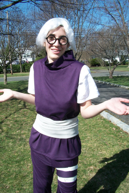
Do you make your own props?
Most of them. I don’t really use props too often as I find them cumbersome to lug around a convention (which is how I thought of the Fire Emblem, Gravity Falls, and Skyrim book boxes to store your stuff and add some extra flair to a costume.) The few props I have made include Link’s sword, his trainee shield, his original shield from Zelda 1, and Soren’s Wind Tome (which I used for Laurent (Fire Emblem: Awakening) because I didn’t finish Soren (Fire Emblem: Path of Radiance) yet…) Then there’s my prized cosplay prop; Victreebel for James (Pokémon). That was all thanks to my fleece hat business in high school that taught me the skills to build that thing.
I actually think the only prop I store-bought was my Hylian Shield because it was so lightweight and easy to carry, plus I was dreading doing all those details at the time. Maybe one day I’ll make it from scratch, but for now, I’m content with my store-bought.
Do you style your own wigs?
Yes. I have been improving my styling skills a lot more since I first started. It was always a more difficult task for me, but I’ve been practicing more and more. The first one that I attempted on my own was my short-haired Rapunzel. That was basically just giving it a haircut, though. My first real styling challenge was Breath of the Wild Link. It took a long time, but I actually had fun figuring out his hair.
For most of my costumes, it’s really just the bangs that need that extra pop, to which I use Got2B gel and spray. Does the trick every time and keeps everything in place. For those who are wondering, though: No, I did not style Pearl’s wig. I am not ready for that kind of gravity-defying styling. That was all E-Bay.
What skill has been most useful for making your cosplay?
Well, sewing mostly, but other skills that have come in handy for me personally have been painting, crafting, makeup, styling, and overall decorating. Probably other stuff too, just nothing more I can think of off the top of my head.
What is the hardest thing when making a cosplay?
Probably figuring out how things connect. This is the main reason I’m timid when it comes to armor. I’ve been getting better, but I’m still having trouble figuring out how everything attaches and how to put on these kinds of costumes, which is why my Skyrim Elven Armor has been put on hold.
What was the biggest screw up you’ve had making a cosplay?
I’m not sure if I had any major crisis’ when it comes to making cosplays, but I’ve certainly had my fair share of irritating mishaps and mistakes. I can’t tell you how many times I’ve accidentally sewn the sleeves on a costume inside out about 4 times before I finally got it right.
I’ve cut holes in my clothing, I’ve sewn sleeves on too tight, and I’ve even completed a hat that took hours just for it to wind up being too small when I put a wig on. I guess most of the major issues I’ve had with sewing are measurement issues, so my advice to you is to always measure and try on your costume as you go. Don’t wait until the day of the con to try out your new cosplay.
How often do you injure yourself while making a cosplay?
Not too often, I occasionally prick my finger with my sewing needles, but I haven’t had too many serious injuries. I think the worst was when I slashed my thumb with the exacto-knife when making my first shield for Link. Needless to say, there was a lot of blood.
Do you try to stay cheap or do you splurge on materials?
I am a frugal soul; if I can save, I will. That’s why I thrift so much. However, on a costume I’m really passionate about, I will spend more to ensure the quality. For example, I spent a little more going to a more shimmery material for Royal Guard Link. It cost about $50 for the blue and red material, which to me, is a lot (and that was with coupons). However, the results were 100% worth it. PS, Michaels and Joann’s ALWAYS have coupons. I totally recommend downloading both apps.
I also stand by that with wigs and contacts. I love Arda, their quality is great, but they are more expensive than Amazon. Contacts I don’t mind spending more for as well since the quality is VERY important in this case; they are going on your eyes, after all.
However, as I said, I am absolutely not opposed to going cheap. If you can make it work, make it work. My Nyo!Austria (Hetalia) cosplay came out very cute and it was literally made from bedsheets. From using mostly thrifted and recycled materials, a lot of my cosplays came to around an overall price of around $30. Some of these costumes include Mega Gardevoir (Pokemon), Tomoyo Sakagami (Clannad), Spyro (Spyro the Dragon), and Luan Loud (Loud House.)
Cosplay can be totally affordable, you just have to be creative and think a little outside the box sometimes to make it work.
Have you ever cosplayed with a partner or group?
Yes, a few times. I’d love to do more group cosplays, but we all have to think of something we all like. Luckily, two of my very good friends decided they would dress up as Steven Universe and Amethyst to go with my Pearl this year for Comic-Con and it was such a great experience! I’m trying to convince them to do others as well, such as The Loud House and The Magic School Bus with me as well, haha.
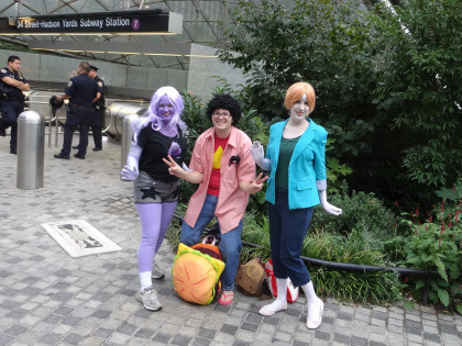
Do you try to act in character?
Always: but I don’t always succeed. It really depends on the character. Pearl I could roleplay for days. It’s probably because I connect so much with her and performing as her doesn’t hurt either. Dee Dee Magno Hall says her favorite lines to say are peoples names, and after giving it a shot myself, I totally see why. I even practiced Garnets “Stronger than you” monologue in Pearl’s voice and tone (in case no one volunteered to sing during our karaoke event) and it always makes my friends laugh.
The characters that stump me a little more are the more serious characters I choose to portray; Link, Laurent, Thranduil (the Hobbit), Belle (Beauty and the Beast), just to name a few. I’m kind of a goofball/airhead so those characters clash with my personality a little bit, but I am getting better. Blue Diamond is surprisingly the easiest of these types to stay in character for.
That being said, I love being the outgoing, oddball characters. Like I said, Pearl is second nature to me, as well as Anna from Frozen. Back in my Hetalia days, Austria and America were my go-to guys. I could act as them forever, and my friends and I literally lived as them for a while with how much we role-played. Most of the Disney Princesses it’s pretty easy for me to stay in character, especially (like I said before) Anna, Sofia the First, and Merida.
How do you react to cosplayers dressed as a character from the same anime/game/etc?
If there are some good character opportunities, I will role-play on the spot, but more often than not I will ask if we could all get a picture together. There were so many fun interactions with other Steven Universe cosplayers when my friends and I did our little group, but one of my favorite interactions was probably when I was dressed as Laurent and I stumbled across a Miriel cosplayer and I just shouted out “MOM! I FINALLY FOUND YOU!”
Do you try to duplicate your character’s expressions, walk, movements, etc?
I can talk the talk (mostly), but I have more trouble walking the walk. I’ve been trying to replicate movements better, but facial expressions I have trouble with (ironic as it’s my favorite part of drawing.) I’m not as photogenic as I’d like to be, as you could probably tell by most of my pictures being the same face, but I definitely am striving to improve on that.
What was your funniest experience of acting in character?
Okay, there’s a lot that I could share, and eventually, I want to do an article solely on cosplay “in-character” experiences, but the one I HAVE to share right now is a recent experience when I was dressed as Ariel from The Little Mermaid.
I was performing at the family day event my church helps out at my pastor’s air force base as Ariel, and after my sing-a-long, my makeup was a little smudged. I asked a volunteer where the restroom was so I could touch up before I headed back out to the crowds. I thought he’d take me to a private restroom, but he brought me to the public one where there were families waiting outside. They noticed and the dad joked “See? Even princesses have to go.” to which I laughed and gave my best Ariel shrug to play along. I went inside, fixed my makeup, and went back outside.
It wasn’t long, so the family was still outside the men’s room. As I walked by, the man’s son shouted out “Ariel, congratulations on going pee-pee!” to which I bursted out laughing. Everyone was. I mean, if you gotta congratulate a princess on using the bathroom, you picked the right one! After that, I did explain that I was just putting on makeup but I appreciated his enthusiasm and thanked him for it.
Do you compete in cosplay contests?
All the time. I love them. Whether I win or lose, I always get something out of it. I learn tips from other cosplayers, get to meet so many interesting people, and those times I do win I get prizes which is always nice as well. Most importantly, though, the memories that are made there are the very best part.
Have you won anything?
I have won quite a few. I have three trophies, a medal, a few certificates, and have won a cash prize as well. My first win was my second convention as Kabuto where I won the best novice trophy. My most recent win was for Ravio in August of 2019 with best in show. It’s amazing, I never thought I would get this far, but I’m so grateful for everything I’ve been a part of.
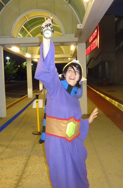
Again, it’s totally not about winning, but I’ll admit that it does feel really nice to have my hard work appreciated. Just as drawing, I still feel like I have a lot of room for improvement in my cosplay, so winning a few contests here and there definitely helps my low self-esteem.
Do you prefer skits or walk-ons?
I’ve only ever done walk-ons. I’ve never had anyone to do a skit with and I don’t think I could pull one off on my own. I’d love to do one eventually, but for now, our panels are good enough.
How many friends have you made because of cosplay?
Quite a lot. My Instagram is full of cosplayers I’ve met at conventions and I love seeing their cosplays and drawings, it’s all so inspiring!
Do you attend photoshoots and meet-ups outside of conventions?
Occasionally. I’ve never done a professional photoshoot (though one day I’d like to,) but I have attended a few meetups. I’ve done one for Steven Universe, Once Upon a Time, Disney, and I actually accidentally walked into a Fire Emblem: Awakening one dressed as Laurent, so that worked out.
What is the funniest reaction you’ve gotten cosplaying from people outside of the community?
The best one was when I was dressed as Link and my friend and I were on the subway. There was a mom and her kid sitting across from us and she pointed to me and said to her child, “Look, an elf! You see? Santa’s got his helpers out all year round, so you have to be good!”
I also had another wonderful experience outside of a con dressed as Link, though it’s not as funny but more just a sweet memory. It’s quite a bit, but luckily I’ve already written about it for Zelda Universe so I’ll just link it here for anyone who’s interested.
Name a few cosplays you’re planning to do next:
I’ve got to get Soren (Fire Emblem: Path of Radiance) done soon. I’ve been wanting to do this cosplay forever and I did start it, but I need to finally finish it. Dimitri (Fire Emblem: Three Houses) is also on my list to do next. Not sure about who else I want to do for sure, but some ideas that have floated around in my head have been Tilly Green (Big City Greens), Anna with her Frozen 2 look, Princess Peach (Super Mario), and a Thalmor Mage (Skyrim.)
What is your dream cosplay?
Princess Zelda from Twilight Princess. I’m still too scared to try to cosplay her. I bought a cheap starter costume that I was going to build off of and it wasn’t turning out the way I wanted, so I put it off again. One day I’ll feel confident enough to make her costume, but until then I’m totally satisfied with my Link cosplays.
What do you take into consideration when picking a character to cosplay?
Honestly, I just have to love them as a character and the costume itself has to seem do-able. I mean, I’m totally not opposed to buying cosplays if I really want to be a particular character, but like I said, making it means all the more to me. It’s my display of affection towards that character, the creators behind them, and the series as a whole.
Is cosplay serious business for you?
Yes and no. No because I don’t do it for money, likes, or internet fame. I do it because it’s fun and what I like to do. Yes because I go all out when I cosplay. I do everything I can to get the look the way I want it and I put my blood, sweat, and tears into it when I make them by hand.
What is your favorite thing about cosplay?
Everything: Dressing up as a character I love, roleplaying them, taking photos, just everything! I would do it more often if I could!
How do you want to grow as a cosplayer?
I want to learn how to make more. I want to build armor, I want to learn new makeup and hairstyling techniques, and so much more. I’m happy where I am, but I know I can be better. I will watch others and learn from them and push myself to try new things!
Are you willing to answer questions and help other cosplayers?
Absolutely! I may not be a top dog of cosplaying, but if I can help someone with something I’ve learned along the way, I’m more than happy to help!
Writing
When did you start writing?
I started in middle school as well, I used to write a Nintendo fan fiction called “The Kirby Show,” where Kirby and his friends would get into wacky sitcom scenarios. They were really just knock-offs of the television shows I used to watch back in the day, but hey, everyone’s gotta start somewhere.
As for my original writing, I started that more in high school. I still wrote a lot of fan fiction at that point, but I was starting to develop my own characters as well. I thought it about time to think of my own creations, and I did. I remember I was in my Godmother’s car when I thought of the main three characters and since then the cast has expanded so much, their stories are much better developed, and the lore is much more solid.
When you were a beginning writer, what did you write primarily? What do you write now, primarily? (i.e. romance, fan-fiction, poetry)
As mentioned before, I started out writing stories about characters that were not my own. Now I do all original writing — well, aside from my work at Zelda Universe. There I get to write about all the unique aspects of one of my favorite game series of all time, so there’s that as well. Writing there has helped me start writing little fandom topical posts for my own blog, such as top 10’s, reviews, and other things along those lines.
How often do you write?
I make it a habit to try and write at least a half-hour a day. If I’m really on a roll, I could write up to a few hours a day before I get burnt out. Even though I’m not always writing, I’m always developing the stories in my head.
When is your favorite time of the day to write?
I always write a half hour before I go to bed. The later it is, the more ideas keep rolling in. With my early hours for work now it’s harder to stay up late, but that doesn’t stop the ideas. I just gotta push myself a little harder to start earlier to have more time before I need to go to bed.
Do you have a writing muse? If so, who/what?
Not in particular. I always just write about what I like and incorporate different aspects of my life into it. I guess I’m my own muse in that sense? I don’t know. I just write what I do know.
What is your most popular lit piece?
Out of all my public pieces, I’d say either my “Animal Crossing Diaries” series or my “Endless Ocean” screenplay. “Vagabond” gets some decent attention as well, which is nice, but honestly, I’d be happy if there was just one person enjoying my work, so I really can’t complain.
What is the piece you are currently writing?
Out of my public blog works, “Vagabond,” from my Zelda Universe collection I’m working on a character piece on Colin from Twilight Princess.
What is the piece you most recently finished?
On my blog that would be my “Top 10 Favorite Fire Emblem Characters” list. For Zelda Universe, it’s actually a piece about Fire Emblem as well — It was DS week, I could write about whatever DS game I wanted to, of course I have to sneak in some Fire Emblem.
What piece are you most proud of?
While “Vagabond” definitely needs some more work, out of all the pieces I’ve posted publicly, that one is the one I am the proudest of. If anything just for Kurt and Maerwynn. They are two of my favorite characters to play around with and I’m so happy that somehow I was allowed to think these two up.
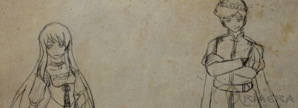
In my more private works, my fantasy story is my pride and joy. I feel so blessed to have been able to come up with these characters, and I do hope that someday I will be able to share them, whether on a television screen as I’ve always dreamed of in a novel of some sort. One day, maybe.
What piece are you most disappointed in?
It’s not so much disappointment, but rather I’ve grown so much in my work, it’s very hard for me to look back at my first romance story. It’s a little cheesy and the dialogue is a bit clunky, some of the actions that my characters had performed totally go against what their characters have become now after spending a lot more time with them. It’s something I would love to revisit and maybe even go public with, but it’s going to take a lot of work.
From all of your stories, who is/are your favorite character(s) and why? (try to limit it to 3)
Since I only published “Vagabond” online, I’ll stick to characters from this story in particular.
Maerwynn is definitely a favorite because she’s got a lot of qualities that I wish I was bold enough to enact myself. She speaks her mind without a care of what anyone else will think, even if it’s blatantly rude. She goes for her goals, even if they may seem ridiculous, and she pursues them with great passion and ferocity. Even with this rough and tough exterior, she’s still got a softer side that she’s just discovering in her new life at the palace. Now, I wouldn’t ever recommend being like Maerwynn ALL the time, but there’s definitely is a time and place where we could all be a little bit more like her, I think. Her confidence is the thing I admire most about her.
Kurt I connect with as well. Again, he says all the things that we all wish we could get away with at one point or another, but he knows he can because he’s royalty. However, he’s got so much going on underneath the surface as well with the complications of his past. He’s learning to open up, connect with others, and understand his feelings. Despite feeling restricted by the laws of his kingdom and the traditions of the royal family, he finds his own way to feel free and be himself.
What is the best compliment you ever got on your writing?
My best friend who I’ve been sharing these stories with for as long as we’ve known each other told me the nicest thing not to long ago. I always laugh at myself for going so crazy in-depth with the lore and characters of my fantasy world, but she told me how she’s admired that and the love and care I put into each little thing was what made it so great. It really meant the world to me to hear that and I can’t thank her enough for all the love and support throughout the years!
What is your main goal in writing?
I don’t know if there’s one main goal in particular, but I suppose if I had to pick just one, it would be to show good through the works of my characters and hope and pray that it inspires others to be like them. Kindness is growing scarce in the world, and if I can just inspire a little bit of it in someone, I suppose that’s all I can ask for.
Have you ever been published?
No, but I am aiming for it. Once I complete Vagabond, give it another revise myself, and hopefully find an editor to give it another look over, I’d love to find someone to publish my book or even self publish on a platform like Amazon. Just something to get my work out there.
Questions asked by you
Who is an artist that you look up to? There are a few artists online that I follow who I just adore their work. Three that come to mind in particular are Bianca Roman-Stumpff, Bellhenge, and TheStarfishFace. Their art is so different from mine, but I think that’s probably why I love it so much (if that makes sense?) They each have such a unique style and great subject material, I highly recommend giving them a look!
What did you think of “Frozen 2”?
I loved it. No secret that I’m a huge Frozen fan, so I was bound to like it. I was actually really nervous about how it was going to end, but I can say (without spoilers) that I am 100% satisfied with how it concluded. Also, Kristoff finally gets the spotlight that he deserves, thank you, Disney.
However, as much as I did love it, I do totally admit I do see flaws in it that could have been improved on. That being said, there was that in the first movie too and I stilled loved it. The characters have enough charm to keep the film entertaining throughout and I just adore them!
What does your family think of your art?
My parents have always encouraged me about my art and I know my grandmother loves it; I gave her a sweater with the art she liked of mine last Christmas and my mom says she wears it all the time. The rest of my family knows and supports my art as well, I never really had any issue with my small art business and the family.
Any memorable cosplay experiences at a con?
So many. I’ve shared a few before, but I think I’d like to make a whole article on the great cosplay experiences I’ve had! There are so many to talk about and stories to share.
Is there a type of art that you would like to get into? I’ve seen a lot of people doing wood carving and burning, but that looks insanely difficult.
I’ve actually been considering wood burning, haha! It does look difficult, that’s why I’ve been hesitant, but maybe in the future I’d give it a shot. I think they’d make my Skyrim wood pieces look legit.
I’m really up for trying anything. If money wasn’t a thing, I’d have tried a lot more by now. In the future, I’d love to try needlepoint as well!
Recently, I had been asked about some of the work that I do, and I thought a fun way to just that was to fill out a few questionnaires. Here I talk about some of the high and low points of doing what I do, what inspires me, and my process of creativity. Welcome all! If you're reading this, I'm assuming you're familiar with my work as either an artist, cosplayer, writer or any of the other creative things I do.
2 notes
·
View notes
Text

Acetate black Girl
In this illustration i started off be making a blue watercoloured back ground with no intention of drawing a black girl and having it printed on to acetate. I made the water coloured back ground with a range of royal blues and a sea foam blues, i then splattered water over it as soon as i had painted it so that it could have some sort of ripple affect to the page. I was originally going to add a nigerian woman over it but i thought that the colours weren’t as strong as i would have liked, as nigerian clothing is bright and colourful. So, Instead i came up with an idea to draw a black girl with an afro centric edge. I have researched into afro centric art and thought i should do more illustrative experimentation with this type of art. I constructed this woman with pencil and sketched her face first i wanted her to be a stylish black woman to define the stereotypes of a black woman being “rough” . When drawing the lips i decided to make them big because black women have full lips, Although this has been a bad stereo type given to black people in my opinion i think their lips are beautiful. When sketching her eyes i decided to learn from my previous illustrations and and left a white spot in her eyes to make them look more realistic. After this, i started drawing her neck i had to redraw her neck a few times because i drew it out of proportion the first few times. When i finally drew it to a standard i thought was good i moved on to drawing the shoulders I wanted it to look like she was layed down on her elbows so i had to think about how i was going to do this. To help me i looked in the mirror and put my elbows on the floor and sketched what i saw in the mirror, this helped a lot and i drew it quite quickly as using myself as a reference. After drawing the arms shoulders and bodies i then drew a simple cropped top and high waisted pants to her body. I coloured in The pants with a sky blue to match the back ground that i will be putting the illustration over. I then moved on to colouring in the skin i used a burgundy brown to represent the Mail skin colour tone that i researched earlier in to my unit. I used the finer end of the pro marker, I later learned that i should’ve used the broad side of the pro marker as you can see the marks where i have coloured in. After i had coloured the skin in i then sketched the braided i drew small oval shapes and then i got a pro marker that was a bit lighter then the skin tone and copiloted this in, in a downward motion. If i was to change anything about this illustration i would use a broad pen instead of the finer side of the pen. I then walked down to the printing room and got the original printed off in acetate
0 notes
Text
anyways here is the text for the “environmental/setting/art direction/WhaTEVER YOU CALL IT” redesign for my danny phantom rewrite a few months back
I actually made numerous sketches in August to demonstrate this because i was originally going to accompany the text with visual examples of each spooky component I wanted to incorporate, since it was inspired by jayrockin's amazing ghost physics post, which I suggest you check out yourself ...but i found out quickly that was too ambitious and I didn't have the stamina for that. However, I’ll still accompany a few rough sketches. It was good practice for me to try to bring about my ideas for the art direction of a show.
Keep in mind this was my personal taste to fit my personal preferred narrative (i wanted it to be a bit more spookier/dramatic, to truly go along the plot)
“A fun spooky essay by Diddly!!
I've seen a lot of people redesigning the characters, which is awesome, but I haven’t seen a lot about redesigning the environment
It can still have that cartoony look that's reminiscent of the original style of the show, but just incorporate the environment differently. How the characters look is one thing, but in animation you also have to think about how the characters move, behave, and sound like. Timing is extremely important in an animated series, and that goes along with how much drama/suspense is produced
They can still look cartoony as heck with exaggerated proportions but it's the way they're animated that really shows what kind of world they live in.” “A good example of this is Gravity falls. It has a simple cartoony style for its characters but they still do a good job at showcasing horror by how it's animated: ”
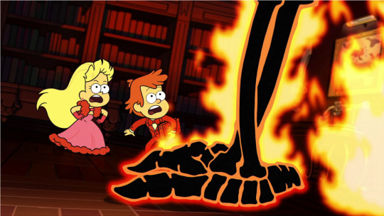
I'm talking about wider range of facial expressions, intense close-up shots, silhouettes and shadows junk!! MAKE IT SPOOKY. CAPTURE THAT FEAR! I want to feel SHIVERS when i see these characters! ((it wouldve made more sense if i had finished illustrations to show this))
((the document was pretty unorganized, but here were some key aspects))
👻 “ imagine if all the ghosts antagonists had their own leitmotif/boss battle themes, like in Steven Universe. that would truly bring about the memorability of their character and immediately tell the audience what their personality is like. It’s no wonder Ember is one of the most memorable ghosts, she has her own song”
👻 “ Soundtrack and movement and setting: everything has to work together to build up that good ol’ suspense! I want it to feel like there truly is something sinister around.”
👻 “spooky and eerie background noises? whispers in the background? make the ghosts have echo-y faded voices? and damn right i want to hear creepy circus music or creepy children singing in the background!!!”


👻 Have the ghosts move/animated in ways that seem suspenseful or mysterious. Make them feel like ghosts, add more flow into their movements! Make them feel a little less human…........

👻 Dont just stop at the ghosts though, the setting of Amity park in general should feel a little unsettling …
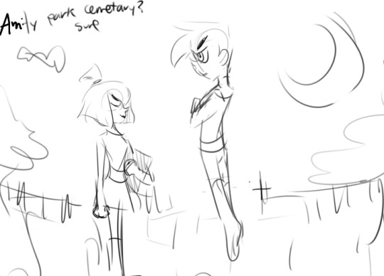
👻 If I were to redesign the show to incorporate a spookier, more ghost-like environment, it takes is spookier lighting and shading for the environment to completely change. (i loved those neon colors, but be smart with color choice when you can!)

👻 Dramatic contrasting lighting? Flickering lights? Have the characters shaded in a way that really showcases the mood? More wispier, transparent ghosts? 👻 for all the ghosts who have firey glowy hair, make their hair look all nice and glowy (have it resemble fire a bit more), with relative lighting and all that. it would be so much prettier and spookier. in addition, have their eyes glow whenever possible!
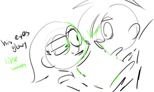
👻 Play with some common ghost trope characters perhaps? It’d be nice to just take full advantage of that fine paranormal activity and do some interesting interpretations on previous horror tropes, but in a unique animated format.

All these things could easily and completely change the atmosphere of a cartoon! And I love that. The cool thing about animated things is that you can draw out some things that you can’t necessarily reproduce in live action horror. TAKE ADVANTAGE OF THAT!
It's more than just redesigning the characters and rewriting the plot, it's about redesigning the whole heckin environment! Go full out! You might not agree with me on all these points but I just wanted to share my ideas on how to more effectively incorporate an environment about ghosts in a cartoon.
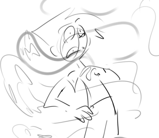
My animation skills are pretty limited and I'm no pro, but just imagine: animation is a really neat medium to do go about such an interesting setting like ghosts, you can make it so much more dramatic in so many ways!
I kept a tag of really cool spooky fanart I reblogged, in case you want to better understand what I’m talking about, go take a look at it.
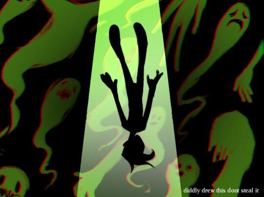
thanks for reading this! ill post more if I can :^)
#it aint just about revamping the story...its about revamping the stylistic choices#diddly darn rewrite#Danny Phantom#long post#danny phantom rewrite#redesign#i wrote this at midnight im tired#ghosts
584 notes
·
View notes
Note
Hey hey :) I was wondering if you could make a Hiro x reader fan fic? I have this cute vision in my mind that a cute and sweet girl comes to the lucky cat cafe, and drinks cocoa and draws an outstanding drawing that captures Hiro's attention and they end up having a nice conversation and becomes friends? Just an idea :)
Aw, that sounds so adorable!
Eye For Art
Fandom: Big Hero 6
Rating: K
Characters: Hiro Hamada and the Reader
Word Count: 1,270
Summary: anon makes it clear :)
Taking another sip of your warm, steamy cocoa, you cherished the peaceful scenery before you. A charming and quiet, yet popular cafe felt like the perfect spot for you to complete a daily drawing. Placing your mug down, you reached over for your purse, unzipping it to take out your sketchbook. You flipped through the pages, quickly admiring your past work before finding a blank page.
The only thing you questioned was what you were going to draw. Perhaps your half empty cocoa mug. Or maybe that old lady sitting in the corner, staring out the window. The more you looked around the room, the more potential you saw for drawing. Grabbing your purse again, you took out your phone, snapping a quick picture of the view in front of you.
You began to draw, starting with the tables. Once those were finished you sketched in the chairs and those that were sitting in them. Looking at the picture you took, you smiled seeing the middle-aged woman who gave you your drink taking someone else’s order. This small detail would definitely add to how inviting this little cafe is.
Unfortunately, you grew frustrated drawing this woman. You couldn’t seem to get her short, wavy hair the way you wanted and her proportions didn’t turn out right. Erasing yet another failed attempt, you decided to move on and draw the counter. Sketching the pastries inside seemed to be a lot less challenging. Working your way up from that, you drew in an employee cleaning the counter and the menu board on the wall.
The overall sketch was nearly complete. All you had to do now was sketch in the walls, flooring and somehow draw the cafe owner to your liking. Putting your pencil down, you took your last sip of cocoa; automatically feeling more calm about the final touches to your illustration.
As you started drawing in the walls, you couldn’t help, but feel as if you were being watched. You initially shook this odd feeling away. It was possible that another customer was just standing behind you and would leave soon. Though that wasn’t the case. Curiosity built up inside you, so you turned around to see if anyone was, in fact, within your radius.
Sure enough, someone was behind you, but it was no customer. It turned out to be one the employees with a tub full of dishes at his side. Although he was a bit of a distance away, he still had his eyes locked on your sketchbook. Despite knowing someone had been watching, it still shocked you enough to jump in your chair.
This took the raven-haired boy aback. He hadn’t expected you to turn around or be so startled by his presence. “S-sorry,” he stuttered, his free hand now rubbing the back of his neck. “I didn’t mean to scare you. I-I was just looking at your drawing. You’re really good.”
Despite still being tensed up from the shock of someone looming over you, you were flattered by this compliment. If you were being honest with yourself, you didn’t think of you were that great of an artist. Hearing positive feedback on your work, even over something as simple as a rough sketch, helped motivate you.
“Really?” You asked, your voice still slightly shaken from being spooked. “Wow, thanks! This isn’t my best work, but I’m glad you like it.”
The boy rose a brow at you before examining your unfinished work. You felt a little self conscious of him doing so, but the grin on his face reassured you otherwise. “Are you kidding? This is really cool. I’ve never seen anyone draw the cafe before.” He chuckled to himself, continuing to admire your work. As his eyes wandered around the page, a certain detail seemed to catch his attention. “Hey…is that…me?”
Looking to where the employee was pointing, you could tell just by the hair alone that it was him in your drawing. “Oh uh yeah…that is you,” you confirmed. “I took a picture a little while ago and you were by the counter. I hope it’s okay.”
You thought maybe he had a problem being drawn at first, but you were proven wrong by the laugh he gave you. “It’s cool. No one’s ever drawn me before. I think I turned out well.”
You managed a soft giggle in return. “I wish I could say the same about the owner. I can’t seem to get her to look right at all.”
“Don’t worry about that. Aunt Cass would be thrilled to know that someone drew her no matter how it turned out.”
His aunt? You thought to yourself. Now I really want to get her done right. “If you say so.” For some reason, you had expected the conversation to have ended by now, but it didn’t. In fact, you were actually enjoying talking to this employee. He seemed friendly and genuinely interested in your work. As busy as he seemed with work, you wanted to keep talking with him, even if it would be cut short. “So, are you much of an artist?”
Shrugging, the boy said, “Not really. I’m more into robotics, but I do have to draw sketches whenever I make something.” He glanced over to the empty chair across from you. “Do you mind if I…” he trailed off, walking closer towards the seat.
“Not at all.”
Placing the tub of dishes to the floor, he sat down, reaching for his notepad and pen. You watched as he quickly started to doodle away. You had to admit, you were impressed. He was drawing with a pen and didn’t seem to make any major mistakes with…well you weren’t sure what he was drawing. Having this quick sketch be a surprise was a little exciting.
“Alright, here it is,” he announced, turning the notepad around. A smile grew on your face seeing the his fast sketch of what looked to be a rather plump cat.
“Cute,” you told him, appreciating how well the doodle appeared despite how little time he spent on it. Nonetheless it was actually done well. The fur looked fluffy and the bell for a collar was a nice detail to add. “You know, if robotics doesn’t work out for you, you’d make a good artist.”
The boy shook his head at you followed by a comical eye roll. “I never considered that possibility, but I’ll keep it in mind. Besides, I’ve gotten used to drawing Mochi by now.”
You would have laughed, but a thought had just occurred to you. You had been talking to this employee for at least ten minutes now and you hadn’t even introduced yourself yet. Of course, you hadn’t originally planned to do so, but given that your conversation was going so well, it only felt like the right thing to do.
“I’m (Y/N) by the way,” giving him a proper introduction.
“Hiro,” he happily exchanged. He held out his hand in a manner of wanting to give you a handshake. However, right as you were about to, a loud voice called out Hiro’s name.
“Enough chit chatting with the customers, Hiro!” His aunt lightly scolded. “I need those dishes washed!”
“Oh uh right!” Hiro scrambled to get out of his chair. Grabbing the tub as fast as he could, he reached over for your finished mug of cocoa. “It was nice meeting you!” He yelled in your direction. “Good luck on the drawing!”
You couldn’t help, but smile. As you got back into your rhythm of sketching, you felt grateful for making a new friend because of this still uncompleted piece.
This was so fun to write! I can definitely see Hiro befriending someone over a drawing. Thanks anon for the request! I hope you enjoyed it :D
#fanfiction#big hero 6 fanfiction#bh6 fanfiction#big hero 6 fanfic#bh6 fanfic#hiro#hiro hamada#hiro x reader#reader x hiro#platonic x reader#platonic!reader#big hero 6#bh6#anonymous
291 notes
·
View notes
Note
dude... you're straight up completely stealing tofuvi's art style :/ not cool
Please do read the whole thing before replying!First of all, I sincerely apologize from the bottom of my heart if this piece of mine (x) looks like an illustration of tofuvi’s. As your ask has made me realize how my art style may be similar to tofuvi, I went to her blog and found the piece that may appear similar to mine. x
From looking at this, I admit the similarity is a bit uncanny. Frankly, if I was an outsider stumbling across this, I would have also believed that I had imitated her art style. To help prove myself otherwise, I will try to explain every aspect of my artwork in full detail! If you still disagree with me, please contact me directly. I will write an apology letter and delete the art if necessary.
First and foremost, the eyelashes. I realized that this is the one aspect that looks like tofuvi’s art style the most. Originally,I wanted to draw eyelashes that were clearly visible, but when I drew it out, it looked very clumped. To mend this, I played with the eyes to satisfy myself, and the eyelashes in my art are the result of that. There’s really no further explanation for this as it honestly looks very similar. For this, I apologize.
Second of all, the lips. This part may look quite similar, but my actual inspiration for them were Jimin (a member of a kpop group called BTS)’s lips! A little strange but true. My goal was to draw the lips plump and soft which is why I went for such a bright colors as well. x It was also inspired by this post in Instagram x
The nose and blush: this was done like this for I want to create a very soft-looking person, and furthermore, this is from a front perspective which is why I colored the nose and cheeks in such a way. I would also like to note that the pink/red tints at the corners of the eyes are there to emphasize the fact that she is crying.
Her ears! Another similarity as both the ears are small. I would like to say that I actually used one of Horikoshi’s drawings as reference here! This can be seen in this drawing of Bakugou. x
The splayed hair was greatly influenced by this panel in the manga My Hero Academia. Again, the concept is similar to tofuvi’s although it is also true that this character’s hair is also spread out and divided into many strands which is what made me do so in my drawing as well. x
Originally, I planned for the background to be lilac, but with a friend’s further insight, I’ve decided on making it the colour it is now. The field-of-star theme was influenced from the colour of the background since it looked like the night sky. At first I was actually going for a field full of flowers but it was cut short since I am not that great at drawing them.The tears were planned out from the start, and the balls are supposed to be floating tears (defying gravity). To create this, I used a black out line while lining the inside and outside white to create depth. The circle inside was to resemble a reflection from the water.
As I’ve already stated briefly in the tags of my artwork, the heart was heavily influenced by TOri’s cover of “in the rain.” x I believed that she used the original pv so basically, it was influenced by the original itself and not the cover.
How I coloured was influenced by tofublock’s latest ask (x) as her art really inspires me to draw! It was a great help and drive to finish this piece.The border was done with intentions of shrinking the canvas and creating an easier workspace because I often tend to go overboard in the background as you can see from the excessive amount of stars.The outline of my artwork was to make the body pop more.
Lastly, here is my draft and sketch. (x) (x) I’m really sorry it’s not really that appealing. It was deformed for when I was doing the sketch I realized that the proportions aren’t correct. As you can see I originally planned to used flowers instead of a heart to express the fact that she is a fragile girl who’s blooming yet at the same time withering. The heart was used instead to express that her own heart is melting or falling apart until there’s none left.
In conclusion, if this still makes you think that I’ve copied tofuvi’s art style please do what I stated in my first paragraph. I will gladly change my art, redraw, and delete the current post as I may have offended some of you.Again, I sincerely apologize for the problems I’ve caused. Next time I will throughly look through art to find an idea which is original and try my best to change my art style as well as improve further in the future. I want to clearly state that I did not copy in any shape or form. Our art styles may look similar, but I do not have any intentions whatsoever to steal her art style. The set up may be similar but the concept is basic and has also been done by other artists (I will provide some links!).
To finalize my response, I want to apologize for the fact that I was not aware that my art looked similar to another person’s.I hope this problem could/can be resolved without any drama, thank you.
Links to art which has similar characteristics/concepts:(Please note that I am not trying to accuse these artists of doing such things as stealing concepts or art style, these links are only here to prove my point and provide insight on these aspect that similarities can be found anywhere!!)Pose: https://twitter.com/loika/status/881749685978882048http://mangafox.me/manga/deadman_wonderland/v13/c057/25.html (and eyelashes)https://www.pixiv.net/member_illust.php?mode=medium&illust_id=42280440
Eyelashes:https://twitter.com/yuari_kim/status/867879916280434688Hair:https://twitter.com/paindoreperdu/status/824803950687825920http://www.nicovideo.jp/watch/sm9155963 (and pose)I respect all the artists mentioned here and follow all their works as well!
1 note
·
View note
Text
12 Design Concepts for a New Generation of Pro Street!
The Pro Street build style has been a staple of Car Craft readers ever since it blew up in the early 1980s. It emerged as hot rodders began emulating the look of NHRA Pro Stock, which used production-based bodies with back-halved rear suspensions and narrowed rearends. Big engines, often with power-adders and trick induction, were paired with “pizza-cutter” skinnies up front and huge slicks in the rear—and for the first time, those big meats were enclosed within the rear bodywork for a sleeker appearance and better aero.
Pro Street has always been about bringing the look and performance of the dragstrip to the street; in other words, going fast in a straight line. Turning is something you do at the end of the track or in to the burger joint. Comfort in a Pro Street car has also traditionally been sacrificed for performance, with race-car interiors and few baubles. With the advent of the Pro Touring style in the 1990s, many enthusiasts flocked to its superior handling, braking, and driveability. With turning in vogue for decades, Pro Street seemed passé. Or so they thought!
Of course, everything old eventually becomes new again, and the Pro Street scene is seeing a revival of sorts with more drag-inspired builds stuffing mile-wide meats in the back. If you’d like to be on the leading edge of the next big thing, we thought we’d provide a little inspiration. A while back, we asked automotive illustrator Ben Hermance to come up with some designs for modern Pro Street builds, and what Hermance delivered makes us want to commission a few of these ourselves. These cars definitely look like a cross between old-school Pro Street with the Pro Touring look that is so hot right now. Gone is the radical rake in the chassis; these cars sit low and menacing. Modern touches like flush window glass and sleek lines certainly help these cars stand out from any Pro Street you’ve ever seen.
With a nod to better braking and handling, the useless Pro Street skinnies up front have been replaced with stickier front rubber and bigger brakes, although Hermance stops short of going to a full-blown wide tire in the front in order to preserve the staggered Pro Street look. And although the renderings don’t show it, the race-car vibe inside, in most cases, is replaced with more comfort and entertainment options. We hope you’ll be inspired to build one!
1961 Pontiac Catalina
Let’s start with the car that’s least likely to be built in the Pro Street mold. Illustrator Ben Hermance explains that he liked the challenge of this car and the way it turned out. “If you are going to do Pro Street, there are some vehicles that look like they are going to resist a little bit, so you have to finesse them more,” he says. “That bubble-top–style car is usually used as customs or street machine-type cars, not Pro Street. So to make it work, I had to change the stance, and I increased the wheel diameter so you don’t have those big, heavy tires. That’s a little bit like having a flamingo upper body and a hippo lower body, it just kind of looked out of proportion. But I like the final result. It’s still a little bit unusual for a Pro Street car, but I think it works.”
1972 GTX
The Plymouth GTX and Road Runner body style is normally associated with 1970s NASCAR racing and is not usually built as a Pro Streeter. But this car can change that, because few automotive shapes were as alluring as Chrysler’s early 1970s “fuselage” styling. Hermance accentuated the low, bulging, aero-inspired shape with Plymouth’s most outrageous color ever: C7 “In Violet” purple. Note how he stretched the C-pillar and the quarter-panels wider to improve the flow over the greenhouse and beefed up the rear tires.
1967 Chevelle
The Chevelle is probably the car here that will be easiest to build. Hermance says he imagined this as a skunkworks factory race car, so it retains much of the factory sheetmetal unmolested. Underneath that big hood bulge, we can easily imagine a big-inch big-block with a single-plane intake and a Dominator carb bolted up top. Rendered with a satin bronze sheen, this illustration reflects recent trends in vehicle wraps and refinishing.
Buick GNX
Hermance might be committing heresy by penning a Buick GNX in anything other than solid black, but we think it works. “I’ve always loved the Grand Nationals,” he says. “They are already evil-looking, and not much needs to be done to them. Everybody has seen a G-body on a dragstrip, so I felt it needed to do something to make it stand out, so I did make a few aerodynamic touches. Really just adding vents to the front end to get more airflow.”
Hermance also lengthened the hood bulge over the stock model. At its best, the GNX’s turbo V6 made 245 hp—not exactly good enough to keep up these days—so the extra room under the hood probably makes room for an upgraded LS (with turbos, of course!).
1974 Laguna S3
If you want to be a real bad hombre, figure out how to keep the Laguna’s swivel bucket seats. But otherwise, do exactly this: “This is the opposite end of the spectrum from the understated Chevelle,” Hermance says. “This build will require a lot of fabrication work. The first thing I did was ditch the bumpers, which we all know in the 1970s were the worst ever. Those bumpers were just gigantic and there was no styling involved. They were just these big chrome bricks. Then, with the rest of the design, I tried to let the good parts of the vehicle dictate where I was going to go with the parts that needed some help. And the end result might be a bit of overkill, but I said, ‘You know what? Nobody’s ever really done a Pro Street Laguna, so let’s try something different. Let’s build a badass car.’”
1969 Camaro
Although it may not be obvious at first glance, there’s actually a lot going on here. There are so many first-gen Camaros out there, to come up with something different, Hermance drew the ’69 as a Nostalgia Funny Car. First, the wheelbase has been stretched by lengthening the front fenders. The iconic Camaro nose has also been raked back. He’s given the car a Lexan windshield (notice the fasteners around the edge of the windshield), and you can even see the rollcage through the windows. The hoodscoop has hints of a Corvette Stingray, and dog-dish hubcaps add a bit of no-frills flair that you couldn’t get with a set of modern wheels.
Ford Falcon
Here’s another car that is rarely seen in Pro Street trim, and that engine makes a pretty obvious statement! Another big statement piece on this car is the greenhouse. “I’ve never really loved the roof line on a lot of these smaller Fords and Chevys from this era,” Hermance explains. “It’s the same thing with the Nova’s. I just thought it was too abrupt. So I thought, This Falcon is roughly the same size as the Mustangs, so what would it look like if you took the roof off of a fastback Mustang and mated it to the body of a Falcon?
“So this was just an experiment to see how that would look, and I think it looks pretty nice. With that big blower sticking out of the hood, this little car should go like a bat out of hell, and I think the look matches the speed.”
1969 Dodge Charger
Hermance admits that he barely touched the body on this 1969 Charger, other than to open up the rear fenders to fit the gigantic rear tires. He says the Coke-bottle silhouette is such a perfect design, there’s really not much to be done other than accentuate it with that green-on-black paint scheme and tuck in the bumpers. Oh, and a giant blower and dual four-barrel carbs help get the point across, too.
1970 Mustang
Here’s another where the original designers got the body just about perfect. Everybody loves the 1970 Mustang fastback, so once again, Hermance simply tried to accentuate those fantastic lines with an aggressive paint job in black, blue, and silver. He did draw in a functioning shaker hoodscoop modeled on the famous Boss design, and LEDs in place of the original headlamps provide an ethereal glow.
1968 GTO
Earlier, Hermance talked about having to work hard to make the Pontiac Catalina work as a Pro Street design. The 1968 GTO is the other side of the coin. “When you are doing something that is a little bit more of a rounded body like the GTO, that body lends itself really well to the Pro Street style,” he says. “It is more rounded. It has hips and curves, so it allows the big rear tires to fit in there naturally. Plus, it is already fast-looking.”
1970 Oldsmobile
Like the GTO, which is also a GM intermediate A-body, the Oldsmobile Cutlass 4-4-2 simply works as a Pro Street car. Tuck the bumpers, paint it a great shade of gold (what else for an Olds?), and drop in an old-school, big-inch, blown V8 and you’re ready to go.
1970 Ford Torino
“This design I really love. My intention with this one is to build an absolute rocket ship. A high-end race car,” Hermance says. “If there is a future for Pro Street styling, this is my candidate for what it should look like. I tried to incorporate what we have now in all the vehicles you see that have aerodynamic advantages. This has got all kinds of aero goodies all over it. Brake cooling, venting for heat extractors, a wing that can articulate to take advantage of aerodynamics, all that stuff.” This would be a more difficult build because practically nothing has been left stock, but boy, would we love to see this one in real life!
The post 12 Design Concepts for a New Generation of Pro Street! appeared first on Hot Rod Network.
from Hot Rod Network https://www.hotrod.com/articles/12-design-concepts-for-new-generation-of-pro-street/ via IFTTT
0 notes
Text
Mob Psycho 100 II - Kameda Yoshimichi’s Character Design Notes

With each blu-ray/DVD volume of MP100 II Character Designer Kameda Yoshimichi gives some notes regarding his process designing each character. Here are all his notes for S2 in the order they are presented, regarding; Shinra Banshoumaru, Emi, Mogami Keiji, Joudou Kirin, Asagiri Minori, The Urban Legends, Shimazaki Ryou, Hatori Nozomu, Minegishi Toshiki, Shibata Hiroshi, Suzuki Touichirou & Serizawa Katsuya.
SHINRA BANSHOUMARU
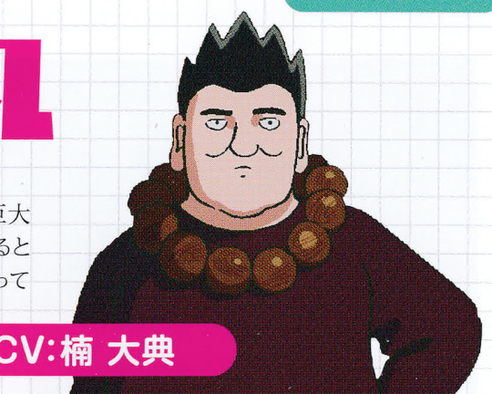
My highly recommended character from season 2, Shinrin Maruo! … that’s not his name, it’s Shinra Banshoumaru!! I super, super love Shinra to the point where it’s unbearable, and I even put him into season 1!!! Do you know where, though? These lovable, chubby characters - they’re lacking in recent anime, but I figured I’m in the position to change that!! I made him bigger than he is in the manga and upon drawing his rough design, Director Tachikawa told me I was going too far and had me draw a retake. I was like a bulldozer - ‘That’s so stupid!’ - so I managed to save his nice body (laughs).
After episode 2 he doesn’t appear at all, but please be sure to love Shinrin!!! How about a spin-off!? “Shinrin Psycho 100”, how’s that!?!?!? Ah, Shinra, actually. Sorry.
EMI
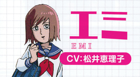
The amount of people who wanted to see this story animated!!!! Since it usually ranks either first or second place in polls that assess the most popular story in the Mob Psycho 100 manga, we figured we’d have season 2 start with it, and since it’s such a popular part, there was an agreement that I’d be animation director for it! Which I was enthusiastic about, until - huh? Episode 2 has Shinra Banshoumaru? Then, I’ll do episode 2! And with that, I left episode 1 in the hands of Yoshida-san! It’s a story with drama at its heart, and that’s what Yoshida-san specialises in, so I was happy with that!!! I’m pleased with Emi-chan’s hair colour. I made it a caramel-pink. My type 100%.
MOGAMI KEIJI

Truth is, work on Mob Psycho 100 II began from Episode 5. Because of that, the first of the fresh new characters to be drawn was Mogami. Just before getting to work on Mob Psycho 100 II I’d been working on something else where the proportions are quite short, so I kept in mind that I had to make sure that didn’t affect my designs here - as a result, for the first rough draft for Mogami, I had him with full on shoulder pads so he’d look taller, in a Saeba Ryou kinda vibe (laughs). Well, maybe not as far as Saeba Ryou. As expected, following a check with the director I was told the balance of his body isn’t Mob Psycho-ish! And now his design is as it is. And yet… maybe it would’ve been nice to have his shoulders be raised, just a little?? In the manga he’s quite a handsome man, but my Mogami isn’t that handsome… that’s regrettable.
JOUDOU KIRIN

I have Joudou-sensei wear a kesa [Buddhist priest’s robe] in the anime - it’s pretty cute, isn’t it? Something I paid attention to was the lines from where his kesa ends to his tip toes! He appears in episodes 4-7 and more so than Mogami does, but he’s fun to draw. His deformation in episode 4 was super funny, so we included more of those (laughs). However, the wrinkles on his forehead and his hair barcode are a bit of trouble, and he’s got three rosaries on, and vertical stripes on his kesa… a lot of lines, and animating all those lines is a delicate matter. Also, he has huge eyes. They must get dry easily, I’m sure that’s tough for him.
ASAGIRI MINORI

We get three design variations for Minori - the one in the bed, the one that’s possessed by Mogami, and the one wearing Salt Middle School’s sailor uniform. Her chipped nails while she’s lying in the bed are an anime original. I wanted something in her design that’d counter her cute face. Above everything, what stands out in her design is her hair colour!!!! Her final design has her with purple hair, but at first I imagined her with a cute pink, like Minky Momo-chan. However, the pink hair didn’t really match with her skin colour and overall ghastliness when she’s possessed by Mogami, so after a revision, I went for purple. The way she is now… well, she’s cute, but I think pink hair would’ve been reeeeeeally cute! There’s not many illustrations in the manga where the characters are given colour, so it was very fun getting to choose colours for the anime!
URBAN LEGENDS
With the characters that appear in the Urban Legend Arc, it was super fun to envision how they might move around, and what details to add and/or remove!! Regarding Wriggle Wriggle from episode 1, in order to give a sense of scale in comparing its height with Mob’s, on its character sheet I drew it with an extreme use of perspective. An angle similar to that image gets used in the anime.

In episode 2, Red Raincoat is as he is in the manga, but The Dragger dragging her dolls behind her is an original design. I gave the three dolls she drags a sense of individuality & a ghastly feel, then thought about wetting her clothes and skirt with mud and rain, deciding to make her simple. The dragger has very long hair, which appeals to my 80s-anime-loving taste. I guess when it comes to original designs I always drag out something that I’ve been stocking in my own drawers (laughs).
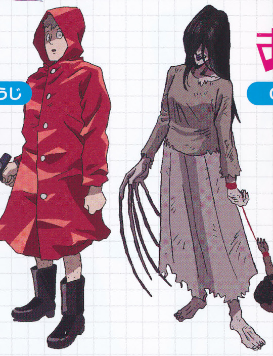
On the other hand, with Dash Granny all we see of her is her running blurry form, so even on her character sheet her references are all smeared - kinda like me declaring, ‘right, I’m the animation director for episode 2, so let me handle drawing the granny.’ (Laughs).
Season 2 is filled with a lot of deep stories, so if we get to continue the Mob Psycho 100 anime, I’d like for us to do more light-hearted stories where cases related to urban legends are solved like this!!
SHIMAZAKI RYOU

The member of the Ultimate Five who gets the most time in the spotlight, Shimazaki - easy to draw, isn’t he?? His eyes are lines, the corners of his mouth are a little lifted - just draw that and there you go! Shimazaki! He fights with Teru-kun twice - episodes 9 and 11 - but I’ve been told that the jersey Teru-kun wears from episode 10 onwards is quite perplexing (laughs). In the manga it’s a black jersey… of course I know that. It’s just… he fights Shimazaki, who has a black colour scheme, and then Mob and Sakurai also have black colour schemes… Suzuki is more or less the same, as is Koyama, so to say. Way too many characters with a black colour scheme. Having all these characters with black colour schemes in one scene? That’s a No, Thanks from me. With all that blackness, you wouldn’t be able to understand who’s who!!!!!! Huh? You’d understand because Teru is blonde? W-well...
HATORI NOZOMU
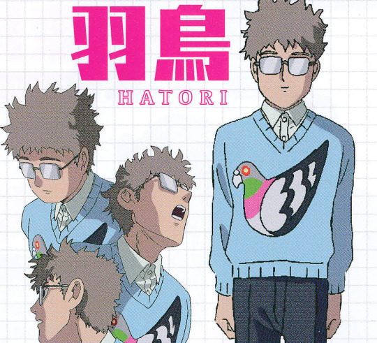
You noticed, right? Hatori’s very cute pigeon [hato] crest!! A crest I highly recommend! … and yet, Hatori doesn’t appear much, does he… plus, the pigeon really didn’t stand out at all either (laughs). As much as I could, I’d leave the style of clothing that each character wears in the manga more or less the same for their anime design, then apply colour, then add a design that matches the character - designing their clothes was fun! Teru-kun’s jersey has a seagull, and Koyama’s hoodie has a spiral-like design - I think it’d be fun to search for these designs!! Actually, why does Teru-kun’s jersey have a seagull on it, you might ask?? Well, flip the seagull upside down… and you get someone standing… pigeon toed!

MINEGISHI TOSHIKI
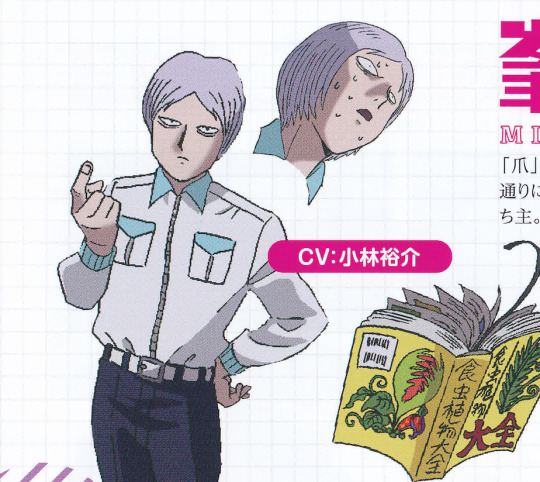
I felt like the kinds of plants Minegishi manipulates would be of a carnivorous nature, so I ended up learning a lot of stuff when I was doing research! When thinking of carnivorous plants, what immediately springs to mind is Rafflesia! Even when reading illustrated encyclopaedias as a kid, I thought Rafflesia plants looked pretty scary. I’d read something about ‘man-eating plants’ and thought to myself, man, I want that to be about Rafflesia - I looked it up and it was! It stinks, so it’s as if it eats both humans and insects! I feel sorry for it - it’s just a stinky flower. Also, I made a big discovery!! Seems like you can drink the digestive fluids of pitcher plants!!! *gags*. Apparently you can only drink it before they catch insects, but it’s close to being germ-free, so please, drink without worry! Also, in Malaysia or somewhere like that, it seems they put rice inside the mouth of a pitcher plant, then steam and eat it, like bamboo chimaki [Rice dumpling wrapped in bamboo leaves]. ...In a pitcher plant… really…? *gags* *gags again*. With venus flytraps, too, people put minced meat in their mouths and grill them or something… those of you who own carnivorous plants; please, give it a go!! But the result is your own responsibility!!!
SHIBATA HIROSHI
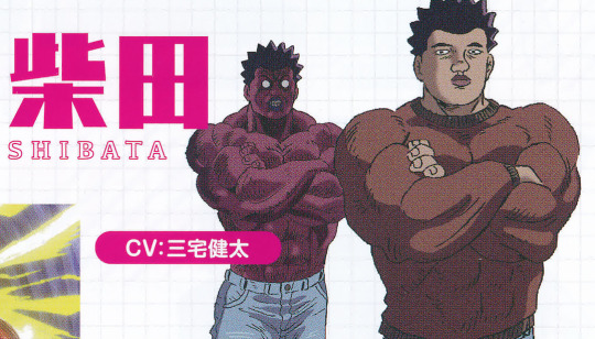
He brings the pressure in episode 10 - when I read the manga, I felt this incomparable atmosphere when Shibata transforms and roars noisily around. I think the anime was amazing in amping that up! Looking at the manga, when Shibata’s on his rampage, he takes on more of a swarthy tone. So when I came to choose his colours for the anime, I first had his skin tone be pretty dark, but I felt like that didn’t give the same impact as it did in the manga, so I proposed giving him a scarlet tone as if he came from the Asura realm! And I’m glad I had the sense to! Actually, speaking on this now, he’s kinda like The Hulk (laughs). I guess it would’ve been funny if I made his skin green.
SUZUKI TOUICHIROU

Truth is, I’d finalised Suzuki’s design during season 1. Only because he appears for a split second during the final episode, though (laughs). But, while working on the main story, something I noticed with my design that troubled me was that alongside being slender and baby-faced, his height left something to be desired… so he didn’t look like a boss character in the slightest. After I finished work on the final episode, I thought it’d be good to make his face a little longer, ie. more mature. To make him appear more aggressive, I tried to make his eyes smaller, but then his design strayed too far from his manga self. Of all the things that caused me grief, the worst one of them all was his hair - does he have a jagged hairline because he’s brushed his hair back, or is the jaggedness there a very short fringe due to him having short hair? After I finished work on the final episode, I unexpectedly had the chance to see ONE-sensei, live, drawing Suzuki - from there, my problem was solved!!! Jagged hair (laughs). (It’s due to him having short hair, right?) I apologise for never grasping the true form of his hair, right up to the end.
SERIZAWA KATSUYA
Translated previously here.
--
Twitter crosspost here.
Season 1 notes here.
#mp100#mob psycho 100#my stuff#shinra banshoumaru#emi#mogami keiji#joudou kirin#asagiri minori#shimazaki ryou#hatori nozomu#minegishi toshiki#shibata hiroshi#suzuki touichirou#serizawa katsuya#booklet#kameda yoshimichi
129 notes
·
View notes
Photo
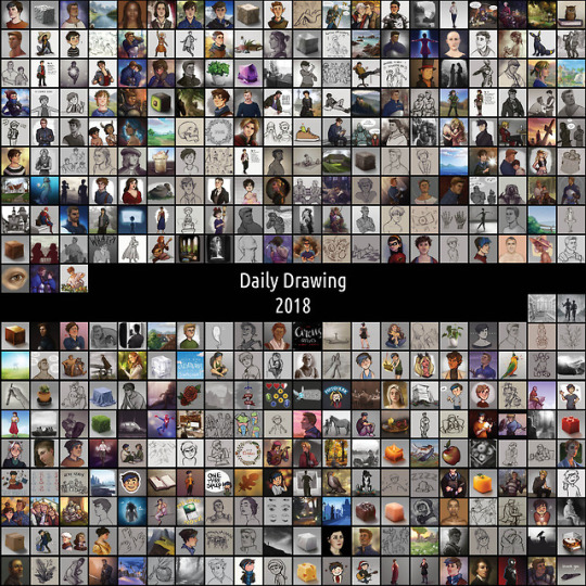
Year three of daily drawing - my experiences
Read about my first year HERE and my second year HERE
Wow! Three full years of daily drawing, all done. When I started out I didn’t even think I’d make it past the first week. I’m still baffled, to be honest. Time to look back on this third year, and on the challenge as a whole. I have a LOT of thoughts, let’s see if I can make some sense of them under the cut.
What was the plan? At the end of last year, I said this about my plans for 2018:
Do more studies, for real this time. I’ll be keeping a tally in my bullet journal of value, anatomy, landscape, portrait and material studies and aim to do at least twenty of each this year. Aside from that, I’m actually pretty happy with how my developement has been going this past year so I aim to just keep that up. I want to do at least one more year of dailies, because I just really like the number three and it means I’ll have over a thousand total.
And how did that work out? Well, I made my study goal! 100 total, and 20 in each listed category. Though, as expected, I ended up making the bulk of them in the last two months to catch up. I think I learned a lot from doing those, but looking back, I feel like I only scratched the surface. See the way studies work is you copy first, then try to reproduce it without reference, then implement the techniques in an original artwork. I stopped at copying, meaning I learned about a third of what I could have if I had taken a bit more time.
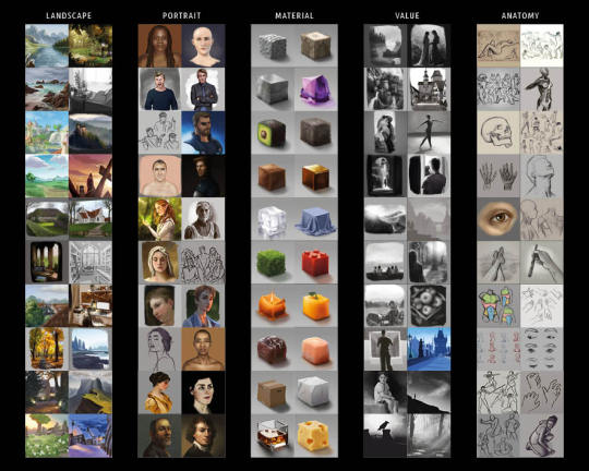
Something else I wanted to work on in 2018 was to stop letting these dailies cut into my sleep time. I set a timer on my phone for 8pm everyday to remind me to start drawing, and used my bullet journal to keep track of all the days I was in bed before midnight. While it definitely didn’t work *all* the time, I do feel like it made a significant difference. The feeling I got everytime I was in a late train home from band rehearsal and I realized I’d already made my daily earlier that day was priceless.
Time to quit? I already predicted I’d probably want to stop after my third year. Turns out that once I’d formed that thought in my mind, I suddenly started to *really* feel like quitting. I mean, I wasn’t about to quit before I’d reached the three year mark, I’m way too stubborn for that, but I did notice a significant drop in my motivation around April. I had an increasingly hard time coming up with things to draw, often lacked the mental energy for more ‘finished’ looking sketches, and overall started to feel like it was a chore instead of something I enjoyed. Near the end of the year I often spent over an hour just hovering my pen over my tablet before actually drawing anything. A sure sign that this challenge was no longer serving its purpose and it was time to stop.
Besides that, this year also brought along some pretty big life events for me, meaning I had little to no brain space and energy to spare for art for a while. Though forcing myself to draw through that exhaustion wasn’t fun, I’m relieved to notice that it didn’t kill my love for creating. If anything, it fueled my longing to make more elaborate artworks, to spend more than just an hour on something, to allow myself to let something sit for a few days before returning to it.
An unexpected obstacle was a sudden bug in Photoshop, or my tablet, or both, that messed with my pen pressure. Meaning that for every 10 pen strokes I did, about 8 or 9 would come out as gross hard-angled black blobs. I have no idea what triggered this, and still no idea how to fix it (I use a pirated version of Photoshop so I can’t update it), so it meant that every drawing took at least twice the effort since I now spent over half my time ctrl+z ing until I could draw the line I intended. Seeing as my motivation was already dwindling, this certainly didn’t help in keeping these dailies fun to make.
Am I happy with the things I drew? Looking back on the things I drew in 2018, I think I’ve further solidified my workflow, having a clear preferred method of sketching and coloring. I sometimes tried turning off the line layers to see if it could work without, which was fun to see, but overall I think I stayed inside my comfort zone a lot (except for the studies). I don’t think I mind, though. Now that I know how I like to work, I can do it much more efficiently than I could before, and that’s a valuable time saver. I also focused on making my drawings look a bit less flat, approaching it as three-dimensional shapes rather than lines. There’s still a lot more work to be done in this department, but I’m happy with the steps I’ve taken so far!
What did I set out to learn, and did I? For 2018 specifically, it was ‘to make great strides in my mastery of anatomy, value, materials, portraits and landscapes’. As stated above, I feel like I haven’t nearly learned enough from the studies I did. Making these studies did give me more experience in a painterly workflow, and I noticed my eye for value and color getting sharper over time, but to really make the kind of progress I’d been looking for I’ll have to go the extra mile. Maybe I’ll get around to that now that I don’t feel obligated to post it all.
What did I learn that I didn’t expect to? That even when I’d made a habit out of daily drawing, I can’t and shouldn’t go on forever. I thought the reason I’d quit eventually would be because I’d simply be bored with it. I don’t think I expected to have as much trouble finding the energy to keep it up, nor did I realize the time spent on these dailies meant less time spent on larger artworks.
Looking back on the challenge as a whole:
What did I set out to learn, and did I?
1. To get over my fear of creating bad art I obviously didn’t 100% shake that feeling, but then again I’m starting to feel like I shouldn’t aim for that. As long as it’s not holding me back anymore, that bit of frustration when something doesn’t work as well as I hoped it would is the thing that’s going to drive me to keep improving. And looking back on how utterly stuck I was before starting this challenge, I’d say this goal has definitely been achieved. Now, I know creating something imperfect is always better than creating nothing at all, and I’ve also experienced that a lot of the time things work out better than I’d feared.
2. To make better art Oh that definitely happened. I’ve improved way more in these past three years than in the three years before that. Some of the dailies I made in an hour are better than the artworks I’d spend multiple days on back then. As intended, the sheer amount of practice resulted in a better eye for cohesive proportions, and it allowed me to finally get comfortable with a certain style. Even though in hindsight I could have done way more to improve through this challenge, I’m very happy with the skill upgrade it did bring.

What did I learn that I didn’t expect to?
1. That I can actually do this It sounds silly, but trust me when I say I never *ever* actually believed I was going to last for longer than a week. I always thought I wasn’t the type of person who could keep up with resolutions. What I learned is that apparently I *am* stubborn enough to keep up with challenges, as long as I feel like I have something to prove to myself. And as long as I’m the one who set the rules. That way I can’t complain about them, after all! ;)
2. To be self-indulgent There was a clear shift somewhere halfway through the challenge where I realized I had been holding off on drawing too much of the same thing, because I felt like my followers would be fed up with it. I felt like I wasn’t ‘legit’ when I was only drawing fan art. I realized that was holding me back, because now I was spending time and energy on figuring out the proper subject for my dailies before even putting pen to paper! The moment I let go of those expectations, and allowed myself to be as self-indulgent with my drawings as I’d like, my art improved. As did my love for art, and the response I got from you!
Plans for 2019
I figured it was best for me not to jump right into a new challenge after this, so I’ve been spending my time just recharging. As I write this, it’s been 13 days since my last daily, and I haven’t felt the need to draw since. I’m taking it slow, getting a feel for where I stand now and what I’d like to learn next. I treated myself to a Schoolism subscription during their Winter Sale, meaning I have access to amazing course material all year, and I can’t wait to see how that will help me grow.
I look forward to making sketches without ‘having to’ post them. Meaning I can copy art by other artists to learn from them without plagiarizing. Meaning I can decide to continue a sketch the next day, with fresh eyes.
One thing I will still consistently do, is make a monthly Patreon illustration. I’ve rearranged the reward tiers to make the most out of the time I have, and I look forward to keep creating and improving with the help of my lovely Patrons.
I’m making a booklet with all the dailies in it, as well as some more in-depth reflection and tips & tricks. Partly because some of you expressed interest, and partly because I feel like it’s important for me to have a physical thing to show for all my efforts. I’ll let you know as soon as pre-orders open!
Right, I think that was about it! If you’re considering a daily drawing challenge and are wondering if it’s for you, feel free to message me if you have questions! If you decide to do daily drawings because of me (which is just... wow), I’d love it if you tagged me in one so I can check them out!
I want to thank you from the bottom of my heart for sticking with me through this challenge! Your enthusiasm encouraged me to keep going, and seeing your tags and comments in the mornings was one of the highlights of my day.
I’ll leave you with some links:
Check out every single daily in my daily drawing tag
If you’d like, you can support and be involved in my art journey through my Patreon
If this information was in any way useful to you, or you’d just like to make my day, you can buy me a coffee
Find me on twitter and instagram too!

120 notes
·
View notes
Text
When splashy headlines become the goal of science, the process suffers
New Post has been published on https://nexcraft.co/when-splashy-headlines-become-the-goal-of-science-the-process-suffers/
When splashy headlines become the goal of science, the process suffers


Brian Wansink’s research almost always made the news. The social psychologist is the head of Cornell’s Food and Brand Lab, known for turning out eye-catching studies on everything from behavior at pizza buffets to inspiring children to eat vegetables.
But a recent Buzzfeed investigation revealed the lab was massaging data and squeezing results in order to draw conclusions, most of which slid neatly into a buzzy narrative—appealing to prestigious research journals, and easily sold to the press and to the public.
Chasing viral fame was, as the investigation showed, one of Wansink’s major goals. Nudging that priority to the top of the list is out of the norm for most scientists. But in a lot of ways, Wansink bluntly illustrated an extreme example of a wider trend in research. Whether explicitly or implicitly, scientists are more and more often encouraged to broadcast the popular appeal of each study they publish. They’re pushed to generate the type of flashy results that will draw attention, both from the research community and from the public.
“There’s an idea that you have to sell your work, and sell its sexy side,” says Michael Eisen, professor of genetics at the University of California at Berkeley, and co-founder of the open access publisher Public Library of Science (PLOS).
This isn’t to say that you shouldn’t believe the results of scientific studies when you see them. The vast majority of scientists would never willingly manipulate their data, and those that would are likely to get caught. But there are some systems in place that play a role in determining which research gets done in the first place, which results you end up seeing, and how they’re presented. To some in the scientific community, that appears to have an effect on the quality and breadth of science produced.
The pressure generated by the structures of science can incentivize researchers to chase prestige. It pushes some scientists to do research in areas that appear trendy or prestigious, rather than following their interests more organically. At its most egregious, it might cause some scientists to artificially inflate or falsify results in an effort to make them seem more significant.
There’s a constellation of factors—professional and financial, internally and externally created, and all intertwined—that produce this type of scientific culture.
Success and fame in science
Funding to support scientific research is limited, and increasingly, there are more junior researchers and students than there are full time positions available for scientists in the academic world. That increases a sense of competition, says Ottoline Leyser, plant biologist at the University of Cambridge.
“There’s tendency for that to drive efforts to big up what you’re doing, to argue that it is earth-shattering even when it just may be important,” she says.
In 2014, Leyser worked with the Nuffield Council on Bioethics to conduct a survey of scientists in the United Kingdom. “We found that there is a pressure cooker feeling,” she says. “The survey was focused in the United Kingdom, but it’s clear this is a worldwide phenomenon.”
Despite the efforts of many scientists, this pressure can also perpetuate the idea that prestige is measured by the journal a particular bit of research is published in. Finishing up a study is only the first step of entering work into the scientific record: scientists then take their findings and submit to journals, who decide if they want to publish the work by having outside experts review each study.
Every scientific journal has an impact factor, a metric that calculates the average number of times, in previous years, the research published in a particular journal was cited by other studies. In other words, how often does the average study from PLOS go on to inspire or otherwise support research by other scientists? It wasn’t originally intended to be, but impact factor has grown into a surrogate measure of the quality of scholarship, says Randy Schekman, cell biologist at the University of California at Berkeley. Publishing in journals like Nature, or the New England Journal of Medicine, is seen as indication that a piece of research is particularly excellent. Getting multiple papers into those journals is seen as one of the best ways to build a reputation as a scientist, and get grant funding and academic jobs.
Most scientists—particularly young, up-and-coming scientists—are frustrated by the focus on impact factor. But they still feel like they have to play that game, says Schekman. “They understand the problem, but they feel powerless.”
In the United Kingdom, where the scientific success of each university is measured through the Research Excellence Framework, there is the perception that the impact factor of the journals professors publish in will be the driving factor behind the results—even though the guidelines specifically exclude it, Leyser says.
“If you go out into the community a lot of people are utterly convinced that’s what’s used,” Leyser says. “So a lot of it is the community doing it to themselves. An anxious group of people will happily convince themselves of it.”
But real or not, the specter of impact factor and prestige can push scientists to pursue one area of research over another.
“Those areas, like stem cell biology, or CRISPR, that are perceived to be hot will attract attention from young people, who feel they have to work in these areas and generate papers that will attract high impact journals,” Schekman says.
Journals may also want to publish research that has more public appeal. “There are lots of things that hit the headlines that aren’t published in fancy papers,” Leyser says. “But it’s kind of well known that the really high profile journals like stories that can be sold in the popular press.”
That happens at the expense of studies that may not appear glamorous, but could go on to prove foundational to scientific understanding, Schekman says. He points to the 2016 Nobel Prize in Physiology or Medicine, which went to Japanese scientist Yoshinori Ohsumi, who identified the genes involved in autophagy (how cells digest and and recycle their internal bits). The work didn’t initially make a huge splash, Sheckman says. “It became more important on more reflection,” he says. Understanding autophagy led to realizations, around a decade later, of its involvement in everything from cancer to Parkinson’s disease. But, Scheckman says, findings that lead to slow-build acclaim couldn’t cut it today. “That’s the kind of work that I don’t think would even be reviewed at high impact journals today,” he says.
The perception that journals want to publish new, groundbreaking and original research may also hold up response to the so-called ‘reproducibility crisis’ in science. Since around 2010, various fields of science, particularly psychology, have found that many published studies and apparent fact-based conclusions didn’t hold up when other researchers tried to replicate them.
But despite calls for more reproductions and more adherence to the ideal of a self-correcting science, few repeat studies make it into the pages of journals. Scientists don’t have incentives to reproduce studies, and that work can take away from time spent on projects that look at something new. Journals also have the reputation of being uninterested in replication. Even if that’s unfounded, it certainly keeps scientists from trying: In a survey conducted by Nature, only a small proportion of scientists who did replication studies bothered sending them to journals.
The push into the public eye
When a big scientific finding hits the news, that’s often because the journal (or the university that the researcher works at) put out a press release. Even if the study itself didn’t come to a flashy conclusion, the press release often makes it seem that way. This hype often bleeds over into the news coverage, especially if reporters lack the training to read and evaluate scientific studies for themselves. Chris Chambers, a cognitive neuroscientist at Cardiff University in the United Kingdom, combed through major press releases about health-related topics from 2011, and found that around 40 percent of them contained exaggerated claims.
Exaggerations happen because universities (and, though to a slightly lesser extent, journals) are under pressure to generate media impact, says Chambers. Scientists typically sign off on the press releases that their universities write, but they often distance themselves from the process. They’re also vulnerable to participating in the hype themselves.
“People want to be seen as doing important things, and it’s easy to slip into a trap of believing your own spin,” he says.
Though it’s hard to say where in the process the hype creeped in, some recent pumped up research includes a study done in mice on potential new Alzheimer’s treatment, covered by ABC News as a potential cure (even though similar therapies have proved ineffective in the past); and an investigation into an anxiety drug’s ability to reverse alcohol-induced brain cell death—headlined by the International Business Times as something that could “treat alcoholics,” even though the study was done in mice.
For big funding institutions, like the National Institutes of Health, buzzy projects and big results may help justify their budgets. Until the 1990s, biology didn’t have a tradition of large, collaborative, and centrally funded research projects, says Eisen. Then came the Human Genome Project: an international effort to sequence the entirety of the human genome. The project cost just under $3 billion, and was completed in 2003.
“The genome project was incredibly successful, both in a PR sense—it was a very headline-grabbing scientific achievement—but also successful scientifically,” Eisen says.
The consequence of success is that funding agencies want to repeat it. But the Human Genome Project had a well-defined, singular goal. That isn’t the case for many of the big data projects that came after, like the ENCODE project, or the human brain mapping project, says Eisen. The motivation to create something that will catalyze future research isn’t a bad one, but there wasn’t a good project that fit the criteria for a successful result.
“There’s a positive feedback loop, with a combination of the agencies, Congress, and the media. The media love these things,” Eisen says. “The big data projects are good PR machines. Funding agencies have incentives to do these projects because they get good attention and lots of money.”
But big projects can concentrate money in one particular area, and funnel scientists into using the resources that the projects generate, even if they’re not actually the best fit for the type of question a scientist is trying to answer, Eisen says. “It turns data collection into something generic.”
All together, the pressures that push so-called impactful work—from grant money, to journal publication, to institutional priorities—are related, and working in tandem, Chambers says.
“It’s all part of the same incentives structure,” he says. “As a scientist, I’m rewarded for high impact papers with positive, striking results. And then rewarded for generating more external impact of that work. The whole system pushes me toward selling research as hard as possible.”
It’s a problem, Eisen says, because that leads an individual result to be taken taken as an independent product, and judged on its own. “Science is very rarely advanced in an obvious way by one work,” he says. “That’s the whole point of science. It’s advanced collectively.”
Written By Nicole Wetsman
0 notes