#I originally just wanted to call attention to the significance of Io being the one to ask the question
Explore tagged Tumblr posts
Visit Tumblr Blog
Explore Tumblr blogs with no restrictions, modern design and the best experience.
Last Seen Tumblr Blogs


Fun Fact
BuzzFeed published a report claiming that Tumblr was utilized as a distribution channel for Russian agents to influence American voting habits during the 2016 presidential election in Feb 2018.
Text
What is love?
In S1E2, after Wombat gives his speech about how he wants the boys to love the Earth and work as the Battle Lovers “until the Earth is filled with love”, Io asks this very important question:

For multiple reasons, it is extremely significant to me that Io is the one who asks what love is.
This is another example of how Yumoto and Io are so opposite each other. Io says in the first light novel that he is uncomfortable around Yumoto because Yumoto is unpredictable. After all, Yumoto is the embodiment of love in its purest form… and Io really doesn’t understand love. Just like he doesn’t understand Yumoto. And yet, here he is being confronted with this mysterious indefinable thing - physically and now figuratively as well - and clearly it is confusing him.
But Ryuu, master of love that he is, cuts in with his own answer.


Now, for the longest time, I didn’t understand what that meant either. I started to wonder if it was something lost in translation or if I was just completely missing some kind of context. But thankfully, these two extremely lovely people helped explain it to me. >w<
“I'm 99% sure this is just Ryuu showing off. It's the same sort of tone as there'd be with like 'there are so many awesome people around! like me, and me, and me'” - @intra-fiducia
“Ryuu making that comment is more about like. How narcissistic he can be, like, "yeah love is me and I'm love eeeeyyyy ;DDD" Ryuu talking about himself was more like... 'what is love? well look no further because... that's me, honey. ;D'” - @elucida
This makes so much sense (thank you both so much you are incredible oh my goodness!!!) because just look at the sort of thing Io has to put up with on a daily basis. ;P No wonder he’s so confused, although he has learned to accept Ryuu and even admire him for this even though he doesn’t agree or completely get it. I mean, look at Io’s face in that screenshot where he asks “just you, huh?” This poor boy. It’s the same face Io makes later when he tries to tease Ryuu about liking their Battle Lover outfits and Ryuu remarks that it really does look good on him. Io doesn’t get it, but at least it seems to make Ryuu happy.
But then Ryuu continues to explain more seriously what love is to him.


Aw, look at how passionate this boy is about the fluffy moments~ >w<
Ryuu’s character song from season 1 also talks about how he seems to be unable to tell his dates that he loves them. He tries to play this off as being a Casanova who can’t be tied down, but it’s possible that this is because he’s confused about his own feelings and isn’t really sure of them. But he sure does love these simple casual moments of just being comfortable in the company of another person. Though, part of me thinks it’s kinda funny that Ryuu specifically mentions sharing a can of coffee with a girl… because indirect kisses and all. *coughs and side-eyes S1E7*
And here is where Io starts to catch on and jumps in with his own conclusion.


Io may not have completely understood what Ryuu was saying, but he’s actually not entirely wrong. He’s referring to the feeling of accomplishment and excitement when something good happens or goes your way. The happiness or sense of satisfaction that Io gets from making a profit and watching his account balance increase is like those tingly happy feelings Ryuu gets when he goes out on his dates or gets a cute text from a girl or any of those casual things he mentioned above.
It’s a different scenario, but Io does understand a little bit of what Ryuu is saying. He just doesn’t equate it with people. And Ryuu is clearly unimpressed with this bullshit, Io. XD But I wonder if Ryuu is actually also referring to the fact that Io specifically has a Cayman Islands account where he keep his money. Yes, Ryuu, tax evasion is very fishy. ;P
But this scene coupled with this moment from S1E1


leads me to believe that Ryuu would be totally fine if he was forced to play Cupid (he does say that he’s okay just thinking of this as cosplay and he seems to think it’s cool that they can fire beams from their love sticks) and Io is convinced that romance really isn’t all that Ryuu is making it out to be. He sounded pretty confident when he tried to dash Ryuu’s hopes there. He can’t seem to fathom that there would ever be such emphasis put on it as that. And so, if this “love” Wombat keeps speaking of can’t be romantic love, Io wants to know exactly what it is that he’s supposed to be fighting for. Obviously, Ryuu disagrees with Io’s disposition on the matter of love, too. XD
#boueibu#binan koukou chikyuu bouei-bu love!#cute high earth defense club love!#random thought#my pretty baby#boueibu love rambles#the ‘what is love?’ question stuck out at me and suddenly this analysis happened#because IO MY CHILD OH MY GOODNESS ;;v;;#I have a lot of feelings about this boy okay#I originally just wanted to call attention to the significance of Io being the one to ask the question#but it sorta turned into a not-quite Ioryuu thing oops ^^’
60 notes
·
View notes
Photo
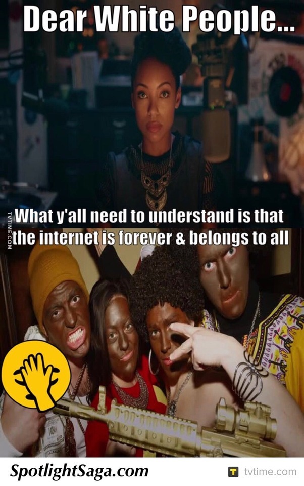
Kevin Cage of @spotlightsaga reviews... Dear White People (S01E01) Chapter 1 Airdate: April 28, 2017 @netflix @JSim07 Ratings: Privatized @DearWhitePeople Score: 7.5/10 TVTime/FB/Twitter/IG/Tumblr/Path/Pin: @SpotlightSaga **********SPOILERS BELOW********** Dear White People, Brown People, and any People who are reading, listening, watching, or paying attention... Eventually it was coming. Eventually this series had to be addressed. But how? The last thing a Sexually Fluid, White Scotch-Irish, Ginger Male in an 11 year+ gay relationship, living in an Argentinian neighborhood within a city that has massive pockets of square miles with +80% people who speak Spanish as a first language... Or large numbers of neighborhoods with Haitian-Creole voices blasting loudly from friendly faces throwing friendly waves from a group of old men, who for some reason are always sitting at a major bus stop in North Miami Beach (but never going anywhere or taking any busses), wants to be labeled as is a 'Pseudo' or even a 'Hardcore-Leftist' who's desperately out to prove that he isn't racist. You won't be getting that article from me. You won't be getting anything of the sort from this 10-Piece Project that I assure you I will be taking my time on. I am not Left. I am not right. I'm barely in the middle. This isn't political, though it might have political undertones and repercussions. That's on interpretation, not me. By now you know that Spotlight Saga never reviews anything in a traditional manner unless it's an everyday type series that doesn't carry a particular tense or emotional impact. We go at our own pace and I prefer existential challenges, but all are welcome. I had made promises to write articles to accompany 'Dear White People', brought to us by the new & true, multitalented Justin Simien, to multiple readers, but I was waiting for the right time. Sure, I have an army of unreleased articles and reviews ready to shoot out of an iOS cannon when I'm not feeling particularly inspired, but that just hasn't happened lately, so expect last second 'Big 4 Network' reviews to start spewing out sometime in September, because everything from 'Gotham' to 'Lucifer' to 'Colony' awaits you. Oh boy. Now let's get something straight, particularly to the people on Social Media whining and crying about the show's polarizing title, claiming to cancel (or to the ones who actually did cancel, though I doubt it) their Netflix subscriptions because the title evoked some sort of feeling of uncomfortable paranoia, or what they felt was divisive rhetoric, even though it was them who were attempting to divide themselves from Netflix and causing a stir... Ultimately giving the show free promotion in the process. DWP isn't a series that is out to make anyone feel shame, wagging a brown finger across your noses, or smacking you over the top of the head with a rolled up newspaper, preferably Sunday (because there are some people who actually deserve it). The show's main protagonist narrates the thoughts of Justin Simien directly and quite accurately, right off the bat. "Dear White People is a misnomer. My show is meant to articulate the feelings of a misrepresented group outside the majority." @jsouth71 on Twitter, one of many racist, idiot keyboard warriors (I'm personally singling out him because he no longer seems to be active - guess he came, he typed, and he successfully looked like an idiot), responded to the original trailer (legit on March 12, 2017, the show didn't even air until April 28th) with multiple hashtags claiming that Netflix was racist. His most hilarious claim (to me anyway) is the one claiming that the show, what it stands for, and those that support it are all full of #LiberalBS. Well what now, Joey Southworth? I'm not even Liberal, Black, or some sort of seemingly desperate apologist... I have no agenda, except to review a Netflix TV Series in a way like no one has ever done before and while doing so, tell you all MY story, my letter to White People, because there is one thing I won't do... Tell someone else's truth... Unless they ask me to, I am for hire, y'all. Ironically, Lionel (DeRon Horton), says something eerily similar to what I've just said and said before a million times. Some people, *coughAVCLUBcough*, don't understand that telling someone else's 'truth' isn't necessarily the point of journalism, but sometimes it does involve telling another person's story from your OWN perspective, after a little help from gaining a bit of someone else's. So let's kick this thing off, shall we? It's going to be a doozy! Samantha White aka Sam (Logan Browning - ah, yes we see the ironic juxtaposition of those names already, especially since the character is biracial) attends an Ivy League school called Winchester University and hosts a radio show on campus called 'Dear White People'. As the aforementioned quote pulled directly from Sam's mouth would suggest, she really just wants to be a voice not normally heard without some sort of filter or applied lens to trickle out what people feel safe with. Sam isn't prejudice or even remotely a bigot, she doesn't seem to be whatsoever. As a matter of fact, Sam's reactions to environmental stimuli and certain situations remind me of me. She is shown often attempting to pull back when faced with a possibility of reacting off of an emotion, but when that emotion becomes overwhelming, she caves and takes control by spiraling out of control. There is a blackface party on campus and it is quickly revealed by the end of the episode that the campus crew, Pastiche, had their Facebook hacked and invites were sent out after the school's administration had already shut down the idea of the party even going forward. Did Sam send it? Please remember we're talking E1, and I don't go beyond that. She claims to have sent the email in an emotionally provocative, genuinely stirring speech she delivers after her radio show is pushed to the sidelines. She had shown up for her time slot and someone else had taken her place due to the recent controversy. This all forces Sam to make a split, snap decision, overthrowing the DJ booth like a straight up BOSS... A prime example of what I mean when I say she 'takes control by spiraling out'. Sam is also seen videotaping the party and later editing & going over the footage. So far, 2+2=4, but if she did indeed do what she said she did, then she's not the only one playing games to prove a point. She's outed to have a white boyfriend, Gabe (John Patrick Amedori), who she seems to genuinely like and in turn he is definitely enamored with her. Yes, by the way, one can be racist and have a significant other of an alternate race (as we covered in an article in S2 of the E4 & Netflix series 'Chewing Gum' after talking with and interviewing several women of color from the Caribbean)... Thats related to the fetishization or perversion of race, skin color, or anything of the like, but that isn't what it looks like what is going on here. There's definitely some real life chemistry brewing. Of course, some of Sam's peers look at her with disdain after Gabe puts their ongoing, once secret relationship on blast with an Instagram pic and a hashtag... Amazing what hashtags are capable of these days, ammirite? Well, in this case it's less the hashtag and more of the 'tagging' of the pic done by Sam's arch nemesis, Coco (Antoinette Robinson - who my white, CW loving ass recognizes from the God-awful 3rd season of 'Hart of Dixie', yeah I see you, Lavon's Niece!)... All of this confusion and animosity is what Coco wanted but this isn't what she necessarily got, not in the exact form she was aiming for, at least. Here comes the fun part! Through self-reflection and talks with her best friend, Joelle (Ashley Blaine Featherson), Sam realizes she does in fact like Gabe and decides to embrace the couple's outing... Bringing him along to her usually, black only, weekly viewing of 'Defamation', a hilarious satire of Shonda Rhimes' (who might just answer this cheeky mockery, since she just scored herself a Netflix contract) ABC political thriller, or just plain dumbed down (sorry Rhimes' fans) version of 'Scandal' (as if it could go any lower). Ouch! Anyway, according to Sam, 'Defamation Wednesdays' are the cornerstone of black college campus life.' It's just that, well, Gabe is obviously feeling a bit 'fish out of water'... Come on, white people, think about how you feel when you are the only white person in the room, you get it right? Well, that's more than likely how your good friend of color feels when you invite them out and they are the only black person to show up at your Baby Shower, Birthday Party, 'Girls Night Out', whatever the event may be. It takes time. It's admirable that Gabe came, it truly is, but this isn't exactly the same situation that I used for environmental comparisons. Sam has a show called 'Dear White People' for Christ Sake, she has an obligation to stick to her guns, sure... But love is love, and as long as there is no perversion of skin going on, who the fuck cares? Mind your mother fucking own! Oh, but that's a tale as old as time, people just love to give no fucks about this or that, while simultaneously giving all kinds of fucks about who someone lays next to at night. I can attest to both of these things, or some version of it, at least... As I live in a part of the States where I'm the only white guy that's not a Euro-Tourist in an incredibly wide radius, also being in a gay relationship, I get quite a few double takes... And the giant Red Beard doesn't help. Yet, I've come to a point where I've been here so long and become so accustomed to a different environment, being amongst other white people makes me a tad uncomfortable. More on that another episode, another day. Reggie (Marque Richardson) isn't too happy about Gabe's presence at the 'Defamation' viewing party... I'm guessing it's a lot less because he's white and a lot more because Reggie feels like he should be the one holding Sam's hand. Reggie comes off as a bit of a jackass, then again, Gabe is not only encroaching on what appears to be Reggie's love interest, but he's also aggressively inserting himself into the group. It's not that Reggie, or most of Sam's friends and acquaintances are prejudice of intolerant, quite the opposite, really. It actually seems more like a 'too much, too soon' situation. Take race out of the equation for a second, take out that fact that Sam's ideals are being broadcasted over the radio, representing a whole lot of people. EVERYONE eyes the 'new' guy or gal in a group, especially if that new person is also a new significant other, I don't care who you are. It's always best to sit back, shut your mouth, and let people come to you... Not stick out your hand and affirm loudly that, 'Hi, I'm Gabe, and I'll be taking a prominent role here now, whether you like it or not.' I love the fact that just like we all have a long way to go as a society when it comes to understanding where everyone is coming from, why people feel what they feel, so do the characters of 'Dear White People', all of them... Black, White, and everyone in between... Especially the girl in between! Yes, it appears that Sam is telling the truth in her guerrilla takeover, emotionally charged, campus wide, broadcasted admission... And if she wasn't she appears very much ready to to take both the praise & the heat (something not yet shown in E1) that she was the one who hacked the Pastiche Facebook and sent out the invites, encouraging the culturally ignorant to show up in Blackface and other embarrassingly idiotic, culture appropriated, misfortunes of human error to a party that had already been given the axe... But the show is still playful in its righteous delivery. The narrator (Giancarlo Esposito) points out a white girl and guesses that she's in a Nicki Minaj costume... Later on, while in her feelings, Sam quickly switches her music from a soft, feminine country crooning track, Suzanna Spring's 'Some Blue Sky' to 'Black' by 'Innanet James' on her way to the radio station when passing a group of Black acquaintances... It's ok to laugh, it's ok to point out the confusing parts of a sliding identity. It's ok to be who you are as long as you are true to whoever that is... Unless your a fucking hateful asshole, then Fuck You. *Somebody cue a 'Run The Jewels' track, please* *********Written By: Kevin Cage********** http://www.tvtime.com http://www.facebook.com/spotlightsaga http://www.spotlightsaga.com http://www.facebook.com/groups/artsentertainment
#Dear White People#DWP#DWP 1x01#Dear White People 1x01#justin simien#Logan Browning#brandon p bell#deron horton#Antoinette Robertson#John Patrick Amedori#Ashley Blaine Featherson#giancarlo esposito#Marque Richardson#nia jervier#jemar michael#Wyatt Nash#jeremy tardy#Brandon Black#Mell Bowser#Marvin Lemus#Chapter 1#race relations#race#racism#tv ratings#tv#Netflix#netflixandchill#Spotlight Saga#Kevin Cage
1 note
·
View note
Text
What's Fortnite Vbucks as well as How might It Perform?
What Is Fortnite With The Digital Currency V
Despite Fortnite being one of the most popular games regarding that era, Epic Games' impressive battle royale say not appeared without its drawbacks. The journey it is getting appears to be leading to Loot Lake, and with under three weeks go pending the ending of the sport current time, it is demanded to touch the location before the issue of Fortnite Season 6. Every war may eat era with eat period will cost something especially when that working with a currency amount from Fortnite V Bucks Hack. You can see time period that will help you to focus on completing actions instantly.
It's already no technique that scammers have taken place wanting to make a fast buck by delivering gamers free V-Bucks, the digital currency that Fortnite players use to get new points with skins from the current battle royale activity. May became the most profitable month for which we have stats open, with Fortnite: Battle Royale bringing in $318 million (concrete post-May figures are challenging to find). That gets it the best-performing diversion of their sort before this metric.
If you've been looking at a certain skin or are trying to save up to get some new items you'll know all about Fortnite V-Bucks. They're the in-game currency to let you to pick up new products like skins and gliders for your Fortnite makeup with load-out. Move the low on Fortnite: Battle Royale, that is right now in time 7. In most multiplayer shooter games, your plan is to eliminate. This is not the indictment if you are going to play Fortnite. Your wish is to continue, not murder. For order, even if you kill 50 opponents, people might lose.
These cheats for Fortnite is 100% designing with authorized to use from the competition. You can simply find Unlimited V Dollars for PS4 by using these structures. Don't you worry, you may and get V Responsibilities For Xbox One, COMPUTER, iOS and Machine using the same approach. Traps are specifically useful in Fortnite, especially to protect the rear. Although it is not recommended to remain silent, if you opt for a passive game, try to recover the different types of corner (at the earth, on the walls) so as to shell you.
Epic Games: Fortnite Battle Royale says no direct the experience to kids under the age of 13 in the BRITISH. Father by April 13, players will be able to meet the Fortnite World Cup Open Qualifiers presented as a game approach in the setting selection screen. Each qualifier can give a total prize puddle of $1 million, which means Epic will distribute $10 million simply in Direct Qualifiers to the World Cup.
Part of Fortnite's increase to power has no doubt become their cross-platform availability, with everyday mobile gamers on the move able to participate with hardcore bedroom gamers on the same footing ( Sony was uncertain , but cross-play operation has lately been allowed for PS4 players ). Many from the FORTNITE V BUCKS GENERATOR websites out there are try to assure anyone that somehow the developers managed to cut into the FORTNITE Database, and thus they may acquire the unlimited free v-bucks into Campaign Royale game.
With Time 7 in full swing, version 7.01 can not look to exciting by contrast. That said, the new variety of Fortnite enters the Infinity Blade system from Epic Games' Infinity Blade series, the new Close Encounters limited-time mode, and more. Figure 2a: Data illustrates the estimated revenue by point manner with value go by Fortnite players May 2017 — June 2018, based on the Edison Trends dataset.
Never Suffer Through VBUCKS Again
If you're looking for other features to help shake up the Fortnite gameplay, be sure to look at these 40 awesome Fortnite Creative Island codes you can play today , and of course if you're a Fortnite Battle Royale player, be sure to check out our Fortnite Season 7: Week 8 Challenges call for facts and suggestions. The Fortnite season 6 Battle Pass costs 950 V Oppose. A bundle of 1,000 V Bucks can be got for £7.99.
If you want help with delivering the fortnite redeem in xbox stay or playstation or microsoft marketplace then consider the blog. If you could recognize and struggling to download fortnite game then write to us immediately to get support for the generator. V-Bucks are the most popular in-game hold for Fortnite players, being up 83% of items obtained and 88% of investing. While different V-Bucks amounts are designed for buy, the one most popular Fortnite point is 1,000 V-Bucks for $9.99, accounting for 53% of things got and 33% of spending.
Unfortunately, some Fortnite players, especially kids also teenagers, still fall for the many scams online next next to YouTube promising them V-Bucks. You can use the Fortnite Generator to get Free Fornite V Bucks, the procedure to do that is rather easy, once you got the application at your own pc, just launch Fortnite also lay the amount of Fortnite V Dollars to you need to get in your account, once you are made you just have to click on the Generate Buttons.
Fortnite: Save The planet is a house survival game using all the same gear and rifles as you'll notice in Fortnite Battle Royale, and controls the person with body defenses before looking down the attack of AI controlled zombies. Survive the night with people make rewards such when different systems, gear, traps with body materials to do it all once again. With take two different modes along with exist inside earlier access, it is wonder how lucky Fortnite runs both at home PVE and PVP modes. As such, you don't require a super powerful PC to play the game.
Epic Activity are trying to produce a miniature model of Fortnite Battle Royale for participants to enjoy with their supporters with creative mode, using a smaller starting circle. With rapid, I discovered a backdoor break into the repositories of several large gaming group. The Fortnite Battle Royale database allows me to charge as many sources when I want into any Fortnite Battle Royale account.
A Good VBUCKS Is...
youtube
Watch the latest episode of our Fortnite talk show Squad Up to get Patrick Warburton enjoy about controversy royale. One of the best things about building a COMPUTER for Fortnite is to, for a great in-game performance, you only really need 2 or more CPU cores. Kids could sometimes get V-Bucks without their parents' information, since the parents' status or debit cards are connected to the gaming account which employ to engage fortnite free v bucks in. Although the issue isn't exclusive to Fortnite, the situation with Fortnite has drawn particular interest because the game is so popular right now.
And so these were some of the best system that is usually used to find free v bucks in fortnite game without using any real money. Fortnite Battle Royale is an online multiplayer survival shooter developed by Epic Games , in which 100 players fight to be the last one rest with entertainment lasting less than forty seconds. It is a free game utilizing some mechanics on the original Fortnite, a success sandbox game, and many aspects on the war royale” type of sports.
The credit defense is our own top priority! Defend the story with allowing 2FA. As a compensate for keeping the bill, you'll uncover the Boogiedown Emote in Fortnite Battle Royale. It's unclear at this time exactly how the Hidden Treasure item will work, however. It'd make sense if the item somehow showed a rare, powerful tool hidden somewhere around the map—but most Fortnite fans don't know what to expect quite yet.
Using Vortex you can enjoy Fortnite with every way. Play Fortnite on last PC, Mac, mobile way or smart TV. Fortnite Battle Royale is the completely free 100-player PvP manner in Fortnite. One big chart. A challenge bus. Fortnite building skills and destructible environments combined with intense PvP combat. The last one place wins. Download now for FREE and leap into the action.
No one can actually pinpoint any hints which happen significant indicators of happy in Time 7. While many consider that this Fortnite map could be switched into a ‘Winter' theme in time for the Holiday's, this remains unclear that path Epic Games will take. In fact, you can hone your expertise from the sport and become one of the better Fortnite players without having to spend a single money in in-game purchases. However, purchasing V Bucks does have the benefits.
Flamemaster”, a tenth grader, says they are, Annoying, obnoxious, dangerous, and infuriating.” What has gone wrong? Of course, every activity gets the drawbacks, also I stay not wanting to prove how Fortnite is a bad game, just demonstrate the way many people who participate in this take ruined what could have been a respectable game. You will accept the e-mail alert if the rate of Fortnite - 10,000 (+3,500 Bonus) V-Bucks can stop.
Motion blur: Trying that upon puts a mist look while moving. This a graphic putting to certain players have, but for a competitive diversion of Fortnite, it will make things harder to accompany after shift in speed. Changing this down is suggested. Way the stats for Fortnite battle royale, complete with global leaderboards for single, couple and squad gamemodes. Unlike the vast majority of multiplayer shooters, the wish of Fortnite Battle Royale is to survive, not to have kills. This is perhaps the most important Fortnite suggestions to think of: you can get 98 kills and still lose.

You can turn off hardware rushing with Google Chrome therefore that history applications done by Chrome do not eat too many resources if you become performing Fortnite. Free Fortnite V Bucks Generator Ideal with Straightforward Way for 2019. Though, if you're not, then pay attention to this division also deliver very precisely. Since those fake V Bucks Hack can cause your ‘Fortnite account banned or blocked�� if you dropped to the trap.
Having moving storm groups with creative would and lived lucky acquired from the Fortnite competitive the public as players will be able to consistently practice hectic end-game scenarios commonly met on LAN events. Fortnite could also follow PUBG's example also insert news maps to spice up the gameplay (but made with Fortnite's signature, goofy way). More vehicles might be another interesting direction to go popular, with competitors PUBG , H1Z1 now Request of Function: Blackout successfully featuring vehicular gameplay.
0 notes
Text
Microsoft Band 2 review
How do you separate your wearable from the Android Put on as well as Apple Watch competitors? Microsoft attempted to do it with a concentrate on health and wellness for the Band, a fitness wearable that likewise did a great deal of exactly what Google as well as Apple's smartwatches could do. It definitely had not been perfect, but integrated GPS and also a detailed companion application implied it had genuine charm for tracking workout routines. When the company revealed a successor, I was enthusiastic it would enhance the original while keeping the attributes that made it so fascinating in the first place.
Design
First impressions declare. The initial Band was never ever the comfiest wearable-- actually, the underslung 2nd battery as well as rigid standard display made it so ungainly that I only used it when cycling to and also from the office, at all other times I took it off, as it obtained in the method when typing and battled to fit under a t-shirt belt. Microsoft has paid attention to its critics, as well as the follow up is much improved.
The level touchscreen is gone, changed with a rounded OLED panel that far better suits the shapes of your wrist. It's safeguarded by rounded Corning Gorilla Glass, too, which must prevent a great deal of the scratches that appeared on the initial model. OLED modern technology should mean better battery life compared to the LCD tech utilized in the initial, however it's still bright sufficient to see accurately in the daylight.
The second battery returns, but it's currently built right into the clasp as opposed to the rubber strap. This means the strap is much more flexible, so it's even more comfy all round. The hold system hasn't already altered a lot either, yet it is bigger than before making room for the second battery, UV sensor and also billing pins. With two different components it was consistently going to be thicker than other wearables, yet it's simply slim enough as to not enter the way.
There are still two physical buttons on the side, now every little thing is completed in silver metal rather compared to plastic. It definitely feels like a much more superior product, which is crucial if Microsoft desires it to take on the Apple Watch or any kind of Android Put on device.
Features
The original band was just one of one of the most feature-packed wearables around, sensing units consisted of optical heart price, ambient light, UV, skin temperature as well as galvanic skin response, plus a 3-axis accelerometer as well as GENERAL PRACTITIONER, among others. The Band 2 enhances on this count with a Measure for tracking elevation. Nevertheless, the holes required for the Measure and incorporated microphone to operate implies the Band isn't really water-proof-- just splash immune. This will certainly be an actual shame for swimmers, as they will not have the ability to utilize it to track their favourite form of exercise.
The microphone is just truly useful for Windows Phone individuals, as you cannot utilize Cortana voice control when you're matched to an apple iphone or Android mobile phone. It does not work with Siri or Google Now, so it's type of an useless enhancement for iOS and also Android proprietors. The first significant firmware upgrade for the Band 2 additionally added songs controls, a function that individuals had been weeping out for - this functions throughout systems, not just Windows Phone.
Notifications are a large part of any kind of wearable, as well as the Band 2 is no various. When paired by means of Bluetooth, the haptic motor shakes and also the screen brightens each time you obtain an e-mail, text message or call. You can also make it possible for other alerts, consisting of Facebook signals, Twitter notifications, and other apps you wish to send out messages right to your wrist.
Pressing the Activity switch will display each word onscreen in quick succession, allowing you check out even more of the headline, but mails are still truncated as well as there's no link between phone as well as band in regards to syncing, dismiss all notifications on your wrist and also they will still be unread on your handset, regardless of running system. It also disregards your phone's quiet hrs or Do Not Disturb modes, the Band itself has its very own Do Not Disrupt mode, yet it's irritating it does not identify this automatically.
The interface is primarily unmodified, with a series of straightforward icons representing messages, emails, calls, exercise, climate, alarms, sleep monitoring as well as even more, depending on just what you've enabled through the friend application. It responds promptly to swipes as well as faucets, but if you were really hoping for a new want to opt for the brand-new equipment you'll be left disappointed.
Battery life
If you do not make use of GPS, the Band 2 should last for around 2 Days in between costs. On some days this was a conservative number, however on others I was nearing 40 % by the time I would certainly made it home. However, with GENERAL PRACTITIONER allowed, I was cutting it close after biking to as well as from the workplace. That being stated, it only takes around 90 mins to fully charge, so a fast blast once you get home will certainly give you sufficient juice to obtain via a night of sleep tracking. Doing the very same in the early morning while you get all set for job will get you via the entire day. It's a renovation over the initial, where I either had to bring the proprietary wall charger in to work, or make it possible for GENERAL PRACTITIONERS for one leg of my pattern commute in order to last the entire day on a single charge.
2 notes
·
View notes
Text
This Meme Explains Why TikTok Isn’t Like Any Other Social Media
People think that TikTok is a black hole where teens jump in and memes pop out. To be sure, TikTok has both teens and memes. But the reality is much more structured than it seems.
TikTok is dominated by videos with a very rigid, formulaic structure: a song, a dance. “You Need to Calm Down” by Taylor Swift plays, and the person sets up a social scenario that ends with them lip-synching “You need to calm down, you’re being too loud.”
Most of TikTok is like Mad Libs: the specifics of the joke differ, but the punchline is always the same. At any given moment, there’s maybe five to ten sound bites—which could be songs, or original audio recorded by users—that are accumulating the majority of the views, sometimes hundreds of thousands in just hours.
Enter TikTok’s latest genre: point-of-view videos, or POVs. They create scenarios that range from horror, to historical fiction, to teenage fantasies, to the completely absurd. These videos often have little in common aside from the significant role that they assign to the viewer.
The traditional TikTok POV is shot from a first-person perspective, making the viewers the main character of the video. TikToker @porrinate, who identified himself as Adam, told Motherboard, “I think it makes it very personal to the viewer, because the video is through their eyes.”
Adam made a POV captioned “#pov you dont have a lunch at school and i offer you my entire lunch because i want you to be okay.” In this video, the viewer is a student that doesn’t have lunch. Adam speaks directly to them.
“I took it from my own experience, which was like, I didn’t get to eat that much in high school—and if I did, it was from somebody else,” Adam said. “So I would always feel like, people need to be more generous, especially towards those who are really struggling.”
The structure of an app helps decide what kind of posts are more likely to succeed. On Twitter, a blank slate of 280 characters, it’s attention-grabbing, ratio-inviting shit posts. On YouTube, where ad revenue can be low or unreliable, it’s lengthy, vlogger-style videos that are cheap to produce.
Meanwhile, TikTok encourages recycling sound bites which are used by sometimes thousands of videos. This has spawned a culture where people use familiar joke formats, and gently add a little bit of themselves.
By making viewers a part of the video, POVs uniquely allow creators to engage with viewers, and by extension, connect with their peers. POVs leverage TikTok to appeal to shared human experiences of joy, despair, embarrassment, and laughter. For now, at least, it’s something that sets TikTok apart from other social media apps.
Why POVs Could Only Happen on TikTok
People can post videos on Twitter or Facebook, but since users only see content from users they follow, those videos have a limited ability to spread. People who aren’t following you, most often, will simply miss the video you share. TikTok is different because of the app’s For You page, which pushes users to view videos from wide-reaching pool of users (even ones that you don’t follow).
The For You page surfaces posts from across the platform. It’s an algorithmically-generated recommendation feed, catered to each user. Unlike Twitter’s Moments tab or Instagram’s Discover page, which also surface posts from users you don’t follow, the For You opens automatically when a user launches the app. But we don’t know the specifics of how the For You page works. According to TikTok’s listing in the iOS App Store, some opaque mix of app engagementlikes, shares, and comments—dictates what users see.
Most TikToks only have 15 seconds to engage a viewer and maximize their reach on people’s For You pages. That’s a large part of why POVs are successful: they grab the viewer’s attention by pulling them into the plot of the video. The impact is immediate.
“Across different platforms, you think of the different types of cultures that have emerged,” Becca Lewis, an internet culture researcher with Data and Society, said in a phone call. “A lot of that is due to these artificial constraints platforms place on the type of content that gets created.”
The opacity of the For You algorithm has a huge impact on TikTok. If you’re trying to make a popular video, it makes sense to stick to one of the Mad Libs formulas that dominate the For You page on a given day. It’s the act of reaching for the biggest-common-content-denominator in a vast pool of videos whose logic you can’t see.
Here are some memes that are popular at the time of writing:
“Wasabi” by Little Mix plays and people lip sync the lyrics while using TikTok’s ��face-tracking” filter, which identifies and zooms in on your face.
“One Jump Ahead” from Aladdin plays and people lip sync the line “Let’s not be too hasty,” and the reply “Still I think he’s rather tasty,” usually while the user pretends to be two different characters.
“No Reason” by YunggTez plays and people act out a situation in which they convey confidence, attitude, and a lack of regard for others.
Nir Eyal, author of Hooked: How to Build Habit-Forming Products, said in a phone call that users won’t make a habit out of an app unless there’s a “variable reward”—or, a variety of entertaining content. Without that variety, users get bored.
“The problem I think that TikTok is struggling with is that they depend on the meme model,” Eyal said. “Because if everybody does the meme the same way, what happens to the variability? It becomes predictable. The predictability makes it boring. Nobody wants to see the meme because they already saw it.”
But POVs are anything but predictable. Instead of appealing to a common meme formula, POVs appeal to a common humanity. They put the viewer into the messy center of an emotional situation.
Take this TikTok by Olivia Giordano, for example. The caption is, “there’s not enough seats at the lunch table today, so you have nowhere to sit.” In this video, the viewer is the person who can’t get a seat at the lunch table. It’s like exposure therapy, violently bringing viewers face-to-face with the shame, humiliation, and sadness of living through this particular situation. But the viewer experiences these feelings in a safe setting: TikTok.
A similar video is captioned, “ur teacher lets u pick partners but u have 2 friends in ur class who partnered up.” In this video, you’re watching yourself try to team up with a friend for a group project, but quickly realize that your friends both chose one another before you.
By acknowledging that these uncomfortable experiences exist, these POV videos lend significance to experiences that young people often have to dismiss in order to get by.
A lot of POVs focus on acting out a true-to-reality situation. For instance, TikTok user @yazdemand made a POV captioned, “#pov your my mirror after My family say that ‘you will always be a boy.’” Viewers watch the private, vulnerable moments of this teenager getting ready. There’s a tension, and you can feel her confidence and apprehension playing out simultaneously. People going through a similar situation can find community.
A Yeet into the Spectrum of POVs
Not all POVs are exposure therapy for the cruelty of being a teenager, or heartfelt experience confessionals. A pillar of the POV genre is the massive selection of videos that rely on humor and sometimes absurdity.
A great example of this is a TikTok captioned, “i’m ur dumb jock crush. you tell me you’re feeling depressed. i try to make it better.” In it, user @idrinkvapejuice acts out the crush’s reply to her admission of depression.
Other videos, like “POV: what my birth control sees when i remember i have to take it” and “POV: im checking ur head for lice (and u have it)” are pretty self explanatory. There’s also videos like “Pov. our eyes meet at the Area 51 raid” (which is a poking fun at a POV formula that starts with “our eyes meet”).
But the POV genre, and TikTok in general, isn’t immune to harassment and hate speech problems that plague social media. Jess Fisher, TikTok user @jess.fisher5 has a recurring TikTok series where she pretends to be the personification of each astrological sign. In her POV video, captioned “#wholesome TAURUS POV,” Fisher acts like the personification of Tauruses, who are generally defined as compassionate, loyal, and sometimes parental.
Fisher said that this POV got an unexpected response: a flood of duets—or new videos that are displayed directly alongside an original video—and comments from old men.
“Not all of them, but a lot of [the comments] were like, ‘I’m gonna rip that shirt off of you,’ and things like that,” Fisher said.
The duets for Fisher’s video exist in a grey area: most of them don’t violate TikTok’s terms of use. It’s not against the rules to duet a video with a suggestive smile and comment. But the response was somewhat violating, she said. (A TikTok spokesperson encouraged users to visit its Safety Center for information about responding to misuse.)
“[The video] did make me think that maybe POV just strikes a chord in people,” Fisher said. “It hits them in a different way than normal videos do.”
POVs Make TikTok Feel Human
Fisher said that POVs make sense in the larger history of TikTok. TikTok, in its original form, was called musical.ly, and musical.ly was dedicated almost entirely to lip-sync videos. Fisher said that the foundation of these lip-sync videos probably lent itself to the creation of the POV genre.
“They could just be lip synching a song with intention, but it’s also like making the viewer feel like they’re being looked at, or being seen,” Fisher said. “The only difference between that type of thing and the POV genre is putting their own dialogue to it and writing it themselves. Like content creation rather than just lip synch.”
Platforms like Facebook often talk about how they want to “bring the world closer together.” But this isn’t easy for any social media platform to accomplish. Often, it seems, meaningful online experiences are built on finding communities with shared experiences.
This is what’s happened with POVs on TikTok. There’s countless different iterations of POVs: there’s humor, fiction, cosplay, fantasy, historical skits, and realistic ones, and there’s innumerable niches that have grown out of these subgroups.
This phenomenon seems to defy the odds: the TikTok For You page, in its seeming randomness, connects people with obscure mutual experiences. The result is something that feels fundamentally human.
This Meme Explains Why TikTok Isn’t Like Any Other Social Media syndicated from https://triviaqaweb.wordpress.com/feed/
0 notes
Text
Apple Will Gives By An iPad Pro 11 Of Its Full Review 2019
Apple believes that the new iPad Pro is the biggest reorganization of the device since the original - it has a focus. There is no home button. This is a stylish 'full screen' design. It has a powerful internal structure, and the laptops stare nervously at each other.
The question is, is it worthwhile to buy one for your wallet? If you are already a normal and happy iPad user, you may already know the answer; but if you are new to tablet games, Apple's approach may surprise you.
Design: It Is The Edge Of The GOT
The new iPad Pro is still a piece of glass and metal, but still feels a bit radical. The new style looks expensive and recalls the iPhone 5 (aka Stuff's favorite iPhone). Initially, I questioned how these edges compare to the curved back of the old iPad.
It turns out that the new iPad feels great even in long-term use. Weight (or rather lack of weight) is one of the factors. The new 11-inch iPad Pro is basically matched to the 10.5-inch iPad Pro and weighs 468 grams. The 12.9-inch model is smaller than the previous model, and the 631-gram is even 50 grams lighter than the original iPad.
The new design on the screen is also balanced. The bezel is even on both sides, and the curve of the display is the same as the curve of the device frame - more spectacular than the LCD XR LCD. It makes the 10.5-inch model look older.
Display And Sound: Screen Time
Considering that there are still bezels, it is a bit nervous to call the new iPad "full screen." But black boxes are not a problem and can help you focus on the content. In addition, Apple plugged the new Face ID camera into it without the use of a groove, which seemed ridiculous on the device.
The 12.9-inch iPad Pro retains the resolution of its predecessor, the 2732x2048, at 264ppi - not as clear as a smartphone, but the distance when using the iPad is not bad. 11 inches makes you 2388x1668, also 264ppi. This is an improvement over last year's 10.5-inch model (2048x1536) and is the first iPad without a 4:3 aspect ratio - it has a wider score.
Despite being an iPad fingerprint magnet, the iPad Pro's display makes it more practical in a bright room than a regular old iPad. Apple's ProMotion and True Tone technologies ensure responsiveness and adaptability to your viewing environment, respectively.
Performance: Excellent Speed
When it comes to the A12X biochip of the iPad Pro core, Apple lingers on it. According to reports, it has sold more than 92% of laptops in the past 12 months and is significantly better than last year's iPad Pro - which is not awkward.
In use, it handles everything I've invested, from complex multi-layered images in Affinity Photo to synthetic heavy Korg Gadget combinations that have killed my iMac many years ago. If you want statistics, Geekbench has a single-core score of 11 inches and a single core of 18,000 miles. This is not far from your expectations for the 15-inch MacBook Pro.
In a more general sense, the iPad Pro is also available. Click on the screen to wake up immediately. Flick the screen and it scrolls smoothly. Even the Face ID has been improved to work in any direction, angle and direction away from the iPhone XS Max. Returning to the Touch ID on the old iPad Pro is like a punishment.
Software: Mainly APPY
In most cases, iOS 12 is impressive. Although I have seen a variety of people who are dissatisfied with the lack of professional apps for the iPad Pro, it depends on what you mean about pro.
Of course, even now, you may not be able to do everything you need on the iPad Pro; but whether you should buy such a device may depend on what you can do - and whether you can do better. For example, if I can minimize interference, I will be more efficient and willing to create music when I leave the office - this is what the iPad Pro is good at. But do I want to manage spreadsheets? not really.
In general, the best high-end apps have been carefully crafted and optimized for the iPad - if not (yet), so is the new screen size. In contrast, Android's performance on tablets is relatively poor. However, Apple can iterate over professional-level workflows faster - iOS 12 still feels rooted in a single-tasking workflow. For example, only a handful of applications provide a two-way view of the document; and splitting the view with multiple applications is still cumbersome.
Accessories: A Sticky Item
Apple's Improved Accessories For The New Ipad Pro, Apple Pencil (£119) And Smart Keyboard Folio (£179) Are The Most Interesting. Both Show A Relaxed Elegance About Their Connection, But Pencils Are Especially Unsuccessful.
The New Pencil Dexterously Handles The Shortcomings Of Its Predecessor. It Is Connected To The Ipad Pro Via A Magnet For Pairing And Wireless Charging. The Flat Edge Improves Your Grip And Prevents The Pencil From Rolling Off The Table. There Is A Double-Click Gesture That Can Be Configured According To The Application - In Procreate, It Can Launch A Radial Menu; In Liquidtext, You Can Circle The Content Of The Document And Then Double-Click To Slide The Extracted Excerpt From The Workspace. Brilliant.
Folio Is Instantly Connected, Simple To Set Up, But More Versatile To Use. Typing Things Didn't Click On Me, I Was Much Slower Than The Standard Apple Keyboard. Significant Jitter Can Occur When You Click On The Ipad's Screen. In Addition, It Is Strange To Fold Folio And Finally Grab The Key.
It Also Shows A Slight Disconnect, Because Apple's Laptops Say That Ergonomics Is An Important Reason To Avoid Using A Touchscreen Mac, Because You Have To Use The Screen Often - And The Docked Ipad Requires You To Do This. I'm Not Sure What The Solution Is, But When You Use Folio Or Any Other Keyboard, Ios Needs To Help You Reduce Interaction With The Screen.
Connectivity: Insertion And Prayer
A Quick Look At The Edge Of The Ipad Pro, You Will Find That Its Predecessor's Two Ports Are Now Gone. I Don't Have A Standard Headphone Port, I Am Not Happy Because I Often Use Wired Cans To Play Music. (Yes, There Is A Dongle That Is Easy To Lose.) However, Lightning Has Become A History That Benefits Usb-C.
This Opens Up The World Of Ipad Pro, And When Apple Shows Me The Unit Connected To A 4k Display, This Is Most Obvious And May Result In Dual Display Settings When Editing Video. But Now, There Are Some Weird Restrictions. For Example, You Can't Connect To Usb-C External Storage And Rummaging Through It In A File. Even Apple's Usb-C Sd Card Readers Require You To Put Images Into Apple's Photo App And Then Send It To Other Places.
Another Problem Is That Apple's Ecosystem Is Now Somewhat Inconsistent With The Connection. I Hope That Ipad Pro Is Not A One-Off, But Represents The Beginning Of The Transition, Lightning Tends To Support Usb-C On Every Ios Device. If Not, You Better Hope That You Have A Bunch Of Dongles Necessary.
iPad Pro (2018) Verdict
Last Year's Ipad Pro 10.5in Was The Best Tablet You Bought. Apple Could Have Launched The A12x And It Is Still The Case. Instead, Apple Added A New Design, Face Id And A Great New Pencil. But We Also Got Another Round To Find The Dongle, The Price Rise And The Weirdness Of Some Common Apps, And The Developers Redesigned Their Products To Another Screen Resolution While Hitting Their Heads On Their Desks .
So Is The Expenditure Worthwhile? Yes. For Me, At Least. Of Course, The Ipad Pro Is Not Cheap, But It Is A Different Mobile Giant With A Diverse And Rich App Ecosystem, Powerful Features, Gorgeous Screens, And Attention To Creativity And Productivity, Which Is Not Exist On Other Tablets
If You Just Want To Excel On Facebook And Netflix, Then Of Course It's A Big Overkill, But With A Standard Ipad, There Are Even A Lot Of Android/Amazon Tablets. Still, Even If You Don't Need A New Ipad Pro, You Can Put It In Your Glove For Five Minutes, And You Might Need One.
If you are looking for a tablet repair centre in the UK, then visit Tabletrepairer.co.uk offering same day repairs and while you wait tablet repairs.
For more details, visit Tabletrepairer.co.uk
0 notes
Link
At the beginning of this year, I was using my iPhone to browse new titles on Amazon when I saw the cover of “How to Break Up With Your Phone” by Catherine Price. I downloaded it on Kindle because I genuinely wanted to reduce my smartphone use, but also because I thought it would be hilarious to read a book about breaking up with your smartphone on my smartphone (stupid, I know). Within a couple of chapters, however, I was motivated enough to download Moment, a screen time tracking app recommended by Price, and re-purchase the book in print.
Early in “How to Break Up With Your Phone,” Price invites her readers to take the Smartphone Compulsion Test, developed by David Greenfield, a psychiatry professor at the University of Connecticut who also founded the Center for Internet and Technology Addiction. The test has 15 questions, but I knew I was in trouble after answering the first five. Humbled by my very high score, which I am too embarrassed to disclose, I decided it was time to get serious about curtailing my smartphone usage.
Of the chapters in Price’s book, the one called “Putting the Dope in Dopamine” resonated with me the most. She writes that “phones and most apps are deliberately designed without ‘stopping cues’ to alert us when we’ve had enough—which is why it’s so easy to accidentally binge. On a certain level, we know that what we’re doing is making us feel gross. But instead of stopping, our brains decide the solution is to seek out more dopamine. We check our phones again. And again. And again.”
Gross was exactly how I felt. I bought my first iPhone in 2011 (and owned an iPod Touch before that). It was the first thing I looked at in the morning and the last thing I saw at night. I would claim it was because I wanted to check work stuff, but really I was on autopilot. Thinking about what I could have accomplished over the past eight years if I hadn’t been constantly attached to my smartphone made me feel queasy. I also wondered what it had done to my brain’s feedback loop. Just as sugar changes your palate, making you crave more and more sweets to feel sated, I was worried that the incremental doses of immediate gratification my phone doled out would diminish my ability to feel genuine joy and pleasure.
Price’s book was published in February, at the beginning of a year when it feels like tech companies finally started to treat excessive screen time as a liability (or at least do more than pay lip service to it). In addition to the introduction of Screen Time in iOS 12 and Android’s digital wellbeing tools, Facebook, Instagram and YouTube all launched new features that allow users to track time spent on their sites and apps.
Early this year, influential activist investors who hold Apple shares also called for the company to focus on how their devices impact kids. In a letter to Apple, hedge fund Jana Partners and California State Teachers’ Retirement System (CalSTRS) wrote “social media sites and applications for which the iPhone and iPad are a primary gateway are usually designed to be as addictive and time-consuming as possible, as many of their original creators have publicly acknowledged,” adding that “it is both unrealistic and a poor long-term business strategy to ask parents to fight this battle alone.”
The growing mound of research
Then in November, researchers at Penn State released an important new study that linked social media usage by adolescents to depression. Led by psychologist Melissa Hunt, the experimental study monitored 143 students with iPhones from the university for three weeks. The undergraduates were divided into two groups: one was instructed to limit their time on social media, including Facebook, Snapchat and Instagram, to just 10 minutes each app per day (their usage was confirmed by checking their phone’s iOS battery use screens). The other group continued using social media apps as they usually did. At the beginning of the study, a baseline was established with standard tests for depression, anxiety, social support and other issues, and each group continued to be assessed throughout the experiment.
The findings, published in the Journal of Social and Clinical Psychology, were striking. The researchers wrote that “the limited use group showed significant reductions in loneliness and depression over three weeks compared to the control group.”
Even the control group benefitted, despite not being given limits on their social media use. “Both groups showed significant decreases in anxiety and fear of missing out over baselines, suggesting a benefit of increased self-monitoring,” the study said. “Our findings strongly suggest that limiting social media use to approximately 30 minutes a day may lead to significant improvement in well-being.”
Other academic studies published this year added to the growing roster of evidence that smartphones and mobile apps can significantly harm your mental and physical wellbeing.
A group of researchers from Princeton, Dartmouth, the University of Texas at Austin, and Stanford published a study in the Journal of Experimental Social Psychology that found using smartphones to take photos and videos of an experience actually reduces the ability to form memories of it. Others warned against keeping smartphones in your bedroom or even on your desk while you work. Optical chemistry researchers at the University of Toledo found that blue light from digital devices can cause molecular changes in your retina, potentially speeding macular degeneration.
So over the past 12 months, I’ve certainly had plenty of motivation to reduce my screen time. In fact, every time I checked the news on my phone, there seemed to be yet another headline about the perils of smartphone use. I began using Moment to track my total screen time and how it was divided between apps. I took two of Moment’s in-app courses, “Phone Bootcamp” and “Bored and Brilliant.” I also used the app to set a daily time limit, turned on “tiny reminders,” or push notifications that tell you how much time you’ve spent on your phone so far throughout the day, and enabled the “Force Me Off When I’m Over” feature, which basically annoys you off your phone when you go over your daily allotment.
At first I managed to cut my screen time in half. I had thought some of the benefits, like a better attention span mentioned in Price’s book, were too good to be true. But I found my concentration really did improve significantly after just a week of limiting my smartphone use. I read more long-form articles, caught up on some TV shows, and finished knitting a sweater for my toddler. Most importantly, the nagging feeling I had at the end of each day about frittering all my time away diminished, and so I lived happily after, snug in the knowledge that I’m not squandering my life on memes, clickbait and makeup tutorials.
Just kidding.
Holding my iPod Touch in 2010, a year before I bought my first smartphone and back when I still had an attention span.
After a few weeks, my screen time started creeping up again. First I turned off Moment’s “Force Me Off” feature, because my apartment doesn’t have a landline and I needed to be able to check texts from my husband. I kept the tiny reminders, but those became easier and easier to ignore. But even as I mindlessly scrolled through Instagram or Reddit, I felt the existentialist dread of knowing that I was misusing the best years of my life. With all that at stake, why is limiting screen time so hard?
I wish I knew how to quit you, small device
I decided to talk to the CEO of Moment, Tim Kendall, for some insight. Founded in 2014 by UI designer and iOS developer Kevin Holesh, Moment recently launched an Android version, too. It’s one of the best known of a genre that includes Forest, Freedom, Space, Off the Grid, AntiSocial and App Detox, all dedicated to reducing screen time (or at least encouraging more mindful smartphone use).
Kendall told me that I’m not alone. Moment has 7 million users and “over the last four years, you can see that average usage goes up every year,” he says. By looking at overall data, Moment’s team can tell that its tools and courses do help people reduce their screen time, but that often it starts creeping up again. Combating that with new features is one of the company’s main goals for next year.
“We’re spending a lot of time investing in R&D to figure out how to help people who fall into that category. They did Phone Bootcamp, saw nice results, saw benefits, but they just weren’t able to figure out how to do it sustainably,” says Kendall. Moment already releases new courses regularly (recent topics have included sleep, attention span, and family time) and recently began offering them on a subscription basis.
“It’s habit formation and sustained behavior change that is really hard,” says Kendall, who previously held positions as president at Pinterest and Facebook’s director of monetization. But he’s optimistic. “It’s tractable. People can do it. I think the rewards are really significant. We aren’t stopping with the courses. We are exploring a lot of different ways to help people.”
As Jana Partners and CalSTRS noted in their letter, a particularly important issue is the impact of excessive smartphone use on the first generation of teenagers and young adults to have constant access to the devices. Kendall notes that suicide rates among teenagers have increased dramatically over the past two decades. Though research hasn’t explicitly linked time spent online to suicide, the link between screen time and depression has been noted many times already, as in the Penn State study.
But there is hope. Kendall says that the Moment Coach feature, which delivers short, daily exercises to reduce smartphone use, seems to be particularly effective among millennials, the generation most stereotypically associated with being pathologically attached to their phones. “It seems that 20- and 30-somethings have an easier time internalizing the coach and therefore reducing their usage than 40- and 50-somethings,” he says.
Kendall stresses that Moment does not see smartphone use as an all-or-nothing proposition. Instead, he believes that people should replace brain junk food, like social media apps, with things like online language courses or meditation apps. “I really do think the phone used deliberately is one of the most wonderful things you have,” he says.
Researchers have found that taking smartphone photos and videos during an experience may decrease your ability to form memories of it. (Steved_np3/Getty Images)
I’ve tried to limit most of my smartphone usage to apps like Kindle, but the best solution has been to find offline alternatives to keep myself distracted. For example, I’ve been teaching myself new knitting and crochet techniques, because I can’t do either while holding my phone (though I do listen to podcasts and audiobooks). It also gives me a tactile way to measure the time I spend off my phone because the hours I cut off my screen time correlate to the number of rows I complete on a project. To limit my usage to specific apps, I rely on iOS Screen Time. It’s really easy to just tap “Ignore Limit,” however, so I also continue to depend on several of Moment’s features.
While several third-party screen time tracking app developers have recently found themselves under more scrutiny by Apple, Kendall says the launch of Screen Time hasn’t significantly impacted Moment’s business or sign ups. The launch of their Android version also opens up a significant new market (Android also enables Moment to add new features that aren’t possible on iOS, including only allowing access to certain apps during set times).
The short-term impact of iOS Screen Time has “been neutral, but I think in the long-term it’s really going to help,” Kendall says. “I think in the long-term it’s going to help with awareness. If I were to use a diet metaphor, I think Apple has built a terrific calorie counter and scale, but unfortunately they have not given people nutritional guidelines or a regimen. If you talk to any behavioral economist, not withstanding all that’s been said about the quantified self, numbers don’t really motivate people.”
Guilting also doesn’t work, at least not for the long-term, so Moment tries to take “a compassionate voice,” he adds. “That’s part of our brand and company and ethos. We don’t think we’ll be very helpful if people feel judged when we use our product. They need to feel cared for and supported, and know that the goal is not perfection, it’s gradual change.”
Many smartphone users are probably in my situation: alarmed by their screen time stats, unhappy about the time they waste, but also finding it hard to quit their devices. We don’t just use our smartphones to distract ourselves or get a quick dopamine rush with social media likes. We use it to manage our workload, keep in touch with friends, plan our days, read books, look up recipes, and find fun places to go. I’ve often thought about buying a Yondr bag or asking my husband to hide my phone from me, but I know that ultimately won’t help.
As cheesy as it sounds, the impetus for change must come from within. No amount of academic research, screen time apps, or analytics can make up for that.
One thing I tell myself is that unless developers find more ways to force us to change our behavior or another major paradigm shift occurs in mobile communications, my relationship with my smartphone will move in cycles. Sometimes I’ll be happy with my usage, then I’ll lapse, then I’ll take another Moment course or try another screen time app, and hopefully get back on track. In 2018, however, the conversation around screen time finally gained some desperately needed urgency (and in the meantime, I’ve actually completed some knitting projects instead of just thumbing my way through #knittersofinstagram).
from TechCrunch https://tcrn.ch/2EPgHLh
0 notes
Link
At the beginning of this year, I was using my iPhone to browse new titles on Amazon when I saw the cover of “How to Break Up With Your Phone” by Catherine Price. I downloaded it on Kindle because I genuinely wanted to reduce my smartphone use, but also because I thought it would be hilarious to read a book about breaking up with your smartphone on my smartphone (stupid, I know). Within a couple of chapters, however, I was motivated enough to download Moment, a screen time tracking app recommended by Price, and re-purchase the book in print.
Early in “How to Break Up With Your Phone,” Price invites her readers to take the Smartphone Compulsion Test, developed by David Greenfield, a psychiatry professor at the University of Connecticut who also founded the Center for Internet and Technology Addiction. The test has 15 questions, but I knew I was in trouble after answering the first five. Humbled by my very high score, which I am too embarrassed to disclose, I decided it was time to get serious about curtailing my smartphone usage.
Of the chapters in Price’s book, the one called “Putting the Dope in Dopamine” resonated with me the most. She writes that “phones and most apps are deliberately designed without ‘stopping cues’ to alert us when we’ve had enough—which is why it’s so easy to accidentally binge. On a certain level, we know that what we’re doing is making us feel gross. But instead of stopping, our brains decide the solution is to seek out more dopamine. We check our phones again. And again. And again.”
Gross was exactly how I felt. I bought my first iPhone in 2011 (and owned an iPod Touch before that). It was the first thing I looked at in the morning and the last thing I saw at night. I would claim it was because I wanted to check work stuff, but really I was on autopilot. Thinking about what I could have accomplished over the past eight years if I hadn’t been constantly attached to my smartphone made me feel queasy. I also wondered what it had done to my brain’s feedback loop. Just as sugar changes your palate, making you crave more and more sweets to feel sated, I was worried that the incremental doses of immediate gratification my phone doled out would diminish my ability to feel genuine joy and pleasure.
Price’s book was published in February, at the beginning of a year when it feels like tech companies finally started to treat excessive screen time as a liability (or at least do more than pay lip service to it). In addition to the introduction of Screen Time in iOS 12 and Android’s digital wellbeing tools, Facebook, Instagram and YouTube all launched new features that allow users to track time spent on their sites and apps.
Early this year, influential activist investors who hold Apple shares also called for the company to focus on how their devices impact kids. In a letter to Apple, hedge fund Jana Partners and California State Teachers’ Retirement System (CalSTRS) wrote “social media sites and applications for which the iPhone and iPad are a primary gateway are usually designed to be as addictive and time-consuming as possible, as many of their original creators have publicly acknowledged,” adding that “it is both unrealistic and a poor long-term business strategy to ask parents to fight this battle alone.”
The growing mound of research
Then in November, researchers at Penn State released an important new study that linked social media usage by adolescents to depression. Led by psychologist Melissa Hunt, the experimental study monitored 143 students with iPhones from the university for three weeks. The undergraduates were divided into two groups: one was instructed to limit their time on social media, including Facebook, Snapchat and Instagram, to just 10 minutes each app per day (their usage was confirmed by checking their phone’s iOS battery use screens). The other group continued using social media apps as they usually did. At the beginning of the study, a baseline was established with standard tests for depression, anxiety, social support and other issues, and each group continued to be assessed throughout the experiment.
The findings, published in the Journal of Social and Clinical Psychology, were striking. The researchers wrote that “the limited use group showed significant reductions in loneliness and depression over three weeks compared to the control group.”
Even the control group benefitted, despite not being given limits on their social media use. “Both groups showed significant decreases in anxiety and fear of missing out over baselines, suggesting a benefit of increased self-monitoring,” the study said. “Our findings strongly suggest that limiting social media use to approximately 30 minutes a day may lead to significant improvement in well-being.”
Other academic studies published this year added to the growing roster of evidence that smartphones and mobile apps can significantly harm your mental and physical wellbeing.
A group of researchers from Princeton, Dartmouth, the University of Texas at Austin, and Stanford published a study in the Journal of Experimental Social Psychology that found using smartphones to take photos and videos of an experience actually reduces the ability to form memories of it. Others warned against keeping smartphones in your bedroom or even on your desk while you work. Optical chemistry researchers at the University of Toledo found that blue light from digital devices can cause molecular changes in your retina, potentially speeding macular degeneration.
So over the past 12 months, I’ve certainly had plenty of motivation to reduce my screen time. In fact, every time I checked the news on my phone, there seemed to be yet another headline about the perils of smartphone use. I began using Moment to track my total screen time and how it was divided between apps. I took two of Moment’s in-app courses, “Phone Bootcamp” and “Bored and Brilliant.” I also used the app to set a daily time limit, turned on “tiny reminders,” or push notifications that tell you how much time you’ve spent on your phone so far throughout the day, and enabled the “Force Me Off When I’m Over” feature, which basically annoys you off your phone when you go over your daily allotment.
At first I managed to cut my screen time in half. I had thought some of the benefits, like a better attention span mentioned in Price’s book, were too good to be true. But I found my concentration really did improve significantly after just a week of limiting my smartphone use. I read more long-form articles, caught up on some TV shows, and finished knitting a sweater for my toddler. Most importantly, the nagging feeling I had at the end of each day about frittering all my time away diminished, and so I lived happily after, snug in the knowledge that I’m not squandering my life on memes, clickbait and makeup tutorials.
Just kidding.
Holding my iPod Touch in 2010, a year before I bought my first smartphone and back when I still had an attention span.
After a few weeks, my screen time started creeping up again. First I turned off Moment’s “Force Me Off” feature, because my apartment doesn’t have a landline and I needed to be able to check texts from my husband. I kept the tiny reminders, but those became easier and easier to ignore. But even as I mindlessly scrolled through Instagram or Reddit, I felt the existentialist dread of knowing that I was misusing the best years of my life. With all that at stake, why is limiting screen time so hard?
I wish I knew how to quit you, small device
I decided to talk to the CEO of Moment, Tim Kendall, for some insight. Founded in 2014 by UI designer and iOS developer Kevin Holesh, Moment recently launched an Android version, too. It’s one of the best known of a genre that includes Forest, Freedom, Space, Off the Grid, AntiSocial and App Detox, all dedicated to reducing screen time (or at least encouraging more mindful smartphone use).
Kendall told me that I’m not alone. Moment has 7 million users and “over the last four years, you can see that average usage goes up every year,” he says. By looking at overall data, Moment’s team can tell that its tools and courses do help people reduce their screen time, but that often it starts creeping up again. Combating that with new features is one of the company’s main goals for next year.
“We’re spending a lot of time investing in R&D to figure out how to help people who fall into that category. They did Phone Bootcamp, saw nice results, saw benefits, but they just weren’t able to figure out how to do it sustainably,” says Kendall. Moment already releases new courses regularly (recent topics have included sleep, attention span, and family time) and recently began offering them on a subscription basis.
“It’s habit formation and sustained behavior change that is really hard,” says Kendall, who previously held positions as president at Pinterest and Facebook’s director of monetization. But he’s optimistic. “It’s tractable. People can do it. I think the rewards are really significant. We aren’t stopping with the courses. We are exploring a lot of different ways to help people.”
As Jana Partners and CalSTRS noted in their letter, a particularly important issue is the impact of excessive smartphone use on the first generation of teenagers and young adults to have constant access to the devices. Kendall notes that suicide rates among teenagers have increased dramatically over the past two decades. Though research hasn’t explicitly linked time spent online to suicide, the link between screen time and depression has been noted many times already, as in the Penn State study.
But there is hope. Kendall says that the Moment Coach feature, which delivers short, daily exercises to reduce smartphone use, seems to be particularly effective among millennials, the generation most stereotypically associated with being pathologically attached to their phones. “It seems that 20- and 30-somethings have an easier time internalizing the coach and therefore reducing their usage than 40- and 50-somethings,” he says.
Kendall stresses that Moment does not see smartphone use as an all-or-nothing proposition. Instead, he believes that people should replace brain junk food, like social media apps, with things like online language courses or meditation apps. “I really do think the phone used deliberately is one of the most wonderful things you have,” he says.
Researchers have found that taking smartphone photos and videos during an experience may decrease your ability to form memories of it. (Steved_np3/Getty Images)
I’ve tried to limit most of my smartphone usage to apps like Kindle, but the best solution has been to find offline alternatives to keep myself distracted. For example, I’ve been teaching myself new knitting and crochet techniques, because I can’t do either while holding my phone (though I do listen to podcasts and audiobooks). It also gives me a tactile way to measure the time I spend off my phone because the hours I cut off my screen time correlate to the number of rows I complete on a project. To limit my usage to specific apps, I rely on iOS Screen Time. It’s really easy to just tap “Ignore Limit,” however, so I also continue to depend on several of Moment’s features.
While several third-party screen time tracking app developers have recently found themselves under more scrutiny by Apple, Kendall says the launch of Screen Time hasn’t significantly impacted Moment’s business or sign ups. The launch of their Android version also opens up a significant new market (Android also enables Moment to add new features that aren’t possible on iOS, including only allowing access to certain apps during set times).
The short-term impact of iOS Screen Time has “been neutral, but I think in the long-term it’s really going to help,” Kendall says. “I think in the long-term it’s going to help with awareness. If I were to use a diet metaphor, I think Apple has built a terrific calorie counter and scale, but unfortunately they have not given people nutritional guidelines or a regimen. If you talk to any behavioral economist, not withstanding all that’s been said about the quantified self, numbers don’t really motivate people.”
Guilting also doesn’t work, at least not for the long-term, so Moment tries to take “a compassionate voice,” he adds. “That’s part of our brand and company and ethos. We don’t think we’ll be very helpful if people feel judged when we use our product. They need to feel cared for and supported, and know that the goal is not perfection, it’s gradual change.”
Many smartphone users are probably in my situation: alarmed by their screen time stats, unhappy about the time they waste, but also finding it hard to quit their devices. We don’t just use our smartphones to distract ourselves or get a quick dopamine rush with social media likes. We use it to manage our workload, keep in touch with friends, plan our days, read books, look up recipes, and find fun places to go. I’ve often thought about buying a Yondr bag or asking my husband to hide my phone from me, but I know that ultimately won’t help.
As cheesy as it sounds, the impetus for change must come from within. No amount of academic research, screen time apps, or analytics can make up for that.
One thing I tell myself is that unless developers find more ways to force us to change our behavior or another major paradigm shift occurs in mobile communications, my relationship with my smartphone will move in cycles. Sometimes I’ll be happy with my usage, then I’ll lapse, then I’ll take another Moment course or try another screen time app, and hopefully get back on track. In 2018, however, the conversation around screen time finally gained some desperately needed urgency (and in the meantime, I’ve actually completed some knitting projects instead of just thumbing my way through #knittersofinstagram).
from Mobile – TechCrunch https://tcrn.ch/2EPgHLh ORIGINAL CONTENT FROM: https://techcrunch.com/
0 notes
Link
At the beginning of this year, I was using my iPhone to browse new titles on Amazon when I saw the cover of “How to Break Up With Your Phone” by Catherine Price. I downloaded it on Kindle because I genuinely wanted to reduce my smartphone use, but also because I thought it would be hilarious to read a book about breaking up with your smartphone on my smartphone (stupid, I know). Within a couple of chapters, however, I was motivated enough to download Moment, a screen time tracking app recommended by Price, and re-purchase the book in print.
Early in “How to Break Up With Your Phone,” Price invites her readers to take the Smartphone Compulsion Test, developed by David Greenfield, a psychiatry professor at the University of Connecticut who also founded the Center for Internet and Technology Addiction. The test has 15 questions, but I knew I was in trouble after answering the first five. Humbled by my very high score, which I am too embarrassed to disclose, I decided it was time to get serious about curtailing my smartphone usage.
Of the chapters in Price’s book, the one called “Putting the Dope in Dopamine” resonated with me the most. She writes that “phones and most apps are deliberately designed without ‘stopping cues’ to alert us when we’ve had enough—which is why it’s so easy to accidentally binge. On a certain level, we know that what we’re doing is making us feel gross. But instead of stopping, our brains decide the solution is to seek out more dopamine. We check our phones again. And again. And again.”
Gross was exactly how I felt. I bought my first iPhone in 2011 (and owned an iPod Touch before that). It was the first thing I looked at in the morning and the last thing I saw at night. I would claim it was because I wanted to check work stuff, but really I was on autopilot. Thinking about what I could have accomplished over the past eight years if I hadn’t been constantly attached to my smartphone made me feel queasy. I also wondered what it had done to my brain’s feedback loop. Just as sugar changes your palate, making you crave more and more sweets to feel sated, I was worried that the incremental doses of immediate gratification my phone doled out would diminish my ability to feel genuine joy and pleasure.
Price’s book was published in February, at the beginning of a year when it feels like tech companies finally started to treat excessive screen time as a liability (or at least do more than pay lip service to it). In addition to the introduction of Screen Time in iOS 12 and Android’s digital wellbeing tools, Facebook, Instagram and YouTube all launched new features that allow users to track time spent on their sites and apps.
Early this year, influential activist investors who hold Apple shares also called for the company to focus on how their devices impact kids. In a letter to Apple, hedge fund Jana Partners and California State Teachers’ Retirement System (CalSTRS) wrote “social media sites and applications for which the iPhone and iPad are a primary gateway are usually designed to be as addictive and time-consuming as possible, as many of their original creators have publicly acknowledged,” adding that “it is both unrealistic and a poor long-term business strategy to ask parents to fight this battle alone.”
The growing mound of research
Then in November, researchers at Penn State released an important new study that linked social media usage by adolescents to depression. Led by psychologist Melissa Hunt, the experimental study monitored 143 students with iPhones from the university for three weeks. The undergraduates were divided into two groups: one was instructed to limit their time on social media, including Facebook, Snapchat and Instagram, to just 10 minutes each app per day (their usage was confirmed by checking their phone’s iOS battery use screens). The other group continued using social media apps as they usually did. At the beginning of the study, a baseline was established with standard tests for depression, anxiety, social support and other issues, and each group continued to be assessed throughout the experiment.
The findings, published in the Journal of Social and Clinical Psychology, were striking. The researchers wrote that “the limited use group showed significant reductions in loneliness and depression over three weeks compared to the control group.”
Even the control group benefitted, despite not being given limits on their social media use. “Both groups showed significant decreases in anxiety and fear of missing out over baselines, suggesting a benefit of increased self-monitoring,” the study said. “Our findings strongly suggest that limiting social media use to approximately 30 minutes a day may lead to significant improvement in well-being.”
Other academic studies published this year added to the growing roster of evidence that smartphones and mobile apps can significantly harm your mental and physical wellbeing.
A group of researchers from Princeton, Dartmouth, the University of Texas at Austin, and Stanford published a study in the Journal of Experimental Social Psychology that found using smartphones to take photos and videos of an experience actually reduces the ability to form memories of it. Others warned against keeping smartphones in your bedroom or even on your desk while you work. Optical chemistry researchers at the University of Toledo found that blue light from digital devices can cause molecular changes in your retina, potentially speeding macular degeneration.
So over the past 12 months, I’ve certainly had plenty of motivation to reduce my screen time. In fact, every time I checked the news on my phone, there seemed to be yet another headline about the perils of smartphone use. I began using Moment to track my total screen time and how it was divided between apps. I took two of Moment’s in-app courses, “Phone Bootcamp” and “Bored and Brilliant.” I also used the app to set a daily time limit, turned on “tiny reminders,” or push notifications that tell you how much time you’ve spent on your phone so far throughout the day, and enabled the “Force Me Off When I’m Over” feature, which basically annoys you off your phone when you go over your daily allotment.
At first I managed to cut my screen time in half. I had thought some of the benefits, like a better attention span mentioned in Price’s book, were too good to be true. But I found my concentration really did improve significantly after just a week of limiting my smartphone use. I read more long-form articles, caught up on some TV shows, and finished knitting a sweater for my toddler. Most importantly, the nagging feeling I had at the end of each day about frittering all my time away diminished, and so I lived happily after, snug in the knowledge that I’m not squandering my life on memes, clickbait and makeup tutorials.
Just kidding.
Holding my iPod Touch in 2010, a year before I bought my first smartphone and back when I still had an attention span.
After a few weeks, my screen time started creeping up again. First I turned off Moment’s “Force Me Off” feature, because my apartment doesn’t have a landline and I needed to be able to check texts from my husband. I kept the tiny reminders, but those became easier and easier to ignore. But even as I mindlessly scrolled through Instagram or Reddit, I felt the existentialist dread of knowing that I was misusing the best years of my life. With all that at stake, why is limiting screen time so hard?
I wish I knew how to quit you, small device
I decided to talk to the CEO of Moment, Tim Kendall, for some insight. Founded in 2014 by UI designer and iOS developer Kevin Holesh, Moment recently launched an Android version, too. It’s one of the best known of a genre that includes Forest, Freedom, Space, Off the Grid, AntiSocial and App Detox, all dedicated to reducing screen time (or at least encouraging more mindful smartphone use).
Kendall told me that I’m not alone. Moment has 7 million users and “over the last four years, you can see that average usage goes up every year,” he says. By looking at overall data, Moment’s team can tell that its tools and courses do help people reduce their screen time, but that often it starts creeping up again. Combating that with new features is one of the company’s main goals for next year.
“We’re spending a lot of time investing in R&D to figure out how to help people who fall into that category. They did Phone Bootcamp, saw nice results, saw benefits, but they just weren’t able to figure out how to do it sustainably,” says Kendall. Moment already releases new courses regularly (recent topics have included sleep, attention span, and family time) and recently began offering them on a subscription basis.
“It’s habit formation and sustained behavior change that is really hard,” says Kendall, who previously held positions as president at Pinterest and Facebook’s director of monetization. But he’s optimistic. “It’s tractable. People can do it. I think the rewards are really significant. We aren’t stopping with the courses. We are exploring a lot of different ways to help people.”
As Jana Partners and CalSTRS noted in their letter, a particularly important issue is the impact of excessive smartphone use on the first generation of teenagers and young adults to have constant access to the devices. Kendall notes that suicide rates among teenagers have increased dramatically over the past two decades. Though research hasn’t explicitly linked time spent online to suicide, the link between screen time and depression has been noted many times already, as in the Penn State study.
But there is hope. Kendall says that the Moment Coach feature, which delivers short, daily exercises to reduce smartphone use, seems to be particularly effective among millennials, the generation most stereotypically associated with being pathologically attached to their phones. “It seems that 20- and 30-somethings have an easier time internalizing the coach and therefore reducing their usage than 40- and 50-somethings,” he says.
Kendall stresses that Moment does not see smartphone use as an all-or-nothing proposition. Instead, he believes that people should replace brain junk food, like social media apps, with things like online language courses or meditation apps. “I really do think the phone used deliberately is one of the most wonderful things you have,” he says.
Researchers have found that taking smartphone photos and videos during an experience may decrease your ability to form memories of it. (Steved_np3/Getty Images)
I’ve tried to limit most of my smartphone usage to apps like Kindle, but the best solution has been to find offline alternatives to keep myself distracted. For example, I’ve been teaching myself new knitting and crochet techniques, because I can’t do either while holding my phone (though I do listen to podcasts and audiobooks). It also gives me a tactile way to measure the time I spend off my phone because the hours I cut off my screen time correlate to the number of rows I complete on a project. To limit my usage to specific apps, I rely on iOS Screen Time. It’s really easy to just tap “Ignore Limit,” however, so I also continue to depend on several of Moment’s features.
While several third-party screen time tracking app developers have recently found themselves under more scrutiny by Apple, Kendall says the launch of Screen Time hasn’t significantly impacted Moment’s business or sign ups. The launch of their Android version also opens up a significant new market (Android also enables Moment to add new features that aren’t possible on iOS, including only allowing access to certain apps during set times).
The short-term impact of iOS Screen Time has “been neutral, but I think in the long-term it’s really going to help,” Kendall says. “I think in the long-term it’s going to help with awareness. If I were to use a diet metaphor, I think Apple has built a terrific calorie counter and scale, but unfortunately they have not given people nutritional guidelines or a regimen. If you talk to any behavioral economist, not withstanding all that’s been said about the quantified self, numbers don’t really motivate people.”
Guilting also doesn’t work, at least not for the long-term, so Moment tries to take “a compassionate voice,” he adds. “That’s part of our brand and company and ethos. We don’t think we’ll be very helpful if people feel judged when we use our product. They need to feel cared for and supported, and know that the goal is not perfection, it’s gradual change.”
Many smartphone users are probably in my situation: alarmed by their screen time stats, unhappy about the time they waste, but also finding it hard to quit their devices. We don’t just use our smartphones to distract ourselves or get a quick dopamine rush with social media likes. We use it to manage our workload, keep in touch with friends, plan our days, read books, look up recipes, and find fun places to go. I’ve often thought about buying a Yondr bag or asking my husband to hide my phone from me, but I know that ultimately won’t help.
As cheesy as it sounds, the impetus for change must come from within. No amount of academic research, screen time apps, or analytics can make up for that.
One thing I tell myself is that unless developers find more ways to force us to change our behavior or another major paradigm shift occurs in mobile communications, my relationship with my smartphone will move in cycles. Sometimes I’ll be happy with my usage, then I’ll lapse, then I’ll take another Moment course or try another screen time app, and hopefully get back on track. In 2018, however, the conversation around screen time finally gained some desperately needed urgency (and in the meantime, I’ve actually completed some knitting projects instead of just thumbing my way through #knittersofinstagram).
via TechCrunch
0 notes
Text
We finally started taking screen time seriously in 2018
At the beginning of this year, I was using my iPhone to browse new titles on Amazon when I saw the cover of “How to Break Up With Your Phone” by Catherine Price. I downloaded it on Kindle because I genuinely wanted to reduce my smartphone use, but also because I thought it would be hilarious to read a book about breaking up with your smartphone on my smartphone (stupid, I know). Within a couple of chapters, however, I was motivated enough to download Moment, a screen time tracking app recommended by Price, and re-purchase the book in print.
Early in “How to Break Up With Your Phone,” Price invites her readers to take the Smartphone Compulsion Test, developed by David Greenfield, a psychiatry professor at the University of Connecticut who also founded the Center for Internet and Technology Addiction. The test has 15 questions, but I knew I was in trouble after answering the first five. Humbled by my very high score, which I am too embarrassed to disclose, I decided it was time to get serious about curtailing my smartphone usage.
Of the chapters in Price’s book, the one called “Putting the Dope in Dopamine” resonated with me the most. She writes that “phones and most apps are deliberately designed without ‘stopping cues’ to alert us when we’ve had enough—which is why it’s so easy to accidentally binge. On a certain level, we know that what we’re doing is making us feel gross. But instead of stopping, our brains decide the solution is to seek out more dopamine. We check our phones again. And again. And again.”
Gross was exactly how I felt. I bought my first iPhone in 2011 (and owned an iPod Touch before that). It was the first thing I looked at in the morning and the last thing I saw at night. I would claim it was because I wanted to check work stuff, but really I was on autopilot. Thinking about what I could have accomplished over the past eight years if I hadn’t been constantly attached to my smartphone made me feel queasy. I also wondered what it had done to my brain’s feedback loop. Just as sugar changes your palate, making you crave more and more sweets to feel sated, I was worried that the incremental doses of immediate gratification my phone doled out would diminish my ability to feel genuine joy and pleasure.
Price’s book was published in February, at the beginning of a year when it feels like tech companies finally started to treat excessive screen time as a liability (or at least do more than pay lip service to it). In addition to the introduction of Screen Time in iOS 12 and Android’s digital wellbeing tools, Facebook, Instagram and YouTube all launched new features that allow users to track time spent on their sites and apps.
Early this year, influential activist investors who hold Apple shares also called for the company to focus on how their devices impact kids. In a letter to Apple, hedge fund Jana Partners and California State Teachers’ Retirement System (CalSTRS) wrote “social media sites and applications for which the iPhone and iPad are a primary gateway are usually designed to be as addictive and time-consuming as possible, as many of their original creators have publicly acknowledged,” adding that “it is both unrealistic and a poor long-term business strategy to ask parents to fight this battle alone.”
The growing mound of research
Then in November, researchers at Penn State released an important new study that linked social media usage by adolescents to depression. Led by psychologist Melissa Hunt, the experimental study monitored 143 students with iPhones from the university for three weeks. The undergraduates were divided into two groups: one was instructed to limit their time on social media, including Facebook, Snapchat and Instagram, to just 10 minutes each app per day (their usage was confirmed by checking their phone’s iOS battery use screens). The other group continued using social media apps as they usually did. At the beginning of the study, a baseline was established with standard tests for depression, anxiety, social support and other issues, and each group continued to be assessed throughout the experiment.
The findings, published in the Journal of Social and Clinical Psychology, were striking. The researchers wrote that “the limited use group showed significant reductions in loneliness and depression over three weeks compared to the control group.”
Even the control group benefitted, despite not being given limits on their social media use. “Both groups showed significant decreases in anxiety and fear of missing out over baselines, suggesting a benefit of increased self-monitoring,” the study said. “Our findings strongly suggest that limiting social media use to approximately 30 minutes a day may lead to significant improvement in well-being.”
Other academic studies published this year added to the growing roster of evidence that smartphones and mobile apps can significantly harm your mental and physical wellbeing.
A group of researchers from Princeton, Dartmouth, the University of Texas at Austin, and Stanford published a study in the Journal of Experimental Social Psychology that found using smartphones to take photos and videos of an experience actually reduces the ability to form memories of it. Others warned against keeping smartphones in your bedroom or even on your desk while you work. Optical chemistry researchers at the University of Toledo found that blue light from digital devices can cause molecular changes in your retina, potentially speeding macular degeneration.
So over the past 12 months, I’ve certainly had plenty of motivation to reduce my screen time. In fact, every time I checked the news on my phone, there seemed to be yet another headline about the perils of smartphone use. I began using Moment to track my total screen time and how it was divided between apps. I took two of Moment’s in-app courses, “Phone Bootcamp” and “Bored and Brilliant.” I also used the app to set a daily time limit, turned on “tiny reminders,” or push notifications that tell you how much time you’ve spent on your phone so far throughout the day, and enabled the “Force Me Off When I’m Over” feature, which basically annoys you off your phone when you go over your daily allotment.
At first I managed to cut my screen time in half. I had thought some of the benefits, like a better attention span mentioned in Price’s book, were too good to be true. But I found my concentration really did improve significantly after just a week of limiting my smartphone use. I read more long-form articles, caught up on some TV shows, and finished knitting a sweater for my toddler. Most importantly, the nagging feeling I had at the end of each day about frittering all my time away diminished, and so I lived happily after, snug in the knowledge that I’m not squandering my life on memes, clickbait and makeup tutorials.
Just kidding.
Holding my iPod Touch in 2010, a year before I bought my first smartphone and back when I still had an attention span.
After a few weeks, my screen time started creeping up again. First I turned off Moment’s “Force Me Off” feature, because my apartment doesn’t have a landline and I needed to be able to check texts from my husband. I kept the tiny reminders, but those became easier and easier to ignore. But even as I mindlessly scrolled through Instagram or Reddit, I felt the existentialist dread of knowing that I was misusing the best years of my life. With all that at stake, why is limiting screen time so hard?
I wish I knew how to quit you, small device
I decided to talk to the CEO of Moment, Tim Kendall, for some insight. Founded in 2014 by UI designer and iOS developer Kevin Holesh, Moment recently launched an Android version, too. It’s one of the best known of a genre that includes Forest, Freedom, Space, Off the Grid, AntiSocial and App Detox, all dedicated to reducing screen time (or at least encouraging more mindful smartphone use).
Kendall told me that I’m not alone. Moment has 7 million users and “over the last four years, you can see that average usage goes up every year,” he says. By looking at overall data, Moment’s team can tell that its tools and courses do help people reduce their screen time, but that often it starts creeping up again. Combating that with new features is one of the company’s main goals for next year.
“We’re spending a lot of time investing in R&D to figure out how to help people who fall into that category. They did Phone Bootcamp, saw nice results, saw benefits, but they just weren’t able to figure out how to do it sustainably,” says Kendall. Moment already releases new courses regularly (recent topics have included sleep, attention span, and family time) and recently began offering them on a subscription basis.
“It’s habit formation and sustained behavior change that is really hard,” says Kendall, who previously held positions as president at Pinterest and Facebook’s director of monetization. But he’s optimistic. “It’s tractable. People can do it. I think the rewards are really significant. We aren’t stopping with the courses. We are exploring a lot of different ways to help people.”
As Jana Partners and CalSTRS noted in their letter, a particularly important issue is the impact of excessive smartphone use on the first generation of teenagers and young adults to have constant access to the devices. Kendall notes that suicide rates among teenagers have increased dramatically over the past two decades. Though research hasn’t explicitly linked time spent online to suicide, the link between screen time and depression has been noted many times already, as in the Penn State study.
But there is hope. Kendall says that the Moment Coach feature, which delivers short, daily exercises to reduce smartphone use, seems to be particularly effective among millennials, the generation most stereotypically associated with being pathologically attached to their phones. “It seems that 20- and 30-somethings have an easier time internalizing the coach and therefore reducing their usage than 40- and 50-somethings,” he says.
Kendall stresses that Moment does not see smartphone use as an all-or-nothing proposition. Instead, he believes that people should replace brain junk food, like social media apps, with things like online language courses or meditation apps. “I really do think the phone used deliberately is one of the most wonderful things you have,” he says.
Researchers have found that taking smartphone photos and videos during an experience may decrease your ability to form memories of it. (Steved_np3/Getty Images)
I’ve tried to limit most of my smartphone usage to apps like Kindle, but the best solution has been to find offline alternatives to keep myself distracted. For example, I’ve been teaching myself new knitting and crochet techniques, because I can’t do either while holding my phone (though I do listen to podcasts and audiobooks). It also gives me a tactile way to measure the time I spend off my phone because the hours I cut off my screen time correlate to the number of rows I complete on a project. To limit my usage to specific apps, I rely on iOS Screen Time. It’s really easy to just tap “Ignore Limit,” however, so I also continue to depend on several of Moment’s features.
While several third-party screen time tracking app developers have recently found themselves under more scrutiny by Apple, Kendall says the launch of Screen Time hasn’t significantly impacted Moment’s business or sign ups. The launch of their Android version also opens up a significant new market (Android also enables Moment to add new features that aren’t possible on iOS, including only allowing access to certain apps during set times).
The short-term impact of iOS Screen Time has “been neutral, but I think in the long-term it’s really going to help,” Kendall says. “I think in the long-term it’s going to help with awareness. If I were to use a diet metaphor, I think Apple has built a terrific calorie counter and scale, but unfortunately they have not given people nutritional guidelines or a regimen. If you talk to any behavioral economist, not withstanding all that’s been said about the quantified self, numbers don’t really motivate people.”
Guilting also doesn’t work, at least not for the long-term, so Moment tries to take “a compassionate voice,” he adds. “That’s part of our brand and company and ethos. We don’t think we’ll be very helpful if people feel judged when we use our product. They need to feel cared for and supported, and know that the goal is not perfection, it’s gradual change.”
Many smartphone users are probably in my situation: alarmed by their screen time stats, unhappy about the time they waste, but also finding it hard to quit their devices. We don’t just use our smartphones to distract ourselves or get a quick dopamine rush with social media likes. We use it to manage our workload, keep in touch with friends, plan our days, read books, look up recipes, and find fun places to go. I’ve often thought about buying a Yondr bag or asking my husband to hide my phone from me, but I know that ultimately won’t help.
As cheesy as it sounds, the impetus for change must come from within. No amount of academic research, screen time apps, or analytics can make up for that.
One thing I tell myself is that unless developers find more ways to force us to change our behavior or another major paradigm shift occurs in mobile communications, my relationship with my smartphone will move in cycles. Sometimes I’ll be happy with my usage, then I’ll lapse, then I’ll take another Moment course or try another screen time app, and hopefully get back on track. In 2018, however, the conversation around screen time finally gained some desperately needed urgency (and in the meantime, I’ve actually completed some knitting projects instead of just thumbing my way through #knittersofinstagram).
We finally started taking screen time seriously in 2018 published first on https://timloewe.tumblr.com/
0 notes
Text
We finally started taking screen time seriously in 2018
At the beginning of this year, I was using my iPhone to browse new titles on Amazon when I saw the cover of “How to Break Up With Your Phone” by Catherine Price. I downloaded it on Kindle because I genuinely wanted to reduce my smartphone use, but also because I thought it would be hilarious to read a book about breaking up with your smartphone on my smartphone (stupid, I know). Within a couple of chapters, however, I was motivated enough to download Moment, a screen time tracking app recommended by Price, and re-purchase the book in print.
Early in “How to Break Up With Your Phone,” Price invites her readers to take the Smartphone Compulsion Test, developed by David Greenfield, a psychiatry professor at the University of Connecticut who also founded the Center for Internet and Technology Addiction. The test has 15 questions, but I knew I was in trouble after answering the first five. Humbled by my very high score, which I am too embarrassed to disclose, I decided it was time to get serious about curtailing my smartphone usage.
Of the chapters in Price’s book, the one called “Putting the Dope in Dopamine” resonated with me the most. She writes that “phones and most apps are deliberately designed without ‘stopping cues’ to alert us when we’ve had enough—which is why it’s so easy to accidentally binge. On a certain level, we know that what we’re doing is making us feel gross. But instead of stopping, our brains decide the solution is to seek out more dopamine. We check our phones again. And again. And again.”
Gross was exactly how I felt. I bought my first iPhone in 2011 (and owned an iPod Touch before that). It was the first thing I looked at in the morning and the last thing I saw at night. I would claim it was because I wanted to check work stuff, but really I was on autopilot. Thinking about what I could have accomplished over the past eight years if I hadn’t been constantly attached to my smartphone made me feel queasy. I also wondered what it had done to my brain’s feedback loop. Just as sugar changes your palate, making you crave more and more sweets to feel sated, I was worried that the incremental doses of immediate gratification my phone doled out would diminish my ability to feel genuine joy and pleasure.
Price’s book was published in February, at the beginning of a year when it feels like tech companies finally started to treat excessive screen time as a liability (or at least do more than pay lip service to it). In addition to the introduction of Screen Time in iOS 12 and Android’s digital wellbeing tools, Facebook, Instagram and YouTube all launched new features that allow users to track time spent on their sites and apps.
Early this year, influential activist investors who hold Apple shares also called for the company to focus on how their devices impact kids. In a letter to Apple, hedge fund Jana Partners and California State Teachers’ Retirement System (CalSTRS) wrote “social media sites and applications for which the iPhone and iPad are a primary gateway are usually designed to be as addictive and time-consuming as possible, as many of their original creators have publicly acknowledged,” adding that “it is both unrealistic and a poor long-term business strategy to ask parents to fight this battle alone.”
The growing mound of research
Then in November, researchers at Penn State released an important new study that linked social media usage by adolescents to depression. Led by psychologist Melissa Hunt, the experimental study monitored 143 students with iPhones from the university for three weeks. The undergraduates were divided into two groups: one was instructed to limit their time on social media, including Facebook, Snapchat and Instagram, to just 10 minutes each app per day (their usage was confirmed by checking their phone’s iOS battery use screens). The other group continued using social media apps as they usually did. At the beginning of the study, a baseline was established with standard tests for depression, anxiety, social support and other issues, and each group continued to be assessed throughout the experiment.
The findings, published in the Journal of Social and Clinical Psychology, were striking. The researchers wrote that “the limited use group showed significant reductions in loneliness and depression over three weeks compared to the control group.”
Even the control group benefitted, despite not being given limits on their social media use. “Both groups showed significant decreases in anxiety and fear of missing out over baselines, suggesting a benefit of increased self-monitoring,” the study said. “Our findings strongly suggest that limiting social media use to approximately 30 minutes a day may lead to significant improvement in well-being.”
Other academic studies published this year added to the growing roster of evidence that smartphones and mobile apps can significantly harm your mental and physical wellbeing.
A group of researchers from Princeton, Dartmouth, the University of Texas at Austin, and Stanford published a study in the Journal of Experimental Social Psychology that found using smartphones to take photos and videos of an experience actually reduces the ability to form memories of it. Others warned against keeping smartphones in your bedroom or even on your desk while you work. Optical chemistry researchers at the University of Toledo found that blue light from digital devices can cause molecular changes in your retina, potentially speeding macular degeneration.
So over the past 12 months, I’ve certainly had plenty of motivation to reduce my screen time. In fact, every time I checked the news on my phone, there seemed to be yet another headline about the perils of smartphone use. I began using Moment to track my total screen time and how it was divided between apps. I took two of Moment’s in-app courses, “Phone Bootcamp” and “Bored and Brilliant.” I also used the app to set a daily time limit, turned on “tiny reminders,” or push notifications that tell you how much time you’ve spent on your phone so far throughout the day, and enabled the “Force Me Off When I’m Over” feature, which basically annoys you off your phone when you go over your daily allotment.
At first I managed to cut my screen time in half. I had thought some of the benefits, like a better attention span mentioned in Price’s book, were too good to be true. But I found my concentration really did improve significantly after just a week of limiting my smartphone use. I read more long-form articles, caught up on some TV shows, and finished knitting a sweater for my toddler. Most importantly, the nagging feeling I had at the end of each day about frittering all my time away diminished, and so I lived happily after, snug in the knowledge that I’m not squandering my life on memes, clickbait and makeup tutorials.
Just kidding.
Holding my iPod Touch in 2010, a year before I bought my first smartphone and back when I still had an attention span.
After a few weeks, my screen time started creeping up again. First I turned off Moment’s “Force Me Off” feature, because my apartment doesn’t have a landline and I needed to be able to check texts from my husband. I kept the tiny reminders, but those became easier and easier to ignore. But even as I mindlessly scrolled through Instagram or Reddit, I felt the existentialist dread of knowing that I was misusing the best years of my life. With all that at stake, why is limiting screen time so hard?
I wish I knew how to quit you, small device
I decided to talk to the CEO of Moment, Tim Kendall, for some insight. Founded in 2014 by UI designer and iOS developer Kevin Holesh, Moment recently launched an Android version, too. It’s one of the best known of a genre that includes Forest, Freedom, Space, Off the Grid, AntiSocial and App Detox, all dedicated to reducing screen time (or at least encouraging more mindful smartphone use).
Kendall told me that I’m not alone. Moment has 7 million users and “over the last four years, you can see that average usage goes up every year,” he says. By looking at overall data, Moment’s team can tell that its tools and courses do help people reduce their screen time, but that often it starts creeping up again. Combating that with new features is one of the company’s main goals for next year.
“We’re spending a lot of time investing in R&D to figure out how to help people who fall into that category. They did Phone Bootcamp, saw nice results, saw benefits, but they just weren’t able to figure out how to do it sustainably,” says Kendall. Moment already releases new courses regularly (recent topics have included sleep, attention span, and family time) and recently began offering them on a subscription basis.
“It’s habit formation and sustained behavior change that is really hard,” says Kendall, who previously held positions as president at Pinterest and Facebook’s director of monetization. But he’s optimistic. “It’s tractable. People can do it. I think the rewards are really significant. We aren’t stopping with the courses. We are exploring a lot of different ways to help people.”
As Jana Partners and CalSTRS noted in their letter, a particularly important issue is the impact of excessive smartphone use on the first generation of teenagers and young adults to have constant access to the devices. Kendall notes that suicide rates among teenagers have increased dramatically over the past two decades. Though research hasn’t explicitly linked time spent online to suicide, the link between screen time and depression has been noted many times already, as in the Penn State study.
But there is hope. Kendall says that the Moment Coach feature, which delivers short, daily exercises to reduce smartphone use, seems to be particularly effective among millennials, the generation most stereotypically associated with being pathologically attached to their phones. “It seems that 20- and 30-somethings have an easier time internalizing the coach and therefore reducing their usage than 40- and 50-somethings,” he says.
Kendall stresses that Moment does not see smartphone use as an all-or-nothing proposition. Instead, he believes that people should replace brain junk food, like social media apps, with things like online language courses or meditation apps. “I really do think the phone used deliberately is one of the most wonderful things you have,” he says.
Researchers have found that taking smartphone photos and videos during an experience may decrease your ability to form memories of it. (Steved_np3/Getty Images)
I’ve tried to limit most of my smartphone usage to apps like Kindle, but the best solution has been to find offline alternatives to keep myself distracted. For example, I’ve been teaching myself new knitting and crochet techniques, because I can’t do either while holding my phone (though I do listen to podcasts and audiobooks). It also gives me a tactile way to measure the time I spend off my phone because the hours I cut off my screen time correlate to the number of rows I complete on a project. To limit my usage to specific apps, I rely on iOS Screen Time. It’s really easy to just tap “Ignore Limit,” however, so I also continue to depend on several of Moment’s features.
While several third-party screen time tracking app developers have recently found themselves under more scrutiny by Apple, Kendall says the launch of Screen Time hasn’t significantly impacted Moment’s business or sign ups. The launch of their Android version also opens up a significant new market (Android also enables Moment to add new features that aren’t possible on iOS, including only allowing access to certain apps during set times).
The short-term impact of iOS Screen Time has “been neutral, but I think in the long-term it’s really going to help,” Kendall says. “I think in the long-term it’s going to help with awareness. If I were to use a diet metaphor, I think Apple has built a terrific calorie counter and scale, but unfortunately they have not given people nutritional guidelines or a regimen. If you talk to any behavioral economist, not withstanding all that’s been said about the quantified self, numbers don’t really motivate people.”
Guilting also doesn’t work, at least not for the long-term, so Moment tries to take “a compassionate voice,” he adds. “That’s part of our brand and company and ethos. We don’t think we’ll be very helpful if people feel judged when we use our product. They need to feel cared for and supported, and know that the goal is not perfection, it’s gradual change.”
Many smartphone users are probably in my situation: alarmed by their screen time stats, unhappy about the time they waste, but also finding it hard to quit their devices. We don’t just use our smartphones to distract ourselves or get a quick dopamine rush with social media likes. We use it to manage our workload, keep in touch with friends, plan our days, read books, look up recipes, and find fun places to go. I’ve often thought about buying a Yondr bag or asking my husband to hide my phone from me, but I know that ultimately won’t help.
As cheesy as it sounds, the impetus for change must come from within. No amount of academic research, screen time apps, or analytics can make up for that.
One thing I tell myself is that unless developers find more ways to force us to change our behavior or another major paradigm shift occurs in mobile communications, my relationship with my smartphone will move in cycles. Sometimes I’ll be happy with my usage, then I’ll lapse, then I’ll take another Moment course or try another screen time app, and hopefully get back on track. In 2018, however, the conversation around screen time finally gained some desperately needed urgency (and in the meantime, I’ve actually completed some knitting projects instead of just thumbing my way through #knittersofinstagram).
Via Catherine Shu https://techcrunch.com
0 notes
Text
Apple Watch Series 4: The Undisputed King of Smartwatches
Our verdict of the Apple Watch Series 4: Fully featured, beautifully designed, the Apple Watch is the best wearable money can buy.910
Apple has dominated the smartwatch market ever since they released the Series 1. The Series 4 offers the biggest improvement over the previous generation with more features, a bigger screen, and a bigger price tag to match. Let’s find out if their sovereignty continues.
youtube
Specifications
Colors: Silver / Space Gray / Gold
Finishes: Aluminium / Stainless Steel
Water Resistant: 50 meters
Minimum iPhone Required (GPS): iPhone 5s / iOS 12
Minimum iPhone Required (GPS + Cellular): iPhone 6 / iOS 12
Case Size 40mm: 40mm x 34mm x 10.7mm
Case Size 44mm: 44mm x 38mm x 10.7mm
Processor: S4 / 64bit Dual Core
Battery Life: Up to 18 Hours
Storage: 16GB
Connectivity: GPS / 2.4 GHz WiFi / Bluetooth 5.0 / LTE (Cellular only)
Heart Rate Sensor: Electrical and Optical
Design
Apple always makes an effort to give you an enjoyable unboxing experience and they don’t disappoint here. Included the box, you’ll get the watch itself which comes in a neat little pouch, your strap of choice, the magnetic charge cable, and the power brick.
Generally speaking, the design is the same as its older brothers, but with a few minor changes. There’s still just a single button and the digital crown, but the crown now sports haptic feedback which is a welcome addition. The mic and speaker positions have been switched around and the speakers are much louder. The Series 4 watches now have ceramic back which enables radio waves to penetrate further for better overall connectivity.
The display is where the biggest improvement has been made. The Series 4 has a 30% larger display and it is spectacular. If you’re upgrading from a Series 3 the difference is significant. The bezels are now much smaller and the screen goes almost to the edge of the of the body. I was a little concerned that this would make the watch feel bulky, but the slimmer body and smaller bezels mean its much more comfortable.
Variations
The display isn’t the only thing that’s increased. The base price for the Series 3 starts at $279 and the Series 4 weighs in a whopping $399. On the plus side, there are so many variations to choose from. The first thing you want to decide on is if you need the cellular capabilities or not.
For $100 more the cellular version will give your watch LTE capabilities along with a little red ring on your digital crown. Having a cellular option allows you to do a few things without needing your iPhone close to you. You’re able to make and receive calls, use Siri, navigation and use Apple Music. This use case is great for runners that might want to leave their iPhone at home and still be connected. In my case, I always have my phone on me and didn’t really need the cellular version, but choose according to your use case. Now it’s time to choose a color and finish.
You’re simply down to either aluminum or stainless steel, the latter being the more expensive of the two. Then you need to decide on the strap. The silicone sports strap is easy to clean, quite durable and will probably be better if you perspire profusely. The velcro strap however, is so much more comfortable.
This is not just because it’s softer, but you can get the exact size that’s comfortable for your wrist versus the holes on the silicone strap. There’s also a Milanese loop which is made from smooth stainless steel. This gives your watch quite a classy look and also fits quite seamlessly as it’s magnetized.
Save Money When Buying an Apple Watch
Here’s a couple of tips so you don’t spend more than you need to.
If you have an older Apple Watch, you can trade it in at the Apple store for up to $225. Apple will just take the watch itself and let you keep the magnetic charger and power brick, both of which can be used with your new Apple Watch Series 4.
You can also find some really good quality generic Milanese loops on eBay. The Apple Watch has been around for some time allowing manufacturers to get as close to Apple’s design as possible. The generic one I picked up is indistinguishable from the original one. So if you’d like to save around $130, try eBay.
If you really can’t decide you can book yourself an appointment at the Apple store and try out some of the variations.
Not Just a Pretty Face
Apple has also added some new watch faces, some of which they actually recorded in a studio which is just ridiculously Apple. The flames face for example was recorded over a watch face that was engulfed in flames. Gratuitous yet undeniably cool.
youtube
The featured one, however, is the new Infograph watch face. It is absolutely packed with complications. There’s a new gauge type of complication which can help display data in a gradient type of format. Some of the new complications are really useful, like a battery complication. Things like the UV index, less so.
Apple Watch Series 4 Complications
One major downside to the new Infograph watch face and complications is that developers need to update their complications from the ground up. Oddly, some native Apple apps haven’t updated their complications yet, which is a little frustrating for people who relied on them. You will need to stick to the older watch faces and older complications if you can’t live without them for now.
Health
The biggest drive from Apple for its new watch is aimed at health with some impressive features. The Apple watch will alert you if it detects unusually low or high heart rates which could be a sign of a serious condition, the symptoms of which aren’t recognizable by the average person. This could possibly lead to a condition being undiagnosed. If you’ve got a heart rate monitor attached to you at all times this could help you seek necessary medical attention.
For all the fitness fans, the Series 4 is at the top of its game when it comes to helping you track your activity and workouts. The only thing not present in the Apple Watch is sleep tracking, which is admittedly a big deal for some people. The Series 4 hasn’t changed in that regard. You can, however, purchase a third party app which will allow you to track your sleep, but this should just be included by Apple.
This is possibly the only area where the Fitbit is slightly ahead. Fitbit’s ecosystem allows you to track your food, workouts, and sleep all within a single app.
Another minor issue: I found that while doing exercises like bench press, my hands would press the digital crown and Siri would activate. This is easily remedied by changing the orientation and having the crown on the other side.
If you’re a boxing or MMA fan there’s no way your watch is going to fit under your handwraps or boxing gloves. Fortunately, Scosche makes a rock solid range of devices like the Rhythm 24 which is able to connect to your Apple Watch. This way you can take off your Apple Watch and still have your workout tracked through the heart rate sensor on the Scosche device.
Electrocardiogram (ECG)
Probably the biggest addition when it comes to health is the introduction of the electrocardiogram or ECG. ECGs normally require about 12 electrodes being attached to you, and provides signals which are recorded by a special machine to be inspected by a medical doctor. ECGs can be used to investigate symptoms such as chest pains, palpitations and among other things can help detect things like arrhythmia. This is when your heart beats too slowly, too quickly, or irregularly.
The problem with current ECGs is that you need to go into the hospital to get it done, and your heart may not behave how you’re expecting it to when you go to the hospital. Having an ECG capable device on your wrist might be able to solve this problem.
In my speaking to some medical doctors, they assume that the data provided by a smartwatch will only supplement a diagnosis made by a doctor, meaning you will still need to take a traditional ECG at the hospital.
A smartwatch won’t be a replacement for a finely tuned medical grade machine. The EKG feature won’t be available till later on in the year in the US and possibly even later in other countries. If this was your only use case you may want to hold off buying it for now.
New Features
There are other features that make the Apple Watch series 4 a compelling buy for some people. The new accelerometer and gyroscope can detect if you’ve taken a fall. It will even call emergency services for you after 60 seconds and send an emergency message your contacts. So if you have a loved one above the age of 65, fall detection makes a lot of sense.
Other things that may also come in handy for seniors will be the walkie-talkie feature which can at the touch of a button get you in touch without having to place a call. The walkie-talkie is available for any device running watchOS 5 or later. It’s like a push to talk feature but it is just a childhood dream to be able to speak into your watch like James Bond.
Still The Best Smart Watch Available
There’s no doubting that the Series 4 overshadowed all the other Apple announcements this year and it’s easy to see why. If you’re fortunate enough to have other Apple devices the watch is a perfect addition to your walled garden. My only concerns, some of which are small, are the growing price, still no Android support, limited complication support and lack of sleep tracking. Other than that Notifications, audio control, and activity tracking are at your fingertips. Having tried many other smartwatches the Apple watch is still the best one money can buy.
Apple Watch Series 4 Giveaway
We’re giving away one Apple Watch Series 4, with your choice of color, size, and silicone or velcro strap. Enter below for your chance to win!
Enter the Competition!
Apple Watch Series 4 Giveaway
Read the full article: Apple Watch Series 4: The Undisputed King of Smartwatches
Apple Watch Series 4: The Undisputed King of Smartwatches published first on http://droneseco.tumblr.com/
0 notes
Text
Below the Surface, Microsoft is not the new Apple
On the heels of its Surface Go announcement, Microsoft last week revved the line’s signature Surface Pro, the Surface Laptop, and the Surface Studio. Black finish options aside, these products look almost exactly like their predecessors. And, with one significant exception, they were introduced with an approach similar to previous Surface devices. Microsoft has spun an attractive narrative that emphasizes a meticulous attention to detail, the thoughtfulness applied to each design decision, and advanced engineering required to achieve advantages that a casual buyer might overlook.
Also: Microsoft’s obsession with Windows is ending CNET
Those elements are familiar to those who have seen Apple product introductions. Indeed, with Surface devices pretty transparently aimed at courting Apple users, including direct comparisons of battery life, it’s not surprising that they would be. Add in a neatly segmented portable product line and a new foray into agent-enabled personal audio products, and it’s little surprise that many have been inspired to call Microsoft “the new Apple.” But that’s a gross mischaracterization across the board for a number of reasons.
Apple isn’t a Mac company anymore
Microsoft might have raised some eyebrows by saying of its computing devices, “It’s not a PC. It’s a Surface.” in the same vein that HBO’s famous slogan proclaimed “It’s not TV. It’s HBO.” That’s a noteworthy shift from the days when Microsoft was eager to demonstrate that the PC deserved your love in the PC Plus era.
However, despite Apple continuing to invest in the Mac and recent promotions highlighting its users, Apple really isn’t a PC or Mac company anymore. This is not only obvious from the overwhelming amount of its revenue coming from the smartphone, but also from its championing of the iPad as driving the “post-PC era.” Indeed, Microsoft framed its hardware introduction by referring to its modern explicit focus on productivity. Apple makes no such qualification because, as a power in the dominant consumer computing platform known as the smartphone, it can cater to both productivity and a wide range of leisure pursuits beyond those of Microsoft’s Xbox.
Also: Windows 10: A cheat sheet TechRepublic
Indeed, even it were rolling out the latest version of Surface phones, Microsoft wouldn’t be the new Apple, as Apple is planting seeds for the post-smartphone era. In the case of wearables, it’s all in. For augmented reality, it’s building up developer support in advance of dedicated hardware. And it’s in the early days of smart speakers compared to Amazon. Microsoft wowed the world with HoloLens, but it still is not a consumer platform, and there is no official timeline for when it might become one.
For Microsoft, hardware supports software
The Surface Laptop exists because the Surface Pro has been successful enough to open the door for it and other line expansions such as the niche Surface Studio. Microsoft even seems to have finally gotten the low-end Surface nut cracked with the Surface Go. But poking Apple in the eye isn’t enough of a justification for the Surface business. Despite the line’s success, it is still a tiny fraction of Microsoft’s revenue that must be profitable, but is never expected — and perhaps cannot be given the conflict that would create with licensees — to become a dominant revenue stream for Microsoft the way it is for Apple. At Microsoft’s Build events, you’ll hear much more about AI and Azure than hardware and hinges.
The most recent Surface event reflected the products’ role in supporting Windows and Office. In contrast, while Apple wants customers to always have its latest operating systems, it doesn’t sell, and therefore doesn’t directly market, macOS. And Apple certainly doesn’t spend that much time promoting its desktop office suite. (Yes, it still has one!)
Apple never has to accommodate licensees
Not only is Microsoft not the new Apple; it’s not even the old Apple. When Surface was announced, there was much debate around whether Microsoft could break the pattern of doom when OS licensors compete with their licensees. The company has largely avoided conflict by focusing its device portfolio to compete most directly with Apple’s and by embracing Surface Pro-like products from other PC manufacturers. Surface’s success has likely emboldened Google and Amazon to produce their own devices while continuing to seek broad licensing. One could even argue that Surface has provided more incentive for Microsoft to step up efforts such as its own stores and retail areas within Best Buy that also feature licensees’ PCs.
Also: Don’t expect Microsoft’s Andromeda this year… or maybe ever
But think about that quip about the Surface not being a PC. What does that say about the merits of other products that are PCs and bound by the same version of Windows? The contrast between the treatment received by Surface and licensees was not pretty when, at its 2017 fall education event, Microsoft introduced the premium Surface Laptop, while the third-party announcements were focused on low-margin, Alcantara-bereft laptops. This year’s Surface event involved no licensees’ PCs. Particularly without the Surface Book skipping an update, though, the Surface Laptop was presented as a far more broadly relevant device — one that was well-suited to businesspeople as opposed to primarily college students and staff.
In contrast, the most Apple ever has to think about in terms of home-turf competition is cannibalization of its own product. Sometimes that can happen. But the company has consistently shown over the years that it cares much less about which Apple product customers buy than that they buy an Apple product. Microsoft has done an exceptional job avoiding the conflict with its licensees, but it can never fully eliminate it.
For Apple, a tablet is still a tablet
Without a doubt, Surface competition has pushed the iPad, particularly the iPad Pro, to offer better support for pen and keyboard input. But strip away those accessories and the iPad retains its original proposition as a generous stage for apps manipulated with fingers. Apple has also significantly improved the iPad’s file handling in the last few versions of iOS. But, again, those are largely out of the way if you don’t want to use them.
Also: Microsoft Surface Headphones: Hands-on with Microsoft’s new Bose-buster noise-canceling headphones
In contrast, the original Surface asked the riddle, “What do you get when you blend a laptop and a tablet?”‘ Six years in, the answer is “mostly a laptop.” A Surface Pro or Go can display PDFs or movies as effectively as any tablet (perhaps more so for movies with the kickstand). But despite showing developers how they can effectively bridge desktop and touch apps, Microsoft still hasn’t really recovered from the touch app desertion that resulted from a renewed embrace of the desktop UI and the demise of its smartphone efforts. The Surface Go is a slim, lightweight device that aptly handles traditional PC tasks on the move, but it is not attracting the kind of apps that the iPad attracts. For example, forget about an optimized touch experience when accessing what would be Google app experiences on the iPad.
For more than 40 years, Microsoft and Apple have represented contrasting approaches to computing. Each has seen its share of successes and failures as their competition has evolved. Today, both companies are making the best devices in their history and are looking at how technologies such as AI, augmented reality, and speech agents will shape their future. But you can bet that those shared pursuits will result in distinct implementations that reflect their dramatically different business goals, culture and identity.
PREVIOUS AND RELATED COVERAGE:
Microsoft will sell consumer and business versions of Surface Pro 6, Laptop 2
Microsoft is making available different consumer and business versions of its newly announced Surface Pro 6 and Surface Laptop 2.
Microsoft’s new Surface PCs are the Macs I want Apple to make
Microsoft’s Surface line of PCs gets an upgrade, and it continues to make Apple’s Mac lineup look old, stale, and increasingly outdated.
How to install, reinstall, upgrade and activate Windows 10
Here’s everything you need to know before you repair, reinstall, or upgrade Windows 10, including details about activation and product keys.
After Windows 10 upgrade, do these seven things immediately
You’ve just upgraded to the most recent version of Windows 10. Before you get back to work, use this checklist to ensure that your privacy and security settings are correct and that you’ve cut annoyances to a bare minimum.
How to upgrade from Windows 10 Home to Pro for free
You’ve got a new PC running Windows 10 Home. You want to upgrade to Windows 10 Pro. Here’s how to get that upgrade for free. All you need is a Pro/Ultimate product key from an older version of Windows.
Related stories:
Source: https://bloghyped.com/below-the-surface-microsoft-is-not-the-new-apple/
0 notes
Text
All the best apps of 2018. (So far.)
New Post has been published on https://pin.atak.co/all-the-best-apps-of-2018-so-far/
All the best apps of 2018. (So far.)
Download these now.
Image: bob al-greene/mashable
By Karissa Bell2018-07-08 11:00:00 UTC
If you can’t remember the last time you downloaded a new app you loved, you’re long overdue for a home screen refresh.
Luckily, we’re halfway through 2018, and the last six months have been filled with plenty of new apps and games worth your attention.
While some have already proven to be smash hits, others have flown under the radar. But whether you’re looking for a new game you can’t put down or something to make you more productive, these are the apps that have made the greatest impressions in 2018.
Camera+ 2
If you’re serious about taking photos with your phone, you’d be well-served by a manual photography app, which gives you more control over the camera’s settings than the iPhone’s stock camera app alone. The original Camera+ was the app that set the standard for what these apps should be. The Sequel, Camera+ 2, is a worthy successor. It has all the same manual controls and advanced editing features of the original, while also making the app faster and easier to navigate.
$2.99: iOS
Fortnite
Where do we even start? Fortnite was already a global sensation when Epic Games launched the mobile version just a few months ago. It’s not surprising, then, that it quickly became one of the most popular titles in the App Store, raking in $100 million in its first three months alone. But the mobile version of the game is significant for more than simply being a mega money maker and further enabling our collective Fortnite addiction. It’s also the rare console game that jumped to mobile without sacrificing what made it great. And the app plays nice with other versions of the game, too.
Free: iOS
Google Lens
Want to know what the future of search looks like? Start with Google Lens. Though it was originally only available to Pixel phones, in June the company launched a standalone Android app for the feature. The app uses your smartphone’s camera to scan the world around you and provide information about the objects it detects. It can scan barcodes, recognize plants and dog breeds, tell you about local landmarks, and provide info on works of art. Some of that may sound gimmicky, but the text-scanning abilities alone make it worth having on your home screen.
Free: Android
Google News
Google launched a completely revamped news app this year, and it’s pretty much a dream come true for news nerds. It lets you dive deep into just about any topic or story you’re interested in, and has power-user features, like personalized content and the ability to save articles to read offline. But its most interesting feature is something called “full picture,” which aims to wipe out Facebook-induced filter bubbles.
Free: iOS, Android
Hole.io
There’s not a lot of nuance to Hole.io. And when I say “not a lot,” I mean pretty much none at all: You have two minutes to drag a hole around a miniature city, eating everything in sight while slowly growing bigger. If you outgrow all the other players, you win. On paper, the game shouldn’t be very good — it’s dead simple, predictable, and filled with obnoxious ads. Yet somehow it’s also unbelievably addicting. So much so that it’s been sitting in the #1 spot in the App Store’s gaming charts for weeks, with more than 10 million downloads.
Free: iOS, Android
Otter Voice Notes
Anyone who’s spent any time transcribing audio recordings knows just how painful that process can be. And while lots of apps have tried to solve the problem, none have totally cracked it. Otter might. Created by AI Sense, Otter records conversations and generates surprisingly accurate transcriptions. It’s much more than basic speech recognition. The software can learn your voice and distinguish between all the different speakers in a given conversation.
Free: iOS, Android
Pokémon Quest
Image: the pokemon company
It’s the Pokémon you know and love, but with a more Minecraft-esque look. Pokémon Quest is already a huge hit, even though the app’s been out less than a month. The game puts you on “Tumblecube Island,” which you must explore in order to find items, decorate your camp, and — naturally — compete in battles against other players. The formula isn’t new, but it’s enough to capitalize on the Pokémon fever that started two years ago. Did we mention it’s also kind of adorable?
!function(f,b,e,v,n,t,s)if(f.fbq)return;n=f.fbq=function()n.callMethod? n.callMethod.apply(n,arguments):n.queue.push(arguments);if(!f._fbq)f._fbq=n; n.push=n;n.loaded=!0;n.version='2.0';n.queue=[];t=b.createElement(e);t.async=!0; t.src=v;s=b.getElementsByTagName(e)[0];s.parentNode.insertBefore(t,s)(window, document,'script','https://connect.facebook.net/en_US/fbevents.js'); fbq('init', '1453039084979896'); if (window.mashKit) mashKit.gdpr.trackerFactory(function() fbq('track', "PageView"); ).render(); Source link
0 notes
Text
Ghost buttons: Why you should be afraid
You’ve decided to buy a new pair of shoes. You open up google, navigate to your favorite shoe site, and linger for a second at their home page. The banner image is appealing, but where is the button to get you to the pair you want? It couldn’t be that small, square box right in the middle of image, could it?
Ghost buttons, buttons with a colored border but no color fill, have become pretty commonplace online. They get the name “ghost” to describe their transparent nature — since they lack a fill color, they take on the background’s appearance (frequently a photograph). But whenever I see them, I have to wonder: did the designers a/b test the buttons? Maybe it’s my background in Conversion Rate Optimization, or maybe it is the ubiquity of them in modern web design. Either way, I have a problem with them.
In this article, we will discuss how web design has evolved from skeuomorphism to flat design, how ghost buttons have gained in popularity in the past few years, and what their impact can be on user conversion.
Where did Ghost Buttons come from?
Ghost buttons weren’t designed in a vacuum — much like anything else on the web, they are the result of user understandings, technical limitations, and aesthetic preferences. So, when we ask ourselves where ghost buttons comes from, we need a little historic context:
1984: Apple releases the first Macintosh
It’s arguable that the first Macintosh was responsible for introducing the graphical user interface (GUI) to the general public. It used the concept of files as rendered papers, containers that could hold files as folders, and a group of containers as a file directory. In 1984, personal computers were a relatively new concept and very few homes had one. By using these visual metaphors, users were able to make the cognitive leap between the physical object and the digital one.
Apple used the design approach of skeuomorphism where the designer stylizes digital tools and concepts to resemble their real-world counterparts. For instance, earlier versions of Apple’s Notes app, referenced yellow legal pads. The idea was that the visual metaphor would help new users quickly understand how to use the app — the Notes app was merely a digital version of the iconic yellow legal pad.
2001 — A team at razorfish launched the first site that adapted to a user’s viewport,
audi.com
2004 — Cameron Adams creates this example of resolution dependent layout.
2007 — Release of the first iPhone
The invention of the iPhone is significant not only because it introduced a greater number of people to skeuomorphism and the Apple way of thinking, but also because it is a mobile device. This was the beginning of smart phone ubiquity and the emphasis on mobile design.
2008–1 in 2 human beings in the world, owned a mobile phone.
2010 — Release of the first iPad
2010 — Ethan Marcotte coined the term “Responsive Web Design”.
Ethan Marcotte defined Responsive Web Design to mean fluid grids, flexible images and the use of media queries. Instead of creating separate architectures for mobile devices and desktops, RWD proposed one fluid architecture that could adapt to any screen size.
Flat Design
While early explorations in responsive web design began to explore how the web could be more fluid and elastic and how that might work, Flat Design began to envision what it might look like. Although many at the time saw Flat Design as a more futuristic, modernist aesthetic, its roots date as far back as the 1950s to Swiss International Style, Modernism, and Bauhaus movements. Flat design strives to subtract unnecessary decoration. Enter the ghost button — stripped of all decoration, reduced to an outlined rectangular shape with actionable text — this design choice is definitely in the flat design family.
When did we start seeing ghost buttons?
We start seeing references to ghost buttons sometime in 2014. A tumblr blog called websiteswithghostbuttons started circulating and Daniel Klopper was the first to tweet #ghostbuttons.
First known tweet about ghost buttons.
First known tweet about ghost buttons.
Some speculate that ghost buttons originate from Heads-Up-Display design. (There are similarities in that HUD UI is often monoweight, and meant to give information without obscuring the pilot’s field of vision.) It’s hard to tell exactly where ghost buttons began, but we can review some of the early adopters.
Examples of Skeuomorphism.
With the release of Windows Phone 7 and Windows 8, Microsoft introduced a design system called “Metro”. This system featured the use of bold color, simple typography and…ghost buttons!
Google and Bootstrap were early adopters of ghost buttons.
Amongst all of the early adopters , Apple’s iOS 7 release was perhaps the greatest influence over the trend taking hold. In this Wired article, Apple stressed that user interfaces should be “unobtrusive and deferential” so that the UI “recedes, elevating your content” — rather than competing with it. There aren’t many people who today would argue against Apple’s philosophy — content should be the most important element, not the interface elements that support it.
Side by side of Apple’s transition from skeuomorphic to flat design.
How are designers using ghost buttons?
Now that we have an idea how ghost buttons may have originated, why did they become a full-on trend? Most designers would likely argue, that their simplistic design makes them versatile. Especially, when you consider full-width hero images or video-heavy website, ghost buttons will often recede and help put the focus on the imagery and type.
It’s not uncommon to see ghost buttons pop up on creative agency websites. Perhaps it is the versatility of ghost buttons — they can be an element of a simple, minimalistic design and they can also be used in richer more complex designs. For example, Crispin Porter and Bogusky’s homepage uses a version of a ghost button that is even further simplified, with the top border of the button subtracted.
An example of a further abstracted ghost button.
One common use case for ghost buttons, is as a compliment to a solid fill button beside it. This two button approach typically has the solid fill button as the main call to action and the ghost button as the secondary, less important actionable task. Some designs go further than this, and incorporate a mix of ghost and solid fill buttons, either to denote hierarchy or to provide variety.
Example of a ghost button used as a secondary call to action.
The use of solid color (or gradient) backgrounds, has also been on the rise since the advent of flat design. Ghost buttons can pair well with this type of design, because it serves as a neutral element. Ghost buttons are also (as we mentioned earlier), an evolution of flat design so if the overall look and feel embraces that aesthetic, then ghost buttons can work well visually.
The Implications of Using Ghost Buttons
While we’ve just discussed all the great reasons why designers use ghost buttons, here are some unfortunate facts and figures that make them less than awesome. Although ghost buttons can aid in creating a pleasing visual design, they can also create issues that can both affect the user experience and have a negative business impact. Angie Schottmuller, former Chief of Conversion Marketing at Unbounce, had this to say about them:
Ghost buttons drive me crazy. It goes against usability. The concept is a designer’s fantasy trend that should die. The only time I find this tactic useful is when a client insists in having two CTAs on the page, and I basically want one to disappear. Ghosted buttons have ghost conversions.”
Here are some common usability issues that can be associated with the use of ghost buttons:
Legibility: If placed over a busy image/video without sufficient contrast, it can be difficult for users to make out what the cta says.
Example of a ghost button with legibility issues.
Contrast: If say, the ghost button and typography are both white, placed over an image, there is often a lack of hierarchy to draw a users eye to the main actionable task you want them to complete. This can have real implications on landing pages, where conversions can be impacted.
In this example, the use of white text and a white ghost button on a black and white photo, makes it difficult to read.
Clarity: While copy and interaction animations can help, it may not be clear that it is a button. If there isn’t appropriate context and depending on your audience’s age, there could be some confusion.
Example of a ghost button lacking clarity in its copy.
While all of the above issues should not be taken lightly, the potential impact on conversions is one that can cost businesses money. There have been a couple of conversion studies that have looked at the impact a ghost button vs a solid fill button can make. Elevated Third ran a test on their newsletter, one version populated with ghost button CTAs, and another with solid fill buttons. They found that the solid fill version, outperformed the ghost button version by nearly 7%.
Example of an A/B test of a ghost button vs a solid fill button.
In another test, the website ConversionXL found a 20% decrease in clicks (based on 10,000 visits) when testing the following images:
Example of an A/B test of a ghost button vs a solid fill button.
Nielsen Norman Group recently released a study, that concluded “Flat UI Elements attract less attention and cause uncertainty.” In the study, NNG found that users spent 22% more time on web pages that had weak signifiers (i.e. there weren’t clear, actionable buttons or links). Since this study was based on targeted findability tasks, the goal is for a user to complete the task as quickly as possible. More time on a page means those users faced more cognitive load.
Since the publications of NNG’s study, there has been some backlash that it did not truly focus on flat design. Sean Dexter of Cigna wrote an article titled Flat Design: Why you should question Nielsen Norman’s research on the trendy design style. In his article he mentions that one of the better examples in the NNG study actually compares a ghost button to a solid fill, thus making the test more about contrast rather than flat design. The problem with this observation is the assumption that ghost buttons are a different problem and not intimately tied to flat design. The argument that NNG’s study was primarily focused on weak vs strong signifiers rather than flat design, is not without merit. That being said, I don’t think it is a stretch to say that many flat design executions have suffered from a lack of contrast.
Example from Nielsen Norman Group’s study on flat design.
These are small samples, and results will vary based on a number of factors such as industry, audience, type of traffic to the page, position on the page, copy, etc. That being said, if you use ghost buttons prominently in your website or email newsletter, this data should make you consider running some a/b tests. Do you have any ghost button conversion tests that you’ve ran? I’d love to hear the results.
Next Steps: Design with intentionality.
We’ve talked about what ghost buttons are, their possible origins, different ways they are being used and possible implications for their use. What can designers do differently, as the approach the design of new brand identity systems and websites? Here are a few takeaways to consider the next time you are considering using ghost buttons:
Use ghost buttons as secondary call-to-actions
Consider contrast, legibility, and clarity
Be consistent
Test, test, test!
Above all, be aware of the possible implications and do not create designs that are largely dependent on ghost buttons. Talk with the involved stakeholders and be sure to have an action plan to test your buttons, early and often. Many designers are wary of data-driven decisions, perhaps because they are afraid that the data will force an undesirable design direction. Data is not the enemy, and if we choose to ignore it, we do so at the potential peril of our clients and the brands we manage.
Surely the decision to use ghost buttons will not single-handedly destroy a brand’s user experience or conversion rate, but if it is not considered and approached with intentionality, it can be a significant factor. It’s our responsibility as digital designers to be aware of the impact of our decisions, so next time think twice about using that ghost button and at the very least, test!
Originally published on Medium.
The post Ghost buttons: Why you should be afraid appeared first on Design your way.
from Web Development & Designing http://www.designyourway.net/blog/web-design/ghost-buttons-be-afraid/
0 notes
Text
New Post has been published on Cloudlight
New Post has been published on https://cloudlight.biz/comcast-now-lets-internet-customers-monitor-wifi-usage/
Comcast now lets internet customers monitor WiFi usage
Comcast nowadays rolled out a new function that shall we customers monitor and manipulate the WiFi utilization of person broadband customers or gadgets in a household.
Called Xfinity xFi, the brand new virtual dashboard also lets customers see what devices are connected and their utilization facts;, set parental controls and WiFi passwords; troubleshoot issues; and installation WiFi. It we could clients create man or woman profiles for own family members and assign devices to each person; they can pause connectivity for certain customers or the complete network. For example, if parents want their children off the net after 10 p.M., they are able to now achieve this with xFi.
Patti Lock, vice chairman of IP offerings at Comcast, advised GeekWire that
“Today, in most of our consumer houses, our gadget is a black container to them,” she stated. “We want to make sure we increase visibility to that field of their homes, as well as supply them control.”
The dashboard also notifies when a new tool has related to the network
xFi may be managed thru a mobile app (iOS and Android), internet browser, and on a TV with Comcast’s X1 voice far flung. The new characteristic is unfastened for Comcast customers who pay monthly expenses to hire a compatible Xfinity WiFi tool: the xFi Wireless Gateway or the xFi Advanced Wireless Gateway, which is most effective to be had to gigabit internet clients. Comcast’s maximum famous wireless gateway tool, that is already in 10 million homes and acts as a mixed modem/router, is being renamed to xFi Wireless Gateway.
“Similar to what we did with X1 and changing the manner people enjoy TV, we need to alternate the manner human beings revel in WiFi,” Loyack said. “We trust xFi permits us to try this.
LoJack touted the reality that xFi can help customers resolve problems that previously may additionally have required a smartphone name to Comcast’s help center. XFi, as an instance, offers well-known troubleshooting tips and in the destiny will offer advice for specific devices which have connectivity problems.
She stated nearly 50 percent of support calls are related to issues with WiFi username and password, and connectivity.
“We want to ensure we empower our clients to remedy their troubles themselves and supply them to gear to do it,” Loyack said.
Comcast is also running with an organization referred to as Plume to provide wi-fi extenders that pair with the gateway gadgets and may be located round a household for higher connectivity. They will be to be had later this yr
Comcast – Why Rebranded?
Comcast, an American worldwide telecommunication conglomerate is in a transition phase. The transition is maximum likely historical and turns into a mile stone inside the evolution of the organization. Comcast, being one of the nation’s biggest broadcasting and Cable Television Company has been serving u. S . A . For the final forty years. As we all understand very well Comcast is absolutely Comcast Corporation with two primary business specifically Comcast cable and NBC customary.
The Comcast cable presents numerous TV and net get entry to offerings to each residential and business clients.
While NBC common offers with news sports cable networks.Recently the agency has decided to rebrand its patron products section as Xfinity. This transition of chrome forged purchaser section to Xfinity is outstanding and wonderful in the records of chrome Cast Corporation. As in keeping with agency blog the transition is to make the emblem precise identification and makes it stand on its strengths rather than status on its determine corporation’s emblem photograph.
However, now the business enterprise feels the need to a transition and is on the brink of rebrand itself as Xfinity. As per many resources which can be near the organisation, this change in company’s logo name is to make itself a good deal acquainted to the younger section of the society. As a broadcasting organization it’s miles tremendously vital for the company to get it altered as consistent with the generations and it have to grow and transform for that reason. This may be the major motive for rebranding of the Comcast.
In reality, the company is not changing its emblem name, however, is altering its consumer segments which include TV, the internet gets admission to and phone as Xfinity. As in line with the corporation’s weblog, it’s far converting the brand name of its patron products to expose case its innovative abilities and is trying to mission itself differently inside the marketplace. Many view this as business enterprise’s advertising and marketing approach to construct its own brand image unique from its determine organization.
As Comcast is a famous logo under cable TV phase and it has been recognized for its logo
Name extra in place of its hanging innovation within the location of TV and internet access. To get rid of such intuitions from the customers and to popularize its other services under purchaser segment, the company’s strategic management unit felt the need of rebranding the chrome forged from its older brand call to Xfinity which envelops all its purchaser products and symbolizes many inventions in near destiny.
Creative Internet Marketing Ideas
It would possibly appear extraordinary that creativity ought to play a part in any form of marketing. Marketing, in any case, is in reality approximately selling products or services to clients in exchange for cash. How can this kind of down-to-earth hobby likely have a innovative element? Creativity, in fact, performs a first-rate element in enterprise, mainly inside the sphere of internet marketing. The OED defines creativity as: “The use of creativeness or original ideas to create something; inventiveness:” If you’re familiar with the workings of net advertising and marketing the creative thing of the business will become crystal clear within the light of that definition.
The three crucial phrases in the above definition are “imagination”, “unique” and “inventiveness”.
I might say that everyone 3 of them is of brilliant significance in innovative net advertising. The real mundane bit of the enterprise, the shopping for and the promoting, may not comprise tons in the way of imagination, however, the system that ends in the transaction simply does. An online business entails several of the innovative arts too, no longer just one. So, permit me to draw your attention to a few creative net advertising and marketing ideas.
The visible arts play a role in lots of approaches. Website design is a completely vital aspect of any on line presence; it’s miles the store window. A suitable internet site welcomes traffic in and, preferably, maintains them occupied for, as a minimum, numerous minutes. Hopefully, it will make them observe the goods and offerings on offer and incentivize them to make that all essential purchase or decide-in.
Rebranding products underneath license also require creative paintings. With a rebranding approach, a marketer can gift an existing product in a unique version, just as supermarkets have their own, so-referred to as, very own brands. These are just present products with the outlet’s own label and packaging. Internet marketers make a product their personal with a modern look.
The writing of a very good, powerful sales letter is an artwork-form in its own proper.
There has probably been extra written about this topic than every other thing in net marketing. This is creative writing of a totally expert type. A desirable income letter will excite the readers, inform the readers, interact or even entertain the readers. If you could keep the reader worried on your copywriting through to the quiet of your letter without being distracted you are in with a very good danger of creating a sale. This takes creativeness and technique.
There are often in jogging an internet enterprise wherein copywriting turns into important. Copywriting is a term which the dictionary describes as “the textual content of classified ads or publicity cloth”. So, apart from income letters and website content, we need to be similarly creative in our writing of emails, newsletters, promotional articles, eBooks, reports and so on.
There is greater specialized creativity worried about the making of video displays for websites and different promotional cloth. These films have ended up increasingly more general in the last couple of years or so. Producing those calls for yet some other set of innovative skills despite the fact that some of the software now available enables the technical factors to be without difficulty treated within the spare room at home. So, there are a number of innovative net advertising thoughts and skills that could substantially decorate any business.
If you feel which you aren’t a ‘creative’ character and would warfare with a few, if not all, that I have written approximately right here, do no longer depression. By using such on line groups as “Fiverr” or “Up to work” you could find experts who can do it all in favor of you – and it may not fee you an arm and a leg both!
Wi-Fi Battery Monitor: Internet-Based Smartphone Battery Monitoring Is Here
If you’ve got ever gone out to your car in the morning most effective to find that it won’t begin, you already know why a Wi-Fi battery monitor gadget is an amazing invention. A Wi-Fi battery screen connects to the internet via your Wi-Fi community and affords battery fame alerts for your iOS or Android phone anywhere inside the international.
We’ve found out over time that the records supplied via the internet are worthwhile. You can get flight alerts, inventory alerts, financial institution account indicators, and greater which can prevent from inconvenient or maybe disastrous conditions.
Until now, the first indication you will have that there is a trouble along with your battery is when you tried to start your car or use the battery for a few different feature. With the appearance of a Wi-Fi battery reveal, you cannot only take a look at the popularity of your battery, it’s going to ship indicators to your telephone to assist you to recognize while there is a hassle.
0 notes