#I love the way the colors + textures + geometry work together here!
Explore tagged Tumblr posts
Text
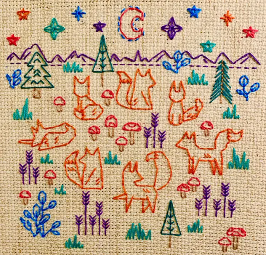
Blackwork Foxes by FlossyFoxShop
#cross stitch#embroidery#blackwork#flossyfoxshop#I love the way the colors + textures + geometry work together here!#and the way it feels like one piece of a narrative--#a multi-panel story in this style would SLAP#id in alt text
500 notes
·
View notes
Text
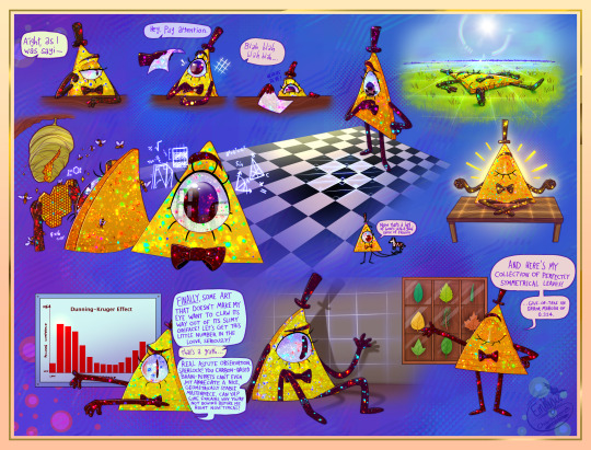
[Please zoom in, there's a lot of detail! And a massive file size...ouch]
Hi guys, long time no post! Been working on Art Fight and life stuff, but I've got something kinda fun for you.
This is a compilation exploring how a mortal Bill may interact with our world if there were still some kinda Euclidean instincts buried in there. Y'know, before the Book of Bill ruins all my headcanons >:P (EDIT: IT HAS BEEN READ. YAHOOOOOO)
Also quite an experimental piece as you can probably tell. Lots of details on both said headcanons and the art stuff under the cut, but I invite you to study the colorful texture yourself beforehand and think about what it might be representative of, just for fun because I got some really cool answers from my friends when asked :]c
TL;DR: the headcanon is that Euclideans have exceptional eyes for geometry. They find things like symmetry, tessellating patterns, graphs and fractals very aesthetically pleasing. If pushed into our 3D world, they feel comforted by the familiarity flat objects/spaces bring, as well as high-contrast patterns. Shadows especially are a familiar dimensional reduction that may bring them much comfort.
Bill would surely not be happy about these inclinations, constant reminders of a past long gone, but I'm not sure he's even aware of them here :P I think his ego gets in the way to the point where he just views these interests as common sense, which, of course, us lame humans just don't understand because we aren't nearly as cool as him. Of course he likes perfectly symmetrical leaves and staring at the kitchen floor, it's called taste, look it up!
And yet, he can't seem to shake the strange sense of melancholy he gets from viewing his own shadow.
~ End of TL;DR, long version below! ~
🔺 Headcanon Development
So, the catalyst of this idea was in relation to my friend and I's AU ( @love-triangles-au ). TL;DR, Bill's brought back mortal, meets another triangle named Y.V. (it's his hand holding the paper in the piece, actually), at some point they fall in yaois together, you know how it is. And, in writing a pair of triangles (or, more broadly, writing from the perspective of a different species), something I've had to consider was that you really can't get much further removed from a human being than sentient geometry.
The anatomical aspect was mostly figured out (see my piece on Bill's eye-mouth), but I wanted to consider what psychological differences might be at play. I wanted them to be weirder, more alien, double-so for Bill. At first I explored these possibilities through the lens of Bill and Y.V.'s relationship, specifically the question "what might a triangle find appealing about another triangle?"
Well, really the only things that came to mind were straight lines and symmetry, anything related to the geometric form of such a creature. That's more-or-less where that ended until the thought struck me that there's no reason this aesthetic appreciation couldn't extend to the rest of the environment, and then further when I realized, "wait, this is a species that is designed to live in a 2D environment. Like, they should seriously be really weird. I need to push this like 200% more."
So...yeah! I did some thinking and brainstorming with others and came up with a pretty long list of things a Euclidean in our world may be inclined to enjoy or find some level of comfort in. It's worth noting again that in this piece specifically this is a mortal/powerless Bill, so he can't really escape this Earthly environment. IF he's aware of these instincts at all (and that's a big "if"; when have you last been cognizant of your own instincts let alone known where they were stemming from?) I think he'd have snuffed them out in immortality and/or purposefully gone against them; he doesn't take kindly to being told what to do.
In order from left-to-right, top-to-bottom, here's an explanation for each!:
Flat objects such as paper are something he may find particularly engaging. It's basically 2D!
Tessellations are especially fascinating, and our world has them everywhere in the form of tile floors. Symmetry and such a predictable pattern...as the infinity of the starry sky might for us, the infinite potential of tessellations might invoke a similar sense of awe in him. Add on the maximum contrast of black on white kitchen tiles and the forms are only even better defined! A sensitivity to contrast would be very helpful for a 2D being navigating their environment.
Fields are flat and open, much like Euclydia itself. Laying flat may make him feel a little more at home.
More tessellation in the honeycomb of hymenopterans (bees, wasps and friends)! It helps that pain is hilarious.
The city is an absolute treasure trove. Rectangular buildings, precise architecture, square sidewalks and straight lines abound...he may as well be looking at a rainbow or an art gallery! I think a Euclidean's brain is very fine-tuned to mathematics, especially in regards to trigonometry. What may appear to be a straight painting might appear obnoxiously crooked to him.
Zebras are high-contrast :]
Another flat surface, another relaxing space <3
I think graphs are about as high as high art gets to most Euclideans.
I've touched on shadows before, and for good reason; truly they must be something borderline magical to the Euclidean and perhaps bitterly nostalgic.
This one kinda speaks for itself. Dweeb.
🎨 The Artsy Stuff
Lately I've been trying to find ways to fit more color into my work, as color is perhaps one of my favorite things in the world. My wardrobe is rather garish; my dad jokes that you could see me from space. My fursona is obnoxiously bright for a reason -- I feel my soul is a very colorful one!
I also realized recently that I don't actually know the exact style that speaks to me. I could talk about the phenomenon of the "style crisis" that many artists have all day, but in my mind the best cure for this feeling is to go against it entirely and begin stealing as much as possible.
So, I've tried to keep an eye out for more sources of inspiration everywhere I go, physical and digital. I've tried to train my mind into making a habit of considering, "can I do anything with this?" everywhere I go, and it recently paid off!
The glittery rainbowy texture you see plastered all over Billiam is this one, a photo-manipulated set of fruit stickers. I must confess I've been obsessed with this image for the past 72 hours, and this seemed like a good excuse to try it out!
I worried throughout the process if it might be so abstract that it loops back around to being horribly deliberate, if that makes sense -- like each sparkle was not a piece of a whole but rather an object in itself -- but it seems like that hasn't been a problem, so I'm grateful for that :Dc
I hope it can dazzle and delight you as it does me, but as long as you find it fascinating at the very least then I consider it a success! I really enjoyed hearing my friends' interpretations while workshopping it, and got tons of amazing answers from opal to kaleidoscope to fossilized bone marrow! I truly believe that the best art has some room for interpretation and it really excites me to be surrounded by that kind of creative energy that follows said pieces. That definitely adds to my pride in this work. It's weird, it's colorful, it's detailed and yet ambiguous. I'm feeling pretty autistic about it
Alright, I think that's about it. Thanks for listening!
#digital art#gravity falls#fan art#bill cipher#artists on tumblr#posting this and running! not returning to social media until my book is here and read front-to-back >:Dc#this may age terribly or it may not...i'm inclined to think it may not. bill's a flatass he already basically said as much#i use the term “flatland(er)” as a placeholder; he's not literally from the same universe as the book Flatland#...probably 👀#EDIT: YEP. words have been changed!
239 notes
·
View notes
Text
Week 10: November 6th - Prototype 3

This week I wanted to do two things: expand my collage and explore oil paint as a medium. My main goal with expanding my collage was to take out the crap that I hated (THE TRAIN UGH) and turn it into something more detailed and intentional. Also it has been a while since I've used oils so i had to relearn how to use them.. oh how I've missed my paint not drying in two seconds 💜
Here are the exercises I did:


I swear they're brighter in person. Then I modified my collage as seen above. I liked how this time I focused on the primary colors. I also LOVE how well the laundry fit on top of the lady's shoulders.
Here is the additional research I did:
Professor Bush recommended I look into the Swedish-American artist Cornelia Hediger
I think it’s interesting that she’s putting her own face in these compositions. One thing I’ve been thinking about when I’m making my photomontages is that there feels like there’s a disconnect between me and the medium. That’s one thing I could do, insert myself into the composition. I don’t have to do it directly with photos of my face, but maybe there are images I can use that feel more personal.
"I endeavor to maintain the tactile qualities and varied dimensionalities that drew me to the objects in the first place"
She just like me fr
Another artist I found on Instagram was Frances Featherstone.
I was drawn to this piece specifically (and then I realized a lot of her work looks like this) because of the stark juxtaposition of the softness of the bed and the hardness of the geometry of the tiles on the floor. I didn’t interpret it as a floor immediately, so I was more so thinking about how I could use this concept of layering different textures to merge collage and painting. Either way if I interpret it as a tiled floor or just an overlaid texture my takeaway is still the same: paint and collage need to meet! Strangers to lovers.
Another artist I looked at was Nicole Eisenman. Her work is so interesting because it's essentially different styles of painting all collaged together in one composition. The distinction she makes between each subject makes me feel like I am a part of everyone's story, not just the whole overarching narrative of the painting.
Robert Longo's combines.
Professor Bush also gave me great advice this week.... if you feel like you're losing motivation "go back to your work every day. Keep interacting with it, even if it's something as small as changing a footnote that's incorrect" which really got me back on my collage grind.
This past week was good. I'm happy with the work I did and I'm happy I was able to get my fingies on some oil paint. I like it a lot better than acrylic. This upcoming week I am have a meeting scheduled with Jeff to talk through my project more. My goal is to merge painting and collage somehow...
1 note
·
View note
Text
Granite By Bhandari Marble Group
Why BHANDARI MARBLE GROUP INDIA RAJASTHAN KISHANGARH GRANITE IS BEST IN THE WORLD
India is a top-ranked country for granite and marble exporting services over the world with high-end premium quality. All granite and marble products are been derived after the long-scheduled natural volcanic processes.
Granite material is the first choice when choosing natural stone for kitchen tops, flooring, and other finishing for home, workspace, and other residential premises. Everyone wants to know about the best granite exporting company to buy quality granite collections, here is the BHANDARI MARBLE GROUP “Top High Selling Granite Exporting and Manufacturing Company in India.
BHANDARI’S granite is considered higher quality and more durable than other granite companies. Countertops should be available in order to provide the necessary durability associated with natural stone.
The largest exporters of these stones are BHANDARI MARBLE GROUP India.
Which Color Granite is best from BHANDARI MARBLE GROUP INDIA RAJASTHAN KISHANGARH?
Dark Granite
No shade will appear more elegant than black or dark gray.
White Granite
Pure white granite is nearly possible to find.
Beige Granite
Neutral granite countertops have unlimited versatility and can be part of almost any design plan.
BHANDARI MARBLE GROUP
Dark-colored granite countertops are harder than light-colored granites. Granites are composed of a variety of minerals, each of which has specific performance properties. The hardest mineral commonly found in granite is quartz, which is normally a somewhat translucent, white to grey colored mineral.
Are you ready to upgrade your countertops to a unique yet durable surface, but not sure where to start? Our top granite stone expert roundup will help guide you to the perfect stone that meets your lifestyle and design preferences.
The beauty of a natural stone is truly unmatched, and granite has a one of a kind look that few other countertop materials can compare to.
Granite countertops can take any kitchen to the next level visually and often become the talk of the room after a new install. Granite has been a top choice for countertops since the beginning, and to this day continues to be, due to its strength and variety of rich colors and natural patterns.
Cutting Edge Countertops carries a wide shade range of granite, so you are sure to find a vibrant or neutral color that suits your style. However, these are the best-selling granite colors in the World!
Alaska White Granite
With Alaska White granite, you can create stunning countertops or backsplashes, perfect for both indoors, and out! This stone has a lighter background with darker minerals running throughout creating a striking look that works well with many different designs. The white can pull in some lighter aesthetics if paired with dark wood cabinetry, or on the contrary, the darker elements can provide a great visual contrast to white or grey cabinetry. Alaska White granite can vary from slab to slab, so with this material, you are sure to get a unique look in your home.
Black Granite
Black granite is a frequently used material for residential and commercial design due to its beauty and durability. This granite features black speckles. These glistening minerals that make up the black design come together to create the perfect timeless piece for your space. This granite color has been a popular choice for decades now, making it a go-to option for home remodels.
Cotton White Granite
Light cannot be described in one defining way. This stone has been around for many, many years, with its reliability and beauty, cotton white granite has created a name for itself in the stone industry. The beauty of cotton white granite can be found in its soft cream color and subtle speckles in shades of deep grey. The mixture generated through the different layers of color is brought to life by the dark black or burgundy contrasts against the soothing cream base. Designing with this stone in your home will bring a beautiful elegance to any bathroom or kitchen. A very neutral option, it can be paired with a variety of styles and colors.
One of the most popular white granites on the market, White cotton Granite can be recognized by its pristine beauty. This granite has been admired for many years and its popularity only continues to increase. This predominately white stone features mixtures of blue and grey tones running throughout. If you are looking to make a statement, pair this stone with a darker cabinet, or achieve a trending yet timeless design by combing it with white cabinetry.
Alaska Gold Granite
Known for its golden creamy tones, Alaska gold Ornamental granite is a gorgeous stone. What gives Alaska gold Ornamental its stunning color is the abundance of golden minerals that are present. Up close, you can see that dotted around the stone is a mix of brown minerals. These minerals can vary though and can range from a lovely light cream color or a dark to light honey color. Achieve a natural and flowing design when you combine Alaska gold Ornamental with finished wood cabinets that have a light or medium. The golden Earthy tones of this stone become one with the cabinets!
Granite countertops kitchen
Trends come and go, but the countertops you choose will remain in your home for years to come. With this being said, we always encourage our customers to pick something that makes them happy when they walk in the room and see it. Shop these beautiful countertops along with many others on our website or visit a Cutting Edge Countertops Factory outlet showroom Our experienced team is here to help educate and guide you on both the current trends and timeless classics to ensure you are confident in your choice.
Make sure you follow along on our Cutting Edge Countertops blog to stay updated on the latest news, kitchen and bath designs, and more!
On Trend: Pairing Natural Stone and Quartz
When planning a new kitchen or major kitchen remodel, pairing countertop and backsplash materials present an age-old dilemma. Many designers swear by hard fast rules regarding how to make the perfect pairing, while others will say all the rules are meant to be broken!
It makes the most sense to start with your countertops. The countertop is the main hub of your kitchen and will most likely take up the bulk of your budget (other than cabinets!). Your desired style, budget, and the way you plan to use it will go a long way in determining the best material for your countertop. Generally speaking, there are more limited color/texture options with countertops whereas backsplash options are virtually unlimited. Nail your countertops first, then you can get creative and make a statement with your backsplash.
Many homeowners desire the look of a natural stone material like marble, but either doesn’t have the budget or are turned off by its high maintenance nature. This is one of the main reasons many opt for engineered quartz for their countertops. Quartz is a non-porous material which makes it virtually maintenance-free. No worries about staining from spilled red wine or highly acidic liquids. Based on advancements in the engineering process, quartz closely mimics the beauty of natural stone and is available in a large variety of colors. It is also more consistent in pattern than the natural stone making it versatile for both traditional and modern styles. As mentioned, this would allow you to get creative with your backsplash and have it define the ultimate style of the space.
Why can’t you have the beauty of natural stone and the ease of maintenance and versatility of quartz? You can, by pairing a natural stone backsplash with your quartz countertops. It’s all about combining different colors, textures, and patterns to project the style statement you desire. For instance, pair beautiful vein cut limestone tiles with a limited pattern quartz countertop. Or add more texture by going with a stacked stone accented backsplash with quartz. To help inspire you to create your own unique combinations, let’s take a look at some examples.
Tranquility
Trending Color Round-Up
Have you seen tour top countertop colors for the year? We’re introducing our semi-annual color round-up showcasing our most popular granite and quartz colors purchased by our customers. Scroll through to see what they love.
Monolith Inception Kitchen Designed by Richard T. Anuszkiewicz
As a luxury kitchen specialist, it is always important for me to bring thought-provoking ideas and execution techniques to the market. At the Kitchen & Bath Industry Show (KBIS) last month, I showcased my latest forward-thinking design titled “Monolith Inception”.
The Monolith Inception kitchen was commissioned by Liebherr Refrigeration to celebrate the launch of their new column refrigeration series. The concept of the kitchen is derived from the definition of “Monolithic”, meaning, “formed of a single block of stone.” This idea can be found throughout the kitchen in the crisp contemporary geometries and the layered long linear planes.
The overall palette evokes a masculine sense in dark and moody tones, think “Tom Ford Fashion”. Exotic and luxurious finishes run through the entire space. Two of the most talked-about pieces in the kitchen where the dual refrigeration armoires. The first armoire was comprised of striking poly-sheen eucalyptus wood. This high-gloss furniture styled refrigeration series has a drawer chest appearance on the bottom and includes a full refrigerator, full freezer, and full wine column.
The second armoire was more contemporary in its nature. A sleek full flat-paneled aged-brass face with the finishing touch of a fine leather stitched handles. Its bespoke details like this that create an experience for your user. This second armoire had a full 30” refrigerator and full 24” freezer.
Another showstopper was my signature Autobahn cabinet inspired by the face of the Bentley grill. This super-car cabinetry complimented the Superior Next series range with custom-aged- brass accents. A pop of excitement was found inside the cabinetry with my trademark Richer Living Collection Luce red interiors.
The island was a multi-tiered element creating a wow factor with a cantilevered 6” thick Dekton by Cosentino countertop. This Kelia material from the Natural Collection ran throughout the kitchen and was in the perfect gray hue to compliment the deep wall color. I designed the custom kitchen table with Grout house lumber highlighting a subtle chevron textured wood pattern with a brass screw detail.
The bar showcased artisan caliber plumbing products by KALLISTA in Gunmetal and hand-hammered polished silver. The Bradley USA “Chika” wall covering by Susan Jamieson of Bridget Beari Designs added a playful graphic detail and was further celebrated by the “Prost” neon sign meaning “Cheers” in German.
The final magic moment of the kitchen was the inception wine room inspired by the idea of a dream within a dream. This selfie-ready room was completely reflective and created the illusion that space infinitely continued.
Add by Granite expert and export team of BHANDARI MARBLE GROUP INDIA RAJASTHAN KISHANGARH.
1 note
·
View note
Text
Imma give this a go!
1 - I used to have FireAlpaca and PaintToolSAI, never used SAI much, was more of a FireAlpaca girl until I got used to the ClipStudio that came with my drawing tablet!
2 - Forward is the easiest for me, followed by facing left!
3 - I'm one of those people who still keeps their childhood OCs with them, namely one of my main ones which got revamped way too many times lmao.
4 - Real people or characters drawn in a pretty style. I always feel like I can't match them, especially if I find them pretty!
5 - I'm counting wips, studies and doodles here so about a 40/60 on posted/personal art. I wish I had more time to draw ahhh :'3 soon.
6 - Anything I think looks cool subconsciously is translated in the way I draw, or into my perspective of what something "looking right" is.
7 - Sculpture, pottery, WATERCOLOURS! So pretty!
8 - Many OCs in the past (when I really like a show or idea I usually make an OC for it lmao), but also many stories, which is why today I write way less.
9 - Whatever describes the drawing best while being as short as possible, sometimes character nicknames.
10 - GIVE ME POOFY SHIRTS I LOVE SOME LOOSE CLOTHING AAAAAA CROPPED JACKETS YES PLEASEEEE
11 - I listen to music and sometimes gameplay videos I don't feel the need to watch. So mostly GTLive or GameGrumps lol
12 - None. :') (if we're getting REALLY specific tho I'll say it's the shoulders, I love drawing deltoid muscles and making them apparent every time I can).
13 - People who draw hyperrealism. I don't really fancy it, visually speaking. But they have tremendous skill and their meticulousness is maddening! The techniques they invent to replicate textures and looks is fascinating!
14 - I love including five and four-pointed stars in my drawings, I just love the shape way too much.
15 - At home, at uni when I was a student and currently at my dad's office!
16 - Talking to people... I know this isn't art related but as you can probably tell, I love talking. Way too much. The problem is that when I meet new people I can never go between talking too much and not saying enough, and when someone suddenly approached me speaking English, which I'm fluent in (as a second language), it's like my whole vocabulary evaporates on the spot. It sucks :')
17 - ...Water... and that's it? jkfsgwejeg usually I don't eat anything WHILE drawing, I get up, go get a snack, eat it then resume drawing.
18 - More like how many I've had broken by people haha... Anyway, I don't think I've ever broken art supplies aside from when I was really stressed and broken a pencil in half in two separate occasions. I also recall a mechanical pencil that suddenly stopped working (half the class had that problem, it probably had to do with the brand at the time because we all used the same one) and my history of having colored pencils with shattered lead straight out of the box. Aside from that I usually take good care of my supplies!
nevermind i just remembered i had geometry in high school and managed to break two set squares and have a drawing compass get so loose it wouldn't draw a single circle right... welp.
19 - I honestly don't know, because I usually only draw humans and animals! Inanimate objects and vegetation is still a struggle. So from what I've drawn I'll say my favourite are foods, shoes and crystals (raw and cut/polished)!
20 - I'm not great at it but I do like drawing hands! They can be so expressive that it's fun to find a good pose for them!
21 - Comic book style like modern DC, the Spectacular Spider-Man cartoon, extremely painterly styles with visible strokes and lots of texture, gritty, more realistic manga styles (Berserk, Vagabond).
22 - Because I stay seated for a logn time I usually stretch my back and crack/roll my wrists, and wiggle my fingers a lot. I also do this while drawing!
23 - Yes! Mainly multiply, hard light and color! I like making lots of light effects lol
24 - Of course they do lmao, sometimes I stitch multiple together to get the pose I need.
25 - I can't remember what it was compared to unfortunately, but I do remember that I had definitely NOT been inspired by it and I barely knew it. xD it happens
26 - THAT ONE TIME I WAS TABLING AT A CON AND HAD A STICKER OF IZUKU'S FACE BETWEEN A TODOROKI AND A BAKUGOU, ALL THREE UNDER A BNHA LOGO I PRINTED, AND A GIRL EXCITEDLY POINTED TO IT AND ASKED IF IT WAS JUMIN HAN FROM MYSTIC MESSENGER (┬┬﹏┬┬) it's funny tbh because I can't imagine how she didn't see the other characters at first, SINCE SHE KNEW THEM, AND HAD THE LOGO ON TOP OF THEM. Fun times tho, I pointed her to a booth that actually DID sell MM merch.
27 - I usually don't warm up before a drawing, but I decompress during it. I doodle on the side, make other drawings, play around with colours etc, to let my brain take a break from the Big Scary Piece.
28 - I sign up for conventions and art markets as often as I can! I have also, while I was still in highschool, made drawings for local projects like a book on the native species of our town!
29 - I'm not the right person to answer this because I'm extremely passionate and curious about LOTS of things and almost all of them translate over to my art. Maybe cooking I guess? Culinary art is still art, right?
30 - Every single one, by myself, because I compare myself to everyone else way too much lol.
Weirdly Specific Artist Ask Game
Didn’t see a lot of artist ask games, wanted to make a silly one.
(I wrote this while sick out of my mind last year and it’s been collecting dust in my drafts, I might as well let it run free) 1. Art programs you have but don’t use
2. Is it easier to draw someone facing left or right (or forward even)
3. What ideas come from when you were little
4. Fav character/subject that’s a bitch to draw
5. Estimate of how much of your art you post online vs. the art you keep for yourself
6. Anything that might inspire you subconsciously (i.e. this horse wasn’t supposed to look like the Last Unicorn but I see it)
7. A medium of art you don’t work in but appreciate
8. What’s an old project idea that you’ve lost interest in
9. What are your file name conventions
10. Favorite piece of clothing to draw
11. Do you listen to anything while drawing? If so, what
12. Easiest part of body to draw
13. A creator who you admire but whose work isn’t your thing
14. Any favorite motifs
15. *Where* do you draw (don’t drop your ip address this just means do you doodle at a park or smth)
16. Something you are good at but don’t really have fun doing
17. Do you eat/drink when drawing? if so, what
18. An estimate of how much art supplies you’ve broken
19. Favorite inanimate objects to draw (food, nature, etc.)
20. Something everyone else finds hard to draw but you enjoy
21. Art styles nothing like your own but you like anyways
22. What physical exercises do you do before drawing, if any
23. Do you use different layer modes
24. Do your references include stock images
25. Something your art has been compared to that you were NOT inspired by
26. What’s a piece that got a wildly different interpretation from what you intended
27. Do you warm up before getting to the good stuff? If so, what is it you draw to warm up with
28. Any art events you have participated in the past (like zines)
29. Media you love, but doesn’t inspire you artistically
30. What piece of yours do you think is underrated
34K notes
·
View notes
Text
20 Years.
Two-thirds of a lifetime ago, a ten-year-old boy in a scratchy wool sweater sat huddled under an old down blanket. The first proper snow of the season had come the week before, and the boy hadn’t been dressed for building forts. Now here he was - bored, sick and sweaty. His mother entered the room with a mug of undrinkably hot milk with honey and butter. In her other hand was an issue of GAME.EXE, a computer gaming magazine. The words “HALF-LIFE” were plastered across the bottom of the cover. The boy loved reading, and loved computers, and the milk needed time to cool off anyway. He opened the magazine and flipped to page 8 after finding it in the table of contents. The boy grew older and switched languages, countries and continents, but his favorite game never changed.
-
It’s hard to compress two decades into text, but I will attempt to do so when it comes to my relationship with the Half-Life series that began all those years ago, with that preview article in that magazine.
The article was written in a second-person perspective that really stuck out to me, and was filled with screenshots that would later turn out to be of an unreleased rough beta version of the game. It ran through several dramatized, episodic descriptions of events in the game, then listed out the weapons used in the game, the enemies you would face and the tactics to deal with them. Finally, there was an interview with Marc Laidlaw himself. This single article was sufficient to make me completely insufferable to my parents for the next few months. “I want to play Half-Life,” I would say. At first, this meant asking to go to an Internet cafe a few blocks away from home, and for money to pay by the hour and use one of their beefy gaming PCs. Later on, it meant asking for a copy of the game, and for time on the “main” home computer - the only machine that could run the game at all, in glorious 320x240 resolution that gave me headaches.
-
A couple of years passed. The move to the US threw everything into a pleasant state of disarray, but the one thing that hadn’t changed was having to ask my parents to use the computer to play Half-Life. I had found one of my own soon after arriving in the States, but it had no sound card. It was there, on my mother’s computer, that I finally beat the game. My thirteenth birthday present was a copy of the newly released Opposing Force expansion. My birthday cake featured an edible photo of myself playing in a fountain in downtown Chicago, which my mother doodled over with brightly colored frosting. I was now knee-deep in toxic green sludge, a crowbar in one hand, and a proud Lambda logo on my chest.
Most kids in my 8th and 9th grade classes didn’t share my enthusiasm for Half-Life. They played console games and were rightfully hyped about the Playstation 2 and X-Box. In search of like-minded people, I took to the Internet. My options for getting online in 2001 were limited to libraries - either during lunch at school, or at the Naperville Public Library, which was a hour-long walk from home. I discovered Planet Half-Life, an offshoot of the Gamespy network. Through it, I discovered the fact that my favorite game was designed from the ground up to be moddable. I learned of Counter-Strike, Team Fortress Classic, and Sven Co-op. I discovered the Handy Vandal’s Almanac and The Snarkpit, two communities focused on level design. Having no reliable internet at home, I downloaded the level editor - then called Worldcraft - onto a floppy drive and brought it home to install. For the first time, I wasn’t simply playing the game. My parents looked on as I worked to figure out the obtuse user interface, trying to remember what I’d read earlier in the day. They raised their eyebrows when I finally managed to compile and run my first level - a hollow, unlit concrete box 512 units across with a single prefab trashcan hovering in the center. There wasn’t much more I could do in the limited time I was allowed to use the good computer, but I had caught the bug. My notebooks were filled with doodles of level layouts, my mind filled with cheesy storylines to match.
Eventually my family moved to a house with proper internet access, and I got a set of hardware with enough power under the hood to run both the game and the editor. It could even produce sound! All the things I could only read and salivate about were now within my reach, and I gorged myself on them. Counter-Strike quickly fell by the wayside, but Team Fortress and Sven Co-Op did not. Natural Selection came out and blew me away with how different a Half-Life mod could look and feel from the original game. I stayed up past midnight, playing, building, and playing some more. I learned that projects can die - when the extremely tongue-in-cheek Scientist Slaughterhouse mod went silent.
The release of the Half-Life 2 trailer took everybody by surprise. I had called one of my like-minded friends and we synch-watched it together, pausing every few minutes to let the video buffer and gush about how amazing everything looked and how much we were looking forward to messing with the modding toolkit. The subsequent beta leak and resulting delays taught me to be patient.
The move to California was not long after, and my patience was immediately put to the test as most of my belongings were stuck with the moving company, including my computer. I must have gone through a full pack of printer paper in less than a month, drawing up concepts and layouts for Xen Rebels, a mod centered around a semi-peaceful human colonization of the realm set after the events of Half-Life. Once my computer arrived, it was right back to the late nights and groggy mornings for me. Our home Internet was bad but workable, and I spent countless hours with the new and more creative mods that were being released, including The Specialists - a strong attempt to recreate the gun-fighting and martial arts stylings of Hong-Kong action movies in a multiplayer game. Around the same time I was introduced to the strange new world of anime, and decided that I simply must change the two throwable knives offered by The Specialists into kunai and throwing needles. This of course required me to learn 3D modelling. At the time, this was done with Milkshape 3D, a model editor compatible with most contemporary game formats. Once again, countless hours of figuring out the interface and the workflow followed, set to the calming tones of the Unreal, Deus Ex and Half-Life soundtracks. Creating models felt a lot more freeform than levels as I wasn’t constrained to a unit grid or forced to use convex geometry, and one day the new throwing weapons were in. I published the modified models on a forum to exactly zero fanfare. Around the same time, I began learning the basics of Photoshop in school, so modelling and texturing went hand in hand. To say my early textures were atrocious would be an affront to honest, hard-working atrocious textures the world over, but I continued my studies. My experience with working in 3D even netted me a 2nd place award at the school art contest - money which I immediately put back into upgrading my computer.
Half-Life 2 came out in November of 2004, to universal praise and celebration. I received the collector’s edition as a present for New Year, along with a copy of Raising The Bar. I beat the game the same morning, without a wink of sleep between unwrapping my present and the final darkness of the credits screen. The SDK didn’t ship with the game, but as soon as it was released I dove in. Soon after, the modding community blossomed, bigger and more vibrant than the original game’s, driven by the incredible flexibility of the engine. One of the first mods that appeared was made by a British man named Garry, and was called simply that, “Garry’s Mod”. It let players interact with the physics engine, and slowly sprouted more and more features. Many players used these features to pose character ragdolls, eventually creating entire comic series with storylines ranging from the comedic non-sequitur to dark and serious. Of course I felt the need to try my hand at it. That lead to the creation of The Plane - the story of Beet, a Combine Elite who managed to break free of his overseers’ indoctrination and find friendship, love, and revenge on his old masters. The only redeeming feature of that story was that it taught me how not to write stories.
I began getting more attached to the Gmod community than the expressly level design one at The Snarkpit. The few levels I publicly released were designed specifically as sandboxes to play and build in. The most popular ones were gm_orbit and rp_bahamut, maps set in space and featuring zero gravity for physical objects, allowing players to build smaller spaceships, or roleplay as the crew of a salvage and exploration vessel. Posting teaser images on the forums taught me a valuable lesson - what it felt like to be the one creating hype, instead of experiencing it. The constant demands were overwhelming. Some would simply want more work-in-progress screenshots. Others would drop ultimatums that unless a certain feature was designed a certain way, they would refuse to use the map. Others yet attempted to worm their way into getting the map early, offering to test it and provide feedback. I had almost deleted each project multiple times before finally releasing it.
Life happened, and things with Half-Life slowed down. When the Orange Box came out in 2006, I attempted to get it at a five-finger discount at a local Target. I got caught. Indirectly thought it was, Half-Life taught me that idiocy often leads to consequences. Buying it legitimately later in the year and playing through Episode Two reminded me that some stories aren’t written to end neatly.
It was in 2007 that I bought a membership for the Something Awful forums, and discovered an avid and very exclusive community of Gmod players. Over the course of the following decade, most of these people remained in constant contact with me, and will probably remain so for the foreseeable future. I became an admin once we opened our serves to the public - moderating the newcomers and mentoring the unskilled. One of the people had a project in mind, and I began creating models again. Miraculously, Milkshape 3D remained compatible with the Source engine, so I worked with it until I learned Maya. This project would eventually become known as Armored Combat Framework, and be released to the Gmod community at large. I learned how to iterate designs based on feedback, and how it felt to work in a well organized team.
Frontier happened around 2010, and was another lesson in teamwork - specifically what happens when things break down without role redundancy. Ambitions ran high, and the hype mounted. The programmer eventually left, and all that remains of the project is the very videos and images that were used to hype it in the first place, and a folder full of now-useless models, maps and textures. That was probably what prompted me to start pulling away from Half-Life and Gmod in general.
Black Mesa came out in 2012 and breathed a new life into my old obsession. I played through the original Half-Life again, then through the remake, noting the differences and the tweaks to make the gameplay more palatable to modern-day players. It felt good, like putting on an old but comfortable jacket. I’d fire up the SDK now and then, mostly to help newer, more driven designers. Two of the guys from Team Frontier went on to work in the industry full-time. There were whispers of a new game in the works, minor leaks of file and folder names hidden away in Valve projects. Episode 3 turned into Half-Life 3. A full sequel, rather than another short episode, as originally planned. “HL3 Confirmed” became a meme, but the people at the top remained silent.
Life kept happening, as it does. I lost people, I found people. I left home. Every now and then I’d fire up HL or BM again, or drop by the old Gmod server. I’d build things and model things, and release none of it to the public. I watched as the Dota International became the most widely spectated event in gaming, making players, sponsors, and Valve millions. The realization slowly started settling in. Then Marc Laidlaw retired, and later posted the Epistle. The workers at Valve spoke of a lack of direction and stagnation that comes with a cornered market. Modding for an engine over a decade old, no matter how advanced, slowed down.
It’s a different world now. Unity and Unreal engines rule the scene. Survival and Battle Royale have become the new buzzwords. Microtransactions. Loot boxes. Streaming integration. Freemium. E-Sports. Mobile gaming. Virtual Reality. If a new Half-Life were to appear today, would it be changed by the zeitgeist, or would it stay the course set by its predecessors? I don’t know. But there’s one thing that the escapades of a mute, bespectacled research associate have taught me more than anything else: hope.
2 notes
·
View notes
Text
Issue 2: Interview with Hannah Depop: @guthball
Q: What brought you to Depop? How long have you had your shop? Did you/Do you sell anywhere else?
A: Depop appealed to me because it's so clear that its basis is in community. I’ve been able to connect, collaborate and create for cool people I might’ve never clicked with otherwise, and I actually, really, truly cherish that. Plus, the layout and features are so user-friendly, there’s never been an intimidation factor. I created an account about two years ago. And I’m still here, maybe just because they added the video feature...
The reception of my art from depop users has been so gratifying. I would not have immersed myself in resin so extensively without that encouragement. It wasn’t long before I joined depop that I began experimenting with the medium; I loved the look, but had no idea what its creation entailed. So I took in a few tutorials, bought a kit, and have grown, or attempted to, from there.
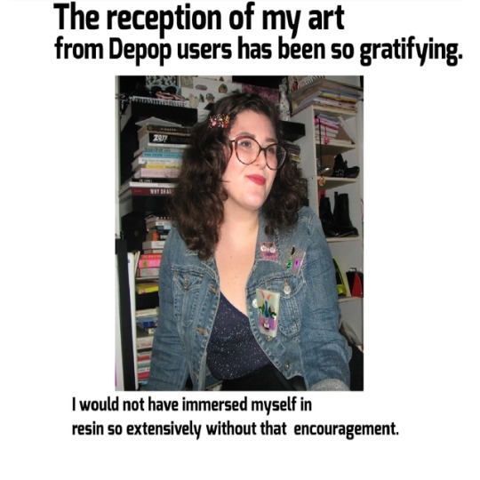
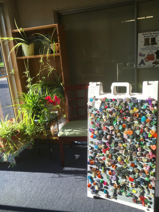
The entrepreneurial bug bit me early. My mom owns and operates a drycleaners, and has allowed me to sell there since I was a kid. It began with hand-drawn bookmarks, friendship bracelets, that kind of thing. Now, I have a display of resin magnets and keychains there. I do local shows here and there, too. Mostly for fun, profit’s never promised. It’s always worth it, though, just to gauge reactions to my work- I love answering questions on process, seeing little kids play with the magnets, or experiencing the moment someone takes a closer look at something I made and really GETS it.
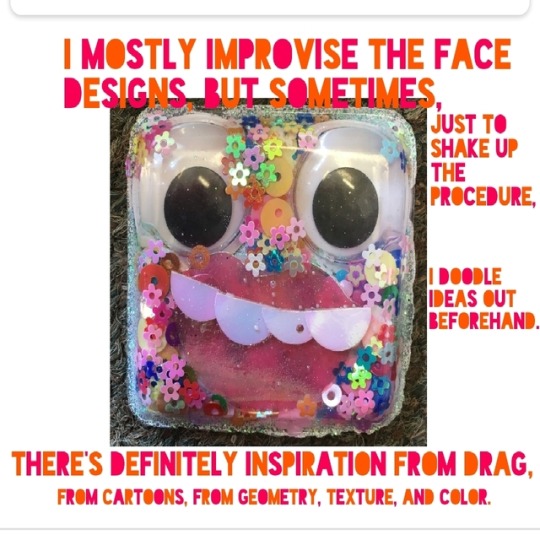
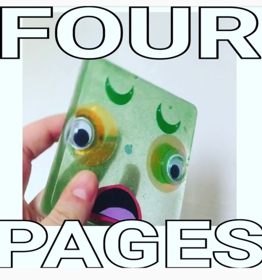
Q: (Your magnet faces make me so happy to look at!) How long have you been making them for, and what inspired the making of these characters?
A: I’m so glad you enjoy the face magnets! They are a blast to make. I just looked through my photos to see how long ago I made my first- it was back to September of 2016. Wow. That piece now resides with my sister, totally forgot it.
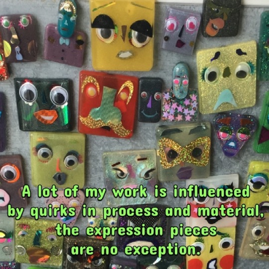
A lot of my work is influenced by quirks in process and material, the expression pieces are no exception. At their inception, I’d done a few projects with encapsulated googly eyes before, and had a bunch of sequins I'd bought to make flower accents. It was around then that I realized that the plastic formed packaging from my jewelry findings could be repurposed as a smooth, glossy tile mold, in a range of sizes PERFECT for magnets and other accessories. Toony faces have always been my go-to in drawing, and these introduced a way to marry my illustration style with resin work. I've put together so many goofy lookers now, made out of all sorts of materials, and set in all kinds of molds. I've refined my technique, but still never really know how (/if!) they’ll come together until they’re popped out. The features are all cut and glued, then layered in backwards, so I don’t have a great view as they cure. Pieces can shift, bubbles can sneak their way in, some materials distort when submerged in resin. It can be a challenge to make sure nothing's too out of place, but the glitches can be where the character sneaks in.
I mostly improvise the face designs, but sometimes, just to shake up the procedure, I doodle ideas out beforehand. There’s definitely inspiration from drag, from cartoons, from geometry, texture, and color. I know there’s one with a pout I ripped straight from a photo of my sister- I'm into the idea of full-on custom magnetic portraiture, but no one’s come to me requesting their likeness in sequins and googly eyes yet. The fact that kids think they're fun is also a huge influence: that motivates me to make them as kooky and colorful as I can. There is a selection that made it to a preschool classroom, and it’s been reported back to me that all the kids like to play and even fight over them. I love that!
Q: Do you have any favorite artists that inspire you?
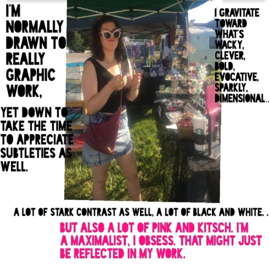
A: She’s inspired by way too many artists!!! A few off the top of my head: Keith Haring, Hattie Stewart, Jillian Evelyn, Betsey Johnson, Parker Day, Shantell Martin, Siobhan Gallagher, Kendra Dandy, Tuesday Bassen, Erté, Klimt, Kay Nielsen, Man Ray, Chagall, Dalí, Hirschfeld, Picasso, Gary Baseman, Kenny Scharf, Neal Levin. If that’s not a weird and wide enough swath... I follow hundreds, if not thousands, of creators of all sorts on instagram. Admittedly extensive, but a wonderful pool of inspiration to dip into.
I have always had an interest in the arts, and (…aquarius here) make a point to be very open to all sorts of visuals. I’m content to take everything in, and very much, like, “like like like”-- it’s a whole thing when I don’t care for something, but I try not to play critic so much. I’m normally drawn to really graphic work, yet down to take the time to appreciate subtleties as well. I gravitate toward what’s wacky, clever, bold, evocative, sparkly, dimensional… a lot of stark contrast as well, a lot of black and white. But also a lot of pink and kitsch. I'm a maximalist, I obsess. That might just be reflected in my work.
And, duh, I admire other resin artists. The medium is SO versatile and I love to see its limits stretched. I put a lot into distinguishing my style from others who create with resin, but there’s major inspo in what everyone else is coming up with! Shout out to my fellow resin-making depoppers :) I’d also like to mention Lauralee Benjamin (if you're not familiar, please change that immediately), who has found inventive ways to use my pieces as accents on her beautiful work. That collaboration is all thanks to depop, and has inspired me in ways I never could have expected.
Q:What is some of your process when you create? (Do you listen to music, create alone or with friends, where is your work space?)
A:Oh my god. It’s all over the place. A lot of my process is just seeing what I can get away with.
So much can go wrong; resin is a finicky substance. I employ a variety of techniques, many developed through trial and error. I try to create unique effects, or emulate things I’ve seen before in my own way. Many of my projects are worked in layers, transformed with each pour. It can be as simple as mixing a bunch of glitters together. Even that can be tricky, though! I can get very in my head about intricacies, and try to balance the detail-oriented with simpler projects, or whatever'll give me a break from the eyestrain. Most of my stuff comes from sitting down at my workspace, assessing my supplies, and sorting it out from there. Once I have a batch of resin mixed, it's a race to get it divided into colors and divvied into molds. At times it requires a lot of precision, and a willingness to just wait it out and see what’ll happen.
Tools and materials dictate much of the process. I have a few staples, but keep an eye out for new supplies just about everywhere. I get the biggest kick out of repurposing components that might’ve otherwise been trashed. Think broken jewelry, old cosmetics, sequin scraps, and single-use plastics. I intend to look into eco-resin and biodegradable glitters down the line; it’s a matter of cost and accessibility, but adjustments I find necessary, at least for my own sake, in continuing with this art form.
At the end of last year I cleared a space in my (creepy) basement as a studio. It’s kept a hectic mess, but… that’s my nature. I work alone, save for a few times my sister has joined me. Friends have been invited to try in the past, but considering resin is such a time-sensitive, kind of hazardous, sticky thing, it’s not a great group activity for the uninitiated.
I work to an, errr, eclectic mix of podcasts and music. A lot of Sondheim, disco, Comedy Bang! Bang! and CBC Radio 2.
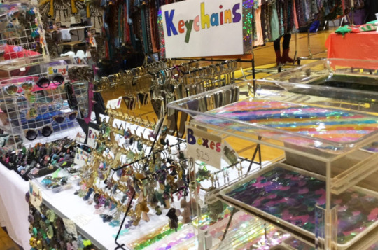
Q: What is your favorite piece you've sold so far?
A: Oooh, toughie. The first that comes to mind is one of the first sequin trays I made- it was a really specific rainbow pattern inspired by a book cover. I also love the custom name necklaces; they always turn out so badass! In a few instances, I've made pieces used in photo shoots or performance. Those are extra special to me, too.
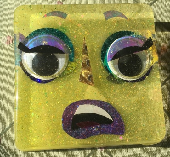
Q: Where do you want to go next with your art?
A: My art is going to morph. I want to hone my skill in areas beyond resin, and then find ways to blend the edges. I want to keep pushing, but know when to pull back. I wish to collaborate more, to find solutions I’ve not yet reached, to make some of my outlandish ideas a bit more tangible. I want to build a brand and learn to accrue my worth for once.
And, maybe, down the line, tile a room with a mosaic of resin faces.
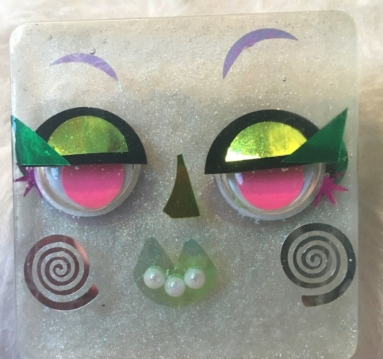
Q: What is your favorite fashion era?
A: I love an outrageous 80’s moment.
Q: Do you do commissions?
A: I adore doing commissioned work, and have had so much fun on prior personalized pieces. I am currently open to fulfilling some custom requests, just DM me, whatever!
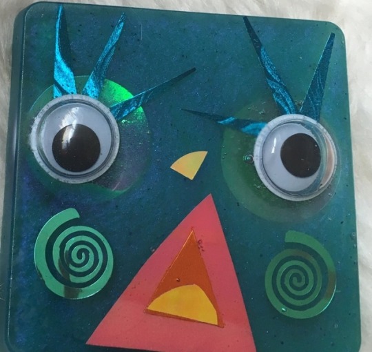
Visit Hanna's shop!
Depop.com/guthball
1 note
·
View note
Text
It’s been exactly a month and a half since my last blog post. Since then, I survived all my classes (I had exactly 90% in 3/4 classes – so close), went on at least 5 shoots, and have had plenty of time to create. This blog post mostly serves as a way of catching up on documenting the last handful of creative shoots that have taken place in the last few weeks.
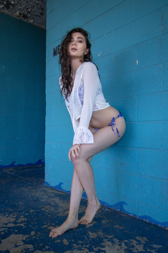
My first creative shoot (with a model) since being home was a great chance to test out the newest addition to my collection of gear: a Canon EF-S 10-22mm f/3.5-4.5 lens. It definitely provides a MUCH different look to the photos taken with it. At the wider end, it adds some distortion. Above is the lens used at 18mm, f/4.5, and below is the lens used at 10mm, f/3.5.
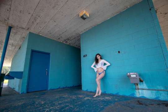
For a crop sensor camera, it is WIDE. SO WIDE. The difference between 10mm and 18mm is astounding, as you can probably tell between the two photos.
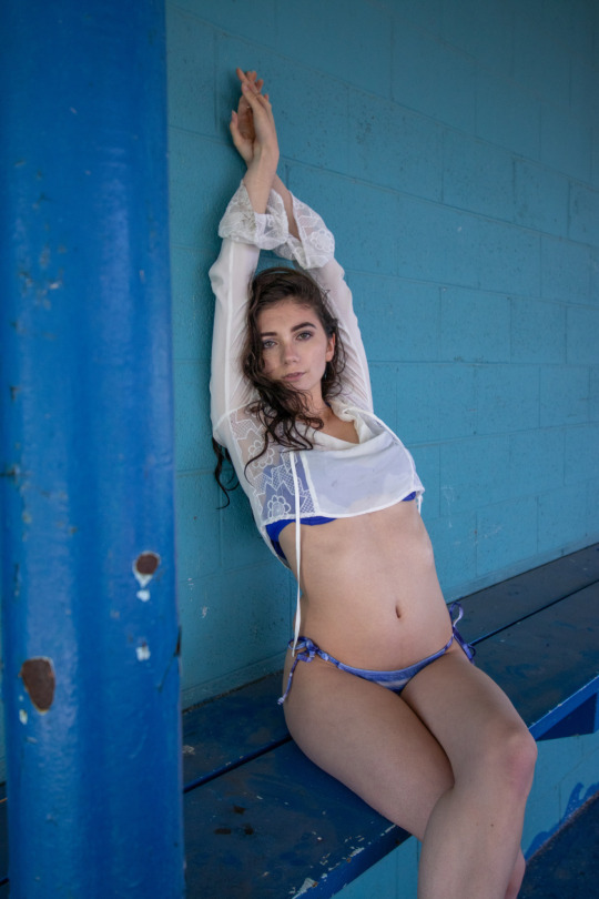
This session with Gabriella was fantastic. I am still fawning over some of the shots we made together! She’s a fantastic model and was super easy to work with. I went in with a general idea of what I wanted to do and no idea that this location would be as perfect as it was. This is definitely a place that needs to be checked out (if you have the proper pass… I went back and got scolded for being in there without one).
This last photo included was taken at 22mm, f/4.5.
The next creative shoot was with Callie! Our shoot was probably the longest shoot I’ve ever done. Together, we completed 3 different looks in 3 separate locations, all not far from each other.
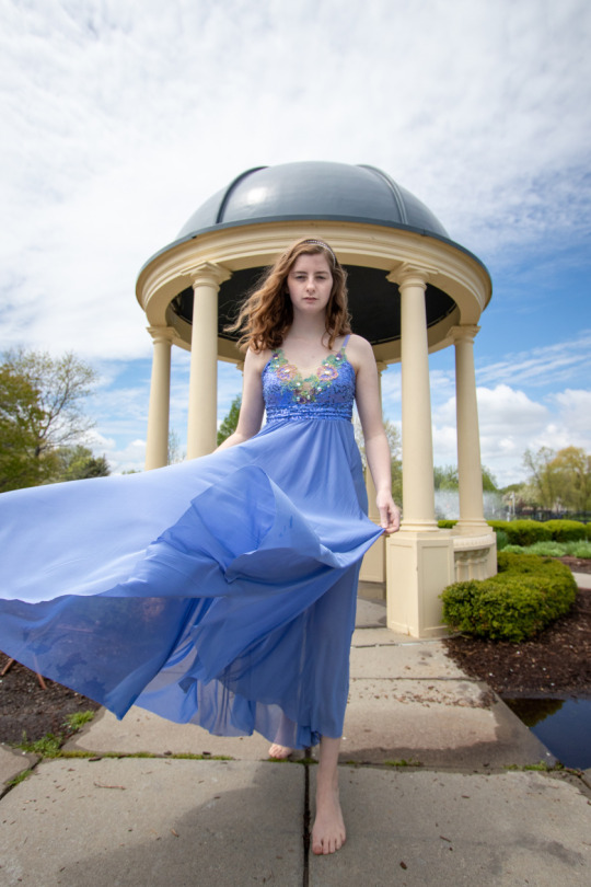
The first was this fabulously flowing gown. What better to do with a gown like that than to try for an elegant, seemingly magical vibe? Our first location was a gazebo in a park with willow trees and fountains. Perfect. The clouds and the sky worked perfectly in our favor.
Second was a fancy red dress. And of course, we needed to contrast the fanciness by… um… catching some candid moments. The background of this location was the perfect contrast in texture and the perfect colors to complete the type of setting we were looking for. We were just below the overhang here, providing a near-perfect indirect lighting set-up for some mid-afternoon shots.
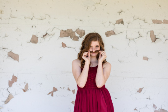
Finally, Callie and I finished out our afternoon strong with some awesome editorial shots. Using some parking lines and bumper poles near the boat ramp, we went for some contrast in shadows and some contrast in color. And of course, no editorial is complete without the dramatic poses and deep stares. The photos below were all taken with the Canon EF-S 18-55mm, f/3.5-5.6 kit lens.
For the third day in a row, I went out to shoot. Danielle really let me test our the distortion on the 10-22-lens. It was a blast! You’d never be able to guess how tall she is based on these photos. My interest in this location, as you may have guessed, was the lines. I love geometry, so this place was perfect. The styling was a collaborative effort – she brought the skirt and boots, and I found the top in my mom’s old pile of work clothes. The neutrals of the outfit really added to the photos, allowing for all the colors already there to pop!
The fourth creative shoot completed last week was with Indiana. This fair was full of energy, sugar, kids screaming, and lights. So of course, we had to bring out the prism. We shot in front of the merry-go-round, under a game booth, on the Ferris wheel, and in the upstairs portion of the mirror house, respectively. The colors were absolutely gorgeous and I had such a hard time culling since she looked amazing in each and every photo. Brandon Woelfel type shoot? Check.
Continuing in the direction of more lines and colors, Gabriella and I checked out the Z Park in downtown Detroit. Holy murals.
Florals. Lines. Abstractions. Beauty. They had everything. After about an hour of posing and stretching and jumping and leaning in the Z park, we wandered to a nearby corner in search of some city vibes. Not only did we find them, but the Q-Line came to us and even passed by at the perfect time. We couldn’t have asked to be more blessed.
It only took a month and a half, but the Emily you know and love is back and working again! I’m only around Detroit for another month – until I leave for Florence, Italy! If you’re interested in having some photos of you taken exploring downtown, rocking your favorite outfit, or know someone who needs some headshots or seniors photos, let me know! I can work on short notice and am adaptable to any situation. You’ll even get your photos back in a week or less.
As usual, don’t forget to interact with me on Instagram! I’d love to hear from you soon.
Take care!
Catching up on Creating It's been exactly a month and a half since my last blog post. Since then, I survived all my classes (I had exactly 90% in 3/4 classes - so close), went on at least 5 shoots, and have had plenty of time to create.
2 notes
·
View notes
Text
Monoprinting Workshop (Part 1)
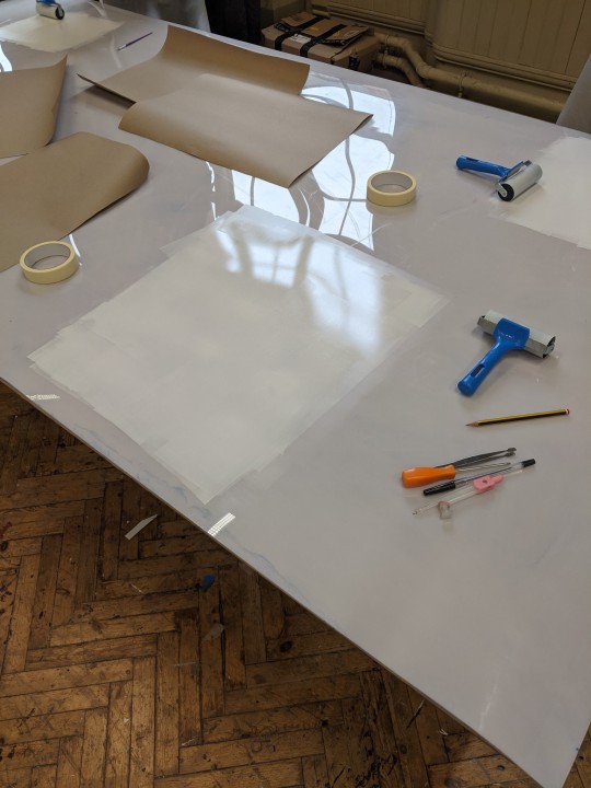
We were given a taster workshop on Monoprinting which I was particularly excited about as I have tried it once before with acrylic paint but not really had the opportunity to do since, nor have I been able to use ink like we did in the studio. This technique begins with rolling the chosen medium, ink in this case, to form a thin layer over to a flat surface such as Perspex or glass which you can see exampled below. This part of the process takes the most work but I found it to be quite a stress reliver. After you have done this, you carefully lay your paper or whatever you are printing on to over the top of the ink without pressing down, we used masking tape to secure our paper to make sure it didn’t move around too much during the process, this also allows you to preview your print whilst ensuring the paper will return to it’s original position and not disturb your work.
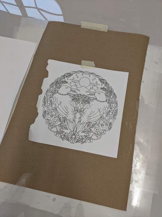
I chose to create a print using a page from a nature mandala coloring book that I own, when I was doing my initial ‘digging deeper’ research and the looking in to Bonsai, I briefly explored several traditional Eastern belief systems, in particular, Vastu Shastra which is derived from Hindu and Buddhist beliefs systems. The mandala ties in to this nicely as it also originated from Eastern culture and is most commonly associated with Buddhism. I’ve always found the mandala to be inspiring to me personally, I am fascinated with the complex geometry of them and I love how they are interpreted differently among varying cultures and so it was nice to be able to revisit this and create something directly influenced by it.
As you can see above, I’ve used the page as a stencil by taping it to the brown piece of paper I was printing on to, we were advised to bring something pointy to make marks with and so I experimented with a metal compass, some tweezers, a screwdriver and a biro. I started out with the compass as I had initially thought that this would give me the best results but I actually found it really difficult to use as I couldn’t apply the pressure required to make the ink transfer on to the paper without tearing the paper and stencil so I quickly moved on to the tweezers as they have a rigid flat edge that I thought might be good for producing solid lines but again, I found these to be inefficient, especially for smaller details due to their size.
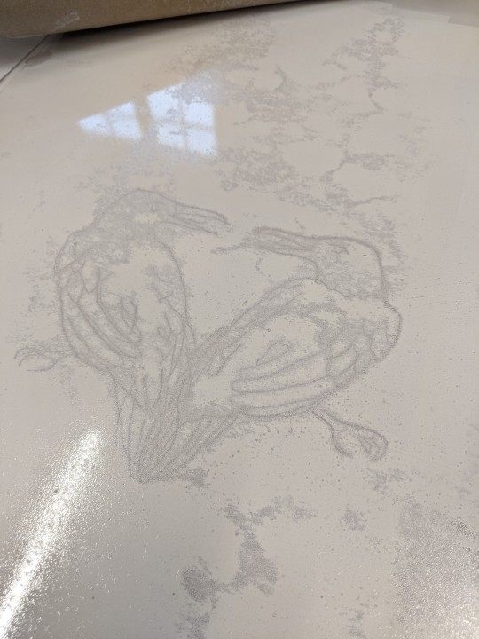
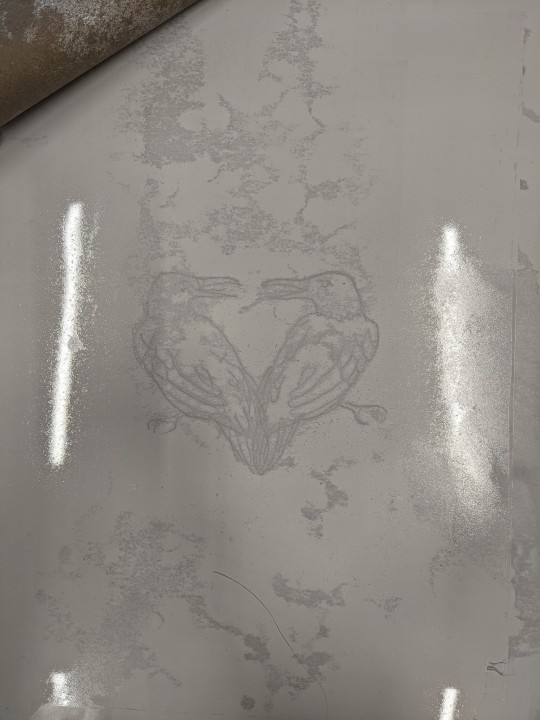
This is the imprint of the design in the ink on the table, looking at this in hindsight, I think I actually prefer it to the print itself. The lines here are much clearer then they are on paper which makes the finer details like the eyes appear much more clearly. I also like that you can see a wider variety of tones in the ink, for example, the lines where more pressure was applied show up a darker grey in comparison to the residual ink that transferred on to the paper during the mark making process. Amongst the off white color of the ink itself, I think this variety gives the drawing far more definition than what the print does as here the marks from the accidental transfer act more like shading amongst the lines whereas in the print they actually mask these details rather than accentuate them. I’m also really fascinated by the texture of the ink, the lines almost look as though they ink has been scraped off in places and the places that the paper touched accidentally have left this really interesting bubbly almost rough looking texture, the rest of the ink has this lovely sheen and reflects the light in the studio in a really interesting distorted way. Because the ink used quite sticky in nature, it also shows up little specks of dust and debris from the studio and surface within itself which I think is quite charming and well represents the mess and sense of unpredictability that comes with printing like this. Finally, I found appeal in the temporary state of this image, it was a little bit sad about having to re roll the ink and get rid of this imprint in order to create another piece of work but it encouraged me to really make sure I had taken a good look at it before it was erased which I think has led me to me being able to deeper analyze this over the final work and contributed to my overall higher appreciation for it.
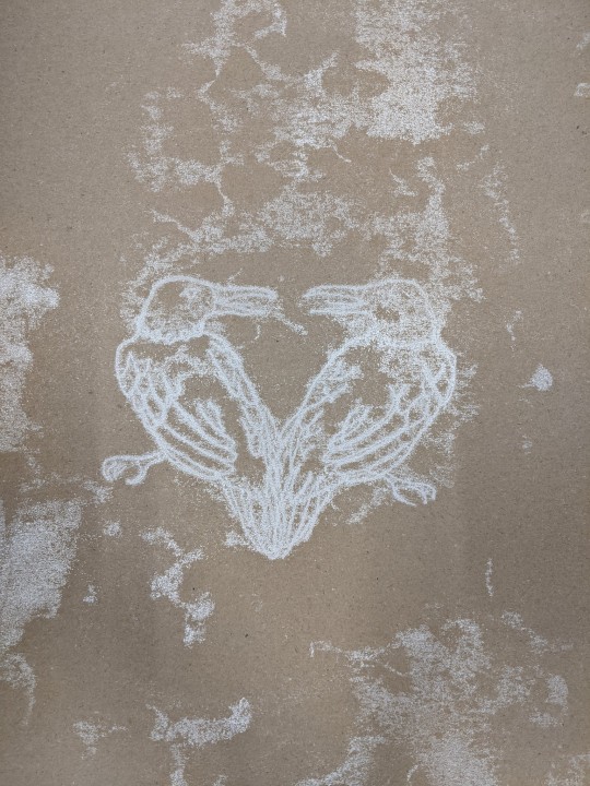
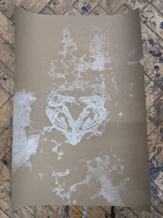
I used a screwdriver to create most of this print, it gives a really interesting effect as the point obviously creates quite a precise line whereas the crosses on the screwdriver apply less pressure to the page giving a more diffuse fuzzy effect around the edges which I really like. As previously mentioned, I was a bit disappointed about the loss of the details in this print but overall impressed with it for my first attempt. Despite having taped my paper down in an attempt to ensure that I didn't distort the print whilst creating it, I have somehow still ended up managing to print these birds with a slight overlap in them which wasn't my intention but does give a nice result. I think it makes the shape of the two birds together look remotely heart shaped which could be interpreted as symbolic of things like love and togetherness for example. The main thing I do like about the print is the contrast between the color of the ink and the paper itself as this makes the white show up a far more brilliant color in comparison to the way it looks rolled out which is quite an off, dulled out shade.
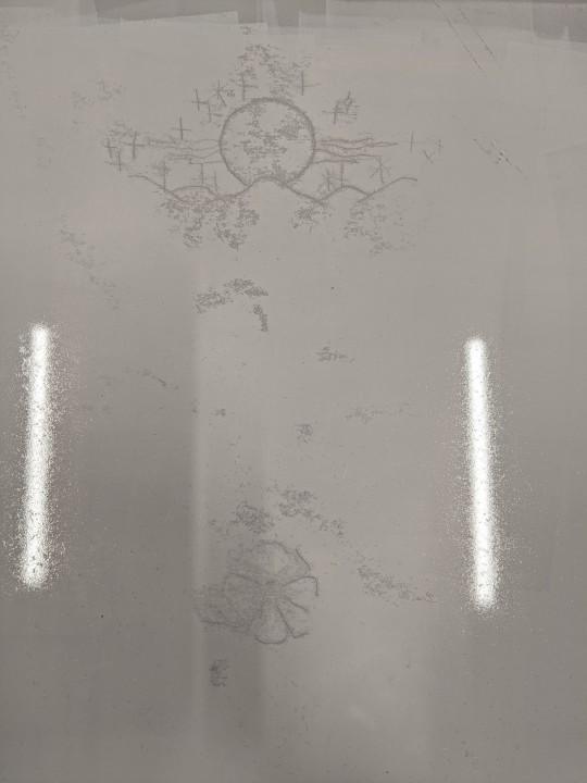
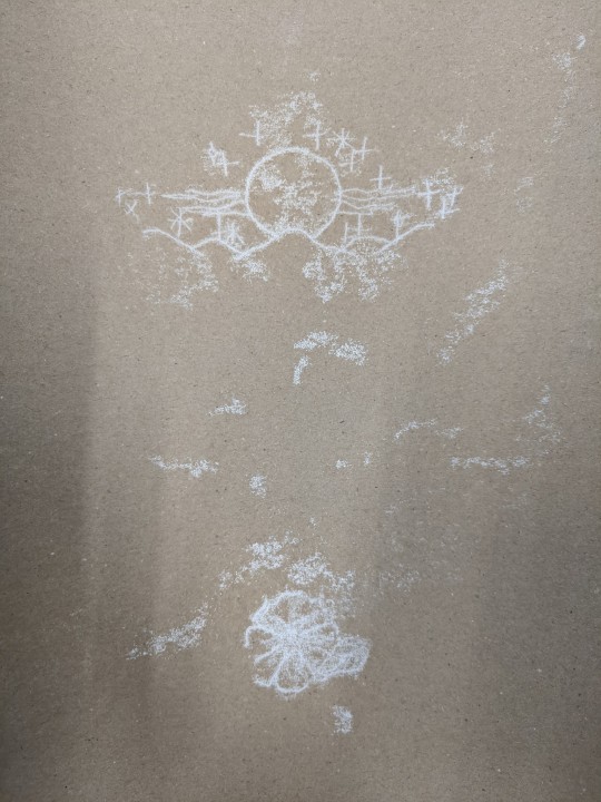
Here is a second attempt using another area of the stencil, as you can see in this one, there is far less residual ink transfer which indicates that the ink was too thick and I didn’t roll it out enough before my first print.
0 notes
Text
June 14, 2020
Stuck Together
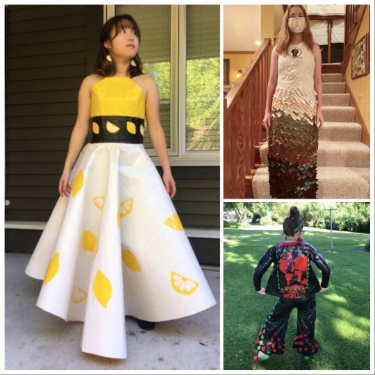
Dresses by Gabrielle C - lemons; Evelyn K - tux; Callan R - Black Lives Matter
For the past three months, I have so appreciated sharpening my lens towards the creative gestures that this time has inspired. These musings began with a hunch that artists would play a significant leadership role in the resiliency that such crises require. While confirmed, my thesis has expanded to recognize that ALL humans are fundamentally wired to be resilient. And because innovation is a key ingredient of resiliency, people from all walks of life (professional artist or otherwise) have been seeking creative expression to tether them through these uncertain times.
For example, take these insanely fanciful prom dresses that teenagers around the US have designed in just 48 hours, using 40 rolls of duck tape and no other materials. I can only imagine to what extent feelings of uncertainty have been exacerbated for these high school seniors, already poised for one of the biggest leaps of their life. With the possibility of on-campus fall enrollment at new institutions threatened, and stripped of important rituals like graduation ceremonies and grad dances, these youth have had to contend with an abundance of shattered dreams. So, it was unexpectedly surprising to see the hope, compassion and beauty in the creations that resulted from this year’s Stuck at Prom Duck Tape Challenge. Browsing the 100’s of jaw-dropping entries on the contest’s website (https://www.duckbrand.com/stuck-at-prom/2020-gallery), there was not a single Covid Sucks, self-pitying design in the bunch. Instead, you can find tributes to essential workers and Black Lives Matter, mottos of solidarity, and an artful nod to “making lemonade.” Knowing that our future is in the hands of these thoughtful young people is perhaps the most encouraged I’ve felt during this entire pandemic.
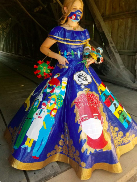
Dress by Peyton M - frontline workers
June 15, 2020
Covid Commissions
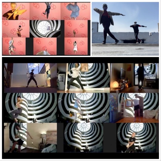
Various WPA Virtual Commissions - see link below
Physical distancing and other economic challenges, resulting from the coronavirus, have taken a huge toll on artists’ livelihood. Currently, many existing arts grants have been either cut or postponed, in order for governments to reallocate funding towards critical services like health care, transportation and housing. And while I believe that the arts are as critical as breathing, full-well contributing to our physiological, psychological and self-actualizing needs, they still fall pretty far down most people’s interpretation of Maslow’s hierarchy.

Thankfully, there have been numerous emergency relief funds available to pick up the financial slack for artists. So, these have provided much needed temporary help to cover living expenses. But they haven’t necessarily supported the creation of new work. Fortunately though, some institutions have recognized the essentiality of the arts by putting them front and centre of their funding priorities. One such organization is the Guggenheim, whose board and donors contributed $150,000 to their Works & Process Virtual Commissioning fund which supported performing artists from a variety of mediums to create up to 5-minute video pieces from home. Like Cooped, a project I referenced on June 4th, all of the resulting works can be viewed here:
https://www.youtube.com/playlist?list=PLJ08rQmWB63RFC3avQF-nDsneUXLrUd4X
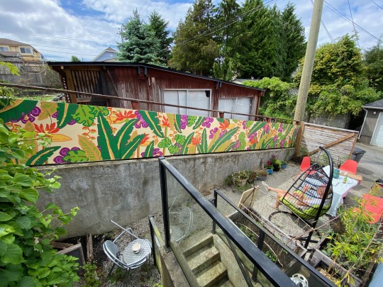
As I mentioned earlier, we dabbled in a little commissioning ourselves, during quarantine. And here is the promised finished product by Natalie Warkentin (@morningmusings), the very talented artist of Bloom: A beautiful process of becoming. Her playful, vibrant piece has made a world of difference to our daily joy, with the inordinant amount of time that we usual out-and-abouters have been spending at home! And we were also thrilled to learn that it has, indirectly, already led to a second commission for her.
June 16, 2020
Piano Play
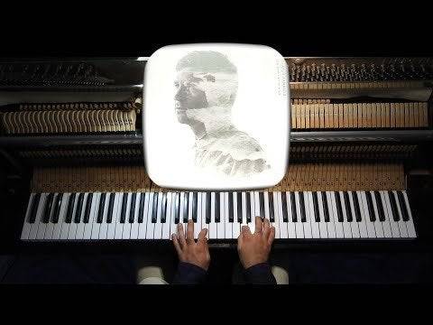
In surveying my peers, I’ve noticed that this has been a time for reconnecting with long-lost friends. As some of these old relationships have resurfaced for me, one of my favorite “icebreakers” has been to ask what new pursuits they’ve enjoyed during this period. For many, it’s been sourdough starters; others gardening; and some, learning French. But I’ve also found that many adults are taking up instruments, which makes me extremely happy. I can’t tell you how many times, throughout my career, after mentioning to a stranger, on a plane or elsewhere, that I was a flutist, they replied “Oh, I wish I played an instrument,” ... almost as if they were already dead. My habitual response is always to encourage adult music-making, and it’s one of the reasons that the majority of our non-profits’ arts programs target adult populations. While I fully support early childhood musical and artistic development, I don’t think these opportunities are nearly as lacking as those for “big kids”. One of my friends, in an effort to brush up on her Grade 4 childhood piano skills, recently asked if I could recommend some playable, accessible pieces in a variety of genres (from film scores to pop to classical). Since keyboard or piano seems to be the most common new instrument for people to learn later in life (with perhaps only ukulele as a close second), I thought it would be fun to post the list that I shared with her. Each of the scores, below, is available online, for free or purchasable download, and generally requires the player to use only one finger, in either hand, at the same time. For a final extra tip: Musescore.com has a 30-day free trial, during which you can download to your heart’s delight!
Regina Spektor The Call (from Chronicles of Narnia)
Sufjan Stevens Mystery of Love (from Call Me By Your Name)
Erik Satie Gymnopedie #1-3, & Le Tango Perpetual
Arvo Part Fur Alina
Olafur Arnalds Tomorrow’s Song
Thomas Neumann Theme from American Beauty
Yann Tiersen Valse d’Amelie
Icelandic pianist, singer/songwriter, Olafur Arnalds
June 17, 2020
Cause and Effect
I love the music of language. Perhaps it’s why my transition from flutist to writer has felt so natural. I rarely remember the lyrics to songs, instead hearing the syllables as a collection of phonetic melodies. I also experience sounds somewhat synaesthetically (synaesthesia being the neurological condition where certain senses, which are not normally connected, join or merge together. Like certain alphabetic letters being associated with certain tastes, or particular smells being connected to sounds). For me, musical sonorities have always been strongly linked to specific colors or shapes. And the geometry of certain words have very distinct and often pleasurable textures when they bounce around my mouth. Perhaps my favorite example of this is the Buddhist word for the “interconnectedness of all things”: Pratītyasamutpāda. More clearly defined, this term refers to dependent origination, or dependent arising, a Buddhist philosophy which states that all phenomena arise in dependence upon other phenomena. Simply put, it’s the law of cause and effect. The far-reaching global butterfly effect of Covid has made all of us keenly aware of this law. Like never before, we are now considering the consequences of our actions in a myriad of ways: like whether or not to touch a pedestrian crossing button with our hands, scratch our nose when it itches, or hug an aging parent. So, while the threat of this virus has had huge negative repercussions for many people’s physical and mental health, I can not deny that there is also a positive way in which it has reminded us of our interconnectedness. Of course, it’s a horrific shame that it took a deadly pandemic to wake us up to they symbiotic nature of all things. And, for my generation and those younger than me, (particularly in North America and other cultures who have not experienced war or famine or a health epidemic, first-hand, for more than half a century), it may only be global warming that has demanded we truly consider how our behavior impacts the people and environment around us. However, even the impact of that seems too large and slow for most to fully fathom. It’s why we still drive like fiends, strangle turtles with our plastics, and fly to Hawaii for weekend getaways (and, of this sin, I shamefully confess I’m guilty too!).
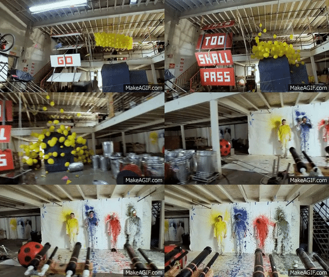
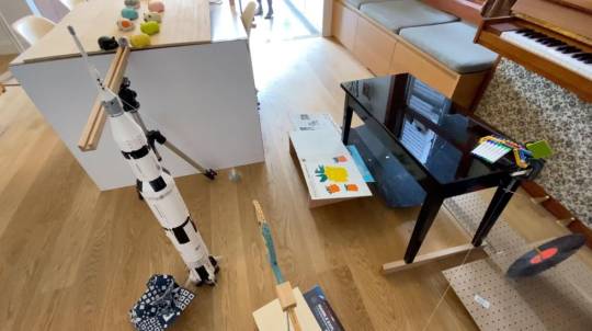
So, we clearly need all of the reminders we can get, which makes this recent contest I learned about all the more fitting. There is perhaps no one who has more artfully or playfully illustrated the nature of phenomenological cause and effect than Rube Goldberg. Maybe you have seen his machines that combine cuckoo clocks, toy rockets, ping pong balls and string in elaborate chains of events that result in a single action. The band OK Go is famous for music videos crafted around such devices. And here, you can check out an absolutely brilliant one of theirs, with a message that we all need to hear right now, This Too Shall Pass: https://www.youtube.com/watch?v=qybUFnY7Y8w
Everyday folks have also been trying their hand at making such contraptions, for the sole honor of being named winner of the recent Rube Goldberg Soap Challenge. And you’ll be amazed at what this Toronto family devised to earn the crown: https://www.cbc.ca/radio/asithappens/as-it-happens-tuesday-edition-1.5604697/toronto-family-thrilled-and-a-little-bit-surprised-to-win-rube-goldberg-challenge-1.5604698
June 18, 2020
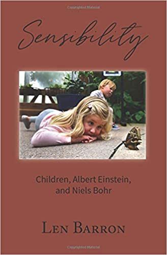
Sensibility
My Uncle Len, a playwright and educator who has engaged in community arts throughout his career, has been a constant muse for me. But more than professional expertise, it has been his sensibilities that have served as my true inspiration. Len defines sensibility as “how we see, what we focus on, affirm and move towards in life.” He is so convinced it is the subject most necessary to study, at this time, that he has written a book about it - his life manifesto, if you will.
Len is simply one of my favorite people on earth. It’s hard not to adore a guy who decorates his exquisite garden with found objects, runs each of his theatre pieces as benefits for various charities, and tries paddleboarding for the first time at 85. This is right in keeping with the sensibilities he holds to be most critical in life, “beauty, fairness, and playfulness.” And while he’s worked on this piece for years, its message could not be more well-timed. Because, to use his words, imagine how effectively we could deal with pandemics, police brutality, and global warming, “if only everyone was rooting for everyone.”

Len’s Einstein likeness is not lost on anyone. And he has made him (and his physicist pal, Niels Bohr) the subject of many of his theatre pieces, not because of their scientific prowess but because they are prime models of “beauty, fairness, and playfulness” themselves.
Like Len’s inspirations, Einstein and Niels Bohr, he possesses the rare ability to find unified principles in seemingly disparate things. In Sensibility, a child’s wonder for a butterfly is illustrated to be as important an ingredient for the welfare of humanity as the thoughtfulness these giants’ exercised, advising on the development of the atomic bomb. Through Len’s unique lens, the reader understands fairness from the perspective of a fifth grader dealing with bullying to a physicist harboring Jews in World War II. We see the critical need for playfulness in everything from driving a junk truck to making a theatre piece. And now, just as the specter of a dangerous virus is re-awakening our sensibilities to affect social change with unprecedented speed, this book is a perfect tale for the times. It concludes with the prescient and hopeful story of 1,500 activists, linked hand-in-hand at the Encirclement of Rocky Flats, while they protest a nuclear plant in 1983, ultimately resulting in its shut down. This exquisite, slender volume is packed with instructions on how to live a compassionate and fertile life. And the beautiful equation it proposes is: Essential life skills = Mastering a Childlike Quality squared (E=mc2).
Just released on Amazon, it is now available here:
https://www.amazon.com/Sensibility-Children-Albert-Einstein-Niels/dp/B088B59P9Z/ref=sr_1_6?dchild=1&keywords=sensibility&qid=1591823421&s=books&sr=1-6
June 19, 2020
Comfort with Impermanence
Historically, humans have gone to preposterous lengths to deny and defy their impermanence. From Egyptian mummies, to cryogenic freezing, to time capsules left for future or alien populations to learn of our legacy. One such preservationist effort was the Voyager Golden Record - a 12-inch gold-plated copper disk curated by Carl Sagan, and sent to space with the 1979 launch, to portray the diversity of life and culture on Earth to whomever might find it. In addition to photos of athletes, mathematical formulas, and mothers with child, are recordings of birdsong, speech in 50+ languages, Bach, Chuck Berry, Indigenous songs and Indian ragas. To judge, for yourself, the accuracy of this audio/visual snapshot of human worth, you can listen to the full playlist here: https://www.youtube.com/playlist?list=PL4D51474AB7BE5595
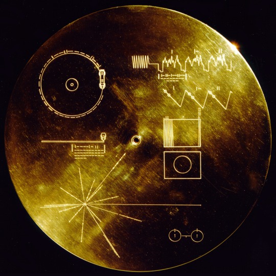
Despite these attempts to ameliorate our fears about our own mortality, our anxiety persists. And now, in these particularly uncertain times, with viral stats, regulations and restrictions changing on a daily basis, more than ever, we need tools to help us become more comfortable with impermanence.
For me, mindfulness meditation is the most expedient way to come to terms with the fundamental truth that all states of being are fleeting and everything is in constant flux. As we become the Watcher rather than the Doer, we observe that our thoughts and feelings are as fleeting as the phenomena around us. And simply recognizing and accepting this can actually bring great comfort. Poet Mary Oliver understood this well, as she describes evocatively in her poem, In Blackwater Woods.
Look, the trees are turning their own bodies into pillars of light, are giving off the rich fragrance of cinnamon and fulfillment, the long tapers of cattails are bursting and floating away over the blue shoulders of the ponds, and every pond, no matter what its name is, is nameless now. Every year everything I have ever learned in my lifetime leads back to this: the fires and the black river of loss whose other side is salvation, whose meaning none of us will ever know. To live in this world you must be able to do three things: to love what is mortal; to hold it against your bones knowing your own life depends on it; and, when the time comes to let it go, to let it go.
And so, too, I think it is time to let this blog go. At least for now. It feels, in its own way, like a time capsule of a very potent moment in our lives. And, as that, this infintissimal drop in the bucket of human thought feels complete. So, while it can seem frightening to be reminded of the speck in the universe that human history truly is, I actually take great solace from understanding our smallness. On this note, I will return to the same text that consoled me early in lock down. I also shared this with my dear Uncle Len, whose 87th birthday just happens to be today. As all people his age, his life has been particularly disrupted by this virus. But as someone who appreciates physics from the persective of the beautiful dance we all do with each other and the cosmos, he received these words with particular gratitude. It is a passage from Maria Popova’s March 18th Brainspickings newsletter, published just one day after the world shut down:
“Meanwhile, someplace in the world, somebody is making love and another a poem. Elsewhere in the universe, a star manyfold the mass of our third-rate sun is living out its final moments in a wild spin before collapsing into a black hole, its exhale bending spacetime itself into a well of nothingness that can swallow every atom that ever touched us and every datum we ever produced, every poem and statue and symphony we’ve ever known - an entropic spectacle insentient to questions of blame and mercy - devoid of why...The atoms that huddled for a cosmic blink around the shadow of self will return to the seas that made us. What will survive of us are shoreless seeds and stardust.”
This final entry is my 64th, a number that has been my favorite since I was a small girl, for its symmetric beauty (8 squared, 4 to the 3rd, 2 to the 5th). Interestingly, this powerful number is also frequently referenced in spiritual texts and throughout pop culture (the number of generations from Adam to Jesus; the number of “tantras” in Hinduism, the number of squares on a chess board, the number of crayons in the popular Crayola pack, and the number of Hexagons in the I-Ching). The meaning of Hexagon 64 is “unfinished business.” Therefore, the story, of course, will go on. Whatever windswept seedling will take root next, however, I do not yet know...
64th Hexagon combination in the I-Ching
0 notes
Text
Game Dev Update | 9.7.17

It’s not just a Seer’s Staff. It’s a greeeedy Seer’s Staff. And it’s looking at your stuff, so better hide the valuables.
Animated gear is just one of many upgrades we got working last month on Exiles, so we’re back with another host of new developments and updates.
Last Update, we saw the Forge come online, showed a first-look at the evolution of combat mechanics, UI design, animations and the new avatar system. This time around, we’re going to dive into Ranked play, our progress on VFX, tiering Exiles loot, Difficulties, Faction relationships, and a very angry Elk.
As always, let’s dig into it together in live Discord chat or on the forums!

RANK
Our last build of Exiles featured some long-awaited systems coming online. I’ve written about the Forge at length, but no less exciting for me is the PVP Rank system now in operation.
It’s a single-point Rank system where players go from Rank 25 down to 1 and then enter the Legendary ladder for supremacy. As you can see from the badges here, there are a number of steps (gems) to progress through each badge, each with commensurate rewards at the end of each Season.

I’ll share the exact rule system as we finalize it, but we’re experimenting with streaks and progressions. Right now, it’s one win/loss, one point plus or minus, coupled with a couple of streak options. Naturally, I spent the first several hours of the build’s existence power-ranking to 1 to make sure that our resident Bard (SingmeAsong) didn’t attain that rank with his cheater-admin-OP characters.
/scowls at the Bard.
VFX
Across Player Abilities, NPCs and Battle Environments, visual effects are starting to make their way into the game’s innards.
We started with effects for Player Abilities, and will soon share these in the context of battle, but here’s 1st looks at
Gravity Prison - Alters the gravity around the target dealing damage and slowing them at an increasing amount for several rounds.

Destruction’s Wake - Deals heavy damage, reduces the target's Martial Resistance and increases Strength of the caster
And my current favorite, Unstable Magicks (that is spelled CORRECTLY) -Consume all buffs to self to cast a chaotic spell that increases in damage by 10% for each buff consumed.
We’re working on applying effects to Legendary items as well. You’ve seen this sword before, but now it’s so much frostier...

Have a look at these and more Exiles effects in this video posted by our own Yoeri Luos Vleer, who’s been cranking them out with crazy gusto.
DIFFICULTIES
The map continues to evolve, as does the game’s PVE systems. For challenge and replayability, we’re working on a system of difficulties for Quests to provide different levels of combat. Here, you’ll see the South end of the Wildewoods Zone, with Port Endmore there above the Difficulties menu. The activities to do on the map here will be filtered by difficulty as well as Events, so you can quickly see what is available to your character and choose (some Events will be rooted geographically, some not).
And yes, with greater risk comes greater reward-- we’re starting to input the Quest chains and their tasty treasures now...
A NEW LOOK FOR LOOT TIERS
We’ve shown the visual tiering system all along the way, and just as the gameplay and UI have evolved, so too has the way we’re approaching tiers. After experiments with changing model geometry and textures, then just textures, then both again, we’ve hit on what we think is the right solution.
The intent is to give the lower-level player interesting gear while offering a significant visual bump up as the same equipment levels-up (via upgrade in the Forge) or is earned in battle once the player is at the appropriate level.
Here’s the system for a basic Warrior helm:

The Tower Shield:

And the Barricade Shield:

This results in a tough, banged-up, less-refined look at Tier 1 and a more elegant power-lookat Tier 3 (and allows for further creativity to the color-tells of Rare and Epic gear).
We’ve also been busy “component-izing” weapons to allow us to create as much variety as possible without going back to square one. A system of weapon-LEGOs, if you will. Using this, we’re starting to see the opportunity for --in the example here-- 9 different weapons, including axe, mace, spear and staff variations from one-ish set of parts.
BOSS ENEMIES GET TURNED INTO LOOT
You might feel sorry for ol’ Grimhowl until you learn what he’s been up to. And you will, but not for a ways into your levelling Quest line. Suffice it to say, he’s not a nice wolf and this fate is perhaps too good for him.
He does make a nice set of Shoulders though.
PUT IT ALL TOGETHER
There will be a near-limitless number of looks you can achieve with your character’s gear, but here’s one based on the helm we showed last Update, the Narrator’s chest piece, Grimhowl’s Pelt and the weapon/shield combo from this post.

Note: comments about his ears clipping through the helmet will merit a SMITATION. We fixed it.
NEW BATTLE SYSTEM COMING ONLINE
Last Dev Update, we covered the changes to the combat system that we’ve been working on and this month, those changes are going into the build of the game. By month’s end, we should be testing those changes in earnest and we’ll report on the results right here.

Notice the current Stance-- the eye next to your avatar and health bar-- as well as the Stance you will move into should you choose each Ability.
(Go here for an explanation of Stances).

Here, you will cycle through your available Ability Loadout.
FACTIONS INFOGRAPHICS
We’re starting to experiment with how to display the goings-on within Embermark for your lore pleasure. Factions within the continent will be allies, indifferents and mortal enemies of each other, and your actions within the game will affect them in a host of different ways.
And for every action, there is a reaction, right? We’re working on how completing certain Quests or defeating certain foes will affect your place in the world as well as what might become available (or locked) to you. In addition, the plan is for a changing landscape-- so one Season (remember a Season in Exiles is currently a month of real-time) might see the Siege Dwarves and the Manifested at each other’s throats. Another, they might enjoy an uneasy alliance. How we’ll ultimately roll this out is up to what we learn in testing and beyond-- we’re just digging in.
Thus, don’t try to fully understand this infographic-- it’s a work-in-progress snapshot on Factions and how many allies/enemies they each have. Note that House Ronin... just doesn’t care. And The Purge wants to see everyone burn.
(For a higher res version, click here)
THE LENARI ELK
The Zone of Lenari is a landform sandwiched between the rocky ruins of Siege and the frigid forests of Eremis. Many species of forest-dwelling animal, including this massive Elk, call the Zone home.

After the Collapse, “embers” issued forth from the Breaches that appeared across the continent. Those embers fell on flora, fauna, inorganics, everything. In some cases, nothing happened. In others, the embers brought pain or death. And in other cases still-- the embers created fantastic alterations to whatever they fell upon. Marks. These Marks created visual mutations, sometimes with power increase or change.
The elk of Lenari are a species whose biology was changed-- they’re faster, smarter and imbued with a power you will have to experience in the game.

The markings along their coats and the coloration of the antlers will be significant to understanding how to take one of these down (and whether you even should).

NOW REMEMBER
We’ll keep sharing details as we soon head into testing (remember to PM TheWizard on the Exiles forums with your device type if you want in on closed testing & beta later), and you can count on early impressions from the testers throughout our various channels.
If you haven’t already, follow along with Exiles development on Twitter, Instagram and Facebook. And if you haven’t, I’ll find you. And SMITE you.
THERE’S CHAT CHATTER EVERYDAY AS WE READY TO BATTLE
If you want to hear about the game, ask questions or connect with others who are helping the development team think about features, design and narrative, hop into the Discord Channel for live chat and say hi– it’s a friendly lot with plenty of daily shenanigans (there’s even– still– a Shenaniganizer).
BONUS: IT JUST WOULDN’T BE THE SAME WITHOUT... TATTERS
You can’t very well start the game adorned in glittering armor and glorious whatnot. Thus, I present to you a bit of Common gear that does--um-- very little for you. Gotta love them... Tatters!

2 notes
·
View notes
Text
What Parallelism Is and How to Use it to Improve Your Photography
I’ve always had a fascination with geometry and man-made structures, their perfection has a strong attraction on me. It took me time to realize that what I appreciated most wasn’t necessarily their symmetry or the simple repetition of shapes but the parallelism between the various elements of the construction of an image.
To better understand what parallelism is, you first need to deconstruct photography and bring it back to its essence. A photograph is light, shapes and colors (or tones, if we speak about black and white photography). Those are the visual blocks that form a photograph. Sometimes there are similarities between those different parts, for example, a rectangular shadow on the ground in the foreground projected by a traffic sign and the rectangular shape of a window of a building in the background.
I have the conviction that our eyes and our brains are naturally attracted by those “connections”, those visual similarities that surround us. I’m probably even more sensitive to them due to my past career in graphic design.
For me, photographs become more interesting when they have visual links between the parts that compose them, it’s not a necessity but it brings a little something more. It’s like the cherry on top of the cake.
In this article, I will explain to you the different types of parallelism and how to use them to further improve your photographer eye on the long term.
Note: The following is purely subjective and reflect my own findings, they should not be followed to the letter but used as a base for further experimentation.
Parallelism in nature
Some people believe that nature and everything that envelop us is organized in a rigorous manner. The order of things isn’t trivial, from the alignment of planets to the cells inside our body, there is an underlying system that makes our world somehow structured. There is even occasionally a unity and regularity in fauna and flora.
When you take a walk in the woods the trees that surround you are a finite number of vertical lines pointing at the sky, the feeling of unity is in this case caused by the repetition, the parallelism of the trunks. Same goes for a chain of mountains, the curves of mountainsides blend together and form a mound of soft lines that look alike.
Hodler, Ferdinand. Lake Thun, Symmetric reflection. 1905. Oil on canvas.
We can also take the celestial vault and its thousands of visible stars, would that vision still be as beautiful if each of those points of light where of different shape, size, and color?
Parallelism in the human figure
Our anatomy is full of similarities, symmetry, and asymmetry. We just have to look at our left and right side, the opposition of our arms, the space between our eyes, the repetition of our fingers.
This goes even further with our clothes, the pleats and folds forms repeated lines. Our movements are often formed by two or more of our limbs. Our figure, slender, is a line that gets on together with other human beings around us.
A crowd grouped around a speaker, a group of friends crossing the street (or the Beatles Abbey Road album cover), a line of people waiting for the bus. Those are all parallelisms.
Photograph by Elizaveta Porodina for Vogue Ukraine 2015
Those two persons above that gaze at each other are a great example of parallelism in photography. Look at their hats, the silhouette of their faces, and the lapels of the man coat contrasting against the sand in the background, which shape is oddly similar than the woman face. The empty area between them and on the sides of the frame, they are also very similar in area and shape. Those are little details that we don’t necessarily notice at first sight but they speak to our subconscious. Our photographer eye takes delight.
Visitors at the Musée Rath in Geneva looking at a Ferdinand Hodler painting called “Eurythmie”
The picture above is another example of parallelism in the human figure. In the painting “Eurythmie,” five men wearing a white cape are walking at the same speed, deep in their thoughts and arched over the ground. “Eurythmie” literally translates to rhythmic harmony, are those priests or hermits in harmony with themselves or with God?
I chose to photograph the painting including the foreground museum visitors, they are aligned in a similar fashion than the subjects of the painting creating another layer of parallelism in the frame.
Construction principles
We saw before that a photograph is an assembly of visual elements and that some of them are linked to each other. There is a number of construction principles, methods that can help you take the various visual “blocks” composing a scene and order them. A photograph can be built following rules, just like how an architect would design a house.
Note: I strongly encourage you to break rules from time to time.
Verticality
We are surrounded by vertical structures, starting from the walls that form our houses and the buildings in our streets. Verticality is to me the easiest construction principle to put into practice, as it’s the most represented in urban areas. By including two or more vertical elements in your frame you’re already creating parallelism. Here are a few examples.
Samuel Zeller, National monument of Scotland in Edinburgh
I shot this photograph above while on a trip to Scotland, I was there to make images for my first book, Botanical, and I also took some time for myself to explore various cities. In Edinburgh, there is a hill with a monument on top of it that looks like a part of an ancient Roman temple and feature twelve columns. A lot of tourists are taking pictures of themselves standing in the middle of the central columns, but I went to the other side and waited until this couple showed up.
I framed two columns and the couple to give a sense of scale, and while doing so I also realized that I created a parallelism. The two columns are a vertical parallelism to the two people, and there is even a second repetition if you consider the people’s legs, which mimic the columns as well. It gives the image a rhythm and an interesting structure.
Samuel Zeller, Lausanne lakeside
Another example: a photograph of three metal poles used to the docking of ships in Lausanne a city in Switzerland on the shores of Lake Leman. They are not perfectly straight but they create a verticality and a repetition in the frame. The reflection in the water becomes part of the composition as an extension of the poles themselves.
Horizontality
Same as verticality but rotated ninety degrees, jokes aside it’s probably one of the easiest construction principles to find in nature. The horizon is often a good starting point to build up parallelism in your images, look for elements that are similar to this line. Here are a few examples.
Samuel Zeller, Crans-Montana Switzerland
How can mountains shot in a vertical orientation be a good example of horizontal parallelism? Well if you decompose the image above you’ll notice that it’s made of three planes, the foreground hill with the house, the denuded rocks behind it and the cold gray mountain in the background. Those three areas of the images are separating the frame in a horizontal way. By layering different elements in your photograph on top of each other you’re instinctively using this horizontality principle.
Photograph by Darren Brogan of the Alisa Craig, a small island west of Scotland
The very delicate image above has a bit more than meet the eye. We already saw that parallelism can also be based on textures and colors and here the gradient from the sea is reflecting the gradient showing on the island itself, it’s also a gradient that repeats itself in the sky. Those elements are all parallel to each other in a horizontal way. Using the horizon line definitely helped here in building up the composition of the image, it acts as a base.
Symmetry
When we think about symmetry we picture a shape that becomes exactly like another if you flip, slide, or turn it. But symmetry doesn’t exclude it’s opposite, asymmetry, it should be a whole. Asymmetry and symmetry are big contributors to beauty. Stop considering the purely mathematical aspect of it and embrace its duality. Here are a few examples of photographs that are exposing in their construction this principle.
Photograph by Jarrod Pimental
Two boats in a dry dock, a pure and simple photograph. The composition is straightforward but also masterful, the two lines formed by the hull are converging and directing the viewer eye to the center of the frame. The symmetry created here is imperfect but that is also the beauty of it, if it was geometrically exact it wouldn’t have the same fineness.
Photograph by Sergio Larrain/Magnum Photos. Santiago, Chile. 1955 ©
Sergio Larrain is another photographer that I admire, he was a true master and decided to give it all up for a spiritual life. If you haven’t read about his work I suggest that you check out this article by Lars Mensel. I included the image above because for me it perfectly represents the duality between symmetry and asymmetry. There is a parallelism between those two kids, they’re both sleeping, they have the same calm faces and hair yet they’re not exactly mirrored.
Perfect symmetry is cold, imperfections give life and I love life, that’s how French-American sculptor Niki de Saint Phalle put it up and I couldn’t agree more. Thinking about balance in your photographs rather than symmetry in its geometric aspect is a good starting point.
Rhythm
I initially wanted to name this principle “repetition” but I realized that it could be too restrictive. You’ll understand why in an instant. Entropy is everywhere around us, and all things come and go. There’s this perpetual flow and cadence in life. The beating of your heart, the waves on the shore, the music you listen to, even this article is defined by a rhythm between paragraphs and images. It is probably my favorite construction principle to play with.
Samuel Zeller, Nazaré Portugal
A few years ago I was walking down the seaside of Nazaré, Portugal when I noticed this door at the end of a little street. It reminded me instantly of the geometrical compositions of Dutch painter Piet Mondrian that I had seen many times before in various museums. If you look a bit closer you start to notice the many horizontal and vertical lines formed by the different colors of paint and the two white gutters.
Then if you keep looking you’ll maybe see that the many rectangles, the window in the door, the door itself, the bottom part of the door, the two electrical panels and all the other “invisible” rectangles defined by the colored parts and divided by the gutters. This photograph has a complex structure, a rhythm.
Photograph by Harry W. Edmonds
Rhythm can also be a repetition of elements. Harry, who’s running a blog called Photographer’s Note, is a great inspiration for me, this picture is probably one of my all time favorite from his body of work. By looking at the world from above we better discern its composition. There’s no wonder why we are attracted by photographs shot with drones, it’s not just because it allow us to see the world from a different vantage point but it’s also because it let us discern the patterns and the rhythm that’s all around.
In this particular case, the image was not shot with a robotic flying device but probably from a bridge or a building. Next time you’re outside with your camera, try to find those elements that repeat themselves, intersect and play with each other and get a few of them in your frame.
Mimetism
The imitation and resemblance of elements can be used as a construction principle. We can find that in biology and evolution too. For example, the Phasmatodea or stick insects who mimic the aspect of small twigs to better camouflage themselves in nature. Our brains are very good at making visual associations. Here are a few examples of parallelism that share this principle.
Photography by Alicja Brodowicz
This photograph above is part of a bigger series called “Visual Exercises” by photographer Alicja Brodowicz which I featured before on Fujifeed, the blog I edit. It’s an exercise of associations — black and white diptychs showing two very different subjects that look alike. Here the hands on the right are mimicking the intersection of the two cactus stems on the left. Parallelism doesn’t necessarily have to happen in the same frame, it can also be used in series (for example when you have a spread inside a book with two images) or here in diptychs.
Photograph by Sebastião Salgado from his book “Kuwait, a desert on fire”
Sebastião Salgado is probably my favorite contemporary photographer and his monograph on the catastrophe of the torched Kuwaiti oil fields is hauntingly beautiful. I found this photo above to be a great example of parallelism, the texture of the fire is very similar to the water being poured on the firefighter. It’s a mirroring between two very opposite elements. It creates a visual link that’s helping the narrative and aesthetic of the image.
Samuel Zeller, Cactaceae pereskia from my series Botanical
This is a photograph that I took for my book Botanical, the project itself contains about a hundred photographs yet this is one of the most appreciated. There are a few reasons to it (composition, color contrast) but one of them is the resemblance between the leaves and the shapes created by the water droplets. They share the same structure, like a tree branch dividing itself into smaller twigs. There’s a natural mimetism happening between those elements that is very pleasing to the eye.
Ferdinand Hodler theory
A Swiss symbolist painter without a traditional academic art background and an infinite source of inspiration for my photography, that’s how I would describe Hodler.
He was convinced that beauty and aesthetics are based on an underlying order — a symmetry and a rhythm. Most of his paintings have a very graphic aspect and they are composed using parallelism, a notion that he borrowed in the 1890 and that was first introduced by Charles Blanc in “Grammaire des arts du dessin” in 1867 and by Gottfried Semper in “Der Stil” between 1860 and 1862.
He repeats in a recurring (but not perfectly exact) way the elements and patterns like lines, colors, movement or subjects to create a visual unity.
Hodler, Ferdinand. Walking at the forest edge. 1885. Oil on canvas.
He believed that it was more than just a composition principle but truly a moral and philosophical thought. A natural law of organizing the world.
We can see an echo to the correspondence theory between the macrocosm and the microcosm which is based on a text by Platon: ��For that comprehends and contains in itself all ideal animals, even as this universe contains us and all other creatures that have been formed to be visible. For since God desired to liken it most nearly to what is fairest of the objects of reason and in all respects perfect, he made it a single visible living being, containing within itself all animals that are by nature akin to it.”
Hodler, Ferdinand. Night. 1890. Oil on canvas.
The structure of the universe is the same in all its elements, no matter their scale. From a cosmic to a cellular level. Everything is inside everything. A city expanding itself over the years seen from the sky strangely look like lichen growing on a tree.
We then better understand this idea of parallelism and why some artists were so attracted to it.
Hodler, Ferdinand. Peaks in the morning. 1915. Oil on canvas.
Parallelism is a law that goes beyond art, it dictate life itself —Carl Albert Loosli
What is incredibly beautiful about Hodler pictures is that they are reduced to fundamental forms and an almost harmonious austerity. The notion of time and space get lost and the paintings reach eternity, his work is timeless because it layers upon an immutable system that is a reflection of the organization of the world itself.
Conclusion
There is far more to photography than meet the eye and I think that the more connections we make between it and other art forms the better. I’ve heard first about parallelism in painting and I naturally try to apply it to my work, I’m thankful for my parents who introduced me at a very young age to the work of masters through the visit of many different museums in Europe. I hope that this piece inspired you to explore other aspects of photography.
About the author: Samuel Zeller is a freelance photographer based in Geneva, Switzerland, who’s available for assignments worldwide. The opinions expressed in this article are solely those of the author. Zeller is an ambassador for Fujifilm and the editor of Fujifeed. You can find more of Zeller’s work on his website and Instagram. This article was also published here.
from Photography News https://petapixel.com/2019/01/10/what-parallelism-is-and-how-to-use-it-to-improve-your-photography/
0 notes
Link
You’ve fallen in love with something that’s a detour from your usual style. Is it a fleeting fancy? Will you love it long-term? And how do you make it work with the rest of your stuff without starting over? These are the questions I’ve had in mind as I worked on this edition of Making it Yours, and it’s time for the final look!
These pink Elroy chairs are the cutest. They’re also super trendy. If you fell hard for chevron, only to grow tired of it after seeing it everywhere, or loved boho and macramé until all of a sudden you didn’t, you might be (understandably) shy about jumping on board with the current crop of 80s-influenced pieces.
You shouldn’t paint your walls white because Instagram wants you to, just like you shouldn’t choose a dark color because I want you to! Our homes are personal, and the decisions to decorate and furnish them should be too. So yes, there is a strong trend showing up in this pair of pink chairs we’re looking at, but if you love them (and extrapolate this to whatever it is that you love), I want to show how they can work with the things you already own and continue to work years from now as your needs and tastes change. This third look imagines the chairs making their way to a spare room being used as an occasional home office and guest room.
We’ve already seen the coffee table, lamp, and planter in use. We reuse pieces around our homes in real life, so I do in my MiY series as well. I also imagine what this person would be drawn to over time, and you can see that in some of the choices below.
She had tassels in the first room, and I’ve brought back tassels in another form here. The brass side table would have worked a third time, but instead I brought in a small indigo velvet stool to pull up to the secretary desk. And speaking of the desk, I wouldn’t pair it with the dresser from earlier looks in the same room, but to go somewhere else in the house you could see that they would appeal to the same person.
Ray Selenite Pendant Lamp, CB2 I’m into lights with gemstones. Selenite (in case you aren’t familiar) is a form of gypsum that looks a lot like quartz, though sometimes cloudier or more pearly. It’s also very soft, and I’m assuming the store is delicately packaging this light accordingly? (You can scratch it with your nails. Sometimes nerdy teenage interests translate into useful knowledge!)
Vintage Batik King and Jester, Maude Woods They are a delight. A delight, I tell you!
Darby Green Handwoven Pillow, Crate & Barrel The room needed a little texture, and I like a mix of color saturation (here, muted walls and inside of the secretary, bolder in the pillows)
Peter Dunham Textiles Fig Leaf Pillow, Hollywood at Home This is double-sided and coming from the ‘official’ store, but there are sellers on Etsy making more affordable versions backed with a solid color.
Switch Coffee Table, Crate & Barrel Maybe I should have switched the top and bottom, just to show that you can? You can.
Tasseled Door Decoration, Anthropologie I think I need this little cutie in my life.
Promenade + Brighton Throw, Schoolhouse Electric I didn’t include bedding for the sofa when it’s functioning as a bed, but I pictured all white, plus the throw pillows and this blanket for color/pattern.
Christine Secretary Desk, Ballard Designs I love this so much; I wish I had a project that it would be a good fit for! I chose this independently of the wall color, but how happy an accident that they work together.
Arc Gray Large Planter, Unison Interesting planters are always such a nice detail.
Serena Teal Blue Vase, CB2 So round, so cute.
Totem Table Lamp (Large), West Elm The stacked shapes speak to the curves in the chairs and elsewhere.
Ball Green Paint, Farrow & Ball Leans neutral, a muddy celadon color.
Block Party Framed Art, Target (Project 62) Target has been killing it with these canvas prints lately! Great style, size, and price.
Piper Stool (Indigo Velvet), One Kings Lane Comes in so many colors, and the little brass banding detail is smart.
Pink Elroy Left and Right Arm Chairs, Mitchell Gold + Bob Williams The chairs we’ve been basing all three of these looks around, of course. Love ’em.
Lucent Rug (Teal Blue), West Elm Yummy, yummy color. Beware though, viscose is for low-traffic rooms (which this is).
Oneira Sofa Bed (Tidal Blue), Article I imagined this as an office/occasional guest room, and a sofa bed is great for that situation. Beyond that though, I actually prefer the skirted look to ground a sofa in contrast to the curvy and airy geometry of the chairs.
Making it Yours 16: Pink Elroy Chairs
All three together. Which was your favorite of the bunch? Could you see incorporating these chairs into your own home?
MIY 16A: Modernizing a Living Room with Classic Pieces
MIY 16B: Bedroom with Elevated Basics
MIY 16C: Occasional Office / Guest Room
© 2018, published by Making it Lovely as Making it Yours 16C: Pink Elroy Chairs | No comments | This post may contains affiliate links; I will be compensated if you make a purchase after clicking on my links.
The post Making it Yours 16C: Pink Elroy Chairs appeared first on Making it Lovely.
0 notes
Text
12 Tips for Fun and Freedom with Watercolor Abstraction
Surface, Dominance, Power and Freedom
Everything about watercolor that I love involves fun and freedom. It is such a pleasure to feel paint slide across my paper surface.
I love how bossy the medium gets. It reminds me of myself! With watercolor, abstraction becomes the language that defines beauty, power and chaos.
I’m definitely not alone. I’ve brought together three artists into watercolor abstraction who also know how to hone fun and freedom for their own ends. Here are a few tips from them so that you can get into the same groove. Enjoy!
Painting in Full Bloom with Jane Jones
Full Bloom by Jane Jones, watercolor painting
Combine the real and the abstract
I drew poppies with an extra-fine Sharpie pen then added the abstract image on top with a 2B pencil. Next, I wet both sides of the paper with a natural sponge and laid it on a smooth Formica board (also called tile board), flattening out any bubbles in the surface.
I left the paper untouched until the shine was off, then I used a tissue to absorb the water from the edges so I don’t get bleed-backs.
Start Loose
Using a 2-inch natural-hair flat, I applied the paint loosely using analogous colors of yellow-orange, orange, red-orange, red and red-violet, as well as the complement of the middle color, which is blue-green.
I also used a discord on either side of the complement, skipping blue and green and using yellow-green and blue-violet. For the underpainting, I made sure not to go over a No. 3 value.
Lost and Found
While the paper was still wet, I found the abstract shapes by painting around the forms that were losing their edges. Using the dominant red-orange color, I painted areas of the main flower, but completely covered the buds and middle-ground flower to bring the large flower forward. I pushed the background back by graying it with blue-green.
Creating Dominance
I began integrating the background colors into the flowers, careful to leave lights in the main flower and keep the center of interest very dark against the lights. I separated each shape, abstract vs. real, with gradations of value and color.
Using only pure hues, I worked wet-into-wet, layering each color; I never mixed colors on my palette. In the end, I wanted the realistic image to be dominant, and the abstract subordinate.
Floating Images Over Reality with Carole Kauber
Emerge I by Carole Kauber, mixed media
Sights and Sounds
This painting is based on the sights and sounds of Morocco. I based the imagery on some of the photographs I took while vacationing as well as sounds I heard there.
When working abstractly, it is key to take inspiration from all your senses and push them into your painting. Sounds have a look and feel, even a specific color–use that!
Geometry to Abstract
To start I floated watercolors over a thin layer of water that defined specific geometric shapes. I then placed a geometric piece of wax paper over that colorful wet shape. The wax paper, if kept smooth, helps to define a geometric shape while adding hints of textural effects.
Once that area was dry, I added new shapes and colors. Other applications of color were allowed to merge with existing shapes and forms.
Out of Control
Spattering paint to several areas created an earthy textural effect. What emerged were unexpected colors and forms. It’s great to let this piece of chaos into your work.
Unknown Ways
The exciting aspect of painting is the experimentation. It leads us into the unknown and forces me into new territories. Once forms have been sufficiently resolved and the desired landscape images take shape, I refer back to the photograph to add details that add to the overall image.
Marie Renfro
My Blue Haven by Marie Renfro, acrylic and collage
Big Brush
For abstract work, more impact comes with larger marks and overall look and feel as opposed to lots of detail. To begin this painting, I generously wet the paper with a large brush, Robert Simmons Big Daddy, and then began to apply color starting at the top right corner of the paper.
Lots of Color
The most fluent way an abstract painting can speak to a viewer is through color. I did washes of pale yellow using Golden fluid acrylics Hansa Yellow Light, and decided on a cool color scheme, so I introduced some pale Ultramarine Blue and some pale washes of Phthalo Turquoise.
I also laid in some small areas of Raw Sienna and Naphthol Red, as well as Alizarin Crimson. That’s a lot of color, but it works.
Add Texture
After the colors were dry, I get started with layering, gluing on some collage paper that I colored with acrylic colors in the same color family as the underpainting.
I used a Japanese fiber paper called sekishu, which I purchase in white and then color with leftover paint in my palette. I also glued on some textured rice papers, as well as a few strips of marbleized bookmaking paper.
Purpose with Pattern
My composition was to be a shapes-within-shapes format, a framed-in rectangle with dark edges around the outside and the center of focus in the lower left, leading to a secondary point in the top right.
I always try to design a pattern with my light values as well as my dark values that will carry the viewer’s eye into and around the painting.
Possibilities of Abstraction
Color, contrast, line, pattern and more! These are the possibilities of abstraction–and that is just for starters. Discover all the creative possibilities of painting abstract art with Abstract Painting on YUPO®. As learning artists, we can have fun with our painting while learning the techniques that will make our artistry grow in leaps and bounds. Enjoy!
A version of this story first appeared in Watercolor Artist magazine. To receive the magazine, click here to subscribe.
The post 12 Tips for Fun and Freedom with Watercolor Abstraction appeared first on Artist's Network.
from Artist's Network http://ift.tt/2z6FrLk
0 notes
Text
Best Montessori activities for 7 year olds
Geoboard - Three Ways
Otis has been home from school for the previous three days, so we have pulled out a couple of new activities! Above is a typical geoboard together with the extra turn of using grid paper. The child draws shapes on the paper then makes the shapes on the geoboard. When using the geoboard Otis typically makes random contours and occasionally creates a picture or small scene. Above he's using a transparent geoboard on the light table. I made Otis this natural geoboard - inspired by this place at Fairy Dust Teaching. I really like how it's a bit rustic and gets the kid think a little differently about making the contours. It looks somewhat more colorful too!
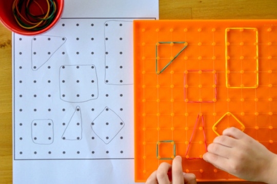

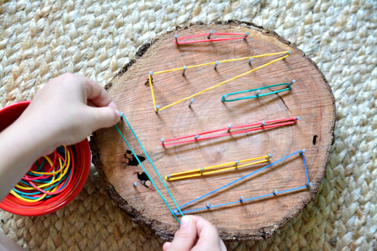
Private home daycare
Alphabet Puzzle Bag
If so, this really is a really fun activity that strengthens knowledge on the contours and type of letters. I'd not do this in a way to teach children their letters or to test them but to reinforce their knowledge. I'd comprise letters they're assured with alongside letters they may be struggling with. This really is a basic task of putting the letters from an Alphabet Puzzle or Moveable Alphabet into a Mystery Tote and allowing the kid by making use of their hands as well as their sense of touch simply to identify each letter. Select the letters from the Alphabet Puzzle (or Moveable Alphabet) and place them in the Enigma Bag with no youngster seeing. Invite the kid over to sit down at a work mat or table. Encourage the child to put one or both hands in the bag and one at a time, without peeking, identify which letter they're holding. The idea is the fact that through touch the kid forms a graphic of the letter in their own thoughts. If they are able to remember the sound of the letter it can help increase their connection between the sound as well as the shape and type of the letter. As an extension, in case you have included vowels and consonants you could also encourage the kid to make some words with the letters they've identified. Above Otis puts his hand in the Puzzle Bag and feels for a letter. He has identified this as a 'w'. He places the letter on the mat and sets his hand back in for another letter. The Puzzle Bag is one of our favourite stuff which we've used many times over time. Otis used his first Mystery Bag as a toddler with a few family items in it. It really heightens their sense of touch. Our Mystery Bag is an easy silk lined, drawstring bag. I generally keep it to around five items in the bag. With all actions at home, I attempt to keep it engaging and light-hearted. In case you give this a go I hope you love!



Geometry Love- Montessori Stuff for Geometric Form Work
You might have guessed following yesterday's post, that we have been doing plenty of geometric contour work around here! We have been using the Geo Strips (number 3.) and I am often asked about them. So I Have compiled a quick list of some other geometric contour construction sticks and bits that might be helpful for a Montessori home or classroom! 1. Learning Edge Linking GeoStix (Australia here). 2. Learning Resources Geometric Shapes Construction Set (similar Australia here). 3. Geo Strips (Australia here) (you are able to see Otis using the Geo Strips in this post). 4. Wikki Stix Basic Shapes Creative Fun Kit. 5. Learning Resources Transparent Anglegs (the Anglegs come in different sizes also!). 6. Montessori Geometric Stick Material (Australia here) (I adore this picture from Westside Montessori School of the Montessori Geometric Stick work, with a brief description).
Using Scales and Balance Buckets
Below are some other Montessori and Inquiry-Based learning ideas that I adore. These tasks are also extremely simple to put together. Our scales were around $15, or you can use kitchen scales, and we only use materials we already have at home! I adore the sensory table for younger children (#6). I believe I will attempt a set up like #3 next, where the kid has many different substances to consider and record - it looks amazing for some additional mathematics and literacy skills! 1. Equilibrium pail with loose components at How we Montessori (on our shelves here). 2. Maths In the Playground with An notion on Tuesday. 3. Magnet Trays and Scale Weighing at Learning Cente of Dundee Omaha, Nebraska 4. Fall Inspired Weighing Task with Balance Scales at Montessori from the Heart. 5. General Mathematics Provocations at Welcome to Primary. 6. Equilibrium Scales in the Sensory Table at An Everyday Story. 7. Equilibrium scales at How we Montessori. 8. Exploring Measurement Through Play - Mass at Suzie's Home Education Notions.

Montessori Sea Shell Actions You'll Love!
My children love tasks that include natural materials. Where there is something for them to hold, feel, touch. Where there is something that's interesting, with fascinating minor details. Today I'm featuring some Montessori Shell Actions whom I understand you will adore. The Shell Poster (left in top image) is from Montessori Stuff and the Univalve/Bivalve sheet is from Montessori for Everybody. Cleaning a sizable shell - Brosser un gros coquillage at Le blog de Sylvie d'Esclaibes. This really is a fantastic idea, the majority of our shells are unclean and could do with a superb scrub! Matching shells to cards - Another example of matching shells to cards can be found at Les aventures chez nounou Marie. Sea shell sorting with cards with labels at Very Montessori. I believe they are using the wonderful shell group and matching cards from Michael Olaf! The cards possess the name of the shell which introduces the language element and allows the parent or caregiver to provide the little one with the proper lingo. This really is from one of my favorite nature tables (which contained lots of shells) where Otis is making depressions with the shells into sand. I recall one of Caspar's favourite activities when he first started in his Cycle One classroom (in Canberra as a three-year old) was a tray with many different varieties of shells along with a simple magnifying glass. There is some thing exceptional about sea shells!


Playdough - Four Ways
Otis is five and loves playdough now more than ever. I've written sometimes about how we use playdough, always with distinct items and in different colours, textures and aromas. Adding essential oils to playdough is crucial. Here are four ways we are currently reveling playdough. 1. Alphabet Stamps. This is an excellent early literacy action, recalling it is best to start with lower case letters. 2. Other Stamps. We've got lots of stamps at home so there is always lots for the boys to choose from. Above are some hand carved stamps I picked up at a market, they are extremely thorough. I have likewise wiped down our Melissa and Doug stamps and these work really nicely with the playdough too! 3. Gumnuts and Sticks. I love combining natural materials with playdough. Feathers, shells and pinecones can also lead to creative play with playdough. We don't have these chewing gum nuts in our neighbourhood so I ordered them through The Natural ReSourcer, they make the cutest small caps or hats. 4. Galaxy Dough!! I have needed to do this for the longest time. It is just black playdough with a lot of glitter blended through. Otis was amazed! It's interesting to play with as it is so different to our other playdough. Spotlight (a craft store in Australia) and cake decorating speciality shops have black food colouring including in a powder form. They frequently have plenty of distinct colors of food colouring which will make a pleasant change from the regular colours you see in playdough. We could make a set of playdough all in the same colour but in different colors - wonderful! We use playdough and Alphabet Stamps from Joyful Hands Happy Heart. I trust you've appreciated this little peek into our playdough play!


0 notes
Text
Montessori games for toddlers
Alphabet Puzzle Bag
Have you got an Alphabet Puzzle or Moveable Alphabet at home? If so, this is a really enjoyable action that reinforces knowledge on the contours and form of letters. I wouldn't do this in a way to teach children their letters or to analyze them but to reinforce their knowledge. I'd include letters they are confident with alongside letters they may be fighting with. Select the letters from the Alphabet Puzzle (or Moveable Alphabet) and place these in the Enigma Bag with no kid seeing. Encourage the kid over to sit down at a work mat or table. Encourage the child to put one or both hands in the bag and one at a time, without peeking, identify which letter they may be holding. The notion is the fact that through touch the kid forms a picture of the letter in their own head. If they are able to recall the sound of the letter it can help raise their connection between the sound and the shape and form of the letter. As an extension, when you have comprised vowels and consonants you can also encourage the little one to make some words with the letters they've identified. Above Otis places his hand in the Puzzle Tote and feels for a letter. He has identified this as a 'w'. He sets the letter on the mat and sets his hand back in for another letter. The Enigma Bag is just one of our favourite stuff which we have used many times over the years. It really heightens their sense of touch. Our Mystery Bag is a straightforward silk lined, drawstring bag. I usually be sure it remains to around five things in the bag. These posts show a number of the ways in which we've used the Mystery Bag (or Mystery Box). With all tasks at home, I try to keep it engaging and lighthearted. In the event you give this a go I hope you love!



Home daycare providers
Using Scales and Balance Pails
Here are some other Montessori and Query-Based learning thoughts that I love. These actions are also really easy to put together. Our scales were around $15, or you could use kitchen scales, and we only use stuff we already have at home! I adore the sensory table for younger children (#6). I presume I shall try a set up like #3 next, where the child has many different substances to weigh and record - it seems brilliant for some added math and literacy skills! 1. Balance bucket with loose parts at How we Montessori (on our shelves here). 2. Maths In the Playground at An idea on Tuesday. 3. Magnet Trays and Scale Weighing at Learning Cente of Dundee Omaha, Nebraska 4. Drop Inspired Weighing Action with Balance Scales at Montessori from the Heart. 5. General Mathematics Provocations at Welcome to Primary. 6. Balance Scales in the Sensory Table for An Everyday Story. 7. Balance scales at How we Montessori. 8. Exploring Measurement Through Play - Mass at Suzie's Home Education Thoughts.
Playdough - Four Ways
Otis is five and loves playdough now more than ever. I've written occasionally about how we use playdough, always with distinct items and in different colours, textures and smells. Adding essential oils to playdough is vital. Here are four methods we are now enjoying playdough. 1. Alphabet Stamps. This really is a wonderful early literacy action, remembering it is best to begin with lower case letters. 2. Other Stamps. We have a lot of stamps at home so there's always lots for the boys to pick from. I've likewise wiped down our Melissa and Doug postages and these work really nicely with the playdough too! 3. Gumnuts and Sticks. I really like combining natural materials with playdough. Feathers, shells and pinecones may also result in creative play with playdough. 4. Galaxy Dough!! It is simply black playdough with plenty of glitter blended through. It ends up all dark and sparkly - just like the galaxy. It is fun to play with as it's so different to our other playdough. They often have a lot of distinct shades of food colouring which would make a good change from the typical colours you find in playdough. We could make a group of playdough all in the same colour but in different colors - lovely! We use playdough and Alphabet Stamps from Happy Hands Happy Heart. I am hoping you've appreciated this small peek into our playdough play!


Geoboard - Three Ways
Otis has been home from school for the past three days, so we have pulled out a few new activities! Above is a typical geoboard with the additional twist of using grid paper. The child draws shapes on the paper then makes the shapes on the geoboard. When utilizing the geoboard Otis usually makes random contours and sometimes creates a graphic or little scene. Above he's using a transparent plank on the light table. I made Otis this natural geoboard - inspired through this place at Fairy Dust Teaching. I really like the way that it is a little rustic and makes the kid think only a little differently about making the shapes. It seems a little more brilliant too!


Geometry Love- Montessori Materials for Geometric Shape Work
You could have estimated following yesterday's post, that we've been doing a lot of geometric shape work around here! and I am often asked about them. So I've compiled a quick list of another geometric shape construction sticks and pieces that may be useful for a Montessori home or classroom! 1. Learning Advantage Joining GeoStix (Australia here). 2. Learning Resources Geometric Shapes Building Set (similar Australia here). 3. Geo Strips (Australia here) (you can see Otis using the Geo Strips in this place). 4. Wikki Stix Basic Shapes Creative Entertaining Kit. 5. Learning Resources Transparent Anglegs (the Anglegs come in various sizes also!). 6. Montessori Geometric Stick Stuff (Australia here) (I adore this image from Westside Montessori School of the Montessori Geometric Stick work, with a brief description).

Montessori Sea Shell Tasks You Will Love!
My children adore tasks that include natural materials. Where there's something for them to hold, feel, touch. Where there is something that's interesting, with fascinating minor details. Now I'm featuring some Montessori Shell Tasks that I know you will love. The Shell Poster (left in top picture) is from Montessori Materials and the Univalve/Bivalve sheet is from Montessori for Everyone. Cleaning a sizable shell - This really is an excellent idea, almost all of our shells are unclean and could do with a great scrub! Fitting shells to cards - This post has a free download of the shell cards. Another example of fitting shells to cards can be discovered at Les aventures chez nounou Marie. I believe they are employing the lovely shell set and matching cards from Michael Olaf! The cards possess the name of the shell which introduces the language part and permits the parent or caregiver to provide the kid with the correct terminology. This really is from one of my favourite nature tables (which contained tons of shells) where Otis is making imprints with the shells into sand. I recall one of Caspar's favourite activities when he first began in his Cycle One classroom (in Canberra as a three-year old) was a tray with all different sorts of shells plus a simple magnifying glass. There is something particular about sea shells!
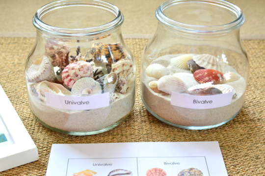
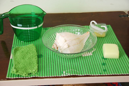
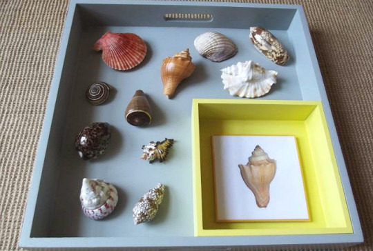
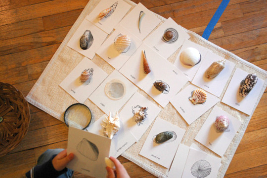

0 notes