#I love the lined character and the lineless background
Explore tagged Tumblr posts
Visit Tumblr Blog
Explore Tumblr blogs with no restrictions, modern design and the best experience.
Last Seen Tumblr Blogs


Fun Fact
Tumblr was named as a finalist in Lead411’s New York City Hot 125 in Aug 2010.
Text

[Click for better quality]
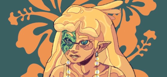
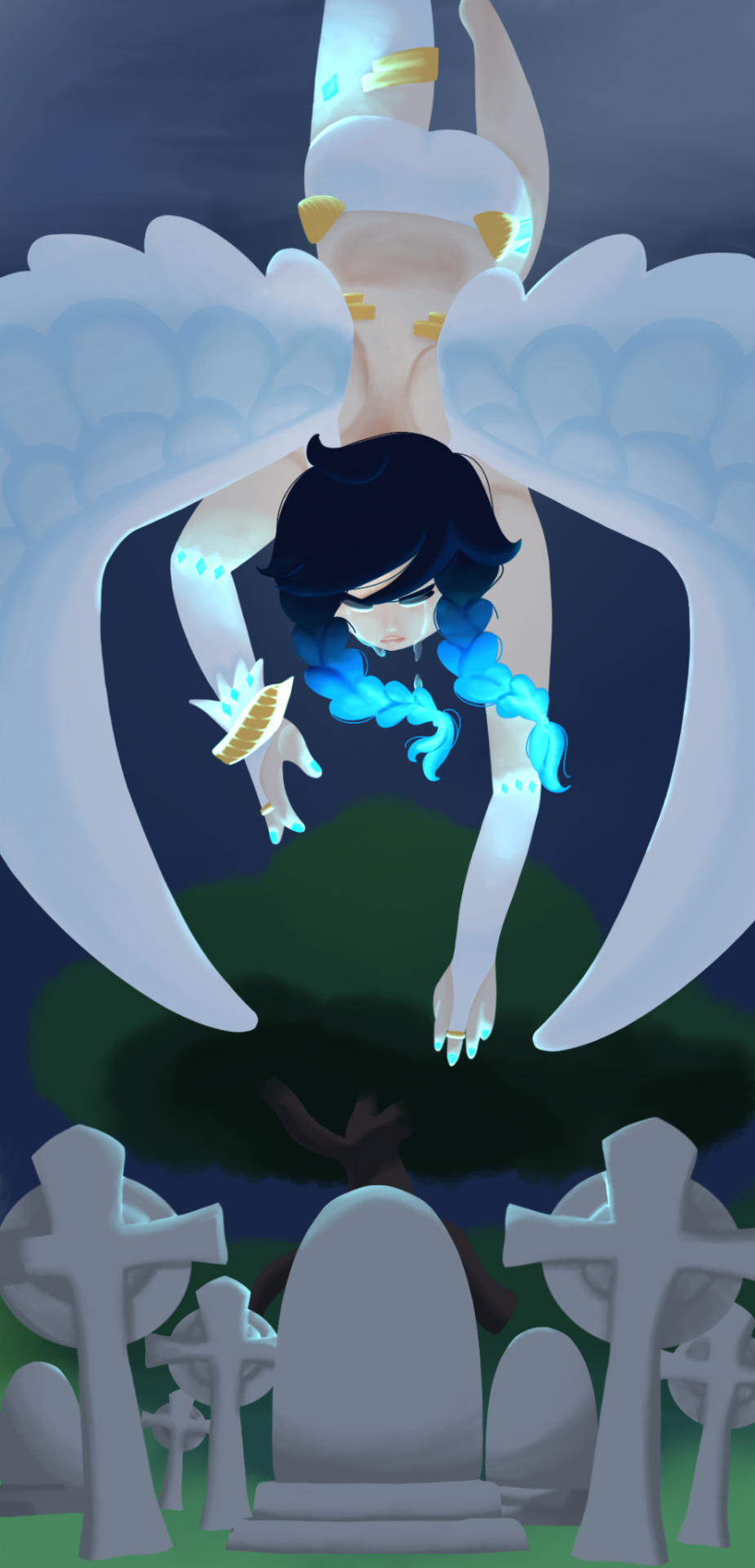
Ok yay I'm back from my vacation yipeeeeeee. I started this drawing of Keiki before I left and I was half considering just giving up on it.... until I did a short study of facial planes and then got motivated to work on this again! I'm glad I didn't give up on it though, as I'm actually really happy with this one!
Artist's Notes;
So as I mentioned in my last post about Touhou 17, I wanted to finish this by the game's five year anniversary but with how progress was going I didn't want to rush this so I decided to take a long break from it. Mainly because of the face. For a while now I was kind of feeling like I was stagnating with my drawings, not really in the clothing but in the bodies. There was something about the way I was rendering them that I just wasn't happy with, and after talking with someone else about this issue, I realized that the reason I felt this way was because the faces were too flat and didn't match the rest of the drawing and that I needed to find a way to make the rendering of the face feel consistent with everything else. So after doing a short study of the plains of the face (I used this 3D head model from art station as a reference for my short study, please go give this person some love as they are a lifesaver) I went back into this drawing and applied what I learned here. It was only after that that I finally became motivated to finish the piece, and while it started off as just a simple character sketch like Saki and Yachie's were, the moment I added in Keiki's little fire dragon I knew I had gotten in too deep and now here we are with a full on background. OK it's not super crazy or anything, but it gets the job done and it's better than there just being an empty void behind her. It's rare moments like this when I use brushes other than the Clip Studio Default Charcoal Brush and use the Clip Studio Default Paint Brushes as well (god bless the oil paint and dry gouache clip studio brushes, they were amazing). I don't know why but painting fire has always been really fun for me, there's something oddly satisfying about it y'know? I do think that another reason for this problem was because I was drawing faces like I would in my more sketchy style that didn't mesh well with my lineless style, so I'm glad I've started remedying that.
After adding in the fire dragon I had an idea to kinda make it feel like splash art in the way the composition works... probably because I have been playing Reverse 1999 again and it has taken over my brain. I do feel like Keiki's tools get a little lost in the composition, and I didn't fully render the metal parts of them mainly because I didn't feel like they needed it, but that's just something for me to improve on later down the line.
If you guys are wondering where I went for my vacation, I went to New York and got to go to the MET and the Museum of Natural History. In both places I found Kofun period stuff and I was so happy to see it you have no idea. I remember one of the Haniwa I saw had some neat face paint under the eyes that I tried to replicate with the makeup under Keiki's eyes in my drawing, though I think I'll gave to figure out how to draw makeup on characters because this reads more like blush to me than anything. While drawing this I also looked up some references of Kofun period jewelry and really liked the stuff I found, which also meant that now she has proper Kofun earrings instead of earrings shaped like Kofun tombs. I put some of the things I referenced with a closeup of Keiki's face as well down below. I made her outfit more reminiscent of the outfit I gave her at the beginning of the year with the buttons and all, though I do want to try and draw her in some more period accurate clothing like the Haniwa I took a picture of at the Museum of Natural History. I wish I could find a way to make her handercheif look better though as I wish I made it a little bit bigger, though I think I'm saying this because I've looked at this drawing for too long lmao. Once again something to work on for when I next draw her. Also want to get better at rendering hair, as some details (like the little strands in front of her ears) kinda got unreadable due to the similarities in colour lol.

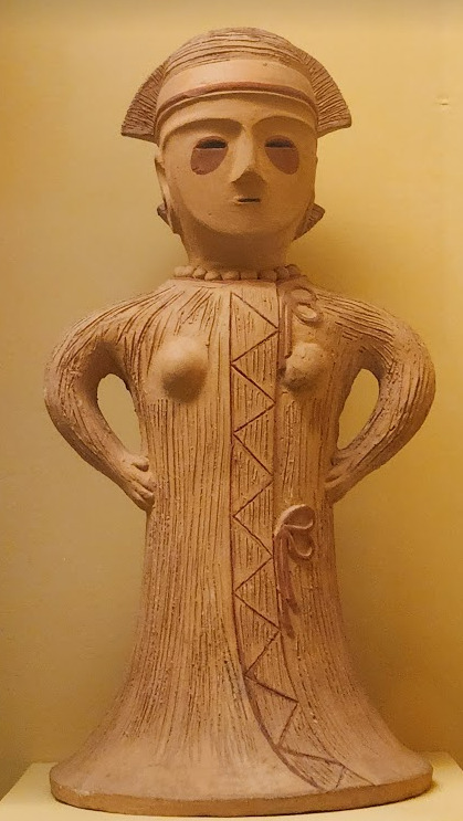


Now you may have also noticed the little cracks I added onto Keiki's face, and that's because I have fallen in love with the idea of Keiki's body being made from ceramic and that she crafted her body herself. While they aren't very visible I also tried to add some doll joints to her body, which is an idea I played around with in the past but never went to far with. I also want to get better at rendering cracks in ceramic, porcelain, etc, as I'm not sure how those read in the drawing. I also have a headcanon where the cracks in Keiki's face show up because of heightened emotions, and while Keiki is aware of this and does her best to make sure her face doesn't break off.... she will still end up with at least a few cracks during any given day, and she can often forget to repair her own body quite frequently so Mayumi has to remind her quite a lot. Mayumi even taught herself some basic sculpting techniques to help repair parts of her body that are so badly damaged to the point where Keiki can't repair them herself, i.e. if both her arms broke off, Mayumi would put them back together for her so Keiki can at least have something to repair herself with rather than nothing. I also like to imagine that if Keiki created her own body, if you took a look at Keiki from the beginning of her life she would look completely different compared to now.
BTW If you guys are wondering what a very very angry Keiki looks like....ok in order for this to make sense have any of you read volume 11 of Land of The Lustrous? Am I bringing back some memories for those of you that have? Ok good, glad we all got that mental image brewing in our minds, I'll probably draw a version of Keiki that is somewhat inspired by that one day as it's an idea I've had for a little while now. And to those who haven't gotten to that volume yet and are confused.... don't worry about it, just keep reading :)
#touhou project#art#fanart#touhou fanart#touhou 17#keiki haniyasushin#wily beast and weakest creature#touhou#東方project#own art
195 notes
·
View notes
Text


Yeah! I really like the way it looks so far!
I'd really love to draw something and share it on here but I've got no inspiration other than working on my pmd story. Makes me kinda sad.
#dragon's stupid thoughts#I've been inspecting a loooot of different artists and media (games. shows. comics) and took a look at how they are doing backgrounds#decided to do lineless background but therefore making the characters with black/almost black line art#(mostly taking inspiration from ww here. i just love the simplicity of the art style)
1 note
·
View note
Text
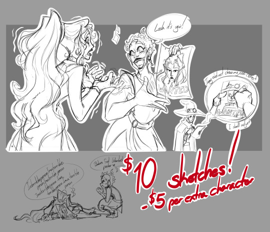
Sorry it's a lot later but behold!
I'm a freelance artist at this time that is trying to do more art related work, I cant live off this so I still have my full time job, however I love to draw and want to properly get my footing back (Ive done commissions in the past however they were usually part time).
There is no limitation on this so I'll try reblogging this periodically to make myself alive (I say this having a history of one and done.) With that being said I'm also doing projects on the side so as much as I wanna be speeding, the goal is quality so if you do consider commissioning me, please have patients with me ^^"
Now for some Commission info!
Disclaimer! I use Paypal only
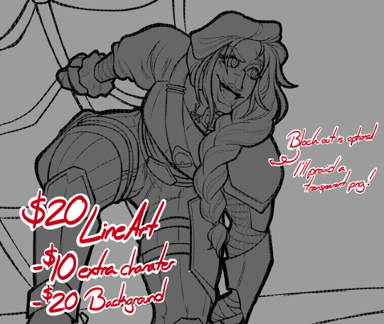
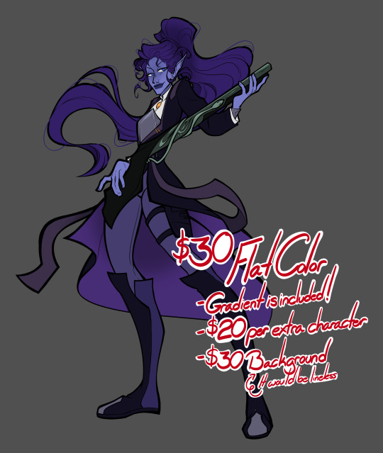
Backgrounds are generally not my specialty, I try to put as much effort in them but I will warn it is not my strong suit. However I find lineless to the most appealing as it helps my line work stand out for the characters. That being said, Sketches get a freebe on backgrounds only because they'll usually end up the most simplified and apart of the characters. Meanwhile Line art would be the only time I'd put the time to line backgrounds since there's no color (No brainier but saying it aloud helps meh brain).
Extra characters are always a tricky thing for me I don't like charging the exact price (trying to make it a deal), but I also have to consider my time in these. So with that, it is set to be little off so it's not like you're buying another commission entirely.
What I Will and Won't do!
Will do: >Animals >Robots >Fanart (Doesn't have to be be strictly what I'm into. I'm excited to create what you would like) >Original characters >Horror/Gore (It will be mild but I'm not scared of blood) >Lgbtq+
Wont do: (Generally if it makes me uncomfortable It's a no. I have the right to decline) >Nsfw >Fetish art >Political art >Inappropriate depictions of underage characters
Also one last disclaimer no use of AI art both to take my work or obviously use. (Not sure if I need to say this but saying this out to the universe now)
If you have any questions feel free to DM me ^^
I also have a Patreon if you'd like to support me for just $2 a month for behind the scene works.
71 notes
·
View notes
Text
I NEED COMMISSIONS AND DONATIONS!
Hey all, need to get some more money this month for rent and loans. My next paycheck is going to come too late, so I need at least $400 to make it to next month. My commissions are open as ever, and I am still offering the 2 for 1 deal, where you can request a commission of equal or lesser value to go along with the first at no edition cost.
A brief rundown of my prices: All pieces start with a line art cost, and color , shading/effects, and lineless options are add-on costs. Head/Busts start at $20, Half Body at $40 and Full Body at $60. Backgrounds start at $20 as either their own piece or an add-on. There are multiple character options, just 2 character commission sheets are up at the moment, but I am willing to workshop a pricing scale for multiple characters in one piece if so requested.
I am also going to be opening up a commission slot for animation, just gifs at first, but I will expand that to animatics and full videos later.
I do original character/work and fanart commissions! I am currently quite fond of doing Psychonauts, Code Lyoko, Gravity Falls, FNAF, and Hollow Knight fanart, and many, many more.
If you have any requests, please commission me on my Ko-Fi. You can also message me there for questions, or DM me here. Please know though that I will only fully process commission requests once they have been made on my Ko-Fi.
Additionally, if you can't support me with a commission, please consider giving me a small donation via Ko-Fi. Donations are $3 or more. I am currently doing for the first 20 donations a $1=1min Sketch requests. How that works is if you make a donation, say $3, I will do a simple 3 minute pencil sketch of anything you request (as long as it adheres to Ko-Fi's rules). I will even record my drawing progress if you so chose! Again, this will only be for the first 20 donations I receive.
IN CONCLUSION! PLEASE COMMISSION ME OR DONATE TO ME ON KO-FI IF YOU WANT SOME RAD ART OR JUST WANT TO HELP ME LIVE!
$400 IS MY GOAL THIS MONTH! PLEASE HELP ME ACHIEVE IT!
💙💜PLEASE SUPPORT ME ON KO-FI!!!💜💙
#emergency commissions#artist help#artist support#artists on tumblr#psychonauts fanart#fanart#fnaf fanart#gravity falls fanart#five nights at freddy's fanart#hollow knight fanart#code lyoko fanart#commissions open#art commisions#commissions#ko fi support#buy me a kofi#ko fi commissions#ko fi link#ko fi#commission sheet
35 notes
·
View notes
Text
COMMISSIONS :D
Howdy Hi!
Welcome to my Commission prices hehe
Just some general info before we get to prices; I take both CashApp and Paypal in USD, Commissions can take anywhere from within the same day as being payed for to a week/month depending on how motivated I am
Do's
Humans
Anthros/Furries
Animals/Dragons
Robots
Blood/Gore
Semi Suggestive
Dont's
NSFW
If interested please feel free to message me here or over on Discord (perfered) @ that_one_cross
Currently I have 9 slots open!
Prices + Examples
Sketch - 10$


Colored Sketch - 15$


Head Shot - 25$


Half Body - 35$


Full Body - 50$


Ref Sheet - 70$


Extra Characters in each piece above will cost ~50% extra Simple backgrounds (Lineless,Sketched and/or blurred) - +5$ Complex Backgrounds (Lined, rendered, and/or visible) - +10$
Reason For backgrounds costing extra is due ot the fact I don't do many backgrounds that aren't just patterns or a single color. Single color + Pattern backgrounds are free, I should clarify!
Below are Comms that cost more + take longer to complete!
Comic Strips - 50$ each page


Simple Animation/Animatic (Short) - 50$

Complex Animtion (Short) - 150$

I have yet to make a long animation of any kind, so sadly anything longer than 1 minute won't be able to be done :[
Below the cut is more of my work that didn't fit with any examples but do show off some of my diffrent styles I can do! None of these cost any extra, but purely for examples! They also include Commsions I've done in the past + Artfight pieces :]
(Blood warning below)


I love dramatic lighting/rendering hehe
16 notes
·
View notes
Text


I can finally post this, after weeks!
But yeah, this here is something I made to celebrate the 9th anniversary of Evoland 2
Some people may remember this work in progress from weeks ago, but now I can finally show the finished product. Which I finished 2 weeks ago
It’s based on the 3D picture you get when you finish the game, specially the 100% completion, and more specifically, my screenshot that I took when I first completed the game and got 100%
Though I should probably also note that this was the only picture I had of the beach scene until I was mostly done with the picture, so there are some inaccuracies between it and the original. Except for Reno in place of the Prophet, that was completely intentional
This game was I think the first (and will probably be the only) game I’ve ever 100% completed, and when I did it the first time, it was just because I knew that games would have extra things for those who 100% it, and I wanted to see what the game would give me. It’s the only time I was so invested in a game that I had to know what I’d get if I got everything. It’s also the only game where losing nearly 10 hours of progress due to a (maybe) glitch does not make me give up the game in frustration, but instead complete the entire thing within a single school week
I may gripe about my issues with the game, but I absolutely love it, and I have a lot of fun playing it. Well, aside from the parts I’m bad at, but that’s just because I’m bad at them. I feel like I have next to nothing to complain about from a gameplay perspective (which is in part because I don’t know how to critique gameplay, but also because I think any issues I have are my own fault), it’s just narrative stuff. And even then, I wouldn’t nitpick it so much if I wasn’t so invested in the world, story and characters
Maybe today I’ll start replaying it again, seeing how I’m pretty sure I’m free today from any schoolwork
I’m still holding on to some admittedly delusional hope that a 3rd game could release one day, even if I know it’ll almost certainly have nothing to do with this one, but even if it never does, I’ll still have this game to play over and over again, so I can accept it
I was disappointed that I missed the last two, since I first played the game in 2022, but not this year, I remembered!
Now to just talk about the art itself, the reason there’s two versions is because I originally made the background lineless, but after finishing the characters I thought it maybe clashed a bit too much, so I made a duplicate of the picture to do a lined version. But I also spent so long on the lineless version that I didn’t want to just leave it in the void, so I’m showing it too
Admittedly now I think I can say the lined version probably is the better one, but I can still show off both
I used the card colors for the characters, since all of them have cards for reference, but now I’m looking at the colors and thinking they look somewhat wrong. At least on Menos
Also as mentioned prior, I switched out the Prophet for Reno. I know I’m biased but I really think he’d fit in this picture of all the main characters far more than the Prophet, considering he’s kind of the reason the plot started, the second half happened, and he’s the main motivation for one of our party members. I mean, I see why the Prophet’s there in the original. He’s really the only other semi-important character with a 3D model, and Reno never had one, so they’d have to make an entirely new one just for this extra thing. Also it doesn’t make sense for him to have a 3D model in the first place, especially not of his Present era self. But not only is this now a drawing where I have the power to do what I want, this scene isn’t canon in the first place, so put Reno in the background there!
Overall though, I’m honestly surprised the piece turned out as good as it did. Those who follow me know that I was really struggling with drawing during the summer, more specifically drawing people and the Evoland 2 cast. But despite all that, I think the characters turned out pretty well. Certainly not the best, but better than I was expecting. And not only that, but the background turned out so much better than I thought it would, especially since I don’t usually do backgrounds. Though I suppose it does help to have a reference for all this though. But yeah, there was a reason I was so proud of how the sketch turned out, and while the final product may not have entirely been what I was hoping for after the sketch, it still turned out pretty good
As long as I can remember it next year (which I really hope I can, considering that’s the 10th anniversary), I’ll try to make something there too, hopefully with much improved drawing skills, since I’m still trying to figure all that out again still
Not sure what I’ll draw then. Maybe I could redraw the beach scene, or make an entirely new beach scene concocted by my brain. But it’s also the 10th anniversary next year, so maybe it should be something more special
Ah well, that’s next year’s problem. For now, have this to celebrate the game’s anniversary. For the minuscule amount of people who actually play this game, I guess
#I’ve slightly started to doubt if today is the actual anniversary#that’s what Google tells me the original release date was#but if I’m wrong I will never know peace#probably the incorrect phrase but I can’t figure out what it’s supposed to be otherwise#but yeah Evoland 2 anniversary#for all 5 of us who care#evoland 2#my art#anniversary art#evoland kuro#evoland fina#evoland menos#evoland velvet#evoland ceres#evoland reno
10 notes
·
View notes
Note
how do you color??? your coloring is so scrumptious and unique and i love it but also i struggle with the coloring process and i want to get an idea of how other people do it
awww thank you!! to be honest i learned a lot from reading vast error! here’s just like a really random example but a lot of the webcomic is just really pretty
if you’re struggling with your colors blending together in general i’d suggest at least trying lineless! without lines it really makes you think about contrast and stuff like that. or just going grayscale helps too!
in terms of color picking in general though, pushing your color palette for a piece or character design towards one color really helps the palette be cohesive!
i think this piece is a good example of that… everything from the whites of the eyes to the blues of her iris and the background is pushed towards more of a teal to match her yellow hair and skin tone. this skill i think is really good for illustrations and stuff like that!
EDIT: the shadows are also a cooler color to match the blue, and also because that’s how light works! :)
however, that doesn’t mean pops of contrasting color don’t come in handy!! like with this piece:

the whole THING is yellow. haha, maybe i just really like yellow…. anyway, my main point is there’s that sharp contrasting electric blue that really pops the whole thing. that’s them complimentary colors working with analogous colors!
i’d also advise you to just look up color tips too, because i’ve forgotten a lot of where i learned things from and its just become second nature LOL. i wouldn’t be very fun to learn from if i just said “now do it like THIS!!” would i??
if you want to see something really crazy though i would watch THIS person’s speedpaints because holy shit they’re fucking cool. i’m like still trying to learn how to do this LOL
youtube
hope this helps!! i love color i’m kissing it on the mouth btw
46 notes
·
View notes
Text
Love is Blind [HSBB]
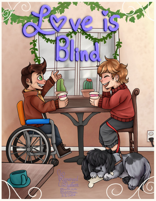
You know that moment when you've known someone for so long that it feels like you've own them forever? That how this fic reads :D It's so light, and fluffy. In this AU Grian is blind and has a massive crush on Scar, whom he shares an apartment building with. How does the rest unfold? You'll have to read the fic and find out yourself!
[Link here!]
Maggiee did such a wonderful job, and was our biggest supporter during this! So let's go show them some love! Another huge shout out to the mods and specifically Dux for putting this event together! Check out the #hsbb 2023 tag for more works and fics like this!
Extras under cut - Wips, rambles, the whole nine yards
Over the course of 2 months, this piece took us nearly 16 and a half HOURS. Up until switching to Procreate I never had an art program that timed how long I worked on something. If CSP has this feature I must've not been able to find it.
The amount of time is pretty stunning to me. I'd say 16 hours isn't that bad! At least by my own standards.
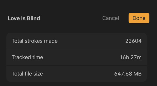
Absolutely shocked by the amount of strokes btw. That's fucking insane.
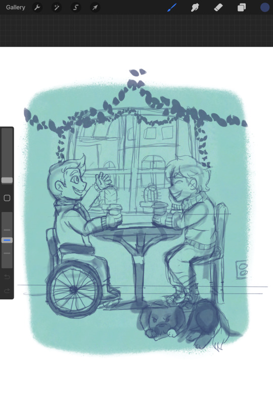
So for once I actually went at this with a few thumbnail sketches and this was the winner out of the 3 and I blew it up to size and started the finalized sketch.

The funniest thing is I started this right before my art style decided to change so I hope you enjoy the old art style :P <3
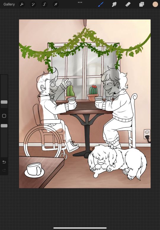
So, I did something interesting here. In the past when we would do full pieces we would do a lineless background, so everything besides the characters were painted lineless.
THIS time we decided to line the background with maroon instead of black to help break up the characters from the background so they pop! more and I really like how it turned out and we're happy to say this has carried over into other pieces. :]

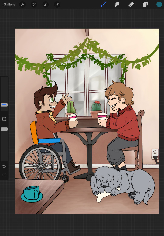
I want you to pay attention to Scar's wheelchair in these shots, it's the only thing that changes. I remember doing the shading on the background and main color on the characters all in one night because I was having a bad bout of insomnia and I posted my progress in the artist wip-sharing channel on our event server and looked back at it the next morning and was SO embarrassed I had to fix it. This is also when I changed references.
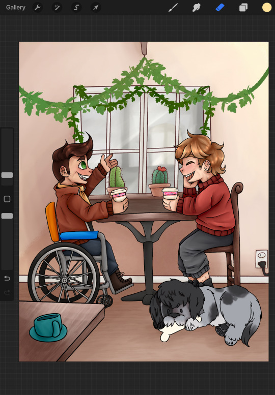
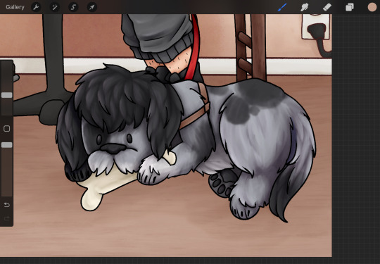
For some reason I didn't capture any in progress shots of the shading but we did manage to get a few shots of Grumbot. :] He's modeled after a labadoodle! While working on this the team and I discovered that's what they were originally bred for, to be hypoallergenic guide dogs! Isn't that cool!?
[With the source we found here]
My partner and I own a poodle and he was kind enough to be my reference/model. He was well compensated with treats don't worry.

Anyways, thank you for reading our rambles! Whether you're here from a reblog, from the fic itself, or were already following us. I hope you enjoyed! Be sure to keep your eyes peeled for the rest of our pieces for the event.
From the Reserved System, Happy HSBB everyone!! <3 <3 <3
#hermitshipping big bang#hsbb 2023#HSBB#hermitshipping#grian fanart#Scar fanart#gtws fanart#goodtimewithscar fanart#grumbot fanart#<- TECHNICALLY#He's the pupper#hermitcraft fanart#Love is Blind AU
16 notes
·
View notes
Note
Both actually! I was mainly wondering how character shading works for lineless art among how you do backgrounds. I've been trying for ages to ask someone, just didn't expect to ask a furry but a good artist is a good artist! So I would love to learn some skills from you.
Just as a caveat, I don't really think of myself as an artist-- I'm not really aspiring to make a career out of drawing or anything. I'm more of a hobbyist who has picked up a few things along the way. As such, I'm sure that the more serious artists out there can offer more efficient or straightforward techniques for this sort of thing.
Anyhow, here's a lineless character sequence. If Tumblr shrinks the image, you can view the full size here.

Now, that rigamarole is for if you're drawing freehand. If you're looking for a more sleek and minimalistic style, I'd recommend using vector art. With vectors, you can skip the lines entirely and just mash together shapes to make a fitting silhouette. Then add shading to define it as needed. This simple Zangoose only uses four pieces of shading:
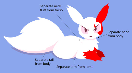
Also note the common lineless shortcut of simply making the limb that's farther away darker than the close one.
I actually find that, with vectors, going lineless is faster and easier than using borders. If I had wanted to retain the borders on the below Lopunny, I'd have to go through and block out the seams between the different segments of the arms and ears, which is tedious. By removing the borders, I can skip right to shading.
Like with the original tutorial, it's a good idea to keep the lines around until you have a good idea of where the shaded areas are going to go.

That's what I know about character shading. I'll try to put something together for doing grass and such soon.
11 notes
·
View notes
Text
Feeling kinda nostaligic looking through some of my art.
I drew this in 2021 and I was so proud of it. It was a companion piece for a fic that never manifested, and I loved it so much. It was my first real foray into digital art. Sure, I'd definitely drawn before, but nothing with this amount of effort put into it. It wasn't even the first thing I drew for the LU Discord: the place that got me back into art.
Looking at the results, I think it still holds up, and that makes me beyond happy. I would certainly change a lot about it if I drew it again today, but I love it all the same, because it's something I could see on tumblr and go "oh that's cute, I'll reblog" and I'm near tears.
I think it embodies what my favorite pieces are to draw: sad/angsty pieces of my favorite characters with dramatic lighting. I don't draw many of them, because they require so much effort, but they're my favorite.

I drew these two pieces in October and December of last year. I learned how to utilize glow layers, my anatomy improved, and I shifted to a lineless art style that is so much work but gives beautiful results. You can even see that between the two pieces I decided to properly learn how to draw wings.
I've improved so much in only three years and I genuinely owe it to the LU Discord. Even if I'm not as active there anymore, y'all got me back into art. I have over a hundred pieces of terribly drawn (by my current standards) fan pieces for your weekly prompts that gave me the practice I needed to improve, and I wouldn't have even bothered if I didn't want to participate in that community.
Specifically, I want to thank @ahrva, one of my best friends. She who collabed with me and encouraged me into so many writing projects and community events. Thank you, dearly. I wouldn't have had the courage to join the secret santas or art exchanges if you hadn't been right there, super excited to participate. You always compliment my art, and it means a lot when you go "OOOOOO" in response to one of my pieces /gen
I'd also like to thank @wolfy1298 whose art was a huge inspiration, even if we've never really spoken. Whenever I saw your work I was so impressed that I couldn't help trying to emulate you a little. Your colors are something I still envy to this day, your masterful highlights and lineart an inspiration to work harder and improve. Your curvy shapes are also very cute and may have infected me lmao
@author-main your diverse body types encouraged me to properly learn anatomy. I'm taking medical classes, but it's another thing entirely to try drawing the human body properly. I'm still unfortunately lacking when it comes to larger bodies, but your beautiful work encourages me to try improving, even if it's only in sketchbooks that no one will ever see. Your lines are full of personality, and I never tire of seeing your work.
@w1lmutt your compositions and poses are awe-inspiring. I struggle a lot with composing a shot, especially with foreshortening, so your work is extremely impressive. You manage to insert so much personality through body language alone, and it's definitely something I'll be striving to improve. That's not even mentioning your backgrounds! I'm generally in awe of every piece you make. I think I'd die if I had to draw a proper landscape/cityscape lol. I can barely manage a bedroom! Just another thing to work towards improving lol
There are tons more artists i want to shout out and compliment, but it's nearly 7am and I haven't gone to sleep yet lol.
Thank all of you. Even if I only pop in once every few months for the events nowadays, I'll always cherish my time in this community. I'm going to keep improving, and I'm glad to be doing so alongside such skilled artists!
#my art#just a thought#thank you#linked universe#tw blood#artist appreciation#art journey#art growth#appreciation post
7 notes
·
View notes
Text
some art progression thing
i wanna look at how my art has changed over the span of about a year (a bit less but close enough) by talking about what i consider key parts of my progress. sooo lets go
also i will only be writing about my human drawings cuz ive been drawing dragons my entire life but only started drawing humans in 2021 i think
(long post sorry)

"kennith simmons"
first time posting art, first posted to reddit. i didnt give this one a title or anything i just called it kennith simmons. this method of toning was continuously used throughout most of my sketchbook drawings. drawn using pc, autodesk sketchbook (now known as just sketchbook), & mouse. not quite sure when i drew it but it was posted to reddit on the 28th of july 2023 so around then i think
(blood/sh warning)

"kennith again"
one of my first times attempting a front view i think?? at least, this is the earliest one i can find. i was pretty proud of it at the time. drawn using pc, sketchbook, mouse. posted september 7th 2023

"tongue"
i included this one because it was when i started to figure out how to do whatever the hell i did with the cup there idk what to call it but yk what i mean. drawn using pc, sketchbook, mouse. posted 27th september 2023

"a smile a day keeps the doctor away"
gave colour theory a try here, its not great but its a start. this one is pretty unlike any other ive done before and it took me a while to figure out how to do the hands and mouth like that (even though it still doesnt look right). the main reason i included this one is because of the background; i chose it because it reminds me alot of my favourite surrealism artworks, and i continued to use backgrounds like this in certain pieces, including a much more recent one!

"hi" (called "something or other" on reddit)
first time using an overlay of any kind- this is just a simple red one. i didnt figure out i could use other things like noise until later. I also tried to tone this one using just. a bunch of black lines rather than colours. drawn using pc, sketchbook, mouse. posted october 21st 2023

"messing with my head"
this was my first one drawn in krita! i really liked the various brush textures and stuff so i decided to go all out with this one. also attempted a bit more colour theory. drawn using pc, krita, mouse. posted october 23rd 2023

"nobody smiles like ray barnett"
i honestly dont have much to say about this one asides from the fact that i really like the toning method i used and i wanna use it again but i keep forgetting. also the lil shiny eye thing i still use that alot. and!! i believe this was my first time using noise overlay. drawn using pc, krita, mouse. posted october 29th 2023

"ponder"
possibly my favourite "old" artwork of mine
crosshatching!! i love crosshatching and i'd like to use that more often too. this one is old but i still really like it, especially the way i drew their teeth. also!! i used the background from the other one again. drawn using pc, krita, mouse. posted november 19th, 2023.

"fool's gold"
this one is special because its the first one i posted that was drawn with a drawing tablet! (it's actually not, but we dont talk about the real first one. i dont like it. at all.)
also, first time using a colour pallete which wasnt just the colours the characters canonically used. other then that i dont really have much to say about this one asides from i used crosshatching again too. drawn using pc, krita, wacom tablet, mouse. posted december 7th, 2023

"Best Friends"
1st posted drawing of 2024
i like this one alot still, it was my first time trying lineless art and i think it turned out alright. i also consider it significant because i still continue to use this eye shape in certain drawings. drawn using pc, krita, wacom tablet, mouse. posted january 2th 2024

"spoilers paper doll"
this was my first time making a paper doll and i think i could have done alot better but tbh this one was more about "finish before 2024" (i started it on the 31st of december) rather than "make this as good as possible". made with pens, pencils, beads, string, scissors. posted january 6th 2024

"creature"
i still like this one, particularly the way i toned it (if you can either consider that toning idk) as well as the way i drew the mouth. i dont think ive ever revealed as much gums as that in any of my drawings but i think its pretty cool.
the most important thing about it is i believe it's the first time i used this particular brush, and good LORD it is still my favourite brush ever. i dont think i will ever stop using it.
drawn using pc, krita, wacom tablet, mouse. posted january 30th, 2024

"unnamed aoapp fanart"
similar to the last one, but more. i also used that eye shape again here as well as a different pupil. and the cake. idk how to draw cake tbh. but i think it looks decent. it was also tough to achieve that body shape with all the other stuff going on. i really like the way i toned this tbh. drawn using pc, krita, wacom tablet, mouse. posted february 9th, 2024

"yes"
okok so this is where shit really started to change. this was my first lord of the flies fanart, and the weirdest thing about it? I DIDNT USE THE FUCKIGN SPAMTON NOSE (excluding my nathan & spoilers drawings). not a fan of how i drew the nose in this one either way but still. wow. i always considered the "spamton nose" a signature part of my style but i decided to just drop it in this one lmao. drawn using pc, krita, wacom tablet, mouse. posted march 3rd, 2024

"jack part 2"
okay nevermind the nose is back lmao. nothing to say about this one other then that tbh, it was just an experimental thing because i was bored and wanted to see how he would look in my usual style. i hate it tbh but it was still kinda fun. drawn using pc, krita, wacom tablet, mouse. posted march 9th 2024

"ralph and jack"
woah fullbody drawings. while im not super fond of the drawings themselves i do really like the pencil and crosshatching, i think it looks nice and would like to do it again at some point. now that im looking at it again i am making a mental note to work on my anatomy. drawn using pc, krita, wacom tablet, mouse. posted march 11th 2024

didnt name this one either. i drew the side view of the face differently to how i usually did it. it now has more of a nose. i also tried a new pupil type, kinda resembling certain older cartoon styles. drawn using pc, krita, wacom tablet, mouse. posted march 20th, 2024

"he got what he deserved"
oh man.. back to gnp again. theres alot of things i like about this one. it was intended to be just perspective practice (even tho its nothing crazy), im really happy with the linework and some of the toning (mostly the teeth tbh) but i also really like the mouth, and i used that weird mouth end thing in my most recent artwork because.. idk its kinda weird but i like it. probably the most "unique" eye i've ever done, same goes for the blood, and i used the same technique for the blood as i did in a later piece. overall i just really like this one ig?? def another one of my favourites. drawn using pc, krita, wacom tablet, mouse. posted march 29th 2024

"delicacy"
this one isnt super important either but i included it mainly because of the way i drew the mouth. its alot more.. realistic?? than how i normally draw mouths, the teeth especially. it was a pretty fun thing to try out and i think it looks pretty good. its also another lineless piece, this version was an unfinished one and sadly i never finished it. i may remake it though, who knows. drawn using pc, krita, wacom tablet, mouse. posted april 1st, 2024

"my jack merridew design"
again, not very important. but im including it because i believe it's my first ref piece, and its a really simple one but its been a helpful guide for drawing this character + knowing what i should include in a ref piece. ive also used it as a guide for colour theory, and by that i mean just slapping what i think fits over the colours and if it works, i use it. it was also helpful for drawing clothing, particularly the folds in the cape. its mostly pretty random but some are deliberate and i think its a good start. drawn using pc, krita, wacom tablet, mouse. posted april 14th, 2024

"i hate this guy"
my first time drawing noses like that in a while, since alot of them before that were front or side view practice. i drew this after finishing my visual arts assignment (not shared anywhere) in which i used colours similarly to this, which inspired me to try it again. the colours are a bit much but i do like it. this was also another unfinished piece that i never got to. it was supposed to involve ralph but i had too much fun colouring jack to actually get to that. drawn using pc, krita, wacom tablet, mouse. posted april 16th 2024.

"yawn"
tried a few new things here. i used a textured background (actually not my first time but oh well), as well as a different brush which i still use on occasion. and i also toned and coloured using a watercolour brush. also i attempted to draw a mouth like this on a more "humanoid" face, and i think i did a pretty good job of that. drawn using pc, krita, wacom tablet, mouse. posted april 21st 2024

this one was never named, despite it being my 2nd most liked lotf post i think..? (next to the fucking mining away video lmao). it was never meant to be that great it was just a random ass doodle i decided to finish because i was bored. i included it here because ofc there's the eye shine thing and shape again, as well as some.. interesting toning choices. but i also used the same kinda blood/gore again, and this time used the eraser tool to create holes rather than drawing in the holes, and i think it looks alot better. i also lined some things with white which i think gives a nice effect. i think my favourite part about this piece is the way i drew the jewellery though, its pretty different to how i did it before and i think it looks nice. drawn using pc, krita, wacom tablet, mouse. posted may 2nd, 2024

"i'll teach you the way"
i mentioned this one before, it has the surrealism inspired background, now featuring trees, clouds and sun. this one took so fucking long mostly because of the war paint on the right dude. to achieve that i made excessive use of the replace tool and it was tedious and painful. anyways i include this one because its similar to the colouring in one of the previous ones i put in here as well as the eye shapes being pretty different to what i usually do (and the background ofc). drawn using pc, krita, wacom tablet, mouse. posted may 5th 2024

"nathan's youtube channel"
this one isnt super special but it was by this point that i decided i would try and vary eye, nose and blush shapes a bit more. and i used that one brush again (can you tell im running out of things to say). drawn using pc, krita, wacom tablet, mouse. posted may 10th, 2024

didn't title this one but from here onwards, i started to try have more variety in how i draw noses. here i was aiming for a hook nose appearance. also, the blush is a bit more wavy, unlike the square blush i used to do. here i also made the shine on the eyelids some shade of blue instead of white and i think it looks alot better. drawn using pc, krita, wacom tablet, mouse. posted may 21st, 2024

"experimental side view"
first attempt drawing a more unique (for me at least) nose at a side view. other then that its not that special and i dont really like it. also i decided to use blue lineart out of nowhere which i also continued using for certain artworks. drawn using pc, krita, wacom tablet, mouse. posted may 25th, 2024

"simon with braces"
here I tried to draw angles of the nose I hadn't tried before in this particular way, and I think it turned out looking decent for a first attempt. I also tried to include a few more 'realistic' features like more prominent lips in the first piece. I also tried to adjust the colours a bit to fit the surrounding blue. drawn using pc, krita, wacom tablet, mouse. posted may 26th, 2024

"ralf"
my most recent "serious" artwork. i mean its just a drawing of ralph but I tried multiple techniques i wasn't very used to before, such as a bit of difference in perspective, as well as another different nose shape, and variation in the lineart colours. i also tried to tone it a bit more realistically (while still keeping it cartoonish if that makes sense. its bright but not as bright as that one jack drawing i also put here). drawn using pc, krita, wacom tablet, mouse. posted may 27th, 2024

"jack, the pig is here"
my most recent piece as of posting this. this one is just a shitpost drawing but I actually really like it. i like the flat colours with the simple black varying lineart. and the style overall kinda reverts back to my older style while also using aspects of my newer one (e.g. i used the new face & nose shape, while also using the weird wonky mouth that I kinda stopped using for a while during my experimenting.) it looks kinda weird but i genuinely like it alot and while theres stuff about it I would still change and try to improve i think it fits what i want my art to look like pretty well. drawn using pc, krita, wacom tablet, mouse. posted 2nd june 2024
sooo thats the post. i do want to continue experimenting and changing and improving over time, but im overall pretty content with the progress i've made in not a huge amount of time tbh. i like my style (most of the time) but im curious to see how it changes in another year or so
also i dont care that i have a tablet now i dont think ill ever be able to give up using a mouse as well
anyways thanks for reading, have a good day
#i feel like theres more I wanted to write but oh well#a couple of these (idk how many) are posted to reddit only so thats why they link to reddit#my art progress#my art#vessel214
5 notes
·
View notes
Text
I've crawled out of my cave after playing Final Fantasy IX for a long ass time what have I missed?
Artist's Notes:
I'M BACK BABY! A while back I made a post with a new style experimentation thingy but I ended up deleting it because it was just kind of a boring face thing, I was planning on doing more art but then I started playing Final Fantasy IX and uhhhh yeah so that game has kind of taken of my brain for the past two weeks and I am 20 hours into the game because I love it so much. I wanted to draw Vivi because Vivi is just really fun to draw ok? I've kinda been feeling really burnt out with my lineless style, mainly because of how hard it was to do lighting. I'll show one of my initial art style tests on the bottom of this post. Again, used to have it be an individual post but it was just one face so it was kinda boring, so might as well include with this one on the subject of art styles. I wanted to kinda mix some aspects of my older style with the sketchy shading lines with a more painterly way of doing the lighting (mainly in the shadows). All in all, I think that's my favourite part about this drawing, it feels nice to finally be able to do some proper lighting again, and I want to experiment even more with my lighting and rendering in future pieces. Also, part of the pant shading got kinda lost in the sketchiness, so for next time I'll probably focus on the clarity of the more sketchy parts of the drawing, since I did go with my initial sketch for the final drawing. I also gave up on the background since I had no idea what to do for it, and I didn't put too much detail into the staff as I forgot which one I gave him in my current playthrough and I didn't want to risk spoiling myself via looking up references, but that's ok I like how the singular yellow circle on it matches Vivi's eyes. Also I was having a bit of trouble figuring out how to draw his body and how to pose him, but I like how the pose turned out a lot. It was inspired by his idle animation when in a battle in game where he does a little shimmy.
Ok I need to talk about Vivi's design because I love it so fucking much oh my god-
I absolutely love how his face is just in complete shadow and only his eyes stand out, it's so cool and unique and I love how they recontextualized the original black mage design from the classic Final Fantasy games. How they did it I won't say because I don't wanna spoil the game, but someone give this poor baby a therapist because he goes through a lot. Actually, same can be said for all of the FFIX cast, they all need therapy (again, I won't spoil anything, please go play the game for yourself).
While I do love almost all the characters in the game, even though Vivi is most fun to draw, my favourite character has to be Zidane (the main protagonist of the game). He's a really fun protagonist, and they could have easily written him as a misogynistic jerk who doesn't respect women but they didn't, and I really appreciate that. He's just an overall cool dude who's a really nice older brother figure to Vivi and also just has a cool character design (who I also want to draw eventually). Initially in the game I was planning on grinding levels for Vivi to make him the tactical nuke of the party, but then that title went to a different character (who was initially multiple levels behind the group since I grinded the party in the starting area way to much before they joined, but now they are two levels ahead of everyone and have pulled the team through a lot of tough battles, again I won't say who it is because it is kind of a spoiler and the way the gameplay actually ties into their character arc is just so good omfg). Once I eventually finish the game I'll probably write a full review on here, so no spoilers until then lol
Also, I've kinda been burning out a bit with making Touhou art, which also made me a bit burnt out with Touhou stuff in general (although I will continue keeping up with the manga) so getting into other things (i.e. Final Fantasy and even Fallout since I've watched the first season of the TV show which is a whole other post for another day) has helped me refresh and given me something new to think about. I've ended up in the exact place I feared ending up, where I would start drawing fanart for it not because I wanted to but because I felt like I had to, so I'm taking a bit of a break. When I do draw Touhou fanart again I'll try to draw for the sake of myself, and to all the other artists and fanartists on this platform (and on any social media for that matter), take care of yourself and don't forget to take breaks when you need to!
(Ok part of that last paragraph was definitley influenced by the good ol' "it's 9:00pm and I need sleeb, but the message at the end still holds up, always take care of yourself)
Oh yeah, and here is that one style experiment I did btw
Man I really fell down the "Yoshitaka Amano art enjoyer" to "Final Fantasy fan" pipe line didn't I?
19 notes
·
View notes
Note
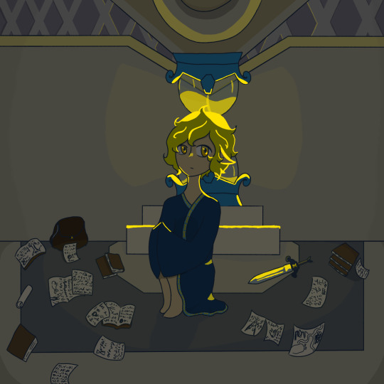
ahhh! congrats on the latest chapter, its AMAZING!! maybe it's just me but I think your art has improved -- the expressions are awesomeee x3 I reaally really love your characters! I also totally don't have a crush on Iya :3 the glasses are sickkk!! seriously can't praise you enough on your work cx you're AWESOME and I am a big fan!
First Impressions anon! You're back! Thank you so much as always. The current chapter is actually based off of the Potionomic card's art because I was really obsessed with potionomics when I was first planning out this chapter. I played a lot with the colors in the background and honestly in some cases lineless art is actually a lot easier to deal with than lined art... in some cases that is.
You and Doc are going to have to fight with everyone else having a crush on Iya. I didn't actually think people would like her that much but I was sorely mistaken to think that a tall lady who can easy hand you your butt wasn't going to be popular.
I'm actually working on an extra chapter where we get to see what happened with Iya tried to check on Desmond in the hospital. If only I could stop translating like crazy and try to focus on this one. Here's a preview of the two meeting. It only goes downhill afterwards for these two since they absolutely hate each other.

11 notes
·
View notes
Text
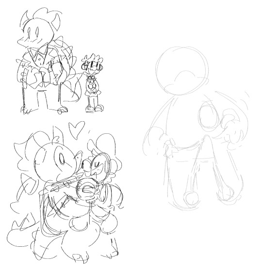
a big wip/sketch doodle dump >:DDD

apricot doodles! (@chasani) despite having litterally just been the first thing that came to mind i am deciding on apricot as his final name~ its cute and i feel it fits his personality fsr~
anyway!! i like to do lots of doodle sheets with my characters so that i can play around with their body language and expressions as well as learn to draw them more efficiently: it's really fun and its great practice! if you struggle with like, drawing a character without a lot of sketching before hand, i'd say this kind of just fill a page with doodles of them excercise can be very helpful :DD
this has been sitting in my wips for a while, ive never done a lineless piece as ambitious as this and im not sure how to go about it, if anyone knows any artists that do cartoony lineless scenes like this please lmk!!! esspecially any speedpaints/timelapses


kirby animation progress is going great!!! i only have a few more backgrounds to color than it'll just be line-coloring and final details!!
recently remembered this sketch! no clue when i sketched this, def a while back. Anyway, its cute so im going ahead and doing some lineart, think ill add simple coloring when im done~
ddlc mockup thing? idk i like drawing game screenshot mockups

im trying to learn how to draw cats: any tips appreciated ndjksafn


des doodles!!

more game screenshot mock ups!! really excited to finish and share this one~

their ocs and i dont know litterally anything about them other than they are lesbians and they are girlfriends
i wanna try like a,i guess like pen looking lineart for this doodle sheet

oc sketches, their name is casette, she's a robot, they're for this webcomic idea i have and i love him sm <3
funfact: once i drew bowuigi and bowsette x peach fanart on a napkin because someone said something that had an aftertaste of homophobia about my passion for shipping silly viddy game characters
8 notes
·
View notes
Note
Hello!! How about 6, 12, and 17 for the art ask game? Hope you're all good!!
Hi, I'm good! Hope you're doing well too!
6. favorite thing to draw?
I answered this in a previous ask, but characters with good shape design are the most fun to me! If I had to pick something else, I definitely developed a love for drawing architecture because of Control!
12. describe your process while drawing
Basically it's a mess. If a pose is complicated I'll pose a 3d model to get the anatomy more accurate, do a really rough sketch based on that, and keep refining the sketch until I think it's ready for linework. On a lot of my pieces with detailed backgrounds, I paint the entire background before I even start drawing the characters
17. what is something youre confident about in your art?
I also answered this one previously and said my linework! To give a different answer, I'm pretty happy with the look of lineless backgrounds combined with outlined characters! It's something I'd do for a couple of pieces and then go back to lined backgrounds until I'd basically forget that I'd done lineless before, try it again, and like the results. So I'm trying harder to commit to that combination more often.
Thanks for the ask!!
1 note
·
View note
Text
Week 1: Movement (16/1/2024)
In order to help me visualise the animation I want to create, I made some mood boards to capture the energy of the animation.
- - - - - - - - - - - - - - - - - - - - - - - - - - - - - - - - - - - - - - - - - - - - - - - -
In the dull and oppressive classroom setting, I quite favour the dark and desaturated tone commonly found in cinema of the 1970's. I first thought of the shots shown below from 'The Wall' in the 'Another Brick In The Wall Pt. 2' segment. (Pictured: Top left and bottom right.) And can be seen similarly in 'The Godfather' trilogy (Pictured: Centre.)

In contrast, when the protagonist is content and happy practicing ballet on her own at home, I wanted to show a far more softer and warmer tone. This would then show why she continues to practice because of the joy it brings her despite the dread of failure that lingers over her in the previous setting.

As seen in the previous two boards, I focused a lot on films based around dance for inspiration. I looked at 'Dirty Dancing', 'Black Swan', 'Flashdance', and naturally I had to include the famous ballroom scene from 'Labyrinth'. I wanted to both see and become inspired by scenes of dance and the expression that comes from them when looking for references for the mood of this animation.

- - - - - - - - - - - - - - - - - - - - - - - - - - - - - - - - - - - - - - - - - - - - - - - -
Once I understood what I wanted for the mood of the piece, it was time for me to move onto the aesthetic of the animation: the style I want to use going forward.
Overall I loved the linelessness(?) (lack of line art?) in the film 'Klaus' and wanted to focus mainly on the softness that can be found in the film.

For the backgrounds, I wanted to continue this thought process and used a lot of stills and concept art from films and videogames as a lot of them blocks of colour instead of line art.


Finally, the character design. I wanted it to be redolent to the styles of artists Carlotta Dicataldo, Chris Riddell, and Tim Burton. I wanted the simplicity of Dicataldo's lining, while avoiding the scratchiness and detail from the other two styles.

Finally, I looked at more lineless (..?) animations to see how they implemented colour to replace line, or soften lines.

1 note
·
View note