#I love repetition of symbols in a character's design <3< /div>
Explore tagged Tumblr posts
Visit Tumblr Blog
Explore Tumblr blogs with no restrictions, modern design and the best experience.
Last Seen Tumblr Blogs


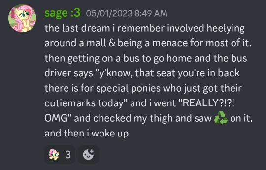
Fun Fact
After the announcement of the deal with Yahoo!, there were 170K signatures of unhappy Tumblr users petitioning to prevent the sale in 2013.
Text
What if I picked him up by his scruff he would be stuck there like a fucking baby
#dipstickdraws#sketch#doodle#oh fun fact btw the bottom of Montague's shoes have the diamond pattern#I love repetition of symbols in a character's design <3#Im being so serious the amount of diamond shapes on this man are astounding and beautiful#montague fortnite#fortnite montague#fortnite#montague#lordy I hate making fan art sometimes with how many variations of a tag there are
57 notes
·
View notes
Text
Jayvik and Butterflies || Arcane Meta
The butterfly motif has put everyone into a chokehold (myself included) and has had me brainrotting so hard for the last few days that I felt compelled to make my first Arcane post.
With how repetitive the butterfly motif is within Viktor and Jayce's lives throughout Arcane, I thought it would be fitting to do a meta looking into what that symbol might mean.
So first things first; where do we see this symbol pop up? In presumed chronological order of in-universe events, here are some of the following;
1. Viktor when following his toy boat (S1E6)
2. Jayce after being saved by the mage (S1E2)
3. Mechanical butterflies shown during Progress Day (S1E4)
4. Butterfly at the Fissures when Jayce and Viktor talk about failing to "do good" (S1E9)
5. A flash frame of a butterfly appears when Jayce hits the Arcane with his hammer (S2E3)
6. The hammer itself is shaped like a butterfly after Jayce emerges from the Arcane (S2E5)
7. Viktor and Jayce vaguely form a butterfly-type shape when they sacrifice themselves (S2E9)
(If I'm missing any I apologize, but these are the memorable examples that I think embody the themes I'm going to discuss. Feel free to comment more!)
I'm not including Jinx's mechanical butterflies here since they are more reminiscent of Firelights, but it is fitting that she has taken a symbol associated with progress from Progress Day and retrofitted it to her own design, just like she does with Hextech itself. That already serves as a manifestation of how Jayce and Viktor's shared creation can lead toward a dangerous path.
Ultimately, I think there are three main themes that I believe fit both characters respectively along with their arcs.
1. METAMORPHOSIS

Viktor goes through a literal metamorphosis of his own as a result of the glorious evolution, both physically and emotionally. Like the change of a caterpillar to a butterfly, his evolution is one that he perceives to be an "improvement" on his prior form. Simultaneously, his obsession with perfection (due to his own insecurities, struggles and oppression) shifts his focus. His original ambitions to help the people of Zaun and beyond are lost as he prioritizes using the Arcane to "improve lives", even against their own will. For the final step of his evolution, he sacrifices his humanity and breaks out of his "chrysalis" as a changed man. Viktor become utterly unrecognizable to everyone, even to his own partner; until the last scene between the two.
Jayce has seen that he has become something completely different than the Viktor he knew before. But regardless, he sees him as beautiful in the context of his current "perfect" AND prior "imperfect" state. The caterpillar and butterfly are one and the same, just like the man he knew and the "Machine Herald" that stands before him. He sees under the facade (a literal mask) that Viktor wears, knowing that his partner is still there.

What distinguishes Viktor from the butterfly is that his metamorphosis doesn't end with the "glorious evolution." While the evolution was intended to be a point of no return, it was eventually shown to be another step in his ever-changing arc. Viktor doesn't revert back to his original state, but makes his sacrifice alongside Jayce because of the growth of his character. The final, glorious evolution he always wanted was in liberating everyone from the Arcane, not enslaving them.
The metamorphosis theme also applies to Jayce, as he has obviously "evolved" after touching the Arcane. Yet despite his own evolution, he never loses that humanity that allows him to keep hope for Viktor still being in there. Both of them become something more in the end. I especially love that this happens by each accepting their flaws and acknowledging one another as beautiful. Jayce would still love Vik if he was a worm the caterpillar, since that was the first and original iteration of the man he admires.
2. THE BUTTERFLY EFFECT

The butterfly effect is one of my favorite thought experiments related to chaos theory; the underlying patterns/laws of the universe's systems that seem random but are actually dependent on initial conditions. The effect argues that a simple flutter of a butterflies wings could lead to a chain of events that cause something completely different and significant. Arcane has several of these "butterflies" (e.g. the note Vander wrote for Silco) but the most prominent one yet again connects Viktor and Jayce.
Old Viktor explains that in every universe, he gave young Jayce a different rune in order to invent Hextech, presumably with the hopes of preventing the apocalypse as well. He knew that Jayce was the only one who could show him the truth about perfection, but without the right rune, he couldn't get there. It was the specific choice of an acceleration rune that allowed for the events of season two to occur. This small change gives Ekko a chance to fight back and Jayce the chance to talk it out with his partner.

(My personal theory is that the acceleration rune allowed for Ekko and Jayce to travel to a different dimension through the Arcane. This led Ekko to create the Z-Drive and gave Jayce the knowledge of his and Viktor's fates. The rune in his wrist was likely what brought him to Old Viktor in the first place. Otherwise, it's likely that Ekko, Heimer and Jayce would have been absorbed/disintegrated in the process.)
At the beginning of S2E6 Viktor describes Jayce as having "a singularity simultaneously self-replicating and self-annihilating." While the singularity seems to be driving Jayce insane and irate, it contains the chaos needed to stop the influence of the Hexcore over Viktor, Piltover, and Zaun.
In the end, both are able to intersect the "chaos and order" of the Arcane, connecting the rune embedded in Jayce's wrist with Viktor's Hexcore-ified body. The disorder of the Arcane in Jayce seemed random at first, just as the rune given to him did. Yet it was these initial conditions that determined the fates of everyone involved, including the closure that he and Viktor were able to have in the end.

The way that these two are able to break the terrible fate determined for them if they ever met, while still being able to resolve their conflicts at the end, is some extremely beautiful storytelling.
3. MIGRATION/THE JOURNEY
Finally, the act of migrating is one that I feel applies most to Jayce in season two, but also is present in Viktor's backstory and struggle against his disabilities.
There's a specific species of butterfly that migrates every fall, which are the Monarch butterflies that are native to North America. These creatures must brave difficult conditions as they travel down south to more temperate climates. It is a physically demanding trip that tests the resolve of the butterflies, which in Jayce's case, also shakes him to his core.
He has to endure many perils and pains when the Arcane transports him to the "bad ending" universe. He travels through Zaun, gets stuck in the Fissures for a while, then finally climbs the Hexgates to learn the truth about his dream. While the sufferings of the journey itself feel unnecessary, it's a path Jayce must take in the end no matter how painful. Like the monarchs, he perseveres and makes it out of there alive.
But unlike them, this difficult pilgrimage is necessary to shape Jayce's character. He essentially speed-runs Viktor's personal journey as a Zaunite; born in Zaun, being poisoned by the Fissures, and "pulling himself up by his bootstraps" all the way up to the gilded heights of Piltover. It's a perilous and painful trip, made more difficult by his injured leg. Yet when Jayce reaches the top, none of the achievements matter to Viktor in this universe. After everything he had done, there was only the empty husk of his loved one and the truth it carried that remained. His illness and "imperfections" were cured, but at what cost?

This puts everything into perspective for Jayce. At the end of his travels, he realizes what he really wants to save isn't Hextech, or his dream, but his partner. In turn, it saves the lives of everyone including that of Viktor's, who comes out of the other side of this journey loved rather than alone. Perhaps their presumed deaths aren't the most happy ending for both of them, but they certainly made it to clearer skies together.
(One last additional note: I love that the alternate universe only has dragonflies instead of butterflies; the connecting symbol between the two is missing in this universe because they couldn't save it in the end.)
So ultimately, the motif of butterflies for Jayce and Viktor represent the change, resilience and interconnectedness of the pair. Throughout the entire two seasons, this symbol follows them on their respective arcs like a red string of fate. As Viktor calls it, they are "two sides of the same coin, inextricably bound." The final two variables needed to solve the Arcane, and they could only do so together.
(i hate these guys they have irrevocably rewritten my brain chem)
Thank you for reading if you made it this far!
#arcane#arcane season 2#jayce talis#jayvik#viktor arcane#arcane meta#arcane analysis#arcane spoilers
71 notes
·
View notes
Text


Slowly, I think I’m getting a handle on this…I tried studying the character art from my favorite dead MMORPG, Maple Story 2, and I think it helped me find a style for the shading and rendering that’s more dramatic but still sort of cartoony.
Plus, I’ve been doing a bit of script writing, which always helps me figure things out. ^^ So please enjoy the additional work I’ve done on these character concepts.
-Between these two, Magolor definitely needed the most work: you can tell because I basically drew a full character design sheet, which is something I almost never do because I don’t like repetition. XP But it doesn’t feel repetitive when I’m totally lost to begin with. ^^; I think I got a little too abstract that first time I drew him, so my focus here was to figure out the specific shape of his body and rebuild outward from there. In stark contrast to my usual Magolor designs, he’s very tall and muscular, with an imposing silhouette (especially with his cape on). Yes, he IS hiding something under all those purple bandages, but we won’t talk about it today. ;)
-I also like that his outfit gets darker the further inside you go, from the solid white cape and glittering chains, to the silver armor and gray scarves, to the skintight navy blue fit underneath. Symbolism??? Perhaps~
-Blade’s design was already pretty solid, so I just adjusted her cape a little, and then dove straight into the Rainbow Malady concept art. ^^ Phase 1 has her sprout a second eye and wings on one side of her face. Her head catches fire, as the power of the Rainbow Sword attempts to ‘burn away the darkness’. In this phase, Blade is already in a lot of pain, but remains fully conscious and can even speak, when she isn’t coughing up multicolored blood. She can recover from this on her own with a day of rest. Phase 2 is much more serious, forcing her organs outside of her body, and growing star-shaped welts over the rest of her skin. At this point, she can no longer recover without Magolor’s help-- essentially, he uses magic to shove all her organs back where they belong and stitch up the open wounds. It’s like setting a bone after it’s broken-- just as painful as the injury itself (if not more), but necessary for proper healing…which takes about a week. Phase 3 is the last and worst, transforming her arms into elongated wings and her whole body into burning plasma, on top of all the issues from Phase 2. Thankfully, she can’t really remain conscious in this phase-- she’s usually delirious from fever, blood loss, and her brain literally burning away. ^^; Storywise, she needs about a month to recover from this, so she doesn’t use it too often…of course, as the 'player', you can put her through it as many times as you want. =T
-Fun fact, I guess: So the primary love language between these two characters is food. ^^ I was musing about what I could do with a protagonist arc centered around worsening illness (which is…surprisingly rare), and I thought, “so what do you do for sick people? You put them to bed, you manage their symptoms, you clean and comfort them…and most importantly, you feed them.” And then ^that little doodle basically came to me in a dream, and from there evolved the idea of Magolor showing kindness to Blade by cooking for her.
Most of the time, the little affection Magolor shows to Blade is…basically performative. Think of it like a hammy supervillain petting their cat-- it’s more of a character stim than anything else. ^^; The way Magolor talks to Blade (and especially the way he talks about her…) makes it clear that the hand-holding and headpats don’t mean much.
But on the other hand, giving Blade food and watching her cutely devour it, especially during the times when she’s bed-ridden and he doesn’t see her as often…I like to think that might genuinely endear her to him a little, enough to make it a sort of stand-out gesture. Like, if he strokes her forehead when she’s sick, that’s whatever; but when he spends 5 hours making a Maxim tomato consommé for her to eat, that’s him trying to say he cares. Maybe it’s just a tiny bit, maybe it’s just in that moment, but a small part of him truly wants her to be happy.
#i think the brain worms are gonna stop now that I’ve finally gotten this out#maybe I’ll try doodling some of the boss characters later on#kirby#gijinka#au#BLADE_Princess#magolor#dark matter swordsman
84 notes
·
View notes
Note
dudeeee, do you know how feral I’m going over this?!? I fucking love it! You absolutely understood the assignment! There’s the unrestrained emotions and chaos I wanted to see in a piece like this!
And believe it or not…the silhouettes surrounding Scourge instilled this sense of personal fear in me. [I’m fine btw.]
I think I’m really bad at finding the clues though…but I can try to interpret what I’m seeing.
[I’m sooo sorry if I get this wrong, you could tell me if I am.]
on the left page:
Piece of the orange jumpsuit, bloody and torn apart.
Key and lock next to a red wall, possibly determined to keep others out. Can also symbolize feelings of being trapped and restrained.
Two silver circles, I’m betting it’s the handcuffs?
Lots of teeth gnashing together. Either out of anger or endurance of pain.
on the right page:
The angry red scribbles on the top right corner, with highlighted teeth, it’s either the verbal abuse he’s endured or is lashing out verbally at others.
Eyes on the bottom right corner constantly watching him, even when he’s free, representing his severe paranoia.
Whenever I see swirls with a golden light, I can’t help but think of the Warp Ring, and based on how you gave the design repetition, I see it as Scourge desperately trying to move forward but he’s stuck in the same time and place mentally.
The former king himself, looking pissed as ever, except he seems to be wearing a spiked collar.
A lot of stars, that has to be part of the cosmic interstate, so he’s on the run. Constantly.
That’s all I can take away from it, let me know if I miss anything!
Overall, it’s just amazing to look at. Thank you for answering my request.
Ooh I'm so happy you love it! ˖⁺‧₊˚ ♡ ˚₊‧⁺˖
It was really fun to make and Scourge is just such a fun character to explore with this type of stuff! Ahh so happy you found all those details especially the stars! Even made some have weird pupils.
The star thing was something I think really fits well with Scourge in my humble opinion. (Star metaphor) like a burned out type of way or a slowly dying one.
Since we are so far away from the stars we don't see them going out or dying. The stars are so far away yet we see them. Their light even if it's now gone echoes across space and we see them.
The collar on Scourge is supposed to be one of those with spikes or prongs on the inside and outside so when he speaks he hurts himself and others. °˖✧◝(⁰▿⁰)◜✧˖°

Really nice catch on the bloody orange jumpsuit pieces! 👍(^▽^) Also you see that light blue on the left corner behind the prison stuff? Yeah that's supposed to be his childhood then it turns purple (a royal color haha) the red cloud the rage,his fall. The black all over is supposed to represent hurt, both mental and physical.
Crammed so much metaphorical (?) shit in this baby *slaps this sketchbook spread* sooo much.
φ(^∇^ ) Again thanks for the request it was super fun and sorry for the late reply <3 I'm always up for requests so swing by with them whenever, they are so fun. ☆ ~('▽^人)
♡〜٩( ╹▿╹ )۶〜♡
#sketchbook#scourge the hedgehog#sonic requests#drawing requests#request#sth art#this really was a fun requests and i had a wonderful time hiding little things about him
7 notes
·
View notes
Text

HAPPINESS CHARGE PRETTY CURE LOVE POST
i just finished hcpc and i really enjoyed it !!!!!! its not going to be some kind of deep analysis i just gonna be silly about things i like in hcpc
THE CHARACTERS i adore each and every one of them (except for namakeruda i wanna punch him with lovely punching punch)
MEGUMI CHAAAN shes so precious to me !!!! so pure so truly lovely her desire to make everyone happy is so heartwarming megumichan always puts a smile on my face whenever shes on screen ^^
i saw people thinking shes mary sue but i cannot agree :c for me marysue is a character so perfect that theyre unbelievable (!)
and megumi IS believable to me . people like megumi do exist,,,,, and she has more serious flaws than being clumsy and bad at studying;
shes all about helping others but cares about herself little, when shes suffering her pain is hidden behind a smile to the point she can't resist her pain anymore, she worries about being weak and her help is not needed - altruistic people like megumi often experience this feelings too
also she reminds me of my fav person </3 and she motivates me to become a better person myself and believe in love and happiness,,, sorry it sounded cheesy but its true.. thank you megumi ^^
HIME HIME HIME my blorbo !!!!! at the beginning her anxiety and arkwardness, feeling of being not worthy enough to be a precure, escaping from problems felt so relatable :c and it felt so good to see her grow. the moment when she saved iona was so powerful. i wish we saw more of her family when she returned to blue sky
btw i love meguhime as friends and as a pairing theyre so pure so cute they care for each other so much awwww,w,w,,w,w,w, *holds them gently*
YUKOO precious rice bean and the most canonical lesbian of hcpc
i love her rice song its cute and catchy i often chant it ahhahaha
also i like how she always wants to keep peace, to befriend villains and give them love they lacked !!! "why keep fighting if we can eat delicious rice together" SAY THIS LOUDER QUEEN HONEY shes so based for this
i can't say much about iona maybe ??? shes a deep and realistic character and her story with cure tender makes me cry but tbh she put me off in the beginning as it was uncomfortable to watch her being harsh on hime (tho its justified)... but she grew a lot too ,,,,
i expected to dislike seiji but actually he was such a nice character and a loyal friend who actually has chemistry with megumi and role in the plot
QUEEN MIRAGE is my fav villain ever and tbh i can even relate to her
deranged traumatised emowoman ily
the story of her relationship with blue breaks my heart ... the moments when she still wants to be loved by blue but cant resist her anxious thoughts and red's manipulation... HER PURIFICATION SCENE WHEN ALL THE CURES COMFORTED MIRAGE;;;;; HER REUNION WITH BLUE;;;;;;;; sobs
the generals are so fun to watch :) dorks with goofy hats
hosshiwa remains my crush forever..... and oresky and namakeruda are just fuking silly smashing them smashing them
tho their final battle with the cures and their purification was such a deep and impressing scene
i love how brutal and creative was this season with its attacks. lovely punching punch <333 lovely beam <33 princess bullet machine gun <333 let cute girls do some violence
and their innocent form attacks are just beautiful
hcpc is often criticized for its repetitive designs and i sorta agree... but at least they were creative with international cures designs (aloha and bomber girls are my favourite, also im glad to see a cure from my country !!!! cure katyusha <3) and form changes AND FOREVER LOVELY DESIGN JUST SLAYS. SHE LOOKS LIKE A LITERAL ANGEL
also maybe theres a meaning behind the similar designs??? like, all the cures all over the world have similar costumes and it can symbolize they have a lot in common, theyre unite, they are a million-cure team .. while the phantom generals are all different, there's nothing uniting them, there's no team spirit or friendship between them
also the soundtrack is so good and catchy !!!!! i adore the opening and the rice song (and especially honey and hosshiwa's song battle) and the innocent song !!!!
i love the message of hcpc that everyone is worthy to be happy and loved, even if youre in deep despair, disappointed in life, thinking you'll never be loved and thus love is worth nothing - someone is always going to be here for you
but at the same time it points out that love can be a destructive force (red, mirage, dark seiji), that its impossible to be happy all the time, that feeling pain and hate is valid
sorry it turned out so long i hope i could share my love for happiness charge with you ,,,,,
i love you megumi i love you hime i love you yuko i love you iona i love you blue i love you red i love you mirage i love you seiji i love you masukomio i love you phantomu i love you hosshiwa i hate you namakeruda i love you oresky I LOVE YOU HAPPINESS CHARGE
#happiness charge precure#pretty cure#precure#happiness charge pretty cure#megumi aino#cure lovely#forever lovely#hime shirayuki#cure princess#yuko omori#cure honey#iona hikawa#cure fortune#seiji sagara#blue#queen mirage#megumi x seiji#blue x mirage#long post#mahou shoujo#magical girl#rknchan art
65 notes
·
View notes
Text
Ranting (Danganronpa) [prt. 4]
I always start liking a fandom or game and brush off any or all criticism because I get so obsessed over things. And that's exactly what happened to me with Danganronpa. I'm slowly fading out of the obsession, but if you ask, I will still info dump. I've been watching more analysis videos I guess you could say about Danganronpa and slowly started to realize it's not as perfect as I thought. Don't get me wrong, the games are beautiful with unique animation, story, gameplay, characters, and lore. But just because something has a lot of good qualities doesn't mean it's free from flaws.
A recurring thing I noticed people getting upset over was the 3rd case syndrome the 3 main games had (3rd case syndrome: Every 3rd case or class trial in Danganronpa was a double murder). It's understandable to be annoyed at the repetitiveness, but it does actually make some sense. Usually, when a new player starts playing the games, the first trial is there to sort of introduce the player into the mechanics and let them get a feel for the world. Then, the second trial ramps up the difficulty a bit, making the player more invested in the game/plot. But if you do another simple one victim murder for the third trial, the player could become bored. It's easy for the player to assume that the rest of the game will just be increasingly more difficult one-kill-trials. So the third trial is the perfect spot to put in this sudden double kill. You can argue that it'd be super interesting to have a double murder for the second case, but I think that making the second case that interesting will kind of make the rest of the games trials less interesting and compelling since the player might want more difficult double murder rather then the standard one. A lot of people were specially criticizing the actual plot of the 3rd cases and just how.. mediocre the gameplay was. I can say that the 3rd case in Danganronpa 2 is kinda bad, it really doesn't make sense and is just... weird. Mikan shouldn't have been able to pull that off. I can't say I enjoyed the other 3rd cases, I mean they were okay. Not the biggest most important thing.. just whatever.
The third game is definitely my favorite. Although I much more prefer the look, sound design, and characters of Danganronpa 2, the game is admittedly not too good story wise in my opinion. I like V3 because it switches up the story a bit and I enjoy it. I liked how you get to play as Kaede, she seems more fleshed out to me than the previous protagonists. And it was honestly so surprising to see Rantaro died and we the player get executed for it. I just wanna yap about Kaede's execution real quick cuz I love it :3. The song that she plays during the execution is "Der Flohwalzer" which is a simple song that is learned by beginners (Sorry if I get any info wrong, please correct me). It is mostly played just using the black keys, but during her execution, she is only seen using the white keys which could symbolize her innocence. A few people also said that since it is a common song for beginners, Kaede likely played this song throughout her childhood, so having to hear a familiar song being played wrong for hours as she slowly died of asphyxiation was likely upsetting to her. It's just an overall very nice execution to me.
I understand why a lot of people didn't typically like Mikan's execution. Because honestly, it was one of the worst parts of the 2nd game. The case that she was responsible for was also kinda bad, it didn't make much sense and bothered a lot of the community. Her execution bothered me a lot, it felt like (to me at least) that he trauma was being mocked or that it invalidated her. I understand that's reaching, but it felt disrespectful. Having to watch a character I felt connected to and had sympathy for do... whatever the hell that was, made everything feel wrong. It feels like the only thing her execution was supposed to represent was her trauma, and I think it could've been pulled off better if it didn't end the way it did. You start off the execution thinking it might be really violent or painful for her, but then it just cuts to something sexual and upsetting to watch, I understand its supposed to be deeper than that but I get shake the unease I felt. And then she gets launched off into space??? Huh????? It felt so confusing and weird, the whole thing should have been taken more seriously.
Of course when you have a game series, it is incredibly hard to make it perfect, I don't think a perfect game/game series is going to come out ever. Everything has beauty in it despite the flaws it may have. Danganronpa at its core is an incredibly thought out and complex game that is a wonder to play. The gameplay is nice, each game is unique visually, characters feel fleshed out and easy to relate/sympathize with, overall I would recommend if you find mystery stories interesting or if your just looking for something new. I doubt we'll get more content but I can only pray. Have a nice day, goodbye <3
#ranting#rant post#rant#danganronpa#danganronpa 2#danganronpa v3#danganronpa despair time#danganronpa trigger happy havoc#monokuma#danganronpa spoilers#kaede akamatsu#rantaro amami#mikan danganronpa#sorry if I got any info wrong#please tell me if I did#I would love to have a conversation with anyone who disagreees or has different opinions
6 notes
·
View notes
Note
honestly if we're going there with hair chat, did anyone rip into mike's s4 hair when the show dropped? i was more offended by that haha, before i understood what it meant for his character. i was like, its not a mullet, it's not his mushroom sweep, it's honestly giving wig and looks limp and greasy, what IS it?? finn has said he doesnt wash his hair (and looking at it during suzie's scenes, he ain't lying lol)
i was more confused by will's s3 bowl. there was no need for it to get so wildly fluffy haha, i loved his s1-s2 cuts they looked natural. unless will was trying something new by growing his hair long over the summer? which is a take i like. who knows
but mostly, i found el's long hair in s4 just bad. in s3 she was clueless, but she was also just natural and seemed cool. maybe it was the fish out of water thing, but they did her so dirty with that scraggy fringe and dried out straw hair in s4. there was no reason for a teen girl's hair quality to change from the lush curls in s3 to that scrag in s4, especially considering she was getting more nutrients and sleep than she was when living alone in the woods. and even though it was a violation, i remember seeing her buzzcut return and feeling like 'were so back', cos to me, that's the real el. i dont think it'll ever happen, maybe shouldnt happen, but i would love for her to reclaim that hairstyle by choosing to buzz her hair even when she's free from her powers and her oppression for good.
I feel like people, at least from what I saw on Tumblr, really loved Mike's long season 4 hair. And obviously still now. Unsure what the less fandom focused, more general public opinion was. Its clear that Will's bowlcut was ripped into (rude lol) continuously because people are boring and repetitive and uncreative with thoughts about shows they watch, but no idea if the Mike mullet was loved or hated. I am not the biggest fan - because it just doesn't look natural. It was a wig, right? Or real with extensions or hair pieces, rigtht? Mostly I hated the bangs. I hated how inconsistent it looked scene to scene. It was decent in the high school / DnD sequences but it often looked like Joan of Arc but not cute at all haha. Maybe that's what they were going for though. I also will always think it doesn't look like Mike at his best. And typically I love longer hair, I prefer it, I have longer hair myself. But it's character AND styling. S4 Mike was very odd all around. But again... maybe it was the point. He's supposed to be jarring in a way.
I'm incredibly biased and I'll forever admit that about Will - I always thought his hair suited him perfectly, especially in 3. Most definitely not Cool. Cute little nerd!! It was ridiculous that summer but I also like the thought he was growing it out. I love the thought that people assume he hates it, not a fan of the way his mom cuts his hair - but he actually loves it. Sees nothing wrong with it. Loves that it's so silky smooth and falls just right. Neat and tidy, that's our Will. Tight little shirts and pants with matching belts. Tidy little helmet hair bowlcut. Love him. But - also adoring the bit of wave for S5. Refined. Less restrained. Still suits him though. More mature.
I always assumed the S4 El look was a Joyce mimic. It looks like Joyce's hairstyle, or one she'd have. The quality of it, I didn't really pick up on but it's not like I'm an expert, just thoughts on styling. But that was my takeaway, looking like Joyce and it made her fit in with the Byers family a bit more.
I kinda like the idea of her reclaiming the buzz cut but I'm also unsure if El in canon would feel the same. Maybe we see it as iconic because El had such a unique introductory character design, but even symbolically a worthy idea of embracing and taking control - I see her wanting a head of hair. Maybe I'm off base!
3 notes
·
View notes
Text
Godzilla Film Watch: Week 2
It's nearly time to say Goodbye to the Showa series. Credit to Wikizilla for the poster images.

Day 8: Seed of Godzilla (1967) Another solid island adventure by Fukuda. The story structure feels a bit more composed than in Ebirah, though I ultimately prefer the earlier film's eclectic mix of characters, despite the introduction of go-to name Goro Maki here. Godzilla's turn as a would be parent here is the highlight, his initial confusion and tough love tactics giving way to genuine love at the end of the film. Unfortunately Minilla leaves a lot to be desired as a character design, and his lack of appeal hamstrings the emotional core of the film. I think it was a mistake to style him after a human child, rather than evoking a baby animal the way the Heisei series would later successfully manage.

Day 9: Destroy All Monsters (1968) In a lot of ways this feels like an expanded iteration on Ishiro Honda's prior film, and I enjoyed it for many of the same reasons. It's fun to see this colorful take on the late 20th century, and we get another cool rocket with Moonlight SY-3. The Kilaaks are also pretty good villains, though they lack the in-depth exploration that the Xiliens got, and I wish the film got a bit more out of the initial human mind control setup before it is resolved. The kaiju action is solid, if somewhat sparse given the expansive roster. Monsterland has some worrying implications though: the forcible confinement of Earth's kaiju to a small island feels deeply at odds with the heroics of many of the more prominent inmates, particularly in the context of later films taking place prior to this one. It's a setup ripe with thematic weight regarding mankind's desperation for control, but the concept remains unchallenged within the film narrative.

Day 10: All Monsters' Revenge (1969) It's funny how neither title for this film matches the subject matter. I understand the argument that the stock footage makes sense in the context of a child's dream, but watching the same battles repeat themselves is hardly engaging, and the film's focus on Minilla certainly doesn't help. The "real world" portions at least have a bit more meat to them. I can see why this was one of Ishiro Honda's favorites: he took the opportunity to experiment with creative framing and camera work. Unfortunately the film's themes don't stand up to scrutiny: what could have been a compelling exploration of the struggles of latchkey children is undermined by a generic "children should fight their own battles" message, minimizing the effects of parental neglect and the dangers of bullying. These themes gets further fumbled in the final scene, where the message seems to be "always cave to peer pressure, as long as you assert your dominance through physical violence first".

Day 11: Godzilla vs Hedorah (1971) This is in the running for my favorite Showa film. Wildly experimental in terms of shot composition and imagery, the darkest film since the original is still never afraid to get a bit absurd. The themes are about as subtle as a sledgehammer to the face, yet their lasting relevance to the present day vindicates their blatancy: it's hard to argue for a more subtle message when society has yet to truly learn it over 50 years on. Yoshimitsu Banno set out to create a monster with the same symbolic weight as the original Godzilla, and I think he succeeded: Hedorah is incredibly well realized and genuinely creepy at times. In retrospect I think Godzilla's savior role here could be read as symbolizing the importance of nuclear energy in moving away from fossil fuels. He definitely gets put through the ringer this time around, and I love the catharsis of him tearing apart the remains of Hedorah as the film's theme song plays.

Day 12: Godzilla vs Gigan (1972) Unfortunately this one failed to grab me. The stock footage returns in full force, but I think the murky lighting, repetitive traveling sequences, and overuse of slow motion hurt the kaiju battles even more. I can appreciate the idea behind slowing down footage to make the monsters seem larger, but without the ability to properly convey momentum they just end up feeling weightless, and the sluggish movement really hurts the fast paced, frenetic action of the Showa fights. Gigan is a fun villain with a strong personality, and the action picks up a bit towards the end, but even then it can't escape the repetitive choreography (at least alternate the direction Godzilla flips Ghidorah). The human cast is at least memorable, though by this point the alien plots are getting repetitive. The M Space Hunter Nebulans give a decent first impression with their uncanny "true peace" vibes (I wondered if there was commentary on Japanese New Religions somewhere in there), but their plan is pretty underwhelming, and it's not entirely clear why they needed the amusement park as a front.

Day 13: Godzilla vs Megalon (1973) What a fun movie. I was hooting and hollering throughout the whole film, having completely lost it by the end of the Downhill Comedy Car Chase. The stock footage is still very obvious, but is much less of an issue when the new footage is so vibrant, energetic, and creative. While none of the films many technical flaws hurt the watching experience, I do find myself wishing the Seatopians were explored more in depth. The ending (briefly) touches on their legitimate grievances with humanity's continuing nuclear tests, a carryover from Godzilla vs Mothra's themes. I think fleshing out these grievances ala the Nonmalt from Ultraseven could have improved them, though this particular movie might not have been the right place to do it.

Day 14: Godzilla vs Mechagodzilla (1974) This movie was the first Showa Godzilla I ever watched, and I think it presents a decent slice of what the era has to offer. It's campy and colorful, but not quite as absurd as some of the earlier Champion series films. This is somewhat reflected in Godzilla's design, retaining the large eyes of the previous film, but giving him a bit more attitude. The film certainly isn't without its own flaws and eccentricities: King Caesar takes up an awful lot of real estate within the narrative considering his limited effect on the final fight, and the second interpol agent feels like the film writing itself out of a corner. The Blackhole Planet 3 Aliens might be the most rote set of invaders yet: they're here to conquer earth and that's pretty much it. They're developed more than the Seatopians at least, and I like the laidback, worldweary performance of their leader, even if I'm used to the scene chewing dub actor. The film is pretty light on themes: the grandfather has a vendetta against the mainlanders, but as it's never really explored it ends up having all the pathos of a relative proclaiming some unsavory political opinion during Thanksgiving dinner. Mechagodzilla himself is the real highlight. Hedorah may be more thematically resonant, but the Cosmic Monster's endless arsenal and Jazzy theme tune allow him to keep his spot as my favorite kaiju. It's easy to see why, despite his late arrival, he would go on to become a key player in the Big 5 Toho Kaiju.
#kaiju#kaiju eiga#godzilla#minilla#kamacuras#kumonga#rodan#mothra#anguirus#manda#varan#gorosaurus#baragon#king ghidorah#gabara#ebirah#giant condor#hedorah#gigan#megalon#jet jaguar#mechagodzilla#king caesar
6 notes
·
View notes
Text
ponysona ref sheet :3


[text transcript: Carrie Go-Round, or Carrie for short It/She, Trans Mare, Lesbian Can prance through air with its saddle on. Gives carousel sky-rides to help others. It likes going around again, solving puzzles, helping with problems, music, good fortune, and going around again. Beholden to the whims of its fate & cycles, it tries its best to be carefree but secretly feels aimless at times.]
Extended character bio & art process thoughts below the cut v
Carrie Go-Round is a unicorn with carousel themed magic. Carousel magic works in mysterious ways. It can direct the magic somewhat and hone certain patterns through repetition, but it’s ultimately at the whims of the fate chosen for it. Usually everything works out just fine though.
While actively using its carousel magic and wearing its saddle, it can prance on top of air. It takes others on rides through the sky using this, giving them time and space to think through a problem they’ve been having. These rides can involve a conversation, a magical spectacle of lights and music, or simply peace and quiet, whatever will help the other pony best. Flying, putting on light shows, and making music are all come naturally when the magic is in service of another.
Carrie has adapted an outwardly carefree and playful nature. It’s partially its true self, and partially a defense mechanism in response to the lack of control that the carousel makes it feel. When you’re stuck going around in one big circle, it’s easy to feel aimless and confused. Helping someone else with a problem of theirs always makes it feel better though. It's also fond of rhymes, puzzles, and riddles.
It’s somewhat taller than average. Not very strong, but when its magic is active any passengers feel light as a feather. Both the color and shape of its hair is all natural.
—
Art process thoughts:
An idea for a ponysona design popped into my head the other day and I'm really happy with how it turned out! Multiple times I've played with designing a ponysona by taking more grounded and literal elements of myself but none of those struck me as exciting or fun. Being freely indulgent and overdesigning a pastel magic horse is way better.
In terms of the drawing itself, this is probably the closest you'll ever see me mimic the G4 artstyle! I referenced a couple screenshots of pinkie to get an idea for scale, and then I cut apart my rough sketch into chunks so I could stretch out the neck & back because I like when the bodies are longer than proportions on the show. This also doubles as making its tallness present in the art but really I would've done that regardless.
The carousel concept is a fun way to tie in the colorful aesthetics with themes of cycles and fate. Girls love to be stuck in a loop of mayyyybe their own choosing. And it also means I get to bring back the saddle & bridle fashion concept Lauren Faust considered for the show's pitch bible. It's definitely kind of weird but in a fun way.
Carrie Go-Round like Merry-go-round but also like Carrie short for Carousel but also like Carry because she physically carries other ponies & helps lift them emotionally. Do you get it.
This is my first time adding ALT text to my images; I did my best to be thorough but not too verbose.
Miscellaneous design thoughts: I love pink and green together! IRL horse coat patterns are so so cute I wish more MLP characters had them. Plus the bubbly shapes on the hooves match her cloud prancing. Duality is everything to me: two different shapes and colors of hair, two symbols on its cutie mark, two little eyelashes. Although I tried less to make it look like me, its hair still has the same general shape (however mine will only rarely form curls like that all on its own). Also the cutie mark arrows being green is a slightly inspired by a real dream I had about getting my cutie mark:
I've been meaning to make a ponysona for a long time now. All in all this was very fun to do and now I'm excited to draw more of my own OCs and their interactions.
17 notes
·
View notes
Note
hmmmmmm... umineko for the ask (please try to keep it spoiler free i haven't read it yet)
ohohoho!!! i will always take the opportunity to gush abt umineko.
i really appreciate the hierarchy of information it has. new info is given at a satisfying pace + the game respects the player enough to not state the obvious most of the time. the characters are overall well written and i really appreciate that the female characters are allowed to be complicated and messy all the time too!! all of them feel so real yet the author treats even the shittiest ones with such care. it's a story that loves the reader and itself
i tend to get kind of annoyed with vns that are too repetitive but umineko somehow avoided that completely for me despite being longer than god. i love watching rich people beef with eachother and die i guess
OH and also i love the vibe and atmosphere of it!! i genuinely really like the haziness of the real-life photo backgrounds in the original i think it adds a lot. dreamlike and kind of pretty..... the sound design is fantastic too
last thing is like. its one of those stories that manages to have its themes, motifs, and format kind of intertwine perfectly imo. the symbols and mediums perfectly convey the point it was trying to make!! slayyyy!!! sorry for rambling so much but its just that good. <3
6 notes
·
View notes
Text

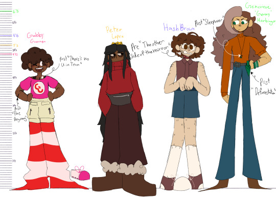
Time for new hunters refs!
I’m gonna ramble about their designs under the cut so u can read that tasty character analysis if u wanna :3


did these in order of who I had the most to say about to least, so dw gabby and peters are super short compared to genny’s lol
Genny
Genny has a general theme of imperfection in her design, meant to allow her appearance to betray her attempts at portraying herself as perfect and above everyone else. You can see her being brought down to the characters she paints herself as better than (hash and Peter) by her similarly messy hair. You can also see many instances of asymmetry where there shouldn’t be to show how she really isn’t all that put together (mismatched hair color, one rolled up sleeve, all bracelets on one wrist, off kilter belt, a jean pocket matched on the other side with a knife holder, and her incredibly lopsided bangs are all obvious examples of asymmetry in Genny’s design.)
Genny’s design also makes a point of using more true pointed ends than any of the other characters, thanks to her ‘sharper’ personality. She also has more triangle esque shapes than the others.
The four green details on Genny’s design represent four sides of her life- the knife is the hunters, received during a monster hunting mission and representing her protectiveness and her desire to fight for those she cares about, the necklace is her children, made for her by nut, a sweet little sentimental craft with no real purpose representing her relinquishing her need to be over productive and destructive and instead doing what she loves (being a parent), the bracelets are her friends, given to her by her best friend Melissa in high school and representing how she still isn’t ready to let go of her teenagehood, and her eyes are her family, with her at birth, green representing how she focuses outward away from herself with jealousy, seeing only how she fails in comparison to others thanks to the way she was raised to always be overly critical of herself and to always compare herself to others.
Ps there not this much symbolism in the others designs, I’m just deranged about genny’s design in particular <3
Hash
Hash is meant to be a character who blends into the background well due to her tendency to try escape/disappear and her general feeling of being invisible and unable to create change. This is why here color pallet uses the least unique colors- her colors are very dull and her clothing choices are fairly basic. Even her shapes are meant to read as somewhat boring, being made not of cute circles or sharp aggressive triangles, but simply squares upon squares. You can see this primarily in her center, as her extending to her edges at the feet, head, and arms start to drift into the more rounded shapes reflective of her weak personality.
Hash’s body hair and bandana serve both a design and practical purpose. Practically, thanks to hash’s difficult life situations the bandana is good for covering up injuries and her hair good for some amount of warmth (and also makes sense cus she doesn’t always have access to the ability to shave) and design wise they bring in a sort of boyish energy that is important to hash’s relationship with her gender (relationship with femininity is a common theme in this story between the main 4, mostly the 3 women.)
Peter
Peters life is pretty dull and repetitive, and I wanted to sort of reflect this in their color palette by making it fairly low contrast and not super bright. I wanted to avoid having details of theirs really pop out too much, hence why I gave them eyes which aren’t as white as the others- if you look at their face compared to any of the other three you’ll find their eyes stand out way less, adding to the low contrast. I also found that giving them lighter schleras made their eyes looks wider, which I wanted to avoid considering their eyes are actively meant to look droopy and tired.
The brightest parts of their design, their red sweater and gold crown, are meant to draw visual similarities to the most important people in their life, gabby and prince. The gabby connection is probably less obvious esp now that their sweater isn’t bright red (similar to Gabby’s reds) like it used to be.
Gabby
Gabby uses a mixture of more triangular shapes (pants, scars, leg warmers, nose) and round shapes (shirt, hair, eyebrows, shoes) to communicate her personality as a mix of her more energetic leaderly traits and her more childish traits.
Like I mentioned in a post I made while drawing the above references, Gabby’s colors are a bit crazy on purpose- she likes her style to stand out, hence why every color she wears is more obnoxious than any of the other characters same clothing pieces, even down to her khaki pants, which despite being her most boring clothing piece, is still much brighter than the other three characters pants.
All
Genny and Peter both have smaller eyes than hash and gabby- this is to help emphasize the age difference, with Peter and genny being “the adults” of the group
Additionally their eye shapes are all meant to line up with their personalities/dispositions. Gabby has large, round, childlike eyes. Peter has half lidded and generally tired looking eyes with their eye bags and wrinkles. Hash has very elongated eyes, as if they’re constantly widened in fear- this also helps to further exaggerate her expressions since her eyes can squint further than the others cus they’re tall. Genny doesn’t have this kind of eye language the other 3 have, but you could see her eyes as just generally being the most adult as they’re small, or say they look squinted compared to the others, which can come across as judgemental, or confused if you wanna dig deeper on how genny is kind of lost in life and just pretending to be totally in control.
You can probably already tell by looking at them, but the biggest theme of the hunters cast design is a lack of similarities, being that they’re the most forced together least friends cast in monsters (despite becoming their own lil found family in the end). Not a single shared height, hair length, age, or facial feature will be found among them, although there are still shared details like genny and hash both being basic denim pant bitches and hash and Peter both having very dull red and brown focused palettes.
#artinevee#art#oc#digital art#artists on tumblr#original character#monsters223#hunters223#gabby garner#peter#hash brown#genny#cartoon#cartoon art#character design#procreate#procreate art#my art#digital artist#character lineup tag
14 notes
·
View notes
Note
Would love to hear about your beefs with Lucas because I have beefs with Lucas
(Sorry it took me three thousand years to answer this, anon.)
They mainly fall under a few headings, with the third being the most serious and the thing that I am genuinely irl furious about at least biannually (and feeling unable to adequately sum up The Problem with it after yelling about it so often is a huge part of why this post has been in my drafts for such a long time):
1. His self-mythologising and the subsequent uncritical repetition of his bullshit in the fandom. Obvious lies like that he had some master plan for 10 films when it’s clear he did not have anything like a plot outline at any point. We all know the thing was written at the seat of various people’s pants, it’s blatantly self-evident that’s the case. There’s also plenty of public record about how the OT was written. Even dumber, more obvious lies, like that Anakin was ‘always the protagonist’ and the entire 6 films were his story from the beginning. This is preposterous and every time someone brings it up (usually with palpable smugness) as fanboys ‘not understanding star wars’ because they don't get that ‘the OT is not Luke's story’... Yeah, I just... I cannot.
Vader wasn’t Anakin Skywalker until ESB, it’s a retcon. It’s a brilliant retcon and it works perfectly, it elevated SW into something timeless and special it otherwise would not have been, but you can tell it wasn’t the original plan and there’s proof it wasn’t the original plan. Let’s not pretend. And Luke is the protagonist. No amount of waffling about such esoteric flights of theory as ‘ring structure’ is going to get away from the rigidly orthodox narrative and the indisputable fact that it is Luke’s hero’s journey. Vader’s redemption isn’t about his character development (he has almost none) and has no basis in any kind of convincing psychological reality for his character, but it doesn’t need to be because it’s part of Luke’s arc, because Vader is entirely a foil in Luke’s story. It’s a coming-of-age myth about confronting and growing beyond the father.
All attempts to de-centre Luke in RotJ just break the OT’s narrative logic. It’s a character-driven story and the character driving is Luke. Trying to read it as Anakin’s victory, the moral culmination of his choices rather than Luke’s and putting all the agency into Anakin’s hands just destroys the trilogy’s coherence and ignores most of its content in favour of appropriating a handful of scenes into an arc existing only in the prequels. The dilemma of RotJ is how Luke will define ethical adulthood after learning and growing through two previous films worth of challenge, education, failure, and triumph; it’s his choice to love his father and throw down his sword which answers the question the entire story has been asking. Vader’s redemption and the restoration of the galaxy are the consequences of that choice which tell us what kind of world we’re in, but the major dramatic conflict was resolved by Luke’s decision not the response to it.
And, just all over, the idea of Lucas as an infallible auteur is inaccurate and annoying to me. Obviously he’s a tremendous creative force and we wouldn’t have sw without him, but he didn’t create it alone or out of whole cloth. The OT was a very collaborative effort and that’s why it’s what it is and the prequels are what they are. Speaking of which.
2. The hubris of the prequels in general and all the damage their many terrible, protected-from-editors choices do to the symbolic fabric of the sw universe. Midicholrians, Yoda fighting with a lightsabre, Obi-wan as Anakin's surrogate father instead of his peer, incoherent and unmotivated character arcs, the laundry list of serious and meaningful continuity errors, the bad storytelling, the bad direction, the bad characterisation, the shallowness of the parallels which undermine the OT’s imagery, the very clumsy and contradictory way the A/P romance was handled, the weird attitude to romance in general, it goeth on. I don’t want to re-litigate the entire PT here and I’m not going to, but they are both bad as films and bad as prequels. The main idea of them, to add Anakin’s pov and create an actual arc for him as well as to flesh out the themes of compassion and redemption, was totally appropriate. The concept works as a narrative unit, there are lots of powerful thematic elements they introduce, they have a lot of cool building blocks, it’s only in execution and detail that they do a bunch of irreparable harm.
But the constant refrain that only ageing fanboys don’t like them and they only don’t like them because of their themes or because they humanise Anakin... can we not. The shoddy film making in the prequels is an objective fact. If you want to overlook the bad parts for the good or prioritise ideas over technique, that’s fine, but don’t sit here and tell me they’re masterworks of cinema there can be no valid reason to criticise. I was the exact right age for them when I saw them, I am fully on board with the fairy tale nature of sw, I am fully on board with humanising Anakin- the prequels just have a lot of very big problems with a) their scripts and b) their direction, especially of dialogue scenes. If Lucas had acknowledged his limitations like he did back in the day instead of believing his own press, he could have again had the help he obviously needed instead of embarrassing himself.
3. Killing and suppressing the original original trilogy. I consider the fact that the actual original films are not currently available in any form, have never been available in an archival format, and have not been presented in acceptable quality since the VHS release a very troubling case study in the problems of corporate-owned art. LF seizing prints of the films whenever they are shown, destroying the in-camera negatives to make the special editions with no plans to restore them, and doing all in the company’s considerable power to suppress the original versions is something I consider an act of cultural vandalism. The OT defined a whole generation of Hollywood. It had a global impact on popular entertainment. ANH is considered so historically significant it was one of the first films added to the US Library of Congress (Lucas refused to provide even them with a print of the theatrical release, so they made their own viewable scan from the 70s copyright submission).
The fact that the films which made that impact cannot be legally accessed by the public is offensive to me. The fact that Lucas has seen fit to dub over or composite out entire performances (deleting certain actors from the films), to dramatically alter the composition of shots chosen by the original directors, to radically change the entire stylistic tone by completely reinventing the films’ colour timing in attempt to make them match the plasticy palate of the prequels, to shoot new scenes for movies he DID NOT DIRECT, add entire sequences or re-edit existing sequences to the point of being unrecognisable etc. etc. is NOT OKAY WITH ME when he insists that his versions be the ONLY ones available.
I’m okay with the Special Editions existing, though I think they’re mostly... not good... but I’m not okay with them replacing the original films. And all people can say is ‘well, they’re his movies’.
Lucas may have clear legal ownership in the capitalistic sense, but in no way does he have clear artistic ownership. Forget the fans, I’m not one of those people who argue the fans are owed something: A film is always a collaborative exercise and almost never can it be said that the end product is the ultimate responsibility and possession of one person. Even the auteur directors aren't the sole creative vision, even a triple threat like Orson Welles still had cinematographers and production designers, etc. Hundreds of artists work on films. Neither a writer nor a director (nor one person who is both) is The Artist behind a film the way a novelist is The Artist behind a novel. And Lucas did NOT write the screenplays for or direct ESB or RotJ. So in what sense does he have a moral right to alter those films from what the people primarily involved in making them deemed the final product? In what sense would he have the right to make a years-later revision the ONLY version even if he WERE the director?
Then you get into the issue of the immeasurable cultural impact those films had in their original form and the imperative to preserve something that is defining to the history of film and the state of the zeitgeist. I don't think there is any ‘fan entitlement’ involved in saying the originals belonged to the world after being part of its consciousness for decades and it is doing violence to the artistic record to try to erase the films which actually occupied that space. It's exactly like trying to replace every copy of It's a Wonderful Life with a colourised version (well, it's worse but still), and that was something Lucas himself railed against. It’s like if Michaelangelo were miraculously resuscitated and he decided to repaint the Sistine Ceiling to add a gunfight and change his style to something contemporary.
I get genuinely very upset at the cold reality that generations of people are watching sw for the first time and it’s the fucking SE-except-worse they’re seeing. And as fewer people keep physical media and the US corporate oligarchy continues to perform censorship and rewrite history on its streaming services unchecked by any kind of public welfare concerns, you’ll see more and more ‘real Mandela effect’ type shit where the cultural record has suddenly ‘always’ been in line with whatever they want it to be just now. And US media continues to infect us all with its insidious ubiquity. I think misrepresenting and censoring the past is an objectively bad thing and we can’t learn from things we pretend never happened, but apparently not many people are worried about handing the keys to our collective experience to Disney and Amazon.
4. The ‘Jedi don’t marry’ thing and how he wanted this to continue with Luke post-RotJ, so it’s obviously not meant to be part of what was wrong with the order in the prequels. I find this... incoherent on a storytelling level. The moral of the anidala story then indeed becomes just plain ‘romantic love is bad and will make you crazy’, rather than the charitable reading of the prequels which I ascribe to, which is that the problem isn’t Anakin’s love for Padmé, it’s that he ceased to love her and began to covet her. And I can’t help but feel this attitude is maybe an expression of GL’s issues with women following his divorce. I don’t remember if there’s evidence to contradict that take, since it’s been some time since I read about this but yeah. ANH absolutely does sow seeds for possible Luke/Leia development and GL was still married while working on that film. Subsequently he was dead set against Luke ever having a relationship and decided Jedi could not marry. Coincidence?
There’s a lot of blinking red ‘issues with women’ warning signs all over Lucas’s work, but the prequels are really... egregious.
#sw#salt#more unhinged rambling#anyway dowload the despecialised editions#unsubscribe from Disney+#be free#usually we'd be having a big family thing for Boxing Day but you know#so God bless us all at home separately#I hope everyone had as happy a Christmas as possible in keeping with the situation#I should see if I can drag my brother outside to build a snowman
42 notes
·
View notes
Text
Spoiler to upcoming H*skerD*st post (why I dislike it)
Spoilers:
“ [SECT 1 - Body Language (Nif > AD) - Avian/Feline/Human] [SECT 2 - BOUNDARIES: rejection, pushy, reflects val, pref unavailable men like Henroin/Bro (Trav, H), power dynamics in fic/rl, candid pic] [SECT 3 - Age, chemistry (pro, con)/common grounds (addictions), convo, maturity, AD type, Opposites DONT attract (proven by science)] [SECT 4 - IG, fans, viv - streams, viv sis, staff, mick ear comment, issues w staff shipping, requests, new and outdated art, mentality, tsundere, male sex abuse victims in media, poor character and world mapping, neg gay stereotype, oversized pet, H being OOC for fanservice and self indulgence is creepy] [SECT 4.5 - Impact on audience: The message this conveys to audience, esp impressionable young people. lack of staff maturity and understanding on this. concerning fetish.] [SECT 5 - Personal Experiences + why it triggers, where my pov comes from and why its valid] [SECT 6 - CONCLUSION: Why it wont work, brief sum of impact on reality, no respect or boundaries, dangerous message, clear and unrealistic bias (that can lead to sloppy storytelling), How to Fix (best course of action from here, maybe a lesson in boundaries and accepting rejection/cant have everything to AD? Start of a purely platonic bond between the pair, Paternal/grandfather and grandson love (not always covered in media), healthy relationships that arent just sex/romance, how different bonds can help give support to healing, realistic relationships and bonds, moving away from creepy stereotypes and stigma, expanding from the cliche of love healing all and why thats dangerous, love is not to fix someone or yourself, how fanservice dampens storytelling and weakens development - ex pyramid head, viv ‘symbolism’ is heart trademark + lack of research, lesson of respect and boundaries, positive messages, how to improve of the storytelling of HH to avoid cliche and self indulgent/fanservicey pitfalls)] “
Finished the introduction and warning sections. Thisll take some time, esp as its touchy stuff for me. But working on something more refined and professional sounding/looking whilst linking the original for reader ref. Some personal info will be redacted as I feel uncomfortable sharing it as well as it’s in my right to have my privacy. Im aware people will question it however some things will trigger me and I will mention that, however I would rather keep somethings personal. Respect that from a real person please.
~~~~~~~~~~~~~~~~~~~~~~~~~~~~~~~~~~~~~~~~~~~~~~~~~~~
Im also going to cover other (Viv Related) topics such as:
The Dangers of Stolitz
Valentino - The Bastardisation of the Pimp ‘Game’ (It’s NOT romantic)
The Flaws of Angel Dust (From Design, Stereotype, Drugs and Sex Work)
Viv and Critique - Why Criticism is CRUCIAL to Growth + the Difference Between Hate and Help
Points to Improve (in HH/HB)
Professionalism Lacking in Spindle + Concerns
Research! Some Facts About Each Era + Demonology (from a Real Witch!)
[Now I know many may have issues with this one but] Viv Inserts - Verosika, AD, Charlie...? (Incl. Viv Impsona, Staff OCs, How to correctly Self Insert)
Vox is a Victim (Whilst dark humour is great, this just crosses a line - and other facts on male abuse victims treatment)
Viv Has Taken on too much - Why this destroys industry before it begins (and how to avoid the temptation!) - A handy guide on realistic workload to reduce your own stresses and work your way towards your final goal!
Alastor - The Poor Portrayal of Race, Spiritual Practice and Design (And how to improve!)
Biggest Pet Peeve - LEARN YOUR DRINKS, DEMONOLOGY AND GAMBLING!
What Drink is Husk Drinking? (Ft my decent into booze aka I can make a drink and drink a drink but my arms tire from the shaking aka blended booze b4 aka Repetition of the AoM ‘What Drugs is David Taking? ft The Addiction Boss Monster’)
Redesigns
What Variation Can Spice It Up?
How To Make An Adult Cartoon For ADULTS (And not just horny teens)
Sigils, Incorrect Usage and WTF ARE YER DOIN?! (Even for non-believers, dont misuse!)
Some Theories To Some Gin (or Whiskey or Voddie)
Review on Each Released Product (From Pilots, Comics to Merch)
Symbolism whilst combining Tragedy with Comedy
Bias, Misogyny and Treatment of Same Sex Ships
Repetition
Why Stan Culture is Dangerous, So is Hate
How to plan, produce and market your own show!
Husk’s Peach Princess Cocktail (as seen on Tipsy Bartender) and Proof the Fans are Too Young To Booze Cruise
Building Rep and Trust whilst keeping boundaries as a creator
The Point and Purpose of the Hotel
Sexual Fixations in both shows - why is everything sex
#stans and antis dni#stans and antis will be blocked and reported#hazbin critical#helluva critical#future post ideas#future critique#critique and tips to improve#more posts will include a section on tips to improve said areas so its not all dismal#Plus I feel some of my critique gets misconstrued as hate just because I have a different set of standards for things compared to others#we ALL have different standards#likewise how can one expect to improve without being given that push in the right direction?#open mind and compassion is key
18 notes
·
View notes
Text
My hopes for WWE & AEW in 2021 and things I hope changes for WWE and AEW in 2021
Hopes
WWE
Roman Reigns stays dominant and reigns supreme as the Tribal Chief
Keith Lee wins the Royal Rumble, joins The Hurt Business and brings the WWE Champion to the Hurt Business
Naomi returns and joins The Hurt Business and dethrones Asuka to take home the gold
The Hurt Business DOMINATES Raw
Bianca Belair wins the Royal Rumble and dethrones Sasha Banks at Wrestlemania
The Riott Squad win the Women’s Tag Team Champions
Unify the men’s Tag Team Championships
Unveil a new Title and give us WWE’s very first Television Championship. It should be styled similar to the NWA and WCW’s TV belts, but on the sideplates it should include USA and Fox on the plates. Shelton Benjamin or Ricochet should be the TV Championship
Big E reigns supreme as Intercontinental Champion and finally gets to face Roman for the Universal Championship at Wrestlemania 38
Rhea Ripley gets called up and goes to Smackdown
Mercedes Martinez dethrones Io Shirai and becomes NXT Women’s Champion
Karrion Kross reclaims the NXT Championship
Anyone but Johnny Sameface as NXT North American Champion
Queen Of The Ring. The amount of female talent available on Raw, SmackDown, NXT and NXT UK is quite something. It's clear that this is the richest women's division in WWE history. They really should do something with all those workers. The 'Mae Young Classic' tourneys have been fine, but people would trip over themselves to see a fully-fledged 'Queen Of The Ring' epic staged across multiple nights. If booked correctly, this tournament could help establish a new contender for top titles. If she isn't Champion by then(though she should be) the perfect person to become Queen Of The Ring would be Bianca Belair! Bianca Belair would have unparalleled credibility for her 'StrongEST, FastEST, ToughEST' mantra if she whipped a bevy of skilled workers to become the first 'Queen'. WWE could also get creative by linking the event in with Charlotte Flair's nickname and spinning off into a feud between her and the winner afterwards.
Form Full-Time Female Tag-Teams and keep them around. The Women’s Tag Team DIvision is a mess. Keep creating makeshift Tag Teams and breaking up established tag teams and your tag team division is dead. The current champs and their predecessors haven't even been "proper" full-time duos - Nia Jax and Shayna Baszler were shoved together awkwardly in the summer, and they've since been replaced by the unlikely Asuka and Charlotte Flair combo. This cannot be allowed to continue. It's damning that WWE don't have more fully-formed pairings ready to go. The Riott Squad are perhaps the only actual twosome who are presented as a tight-knit collective weekly. Other than that, who is there? Considering the belts have been around for a few years now, that's unacceptable. The IIconics split, so did Sasha Banks and Bayley, and the scene is littered by 'odd couple' tandems like Mandy Rose and Dana Brooke, Lacey Evans and Peyton Royce, and Billie Kay teaming with the likes of Natalya or Tamina when it suits.
Ensure NXT is treated like a proper third brand rather than a quasi-development league for Raw and SmackDown. NXT has been on USA Network for over a year now, but it's still very much behind both Raw and SmackDown as a priority. Need proof? Look at the way Keith Lee was handled when he was "called up" after SummerSlam 2020. The former NXT Champ had to start all over again, and he's had several teething problems on Monday nights. It'd be nice to see WWE move away from positioning NXT as a 'feeder' for the other two shows. Changing someone's gimmick when they leave makes the brand look less-than, and there's simply no need for that anymore; NXT should be an equal to Raw and SmackDown, not a development league. Sadly, it still comes across as that. Lee's stop/start plight and the (mis)fortunes of others like Aleister Black and Ricochet should be a lesson to WWE. Some workers are better off rocking the black and yellow, not the red or blue.
AEW
Darby Allin becomes AEW World Heavyweight Champion
Adam Page costs Kenny the title and Page gets revenge and DESTROYS Kenny
MJF destroys the inner circle from within and when Jericho realizes what just happened, that’s when MJF and Wardlow destroys Jericho
Which is when we get a Sammy Guevara babyface turn and we get MJF vs Sammy
Arn Anderson turns on Cody
AEW’s Four Horsemen is formed. MJF, Shawn Spears and FTR with Tully and Arn managing as the JJ DIllon mouthpieces
Darby Allin and MJF feud for the title
The Women’s Division is improved. The girls get more time to shine on Dynamite. Your champion actually appears(shocking, I know) and build feuds and stories for your women’s division. There’s still some time to do what’s right for your women’s division, but the only thing that remains to be seen, does the powers that be of AEW even care?
Get a new title design for the Women’s Championship. It looks like a toy for a child. It’s plastic, not gold. It should be as big and beautifully designed as the men’s titles. It should be as big as the NWA’s title or even the WWE’s title. The title is symbolic as to how AEW treats it’s own women’s division and that needs to change with a fresh new design.
Sign Thunder Rosa. It may not fix everything with the women’s division, but it gives you your needed star power. Tony Khan should be begging on his hands and knees to sign Thunder Rosa in 2021 after her time with the NWA is up, his women’s division is getting their asses kicked by what his EVP refers to as a “developmental brand”
If you can’t sign Thunder Rosa. My solution is Push Anna Jay and Britt Baker as the top face and heel of the women’s division and either of them dethrone Shida.
Changes
WWE
Leave whatever that monstrosity of a creative team they have for RAW is. Let the Wrestlers dictate what they want their characters to be. Ditch the scripted promos. Let promos feel organic and real. Let the wrestlers be characters who feel real and genuine. Get rid of a “Creative” that isn't creative and let the wrestlers be creative and let them be free of terrible creative.
Get rid of the Gimmick PPV. WWE has ruined gimmick matches by turning them into themed PPVs. none of these matches are organic or special anymore. The matches themselves are great but are booked to fit a theme of a pay-per-view, when they should be used organically at the height of feuds. no one cares about the name of PPVs, so i don’t understand why WWE does this. the only one that actually works is MITB, because it makes sense as storylines reset after Mania.
Scrap the Brand Warfare/Brand Supremacy. WWE should scrap the tired brand warfare format at Survivor Series and move away from Raw vs. SmackDown completely. Booking around a calendar has become company law in WWE over the past decade or so. Perhaps McMahon always formatted things this way really, but it's more glaring now that gimmick bouts like Elimination Chamber, Hell In A Cell and Money In The Bank have their own pay-per-views. Survivor Series, with it's played out Raw vs. SmackDown vibes, also needs a rethink. "Brand warfare" is boring now, and it has been for several years. Although 2020's event was fun, it's nonetheless true that the month-long build to Survivors feels like a repetitive slog fans are forced to sit through every November. Hopefully, 2021 will change that. It is possible to book traditional elimination bouts without some sort of false show loyalty - WWE did this almost every single year until the first brand split in 2002. Their over-reliance on Raw vs. SmackDown is plain lazy. Survivor Series should be revolved around great rivalries between stables/factions. It’s really not that hard. Or at the very least if there IS a Smackdown vs Raw themed Survivor Series, at least add a damn reward. Give the brand a head start in the Rumble,, give the winners of the match number one contenders for their brand’s respective titles or ANYTHING better than just “brand supremacy lol”
Get rid of the 24/7 title. It has run it’s course. R-Truth is funny, but even he can’t make it work anymore.
Stop. Breaking. Up. Tag Teams. Stop killing your Tag Team Division. For the love of god just stop!
Cut Akira Tozawa’s ninja bullshit. It’s not funny, it’s annoying
Kill Retribution. It’s complete garbage. It has been consistently terrible ever since Retribution began. Mustafa Ali cannot save Retribution, he’s trying but no one can save it.
Stop the 50/50 booking
Stop rewarding Nia Jax, the living botch machine for injuring her fellow wrestlers
Stop pushing Lars Sullivan. Absolutely no one wants him.
They should cut raw to 2 hours because 3 hours is unbearable
Stop the overreliance of part time wrestlers. I don’t want to see Goldberg being pushed at the expense of today’s talent and I don’t want to see Goldberg period. I don’t want to see Brock Lesnar return at the expense of today’s talent. I don’t want to see Legends return. Push your current fucking wrestlers and make stars. You idiots!
Do not rush Becky Lynch back to the ring, she just had a baby. I read the reports that Vince wants Becky back by Wrestlemania. That is a terrible decision
Stop killing pushes because Vince changed his mind
Enough with “creative has nothing for you” if your “creative” has nothing for a certain wrestler, then they are not creative. Either let the wrestlers appear on the show or release them if you don’t want them anymore, it’s simple as that.
Do. Not. Put. The. Title. On. Goldberg. Goldberg should not have beaten Bray Wyatt's 'Fiend' for the Universal Title at Super ShowDown in February - that was a huge mistake, one that set Bray back and felt totally unnecessary. In 2021, WWE should outright avoid any temptation to repeat the trick and give ol' Billy another go-around with one of the top titles. If anything, Goldberg's only purpose should be to play victim for a quick Roman Reigns squash. Get through that elusive match then turn Bill into a company ambassador. He doesn't need to pretend it's still 1998 all these years on.
AEW
Leave the overabundance of spots just for the sake of spots and enough with the false finishes. Jim Ross was right, like it or not, the spots for the sake of spots and the false finishes need to end. This is my major problem with AEW and why I can’t stand The Elite in general. Everyone just needs to get their shit in. Everything looks fake. No one can look strong or credible and we have to see garbage Indy wrestlers and the spot monkeys make everything look fake and phony. The champions never look credible and everyone is on the level of job guys. This needs to change
Stop leaving your Women’s Champion off the show. It is downright insulting how dirty they are doing Hikaru Shida. She deserves as much time to shine as the other champions deserve.
Stop putting the NWA Women’s Champion as more of a priority than your own Women’s Champion
Enough with Brandi. Why is the women’s division given absolutely 0 screentime and barely anytime to develop their stories, but Brandi is ALWAYS THERE! Everything has to be about her. When a feud between Cody and Shaq was close to happening, of course it had to be about her. She’s turned heel/face as much time as the Big Show. I’ve grown tired of Brandi Rhodes. Stop shoving that attention whore down our throats. WE GET IT! You wanna be Stephanie so bad!
Enough with Cody’s big dramatic midlife crisis entrances. We get it, you wanna be Triple H SO BAD!
Stop the petty bullshit shots at WWE. It was fun at first, but it’s getting annoying. This is Eric Bischoff giving away the results and “That’ll put butts in the seats” level of petty bullshit. AEW had the fucking nerve to tweet a fan’s post saying they did a better tribute for Brodie Lee than WWE. HE JUST DIED! AND YOU ARE MAKING IT ABOUT YOUR FUCKING RIVALRY? GROW THE FUCK UP!
#WWE#AEW#Roman Reigns#Bianca Belair#Keith Lee#Naomi#Ruby Riott#Liv Morgan#Shelton Benjamin#Ricochet#Big E#Rhea Ripley#Mercedes Martinez#Karrion Kross#Darby Allin#MJF#Chris Jericho#Sammy Guevara#Wardlow#Shawn Spears#FTR#Dax Harwood#Cash Wheeler#Hikaru Shida#Thunder Rosa#Anna Jay#Britt Baker
26 notes
·
View notes
Text
The Final Season - Episode 1 Thoughts
I've watched the first episode around 3 times on my own and over a dozen times from anime-only live reactions on YouTube. Those are always something to have a field day with every season, and are part of the whole enjoyment post-watching the episode on your own.
Obviously I'm only reviewing this based on the first episode, so it's way too early to judge The Final Season as a whole. However, I will say that my strategy to keep my expectations low definitely worked. I was very hyped, don't get me wrong, but after Season 3 Part 2, I realized that production and scheduling has never been this show's strong suite and things behind the scenes were always chaotic. And it was my mistake to realize it this late and have unrealistically high expectations of the manga's adaptation.
But enough about that. I'm just gonna say it right now. I absolutely loved this episode and was completely blown away by it. It was a rollercoaster ride from start to finish and boy, the staff wasn't kidding when they said the first episode was like a movie. It definitely felt like that, and it went by in a flash. Now, on to the individual points.
Story/Adaptation
Flawless. Everything was executed perfectly and went beyond my expectations. The thing that stood out to me the most was how many things were changed from the PV in terms of scene construction, camera angles, and overall storyboards. There was only one shot that we reused from the PV, namely the one with Zeke and Reiner inside the airship where they're referred to as the spear and shield. Everything else was redone, which was a huge surprise. Wit was always very faithful to the original manga panels with how they used them as a big reference for most of their cuts, but this one changes them up a lot. Personally, I am 100% fine with it and as someone who has read these chapters in the manga dozens of times over the past few years, seeing them like this was a pleasant and very welcome surprise.
The anime-only additions here are notable and also quite welcome. Falco's line in the beginning in particular stood out the most in the long-run, but the addition of the Eldians' terror being shown as well as the scene before the ED was very welcome. I would like to assume that this was Isayama's doing as whenever the anime usually adds/changes up things, it's his request to do so. He sort of considers the anime to be the "definitive" version of the story that he, for one reason or another, couldn't do in the manga himself when that particular chapter came out. Season 3 Part 1 (The Uprising Arc) is a prime example for this. Once again, I'm very content with what was done here and I trust MAPPA will do the story justice.
A small but very neat thing is the fact that we got to keep the title cards and the info eyecatches mid-episode. Really added to the whole sense of consistency.
Animation
When the initial trailer came out, many people were concerned about Shigeki Asakawa (Director of Photography)'s odd and excessive usage of blur filters on top of the scenes and were wondering if they would remain in the final product, given her track record with other shows like The God of Highschool. Luckily, that is not the case here as the scenes look very clean and the minimal blur on top adds a bit to the muddy/gritty atmosphere of what's going on. Personally, I don't mind it at all and I barely notice it anyway. MAPPA's biggest strength to me is the usage of effects like blood and explosions. You feel the impact of everything and with such an action-packed episode, it made everything so much better.
The usage of 3D CGI for the Titan Shifters has been the biggest controversy surrounding this first episode. When I first watched it, it didn't bother me at all. Personally I care more about a model fitting in the action sequence rather than how it looks for the most part. Right now I would say I'm neutral. It's not the greatest CG ever conceived in anime but it definitely does not look out of place and is pretty decent. For the Jaw Titan, I couldn't tell what was CG and what wasn't for the most part. For the other Titans it's more obvious, but it's not too jarring. Obviously, if it was up to me and the production committee/NHK didn't push their scheduling shenanigans onto MAPPA, I would have gotten every Titan in 2D, but you can't have everything. If they choose to focus on more important scenes later on and cut corners in this first episode as a result, that's understandable. I can live with it. And again, even then, it's not that bad in my eyes.
Now, the character designs are just absolutely stellar. In multiple interviews, it’s been stated that they wanted to stay true to Kyoji Asano’s designs at Wit while also being consistent with Isayama’s style in the manga. And boy did they absolutely nail it. It’s exactly what as they said. Tomohiro Kishi could not have done a better job with the characters we’ve seen so far and I am beyond impressed with his work. I look forward to seeing the rest of the characters in this arc.
Sound
I've been following Kohta Yamamoto's works for a few years now, ever since he started working with Sawano (and being mentored by him to an extent) in early 2017. Although he's been involved with AoT before, particularly with the character songs in Season 2, whenever those two would collaborate on a project it would usually be because Sawano is too busy to compose a full soundtrack. So what usually happens is, Sawano does one track and variations of it (think ShingekiNoKyojin, ThanksAT and T-KT), and nothing else. Meanwhile, Yamamoto handles the rest of the music for the show. On top of that, Yamamoto's style as a composer is different from Sawano's as he comes from a rock/guitarist background as opposed to Sawano, who is a pianist and is classically trained. My biggest concern for The Final Season was that we would get a similar case as with the other shows where Sawano doesn't put in too much effort, while Yamamoto essentially becomes the main composer. Although it looks like this is in fact the case after this first episode, let me explain why I don't think it's a bad thing.
After the premiere of the first episode, both Sawano and Yamamoto tweeted that it was in fact Yamamoto who is handling the majority of the Marley Arc's music. And after this first episode, I have to say I'm impressed. His initial track that he made for the PV was a bit off-putting to me because it sounded like every epic blockbuster Hollywood trailer background track ever, but after the way it was used in this episode alongside a few other tracks, I have to say I'm pleasantly surprised. It fits what's going on, and overall delivers a fresh sound to the show that is very appropriate given the massive change in narrative. Back during S3 Part 1, Sawano stated in an interview that he was already burned out and had trouble coming up with new music for AoT given how many tracks he had already composed for it. Given how few new melodies were in S3 Part 2;s music, I think this should be clear. Especially now that we're going into yet another season. To summarize, I think Yamamoto's work here is a result of three conditions that just happened to line up perfectly. The change in narrative, which the new composer style reflects. Sawano being busy. And Sawano being burned out with AoT. Now personally I still believe we're going to get at least one new original Sawano track with variations of it for the big climax moments this arc, and he may compose more music for the 2nd half of this 16-episode season, since that's technically a new arc. But we'll see. As a whole though, I'm satisfied with what I've heard from Kohta Yamamoto in this first episode.
The last point to make in regards to the sound is Masafumi Mima who, apart from Sawano, the voice cast, and some freelancers, is the only one from the previous seasons' staff members to return here. And once again, his work here is absolutely phenomenal. The mixing and usage of sound effects in this episode was stellar and truly felt like I was watching a war movie. It enhanced the action tenfold and I could not want it any better. Music usage is something that goes through the director (Yuichiro Hayashi), but ultimately the sound director is the one who implements the track (instrument layering/stem editing) and does the mixing. The usage of Kohta Yamamoto's music here was very well done, and although the track from the PV repeated quite a bit, it didn't get repetitive at all. Also, the sound director remaining consistent here means we got to keep things like the titan transformation sound effects, which may be a small thing but was very welcome and added to the whole consistency.
Opening/Ending
I'm gonna wait until Shinsei Kamattechan releases the full version of the opening in a single or album to fully judge the song, but boy do I love this opening. Although I'm not sure if the TV-size version is my favorite AoT opening yet, I have to say that it's without a doubt the most fitting OP this show has had until this point. It perfectly showcases the themes of war that this arc focuses on and has this lowkey disturbing eerie vibe with the dissonant chords and mixing of the vocals that feels just as "mysterious" and "tense" as the show itself. I love it so much, honestly. Now, Isayama was a fan of Shinsei Kamattechan prior to them doing the S2 ED, and was the one who got them on-board to do it. Although that song isn't really my thing it's also a perfect fit, which leads me to believe that Isayama himself most likely chose the band again, namely to do this OP. And it's fantastic. I love the song. The visuals also have a very distinct style with all the colors and white backgrounds and I love how it's more metaphorical and symbolic (I guess "abstract" as well?) rather than flat-out just spoiling everything like the last arc's OP did.
The ED by Yuko Ando is fantastic. The first time I listened to the full song on its own I couldn't stop getting chills. Love the production aspects of the song and it's just really nice altogether. The visuals are quite interesting especially towards the end and I also like them a lot. Not much else to say about the ED. It's amazing. Go listen to it.
Conclusion
As a whole, I kept my expectations extremely low prior to the premiere despite my hype. As a result of that, not only were they exceeded, I was absolutely blown away by this first episode in pretty much every way. It may still be too early to judge, but from what has been shown here so far, I am absolutely looking forward to see MAPPA adapt the rest of this amazing story, or about as far as they can get with 16 episodes.
#well this just became a whole essay lmao i'm sorry about that#anyway i hope y'all have been doing well#i don't plan to use tumblr actively again but it's nice to have a place to post huge rants like this#but yeah smh at discord lmao#snk#shingeki no kyojin#snk the final season#snk season 4
18 notes
·
View notes
Text
the effect of The Caligula Effect
I just beat The Caligula Effect, a game I heard about years ago, but always understood to be a semi-bad Persona clone full of angsty-looking high school kids with superpowers. But I was eventually convinced to play The Caligula Effect: Overdose, an expanded rerelease that allows the gamer not only the opportunity to play alongside the Go-Home Club – a group of students who are searching for a way to escape the virtual utopia that entraps them – but also the chance to simultaneously join the Ostinato Musicians, another group of students who are determined to preserve the utopia and their idealized lives within it at all costs.
I'm a big fan of Persona, and this isn't the first clone I've played. Last year I tried out Falcom's Tokyo Xanadu. As far as I'm concerned, neither game approaches the quality of the latter three Personas, but in terms of visuals, gameplay, and story, Xanadu has Caligula pretty well beat.
I like Xanadu. But between the two, Caligula is the one I like more and care much more about.
Justifications below the cut. Also some extremely vague spoilers.
The Bad: The Caligula Effect has major shortcomings in many, many areas. For me, the battle system is clunky and bland (though if I raised the difficulty, I might find it more interesting). The character models are awkward. The environments are repetitive and the levels are too long. And as far as battles go, you are literally just fighting other students – no interesting monster designs anywhere. Those are a few points, but there are definitely more flaws that could be gone into.
But if you've followed me for a while, you know that the games that end up grabbing my attention aren't necessarily the most deserving. So here's what I like:
The 2D art is lovely. The characters have changeable portraits based on their emotions, as per Persona, but the menu features two full-length portraits for each character, Go-Home and Musicians alike. The elegant, silvery art style is gorgeous, and it's a shame it wasn't used more prominently and creatively, rather than the awkward 3D models. The main visual motif is flowers, and to that end each Go-Home member has unique (and highly symbolic) flowers associated with them. When they access their superpowers, each of them is shown with a stake driven through their heart, surrounded by their flowers – a striking and unusual effect. The desaturated colors in the characters' designs make their flowers stand out all the brighter.

And definitely check out each character's status screen because their portraits hint towards their true personalities.
Speaking of which –
Caligula mimics Persona's Social Link system (it doesn't use the term Social Link, but that's what I'll use here), allowing you to grow closer to your teammates on both sides of the ideological conflict. Not all of the Social Links are written equally well – some are more interesting than others – but a number of them are intertwined (even across both teams in the Overdose release) and become very engrossing as you try to figure out how events fit together. And who these people you're working alongside really are.
Like Persona, several of your teammates are motivated by personal trauma. As great as Persona 3 is, it can start to feel ludicrous how many of its characters have dead parents. (In fairness, their traumas aren't just that they have dead parents – but most of them have at least one dead parent and it gets old.) In Caligula, the traumas feel varied and more unexpected, touching on subjects I haven't often seen in JRPGs. For example, I guessed Mifue's trauma fairly early on, but was surprised at how seriously it was eventually depicted. I thought I figured out Ayana's quite quickly, only to have my theory pulled out from under me. Izuru's Social Link ended up shocking me at one point, then made me more thoughtful as I listened to him analyze himself. I've heard Kotono's arc wasn't universally liked in Japan, but I was really happy to see her specific backstory handled, even if it made her more complicated than a typical pretty girl in a high school game. And when it came to Shogo's, I immediately started to downplay the seriousness of his past – only to be proven quite wrong.
And it's not just the heavy stuff. Going through characters' Social Links (and talking to them on the game's texting feature) often changed how I felt about them. When I first met Suzuna, I was instantly fed up with her timid personality and thought I was going to hate her. She ended up being one of my favorites, the change not so much due to big story events but because of small details about her personality. I disliked Ayana and Naruko early on, but softened as I got to know them. This is especially noticeable with the Musicians. If you only encounter them as the Go-Home Club, they'll be rather flat, easily dismissed antagonists. Getting to know them on their own turf reveals characters who are often as fleshed out and interesting as the main cast. And again I was surprised at who I ended up really liking, like Sweet-P and Shonen-Doll.

Another, more subtle, thing I enjoyed – in different Persona games, a number of your teammates are very cool people. Eriko's mysterious and interested in the occult, Mitsuru's this unattainable school celebrity, Akihiko's a star boxer, Ann's a professional model, Yusuke's an artistic prodigy, Rise's a literal teen idol. There are certainly talented people among your teammates in The Caligula Effect, but for the most part, you're all nerds and losers. And that goes for the villains as well. Most of the characters aren't that socially impressive, either because of their personalities or they have very powerful reasons for turning away from the mainstream. And while many of them grow and change, they're not really wish-fulfillment characters.
One last thing I want to touch on – this virtual utopia our characters are struggling in is rather deceptive. Everyone within it takes on the role of a high schooler, but this doesn't always reflect who they are in reality, adding another layer of interest for me. Without going into specifics (because one of the most fun things for me was trying to figure out who people really were), a (vague) number of these characters are adults, not teenagers. And many of them are motivated by very adult concerns, such as dissatisfaction with their professions and questioning their positions in their adult lives. One of the main tensions of the game is whether it's better to direct yourself as an adult in the often-disappointing real world or whether it's better to remain a child free from responsibility in the virtual world. Despite all the game's high school trappings and tropes, I found myself wondering who the intended audience really was.
Caligula's main story is pretty flat and basic, much less sophisticated than the plots of the Personas or Tokyo Xanadu. But because of the characters and the multitude of B-Plots you go through with them, the game still has a compelling, and even adult, quality.
It's not a great game. I can't stress that enough. The first handful of hours are terrible. I think one reason I'm so into it is that I entered the game with very low expectations. But its characters have a lot to offer, and for me that ended up being the heart of the game. So I liked it.
#the caligula effect#lucid#suzuna kagura#(being the pictured characters)#meta#rayless reviews#i'm not going to do game reviews as a regular thing#but i had a lot of thoughts after beating this game#and may post a few more thoughts in the future#persona#tokyo xanadu#mine
8 notes
·
View notes