#I love characters with fun/distinct visuals
Explore tagged Tumblr posts
Text

Delilah for @plasma-packin-mama
#krok.png#Peep: Delilah#Here you go!#One Del hot off the press#Forgive the nose being Not Right; it might take me a few goes but I'll get it right eventually#I loved doing Del's hair#The colours really pop#I love characters with fun/distinct visuals#I think I can remember Delilah from ... quite a while actually#I first saw them in a little comic whatsit you did#Fallout: New Vegas#Courier Six#F:NV#Fallout#Fallout OC
36 notes
·
View notes
Text
i could have it within me to be one of the better film bloggers on this site. if i was not faceblind and could reliably tell actors apart when watching films
#narrates#i WANT to know more about film because im very interested in the medium#i love set design and effects esp. it's really fun to me to know how things are made#but it's really rough :/ i have to concentrate a lot just to tell people apart and it means i can't pay as much attention#to anything else going on#it suckkkks i always want to appreciate art and art mediums to the best of my ability#but in the case of film it's simply always going to be an uphill battle#theatre is actually easier for me; a lot of costume design is focused on making sure major characters are visually distinct#since a good chunk of the audience will Not be able to see their faces at all
16 notes
·
View notes
Text
On an unrelated note, I've been checking out all the content about DA: Veilguard that is being released lately and I'm so excited!! Of course this is entirely subjective but to me It looks absolutely incredible!! The environments are jaw dropping, the character creator is amazing and the hair is probably the best I've ever seen!! the companions are so distinct and fun in their designs and I'm loving their stories from the glimpses we are getting. The combat I'm aware it's not everyone's cup of tea but I love it! I'm an action combat enjoyer and this looks so dynamic and flashy and fun. The main story seems to be everything I was hoping for ten years ago to such a ridiculous extent, for some reason I feel that the writers were reading every Solavellan fic out there all these years lmao. I'm in a permanent state of 'I can't believe they actually did that', it feels like they finally reached the full potential of the vision they had for this story and couldn't quite get there in Inquisition. The scale and visuals are insane and they held nothing back ahhhh I feel so catered to 😭
#nips blogs#personal#dragon age veilguard#veilguard#I feel guilty about how much I'm loving it when I see many people I follow being disappointed by the direction they took aaaa#I really hope it ends up pleasantly surprising you 😭#I also hope that our old pcs can run it 😵💫
364 notes
·
View notes
Text
LET'S TALK COSTUMES YALL!
I don't completely understand the dislike of the Wembley production too well (It's a non-replica production yall, for what it is it's a lot of fun!) but I have seen that a major point of contention for people seems to be the costumes, so I wanted to create a post discussing why I think they are done very well.
First off, they are wonderfully colorful- one of the things that always concerns me in costuming is a disappearance of color in favor of darker neutral colors, but even the characters that have closer to neutral pallets- Rusty, Momma, the Components- all still have elements of color within their designs, and different textures and shapes to make them visually interesting. As this musical is a dream being had by a little kid, the colors also help reflect this as well- Control is an imaginative child, whose made up world reflects that.

The three main engines (Rusty, Greaseball, Electra) all have very distinct appearances, marking them as principal figures and representative of the three different types of engine we see- diesel, steam, and electric. All three have unique color pallets and silhouettes- the exception being Rusty, who shares similar design elements with Momma (though not quite the same colors). The are the main three racers the story revolves around, and they stand out accordingly.
The thing about the other costumes that interests me, however, is how despite the fact that the rest of the characters in the show are all different colors (with the exception of the Components, whose costumes denote them as a group unique to Electra), there are certain design elements used on the other engines, coaches, and freights that helps denote them as such.
The champion engines are the easiest example here- they all have identical costume elements, just done in different colors. All of them have fin-like hairstyles, and identical plating: shoulder pieces that when an actors hands are at their sides can stretch up to their ears, a rounded breastplate with the symbol of the engine in question, and two pieces for the legs.

The coaches also have this- despite being a myriad of colors and having elements unique to their design, they are a couple through lines- namely a piece around the waist than fans out similar to a skirt, and padding on the shoulders (except for Pearl, but she's got other stuff going on there). They also have more form fitting pieces on their legs- similar more to regular pants or leggings, which makes the detail at the waist and the padding at the shoulders the widest parts of the silhouette.

The freights also have a very similar construction of their costumes- oversized pants and large vests with shoulder plating, and then smaller pieces for the arms- they all very clearly do the same job, despite being different colors and with different patterns (Hydra is not an exception to this, but there are subtle differences signifying how he differs from the others- the plating on his arms is not as bulky as the others, the colors on his pants are inverted, and the vest comes down to his waist rather than stopping below his ribs, giving a smoother silhouette and less bulky appearance, to name a few examples).


And of course, the Components- all trucks like the freight, but their main job in the show isn't what they carry- it's to make Electra look good. As such, they all very clearly fit Electra's aesthetic in a way that none of the other coaches or freight fit the other engines- complementary silver and white to their blue and silver, with the only personalization their belts and the shape of the protrusions from their plating. (They aren't the focus of the next picture but I love it too much not to put here in some fashion.)

All of this is deliberate attention to detail- as the majority of theatre-goers are not going to be intimately familiar with the characters, and the train types, and the roles, and the story, and- you get the idea. The shapes of a character's costume helps denote them into a group- if nothing else, an audience member can tell you "oh, that's an engine" or "that's freight". It also helps people sitting further away to track the action a little better- costume details and textures will become invisible at a distance, but bright colors, large shapes and consistent silhouettes help everyone have a good time.
So, if you didn't know anything about the musical, what could you tell me about the trains in this picture?

#starlight express#stex london 2024#rusty the steam engine#electra the electric engine#greaseball the diesel#momma the steam engine#hydra the hydrogen tanker#pearl the observation car#joule the dynamite truck#killerwatt the security truck#slick the oil tanker#dinah the dining car#tassita the quiet car#belle the sleeping car#wrench the repair truck#volta the freezer truck#costume#porter the coal truck#lumber the wood truck#stex#stex revival
116 notes
·
View notes
Text
Why does this fantastic trans visual novel only have 23 reviews on Steam??

Breathless Winds is an island-fantasy visual novel that mostly focuses on an impending metaphorically-ecological magical disaster, with a strong romance side plot centered on a pre-transition trans girl protagonist. The art is GORGEOUS, the artist has a really distinctive and evocative style.
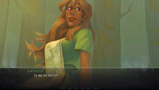
This is the CG where I fell in love with Lantana
The worldbuilding is also very good and immersive, and the writer does a great job doing something that I don’t think is required in a branching visual novel, but I still appreciated, which is making all of the different routes be operating in the same reality—problems that crop up mainly to serve one route will appear in another as well, but with different focuses that make it fresh. Characters’ personalities are very consistent whether they’re acting as a love interest or as a supporting character or even an antagonist.

Romance plotlines I think take a backseat to the fantasy adventure, but they’re very fun and enjoyable. The romance is very much a bisexual dream, with two men and two women with equally weighty plotlines. Two of the love interests are also trans (one man and one woman), which made my little t4t heart extremely happy.
I have A LOT of thoughts about the trans representation, which, again, is not the main plot. Thoughts below:
I’m a sensitivity reader for trans representation, and as someone with that experience, I was pretty shocked because this visual novel pulls off something that I’ve never seen any other narrative do before. Namely, writing long-term about pre-transition with a high level of empathy and compassion.

My advice to writers whose projects show up in my inbox is usually to not set scenes in pre-transition because writers tend to have a lot of problems there. But reading Breathless Winds has taught me that writing about pre-transition is not the problem—the problem is the level of compassion.
Breathless Winds has this compassion in spades. Where many works would get caught up finding edginess in the contradictory nature of pre-transition, Breathless Winds is concerned with Poppy’s inner world and her mental health. Where many works would have her be “walked in on” wearing dresses and use that for humor or conflict, Breathless Winds allows Poppy to experiment in private and come out when she’s ready. Where many works would treat her upcoming transition as something that disqualifies her from romance, Breathless Winds’ romantic options all validate Poppy’s real gender even when she’s pre-transition.
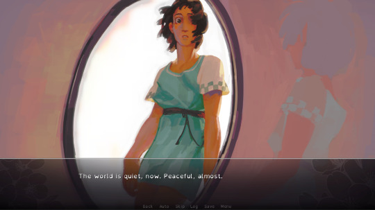
Maybe this is because that my pre-transition days are 11 years in the rearview mirror, but I’m kind of shocked that it never even occurred to me that a romantic fantasy for a pre-transition person is something that could/should exist. I love that this exists not just for pre-transition people (or people unable to transition, etc.), but also for those of us who have transitioned, to imagine a compassionate fantasy for the ways we used to live our lives.
I do just want to advise the reader that Poppy is misgendered and deadnamed by the narrative by necessity, so if that would be troubling for you to read, I would say consider this one carefully.
I also thought that they did a great job with the portrayal of Prince Valerian, a trans man (who transitioned a long time ago in the plot), to be A+, chef’s kiss. I may be biased, but I thought that his route was the crown jewel (ha ha) of the routes, and I’m really glad I did it last.

Valerian performs an impressive "asserting dominance while short" maneuver
While not a big part of Valerian's route, a struggle that pervades his relationships with other men from his country is that even though they gender him correctly, there's a sense he will never be in the "boy's club." This subtle nuance in many relationships between cis and trans men is such a real phenomenon that a lot of writers writing about trans man characters don't explore, and I was impressed to see it here. (It's more common to see writers only interested in overt, misgendering transphobia.)
The writer also did a great job avoiding another pitfall many writers fall into, which is sort of “damseling” the trans man character and exploiting (what a writer might presume to be) his “natural” physical weakness—Valerian is portrayed to be as physically capable and powerful as the other male characters, and a worthy adversary.
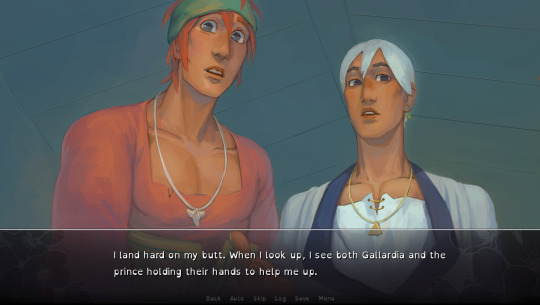
If you want to do all of the routes, my recommendation for route order would be to do Gallardia’s route first, then the girls, and then Valerian last. Just a note that outside of picking the route, all of the choices are “for fun”, so don’t stress about your choices! I did Rue’s route first, which had a bit of a goth, downery vibe, and I was like “Oh god, I’m picking bad choices,” but no, that’s just the route, lol.
If you are interested in visual novels or fantasy or romance at all, I really recommend playing this game and giving it a review on Steam!
#breathless winds#visual novels#visual novel#visual novel review#video game review#video game reviews#indie game#indie games#indie game review#lgbt#transgender women#trans art#trans video games#trans media#lgbtqia#queer#queer media#bisexuality#transgender#trans positivity#bi women#bisexual#effort post#cam posts
94 notes
·
View notes
Text
I absolutely CANNOT get this eah idea out of my head, so I'm going to ramble about it so I can finally get some sleep!
Basically, the concept is: a visual novel style Apple White lesbian dating sim with 4 endings/love interests, those being Darling, Raven, Briar, and Daring (his option being a sad comphet ending). (More under the cut cause I wrote so much lol)
It would take place their senior year of highschool, and the story would be set during Prom season (ofc prom would have a pun as a name like thronecoming, just cant think of one rn lmao), with Apple and Maddie being coleaders of the Prom planning committee. All 4 love interests plus other background characters would be on the committee, and you get to choose who you spend time with based on which prom planning activities you choose to check up on/help out with.
The story culminates in who Apple chooses to ask to go to Prom with her, and if the player has enough affection points with who they decide to ask for them to accept. Daring will have already asked Apple to Prom, to which she will have said she had to think on it, and if either who the player asks says no (due to not enough affection points), OR they willingly choose Daring, Apple will go to Prom with Daring.
If Apple goes to Prom with Daring, she will have a good time, but 'something' (comphet) will make her feel off and melancholic. If she goes with one of the female love interests, they will have a fun yet distinct and unique time from the other female love interests, with unique CG art for each.
Each ending will have an epilogue with unique CG art as well. If Darling was taken to Prom, Apple will end up with her and have fulfilled her Snow White destiny with Darling as her Charming, and will be happy and fullfilled as queens of the land, which is filled with unique and fluid destinies (aka Raven isnt forced to be the evil queen lol).
If Raven is chosen, Apple will have become a Rebel in the end and broken tradition and not become the next Snow White, and lives out her days going on adventures with Raven as her partner, NOT becoming queen and not living life as a royal, yet still very happy.
If Briar is chosen, she also becomes a Rebel like in the Raven ending, except she still lives a life of luxury and royalty with Briar as her partner in a grandiose castle, however she did not become Snow White or follow in her mother's footsteps, thus not becoming queen. Very happy in her life of luxury.
If Daring is chosen, either actively or by default, then... Apple gets everything she thought she wanted. Everyone's fairytale fate is enforced, she becomes Snow White, and becomes Queen. But she isn't happy. There is no love between her and Daring, and she is consumed by regret.
So 3 happy endings and one sad ending. Also Maddie would play a decent sized role, being someone Apple could go to for advice and friendship, as well as Ashlynn to a smaller degree.
I love this idea but it would be so much workkkkkkkkk to create something like this so I probably never will but. It's fun to dream!!!
74 notes
·
View notes
Text
Ways to consume Journey to the West (without needling to buy and read a full translation)!
I’ve noticed that a lot of people can’t read the book for a lot of different reasons, so I’ve compiled a couple of my favourite ways of consume the story while bypassing these problems, categorized by the various issues I’ve come across.
Note that this is mainly for English speakers, as that’s the language I default to for translations.
The book is too inaccessible/expensive for me to obtain physically
Journey to the West Research has an entire blog post dedicated to compiling free PDF versions of the book. This includes many languages, not just English.
I struggle with reading text in that quantity
There are abridged versions of the story, my personal favourite is the one by Julie Lovell—it’s approximately a quarter of the original story’s length, and mainly focuses on the most iconic chapters. These versions are also typically more easily found in local bookstores.
I struggle with reading novels in general
The story has been converted into audio form! Here are the ones off the top of my head, each listed with their own pros and cons:
Journey to the West: An Audio Drama Series is an original translation told in a read-aloud format, in which the host, Lin, acts as a kindly librarian reading to a group of awaiting 1st graders. She gives every character a distinct voice and personality, and she’s obviously delighted to be able to share her culture with the listeners. The show used to have free translation notes, where Lin gets to act as a disgruntled translator going on about the intricacies of the Chinese language and historical/mythological contexts, but these now require a subscription to access. This show is the reason why I know how to pronounce these characters’ names.
Legends Summarized: The Journey to the West by Overly Sarcastic Productions is one that I’m sure I don’t need to include (because of how widespread it is) but feel I should because someone is gonna mention is anyways. It’s a very summarized, very sarcastic retelling of Red’s favourite chapters in the book, accompanied by fun visuals and the excitement of someone who clearly knows and loves what they’re talking about. As Red has said herself, this series should not be your only source of JTTW knowledge, as she simplifies it a ton to make it more digestible. Great for people who are just getting into the story and want a general overview, not great for people who want a more in-depth understanding of the themes and other complexities.
Journey of the Monkey King is a podcast akin to a longform, more in depth version of the OSP series. It consists of two Irish comedians discussing one chapter per episode; one of them (Caoimhe) has read the book, the other (MJ) hasn’t. The format is mainly Caoimhe giving a comedic abridged version of the chapter while MJ gawks in horror at whatever absurdity the Monster-of-the-Week presents. Because it’s hosted by Irish people, there isn’t much cultural context given, and some names are butchered, however I do find this one a lot easier to follow in comparison to the Audio Drama Series, and it’s far more detailed than Legends Summarized.
Journey to the West English Amateur Audiobook is one that is on my radar but have not started. To my current knowledge, it is an audiobook version of the WJF Jenner translation, which is notable to me because most of these types of podcasts are derived from the Anthony C Yu translation, so this one would be a nice listen to compare how the two went about handling the text.
Please know that this post isn’t intended to shame anyone into consuming the story; it’s not for everyone! But I’ve come across my fair share of aspiring fans who couldn’t access the book in a way that suited them (including myself) so I wanted to make this knowledge more generally know for anyone else who might need it :]
#journey to the west#jttw#xiyouji#there are a TON of podcasts that discuss this book I barely scratched the surface#sorry for the monkey posting I have Journey brain atm#post!
180 notes
·
View notes
Note
I love your slasher boys, it's so cute that people put their y/ns and ocs into your au, it also makes me laugh a lot. Like an idea the boys have the while gang of various people and non human beings being on their side. Like a little support group, and boys are do confused that so many people not only accepted them, but kinda? Hides them from the police? Gives them a reading from tarot? Gives them info about another rulebreaker? Kinda just chills with them? I love this universum lol
But I got a little confused and can't find the answers so If you would tell me I would be so happy! Because of how many ocs were added by people to au, what is canon after all? Is there some canon Y/n for slasher boys? Love you!
I don’t blame you at all for being confused 😆 Maybe I should put smth on the masterpost about it. Gotta update that thing anyway.
I think @/sinister-sincerely put it concisely as “DCA Slasher AU multiverse” which made me laugh but it’s accurate to how I conceptualize the AU now.
When I first started sharing art and blurbs, it was a very simple one y/n kinda situation. Y/N was also more of a “blank-slate” type, at least in personality. When I posted their character sheet on the first yapathon about the AU, I also threw out there that I would love to see other people’s versions of “Final Girl y/n,” not having any idea how much people would actually fly with it 🤩.
And they didn’t just create reskins of my y/n—people were making or adapting y/ns and ocs with a whole host of unique characteristics and backgrounds. AND adding details like locations or other characters to the world of the AU! Really adopting the slasher AU as their own. Still makes me giddy to think about 🖤.
All the creativity inspired me to go back and flesh out my y/n character “Star.” I thought to myself “well, everybody else is making such distinctive characters, why don’t I have fun with it too?” I wrote a little more about them here but still have plenty more yet to share publicly. For the purposes of any future long-form story I write, Star will be the one and only y/n character. To answer your question directly, in my version of the AU (the original dca slasherverse naught I guess lololol 😝) the “canon” y/n is Star.
BUT! I like to play around! ¯\_(ツ)_/¯ I like to draw other people’s characters with Smoon, imagine scenarios where the arcade has a whole cast of personalities. It’s so much fun to explore all the different dynamics, the what-ifs, and see how things play out! And I continue to encourage people to do the same! This AU is a sandbox for people to play in (a visual friend @/happysaddca has put in my head multiple times). I just put the sand there ☺️.
#and i love you too anon citizen 😎#ask#dca slasher au#hmmm ill try to be clear about what is or isn’t canon#also the vagueness is sorta fun to play around in too lol 😝#im sure that annoys some people orz#canon isn’t a binary….it is… a continuum to me EHEHEHEH
58 notes
·
View notes
Text
metal from heaven fans i have character design sketches for most of the cast I would love if anyone has Thoughts Ideas or Suggestions (gay sketches as a reward if you read to the bottom)
i did..... not quite every on page character, but pretty much everyone who's there more than once and at least vaguely described (or like. I'd do gwyar if it wouldn't be a spoiler)
all the character descriptions I have recorded are here by the way !!
some of the characters are described a lot but most are like.....their face/hair but nothing about their clothes, or the other way around, so for a lot of them I just winged it - part of the reason I wanted to do so many characters roughly was so get a sense of the overall styles and vibes? august said they were thinking about john galliano for fashion so I took a lot of inspo from that and also a heavy dose of western vibes.....fashion is not my strong point though. truly just stuck it all in a blender and slapped it on.
and also for most of these it's sort of first-or-second-pass designs - basically just getting an initial feel rather than really solidly Designed. so likely to change. I could definitely push a lot of them further!!!
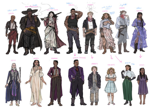
fingerbluffs/choir etc!
sisphe is described with having sunlight trapped in her hair and then also a dark curtain of hair and it's PROBABLY dark but I did imagine her blonde initially because of that. going with blonde hair as a kid that got darker to compromise...
her disguise outfit isn't really described other than gloves but I kinda matched it to marney disguise (below)
harlow took me so long to figure out getting her face like I imagined and also like how I described....I'm not sure still. i love her sm
amon is accidentally giving victor arcane. the character archetype + colour palette I guess. I specifically made it blue/black with pink highlights because of the tullian gender colours though..
tbh I still haven't figured out how their bandit hoods work. I think they pull over from the back of the head but I can't figure out how to draw that in a way that works so they're bandanas for now
not pictured but what are we imagining the lurchers like. just fun punky sff motorbikes?

aristrocrats !!
i am pretty happy with my marney and goss (though goss could be shorter...)
wanna do more vikare outfits
yann i. chauncey supposed to be quite boring and nondescript but also. sure does like Like A Random Dude in this lineup huh
basically all of the bottom row are only lightly described so I just went with the initial vague mental image I had tbh!
could I put more effort into giving them more cultural distinctions / make the areas they're from more visually distinct? yes probably. it's hard to get a sense of some of that when some of the places are within ignavia and some are like.. separate continents - and there's no map to sort it out in my head. (you may notice i wrote where they're from in blue by the names though)
description: 'detailed traditional tullian/drustish/etc embroidery' me: here's some vague scribbles
could deffo get some more body diversity in here
anyway genuinely very interested if anyone is like 'I imagined x to be completely different in y way' or fancasts or anything else! i am so open to and interested in making changes if other people have thoughts (and like if you're not an artist so can't draw it yourself) (or even if you are an artist but don't have the time and want to make me draw it instead. i know the feeling)
----
thanks for reading here's sketches:
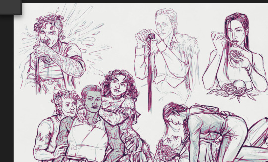
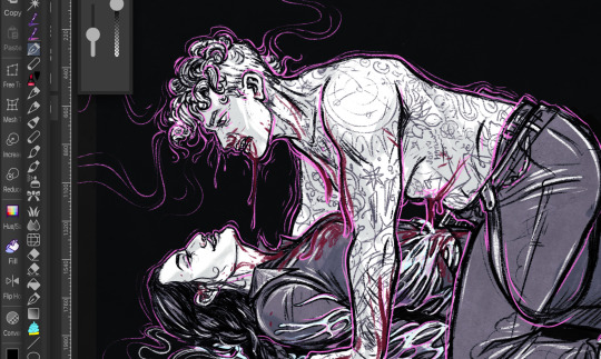
I promise I will post these properly on my art blog sometime. also if anyone has ideas for little sketches like these, of any particular interactions or whatever....
#metal from heaven#art inside! but rough and i want peoples thoughts if you have thoughts!#my art#august clarke
107 notes
·
View notes
Note
Lemme just say again how much I love your work! I do have food for thought about Kaz's R tattoo on his bicep... The first few times I envisioned it, I did so as a Roman Alphabet R. And then I saw the Kerch Alphabet on the Grishaverse wiki, and revised my thinking. Just putting it out there, since I absolutely adore the sketch you posted with Kaz shucking off his shirt in front of Inej.
Oooooooh... now that's a good thing to think about! I often go back and forth on how I should portray the Kerch language. The first way is like the show where the written language is Kerch, but the spoken language is "English" (Kerch translated for the audience's and the actors' sakes). The second way is to make everything translated into English for the audience. Here's what I think about when weighing these two options:
Option 1 pros: makes the world more unique and fleshed out, adds a level of intrigue to the backgrounds
Option 1 cons: alienates the audience because the casual reader wouldn't take the time to translate signage, text, etc. Could lead to clarity issues
Option 2 pros: the audience immediately understands, strengthens clarity
Option 2 cons: less chances for creative worldbuilding, environment is less believable as a separate world from ours
Since I'm an artist who values clarity, I often go for option 2, even though that leaves out the worldbuilding that comes with option 1.
When it comes to the tattoo, the Kerch alphabet "R" would be more appropriate (and honestly cooler) for the world of the Grishaverse; however, I have to think of the audience. The reason readers of the book can connect the dots between the tattoo and the Rietveld name is the visual of the "R" within the book's text itself. If I don't allow comic readers to make the connection in a similar way, it's not as fun for them because of the clarity loss.
On another note, I also need to think of character POV and how the readers can insert themselves into that POV. If a character understands Kerch, the reader should, too. My adaptation hasn't gotten anywhere near the parts of the books where other languages come into play, but I can imagine making the depiction of text dependent on which POV the chapter is in. This feature would be important for all the characters, but it would be especially important for Wylan's POV. Funny enough, I once asked one of my professors how I could manage 6+ languages in one comic, to which his answer was something along the lines of "why would you do that to yourself?" It would take a lot of thought to make the distinctions clear, but I've been doing some good brainstorming.
Okay, text dump over! Thanks for sending this suggestion in. I always love talking about this stuff. There's so much about the depiction of language in comics that I haven't covered here, but that could be a whole book and I have to get ready for class...
54 notes
·
View notes
Note
Hi! I'm a big fan of your art, and I just wanted to know, did you study the WOY art style? I'm asking because the way you draw each character, Hater especially, is so expressive! Do you have any tips with expressions? Thank you!
thank you so much!! and to kinda answer your question: while what i do is, technically, studying, that's not what it feels like. i genuinely just enjoy looking at character sheets. a lot of the time they'll include little notes about things you wouldn't think about unless you're told to, like wander's eyes typically angling towards each other at the bottom or sylvia's eyes obscuring the full width of her neck.
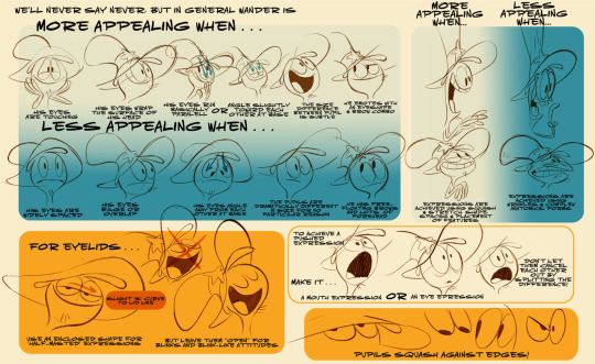
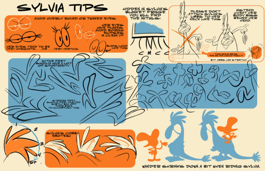
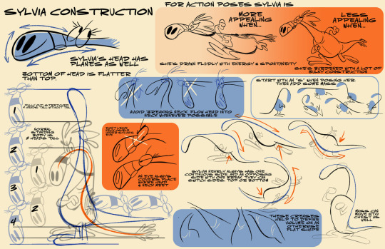
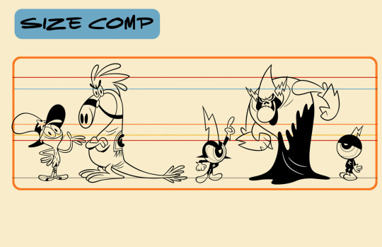
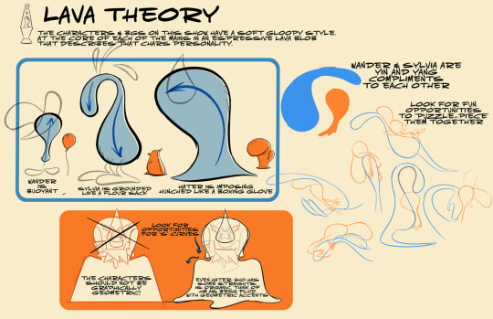
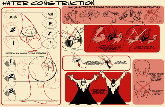
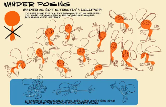
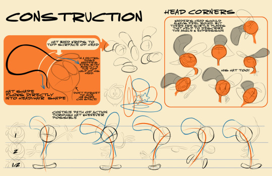
(i have any one of these open in my reference panel almost always! not only are these full of tips & tricks for your everyday sketching, they're full of rules for each character, which are meant to be broken in interesting and fun ways.)
[im gonna pack a bunch of other, tangentially related tips and tricks and thoughts into the readmore, including my personal breakdown of hater's expressions specifically, so feel free to give it a click. long post ahead]
a lot of stuff can be picked up by just watching the cartoon as many times as you want. i have watched every episode (minus big fucking baby episode, which i hate) like 6 times over, sometimes more (looking at you the rager), and that has definitely solidified my wander over yonder visual library.
also, wander over yonder's art style already fits in with the way i draw, because i LOVEE long curvy lines and super crisp & clear silhouettes!!
as for why/how i get hater so expressive.... that mainly has to do with the fact that i think he's So Cute. He's So Cute and i wanna Squash Him. and his character design reflects that!!!
his hood is his eyebrow and his eyes may or may not be rolling around in their sockets, and his nose is a little upside down heart. but all of the lord hater emotion is stored in the chin. lord hater has a bunch of specific and VERY malleable options for mouth shapes, depending on what makes the expression and lipsync look clearest.
you can keep it super simple, with a clear divide between his top and bottom jaw, and do several round bumps for teeth, which they do a lot when tweening, like this:
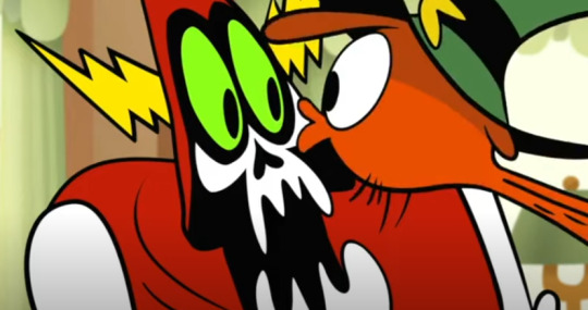


this kind of seems to be his default state, depending heavily on the episode and when it was made and who was drawing him the most, of course.
you can also keep his jaw and skull distinct, but keep his teeth straight and flush with each other, which helps for sharper expressions, esp. anger or frustration, but can also work for a good "squee". he also sometimes pouts so hard his chin eats his mouth, which is, again, cute.


if you're having trouble keeping an expression clear while also maintaining the distinction between his jaw and the rest of his skull, it's pretty common also to forego most of the overt skeleton bits, save for a few hatch marks to indicate teeth (sometimes squiggles or bumps, when he's yelling about it). in my head i affectionately refer to this style of hater expression as the "peanut sans"


none of these convey the intensity of emotion you're looking for? fear not, you can also always just go Full Skeleting. and give his teeth a full outline. this is great for Pain and Strain and Nefariousness.


and then there are a million expressions in between and possibilities within these parameters beyond your wildest belief. nothing should hold you back from a really fucked-up lord hater expression. not proportion. not structure. ESPECIALLY not symmetry. please. make his chin bigger. make his head bigger. make one eye bigger. make him look in two different directions. scrunch his nose up. whatever it takes. by all means. i implore you to have fun


(honorable mention. his W face. the face when he says the consonant W. sometimes OO. i'm. obsessed. with it . he looks. kity)

anyway. lord hater tangent aside. i could also share my own process for expressions, but it really just hinges on what looks appealing/what i like the most/what communicates the emotion i want to communicate the clearest, and it varies between characters and people.
it helps to, again, build your visual library, and look at lots and lots of funny faces, both in real life and in cartoons you like. make funny faces in the mirror and try to focus on what parts of your face change shape or interact with other parts of your face when you do something like smile really wide or drop your jaw. your skin is taut, and there's a bunch of muscle and fat attached to your bones, so when one big bone moves, a bunch of muscles and fat under the surface will shift around too, and understanding that relationship is really helpful in the long run, both for drawing real people and for drawing cartoons.
and the easiest way to retain information like that is to have fun while you study. stop thinking of it as studying and start thinking of it as gathering information on this thing you like a lot and want to do more of, like when you scroll through someone's account to look at all their art, and just. do more of that. do more exploring and observing. since animation is my special interest, this part is pretty easy for me, but it does still take practice to get into that mindset, especially when you convince yourself you have to be super strict and rigid to make it in the art world. focus on drawing and observing what makes YOU happy first, and everything else will follow.
and don't worry about taking notes. don't worry about remembering everything you look at. just look at things you like, and think about them for longer than you usually would. think about the shapes and colors. what makes that drawing so darn appealing to you, besides subject matter and the vague concept of an "artstyle"? you'll be surprised just how abstract what appeals to you can be. for me, with expressions especially, it comes down to random shit like "i like when the edge of a character's mouth creates a tangent with the outline of their head" instead of "pretty eyes" or other, vaguer elements. and that shit i like becomes a part of my artstyle, but only when it fits in and looks appealing, because you can't do stuff like this in every single drawing & retain a full range of expression

ANYway. i hope this made some sense/helped at least a little. i like lord hater a lot. and i also like to draw
134 notes
·
View notes
Note
hmm.. i dont have anything specific in mind but do you have anything fun about karis? i love him dearly and I'd love to know more about him
oh boy hmmm some Karis Fun facts:
I said this in a previous answer but giving Cynte a boyfriend was kind of always my plan. like when Miz was like "let's start on Endo 2, what do you wanna write" and I was like "I wanna make a bug cult and give Cynte a boyfriend" he was like "great. go for it" LMAO
Karis had the most name ideas out of any of the new characters for Endo 2, including: Hesiod (which ended up the name of the ship), Ki, Vere or Vero, and then Caris, which ended up being changed to Karis for a better visual distinction from Cynte
he's intended to be Cynte's narrative foil and Cynte is definitely like objectively a bad person but also the idea of him finally Loving Someone and having that happen for the first time in his life and then they LEAVE..... it broke my heart so I had to write it like that
so Karis is like humble and trusting and he's a doctor because he wants to help people (as opposed to Cynte who probably got into biology as more of a god-complex serving thing)
if Cynte likes his coffee black then Karis likes caramel brulee lattes. I think Karis has an atrocious sweet tooth
I don't want to yap too much about what happened with them before endo 1 and 2 (bc I like when folks write their own stuff I think it's great) but I think Karis probably gave Cynte a present for the first time and Cynte thought it was just a wrapped box so he didn't open it for days. a strange trinket from his boyfriend
when it comes to Karis administering the antidote to myself that has Gameplay Reasons obviously but I wanted to communicate that the fact Karis left Cynte behind weighs so heavily on Karis. like it obviously weighs heavily on Cynte (who was so bummed about it he went full girlboss mode and created a contagion oops) but I wanted to communicate that the bad feelings there are mutual. all the feelings they have are 100% reciprocal, positive and negative, and that is so confusing to both of them and I just think that's Beautiful
Karis would main dry bones in mario kart
68 notes
·
View notes
Text
Some more DA:TV and related snippets from Sylvia Feketekuty, Part 4. rest of post under a cut due to length and spoilers. [Post One, Post Two, Post Three]
User: "How and when did he and her(johanna) meet? What was the story between him and her back then?" // Sylvia Feketekuty: "1. So I always imagined he and Johanna met pretty early on, in the Watchers. In their teens, maybe? (Hezenkoss was a pretty exceptional mage and Emmrich was raised by the MW, so I imagine both were fast tracked into the order.) 2. I have rough ideas, but of course since not much is in the game, not much is set in stone. One thing I did hint at obliquely I think is okay to expand on: when Hezenkoss complains about the Venatori and Emmrich says disapprovingly they remind him of Tevinter's nobility, and she agrees. In my mind, I imagine Hezenkoss came from a family not that much more socially higher than Emmrich's. So they were kids who probably bonded early on not only out of intellectual curiosity, but because they both came from working class families compared to students from the elites." [source, two, three]
Nick Boraine: "Hey Sylvia. thanks for writing such a beautiful character. I loved saying your words. Hope to again one day." [source] // Sylvia: "Nick! Hello! I hope you've been soaking in people's reactions to your wonderful performance. People have fallen in love with it! "Hope to again one day." If the stars align, I'd love that! Also: hope you saw that Emmrich picked up the Silver for "best new character" on the Playstation blog fan vote!" [source, two, three] // Nick: "I have indeed - it’s been incredible. So grateful. Hoping VG companies will all come on board soon and we can end the strike. I’d love to interact more with all the fans." [source] // Sylvia: "I'm glad to hear you've been getting to see some of the fan reactions! "Hoping VG companies will all come on board soon and we can end the strike." Amen to that. Best of luck to everyone holding the line, you all deserve what you're asking for and more." [source]
User: "I had been looking forward to learning more about the Mourn Watch since reading “Down Among the Dead Men” (which made me cry!), and it has been such a delight to explore that part of DAV" // Sylvia: "I'm especially touched to hear that about DatDM. It was a privilege to be the first writer who got to really open up the tombs in that story." [source]
User: "I'd be interested to know if you know any fun facts or something about the nevarran language featured in the game" // Sylvia: "Ah, tomb-script. I named it but it was our concept artists who went developed it with the hexagon shape-language of the Mourn Watch, which I loved. Conceptually: I think it's used purely an occult or sacred language. Something for the graves, or books on magic, but not everyday things." [source] // User: "The artists did an amazing job—it’s such a unique and visually striking evolution of Elvhen script, and it really highlights the distinct Nevarran aesthetic beautifully. It would be great to hear more about it if there's anything you're able to share from the concept/lore side of its development!" // Sylvia: "I don't know if I have too much more, but I did love how our artists made it follow the hexagonal shape-language of the Mourn Watch in general. (It's everywhere in their architecture and props.)" [source]
User: "1. What was Emmrich like as a student? Did he struggle with a particular topic in classes? Hezenkoss says some about him dragging her to parties so I was wondering if he was wilder in his youth" // Sylvia: "1. I think he was a diligent but very social student, very outgoing and fairly popular. I can't think of what lessons he might be bad at, not because he was good at all of them, but because that would mean getting into extreme detail about the MWers academia. e.g. I think it's fair to say visualizing and compartmentalizing thoughts and memetic rituals is part of casting magic, but but what do those classes LOOK like? How many are broken into sub-specialties? Etc. That said, even though I'm not sure how much it'd come up, Emmrich is absolutely terrible with anything mechanical. (Touched on that in some banter between him and Bellara.) 3. I'd say someone achieving the rank of Watcher is probably discussed by senior staff members, and is tailored to each mage. More about competence, temperament, and control, rather than passing a set test. (Which could include a thesis or a practical demonstration, but not as an end-goal per se.)" [source, two, three, four, five]
User: "could Emmrich be considered a spirit healer, or rather whatever it is that makes a spirit healer have that extra affinity for spirits? (I always felt like the healer bit was encouraged out of fear) Is corpse whispering a subset of that or a different thing entirely?" // Sylvia: "I definitely feel Nevarran necromancy is in the same realm in general, yet that Emmrich's corpse whispering isn't drawing on spirits to function, it's his own personal will. If that makes sense." [source] // User: "I think I understand! Like he can comprehend the spirits a little more clearly than most so they're inclined to want to interact with him but the corpse whispering itself is his own request/demand, the spirit/corpse/whatever a soul is is responding rather than assisting with the magic itself?" // Sylvia: "Yes! I think that's a good description of it." [source]
User: "I have to ask, did you write the Josephine letter to the inquisitor codex?" // Sylvia: "that was indeed me! I liked revisiting those two, even a little bit, in that letter." [source]
User: "since he's interested in botany, do you think he'd enjoy opening up a flower shop with a romanced Rook?" // Sylvia: "I don't think he's a man interested in the headaches of running a business, but if Rook REALLY wanted to go for it, Emmrich would probably help grow the plants." [source]
User: "my question is did any of nick’s performance inform how you wrote emmrich, because some of the scenes of his i had to stop the game and just take in the perfect unity of actor and writer voice to conceive such a realized character. and were you always interested in claiming emm to write?" // Sylvia: "1. Yes, absolutely. Nick got who Emmrich was, right away, and that informed future writing once I knew what Emmrich actually sounded like, how Nick embodied those emotions. 2. I pitched Emmrich, so: yes, absolutely! I'd always thought the Grand Necropolis and its inhabitants sounded like a very cool corner of Thedas, and I'm partial to necromancers in general, so "necromancer" was the first thing I thought of when it came time to pitch new followers." [source, two]
User: "do you think Emmrich would ever end up referring to Manfred directly as his son?" // Sylvia: "So I had Emmrich call Manfred his ward, not his son, because I thought that was one step too far for him right away. But I don't think anything is impossible in the future." [source, two]
Sylvia: "It was my pleasure to to work with the team to finally show off the crypts of the Necropolis." [source]
User: "Can you please tell us what type of tea Emmrich drinks for breakfast? He strikes me as an Earl Grey person but then again English Breakfast also makes sense somehow" // Sylvia: "I'm actually not a big tea person, so I almost feel I should let this be whatever your head canon is. (That said I do think Earl Grey has the better scent. But do Emmrich's refined tastes match my own? I dump a lot of sugar and cream into mine after all lol.)" [source]
User: "Emmrich as Vincent Price: all in my head or intentional? And if the latter, who do I have to thank?" // Sylvia: "Love Mr. Price, a legend, but it was actually Peter Cushing who was one of my first touchstones before we had any art for Emmrich in." [source]
User: "1. When Em&Rook had their fight - what were his intentions? Did he try to break up with Rook? 2. Just hypothetically, if my Rook bends her knee and asks him to be hers forever, what would his reaction be? 3. Johannas hand, it's planning mischief, is it not?" // Sylvia: "2. Emmrich would be over the moon. He would absolutely love to get married. 3. "Johannas hand, it's planning mischief, is it not?" Who could possibly say? (yes)" [source, two]
User: "Could you tell us how Mourn Watchers life is arranged? Do they live in Nevarra or right in Necropolis? Are their rooms similar to that coffin room?" // Sylvia: "The Watchers live in the upper, safer levels of the Necropolis. I imagine this is where they sleep, eat, teach/train, and also where they prepare bodies for interment. "Are their rooms similar to that coffin room?" I don't want to say either way, just because we never actually go there, and I prefer to keep things open until something is actually in the game or in a story or comic or etc." [source, two]
User: "He has also been an extremely positive driving force and has caused me to pick back up my plan to go back to university and become a lecturer. It's a dream I shelved because of little self esteem but I know he would be sad if I didn't at least try, sad Emmrich is a powerful motivator!" // Sylvia: "He would indeed be sad, especially if this is a passion of yours, but glad to hear you're picking it up again. Sincerely, best of luck." [source]
User: "Can you talk about your writing process? I'd love to hear a bit about what influenced/shaped not only Emmrich but the Mourn Watch and Necropolis. I actually find comfort in death and I just adore what you crafted for the game. I'd love to join the Watchers myself." // Sylvia: ""Also, are you able to talk about what you envisioned every day life for Watcher's to be like? Or maybe some cultural tidbits you'd imagined while writing? I like to think they'd have some incredible festivals and create really interesting folk art!" Oh that is fun. I'll be honest though I'll be a little reticent, just because I tend not to talk about too much until it's in a game. I do think a lot of their everyday life is what Emmrich describes to Rook: Preparing bodies, helping grieving people visit their loved ones, maintaining the graves, and the undead that help maintain the graves. And of course hunting down malign manifestations. The MW and their carefully-courted spirit allies are good at preventing demonic incursion. But as we've seen, it's not impossible. And there's a desire to figure out the weirder stuff that not even the Watchers really fully know. (X-files theme). "I like to think they'd have some incredible festivals and create really interesting folk art" Me too! They involve the dead in their lives so much, I think that includes going down to the graveyard to celebrate milestones, versus visiting on a calendar date. One of my favorite things to write was the folk tale about how spirits were first drawn to Nevarra in particular. I really wanted to make it feel like one of those founding myths filtered through storytelling embellishment in the winter nights. [link] "I'd love to join the Watchers myself." The Necropolis is always looking for more company" [source, two, three, four, five, six]
User: "I just wanted to add that Hezenkoss is absolutely my favourite noncompanion character!" // Sylvia: "Thank you so much for this, because Hezenkoss was a great joy to write. I risked going all out with her, and I don't know if that lands for everyone, but I wanted to have a proper mad scientist who was also Emmrich's best friend because personal seemed better for him." [source]
User: "I heard a rumor that you wrote a lot of the codex. Did you write these? If not, do you know who did? I found them hilarious. [link]" // Sylvia: "Oh, that's not true at ALL. The writers all wrote about an equal amount of codex entries. (One of our editors and I did some work on the proposed structure and organization, but I'm in no way the main writer of the content.) The letter is very funny though. If it's LoF I'd assume there's a good chance this might be by Trick Weekes" [source, two] // Trick Weekes: "Honestly, while I gave that one a quick writing pass, it was largely Malcolm doing the first pass and busting out that Aethelred the Unready reference. (Which I loved and kept.)" [source]
User: "congrats on Emmrich winning second place for the best new character award" // Sylvia: "Thanks very much! I was thrilled to see him there, especially because it's a fan vote." [source]
User: "i would absolutely love to know a bit more about his relationship / time with Dorian as his student in the necropolis ! (Is it possible Dorian got inspired by him for his mustache ?" // Sylvia: "1. I'm afraid my response is pretty dull, because there's not much in game (and I'm not Dorian's writer) so I'm reluctant to add anything off the cuff. Sorry! 2. Aw that'd be cute. I think that's just artistic coincidence though, so it also has to remain in the murky mists of uncertainty. (But because it lives in that space, it's also not impossible. I'd say head canon it how you like!)" [source, two]
User: "i was also wondering if you worked on any other side characters beside Hezenkoss ?" // Sylvia: "I did! The Mourn Watchers were me. And through a complicated chain of events, I wrote one single merchant in Treviso - the gallery owner, Mistress Trella." [source]
User: "I have a very important question and I’m sorry if it’s been asked elsewhere: what’s his favorite kind of tea?" [re: Emmrich] // Sylvia: "I talked about it a little in this thread [compiled above], where I confess I'm not much of a tea person myself. So I'm happy to let tea-fans imagine anything they like." [source]
Sylvia: "So much of the romance rests on our animators and audio team and Nick Borraine stepping up to deliver everything perfectly" [source]
User: "Less of a question and more just appreciation. I love him so much, the casual plant lore, just everything." // Sylvia: "Aw thank you! I'm especially glad you enjoyed the plant lore, it really gave me an opportunity to have Emmrich enthuse about the Memorial Gardens, one of my favorite spaces in the game." [source]
User: "Also, if you don’t mind aside from liking pineapple and hazelnut torte. Does Emmrich have any other favored foods? Or favored flavours like spicy/salty/ect?" // Sylvia: "I actually went over that here a little, which isn't much detail. He DOES bring back dates for the group at one point. For whatever reason, I never pictured him with a huge sweet tooth, but the occasional pineapple or date is a nice treat." [source]
Sylvia, re: Emmrich: ""And I’m immensely jealous of how stylish he is" Same. He absolutely has a tailor or two who knows their stuff." [source]
Sylvia: ""did Emmerich studied only in Grand Necropolis or he was in Circle of Magi? Or mages in Grand Necropolis doesn't must to learn in Circles?" I talk about that a bit here: I think he trained in the Necropolis, but taught both there and Cumberland's Circle. Admittedly, I never defined the Mourn Watch's Circle status in game. It could be a sanctioned fraternity that takes in promising mages and trains them for the Necropolis, but isn't technically a Circle itself, even if it oversees harrowings. (There's a bit of banter from a Necropolis NPC on that.) This would explain why there's non-mages around with full MW membership, like how your Rook can be a MW warrior or rogue. So I'm inclined to think this is the case. (But until it's ever in a DA game or piece of media, I wouldn't consider that 100% canon. It's just my own thoughts.) "I'm not sure if I it was in game, but how Strife take it if Emmrich became a lich? Is he alright with that and they continue relationships or he just drop it?" We didn't tackle that in that game, I'm afraid, so there's no actual answer there. Sorry! Apologies if that non-answer is frustrating. But that's the kind of topic I wouldn't want to answer unless a future game had a reason to go into it. "How long Vorgoth have been around in Grand Necropolis? There's theories about their persona and I know that you can't give straight answer but could they be a lich?" I'm afraid Vorgoth must remain mysterious, but nothing is impossible with them... "me and my friend have headcanon that there should be something like hospice in Grand Necropolis. You know some place where palliative care is given to those who needs it. Could it be true or it's not in Grand Necropolis nature?" I hadn't planned it, but that's a fun head canon if you like it!" [source, two, three, four, five, six, seven]
User: "I have a question and that’s if you listened to anything in particular when writing Emmrich? Or any of your characters" // Sylvia: "I did! I have my playlist on my old computer and if I dig it out, I will post it here. It's mostly ambient stuff, I prefer music without words when writing. A lot of stuff from Cryochamber, but I listen to it a lot in general. [link]" [source, two]
User: "1. Were Johanna’s morals *always* questionable, or did they steadily decline? It sounded like she’d been given a lot of passes by the Mourn Watch, brilliant mind or no! 2. Anything you can tell us re: the War of the Banners? Like, how it began, or which spirits/noble lines were involved?" // Sylvia: "1. I think Hezenkoss always had what Emmrich might call a "cavalier attitude" towards rules and limits, but that it got worse over the years. Being exiled probably did not help, but she probably crossed a line at that point already. 2. The War of the Banners part of the backstory actually came from another writer, and I loved it. But I don't think I want to colour in the lines because there's so much room for imagination. (And since I'm not at BW anymore, it would be even more my own head canon than most other things.)" [source, two]
User: "It's so interesting when he is a lich, it's rare that we see conflict in a game romance like that. Also, his "coming out" scene to the whole group was unexpectedly funny and had me rolling xD" // Sylvia: "The "everyone: I'm a lich" scene was one where I was really trying to balance the seriousness of the previous scene with something a bit more lighthearted but still heartfelt. So I'm very glad you dug it!" [source]
User: "I wonder how Emmrich studied the Fade? cmiim he explored the Fade right? Was it through dream? I'm so intrigued by that." // Sylvia: "Your question is a good one. He has definitely explored it via dreaming/trances, but I think a Watcher would first train for that, learn how to set up wards, and to start with, do it under supervision. Given Emmrich's affinity for spirits, I'm sure he cultivated trustworthy spirit friends in the Fade who could guide and aid him as well. (The way we see him reach out during House of the Dead to spirits from a previous quest)" [source, two]
User: "Is Emmrich Andrastian?" // Sylvia: "I have some thoughts on this one. Nominally, yes he us. But I think a lifetime of studying other death practices and religions has shown Emmrich so many points of commonality in the search for transcendence and the divine, that he believes all religions may explore something of a universal truth. So the Thedas equivalent of Universal Unitarianism, basically. And maybe he corresponds/debates with some like-minded scholars out there. Though quietly. I think he'd err on the side of "Let's not trouble the Chantry with this." for safety's sake. (I didn't want to make him an agnostic free-thinker, that seems too conveniently lined up with modern conventions. But I think seeking truth through argument and philosophical exploration fits him.)" [source, two, three]
Sylvia, in response to a user saying this phrase: "BTW I got a kick out of "nevarran cryptid". Who knows what haunts the lower halls?" [source]
User: "Can a MW Rook have an opportunity to achive Lichdom in the future?Or maybe only a mage Watcher could?" // Sylvia: "So Emmrich managed it, and so did Hezenkoss after she pieced it together from what he told her. So we DO know it's not impossible for any mage to try it. Whether a non-mage could is a very good question. The abilities of the liches are very ill-defined at the moment, so possibly Emmrich meant that promise very literally... But! I'm also not at BW anymore, and at this point this is just my own thoughts, which are very non-binding. (Sorry, that's a lot of words to say "Could be cool, but currently nothing set in stone.")" [source, two, three]
User: "What is Emmrich's preferred tea and how does he have it? Different types for different times of the day?" // Sylvia: "Different types for different times of the day?" I think so, that fits in with his sense of the rhythm of a day. But I'm no tea drinker myself, so I'm happy to let fans imagine what works for them." [source]
User: "Do you have any thoughts about emmrich & marriage proposals, would he prefer to be the one proposing? Or would he be equally excited to be proposed to? Ostentatious, public, private proposal?" // Sylvia: "Re: a proposal, gee. I think he'd be equally excited either way, though he'd prefer it to be a private moment. Somewhere he and Rook can enjoy each other's company and talk about it honestly, just with each other." [source]
User: "1. What was he good at in school besides anatomy? 👀 2. What's his favorite food right now? ✨️👀 3. Did he give Manfred his name himself or did he read the names in the book for Manfred to choose?" // Sylvia: "1. Grasping abstract and metaphysical concepts, and distilling them down into language suited for others, which is handy for both magecraft and professorship. And communing with spirits, so magical control. (I imagine the Watchers prize control greatly, since they work with spirits so closely, they're well aware how dangerous their focus is.) 2. Hrm. Uh...good question. Aside from being vegetarian, I don't think he's a picky eater, but he probably marvels at what a sure and skilled cook Lucanis is. 3. Emmrich likes giving Manfred some (limited, supervised) autonomy. But I think he named his skeleton companion himself." [source, two, three, four]
User: "Did he ever see Manfred as his son?" // Sylvia: "I think consciously, calling Manfred a son seems like one step too far for Emmrich right now, but he's absolutely paternal towards his bright young skeleton child." [source]
Sylvia on Emmrich: "He truly was a team effort. Everyone in level design, cine, art, audio, his voice actor, the other writers and editors contributed greatly to who he is." [source]
User: "Do you think he has a tattoo👀 Maybe a skull or the symbol of the moun watcher" // Sylvia: "I think this is a 'it wasn't shown in game, so I don't want to commit to anything' deal, sorry. (But feel free to imagine whatever you'd like!)" [source]
User: "what subjects did he study well when he was a student?" // Sylvia: "I think probably the same subjects as in the answer to question number 1. Though I do imply in dialogue that the Mourn Watch likes to give its members a well-rounded education in non-magical subjects- history, literature, etiquette etc." [source]
Sylvia: "Hey everyone, I'd like to correct a misassumption I've seen floating around. I saw a few people who saw my name attached to the codex system, and assumed I wrote the bulk of codex entries. That's not true at ALL. Codex writing was split roughly evenly among all the writers. I pitched some style and design suggestions to the narrative team. Then editor Cameron Harris did the actual structure, the docs and training, a lot of the editing, and the importation of all the legacy DAI entries." [source, two]
Sylvia: "Emmrich would be over the moon if Rook wanted to join the Mourn Watch. More time together in the Necropolis!" [source]
User: "From your point of view, do you think Emmrich is jealous? (a little?) I noticed that he liked some things related to the Storm age (he mentions it several times), is that a coincidence or is there a particular reason?" // Sylvia: "-I don't think he's beyond jealousy (few people are!) though it'd depend on the circumstance and what it was about. -Oops! Actual coincidence regarding the repeated mentions of the Storm Age." [source]
User: "1) Did you ever choose the name of the 5th Montilyet sibling? 2) What were the inspirations for her character? 3) If the player doesn't romance her, do you think she'd marry Otranto or would she pass him on to Yvette anyways?" // Sylvia: "1) You know, I never did! It remains unknown. 3) I think Otranto and Yvette are too perfect for each other for them not to get together, so it'd be appropriate if a comedy of errors going on inside the house Montilyet led to that happy outcome if you didn't romance her." [source, two]
User: "Curious how Nevarrans, and specifically Emmrich, would view stuff like Victorian mourning jewelry. Obviously would be horrified by the ones containing ashes, but what about hair? Wondering if it would be seen as special or grotesque!" // Sylvia: "What a good question! I think a lock of hair would be perfectly all right, even romantic. Perhaps a LITTLE bit of bone would be okay, though the actual Mourn Watch wouldn't love breaking up the body. I don't think they'd see keeping a small fragment or such as wrong, just a bit unfortunate." [source]
User: "I love your work and I wanted to thank you. Through how Emmrich is written I’ve realized that dying isn’t an option because there are people that care for me and I would be missed so I’m here and will be Also I wanted to share a song that reminds me of Emmrich’s romance: Deathproof by Graveyard Club" // Sylvia: "Thank you for saying so, Lena, and for sharing that. I'm glad getting to know Emmrich was helpful, even a little, and I hope it continues to be so. And thank you for the song rec! I have a real weakness for synths (may their comeback be eternal) and "You’re nowhere to be found/but you follow me around" is a killer set of lyrics especially." [source, two]
Sylvia on Emmrich: "There was a huge team working on him, and this is just what you hope to hear one day when embarking on making something." [source]
#dragon age: the veilguard#dragon age the veilguard spoilers#dragon age: dreadwolf#dragon age 4#the dread wolf rises#da4#dragon age#bioware#video games#long post#longpost#dragon age: tevinter nights
49 notes
·
View notes
Text
Japanese QL Corner
One show wraps up its run and another continues to stumble toward its end. We have two new shows starting next week, and I'm looking forward to it! In the meantime, these two are streaming on Gaga.
Our Youth

I have to call it at this point: this show is not ending strong, and I'm pretty bummed about it. The first six episodes were some of the strongest work from Japan this year, but the narrative fizzled and we're left with this muddled mess of a story that is bound to end on an unsatisfying note next week. I feel thoroughly unmoored in this narrative, the new college version of these characters don't connect back well to where we left them in high school, and the show has failed to make a compelling case for why these two should get back together. And for me personally, the total abandonment of the class disparity themes from the earlier part of the show is a real letdown. @my-rose-tinted-glasses made a great point in her own thoughts about the show that the creators seem to be prioritizing visual metaphors at the expense of logical character behavior, and I'm really feeling that. We'll see where the story takes us in the finale, but I'm officially marking this one down as an end of year disappointment.
Love in the Air Koi

And in more fun news, LITA Koi ended its run today with a funny, sweet, and just a little bit weird special finale that felt fitting for this show. The plot of this special is very silly--in the original Thai version and here--so I loved that they leaned into that by amping up the comedy, adding some spirit shenanigans to give us even more smut, and bringing Fort and Boss over for an extended cameo. It all felt very loving toward the original show while finding small ways to add to the canon, on par with this entire project. From beginning to end it has paid tribute to the original in everything from its costuming to its scene blocking, while still bringing a distinctively Japanese style. As the show wraps, I'm happy we got both versions of this story, to have Fuma and Kai as my new favorite version of their characters, and to see what other Thai/Japan collaborations we might get in the future.
#our youth#miseinen#love in the air koi#love in the air japan#japanese bl#japanese ql corner#shan shouts into the void
54 notes
·
View notes
Text

[1]
Almost missed this cover entirely but luckily this blog saved me.
Chapitre 220 - 'The Strongest Magic' or 'The Ultimate Magic'
Splash text: Turn weakness to strength, despair to hope, carve out the proof that you have lived!
And OH THIS IS GORGEOUS!
MATCHING FAMILY BATTLE OUTFITS?!
THE SYAORANS WEARING THE EXACT SAME ARMOUR WITH IDENTICAL SWORDS??
And one of them looking like he has his hand on the other’s shoulder?!
I love it. Even if it’s actually just hovering above the shoulder or something the visual effect is enough for me.
From the eye colour I think I would guess this is Daddyaoran and Lava Lamp? But I suppose it could just as equally being Lava Lamp and Syaoran. It’s fun either way - either it’s married couple Kurogane and Fai taking their two sons on a battle trip or it’s Lava Lamp and his three dads on an adventure. We win either way!
I really enjoy that Kurogane and Fai have their signature colour schemes (Red and Black/Blue and White) on opposing sides of the page, while the Syaorans have their own unique cape colours that swirl out between them on either side. (or not quite capes. Whatever those are) It makes this so much more dynamic than it would be without the splashes of colour and brings so much energy and action to what is essentially a still pose. And it’s fitting that the (capes?) are red and blue, as it helps the Syaorans be distinct from each other but lets them match the character that they share the physical space with on each page (Fai on the left page, Kurogane on the right).
But! No matter which page you were looking at individually, you would still see a small splash of the opposing colour. I think I even have an example, here we go:

If you were only looking at the left page, which is predominantly blue and white, you still get some red at the bottom. And on the right page with its blacks and reds you still have a flash of blue in the middle. Which matches the yin-yang symbol that is Syaoran’s soul - where even if you are strongly on one side of the symbol there is still always some of the opposite side inescapably in there. And the melding together of the two colour schemes creates the family that they’ve built together in everything that they’ve been through. AND, the bridge connecting the two pages, the moment of contact between them, is Syaoran’s hand on the other Syaoran’s shoulder. Which is SO FITTING I COULD SCREAM.
So with that in mind this is probably Lava Lamp and Syaoran right? With Syaoran on the right, with his strong connection with Kurogane (think the time they trained together in Outo), and Lava Lamp on the left, who trends closer to Fai (I think, like in the conversation they had when Lava Lamp shared his backstory with them in the Clow ruins).
Now the only mystery I have is this bit.
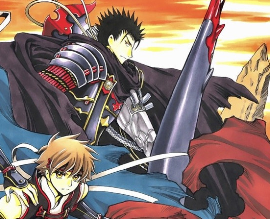
Which I’m sure is not supposed to be a mystery but I just don’t know what that bit sticking up is. I know it’s NOT Kurogane’s leg but that’s what my eye sees every time, which makes it look like Kurogane is doing a fancy little Bayonetta kick off to the side.
Which I would be in full support of, for the record.
#I am on the Kurogane doing Bayonetta Kicks Agenda#I have never thought about this before#But now it’s all I want in the world#Liveblogging the reservoir chronicle#Tsubasa#Vol 220#Fai#Kurogane#Syaoran#Lava Lamp Guy#My Syaoran My Syaoran and Me#Dear Clamp#For Christmas this year I would like Kurogane Sexy Kick Attacks#Thank you
57 notes
·
View notes
Note
hello i love your art so much, do you perhaps have any tips on character design bc yours are so distinct to me? thank you <3
tysm, anon! I'm glad you like my designs, since you decided to ask me for tips <:D
actually, I don't consider myself very skilled in creating character designs, and I don't really feel like i’m focusing on this in my work, but from the outside view I really like watching this area in my favorite media. I don't know if I can give really working tips, they may not be suitable at all for your creative process and character vision.
here I’ll talk more about creating a design based on an existing image, like minecraft skins, where everything is shown in a very minimalistic way originally and you just have to work from it.
I try to focus as much as possible on the feeling of "is this thing actually suitable for the character or not?", trying to create some kind of composition in the overall design of the character so that everything is in its right place. and that's it, I guess..
I don’t like frequent themed designs that changes every arc/season/smth. in my opinion, yes, it can be beautiful, but it doesn't work at all in my head. some characters TEND to change clothes frequently, sometimes it's literally a character feature that explained by the plot, but it’s not for everyone, I feel. instead, I try to change the original design a little bit for various occasions. especially when you have a base of specific items of clothing, it's a lot of fun to try to keep the same clothes, but changing the shape, details, etc.
I don't like changing the canonical design much, for me it feels wrong by default. but it's still fun to adapt things to your own vision, the main thing is not to get carried away. these frames of the canon makes you think outside the box always, I love it.
logic and practicality are also important to me, simply because that's how I live my life. I’ll obviously choose something practical and comfortable for a daily physical work or a survival games, rather than something fancy. BUT at the same time, I want to do some ordinary practical details fancy still, because it's interesting in the context of practical design.
this doesn’t mean that I’ll assert every detail only on the logic basis, but most often it is so. I like the thinking process itself, how I can adapt a thing so that it works in design both visually and practically and works for the character’s essence.
+ personally, I really like asymmetry in designs, it looks interesting
therefore, I will probably highlight from my entire answer:
— focus on your sense of character, but do not forget about logic and practicality, it’s so useful sometimes.
— try to analyze the character as much as possible so that you can convey many features through their design. shapes and colors are the ultimate basis.
— often look at the design in full picture, so you don’t get some overloaded parts, otherwise the whole design falls apart
[sources with universal advices from professional character designers who have been in their industry for a long time will be useful here, you can find many videos on this topic on youtube]
— references. save as many references as you want, scroll through the pinterest feed at least once a day, there are many unexpected details that can be used to create a character design. artbooks for various media are a very cool thing for this, I dream of a collection of such books.
— if I work on something from scratch, it’s easy to draw a multiple versions of the same design, with some changes, just to see which of them is working the most. also always trying to analyse each of them, “what I like about this version? and what about that?” and etc. after the time you can find a perfect combo of each criteria you like from every versions.
— sometimes also you just have to give it a time, if you doubt some parts of the design.
I tried to think on something more to add here, but for now that’s it-
86 notes
·
View notes