#I like the first character's design BUT I HATE HOW I DREW HER IN HER NORMAL FORM
Explore tagged Tumblr posts
Text
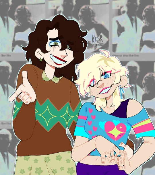
First drawing inspo frum
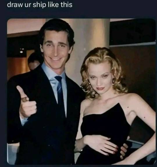
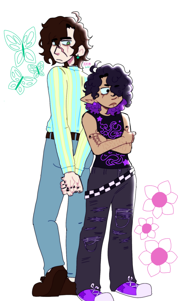
#ive been waiting to post these until i had more big drawings to post with so it cud b a proper art dump but my hands not working as pf late#so big drawings arent on the way :/#i cud post them separately but like why#dont like how i drew bowen in first pic#she generally looks janky but also her face is supposed to be like a forced uncomfy smile but she looks like an awkward uwu <:) type girl#AND I HATE IT#like any character i draw looking <:) ur supposed to hate#but like bowen's the exception ig#btw astris nd bowen arent canon or nuthin theyre just cute#for the record theres practically no canon ships in overlook#there are characters that are married or have crushes#but none of the crushes go anywhere canonically and all the marriages are loveless LOL#cool art#cool ocs#original character#art#cool drawing#character design#virgil crierr#bowen aroe#astris vikund
1 note
·
View note
Note
Hello!
I would like to start with the fact that your art style is amazing, same goes for the design of the characters. (They look yummy tbh)
I have been wondering if you ever got some kind of art block, if yes what did you do?
If you see this, I hope you have a great day.
Thank you!
Most of the time, when I wanna draw but cant quite know WHAT i wanna draw, I redraw stuff. Like, screenshots. Or old drawings. Or even memes. Those are especially fun for drawing expressions I might not usually draw. Or I take scenes from fics I like or fics I've written and draw them. It helps that I get to move my pen with only half the brain power needed to picture what I want drawn.
But sometimes when I really cant overcome it, I usually just wait it out. Do my other hobbies like read or write or churn up another meta analysis. You cant force yourself to overcome that block sometimes and that's ok.
Oh but sometimes tho! Something that works unintentionally is when I'm like really really upset. I dont like to show it much, bcuz I understand that I'm getting old and I have a significant amount of followers that I dont wanna be a bad example to... But I can have quite a temper on me and can get really petty. But instead of exploding, I try to draw with those feelings.
Like, a while ago, I got really upset about stuff with an AI art fraud. And im just like, you know what this person can claim they're an "artist" all they want, but they still havent even shown a paper drawing as concrete proof. all just excuses and shit. The next moment I drew this, just to reassure myself that I'm an artist and I know what being a real artist is. That unlike AI frauds, I can show I dont need a computer to draw. All I need is a pencil and paper and I'm good.
(Then I proceeded to draw more than I usually do on paper because of that lmao)
And then when Youtooz came with an announcement that they're gonna release four figurines, half of which was 2 versions of Alastor and NO sign of Vaggie, I drew four Vaggies. Yes. I drew all this angry. Until yunno. I got so happy over how nice this ended up looking instead.
And then the last art I posted with the Harem Hotel AU? That's been in my drafts since november but I only got to finish it recently because I got upset over all the people in my notifs leaving hate comments about Vaggie lmao. Just told myself that they can claim to be objective critics who arent misogynistic, but at the end of the day all they could do is leave mean comments on twitter. Meanwhile, I can create! It's borderline horny gay shit, but hey! At least I'm doin' something productive! I can show female characters like her are are worth so much love to the point of making art!
Just. Idk. Maybe next time you feel negative feelings and shit, use art as the outlet for that negativity. Make something out of it. It doesnt have to be pretty, but hopefully it could make you feel good.
Or you know. Like I said, just wait it out.
65 notes
·
View notes
Text
OC creation musings + Juno retrospective
I was rewatching this video by Rea, and it struck me that this exact phenomenon happened to me in 2022, with the first inklings of Juno's design - back when I couldn't decide on whether or not her name would be "Juno" or "Kite", and desperately trying not to make her a scientist. She's obviously come such a long way since then, having now become a very well-known character in the fandom, but I often think of the fact that had she not become on of my artistic passions, I probably wouldn't be anywhere near where I am today.
Juno is absolutely everything to me. She is a representative of my passion for storytelling, and she connected me with so many of my now closest friends - one of which is currently living in my house! How crazy is that, man! All of which I can attribute to simply becoming so fixated on my own OC that I couldn't stop thinking about her, or drawing her.
Of course, that's come with some highs and lows. She's getting a professionally done cosplay, a 3D model and potentially a Battlefront mod - but she also has her own dedicated group of haters who think she represents the 'wrongs' of fandom, lol. I certainly have recieved my fair share of 'Juno hate' in my 3-4 years here, but the positivity and support make it well worth dealing with a few rotten apples. It's radiant and outpouring, like a warm ray of sun, and it keeps me going deep into the night.
Anyways. Total tangent. Want to see all her design iterations? Yea you do ;) Here's the first ever Juno ref!
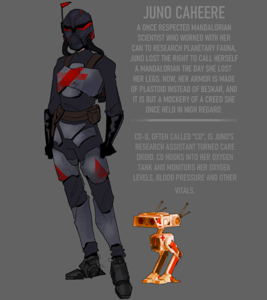
I made this on my phone in 2022, at the tale end of watching TCW and back when TBB was just one season. You can definitely see that the idea was always there, just a bit disjointed in its application. That gas mask on her helmet ended up causing a lot of confusion, so I removed it in later iterations - but to this day, I think this one picture is what really captivated me. Something about the aura, man,, she scary lookin
Then, of course, I had to draw what her face would look like - if it hadn't been for a RP, I don't think I would have.

Woah - she's like a whole different person! And you can see the beginnings of her white hair streak, though back then, I wanted i to be really subtle. And I was soooo adamant about this lol. She also was almost beat for beat Ellen Ripley, and you can see me paint over a picture of Sigourney below with her OG faceclaim haha.

Then we have the Juno-ing... part two. Where I went darker!! Both in themes, and in her color scheme. This one still has so much personality, and I remember being obsessed with how I drew her eyes and face back then. Nowadays, I think it's hideous. xD This was also around the time I was phasing out her gauntlets and oxygen mask, but both still remained for practicality purposes, even if they didn't serve anything to the design. Oh, and the hair streak. Now it's a Thing :tm: but it isn't really flowing well with the design - not yet, anyways!


We finally get to a point where I, begrudingly, accept the fact that her white streak is going to be her facial focal point - and at this point I'm laughing about how much I tried to avoid it LOL. But here, we also see her get more and more refined. Her face is still a bit wonky, but the stern vibe and posture are starting to come together and tell more of a concrete story, even if the reference doesn't have as much color or personality as the last one. I also did this one for my senior year of college!
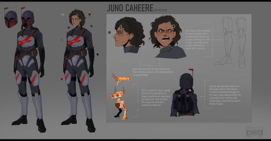
I even designed her some totally BS civvies - and I gave her a s2 paint job, which admittedly looks hideous LMAOOO but we ball regardless. The second design was scrapped anyways almost immediately. The civvies stayed!

And then, of course, THE FINALE! Her face went through so many iterations with her current ref, but thus far, it's been the longest standing and most accurate one. It atually started out just as me goofing off with a marker pen in CSP, that quickly changed to "hey... this could be something good." And I was right! This is the Juno that's currently circulating today, and I've been polishing and refining her as I go, since I still feel as though I could perfect things.

And then, of course, her various outfits, which I posted about a while back. Oh - and have you seen Baby Juno?
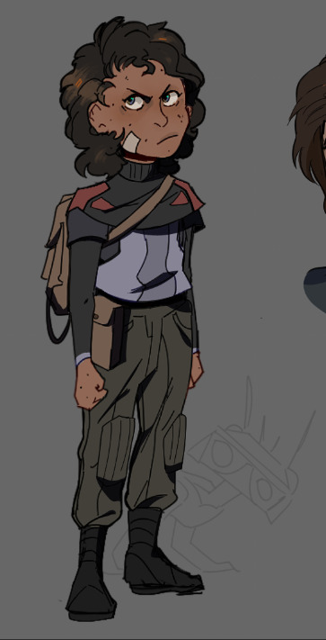
Well now you have. :)
I think it's so cool to see how someone can fixate on a character and pour so much love and thought into them, that this character becomes their entire brand. Juno inhabits every part of my brain space and is what I think about 24/7. I'm so proud of how far she comes, and she reminds me about how incredible fandom can be and continues to be! Something about her is just so intoxicating to me. I can't get enough of her, and I can't wait to keep developing her over the years to come.
Which then begs the question - what is your equivalent to this entire thread? Do you have an OC like Juno, who you're fixated on and who dominates your creative pursuits? Do they have multiple artistic iterations? Because if you do, share them!! I WANNA SEEEEEE.
Anyways, that's Wren's Ramblings for today ~ I got bored haha
SHARE YOUR OCS!!!! >:0
#the bad batch#star wars the bad batch#star wars#juno caheere#juntech#mandalorian oc#mandalorian#star wars character#star wars oc#original character#oc#fanart
60 notes
·
View notes
Text


INTRODUCING THE MOST MANIPULATIVE KING IN HISTORY , MAGNIFICO!!! 🎇🎇🎇🎇(I hate him but he deserves a redesign lol).
For those who see this post for the first time, I introduce myself, Hi :D! I'm Aled and this is a collaboration with @ animación , author of the rewrite of Wish that is on her profile (read it, the story it's soooo good) and I am in charge of drawing the redesigns of her story.
Now, coming back to the main thing, I will show how we got to this result :)
FACIAL FEATURES AND HAIR:
-Honestly, I never thought that getting used to drawing Magnifico would be so difficult lmao, how in most of my procedures to make the designs, I start with sketches and studying the structure of the character's face, this was a little difficult because I'm not that I'm used to drawing people over 20, but with a few practices I was able to figure out how to draw him :D
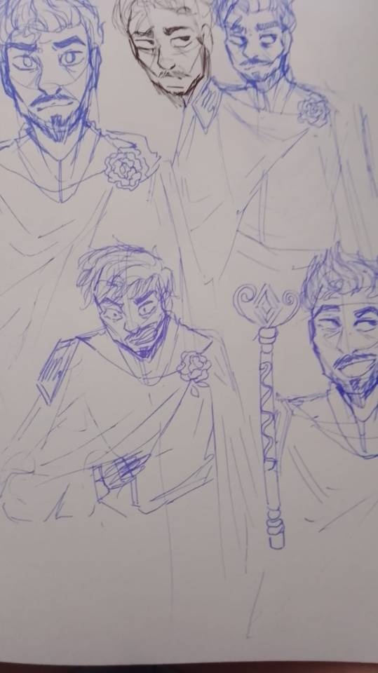


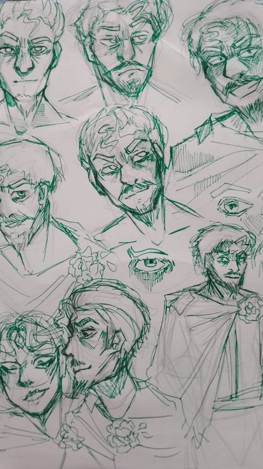
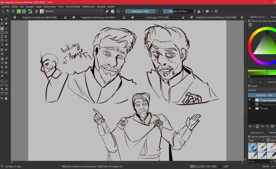
(I also did digital internships, but I didn't save most of them because I forgot lmao)
COLOR PALETTE:
-Don't think that I chose a palette of yellow and gold colors just because I thought it was pretty (well, that's also another reason), what happened is that when I was searching through conceptual arts, I found some designs by Magnifico where They used a blue and yellow color palette
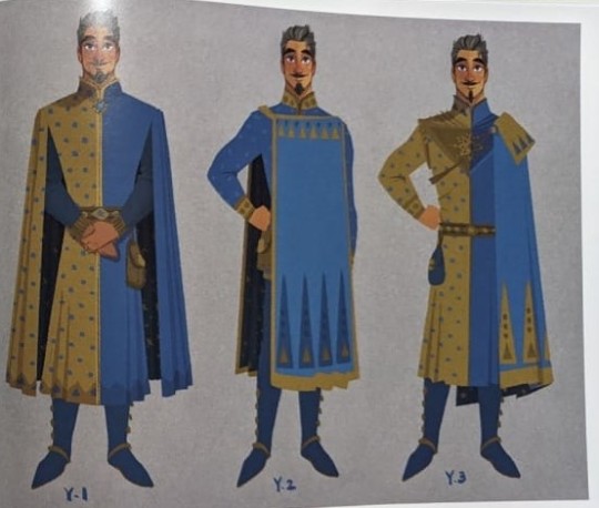
I did a quick search and found this:

-Tell me this doesn't remind you of Magnifico, then yes, that's why I chose a yellow color palette, also adding a golden tone to give it a royal vibe.
-I also applied this in the design of Queen Amaya, in the publication of her design I explained why I added details of a dark blue color in her costume and Magnifico's costumes
ATTIRE:
-From the beginning I always wanted to modify Magnifico's cape by adding a rose as a brooch, and searching through the conceptual arts I found quite a few interesting models, so it can be said that I combined everything I liked and that's how I got the cape for Magnifico, Also adding other details that occurred to me.
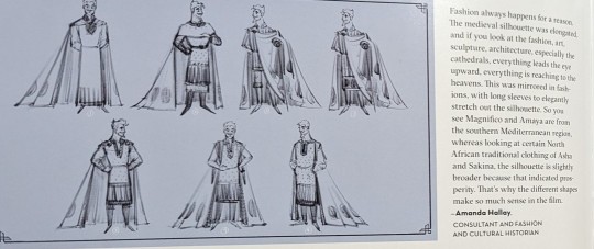
-The author sent me several ideas for Magnifico (thank you by the way :D), one of them was associating Magnifico with the sun, I really liked the idea and that is why there are so many symbols of the sun in his suit, plus these It reminded me how in so many cultures the Sun is worshiped, just as the kingdom of roses worships Magnifico, there are also other reasons why the sun fits with Magnifico but I already mentioned that in the publication of Amaya's redesign.
-The truth is, I only drew the other details improvised, this time I just got carried away, but hey! The outfit didn't look bad at all :)
-Another important part of Magnifico's costume is the "M" on his badge, but in fact it is not an M 😅, it is the sign of Scorpio ♏, this idea was from Anny Mation
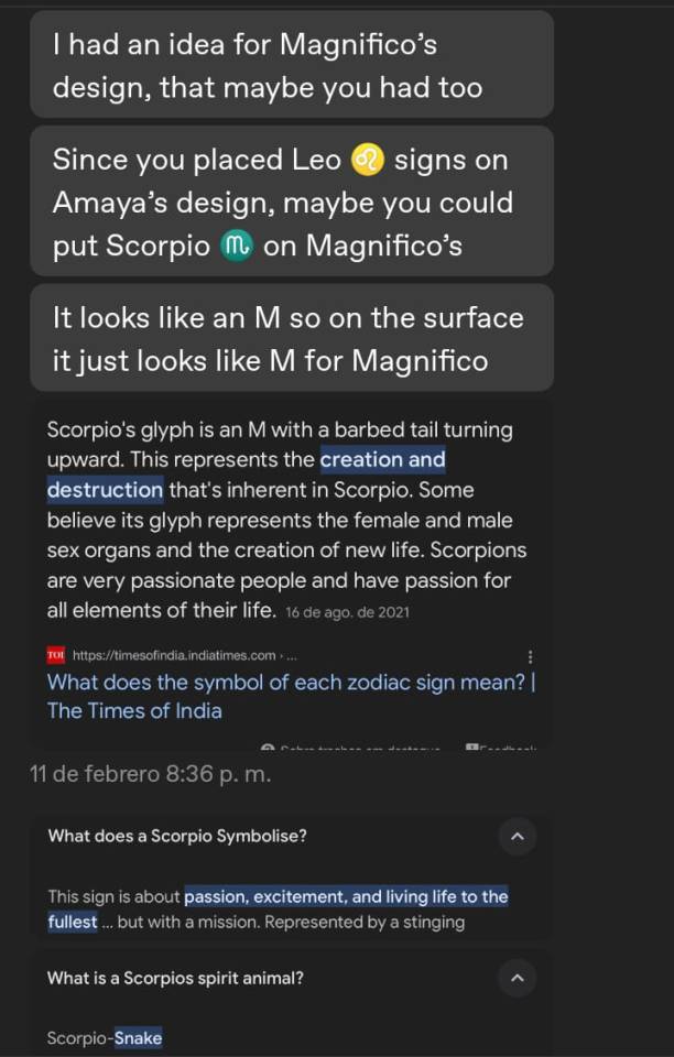
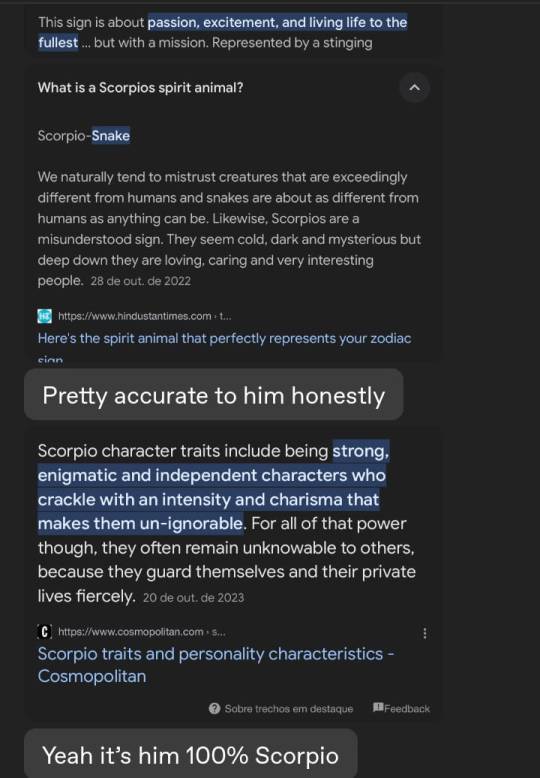
-So yeah, I had to add the Scorpio symbol yes or yes, at first I thought about adding it to the back of the cape but I wasn't convinced by the idea, but then I thought: "Wait, why don't I add the sign on the gold plate ? that would look elegant."
FINAL COMMENTS:
-I'm proud of how this turned out, I feel like it does justice to a villain that commemorates 100 years of Disney :)
-Also, I think that those who have already seen the other redesigns know which character is next, right 👀✨? For Aster, I don't know how long it will take me to draw him, since the boy is literally a walking animation studio lmao.
That would be all for now, until next time :D!
#sketch#art#artists on tumblr#artwork#disney#disney wish#drawing#digital art#illustration#my art#magnifico wish#king magnifico wish#king magnifico#magnifico#wish magnifico#magnifico x amaya#wish disney#wish 2023#redesign#wish reimagined#wish rewrite#wish movie#wish#disney movies#disney animation#disney fanart#wish star#asha#queen amaya#redesing
199 notes
·
View notes
Note
hii again i was wondering how do you think avatar characters would react to their human partners having facial piercings or tattoos like a lot of them
Like me?

Pairings: Characters x FemHuman! Reader
Summary: It’s amazing to see how they react to see similarities, even if they are in small ways
Warnings: No smut just fluff and cuteness.
➳༻❀✿❀༺➳ ༻❀✿❀༺➳ ༻❀✿❀༺ ➳
Tsu’tey:
When Tsu’tey first saw you, he couldn’t pull his eyes from your form. His eyes trained on the piercings perfectly placed upon your face. Your lip, nose, and ears piercings with pretty jewelry that called his attention.
Often times Tsu’tey found himself staring intently at you, his eyes though hard held little bits of curiosity. You were such a strange creature to him, so small yet so alike to him or maybe you were just different.
One day Tsu’tey couldn’t take it he needed to know, to better understand. His larger hand wrapped around your forehead before pulling you off. His gaze hard as she gripped into your chin tightly, moving your face around to further inspect your piercings.
“Despite being a sky person you wear jewelry upon your skin as well, maybe we aren’t that different demon.”
Now that the two of you were lovers he found himself touching and admiring the jewelry.
Neytiri:
Neytiri’s eyes widened when she finally saw your human form. It was a lot different than your avatar, its bare skin free of any piercings or ink. Smooth and pretty, yet here was your human form covered in tattoos and piercings.
Her eyes took in every single detail, sucked into all the things that made you both similar yet so different. Despite her hate for the sky people she often times found herself tracing the ink that covered your skin with her eyes until finally she caved.
Having you in her arms, body pressed against hers she could easily trace the ink along your skin, taking her time to memorize the details in her mind in every possible way.
Ronal:
Ronals distance for humans was justified in every sense of the word, making sure the people were safe was her up lost priority. However when Jake sully brings these humans in false bodies she can’t help but be drawn to the intricate designs of ink scrawled on your skin. The designs similar to the ones her clan bore.
Soon enough without realizing it her eyes looked for your form everywhere, as much as she tried to avoid you she couldn’t help but seek you out. How she longed to run her fingers against your smooth skin. Tracing the ink that marked your body.
The moment the dreams became reality she couldn’t keep her hands off of you, each chance she got she’d traced the ink. Memorizing every swirl and every patten that was etched into your body. It was her favorite thing to do when she needed to calm down.
Tonowari:
He didn’t welcome you with open arms, feeling reserved about your arrival to his clans lands. Apprehensive about your arrival but genuinely captivated by your features.
You looked so different but what stood out the most was the jewelry that shined brightly in the light, your piercings and slightly colored ink of drawings that littered your body. He was as curious as an Olo’eyktan could be, curious about the sky person who showed to have similarities with his people yet so many differences.
Your inked skin and shiny jewelry drew him in, curious touches and even more curious gazes. He wanted to admire yet touch that places the ink seemed to go on forever in. he was simply captivated by such a small thing. The moment you were his he made sure to look over and touch as much as he could. Familiarity in all things that you were and all things that he was. He likes that you were two in the same in different ways.
➳༻❀✿❀༺➳ ༻❀✿❀༺➳ ༻❀✿❀༺ ➳
Taglist: @pandoraslxna @sunfyresrider @headsincloud9 @etherialblackrose @blue-slxt @justcaptiannoodles @neteyamyawne @oakbuggy @eywaite @luvv4j4ybe11 @quicktosimp @cardi-bre91 @torukmaktoskxawng @rivatar @thepeonysbackup @tallulah477 @anemonelovesfiction
#⋅ʚ♡ɞ⋅ xyliana’s babes ♡ ✧˖*°࿐#⋅ʚ♡ɞ⋅ xylianas asks ♡ ✧˖*°࿐#avatar#avatar twow#atwow#avatar the way of water#avatar jake sully#james cameron's avatar#tsu'tey x human reader#ronal x reader#atwow tonowari#neytiri x reader
43 notes
·
View notes
Note
Hello! I have a B&R question!
I love Bea's design SO MUCH. You have given my soul so much healing thanks to how realistically/non-fetishy you draw her and STILL make her look sexy when she wants to give sexy. I hate how rare that is, but this is the world we live in and you're doing important work.
I was kind of surprised when I first saw a selfie of you and saw you're not of a similar size. I KNOW HOW THAT SOUNDS. What I mean is that it's rare to see such good fat representation from an artist who doesn't themself walk that particular life. So my question is what drove you to create Bea the way she is now?
I'm sending this off anon to hopefully show this is entirely out of good faith curiosity. You could say "I just felt like it!" or nothing at all and I'll still love B&R and Bea. You don't NEED a reason to make her, but I would love to hear your thoughts as her artist if you'd like to share 💜
Hey!
I'm always so happy to hear when Bea's made a positive impact in someone's life, whether it be through her story or just her existing!
As for Bea's character design, it's sort of a combination of "I just felt like it" and also she was technically a pre-existing OC I had made initially for a DND campaign that I repurposed for BnR because her character silhouette was a really good contrast to Laz's spindly, noodley one. I thought they had good shape dynamics, and I still do!

(old art, obviously)
Bea and Lazareth were designed together to be good visual compliments! So that's why, basically.
I also, at the time of making Bea's VERY FIRST DESIGN, when she was just a tiefling I was gonna play-

-was my first "plus size" body type (as you can see, she's filled out a lot more as her concept was developed). When I was younger, I used to be pretty arrogant about my "body diversity" in my characters, and at one point someone here on Tumblr, on Anon, came into my ask and essentially told me to shut up bc I only drew thin or buff people.
Definitely not the nicest way to put it, and I was pretty upset at first, but after I calmed down, I realized they did have a point. So I made Bea, and then, as I explained above, ended up using her for BnR!
#mei responds#bnr asks#long post#I have a lot of art from both Bea and Laz's design phases#Laz was pretty steady after his 2nd draft in terms of design#Bea had a lot more tweaking on.... literally everything
37 notes
·
View notes
Text


Yet another Magma doodle board with some of my friends! (Ignore the cum)
Black lineart = Me
(Mostly) uncolored, but used colored lineart = @towost
The Boxtons with the really thick lines = @shrimplybrekfast
The Goob in the top right of the first image = @pinnochios--vices (Strawpage)
Drew a bunch of characters and decided to give Scraps and Glisten headcanon designs! (Glisten cause he's my best friend's fave character and I wanna draw him for him in the future without hating it) covered Scraps in a bunch of paint splatters and turned her hands into pompoms, and decided to make Glisten a ballerina because I had no better ideas, I think he would like ballet, and he gives me ballet vibes from when I used to do it when I was really little (Dropping Crumb Lore for you guys, yes I did ballet) idc if it's self indulgent idk how else to draw him shut up. I'll likely change the outfit tho I hate it
Rest of the characters I didn't add that much to, gave Vee a suit ig but I suck at drawing suits so I didn't really try. Don't ask me why I drew her with that face, I felt like it shut up.
Anyways I'm gonna stop yapping now bye I love youuuuuuuuu <333333333333
If one person mentions the amount of tags I'm killing myself <333333333333
Edit: Uncropped out a Goob drawn by someone I didn't previously have permission to upload, it's in the first image now
#chat im boutta die doing these tags lets do this wish me luck#my art#art#dandys world#dandy's world#dandys world fanart#dandy's world fanart#dandys world goob#dandy's world goob#dandys world scraps#dandy's world scraps#dandy's world glisten#dandys world glisten#dandys world boxten#dandy's world boxten#dandys world razzle and dazzle#dandy's world razzle and dazzle#razzle and dazzle dandys world#razzle and dazzle dandy's world#dandys world astro#dandy's world astro#apparently there is a tag limit so it deleted half my tags when i saved this as a draft yay#dandys world vee#dandy's world vee#dandys world teagan#dandy's world teagan#dandys world dandy#dandy's world dandy#please dont delete my tags again
55 notes
·
View notes
Text
Weiss - Atlas Design Critique.

Wow, I’m back to do two things useful with my RWBY Archives, talk about Weiss’ canon look in Atlas, and redesign her. I’m gonna talk about her actual look first, as the character notes on her dedicated page made me… hate the look much more. It was already in my top ten least favorite designs in RWBY but NOW it’s in the top five. RWBY Archives


I’ve been wanting to know why they thought it was a great idea for Weiss to wear a restricting-looking dress in the North Pole. Why does she choose to look like a wealthy princess when she is no longer tied to money or her family? The book gave me an answer I was not expecting… they just wanted to make her look like a wizard. I HATE IT. It’s bad enough that Weiss just summons, but this has to be some animation trick. They didn’t want to animate Weiss fighting like a ballerina anymore, so it was best she stuck to just summoning and only uses Myrenaster as a glorified wand. You might as well dress Weiss in whatever way you want cause all she does is stand and point… and whenever she does try to fight it looks janky as hell.

No way did they think Weiss could fight in a dress, Maria and Cinder could, but no way can I see Weiss fight like THIS anymore.
Hair


Now I don’t wanna disrespect the modeler cause I’ve seen their Artstation account. They modeled the Gods’ dragon forms, Winter, and Jaune! Models that look good! But the hair… they struggled and the backlash was hard cause they tweaked her hair again for Volume 8. I’m surprised they chose to change it when the people in charge should’ve changed it before Volume 7 even aired. It just tells me their standards are low and don’t give a crap about the product unless they need the fans to say something. The huge mass on top of her hair was so jarring I was convinced Weiss just took Blake’s chopped hair, dyed it, and applied it to hers.
Primary Color - White?

Blake is wearing more white than her, The Ace Ops are wearing more white than her, and Jacques is wearing more white than her- Weiss’ colors are perfect if she was representing the color blue and her name was something like Azure. The tiny reds don’t make an impact, wouldn’t surprise me if people didn’t know there was red inside of the dress. The super blue for her puffy jacket can’t be found anywhere else to balance that color, and her whites are then covered by grays. It’s like too many colors, what else can I say other than SHOWING what they could’ve done in the choice of color placements.
Positives?

This is gonna sound like an odd positive but I think she looks downright gorgeous in Ever After. The whacky princess look standing next to the Red Prince was amazing. It made me wish Weiss was the ‘Red Queen’ for The Ever After, similar to how Neo was ‘The Mad Hatter’ and Jaune being ‘The White Rabbit.’ It really could’ve tied in well.
Redesign

I miss redesigning a character; I kept in mind that White is primary, the tiara is no longer a staple to her design since she is no longer tied to wealth or even the heiress, and that her Volume 6 leggings and scarf stay intact. Why make accessories to protect her from the cold, but when she gets to a colder place she ditches them for a boob-window and bare legs that can make anyone freeze to death up in the north??? Side note; It’s not perfect, I’m not saying mine is better than the originals or anyone else’s this is just how I would’ve designed her or at least kept in mind to make a priority for the design. I also wanna say, yes, this outfit does look similar to another redesign of Weiss that someone else has made. I drew the design first before I went to Google to check if the look did look similar to someone else’s and I was like “Oops.” It wasn’t the intention, just coincidence. I didn’t steal.
Conclusion

It looks like the Atlas designs had a very huge backlash by just how BAD they were, as it now affects the girl's presumed Volume 10 looks in Vacuo, they have Weiss in white, ditched the chunky braid, and kept her in a presumed combat skirt than a restricting dress. Either A.) The original character designer for team RWBY finally took constructive criticism to get the girls back to themselves B.) They no longer design the girls and Viz Media put in a new artist for the team or C.) Vacuo designs were much easier to make than Atlas.
These options can be wrong too these are just my little theories, end of the day we got a design for Weiss that just shouldn’t have made it into the show. A design that didn’t represent white, displays wealth when trying to distance herself from her family/company, a huge animation restriction, and overall one of the worst outfits I’ve seen put on Weiss Schnee.
But of course it’s just my opinion. If you love this design or hate the design, please share your opinion. I’d love to hear it! :D
77 notes
·
View notes
Text

❁ Shih-na and Calisto Yew❁
Rest of post will contain spoilers to aai1 as I can't talk about this drawing without going into spoilers sorry
Yesterday I finished drawing on the first page of my new sketchbook and I had to draw Shih-na/Calisto. why? Because unfortunately I really like this character XD. Originally I went into why I love this character so much, but that was a whole essay and idk who wants to read that lol, but I will say this, it was fun and frustrating at times trying to figure out how to draw both Calisto and Shih-na in my art style, but I think I've mostly figured it out :-).
I also found myself liking Shih-na's dress a lot less after drawing the top part of it. I assume it's meant to be a halter top dress that's vaguely qipao dress inspired??? but idk, it's super strange dress design and after drawing it I low-key hate it (sorry). Still love the irony of her having a heart on her gloves (in the place where a sleeve typically is!)! I was also surprised with how hard I found it to draw Shih-na's hair and both her and Calisto's eyes, but as I said, I think I figured out a way I like to draw these characters and had a lot of fun doing so! Especially since half way doing lineart I bought a new brush liner (the other one is still lost (´-﹏-`;)) and had even more fun doing the lineart.
I'm sure you noticed for drawing 4 and 6 I did different outfits for them, for Calisto I felt like drawing her in a casual outfit, I like to think for her Calisto persona she wore clothes that look simple and casual but, are tacky designer brands, also gave her sunglasses cuz I think it suits the look and, as a reference to some of Shih-na's sprites :3. As for Shih-na, I drew her in a vintage qipao dress I found online but changed the colours to match her canon outfit colours, hopefully I did a good job drawing it, definitely need to study more historical clothing, especially from non-white cultures though.
With all that said, hope you all enjoyed these silly little drawings (ノ◕ヮ◕)ノ*.✧
#ace attorney#ace attorney art#ace attorney fanart#traditional art#aa#artists on tumblr#shih na#calisto yew#ace attorney investigations#aai#aai1
30 notes
·
View notes
Text
Hi! Decided to post some nega!au designs i did:
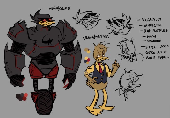

First off, nega!Gyro's and nega!Fenton's designs, i drew them first because they're my favorite characters, so they're the ones i have most figured out about yet.
Also i don't have much to say about them for now, what's important is kind of already on the pics, nega!Gyro is still a scientist and nega!Fenton is still an intern and hero villain!
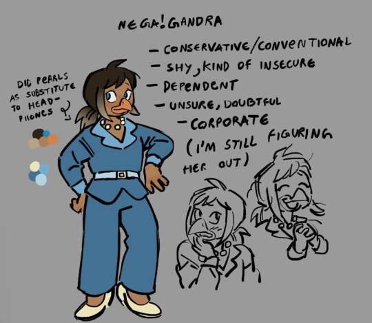
Here's nega!Gandra! I really liked drawing her and even tho i'm not too sure about how i characterized her i still liked the result.
I'd say that she's working a corporate job at Waddle or something, and even though she doesnt hate it she still wishes she was doing something more important. I'm thinking of giving her a villain arc...
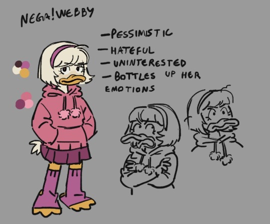

Then here's nega!Webby and nega!Lena ! Designing Lena was hard but i ended up really liking the result.
Weblena just kind of switched vibes with each other, nega!Lena is dorky and very naive, and nega!Webby is more like an angsty teen that's kind of annoying, i still don't know if her hyperfixation on the McDuck family stays in this au or not.
I don't have a story yet and i still want to develop these designs more, especially Webby, i feel like she's not edgy enough.
#digital art#arttag#ducktales#duckverse#gyro gearloose#fenton crackshell cabrera#webby vanderquack#lena sabrewing#gandra dee#gizmoduck#metalks#ducktales au#nega au#negaverse
264 notes
·
View notes
Note
have you ever drawn/considered drawing more minor or one off oxventure characters like rust on the harbour or no-security-deposit bill?
or even the members of the red hand gang!! I've seen surprisingly little fanart of them and they all have real cool designs
i think the world needs to see Squiffy drawn in your art style
thank you bye
i have drawn a handful of minor characters, including rust on the harbour! and i've drawn them again for you here, because. i love them. especially the true heroes of geth, they make me cackle gbfhjdghjfbd except i completely redid my design for cuore because i hate how i drew her the first time lol

aaand as for side characters that i havent drawn before-! here's my two favorite side characters, max and shattershield, as well as a squiffy for you :3

"hey travis, why did you decide to draw 11 characters in the three hours you had before bed" i needed to take my mind off of dinner with my mom. g'night and thank you for the ask :]
#yabbadabbaghoul#ask#oxventure#I ALMOST DREW THE ENTIRE RED HAND GANG. WHY DID I THINK ID HAVE TIME TO DO THAT#got half way thru squiffy and went Oh my God. What am I doing
34 notes
·
View notes
Text
Lady Orchid
★ I just drew her so now I gotta talk abt her too ★
- realmsau
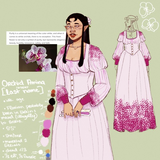
I don't have much art of her bc I'm lame and I suck, but wtvs here goes :3
Orchid Amina was married to Elliott Hark, my best friend (Lou)'s oc.
She was born in the kingdom of Erkin in the Flower Realm, and she and her family lived there for the first 10 years of Orchid's life. They then moved to the Spice Realm and somehow Orchid's father got the title of uh Viscount or smth (I haven't decided, and her lore is more recently being established).
Elliott's family was brought on as servants, and idk that's how she met Elliott and fell in love w him
I have never drawn him young so you get these drawings of him (that I hate) ↓
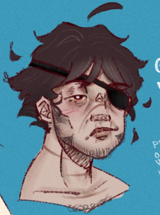
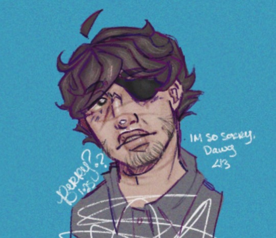
as you can see I can't decide on how I want to translate lou's style into my own sigh
anyway they get married eventually yk
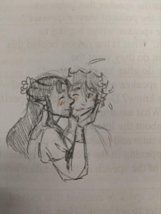
They both become Viscount and Viscountess after Orchid's dad dies
anyway fast forward a few years, Orchid has Lynch Syndrome (?).
she develops gastric / stomach cancer bc of it. she doesn't tell Elliott and she hides it pretty damn well.
Elliott goes away to war, seemingly smth he'd wanted to do for a long time, this fighting. This is a part of the reason she doesn't tell him — she doesn't want him to not go and do what he wants to do.
but anyway, once he's gone, Orchid hires a nurse, Valeria. I have never drawn Eri and I never will.
She slowly gets sicker and sicker, coughing and vomiting lots of blood, is unable to eat or drink, is constantly coughing and in pain.
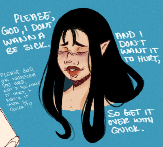
she seeks out the Queen of her former kingdom / birthplace, Queen Alba. She begs the Queen to let her have some of the water from the Tree of Life / Lignum Vitae to try and cure her illness. Alba tells her the water will not save her, but only make her suffering worse. (the cancer is alive, not just a virus or smth. the lakewater would just give the tumors vitality or smth).
at this point, Orchid is beginning to regret not telling Elliott and making him stay. she doesn't even hope to survive anymore, only hopes to live long enough to see him come home, to see him for only a second one last time.
well... she doesn't live. she dies like a month after visiting Alba and a few months before Elliott's return. She instructs Valeria not to write Elliott reporting her death as she doesn't want grief to overcome him and get him killed.
so ultimately, he comes home to an empty house.
atp Elliott is like 60 or 70 or smth and the king of the ice realm, Elias wants him SOOOOO BAD. (Elias is Lou's oc)
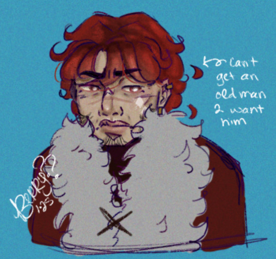
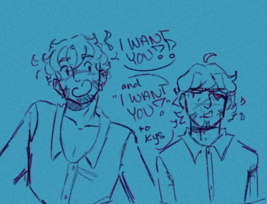
Elliott (from what I can understand from Lou's queerbait yaoi fics) does end up wanting Elias back (?),, but not until Elliott is like damn near dead from being assassinated.
actually I think Elliott ended up dead at that point, hence how these doodles were born ↓


but uh yea that's it so far fjsnnxbnsnnxnnsnnxna
have her portrait,, my beloved Orchid
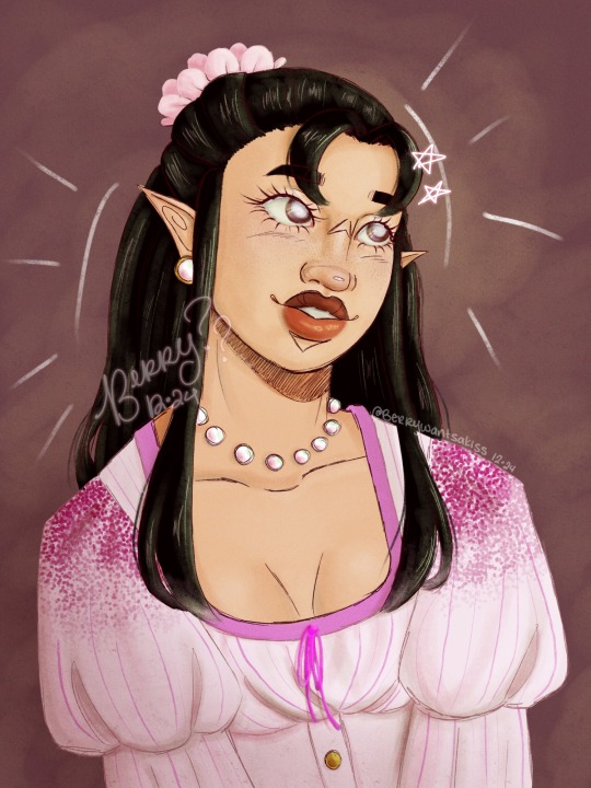
this was poorly written, but that is bc she isn't really all that developed outside of existing lowkey just for lou and I to torture each other and for Elliott's character.
she was initially just some idea Lou had, the Elliott had a dead wife in his past — shoulder shrug wtvs — and I was like "CAN I DESIGN HER !!! PLS !!!” and now we are here. bc. I made her really pretty 😭😭
her original concept (from when my current artstyle was still developing </3) ↓

but uh, yea !!! thanks for reading :3
I'm going to go doodle her now instead of.. oh idk.. doing anything else 🤭
#art#illustration#artists on tumblr#digital art#artwork#drawing#oc#my art#oc art#my ocs#realmsau#oc rant#oc rambling#drawing reference#character reference#oc reference#doodles#rant post#rant
21 notes
·
View notes
Text
First impressions on Champignon Witch
This manga isn't really magical girls, but there is a witch in it (duh) and no way I'm not gonna talk about it. I saw this in a compilation of anime that's coming out in 2025 and from the promo art alone I knew this was going to be my manga (from the mushroom witch hat with ornate decorations), and so far it has lived up to expectations.

The story is set in a fairytale style world, where the black witch Luna lives in her little mushroom house in a forest with her magic familiars, and makes various powerful medicine out of poisonous mushrooms. People fear and hate her because she emits poison, and even the few merchants who will do business with her and treat her in a friendly way wear protective items around her and will scrub clean everything she has touched after she leaves. Luna continues to create medicine for the townspeople though, because she has few other ways to feel connected to other people outside seeing everyone all happy about the anonymous source's cures, even if she knows that nobody would want them if they knew they came from the poison witch. Also unbeknownst to the normies the poison she radiates is actually beneficial, because she involuntarily sucks up this vague evil bad vibe energy around her, and turns it into a more manageable form.
The first volume or so is spent following Luna's life, and it isn't until later when she finds the turbo poisoned boy Lis, somewhat cures him and takes him as an apprentice that the main story actually starts. The council of the black witches wants to kill him, because it is speculated that his poisoning will eventually take over and he'll cause large scale ruination, and only allow a limited time for Luna to teach him to manage his own poison.
I like how the whole series has a rather somber tone, which mostly comes from the characters wanting and failing to be close to one another, and trying to make peace with having to give up on someone. Like Luna has lost several of her black witch friends to witch hunt executions. The story also has a difficult relationship with love, since love is "poisonous" to black witches and messes up their magic, and also Luna has to live in isolation anyway. But it doesn't seem like this is a "love conquers all" kind of romance, because it has a side character give a speech on how it's condescending of outsiders to think that life without love is somehow incomplete.
I really like Luna, aside from the lovely character design she also has sweet quiet personality and it's easy to root for her to get through her self esteem troubles. I also like that she is already an experienced witch at the start and not a newbie who is baffled by everything. I'd say my biggest complaint about the story is that lately it has been a lot more about characters other than Luna, I wish she'd come back to the spotlight soon!

Since Luna's character design is what drew me to this in the first place, I was extremely happy that she wears a lot of memorable "medieval fantasy" type outfits. Quite many of them in fact, she has a new one almost every chapter! And sometimes multiple in the same chapter! And you know how I often like to draw collections of animu outfits with the character standing there in a neutral pose, here the author has done my job for me because almost every chapter ends with a good reference image full body pics of the major characters' new clothes! Even the ones that only appear once on a cover! It's like this was made for me.
Finally it should be mentioned that eventually Lis falls in love with Luna; it's somewhat complicated how old he is because he keeps getting aged down by magic so he is chronologically older than how he looks (and so is Luna for that matter, this is a "magic people stop aging" kinda series), but if that's a dealbreaker to you then maybe steer clear.
23 notes
·
View notes
Text
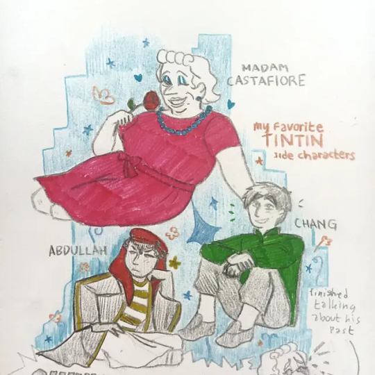
MY FAVORITE TINTIN SIDE CHARACTERS
ARRGRGWHDHEH I'M VERY VERY PROUD OF THIS I'M NGL!!!!!!! I LOVE THE WAY I COLORED THE CHARACTERS, I LOVE THE POSES I DREW THEM IN, I MADE SOME DECENT COMPOSITION IN THIS ONE!!!! HATE THE EDITING I DID I FUCKING SUCK AT EDITING
Anyway, I'm going to ramble about these guys and you can't leave until I'm done ok? Ok.
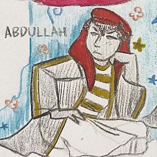
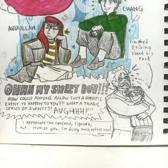
First of all, MY BOY MY SON MY PERSONAL LITTLE DEMON, ABDULLAH!!!!!!! he is very endearing to me!!! But I really do wish we could've seen more of him!!!! He looks mischievous enough to sneak on adventures along with the marlinspike crew himself for shits and giggles!!!!! HIM AND HIS DAD'S DYNAMIC IN LAND OF BLACK GOLD IS MY FAVORITE IT MAKES ME SO GIDDY AND HAPPY. like no matter how obnoxious and annoying Abdullah's pranks can become, his dad will forever love him unconditionally. MY FAVORITE DYNAMIC. I MISS THEM SO MUCH.
A little note, even though a lot of poc representation in tintin is pretty influenced by the stereotypes of the time, and a bit of orientalism, tintin and the land of black gold is also the first time in my childhood where the words "assalamualaikum" Was muttered in any piece of animated media. It definitely wasn't perfect, but that was important to me as a Muslim child. Maybe that's why Abdullah and his dad hold a special place in my heart!
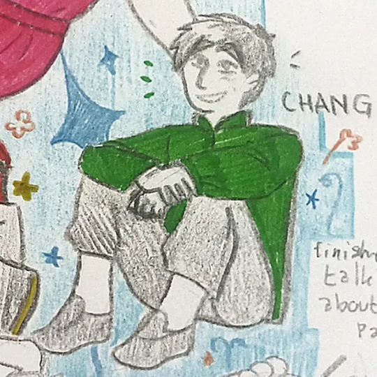
Next up we've got ARREGEHFHFHHGHJ!!!!!!! CHANG!!!!!!! MY FRIEND FROM SCHOOL WHO HELPED END A CRIME RING IN SHANGHAI!!!!!!! I adore him and his personality so much!!!! HE WAS ONE OF MY FAVORITE CHARACTERS AS A KID AND HE STILL IS TODAY WHEN I REWATCH BLUE LOTUS!!!!!!!! The way that the moment he was saved by Tintin in that flood he pledged his undying loyalty to Tintin will never not be sweet to me. HE IS SO TALENTED AND CUNNING, HE SAVED TINTIN FROM CERTAIN DOOM MULTIPLE TIMES IN THE LITTLE TIME THEY'VE SPENT TOGETHER, AND IN TINTIN IN TIBET, TINTIN SAVES HIM ONCE AGAIN (Tintin in tibet is also a very memorable and special episode for me) AND JUST-- ARGEHDBEHF I CAN CONTINUE ON AND ON ABOUT HOW CHANG SHOULDVE BEEN INCLUDED IN MORE ADVENTURES!!!!! actually Tintin has TONS OF CHARACTERS who should have been given more important roles in a lot of different stories!!!! Idk maybe that's just a wish that will never be fulfilled.... Still I can dream!
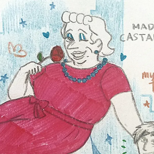
And last but DEFINITELY not least... THE MILANESE NIGHTINGALE HERSELF, BIANCA CASTAFIORE!!!!!!!!!!!! AGHHDHEHFHJDHV MY GORGEOUS MY BEAUTIFUL MY LOVE MY EVERYTHING I MISS HER SO MUCH
SHE WAS A HIGHLIGHT FOR ME!!!!!! AND SHE IS VERY UNDERRATED!!!! I love seeing how much she treasures her friends, how she's so dramatic about everything, how she has such an unapologetically loud and large presence and personality everywhere she goes, how she is genuinely passionate about her singing and her art, how she clearly knows her worth and won't settle for less from anyone.
Every time she was on screen she always made me feel very happy and warm inside, also I really like her voice!!!!!
AND HER DESIGN!!!!! ARRRGHWHFHH HER DESIGN!!!
I'm ngl, she was the hardest for me to draw. But at the end I'm quite satisfied with the results!!!!
She would be such an amazing friend. SHE'S ALWAYS BRINGING GIFTS AND BEING CONSIDERATE WITH HER FRIENDS, AND SHE WOULD NEVER HIDE JUST HOW MUCH PEOPLE MEAN TO HER
PLEEEEASEEEE CASTAFIORE I MISS YOU SO MUCH GIRLFRIEND COME BACK TO ME-
Anyway, the last picture is how I'd imagine Chang and Castafiore's first meeting would go. She as always, acts as sweet and polite and extra af as she always does, let's Chang know that Tintin's talked a lot about him! And then she would bring out some biscuits and pastries she bought as a gift for everyone, and then she and Chang would sit together while eating, and they get along really well, CHANG HAS A WICKED SENSE OF HUMOR THAT CASTAFIORE CAN'T GET ENOUGH OF, (haddock would be completely dumbfounded with how good at talking to Castafiore Chang is, and how anyone could talk to her for so long) but little did haddock know, in their conversations, Castafiore does a whole lot more listening than speaking, especially when Chang starts to tell his back story, and all the things that have happened to him and Tintin. After Chang ends his story, he looks up at her after a while of being lost in his story, and mascara is dripping down her face silently, her mouth is agape, and for a few moments couldn't say anything.
Suddenly she burst out loud, pulled Chang into a hug, and sobs after listening to the horrors this sweet kid has gone through.
In over a few hours she seems to have grown a strong attachment to this kid, she'll probably send a package filled with gifts a few months later, along with a long letter talking about what she's been up to and her wishes that Chang will succeed with anything he's currently busy with, and that he shall take care of himself well.
Anyways, I hope you enjoyed the small character appreciation I was able to share for some obscure/underrated characters! And that they will occupy your mind just for a little while. I love these three so much, tintin shaped me as a person, tintin made my childhood, I hope you have a great day.
Click for better quality!!!!!!
#bianca castafiore#chang chong chen#tchang tchong tchen#chang#abdullah#prince abdullah#the adventures of tintin#adventures of tintin#tea art 🎨#oklo makes a post
142 notes
·
View notes
Text
hey chat sorry for the month of inactivity. i was unmotivated to do anything with this blog
but then i looked at some of the art on here and realized that i just lost my love for the character designs. so you know how we're gonna fix that? we're redesigning some characters bayybeeee 😈
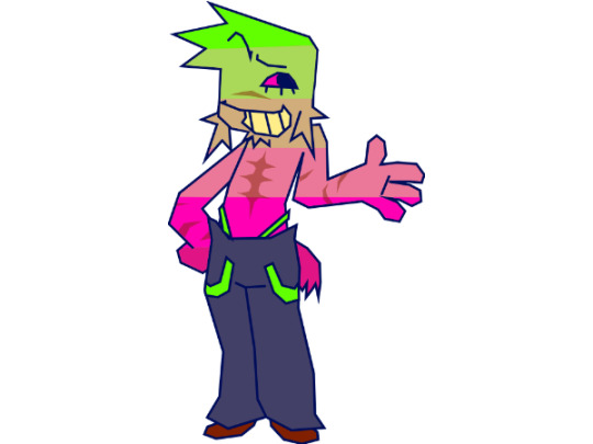
starting with the man the myth the legend, here is UNPLEZZIE 2.0
he's probably the only one i had genuine problems with other than not being very aesthetically pleasing. he seemed too boring, his proportions were always a bit wonky, and the way he became more and more simple the more i drew him dumbed him down to just...awkward.
for this redesign, i kept all the features that made him my unpleasant. the only really signature thing i changed was his hair, sorry not sorry he had to fire his barber. i changed his scars to be far less opaque as to not clutter him up (which was the main reason i left them out most of the time), the only drawback is that i'm no longer just scribbling them in with a brush, they're actual geometry, so i cut back on the arms just for my own sake. also his tail now looks (and acts) like an actual docked tail.
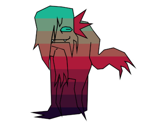
next is the QSWX GVCTXMG AMXLSYX VIEPPC FIMRK GVCTXMG GLEVEGXIV SJ XLI CIEV, here is CREEPY 2.0
creepy was probably my least favorite character to draw. its head shape with the hair that always ends off screen, the 4 arms, the lack of any real way to move visible, it has always been a mess of a character. don't get me wrong, creepy is my second favorite character to write for (beaten only by neuro), i love its personality and its inflection, i just never got the chance to show that because i hated drawing it so much.
so for the redesign, i've basically reimagined it. its face hair now has an actual definitive ending, it has a more unique shape, and is just much more expunged-friendly in my opinion. it looks even more like its mom now...
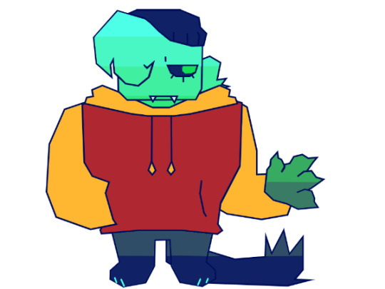
next is this one, i thought she was american. here's PARANORMAL 2.0
i'm gonna be totally honest i have no idea what i was doing when designing para for the first time. that outfit was 100% subconsciously stolen from some other character i can't think of right now. it also really just didn't fit her character at all. also i dont know why i gave her boobs???? what????
anyways for the redesign she's basically a whole new design now. i wanted to play with some shape language. also, para always had a sort of inhuman quality to me, despite her personality, so i've given her inverted eyes and some animalistic features. i guess it adds irony or something, i dunno.
and finally, the moment GERIATRIC CAT you've all been waiting for, UNNERVING 2.0
in truth nervy's design is my favorite. the only gripe i had is the lack of legs, like with creepy. also i had to give her one of the same pride flag ass gradient as the rest so she'd fit in with the rest. other than all that i love her she is perfect just the way she is with minor adjustments
that's all the redesigns done!! i only did these 4 because stabby is not mine to redesign and NEURO is perfect just the way it is. feel free to give me any constructive criticism for these redesigns, i can always tweak em a bit. also the more stripy gradients wont a pattern that follows the contours of the body but rather just unmoving plaid always. i hope this lengthy yap sesh contributed something to something, maybe gave some insight into my characters.
and if you got this far i put a public discord server link in the intro post. you dont gotta ask anymore. dont tell anyone....shhh....*lovingly puts my finger on your lips* *smirks* *bolts away* *gets hit by truck* *instantly fatal*
#regretevator#regretevator roblox#roblox regretevator#ooc unpleasant#regretevator unpleasant#unpleasant gradient#creepy gradient#paranormal gradient#unnerving gradient#gradient oc#regretevator gradient oc
47 notes
·
View notes
Text
Okay, now is technically the last one before my prefect design lol. OOPS I FORGOR fuck well here they finally are lol...
😭Other Side Characters😭

I drew so many cutie patooties in this batch omg they're adorable. But first we'll kick off with the Royal Blade characters!
🐱Chenya🐱
Because I'm not spelling out his whole damn name 💀
(he/she/they/it/ whatever pronouns you can think of lol) Genderqueer - Pansexual

Teehee I forgot to colour in the damn hair clips... I'm gonna kms /j
- Genderqueer cat. Any character based on the Cheshire Cat is genderqueer to me istg. Chenya is no exception.
- I kept most of her design the same but added in some heterochromia for funsies and used those colours for the hair clips and earrings. Xe is also Hispanic, idk it just felt right.
- Totally has ADHD. The impulsive thoughts are obvious with this one and I think that Neige serves as its impulse control. They made like, a pact of sorts (after their Headmage yelled at Chenya for doing something) that Chenya tells Neige whatever the impulsive thought is and Neige either tell Chenya 'No, you can't do that' or 'We can do this instead'.
- Broke asf. I dunno but I feel like Chenya has like the worst habit of impulse buying you've ever seen so they never carry money on they to try and avoid it at Trey and Riddle's recommendation. It's mostly worked as Neige buys anything Chenya needs when they go out anyways.
Speaking so much of Neige,
🐦Neige LeBlanche🐦
(he/him) Transmasc - Biromantic Asexual
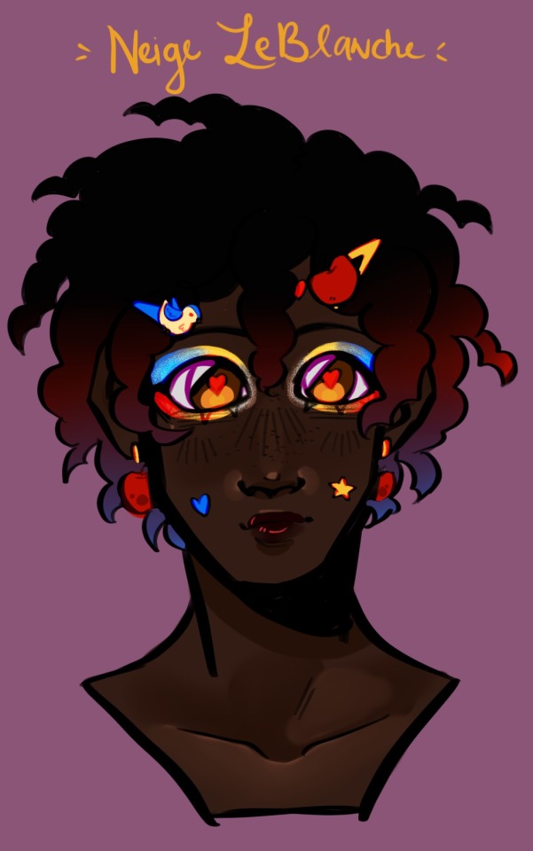
God I love how Neige came out, look at him!!! He's such a cutie patootie omgomg I love him sm
- Anyways, I was fighting my demons to not make him black and I lost. I dunno, we don't have enough sweet, cute black boys in media and that is a crime.
- I gave him some hairclips with cute lil charms on them and some of those silly little acne patches. Idk if he actually has acne, he totally could, but I think he'd wear them either way to like normalise not be ashamed of it, y'know?
- I gave him some cute little apple earrings which were a gift that Rook gave him after a concert with one of his letters lol. He wears most of the jewelry gifted to him at one point or another but he really likes the apple earrings.
- Has a crush on Vil. Idk how popular of a headcanon that is but as soon as they interacted, I felt like it made sense. I love the one-sided rivalry lmao with Vil hating his ass and he's just like, 'Omg, she's so pretty and cool and smart. Wow, I'm so glad we get to work together so much!' It's really funny ngl.k
- Loves to crochet, knit, and sew. All are kinda skills he picked up while caring for the dwarves but they're his favourite to do. He's made Chenya a few sets of mittens (because for some super mysterious reason, they always go missing) and a quilt at some point.
- Likes anything with apples in it, pies, drinks, you name it. Fall is his favourite season because of apple cider alone (otherwise it'd be spring).
Onto the Kingscholars!
🦁Cheka Kingscholar🦁
(he/him)
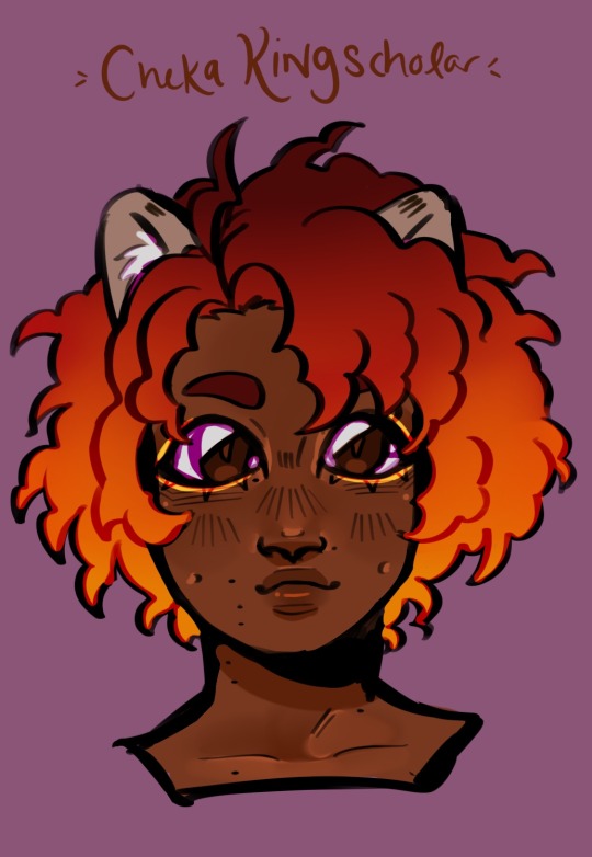
He's so cute!!! I love him omg I'd actually love to babysit him look at those eyes
- I kept his design also pretty on model, darken his skin a smidge and textured his hair to match Leona's. Smacked some dimples and birthmarks on as if he wasn't cute enough already.
- The gold eyeliner is like a royal thing, maybe be specific to the crown line or maybe Leona's just too fcking lazy, probably the later.
- He's actually really good at chess. He's played many games with Leona, even though he didn't get it at first, but now he can beat most people who play him (still not Leona lest he really screws up something). Most of his birthdays, he gets a new pretty chess set and he has a little display of them in his room.
Now for his dad! The only character here without a canon design (as far as I know... which I'm upset about).
👑Farena Kingscholar👑
(he/him) - Heterosexual
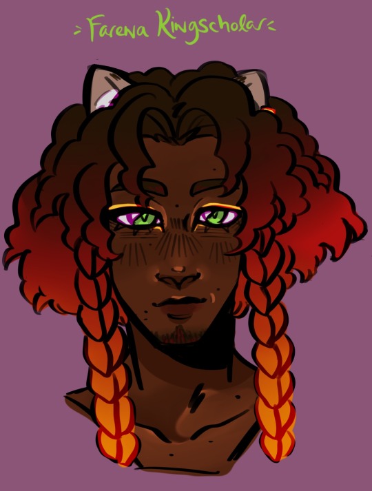
I woulda also made a design for his wife but I don' think she even has a name?? So maybe in the future.
- I based him more on Leona, trying to make sure that Cheka didn't just get his trait lmao. I think that he got his piercing actually after Leona got his because the palace staff were criticising him for it so Farena went and got one.
- I dunno, he's giving bi wife energy. It helps that the women of Sunset Savannah are buff and cool and I'm so mad we never saw them 😭😭😭 I wanna see Leona's sister-in-law so bad ;^;.
- He's not as much into the intellectual side of things like Leona is, would rather defeat people with strength which is why the two really don't get along super well. Though I think it's only perceived on Leona's side, I don't think Farena realises how much hurt Leona's had throughout his life.
- Angst aside, he doesn't get much in the way of free time what with all his royal duties and such. His favourite activities are spoiling his family and getting used as a weight for his wife's daily exercise!
We got even more other family characters incoming...
🐍Najima Viper🐍
(she/her) - Bicurious
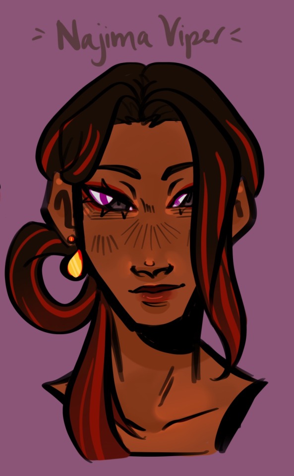
Fair warning, I haven't encountered any of the last three characters lol.
- I didn't change much here either, just added some red streaks to her hair and matched her palette to Jamil's.
- I don't know if her age is ever implied but I think she'd be younger than him by like a year. She went to a different school with Kalim's cousin (who they're like besties).
- I feel like Najima didn't get the same set of exceptions set on her growing up and so her relationship with the Al-Asims, while still not necessarily healthy, was nowhere near as damaging. I think that while Jamil definitely envies that, he'd rather die than make her go through the same thing as him.
Up next,
🧢Mama Spade🧢
(she/her) - Bisexual
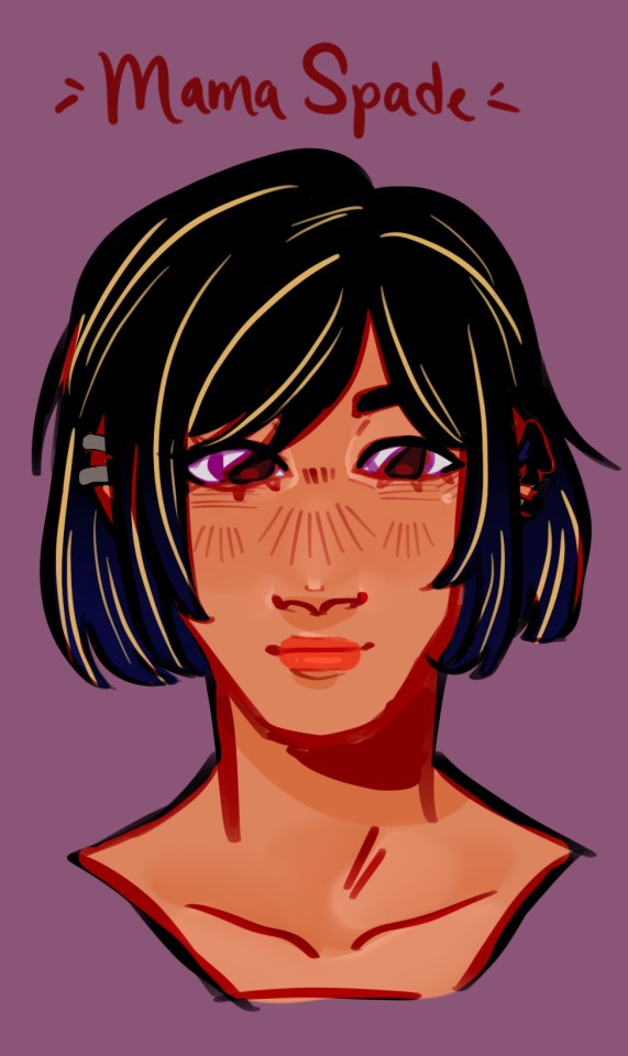
Never met her either 😭😭😭
- I based her off my Deuce design and really just added some more piercings. I actually toned down the blonde streaks but I think they'd both have just a few.
- I believe she has a small business??? Or something? I didn't read the wiki but her hat had a delivery service me thinks but I stan her having a small business.
- She loves her son very much and was super excited when she saw his new piercings. Also, super accepting when he came out, obvi and thinks that while Ace is a bit of a rascal, they do click together.
I don't have a ton for her but I want that event to come back pleaseeee 🙏🙏🙏
🐉Meleanor Draconia🐉
(she/they) Agender - Aromantic Pansexual
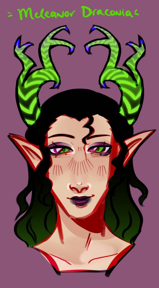
- I had so much fun with her horns. I made them more branchy and I think a full grown dragon (well, like an old one) would basically have a web of antlers. I added some purple to the tips for the 🌸aesthetic🌸.
- Also added some wave to her hair. Malleus looked in her spitting image so I figured I'd give Levan's genes a chance lmao. They're also super tall, probably even taller than Mal herself and especially with the horns.
- I think she'd have left some things that Malleus ended up growing up with not realising they were from her, like a hair clasp, some assorted jewelry, a couple toys and items that Lilia gave him when he was old enough. Pieces of her for him to grow up with, y'know?
Anyways, I'm so sorry for this posting without anything lmao I was real tired last night! Prefect is next on the chopping block!
#god save me i’m in twsted hell#twisted wonderland#digital art#fanart#art#sunthyme#chenya#chenya twst#chenya twisted wonderland#neige leblanche#neige#twst neige#cheka kingscholar#twst cheka#farena kingscholar#najima viper#twst meleanor#meleanor draconia
122 notes
·
View notes