#I learned to toggle a button today!
Explore tagged Tumblr posts
Text
This post officially sponsored by undiagnosed ADHD and depression
107 notes
·
View notes
Text

꒰ ͙ ❄ MOVIN' ON . . . ꒱
a redirect theme by gordonramsei .

introducing MOVIN' ON , a redirect theme for users who have moved blogs and wish to redirect their users to their new url ! there are so many options with this theme to customize it and make it ur own . who said redirect pages have to be boring ? pls keep in mind this code does use javascript therefore is not a feasible option for use as a page . it also does not immediately redirect users , and has a user - directed experience with a button to navigate to the new url . as always , please let me know if u encounter any errors and i will troubleshoot asap !
if u intend on using this theme or just want to be a supportive hottie , please give this post a like and a reblog ! stay hydrated and be sure to pet a cute animal today ! mwuah ! 💕 💕 💕

ⅰ. THEME FEATURES .
accessible font size toggle that removes the script font for users with vision disability .
optional noise texture for the background with an opacity toggle to achieve ur ideal look .
optional noise texture for the sidebar img with an opacity toggle to achieve ur ideal look .
optional drop shadow for ur sidebar img .
optional blob that frames the sidebar img .
optional scribble that adds to the overall aesthetic .
single sidebar img sized at 225 x 150 px .
user directed experience that only redirects upon button click .
for a more detailed compilation of credits and features , please see the google doc containing the code .

͙ ❄ this theme is a patreon exclusive : want access ? consider signing up to join the fam - a - lam to get ur hands on this theme as well as my entire coding catalogue . click here to learn more !
source link directs to a live preview of MOVIN' ON .
#rph#rpt#rp theme#indie rp theme#supportcontentcreators#coding cabin#mine#rec#themes#redirect theme#for patreons#for patrons#had to change my previews bc tumblr kept blocking my vid previews :///
29 notes
·
View notes
Text
How I write my short stories
I posted this last week and only now realized that Tumblr deleted half the post before publishing. So here I am re-posting it :)
I felt like sharing my process for how I write (and plan) all my kpop smut for this blog 😀
I work in something called Notion, a project management tool. In it, I've set up my own dashboard specifically for this blog. In this post I'll share some screenshots and insights if anyone's curious 🙂
The screenshots will also reveal a few details about what you can expect next on this blog, if you pay close attention to them 😉
Overview
Unfinished stories to prioritize:
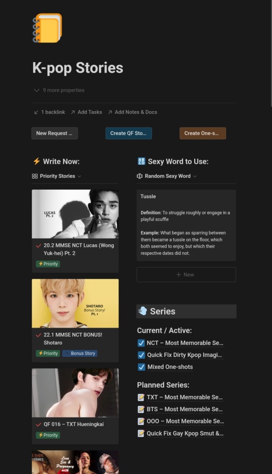
The very first thing I see when I open my kpop smut dashboard is a list of stories I'm currently working on, and which I should prioritize. These are the stories I need to finish as soon as possible because they've already been announced or planned for publishing.
If I click on a story it's opened on a new page, where I can write the first draft of the story before I move it to Tumblr. Tumblr doesn't have a good overview of many drafts which is why I do the majority of the work in Notion. I currently have maybe 30 individual un-written story ideas in my Notion story database 🙂
Requests:
See the little "Priority Stories" toggle near the top of the left side column? I can click this to change the list of stories I should focus on to "Requests", which will give me a list of all the requests I've received on Tumblr and which I plan on writing a story for. (Because I don't want to get your hopes up in case I never get to your request, I don't want to show this view in the screenshot.)
Series:
To the right in the above image, I have a list of my ongoing and planned series, which each have their own page for organizing and scheduling stories. Clicking a series will take me to its page where only stories belonging to that series are shown. I use this for planning the schedule of each series, for example my Most Memorable Sexual Experiences of NCT series.
Sexy Words:
Also in the right side column I have a random sexy word displayed, which changes each time I open the dashboard and which I use to inspire my writing 🙂 I try to learn and incorporate new words so not every story feels the same.
Quick Add Buttons:
Also notice the three buttons at the top – these are quick links I can click to easily add new stories to the database of shortstories that powers the dashboard, based on the series they belong to.
To-do's & Resources

To-do Lists:
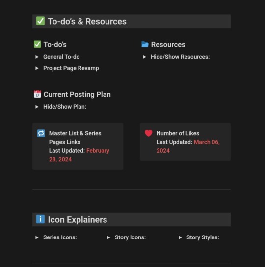
In the To-do's & Resources section, I have toggles where I keep various information I need frequent access to. This includes checklists for tasks I need to remember to do, like making specific changes to a certain story or editing something on Tumblr. I add tasks as I think of them and go through the checklist regularly.
Resources:
The second image above shows the Resources section. Here, I've saved links to articles I've come across and which I use for reference and inspiration. How many ways are there to say the word "penis"?
Current Posting Plan:
This section, seen in the first image above, hides a calendar view of all my scheduled and published stories on Tumblr. I use this view to plan and space out content. For example, I checked it before publishing this post to ensure I'm not also posting a smut story today.
Ideas & Works in Progress
Ideas:
The dashboard features an Ideas section (not shown in the screenshots because I don't want to reveal too much). In this section I can filter through the many story ideas I've spontaneously added to the dashboard, to help myself plan what I should work on next.
Works in Progress:
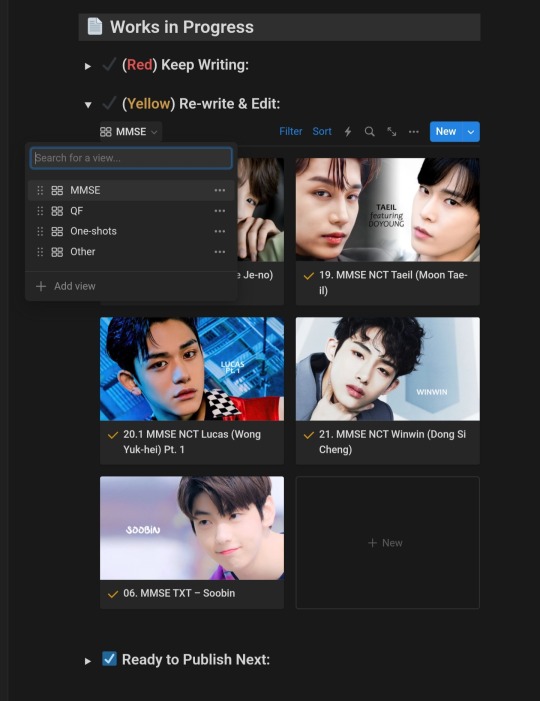
In the section shown in the image above I am able to filter through stories based on how far I've come in writing them. I can check stories I've started writing but not yet finished the first draft of, drafts I need to re-read and edit, and stories that are done and ready to be scheduled on Tumblr.
Notice the menu in the image (MMSE, QF, One-shots, Other). Here, I can select an option to view only stories from a specific series. For example, the stories shown in the image are MMSE (Most Memorable Sexual Experiences) stories where I have finished writing the first draft of but still need to edit and proofread.
All Published Stories
The final section of my dashboard shows all stories I've already published (or scheduled to be published) on Tumblr. Here, I can filter through all the stories for various purposes.
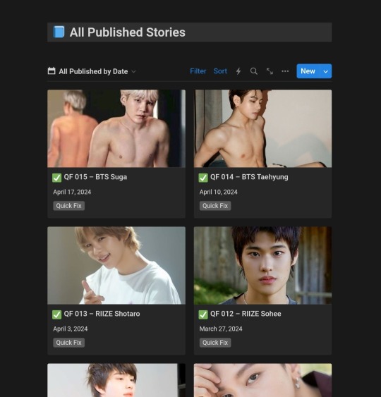
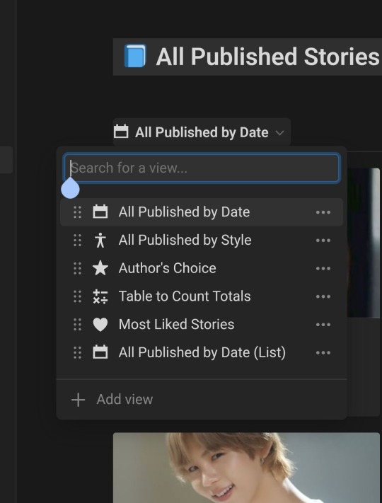
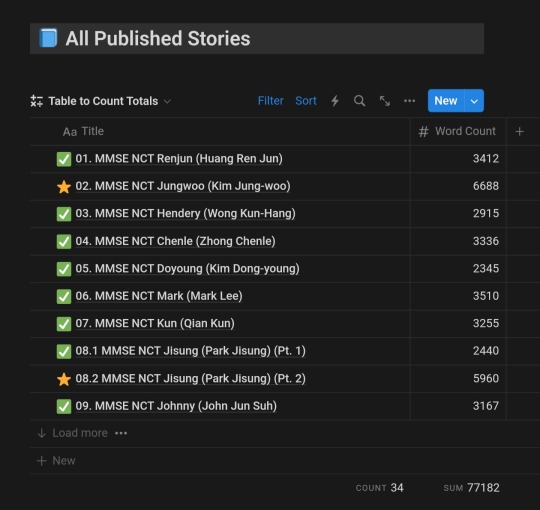
Different Views:
As shown in the second image, I have a drop-down menu where I can choose how I view the published stories. The views include:
All Published by Date: A gallery showing the most recent stories first (like in the first image).
All Published by Style: A gallery in which stories are grouped by the style of sex they contain (Vanilla, Medium, Wild, etc.)
Author's Choice: My own personal favorites. Not sure why I have this feature, but might do something with it in the future.
Table to Count Totals: A table list of all published stories that shows the word count per story and total number of stories I've published. This is the view you see in the third image above. Notice the totals in the bottom right corner: I'd published 77,182 words at the time the screenshot was taken.
Most Liked Stories: A list of all published stories, sorted by the number of likes they've received on Tumblr. This gives me insights into what types of stories you guys love the most.
So there you have it, just a little quick insight into how I plan, organize, draft and schedule all the smut you enjoy on this blog 🙂
8 notes
·
View notes
Text
Invoker Commands: Additional Ways to Work With Dialog, Popover… and More?
New Post has been published on https://thedigitalinsider.com/invoker-commands-additional-ways-to-work-with-dialog-popover-and-more/
Invoker Commands: Additional Ways to Work With Dialog, Popover… and More?
The Popover API and <dialog> element are two of my favorite new platform features. In fact, I recently [wrote a detailed overview of their use cases] and the sorts of things you can do with them, even learning a few tricks in the process that I couldn’t find documented anywhere else.
I’ll admit that one thing that I really dislike about popovers and dialogs is that they could’ve easily been combined into a single API. They cover different use cases (notably, dialogs are typically modal) but are quite similar in practice, and yet their implementations are different.
Well, web browsers are now experimenting with two HTML attributes — technically, they’re called “invoker commands” — that are designed to invoke popovers, dialogs, and further down the line, all kinds of actions without writing JavaScript. Although, if you do reach for JavaScript, the new attributes — command and commandfor — come with some new events that we can listen for.
Invoker commands? I’m sure you have questions, so let’s dive in.
We’re in experimental territory
Before we get into the weeds, we’re dealing with experimental features. To use invoker commands today in November 2024 you’ll need Chrome Canary 134+ with the enable-experimental-web-platform-features flag set to Enabled, Firefox Nightly 135+ with the dom.element.invokers.enabled flag set to true, or Safari Technology Preview with the InvokerAttributesEnabled flag set to true.
I’m optimistic we’ll get baseline coverage for command and commandfor in due time considering how nicely they abstract the kind of work that currently takes a hefty amount of scripting.
Basic command and commandfor usage
First, you’ll need a <button> or a button-esque <input> along the lines of <input type="button"> or <input type="reset">. Next, tack on the command attribute. The command value should be the command name that you want the button to invoke (e.g., show-modal). After that, drop the commandfor attribute in there referencing the dialog or popover you’re targeting by its id.
<button command="show-modal" commandfor="dialogA">Show dialogA</button> <dialog id="dialogA">...</dialog>
In this example, I have a <button> element with a command attribute set to show-modal and a commandfor attribute set to dialogA, which matches the id of a <dialog> element we’re targeting:
Let’s get into the possible values for these invoker commands and dissect what they’re doing.
Looking closer at the attribute values
The show-modal value is the command that I just showed you in that last example. Specifically, it’s the HTML-invoked equivalent of JavaScript’s showModal() method.
The main benefit is that show-modal enables us to, well… show a modal without reaching directly for JavaScript. Yes, this is almost identical to how HTML-invoked popovers already work with thepopovertarget and popovertargetaction attributes, so it’s cool that the “balance is being redressed” as the Open UI explainer describes it, even more so because you can use the command and commandfor invoker commands for popovers too.
There isn’t a show command to invoke show() for creating non-modal dialogs. I’ve mentioned before that non-modal dialogs are redundant now that we have the Popover API, especially since popovers have ::backdrops and other dialog-like features. My bold prediction is that non-modal dialogs will be quietly phased out over time.
The close command is the HTML-invoked equivalent of JavaScript’s close() method used for closing the dialog. You probably could have guessed that based on the name alone!
<dialog id="dialogA"> <!-- Close #dialogA --> <button command="close" commandfor="dialogA">Close dialogA</button> </dialog>
The show-popover, hide-popover, and toggle-popover values
<button command="show-popover" commandfor="id">
…invokes showPopover(), and is the same thing as:
<button popovertargetaction="show" popovertarget="id">
Similarly:
<button command="hide-popover" commandfor="id">
…invokes hidePopover(), and is the same thing as:
<button popovertargetaction="hide" popovertarget="id">
Finally:
<button command="toggle-popover" commandfor="id">
…invokes togglePopover(), and is the same thing as:
<button popovertargetaction="toggle" popovertarget="id"> <!-- or <button popovertarget="id">, since ‘toggle’ is the default action anyway. -->
I know all of this can be tough to organize in your mind’s eye, so perhaps a table will help tie things together:
command Invokes popovertargetaction equivalent show-popover showPopover() show hide-popover hidePopover() hide toggle-popover togglePopover() toggle
So… yeah, popovers can already be invoked using HTML attributes, making command and commandfor not all that useful in this context. But like I said, invoker commands also come with some useful JavaScript stuff, so let’s dive into all of that.
Listening to commands with JavaScript
Invoker commands dispatch a command event to the target whenever their source button is clicked on, which we can listen for and work with in JavaScript. This isn’t required for a <dialog> element’s close event, or a popover attribute’s toggle or beforetoggle event, because we can already listen for those, right?
For example, the Dialog API doesn’t dispatch an event when a <dialog> is shown. So, let’s use invoker commands to listen for the command event instead, and then read event.command to take the appropriate action.
// Select all dialogs const dialogs = document.querySelectorAll("dialog"); // Loop all dialogs dialogs.forEach(dialog => // Listen for close (as normal) dialog.addEventListener("close", () => // Dialog was closed ); // Listen for command dialog.addEventListener("command", event => // If command is show-modal if (event.command == "show-modal") // Dialog was shown (modally) // Another way to listen for close else if (event.command == "close") // Dialog was closed ); );
So invoker commands give us additional ways to work with dialogs and popovers, and in some scenarios, they’ll be less verbose. In other scenarios though, they’ll be more verbose. Your approach should depend on what you need your dialogs and popovers to do.
For the sake of completeness, here’s an example for popovers, even though it’s largely the same:
// Select all popovers const popovers = document.querySelectorAll("[popover]"); // Loop all popovers popovers.forEach(popover => // Listen for command popover.addEventListener("command", event => // If command is show-popover if (event.command == "show-popover") // Popover was shown // If command is hide-popover else if (event.command == "hide-popover") // Popover was hidden // If command is toggle-popover else if (event.command == "toggle-popover") // Popover was toggled ); );
Being able to listen for show-popover and hide-popover is useful as we otherwise have to write a sort of “if opened, do this, else do that” logic from within a toggle or beforetoggle event listener or toggle-popover conditional. But <dialog> elements? Yeah, those benefit more from the command and commandfor attributes than they do from this command JavaScript event.
Another thing that’s available to us via JavaScript is event.source, which is the button that invokes the popover or <dialog>:
if (event.command == "toggle-popover") // Toggle the invoker’s class event.source.classList.toggle("active");
You can also set the command and commandfor attributes using JavaScript:
const button = document.querySelector("button"); const dialog = document.querySelector("dialog"); button.command = "show-modal"; button.commandForElement = dialog; /* Not dialog.id */
…which is only slightly less verbose than:
button.command = "show-modal"; button.setAttribute("commandfor", dialog.id);
Creating custom commands
The command attribute also accepts custom commands prefixed with two dashes (--). I suppose this makes them like CSS custom properties but for JavaScript events and event handler HTML attributes. The latter observation is maybe a bit (or definitely a lot) controversial since using event handler HTML attributes is considered bad practice. But let’s take a look at that anyway, shall we?
Custom commands look like this:
<button command="--spin-me-a-bit" commandfor="record">Spin me a bit</button> <button command="--spin-me-a-lot" commandfor="record">Spin me a lot</button> <button command="--spin-me-right-round" commandfor="record">Spin me right round</button>
const record = document.querySelector("#record"); record.addEventListener("command", event => if (event.command == "--spin-me-a-bit") record.style.rotate = "90deg"; else if (event.command == "--spin-me-a-lot") record.style.rotate = "180deg"; else if (event.command == "--spin-me-right-round") record.style.rotate = "360deg"; );
event.command must match the string with the dashed (--) prefix.
Are popover and <dialog> the only features that support invoker commands?
According to Open UI, invokers targeting additional elements such as <details> were deferred from the initial release. I think this is because HTML-invoked dialogs and an API that unifies dialogs and popovers is a must-have, whereas other commands (even custom commands) feel more like a nice-to-have deal.
However, based on experimentation (I couldn’t help myself!) web browsers have actually implemented additional invokers to varying degrees. For example, <details> commands work as expected whereas <select> commands match event.command (e.g., show-picker) but fail to actually invoke the method (showPicker()). I missed all of this at first because MDN only mentions dialog and popover.
Open UI also alludes to commands for <input type="file">, <input type="number">, <video>, <audio>, and fullscreen-related methods, but I don’t think that anything is certain at this point.
So, what would be the benefits of invoker commands?
Well, a whole lot less JavaScript for one, especially if more invoker commands are implemented over time. Additionally, we can listen for these commands almost as if they were JavaScript events. But if nothing else, invoker commands simply provide more ways to interact with APIs such as the Dialog and Popover APIs. In a nutshell, it seems like a lot of “dotting i’s” and “crossing-t’s” which is never a bad thing.
#2024#API#APIs#approach#Articles#attributes#audio#chrome#command#CSS#custom properties#deal#details#dialog#event#Events#experimental#eye#Features#firefox#how#HTML#it#JavaScript#learning#LESS#listening#logic#loop#mdn
0 notes
Text
How to Get Rid of AirPlay on Lock Screen: Your Ultimate Guide

Introduction Are you tired of AirPlay notifications cluttering your lock screen? At Rewirelessify, we understand the importance of a seamless user experience. In this comprehensive guide, we'll show you how to remove AirPlay controls from your iPhone's lock screen, allowing you to enjoy your device without distractions.
How to Get Rid of AirPlay on Lock Screen
AirPlay is a powerful feature, but its controls on the lock screen can sometimes be intrusive. Here's how to remove them: Step 1: Access Control Center Settings Open the "Settings" app on your iPhone. Scroll down and tap "Face ID & Passcode" or "Touch ID & Passcode," depending on your device. Step 2: Disable Access on Lock Screen You'll be prompted to enter your passcode. Once authenticated, scroll down to find the "Allow Access When Locked" section. Toggle off the "Today View" and "Notification Center" options. This will prevent AirPlay controls from appearing on your lock screen. Step 3: Customize Control Center Return to the main "Settings" screen and tap "Control Center." Here, you can customize which features appear in the Control Center. To manage AirPlay, tap "Customize Controls." Step 4: Remove AirPlay from Control Center In the "Customize Controls" section, you'll see a list of available controls. Locate "Screen Mirroring" (AirPlay) and tap the red minus button next to it. This removes AirPlay from the Control Center. Step 5: Enjoy a Clean Lock Screen Exit the "Settings" app and lock your iPhone. Voilà! Your lock screen is now free from AirPlay distractions.
Frequently Asked Questions (FAQ)
Q1: Will Disabling AirPlay on the Lock Screen Affect Its Functionality? No, disabling AirPlay controls on the lock screen will not impact the functionality of AirPlay. You can still use AirPlay from Control Center or within apps. Q2: Can I Still Access AirPlay Easily After Disabling It on the Lock Screen? Absolutely. Although AirPlay won't be on the lock screen, you can still access it quickly through the Control Center. Q3: Will This Process Remove AirPlay Completely from My iPhone? No, this process only removes AirPlay controls from the lock screen and Control Center. AirPlay functionality remains intact.
Enhancing Your iPhone Experience
Congratulations! You've successfully learned how to remove AirPlay controls from your iPhone's lock screen. At Rewirelessify, we're committed to helping you optimize your wireless technology usage for a seamless and distraction-free experience.
Join Our Community
Stay connected with us and become part of our dynamic community on social media: - Facebook - Pinterest
Get in Touch
Have questions, suggestions, or feedback? We'd love to hear from you! Reach out to us through our contact page. At Rewirelessify, we're dedicated to providing expert insights and guidance for all your wireless speaker interests. Embark on a journey of sonic exploration with Rewirelessify today! Visit us at: rewirelessify.com Read the full article
0 notes
Text
On learning to love the way things fell part 9: putting things behind us
As expected, our target was still in the arena, and it was time to begin the heist. Beuregard was leading his staff the same way he always did, his Mr. Rime directing the water Phione swam through.
Brant’s job was to draw as much attention as he could, fortunately mythicals are rather apt for that. He and his Genesect worked away in what was less of a performance and more a chaotic mess that drew all attention to the center of the area. Beuregard retreated to the wall while the crowd above remained fixed on Brant. Now it was my turn to make a scene.
Bisharp kicked it off, being catapulted into the arena by Beheeyem’s psychic and planting a blade square in the face of Mr. Rime. Beheeyem and I were up next, lifting the Phione into the small tank on my back. It passed out instantly, the sleep powder mixed into the water working wonders. I left Beheeyem and Bisharp behind to cover me and took off.
Some of Beuregard’s staff gave chase out of the arena. Gardevoir cut them off a short distance behind me, using Double Team to flood the street with copies of herself and block any lines of sight. It worked better than expected. I was starting to get confident things would turn out okay. That feeling lasted right until I smacked face first into an invisible wall.
Beuregard’s Mr. Rime had been waiting for me, and I was now trapped by it’s screens. A familiar high pitched cry shook me out of my daze. It was Beuregard, carrying my barely breathing Beheeyem and wearing the emptiest expression I’d ever seen.
“Well done, I expected nothing less from one of Plasma’s finest.”
The box around me closed in.
“But I suppose you don’t have enough time for a nice chat do you? So why don’t you return my property?”
He picked up Beheeyem by the top of his head and shook him.
“Or you’ll learn why even Ghetsis was smart enough to never meddle in my affairs.”
He gripped tighter onto Beheeyem's head, laughing as I banged against the barriers.
“Don’t pretend to be worth more than you are. This wouldn’t be the first nor the third time I’ve started fresh. Nothing you can do to me will stick long enough to matter.”
As the dean gloated I noticed a spark of life in Beheeyem’s eyes. I motioned towards my pokeballs, mouthing Beuregard’s name at him. He used a soft pulse of power to click the button on Mr. Rime’s ball, withdrawing it. Beuregard seemed to think it was a technical glitch and sent him back out, not realizing that was exactly what I needed.
It’s ability kicked in, melting the barriers around me before it had a chance to warn its trainer. I withdrew Beheeyem from Beuregard’s clutches while Ditto took on his form, blasting Mr. Rime away with Signal Beams before using Wonder Room toggling to knock Beuregard off his feet.
Ditto pinned him there long enough for Brant to arrive and take him off our hands. We made our way to the hospital, and I collapsed as soon as the door closed behind me. We got the news not much later, it was everything we expected. Beuregard really had screwed up the discovery of a century. It wasn’t like he did this for some greater cause, it would’ve been comforting if his motivation was because he wanted to give it to Ghetsis. The fact that he didn’t need a real reason was what scared me the most.
Concordia had come out to the hospital to see things for herself, and joined me outside with my team once it was all over. We talked about neo plasma, Ghetsis, and how much more work there still was before today would be over. She pressed something into my hand and smiled, saying that at least now I wouldn't have to go at it alone. It was a Plasma Foundation crest, the mark of a full member.
0 notes
Text
HOW TO SAFELY LABEL YOUR POSTS DURING REYLO SMUT WEEK!!!! (We don't want to wake the tumblr gods)
Our goal will be to properly label all of our posts and reblogs. Sadly I think this means we will not be able to shortcut reblog event posts. It seems reblogs cannot change the Post Label so it will be up to the OP to adjust the settings on their old posts. So here's a guide for what things look like on both mobile and desktop and where they are.
EDIT 10/4/22:: Ok— so in today’s bugfix, reblogs CAN take labels but it may take several seconds to register. It is a notably delayed application to already posted reblogs especially, and there is no outward mark on the saved post that it has any sort of label on it so it’s difficult to tell when/if the label actually sticks. So my advice: set it and forget it! What more can we do? I’ll keep you guys posted if I learn more!
>>>Make sure your mobile app is updated to the latest version of Tumblr!! Or else you may not see all of these buttons! 😭
MOBILE VERSION:
When you start a new post, here's what the page looks like--

Notice this shiny new people button at the bottom circled in red- this is the new LABELS button. When you tap this button, here's what you see--
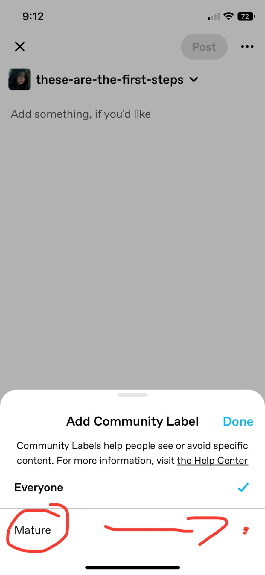
You have the 'EVERYONE' check box, and the 'MATURE' check box. Check 'MATURE', and now you'll see this---
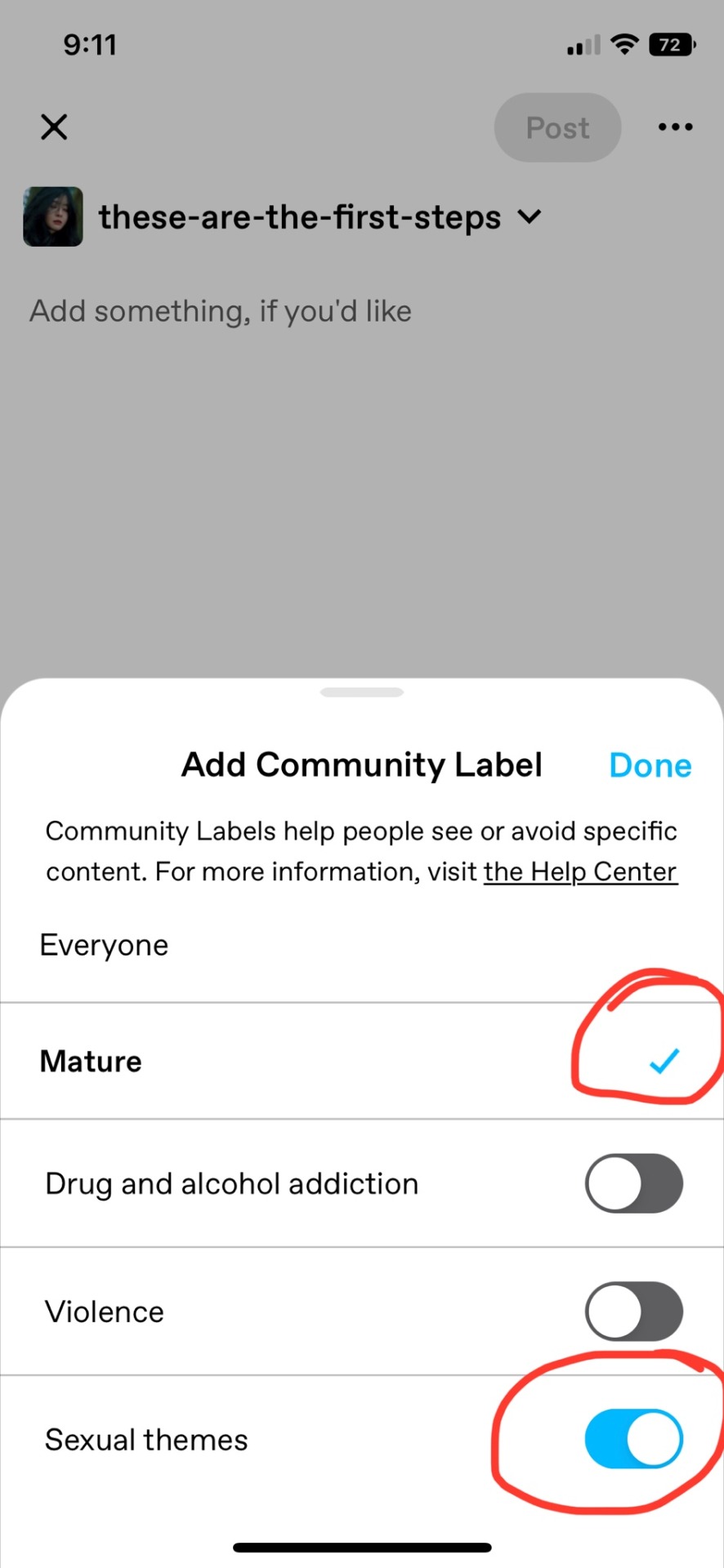
Make sure 'MATURE' is checked, and that you toggle on 'SEXUAL THEMES'. And then hit DONE. Now, your bottom bar will look like this---
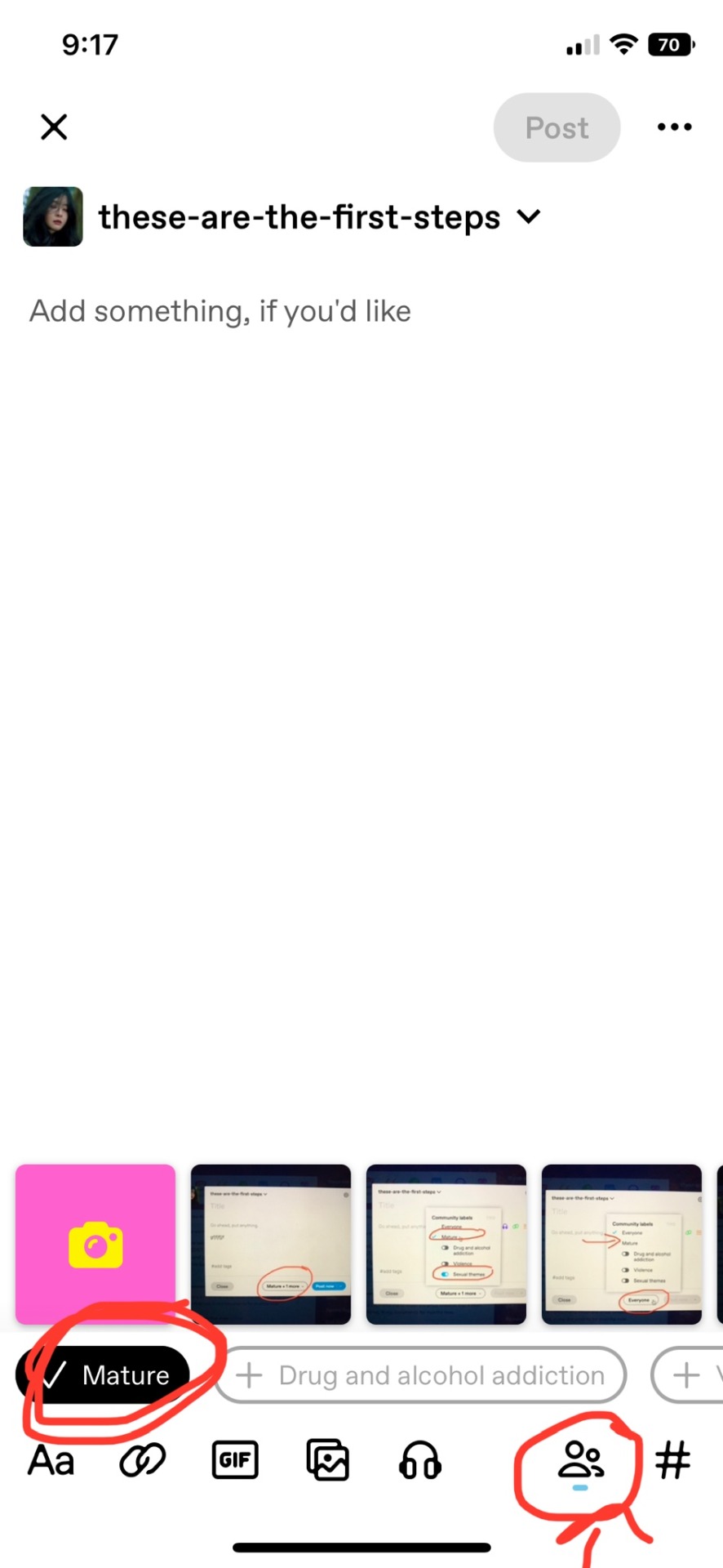
So, 'MATURE' is checked, and you can see labels are working because there's that insignificant blue line under the people icon now lol. ANYWAY, your post is now fit to post!! Don't forget to tag your post with #REYLOSMUTWEEK2022 and post away!! <3
DESKTOP VERSION::
When you start a new post, here's what the page looks like--
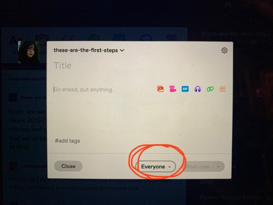
Hit the big fat circled 'EVERYONE' drop down, and your page will now look like this--

You have the 'EVERYONE' check box and the 'MATURE' check box. Make sure 'MATURE' is checked by clicking on it, and toggle on 'SEXUAL THEMES'. Click away from this drop down box and the drop down will now look something like this--

'MATURE' is clearly visible with the +1 indicating you've picked a specific label. Make sure you add #REYLOSMUTWEEK2022 to your post and your piece is finally fit to post!!
MAKE SURE!!
Along with this, make sure you go into your account settings and right there on the main account settings page you'll see your label controls. Make sure they look something like this so you don't miss any posts!
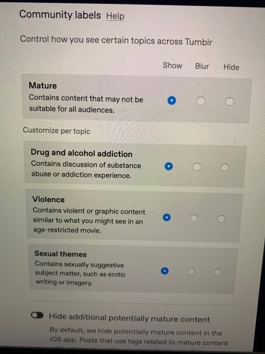
Alright, friends, that's all I've got!! I can't wait to see everyone's posts!! #REYLOSMUTWEEK2022 starts in about two hours!! And for anyone not interested in the smut renaissance, please do block the tag for this week. <3
See you soon, friends!!
51 notes
·
View notes
Text
Chill the fuck out, deviantART did a REALLY good thing.
No. Seriously. I did not expect to wake up to "deviantART invented a protocol to allow people to opt out of having their art used in AI training datasets" today. I genuinely was afraid something like that was going to take a lot longer. The finer details about the rollout strategy sucked, yeah, but that's about normal for dA...you'd think they'd learn better after years and years and years of every TOS update, major or minor, resulting in people flipping shit about them claiming enough right over your work to display it on a social art website as designed, but it can be like that with websites sometimes.
Because, here's the thing, the big ethical problem we had before, is that there was no way to opt out before. Posting shit damned near anywhere on the internet was, by default, treated as implicit consent. Which is not as evil as it sounds - again, despite a lot of claims, image generation AI is not "just a collage machine" any more than Photoshop is, until you get into the loudest and cruelest users it's a lot more comparable to how an art student would do studies and the big ethical question about it centers on how it can do those studies so much faster than a human and it's not very hard to use the right prompts to plagiarize and the machine doesn't know the difference between that and just figuring out how colors and brushstrokes work - but it is bad. There's no way around that, it's an absolute mess and really shouldn't be the way things run at this point in time, but that just gets into a whole can of worms about how the technology started and relative scales and all kinds of other factors that we don't have time to get into.
We have an opt out button now. We didn't before. This is big.
The ONLY real fuck-up is that...they ALWAYS fuck up the phrasing of these updates, don't they? Plus, defaulting to "turning implicit consent into explicit consent" was the method that would functionally change the least, yes, but also might have been the stupidest way possible when it comes to human behavior and etiquette. If I have a preference, especially a relatively common one, that someone NOT do something, even if they otherwise expect to be allowed to do it most places - say, "please don't wear this specific perfume when we get together" - I'd be pretty pissed if someone suddenly taped a sign to my forehead that EXPLICITLY said "ALL PERFUMES OK AROUND ME" and expected me to dig through a drawer of alternate signs to communicate otherwise, plus defaulting to EXPLICIT consent when a lot of the web is still operating on undeclared, hotly contested, ethically dubious implicit consent makes it sound like scraping data from people who have openly said "I wish I could opt out, is there a way to do that? Because I really want it, opt me out now" but haven't hit the right toggle yet is BETTER than scraping from other sources when you're compiling a dataset. So, that was stupid, and I'm glad they changed it.
But ultimately? This is good. We have an opt out flag. WE HAVE AN OPT OUT FLAG. This should be the bottom line we're all focusing on here. We have an opt out flag that is ENCODED INTO THE RELEVANT PAGE HEADERS. AND SEVERAL AI DEVELOPERS ARE RUSHING TO PROGRAM IN RESPECT FOR IT. THIS IS HUGE AND GOOD.
14 notes
·
View notes
Text
I was today years old when I learned that the snow toggle is a button up the top of the screen and you don’t actually have to run around looking for the capran to change it.
Totally haven’t been looking for that capran for days. Totally
#sso#the snow stays most of the time because it's pretty#but it does make certain druid missions near impossible so off it goes until I'm done
9 notes
·
View notes
Note
I thought of a good one today, how do you think your favorite slashers would react to their SO introducing them to a video game, something like super Mario or something
Oh dangity-dog
It'd be like my job but instead of kids, it's slashers HAHA!
I also added in the extra family members of these slashers so there can be a variety UwU
----
With the Hillikers a god damn nightmare!
Well, except with the three kids, the older teens Brother and Sister would be more easier to teach and you could leave them alone to their own devices, they'd be more quick at learning technology than their parents and pick up on consoles and how to work them.
They'd be down for any types of games but I see them enjoying the more explorative rpgs such as Elder Scrolls, Legend of Zelda, Minecraft etc. They'd love split screen games the most, where the two get to play together and work as a team.
Three-Toes though, get him into some combative multiplayers games like Stick Fight, Gang Beast or Fallguys and he's having the time of his life, scarily too good at these games and beats everyone with such ease, gets a bit of a big head a bout it so his screen time gets cut down a lot.
For the adults, 100% just stick them with something like Mario Kart, they struggle too much and giving them that simple switch controller and having them just press the toggle and go button is enough, heck even just the toggle and keep their character on auto drive as they're struggling enough.
But wii sports would actually be a favourite of Ma, Pa and One-Eye. Saw-Tooth doesn't care for games and refuses to get up for them, but the other three love wii bowling, especially Pa and One-Eye, or wii golf. Wii tennis and exercise are more Ma's thing, she will always grab her three children along to do wii sing or just dance with her, or she does it by herself late at night. Doesn't like her brothers joining in on just dance and sing as Pa gets too handsy and the other two One-Eye and Three-Fingers are morons and cause a ruckus.
Though Three-Fingers would give Stick Fight a go simply cause he enjoys how crazy fast it is and the noises of the guns, but always loses to Three-Toes and is actually a good sport about it, laughs like a complete hyena every time his little stick character is thrown across the screen.
They will never play PC games, that's too much for this family it's easier to stick them with consoles.
--------
With the Jupiter Clan (god knows whose s/o this is)
Ruby is probably the only one to respect the consoles and learn the fastest, she'd be into things like Animal Crossing, Minecraft or Untitled Goose Game, things that are cute and silly that would take her away from the rotten hell she lives in.
Will become game addicted for escapism, so its good to keep an eye on her and make sure she's having a fun time alone, especially away from her shitty brothers.
The ones who don't care for games the most would be Lizard, Papa Jupiter, Big Mama and Cyst, so showing any of them is going to be a struggle. Papa Jupiter being the worse, its best to just leave him be to whatever sick shit he's doing, while with Big Mama it's best to just set up reality tv shows on those consoles app add-ons and leave her be.
Lizard is the one you want to keep away from the consoles the most, especially if you're his s/o. He's too hotheaded and a sore loser, you'd never be allowed to beat him in anything, even in games that are not competitive, or he'll go apeshit if he fucks up and end up destroying the console, so for the machines safety keep him away.
Cyst just doesn't give a shit, though may play car games that aren't too stressful, something like Forza Horizon where he just gets to drive around looking at scenery.
Those who may appreciate it, but can't be too sure may be Goggle, Pluto and Big Brain, and the two kids Venus and Mercury who'd be pretty easy to get them a nice game like Mario Kart or Mario party.
Big Brain would be better of with a PC compared to any other member who would be better of taught with consoles, where he can be stuck with a variety of games and oh he would be trying them all from horrors, rpgs, competitive and those odd dating anime games, if anything he'd secretly play those and enjoy the puzzles to undress these pretty girls but turn it off so fast if anyone entered his room. Is a big reason why the PC gets so many viruses and you would have to monitor him heavily and block social medias so he doesn't end up getting into online fights.
For Pluto, getting him active on wii games is best for him, gets him moving and entertained, especially Just Dance, that man would go feral for Just Dance and be difficult to stop him until he exhausts himself out.
Now, for Goggle, video games are pretty enjoyable but not practical for him if anything sticking him with a mobile game like Candy Crush, Dragon City or Bejeweled would be better since he scouts so much out in the desert cliffs, and boy does he get into them. He has tried Pokémon Go but with there being absolutely nothing out in that desert he gave up. Definitely gets into Candy Crush like crazy that could make any suburban mother run for her money.
------
For Giorgio, something therapeutic and calming would be best for him, so I'd say Tetris or Bejeweled would be good for him, but on classic where he'll never have any timers or tasks to do that may risk him getting anxious in getting a task done quickly. It would definitely be a good distraction as well so you can go do basic chores around the castle.
And the last boy, Deacon.
I'd think he'd enjoy a mix of things like COD, God of War, Battlefield from hunting games to even games like deeeer and goat simulator, he's like most blokes with video games and tries all different types but would actually moderate his time than needing his s/o to moderate for him as he does get bored after about two hours of gaming.
Likes when his s/o joins him in splitscreen games though, the more you are by him the happier he is.
#just some killers having fun really#anon ask#anon answer#slasher asks#slasher answers#these really are my fave killers currently
13 notes
·
View notes
Text
SWTOR: It's. About. Story.
After weeks of complaints about the new Galactic Seasons program, the devs posted a response today. Unfortunately they managed to neatly sidestep almost all of the complaints players have been making en masse:
1. The PVE objectives funnel a lot of players into areas where the instances are too large for the map to accommodate, such as 30 players on CZ-198. It's thus making those areas miserable to play, and woe to anyone actually trying to complete story (such as Rishi and Yavin 4).
Solutions to this issue would be a) lower the number of players in each instance; b) distribute the objectives more broadly so players don't all converge on a few specific areas. EA/BW said nothing about the former and doubled down on making the objectives narrow for the latter, at least for the first season of GS.
2. The "RNG" for objectives is very heavily skewed toward PVP and GSF, which are activities many players dislike and do not want to do. It's not uncommon to have both GSF and Warzones come up as the day's POs, and there's only one re-roll.
3. Re-rolling any objective often results in GSF or PVP coming up again. There's only one, so that often means a player cannot complete their PO (s) for the day.
As solutions to #2 and #3, players have been asking for a) more re-rolls; b) a way to toggle mission preference between PVE, solo PVE and PVP objectives so they avoid the ones they hate and won't do.
4. There are no solo weekly POs.
It seems as though EA/BW is making a conscious effort to ignore all the feedback on what many players actually want from the game and the issues they've expressed both on the PTS and live, to try to push the play styles they - and a small clique of fans - personally favor. It feels to me that they are trying to force the game and the player base to be something they're not.
SWTOR was marketed as a story based game. Its core demographic comes largely from two single-player, story-based games: KOTOR and KOTOR II. When it was released it was praised for the richness of its storytelling, and the strength of its voiceover artists.
Not PVP.
Not raids.
Not GSF.
Story. Good, substantial story.
The writing on the wall is there with other EA/BW games, too. The next Dragon Age was changed from a MMO to a single-player game. Anthem, a game involving group play, failed. Fallen Order, a single-player story based game, did well.
Mass Effect and Dragon Age are a decade old. KOTOR is an older game, too. People still play them, and want more of them, because of the story.
Of course, EA/BW would love it if the SWTOR playerbase en masse learned to love PVPing and GSF. It's low-cost content for them. They don't have to do much; just provide the maps and let players kill each other. But that isn't why people play this game, overall. There are far better games for PVP, first-person shooters and space battles, if that is what one actually wants. Heck, there's an entire space battle Star Wars game, Battlefront II, if that is what one wants.
In SWTOR, it's about the story. It's about the characters.
Sometimes I feel like there are devs at EA/BW who are trying to do this with the resources they have, and I'm grateful for that effort. The swoop rally had short storylines and characters to talk with. Echoes of Oblivion brought us the best writing since KOTFE. They had a Mandalorian themed flashpoint that brought in a storyline for non-Force users. None of it was IMPS VS PUBS 4EVA!!! which was great. Even the Secrets of the Enclave was pretty good. While I dread what it may be setting up, and it's back to the IMPS VS PUBS 4EVA!!! treadmill which is boring and tedious as fuck, it was designed well and had some really excellent moments.
But...Spirit of Vengeance was designed initially at a level much more tedious, and requiring better gear, than usual story/solo flashpoints. GSF objectives get way more conquest points that anything else. Some mats are only available through ranked PVP or NiM Ops. And now, Galactic Seasons, which could have been brilliant but seems to be garnering more resentment, anger and lost subscriptions than anything else.
When is there engagement and interest in SWTOR? When does one see more people posting on the official forums? When do the planets seem busier? When there's new story or event that can be soloed.
What do people constantly ask for? New stories, new engagement with companions, new strongholds, new world building.
It's interesting that EA/BW never has to beg or bribe people to play the story. Players do it because they want to. Even KOTFE/KOTET, which are not super popular, do not require player bribes. The only story content people seem to avoid or revile en masse are the walker missions; Oricon, which needs two ops to be completed; and Makeb, which tellingly has no characters with which the player can bond and engage long-term.
The class stories? Still being played. I've been through the Sith Warrior story four times, with several clones at various points in the class story working their way through. I've been through the Sith Inquisitor story three times, again, with more clones coming up. Bounty Hunter? Three times, so far.. Smuggler? Twice, so far. Imperial Agent? Twice. I've repeated every class story at least once, and I still keep coming back to do the class stories and planetary stories and side quests, because they are good. Because I like the characters I meet. Because the planets are engaging.
Shadow of Revan? Still being played.
I still see people on Ilum. I see people on Onderon and Ossus. Even Zakuul and Iokath. The story content gets played, and played again. One of the things people have requested again and again, in fact, is a way to repeat the story content.
Voiceover artists are expensive, especially when three languages are being recorded, but players have offered ways to add engagement with companions without speech, such as emails from them. Silent missions. You don't need to have a voiceover artist to animate a short scene of Lana Beniko or Theron Shan dancing on the beach with a PC they've romanced. Even if they cannot keep up every romance, if they just kept up with Lana and Theron it would make players happy. Add in, let's say, four or six selected from the class stories - let's say Scourge, Kira, Quinn, Jorgan, Vette, Risha - and a lot of people would be overjoyed. Four men, four women; equal number from each faction + KOTFE. That does leave an uneven number of mlm/wlw possibilities but there are two of each, as well. And those companions can certainly have platonic friendly conversations with the PC, too. I personally really miss Vette, Talos, Xalek, Blizz, Ashara and Jaesa being in my story. And many others, too.
The things being offered by GS are things that story players enjoy - decos, new strongholds, companions with side story missions - and this makes it even more frustrating that story players are being expected to PVP, GSF and use Group Finder, unless they want to buy their way through, to get them. Don't get me wrong - the fact that it's all optional makes me less angry at EA/BW than Iokath and Oricon did, by a long shot. All the same, it's a shame they're setting it up this way, because if they gave story/solo players objectives that were not PVP and group based, I think they'd be seeing a lot more excitement and engagement right about now.
Right now, it seems EA/BW is far more interested in catering to a smaller player group who enjoys side content that the rest of the player base has to be actively bribed and coerced to play. Should PVP and GSF get development? Sure, if people enjoy it. Should the game try to funnel the rest of us into it? No. The fact that players don't want to be there, and have expressed that sentiment again and again, and constantly need to be bribed and coerced into it, should be a wakeup call. But EA/BW is still sleeping and hitting the snooze button.
SWTOR is a story-based game. Raids, PVP, GSF are all wonderful for those who enjoy them but they are not for everyone. Players in a story based game need story.
95 notes
·
View notes
Text
Pokémon Legends: Arceus, first impressions
Got the game today and played for about five hours, stopping after getting the Kleavor quest.
It more or less bears out what I expected in that it's a different kind of game than regular Pokémon, and that kind of game doesn't vibe with me as much as regular Pokémon. Wide open spaces in games mostly give me the persistent annoying feeling I've probably missed something somewhere all the time, and having to worry about button timings and dexterity and aim (God, I hate aiming) is mostly frustrating to me. These things are obviously not objectively bad qualities, just things I personally don't really enjoy, that I knew I wouldn't enjoy when I started.
On the other hand, despite this and that I have various actual gripes and complaints below the cut, I'm kind of enjoying it overall more than expected so far? There is a fun dynamism to having to watch out for Pokémon literally attacking you, being able to actually walk up hills and mountainsides is kind of magical, and the characters are more emotive than usual and I really appreciate that. Pokémon just existing in the field and behaving differently adds a lot of life. Most of all I like that there actually seems to be a fair amount of breathing room for different ways of playing the game. You can sneak up on Pokémon and try to aim a Pokéball at them, but you can also just engage them in battle and throw balls without the aim bit. You can catch a dozen of the same Pokémon to complete research, but you can also just battle a bunch of them to do it, or just catch one and have it use certain moves in battle - I appreciate that and it makes it a lot less annoying to do research tasks. I definitely all in all find myself wanting to play more of the game, which I wasn't sure about beforehand.
Also, somehow I already found and caught a shiny Bidoof? I thought Ultra Moon was the one game where I'd miraculously catch a shiny at like level 7 but no, apparently this is just a thing that happens to me now. (Reminder that like, I played my Gen II games and Sapphire for hundreds of hours each without ever seeing a single non-Red Gyarados shiny. I learned about shinies on the internet but for all I knew everyone could just be pranking me with rumours.)
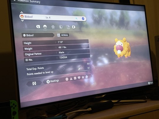
Complaining below.
I find the controls a lot more obtuse than they had to be even for a game with a more real-time bent than usual. It's theoretically a cute idea to have the same button for throwing empty and occupied Pokéballs, but gameplay-wise these are simply two fundamentally different actions and it's a bit maddening how easy it is to accidentally do the one you didn't want when they're mapped to the same trigger and have to be swapped between - absolutely no part of my game experience is better for the ability to waste my Pokéballs by throwing them at trees. (And why is X, a face button, something you use to swap between Pokémon and items, while the right trigger, something other parts of the game's own interface use to flip between different things, throws the ball?)
Also, I don't know if it's just me but the whole function to use the left trigger to focus on a Pokémon and see what research tasks you have for it seems so fiddly as to be useless and I pretty much gave up trying it? Which is already annoying me a fair amount because there are different research tasks for every Pokémon and remembering what they are or if you've completed the research for this species without manually checking every time you encounter a Pokémon is largely impossible. Wish you could at least like, toggle on/off the automatic display of a little bubble that'd appear above any Pokémon species in clear view, telling you whether you have outstanding research to complete on it.
Meanwhile, the process of initiating a simple battle with a wild Pokémon takes significantly more finesse and mental effort here than in a regular Pokémon game, which I'm sure is fun for many people but for me it's mainly just friction that makes it a little fiddlier and more annoying to get things done in the game. You even need to aim and make sure you have a Pokémon selected in order to collect resources in the field. It's not that much friction but it is friction. I do kind of enjoy the fact you actually use your Pokémon to get stuff, but heck, they could've done that for flavor while still making it happen when you just press A, you know? Godddd I just don't want to have to aim at things, aiming with a controller is the worst.
There are a lot of mechanics the game has sort of told me about but not really well enough for them to make any sense. Like, it's told me about throwing berries into the field to distract Pokémon, but when I throw a berry it seems to be giving off some sort of noxious odor and the Pokémon ignore it and then it disappears? I have no idea what that's supposed to mean. A guy enthusiastically told me a recipe for cake that's supposed to attract Dragon Pokémon, but what does that mean - like, do I have to throw it out in front of a Dragon Pokémon I already see, or does it cause them to spawn? Is it also going to disappear in like ten seconds like the berry? Very unclear.
Also I never really thought the game looked as terrible as people said from the previews but actually playing it on the TV, it does look pretty rough and I wish the graphics had at least a bit more polish.
16 notes
·
View notes
Text
FF6 Review (Overall)

I'm going to rate similar to the way I did FF7 Remake, but in only 2 parts, so there will be an overall review then a separate deep dive into the characters.
I played this game using an emulator and I'm not ashamed of it because I used the FF6 Relocalization project which I'll link
Basically nerd talk and explanation of what that means: It's basically a retranslation of the original SNES script using the GBA port as a base and mixing and matching some of the best parts so there you go. They have a way to mod the PC version to have the OG sprite work because sheesh is that thing ugly and they also have a way to resprite and resound the GBA version but this is the easiest and logical solution to get the best of all worlds. There's also "Anthology" which is the PS1 port that adds some CG custscenes which I just watched off of YouTube because it's only a few of the major scenes.
Anyways, yeah, I'm glad I emulated it especially because of the fast forward function. That first chunk would've been rough without it because you're left just waiting for one of your party's commands to be ready but it eases up as the game goes on because you get pretty busy with the combat.
I'm not a fan of turn-based RPGs which was the main reason I haven't touched a 2D FF game until now so this is my first and oh boy, what a first!
Could you just watch a playthrough or read the story then? I wouldn't recommend it. There are certain things that I feel are better experienced.
Gameplay actually wasn't all that gruesome, as I mentioned, it got better thoughout but I know for a fact that I didn't do everything it had to offer because I see other people doing it online and I just had no idea how. That's not to say it's not newcomer friendly though, I mean I beat the game, didn't I? I think it would've just gotten complicated and made me confused if I learned how to do everything in the game anyway.
I found myself liking some of the mechanics and recognizing some of the systems from games as late as today (I'm not sure if this is where they started but I wouldn't be surprised). The random encounters weren't all bad because of the emulator's speed up function but there were definitely times where it felt a little out of hand with the amount I was getting. (I'm looking at you Cave to the Sealed Gate!) So it's all pretty familiar, though there are "Relics" which are kind of like Materia but each member has 2 each where it gives you an ability, f.e. Reflect, every attack hits, extra power, auto cast protect, heal with every step, etc.
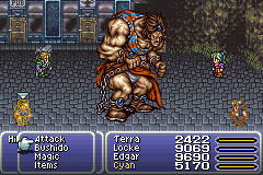
One of the drawbacks of using BSNES though was that there was no toggle for a L or R shoulder button, just turbo and while that's not a big problem, that is the button to Flee a battle, so I just never fled. There is an item that lets you escape any dungeon or battle but I didn't really use it, same with the permanent item that Mog has in the cave (pretty late in the game). I'd rather there be a repel than the warp stone, but I figured that if I just fought whenever the opp arrived then I wouldn't have to grind, which is another thing I hate about RPGs! Luckily, I didn't really feel the need to grind other than for the ending.
Difficulty wasn't really a grind but make sure once you get to the floating island, that you know what you're doing because that level was annoying and I felt a very stong spike in difficulty as soon as I landed on it. Another thing is that sometimes it'd glitch and an enemy would have infinite health so I'd just sit there on fast forward, watching and watching then finally use Libra and no damage was made, might be an emulator thing, might be a game thing and although rare, it still happened.
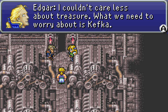
There are these sections called scenarios where the game branches off into multiple different paths and you can choose which order to follow the specific sets of characters. I really like that aspect and makes it seem less linear and interactive because it's letting you choose how to tell the story. I have a thing for games that let me interact with it (That opera scene is pretty interactive too).
For a 2D sprite game, it has quite a personality with its cutscenes. They can be very cinematic and defintely makes the characters just that more engaging with some of their mannerisms.
Ok, I get it now. The music is bomb. If anything, that would be worth doing a remake for, to get orchestral and updated versions of some of the themes. (I'd probably cry at that opera scene) But Celes' theme is probably my favorite. The PC port has pretty good remixes for the most part though.
Could this use a remake? It's a trivial matter because I think a good majority of fans want it to be remade and I understand why but at the same time I understand the other side of the argument as well. This was the last 2D FF game and that's special, in a way, the story kind of reflects that. And I think with all the personality comes a bit of caution because you might see something in these characters or scenes that may be misinterpreted or done differently in a remake, similar to how you read a book and just imagine how it's playing out. I think it lays enough ground so that you don't "have to interpret" like with most NES games (how the Super Mario Movie was born) from an outsider's point of view, it may first seem that way though. (myself included (yes, I know this was SNES era. Shut up!))
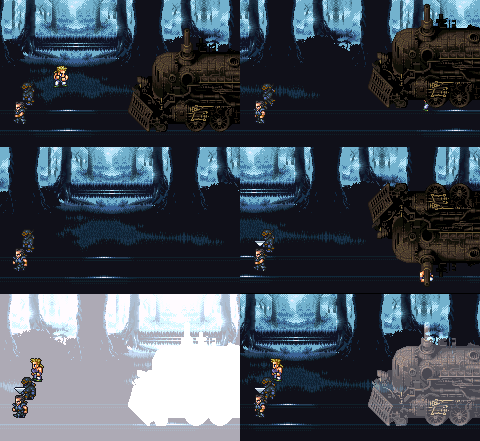
What would I want out of a remake? I would want the airship to return and be able to move around freely but keep the towns pretty faithful (which makes for more linear opportunities). I could see Edgar's tools being used similar to Barrett's but we have "First Soldier" now which is a 3PS Battle Royale, why not have his tools play similar to that? Then actually give him story opportunities to pick up his tools rather than "just because you bought them" It would be a nice natural progression. I would suggest the same with Sabin and Cyan, have them learn their Blitz and Bushido moves by being taught by Duncan, you do learn one move from Duncan in the vanilla game but I'd see it as more opportunity to build your characters and make it feel rewarded. So, in those aspects, I would like to see FF6 remade or improved but as for everything else, they should keep it a lot similar to the original than FF7R did. I think that's where a lot of the criticism with FF7R came from (as well as what I mentioned in the previous paragraph) While I'd prefer a gameplay overhaul similar to what they did with R, I'd rather keep the essence. There aren't sequels or spinoffs or anything of this game so this is all it has (unless you count the ports but that's minimal).
In the CHARACTERS section, I compliment the side-quest system but I would like there to be a better indication as to "what" you're doing, rather than just looking up the next steps or be left to travel around until the goal is clear. They have the quest completion menu as well as waypoints in FF7R, I could see that being put to good use in a game like this. It would also be cool to actually "visibly" wear the gear that you equip to your character but I understand why that isn't utilized in most of the games (probably makes for better character models) especially considering most of these characters' costumes could use an update. You didn't get to use the Magitek suits nearly as much as I thought you would from the marketing and even the dang cover and logo, so a remake could improve on that as well. Another small complaint is that it doesn't tell you what the items do WHILE you're in battle, only when you're in the menu, sorting them and while some are staples like Phoenix Down, I still don't remember what the heck a 'Gold Needle' does.
Overall I'd probably rate the FF games that I've played (but maybe not finished all of) as such: FF7 > FF13 > FF6 > CRISIS CORE > FF15 > FF12 but I think 6 and 13 are kind of interchangeable because if you said one over the other, I wouldn't really argue.
#ff6#final fantasy#review#ffvi#final fantasy 6#final fantasy vi#game review#game#it's also considered ff3 but nah
6 notes
·
View notes
Text

【 Okay, Gamer 】
❧ pairing: kozume kenma x gn!reader, slight kuroo x reader if you squint hard enough
❧ synopsis: who would've thought you'd meet the love of your life through fortnite?
❧ genres: fluff, e2l (the enemy phase being 5 seconds lMFAO), one-shot
❧ warnings: guns, shootings, violence all the stuff you do in a battle royale if that needs a warning???? oh, and cursing.
❧ word count: 2k-ish
❧ a/n: purely self indulgent hehe the things i'd do to game with this guy 🥴

Your fingers move swiftly across your controller, pressing the combinations of buttons that have been ingrained in your brain from muscle memory. Your eyes shift from left to right, focusing solely on the screen of your TV as you scan the large platform for the person who shot you earlier.
Gaining another shot from the right, you immediately toggle your left stick towards the sound of the gunshot, aiming for the pink haired player not far from you.
"SHIT!" You throw your controller out of frustration, seeing it bounce a few times on your bed before making its way onto the floor with a large thud.
"I'm knocked down by the tree, the enemy's literally at 15 health." You groaned through the microphone, picking up the controller back up as you hear a soft hum in reply.
You could see your partner making his way towards you, building up floors and ramps skillfully as he avoid the shots made by the other player earlier.
It doesn't take much time for your teammate to kill off the female character, various items of different colors dropping from her death to which he gathers immediately.
"Oh my God, you're really out here looting and healing first when your teammate is literally seconds away from dying?!" You yell, feeling more and more frustration pile up as you see your health bar becoming shorter and shorter.
"It's your fault that you got knocked down."
Your grip on the controller got tighter than before as you take a deep breath, holding in all the numerous curses plagued on your mind as of now.
"Username 'applepi', I swear to God if you don't get your ass back here and revive me, I'll come and haunt you in real life."
You hear a exasperated sigh from the other side of the call before seeing a purple and black skeleton running his way to the tree you're currently residing in.

The rest of the game went out just as bad as the start of it. He would fire shots aimlessly and pointlessly to attract enemies nearby, solely because he knows it'll piss you off. Of course, you can't just back down from his childish antics so you pay him back by following him everywhere and anywhere, stealing any weapons and materials he got on his sight.
"Hey, there's someone coming over towards your left."
"You already did that trick, try again next time."
"No, I'm serious-"
Bam!
And he's down.
"What the fuck?"
You couldn't help but obnoxiously snort at the sight of your teammate falling down to his knees, only being able to crawl and nothing else as he watches his health bar dwindling into nothing.
"Pfft- See! I-I fucking t-told you but you wouldn't even l-listen!" You stammer in laughter, clutching your stomach in pain. Tears are starting to form in the uppermost corner of your eye, your cheeks beginning to feel sore and chest heaving up and down uncontrollably.
"Shut up and revive me." The player behind your laughter said in an unamused tone. You could hear the aggravation behind his sighs, the sound of what seemed like a device or some sort being put down forcefully followed behind, leaving you in fits of blissful giggles.
Oh, how sweet that karma is by your side.

Top 3.
That's all it takes for the endless banter between you two to cease.
Your body is tense, not wanting to move a single inch from your spot, afraid that it'll wreck the whole game if you put any attention to anything else besides the ongoing match. Your hands are clammy, layered with sheets of sweat between your palm and the black controller you're gripping at, holding it tight as if it's your only hope in winning the game.
You rapidly toggle the small joystick, trying to aim for the player in front of you as you furiously press buttons to shoot and evade at the same time, taking a few shots in the process.
Pressing the R2 button a few more times, you finally knocked your enemy down, shooting them in the head to truly end them.
The green health bar located on the bottom side of your television has about a quarter of it left, causing you to move away from the enemy's sight, searching for a secluded place to refuge in.
Switching your shotgun into a red and white bandage, you heal yourself up, anxiously waiting for the timer to count down to zero to finish healing, hoping that no one comes to ambush you in the meantime.
Your heart thumps against your chest, caused by the surge of adrenaline through your body.
The timer ticks down to six when you get shot, all your remaining health diminishing in one go along with your energy and enthusiasm.
You see your shooter immediately make his way to your teammate, greedy for kills, leaving you to watch your character slowly die in all fours. You think it's a stupid mistake that they didn't finish you off but you're thankful for the chance given.
"Applepi, revive me!" You order frantically, your hope of winning the game slowly decreases as you see your fellow teammate's health at half, the sight of him frantically moving backwards to create distance between his two opponent tells you that he's having a hard time.
"We'll both die before I have the chance to revive you."
An aggravated sigh left your chapped lips as you watch one of the players close in on him.
"Well, you can't beat two players all on your-"
Before you can finish your sentence, soft party music suddenly booms from your speakers, a large blue banner with the writing 'Victory Royale' displaying on your screen. It is as if the gods above and he himself are playing with you, proving you wrong before you could even try.
"What did you say?" The male asks in fake innocence and you might be dreaming but you think that you can hear the slight smile in his husky voice.
You let out a small groan as the game cuts off to its loading screen, the voice chat between you and the quiet male ending.
Trying to fight off the disappointment growing in your heart, you take off your blue headphones, finally setting your controller down after what seems like hours.
Blinking the tiredness of your strained eyes, you give the in game menu a final scan.
As if all the negative emotions that you felt were never there, you hold back a smile, feeling a budding hope when you make out the words in front of you.
Applepi sent you a friend request!

You learned a lot of new things about your new friend.
You learned that his real name is Kozume Kenma, he's a year older than you and goes to Nekoma High, the school a few stops before yours.
You learned that he has blonde hair and ebony roots, along with gold slit eyes and small pupils that makes him resemble a cat.
You also learned that he uses the username 'applepi' because he loves apple pies, he's a quiet person in general, not just in game but in texts as well. Sometimes he surprises you, getting chatty and affectionate at rare times.
You screech out his name, the boy being mentioned having to wince at the loud sound from his headphones. You run around the grassy platform, avoiding the player coming for you at all cost due to your lack of good weapons.
Kenma watches you for a while, contemplating whether he should just leave you or actually save you.
He opts for the latter, he always does.
Rushing in with a stronger weapon than yours, he jumps through bushes and cars, avoiding anything that seems to block him. Turning left from the rocky road, the blonde male immediately shoots at a purple character near yours, focusing on aiming at the small figure faraway.
"You suck, Y/N." He points out, controlling his skeleton-like character to run towards you after finishing the last blow.
"Yet you always play with me anyways." You argue.
You know you hit the mark when he doesn't give you any sort of response.

Your lips curl up into a soft smile as you hear the boy you grow more and more fond of talk about today's practice.
You don't know how or when it happened but the hectic calls while gaming are slowly replaced by a more ordinary and intimate one instead. Insults about the other party's skills turns to subtle compliments and childish banters turn into curious questions about one's life.
You would be lying if you said you didn't like the change.
"So this Hinata guy just spikes without even looking at the ball?" You ask intriguingly, genuinely interested at the dynamic duo he had been telling you about.
"Uh-huh, he's amazing."
You let out a small giggle at his response.
He doesn't notice but the tone of his voice always seems to change when he's talking about the things he's passionate about. Whether it be the new game he started playing or even volleyball, when he played an intense match. It's a minuscule change but you notice it anyways.
A slight click of the door opening followed by one or two footsteps can be heard from Kenma's room, a sly voice resonating throughout the walls.
"Ah, is that your Fortnite girlfriend you're calling again?"
You can vaguely recall the voice belonging to Kuroo Tetsurou, one of Kenma's teammate whom you shared a few conversations with before, much to the blonde's dismay. Feeling a slight cringe upon hearing the tall athlete's words, along with a hint of envy, you choose to stay quiet as they talk.
"It's not. Get out of my room, Kuroo." The cat-like male spit out, black eyebrows furrowing in annoyance.
Kuroo's lips twitches up into a infuriating smirk, knowing full well of the ticking time bomb in front of him. He does as he was ordered to, stepping his foot out of his childhood friend's door.
Not before dealing a blow though.
"If you don't ask her out soon, I might just go and steal her, you know~?" The clever male goads before escaping out of the room.
Upon hearing those words, Kenma's mind goes into a havoc, his heart dropping down into his stomach.
He knows that you and Kuroo have been texting as well lately, the said man mentioning that he is in fact, quiet interested in you.
What are you bothered of anyways? People can get close to her however they'd like, he thinks, yet he feels all these negative emotions swirling around his head when he imagines you going out with the suave boy.
"Fortnite girlfriend?" You inquire, breaking his train of thoughts. You can't help the slight bitterness in your tone when you speak, though you're sure it goes unnoticed by the person you're speaking to.
"It's nothing, just ignore what he said."
Not satisfied with his answer, you push more, "Well, shouldn't you really ask her out? We can't let Kuroo be a step ahead of you, can't we?"
You try your hardest to play it as a joke, masking your jealousy with a cheerful and joking tone.
It is exactly this that gives Kenma the final push, giving him the last ounce of courage and guts that are needed to say his next line.
"Then Y/N, would you like to go to the cat café I mentioned about together this Saturday?"
Your mind short circuits, incompetent to form words and your eyes widen by a tenfold. To say that you are shocked would be an understatement
You can hear Kenma beginning to take back his words, scared that he's putting you in a difficult place or making you feel uncomfortable but before he can finish his words, you cut him off with a stuttered and loud 'yes!'
The Pudding Head smiles slightly at your agreement and before arranging his plans with you, he opens the messaging app on his phone, immediately texting the number one contact.
Kozume Kenma
I did it.
Kuroo Tetsurou
Took you long enough.
#haikyuu imagines#kenma x reader#haikyuu#kuroo x reader#kozume kenma#kuroo tetsurou#haikyuu x reader#haikyuu fluff#kenma imagines#kuroo imagines#haikyuu scenarios#haikyuu fics#i had to edit and proofread twice bcs tumblr didnt save my draft#so if this flops#i'm gonna SOB
135 notes
·
View notes
Text
How to Remove AirPlay from Lock Screen iPhone 11: Your Ultimate Guide

Introduction Are you tired of AirPlay controls cluttering your iPhone 11's lock screen? At Rewirelessify, we understand the importance of a clean and distraction-free user experience. In this comprehensive guide, we'll walk you through the steps to remove AirPlay controls from your iPhone 11's lock screen, allowing you to enjoy your device without interruptions.
How to Remove AirPlay from Lock Screen iPhone 11
AirPlay is a versatile feature, but having its controls on the lock screen can sometimes be unwanted. Here's how to remove them: Step 1: Access Face ID & Passcode Settings Open the "Settings" app on your iPhone 11. Scroll down and tap "Face ID & Passcode." Step 2: Disable Access on Lock Screen Enter your passcode to proceed. Scroll down to find the "Allow Access When Locked" section. Toggle off the options for "Today View" and "Notification Center." This will prevent AirPlay controls from appearing on your lock screen. Step 3: Customize Control Center Return to the main "Settings" screen and tap "Control Center." You can personalize the features displayed in the Control Center. To manage AirPlay, tap "Customize Controls." Step 4: Remove AirPlay from Control Center In the "Customize Controls" section, locate "Screen Mirroring" (AirPlay). Tap the red minus button next to it to remove AirPlay controls from the Control Center. Step 5: Enjoy an Uncluttered Lock Screen Exit the "Settings" app and lock your iPhone 11. Congratulations! Your lock screen is now free from AirPlay controls.
Frequently Asked Questions (FAQ)
Q1: Will Removing AirPlay from the Lock Screen Affect Its Functionality? No, removing AirPlay controls from the lock screen will not impact AirPlay functionality. You can still use AirPlay from the Control Center. Q2: Can I Still Access AirPlay Easily After Removing It from the Lock Screen? Absolutely. Despite not being on the lock screen, AirPlay can still be accessed quickly through the Control Center. Q3: Does This Process Remove AirPlay Completely from My iPhone 11? No, this process only removes AirPlay controls from the lock screen and Control Center. AirPlay functionality remains unaffected.
Enhancing Your iPhone Experience
Congratulations! You've successfully learned how to declutter your iPhone 11's lock screen by removing AirPlay controls. At Rewirelessify, we're dedicated to helping you optimize your wireless technology usage for a seamless and distraction-free experience.
Join Our Community
Stay connected with us and become part of our dynamic community on social media: - Facebook - Pinterest
Get in Touch
Have questions, suggestions, or feedback? We'd love to hear from you! Reach out to us through our contact page. At Rewirelessify, we're committed to providing expert insights and guidance for all your wireless speaker interests. Embark on a journey of sonic exploration with Rewirelessify today! Visit us at: rewirelessify.com Read the full article
0 notes
Text
High EPC's and Conversions During Testing With a Cold Segment and Limited Organic Traffic
Kboovo's Hybrid Marketing Engine
📷
Not just for beginners, Kboovo powers affiliates of ALL levels with powerful, reliable marketing software, innovative automation & convenient management tools that help to start, build & grow an online income...Even With ZERO Experience!
These sales are 99% from our own efforts testing to a small cold segment and some organic traffic that trickles in. We have yet to push this hard. These sales represent Trial, Monthly and Yearly options. Three of the refunds repurchased at the yearly option.
The Only TOTAL SOLUTION is Kboovo
📷
First, Kboovo is an extremely affordable all-in-one affiliate solution providing every single software tool, automated infrastructure and ongoing training. Even experienced affiliates will appreciate one click access to all these powerful tools.
This isn't just a bunch of marketing tools bundled together...
Everything in Kboovo is intelligently interwoven saving important details for use in later steps, it remembers what you do as it intuitively knows your next step making the entire affiliate marketing process easier, faster and as close to fail proof as you can get.
KBOOVO REVIEW WHAT IS IT
Kboovo powers affiliates of ALL levels with powerful, reliable marketing software, innovative automation & convenient management tools that help you to start, build & grow your online income…Even if you have ZERO Experience.
Today, more than 80% of all online businesses and 92 % of all online websites incorporate affiliate marketing. Nearly 20% (2 out of 10) of all purchases made online globally comes from affiliate marketing. Affiliate marketing will become a $10 billion industry by the end of 2021 and has grown 52% annually for the past 5 years. Google searches for the term “Affiliate Marketing” is at an all time record high.
The Problem for Beginners: Finding up to date legit training thats goes beyond just basics, Having to buy multiple costly tools to implement the training, Even with todays tech, beginners still face Infrastructure barriers. NONE of those above provide anything close to a total solution and mostly just leave beginners feeling jaded: Affiliate website builders don’t offer a total solution, Affiliate training courses don’t provide it either, Affiliate courses that have some basic tools are far from complete, Affiliate training forums and membership sites definitely don’t cut it. Many of these lesser options are outdated, not supported and not a product that the creator ever intended on building upon, supporting or growing. With two out of every ten purchases being made through websites monetized with affiliate links now is the most opportune time ever for you to get involved with affiliate marketing. Not only because of those statistics, but because you’ve also found Kboovo.
You can use Kboovo to effortlessly….
Research & find more potentially profitable keywords to tackle
Find and Instantly add more related top selling products
Add more monetization methods like Google AdSense
Monitor social media signals to maximize traffic and exposure
Create other related websites/domains to help boost the project
Create more landing pages and lead funnels
You can see at a glance how your affiliate sites are performing and do all or any of the above from one single place, without opening multiple tabs or tools and without having to toggle back & forth. You can’t get this kind of efficiency with any other affiliate marketing platform. Kboovo can take a days worth of your efforts and whittle it down to just a couple hours or less. When you’re this efficient, you don’t have to settle with the income from just one website. Get practically everything you do with affiliate marketing done faster, easier and more conveniently without boundaries. You can now manage all your affiliate projects more efficiently than ever before all from one dashboard. Not only will your productivity increase but your earnings will soar, or you can trade all the time you save for a nice relaxing break. Get more done in way less time with innovative automation that will accelerate your business growth and your income. Get It Now.
KBOOVO REVIEW FEATURES
📷
Beginner to Advanced Perpetual Affiliate Marketing Training
Get the Essential Software Thats a MUST for ALL Affiliate Marketers
SEVEN Different Ways to Easily Monetize Your Affiliate Websites
SEO Training From One of Todays Top Search Engine Specialists
Includes the Ranking POWER of SEnuke COMING SOON!
Discover Funnel Marketing with Included Point & Click Funnel Builder
Affiliate Management Features that Help Your Grow Your Business
Free WordPress Hosting for Your Affiliate Website
All Technical Barriers Eliminated Through Marketing Automation
You Get Full Access Nothing Else to Buy or Upgrade to Make it Work
Nothing for You to Download, Install or Update…Ever!
WHAT KBOOVO REVIEW CAN DO FOR YOU
📷
Affiliate & Digital Marketing Training: First ever software assisted training to take you from beginner to advanced along with SEO training from an industry expert. With Kboovo’s Perpetual Training you will always have the latest strategies and methods. Your training will never end for as long as your are a member.
Keyword Research Suite Powered by SEMrush: It gives you an entire suite of powerful keyword & niche research tools built right in. You’re no longer stuck having to buy separate outdated sub par research tools, SEMrush provides you with the most reliable search data available that is both recent and accurate.
Complete Domain & SiteSetup Automation: No more technical barriers to hold you back. With Kboovo’s innovative marketing automation complicated things like domain registration, DNS setup, installing WordPress are done for you in just a few clicks!
Easily Monetize Any WordPress or WooCommerce Theme in Minutes: Kboovo includes SEVEN methods of monetization with more being added all the time.. Easily monetize WordPress or WooCommerce themes with top selling products from: some of the biggest online retailers and affiliate networks.
Create Your Own Funnels with the Point & Click Funnel Builder: Discover how to create profitable marketing funnels with this easy to use point & click funnel builder. Loaded with a variety of customizable templates. Integrated with all of the most popular payment options.
KBOOVO REVIEW FREQUENTLY ASKED QUESTIONS
📷
Is Kboovo a Site Builder? Heck No! Automated site builders don’t work, they all know that. Yes, you can get a cookie cutter site in 60 seconds loaded with duplicate content just like everyone else who owns the same product with probably the EXACT same site you got from pushing a button. This isn’t affiliate marketing. Think about it, if any of those were actually effective (and there’s lots of them). It probably would take the net by storm and everyone would be wealthy…sorry, there are no shortcuts. You can streamline and automate the affiliate process to make it as easy and fast as possible, just like they have done with Kboovo, but it can never be fully automated AND still remain effective. Kboovo is an affiliate & digital marketing platform that does everything marketing BUT that. It doesn’t create websites, but it will automatically setup your website infrastructure, things like your domain, cPanel installation or complete WordPress install, including all plugins. In other words, it sets up your website, but it will still need your personal touch to customize logo, colors etc. The new WordPress editor makes basic customizations pretty simple to do and they provide some basic instruction, so they know that you got this. But If you give it an honest try and still can’t really get it, open a helpdesk ticket and they will see if they can help with any basic customizing issues.
Do I Pay Monthly for Kboovo Membership? Yes, It is a paid monthly membership. You get full access to all the tools, training and resources that it provides for one low monthly cost. They get to keep the software running smoothly for you as well as adding more marketing features, ongoing training and just some really cool exclusive stuff. If you were to individually purchase all the training, software, plugins and management tools that Kboovo offers, you would be looking at an upfront cost of more than $794 and a monthly cost of $400. That upfront cost alone would be more than three years of a Kboovo membership. (yearly plan)
Am I Guaranteed to Make Money with Kboovo? No one can guarantee that and If you see a claim like that, leave the page instantly as you are guarantee to LOSE money. Your success will depend on factors that are beyond their control such as time, how much effort you put in, following the instruction exactly as intended, your niche selection etc. lots of things. You must walk before you can run, so don’t expect to see results overnight, that only happens with paid ads and even then, you need to walk first. Your training is provided by a 20 year Super Affiliate & SEO industry expert, you will be learning the same strategies he uses daily. Although they don’t guarantee anything, there is no reason why you shouldn’t see some type of results.
If you have followed the training as intended and you are still not seeing ANY results. They will look at what you got going on to see if they can help. They may even tell you to scrap the project and start over, it happens, even with them. But if you are really trying and putting in effort, they will do their best to help you out.
Do I need to Buy My Own Hosting? No not right yet. It provides you with top tier WordPress hosting on LiquidWeb lightning-fast servers. They have been with LiquidWeb for more than two decades…if they weren’t THAT good, they wouldn’t still be with them. It will host your first affiliate website at no cost, on their servers. Why only one website you ask? It’s all ANY aspiring affiliate marketer needs to find out if affiliate marketing is right for them or if have only limited resources till they begin to see results. On the other hand, if you have the resources and you are committed to your goal of becoming a successful affiliate marketer then having your own server from the start is a smart business move. After all, it will be the backbone of your online business now and into the future…well, besides Kboovo.
📷
Do I Have to Host My Sites with Kboovo? No, it makes self-hosting easy. You can add your own server in just a few clicks to host your affiliate websites on and still have complete Kboovo functionality!
#Kvoobo#Khoob preview#software#kboovo review#kboovo hybrid affiliate marketing engine#kboovo demo#affiliate marketers#kboovo bonus
1 note
·
View note