#I just got CSP for the first time so I'm experimenting
Explore tagged Tumblr posts
Text

A certain interaction made me..,,, emotion al.
#angel duo#tommyinnit#philza#ph1lza#mcyt#dsmp#tommy smp#my art#mcyt fanart#tommyinnt fanart#philza fanart#I just got CSP for the first time so I'm experimenting
2K notes
·
View notes
Note
Hey, I was wondering if you had any starter tips for digital art? I'm a traditional artist and have been for years, but I was recently given a tablet and clip studio. I am having SUCH a hard time getting anything to look right: shaky lines, flat/too soft pieces, just an absolute childish mess every single time. I see all these gorgeous digital pieces and have NO IDEA how to get there.
Heya!
So, it's been a very very long time since I transitioned from traditional to digital art, but I DID do proper traditional for a few years; we're talking ink pens, color pencils, markers, watercolor, fancy papers, the works. I did some acrylic painting too but only monochrome (and before anyone asks, these works no longer exist so I can't share them) all that to say that I do have some experience with the former and definitely felt the learning curve when I changed to a tablet.
To get the unhelpful advice out of the way first: It's a different and unfamiliar medium, and there is probably nothing significant that you're "missing" about it except time and exploration. There are pillars to digital art just like there are in traditional art, but when it comes to personal process everyone has their quirks and habits - you gotta mess around and find what works for you. I suggest looking up tutorials and speedpaints on youtube even if you know all the basics or if the style you see doesn't appeal to you; just watching how others do their thing might help you figuring out how you would like to do yours!
Now, for the more practical advice:
-I don't know what kind of tablet you got, but assuming it's a non display, that's an extra hurdle you have to get over in developing the eye-hand coordination necessary to use it. This feels very alien at first but it shouldn't take longer than a few weeks to feel completely natural.
-On that note, if there is a significant size discrepancy between the tablet and the screen you are looking at, that might mess you up. Try adjusting the size of the CSP window so it fits the size of the actual drawing surface you are using more closely.
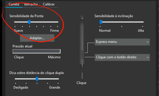
-Every drawing tablet's pen has pressure settings that can be tweaked to your liking, I for one always make it a little softer than the default.
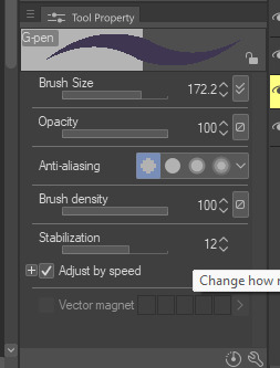
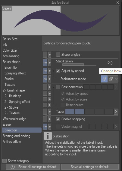
-BRUSH STABILIZATION! That's a setting every individual brush (and almost every tool, I believe) on CSP has. It does as advertised: stabilizes your brush strokes. A lot of people like this set between 8-20 depending on the brush, and it can make a huge difference to the way you draw.
It is usually always visible in the tool properties, but if not, you can toggle it on through the "sub tool details" menu by clicking the little wrench symbol on the bottom right.
Hopefully this has been helpful at all. Good luck!
200 notes
·
View notes
Text
Sky Cotl Skytober 2024: A retrospective by ME!

All of my skytober pieces in chronological order! -> here The song I set it too! -> here
This year, I participated in an Inktober adjacent drawing event. I did the Sky Cotl version of Inktober, Skytober. Now that it's November 1st, I have thoughts and feelings about the experience, what I learned, what I did right, and what I can improve on! This post is very much for me to reconcile and reflect on the art I did this month, but please feel read and enjoy my raw thoughts as well. I feel like everybody can learn from or relate to what I'm gonna chatter on about below, so take a read if you're so inclined! I'll be touching on relatability, popularity vs niche, effort vs efficiency, and passion vs honing skill.
WHY I DID SKYTOBER
So, as I said above, I participated in Skytober! It's my first Inktober adjacent event EVER! I've done similar projects in the past related to other arts (NaNoWriMo for example) but ultimately failed! Why? Well, I just didn't see that stuff through. I did not have a strong goal, and thus the past projects inevitably failed.
This year, however, I was DETERMINED to finish this project! This is because I have been meaning to make my inevitable swap from Paint Tool Sai 2 to Clip Studio Paint for AGES. I've had this program since forever (and even had the old version Manga Studio as a kid!), but it was far too robust at the time for me to want to learn it. However, it's been sitting on my computer for ages, and I have a massive commission in the works currently! I felt many of CSP's tools would be useful for that commission, so I took a bit of a detour and decided that Skytober would help me sit down and actually spend time learning this damn program.
Needless to say, I think my attempts at learning at least a bit of the program was successful. I learned a lot of the basic functions and where I liked tools and functions placed, I learned how to fiddle with some interesting brushes, and I also spent a LOT of time learning how to (roughly) paint backgrounds! These are all skills I was desperately trying to learn anyways, so having some solid and strict direction very much helped. I still have a lot to learn program wise, but drawing (nearly) every day has definitely given me a solid foothold in this program. As a diehard SAI2 user, the jump is difficult! But I think I did alright.
MY CREATIVE MINDSET AND DIRECTION
Now, the art itself. There are favorites I have, and there are absolute duds as well. In my eyes, to be specific. Drawing (nearly) every day is bound to run you dry for some mental and creative resources, but I did a few things to help mitigate that and keep the train chugging. For a long time, I had been meaning to make a Sky Cotl animatic using the song Virtual Angel by ARTMS. That's a recent release from that music group, but it's been one of my favorites recently. I think it's a beautiful song, and with lyrics like 'for the sin of swallowing up the sun' and 'fly me to your eden, this is eden' and 'i'll be there for you when your wings break', I thought the song fit Sky Cotl's vibe perfectly. However, I know absolutely nothing about animatics, so I decided to repurpose the idea into assigning a lyric to each Skytober piece instead. This massively helped with direction of ideas. It wasn't perfect, but it still significantly helped. Another thing I did to keep myself inspired was I actually wrote out a significant number of my ideas beforehand. They were not super fleshed out at times, and often they changed if I got inspired in another way. And other times, I just completely gave up on any ideas and decided the goal was just to finish SOMETHING, if just to keep the ball rolling. Either way, at least planning some things ahead of time helped eliminate a majority of the 'idk what to draaaaw!' woes down. It also helped me stay efficient, and having the song as direct inspiration sort of kept stoking the fires of my passion and helped me keep going! Raaah! Even so, I still ended up with duds, and you can absolutely see that reflected in each pieces notes.
RECEPTION OF MY WORK
I've never had this much attention on my work before. I used to run a pretty popular twitter before restarting it (and then deleting that second one just recently due to twitter being twitter), but I've never surpassed 1000 notes on anything before. Please understand, while I know that's not really all that much, for me that is! It's like imagining 1000 people standing in the same room as me giving me a thumbs up on my silly picture. It was amazing!! I would look at my notes all day at the start of the month with a smile on my face. It was surreal seeing people's thoughts coming in in real time. Seeing everybody's thoughts and feelings and interpretations of my works was amazing and so interesting to see. There would be people simply screaming at my work with glee, giving me genuine and sincere compliments, giving me their interpretations of how my works made them feel, and so much more! The most jarring thing for me was seeing a few people tag their friends in my work. I would sit there like 'huh, this person liked this piece so much that they had to show their friend directly!'. And it made me smile.
I also got to see in real time how my efforts can directly correlate with the interactions I got. And that swung both ways. There are some pieces I posted that barely had eyes on them, and it wasn't because I did poorly. It was because I think people can very much see when something is low effort or if you post something without confidence. Meanwhile, there were some pieces I posted that I sort of just threw together, and people LOVED? My picture for the prompt 'Mural' went absolutely bonkers, and I don't even really think it's all that good! On that piece I was just testing out manga stone wall brushes and fussing with glowing layer modes. It's by far my most popular Skytober piece as of posting this retrospective though, so it's interesting to see!
Another thing I saw that was interesting and I picked up very quickly on was my own OC content sees less eyes! Not because my OCs are bad or anything, but strangers can't relate to it! Even if the art is baller, my OC content had less interest than my more vague pieces. The pieces where I posted random moths (the closer to base game look, the better) were the ones people liked the best! That, or if I posted in game characters.
OVERALL
All in all, it was a very enlightening experience! If I do another event like this again, I will not pigeonhole myself to the square little paint stamp vibe I had going on. That made it hard to branch out or many images look wider. I will also put less effort in. Funny that I word it like that, but I actually think I put TOO MUCH effort in on some pieces! That made my inspiration (and other pieces) suffer. I also think that while I enjoyed posting my works with song lyrics, I won't do that again. Or if I do, I'm choosing a shorter song. I might also combine prompt days next time.
53 notes
·
View notes
Text

First of all I need to thank my artist friends @meizze-art and @annarielmidori for leading me into this brilliant software... (it's so much better than Photoshop goddang)
Like I mentioned in my previous post, I was doing a "research" this morning...😂I took notes of artworks that I really love the style of, and then also took notes of the ones that I wasn't a fan of. I also wrote what feature I'd like to learn. My note looked like this... (please don't misunderstand, these artworks are all amazing in their own way, I'm only making notes on their artstyle to decide my personal preference)

And second of all sorry it's not a Hogwarts Legacy character😂When it comes to the process of learning, I'd prefer practicing on the faces I'm most familiar with, and...that's just Dan. I'm not sure if I should switch to my Dan Stevens content only account because if I tag my friends there it'll be a bit weird...so...
Anyways, because this is literally the first time I actually do a rather "serious" colored digital art (previously my experiences in drawing are only limited to traditional methods, and most of them are either b&w pencil sketch or copying manga panels/manga art with colored pencil/copic marker), and I just got this pen tablet a week ago, so umm...I'm still exploring. This one took me too embarrassingly long, idk exactly when did I start but probably 6 hours or something. I used this photo (my favorite screenshot from "The Guest"...) as reference:

I admit that I acturally traced some part of it (like the sihoutte of his hoodie, and hair shape overall), however during my drawing I realized I actually cannot directly follow his face's jawline's contour, because the proportion would look a bit weird...so I sort of redrew that. Also on the eyes, originally I wanted to do a full realistic size, however I noticed that if I used the actual eye size, there won't be enough space for me to emphasize his eyes, so I enlarged them a little bit. I guess I'm still...leaning towards modern anime style more?
I checked my "research notes" (🤣) for many times and in the end I basically just did a 4:6 mixture of Vinland Saga and Variable Barricade (???), I wasn't planning to reference Vinland Saga in the beginning but I really really want to add his unique "aegyo-sal" in my drawing but most of the works mentioned in my notes don't really have it, so I experimented a lot and...well, Vinland Saga's method sort of works...
Managing layers is a real pain in the ass. Like previously when I was only working on Photoshop I didn't really have to deal with so many layers that constantly requires modification, and now it's like...I need to remember which is which and the logic and order of putting different parts into different layers.

(This screenshot was taken before I changed the gaze direction. In the original screenshot he was not actually looking at viewer, but I feel like it's gonna be more "fetching" (???) if he's looking at viewer, so I basically just cropped out the eyes and paint the area white and masked the cropped out eyes and fixed some details )
Well, this is only my day 2 of using CSP and I haven't even watched any tutorials of what's the proper way of drawing this kind of anime...hopefully I could get the hang of it soon.
12 notes
·
View notes
Text

Oh boy, my model and rig for Xeon are finally done! I've got a lot of info in this post, because dang it's been a journey haha.
Over the past month and a half I've built this lad, rigged him, put him into VRChat, made a 2D background to showcase him, and shot him out of a rocket in spite. Well, not really, but oh man sometimes I wish I could have. *wheeze*
The Xeon rig and model features a new rigging system, a better model, better organization, and a whole host of improvements over my last model of Medea. And dang, I'm excited to dive into em!
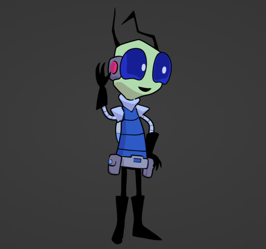

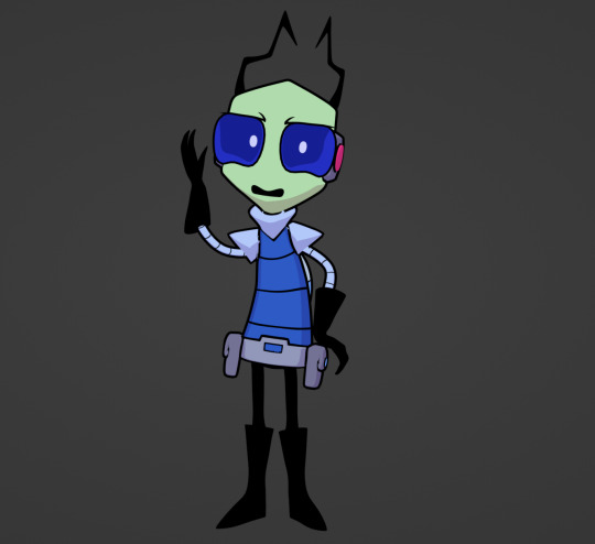


First up is the lil fun showcase. Using the new rigging system, I did lots of fun poses! And I'm super happy with how the toon shader looks too. For his model, I focused on refining the topology and making the weight painting better. Noodle arms also helps a ton too! These improvements really helped get it looking as not 3D as possible hahaha.
Keep reading for more of the behind the scenes stuff!


Yes, this is a 2D background! Way back in the day I used to make backgrounds to showcase my finished models... but I kind of strayed away from that. With Xeon though, I decided to get back into making backgrounds, and instead of doing it in Blender- I drew it!
This is the first ever one I've publicly published, and only one of 3 I've ever done. I first laid out the perspective in Blender and the lined/colored it in Clip Studio Paint. The model of Xeon was rendered in Blender on a separate layer, then I dropped him in the CSP background.
There's defintiely some wrong things with my 2D background, but for the first colored one I've done, I'm pretty happy with it. Its all about practice, and as I gain more experience I hope to better refine the Blender perspective to 2D pipeline.
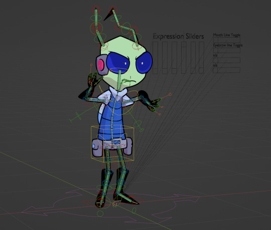
This time for Xeon, I wanted to massively push my rigging skills. So with the help of Rigify, I've done just that. The rig for Xeon features a very advanced and customizable rigging system that allows me to pose him in so many different ways.
Oh and also, noodle arms and legs! That was a thing I've been meaning to add to my characters for so long, I just haven't known how to. But now with the new rig I can do just that!
As you can see below, the rig is also very user friendly. It's definitely complex, but it should be a lot more standard and a lot more user friendly.
I can't wait to add this rig to all my future models as well!
That's all I have for ya'lls today, I hope you all enjoy him!
#invader zim#invader zim oc#irken oc#blender#blender model#blender stuff#irken#irken empire#bluecolty's art#blue's character: xeon#toon shaded#invader zim blender#3d character#invader zim fanart#invader zim fandom#invader zim original character#iz oc
130 notes
·
View notes
Text
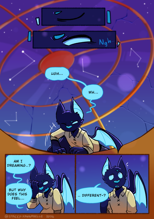
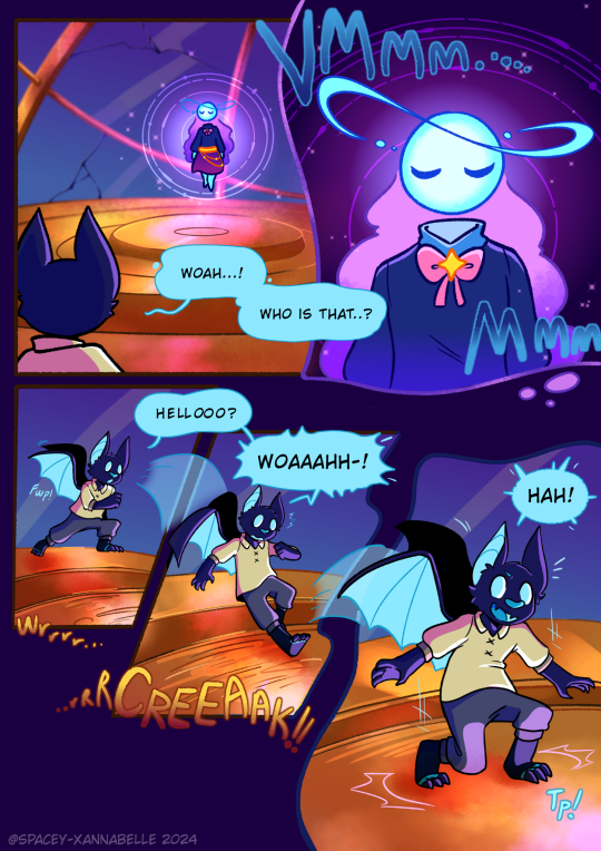
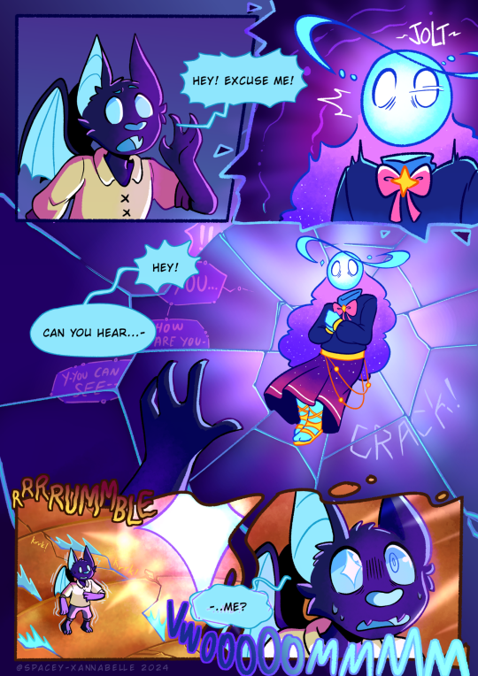
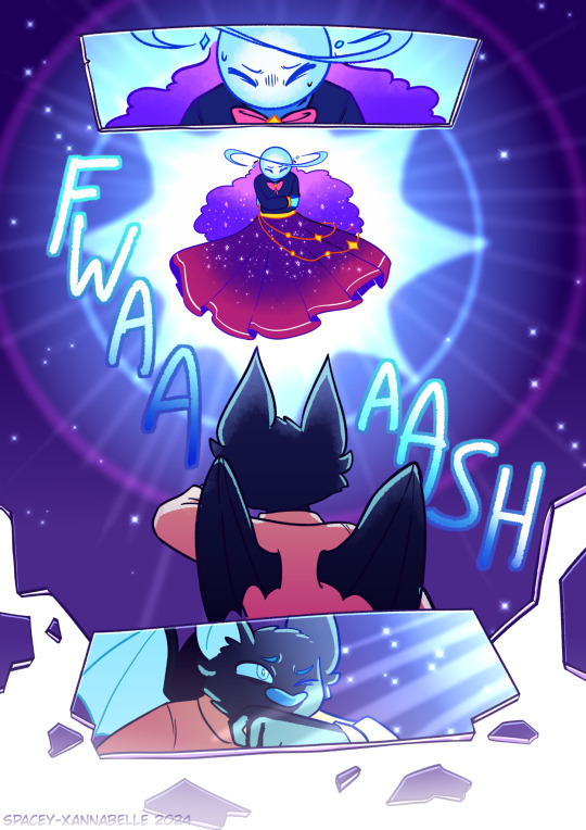
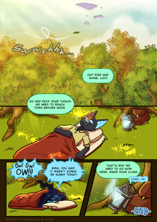
Fateful Encounter...
Last month, at around April 10th, I decided to revisit an old project I started months prior which was to polish up a test sketch of a comic page about Lucy encountering Lumi in the dreamspace. And after slowly making progress on this, I'm finally finished with this!
I'm gonna leave some artist notes under the read more, but overall I'm super proud of how this turned out!! This is pretty much my first serious attempt at making comics in general so this has been a very interesting learning experience!
Artist notes: So this is what the original sketch for this whole thing was. It was just me scribbling out a scene I had in my head for Startrails that I wanted to put on paper:
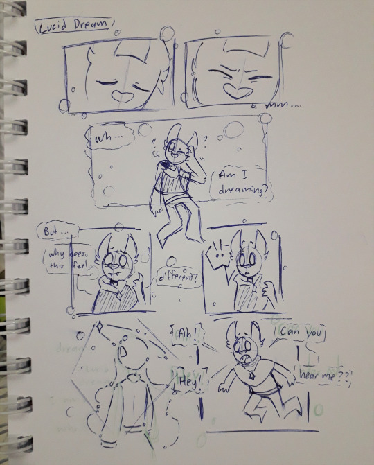
This I'd say was made around 2020-2021 ish. At the time, I didn't really do much with it. Until several months ago, I thought of trying to redraw this page and expand upon it.
But my first attempt at doing this didn't quite lead anywhere. I barely got through the thumbnailing process and just gave up bc I lost motivation (and life/work stuff was Happening so yea I had to put this aside as I figured stuff out). Here's the first draft of the thumbnails:
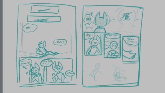
It was just two pages at the time and was pretty simple. I left this project sitting in my files for a while until I one day just, started binging videos from Thestarfishface on YouTube, primarily her webcomic guide videos. And I decided I'd give this project another go.
It was here where I began making a second draft of the thumbnails and this was what I had to work with:
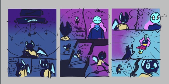
I wanted to experiment with the panels and get funky with the compositions this time around. The 2 page draft expanded to a 3 page thing. But I thought it would've been better if I added one more page at the end with Lucy waking up as a conclusion to wrap this whole thing together.
And in the middle of working on page 3, my friend had suggested to do a an impact frame page, which I hadn't considered during the thumbnailing, so 4 pages became 5. And this was the result!
I posted the pages as I finished them onto my deviantart so that's where a lot of my thoughts were journaled as I went along dfjsdh. To summarize my ramblings there, this project was a very fun (and a bit frustrating) learning experience! I'm hoping to keep practicing and improving my workflow, and hopefully one day make Startrails a full fledged webcomic :')
Additional ramblings:
The structure that Lucy finds Lumi in is inspired by an orrery.
For page 5, I initially didn't plan for much dialogue but as I drew it, it felt just a liiiitle bit empty, so I kinda just threw in some dialogue for Mira. But bc I was already in the inking process (and I just wanted to have this project completed), I didn't redo the page to even include Mira in it. So Mira's just out of frame sdfjskdh. If I had more time and energy to keep this up, I'd have made a revision of the page so I could include her.
This experience has taught me that I could seriously work on my rendering process a bit more, and that my layer management is just atrocious sdkfjksdfh
This has also taught me that while Medibang has the tools needed for me to draw these pages just fine, it also lacks some stuff that I personally need if I were to do a longer project like this. So I'll be experimenting with CSP next!
The dialogue throughout this whole thing wasn't all that planned out- I really just stuck close to what the initial doodle had which probably wasn't the best idea bc I just have like, 2 pages of Lucy's awkward sounding dialogue aaaa. I might do something a bit more dialogue heavy to help improve this skill next time.
Anyway, thank you for reading through my 1 am ramblings on this little project of mine shdkjhks
#artists on tumblr#Art#Digital art#comic art#original characters#OC lobby#OC art#Xan draws#Lucy#Lumi#Mira#Kinda dfjfkh#Startrails
19 notes
·
View notes
Text
For those of you who wondered how I made my stickers
So how I made my stickers I did not make them in a website like canva or anything like that or got them printed I actually made them all by myself with a few things that I got off Amazon So first you need to get a good sticker paper or the one that you can afford I spent like $25 for a pack of 100 glossy sheets and it was called printable vinyl sticker paper for inkjet printer

This is the brand I use I think you can use whatever brand but use what is best for you You can use mat you can use glossy I use glossy because I like shiny stickers and it makes them pop when I put sparkles on them
Next you will need to have a printer I have an HP inkjet printer also before you get your sticker paper make sure you know what type of printer you have Because some certain types of printers do not support certain types of sticker paper because it can jam the printer and maybe even break your printer so make sure you check that this print paper works for your printer

This right here is my printer that I normally use Just a basic ink jet but also make sure that your printer also supports colored ink as well because if not you're just going to have a bunch of black and white stickers
Then have a drawing program whether that is procreate, fire alpaca, Adobe, CSP, both Paint tool sai's, ect. Whatever drawing program you like to use Just make sure that you can make it transparent in the background when you are ready So you can export it to a different type of program if you decide to do it that way I don't do it that way I actually print it through my drawing program also another tidbit do not use colors that are overly bright especially for using the type of glossy paper I use I learned from experience overly bright colors will make it look washed out and it will not pop so try to make sure you use medium to darks if you can and add lots of shading also make sure you have your line art dark as well so it can show the image well as well I just know from mistakes I've made in the past It's all trial and error my friends
Next how I do it as I make my stickers waterproof I use mod podge I used to spray on stuff I use the gloss spray on I don't use the mat because I don't like Matte stickers And I bought mine off of Amazon for about 10 bucks but it does last me a while except for the times I had a big sticker order then I used a lot more of it but yeah all you need is like a quick little coat I like to make it as my "save" button So my image does not get scratched up and scuffed up because with my type of sticker paper if I'm not careful the image will get all scuffed up which is why I spray so I can preserve the image.

This is the one I use It's lasted me for a good amount of projects also you only need like one or two coats like light coats don't go too heavy-handed or it can make your paper curl and that's something that you do not want and if it does curl put a heavy book on it for a few minutes and it should straighten up enough for you to put the laminate on also make sure you're in a well ventilated area if you are going to spray I recommend doing it outside but if you have to do it inside open a window make sure it's well ventilated and wear a mask You do not want to be breathing in this
Speaking of laminate That's what I use next I use sparkly laminate after the spray has dried and everything I put laminate on it since I do not have a laminate machine or anything I do everything by hand which is not easy to put laminate by hand laminate sheets are like these sticker sheets I use The ones I use are called Cosrk premium holographic laminate sheets And I bought those on Amazon for about 10 bucks each but it does come with a lot of laminate sheets in different styles in one pack You just choose which styles you prefer also it says this in the description but some people tend to forget you cannot print on these laminate sheets It will jack your printer up these are meant to put over an image not to print on an image there was a lot of reviews that said that it didn't work on their printer and I'm like yeah because you didn't use the product right lol So if you do get this product please make sure that you do not print on it it will really mess up your printer


Here's a brand an example of how the laminate looks like also another tip Make sure you keep it in a cool area If the area is way too warm they will curl up and if they do that make sure you just place a heavy book on it and hopefully it flattens out enough which comes on to putting it on the stickers this is a very delicate process because you can mess it up real easily if you are not careful especially if you do not have a machine to help you put the laminate on So I gently pull the laminate off Make sure there's no air bubbles or anything and if you do get air bubbles there are like tools to help get air bubbles out I don't know what the thing is called I think it's like a scraper I don't have that because I get frustrated with it and plus I learned enough to not get bubbles on my stuff anymore but I know what helps is I quickly gently put it on over it like quickly and gently Don't even press it down and then I quickly put a heavy book on it and usually that has worked for me like for a few minutes I put a heavy book on it and then the laminate is straight it barely has any bubbles and that's just the method it works out for me If you have another method try it out
And now for the final which is to put another coat of spray on there to make sure they're waterproof and protected I recommend putting about two coats like the last time light coats And then let him wait for a few seconds until they're not tacky anymore and then once they're all dried up you just cut them out since I don't have a cutter I cut them by hand which is not the easiest either especially if it's a unique shape but I try to cut him the best as I can I'm hopefully one day I can get a sticker cutter but until that day comes I'm going to do everything by hand lol So I hope that answers some of y'all's questions about how I make stickers If you have any more questions don't be afraid to ask me I will be more than happy to help out as you can only say so much on a blog post lol


Here's some sticker examples of the process lol also a little bit of fan art with those stickers And my graphic design skills
#stickers#how I make stickers#artists on tumblr#some fan art stickers#sticker tutorial of sorts#i love stickers
8 notes
·
View notes
Text
Eggtober 14th 2023
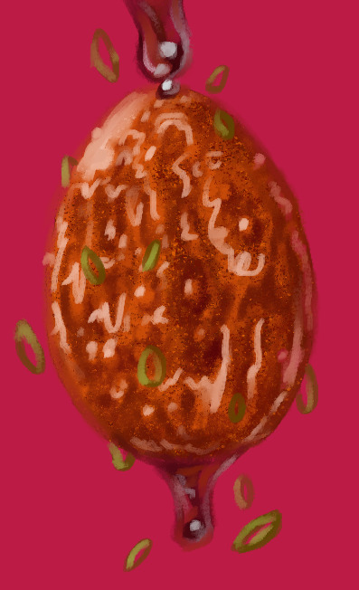
"Sticky": Tiger Skin Egg with Sauce.
(Clip Studio Paint, Gouache Brush, Gouache Blender, Airbrush tool. 10 colors, 45 minutes.)
Cripes, I almost forgot to post this one. Been a busy bee the last few days.
The first time I made this dish it was all going perfectly until it came time to caramelize the sauce. It goes from runny and thin to thick in what feels like 30 minutes and then from thick to CHARRED AND AWFUL in 0.5 seconds. I'm not a stranger to syrups and sugary sauces! Maybe it's the soy sauce that's dangerous because the color can't indicate early signs of caramelization that I can see? But I make brown sugar glazes for fruit all the time. And my standard stir fry sauce has soy, brown sugar, and gochujang in it, which are all dark, and I've never burnt those things. Anyway, first time I made these was a disaster. The eggs were overcooked because the sauce took too long to thicken and then I burnt it so it tasted terribly perfumey. But I remade the sauce by itself much more carefully later and it really is tasty! I just had an awful first attempt. Speaking of which, I need to do a proper study of craggly, crackly fried things. I can get away with a lot here because the rendering is a bit stylized and it's a shiny sauced egg, but trying to replicate that almost-breaded looking fried exterior from my reference was hard. I think we've established I'm fairly effective at drawing smooth things with all my shiny eggies of late but I need to learn how to draw coarser, rougher textures. Maybe more pencil tool next time.
Anyway, here's the speedpaint and the shoutouts. @lady-quen, Another gravity defying eggy for you to draw your precious brebbugs on. Take your time of course. The breadbugs need time to eat all the eggs they stole already!
Thanks as always to @quezify for all the inspiring fried eggy art.
Despite the unfamiliar textures being a challenge, it was fun. And of course I got to make it deliciously shiny. The speedpaint makes it all look so competent and deliberate and my ass is sitting here like "Past me has the competence of a god, or at least seems like it, but I know that bitch personally and I know for a fact there was internal screaming for part of it. "It's bumpy in the reference! There's texture there! But how do I do that? AUGH!" And then it turned out fine anyway, despite faffing around. Gotta get better at trusting my process and actually treating these as LEARNING experiences like last year. Self mantra of "It doesn't need to be perfect. It needs to be an egg. If it's hard, that mean's you're learning." Actively squash that little voice in my brain that doubts. Making art is about the making. The art is just a coincidence. It can be a product later if I decide so, but that's not the objective. The objective is to turn 1s and 0s and funny little lights on a funny little screen into things that look like eggs and manifest something that didn't exist anywhere before except my brain. No doubts, no stress. Only eggy. Plus at the end I can stare at past me making egg very fast like magic. I do like that part. Bless CSP for having a native timelapse capture feature. I just get to click a button and share with you all my magical process.
41 notes
·
View notes
Text
Artfight Postmortem
as you may know, i am prone to reflection on my art and process and progress. herein, i'm gonna navel gaze a bit about artfight 2024.
top line: really enjoyed myself, did a bunch of new things and this was "The Year of Artist Friends" which is spectacular.
i completed 20 attacks this year, including my first ever mass attacks! altogether I drew 28 different characters (incl 4 of my own).
for the first time, I had *users* i wanted to attack, rather than just characters i'd gathered via search or discord. honestly, three years ago when i picked up the stylus i was just excited at the prospect of drawing for other people, period. artfight was a cool way to be in community without prerequisites. i didn't quite dare to dream i might make some real connections and make proper friends. and yet :) here we are! i went in with three 'art friends' and i'm leaving with at least three more
in addition to being the year of artist friends, this could be "the year of clip studio paint was on megasale a week before artfight" because i knocked out like 2 practice pieces before July 1st so i wouldn't be starting with completely unfamiliar tools, but i used/learned csp for the vast majority of my attacks. one i finished in krita (lonnie), and my final attack i only used krita.
definitely trial-by-fired myself! but it motivated me to explore csp, and most important, gave me a reason to practice practice practice. last year i drew almost exclusively humans, lots of full bodys, because i wanted to get a better grip on anatomy and drawing a variety of faces. it worked then, and, well, i think i learned more of csp in one month of artfight than i would have if i was just plodding through my personal projects for 33 days :) *looks at my wip folder with months old files* pretty sure.
ok i'm gonna look at a few faves/standouts now:


came in hot with 0tt0 here! the main brush for this one (froggy pencil) was a mainstay for the whole month. so versatile!!! and lovely texture. this isn't quiiite brat green but this was what made me go, hmm, what if i... did a few pieces inspired by this album i can't stop listening to?
and then i took a huge turn and just used a soft round brush for Desa and Iryna for my dear friend @bobomcfoe bc i really wanted to turn these out in something approaching my "usual style" of late and i feared getting too deep into the temptations of csp if i put them off. and, um, yeah i love them. i got sooo close to matching that angle but ahh i can see the tilt now! nonetheless, love these two, not least bc brookie has some of the most pleasing color palettes to work w :)


then on to Rosé and baby's first vector lines! you can RESIZE lines in csp. did you know that? i didn't know that. i did forget to use it as much as i could have in later ones though, so i still only kinda know it ig. and halftone shading! bc why not? another thing i really only did this once, but want to experiment with more
Rook here, for my new friend @gender-premium-tm, was me realizing how to use filters/filter layers in csp. now THAT is something i used a lot this month! also something i use often in krita. i must say, though the csp options are slightly more limited (afaik), they have oomph!


okay these two are my "explicitly brat pieces"! artfight keeps you moving, which i find really valuable, bc i could have dithered foreverrr over Lonnie's gif here. like, do i add his arm? maybe he should be wearing a shirt? or, what if i just draw him twice, instead of splitting the expressi--see it just never ends. and as i am always going on about, art is so precious bc it is a reflection of us when we make it. maybe for some future artfight i'll redraw this (as Lonnie's artist @wenmistry did for me with Ebon this year), but for july 2024, i'm amazed at how well i executed this for just 2.5 days of work! (i did forget his glasses, which realization gave me a different take on the composition, so this is high on my list of potential redraws)
and then Aagatha. this is in my top 3 for this year. the pink just works so well with the green and her artist added the song to her character playlist AND added the necklace to her actual dnd inventory. like. omg. the impact your art can have!!! how freaking cool is that???


two mass attacks! i was in a silly goofy mood. i feel like i really got a handle on vectors w the anthro mass attack, i adjusted every single point on that one by hand. weird what hyperfocus makes you do sometimes, but i learned a lot from that. mainly that i will probably never user vectors as my main linework tool. there are circumstances it is perfect for, and outside of that i'm good w my raster lines lol
which is exactly what i used for this other mass attack, featuring mostly my ocs. hey, sometimes you need to shake things up! i can see here the style starting to hew back to my "usual style", though i'm thinking that might have a lot to do with drawing 5 people very quickly. falling back on practiced techniques. and by this time i apparently knew csp well enough to reproduce them pretty closely! ooh, one thing this made me miss was the transform tool in krita. that floor was ROUGH to wrestle into place in csp.
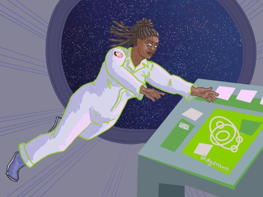


purple and green turned up a lot this year!
Echo is my crowning achievement with the froggy pencil, most of the shading here is just layers w that. and one last nod to brat green :)
i've worked in the paper cut style before (both my pfp's use it) but i really exploited csp's clipping layers to make Scraps here. they did make me briefly forget how they work in krita when i switched back, so well done w that
i played with gradient maps a little earlier in the month but for Okanar i actually made my own gradient! really a useful tool for ref'ing real human skin tones to make non-human ones, without muddying them up too much.

finally, Chaos. this actually might be my favorite! ironically this is the one that i made in krita. it was like, ahh, yes my old friend. wait where is the scroll bar. ah, okay, yes my old friend... the line layer is set to burn which just makes the whole thing so warm (and the cause of the red outlines on the earrings). used my old sable brush, a pattern fill set to overlay... my old stomping grounds! but plus a rendering technique i picked up this month and some other random habits i picked up in csp (like copying a detail to a new layer, moving it where i want a copy, and drawing/tracing it back onto the original layer in the new position. nothing i couldn't have been doing in krita all along, but made easier by the tool layout in csp, and therefore now discovered by me. amazing how one integrates new knowledge. it's like magic sometimes!!!)
that was a good roundup! if you actually read this to the end, wow! and thank you! i hope it was interesting... and inspiring! bc i want to read about your process and reflections too! yes you! and plz tag me, i'm always down to gush about art XD
7 notes
·
View notes
Note
i'm curious about your technique ..... the texture in your fabrics, metals and skin is magnificent, do you have some favorite brushes and how do you approach drawing these materials? thank you!
Hello!! :D First things first, thank you so much for your kind words!! My favorite brushes to render with are these:

I don’t remember where I got this brush exactly :( It might be an old Photoshop brush that I tweaked and/or changed its properties quite a bit over time to suit my preferences. The good thing is, this brush is easily replicable, all you need to do is take a simple round brush and enable color mixing!! Then adjust how much paint you want the brush to pick up and/or how intense you want the color mixing to be :D I use this brush for pretty much everything, from skin to fabrics to metal!! I also want to mention that Clip Studio’s default “Smooth watercolour” and “Transparent watercolour” are decent alternatives!

I've worked with this brush for years now! Nowadays I use it for really fine details which require hard edges or opacity. There isn’t much to say except I really like its texture and it balances between being a hard and soft brush really well ^__^ You can get it here!

I got this one from the CSP Asset store, however it originally had a Japanese name which I couldn’t read, so I changed it to just TEXTURE. I don’t see it in my downloaded brushes catalogue though, so I’ll update this post if I manage to find a link

Really good brush for adding some fancy texture – it’s a simple rake brush consisting of 9 lines, nothing too complicated AND easily replicable :D I consider it a good addition to my personal brushset. It’s really fun to use!
Now... I’ll try my best to explain how I approach things during rendering :D (disclaimer: I am no professional artist…this is just how I do things when painting) So! With skin I always keep in mind that light penetrates its surface and, in a way, illuminates it from the inside. This usually leads to experimenting with many colors depending on the subjects skintone and lighting of their surroundings/scene they're placed in :]
Fabrics - I generally paint them very close to how I paint skin :D Of course it’s not a one-fits-all solution, as there are different types of fabric with different properties. Whenever I render a specific fabric - let’s say for example leather – I keep asking myself “How do I make this look like leather? What properties does a leather surface display? Is it shiny, thick or thin, does the material allow subsurface scattering?”
For metals, I usually stick to a general rule of thumb - use stark contrasting values when rendering (really push those dark, saturated shadows and really shiny lights) and don't forget about how reflective metallic surfaces can be!
That's pretty much it! ^__^ ❤️
#ask#phEWWW this was a lot to type#anyways I hope I answered your question anon!! ^__^#much love#faq#brushes
96 notes
·
View notes
Note
heyyy I'm new to digital art, would you mind sharing some tips regarding programs and tutorials and etc? also on how to turn a real life piece into a beautiful and clean digital piece... really love your art
oh good luck with your art journey! my experience with digital art is pretty dated (as in a decade + levels dated) and i might be too out of touch to give beginner tips but regardless, allow me to attempt
Programs: it would help to know which hardware you have for digital but ill put down some i have experience in 1. Clip Studio Paint Pro - PC/Android/ipad/everywhere i think? unfortunately they betrayed humankind and its now a subscription everywhere but on PC. i bought a one-time license years years years ago on sale and its probably the best available on my end. I also got it on subscription on android so i can sync works between my PC and tablet. its very flexible in a way that you can draw with it in the most basic way single layer sketches or whatever but they have so many features and keep adding more.
2. procreate - ipad only never been an apple user but my friend is, and he's been a procreate user forever. he recently tried CSP on ipad though and he still claims he likes procreate better for ease of use and compatibility with tablet ergonomics and apple pen
3. medibang paint - pc/android/ipad
free forever. and out of all the free programs i recommended my other digital art newbie friend this is what he liked best.
4. adobe photoshop - dont even look at this the only reason i have one is im leeching off company license. its still unfortunately the industry standard tho but CSP is much cheaper and has the same controls and most of the basic functions 5. Paint Tool SAI - my first art program but i haven't tried it again. honestly still think this has the best brush flexibility and pen pressure control ----- As for tutorials, i find digital art has such a steep and high skill ceiling and its a challenge im still tackling and probably will forever tackle haha. I'm trying to osmosis painting techniques from splash art painters from League of Legends who most of them post complete timelapses (my favorite being Bo Chen) where you can study not just their techniques but like, art directions that make their pieces striking. Anyway, I also promised a friend I would make a simple coloring tutorial so maybe after inktober hustle, I would look for a piece there I'd use for the guide.
---- Traditional to digital is never a satisfactory process to me but if you can, invest on a scanner. I use an epson v39, had it for years.
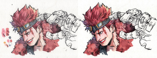
scanned vs edited. the goal is to at least get the white of the paper as white as possible and the blacks the blackest, without whitewashing/burning the rest of the colors. Level correction function is your best friend here and most art programs have that.
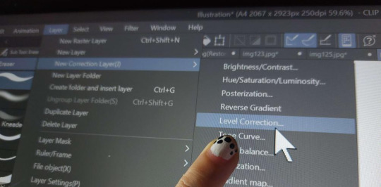
Then i just clean dust and errors and slide the contrasts around until it looks as close to the original piece
If you have a decent phone camera, you can get away just posting instagram aesthetic pics with materials framing it or smth and just edit as usual. natural light tends to be a lot more forgiving than the harsh light of scanners anyway.

Anyway I hope this helps and have fun learning!
#granpa voice: back in my day we didnt have phones or tablets capable of drawing#we had to use dodge and burn on pirated photoshop apps using a mouse on the family computer#i think i also started digitals a bit late in life so unlike younger millenials and gen Zs its not easy as second nature to me#compared to traditional mediums at least
31 notes
·
View notes
Text
11/1/23 Update
Hello! Sorry this update is a bit late. Let's dive in!
Backerkit Survey
Still waiting for about half of the backers to complete their Backerkit survey! If you got yours, make sure to fill it out as soon as possible to help me with reward fulfillment.
Join the Discord
We've gotten a lot of new Discord members lately! Come join the fun! See updates before anyone else, participate in polls, and read some fun AU stories!
Sahi's Route
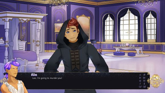
Sahi's route is in beta testing!
Lune's Route
So I've been working through Lune's route, mostly coding in sprites and music, etc. The writing was pretty solid for this one on the first go through, but there are a few things I want to tidy up and add, I believe. I'm actually on the last scene in his route, and then I just have the endings. The endings will take a bit more time because there are a few scenes I tagged that need to be added in or fleshed out, but it shouldn't take me much longer. I anticipate finishing this up mid November.
In the final draft, I'll be adding more branching for personality stats—just small, one or two line changes in dialogue, but combined with a couple of these in every scene, it should make for a fun new experience with each playthrough.
Love Letters

These should be out by the time of my first Kickstarter update, which will be 11/12. All the recordings are in, I just need to put together the final cut and package them nicely. I'll be including a .mov, a .txt, and .wav for all three for all backers in nicely zipped packages.
New Start Screen

I've been working on a new start screen, as the original was always intended as a placeholder. I'd thought about commissioning one but with the final budget decided to draw it myself. I'm happy with how it came out! This has been implemented and will be in the next update.
Skin Tones

I've been slowly working on implementing the new skin tones, thanks to reaching our stretch goal! Right now I've just done masc Terra's darker skin tone. My goal is to do about one a week until completion. I really like how they turned out!
Notice
I will be going to visit family from Mid November to early December, during which I won't have my tablet, so the weekly drawing streams will be canceled during that time. Unfortunately my new tablet is just too big to travel and my license for CSP is only available on one computer at a time, and I can't bring my desktop. I'll be sad but will have to subsist on a sketchbook in the meantime.
Anyway, because I won't be able to draw I'll be focusing on programming and writing.
Conclusion
Things are still going along smoothly! I'm still hoping to finish up the second draft and send all routes to beta testing by the end of the year.
#visual novel#vndev#celestial crowns#english otome#celestialcrownsvn#game development#english visual novel#character customization#lgbtq
10 notes
·
View notes
Text
It is time for me to rest now.
I think I made a pretty big dent in my first time participating in Artfight! It was really fun. I have one mote simple one to finish and then I should focus on some other things. (like actually learning dragon bones and doing something for Grey in the tanuki kigurumi or characters I never saw get into X Dive)
Really good learning experience I'm definitely proud of. I might participate in the smaller events too, but I think I was running low on bookmarked characters to draw and poses to choose from. The RNG search function may have missed some cool designs which id a bummer, but I got *some* at least haha
Been wanting to rejoin some Megaman art discords to really have the opportunity to feed my reploid OC art gifting habits, but as I have learned, Discord ain't it for this fandom. 🫠
Furry servers are okay so far. There's a lot of children, which I DON'T prefer, but they have art-trade chain channels. I like them since I rarely receive fanart for my designs, and the other person is held at gunpoint to finish within 24 hours! (seems like my designs break the flow every time. Could be their complexity? But I think it's... something else... Not sure yet though. Thought some of my OCs were simple, like the fairy armadillo one... it's been almost 3 days when they were supposed to get it done in 24 hours aaaaaaaaaa don't claim if you dont have time!!!)
I just... idk hope I can keep finding stuff to draw and keep up the momentum between commissions. I enjoy drawing, enjoy engaging with people who like my art... I miss it! Makes me excited, even if it's just like... 2 people or so here and there. My Twitter only has like one guy commenting and even that brightens my day, haha.
I need to give my close friends a break since they aren't always interested in the stuff I make. Most aren't furries or aren't into Megaman or male characters, etc. I wear them so thin at times. Bless their hearts for dealing with my bullshit for over 5 years (like closer to 10 probably).
Now that I have the ability a d knowhow to make CSP speed drawings, I could make a proper Youtube channel for those interested in watching them, but don't want to join my streams. I thought about doing storytime speed paints, but the subjects of most of my more interesting storytime potential stories live WITH me and can hear me. And music gets copyright claimed. 🫠
Guess the era of storytime art passed me by unfortunately.
So... Yeah, haha.
But...! Big things comin! Stuff on the horizon! I'm learning CSP real good so maybe I can tackle that long list of to-dos! :D Aside from animations, I'll keep it a secret so I don't generate even minute disappointment haha...!
Thanks for lookin at my art. Thanks for reading my rants. I appreciate any and every glance for however long. It means a lot to exist a little more each day.😄
3 notes
·
View notes
Text
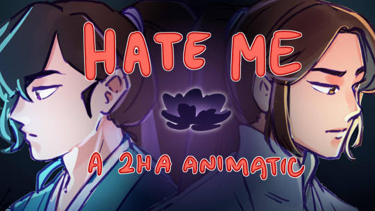
Finally woke up and decided to work on animatic. Obligatory announcement post + essay commentary of this one below. Major book spoilers are abound.
Watch it here
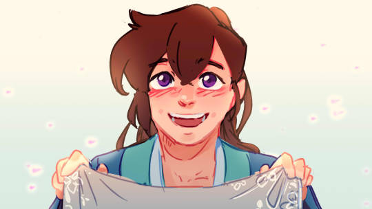

Anyways
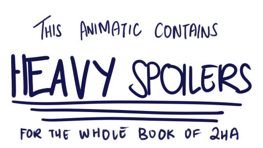
Proceed with your own discretion. But don't blame me if your reading experience is ruined because you decided oh this sounds interesting I'm going to read it even though you haven't finished the book.
Watching the video won't spoil you. No worries ^^ No guarantees either :P
Don't worry about it. Don't think about things too deeply.
Some things about Hate Me
Okay, I've really really wanted to talk about this even when I was in the middle of working on it because hoooo. Not only is this (I think) one of the more densely packed animatics that came out of my mind lately, it's also one that has a really good chunk of WIP lore in it because this is a year old.
THIS HAS BEEN STUCK IN MY MIND FOR A YEAR
And it's not even the whole thing :3
Anyways why this song? What is "Hate Me" anyways?
First listen, thinking about the lyrics, it's a song about liberation. Basically liberating yourself from a toxic relationship, finally saying good riddance to the one that basically ruined your life. It's also kind of why the song sounds so peppy.
Like the best animatics I've had, I got this idea while stuck in one of my long hour commutes. And basically it stems off of this one youtube short about the song's creation and it's a vid of someone getting their tattoo removed.
But my idea at the time was oh this would make a really fun animatic of MR turning evil under the influence of the Long Hatred Flower. And I think the flower's name and effect also has a hand in the creation of the idea.
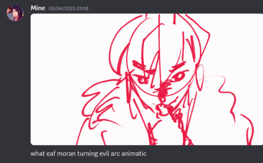
And initially, I just went off of vibes and just made concept gifs on CSP because that's the only thing I can do at the moment.
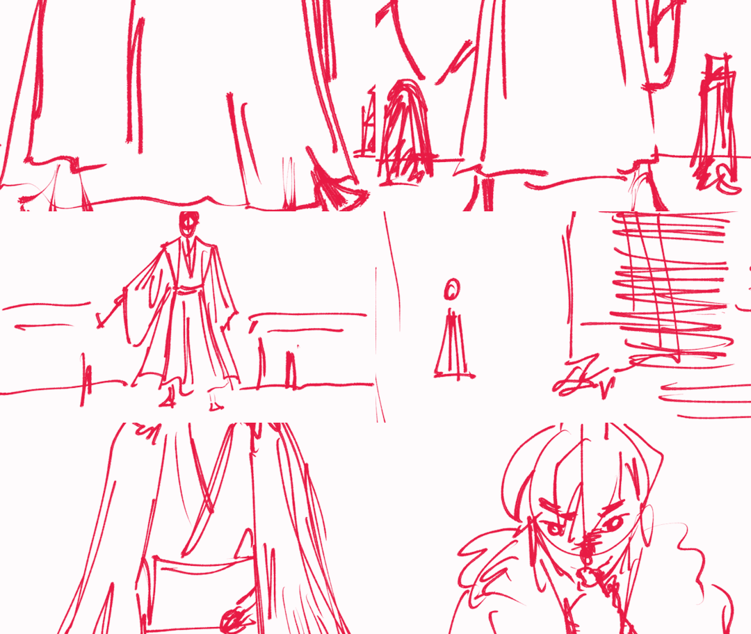
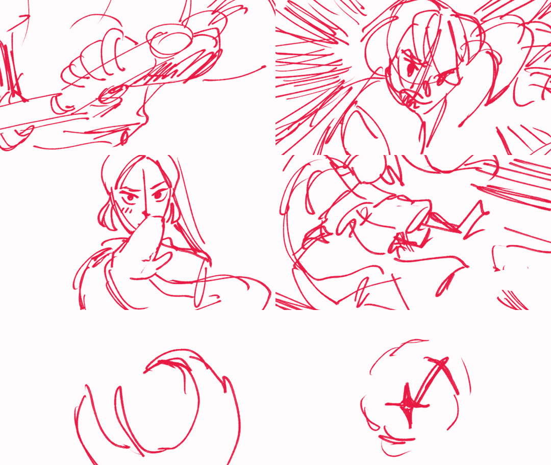
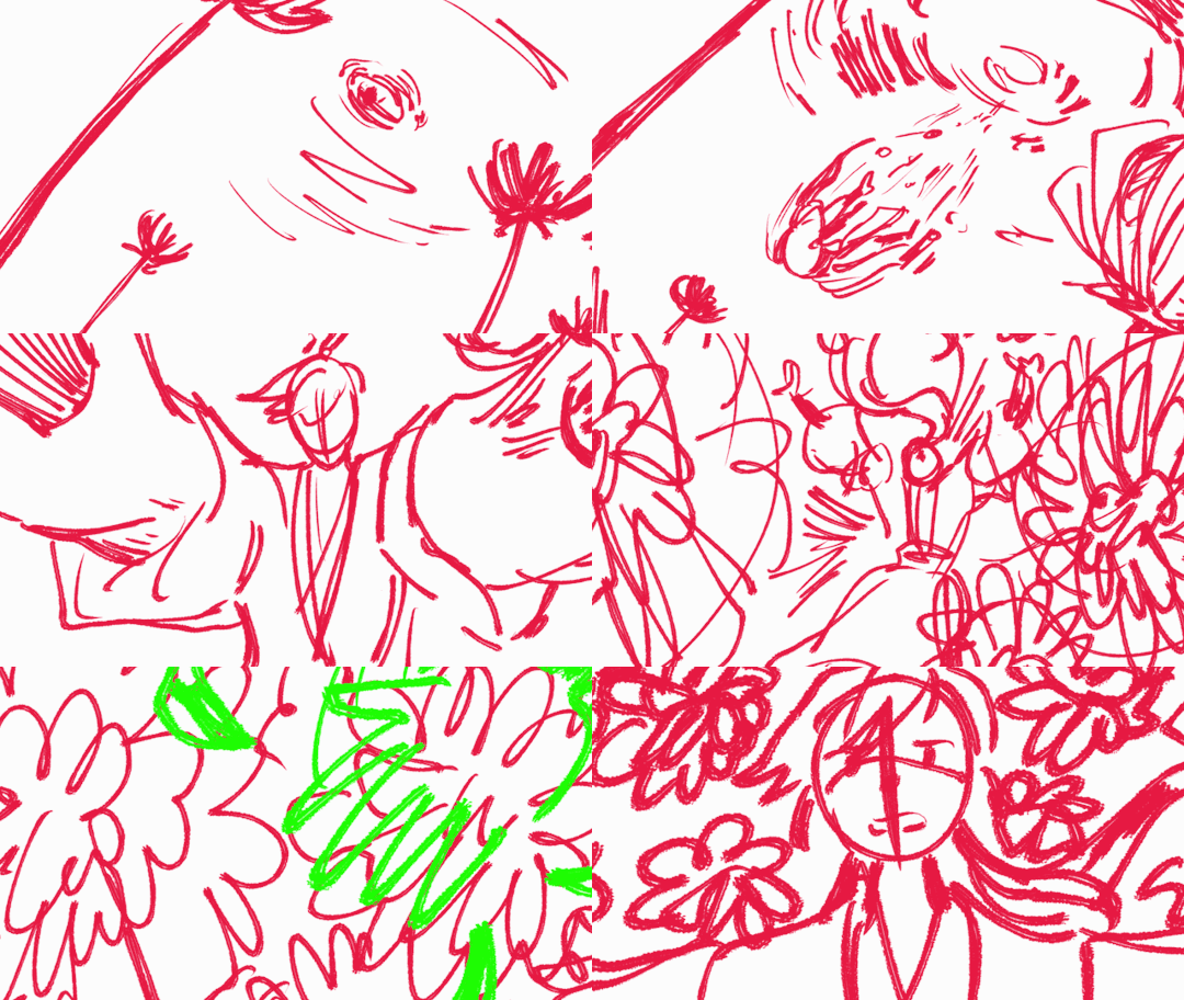

Most of which got in, but some didn't. And at the time I was just fresh off of being mentally rewired after seeing Lonely Man's Lazarus' The Mind Electric animation so my mind then was like oh transitions which is suuuuper evident in the final product.
Pretty rich coming from someone who rarely even makes animations but yeah.
Like how the flower distorts MR's perspective. The song's message also becomes distorted. Instead of liberation, MR slowly becomes trapped deeper and deeper into the headspace that the flower cultivates. And my intention was to convey that as a good thing and something to be hyped about.
TXJ's rise to power is supposed to be rejoiced about here. Honestly don't know why people are crying in the comments section lmao.
People in the know would be hit hard. People not in the know are supposed to just go "oh cool symbolism". And speaking of...
Let's talk about the symbolism!
The flower
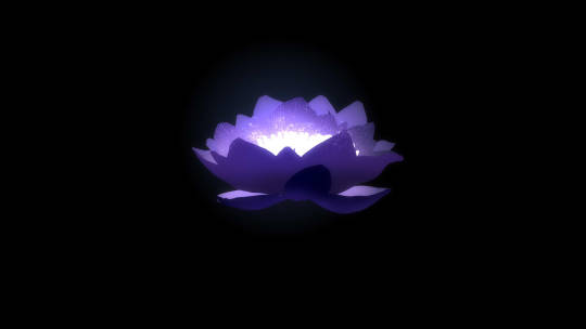
It's one of the mainstay and most obvious symbols littered up to the 2nd chorus. In hindsight maybe the animatic itself does have explicit major spoilers at the start ;P considering this is the first thing we see until it fades into MR's chest. It's also one of the things I heavily emphasized...
...anyways I'm just gonna pray people would be confused at most. 😄👍
We follow it from being a bud, to slowly and literally swallowing MR whole as a progress of MR's descent into evil and it literally culminates to MR burning Rufeng sect and CWN facing him off.
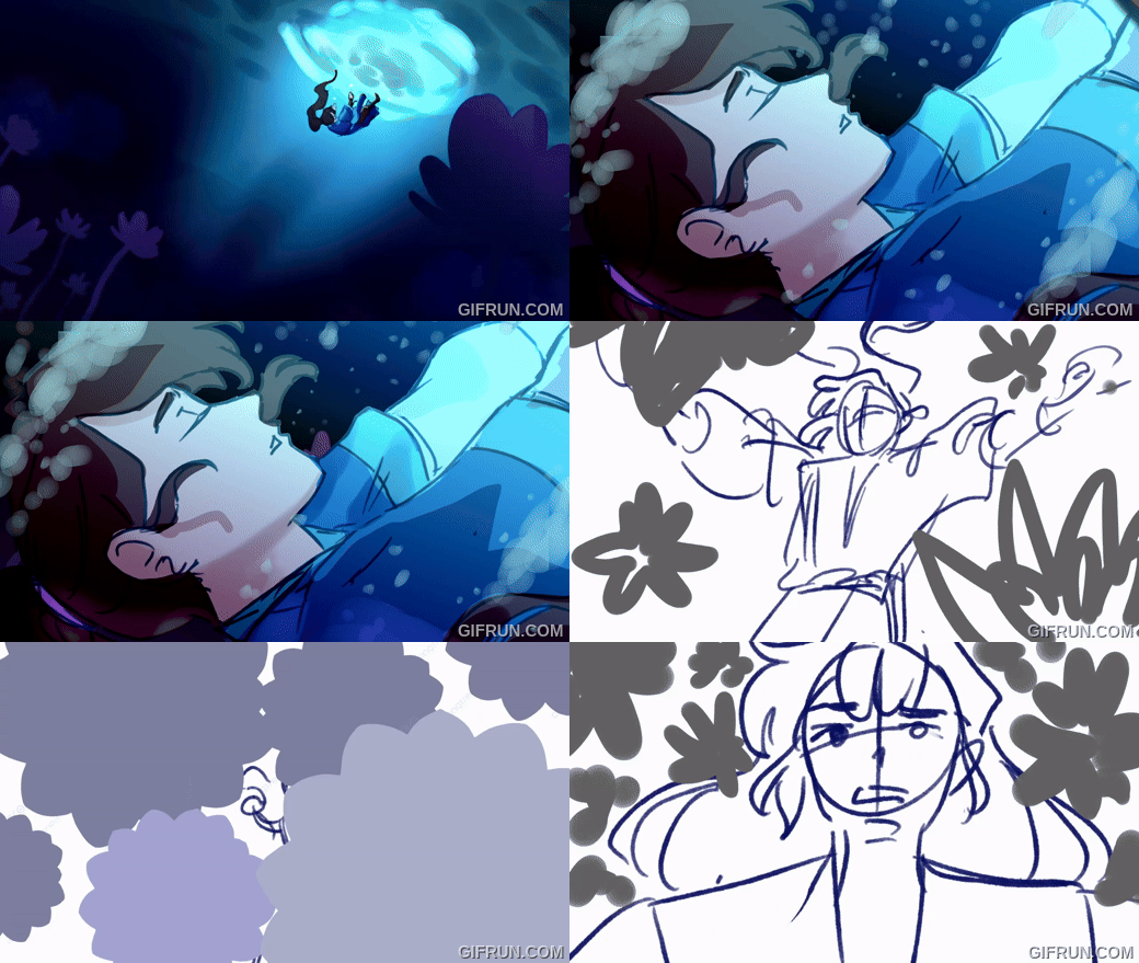
The flower itself is modeled after a lotus flower. Quite obvious as the name is a direct reference to the eight sufferings in Buddhism. (2ha actually has major Buddhism inspiration but that's for some out of pocket essay I made for my friends).
Narratively, it's described to be "那花朵含苞待放,还未打开,黑色的瓣叶,边沿闪动银光。" (A flower bud, still yet to bloom, its black petals and leaves fringed with a flickering silver light.) which isn't a lot, but other things also add to my headcanon that it's a black lotus, one of which is simply the term itself.
The first time I've encountered the term was in Scum Villain's Self-Saving, wherein it's used to describe Luo Binghe after the timeskip where Shen Yuan perceived him to have turned evil. While there's only a few discussions about what the term itself means, personally I agree with the interpretation of the white lotus being corrupted thus making it black.
Which is really really apt for MR's story. For 15 years of his life, he's stuck to the values of being kind and forgiving others, but it's only when he succumbs to the flower that he lets the intrusive thoughts win.
It also serves as a counterpart to CWN's association with the red lotus.
Chinese Chess Pieces
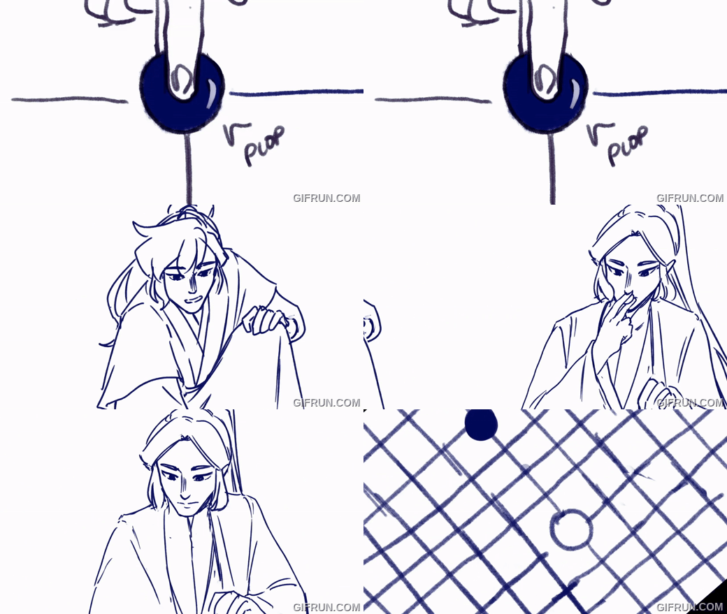
Zhenlong is one of the main ways that MR used in his rise to power. So naturally it would make sense to include it.
Contrary to what Westerners would think, the pieces themselves are Chinese chess pieces which are round pebbles that are colored black and white. It's main goal is capturing territory, and there can be a lot of board combinations which makes it a complex game to play.
In a way, MR slowly deciphering the technique is a sort of balancing mind game he and CWN played. (Although CWN has no idea about it). MR acknowledges that CWN is powerful enough to stop him in his journey to grow stronger, thus he has to make sure to go around CWN in order to win, slowly turning the tides to his favor.
It's kind of being pieced together as I typed this, but in a way the scene I attached above shows the start of the game. With MR has set the stage and is starting to gather his territories. It's not necessarily wrong for a scene, because black typically goes first in this game.
Puppet Mo Ran
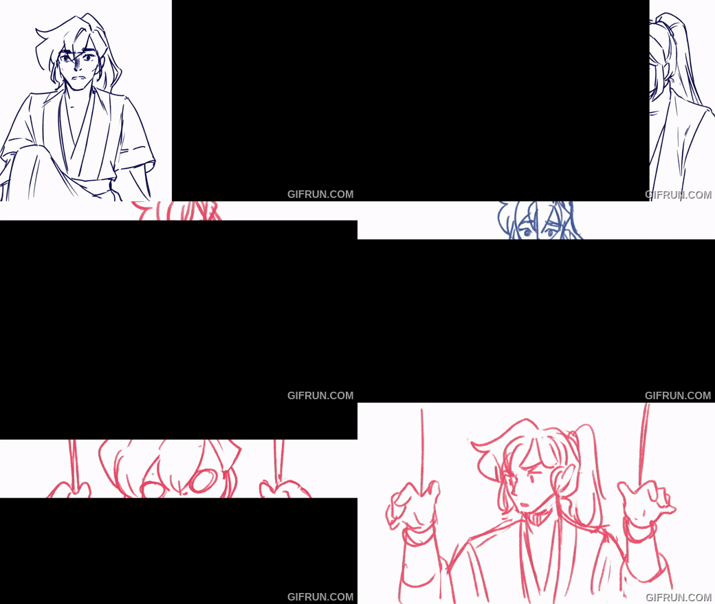
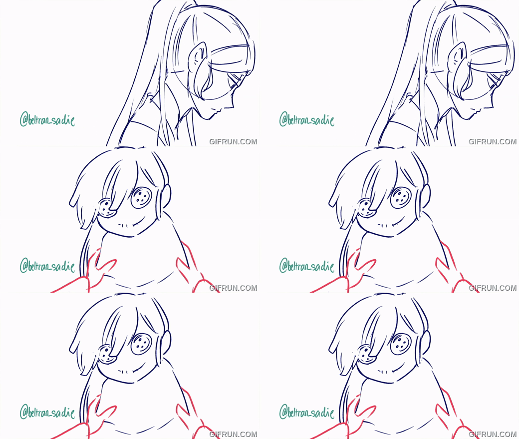
It's such a small thing, but it's an intentional inclusion. For those who are up to date with my animatics, Puppet!MR is a direct reference to Please Don't Leave Me! Something I'm very happy to include because this means I'm so far into the 2ha animatic brainrot that I can start making references to my own work.
Specifically for the sequence before Puppet!MR appears, it's a reference to chapter 140. Where a flashback from CWN's previous life is introduced. Without going into details, it's one of the scenes wherein MR who's already deep into learning Zhenlong and into the clutches of the flowers temporarily gets out of the curse just because CWN got injured.
Something that shouldn't be shown for someone deep into the curse.
MR turning into a puppet, is partially me headcanoning that he might get an inclination that something's off with how he's acting towards CWN, and so tries to break away. What follows is his descent deeper into the flowers.
Burning Memories
Another sequence (not really a symbolism, but more of a reference) that I want to call to attention is the sequence before the first chorus which basically shows the flower's bloom and MR's good memories fading away.
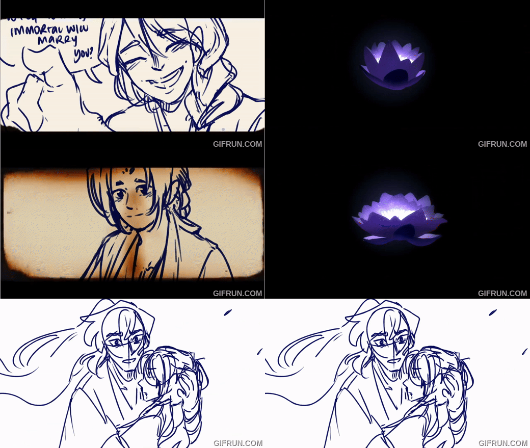
Yes. It's Duanxun.
IT'S NOT COZ I'M BIASED TO THEM THOUGH!!! It's literally because of this small passage in chapter 278 and it's basically the moment before MR falls unconscious after taking the flower.
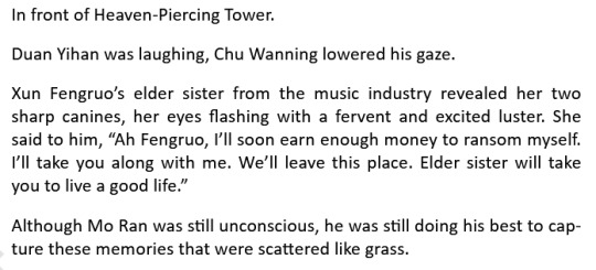
One of the flower's effects is the loss of good memories. And to a 15 year old MR, the people closely attached to the memories he holds dear are Duan Yihan, Xun Fengruo, and Chu Wanning.
While they don't appear in the same order, I specifically chose to use a burning paper effect to show memories fading away. Partially because MR is closely attached to fire. Not only will he burn Rufeng sect to the ground, but it's also because he burned down Xiangtan manor—a place that's closely related to the two people he could call family.
The scenes I referenced in the burning clips are also in the book, namely near the end of chapter 258 and somewhere in the middle of chapter 259.
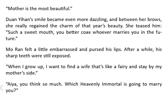

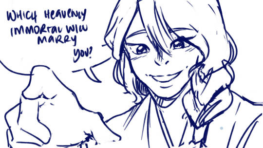
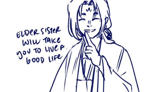
The only scene that doesn't burn away is CWN's. Partially because there's not enough space in the song, and mainly because I wanted to transition to the triggering event for MR which is Shi Mei's death.
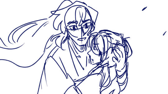
About the Work Process
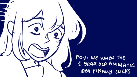
I did mention it was a year old before. But it was mostly because I was going off on vibes when I started. Aside from what I've done with the concept animations (which isn't a lot), what I managed to create at the very beginning when I decided to finally sit down and work on this, is a prologue that finally sets the scene as well as the first verse.
(hint hint, check the last 2 seconds of the youtube video)
For a reason that can be summed up as "I don't want to spoil people too hard", I've decided to split it into two animatics. The second of which I'll post at a later date. Only you, dear reader, and my close fandom friends get to know this knowledge and this preview.
As for the rest of the animatic, I was stumped. I knew I had to include some scenes from the concept animations, and also some scenes, but to connect them...? I was lost.
Some parts solidified as time passed namely the memories burning away sequence and the last chorus. But how to execute the 1st chorus and the 2nd chorus? It took me a year to finally come around to forming it.
Mostly because of an 11 hour bus ride I took for vacation. (Man I really do take long commutes).
After that it was smooth sailing. I prioritized getting a rough draft down before cleaning it up and piecing things together and it went well.
youtube
It's really just getting over perfectionism and just getting things done. I'll prolly edit this when the prologue is out.
I think that's most of what I wanted to say. Thanks for getting this far and checking out my stuff, as well as the constant support!
See ya :3
Ok last: Bonus unintentional easter eggs
Because I draw too much 2ha, it's inevitable for some frames to be similar.
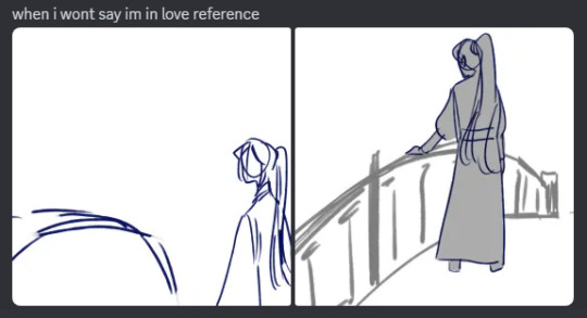
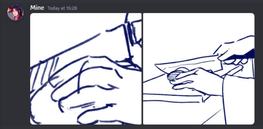
(Counting this one because of this unfinished frame i didn't commit to)
I draw too many CWN sideviews, but I distinctly remember referencing this while drawing the one on the left.
Summary
Overall, Hate Me is a very insightful animatic to work with. I ended up making frequent observations and ponderings while working on this too. A good example would be the Long Hatred Flower is a black lotus, and (the most out of pocket 2ha analysis) CWN and Buddha parallelism to name a few.
It could be better of course. Especially the razing of Rufeng sect sequence could've been executed better if I did it with after effects. And I've grown pretty particular with how I rewatch this.
Would this be the last? No, of course not.
It's an animatic that's part of my exploration into Mo Ran's character. Which is, in turn, part of an informal series diving into the theme. Heirloom is part of the series, there's another one that might be too 🗿 for yt and I've never bothered expanding on too.
I might end up posting some Duanxun animatics though (part of the Duanxun agenda more people need to acknowledge Xun Fengruo), or some non 2ha WIPs if I bother finishing them. Imagine 2ha AU animatic 😔 but that's for the very vague future.
Stay tuned for part 2 😘
#2ha#erha#danmei#dumb husky and his white cat shizun#animatic#evil mo ran arc animatic#yessir#Youtube
5 notes
·
View notes
Note
Hi i follow ur mademoisemuder tumblr account and I really like how smooth your lineart is especially the black & white manga style and regular linework.would you be willing to share your brushes or brush settings? A photo works to. I use clip studio & I’ve been dying to draw smooth lineart like you do! And your knife girl oc, to die for! A friend said she uses a brush size of around 6-7 with no taper and adjusts her pen pressure settings, dunno how she does it, how is your brushes settings like? I’m a iPad person and I recently got a screen moniter but it’s a whole different experience switching from procreate iPad to PC. Please share your ways por favor , -art anon
THANK YOU SO MUCH!!!
I use Clip Studio too! I use it on PC with a tablet (regular, not screen), so idk how well my settings will translate for you but I'm happy to share regardless!!
First of all, and importantly: a lot of it is muscle memory and training that comes naturally as you continuously do lineart. With time, you'll notice that the bigger swoops and long lines/curves that form a smooth line will start to come more naturally to you simply because your hands get used to the motion and you don't have to actively think about it anymore. Hands are cool like that.
(but also sometimes a stroke just takes 15 attempts regardless. Strg+Z is your best friend.)
As for the brushes I use, I'll put them under a readmore (got a bit lengthy)
First, for a rough reference/guide regarding the brush sizes, I usually sketch on the base A4 layout with 300 dpi, but I sketch small and not page-filling. Here's a thumbnail so you get a rough feel for their size on an A4 page.
Also I recently adjusted my pen pressure settings a little (under File - Pen Pressure Settings) so it now looks like this, but it used to be the default until a little while ago though!
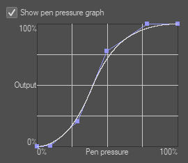
Onto the actual brushes:
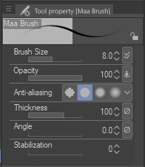
Most of the stuff on KG's blog is drawn with the Maa Brush from the CSP Asset store, so for example this, this and this were all done using the Maa Brush. I use it to sketch and line, usually on size 5-10, these are my settings:
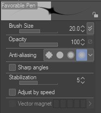
Next, for very thin delicate lineart I like to use the Favorable Pen from the Asset store, which I used here for example. I use around size 20 for it (I don't use a lot of pressure so the line comes out quite thin)
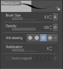
For a lot of my more rendered art I use the basic Mapping Pen in Clip. I used it for example for the recent story-arc update in asksds or for this. I generally use size 6-10.
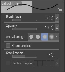
Back when I used SAI I had a brush called the Ballpoint Pen which I THINK I made myself in Clip (I at least couldn't find it again under that name in the asset store but I'm sure there are a dozen brushes like it) which is just a basic brush without pen pressure. I often use that one to get me out of a rut or to force me to focus on simpler shapes since it does kinda need you to be a little controlled to keep everything readable. I used it here and here for example. I use it at size 3 but keep in mind that I draw small.
I guess I could also mention that for most of the regular asks in asksds I use the Simple LineArt pen from the Asset store. There's no significant difference to the Mapping Pen, I just feel like the tips aren't quite as delicate as the Mapping Pen and I prefer that for sds...it might be an illusion though.
And we're done, those are the main brushes I use for lineart! Occasionally I try something different (like a G-Pen for a more textured look) but these ones are my regulars. I hope it helps!! (❁´◡`❁)
5 notes
·
View notes
Text
So, Clip Studio Paint has finally launched and started pushing Version 2.0. And I'm not very happy about it. I'm including headers and dividers 'cos this is a long long post. There's a TL;DR if you want that.
──────────
"Update? No, new program, baby!"
I got a pop-up saying that an update is available (when you open Clip Studio Paint you get a little pop-up that says "see what's new", clicking "ok" opens the main Clip Studio program), normal CSP update stuff. When I went to check it out, though, I saw that it meant Version 2.0 is out rather than another 1.0 update being available, with all this stuff in the update window:

The release notes on 2.0 look pretty cool, so let's check the pricing. That "use the latest features" button is new; clicking it (as someone who already own CSP 1.0, idk about people who don't have it) take you to this screen with details on the different "plan options" you have for 2.0.

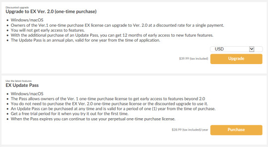
(Keep in mind the prices here are based on CSP EX, the most expensive version of the program at $219 without discounts)
Since it exploded on social media when it was first announced in August 2022, nothing has changed: if you want to get a permanent license for EX 2.0 while already owning EX 1.0, you have to pay an extra $39,99 for a 2.0 permanent license, and you'll need to pay $28,99 a year if you want to get feature updates, for a total of $68,98 from the get-go if you're a 1.0 user.

The only 2.0 users who get feature updates bundled with their license are monthly licenses, starting at an "affordable" $0,99 a month... and $7,49 for a monthly license for two different devices? How strange...
──────────
"Wait, that doesn't look right" (my descent into madness)
"How come monthly usage of CSP EX is $0,99 a month for one device but $7,49 on two devices?" I hear you ask - I had the same question as well! The way the page is formatted makes it look like an absurd sale price, maybe even an error in the listing. And the simple answer is: CSP EX is not $0,99 a month.
The little "Plan list" hyperlink opens a window in your browser that clears this up. $0,99 a month doesn't get you CSP EX, $0,99 a month gets you CSP Pro... On a smartphone.
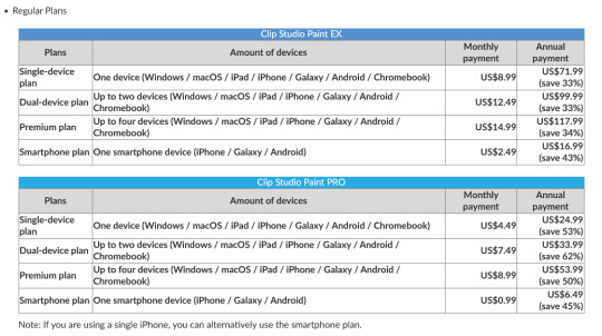
Monthly usage plans are "flexible" in that you pay a specific amount of money a month in accordance to the amount of devices you want to use your license on: smartphone plans are the cheapest since they only give you a license usable on mobile versions of the program, while every other plan includes at least one tablet or pc device. The "cheapest" option for a single device of Pro is $4,49 a month; for EX, $8,99.
"Why did you say 'cheapest' in quotes there?" you ask again. Well, the folks at Celsys (the devs of the program) have been so generous as to offer a discounted monthly plan to people who already own 1.0!
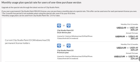
And oh how generous they are.
──────────
"It's maths time!" (the part where I go full Joker mode)
1. Upgrading
Let's do a thought experiment for a second here. Let's say you're like me: someone who bought a permanent license for EX 1.0 before January 2022 (because you don't have to pay for a new permanent license if you did so after the date), someone who only uses CSP on the pc and likes owning the programs you pay for instead of paying subscriptions. Let's also assume you want to access feature updates and not just stability upgrades.
If you wanted to go from a permanent EX 1.0 license to an EX 2.0 monthly plan (which... why), you'd either pay the one-device plan for $8,99/month or $71,99/year which has no special discount, or the dual-device plan for $7,49/month or $61,49/year with the special discount. You go "what the hell, why not? I don't have an obligation to use the second license, and maybe I'll want to use CSP on mobile*!" (*you know you won't) and get the dual-device plan.
Now, remember that a permanent EX 2.0 license if you already own 1.0 costs $39,99, and the Update pass is $28,99/year; $68,98 total. The $7,49/month plan would've costed you $89,88/year, a little over $20 compared to a permanent license with feature updates. The yearly option would still be cheaper though, saving $7,49 in comparison to permanent EX with the Update pass, and $28,39 compared to the monthly option... For the first 12 months, that is.
Don't forget that this is a special offer; after those 12 months, the $7,49/month and $61,49/year will go to their usual price of $12,49/month and $99,99/year.

If you don't cancel that dual plan in time, you could potentially spend $161,48 on CSP EX - a $63,51 difference between that and the $39,99 upgrade with two years of the Update pass ($57,98). And don't forget that you can't get a refund if the renew goes through.

And don't forget that, if you did end up using a smartphone with your plan and that phone is not an iPhone, you'll have to pay for a normal single-device plan instead of the smartphone plan if you want to use pen pressure sensitivity.

(Literally what the fuck?)
That's just the annual plan, though. This is speculation on my part, but I imagine more people would cancel the yearly payment once it's gone through, since it's a bigger sum of money with much more time between payment periods to do so.
Let's say you, like an estimated 40% of people who get a subscription service on some kind of trial or sale, forget to cancel and one day you get billed $12,49 instead of $7,49 for the monthly plan, for an accumulated total of $101,47. Maybe you decide to keep the dual plan wilfully, or you just keep forgetting to cancel or downgrade it, or whatever else... and, without realising, by the second year of your monthly subscription you will've spent a cumulative $239,76 for the program. A permanent license upgrade from 1.0 to 2.0 with two years of the Update pass would've cost $97,97 instead.
2. Don't get scammed upgrading (scam them instead!)
Let's assume that you, like me, have upgraded from Pro to EX in the past. You may have forgotten about the fact that you don't own one, but two CSP licenses. All the upgrade from Pro to EX does is give you a serial number for EX at a discounted price, so even if you use one of them you still have the other floating around in your account info.
But why is that important?

If you (I don't really understand why) wanted to get EX 2.0 monthly with that dual-device discount and pressed the "EX Dual-device discounted plan" button in Clip Studio (img 2 & 4), you'd get taken to this screen which claims you get EX for $7,49/month for... 6 months, even though the website clearly says it should be $7,49/month for 12 months?
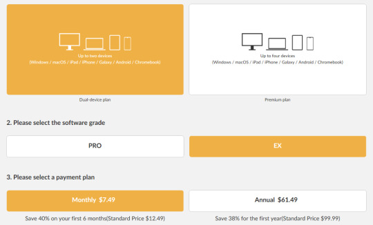
What's happening there is that the offer automatically assumes you want to get this discount based on your Pro license and not your EX license. As you can see here, the special offer gives people with a permanent 1.0 Pro license the monthly discount for either Pro 2.0 or EX 2.0 for only 6 months.

What you have to do to actually get the $7,49/month for 12 months offer, you have to click on the "Return" button at the bottom of the page, then select the EX license manually to get the appropriate discount like so:

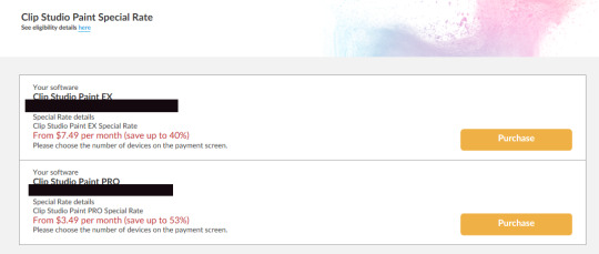

If you did this on purpose, though, you could get EX for $7,49/month for 18 months instead of 12, or $61,49/year for two years instead of one - again, you'd have to actively remember to change your plan's info, but a neat trick to keep in mind if you really want to go through with that.

Even if you did, both would still be more expensive than a permanent license with two years of feature updates ($209,76 for monthly, $122,98 for yearly).
3. But I don't have 1.0!
I wasn't going to include this originally because I feel I've talked about numbers a lot already, but I also understand that at least some of the people who are reading this did not own a permanent CSP license prior to the release of 2.0, so let's go over that too.
We'll keep using EX for simplicity's sake. There's technically four prices for a permanent license for CSP EX: $219, the regular listing price; $129, the sale price; $169, the price to upgrade from Pro to EX*; $84, the sale price to upgrade from Pro to EX*.
*right now there's no listed prices for the upgrade from 2.0 Pro to 2.0 EX, probably because it just came out - regardless these have always been the prices for upgrading from one to the other, and Celsys keeps both regular and sales prices pretty static.
Clip Studio Paint goes on sale very frequently, around 3 or 4 times a year. If you wait to get EX on sale (like how it's on sale right now), you'd be spending a total of $157,99 for a permanent license with one year of the Update pass; if not bought on sale, that'd be $247,99 instead. At first glance it doesn't look as inviting as the subscription model, but you have to remember: buying EX and an Update pass will be $157,99-$247,99, but once you own the program you only have to pay $28,99 a year if you want the Update pass. If we wanted to compare this to the subscription models, we could say it's like paying $13,16/month or $20,67/month for one year, and paying only $2,41/month for every year after the first one.
...And this is assuming you do what the Update pass! You don't need the Update pass at all to use Clip Studio Paint 2.0! And you can keep using 1.0 if you own it!
(If you're a monthly subscriber to CSP already and/or didn't buy a perpetual 1.0 license before today you can't use 1.0 anymore though, sorry)
──────────
"Wait, what?" (and "what the fuck is the Update pass?")
Maybe we got a bit lost in all the maths and endless screenshots of things, so let's dial it back. I keep throwing the name "Update pass" around, so let's go back and explain what that is and what it does with some context.
CSP (what is now known as CSP 1.0) has always been praised by its users for the dev's involvement with the art community, its disposition to incorporate real user feedback when possible, and constant bug fixes, but what it's been praised for the most has always been the free feature updates. The colour mixing palette was a feature update, Companion mode was a feature update, the liquify tool, compatibility with Photoshop brushes, timelapse videos, dual brushes, SVG file support... All of those were feature updates, additions to the tools that were already available in the program, or new tools and functions altogether. All of them were provided for no extra charge, no matter if you got a one-time purchase permanent license or a payment plan.
That is no longer the case with CSP 2.0's perpetual license. And this is where the Update pass comes in.
If you own a perpetual license of CSP 2.0 you will get stability updates (bug fixes so the program actually works lol) if there's big bug fixes that have to be done, but will only receive feature updates for the current version of CSP you own if you pay the yearly Update pass.

And I say "the current version of CSP that you own" because you will get all the new features that release through CSP 2.0's Update pass with the release of CSP 3.0 in 2024.


"3.0?! Already?!" I see you stumble back with my mind's eye. Yes, CSP 3.0! Knowing this, it's easier to understand it all if you see the Update pass as less of a "key to unlock extra content" and more of an "early access to the next version of the program". Whatever it is that Celsys releases between 2.1.0 til 3.0, all of it will be included with the purchase of a perpetual license when 3.0 comes out. You can use 2.0 and its included new features (which look super cool btw) without shilling out an extra $9,99/year for Pro or $28,99/for EX a year on top of the product's license.
──────────
"What the fuck was that all about then?" (it's all so confusing and frustrating, in conclusion)
I know right??? I've been reading and writing and reading again and asking and going back and forth since 10:40am and it's almost 9:50pm. I am going insane. I don't even know why I'm writing this desperate yelp into the void knowing it won't even have the courtesy to stare back at me.
If you're at all familiar with any kind of subscription model, or other "convenient" continued payments over a one time payment, is that these payment models are over-complicated on purpose. Companies bank on you not being insane like me and not sitting down for hours making calculations and analysing shit that's way more obtuse that it should be, so you'll pick the path of least resistance and gear towards the option that gives them eternal revenue from you. Just look at this shit:
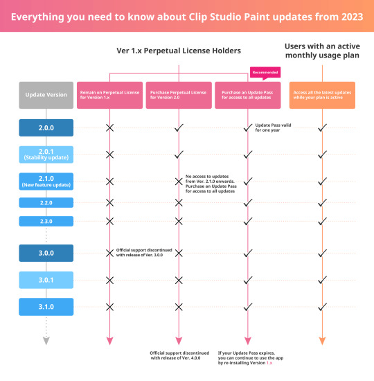
If you already own a license for CSP 1.0, they literally go and tell you the best thing you can do is pay an annual $9,99/$28,99 instead of buying a $49,99/$219 license. It's pure capitalist greed and it sickens me to my very core.
It feels silly to say, but even though we've known this was how it was gonna be for over half a year now I'm still so, so disappointed and distraught. Of course, logically, I know not to trust a company, or a brand, or whatever other money-maker, but in the sea of shit that Adobe has drowned the art industry under, it was nice to have the one really good program that didn't try to pull that shit on you, you know? I spent almost 12 hours of my life writing this for a reason, after all. And just... I don't know, man. Life under capitalism is so bleak, can't even draw in peace and shit
──────────
TL;DR
If you use/want to use CSP on pc don't get scammed into buying any subscription bullshit lmao just get the perpetual 2.0 license and wait for 3.0 in 2024 if you want new features so bad eat the rich bitchhh
Also if you wanna spend any money I'd recommend waiting at least a couple days cos there's been a lot of posts about people having their licenses and subscription activations delayed by ~24 hours due to high demand
Screenshots from:
Clip Studio (main program)
CSP Product line-up page: https://www.clipstudio.net/en/lineup/
CSP Monthly payments help page: https://ec.clip-studio.com/en-us/help#about_plan
CSP FAQ "How many devices can I use for the Monthly usage plan?": https://support.clip-studio.com/en-us/faq/articles/20210060
"Changes to the Windows/macOS One-time Purchase (Perpetual) Version in 2023": https://www.clipstudio.net/en/news/202208/22_01/
"Updates to the version 2.0 announcement": https://www.clipstudio.net/en/news/202210/13_02/
Also I feel like my english fails me whenever I attempt to do image descriptions so if anyone makes them let me know and I'll incorporate them. That is my bilingual curse. Mi maldición
#rambling#clip studio paint#clip studio#csp#clip studio paint 2.0#artists on tumblr#This is my joker origin story
12 notes
·
View notes