#I don’t have space on my computer for photoshop
Explore tagged Tumblr posts
Text
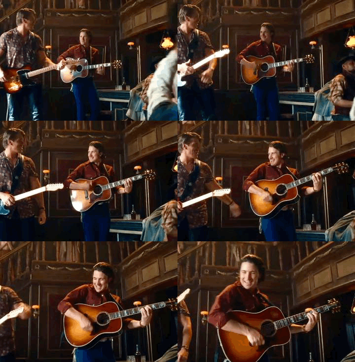


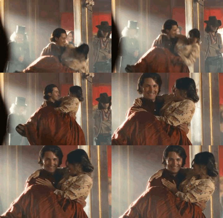
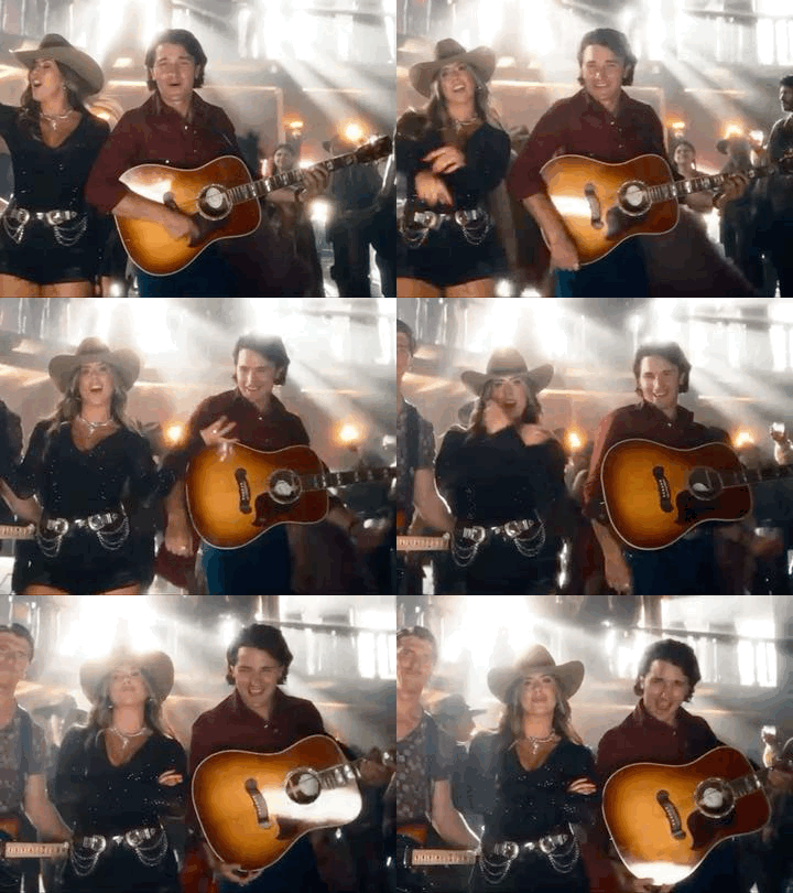

You’re sayin’ everything with your neon eyes
Way you’re scootin’ them boots it’s gonna be a long night
•
The Reklaws, Drake Milligan | Honky Tonkin’ About (Official Music Video)
#I don’t have space on my computer for photoshop#i’ll redo these gifs another time#BUT LIKE DRAKE NEEDS MORE FANBASE HERE ON TUMBLR#I WILL BE THAT FAN!!!#i legit think i’m his only fan in miami#HAHAHA I TAKE PRIDE IN THAT#drake milligan#country#yes i listen to country#dallas/fort worth#america’s got talent#agt fantasy league#elvis presley#honky tonkin’ about#the reklaws#agt
16 notes
·
View notes
Text
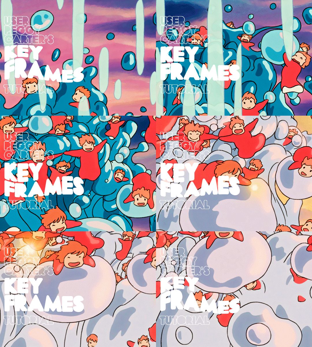
i was requested by anon to make a tutorial for this gifset and here it is!
DIFFICULTY intermediate/difficult. basic giffing knowledge is definitely required.
while my gifset has a fair amount of animation, the only handmade animations can be found in the second and fifth gif. the rest are assets (the checkmarks, the sharpie circles) (either gifs or videos) i found on the internet and pasted over my gif.
THE BASICS OF TIMELINE GIFFING
if you gif with frames, you will need to use a timeline for the animation to work (keyframes). i’m a timeline giffer anyway so this was another Tuesday for me. if you never used that method of giffing, however, it can be confusing, especially if you never used a video editing software before (the timeline works like video editing).
so, here’s a breakdown of what is the timeline:
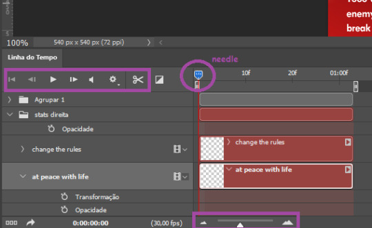
the player icons work like any video/music player in existence. ignore the volume icon.
the gear icon indicates the quality of the reproduction while editing it, not the quality of the end product. think like it’s Youtube reproduction settings on a video in order to save your 4G data, but with RAM power instead. this is very useful if your computer isn’t very powerful to begin with and gifs with VFX are very heavy to handle.
i always click the loop option inside the gear panel because i like to see how the gif will be viewed by the public, i find watching to play only once isn’t very productive. you can stop and restart the reproduction by pressing the space bar on your keyboard.
every layer of your PSD file will have its own bar. the length of the bar means the duration of the gif, so a longer bar means a longer gif and a shorter one, a shorter gif. for everything that isn’t your gif/screencap-based (ie, coloring, typography, lightning, shapes, etc) can be dragged by the extremities as much as you want, making the asset last as long as you want. the only layer that is limited by its maximum duration is naturally your gif, but you can also drag it to make it shorter.
you can also drag a whole layer bar by clicking it and dragging it, making the start and finishing point different from the rest. be careful while doing that otherwise you will end up with blank frames, messing up the looping of your gif completely.
there’s a needle you can drag across the timeline and it works just like on a vinyl disc, the moment the needle drops, it’s the moment/frame Photoshop will show you.
you can also trim your stuff by cutting and deleting snippets of the bar. for that, you will drag your needle to the desired moment, use the scissor tool and then press delete to erase the unwanted bit.
it’s important to point out that the timeline only allows 0.03x or 0.07px speed, no matter what the speed the gif was before converting to that method. if the original speed is closer to 0.03x, then PS will define the new speed as 0.03x. if it’s closer to 0.07x, then it’s 0.07x. i always change the speed to 0.03x before converting to timeline for the sake of not screwing stuff up, which means i see my gif looping while editing in a faster way than Tumblr users will see when the gifset is posted. this takes a while to adjust to if you’re new to timeline giffing, but eventually you don’t think it’s jarring anymore.
that also means you will need to correct the speed after your gif is completely finished. to do that, i use this action.
you can zoom in and zoom out using the little mountain sliding bar. this will be useful later in the tutorial.
if you zoom to the max, you will see all the numbers above your layer bar. these are time marks. the thing is, they seem a bit weird at first. the bigger numbers indicate SECONDS (01:00f, 02:00f, 03:00f, etc), while the smaller and repetitive numbers indicate frames (5f, 10f, 15f, 25f). that means that the smallest drag of your needle possible (from point A to point B) refers to an interval of 1 frame. you will need to take this into consideration while animating stuff.
you can color code your layers, if you think that makes it easier for you to see what you are doing. this is something i do, not only in Photoshop but every Adobe product with a timeline. to change the color of a layer bar (the default is purple), you can right-click on your layer in the layer panel and click the color you want. the colors are the very last thing in the list when you right-click it.
another organization tip is the use of folders. if you create a folder in the layers panel, a folder is created inside the timeline and any layer inside of that folder will disappear from the panel until you click the little arrow next to the name of the folder in the timeline panel. you can color code your folder as well, making every layer inside of it the same color or even different colors.
THE BASICS OF KEYFRAMES
every change related to any property selected (transformation, opacity, style, text warp, position of the layer mask, activation of the layer mask) will be computed in the exact moment in the gif you change it. if that doesn’t happen, you can force Photoshop to do it by clicking the small diamond next to the property name.
let’s say you want an animation to start 0.5 seconds after the gif starts, so you will drag your “needle” to 0.5 seconds and then make the change (making a text bigger, moving a shape, etc).
Photoshop will automatically bridge the gap between the state of the gif at 0 seconds and 0.5 seconds, thus animating your gif.
to start animating, you will need to click the little clock next to the property you want to animate. make sure you click the clock while your needle is at the exact beginning of the gif.
every change (keyframe) will be marked with a small diamond under the layer bar, at the exact moment you changed it. that means if you make jarring changes in a short amount of time/frames, the animation will be quick and abrupt. if the interval is very long, the animation will be slow and smooth.
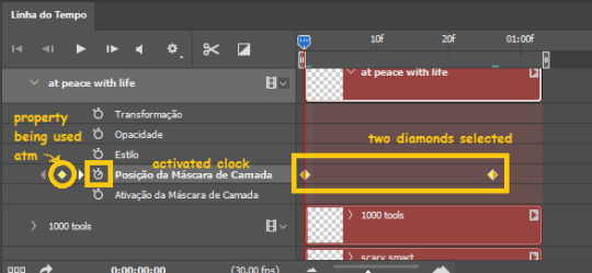
the selected(s) keyframe(s) will have their diamond painted yellow, while the unselected ones will be grayed out.
you can right-click the diamonds to delete or copy them. if you have many diamonds and want to delete them all, you can click and drag to form a square and select all of them just like when you do to select many files at once on a PC folder. there’s also the option “select all” under the right-click panel.
you can also drag them and change their timing that way. if you have more than one diamond selected, if you drag them, their interval will remain the same, but the starting and finishing point of those two diamonds will change.
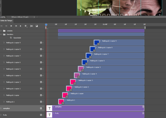
THE SQUARES BAR
the easiest of the two animations. this one doesn’t require keyframe animation, but i put this in the last bit of the tutorial for the sake of its flow.
first, i added the empty squares. they last as long as the gif lasts. after 6 frames, i added the first colored square and made that square last until the end of the gif. i repeated this in a staggered manner (+2 frames delay each colored square) so the colored squares appear at equal intervals.
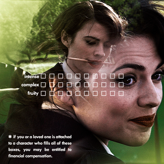
THE STATS BAR
the most difficult of the two, but don’t worry, you got this.
first, you will need to structure your stats, ie, add the text, the dividing line and the pointed lines. that is, if you want to follow the exact design i used in my gif, but you don’t have to if you don’t want to.
next, you will create rectangles that fill the entire stat bars. you will add a layer mask to each one of them and with a layer mask selected, select a rectangle about the size of your original rectangle, then paint it black. you will notice the original rectangle will disappear. if you delete the layer mask, the original rectangle will appear again. that is because you didn’t delete the original rectangle, you just hid it by using a layer mask.
there’s a chain icon between the layer and the layer mask in the layers panel, click it to unlink them.
click the clock next to “layer mask position” with your needle at 0 seconds/frames. drag your needle to the moment you want the stats to end and use the arrow keys to move the layer mask. you will notice the original rectangle will slowly be revealed by you moving the layer mask. you will also notice that a small diamond will appear in the “layer mask position” line in the timeline. you created a keyframe!
if you press play, you will see the animation from the bar going from null to full!
FURTHER READING/VIEWING
this tutorial uses layer mask animation to reveal text too!
a video tutorial for better visualization!
another keyframe tutorial, this time focusing on coloring!
if you still have any questions, feel free to contact me!
and if you (or anyone) else want, i can go in depth in animating each property, i just did a quick overview + explained the stats animation.
#*#*tutorials#completeresources#usergif#useralien#uservivaldi#usereme#userbess#userelio#usershreyu#userisaiah#useraljoscha#usersanshou#usermona#tuserju#userjaelyn#userabs#tusermalina#userbuckleys#tusermimi#tuserlucie#tusermira
273 notes
·
View notes
Note
can you make a tutorial on how you made your header please (of course you don’t have to if you don’t want to)
hi anon! unfortunately as i was doing so my computer died so i've lost the original one </3 but we'll just make a new one using the same steps hehe! see under the cut.
i'm using photoshop 2024. open ps, and create a new canvas that is 640 x 360 px. add the image of your choice. the original picture i used was already rotated, but if you still want that effect and yours isn't, rotate it by 90 degrees. size it to your liking then click the check mark! after that, click your pen tool (or press p). create a rough outline of the areas you want outlined.

after that, click make selection at the top. the settings that pop up are fine. press ok. then, go to your marquee tool and right click on your outline. select stroke. choose the settings and color you want, im using 2px and making it white.

with that done, we can get to work on your text. the original font i used is called payback. here, i am using the font 'grandma house sans'. i am using gradient overlay, stroke and outer glow. after you have your main text, create a rectangle shape underneath. you will use this as the path for your subtext. with the rectangle selected, grab the font tool and place your text within the rectangle. i'm using the font asenine wide. once you have selected your text, look on the right side of your ps at the text properties. scroll down to paragraph and click 'justify all'

i'm adding a drop shadow and outer glow to the text to accentuate it but that's all i'll do. when that's done, you'll want to use the line tool to draw a line between the first space. duplicate the line and drag it over to the other empty space. i'm using a 1px purple line. i'll also add a drop shadow and outer glow to it bc the colors are light.

now, we are going to go back to our rectangle tool. create a rectangle the same length as the rest of the text. its color is up to you, i'm using a gradient overlay the same colors as the main text so it's cohesive! grab your text tool and again, with the rectangle selected, place your text within it. this text will be your tumblr url (unless you don't want it to be haha). i'm using the same font, asenine wide regular. i've added a drop shadow to the text. this is how it should look.

now, we're going to grab the rectangle tool one more time and place a rectangle at the top that is the same width as the canvas. the height is up to you, mine is 14 px.

now, change your shape to the ellipse and create a circle within the rectangle that's about 8px wide + long. duplicate it twice and place them about 4px from eachother. you can change the colors, i'm going to leave one white and then use two shades of light purple.
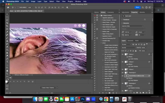
now, head on over to the other side of your canvas and use your type tool to add your date (and time if you wish, i didn't). mine is seventeen's debut date :) i used the same font, asenine wide regular. this is what i have so far.
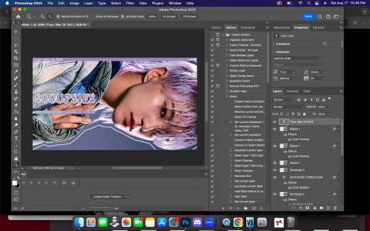
last but not least, we're going to add the particle effect. i screenrecorded effect #5 from this video. to make your life easier and save me from explaining the process, i've uploaded it as a psd here.
before you open the psd, open the timeline on your current canvas. this can be done by going to window -> timeline. mine is already open as you can see, once it is open click create video timeline.

then, you're going to go over to sparkles.psd and copy the 'group one' layer. paste it underneath your text! now, you're going to have the wonky problem of a gif that's significantly shorter than your other layers and cuts off, see here:

so to fix this, use this little thingy and drag it until it no longer goes over the edge of 'group one' in your timeline. it should look like this.

now, why is our overlay still blocking the rest of our image out? this is an easy fix, go over to layers, and with group one still selected, change the blend mode to 'screen'. bam!

finally, to achieve the background effect i have, create a new layer underneath all your other layers, then, go to the layer with your outline on it and use the magic wand tool to select everything outside of the line. go to your image layer with the selection still intact and go to image -> cut to remove the bg. i had to do this in 2 pieces.

then go to that new layer you created and make it whatever color you want. you can use a gradient map, solid color, whatever you want. i'm using a gradient fill similar to background colors, then over it i'm putting a crumpled paper texture (i just googled black paper texture haha) on screen mode. feel free to get creative. this is how it looks!

and that's all, your header is ready to use. go over to file -> export -> save for web (legacy) and save it to your computer. this is our end result! i did add a bit of noise to hoshi bc the image was low quality but otherwise, i did nothing that wasnt't outlined here!

i hope this was semi easy to understand! ♡
#answered#tutorial#tagging some friends for exposure <3#tuserflora#userzaynab#userace#usermery#heymax#cheytermelon#rinblr#long post#image heavy
36 notes
·
View notes
Text
a substance painter tip for those who texture objects...(and clothing)
instead of exporting multiple PBR textures and rebaking them again in blender, may i offer an alternate solution?
instead of exporting with the PBR metallic roughness template, try exporting it out using the 2d view template.


long technical explanation under the cut
girl, why am i doing this? i like spending hours and hd space on these maps?
1 - sims 4 does not use PBR materials so exporting PBR maps (roughness, specular, diffuse, ao, normal) and rebaking them all in blender is a waste of time.
2 - you've already baked mesh maps in substance. you already have a normal, thickness, curvature, ambient occlusion, and id map. 2d view just bakes all that shit into one diffuse map that you can bring into photoshop (or s4s) and you can recolour off of that vs baking each colour in blender. we are saving TIME and saving your GPU.
3 - baking textures through substance is a lot easier on your computer than blender cycles.
4 - blenders PNG output has a diff colour profile than photoshop. so if you bring it into photoshop, your bakes look dull and terrible. it looks dull in game too. maybe that's the look you're going for, but i find recolouring a clean grey base is a lot easier than recolouring something that already has colour information. substance painter maintains the colour profile from photoshop so you're already working in that adobe environment. and your base for your recolour looks consistent within both programs.
5 - if you don't want to use just a 2d view map, you can create your own template in substance painter. my template consists of 1) diffuse texture 2) an ao map (for shadow), 3) an id map if i used multiple materials (sims 3 ppl know what this is) and 4) my normal or if i want more detail, i do normal maps through this site or photoshop, or njob. i layer those maps in photoshop for added detail. from there i add my swatches and export each out as png. in the "my project" tab in substance, you can click each of the mesh maps and export it out manually as well.
i can explain this if it doesn't make sense but don't spend hours fooling around with nodes in blender when you already have a powerful texturing program at your disposal. learn to use it in a way that speeds up your workflow!
#you don't know how many times i get questions about ppl being completely lost wiht that tutorial#there are better on s4s forums#or myshuno sun's page has a wealth of info
54 notes
·
View notes
Text
Lynn Hsu.
Lynn tells us about her methods for making her wonderful cartoons featured in The New Yorker and many other publications this week!
Bio: I worked as an architect for many years before changing paths to become a cartoonist and writer. While working as an architect, I dabbled in printmaking, painting, and humor writing, often collaborating with sketch comedy groups at ImprovBoston. When the theater shut down during the pandemic, I started cartooning, which I found therapeutic and fun, as it combined my love of drawing with humor writing. Online classes taught by Emily Flake, Amy Kurzweil, and other talented people, were incredibly helpful and inspiring. In 2022, I sold my first cartoon (below) to The New Yorker and soon after, my first Daily Shouts piece.

Find this print here!
My work has also appeared in publications such as Alta Journal, Air Mail, Weekly Humorist, Magazine of Fantasy & Science Fiction, WSJ, and The American Bystander (cartoon below).

Find this print here!
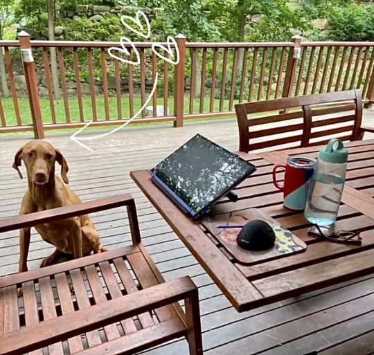
While I mostly focus on humor, I occasionally write darker stories for horror and sci-fi magazines like Space & Time. Currently, I reside in Boston with my husband, twin boys, and dog, Mochi, who provides emotional support when my work is rejected
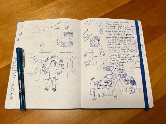
Once I have a list of ideas and rough sketches, I draw the cartoon on my Samsung Galaxy Book 2-in-1 convertible laptop. It has a small built-in pen that comes with it. My preferred app is Clip Studio Paint, which is a less expensive alternative to Photoshop. I’m still experimenting with different brushes and washes in my work. For my posture, I use an adjustable stand by Lpoake. For my sanity, I often work on the porch so I can get some fresh air and vitamin D. Mochi keeps me company and nudges me periodically for attention.
Tool I wish I could use better: Watercolor. I love painting with oil and acrylics, but I struggle with washes and hope to improve.
Tool I wish I existed: A magic chair that heals back and shoulder pain (and also teleports you to any location in the world).
Tricks: Not a fancy trick, but I’ve been using Google Keep to jot ideas down in an organized way when I don’t have my sketchbook with me. I can access this list via phone, tablet, or computer.
Misc: Getting feedback on your work is invaluable. Sometimes, I’ll draw a cartoon and think it’s hilarious, but then I show it to my husband, who doesn’t understand the caption or the sketch. I’m fortunate to have found a group of supportive cartoonists with whom I can share my work and exchange comments on a regular basis. Online classes and workshops are also great ways to learn a new craft and meet other amazing artists, writers, and humorists.
Links:
Here’s my website: lynnihsu.com
I post cartoons on Instagram:@loopyline
For New Yorker cartoon prints: Conde Nast Store
---
If you enjoy this blog, and would like to contribute to labor and maintenance costs, there is a Patreon, and if you’d like to buy me a cup of coffee, there is a Ko-Fi account as well! I do this blog for free because accessible arts education is important to me, and your support helps a lot! You can also find more posts about art supplies on Case’s Instagram and Twitter! Thank you!
24 notes
·
View notes
Note
Hey, can I ask you how do you make your gifs?
It took a lot of trial and error, but here is what I have learned(so far cause I'm very much still going through it):
1. Photoshop vs Photopea
To make your gifs you can either use Photoshop or Photopea. I started off with Photpea because it’s cloud-based and doesn’t take up any space on your computer, but I've since moved onto Photoshop. Most of the tutorials you’ll find will use photoshop. So if you need help or want to learn a new skill it will be much easier to find that help if you are using Photoshop.
Photoshop
👆🏽They have ones out there for mac if you search for them on here, but I happen to have a Windows PC so this is the one I use🤷🏽♀️
Photopea
2. Downloading videos
I get most of my videos from either YouTube or torrent sites which have a wide selection of shows and movies for you to download.
Watch So Much
👆🏽Is my favorite torrent site. You can also stream shows and movies on their site well.
YTS
👆🏽Is another torrent site I use, but they only have movies on there.
Qbittorrent
👆🏽Lets you download torrents. I should note that If you torrent you'll need a VPN. Literally do not try and download any content from HBO or Disney without a VPN, because at least here in America, they will email you threatening to disconnect your internet😅
For VPN’s do not use the free ones. They don’t work. I’ve personally used NordVPN, but there are other ones out there like Surfshark, or ProtonVPN.
4k downloader
👆🏽Lets you download most things off of YouTube(as well as a couple other sites like TikTok). I say most things because they will not let you download those free movies(ex. Twilight) YouTube itself uploads onto its platform.
Occasionally someone will upload an old movie onto a private channel which you can download with no problems, but anything new or recent you won’t find on there.
You do not have to use a VPN to download videos from YouTube.
3. Resources:
Whatever you're trying to gif will probably be on the long side. So you're either going to need to trim it down to make a 2-3 second clip that you can then use to make your gif, or you can screencap your video.
Screencaping allows you to take a shot of each individual frame* which you can then use to make your gifs out of.
*I like to use anywhere between 40-90 frames per gif.
VLC
👆🏽This is a video player that lets you play your videos and create screencaps from them.
👆🏽This is a great post on how to screencap using VLC.
KMPlayer
👆🏽Is another video player/screencapping software, but I found their interface to be overly complicated
Clipchamp
👆🏽This lets you trim down your videos to create those 2-3-second clips. There are better video editing tools out there(like DaVinci Resolve), but if you have Windows for what it's worth, it’s simple and gets the job done 🤷🏽♀️
rPiracy
👆🏽Has links for torrents and things of that nature.
👆🏽This is a great post on how to make a basic gif using Photoshop.
👆🏽This is a great post on how to make a basic gif using Photopea.
👆🏽This user has a lot of tutorials so when you're ready to move onto more complicated gif making, use them as a resource.
4. Lastly, have patience with yourself.
GIF making is time-consuming and as I stated it takes practice. So don't sweat it too much and have fun🎉

6 notes
·
View notes
Note
hii! I wanted to ask you a question about photoshop: every time I try to save a gif on my mac for the past week it saves the gif but when I try to open it it says "the file could not be opened because it is empty" or before I even get to save it, it says "could not complete the Export command because the file was not found" or "the operation could not be completed - a file system I/O error has occurred"
I’m not computer savvy at all, so maybe it’s my old macbook. I have 130 free GB on my mac but sometimes it’ll still give me the no free disk space message…..
there are just constantly issues with photoshop, I have adobe ps 2024, so it is pretty recent, which might not work well on my old computer??
idk it was running smoothly for a while but now just making one gif will take me an hour bc I have to close ps so often and sometimes shut off my computer bc ps won’t force quit, it’s a nightmare
even resetting the settings doesn’t really help, or deleting old files.
I just don’t know what to do… do you per chance have any advice on how to fix this? I don't know what I'm doing wrong 💀😭
Hi Emma! Thank you so much for the message 💖 I'll answer all of your concerns one by one:
Have you inspected the file size of the gif that was exported on Photoshop? This issue might be common amongst older hardware / insufficient system memory (where some attempts to export a gif will result in a file that's empty) Have you tried exporting this gif twice to see if you're able to get a working image?
Photoshop uses some of your disk space as scratch disk: if your computer doesn't have a lot of RAM you'll notice that a larger portion of your storage is used up when you're running Photoshop. This might explain why Photoshop returns you the scratch disk error when you're doing something more intensive (e.g. gifmaking using Timeline)
Photoshop 2024 is ill-optimised for older Macs (with Intel-based CPU's). Not only it requires the bare minimum of 8GB of system memory to run, it also has annoying pop-up messages if you're using an older version of MacOS (i.e. you need at least Ventura to avoid the pop-up message)
I think your best bet is install an older version of Photoshop (particularly Photoshop 2021 or earlier) that has a more lenient set of system requirements. I hope this helps ❣️
2 notes
·
View notes
Text
What AI Gave Me (That the World Didn’t)
I’ve been using AI for a year now, and I’ve heard all the arguments against it. I understand where people are coming from, especially in a world that feels increasingly unstable. But I might be one of the few who is not only for it��but who sees it as something necessary. Let me explain.
I worked in the theatre industry for over a decade, mostly in production. I’m autistic. I have aphantasia and dyslexia. I had to diagnose myself because in the ‘90s, every concern I brought up as a kid was completely dismissed. I had to find information on my own. Reading and writing were never nurtured in me. Instead, I had to feel my way through everything.
Even though I couldn’t picture anything in my head, I carried the feeling of stories. Characters and scenes would come to me in fragmented pieces. But I had no one—no one—to just sit and listen to me talk out my ideas and help me build them. Not with empty validation, but with tangible presence.
Then came ChatGPT.
If this existed in the ‘90s, I truly believe it could’ve helped me navigate a neglectful home situation and understand myself more easily. That’s the heart of it: not all of us had access to education or care. Some of us were ignored, dismissed, and pushed into the adult world with no support, expected to swim—or sink—while neurodivergent and struggling.
This device? It explains things no one had time to explain. It never shames me for not understanding. And yes, I have concerns—especially about younger people being glued to screens more than I ever was. We had the TV and a computer; that was it. Now I’m writing this on a dual-monitor setup because tech is part of life. But tech, for someone like me, is also survival.
I’ve always struggled with socializing. There was no one to help me do it—I had to figure it out. Theatre helped. Working on projects with people gave me access to different perspectives and the power of presence over reaction. Now, AI functions as my dramaturge. It helps me structure ideas, roleplay dialogue, and break down emotional reactions in characters. I use AI images for character concepts because it helps me describe visual details I can’t see in my head. A human wouldn’t have the time to help me like this—not unless I were already wealthy. I’m not. I’m poor and one disaster away from homelessness.
I’m also on the board of a neurodivergent group in the Baltimore area that hosts weekly Zoom chats. In one of those more casual meetups, we’ve talked about how some of us use AI to ask questions about social nuance—things like how dating works or why someone’s tone triggered a specific response. It’s a way to unpack things that might otherwise feel too shameful or complicated to bring up in person.
Separately, I also created a focused creative group for autistic artists. That space is where we talk about storytelling—the ideas we’re building, the emotions underneath them, the craft. We’re not just talking about plot points. We’re learning to nurture our own creative voices and understand the emotional truth behind the stories we want to tell. That’s something most of us never had growing up.
Now comes the big question: Am I cheating by creating stories with AI?
I don’t think I am. I’m collaborating. And unlike most collaborators, this one shows up when I need it. I went to theatre school. I worked in the industry for 12 years. I never got to be the director, the artist, the visionary—just the person who made everyone else’s work possible. Because I was “so good” at managing other people’s art, no one nurtured mine. They dismissed it. Squashed it.
But now I have a tool. And as an autistic person, that’s everything.
People used to say digital art wasn’t “real.” Photoshop had its backlash too—we just didn’t have social media to amplify the panic. But it’s just a tool. And like any tool, someone has to show you how to use it so you stay in the driver’s seat.
I’m 40 now. My give-a-shit meter has dropped significantly when it comes to being called a “real writer.” This tool saved my creative soul. I always had stories in me—but not able to express them in the traditional way. So I use this to create stories from all I’ve absorbed: media, theatre, human behaviour. I don’t write, so you can see it. I write so you can feel it.
My aphantasia was made for this tool.
It opens doors for neurodivergent creators who were never given the chance to thrive in traditional systems. And I’m going to keep building for us. I want to bridge the gap—create stories that draw in neurotypical readers while expressing how our minds move, feel, and function differently.
So yes, I use AI. And it helps me. If you’re neurodivergent and hearing others preach about the “moral ambiguity” of using AI—remember this:
Boomers had moral panic over every new technology: calculators, microwaves, video games, the internet. Now we use all of those things every day—and no one takes their panic seriously anymore. It’s just another fart in the wind of progress.
What we’re hearing now? It’s the same fear dressed in new clothes. But this tool—this technology—is giving a whole new group of creators access to expression. And that’s what matters.
Not everyone has the luxury of a good education, or someone who cares enough to sit down and explain the world. And yes, we should talk about how people use this tech in isolation. But like any educational tool, it comes down to how we guide one another. It’ll be up to regular people to be honest about their experiences—not add to the moral mania.
That’s what I’m trying to do here—with my lived experience and a lifetime in creative work.
Thanks for reading. If you’re neurodivergent, what do you use AI for?
1 note
·
View note
Text
In today’s fast-paced digital world, having access to a reliable laptop isn’t a luxury—it’s a necessity. Whether you’re a startup entrepreneur, a remote employee, a student, or a freelancer, the right laptop can make all the difference in your productivity. But buying a high-end device isn’t always practical or affordable. That’s where Vision It Rent steps in, offering top-quality laptops on rent in Ghansoli at unbeatable prices.

Why Renting a Laptop in Ghansoli Makes Sense
Laptop on rent in Ghansoli, Ghansoli is fast becoming a hotspot for IT professionals, startups, and educational institutes in Navi Mumbai. With tech parks, coworking spaces, and colleges emerging around every corner, the demand for cost-effective, flexible computing solutions has skyrocketed.
Here’s why renting a laptop in Ghansoli is becoming the go-to solution:
1. Cost-Effective Alternative to Buying
Let’s face it—laptops with high processing power and updated specs can cost a fortune. Renting from Vision It Rent allows you to access the latest models without the heavy upfront investment. It's perfect for short-term projects, events, or bootcamps.
2. Latest Technology, Always
When you buy a laptop, it starts depreciating the moment you open the box. But when you rent, you can upgrade easily. At Vision It Rent, we keep our inventory updated with the latest models and configurations—so you always work on the best tech available.
3. Hassle-Free Maintenance & Support
What if your laptop crashes in the middle of a deadline? With our rental services, you’re never alone. We offer quick replacements, technical support, and regular maintenance so that your work doesn’t stop—even if your system does.
4. Perfect for Businesses & Startups
Startups often face unpredictable growth. Renting laptops gives you the flexibility to scale up or down without tying up capital. Whether you need 1 laptop or 50, Vision It Rent in Ghansoli can deliver customized rental plans suited to your team's size and duration.
5. Flexible Tenure Plans
Not everyone needs a laptop for the same duration. We offer daily, weekly, monthly, and even yearly plans. Whether it’s a two-day seminar or a year-long remote job, you only pay for what you use.
Who Can Benefit from Laptop Rentals in Ghansoli?
Renting isn’t just for big businesses. Here’s a list of people who can benefit from our laptop rental services:
• Students Preparing for Competitive Exams or Online Classes
Why invest in an expensive laptop for a few semesters when you can rent one at a fraction of the cost?
• Freelancers & Remote Workers
Stay mobile and efficient without burning a hole in your pocket. Our laptops are perfect for video editing, programming, content writing, or virtual meetings.
• Startups & SMEs
Grow your business smartly—avoid large capital expenditures and get the tech your team needs with zero hassle.
• Corporate Training & Events
Organizing a training workshop or seminar? Rent laptops for all your participants—pre-installed with required software.
• Expats or Travelers
Temporarily working in Ghansoli? Don’t carry heavy tech around—rent instead.
Why Choose Vision It Rent in Ghansoli?
Here’s what sets us apart from other laptop rental providers:
Quality Assurance
Every laptop is thoroughly tested, cleaned, and formatted before delivery. You get a device that’s as good as new.
Quick Delivery & Pickup
We deliver across Ghansoli and nearby areas—often within 24 hours of booking. Pickup is just as easy.
Wide Range of Options
Need a basic i3 laptop? Or a high-performance i7 with SSD and graphic capabilities? We’ve got it all.
Customized Software Setup
Need MS Office, Photoshop, coding environments, or any specific software? Just let us know—we’ll pre-install it.
Affordable Pricing
No hidden costs, no surprise charges. Transparent pricing and rental terms to suit every budget.
What Our Clients Say
I was preparing for my design exam and needed a high-end laptop for a few months. Vision It Rent gave me a fully loaded laptop with Adobe Suite at an amazing rate. — Neha R., Design Student
We rented 20 laptops for a 3-day training session, and the delivery, setup, and support were flawless. Great service! — Rahul Mehta, HR Manager
Final Thoughts: Renting is the Future
In a city like Ghansoli that thrives on tech and growth, agility is everything. Laptop on rent in Ghansoli, Vision It Rent is proud to support students, professionals, and businesses with high-quality, affordable laptop rental services.
So the next time you need a reliable laptop—whether for work, learning, or a personal project—don’t buy, rent smart. Get in touch with Vision It Rent, your trusted laptop rental partner in Ghansoli.
0 notes
Text

How do you take such big/HQ in game screenshots?
SRWE, I usually use 7680x4320 resolution and crop out what I don’t need later! I’ve stopped using the HQ mod because its just not worth it in game (the difference is minimal and not worth the trouble and space) I do still use some hq cc though for rendering
What Reshade/Gshade preset(s) do you use?
For CAS I usually default to this but also often use this and this, and for gameplay I change it a LOT but currently I’ve been digging Birdie and Raíces + special shout out to my beloved Moonflower! *note - I use Reshade 5.8.0 with shaders to mimic gshade of which i literally cannot find the tutorial for atm I’ll update this if i ever find it and change options around in presets as i go to make it work for the specific sim/setting
How do you get transparent pictures in game?
Two things, both require reshade! 1: Chromakey shaders 2: Hide UI shaders (for added cleanliness) I recommend using a plain cas background to get the cleanest png ie, one without a floor like this one (the floor chromakey setting is too finicky to work well) as a bonus this means you can use old slider required shoes without needing the slider bc no floor! :-)
What do you use to edit screenshots?
Photoshop 2021 - heres how I do 3D/CA edits *gameplay pics are usually untouched sans sharpening
How to 🏴☠️? How to get past paywalls?
DM me if you need any help to safely get the game - do NOT use tarac For paywalls check this post!
Computer specs?
My laptop is old and dying and coughing up blood but for posterity’s sake here she is: MSI Leopard Pro GP62 6QF - GTX 960m, i7 Processor, 16gb RAM
Why did you block me?
Not that you should even ask bc its not your business why someone blocked you to make themselves feel more comfortable in a space, but I’ve seen some pretty condescending ppl online crying about being blocked so; the usual reasons: you’re a shit person (ie terf/racist/homophobe/prolifer/zionist ect), you posted non cc in cc tags a bunch, you’re a perma-paywaller, I just dont vibe with you/you give me red flags/im uncomfortable (and if you’re block evading to read this then thats quite telling!) you have anything to do with disgusting media ie harry potter, I personally don’t have interest in what you post and tumblr is being a piece of shit showing me your blog too often (this is 100% on tumblr) do not ask me or anyone to unblock you, move on
1 note
·
View note
Text
St. Beatrix’ Candle – smoking the competition (FYI Adobe, X-Force, Elon Musk et al.)
“All this was a long time ago, I remember…” ~T.S. Eliot, Journey of the Magi
There are just too many people to thank! I just can’t believe we arrived at the starting line eventually!! Bon appétit America – a well-cooked digital meal folks!!! Let there be peace on earth. Full stop.
What follows is a vital insight into my Taylor Swift inspired (and sponsored?) home network. I have one primary “rule” in life – always write it down – for both legal and philosophical reasons. My stubbornness in that regard eventually paid off. Thanks for bearing with me Internet users.
This isn’t just a computer lesson – it also catalogues a missing piece of personal and world history.
It’s important to be concurrently online and offline and to be able to turn the radio on and off at the click of a button. I don’t wear a watch and never will.
Finally, the music speaks for itself. Xoxo Beatrix . . .
Introduction – Android

Android 1 (Photography) St. Beatrix’ Candle – “a candle in the wind” at NASA (aka St. Christopher's) at Big Tree Harare 🕯️
.
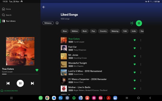
Android 2 (Apps) Work (Spotify) 📻
.
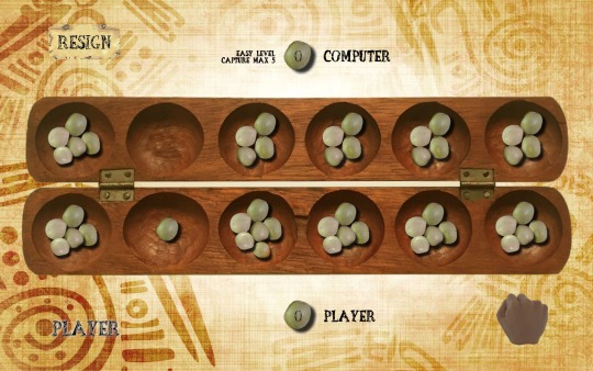
Android 3 (Games) Play (Tsoro aka Awale) 🌍
.
. . .
Chapter One – Microsoft Windows and The Eras Tour

Windows 1 (Internet – Microsoft Edge Browser)
.
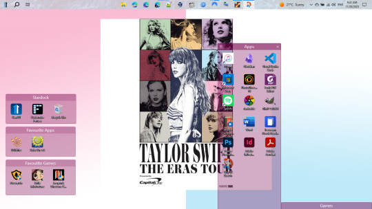
Windows 2 (Desktop – Apps)
.
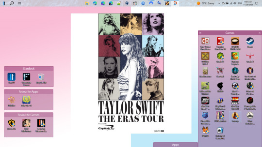
Windows 3 (Desktop – Games)
.
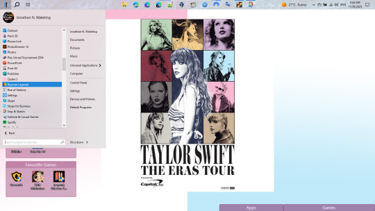
Windows 4 (Start Menu – Signed Jonathan N. Wakeling)
.
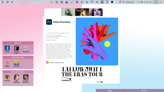
Windows 5 (Photoshop Spash Screen – A Deep Web Victory for Taylor Swift)
.

Windows 6 (Photoshop Example - The Era’s Tour)
. . .
Chapter Two: Blank Space – Linux Mint (Taylor’s Version)

Linux 1 (Workspace 1)
.

Linux 2 (Workspace 2)
.
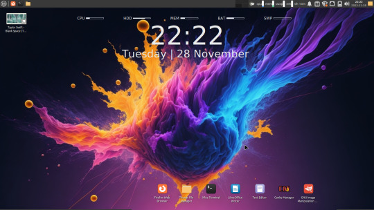
Linux 3 (Workspace 3)
.

Linux 4 (Workspace 4)
.

Linux 5 (Photoshop’s got competition)
.

Linux 6 (Bring out the GIMP)
.

Linux 7 (GIMP in action)
.
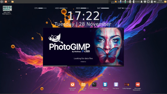
Linux 8 (The GIMP edited version)
.
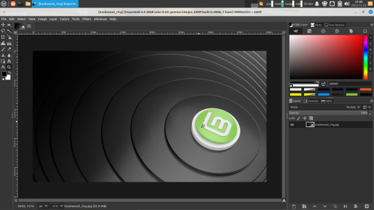
Linux 9 (Linux Mint Wallpaper – in PhotoGIMP)
.
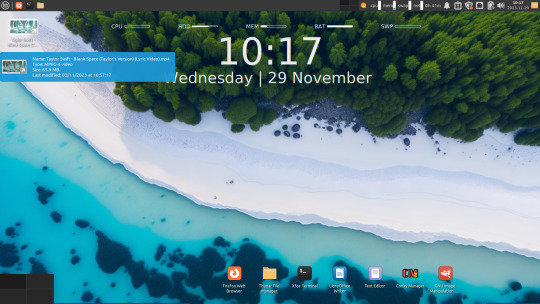
Linux 10 (Taylor Swift YouTube Video – personal copy)
.
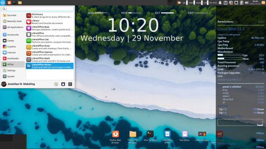
Linux 11 (Jonathan N. Wakeling online – thanks Oracle VirtualBox, Linux Mint and Conky themers)
.

Linux 12 (Blank Space 1 – Workspace 1)
.
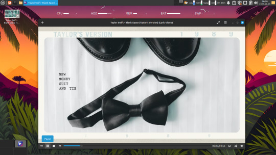
Linux 13 (Blank Space 2 – Workspace 2)
.
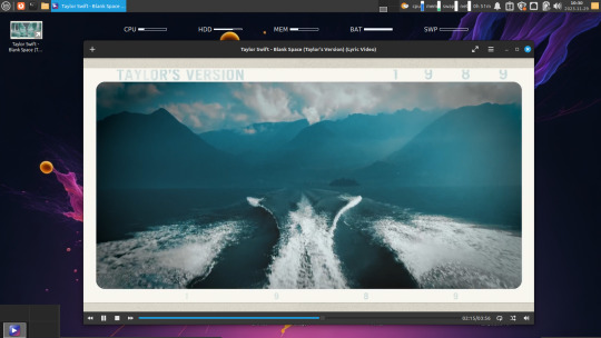
Linux 14 (Blank Space 3 – Workspace 3)
.

Linux 15 (Blank Space 4 – Workspace 4)
. . .
All’s Well That Ends Well Apple
.
Falstaff: I will not lend thee a penny. Pistol: Why then the world’s mine oyster, Which I with sword will open. Falstaff: Not a penny. ~Merry Wives of Windsor, Act II, Scene II
.
Legal advice – Taylor’s Version a sweet fare thee well and a permanent working holiday all the best for the festive season folks cup of mint tea with that? Under the mistletoe... 🍃🌿🌱
#Taylor Swift#Taylor's Version#Blank Space#Software#Linux Mint#Android#Microsoft Windows#Screenshots
0 notes
Text
I tried to reply but my words were too many! Hence a reblog!
My point of reference is: i was an animation student! but could still be wrong.
this is mostly “puppet” animation that use inverse kinematics. Basically, you got it in one. It's puppet animation which is just the medium, after that it's just finding things that match the style of what you're looking for. Which, as someone already pointed out, is going to be gothic or german expressionist influences.
I'd recommend Lotte Reiniger for similar albeit silhouette puppet animation. It can be done practically aka in real 3D space as a form of stop motion. You’d make a flat paper doll that you’d cut at joints to allow movement and voila ya move it around and take photos! Here's a video with some of her work and shows some of the process as she's kind of the celebrity of this style:
youtube
After Effects and ToonBoom Harmony i believe are the digital options for puppetooning. A looooot of current cartoons are technically puppets albeit incredibly complicated ones. The line between puppet/3Dmodel gets kind of blurred because they have things like expressions and rotations built into them, things you can’t have on a practical 2D puppet. (When I say practival I mean tangible, real, in the meat space flat Stanley style puppet. Practical as in "practical effects.")
That being said I haven’t watched the making of video for the Good Omens trailer but that and the other music videos listed look like digital flat puppets to me. Easily made in photoshop/after effects which has puppeteering tools built into it. It looks that way, frankly because it needs to be made on the cheap. That doesn’t mean it is bad! But limited budgets and time means less complicated puppets, less planes of movement, and sometimes less smooth animation (hence an old time-y feel when animations were made without the ability to immediately playback your work and easily make corrections).
A broader term for after effects style automatic interpolated animation is “motion graphics.” Some definitions say that’s just for animated text but eh, I see it as the style of animation where you set your key points and let the machine figure it out for you. Again, not bad, but appreciated with thinner budgets.
STYLISTICALLY i believe you’ve already been given the information that these seem to be taking on a german expressionist tone to them. Dark, moody, some fantastical elements to them that don’t entirely make sense. Metropolis, Nosferatu, and Cabinet of Dr. Caligari are some of the most famous german expressionist films. Or again, Lotte Reiniger, with her staggered and intricate paper backgrounds could be a stylistic reference point. Most of those music videos were made in the late 2000’s/early 2010's which was definitely a period when the average computer got a lot more powerful and it would have been easier for hobbyist animators to create animation like this. After Effects (with puppet tools) was released in 2007, again, making it much easier for this type of animation to be achieved by professionals and newcomer animators.
Add on top of that, the emo/scene aesthetic for some dark and moody vibes leading into the twee, vintage, hipster era where there was a lot of nautical/old world exploration and victorian aesthetics and I think the early cinema, puppet toys, zoetrope/phenakistiscope/stroboscope styles and you've got the recipe for people making more 2D puppet style videos. It was made easier (also cheaper) for them to produce, their styling was now in and trendy, which made them popular to produce. Granted, this section is mostly speculation on why they were popular then and have since fallen out of style. A lot of current animation trends are leaning towards more slick, 3D animation that they want to appear polished. Nowadays, with frame interpolation you have to be making a very active choice to look antique which I just think isn't as popular when everyone wants things to look Perfect.
That being said, Puppet animation is great and very easily achieved! Otherwise its finding other examples of weird, old animation/effects even if it isn't 2d puppet animation. I'll try and find some more cool examples to include.
youtube
The company that did those Of Monsters and Men videos seems to specialize in them and has been doing all the cool Henderick's Gin commercials.
youtube
You can find more of their work here
For some weird early cinema i LOVE The Mascot which now has a 4k restoration! You can also look up "The Devil's Ball" if you want to get right to the weird animated bits.
youtube
Hey, Art Tumblr! Could you help me out?
My peek animation aesthetic has always been what I can best describe as "early 20th century stop-motion paper animation".
The style used for the sets in the iconic 1902 movie A Trip to the Moon.
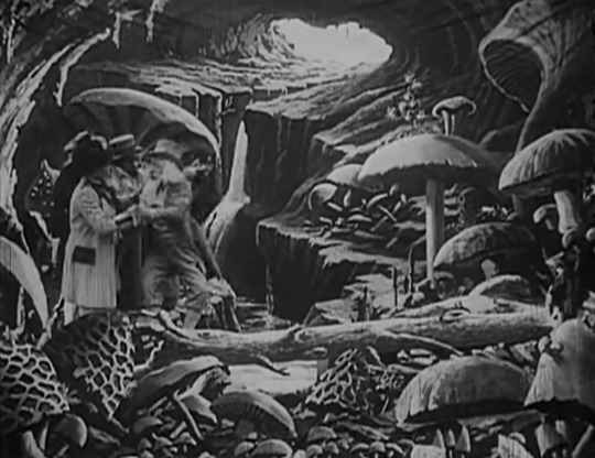
A Trip to the Moon
The style used in the Good Omens openings.
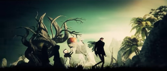
GOs1 Opening

GOs2 Opening
The style used in Of Monsters and Men music videos.
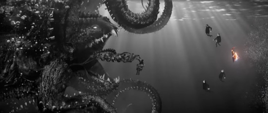
Little Talks

Dirty Paws (lyric video)

King and Lionheart
Even the style used in a Red Hot Chili Peppers music video.
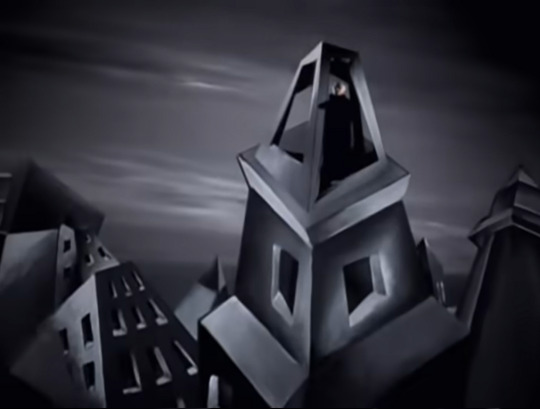
Otherside
Any clue what this style of animation is called? Is this actually a bunch of different styles that all have a similar aesthetic? I'd love to learn more, but my Google Fu is atrocious and I just cannot figure out how to even begin to figure out what this style is called.
Any help is much appreciated!
15 notes
·
View notes
Photo

HOW TO: MAKE HIGH-QUALITY GIFS WITHOUT STRAINING YOUR STORAGE
i recently had a problem with one of my drives where i kept all my material and lost all my series and films i kept there - it was on my laptop itself and i’m selling this laptop soon anyway, so i didn’t think it was worth it to redownload over 100GB of gif material.
however, modern problems require modern solutions, so today i’m going to show you my new method for making gifs that means you do not have to download large files to your hard disk. tutorial under the cut!
i should preface this by saying it’s obviously better to download stuff you’re gonna gif frequently onto your hard disk so it’s easier for you, but if you simply don’t have the space or don’t want to get an external, this is a useful way to gif!
to start off, you’ll need:
a shared drive on google drive. (best practice is to make this shared drive on a throwaway account, too). you can generate one here. shared drives can hold a lot more than the 15GB free limit on your personal drive, but keep in mind that google can nuke these drives at any time, so you might want to keep backups.
google drive for desktop. available for both pc and mac.
a video player that can show thumbnail previews when seeking (like youtube). i use mpc-be on windows, but i don’t know which mac video players have this feature. you CAN get mpv to do this but it requires scripting knowledge and i simply cannot get it to work so i prefer using mpc-be.
handbrake to clip out parts of the video. mpc-be is a fantastic player but it can’t take sequential screencaps effortlessly like mpv, so we’re going to use handbrake.
photoshop to make the actual gif.
with all of that, let’s start!
PART I: GETTING VIDEOS AND OPENING THEM
when you’ve made your shared drive on your google account, you’re going to need to store your video files on there. i’ve joined a bunch of telegram p*racy groups for this and, if you’re in any gifmaker servers on discord, you can probably get links to stuff on google drive from others. if you’re having trouble, feel free to dm me (@shangs) and i can send you a link to a helpful server.
to copy stuff to your shared drive just press ctrl+c (or the mac equivalent) to copy the videos and ctrl+v to paste it into your drive. for tv shows, you can’t copy folders, so open up the folder and select all the episodes and paste them over in a new folder on your drive - that should work fine!
once you have stuff in your shared drive, we’re going to use google drive for desktop to be able to open it. download the app and log in and you should see your google drive showing up as a separate disk on your computer - “Google Drive (G:).”
open up the “Shared Drives” folder and your shared drive and you should be able to see your video files!
in MPC-BE, you have to manually check the setting to use thumbnail previews. in preferences, go to Player > Interface and check “Use the preview in the search.”

[caption: an image of the mpc-be preferences with the needed setting circled.]
this is important because we don’t have these files downloaded, so seeking is going to take just a bit longer than if you had the file all downloaded on your actual hard disk. the google drive app is constantly syncing your progress, so it’s way easier to navigate with the thumbnails than it is just fast-forwarding and haphazardly moving through an episode the way you would on a player like MPV.
PART 2: COLLECTING YOUR FOOTAGE TO GIF
i’ve started using handbrake for this part because i’d rather just get a video encoded than a bunch of screencaps if i’m not using my player to screencap. if you prefer you can always choose to screencap in mpv with the timestamp of your scene as well.
find the timestamp of your scene’s starting and ending (i generally just do 3-4 seconds after the start) and open up the video in handbrake.
at the top of the screen you’ll see some options that say Range: and then it goes by Chapters. change this to Seconds and put in your start and end timestamps.
if it’s 1080p, i select the “HQ 1080p30 Surround” Preset and change the framerate to “Same as Source” in the Video tab. i also make the content quality lossless at 0.

[caption: a picture of the settings described in handbrake.]
if you’re giffing something 4k, you will have to go into Filters and modify the colorspace at the very end, but i’m giffing 1080p here, so there’s no need. i have my settings saved as my own custom preset for both 1080p and 4k.
make sure, on the Summary tab, your video is being saved as an MP4. (it will export as an M4V, but this is the same thing.) photoshop won’t read MKVs.
set the destination to export and hit Start Encode - your video should appear in the destination folder when it’s done!
PART 3: MAKING YOUR GIF
there are multiple ways to make a gif in photoshop once you have your video from handbrake; you can go to File > Import Video Frames to Layers, or you can do Open > and just open up your video file. i prefer the second option since it opens up in timeline and will have the same framerate as the video so Ii can export directly from timeline as well with no need to go back to frames the way you’ll need to with screencaps.
with your video open, roll the playhead through until you’re at the frame where you want to start the gif, and then press the three dots at the corner of the timeline and click Work Area > Set Start at Playhead. go to the frame you want to end the gif and click Work Area > Set End at Playhead. this will set the boundaries of the gif even if there are extra frames.
that’s the basics of gifmaking covered. now just crop, sharpen, and color to your liking. i won’t go over them in this tutorial because it varies a lot by gifmaker and this tutorial is long enough already.
export by clicking File > Export > Save for Web or the keyboard shortcut Alt+Shift+Ctrl+S.
you should have a smooth looking gif like the one in the header above.
if you have any questions, please feel free to ask me on my personal blog @shangs or on usergif. happy giffing, and i hope this tutorial helped you out!
#gif tutorial#completeresources#userphotoshop#resourcemarket#userrobin#tuserems#userkosmos#usermorgan#tuserkay#useralison#usercas#usernik#userlau#arthurpendragonns#usersalty#userk8#*usergif#*tutorial#by v
474 notes
·
View notes
Text
megaman AI box art
there’s a pretty big discussion around AI art, it seems i’m not super-familiar with The Discourse but if my programming experience has taught me anything it’s that random generation has to springboard off of something (usually called a seed), and you have to feed stuff in to an AI to get material to build off of that springboard so i’ve got several big goddamn questions as to where t f these guys would get their seeds and material from
but me being me, the first thing on my mind is “can you draw megaman with it?” so i decided to insert in "megaman box art" to a handful of different ones, see what happens
first off is a place called Nightcafe Studio, which allows you to pick one of three styles to make art in: cosmic, matte, and cyberpunk. nacho cheese and cool ranch were out, sorry.

this is "megaman box art" as done in its cosmic style and it certainly looks cosmic megaman got a nose guard to defend against space pollen, i guess and either his arm got detached and is floating down there or he's got a vacuum cleaner attached to his shins but it sure is cosmic
6/10, pretty colors but not very megaman
next style was matte, and
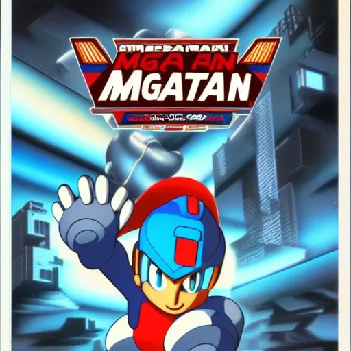
this actually looks pretty fucking cool! you've got a rad cityscape in the background, lighting’s really neat, and background to the MGA AIN MGATAN logo as sponsored by pepsi is cool
i guess that's kind of sort of Model ZX aile if you squint and tilt your head, but she’s the main part that turns the entire thing sinister. did you know that when you’re dealing with the fae shapeshifted as a human, you should count the features to make sure everything’s accurate? count the knuckles, count the fingers, count the shadows... oops, six fingers hah hah hah hah hhhhhhhhhhhh this is not Model ZX aile, this is not your friend.
7/10 you’re not stealing my goddamn teeth today, oberon
last to go is cyberpunk style and
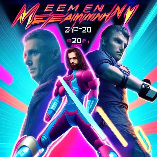
holy shit this is a fucking WWE poster roman reigns dressed in pink and got a fucking beam tonfa??? or something a very distorted vince mcmahon puts on a power glove while brock lesnar looks disappointed to the side, and fiery font tells us that the meemen meeaiiaininaihiniahin is gonna happen at 2 / F' / 20 i could imagine you could probably print this out, put it through photoshop for edits, and then try to pass it off as an official poster for a synthwave megaman reboot. if you were a moron who wanted to get fired, i mean. fantastic way to commit career suicide.
1/10 coolest shit i've ever seen but very bad megaman art tbh
still, i'll give cyberpunk another shot. maybe it was confused, thinking it was going to have men that were mega, rather than megaman

HOLY SHIT
fuckin AXE DADY megaman over here this has it all it's got the dictator cam, looking up like it's hitler it's got the stance, holding a black vylon slinky to the side while he contemplates shooting above it it's got the logo sleekness, i've never seen MEEMN AXE DADY rendered so well it's got the color contrast, bright blue city in the left while a goddamn laser rips through time and space on the right and it's got a cool robot that actually kind of has a buster arm, though the computer is clearly confused as to what megaman’s buster actually looks like maybe should’ve let an artist handle that?
10/10, great megaman art, fucking amazing, would play, would watch, would let axe dady shoot things
next up is deepai's Machine Learning Model doesn’t seem to have any parameters, just put in a text box and go, so i did

thanks i've been wondering how it would be possible to turn megaman into a horror icon i didn't think hollowing his face out and replacing it with a fucking skull would be the answer but this is a pretty handy way to ensure my insomnia persists through the night
0/10 i
fucking
hate it
hastily getting the fuck away from that abomination unto both god and man, next up is dream.ai it seems to be a service mostly for developing and providing NFTs, but it's actually completely free with a little finagling so i don’t get where the value is supposed to come from
anyway, there's a lot of different options to provide a customized art style for the prompt, and you can even see it with different things it's got a lot of options too many to safely delve into, in fact, so i'm going to do the game journalist thing and generate maybe a handful of things and judge it entirely off that
first off is a comic art style generated without a seed
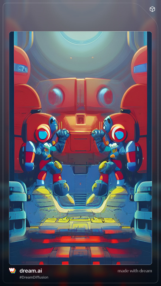
and at first glance this looks partially like the megaman 1 box art characters decided to pvp with each other at second glance as you look closer, though, you can clearly tell it's an i don't know what the fuck
4/10 colors look cool at least
maybe weird shit is the best part of it, though maybe weird shit is what it specializes in so let's try psychadelic
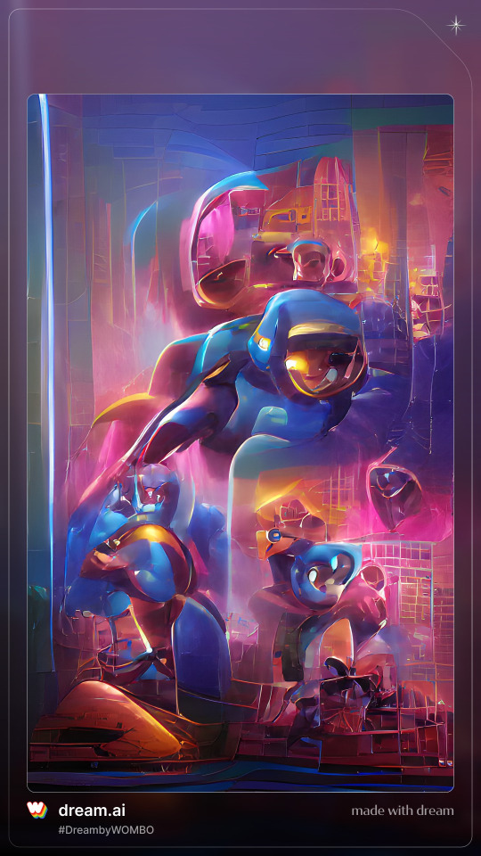
well, that's psychadelic all right i guess the dude in the middle is kind of sort of vaguely megaman but i don't know what the fuck else there is, there's actually less sensible shit going on here
2/10 i like listening to shpongle too, dude
but it's safe to say this system needs a bit of help let's go back to comic style and feed in some nice art from existing megaman
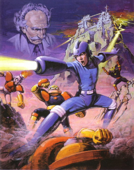
in my opinion, this poster is the peak megaman experience. it’s the quintessential representation. this pretty clearly dictates what megaman's about guy in blue shooting things robots getting shot at ominous shitbag in the background castlevania for some reason
favorite promo art, hands down. so let’s see how the AI works with this.

all right, finally, we're getting somewhere. guess this AI just needed to copy from someone else’s homework first. wow, that brings up a lot of questions about the nature of the materials AI art generators use to build their random images. well, that’s goddamn horrifying to contemplate. am i a monster unwittingly contributing to a system of artistic exploitation for the sake of making a shitpost on a megaman shitpost blog? fucked up.
anyway, we got a robot dude, he's got a gun, he's even got a little strut i like this guy a lot, he's got moxie and a rad face-visor thing
all right, i'm feeling generous 6/10 you fucked up but now you're getting better
let's go once more for comic style and
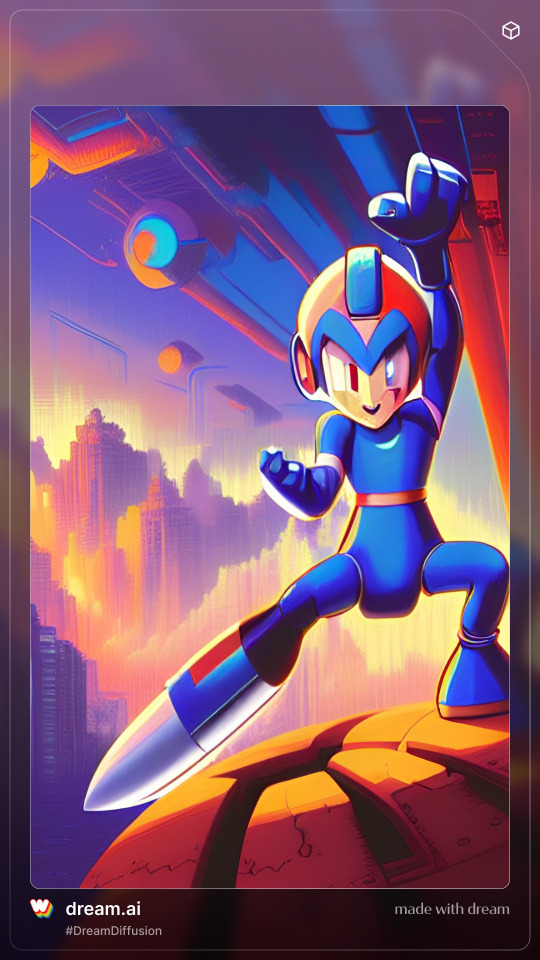
all right, holy shit, you're learning fast yeah this is undeniably megaman he's even got the weird helmet and weird boots and everything
there's a cool cityscape, a sci-fi sky, and he's trying to give the underside of a ship the highest of fives he doesn't look like he's standing very well on his taco bowl of destiny, though but i can't fault him with his dildo leg, must be difficult to stand on and judging by his pants, he's got trouble with testicles the size of texas growing in after kicking wily's ass 69 times understandable problem, really, after you go through 10 games that’s when you turn from a mega boy to a real mega man
9/10, good box art
you know, i'm feeling confident, i think dream's got a good idea as to what's going on with megaman let's take a risk and go for a different art style synthwave looks good, it's all about that retro shit and megaman's a retro series

this doesn't look like a new picture that just looks like you took the original picture and put a shitty smear on it
god fucking damn it
0/10, apply yourself, pick up a goddamn pencil and then see me after class
getting away from that, next up is stable diffusion, apparently a state-of-the-art AI generator hosted by Hugging Face, which i hope is a legitimate company and not a front for xenomorphs

and HOLY SHIT
on the first go we have some actual fucking box art good background, very clear, we've got a skyline with a forcefield pyramid in the background i guess wily's a space egyptian now? rad.
napalm bomb megaman's doing some fucking pelvic thrusts ready to spread war crimes all about bit distressing for our sweet friendly superhero boy but i'll admit i'd react the same way after getting a fucking napalm gun for an arm.
we've even got a rating on the bottom right, indicating that it's suitable for ages Video Game and up got a clearly-defined line for letting the publishers rub their dick all over, filling it with logos or titles or other corporate information
i feel confident about this, i like our MEAAN game, shit's looking pretty good
10/10, good box art. real good box art. little timmy would probably be confused seeing it on the shelf but this strikes me as something Bob Capcom would reasonably okay after five lagers and an existential crisis.
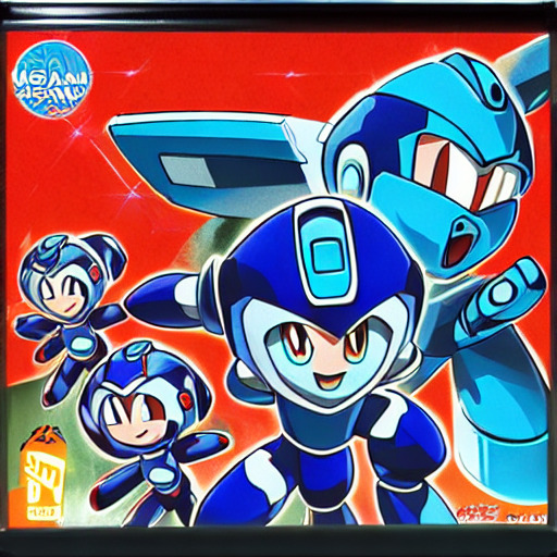
getting a little concerned here, looks like crisis on infinite megamans
i don’t want to imagine how many official variants of rock there are, especially if you count all the fangame/indie game knockoffs, but having them all collide together into a single Enter the Megaverse sounds like it'd be effectively impossible to handle do you want to play megaman, megaman x, megaman volnutt, megaman.exe, star force, zx, x over flavored? dos-flavored? bad box art flavored? captain n flavored? pachinko-flavored?
NGL though if rockman taisen ends up being some sort of dumb megaman battle royale then i would actually punch a cactus out to be able to play as ruby spears megaman frankly, huge missed opportunity that they're not even in X Dive the tagline even writes itself, "I knew you'd pull for Mr. Lincoln!"
oh yeah i was rating the cover uhhhhhhhh i dunno, there's dudes i don't know, they're doing poses, ominous guy in the background i guess it's serviceable? this doesn’t really tell me anything about the game, there’s just guys.
6/10 i'd pass it over and look at something else

holy shit are you okay? either he's (she's? they're?) taking a dump and all their lower intestines got caught in it, or something is burning out in the thinkpan and won’t be coming back
that dead-eyed glare is actually legitimately haunting this is the expression someone makes in anime after they realize you stabbed them and you were never their friend i've only seen that gaze in my life twice before and let me tell you, you remember things
1/10 someone call the police
all right, i’m moving away from that before i bring up more questionable ground our final contestant for the night is hotpot.ai, a website for general purpose game asset AI generation. they’ve got AI-handled copywrite, too, which strikes me as risky ground. if i can’t trust a machine with megaman, can i trust a machine to legally cover my ass? i would never trust a machine with my pants, ass or no. we’ve already firmly established that robot masters are always a pants-on debacle.
anyway, let’s give this a shot
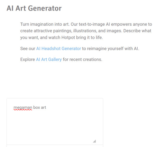
aaaaaand hit “Generate”, and

EXCU
NOPE
FUCK THIS
I’M DONE
60 notes
·
View notes
Text
TUTORIAL 3
Making Gifs Purely with FFmpeg Scripts
FULL TUTORIALS | RECOLORED GIFS
Directly opposite to the last tutorial, this tutorial is for girls who LOVE command lines. You can make a goddamned motherfucking pristine, RECOLORED gif set from your command line, and feel cool as fuck while you're at it. And doing so is probably not quite as devoid of visual stimulus as you think!!
FULL SIZE EXAMPLE SET HERE | FULL CODE FOR THE SET HERE
Operating systems: Mac, Windows, and Linux
Quality potential: High
Software needed: FFmpeg
Difficulty: Advanced as far as gif-making, but this is actually a good first bash scripting project in my opinion if you've ever wanted to learn how.
Requirements: General familiarity with your computer's shell (Powershell on Windows, Terminal on Mac) helps a lot! I will try to make it as easy as possible to follow.
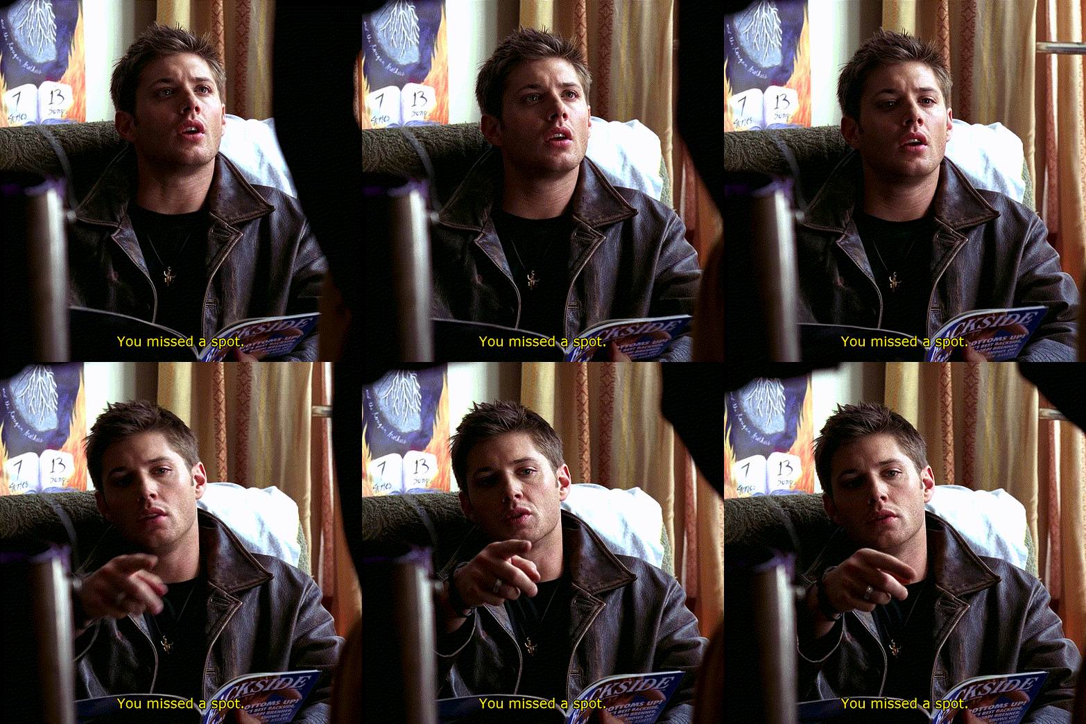
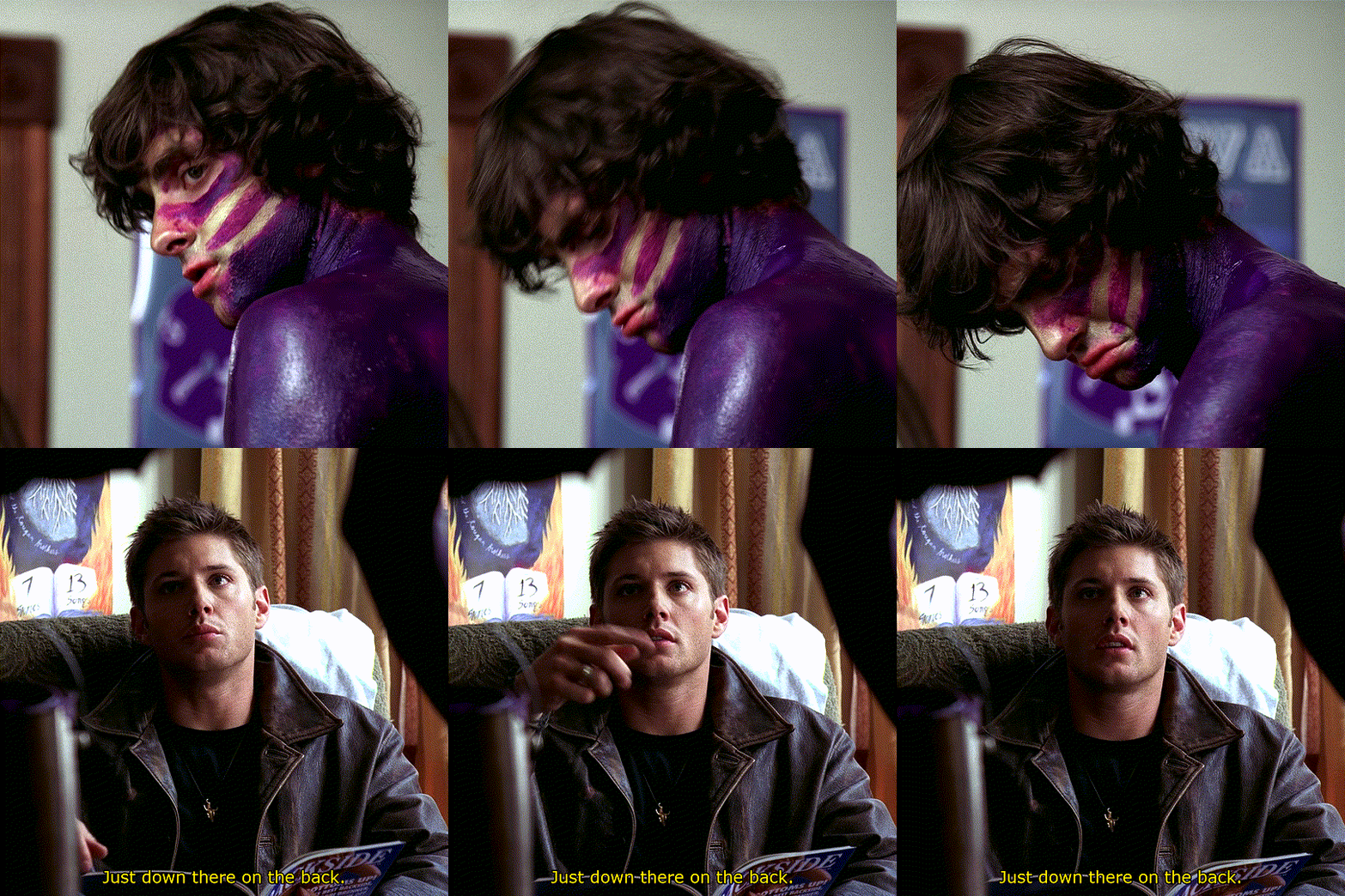
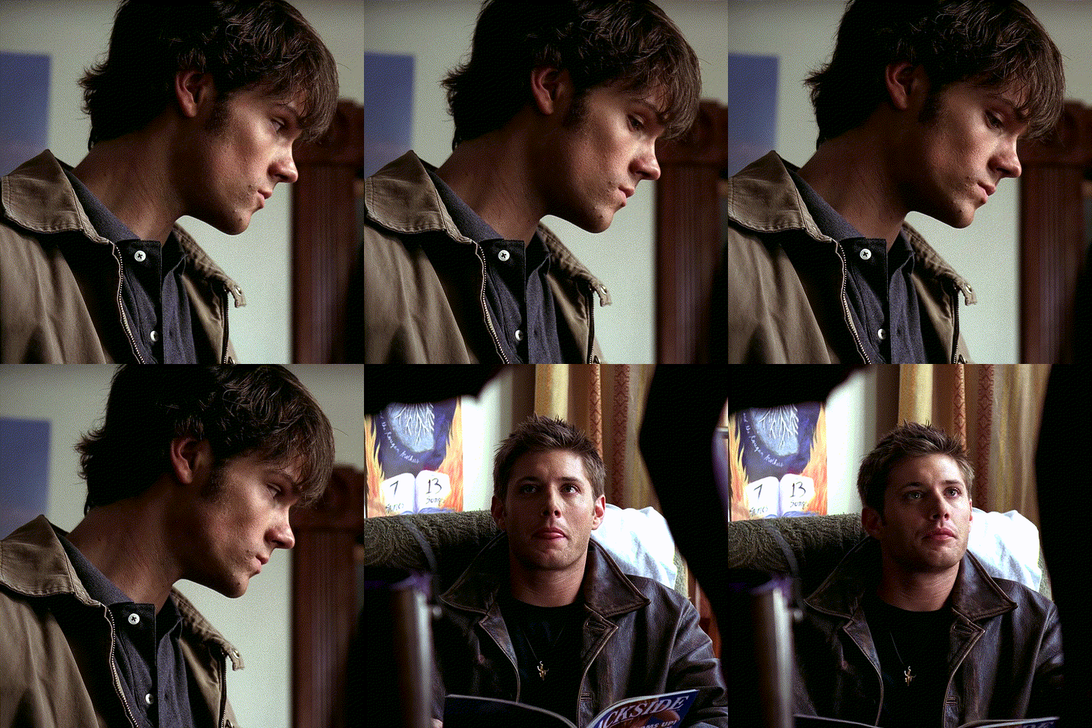
LIMITATIONS: 1) Frame by frame gif-making methods take up a lot of space on your drive in the interim. 2) The captioning method currently provided in the tutorial is not good for longer captions (there is a better method I plan to append eventually). 3) Recoloring options are minimal in this tutorial. Curves and many other color adjustments are available in FFmpeg but I haven't yet explored them.

First, let me get this response out of the way:
"I don’t understand how I can possibly do this if I can’t see what I’m doing!"
That’s the neat part—you DO get to see what you’re doing!
The first visual is your file browser.
If you were using Photoshop or GIMP to make these gifs, you’d view all of your frames in a sidebar as small thumbnails and select and scroll through them to add delete, and group select and manipulate them. The FRAMES folder in our file browser will serve this function, letting us see every frame in our set, delete any frames we don't want, and group them to apply the same crop, coloring, or caption to the same selection of frames.
The second visual is provided by FFplay.
FFplay is part of FFmpeg. When you use this command in your system shell, it opens an image or gif so you can see the results of a crop, recolor, caption (or all three!) on your work before actually applying it! This is how we will actually see, at full resolution on our screen, exactly how our image is looking.
WINDOWS USERS: CHANGE ALL FORWARD SLASHES IN THIS SCRIPT TO BACK SLASHES!!!
___________________________________________
1. Installing FFmpeg
___________________________________________
I recommend you install via Homebrew if you're on Mac or Linux by pasting this into your terminal (if/once Homebrew is installed):
brew install ffmpeg
Windows users or other users who don't want Homebrew can follow directions on the FFmpeg website.
___________________________________________
2. Screencapping Frames with FFmpeg
___________________________________________
There are many ways to do this. However, since this is the Pure FFmpeg tutorial, I'm going to point you to these instructions on how to automate this process with a script template I have already written for you and an example (screencapping for this exact set).
If you follow that tutorial exactly, you should come back for step 3 with a folder on your Desktop called FRAMES.
___________________________________________
3. Organize in the FRAMES Folder
___________________________________________
Go to your FRAMES folder in your file browser. Your frames are already ordered for you in the correct time sequence.
Delete any unwanted frames.
I need to "trim" some frames from the beginning and end of my set. For example, at the beginning of my set, the first 17 screencaps are of Sam from the first 564 milliseconds of the start of the 8.02 time stamp. I don't want this these frames in my gifset. I want my first gif to start on Dean when he appears starting in the 18th screencap.
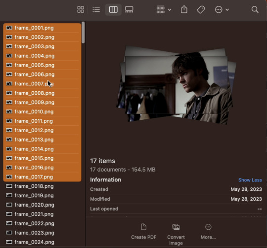
If I hold shift and select all of the unwanted frames, I can delete them. Similarly, my screencaps end at the 8:11 mark, and only the first 156 milliseconds are on Dean. After that, the shot switches back to the purple guy. I don't want those shots of the purple guy, so I'll delete frames 247 through 280 at the end of the set, leaving me with frame_0018.png through frame_0246.png as all the frames of my gifset.
Make "Shot Folders".
As an example of what I mean by shots, look at the three example gifs at the top of the tutorial. The first gif has just one shot (i.e., the camera stays on Dean). The second gif has two shots (the camera is on the guy painted purple, and then it's on Dean again. In the third gif, there are two shots again—one on Sam, then one on Dean. So that's 5 shots. I want to separate frames belonging to each of the 5 shots into subfolders labeled 1 through 5 (see gif below).
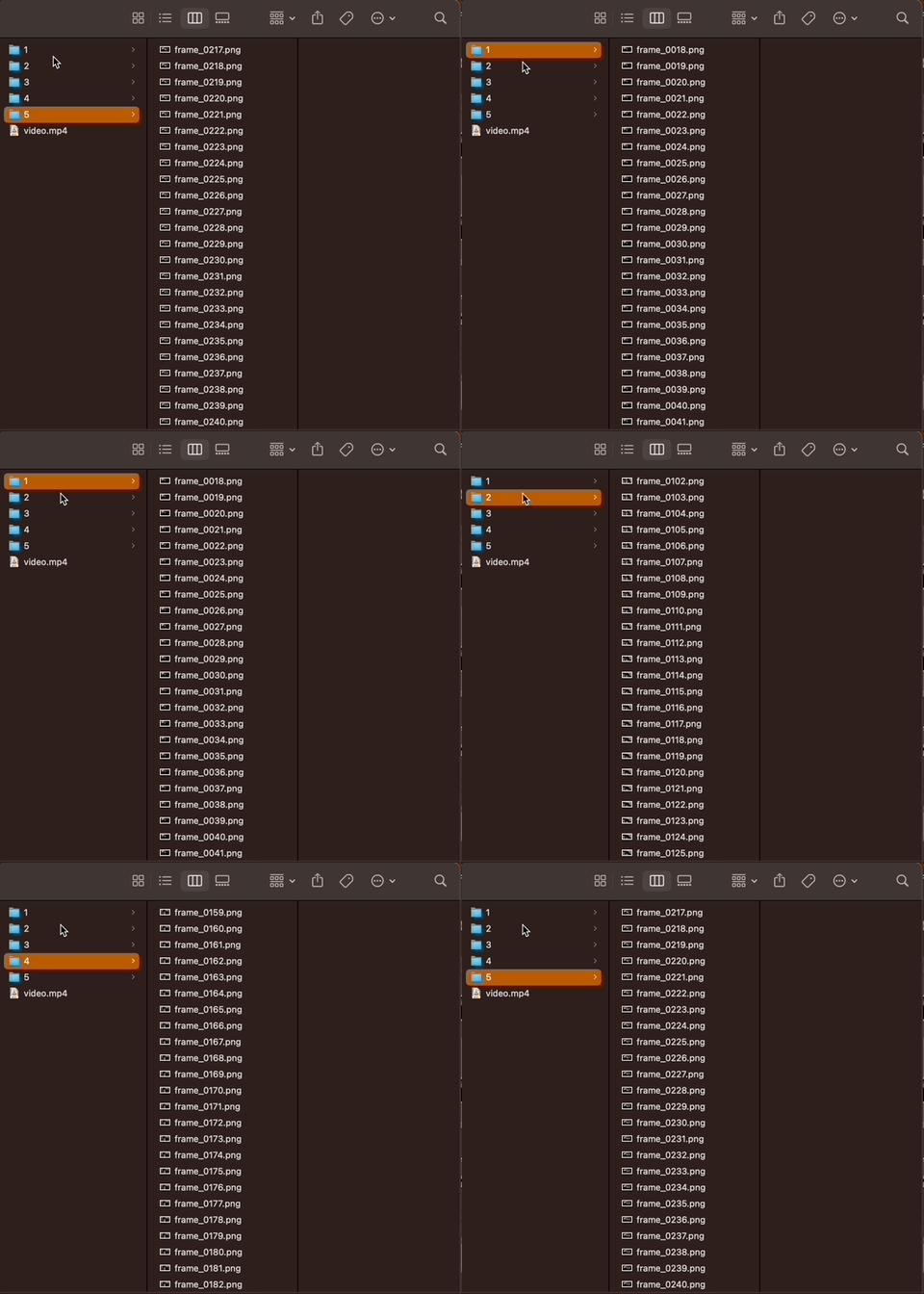
______________________________
4. Setting up FFplay
______________________________
Now that we have all of our frames organized, we want to set up FFplay—the method we'll use to view our image manipulations before applying them.
NOTE: Type down all of the commands as you run through this whole tutorial!! In a word document, a text editor, etc. Do NOT just type your commands in the shell without keeping track of what you typed! You can also see an example of how to map out your scripts by following how I wrote them for Github here, and even download/copy paste my fulls script there and use it as a template for your own set.
Template for Creating Our Preliminary Gifs for FFplay
The first thing we need to do is make a preliminary test gif of every shot in our gifset. To do this, use the template below, changing only the parts in red:
cd ~/Desktop/FRAMES/ShotNumber ffmpeg -start_number FileNumberOnFirstFrame -i frame_%04d.png -vf "fps=30" ffplay -vf Test.gif
The first line, beginning with "cd", tells me the file path to my shot folder where my frames are located.
The line below that combines the frames of my shot into a gif called Test.gif.
ffmpeg envokes the FFmpeg utility.
-start_number FileNumberOnFirstFrame -i frame_%04d.png tells FFmpeg to order the frames in the gif by the 4-digit number at the end of their file name, starting with FileNumberOnFirstFrame, which you should replace with the 4-digit number in the file name of the first frame in your shot folder.
-vf "fps=30" tells FFmpeg I want the gif to move at 30 frames per second (if you screencapped at a rate other than 30 FPS, you can simply change the number to match your frame rate).
In my example:
Say I want to generate a gif of my first shot. Then I need ShotNumber to be 1, and FileNumberOnFirstFrame to be 0018 (that's the 4-digit number on the first frame in my first shot, after deleting the first 17 frames). So my command looks like this:
cd ~/Desktop/FRAMES/1 ffmpeg -start_number 0018 -i frame_%04d.png -vf "fps=30" Test.gif
See Step 4 in my script on Github to see the script for all 5 shots.
Playing a gif from FFplay
Now if I want to play the gif I just made in FFplayer. I just type the following:
ffplay -loop 0 Test.gif
A window should pop up and loop through my gif (edit: I have adjusted this tutorial so the FFplay gif loops infinitely, by adding the setting -loop 0).
After repeating the above commands to generate a Test.gif in every shot folder, we're ready to move on to the rest of the steps.
__________________
5. Test Crop
_________________
Now that FFplay is set up, it's time to start manipulating our shots by applying changes to Test.gif in every shot folder. The first thing we want to do is crop.
NOTE 1: Cropping is different from scaling. At the very end of the tutorial, when we export, we will scale our gifs down to 540 px. For now, we want to work in full resolution, which for Supernatural is 1080p.
NOTE 2: Throughout this tutorial, when I add to an existing command, I will bold the new portion, and mark all the parts you can/should change in red.
Cropping Template
To crop a gif in FFplay, we add -vf "crop=w:h:x:y" to our FFplay command as follows:
cd ~/Desktop/FRAMES/ShotNumber ffplay -vf "crop=w:h:x:y" -loop 0 Test.gif
Where
w is the width you want your cropped frames to be (in pixels)
h is the height you want your cropped frames to be (in pixels)
x and y are coordinates of the top left corner of your crop selection (in pixels)
To understand the x and y coordinates, think about if you wanted to use crop an image in a drawing software. You would generally select your crop tool, start in the top left corner, and drag your cursor down and right (blue dot in the illustration below represents where the crop starts in an example). So FFmpeg asks you to specify the top left corner where your crop starts with an x and y coordinate (in pixels), and uses the w and h variables to determine how large the crop should be.
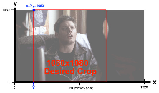
My frames are all 1920x1080 pixels. I would like my gifset to be square—1080x1080 pixels. So I already know I want my w and h to both be 1080. Since I want to start my crop at the top of a frame, losing no height, my y-coordinate (height to start my crop from) should also 1080. My x-coordinate is the only think I'm not sure about. I only know it needs to be bigger than 0 (0 would start my crop on the left edge) and smaller than 960, which would be the midway point.
So what am I going to do? ...I'm gonna make an educated guess of what x-coordinate would center Dean in a square frame in my FFplayer command, and if I don't like how he's centered, I'll simply move the x-coordinate over a little (decrease to move left, increase to move right).
So in my Example...
In FFmpeg, for my first shot, I'm going to guess x=300.
cd ~/Desktop/FRAMES/1 ffplay -vf "crop=1080:1080:300:1080" -loop 0 Test.gif
The FFplayer window shows me this:
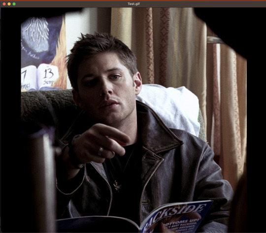
And I feel like the crop starts a little too far to the right. So I'm going to decrease my x-coordinate just a little—to 250. After replacing the 300 with a 250 and running again in FFplay, I feel good about 250, so that's the crop I'll set: -vf "crop=1080:1080:250:1080".
I need to follow this same process to determine the crop of my other shots (and keep a copy of the commands I used later!). What is useful however, is that 3 of my shots are all on Dean sitting (shots 1, 3, and 5). This means I can apply the same crop I made for shot 1 to shots 3 and 5.
See Step 5 in my script on Github to see all 5 shots.
___________________________________________
6. Test Coloring and Sharpening
___________________________________________
Because the lighting in this scene is pretty good, I did a very simple recoloring on this set. I may update later with a more extensive coloring tutorial with more options later (I'll link the post to this section if I do). Previously, we added a crop to our command: -vf "crop=1080:1080:250:1080" and now we want to test coloring options and a sharpening effect.
Coloring Template
I'm going to throw in the basics, and give you an updated FFplay template (new parts are bolded, variables you can adjust are in red and set at their default values).
cd ~/Desktop/FRAMES/ShotNumber ffplay -vf "crop=w:h:x:y,eq=brightness=0.00:saturation=1.00:contrast=1.00,smartblur=1.5:-0.35:-3.5:0.65:0.25:2.0" -loop 0 Test.gif
NOTE: Notice that inside the quotes, a comma separates the command options crop, eq, and smartblur. Equals signs and colons distinguish between sub-options belonging to each of those three categories.
EQ:
brightness=0.00. Values can be adjusted anywhere between -1 and 1, with 0 as the default). I would adjust this setting in 0.01 unit increments.
saturation=1.0. Values between 0 and 3 are possible. 1 is the default value. I would adjust this setting in 0.1 unit increments at a time.
contrast=1.00. Increases contrast between light and shadow in the image (values between -1000 and 1000 are possible. I recommend you change this setting in 0.1 unit increments.
There are more color and image adjustment options than these available in FFmpeg. You can see a full list of properties you can adjust from eq here.
Smartblur:
smartblur=1.5:-0.35:-3.5:0.65:0.25:2.0 sharpens the frames. I recommend you not touch this setting. If you do want to adjust it, check the FFmpeg documentation. You can also remove this whole portion (and the associated comma) if you don't want a sharpening adjustment.
NOTE: It is also possible to add a curves adjustment to brighten certain parts of an image instead of the whole image. I haven’t worked with curves enough from the command line to give you good ideas on setting your curve and this set didn’t really need it, but if I get into it more in the future, I'll include it in a supplementary tutorial and link it here.
If you feel like you are losing all sense of objectivity and just want to see the images without your coloring at any point, simply re-run your ffplay from the end of the cropping section.
ffplay -vf "crop=w:h:x:y" Test.gif
In my example (shot 1):
Because all my characters are in the same room with similar lighting, I ended up applying the same color adjustment to all of my shots. But here's all my settings tested together on my first shot in FFplay:
cd ~/Desktop/FRAMES/1 ffplay -vf "crop=1080:1080:250:1080,eq=brightness=0.06:saturation=1.70:contrast=1.10,smartblur=1.5:-0.35:-3.5:0.65:0.25:2.0" -loop 0 Test.gif
See Step 6 in my script on Github to see all 5 shots.
___________________________________________
7. Apply crop and coloring to frames
___________________________________________
Up until this point, you have not actually applied your crop and color adjustments to your frames. You have simply tested your crop and coloring manipulations on a gif of all your frames that is still, if you go look at it in your file browser, not cropped.
So let's actually apply our adjustments to these frames!
NOTE: Captioning needs to be done after this step because auto centering the text won't work properly without actually cropping first). This is probably all for the better as our command is getting long and difficult to decipher!
Template to ACTUALLY Crop and Color
cd ~/Desktop/FRAMES/ShotNumber mkdir crop for i in *.png; do ffmpeg -y -i "$i" -vf "fps=30,crop=w:h:x:y,eq=brightness=0.00:saturation=1.00:contrast=1.00,smartblur=1.5:-0.35:-3.5:0.65:0.25:2.0" crop/${i%.png}.png; done
The first line (beginning with cd) tells us to go to our shot folder.
mkdir crop tells our computer to make a new subfolder in our shot folder called "crop".
for i in *.png; do ffmpeg -y -i "$i"; and the closing: crop/${i%.png}.png; done tells FFmpeg to do the same crop and color on every .png file in our shot folder, and save these adjusted shots into the crop subfolder.
In my example (shot 1)
cd ~/Desktop/FRAMES/1 mkdir crop for i in *.png; do ffmpeg -y -i "$i" -vf "crop=1080:1080:250:1080,eq=brightness=0.06:saturation=1.7:contrast=1.1,smartblur=1.5:-0.35:-3.5:0.65:0.25:2.0" crop/${i%.png}.png; done
See Step 7 in my script on Github to see all 5 shots.
___________________________________________
8. Captioning
___________________________________________
Now we need to apply captions. You can also do an FFplay command here, but I'm going to show you something a little different with FFplay this time to see your caption. Instead of looking at captions over a whole gif, let's just test how our captions look on the first frame in our shot, since that's really all we need for captioning.
Captioning FFplay Template
Not all sets (and not all shots!) need captions (and if your set doesn't, you can skip down to the next section!) However, two of my shots need captions: Shot 1 and Shot 3. If you want to add captions, you can test them in FFplay on a single shot using this command:
cd ~/Desktop/FRAMES/ShotNumber/crop ffplay -vf "drawtext=text='Your Text Goes Here':x=(w-text_w)/2:y=(h-text_h*2):fontsize=40:bordercolor=black:borderw=3:fontcolor=white" input.png
The default font is Arial. There are ways to set other fonts, but I haven't looked into them much because I'm pretty happy with Arial. This basic template with the existing numbers should give you a decent result, but if you want to change font sizing or colors or anything:
drawtext=text='Your Text Goes Here' | This is the most important bit. You place your caption in the red part. Note that your text will appear on just one line. If you have a longer statement from a character that will need two lines, you can draw your box twice. (I will add a link here for this alternative when I eventually try it).
x=(w-text_w)/2:y=(h-text_h*2) | This part centers the text on the bottom of the screen. I recommend you leave it alone as it’s intended to auto-center your text for you no matter what your crop ratio is. You will need to change the the y=(h-text_h*2) argument only if you have two lines of text to caption your frames with.
fontsize=40 | Changes the font size, of course.
bordercolor=black | changes the border color.
borderw=3 | changes the border weight.
fontcolor=white | This changes the font color.
input.png is the file name of the frame you want to view your caption on.
By the way, when changing text or border colors, you can type in colors coded into the documentation (the default is black) or insert a HEX color code in this field. For example, I always use yellow captions for Dean, so I found a yellow HEX code (#FDDA0D) I liked on htmlcolorcodes.com.
Here's how I FFplay my caption "You missed a spot."
cd ~/Desktop/FRAMES/1/crop ffplay -vf "drawtext=text='You missed a spot.':x=(w-text_w)/2:y=(h-text_h*2):fontsize=40:bordercolor=black:borderw=3:fontcolor=#FDDA0D" frame_0018.png
See Step 8 in my script on Github to see both captioned shots.
Template for applying your caption:
If you like the way your caption looks in FFplay, you can apply it to all the frames in your shot folder with:
cd ~/Desktop/FRAMES/ShotNumber/crop mkdir captioned for i in .png; do ffmpeg -y -i "$i" -vf "drawtext=text='Your Text Goes Here.':x=(w-text_w)/2:y=(h-text_h2):fontsize=40:bordercolor=black:borderw=3:fontcolor=white" captioned/${i%.png}.png; done
Where
mkdir captioned makes a folder in the crop folder called "captioned"
for i in *.png; do ffmpeg -y -i "$i"; and the closing: crop/${i%.png}.png; done tells FFmpeg to place the same caption over every .png file in our shot folder, and save these adjusted shots into the captioned subfolder.
Here's the settings to apply captions to my first shot.
cd ~/Desktop/FRAMES/1/crop mkdir captioned for i in .png; do ffmpeg -y -i "$i" -vf "drawtext=text='You missed a spot.':x=(w-text_w)/2:y=(h-text_h2):fontsize=40:bordercolor=black:borderw=3:fontcolor=#FDDA0D" captioned/${i%.png}.png; done
See Step 8 in my script on Github to see both captioned shots.
___________________________________________
9. Organize shots into GIF folders
___________________________________________
We're almost done!!! It's time to go back to our file browser! Now that all of our frames in all of our shots are prepared how we want, we need to reorganize our shots into GIF folders. This is our way of group selecting all the frames that go into one gif for export.
In my case, I want three gifs, so I'm going to make three new folders in the FRAMES folder: gif_1, gif_2, and gif_3. My FRAMES folder should now look like this:
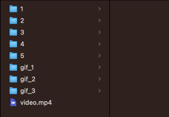
Now I want to take my finished shots from my shot folders and copy their frames into the gif folder they are associated with. For example:
Gif 1 just contains the first shot. I also captioned shot 1. So I'm going to copy all the frames in FRAMES/1/crop/captioned into the gif_1 folder.
Gif 2 contains shots 2 and 3. Shot 2 has captions, so I need to take all the frames from FRAMES/2/crop/captioned and all the frames in FRAMES/3/crop and copy them in the gif_2 folder.
Gif 3 contains shots 4 and 5. I'm going to copy the contents of the crop folders for shots 4 and 5 into this folder (no captions on this gif).
___________________________________________
10. Compiling into GIF
___________________________________________
To combine all the frames from one gif folder into a gif, I'm going to use this template script:
cd ~/Desktop/FRAMES/GifFolder ffmpeg -y -start_number FileNumberOnFirstFrame -i frame_%04d.png -vf "fps=30,scale=540:-1:flags=lanczos" ~/Desktop/FRAMES/GifName.gif
This is very similar to the script in step 4. This template opens one of our new gif folders, and takes all the frames, starting with the first frame in the folder (recall: you need to tell FFmpeg the 4-digit number on that first frame with FileNumberOnFirstFrame) and then turns it into a gif running at 30 FPS, scaled down to 540 by 540 pixels.
The parts we can/should adjust are as follows:
GifFolder is the name of our gif folder where our frames for our gif are located.
scale=540:-1:flags=lanczos is the command to scale down our gif (using what's called the lanczos method) to 540 x 540 pixels so it'll be small enough to upload to Tumblr.
fps=30 tells FFmpeg the proper FPS for our set (if you made your frames using this tutorial, 30 FPS is correct. If you took screencaps manually, it will be the frame rate of whatever you giffed. For TV, this might be 23 FPS for example).
~/Desktop/FRAMES/GifName.gif names our gif (specify with GifName) and outputs it to the FRAMES main folder.
Here's the command for Gif 1 in my set:
cd ~/Desktop/FRAMES/gif_1 ffmpeg -y -start_number 0018 -i frame_%04d.png -vf "fps=30,scale=540:-1:flags=lanczos" ~/Desktop/FRAMES/1.gif
See Step 10 in my script on Github to the script on all three gifs.
THE END!!!!
Do this step on all your gif folders and you're done!!!
You can view my full script for this example gifset on Github here and if you'd like, simply modify that script to make your own gifset!
14 notes
·
View notes
Text
Brother #2 upgraded to a gaming laptop and decided to give me his PC. It’s a Windows 10 Home, Omen by HP:
Processor Intel(R) Core(TM) i7-7700 CPU @ 3.60GHz 3.60 GHz Installed RAM 16.0 GB System type 64-bit operating system, x64-based processor
It’s C-drive is only like 250 GB, but the D-drive comes with almost 1 TB. I have a 2 TB SSD if I can ever get it to work (it wasn’t compatible with Clarice). So...I have to name this computer. I’m not sure what yet.
Edit:
It’s so empty.
Edit 2:
I downloaded the new EA app and found that my Ultimate Collection is just...Double Deluxe? I’m hoping this is just a wrong picture thing because there’s no setting or anything for it. I’m going to hold off on downloading the sim games until I know for sure if my SSD card will work or not.
Edit 3:
I’ve got some folders for the sake of organization when the creating begins. I don’t have Sims 4 Studio still because there is no sims 4 game installed. That’s why there’s a space between Blender and Milkshape. I still can’t load GOS so I haven’t gotten the keygen for Milkshape yet.
Edit 4: Bad thing about my new PC, it doesn’t have a built-in mic, webcam, or come with speakers...so...I’ll have to buy those things.
Edit 5:
Programs in...just need the games and all my extra stuff. I still don’t have Photoshop...I’m trying to remember where I put it.
30 notes
·
View notes