#I chose it as I like this particular artwork and I feel it encompasses the overall vibe of his character and the themes of WH very well!
Explore tagged Tumblr posts
Visit Tumblr Blog
Explore Tumblr blogs with no restrictions, modern design and the best experience.
Last Seen Tumblr Blogs


Fun Fact
In 2020, Tumblr had 29.4 million users in the US.
Text
Puppet Boy's Mystery (A poem for Wally Darling from Welcome Home)
Puppet boy, what is it you hide? I think of you often and the same it is tonight. A doe-eyed nightmare or a smiling dream - what are you, puppet boy? What is it that I see? Indigo blue and a colorful charade - the trademarks of the Beast have enchanted me. Now each night as I go to sleep I think of thee, and the puppet boy's Eldritch mystery.

After a longer delay, I return with a short and sweet poem inspired by one of the most curious internet phenomena, that is rapidly gaining popularity by the minute. Wally Darling is a mysterious main character of the psychological horror project by a talented artist who goes by Clown ( @partycoffin ). The project revolves around lost media, more specifically a children's television program called "Welcome Home" that was broadcast onto an unknown TV channel sometime in the 1970's before being abruptly cancelled by its creators for mysterious reasons. The project itself is in its beginning stages, but it has already, miraculously managed to gain a huge following and popularity. Topics explored in the "Welcome Home" project likely include occult practices, Lovecraftian themes, cults and psychological manipulation, which all could have contributed to the "show's" cancellation. The same phenomena still lingers behind the 4th wall of the Welcome Home Restoration Project's website, preying on us, viewers and "neighbors" - as the show's characters call us, as we curiously partake in unravelling its dark mysteries. I am looking forward to seeing how this project goes forward. Make sure to follow along!
-Heidi @theatrum-tenebrarum
#welcome home#wh#wally#wally darling#welcome home arg#occult#esoteric#art#arg#welcome home wally#welcome home puppet show#internet mysteries#clown#poem#poetry#dark poetry#occult poetry#poet#poetsandwriters#wh wally#i love wally#wally welcome home#wally darling baphomet#baphomet#I am aware the Baphomet pose isn't relevant anymore#I chose it as I like this particular artwork and I feel it encompasses the overall vibe of his character and the themes of WH very well!#and yes I was inspired by the song Puppet Boy by DEVO#theoccultinpopularmedia#own#mine
6 notes
·
View notes
Note
this doesn’t really feel like anything huge but i did want to show this to you because i was thinking about them (jwds) for the millionth time 💛
relating these two to my favorite art style, dansaekhwa. (sorry for the bad cropping, there was only one website to find it on and i had to screenshot 😅) this piece—‘Pray VI20’ by hyun ae kang—in particular reminds me of them…

it’s literally named ‘pray’!!! need i say more? 😳
HEYYYYY!!! I'm so excited right now because this is some cool shit!! Thank you so much for sending me this, I LOVE this piece and the fact that you decided to send it to me, of all people! 🥰🥰 I'm going to put a page break/read-more divider here because... well, my response is looong and barely makes any sense 🤦♀️😂 I apologise in advance, and please ignore/forgive my dyslexia (it's rampant this evening)
I see so much symbolism to jwds here. I often associate cool tones (like navy blue) with Joo Won and warm tones (like yellow or orange) with Dong Sik*. Obviously, the colour palette (for their attire) the show creators put them in has influenced this thought process, but I also view them in this way because I see Dong Sik as the sun and Joo Won as the moon. *I would be remiss to not point out that in colour theory blue and yellow are *almost* opposites on the colour wheel. But they are oftentimes seen together; almost every day, in fact, when the sun is out shining bright and beautiful against the brilliant blue sky. (I could go on about light waves and how the sky is ever-changing, and how that relates to Joo Won... but it messes with my moon symbolism lol) I hope you don't mind but I'm going to share with you some quotes that I think are very fitting for this subject The moon is a loyal companion. It never leaves. It’s always there, watching, steadfast, knowing us in our light and dark moments, changing forever just as we do. Every day it’s a different version of itself. Sometimes weak and wan, sometimes strong and full of light. The moon understands what it means to be human. Uncertain. Alone. Cratered by imperfections. ― Tahereh Mafi, Shatter Me (hello han joo won)
“Even After All this time The Sun never says to the Earth,
"You owe me."
Look What happens With a love like that, It lights the whole sky.” ― Hafiz (hello dong sik)
Love is the great unifier of both light and darkness, aren't the luminaries beautiful? I choose to walk with the brighter one to unveil the mysteries of the darker one. ― Patricio Telman Chincocolo (hello jwds) Anyway, the first thing that came to mind when I thought of this beautiful artwork is the symbolism of light and dark, and how the lighter parts of the artwork are encompassing and almost smothering the darkness. I think this is a beautiful representation of the story of Beyond Evil, and how the good outweighs the bad; how jwds chose to focus on the good, instead of the bad and together, they bring forth lightness in a world of dark (brb i'm crying) Also, I love the crackling of the paint (?). It shows that even beautiful things can break, or, better yet, there is beauty in breaking apart. I adore that the colour melds together into a concoction of purple hues and that when the two colours overlap, they don't necessarily cancel each other out, but instead, bring forth a new element to the piece overall. But the second thing that came to mind is autumn sunsets. This scene looks like the early-evening sky during a bright October day... and then I thought that's very apt, considering what time of year Beyond Evil is set in.... but then I remembered episode 2.... and just-

⬆️⬆️⬆️ helllooo?? It's the skyline at the reed fields in Manyang!!
Another thing this artwork reminded me of is this BEAUTIFUL piece by @micah-lat!! The colour palette and how it ties in with the reed fields, and how that ties in with marrying of light and dark, life and death, and how one can lift the other up from darkness or nefarious intent.... how Joo Won is Dong Sik's "saviour"** but really, they saved each other. ** as quoted from the script book: "Han Joo Won, my saviour, who came to ruin my life" (the actual quote might be slightly different, I'm basing it off memory)
Also, I am going to be self-indulgent and share with you a little thing I wrote last year when I was on a bus during an autumn sunset-
That time of dusk when tropical meets marigold and they kiss like lovers do; with an envious display of earning, for - through tragedy and design - they can only meet once a day. It is a fleeting romance, only lasting a few moments before it is gone. Their kiss is beautiful, and they meld together like the wrong paints on a canvas, growing in saturation and passion until they are cobalt and vibrant tangerine. From their love blooms a smattering of bruised purple and with it, the beauty is over. Night-time has arrived.
(idk, it feels fitting) Whilst we're here, I going to also point out the beauty of jwds being represented by an "in-between" state of being, such as dusk. They aren't a definite, but instead, a fleeting moment that rapidly changes and morphs into something beautiful; and is itself beautiful. They aren't black and white, summer or winter, altogether good or bad. Instead, they are autumn and spring, dusk and dawn. They are twilight and the seasons of change; they are the guarantee that the day kisses the night as they meet once again. They are intersection and connection; a light breeze in early fall.... the quiet comprehending of the ending of it all***... light, warmth, touch, trace, memory- *** I don't know why this came to mind but it's a beautiful lyric
Oooooh, and the fact that it is called 'pray' is just SO GOOD! Perfect, even. One day I will write a think piece on the religious symbolism in Beyond Evil and the folly of man praying for better days in a world of bad, but how that's juxtaposed against the beauty of putting one's faith in another person, and how a person can be a religion, a deity, the symbol for hope and justice, if one chooses them to be, because faith is all about choice, and jwds chose one another, and, and andnand !!!!!!!
Sorry, I literally just sat with my head in my hands because I needed a moment.
I need to stop; I have gone past the point of comprehension (was it there, to begin with though?) and just end with this: Thank you. I love this ask and I appreciate you so much for sending it to me. I did have other points to make but I have forgotten them along the way haha. This made me so happy, and I really enjoyed word-vomiting at you in my response. I hope there's something of interest here in my reply- I'm not entirely sure if I'm making sense, or what point I am trying to make. But know that this is awesome. Thank you once more, and goodbye! 😊
12 notes
·
View notes
Text
ANALYSIS of Together
Denada Permatasari. 6 November 2017.
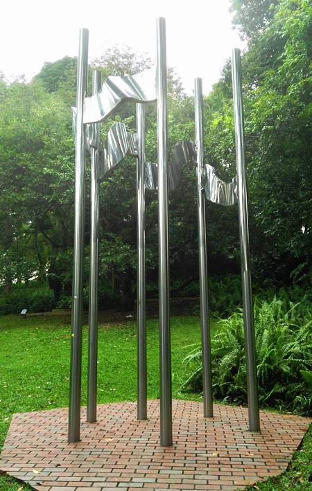
Fig 1.0 Photograph of Osman bin Mohammad’s Together, taken at Fort Canning Park, Singapore.
I have chosen this sculpture (Fig 1.0) titled Together by Osman bin Mohammad, a sculptor from Brunei Darussalam made in 1988. This sculpture is 3 meters tall and is made of stainless steel. Together is situated in Fort Canning Park’s sculpture trail, and is a part of the ASEAN Sculpture Garden, along with other five sculptures representing the original members of ASEAN.
I think that this sculpture is the most interesting sculpture in the whole trail because I understand its meaning just by looking at it. Other sculptures may have more interesting shapes and abstract, but because I do not understand what they mean, their significance is lost to me. I also find that Together is aesthetically more pleasing than rest of the sculptures in the trail.
The six flagpoles represent the six members of ASEAN at the time, which is Singapore, Indonesia, Malaysia, Thailand, Philippines, and Brunei Darussalam. What makes this sculpture stand out –especially in the context of the ASEAN Garden- is this one of two sculptures in the ASEAN collection representing six figures. The rest of the sculptures (Fig 1.1) have five figures as symbolism for the ASEAN members (Singapore’s Balance is a sculpture divided into five parts; Philippines’ Fredesvinda has five pairs of ribs; Indonesia’s Unity has five vertical sticks jutting out and five crisscrossing “pinheads” in its center; Thailand’s Concentration which is made up of five separate steel plates together; with the exception of Malaysia’s Augury which has six points going up). I found that this exception is due to Together being made last, as originally, Brunei Darussalam was not a member of ASEAN when the collection was made. The sculptures were made for the first ASEAN Sculptures Symposium held in May 1981. This symposium was hosted by Singapore.
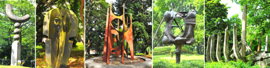
Fig 1.1 The rest of the sculptures in the ASEAN Sculpture Garden. From left to right: Singapore’s Balance, Thailand’s Concentration, Malaysia’s Augury, Indonesia’s Unity, and The Philippines’ Fredesvinda (courtesy of the National Parks Singapore).
It is known that Singapore was improving its infrastructure rapidly during the 60s and 70s, proven from “its massive planting of instant trees in places of high visibility” (Gwee 17). In fact, the genius lies in the background of the ASEAN symposium:
Sculptures were introduced to improve the quality of the landscape by creating interesting landmarks in parks. The ASEAN Sculpture Corner was created at Fort Canning Park, as part of the ASEAN Sculptures Symposium in 1981, to ASEAN unity and cooperation. Sculptures were donated by each member country and installed at the Park (Gwee 18).
From that excerpt, I can say that Together was not just a diplomatic, political show of cooperation from Brunei, but instead, it is that and a genuine attempt to beautify Singapore.
The meaning of this artwork is also apparent through its looks. From Together’s aspects of form, it is easily the most understandable sculpture in the entire bunch. The sculpture just shows six flagpoles with five flags connecting them. Together resonates closest to the theme of the camaraderie of ASEAN members. Flags are widely regarded as nationalistic symbols, high and prideful, broadcasting a country’s presence and identity (Artic).

Fig 1.2 Zoom in shot of Together, showing the connected flags clearer. Taken from a low angle.
The way the flags themselves are arranged also has meaning behind it, for the flags in Together are connected on one flagpole to another. The artist could have made conventional flag displays, each separate from the other, but this conscious design choice is actually the main reason why this sculpture is rightly titled Together. Through the connected flags, they make the relationships between the poles, or the countries, interconnected and interdependent on one another. The connecting design makes six separate pieces –countries– into one, stronger, wholesome unit.
Even the shape and the curvature of the “flags” carry meaning. The wavy, dynamic form of the flags (Fig 1.2), as if blown by strong wind yet still anchored firmly unto their poles, speaks of the artist’s vision for the ASEAN members. The wind here is a metaphor for difficulty and challenges that a country faces, as echoed by the concerns of Narciso Ramos, the Philippines Secretary of Foreign Affairs at the time, that:
“’The fragmented economies of Southeast Asia,’ [Ramos] said, ‘[with] each country pursuing its own limited objectives and dissipating its meager resources in the overlapping or even conflicting endeavors of sister states carry the seeds of weakness in their incapacity for growth and their self-perpetuating dependence on the advanced, industrial nations’” (ASEAN).
The fluid, almost water-like curves of the flags can also act as a metaphor for the ASEAN members’ flexibility and potential for the future.
The number of flags, five, in comparison with the number of flagpoles, six, is also another point of intrigue. Why did the artist deliberately left out one pole without a flag? At this point of the essay, I must admit to the very limited number of accessible analysis of this artwork, therefore I resort to making my own assertions. I would guess that it was to make the sculpture have an opening gap. If there were six connected flags, the sculpture would be a closed circle. In turn, this could mean that Osman wanted to convey the openness of the ASEAN countries, in particular, their openness to cooperation and change for the better.
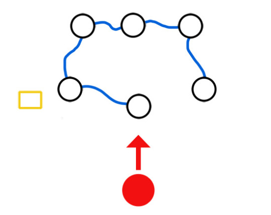
Figure 1.3 A simplified diagram of Together, from a bird's eye perspective. Note that this diagram is not up to scale.
Through my own observation, I have noted that the placement of the flagpoles is also curious, and worthy of further analysis. I have made a diagram (Fig 1.3) to illustrate more clearly how the artwork is arranged. The black-outlined circles are the flagpoles. The blue wavy lines are the connected flags. The yellow box on the side is the artwork’s information. The red circle is the viewer, along with the direction of sight that the viewer will naturally have if they should see the artwork. This is to affirm the orientation of the sculpture.
For one, the arrangement is not perfectly symmetrical. Though there is a recognizable formation, I think the imperfect placement is deliberate, though the meaning of this is not very obvious. I choose to interpret it as that Osman acknowledges the countries, and especially ASEAN itself since at the time, ASEAN was still in its infancy. The sculptor realizes that they are not perfect and that there is room for improvement. However, the main highlight of the arrangement is the middle pole in the outer three that juts out from the rest.
This flagpole stands nearest to the viewer, as if a leader or a commander of the group. This could be taken as placing one of the countries as the leader, or in this context, the host, which is Singapore. Or, it could also mean that the flagpole in question is a newcomer, not yet fully aligned with the others. If it is the latter case, then the metaphor shifts from Singapore to it being Brunei, as Brunei Darussalam was the newest addition back at the time. If this is so, then this speaks of the sculptor’s awareness of the status of his country and chose to acknowledge it.
Stainless steel as a material is also a point for discussion. Stainless steel are known for its long-lasting properties, resistance to rust, and durability (BS Stainless). I feel that this gives the meaning that through this sculpture, the six ASEAN members are portrayed as strong, enduring countries.
Last, but I think that this is critical to analyze, is the location of the sculpture itself, which is at Fort Canning Park. It occurred to me that out of all the public parks in Singapore, why Fort Canning? Why were the results of the ASEAN Sculptures Symposium placed in Fort Canning Park? Is there something particular about Fort Canning Park, or was it just one of the many parks in a checklist?
I found out that even the placement in Fort Canning Park was deliberate, as said by Mr. S. Dhanabalan, the Minister of Culture at the opening of the symposium:
I am happy to announce that the sculptures will be given pride of place in what will become one of Singapore’s most beautiful parks. A sculpture garden will be created to display the finished works on the site of the Central Park in the heart of historic Singapore. … We could not have asked for a more appropriate site, for it encompasses those institutions that have come to be associated with out artistic and intellectual life, namely, the National Museum, the National Library, [and] the National Theatre … (Natl. Archives).
The simple fact that Fort Canning Park used to be called Central Park during this time is already telling in of itself. Further research reveals that Fort Canning Park is one of the main historical sites in Singapore, from it being a center of power about 700 years ago, then as a military base in the mid of the 19th century, again in World War II, and finally a place of lush greenery for relaxation today (Walton). The gesture of placing the ASEAN Sculptures in the heart of the country is not lost on anyone; Singapore is proud to have international connections to other South East Asian countries through ASEAN. I believe that this is one of the rare moments where the meaning of an artwork is amplified by an external party, unbeknownst to the artist himself.
To conclude, I would like to posit my final thoughts regarding Together: I find it extremely curious that Brunei Darussalam still wanted to donate a sculpture even after seven years later the symposium was held. This persistence speaks of Brunei’s attitude with international relations and status; the country cared about contributing to a collective. The use of flags is also simple and effective, especially in consideration of the ASEAN theme.
I think that the straightforwardness of the subject matter is the sole reason why I think Together is the most interesting sculpture in the trail. Its simplicity, especially in comparison with the other ASEAN sculptures, makes it the most available and legible for viewers. Even more impressive is that Osman managed to imbue so many meaningful metaphors and symbolism to his seemingly straightforward sculpture without making it abstract like the others. Whether or not he intended to include the metaphors there through his aspects of form, as information regarding the artist is scarce, is ultimately irrelevant; I, as an outside viewer, managed to draw meaning just by looking at the sculpture, and therein lies the true genius of Together.
Works Cited
Gwee, June. Case Studies in Public Governance: Building Institutions in Singapore. Routledge. 2013. 17-18.
“What is the importance of a flag?” Artic. N.d. 5 Nov 2017 <http://www.artic.edu/~hkang2/importanceofflag.htm>.
ASEAN. “History: The Founding of ASEAN.” Association of Southeast Asian Nations. N.d. 5 Nov 2017 <http://asean.org/asean/about-asean/history/>.
BS Stainless Ltd. “Why Use Stainless Steel?” N.p. 6 Jan 2012. 5 Nov 2017 <https://www.bsstainless.com/news/2012/january/what-is-stainless-steel-and-why-use-it.html>.
Natl. Archives of Singapore. Archives and Oral History Department Singapore. Speech by Mr S Dhanabalan, Minister for Culture at opening of ASEAN Sculpture Symposium, at National Museum Art Gallery. Singapore, 5 Apr 1981 <http://www.nas.gov.sg/archivesonline/data/pdfdoc/SD19810401.pdf>.
Walton, Millie. “Singapore Stories.” LUX Magazine. 2 Aug 2014. 5 Nov 2017 <https://www.lux-mag.com/2014/08/02/singapore-stories-fort-canning-history/>.
#together#osman bin mohammad#brunei darussalam#asean#sculpture#flags#stainless steel#fort canning park#park#june gwee#millie walton#malphigus#malphiguswrites#art#analysis#essay#2017
4 notes
·
View notes
Text
Who are You?
The Brief
Overview.
Without the use of words produce a series of connected images that visually illustrate who you are?
Create.
Exploring the work of other photographers and/or artists will help you develop a ‘visual story’ for your own work.
Give some thought to the things that are important to you. Everything you have ever done, the places you visit, the music you love, the stuff you keep, the memories and mementos carefully stored away are all part of what makes you unique. Consider how you might best illustrate who you are?
Produce.
1. Relevant research, planning and development of your work in your blog page.
2. One A3 ‘triptych’ portfolio quality print.
(The three images must include:
a. A self-portrait.
b. A place you’re connected to.
c. An object significant to you.
3. Three Individual full res 300ppi jpg files uploaded to My City.
4. An evaluation of the project in your blog page.
What is a Triptych in photography?

Modern photographic triptych
A photographic triptych is a common style used in modern commercial artwork. The photographs are usually arranged with a plain border between them. The work may consist of separate images that are variants on a theme, or may be one larger image split into three.
Source: Wikipedia https://en.wikipedia.org/wiki/Triptych
Research
Examples:

Alex Efimov “Three persons? Not sure” 2009
Source: https://www.artmajeur.com/en/e-gallery/artworks/3842743/triptych
I like this set up and treatment to portray 3 different sides of the one character.
Dimitri Mais
Source: https://www.dimitrimais.com/about-2
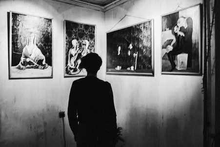
Could my Triptych show my self-portrait from behind and my 3 images? (including the self-portrait) as 3 images in a gallery space (which could be my special place?)
Concepts
Having researched other photographers work using Triptychs, I observe they often tell a story and when using self-portraits, use their images to convey their characters (inwardly and outwardly.) I like the concept of a single image spanning 3 panes with white between, which allows your mind to complete the picture in the unseen areas and when well executed (as in the picture used for the brief) can cover the portrait, place and object sections of the brief in a single, well composed image split into 3.
My concept is to incorporate my self-portrait into all 3 frames of the Triptych in an attempt to convey the 3 different roles I play on a daily basis The “Family Man” (centre frame with portrait shot from behind showing me looking at a photograph of my family (or objects that show I’m a father…Father’s Day gifts?), casually dressed – CENTRAL (and selfless represented by the back of my head shot focusing outwardly on my family) on to everything I do and matter most to me), “Business Man” (left hand frame in profile, looking to the right in an office/corporate environment, looking an object that typifies the business I work in - Still life of Sharpie, LX tape, open MacBook showing set visual? - dressed in business attire) and “Student” (right hand frame, in profile, looking to the left showing the College in the background, which would be the place that means a lot to me as it’s where I’m leaving the old businessman on the left frame to re-educate to be the photographer and new businessman on the right frame.
On reflection, some of the above concepts are fairly basic and possibly overly self-explanatory so I need to think of objects that more subtly hint at the message I’m trying to convey to the viewer and allow them to draw their own conclusions…
Treatment of 3 images:
I could maybe have the image on the left fade or become slightly out of focus to represent the fact that this part of my life is slipping into the past and have the image on the right-hand side coming into focus and sharpness to represent the future… How do I achieve this? Colours and tone of all 3 shots need to be sympathetic to each other, similar feel/family. Slow shutter speed on images left and right to show blurred action in the background and demonstrate fast paced action of both student and business?
Specific examples relating to the 3 stills I’m looking to shoot:
Possible type of shots for student portrait


Possible type of shots for business portrait

Possible type of shots for family portrait
Possible type of shots for family portrait


“Old School” photo album from ‘70’s
Father’s Day gifts
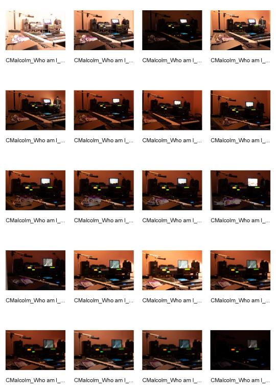
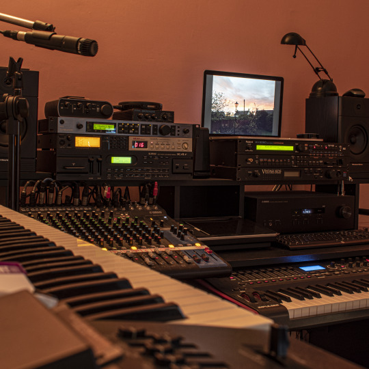
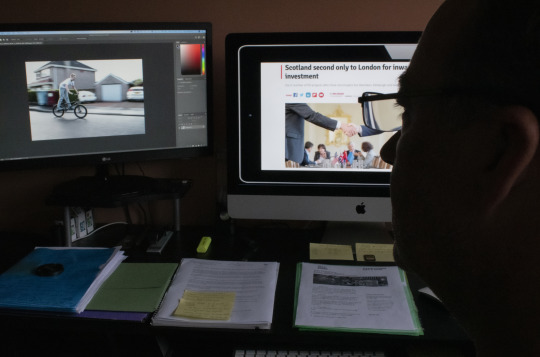
Today’s shoot captured the “Place” aspect of the project
This is my home studio where I spend time writing and recording music. Usually for pleasure, but occasionally for video projects or live events I’ve worked on over the years. This is my creative place that means a lot to me.
These are my favourite 2 shots...

Contact sheet from this shoot:
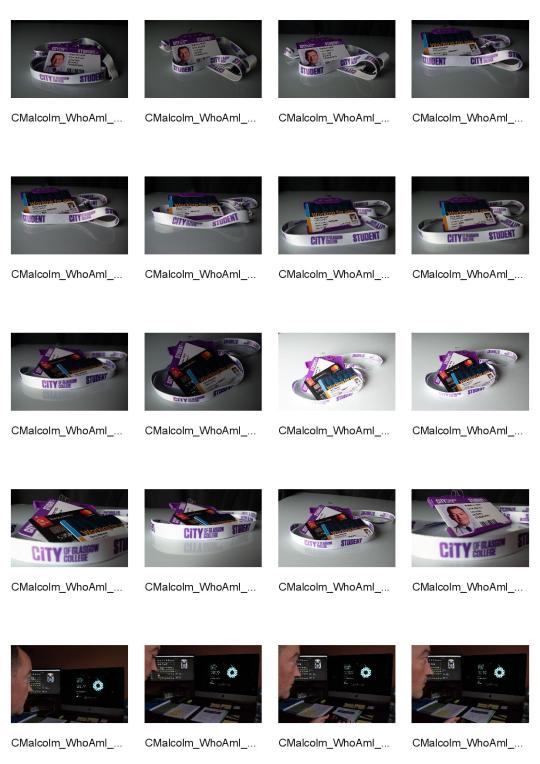
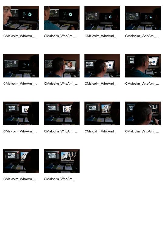
Today I shot the “Stiil life” part of the project and the “Self portrait” shots. Below are the contact sheets from these sessions:
Individual shots chosen for first attempt:
I chose this one as I thought it would work better with the still life shot as it was sharper with the focus being on the mixing desk, rather than using the shallow depth of field shot I had previously chosen above.
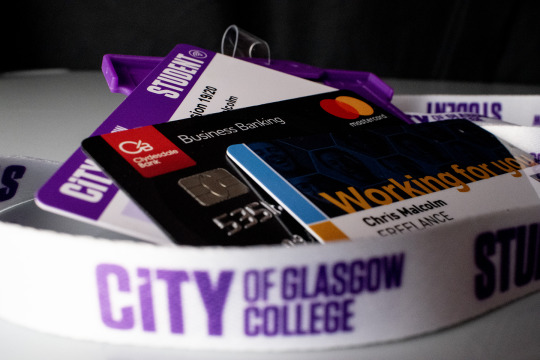
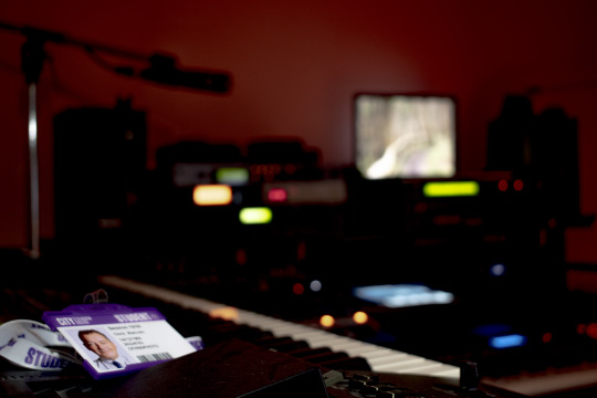
I liked this shot as it encompassed the various aspects of my life in ID cards and a business credit card, with the lanyard encompassing everything, hopefully showing it’s importance in the shot.
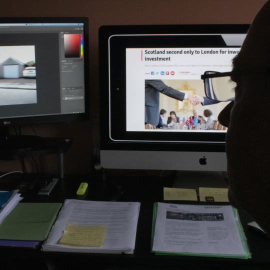
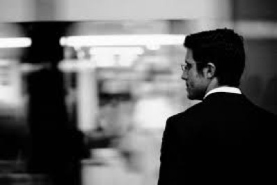
This, quite subtle silhouette portrait, was chosen as I wanted to show myself working in my office to demonstrate the business part of my life.
Full Colour Triptych

I thought the 3 images would work together better if I made the outside 2 square.
Black & White Triptych
I wasn’t happy that the tonality of all three images worked together well, so I converted them all to black and white in Photoshop. This helps with the tonality, however, I think it’s probably a bit of a cop out so need to look at better ways of making the 3 images work together as a triptych.
Class and lecturer Feedback
The feedback I received from my class mates was comments like “They are a working man”, “Productive lifestyle”, “Workaholic - puts a lot of energy into their work”, “Hard working person, enjoys studying and is passionate” and other very similar comments. This feedback was really useful as it showed I had conveyed part of the message of “Who am I” but also highlighted that I had not conveyed the family part of my message and should look at using the full versions of some of the original shots, which show the other aspects of my character and life. I had constructive feedback from my lecturer too, which gave me ideas on how to improve the shots and hopefully make them “hang” together better as a triptych.
Second attempt at triptych shots


My initial feeling is that while these images MAY be ok individually (although I am no longer happy with the self portrait as I feel it’s too dark), by the time they are put together as a triptych, there is just WAY too much going on in them and no real flow to them. I need to have a re-think and maybe look at shooting 3 more images that work well together, tell the story, as per the brief and I am happy with creatively. A better self portrait could be the answer, so I will re-shoot that this week.
Final shoot for triptych
Contact Sheet:
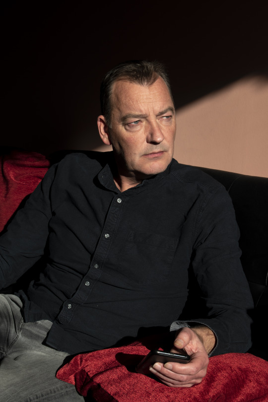
I realised today, that the best way to make sure all 3 images worked together tonally well, was to shoot them in the same place. Although I was reasonably happy with the still life, it was out of place in the triptych so I decided to drop that shot (along with the very dark and not too obvious) self portrait. The only shot I was happy with was the “place” one, so today, as the natural light coming into my studio/office was really nice and golden due to the time of year and cast interesting shadows, I decided to shoot the portrait there, in the next section of the room and the final “object” shot in the last part of the room, as the sunlight moved and illuminated the different areas in interesting ways.
For the portrait, I selected a shot I thought would work well, used in portrait format, in the centre of the triptych. I think the shot is fairly enigmatic and works quite well with the effects created by the sunlight and shadows. I would have liked better catchlights, however, I think the fact they aren’t prominent lends an air of mystique and maybe even sadness to the portrait.
For the “still life”, I decided to show my object as my iMac, as this is where I spend a lot of time working on content for my events, studying photography and viewing pictures of my family over the years. I dropped in several shots on the monitor on the left to show family are a large part of my life, however, finding a shot that tonally worked and didn’t look really cheesy and posed was not possible so, unfortunately, I dropped that idea from my final triptych and used a shot I think still told a bit of the story but really worked much better to give the flow I was looking for (and the picture within a picture). I really like the shapes in this image and think it works quite well.

Final Triptych

Evaluation
My initial research didn’t really give me anything in particular I wanted to emulate or I thought would work particularly well, with the concept I was trying to portray. The first 3 images (apart from the “place” one), were a bit literal and “corporate” and that was the message I got from the feedback (rightly so). I am happier with my final 3 images as I think the flow together in this triptych much better than the previous 3 which I realised were not only quite detached from each other but also were WAY to busy to allow the viewers eyes to view as single images but more importantly, as one overall image that wasn’t confusing but hopefully interesting, balanced and intriguing. I think that I am so used to thinking in terms of individual images rather than how they would all work together as a series, I found this brief quite hard, however, I am happier with my final triptych and look forward to feedback.
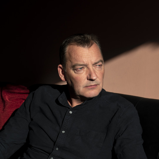
Today I had feedback with my lecturer who suggested cropping the self portrait as a square as he thought this would work better and show more of a relationship between the centre and right images, I did this and think it helps and gives a better balance. Below is the square portrait edit and beneath that, my final revised triptych.

2 notes
·
View notes
Text
Virtual Sketchbook #2
1.
unity & variety: artwork encompasses elements of unity with a variety bringing them together ex.

balance: equal amount of effect on both ends of a spectrum ex.

emphasis & subordination: both go hand in hand to highlight and contrast places in artworks ex.

directional forces: an influence imposed on who is looking at the artwork ex.

repetition & rhythm: repetition is strategically placed rhythmically to highlight portions of artworks ex.

scale & proportion: size composes a proportion ex.

2.
"Three Flags" by Jasper Jhones page 121

Jasper Jhones created "Three Flags" upon three canvases with oil paint and hot wax. This in return created a three-dimensional artwork with the use of geometric shapes and lines, to accurately portray the American flags. Jhones uses the principle repetition and rhythm to highlight and contrast the red and white lines on each flag. The colors chosen were not chosen by chose but in order to follow the accurate description of the American flag.
3.
In my personal experiences I would say I most likely the color scheme of blue. Throughout my life I have endured many trials and tribulations, but haven't we all? Over time these events have shapen me into the person today. One permanent experience that has stuck with me throughout my life, is the relationship with my mother. She has not had the easiest life there is but that is what makes her my mom. I would describe her to be a person more of crimson hue, not so much in a sense she has a strong personality, but a person where what she says and does sticks with you, whether she knows it or not. Because of this particular event it has made me to be a calm person that thinks before doing. I see myself as a blue color scheme because when I see blue, I feel a sense of peace, which I believe is something I give out.
4.

5.
Bad Design

Good Design

A good design is when the message is a clear and concise, the Starbucks ad accurately portrays this by the simple design and subtle logo in the corner. Starbucks does a good job portraying the message to their audience. A bad is when the message comes across confusing or disturbing, in the 7Up ad with the baby it can be distracting from the point of purpose. As for the 7Up ad it does a poor job of portraying what message they really what to convey.
0 notes
Photo


Lune82
A different kind of interview for us since it’s the first time we’ll be talking about style writing with one of the most recognized representatives of this kind in Greece. In other words, lune82 this month in Greek Street Art - Talks.
Have you studied anything in relation to visual arts, how did you got engaged with graffiti? My relationship with graffiti began around 1996 in my school and neighborhood, more seriously and intensively in 1998 with Dan and some other kids from my area. At that time there was no internet and everything was difficult for those getting involved with graffiti. So being influenced by some others associated with the NBW and by the period graffiti magazines we could collect we started getting into its culture while design as maniacs and whenever we could we’d go secretly from our parents to illegal graffiti. My initial studies are around the subject of business and management, no relation to visual arts and as it turned out then they didn’t win me over after all. My last degree though is around graphic design, something I like which continues to influence me in my style along with some visual trends.
You’re interested in styles, how difficult is it to create a piece of this kind and which are the stages of your work process? My main subject in graffiti is style writing and my greatest love letters. To create a style every writer has his own ritual, so I always draw on an A4 with pencil and eraser, if there is time I’ll combine all the elements of the composition (forms of letters - elements - background) with the colors and the effects and details I want, if there isn’t I’ll simply make a clean and calculated drawing with all the forms of the letters, details and background without color and I’ll make the composition of the colors during the creation on the wall. In case I don’t have an organized color palette, I’ll do the color composition freestyle!
If there was any connection with graphic design we’d be talking clearly about typography. How has your engagement with styles affected your graphic design and vice versa? There’s a connection with graphic design even though the common eye won’t directly see it, however it’s not just about typography, there are elements influenced by visual art movements such as constructivism, optical & kinetic art, pure forms of graphic design and gradients, as well as bold clean lines, symmetries and harmonies. My involvement with styles has influenced me to move more towards the creation of logos, typography and custom lettering, while graphic design to the things I mentioned above but also to deal with digital graffiti, something that not many writers do, which is also the combination of the two things I like.
This particular form of art in public space is probably the most misunderstood. Most people connect it with vandalism, since such pieces are quite on the streets and are usually created in a short period of time. Are all of them nice? How can a separation be made? This "selfish" form of art has always been and continues to be misunderstood, perhaps even the word “misunderstood” isn’t the proper term. The art of graffiti writing, by its nature, place its object outside of society’s rules and orders, since to begin with you write your name in public view as often as you can in the way you perceive it. This whole process doesn’t take into account both reality and its rules and even visually it creates another one from the perspective of the writer. There are writers who consider vandalism to be something very normal, although this is the ideal original form of graffiti, and there are writers who consider vandalism as hardcore and most ephemeral, and prefer to make their part in silence.
The world outside graffiti writing culture perceives it as vandalism if it’s done in private property without authorization, or in public buildings, monuments or public transport. There is also the view that when people don’t understand something they dislike or overlook it, so they perceive it as visual violence, something they don’t really enjoy watching. On the other hand, there aren’t plenty good enough pieces, and this is because many writers are ephemeral and don’t know the roots and the history of the culture they are dealing with, so they can’t understand the creation of the style in its entirety. To create a strong personal style, you must certainly have the talent to do it, but also the knowledge and close occupation to the subject. In the past when street bombing was more difficult and hardcore each writer organized everything much better, from the way they’d spot their place, the all day traffic there, how much time he’d had, to the colors, the style, the photography, everything. Now it feels like going for a walk, almost everyone who has 5 sprays and has found a spot can do the action, but that doesn’t necessarily mean it will be good. For me a good style, must have personality in the letters, to distinguish who did it without even seeing the signature. A good style stands without its colors and extra features.
Style, wild style and tags. Which are their differences? Style is a general term that encompasses all the features that portray each personality in the letters and stand out from those of others. Also, when a writer says he does style, he means that he does stylewriting, he "writes", he's painting his name on a wall, train, or any other surface, creating through his letters or through whatever he writes about every time.
Wildstyle is the most complex form of graffiti, it contains unreadable forms of letters, which are connected with bars, arrows, stars, haloes and other elements, geometric or personal depending on the writer's artistic background. This form is a kind of code for writers, which is hard for non-writers to decode.
Tags - Signatures are the first graffiti signatures· they were created around the mid-60s in Philadelphia, USA by “Cornbread” and “Cool Earl” who signed their names all over the city, while in 1971 the New York Times published an article about a young guy in the city that signed everywhere under the pseudonym TAKI 183. The appearance of the unexpected name with the strange number next to it, promoted even more the article of the newspaper. He was the first recognized graffiti writer in the history of this newborn culture. In the course of time the tag was enriched with extra features and contours, until it ended up being wild style. The style of a writer is even more visible in a Tag since it's his personal mark.
Exarchia seems to be "bombed"! Infinite visual information and the paradise of style. Personally how do you choose the spots you paint? Exarchia is as you said "bombarded" in the sense of graffiti bombing but for me it’s not the styler’s paradise. Also the infinite visual information doesn’t necessarily mean it’s a good information too. There’s more visual noise than quality. It used to be a paradise when there were clean and empty spaces, a degree of difficulty existed and everyone had respect for writers and their pieces. Now we can see pieces one above the other and murals with fans’ slogans, toys (writers without experience or respect) and every kind of pedestrian writing whatever someone can think of. If I choose to do an illegal piece (street bomb) I’ll pick a spot where when I do the piece I won’t be so visible, I’ll be able to do it undisturbed, have as much time as I can and take a good day photo. If I'm going to do a piece (style production) where no one is going to disturb me, then I'll choose the spot based on the design I want to make and my composition. If there isn’t a chance to find the right place, then I’ll adapt my composition to the environment, but there will be times when I’ll just do my piece without any adaptation to the space, I’ll just place it like a sticker on the surface that I paint.
How do you choose the words each time? Does their meaning relate to the shape of the piece? If it's a collaboration with other graffiti artists, then the chosen words will be inspired by the central idea of each project along with my own ideas on it. In any case, words are symbolic in a sense beyond the meaning they describe when they’re read. If it’s a personal project or a style of my own, then the words and their meanings, obvious or symbolic, are linked to the whole composition and the form of the piece.
If you chose one of your own pieces not to exist, to be erased. What would that be and why? I’ve never thought of it, graffiti is ephemeral since its birth, so most of these artworks that aren’t paying works or licensed will, of course, be erased. So I never get into the process of thinking whether I ever wanted to erase any of my pieces.
Any partnerships you have enjoyed? With who Greek or foreign artist would you like to work with and you haven’t yet? I've enjoyed murals at festivals along with the friend and partner Billy Gee & Alex Martinez, with whom we are members of the international graffiti crew Color Nomads. Another one in Eresos in 2014, which was a 4-5 hour freestyle production on the main beach and was created thanks to Alex Martinez who organized it all. In the same year, a 2-day production on a basketball court with the view of the whole city, in a suburb of Lucerne in Switzerland, with my friend Ezra one. The mural I made in cooperation with Billy Gee and Alex Martinez in Paphos, Cyprus, when they called us there in 2017 as part of the Pafos 2017 - European Capital of Culture event. And several other freestyle walls with Greek and foreign writers, from time to time. I would like to work with Felipe Pantone, Faust and several other artists who inspire me while give boost and evolve the culture.
In ten years from now? I’ll definitely continue to develop my style in stylewriting, and lettering, and I won’t stop making styles even if this is once in 4 months!
Peace out & props to all my friends and acquaintances inside and outside of the culture.
Follow Lune82 Instagram
_
Μια διαφορετική συνέντευξη για εμάς καθώς είναι η πρώτη φορά που συζητάμε για το style writing με έναν από τους πιο γνωστούς εκφραστές αυτού του είδους στην Ελλάδα. Με άλλα λόγια ο lune82 αυτόν τον μήνα στο Greek Street Art – Talks.
Έχεις σπουδάσει κάτι σε σχέση με τα εικαστικά, πως ξεκινάει η σχέση σου με το graffiti; Η σχέση μου με το graffiti , ξεκίνησε γύρω στο 1996 στο σχολείο και στην γειτονιά μου και πιο σοβαρά και εντατικά το 1998 μαζί με τον Dan και κάποια άλλα παιδιά από την περιοχή μου. Τότε δεν υπήρχε το internet και όλα ήταν δύσκολα για όσους ασχολιόντουσαν με το graffiti. Έτσι επηρεασμένοι από κάποιους άλλους που έκαναν παρέα με τους NBW και από όσα περιοδικά graffiti της εποχής μπορούσαμε να συλλέξουμε, ξεκινήσαμε να ψάχνουμε την κουλτούρα και να σχεδιάζουμε σαν μανιακοί και όποτε μπορούσαμε να πηγαίνουμε κρυφά από τους γονείς μας, για παράνομο graffiti. Οι αρχικές μου σπουδές είναι γύρω από το αντικείμενο του business και του management, καμία σχέση με εικαστικά και όπως αποδείχτηκε μετά δεν με κέρδισαν. Το τελευταίο μου πτυχίο όμως είναι γύρω από την γραφιστική κάτι που μου αρέσει και με είχε και έχει ακόμα επηρεάσει στο στυλ μου, μαζί με κάποια εικαστικά ρεύματα.
Ασχολείσαι με τα styles, πόσο δύσκολο είναι να δημιουργηθεί ένα τέτοιο κομμάτι και ποια τα στάδια εργασίας στην δίκη σου δουλειά; Το κύριο μου αντικείμενο στο graffiti είναι το style writing και η μεγαλύτερη μου αγάπη τα γράμματα. Για να δημιουργηθεί ένα style ο κάθε writer έχει την δική του τελετουργία, έτσι κι εγώ, πάντα σχεδιάζω σε καθαρό Α4 με μολύβι - γόμα, αν υπάρχει χρόνος θα βάλω όλα τα στοιχεία της σύνθεσης ( φόρμες γραμμάτων - στοιχεία - φόντο ) με τα χρώματα και τα εφέ και τις λεπτομέρειες που θέλω, αν δεν υπάρχει απλά θα κάνω ένα καθαρό και υπολογισμένο σχέδιο με όλες τις φόρμες γραμμάτων, στοιχείων και φόντου χωρίς χρώμα και θα κάνω την σύνθεση των χρωμάτων κατά τη διάρκεια της δημιουργίας στον τοίχο. Σε περίπτωση που δεν έχω οργανωμένη χρωματική παλέτα, θα κάνω την χρωματική σύνθεση freestyle! Αν γινόταν κάποια σύνδεση με την γραφιστική θα μιλούσαμε καθαρά για τυπογραφία. Πόσο έχει επηρεάσει η ενασχόληση σου με τα styles την γραφιστική δουλειά σου και το αντίστροφο; Υπάρχει σύνδεση με τη γραφιστική κι ας μην την βλέπει το κοινό μάτι κατευθείαν, παρολαυτά δεν είναι καθαρά μόνο τυπογραφεία, υπάρχουν και στοιχεία που είναι επηρεασμένα από εικαστικά ρεύματα όπως ο κονστρουκτιβισμός, optical & kinetic art, οι καθαρές φόρμες της γραφιστικής και τα gradients, καθώς και οι bold καθαρές γραμμές , συμμετρίες και αρμονίες.Η ενασχόληση μου με τα styles με έχει επηρεάσει ώστε να κινηθώ προς την δημιουργία των λογοτύπων περισσότερο, της τυπογραφίας και του custom lettering , και η γραφιστική σε όσα είπα παραπάνω αλλά επίσης στο να ασχοληθώ με το digital graffiti, κάτι με το οποίο δεν ασχολούνται πολλοί writers και είναι ακριβώς ο συνδυασμός των δυο αντικειμένων που μου αρέσουν.
Αυτή η συγκεκριμένη μορφή τέχνης στον δημόσιο χώρο είναι ίσως και η πιο παρεξηγημένη. Οι περισσότεροι το συνδέουν με βανδαλισμό μια και τέτοιου είδους κομμάτια είναι αρκετά στους δρόμους και συνήθως δημιουργούνται σε πολύ λίγο χρόνο. Είναι όλα καλά; Πως μπορεί να γίνει ο οποίος διαχωρισμός; Αυτή ή «εγωιστική» μορφή τέχνης πάντα ήταν και είναι ακόμα παρεξηγημένη και ίσως η λέξη παρεξηγημένη δεν είναι και ο σωστός χαρακτηρισμός. Η τέχνη του graffiti writing, από τη φύση της θέτει το αντικείμενο της εκτός κανόνων της κοινωνίας και των θεσμών καθώς γράφεις το όνομα σου σε δημόσια θέα και όσο περισσότερες φορές μπορείς με τον τρόπο που εσύ το αντιλαμβάνεσαι. Όλη αυτή η διαδικασία δεν λαμβάνει υπόψη της τόσο την πραγματικότητα και τους κανόνες της και έστω οπτικά δημιουργεί μια άλλη, μέσα από την οπτική γωνία του εκάστοτε writer. Υπάρχουν writers που θεωρούν τον βανδαλισμό κάτι το πολύ φυσιολογικό αν και αυτή είναι η ιδανική αρχική μορφή του graffiti, και υπάρχουν writers που θεωρούν τον βανδαλισμό κάτι το σκληροπυρηνικό και το πιο εφήμερο, και προτιμούν να κάνουν το κομμάτι τους με την ησυχία τους.
Ο κόσμος που βρίσκεται εκτός της κουλτούρας του graffiti writing, το αντιλαμβάνεται ως βανδαλισμό εφόσον αυτό γίνεται σε ιδιωτική περιουσία χωρίς εξουσιοδότηση, είτε σε δημόσια κτίρια, μνημεία ή μέσα μαζικής μεταφοράς. Υπάρχει και η άποψη του ότι όταν κάτι δεν το καταλαβαίνουν το αντιπαθούν ή το προσπερνάνε, έτσι το αντιλαμβάνονται σαν οπτική βία, κάτι που δεν κάθεται καλά στο μάτι τους. Από την άλλη δεν είναι και αρκετά κομμάτια καλά, κι αυτό συμβαίνει γιατί αρκετοί writers είναι εφήμεροι και δεν ξέρουν τις ρίζες και την ιστορία της κουλτούρας που ασχολούνται, έτσι δεν μπορούν να κατανοήσουν την δημιουργία του στιλ σε όλο το φάσμα του.Για να δημιουργήσεις ένα δυνατό στυλ με προσωπικότητα πρέπει να έχεις και το ταλέντο να το κάνεις αλλά και να έχεις γνώση και ασχολία στενή με το αντικείμενο. Παλιότερα που το street bombing ήταν πιο δύσκολο και πιο σκληροπυρηνικό ο κάθε writer τα οργάνωνε όλα πολύ καλύτερα, από τον τρόπο που θα τσέκαρε το σποτ, τι γινόταν μέρα ή βράδυ, πόσο χρόνο είχε , τα χρώματα του, το στυλ, την φωτογραφία, τα πάντα. Τώρα που έχει γίνει σαν να πηγαίνεις μια βόλτα, μπορεί να κάνει το action σχεδόν ο καθένας που έχει 5 spray και έχει βρει ένα σημείο, αλλά αυτό δε σημαίνει απαραίτητα πως θα είναι και καλό.Για μένα ένα καλό στυλ, πρέπει να έχει προσωπικότητα στα γράμματα, δηλαδή να ξεχωρίζεις ποιός το έκανε χωρίς να δεις καν την υπογραφή. Ένα καλό στιλ στέκεται και χωρίς τα χρώματα και τα έξτρα στοιχεία του. Style, wild style και tags. Ποιες είναι οι διάφορες τους; Style είναι γενικός χαρακτηρισμός που εμπερικλείει όλα τα χαρακτηριστικά που αποτυπώνουν την προσωπικότητα στα γράμματα και τα ξεχωρίζουν από αυτά των υπoλοίπων. Επίσης όταν ένας writer λέει ότι κάνει style εννοεί ότι κάνει style writing, "γραφει", ζωγραφίζει δηλαδή το όνομα του στον τοίχο , τρένο ή οποιαδήποτε επιφάνεια, ασχολείται δηλαδή με τα γράμματα του ή και με όποια άλλα γράφει ανά καιρούς.
Wildstyle είναι η πιο σύνθετη μορφή graffiti, εμπεριέχει δυσανάγνωστες μορφές γραμμάτων, τα οποία ενώνονται με μπάρες, βέλη, αστέρια, φωτοστέφανα και άλλα στοιχεία , γεωμετρικά ή προσωπικά ανάλογα με τις καλλιτεχνικές καταβολές του writer. Η μορφή αυτή αποτελεί ένας είδος κώδικα για τους writers, τον οποίο είναι δύσκολο να αποκωδικοποιήσουν οι μη writers. Πολλοί καλλιτέχνες πιστεύουν πως η επένδυση στην πολυπλοκότητα της δομής ενός κομματιού, αποτελεί πρόοδο και εξέλιξη. Η δημιουργία ενός κομματιού ποικίλει από 30 λεπτά έως και μήνες αναλόγως την όρεξη και το σημείο.
Τα Tags - Υπογραφές αποτελούν τις πρώτες συνειδητές υπογραφές graffiti· δημιουργήθηκαν γύρω στα μέσα της δεκαετίας του ΄60 στην Φιλαδέλφεια των ΗΠΑ, από τον ‘’Cornbread’’, και τον ´´Cool Earl´´ υπογράφανε τα ονόματα τους σε όλη την πόλη, με αποτέλεσμα να τραβήξουν την προσοχή της κοινότητας και του τοπικού τύπου, το 1971 οι New York Times δημοσίευσαν ένα άρθρο για έναν νέο της πόλης που υπέγραφε παντού κάτω από το ψευδώνυμο ΤΑΚΙ 183. Η εμφάνιση του απρόσμενου ονόματος με το περίεργο νούμερο δίπλα, προώθησαν ακόμη περισσότερο το άρθρο της εφημερίδας. Ήταν ο πρώτος αναγνωρισμένος graffiti writer στην ιστορία αυτής της νεογέννητης τότε κουλτούρας. Το tag εμπλουτίστηκε στην πορεία με έξτρα στοιχεία και περιγράμματα και έφτασε να γίνει wild style. Στο tag φαίνεται ακόμα πιο καθαρά το style ενός writer, είναι το καθαρό προσωπικό του αποτύπωμα.
Τα Εξάρχεια μοιάζουν να είναι «βομβαρδισμένα»! Άπειρη εικαστική πληροφορία και ο παράδεισος του style. Προσωπικά πως επιλέγεις τα σημεία που βάφεις; Τα Εξάρχεια είναι "βομβαρδισμένα" όπως είπες ναι μεν με την έννοια του graffiti bombing αλλά για μένα δεν είναι ο παράδεισος του styler. Επίσης η άπειρη εικαστική πληροφορία δεν σημαίνει πως είναι και καλή πληροφορία. Περισσότερο οπτικός θόρυβος παρά ποιότητα. Παράδεισος ήταν παλιότερα που υπήρχαν καθαρά σημεία, είχε κ ένα βαθμό δυσκολίας και υπήρχε σεβασμός προς τους writers και τα κομμάτια τους. Τώρα μπορείς να δεις πατημένα κομμάτια και murals από οπαδικά συνθήματα, από toys (ανέμπειρος ή ασέβαστος writer), και από κάθε λογής περαστικό που γράφει το μακρύ και το κοντό του.Εάν επιλέξω να κάνω ένα παράνομο κομμάτι (street bomb) τότε θα διαλέξω ένα σημείο που όταν κάνω το κομμάτι δεν θα είμαι και τόσο ορατός, για να το κάνω με την ησυχία μου και να έχω όσο περισσότερο χρόνο μπορώ στην διάθεση μου, και να βγάλω μια καλή φωτογραφία ημέρας.Εάν πρόκειται να κάνω ένα κομμάτι (style production) όπου δεν θα με ενοχλήσει κάποιος, τότε θα επιλέξω το σημείο με βάση το σχέδιο που θέλω να κάνω και την σύνθεση μου. Αν δεν υπάρχει η δυνατότητα να υπάρχει το κατάλληλο σημείο, τότε θα προσαρμόσω την σύνθεση μου στο περιβάλλον, αλλά θα υπάρξουν και φορές που απλά θα κάνω το κομμάτι μου χωρίς καμία προσαρμογή στο χώρο, απλά θα το τοποθετήσω σαν αυτοκόλλητο επάνω στην επιφάνεια που βάφω.
Πως επιλέγεις τις λέξεις κάθε φορά; Συνδέεται το νόημα τους με την φόρμα του κομματιού; Εάν πρόκειται για συνεργασία με άλλους graffiti artists, τότε οι λέξεις που θα επιλεχθούν θα είναι εμπνευσμένες από την κεντρική ιδέα του εκάστοτε project σε συνδυασμό με τις δικές μου ιδέες πάνω σε αυτό. Σε κάθε περίπτωση οι λέξεις έχουν συμβολική σημασία πέρα από την έννοια που περιγράφουν όταν διαβάζονται.Εάν πρόκειται για προσωπικό project ή κάποιο δικό μου style, τότε οι λέξεις και τα νοήματά τους, προφανή ή συμβολικά, συνδέονται με το σύνολο της σύνθεσης και την φόρμα του κομματιού.
Αν επέλεγες ένα από τα δικά σου κομμάτια να μην υπάρχει, να σβηστεί. Ποιο θα ήταν αυτό και γιατί; Δεν το έχω σκεφτεί ποτέ, το graffiti από την γέννηση του έχει εφήμερο χαρακτήρα, οπότε τα περισσότερα κομμάτια που δεν είναι επί πληρωμή ή με άδεια, νομοτελειακά θα σβηστούνε. Έτσι δεν μπήκα ποτέ στην διαδικασία να σκεφτώ αν θα ήθελα ποτέ να σβηστεί κάποιο από τα κομμάτια μου.
Συνεργασίες που έχεις απολαύσει; Με ποιον έλληνα ή ξένο καλλιτέχνη θα ήθελες να έχεις συνεργαστεί και δεν έχει τύχει ακόμα; Έχω απολαύσει murals σε φεστιβάλς μαζί με τον φίλο και συνεργάτη Billy Gee & τον Alex Martinez, με τους οποίους είμαστε μέλη του διεθνούς graffiti crew Color Nomads. Ένα άλλο στην Ερεσό το 2014 το οποίο ήταν ένα freestyle production 4-5 ωρών στην κεντρική παραλία και δημιουργήθηκε χάρη στον Alex Martinez που τα διοργάνωσε όλα. Την ίδια χρονιά ένα 2ήμερο production σε ένα γήπεδο μπάσκετ με θέα όλη την πόλη, σε ένα προάστιο της Λουκέρνης στην Ελβετία με τον φίλο μου τον Ezra one. Το mural που έκανα σε συνεργασία πάλι με τον Billy Gee & τον Alex Martinez στην Πάφο της Κύπρου, όταν μας κάλεσαν εκεί το 2017 στα πλαίσια της διοργάνωσης Πάφος 2017 - Πολιτιστική πρωτεύουσα της Ευρώπης. Και αρκετά άλλα free style τοιχάκια με Έλληνες και ξένους writers, ανά καιρούς. Θα ήθελα να συνεργαστώ με τον Felipe Pantone, τον Faust και άλλους αρκετούς καλλιτέχνες που με εμπνέουν και δίνουν ώθηση και εξέλιξη στην κουλτούρα.
Σε 10 χρόνια από τώρα? Σίγουρα θα συνεχίσω να εξελίσσω το style μου στο stylewriting,και στο lettering, και δεν θα σταματήσω να κάνω styles ακόμα και αν αυτό είναι μία φορά στο 4μηνο!
Peace out & props σε όλους τους φίλους και γνωστούς μου εντός και εκτός κουλτούρας.
#greek street art#street art#street#art#graffiti writer#lettering#stylewriting#lune82#Athens#greece#urban culture#public art#mural art#walls#street art europe#outdoors#Greek Artist#spray#greek street art - talks#γρεεκ ποστς#γρεεκζ
3 notes
·
View notes
Text
Final artwork no.3 - Time-based piece (video);
https://youtu.be/EB7Ft3PRgcY
youtube
Title; Red
For my time-based final, I wanted to make a video detailing the reality of the menstrual process.
My original plan for this piece was to create a spoof of the way menstruation is treated in the modern media, in particular through adverts for sanitary products. I wanted to create a piece that showed menstruation for how it actually is, as opposed to the way it is handled in adverts - upbeat and shying away from the reality, with happy women who don’t seem to be experiencing any of the menstrual symptoms that they claim to. However, although I started out with the view of creating a comedic piece, I soon decided against it as I realised that it wouldn’t share the same tone as either of my other final artworks.
I decided instead to take away the comedic aspect, and instead focus on how menstruation affects women in a more intimate light. I wanted to focus more on a woman’s feelings surrounding it, and in doing so, the project morphed into more of an abstract depiction of menstrual effects. It focused more on the feelings of discomfort and reaction to the mess created as opposed to simply noting the symptoms and routine of a period.
I decided to use the shower as my setting for a number of reasons, the main reason being it would be the easiest the clean (as I intended on creating quite a bit of mess). I also felt that the shower tied in very well with my concept in that it is a huge part of personal routine, and even more so when a woman is on her period - showering helps her to feel clean, but also helps to distract from any pain from cramps or back-ache that she may be experiencing. The sound of the water also has a calming effect, and the shower is one of the only places that you are completely vulnerable - just your mind and naked body occupying a space.
I also wanted to use some sort of red media to represent the physical blood of menstruation, and I ended up deciding on red acrylic paint. I chose this because it was easy to use, water soluble (meaning it could be washed off easily), and it had the most effective bright colouring. The fact that I was using my fingers and hands to spread it as well spoke of an even more conceptual aspect - painting using fingers and hands is something that is so inherently human in nature. Little children use finger painting as one of their first tools, and it dates back thousands of years to the very first cave paintings, with outlines of hands imprinted on walls. This overall speaks of the humanity found in painting - it is something inherent and deeply ingrained into our psyche. This relates to the process of menstruation, as it has been around and been dealt with for the same amount of time.
I originally started by writing the various symptoms of menstruation on the shower wall, before washing them off with water (this was inspired by the concept of my 3D final piece). However, I felt that (although effective), this didn’t quite capture the reality of a period for a woman. It was just a list of words on a wall, with no visual backup whatsoever. I decided to scrap this idea, although I did really like the visualisation of red paint on the wall. I kept this in mind as I moved forward, and began to think about other imagery that I could incorporate.
As I continued to plan my final, I remembered how effective the imagery I had used for my 2D final had been - bright, bloody red paint against the white of my own skin. I felt that this would be even more effective in the form of a video, by painting myself with the red paint. In this way I could also metaphorically highlight the mess created by a period, and record my own reactions to seeing the paint spreading everywhere. I ended up taking various videos of myself covered with the paint, before washing it off. This was to symbolise the way that the period affects many areas of a woman’s body (the stomach with cramps, back ache, headaches, feeling exhausted and heavy, etc), and how a shower is used to help clean, refresh and distract the woman from it all.
As well as the visual clips, I decided to use music to help create the right atmosphere for my video. I wanted to stay away from the bright, upbeat music that is used in stereotypical sanitary product ads, and instead use atmospheric, melancholy music to try and get across the more pensive tone that I felt the clips encompassed. The slightly melancholic music was also realistic in representing the emotions associated with menstruation - it is not fun and happy, rather it is more sad and despondent.
Overall, I ended up with a time-based video that abstractly represented the discomfort, mess and emotion associated with the reality of a period, as opposed to the positive, glamourised version that is constantly shown by adverts in the modern media.
0 notes
Text
EXCLUSIVE INTERVIEW: Joe Russell Brown
(This post originally featured on Backseat Mafia)
If I were to interview Joe Russell Brown, I wouldn’t have it any other way than this: tucked away in the far corner of Café Indiependent, in second-hand armchairs after a game of Trivial Pursuit. This quiet, peaceful setting was altogether unremarkable, which looking back, was incongruous to a remarkable musician. But there is humbleness about Joe, a certain obliviousness to the extent of the sheer talent he possesses that everyone else is aware of. So it would only be right that there would be no airs and graces about our conversation about his latest EP release, Post-Youth Depression.

It has been a year since his first release, Lemonade. Those three pastel-shaded, cinematic tracks he released, with their gentle instrumentals carried along by his characteristically hushed voice, were the only ones the 19-year-old dream-pop artist had ever released to the public. It was a flavour of what was to come, but was met by a sudden hiatus of uncertainty. It has been a long time coming.
“Post-Youth Depression is different to what I’ve done before. Lemonade was more about myself and being young, whereas this EP is the inverse of that. The idea of “post-youth depression” was one that was particularly poignant for me. I dropped out of school and started bricklaying, and eventually there came a point when I realised I couldn’t do this for the next twenty years of my life. I suppose it’s retrospective of those days of being young, and the euphoria that comes with that, when you feel like it’s passed you by.”
There was a pressing question I was intent on asking Joe, and it pertained to something that has always intrigued me about every artist from every echelon of music: who is on the EP artwork, and why? “That’s my mum.” Joe told me. “I was looking through old photographs, and I found this one of her when she was about my age now. I thought it fitted quite well, this idea youth, of what it is to be young, and life beyond that.”

After having listened to Post-Youth Depression, and coming to understand why he chose an old picture of his mother when she was only 19, it adds a dimension of depth and emotion to his music that was unexpected; the intimate, personal look in her eyes is something quite beautiful – in this sense, it reflects Joe’s music perfectly.
Each track on Post-Youth Depression feels like a tiny fragment of Joe’s life, something confessional and candid as if we were reading an entry in his diary. One thing that was indicative of that was the tracks ‘Happy Birthday Emily’ and ‘Daniel’s Book’. This intimate, yet ambiguous use of names so often throughout was something I had to ask Joe about. Who are these people, and what significance do they hold? “Emily was a girl I used to know, but Emily has now come to represent an idea as opposed to a particular person. Emily is the girl you grew up with, the girl you saw change, the girl who hit adolescence like a brick wall.” This delicate, weightless song is anchored with the solid pulse of drum beats that makes it an arresting listen, and the lyrics channel this wistful sense of watching someone who’s out of reach.
“Daniel represents the opposite to me. He’s someone who had a complete different upbringing – the kind of guy who’d ask you to write a song about him.” This, in my view, is perhaps the most touching song on Post-Youth Depression. It encompasses a spectrum of sounds, and has such versatility that it breaches the boundary of a song and seems to enter into the realms of a cinematic score; the way it can summon so many emotions, with something as simple as the particular way his voice sounds, or that beautiful sound the slide guitar makes halfway through the song, makes it something just a little more than just a song.

I asked Joe about the cinematic nature of his songs, and couldn’t help but wonder what kind of films he could envision his songs being set to. “I could probably see it being set to Trainspotting, or a coming-of-age film like Submarine. I admire Alex Turner’s album for it.” Of course, I wasn’t satisfied with that alone – my interest in his influences was piqued. “My influences specific to this EP were The Velvet Underground – like when the drums speed up in their song Heroine. I also think Bill Ryder Jones and bands like The Jesus and Mary Chain played a part in how this EP turned out.” Though music influences are all well and good, I wanted to know a little more about his personal influences in his life, particularly who Mrs Letherland is, to whom Post-Youth Depression is dedicated. “Mrs Letherland was my music teacher. I never really fit into the typecasts at school – my friends and I had a different sort of culture and it was hard to know what to identify with. She got us into music, and that’s how I began learning the drums. So I suppose none of this would have happened if she hadn’t encouraged us.”
There was one final thing I needed to understand, and that was just how far Warren Records had helped Joe secure this massive audience of thousands of listeners all around the world, and how he came to be involved with the Hull-based record label. “Last September I got involved with them through Facebook. They certainly helped me to get my music out there to so many listeners, and the experience and support they offer isn’t something you come by often.”
After all was said and done, and as I write this listening to it, Post-Youth Depression carries an importance to me that other music seems to lack. I don’t know if it’s from learning about the sheer dedication and thought that went into each track, the artwork and the title itself, that has given it a dimension that I have a newfound appreciation for – or the fact that Joe Russell Brown is the Scunthorpe music scene’s friend and one of the most valued members. It doesn’t only evoke admiration, but far more than that: pride. Perfection may be an unattainable ideal, but things can be quite beautiful. Post-Youth Depression is just one of those things.
Listen/purchase: Post-Youth Depression by Joe Brown
1 note
·
View note
Text
Critical Review
In response to the assignment brief to create a series of images based on the concepts of Land of Hope and Glory, I have constructed a narrative comprising of 6 artefacts that act as a record of a selection of documents that were once in the possession of Mr and Mrs Chandler of 33 Graham Close. These artefacts, an assortment of used teabags upon which I have printed the documents, investigate into the evocative of the phrase ‘keep calm and carry on’ and act as a reference to the concept of Britishness.
The idea for my project initially stemmed from the first Autobiography tasks, for which I referenced the work of artists such as Ines Seidel and Ania Wawrzkowicz in order to create my response to these briefs. The work that I produced as a result was an exploration into the manipulation of my own personal documents, the outcomes being a physical portrayal of my emotional response to them. I was notably pleased with the work that I had produced for these tasks and, with my interest in document manipulation piqued, I was eager to pursue this technique in whichever brief I chose to follow.
Considering that both of my responses were based on both celebration and rejection in paper form, I thought that that the most relevant and appropriate brief to select would be that of Sensations. I had hoped to expand my experimentation of document manipulation in order to encompass the exploration of emotions evoked by certain documents, for instance, I was considering ways of interpreting emotions through the use of colour and visual texture. Nevertheless, following the purchase of my documents, I began to reconsider whether this was the theme that I wanted to follow, hence inevitably made the choice to change to the brief of Land and Hope and Glory. I believe that the decision to switch to this new brief enabled me to make a much better use of the documents that I had, allowing me to highlight a deeper significance and thus produce a more intriguing narrative.
The decision to change briefs was initiated by an inspection of the documents that I had purchased, the majority of which were revealed to be overdue gas bills and final demands. This discovery led me to contemplate the circumstance of the people that these documents belonged to and thus I had considered building a narrative upon the document owners by investigating into their history. Unfortunately, nothing came to fruition from my brief research into ancestry websites and online directories. I think with more time and access to better and more extensive resources, I might have been able to produce better results, nonetheless, the would have altered the direction of my narrative and therefore, although it would have been incredibly interesting to discover the history of the documents, it was not imperative to the work that I was producing. On the contrary, considering the narrative that I ultimately built, I think the history of the documents is consequently irrelevant. The element of mystery compliments the peculiar nature of the objects, and thus it is not necessary to make the viewer aware of their origin.
The narrative that I eventually developed, in fact, focuses on these two individuals living in Portslade, Brighton between the sixties and seventies. After discovering the surplus of gas bills and final demands amongst the every day, mundane documents such as wedding invitations and handwritten notes, I became fixated on the idea of Britishness, particularly in relation to the concept of ‘keep calm and carry on’, a phrase that advocates remaining calm in adversity. I think this narrative perfectly summarises the image that was conjured in my head upon filing through all of these documents and, in particular, makes reference to a photograph that I found amongst all the letters. The photograph depicts of a group of people, two of whom I assume to be Mr and Mrs Chandler, sat around a garden table drinking tea. I think that this perfectly encapsulates the situation that I was aiming to describe. Despite what may seem quite subtle or even hidden connotations, which perhaps are distracted from with the quirkiness of the use of used teabags, I think the statement that the work is making remains clear.
It goes without saying that the work of Ania Wawrzkowicz was a notable contributing factor to the type of work that I wanted to make in response to this brief. After seeing her series of Ambiguous Documents, I was inspired to create something that I hoped would meet the same level of intrigue and individuality. Her work really stuck with me throughout the project and as a result it was an integral part of my work. Without discovering Ania Wawrzkowicz, I never would have adopted documents as the subject of my artwork.
Most significantly, however, it was the work of Ines Seidel and her unique use of materials that really inspired the work that I was producing. The recurring use of teabags within her artwork captivated me, hence my decision to explore the medium myself. This was the largest impact upon the direction of my project and is what aided me to refine my initial ideas and begin to focus on an outcome. Another artist who was pivotal to my project was Jennifer Coyne Queeden. Although initially I was satisfied with the first outcome, for which I inserted a miniature document into an empty teabag, I think I really benefitted from researching this artist’s work as this introduced me to the concept of printing onto teabags which would later become my final outcome.
The work that I was producing additionally provoked me to revisit the question that I was afflicted by in the previous project for Space and Place; whether the art was separate from the photography. In the previous module, by consulting the opinions of other sculpture artists who photograph their work, I drew the conclusion that in my case, the artwork was separate. I contemplated the fact that there is more control over displaying images as they can be edited in order to regulate what the viewer sees. Nevertheless, I found that in this project, I felt less opposed to the idea of displaying the artwork, despite the fact that it may be open to more intense scrutiny. What is more, I would even go as far to argue that the teabags are in fact photographs. When it is considered that a photographic print is defined as ‘producing a final image on paper for viewing’, by printing the scanned images of my documents onto the teabag, which is composed of filter paper, each teabag is technically a photographic print. Thus, this concept could be used to potentially quash any query of separation between art and photography when it concerns the production of art for a photography assignment, something that I certainly conflicted over myself.
Despite the fact that I am content with my final outcome, there are of course various aspects that I could have potentially approached differently. For instance, I feel that I did not experiment to a very great extent in regard to the teabag material. I feel that there were more colour and texture results that I could have produced in order to make the teabags more visually interesting and as a result achieve the exact look that I was envisioning. In addition, I would’ve liked to achieve much more flawless results when printing, as to avoid certain spots or ink bleeding that I experienced when printing onto the crumpled and absorbent teabag material. Although this may have been a more challenging issue to overcome, it is an area I could have explored, for instance, by using different printers or trying different types of ink. It may have been interesting to instigate a new method entirely. Nevertheless, I do think it was important to maintain an element of simplicity within this work, in order to avoid over complicating the outcome and as a result losing the original concept. Subsequently, this does mean that the teabags did remain relatively true to the originals that I produced, following only minor developments, however I would argue that the development of my project was more relevant to the narrative.
If given more time, and with access to unlimited funds, I would have liked to be able to source better quality frames. Undoubtedly this would have improved the presentation of my work, which is something that I have neglected to consider in past modules and as a result ought to put more consideration into in the future. I additionally feel that with better time management, I could have allocated more time to the planning of my presentation which would have allowed me to research more display options. Again, with more time and unlimited resources, I could have produced more teabag prints which would have opened the option to more display ideas such as the user defined narrative box display of Teatimes by Allison Cooke Brown. Alternatively, I would’ve liked to continue the production of teabags in frames to accumulate enough to occupy an entire wall. This would’ve involved the use of many more documents, something which I would not be opposed to, having found each document so individual and interesting.
Needless to say, I have learnt a lot from this module, and I have seen my style begin to develop. I was aiming to produce a piece of work that would allow me to experiment with the manipulation of documents whilst also exploring the emotions attached to said documents. In fact, I produced a series of work that highlights the hidden, and in my opinion more significant, connotations attributed to certain documents. This new approach to a brief seemed to work quite well for me and as a result this is something that I should adopt for future briefs too. Throughout the past year I feel like I was really able to explore various photographic techniques which is what enabled me to refine a certain style and approach to use for this module.
The module for Space and Place really pushed me out of my comfort zone and challenged my perception of photography. As a result, I found myself to be very critical of the work that I had created. I have certainly improved on that part in this module and consequently I feel much more confident with the final outcome that I have produced.
In my critical review of the previous module, I discussed how I hoped to continue the exploration of new concepts within photography and I think this is something that I have been successful in achieving. In the future, I hope to use the confidence that I have gained in experimenting with new mediums and I would like to continue to push the boundaries of my comfort zone in the way that I approach photography.
0 notes
Text
23 of the Best Personal Websites to Inspire Your Own
New Post has been published on https://financeguideto.com/awesome/23-of-the-best-personal-websites-to-inspire-your-own/
23 of the Best Personal Websites to Inspire Your Own
Some refer to it as a full-time job in itself. Others compare it to dating. And several cats over at BuzzFeed think it just plain stinks.
But it doesn’t have to be that way.
When you’re applying for a task, you’re typically asked to submit a resume and covering letter, or perhaps your LinkedIn profile. But there are better ways to stand out from your rivalry, and build a personal website is one of them.
Why You Need a Personal Website
Here’s the thing about resumes and cover letters: No matter how unique you try to induce your own, for the most part, they tend to read dry. And there’s a good reason for it: It’s supposed to be a single , no-frills page that documents your work experience. And while being concise is good, there’s very little opportunity to convey your uniqueness, or for your personality to glisten through at all for that matter.
While a resume is a sole, largely unchanging document, a personal website can be customized and updated according to what you’re working on, or what you underlined the fact. It’s both liquid and current.
Did you know 70% of employers say they’ve rejected a job candidate because they learned something undesirable about them online? This doesn’t mean you should scrub the internet of everything about you — in fact, this statistic underscores the importance of polishing your online presence. Recruiters are looking you up online, and a personal website that tells the story you want to tell can make all the difference between you and a competing candidate.
If you’re thinking about creating a personal website of your very own, check out the examples below that hitting the fingernail on the head. Inspired by a particular type of website? Click one of the following links to jump to that segment of this article :P TAGEND
Personal Resume Websites
Personal Portfolios
Personal Blogs
Personal Demo Websites
Best Personal Websites
Gary Sheng
Raf Derolez
Pascal van Gemert
Brandon Johnson
Quinton Harris
Sean Halpin
Tony D’Orio
Verena Michelitsch
Gari Cruze
Melanie Daveid
The Beast Is Back
Daniel Grindrod
The Everywhereist
Side Hustle Nation
fifty coffees
Smart Passive Income
Minimalist Baker
Kendra Schaefer
Mr. Money Mustache
Albino Tonnina
Robby Leonardi
Samuel Reed
Devon Stank
Personal Resume Websites
Whether you create a single-page site or a larger portfolio, the web resume serves as a more personalized alternative for sharing information and demonstrating your technological abilities — and it can be used by all types of job seekers.
Even if you have very little work experience, you can leverage a website to build a better picture of your capabilities and yourself as a candidate, while tilt on your traditional resume to provide the basic background information.
1. Gary Sheng
Unlike a standard resume document, Sheng’s website induces it easy for him to include logos and clickable connections that allow his software engineering and web development abilities to shine.
We love that visitors can choose to scroll down his page to view all of the website’s categories( “About Me, ” “My Passion, ” etc .), or jump to a specific page utilizing the top navigation.
The “My System” section reads like a company mission statement, and this personal touch assistances humanize his run and make him more memorable.
2. Raf Derolez
Derolez’s web resume is modern, cool, and informative. It shows off his personality, branding, and developing abilities in a way that’s still very simple and clear. Not to mention, his use of unique typefaces and geometric overlays ascribes personality to his name in an eye-catching way.
Want to get in touch with Derolez? Simply click the CTA located at the bottom of the page to open up an email that’s pre-addressed directly to him. Or select one of the social media links to connect with him on platforms like Twitter — where the look and feel of the visual assets happens to seamlessly align with the branding of his website. Well played, Derolez.
3. Pascal van Gemert
Pascal van Gemert is a web developer from the Netherlands, and his personal resume website demonstrates you can include a lot of information on a single webpage if it’s coordinated properly.
The more experience you get, the more of it you’ll have to share with employers. Pascal’s resume, shown above, utilizes an extended scroll bar to keep guests from having to navigate to a different page when learning about him. He also visualizes his career in different ways between “Profile, ” “Experiences, ” “Skills, ” and “Projects, ” while using a consistent teal colouring to unite all of his resume contents under one brand.
4. Brandon Johnson
Johnson’s unbelievable resume must be seen to be believed. Beautiful images of planets help to complement his planetary science background, and animations induce his resume more of an experience than a document.
In terms of design, the textured, multi-layered background adds greater depth to the two-dimensional page in a way that elicits feelings of space and the planetary systems, which Johnson’s run focuses on.
5. Quinton Harris
Harris’ resume utilizes photos to tell his personal story — and it reads various kinds of like a cool, digital scrapbook. It encompasses all the bases of a resume — and then some — by discussing his educational background, work experience, and skills in a highly visual way.
Not to mention, the transcript is fantastic. It’s clear that Harris took the time to carefully choose the right terms to describe every step of his personal and professional journey. For example, the section on storytelling reads :P TAGEND
NYC, my new home, is filled with the necessary secrets to not only propel my craft forward, but my identity as an artist. With every lens snapped and every pixel laid, I am becoming me.
Finally, at the final navigational phase( note the scrolling circles on the left-hand side of the page ), users are redirected to quintonharris.com, where he goes on to tell his story in more detail.
6. Sean Halpin
Halpin’s resume is short, sweet, and to the point, which is authentic to his voice and personal branding outlined on the site. The white space lets his designs and copy to pop and command the reader’s attention, which helps to improve readability — especially on mobile devices :P TAGEND Best Practices for Resume Website
Code your resume so it can be crawled by search engines.
Offer a button to download your resume in PDF so the employ director can add it to your file.
Keep branding consistent between the website and document versions: Use similar typefaces, colorings, and images so you’re easy to recognize.
Be creative and authentic to yourself. Think about the colors, images, and media you want to be a part of your narrative that you couldn’t include in a document resume.
Personal Portfolios
Building an online portfolio is a highly useful personal branding and marketing tool if your work experience and skill set call for content creation. In fact, photographers, graphic designers, illustrators, writers, and content marketers can all use web portfolios to show off their skills in a more user-friendly way than a resume or hard copy portfolio.
7. Tony D’Orio
It’s important to keep the design of your visual portfolio simple to let images capture visitors’ attention, and D’Orio accomplishes this by featuring bold photographs front-and-center on his website. His logo and navigation menu are clear and don’t distract from his run. And he makes it easy for potential customers to download his work free of charge.
Want to give it a try? Click on the hamburger menu in the top left corner, then select+ Create a PDF to select as many images as you’d are ready to download.
Once you open the PDF, you’ll notice that it comes fully equipped with D’Orio’s business card as the cover-up … just in case you need it.
8. Verena Michelitsch
When you’re a decorator , not one pixel on your personal website should go unused. Verena Michelitsch’s portfolio, shown above, is covered end to end in artwork. From her extensive library of work, she chose to exhibit multiple colourings, styles, and dimensions so visitors can see just how much range she has as a decorator. It’s a perfect instance of the classic adage, “show, don’t tell.”
9. Gari Cruze
Cruze is a copywriter. But by turning his website into a portfolio featuring images from various campaigns he’s worked on, he makes guests want to keep clicking to gain a better understanding of him. Also, there’s a great CTA at the top of the page that leads visitors to his latest blog post.
His site’s humorous copy — specifically in the “1 7 Random Things” and “Oh Yes, They’re Talking” segments — serves to show off his abilities, while making himself more memorable as well. These pages also include his contact information on the right-hand side, constructing it easy to reach out and connect at any point :P TAGEND 10. Melanie Daveid
Daveid’s website is a great example of “less is more.”
This developer’s portfolio features clear, well-branded imagery of campaigns and apps that Daveid worked on, and she demonstrates off her coding abilities when you click through to see the specifics of her work.
While it might seem overly minimal to only include three examples of her work, Daveid did her portfolio a service by including her best, most noteworthy campaigns. At the end of the day, it’s better to have fewer examples of excellence in your portfolio than many examples of mediocrity.
11. The Beast Is Back
Christopher Lee’s portfolio is busy and colorful in a way that works. When you read more about Lee on his easily navigable site, you “ve realized that” such a fun and vibrant homepage is perfect for an illustrator and plaything designer.
Known by his brand name, “The Beast Is Back, ” Lee’s web portfolio highlights eye-catching designs with recognizable brands, such as Target and Mario, along with links to purchase his work. This is another gallery-style portfolio with pops of coloring that make it fun and dedicate it personality, thus making it more memorable.
12. Daniel Grindrod
This freelance videographer is another example of a simple but sleek portfolio, organizing the many types of media Daniel’s done into the categories by which his potential clients would likely want to browse. The opening video place on the homepage — labeled “Daniel Grindrod 2018, ” as shown on the still image — also ensures his site visitors that he’s actively creating beautiful work.
Best Practice for Portfolio Website
Use principally visuals. Even if you’re showcasing your written work, using logoes or other branding is more eye-catching for your visitors.
Don’t be afraid to be yourself. Your personality, style, and sense of humor could be what situateds you apart from other sites!
Organization is key. If your portfolio is full of photos, logoes, and other images, make sure it’s easy for visitors to navigate to where they can contact you.
Brand yourself. Choose a logo or icon to attain your info easily identifiable.
Personal Blogs
Consistently publishing on a blog is a great way to attract attention on social media and search engines — and drive traffic to your site. Blogging is a smart way to give your work a personality, chronicle your experiences, and stretch your penning muscles. You might write a personal blog if you’re a writer by trade, but virtually anyone can benefit from adding a blog to their site and providing useful content for their audience.
13. The Everywhereist
This blog seems a bit busier, but its consistent branding assists visitors easily navigate the site. The traveling blog uses globe iconography to move visitors around the site, attaining it easy to explore segments beyond the blog.
Owned by writer Geraldine DeRuiter, this blog also features a “Best Of” section that allows new visitors to learn about what the blog encompasses to get acclimated. The color scheme is warm, neutral, and free of excess clutter that could distract from the content.
14. Side Hustle Nation
Side Hustle Nation is the business blog of Nick Loper, an advisor whose website offers tons of valuable financial advice for individual business owners. His homepage, shown above, sets a lighthearted yet passionate tone for his readers. It indicates you’ll get friendly content all committed to a single goal: financial liberty. The green call to action, “Start Here, ” assists first-time visitors know what it is to navigate his website.
On Nick’s blog page, shown above, you’ll notice two unique types of content: “My Podcast Production Process, ” the top post; and “Quarterly Progress Report, ” the third post down. The top post depicts readers how Nick, himself, generates content that helps his business grow, while the third post down holds his readers up to date on his blog’s growth over day. These content forms give people a peek behind the curtain of your operation, showing them you practise what you preach and that your insight is tried and true.
15. fifty coffees
The website fifty coffees chronicles the author’s series of coffee sessions in search of her next undertaking possibility, and it does a great job of using photography and visuals to assist in the telling of her lengthy stories.
The best part? Each post ends with numbered takeaways from her sessions for ease of reading comprehension. The high-quality photography used to complement the narratives is like icing on the cake.
16. Smart Passive Income
This is Pat Flynn’s personal blog, a hub for financial advice for people who want to start their own business. His homepage, shown above, lets you know exactly who’s behind the content and what his mission is for the content he’s offering readers.
His blog page also comes with a unique navigational tool, shown above, that isn’t just categorized by subject matter. Rather, it’s organized by what the reader wants to accomplish. From “Let’s Start Something New” to “Let’s Optimize Your Work, ” this site structure helps customize the reader’s experience so you’re not forcing them to simply guess at which blog posts are going to solve their problem. This helps to keep people on your website for longer and increase your blog’s traffic in the long term.
17. Minimalist Baker
I’m not highlighting Dana’s food blog merely because the food looks delicious and I’m hungry. Her blog employs a simple white background to let her food photography pop, unique branding to attain her memorable, and mini-bio to personalize her website.
18. Kendra Schaefer
Kendra’s blog is chock-full of information about her life, background, and professional experience, but she avoids overwhelming visitors by using a light background and coordinating her blog’s modules to minimize clutter. She also shares links to additional writing samples, which bolsters her writing authority and credibility.
19. Mr. Money Mustache
Mr. Money Mustache might take on an old-school, Gangs of New York-style facade, but his blog design — and the advice the blog offers — couldn’t be more fresh( he also doesn’t genuinely look like that ).
This financial blog is a funny, browsable website that offers sound insight into money management for the layperson. While his personal tales help support the legitimacy of his advice, the navigation links surrounding his logo make it easy to jump right into his content without any prior context around his brand.
Best Practises for Blogs
Keep your site simple and clutter-free to avoid additional distractions beyond blog posts.
Publish often. Company blogs that publish more than 16 posts per months get nearly 3.5 X the web traffic of blogs that published less than four posts per month.
Experiment with different blog styles, such as lists, interviews, graphics, and bullets.
Employ visuals to break up text and add context to your discussion.
Personal Demo Websites
Another cool way to promote yourself and your abilities is to create a personal website that doubles as a demonstration of your coding, design, illustration, or developer skills. These sites can be interactive and animated in a way that provides information about you and also demonstrates hiring administrators why they should work with you. This is a great website option for technical and artistic content creators such as developers, animators, UX designers, website content directors, and illustrators.
20. Albino Tonnina
Tonnina is showcasing advanced and complicated web developing abilities, but the images and icons he use are still clear and easy to understand. He also offers a simple option to view his resume at the beginning of his site, for those who don’t want to scroll through the animation.
21. Robby Leonardi
Leonardi’s unbelievable demo website use animation and web developing skills to turn his portfolio and resume into a video game for site visitors. The whimsical branding and unique way of sharing information ensure that his site is memorable to visitors.
22. Samuel Reed
Reed uses his page as a start-to-finish demo of how to code a website. His website starts as a blank white page and objectives as a fully interactive site that visitors can watch him code themselves. The cool factor attains this website memorable, and it stimulates his skills exceedingly marketable.
23. Devon Stank
Stank’s demo site does a great job of showing that he has the web design chops and it takes it a step further by telling visitors all about him, his agency, and his passions. It’s the perfect balanced regional a demo and a mini-resume.
Plus, we love the video summary. It’s a consumable summing-up that at once captures Stank’s personality and credentials.
iframe> Best Practises for Demo Websites
Brand yourself and use consistent logoes and colors to identify your name and your skills amongst the bevy of visuals.
Don’t overwhelm your guests with too many visuals at once — especially if your demo is animated. Be sure to keep imagery easy to understand so guests aren’t bombarded when they visit your site.
Read more: blog.hubspot.com
0 notes
Text
Case Study #2 “How” / “When” / “Where” / “Who” / “Why” pictures Now: Louise Lawler’s works pose the image as a question
“The situation is always part of what produces the work for me.[1]
Lawler grew up in Bronxville, New York received her B.F.A at Cornell, before moving to Manhattan in 1969. She has been exhibiting her work since the late 1970's. An act of appropriation has always been present in her practice, from the very beginning of her career, Lawler has been interested in, "borrowing something that had a different context, different meaning."[2] Lawler’s time-based work provokes questions that make the viewer reflect upon the role of images as enforced systems of meaning production – as powerful mediators for picturing / representing / imagining a presented moment. Her works appear to function as proposal’s for self-interrogations, with Art, as the proxy subject, foregrounded interrogating itself by examining its relationship to art production, action of creating, in of the power dynamics of the Art World, as the context.

Why Pictures Now, 1981. Gelatin silver print, 3 × 6 inches.
The title of the above work by Louise Lawler, Why Pictures Now, does not end in a question mark, yet the image resists a declarative reading. Much to the contrary, it operates in a radically interrogative space. Punctuation is not necessary, the image itself becomes a question. Furthermore, playing with the parts of speech, if one reads “pictures” as a verb rather than a noun, the image opens up the possibility that maybe Lawler is asking us to consider how “Why” would picture “Now” – meaning, what does it look like when we examine the present in relationship to questions rather than answers.
I chose Louise Lawler for my second case study similarly to why I chose Renée Green for my first. Lawler’s practice views arrested time as a nevertheless mobile, multi-layered spacio-temporal environment. In addition, her distinctive creation of thoughtfully constructed settings that rely on unexpected juxtapositions of appropriations and re-appropriations, induce the viewer to extend the margins of her visual perception beyond, “What” to “How”, “Who “, “Where”, “Why” and “When am I looking at?” Her viewfinder frames a subtle yet powerful disturbance that awakes our visual processing to an all-encompassing disorienting experience, both visual and cognitive, rather than acute “punctum which pricks us” with the specific it moment associated with “good pictures.”[3]
“I don't exactly think I am a photographer. I'm just trying to point things out. I never feel like I am answering anything.”[4]
In Camera Lucida, Barthes states that the photographic image, “is the absolute Particular, the sovereign Contingency [...] the This [...] the Real, in its indefatigable expression.”[5] The photographer, according to Barthes, says, "Look. Here it is."[6] Louise Lawler’s oblique lens avoids such impudent declaratives by prioritizing questions and relationality over answers and an idea of an Absolute. For Lawler, a picture is not the event but how we understand the event and what connections we make."[7] Her images are created through repeated cycle of auto-negotiations and considerations of parts and pieces previously used in different times and situations. “Look.” Lawler seems to say, “Here? It? Is?” For what we see may seem different but is the same or may seem different but is the same as before.
An act of appropriation has always been present in her practice, from the very beginning of her career, Lawler has been interested in, "borrowing something that had a different context, different meaning."[8]

Installation view of Louise Lawler- WHY PICTURES NOW. The Museum of Modern Art, New York, April 30-July 30, 2017
“Why Pictures Now,” a survey exhibition spanning more than 40 years of Louise Lawler’s work opened at the MoMa in 2017. In this exhibition were featured three (re)works that Lawler referrers to as “adjusted to fit”: Pollyanna (adjusted to fit) 2007/2008/2012, Pollyanna (adjusted to fit, distorted for the times), 2007/2008/2012/2017, and Pollyanna (traced) 2007/2008/2013. She applies the distorted effect to an older work she created between 2007 and 2012. The traced version was created in collaboration with artist and children’s book illustrator Jon Buller in 2013.
An intriguing aspect of Lawler’s practice is her process of continuously re-presenting, reframing, or restaging her work in the present, a strategy through which the artist revisits her own pictures by transferring them to different formats, from photographs to paperweights, tracings, and works that she calls “adjusted to fit.” The tracings are large-format black-and-white line versions of her photographs that eliminate color and detail, functioning instead as “ghosts” of the originals. “Adjusted to fit” images are stretched or expanded to fit the location of their display, not only suggesting the idea that pictures can have more than one life, but also underpinning the intentional, relational character of Lawler’s farsighted art. Furthermore, in keeping with Lawler’s interest in each picture’s provenance and the institutional creation of values, each label in this exhibition includes the owners of the full edition of that particular work.[9]
In her seminal text, On Photography, Susan Sontag writes that "to take a picture is to have an interest in things as they are, in the status quo remaining unchanged (at least for as long as it takes to get a "good" picture), to be in complicity with whatever makes a subject interesting, worth photographing."[10] I don’t think that this applies to Lawler’s approach to her practice in the medium of photography.

Pollyanna (adjusted to fit, distorted for the times), 2007/2008/2012/2017 adhesive wall material, variable dimensions
The Pollyanna works enthusiastically refuse all of Sontag’s declarations. With this series, Lawler plays with auto-appropriations of appropriations and adjustments as needed, again and again to question the status quo – on the macro and micro level, the particular image and the larger world in which it circulates – from different tempo-spacial perspectives rather than picturing it as a static given. Every variable present is distorted: framing, scale, material, presentation, viewing, (…). In contrast to what Sontag says, Lawler as a photographer has no interest in things as they are, including photography, photographs or photographing. The images she creates break the imposed history of picture regulations.

Pollyanna (adjusted to fit) 2007/2008/2012 As adjusted for the MoMA exhibition WHY PICTURES NOW, 2017 variable dimensions

Pollyanna (traced) 2007/2008/2013 Adhesive vinyl, variable dimensions in proportion to size of original artwork: 30 1/8 x 24 1/8 in. (76.5 x 61.3 cm)
As difficult as it sounds, Pollyanna allegedly saw the best of every situation. Could it be that with these titles, Louise Lawler intends to communicate the same sentiment? Or, are the titles communicating that no matter the distortions and exaggeration in the environment, endless adjustments and fittings are necessary to ideally engage with the present? Or, is the reference to the phenomenon another layer of distortion to further destabilize any reading of the images that confirms preexisting beliefs or hypotheses? Louise Lawler’s pictures leave me with questions without answers.
[1] “Louise Lawler at MoMA.” Art Viewer, 16 July 2017, artviewer.org/louise-lawler-at-moma/.
[2] Sontag, Susan, 1933-2004. On Photography. New York :Farrar, Straus and Giroux, 1977.
[3] Sontag, Susan, 1933-2004. On Photography. New York :Farrar, Straus and Giroux, 1977
[4] “Louise Lawler: WHY PICTURES NOW.” Lee Bontecou. Untitled. 1959 | MoMA, Apr. 2017, www.moma.org/calendar/exhibitions/1646?page=2, accessed on Nov. 10, 2018.
[5] Barthes, Roland. Camera Lucida: Reflections on Photography. New York: Hill and Wang, 1981, pg.4.
[6] ibid, pg.5.
[7] "Louise Lawler by James Welling BOMB Magazine." bombmagazine.org/articles/louise-lawler/, accessed on Nov. 12, 2018.
[8]Rachel Wolff (May 1, 2011), Impressive Proportions: Louise Lawler photographs great art—then treats it like taffy New York Magazine.
[9] Lawler, Louise. An Arrangement of Pictures. Assouline Publishing. New York. 2000.
[10] Rachel Wolff (May 1, 2011), Impressive Proportions: Louise Lawler photographs great art—then treats it like taffy New York Magazine.
0 notes