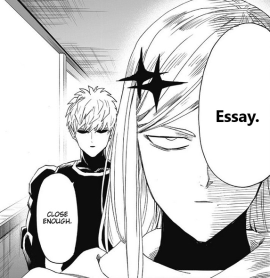
#I can't do photoshop so take this as a text post
Explore tagged Tumblr posts
Visit Tumblr Blog
Explore Tumblr blogs with no restrictions, modern design and the best experience.
Last Seen Tumblr Blogs


Fun Fact
Tumblr was attacked by a cross-site scripting worm deployed by the Internet troll group GNAA on Dec 3, 2012.
Text
Chevy: Making breakfast for my beautiful wife ❤️ Lorne: Who the fuck is burning down my kitchen
#saturday night movie#ch: lorne michaels#ch: chevy chase#Lorne/chevy#I can't do photoshop so take this as a text post
8 notes
·
View notes
Text

Someone reblogged my Sims trading cards with 'inspo'... So why don't we all take some inspo and make some trading cards!
FOR THE CHALLENGE:
• You must make a trading card featuring a Sim (or Sims) / pets etc. of your choice. OCs, premades, whatever Sim you like! You can also make as many cards as you like!
• You can do in-game screenshots or renders, and you can add as much or as little after-editing as you like! Do not stress over 'aesthetics' or such, this is just a fun little group project!
• You can use whatever template you like for your trading card! You can make your own template or you can use one from online. Card Conjurer is the one I partially used. Linked below is a template you can use that I put together using Card Conjurer's 'Simple Token's frame and some editing. Links below are MediaFire, no AdFly [Simblr Trading Card Template: (for GIMP) | (Photoshop)]
• You can add whatever text you like to your cards and base it off of whatever card game you like, or just make up your own text and such so it resembles a certain game etc. You can make it as serious or as funny as you want! When you are done, post them to Tumblr and tag them with the tag #freezerbnuuytradingcardchallenge. Tag me too if you want! I can't promise I won't miss some, but I'll try to reblog as many as possible.
• I recommend only using free-use or public domain assets for the cards if you want to use artwork etc., but if you do use someone else's art for an element of your card, please credit the artist of those art assets where possible in the post's text.
There are only a few DONT'S to this challenge: • No element of your card will be AI-generated. No AI-generated text, art, or anything else. • No images or text that undermines, harms or is bigoted towards any marginalised group.
Let's get making! And reblog this so we can get as many on board as we can!
85 notes
·
View notes
Text
For crowdsourcedgender's 400 follower (thank you!!!) coining event I present to you...

(If ALT text isn't accessible to you, the above image is a banner reading 'Coining Challenges', and all others are dividers.)
Each day has two themes which you can choose from, combine, or coin for both. They are a kingdom & a theme, which aren't really connected.
Each day also has a challenge: some kind of technical constraint to do with flag-making (the definition and name themselves aren't affected). The challenges are just for fun: if you'd like to coin normally, adjust the parameters, or only do some days, feel free!

Event themes & challenges
[PT: Event themes & challenges /End PT]
(24/03) -> fungi / fluidity
Make the flag (or whole term) with a time limit. The limit is up to you and depends on how long your method of flag making takes, but the idea is to make you rush. Suggested time: 3 minutes
(25/03) -> eubacteria / connection
Use no straight stripes (any orientation) in the flag. 'Straight' meaning consisting of two straight, parallel edges.
(26/03) -> protista / technology
Make the flag in a software or using a technique you've never/rarely used before. Bonus points if it is significantly different from your regular one. Suggested tools: Photoshop, MS paint, Ibispaint, flag-creator.com, Magma, or many programs similar to these (e.g. jspaint.app). Suggested methods: fill tool on a flag template, rectangle tools, in-built dividers
(27/03) -> animalia / silliness & fun
Create the whole flag by hand or mouse: no line, shape, symmetry, or any other similar tools. Stabilizers are up to your judgement.
(28/03) -> archaebacteria / space & the sky
Use a very low resolution canvas, or scale it down afterwards. Suggested size: 166 x 100px
(29/03) -> plantae / color & light
Use an in-built color filter on your device so you can't tell what colors you're using. You may also want to create a randomly assorted palette if you're too familiar with your program for the trick to work. Suggested filter: greyscale
(30/03) -> free space!
Recreate a flag of your choice (either made by you or someone else) by memory. More fun with complicated flags you don't remember well.
Event rules
[PT: Event rules /End PT]
No radqueers or explicitly radqueer terms (stuff like non-rq transIDs are fine)
Keep it SFW
All types of terms (including alt flags) are welcome!
Please tag @crowdsourcedgender and use the tag #crowd400
You don't have to follow the dates, challenges, or themes precisely. Have fun with it!
If you'd like to provide an alt flag made without constraints on the post for people to use, you totally can (but don't have to)
It would be interesting to see what constraint specifically participants used on the post, such as how long of a time limit you chose (but you don't have to)
Tagging @jiiamp @voidfanged @fangpunk
#crowd400#mogai#microlabels#mogai coining#label coining#moqai#coining event#liomoqai#liomoqai coining#qai#qai coining#mogai coining event#coining#listen i have no idea what people tag stuff
64 notes
·
View notes
Text

HOW TO: Make an iPhone Layout + Downloadable Template
Hi! I've gotten a few messages asking for a tutorial on my iPhone gifsets — but instead of only doing a tutorial (that would probably be triple the length this one already is), I decided to turn my layout into a template with all the bits and bobs! In the "tutorial" under the cut, I'll share everything you'll need, a free template download, and quickly go over how to use this template. :)
Disclaimer: This template uses Video Timeline and this tutorial assumes you have a basic to intermediate understanding of Photoshop.

PHASE 1: THE ASSETS
1.1 – Download fonts. These are the fonts used for all assets I've included in my template: – SF Pro or SF Pro Display (Regular, Medium, Bold): Either version works, they look nearly identical. You can download directly from https://developer.apple.com/fonts/ or easily find it via Google – Bebas Neue: Free on Google Fonts, Adobe Fonts, and dafont – Times New Roman (Bold): Should be a default font in Photoshop

Make sure to download and install any of the fonts you don't already have before opening my template. That way, once you open the template file, all the settings (font size, weight, spacing, color, opacity, etc.) are as intended.
1.2 – Download my template. Before you use my template, all I ask is that you don't claim or redistribute it as your own and that you give me proper credit in the caption of your post. Making these iPhone gifsets takes me a longgg time and turning this layout into a template took several hours too.
DOWNLOAD TEMPLATE VIA KO-FI ← This template is completely free to download (just enter $0), but if you feel inclined to tip me, I appreciate you! 💖
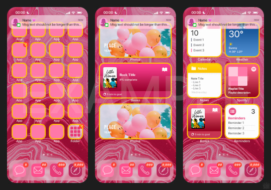
BTW this template also includes some of my frequently used icons!
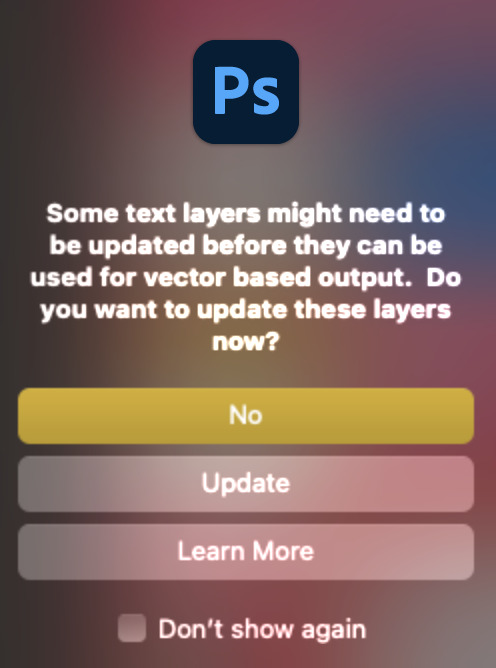
NOTE: If, for some reason, you open the template and see the pop-up shown below, click "NO" — otherwise, the fonts will be all messed up:
And if you see this triangle with an exclamation point by a text layer, don't double-click it — it'll mess up the font as well:

PHASE 2: THE GIFS
I'm just going to briefly go over gif sizes and my recommendations. Also, keep in mind when grabbing your scenes, you'll want all of these gifs to be the same amount of frames.
2.1 – Background Gif: 540 x 540 px. I recommend this size so you have a good amount of visibility for the gif behind the iPhone wallpaper. I also recommend making this black and white (or in my case, black and white with a slight blue tint — idk I just like the way it looks) so the wallpaper coloring can stand out.
2.2 – Wallpaper Gif: 230 (w) x 500 (h) px. Keep in mind the very narrow dimensions of the wallpaper! And also keep in mind that you'll have a bunch of apps and widgets covering the image. I try to use wide shots (or layer my clips into looking like wide shots). Also, keep in mind your color scheme for your set and your character's aesthetic! I tend to focus on one or two colors for the wallpaper.
I usually position the wallpaper to the side with 20px bumpers, so there's lots of space to see the background:
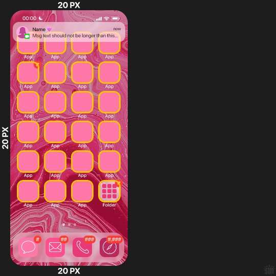
2.3 – Large Photo Widget Gif: 201 (w) x 96 (h) px.
2.4 – Small Photo Widget Gif: 94 x 94 px.
PHASE 3: THE TEMPLATE – "IPHONE" FOLDER
In this section, I'll try to quickly walk you through how to use this template and some bits that may require extra instructions. I'll be going through each folder from top to bottom.
3.1 – Status Bar. Time, Service, and WiFi are pretty self-explanatory. In the Battery folder, you can use the shape tool to adjust the shape layers labeled "Fill (Adjustable Shape!)" to customize the battery level.
3.2 – Message Notification. Again, these are pretty self-explanatory. I've already masked the circle for the contact photo, so you can simply import any photo and use the transform tool to shrink it down. The circle is 24x24 px. If you don't want to use a photo, there's another folder called Default Initials.
If your message text can't fit the text box, the message should end with ellipses which is how iOS caps off long texts.
3.3 – Blurred Banner (IMPORTANT) This folder is easy to miss because there's only one placeholder layer in there. On iPhones, the area behind a banner notification and the dock get blurred (including the wallpaper and any apps).
What to do: Make a duplicate of the apps in Row 1 and/or widgets that intersect the message banner, convert them all into one smart object, apply a Gaussian Blur filter (Radius: 3.0 pixels) on the smart object, and move the smart object into this masked folder!
(There's another masked folder in the Wallpaper folder for the dock which I'll go over in that section.)
3.4 – Apps Turn off the yellow guide if you don't need it to keep things aligned and turn off layers you don't need by clicking the eye icon. Replace the "App" placeholder text with your app name, change the color or gradient of the square to compliment your color scheme, and add your custom app icon overlay!
If you can't find an app icon you need from the ones I provided, flaticon.com is a great resource. Also, if you can only find the filled version of an icon, check out this tutorial for how to make any text or shape into an outline.
Also, each app folder has 4 notification bubble options (1-4 digits). Again, you can toggle these on and off as you need!
3.5 – Big Widgets I like using these when my wallpaper has A LOT of negative space to fill. I included the Photos and Books widgets in my template, but there are lots of widgets available on iPhones. You can check some of the other ones I've done here, or if you have an iPhone, simply try adding some widgets to your phone!
There are also widgets bigger than these, but they would take up half of the phone screen which is why I don't use them for these edits.
3.6 – Small Widgets The only thing I'll say about these — because they're pretty straight forward — is there are a lot more weather themes than I included in my template. Also, if you set your character's phone to evening, the weather widget will show a dark background (sometimes with stars), so keep that in mind.
Speaking of, I've included Light Modes and Dark Modes for, I think, every applicable widget.
3.7 – Page Dots These barely perceptible dots indicate that your character has more pages of apps than shown in your gifset (so if an anon tries to come at you, you can just say "it's on the next page of apps" /j /lh)
3.8 – Dock Again, the dock has notification bubble options and I've included the default app designs, custom filled designs, and custom outlined designs for iMessage, Phone, Email, and Safari (there's also a FaceTime alternative if that's how your character rolls). These are usually the apps people keep in their Dock, but this is fully customizable too. So, if your character is, like, super obsessed with Candy Crush or something and needs it in thumb's reach — you can put it in the dock.
3.9 – Wallpaper This whole folder is masked already to a 230x500 px rounded rectangle.
Inside, you'll find another "Blurred Portion" folder for the area behind the message banner notification and the dock.
What to do: Duplicate your gif layer and place it in this folder, remove any sharpening filters, and apply a Gaussian Blur filter (Radius: 3.0 px). Be sure to add any coloring/adjustment layers ABOVE this folder and your original sharpened gif layer.
PHASE 4: EXPORT
We made it!
I hope this template makes it super easy for you to recreate this layout! If you decide to try it out, feel free to tag me with #usernik.
If you notice anything wonky about the template, kindly let me know so I can fix it! And if you have any questions about how to use this template, please don't hesitate to send me a message! I just ask that you try to be specific in your question so I'm able to answer you the best I can!
#gif tutorial#completeresources#userpickles#usersmia#userabs#usertreena#alielook#userkosmos#usershreyu#userzaynab#tuserabbie#useryoshi#usersalty#tuserlucie#usernanda#userelio#userhella#usercats#gfx*#resource*
950 notes
·
View notes
Text
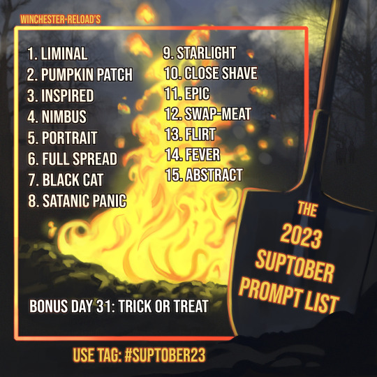
Directions: Fill each prompt ON or After each day listed (the 1st-15th of October, then again on the 31st for our bonus day), then post it on your desired social media platform using tag #suptober23. Be sure to include which prompt you're fulfilling in each post. You can write, you can make art. You can do both! You decide. Rules: All posts must be Supernatural-themed. Like, comment, and reblog others' posts. No hate will be tolerated, including actor hate. NO AI. Do not throw a photo in a Photoshop filter and post it as art. Challenge yourself to create. Noncon, incest, and hate will not be reblogged.
To include your work in the Suptober 2023 archive, you must ALSO post it to the collection in Ao3!
In previous years, I've worked diligently to reblog each and every post listed in the tag to include in an archive on tumblr. However, more than a few things have changed in the past six years, including my earlier creeping bedtime. This year, I'd like to move the archive to Ao3 for something more inclusive. That means this year, it's up to you to get your work in there! Authors: be sure to use tags so your stories are searchable! * Artists: mind ao3's rules for images. You may choose to include a clickable link instead of the art itself.
Posting starts October 1st, 2023.
Special thank you to my friends over on Patreon for their help with this year's list! Truly without them, this would not be happening. Consider joining to help support more events like this! For a text copy of the prompts go here! Join the Discord
FAQ's
Why aren't there 31 prompts this year? Because I'm changing it up to something a little less overwhelming for you and me. Fill all the days, and if you're still hungry for more, send me a message and let me know it wasn't enough so I can take that into account for next year!
I posted my work and you haven't reblogged it. What did I do wrong? Probably nothing. I may have just missed it, which will happen. The good news is, it's up to you to include your work in an archive this year, so be sure to do that! Also be sure to tag it correctly using #suptober23, and the day you're fulfilling.
I'm really busy in October, can I post it later? Yes! The collection won't close.
I can't write or draw, is there another way I can participate? Yes, you can support all the creators by liking, commenting, and reblogging their work. It's just as important as the things being posted. Also, I bet you'll soon realize you absolute can make art and write too! There's no skill level required to have fun.
How long do the stories need to be? There's no word length just be sure to make a good effort, and challenge yourself.
Can I include multiple days in one fic? Sure, but don't post early, and be sure to tag for each day both here on tumblr (if you're posting to tumblr) and on Ao3. In the past, people have used each prompt as a new chapter, and that works great for a cohesive project!
Can I repost the prompt list with my posts? Yep. Go ham. Use at will.
More questions for me? Send me an ask!
546 notes
·
View notes
Text
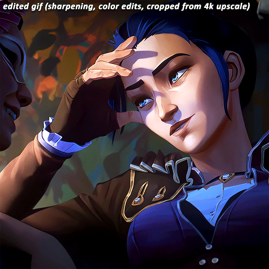
On Gifmaking:
So season 2's coming soon, and I wanna reflect on making gifs ever since I came back to Tumblr. I can't believe it's been 2 years of making gifs for this show!!!!! Look at how large my folder is lmao
And those are JUST gifs lol
Anyways, over time, my style has changed, especially how I color edit Arcane gifs. I kind of strayed away from a stylized filter color into just something that looks a lot more "natural" and works with the original scene.
Initially, I thought I'd save time, but I ended up not using my old arcane preset PSDs and resulted to coloring almost every scene manually. So in the end, it takes even longer to make them HAHAHA. It takes around an hour and a half for me to make a 10 gif set, basically. It also helps that I have a photography background, so coloring/editing is a lot simpler for me.
Here's a lil before and after of a dark scene (hiiiii viiiiiii <3)


Arcane is a REALLY dark show, but it goes for most of TV shows. Many of them are darker and harder to bring up the lights to make stuff look nice as gifs. Some people don't like to color their gifs, and that's okay. I personally just like color edited gifs more.
I've started learning how to upscale scenes myself, so that I have a better resolution and leeway to make things look "HD" more.
If you're wondering why my stuff look so "crisp", it's a combination of the scene's lighting, my sharpening settings on Photoshop and knowing how to upscale everything into 4k resolution. Of course, doing this needs an extremely beefy pc, which I am very lucky to own one.
Here's another before and after of a nicely lit scene. These are much, MUCH easier to do than all the darkly lit scenes because of shadows and lighting (caitlyn kiramman truly the rizzler <3)

I've been very lucky to be able to essentially take a nice, long break for like a month doing nothing after being so damn busy for the last year and a half, so it's nice that I was able to make a ton of gifs and be chronically online for a short while LMAO.
It's been so fun! But it's time to go back to reality lmao. I closed reqs for a bit because I was just so swamped with them the last few days, and I wanted to gif scenes that I like this time. I've done like 2 weeks worth of gifs. And you will see Vi a lot bc she's on my mind a lot heehee 🥰what can I say, she's such a babe <3
Here's a lil sneak peek, just look at herrrrrrr 🥰🥰🥰 and yeah, 4k upscaled resolution really helps making these tight crops, it's why i never went back to 1080p lol. It's how I’m able to make zoomed in gifs look decent (like the kirammountains gifset lol)

Thank you so much for all the support, likes, reblogs, and the nice tags you guys give. Yes, I can see and read all of them (both the nice and nasty ones lmao). If you have nothing good to say about the characters or my editing style, or anything related to the edit, please I beg you, just write a separate text post about it <3 If you have nothing nice to say, don't say it in my edits.
Lastly, thank you to the people who share my stuff outside the site and credit the blog and link them back here. I see you and appreciate you <3 You guys don't know how much I appreciate shoutouts and link backs, because people stealing my gifs is something that I've dealt with after making them for like a decade.
Tumblr is sadly not what it used to be in the 2013-2015 era. There’s definitely less activity as time goes by, so I appreciate all the people who credit and link back to this sideblog. Unfortunately, there’s more people who just repost them and it gets wayyy much more traction in other soc med sites. Yeah, ofc I get a lil jealous, but eh what can you do 😞 can’t really stop em.
I also don’t like putting watermarks because it personally looks tacky to me, but I understand why other people do it.
Anyways, if you reached at the end of this lil rambling of mine, thank you! I sadly might be busy during November because that's usually busy season, but I'll try to make time for making gifs of Season 2! Thank you and enjoy your stay on this lil sideblog :)
#personal tag#arcane#long post#nothing i just have free time rn and i wanna spend time on it rambling and yes im tagging the public tag lol#goodbye leave hello real life again
114 notes
·
View notes
Note
how do you plan out your stories?
Hi there! :) Here's what a day in the life of Tahj looks like (long post w/ dets under the cut!)
First things first, I'm going over my notes. I use google docs mostly and I have a master doc per story (right now, I have 2 active stories- COTF and Missing Moments - not the The Quinns Gameplay because I just make it up as I go). I'm always reviewing my notes because I don't want to retcon anything or there be any continuity errors. My notes are not organized at all. I'm the kind of note taker that only takes notes that makes sense to me lol

In my notes, I have a ton of things to help me plan scenes/poses etc. It helps me stay on top of cc shopping too, like just recently I was looking for childbirth scenes and if I don't find the one I'm looking for then I use my doc to make note that I may need to look into creating a pose. I also use Pinterest like it's my religion. I spend a good hour sometimes on Pinterest find inspirations, aesthetics, references as well as creating mood boards and even doing quick general research too, it's a really helpful tool IMO.

Next is Canva time! After gathering 13947574 screenshots for one update (I'm not even kidding, I take ALOT of screenshots. Shout out to my 1TB external hard drive I got for my birthday) I go into Canva to arrange my scenes, add texts and what not. I like to keep things together, so all my Missing Moments scenes are under one project folder, same for COTF and that helps me a ton when I need to quickly reference something again.

And Canva is a pretty great tool for simple edits but what I can't do in Canva, I'm taking care of in Photoshop.

Overall, it takes me about 1-2 days to do 1 scene. That's because I'm pretty much working on it most of the day on and off. I have a pretty bad attention span so I'm always yeeting myself away from my computer a million times a minute lol but when I can focus (mostly at night when everyone's in bed) I can knock out multiple updates. Mostly 2.
And all this is able to happen because when I'm not checking notes, playing the game or scrolling through simblr, i'm like obsessively daydreaming about my stories where a good bit of the plot is happening; in my head lolol
#storytelling#ask#back in my tiktok days- it was chaos#I had no docs no folders just vibes#so after working on Fallen Angel I realize I had to get some type of order going#so far- this all helps me a lot!
28 notes
·
View notes
Text
One thing that frustrates me about AI dangers conversations online is that a lot of it is just people discovering that a lot of perfectly ordinary types of crimes and antisocial behaviour can also be done with the new technology, and then immediately making that fact the technology's fault.
People can produce a lot of bullshit and post it online? People can already do that with their own hands, by paying a dude to write, by using a crude algorithm stitching text. Using the bullshit to lie? You can do that by... Lying. Or pasting your bullshit into a fake news format. Media organizations can and do do these things at scale.
People can create convincing images of things that didn't really happen? You can already do that with photoshop. Or by staging a photograph. Or by physically modifying film images, back in the day.
People can blend images of someone's face onto nudes? Terrible thing to do, but you can do it with photoshop. Or by cut and pasting printouts. Or hiring an artist to sketch your custom porn.
People can plagiarise your content and take your ideas, or elements from them, in ways that are hard to trace or detect? To do things with them you did not intend? They can and do already and have done this for centuries. Hell, you probably support them doing this to an extent, when it is called "influence", "homage", "derivative work", "remix".
People can produce fake audio recordings of your voice? Harder, but impersonations exist. It is possible to edit speech, to ascribe words to people who didn't say them.
Now the obvious rejoinder to all this is that AI tools lower the access barrier to some of these things, and yes, they do. As did photoshop, photography, mass media, the internet. You have discovered the purpose of technology; to increase accessibility across the board to more complex creative and productive processes.
All of the above problems are real and concerning, but they are human problems, and they will continue to be done by humans, as they are, and condemned/combated by humans, as we already do. New methods being invented to do these things may embolden people to try their luck at being shitty for a time, but that will lessen as these techniques become normal things that exist, as all technologies do. AI is in so many ways just another general purpose technology that makes doing a lot of different things easier, for good or ill. Actions are the problem here, but in this regard AI itself specifically really isn't.
Unless your problem is with technological development in general, and you believe that past a certain point people, or at least "the masses", can't be trusted with new tools. But that's a different conversation, and a position that I imagine people will find much harder to defend and find acceptance for than "computers bad".
64 notes
·
View notes
Text
How I write metas? A meta about metas
If this deconstruction post is going to be useful for any aspiring meta writer on this OPM fandom that I currently follow, then be my guest. :D
Warning: Semi-long post.
Step 1: Inspiration
Nope, really can't get into my head all the time to write stuff as much as I would love to but when I do, it's because I get a good inspiration from something. It does not really matter at this point if it's short or long, just the subject matters. Then if I get inspired, I will usually stew on that idea for a while and think about the points in the manga that fit.
Unfortunately inspiration does not strike all the time so there's always that. I'm going with the route that "you can't force inspiration to come to you, you want the inspiration to become you" or something like that. Take that with grain of salt, I just made it up on the spot.
Step 2: Practice
I've personally been writing fanfics since I was...a teen I believe and meta is just a subsection of writing school essays, except it's actually fun. So writing something has been quite a lot of work put behind it, but nobody says one cannot start from scratch today and the meta doesn't need to be immediately impressive, we're just writing it for fun yanno? For other fandom peeps who maybe wanna hear our thoughts. Just gotta start from somewhere yanno? My earlier metas are prolly a fair bit different than my current metas.
Like they say, practice makes perfect.
Step 3: The creative process
Ok so to the nitty gritty of the meta making... PLOT NO JUTSU!
I oftentimes either discuss the meta on discord channels with likeminded peeps and then start gathering some images from the manga to use as my images to enhance my point and make my texts also visually interesting to look at and make some clarifying points. I tend to find some good relative image to use as my first image because it'll show up in archive search like so:
It'll be easier to search for my metas even without searching for my tags from my archives if they look similar.
Next, I keep a folder for all my meta images in a neat pile and I use paint ms to cut me nice images to post into my meta and I also have cubari , the one site which hosts all the chapters so far, open where I can just grab images whenever. Basically any kind of image tool you got from paint to gimp to photoshop can help you crop images you want to use if you want to use images in your meta.
My brain can sometimes be pretty hard to follow apparently, so I do try to parse a lot when I write my texts and keep it somewhat coherent. Parsing information via the canon timeline can help form a coherent timeline to follow in a meta.
In general, you want your writing progress to be seamless and disturbance free creative process, not unlike drawing. Sometimes ambient music on the background can help focus on the actual meta writing process (currently listening to Ardenweald from WoW), which can take me from 1 hour to all the way to 5 hours in a single sitting, which is quite long but remember, tumblr drafts saves your progress even if you save it nowhere else and it's entirely possible to finish the thinking process another day when you have more time.
Sometimes I include links to either my own metas or some outside source, which I then briefly quote on my text, like in the Saitama mental health meta where I citate depression effects on memory recollection. The quote sources can also be stated at the very end like in a real essay, but to me personally I'm fine without the citations at the end, long as I state my sources and then put quotes into indented text.
Step 4: The writing itself
Paraphrasing helps make your text look coherent and easier to read to just about anybody, so avoid pure walls of texts. I usually write longer texts, but that is up to the writer to decide how short, long or how abridged they can/wanna make their work, which frankly is not one of my best skillsets lmao. Just gotta make sure to put that warning in the front if it's long post.
Nowdays, I also include chapter names and numbers about the relevant information I'm writing meta about in between () marks and itallics to further separate it from plain text, which might be helpful to people if they search for that specific plot point from the manga itself. Then if it's a particularly long meta, a tl;dr at the bottom if I can form a proper tldr.
Sometimes I also get struck by random thought and I just have to write it out haha. Sometimes I ask for aid and opinions on discord channels.
Any long metas should definitely have that "readmore" cutoff in the beginning, else entirety of tumblr or wherever you'll post the meta will hate you.
Step 5: Revision & Tagging
You can hold on from posting the meta the very same day and just keep it revised for a bit longer if you want to correct spelling mistakes or if you think you can maybe adds some more to it. Revision is just as important in writing meta as in writing something like fanfiction and I personally do a fair bit of both.
When tagging, I just use "opm meta" for all my opm related metas and then tag in fandom and characters that apply to the current meta and then some other related subjects like "mental health, character study" etc. I prolly haven't tagged my earlier metas that properly but eh... if you write on another platform and then copypaste it to tumblr, make sure that the plain text shows properly and doesn't create any weirdness.
Closing thoughts...that's about it folks, that's how I write meta and how I wrote this piece as well. Which took me roughtly 1hr 45mins to write down at my current writing speed but I've been thinking about this since yesterday haha.
Tl;dr: Inspiration, practice, creative process by saving images and thoughts as they go, writing and paraphrasing, revision and tagging properly.
11 notes
·
View notes
Text
↬ OC Verse Trading Cards
Here it is! The reason (well, one of the reasons) for why I've been so inactive lately. I saw this super cool trading card template by @squea and @buttertrait and thought it was super fun, so I wanted to make something similar for my mutuals and myself. And, as you can see, I rediscovered my love for art deco on the way, so it's very art deco lol
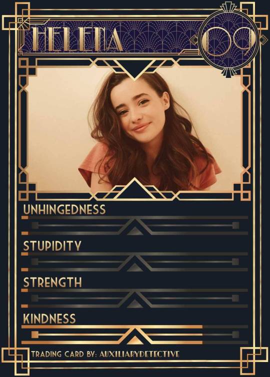
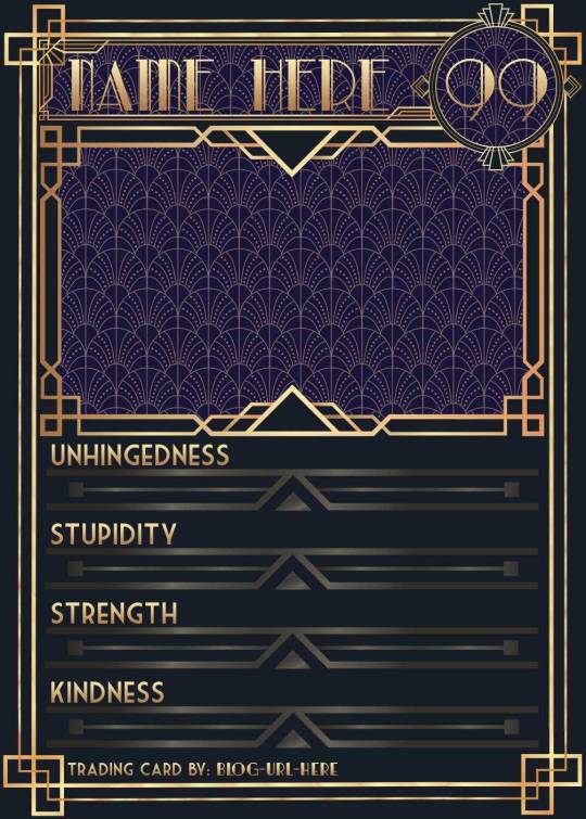
You can find the template to make your own cards here - and I explicitly encourage you to make your own, because I was kinda hoping I would get to see cards of you guys' OCs and we could collect them all in a binder like this one. It would be really fun! (The number next to the name is the power level btw - I wanted to imitate a set of Star Wars trading cards I used to collect as a kid) Make sure to @ me when you do and tag your post with #ocversetradingcards!
I tried to make the template as accessible as possible so that even beginners should be able to use it without any issues. So, I color-coded the layers!
The red layers are ones you shouldn't touch. They make up the main frame of the card. The orange layers are ones where you can play around with the colors, but that's for advanced photoshop/photopea users. The green ones are the ones where you put in text! Edit those freely. Blue ones are ones you have to select and move as a batch - if you don't know how to do that, check below the cut ^^
You'll need to download these fonts:
Park Lane (name & power level)
Market Deco (main text font)
Artisual Deco Black Italic (blog url)
Below the cut, you'll find a tutorial for the template and a list of the image resources I used - Quick info for everyone, including the more experienced Photopea users: Save your image at 50% quality. The template is a big file and the exported image will also be pretty big if you don’t save it at a lower quality. 50% is what you can see above and I think it's a nice size-quality ratio.
Tutorial Time
Opening the File
Step one: Get either Photoshop or Photopea. Photoshop costs money, Photopea is free and runs in your browser. Take three guesses which one I use. Yeah, it's Photopea. As such, this tutorial will be Photopea-centric, and I also have no clue what the Photoshop interface looks like, so I can't really help you if you work on Photoshop. But I'm told they're essentially the same, so...
Step two: Download the fonts listed above from the links in this post.
Step three: Click on the link above to go download the template. It's a bit of a big file, so I put it into a zip file for you. Don't worry, you don't need a special program to open it. Photopea will do that for you.
Step four: Open Photopea. Click on "File" -> "Open..." and select the "TradingCardTemplate" zip file.
Step five: Click "File" -> "Open..." again and select the zip files for the fonts. This will import them to Photopea. There are also preview images included in at least one of the zip files for the fonts, so just close the windows for those projects when they pop up by clicking on the little "x" next to their file name. You only need the "TradingCardTemplate.psd" tab to be open in your Photopea window.
Great! Now you're all set to edit!
Editing the name, power level and blog url
I decided to group these together because they function essentially the same way
Step one: Select the typing tool. It's the little "T" symbol in the toolbar on the left side of your screen.
Step two: Select the layer of the text you want to edit. The blog url one is in plain view. For the name and power ones, you need to open the corresponding folders first. They're the green layers in the folders!
Step three: Click on the text you want to edit. It's easiest to aim for the middle, that way you have the least chances of missing. The typing tool is a bit finicky with that sometimes, especially if the text is small.
Great! Now you can use your keyboard to delete the placeholder text and replace it with your own! The power level will only fit two digits and picking "00" will look bad. Your OC should have at least some power. They need it to breathe.
Changing the size of the name text
As you might be able to tell, the basic text size only works for fairly short names. So, you might have to make it smaller for your OC's name to fit
Step one: Enter your OC's name as described above.
Step two: Select the text as you would anywhere else in your browser.
Step three: Above the little tag where it says "TradingCardTemplate.psd", there's an options bar. You'll find a box there labelled "Size" with a box that says "150px" and a down arrow next to it. Click on the down arrow and a slider will pop up. Play around with that slider until your text has a good size. Then click on the checkmark.
Step four: Switch to the transformation tool. It's the cursor with the directional cross next to it, at the top of your left-hand tool bar. Move your text so that it aligns well with the left side of the frame but make sure it's below the middle.
Step five: You now have to select two layers at once. The text layer and the frame for the name tag. Do do that, either press and hold your control key on your keyboard while selecting the other layer or toggle the control key using the on-screen keyboard at the bottom left of the toolbar. If you use the toggle, don't forget to untoggle it after.
Step six: On your horizontal toolbar above your project window, click on the icon that's a horizontal line with two boxes centered on it.
Congrats, your text should now be centered!
Adding in your OC picture
Step one: Open the "Picture" folder and select the layer beneath "Add picture here". This will make sure your picture will be in the right spot. Also make sure to click on the eye next to the "Pattern" layer tag to make it go invisible.
Step two: Select "File" -> "Open & Place..." and pick a nice image.
Step three: Once the image has been imported, make sure you change the zoom percentage to 100%, that way the image doesn't look pixely or weird. Click on the checkmark.
Step four: Resize your image so your OC fits nicely into the frame. The image should fill the entire space inside the frame and can stick out as much as you want.
Step five: Right-click (or press and hold, if you're on mobile) your image' layer and select "Clipping Mask".
Perfect! Now your image should no longer stick out of the frame. Feel free to adjust your image's coloration, brightness etc. by selecting "Image" -> "Adjustments" and your preferred action.
Changing your stats bars
This works the same for each bar and I tried to make it as simple as possible.
Step one: Open the corresponding folder.
Step two: Select the set of three blue layers together. You can do this by selecting one layer normally, then selecting the other two while holding your control key or while having it toggled using the built-in on-screen mini keyboard at the bottom left of your screen. If you use the toggle, don't forget to untoggle it after.
Step three: Switch to the transformation tool (the one at the top of your left-hand toolbar, it's a cursor with a directional cross) and move your layers. By moving them to the right, you'll reveal more of the gold underneath the overlay. More gold = higher level of the corresponding stat.
Great job! Now adjust the bars to your liking.
Saving your project + card image
To save the project: Click on "File" -> "Save as PSD". This will download the current project under the same name as the file that you downloaded it as. So, it will be called "TradingCardTemplate (1)" or something similar. Make sure you change the name in your files so you know which is which. Alternatively, you can also change the name of the project by double-clicking the little square that currently says "TradingCardTemplate" and type in your new name. If you save again now, it will show the new project name! Make sure to save your project if you want to be able to recover it and/or work on it later!
To save the card image: Click on "File" -> "Export as >" and pick your preferred image file type. I suggest JPG for best results. Make sure to turn the quality slider to 50%, then hit the save button. This will download an image file of your chosen type, under the same name as the project name. To change that name, refer to the bullet point above or go to your files :)
Advanced: Changing the BG color of the pattern
Step one: Select the pattern background of either the name tag, power score or picture and turn it to 100% opacity.
Step two: Color-pick the current background color of the pattern.
Step three: Click "Image" -> "Adjustments" -> "Replace Color..." and click on the colored rectangle in the new pop-up. Replace the default color with your color-picked color. Now use the Hue, Saturation and Lightness sliders to get a new color that you like. Note down your slider values for later so you have them for the other elements.
Step four: Color-pick your new color and select the corresponding solid background layer. For those layers, click "Edit" -> "Fill..." and make sure you have "Foreground" and "Normal" selected, your Opacity is 100% and you have "Preserve Transparency" checked.
Step five: Don't forget to turn the opacity of your pattern layers back down to 60%.
Congrats! You have your colors changed! Repeat this process for the other two patterned elements.
Extra advanced: Changing the card's background color
NOTE: I DON'T recommend this. You can do it, but it's a lot of work.
Step one: Select the background layer and change its color to the new color you want. You can do it with the "Hue/Saturation..." adjustment, with the "Fill" edit as described above, or whichever way you want. Color-pick your new color.
Step two: Open the smart object PSDs for the frames for the frames for the picture, the name tag, and the power counter by double-clicking on the preview image of the layer.
Step three: Select the lowest colored layer of each and change its color to the same as your new card background color. Click on "File" -> "Save (Smart Object)". Close the project windows.
Step four: Open the folders for the various stat bars and select the "Color Overlay" layers. Change their colors the same way you did for the other layers. Warm colors and high-saturation colors will most likely not look good here and you might need to find a different way of making the stat bars look good. Playing around with the "Brightness/Contrast" adjustment layers above might help, but I can't promise anything. This is the main reason why I don't recommend changing the card background color. The stats bars are adjusted to the background color.
There we are! Either your card looks very pretty now or you understand why I don't recommend this. Either way: Good job!
Resources from Freepik:
Corners by tartila Power counter frame Picture frame by pch.vector Stats bar by tartila Pattern

Taglist (we're bringing out all fandoms today): @starcrossedjedis @oneirataxia-girl @daughter-of-melpomene @bravelittleflower @box-of-bats @fluffle-system @wheresmybloodynauglamir @nanukanal @supermarine-silvally @cody-helix02
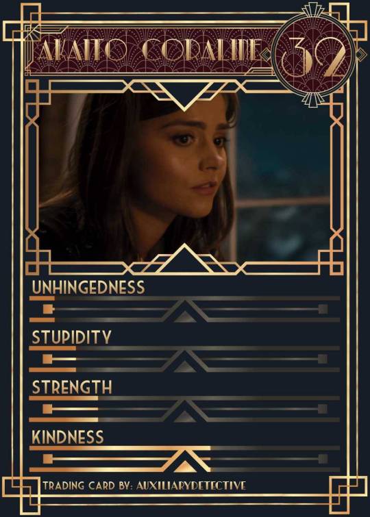
#ocversetradingcards#artsy#photopea adventures#oc: akaito coraline#oc: helena#holy freaking shit i finally did it#look everyone!!!
20 notes
·
View notes
Note
Another entry. Firstly, Still With Me? Did JK release a new song that I didn’t know about? Secondly, I would rather speculate that a song is about someone then a hand gesture that a lot of people do.
I saw them coming at us for paying attention to numbers and 11/08 even though that's way more real than whatever tf this is. Like... aren't they embarrassed????
Anyway guys, I have an announcement to make.
Attention please!
Thank u ☺☺
Okay so I've been getting alot of frustrated asks mad at tkkrs and antis on twitter, right? Unfortunately I tend not to post them because I don't wanna bring too much negativity on this blog. Especially when some of those things are vile AF. Anyway, the point of this post is, My friends and I are in a Jikook discord and a few of us do this thing on twitter where we fight antis and shit especially when they come to Jikook spaces.
As we know recently a big Jikook account with 15k followers was attacked the other day for liking a post from an anti. But she had no idea that person was one. She just liked the post coz it was Jikook related. It's an easy mistake to make, really. She tried apologising and explaining she'd blocked the anti but these assholes didn't listen. They went though her profile and started commenting under all her regular, normal tweets that she was an anti and should be ashamed of herself or whatever. They were determined to give her no peace whatsoever.
When called out themselves, one account shamelessly said that they were antis and proud. That they didn't pretend that they don't hate Jimin. This really made me mad. It's not the first time they've been quite proud of the Jimin hate they partake in. Tkk accounts will gets thousand of likes on a post hating on Jimin and this ain't right. An anon sent in an ask venting about us being cowards and I agree. They attack Jikookers and these jkkrs end up deleting their Jikook posts. THIS SHIT AIN'T RIGHT!!! Its not.
They do this thing where they move in balk. My friends and I tried to back this account up. Encouraged her not to let them get to her. But it dont matter that 5 people are on your side if 30 people are telling you to kill yourself its just... /sigh/
This account is still running. But they had to unfollow everyone they follow and start from scratch. This ain't right guys. Its just not fair no matter how u look at it. I think we need to start giving tkkrs the same energy they give us.
Simply ignoring them is NOT working. We don't go to them, they come to us. I think its time Jikookers fought fire with fire. Which is why I'm making this post. A few of us had the idea to create a Jikook fighting discord.
If you are reading this and are tired of taking shit lying down. If you have wanted to fight these people but you were worried that you are just one person and won't make a difference. If you see the Jimin hate and wish there was something you could do about it, I come with an offer. Fuck tkkrs. Fuck antis. Fuck solos and fuck ot7 accounts that call out the vermin but then delete their tweets when they start to loose followers. Fuck all these people. Lets do something about this, ourselves.
Tkkrs are the ones causing chain reactions. If they didn't attack Jimin, Jimin solos wouldn't attack V and JK. (Yesterday I saw an art of JK with a dirty diaper and I just...🤮) If they shipped in peace and didn't attack Jimin literally all this shit wouldn't be happening.
I say we give them a taste of their own medicine. So if you see this post and you agree that enough is enough, then come join us here.
If you can't join then spread the word. Time to defend Kookmin and Koominers. Fuck this shit. The vermin have ran rampant for long enough. Photoshopping Jimin getting blown by band pd wasn't enough. Now they're editing him into porn. Guys, they've go10 too comfortable. Let's do something!
1) Create a separate twitter account before you join us. Safer not to use your main
2) ONLY Jikookers allowed in this discord. If you are not one of us we will know.
See you soon. I hope some of you consider. This shit has to stop. Kookminers assemble!!
Bless 💜
94 notes
·
View notes
Note
I'm not sure if this counts, but would you ever consider sharing tips and tricks on rendering? You're so good at it! Love your posts 😁
it absolutely counts! Thank you sososo much I REALLY appreciate that, your so kind 🫶🥹 :)))
I can't really tell if you're talking about blender rendering or rendering like in photoshop, so... I'll just do blender tips and tricks, even tho I don't have a lot 💀 and a lot of the magic comes from putting the rendered products into an editing program (which I can also do a post about how I render if you'd like that :')) To preface: I make all my poses myself (besides the first render i made), and I use blender 2.83 👍 For blender: don't be afraid to play with colors in the lighting! Usually I have two lights (depending on the project), one white light for normal lighting (this doesn't apply to darker scenes like Nirvana's post or Kyneva's p2 post) and a colored light, use the light to your advantage especially to create atmosphere, Nirvana's post and this post are a good example, since I rlly utilized lighting to create an atmosphere (besides the text lol), I don't really know what else to say, but utilize lighting 👍😭 USE REFERENCES !! I use them off and on, mainly cause I can never find what I'm looking for, Kyneva's pose and Nanel's pose were heavily referenced by images I found, Nanel was moreso to make sure I got the hands to look right. A couple poses from the Roo-seum were referenced, but like Nanel, it was for anatomy. As someone who CANNOT anatomy for the life of me, utilize references, even if you take the pics yourself, refs are SO good especially for anatomy checks, and just to get ideas for poses if you don't really know what to do for a pose. That's kinda it, a lot of what I learned is self-taught other than the VERY very basics, everything else in my rendering process (including non-blender posts) all heavily relies on editing, and again, if you'd like that, I can make a post about it :)
#sorry I feel bad that I could only cough up two tips i feel like i dont do anything special for my renders#and if i do do anything special its probably something i just learned myself and feel like everyone else who uses blender just magically#knows 😭😭#yapping
8 notes
·
View notes
Text
i was tagged by @sandushengshou @khaotunq @baek1nho and @chickenstrangers to post my top/favorite creations from each month of 2023! thank you all so much for thinking of me <33
doing this loosely and with director's commentary bc i can never resist
january: my top set is this winteam hugs one. man i struggled so much with maintaining quality while trying to do that yellow to blue gradient coloring down the set. i definitely remembered it as looking worse than it does though, so i was pleasantly surprised to see that no it looks pretty good actually. probably also my favorite from that month since the others are very basic but honorable mention to my chinzhilla set cause i gotta shout out my beloved namesakes
february: top is jimbo the gogurt cat 😻 february was a slow month for me gif-wise so there aren't that many to choose favorites from, but it's probably my eclipse rewatch ep4 for the coloring
march: well uhh march was even slower than february i have two whole posts from that month and they're both eclipse rewatch sets (this was when my old laptop died and i spent like 3-4 weeks without photoshop). top and fav for this month is the eclipse rewatch ep5
april: top is akkayan in the first our skyy 2 trailer and fav is .... akkayan in the second our skyy 2 trailer (the quality of these is so much better how did i manage to make those first gifs look so bad 😅). honorable mention to my coloring in the eclipse rewatch ep8
may: ahh the our skyy 2 days...take me back..... top is every akkayan kiss as it should be. which i think is also my top post on this blog. as it should be. fav is vegas x it's about time (tw for glitch effect/flashing). there's some stuff there that i would go back and change cause i don't think it comes across great in retrospect, but i'm still really pleased with all the technical details
june: top was minoru's heart eyes part 3 (a gif series i WILL come back to shortly - i think the bleak midwinter is the perfect time for an odt rewatch). fav is akk x identity, but god would i go back and redo the typography and layout of the lines/text boxes (iirc i was like. minutes away from missing the deadline on this event so). still very pleased with the blending and what the set actually conveys though
july: oh look another gif series i've put on hold.... top is word of honor rewatch ep1, fav is tied between kp pretty boys (a set which is very pretty itself, if i do say so myself, and was very fun to make) and lomfontien kiss details (truly one of my all time favs on this blog even though it's so simple also everyone please go watch la pluie right now thank you)
august: bombastic side eye: the series takes the cake this month, which was SUCH a fun set to make (as was its spiritual companion, objectifying him to filth, which trailed by only about 30 notes). fav was charn vs wkx quotes. i honestly think i nailed it both conceptually and aesthetically
september: top is the first kanaphan drinking straw cinematic universe which continues to delight me whenever it shows back up in my notifs. fav is tied between cursed sandray parallels (tw glitch) (because it was one of those where as i was making it and inflicting emotional damage on myself, i knew it was going to be delightful inflicting that damage on others, and it was) and sandray x it will come back (mostly for the neon text and its reflection in the first two i just think it looks really good)
october: top was sandray love scene details (tw flashing) which was basically a rip off of my lomfontien kiss one from july but this one was much more successful lol. favorite is only friends x shameful company (tw flashing) (which now i can't look at without thinking of the sign skdjfds). really happy with the cards gif in particular
november: the guynawa kiss won november and they deserved it. my favorite was jim x loss which took me foreverrrr and i redid the last two gifs like three times but it was worth it. also shoutout to my dan x shadow post for all the 'wait there's actual monsterfucking in this show' reactions it elicited
december: top is phayatharn ep1/ep2 parallels and i have to take back what i said about every akkayan kiss being my top post - this one beats it by three notes! which surprised me but i'm glad we're all in this madness together with these two. fav has got to be morkday x come closer (tw flashing) if only for how much i beat my head against a wall over it during the creation process skdjfskj. although i also really love this set of tharn's sexy dream (nsfw) specifically because i added an offset pink layer and i'm OBSESSED with the way it looks with phaya's tattoo
if you read all that.. thank you and also i'm in love with you. anyways it was super fun to look back on everything i made this year! and interesting to realize i'm not nearly as prolific as i thought, especially in the first half of the year. here's to many more gifsets in 2024!!
tagging a few people i don't think have done this yet, apologies if you already have! and as always no pressure
@i-got-the-feels @pharawee @markpakin @difanghua @junghaesin @krystaljungs @firstmix @khaotunqs
8 notes
·
View notes
Note
hii it's unorcadox ^_^ how does your editing process work!!! like how do you choose what images to use, how to combine them, how to get the right "feel" etc. 👀 very curious abt ur answer
Damn, great question! Also, love your edits, Orca! (also a bit jelous abt your productivity, wish i had so many great ideas) So i present to you: a wall of text! (cw really long!)
So, many people see a great base image and then immideately get an idea of what they wanna do w/ it. I'm not like that, i ususally have an idea of an edit in mind, and then search for sometimes a few hours for a base image that may work. I have a whole tutorial-worthy process of how i always find what i need, but i digress… Most of the times, tho, i get something better than what i had in mind. I love this process, cause it's like tresure hunting for me. (ofc it's not always like that, just most of the time. Since i have a giant collection of base images i may sometimes use them). I choose my images based on the mood i wanna portray. It's always supposed to be looking kinda dreamlike and unreal, but it can also be creepy, dark, bright, etc.
When editing my favourite style of edits - fake dreamlike places - I try to make them look as real as possible, regarding color, lighting, etc, while still making them look blatantly fake regarding the composition, subject matter, etc. Ofc i don't try to perfect my lighting, since it can take away the feeling i strive for, so it's kinda based on my own feelings idk. I get really inspired by the surrealists' painting. Artists like Brent Wong, for example. Liminal spaces are already weird, so why not make them even weirder, by making the geometry non-Euclidean and subject matter impossible in the real world. Also unlike surrealist painters, i have a luxiry of making the scene like "more real" by combining actual photos in photoshop. Ofc people have been making surreal art w/ 3d programs forever now, but it still doesn't give off the same feeling real picture does, yk.
Uhh... what was i talking about... Ah, yes! I firstly make a collage, that i have in mind by this point, and sometimes it just... doesn't work out! i had discarded so many great ideas, cause they weren't turning out good. But if it works, i add shadows and highlights. I look at real liminal space photos and try to really analyze them. Like, what makes them work? the color, the quality, the blurriness? Then i add effects that works to my edit. Every edit needs it's own level of compression, sharpness, blurriness... You just gotta feel it.
Really important step. I leave my edit for a few hours, so i forget how it looks, and then return later. All the imperfections, things that don't work, etc pop out immediately. I read somewhere that the process of creating and the process of analyzing are two completely different things, and i couldn't agree more. It's annoying when you have a finished edit, and you really wanna show it to the world, but you have to wait... But it's better, than being embarrassed later that you posted something unfinished and you can't fix it now.
Ofc i make text edits as well, but they basically serve the same purpose and not that interesting to describe, cause process is the same just with a few steps skipped.
There wasn't such question, but i still wanna talk about it, cause it kinda answers "how do you get the right feel". Well, why do i make edits? Well, the world sucks ass (i don't agree w/ this statement for the most part, like friends are great, nature is buitifull, but then there are parts that just... yk...) and for me weirdcore is a sort of an escapism. I can't traverse dreamworlds mindlessly, alone or come across magical events in real world, sadly. But I can make them however i would like them to look and feel, with my characters (like deer), and my own thoughts about them, that no one except me knows. It's kinda like i actually've been there, and i took a picture. Or hell, maybe i've never been here myself, but those deer were, or invisible creatures, that are not in the shot. And i know them personally, cause i made them, they are a part of myself! And it really helps, and i'm so glad these pictures resonate with so many more people here too! I had been making these pictures without realising why for a year. I had some thoughts and heard dozens of opinins of other pople, but i hadn't had a full picture. And then a video by SuperEyePatchWolf about liminal spaces comes out, and i get it now, it was really eye opening, for me at least. It explains really well why we love unreality so much.
26 notes
·
View notes
Text
Well, I guess it's time to address the situation... or the lack of situation lol This is gonna be long, be warned. There's a TL;RD at the end if you wanna skip the wall of text. To start, thank you to the two anons who took the time to read the comic and prod me about it and the new people who started following this tumblr in spite of the Hiatus warning. Altho this place has been collecting dust for more than a year now, I'm still around, updating my side reblogs tumblr, so it's not like I dropped from the face of the earth.
The truth is, at this moment in time, I've feel out of love with making this comic. It was always a lot of work due to me being a perfectionist. I never used any extra rendering apps, all you've seen here is raw sims images and a lot of work on Photoshop, so much so it gave me a muscle contracture on my right shoulder (because I did all my work in bed with my laptop/drawing tablet in my lap. I never said I was a smart person lol) that still flares up from time to time because I learned nothing. Then the VA fandom was already quite small by the time I started doing this in 2015 and I never really advertised this in the fandom anyway. I always got the impression most of the fandom didn't like the OG comics as it was and most of the people that followed the comic were sims 2 fans because, well, it's made with the sims and the images were pretty (forever holding in my heart the people you said this <;3) The recent "Vampire Academy" TV series (it was just in names, honestly) was the final nail in the coffin of my motivation. After information had leaked I was already disappointed in it, but after actually watching it, yeah no. Only plus to it was the surprise to see it was partially filmed in my country, in places where I have been myself. And lastly, and probably most importantly, I struggle with motivation a lot. It happens to us all, I am sure. It's no secret that I hated to panel, if I'd start all over again I'd just post the big images like many of you telling stories are doing now, it'd be less of a stress for me, but alas, I can't change formats now. And I said many times I was doing it mostly for myself, because I did love the comics based on the books, but doing it for yourself only gets you so far until you get bored. And I got bored. I'm actually surprised my hyper-focus on it lasted for as long as it did. I haven't been to Photoshop for editing - I used to make photomanipulations and other kinds of editing - for way over a year, so it's not only the comic that stopped.
I still have 7 pages to end chapter 6 in various degrees of editing, Veninorchid and Esotheria-sims have seen them, so they exist lol I will eventually finish editing them - it's mostly a Romitri flashback - and post them. But after that, I will have to decide how to proceed. Spending less time editing would help, but lowering the quality of my pages, the only thing people like about it, really doesn't sit well with me, because yeah, perfectionist.
So at the very least the remaining pages will be posted in early 2024, I might go back to it slowly, a little bit everyday so I don't burn out or put stress on my shoulder. But after that, it's up in the air. It's not like I've been staring at the walls during this time, I had other things taking my goldfish-like attention. I got interested in home bookbinding, which made me dig out old unfinished stories I once started and I've been trying to finish them and later try to bind them, because why the fuck not lol And on my reblogs tumblr I had this set of pictures about a Regency little story that people really loved and I'd like to add to it, but then again, all the editing it'd need *cries* I feel tugged in so many directions I fear I'll end up doing nothing lol
So the TL;DR is, I got bored with the comic because it was too much work and resulted in physical pain, I lacked the motivation and other things got my attention meanwhile. Chapter 6 will be be finished eventually, but after that it's up in the air. Cross my fingers that I get my mojo back while editing those pages. Still, a thank you to all of followed and are still following, sorry these were not the good news you wanted to read just because I made a post. You support up until now was what kept me going in the past, I can't thank you all enough.
17 notes
·
View notes
Text
This is gonna be long 🫣
I saw a post by @b-lessings the other day talking about an incident that happened with her and how she dealt with it in a way that her old self wouldn't and I want to talk about something that happened with me between yesterday and today that I dealt with completely differently than how the old me would.
Anyway, as some of you know that I've been busy with my cousin's wedding and also already started working on Seb's tumblr birthday post, which means the only free time I get while using photoshop is for Seb's birthday post.
My boss texted me last night while we were driving to the venue for the wedding, she asked if I was free to edit some stuff and design some flyers work related, I told her that I was at the wedding and that if we don't need them anytime soon I'd do it, she said that half of the work has to be ready by tomorrow (today) and the other half has to be ready Sunday the 13th (surpris surprise Seb's birthday 🤣)
I said that I can only make the stuff that's due the 13th and if the stuff for today can wait a little bit more, I can squeeze it this morning and I can do it.
She agreed, I asked her to send me the details.
Woke up this morning and I didn't find any details sent, I contacted her and she said she's gonna do it in a few minutes and that the stuff should be ready by tonight.
It's been literally 8 hours and no details has been sent.
Now, she sent me and it's a lot of work that it's impossible to finish before tomorrow.
I was like, I'm sorry I can't finish all this by tonight (it's past 10 pm), she was like you didn't insist on the details, I was like I told you to send me the details since last night and I told you again this morning, it's not my problem.
She didn't say anything lol and now I'm back at working on Seb's birthday post.
The old me would stress herself into finishing it all and probably she would give up on Seb's birthday post.
So yeah, therapy does work, and setting boundaries does make your life easier and stress free 🩷
Take care of yourselves loves ❤️ because when you fall nobody is going to lift you up BUT yourselves!
10 notes
·
View notes