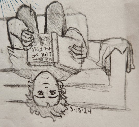
#I actually drew this first and when I struggled with the posing I did the full body sketch that I posted forever ago
Explore tagged Tumblr posts
Visit Tumblr Blog
Explore Tumblr blogs with no restrictions, modern design and the best experience.
Last Seen Tumblr Blogs


Fun Fact
Tumblr was created by web developers David Karp and Marco Arment.
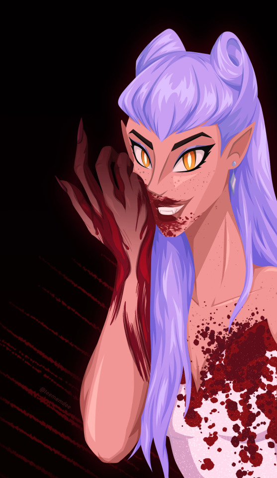
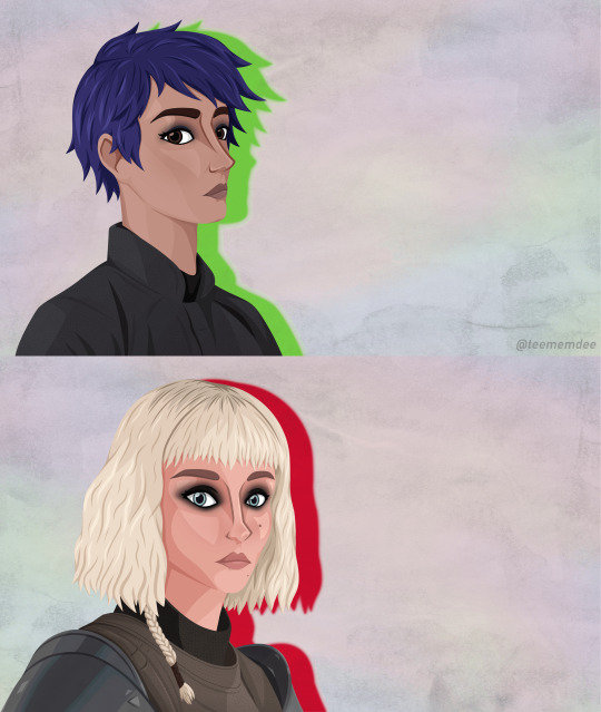
Photo

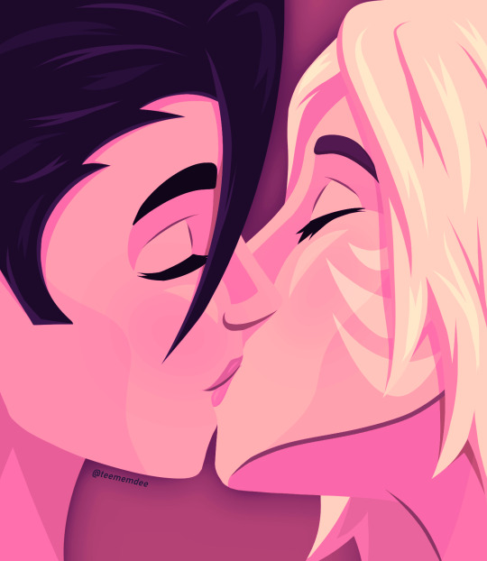
the priest-emperor and his champion
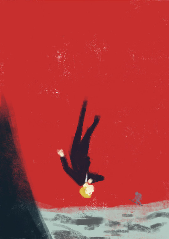
#oblivion au#dreamwastaken#georgenotfound#dnf#yes this is technically a redraw of the other sketch#ert#I actually drew this first and when I struggled with the posing I did the full body sketch that I posted forever ago#i just didnt have time to bust out the alcohol markers to colour this
119 notes
·
View notes
Text
A Canary’s Final Flight
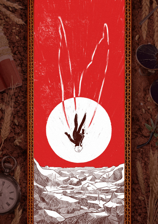
My piece for @trafficzine 4th edition! Get it for free here! 200 pages of excellent art and fics, incredible work from all participants and from the mods especially!! huge shoutout to the mods for real
Process notes under the cut! (I struggled a lot so it's a bit of a novel)
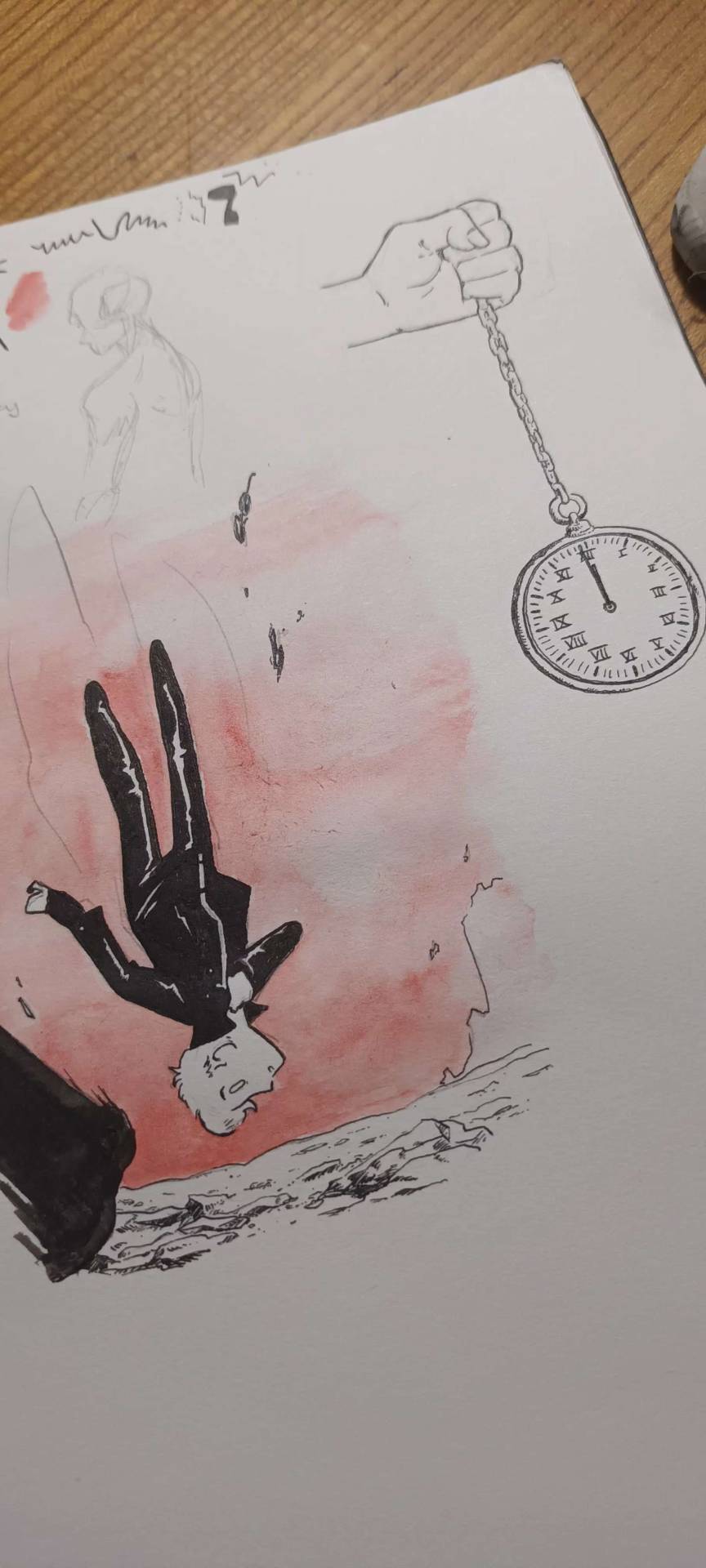
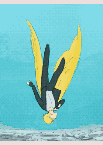
So the entire process was a Ride. I knew when I picked this prompt that I was going to have a hard time, because Jimmy’s final death had been illustrated a billion times over by extremely talented artists. But I had a Vision of the snapshot of the second before the impact, when everything is still but you know what’s about happen. It was very much inspired by the clip of Fog by Jabberwocky, bu the thing is, they have the advantage of all the build up of the fall, and that’s when the trouble started.

This was my first version, and obviously it wasn't working. And I was trying so hard, with so many iterations! Small wings, big wings, no wings, different poses, less backgrounds elements. I'd done compositions were everything seemed peaceful but something is Wrong, but it wasn't working this time.
So instead I focused on what rendering I'd like to do - I tried a painterly approach, for that visceral feeling, but it wasn't working either (but hey, I did keep the red sky, so, progress)
At this point I'd been doing back and forths for weeks and I was just as lost as at the start. Now that's my tip for people who make art of any kind, in situations like that, stop thinking about how you can make the best piece possible, and think about you can have fun with it (because when you aren't it's visible). And for that was, 1 - going back to using ink and pen nibs and doing way too detailed inking, and 2- looking at Dave McKean's covers for Sandman (which, funnily enough, was also a reference for my previous trafficzine piece)
And from there I was actually going somewhere! Between the jagged rocks, the red sky, and the increased verticality with the borders, I had hit the vibes I wanted.
I did some experimentation with the border, and even though I really liked the bad boys I drew they were taking too much away from the lonely desolation, so I actually used Red (Unecessary Redstone)'s idea of all of Jimmy's worldy's possessions scattered on the ground post impact, with the idea to make it looks like the central image is his grave being dug.
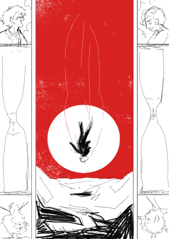
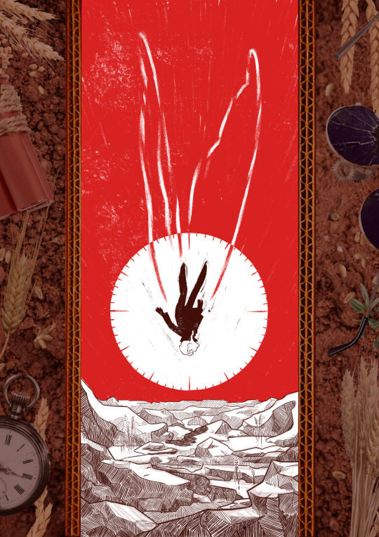
(and yes for a short amount of time the were supposed to be clock markings on the sun, but there was already enough going with the wings so I scrapped that) (also fun fact the reason why the wings aren't fully material but more ghostly is because my toddler cousin was watching me draw the very first draft and asked why he didn't just use his wings and i went :( so the wings are a metaphor now)
So from there I found a bunch of picture and took some myself, cut and assembled everything together, added shadows in all the appropriate places, and repainted some elements so that everything would look better intergrated (some of the wheats are basically 100% handpainted, the cardboard as well). This took a suprisingly long amount of time, but I was done!
Well I wasn't expecting to have that much to say, but I hope if you're still reading, it was at least interesting!
#trafficzine#limited life#limlife#limlife fanart#jimmy solidarity fanart#solidaritygaming#i forgot all the tags augh#curse of not posting often#mcyt fanart#mcyt#zine illustration#zines#my art
1K notes
·
View notes
Text
Soooo, here we are, a New Year
Now, this post will be different than my usual art Posts i do. A few days before the New Year hit i got kind of reminded that Art Summaries exist.
Usually people only put one Art in, i think its the "best" one which they like the most, i think.
Though i wasn't able to decide for only 1 piece for each Month, so let me take you through my whole 2024 Art Journey!
- - - ☆
Starting off, i was 19 when i started Art. Back in May was when i came up to my beloved now girlfriend Kiera and asked for Advice on Drawing and told her that i wanted to start Art.
I chose to start with Hands. (albeit i did not include those visually in my Summary)
Hands were.... well.... hands. Kiera sended me a few Videos on how to draw, recommending me a German Youtuber called DrawingLikeASir. This is where i got my basic understanding on how hands (and also Human Anatomy as a whole) work and how to draw them.
I'm very grateful that people who do Art for a long time already, share and make Tutorials to follow. It's alot easier for me when i have real time visual explanation, so DLAS's Video's really helped me alot.
Besides those Videos, Kiera gave me alot of help too. She would give me tips if my Anatomy was off, help me fixing it via voice chat or messaging and overall just helped me understand Art to the extent that i then started to do it more regularly and frequently.
- - - ☆
Now, after this Yapfest, how about we take a deep dive into my Art?
This will be the longest part, but i do have alot to share actually....
Let's start with May !
I don't have any visuals here, so i will keep this brief.
In May was the first time i actually tried learning how to draw. I did start with Hands first. Why you may ask? Because i wanted to tackle one of the presumably worst things to draw. I did a basic fanned out Hand for a few times before i started drawing Hands around things. I felt comfortable very fast with how i drew Hands back then. And that was my May more or less.
June !
Let's get a nice Picture of June out, because June is the Month i started to learn Human Anatomy. It sucked.

I tried learning Human Anatomy after i felt confident enough with hands. I experimented around a bit, tried drawing either masculine or feminine body Types, but i did struggle with both. In the end, i tried settling for more androgenous Body Types. Those were alot easier for me, and Kiera did tell me that they can be easy to work with, since i can basically "shape them like i want". So i went with it.
Pretty much my June was occupied with learning to draw a whole Human Body.
July !
In July i made alot of Progress i think, this was my Prime time for learning how Bodies work. I took Ideas from other people i've interacted with, tried a DTIYS (Do this in your Style), created a small sketch page, participated in Rimlaine Week and also started to do Digital Art!

Now, starting Digital Art was hard, it still is for me after roughly 6 months. My missfortune was, i had no pen for my Tablet. I needed to learn how to Finger Draw. It was really taxing and unforgiving on my Hand, but i still pushed through it and gave my best. I didn't wanted to stop with Digital Art just because i had no pen.
Eventually, at some point (actually 2 points, one later though) I had a pen that worked, though it broke, both of them did. So i just stayed with Finger Art.
It honestly feels more natural for me to use my Finger by now and i think i actually want to stay drawing with my Finger for now. Unless i actually get a pen that doesn't break imidiatly.
August !
Short things for August: I had an Artblock. I managed to find 1 whole picture for August.

I can't really say anything more here i fear.
September !
September.... I tried alot of new things in September! Brushes, bigger Canvases, even rendering (not visually included)
September was a nice month. I made alot of progress, pushed my comfort zones and met ALOT of great Artist's!

I tried alot of new things. Posing, shitpost doodles, multiple people, character sheets, the Nasty Dog trend (i had fun doing that) and also tried to participate in dazai hurt/comfort week, i couldn't finish it due to personal reasons.
In September, i joined a Soukoku Discord Server which is run by Kaez. I joined there with intent of talking about SKK and it developed into active talking and Art Streams nearly daily! I got ALOT and i mean ALOT of good advice and tips on how to draw from more experienced Artist's!
It truly helped me find my Artstyles and Tools i can use on my drawings.
I am very thankful that my girlfriend sended me the link to Kaez's post about this server, it has been alot of fun there and was very educational aswell!
October !
In October i still was drawing nearly every day and started to draw Characters from Kiera's and mine own Story! I also experimented with Artstyles and Chuuya's hair. His Hair was a mess, it still is, but drastically changed the way i draw his hair in that month.

I specifically also tried to stylize eyes, it failed mostly but i still tried regardless (Eyes and facial expression are hard to draw, i learned the hard way)
November !
November was the Month where i started drawing (and writing) my first AU! My 14 Year old's BunnySkk AU!

I am very proud of those beans and all i had in my brain were those 2. I did inflict pain and suffering and great Trauma on Skk, but fear not, they are well now... or are they?
Lastly, December !
Going strong with the last Month of the year, I struggled, greatly. I had alot of personal Issues coming up, but went through those with trying to do art. Art really helped me get my mind off things, due to me not having a single thought while drawing (My head is a blank slate while i draw)

But besides those struggles, i got cheered on to keep going and so i did. I delivered Art from a Ship i was first very reluctant to draw things in fear of people being well.... online people. But i eventually overcame myself and started drawing my second favourite ship... Kunichuuzai!! I absolutely love their dynamic and can't wait to get back into drawing them. I need them. Carnally.
- - - ☆
Now now, this is probably as long as it can get now, so i will try to keep myself short here. (Try is the keyword, i am a yapper at Heart)
First and foremost, i will be thanking Kiera @misterloong , for even getting and pushing me into Art. I don't think that i would have been able to accomplish what i am doing currently without your great help and Feedback!! And thank you for putting up with my sometimes breakdowns over Art, its hard and we both know that.
Secondly, i am thanking Kaez @xkaez for creating the Skk Server. I don't think i would have had such a fun time over the last months while doing art if it wasn't for sitting together in vc with everyone and equally loosing our heads over Art together. The Art struggle is real but worth it.
Third..ly? Third?.... Leaving it at that. I am thanking the VC Dwellers Soup @iwantmochisoup , Goat @thatghostinyourbog , Jema @msshinylemon , Salt @saltedbiscuiit and Killeia @nolongerforthetainted . I am thanking you all for sitting in vc together, planning things, working together on thing and just having a fun time together! I learned a shitton, and i mean a shitton from being together in VC, drawing, talking or just hanging out together. I really hope this never dies out, its really fun with you all!!
Fourthly.... Fourth....? I am thanking Rosie @anticidic , Cinny @ohhcinnybuns , Ari @nevertheblood, Brin @ediblepandas and Cryptid @cryptid-juzou for giving me alot of Ideas and talking about all the ideas you guys had. It's always fun to lurk at night in the chats and see good ideas spring in. It might be one of my favourite pastimes aswell to just lurk in :)
And Lastly, i thank everyone else who i forgot to mention, whether its Skk server people, random online people, my mom or literally anyone who sees my stuff. I thank you for being here and supporting my Art Journey in any way you can. It has been a fun half Year of doing Art and i am so hyped for creating a full year of Art this year!!
I hope everyone who wants to do Art, starts doing Art, same with Writing or whatever other creative hobbies there are. It will bring you fun and can potentially even help you express yourself more.
On to a new Year
- West
- - - ☆
Adding on:
2 more Chibi doodles for making it to the end :>


#Happy New Years#This is sappy and probably poorly written grammar wise#don't lunge at me guys#besides anthing thank you for everything#may the new year treat us all well#also i cringed at looking at my old art#i hope i dont need to see it again LMAO
22 notes
·
View notes
Note
Aight bet-
Can i get Shanks paired with a female reader (romatically) who is also missing an arm and/or has red hair.
Thank you v.v
Not my bestest work but I thought it was funny and warm.
Narcissistic Romance
Shanks x Fem!Reader. Reader has red hair and missing arm. Miku is Miku even if she looks different so skin color or hair texture can be anything else. Small angst(?) but mostly fluff. Drabble + Headcanons

“I get we have the same hair and stump but did you really need to go this far? You even drew the scar on me.” You touch your eye where some friends had drawn Shanks’s signature scar on.
“This fits so well! You might as well be his female form.” You’re all near a bar, one of your friends got the idea to dress you up as Red Haired Shanks after getting drunk. “Strike a pose or somethin-” They’re interrupted when yelling is heard.
“C-CAPTAIN!?” You hear from behind you, turning to see a group of men staring at you.
‘Captain?’ You think to yourself, confused before it clicks. These must be Red Hair Pirates, but how? This is a crazy coincidence that they’re here right as you’re dressed up. Your mind runs at a million miles a second and you clamp a hand over your friend’s mouth before they speak. “Well, I got caught by a devil fruit. Changed my looks a bit but I look good as a woman too, right?” You smirk, going along with it. Unfortunately, your cover is blown almost immediately when a head peeks over your shoulder to look at you.
“Hmm. I do look good as a woman, don’t I?” It’s Red Haired Shanks, another coincidence and you jolt with a yelp. “Freaking out, Miss Red Hair? Not very Emperor-like.” He teases with a grin. Maybe you shouldn’t have tried to go with the joke considering how quickly you got caught, and by the man himself. “What’s my female doppelganger doing here?” He looks at your friends with a wink, this is so embarrassing. “Popular as a woman too?”
That was how the two of you met, a funny cosplay of a funny guy.
You were scared at first you were going to get in trouble for impersonating him, even if it was a joke and you were caught immediately.
Shanks isn’t a sore sport though and he actually found it really funny.
He had stayed at the island and you were good company, proving to be a good fighter as well.
He couldn’t just leave an attractive and strong woman alone, right?
You ended up joining his crew along with a few of your other friends that could fight and wanted to go, the rest you all sending letters to any others often.
The official number of redheads in the Red Hair Pirates is now two.
The two of you two hit it off, cracking similar arm jokes and having fun together, it was perfect.
It really wasn’t long until you both ended up dating, then came new jokes.
“Narcissist.” That’s what people like to tease you both about.
Dating a person that can look like a genderbent version of you with the right clothes and makeup is definitely narcissistic.
Of course, you both take it with pride.
Shanks even likes to show you off, calling himself the luckiest man ever to find the most beautiful woman ever to play into the narcissist joke.
Something on a more personal level is that the two of you can relate to missing an arm, helping each other with phantom pain and insecurities.
After all, when the person you love has the same imperfection as you it’s hard to be insecure about it.
You’re perfect to him and him to you, despite your disabilities.
It’s nice to have someone that understands, that knows how hard it is to deal with losing a limb.
When you’re feeling insecure sometimes Shanks puts his stump on yours, smiling and calling you both “stump buddies” before kissing you.
If the weather is bad and you’re both struggling with pains you can hold each other, finding comfort in the warmth of your lover.
Shanks holds you tight, even if he’s clenching his jaw, always trying to put your pain above his no matter how much you try and tell him he matters too.
It makes you feel insecure, he should have a partner that would be able to help him without struggling themselves, but to him you’re everything.
He’d rather hold you while shaking from pain himself than be comforted by anyone else.
These bad moments with you are more precious to him than the best with anyone else.
#fanfiction#one piece x reader#anime only#shanks x reader#drabble#headcanon#headcanons#shanks x female reader#female reader#fluff#angst
48 notes
·
View notes
Text

A pose sketch I did to make sure I drew something today since I didn't draw yesterday. Not my best, but, that's okay! I'm just glad to put some of the ideas I have down.
I've had an Actor AU in my head all because of the MHA stage plays. Some spoilers below, but I won't go into detail on what.
So for the Actor AU I basically made Aizawa and Izuku actual father and son. (No shock there. XD)
The two actually do well when they have scenes together. But, sometimes they have a really hard time seeing each other injured even if it's fake.
Hizashi is dating Shot and adored Izuku. So he's included in the having a hard time whenever their is injury. Both Hizashi and Shota hold hands whenever they hear Izuku scream in 'pain' or 'anguish' because it's just a wee bit too real for them.
The USJ was the hardest and there was a few short breaks because of how upset Izuku was getting. A lot of the other actors were helping.
For instance Tsu was holding onto his arm in the water scene. Though no one noticed.
Of course, reverse, it's very hard for Aizawa and Hizashi to see Izuku being 'hurt'. But, they have a better handle on it.
Shota and Hizashi will choke 'hello my son's mother and other dad' to the actors who do Inko and Yagi. Who all find it hilarious and do the same back to them by going 'hello actual dads of my son'.
On set, when everyone is really exhausted, you can find Izuku sleeping against either Hizashi or Shota. Though, he'll be cuddling with the other class 1-A actors.
Hizashi will bring strawberry milk whenever they go on set for Izuku and coffee chocolates for Aizawa.
During the last war battle and during THAT particular scene. That was the first time they literally had to take breaks for not just Shota and Hizashi. But, for the rest of the actors because it was just too real for them.
Shota had to check that Izuku was in fact whole and not actually injured. While Hizashi just keeps clutching Izuku's hand. I didn't draw Hizashi in this because I still struggle with drawing multiple people. But, I know I will get there!
Anyway, thank you for hearing me ramble and enjoying this if you did! I hope you have a wonderful day! Remember to eat food, drink water, and take you meds if you have any! And don't forget to stay kind!
8 notes
·
View notes
Note
Psst. The Outsiders doodle ideas:
Ponyboy reading a book (could be used to practice posing, expressions, background, foreground, etc). Or its homework and he cannot figure it out for the life of him
Johnny and Ponyboy getting milkshakes
Johnny. Just.. him
If you want to on with color: blond Johnny and black (or is it just a dark brown????) haired Ponyboy
Ofc don’t feel forced! And if you want to swap and characters then go for it, just used those two since you said they’re the only ones with set designs so far
TYYYYY 🙏🔥💯‼️ love all the amazing ideas i did a few bc it is a teeny bit late rn (3 am)
first we got Pony reading Lord of the Flies in honor of my lotf hyperfixatation sophomore year 🫡🫡🫡 why is he upside down? bc why not 🤷♂️ i feel like Pony would be the type of person to get wayyyyy too invested in like, all the books he has to read in English class (projecting), I mean dude literally read Great Expectations n was like 'damn this guy just like me fr'. anyways Ponyboy lotf fan is real to ME

and then this is Pony STRUGGLING w his math homework bc i drew this while putting off my own math hw <3 I think that Pony would be pretty good at math bc obviously he's a smart guy but yknow he's more English smart than math smart so I feel like he breezed thru math when he was younger n then he started getting into more advanced classes n realized math is actually pretty difficult n he does NOT wanna be putting all that work into it but he's pushing thru it 🫡 trying so hard to be math smart its ok Pony embrace the English nerd in u
and finally Johnny drawing that im ngl im not liking but idk why.... it is 3 in the morning so ill probs wake up n realize a million things that r wrong it but for now its good enough to post 🙏 i do like the hair tho it looks nice
#this is a lot of me projecting onto Ponyboy but IDC 🗣#im literally him yall (method acting)#no but the amount of times a day i get called Pony is kinda silly. not even like when im acting ppl will like walk by me and go “hey pony!”#get on my level yall#the outsiders#the outsiders fanart#ponyboy curtis#johnny cade#the outsiders 1983#the outsiders ponyboy#the outsiders johnny#cam draws
25 notes
·
View notes
Text
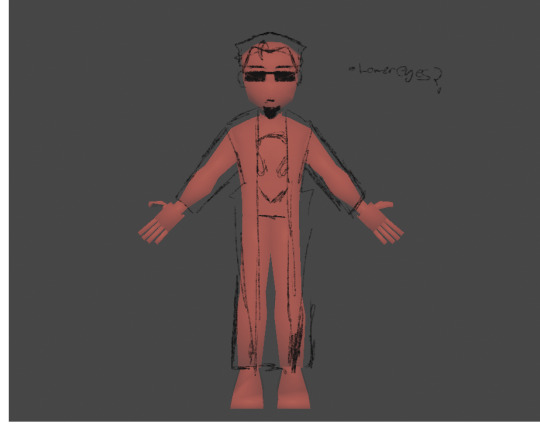
Postal Model
hi sorry ive been neglecting my tumblr because im working on a stupid postal 2 dude model(so sorry if ive been late to replying to stuff and posting art :3), heres some screenshots(the textures are temporary i literally just drew the alien right on I SWEAR ITS TEMPORARY)


More information on the model below + some extra earlier screenshots at the end
this model is more advanced than daniels's(my first model) because it:
has a face instead of a 2d texture with a semi functioning mouth(working on the mouth and eyes cuz its new to me and idk what the hell im doing)
better anatomy(though the choice for a simpler look was for aesthetic reasons for daniels model)
Ears!(except my first models hair would have hidden the ears so take that as you will)
actual clothes apposed to just being melded on to his body(except for the pants cause i didn't care for adding physics to the pants) So the trenchcoat and shirt are seperate piecies, yay!
Heres whats coming next:
Im hoping to add actual eyeballs that will hopefully work, which will be hard because i have never modeled and rigged eyes before(or really rigged anything w/o mixamo)
posable eyebrows
physics on the clothes
uv unwrap (shudders cause i have no idea how the actual fuck to do that without the blender automatic unwrap)
trying out shaders cause that looks fun(hoping for some bright cell shaded cartoonish look)
then rigging and posing everything
Let it be known that this is only my second actual model and like day 2 of progress so if it looks ass IM TRYING MY BEST i know i cant do something super realistic yet, and truthfully i dont WANT to, so im trying to go for a more cute look.
Heres some extra screenshots I have from earlier in his development:

These are his og refs, I knew from the beginning i wasn't gonna really follow the head design because i wanted to have a similar look to my first model, but i added the head like that anyways just so i could experimen with it(which i did and i didn't like it)
this was when i was really struggling with the hair so i had to make another ref


for the eyes im hoping for it to look similar to Daniels, but yk 3D

#art#artist#artwork#3d modeling#3d model#3d wip#blender 3d#low poly#blender wip#postal#postal 2 dude#the postal dude
24 notes
·
View notes
Note
would you mind sharing how you go about drawing the anatomy (body/legs/tail in relation to head) of a cat? its like the main thing i struggle with that i cant seem to find all too many tutorials for. apologies if youve answered something similar you just draw really good cat bodies & poses
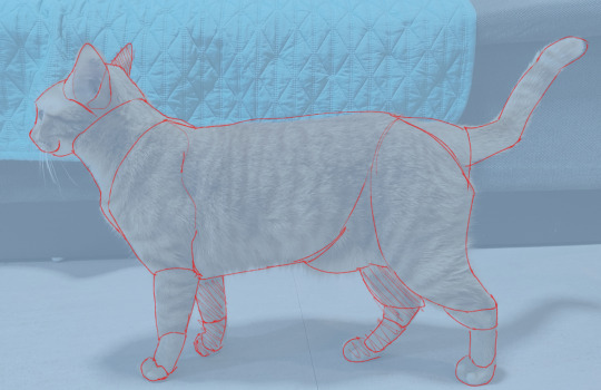
i have NO idea how to put my thought process into words but i do have this image which has helped me very much (its a pic of a cat i saw here on tumblr that i just drew lines over) and also one simple rule that ive been trying to follow lately: the cats head (w/o ears) should be able to fit into the cats chest area and if it does not your head is too big
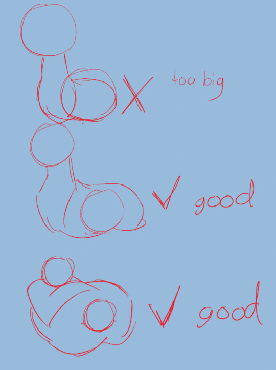
heres an example i drew quickly !! i also want to say that this is if you want your cats to be relatively anatomically correct (or at least how my brain says it should be) if your style says otherwise that is OK!!!!!!!!!!! do whatever you want idc . i also do break this rule and make heads too big occasionally (usually on kits cuz its funny looking) head size compared to tail doesnt really matter (to me) tails are very silly fun to draw and i like to have fun with it and leg size i usually base off of whether or not i think this cat would be able to stand up (ex: i wouldnt give a cat like the one at the bottom on the pic above skinny thin tall legs their legs would be chubbier and thicker) i also often draw necks too thin because well thats just how i draw them which doesnt matter too much the only rule with that i put in place for myself is the body has to be at least a LITTLE thicker than the neck er i dont think i have anything else to say the only other thing i think i could give you is breaking down the different body parts (like i did on the first image) for some of my designs which could maybe help ? if you want that then just send an ask! actually with that breaking down different body parts if you want to learn good anatomy id reccomened just finding images of cats online (preferably ones with different body types & simple poses) and then segmenting off their body parts like i did in the first pic it helped me alot when i used to reference images (now most of my poses just come from my head) because then i had a structure to draw off of (think of how some people draw human bodies with boxes and circles and triangles) ok im done for realsies now sorry i couldnt helpp too much im bad at explaining my though processes lawl
70 notes
·
View notes
Text

In 4 years have you ever wondered why I named it llcocogoatyll, I'll tell you the story about it from the beggining, my journey through all this year, and why I'm doing this. And to tell you why I drew this art.
Once I created this account it's just for consuming media I scroll everytime and looking for undertale contents and aus, I'm a fan of undertale specially for Asriel Dreemurr because I like his personality his background lore, his struggles or internal conflict in which I feel so sorry about him, and how he deal his problem by the help of Frisk. To continue, so I was just a media consumer keep scrolling on Undertale arts, learning undertale Aus and appreciating UT arts but back then, inside of my contents are empty, no pfp and just a random bot username.
Then It started to came to my mind that "What if I'll gonna start to make my own blog and posting arts and aiming to make someone appraciate my arts and to be a famous or renowned Ut drawer just like other famous UT cc". Back then I was'nt good drawer at first when I started it always get mistake and I feel like I don't like the way I draw. My first art that I drew was Asriel, it's just a regular pose and simple, oh if you want to find it? It's from the bottom or from the first post, I challenge ya if you find it you'll earn my respect haha. Ok back on track, when I post that asriel art, I put on my mind that I hope someone will leave a like or reblog it. After 2 days I received 2 likes and I felt way too happy and it's just 2 likes but I felt a burst of excitement and then inspired to draw another so I drew Chara and posted it, but same again I gain a verry few likes but I'm verry happy of it.
Then the next thing I did was how will I rename my Tumblr so that I will start my actual drawing blog. It takes me hours of how will I name it, and choosing a right name. Then after all of that I named it llcocogoatyll, I named it because it all starts when I play Genshin, and heard the name cocogoat. If I can recall correctly, Cocogoat is a legendary adepti goat beast claimed by Qiqi because she wants a milk that are made from cocogoat, and cocogoat or also known as Ganyu is my favorite character back then. So that's why I named it llcocogoatyll since I like Asriel and Ganyu.
So soon after making several drawings practicing hard to improve my skills, and receiving likes, criticizing, and reblog to give me inspiration to continue on. But after 1 and half years later of keeping drawing and active, I also created a Twitter account and posting some of my arts there, all I was aiming for is just for likes and reblog. So I started to feel like I'm not gonna be famous and I'm used to it, and that's why I lose my interest, motivation, I make arts but sometimes getting lazy, and posting it after 1 month, and today I post arts like every 3 months or 5 months, and getting busy from schools and projects. I was about to surrender and just receiving few followers. So what I did is I change my view, by changing my interest or motivations not from the likes or reblogs or gaining many followers but for to make new friends from Tumblr and but most specially to improve my skills on drawing.
"To be a inspired artist you must look through all your progress of your drawings from the first and compare it to now and look for the improvements". I did this practice so that I can see my improvements and continue to be a good artist, until now I keep practicing through passing years and now. I hope you like my stkry and through all of my journey and efforts.
So I made this simple art that resembles my username in X or Twitter, called Nuttygoat because I love nuts in another reason. If you wanna see my blog on other media, check it out on X, I'm way more active there. And explore more about my likings and drawings, hope to see you there:).
3 notes
·
View notes
Text
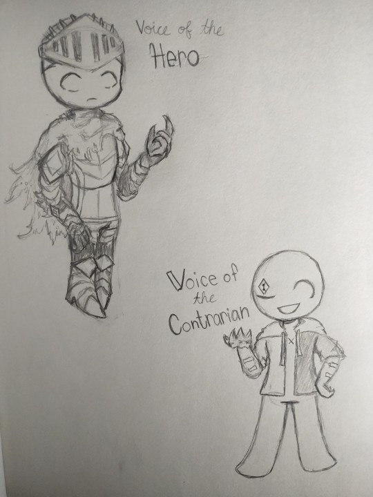
impulsively made designs for the voices! they're kind of more like concepts so they're likely to change if I get better ideas for them. I didn't want to make them too complex and give them pinterest outfits lol (I might do that another time though). notes for each voice under the cut!
Hero: I was kind of inspired when a friend said they'd picture that Hero would have similar armor to Artorias from Dark Souls, partially the reason I started drawing the voices
Contrarian: the first thought was to make him a jester, but I thought that's what people would usually imagine him as. so I gave him something more modern to stand apart from the rest of the voices where they're all medieval-ish. also the only voice with a completely round head and the only one without a lower eyelid. he looks silly too so bonus points for that. Contrarian can open his other eye, the diamond on his face is like a tattoo of sorts lol. The X on his chest is a reference to the Razor when he skewers himself (or ourself but same difference)
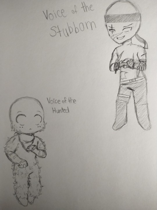
Stubborn: the first one I actually tried to design. I had the idea of giving a sharper, more prominent chin to the voices who seem more likely to resort to violence. the only idea I had for him was his arms so I had to google and this is the best I could come up with
Hunted: my first roadblock. I was clueless and even considered leaving him as just the base form, but a friend suggested giving him a bandana on his neck, so I did that. a little later I decided to make him fluffy instead of giving him clothes and it took a bit to figure out how to do that
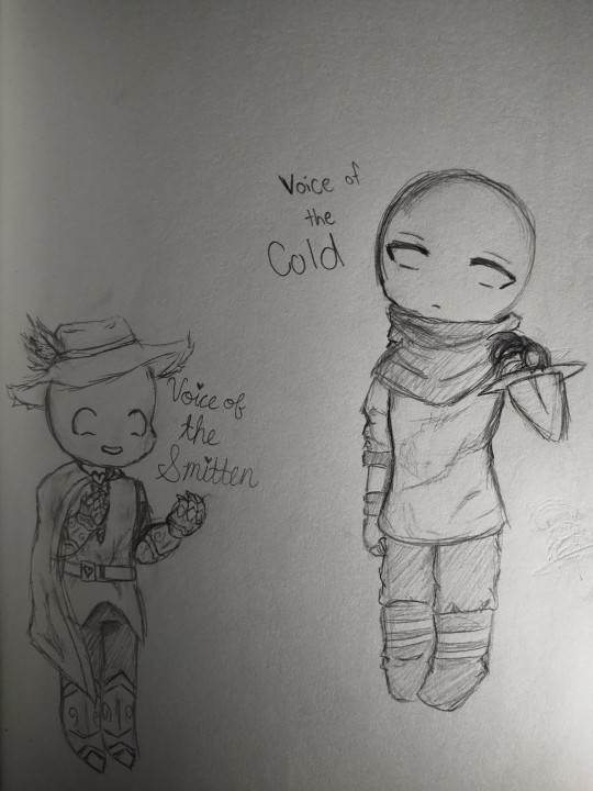
Cold: I found an outfit while I was looking for ideas for Stubborn and I thought it was perfect for Cold. my original idea was just a scarf, but I really liked what I found. don't mind the bad posing by the way lmao, I had an idea for a separate art piece but executed that very poorly so now it's part of the design drawings
Smitten: I got some inspiration from Reverse 1999 for this one actually, but the idea was a little too similar to Hero so I mixed that in with something a bard might wear and gave him a funny feathery hat
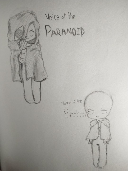
Paranoid: I drew him before this post and nothing changed from there. the eye on his hood is one sided and there's nothing else underneath. I don't know how to fit all the details in a pose that would make sense so I'll make another post later lol
Broken: in the Tower route pledging yourself kind of was like becoming a priest for her or something so I gave him the first thing I saw on pinterest when I was looking for priest like clothes. there's a shard of glass connecting the cloak together. he also has stab wounds on his torso from the Tower route
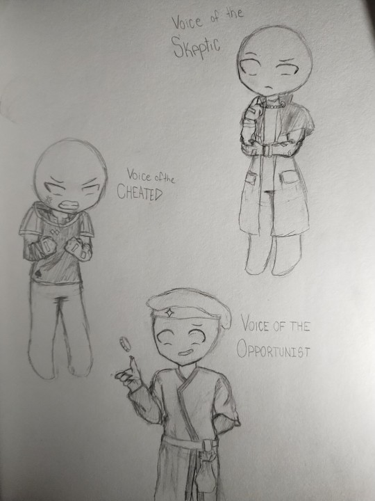
Skeptic: so the last three I struggled to think of designs for so much. he has a scar on his neck from just before the Drowned Grey route where giving him the knife would get him to slit the player's throat. the outfit was inspired by something I found on pinterest and thought the chain going across could somewhat be like the chain going around the player's neck
Cheated: this took the longest to figure out and I gave up on thinking of something. I just gave him whatever outfit I could find on pinterest I thought that would fit him lmao. the only thing I managed to think of was putting bandages around his wrist. he has a scar under the bandages from the Razor
Opportunist: I don't know what I was thinking when I designed him or his clothes. I think he just kind of gave me merchant vibes so I tried going for that and gave him a silly hat. he's definitely not hiding a blade behind his back. the coin was just an extra thing I thought of adding. I ran out of paper space on the page and didn't want to put Opportunist on a different page all by himself so he's the only one without a full body drawing, but it wouldn't make much of a difference if it was a full body
#slay the princess#voice of the hero#voice of the contrarian#voice of the stubborn#voice of the hunted#voice of the smitten#voice of the cold#voice of the paranoid#voice of the broken#voice of the skeptic#voice of the cheated#voice of the opportunist#this took way too long#it's 5am I need to sleep now lmao#scopophobia for paranoid maybe#ignore the lighting#and the fact I drew hero with longer arms than intended#fragments of glass
18 notes
·
View notes
Text
@rocket-eighty-eight mentioned you on a post “The real saw trap is reading an incredibly wrong...”:
@titleleaf WHERE did you see this red dragon take?!?!!
Why, here on Tumblr Dot Com, of course! I thought I had it screencapped but I managed to restrain myself from engaging with the original post -- the OP was all of 20 and God knows I made absolutely boneheaded Tumblr posts when I was 20, I make some pretty stupid ones now. Regardless, it had pretty hardcore "hasn't actually read Red Dragon" energy. As you might also expect it was a post gassing up the NBC Hannibal s3 finale, framing Will's participation in the killing of Dolarhyde as him embracing queerness and aligning himself with his true love, Hannibal, rather than his fake comphet love, Molly.
Paraphrased, their interpretation was: "the end of Red Dragon, the book, has Will triumphing over Dolarhyde and successfully saving his wife and child, reaffirming the integrity of heterosexual marriage and exorcising the queer threat that Lecter poses to Will's identity of himself as straight, while the show's s3 finale has the better and more affirming depiction: Will leaving behind his wife and child and going to be with Hannibal and embrace his nature as a killer, showing that he's accepted his true self and what he holds in common with Lecter." Which... all of that aside, that's not remotely what happens in the book Red Dragon!
The ending of the novel is so notoriously downbeat and ambivalent that I have read multiple pieces of academic writing commenting on it, and it's something both film adaptations have felt the need to change. It's a fucking downer. You can't even feel good about Molly killing Dolarhyde because you've seen enough of Dolarhyde as a sympathetic wounded beast to wish that outcome, however inevitable genre conventions make it, could be different. Will's relationship to his stepson is already fatally wounded before Dolarhyde shows up, and Will's marriage is fucking toast -- even as Will's lying in his hospital bed he knows this, that Molly will leave him because of what's happened, and by the time SOTL takes place it certainly seems to have come true. Will's physical and mental well-being have been burned through, and by the next time we hear about him he's a deeply traumatized alcoholic whose face looks like damn Picasso drew it, and, we can assume, very single. Heterosexual love is not enough in this book to save anybody! Not Dolarhyde and Reba, not Will and Molly, not the Leedses, not the Jacobis, not Dolarhyde's mother and her new husband, not even Freddy Lounds and Wendy. Will comes to a fuller understanding of the "vicious urges" within him that humanity more broadly struggles with, not just outliers like Dolarhyde and Lecter, but it's not a comfortable exorcism of the destabilizing threat of violence, the emotional tone remains uneasy and weird. It's a bummer. Nobody is living happily ever after and it's Lecter who gets the last word. (And he's such a bitch about it, too, I'm obsessed.)
My own feelings on how the show does the RD plotline with Dolarhyde in s3 aside (short version: badly) I think people have a tendency to back-project the show's framing of Will and Hannibal's relationship onto the first novel when it doesn't apply. Their relationship in the book is interesting and imo very fun but it's very different because the rest of the canon from which the show will draw to pad it out just does not exist yet -- the show sort of Frankensteins together parts of Clarice's plotlines to make up the difference and while I enjoy the results in isolation Will and Hannibal's relationship dynamic in the show isn't remotely a straightforward translation from book to screen or some kind of more correct, uncensored version of what the book was too timid to show. (Clarice's whole perverse union with Lecter in Hannibal the book follows its own different trajectory, and I can see how people read it as liberating and/or affirming, but uhhhh I'll get back to them on that later.) I don't think the show does the fusion of those two relationships particularly elegantly (or the distribution of other aspects of the Hannibal-Clarice relationship onto other characters' relationships to Hannibal, though it did bring me one of my favorite parts of s3 with Bedelia) but I think it's really muddied people's ability to talk about the actual books (and films) on the merits of what they actually contain versus what they assume they must contain or would like them to contain. It's a hot mess express.
10 notes
·
View notes
Text
2023 ART SUMMARY!!!
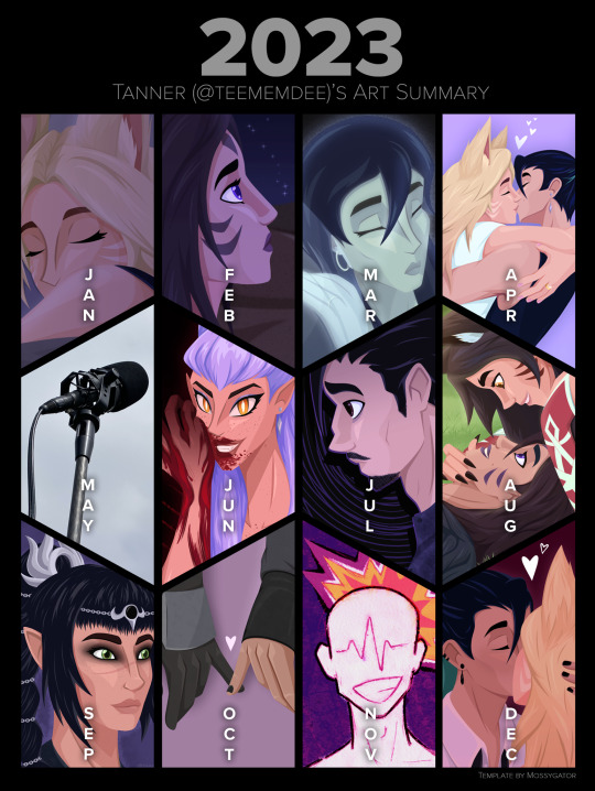
2023 was uhhhhhhh a year! And I made art! And I’m going to talk for a long time about everything I did month by month! Yippee!!!
original individual posts can be found in my #tanner art tag!
JANUARY
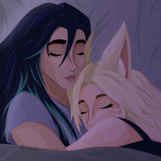
Started off the year with my favorite skrunklies sleepy and snuggling. Then sleeping together while holding one another is so incredibly important to me, they’re so cute and I needed to draw it. Struggled with Kai’Sa’s face but I particularly like the drapery of the pillow behind them.
FEBRUARY

First off, just a simple Kai’Sa piece for the Vibes(TM) and background practice. I was also fairly miserable and when I get miserable I draw Kai’Sa being miserable as well. I love my favorite character of all time <3
Then a quick Valentine’s Day piece, soft gradient map stuff. Love my skrunklies, hopefully this year I can make something for the day that isn’t rushed
MARCH

In March I FINALLY finished my Star Guardian Kahri fic, be the light to carry me, and drew Kiko and Ina being adorable together to go along with it. They’re SO cute and people LOVE that fic. Chapter 3 ended up being a whole 20k words and every time I re-read I’m amazed that I wrote it.
A kiss for Kai’Sa’s birthday! This was actually two sketches mashed together because I had a good Kai’Sa and a good Ahri on separate attempts. Love Kai’Sa’s smile on this one.
NOW. Strong contender for my favorite piece of the year. Captioned “please don’t lose yourself,” my K/DA-verse Kassadin’s very dead wife’s ghost weighs on him, begging him to not get lost in his grief and lose sight of their daughter. Kassadin feels lost and broken without her. I love the emotions in this one, and I think the idea comes across even without knowledge of my headcanons. Love it so much.
APRIL
Full-body piece that took me all month. I just love this one so much. It’s just pure Kahri, pure love, pure joy. Pose inspired by Blake Belladonna from RWBY’s leg pop during the long-awaited Bumblby kiss. This piece just makes me so happy.
MAY
Oops! No art! Was too busy being on a (student) film set every weekend as well as dealing with classes and multiple other stressors. I did START a piece though, but wouldn’t finish it until the middle of June.
JUNE

I actually did the first sketch of the Evelynn piece in February, but I decided to revamp it in May, and then when school finally set me free I finished it, and it turned out exactly how I wanted it to. Her hair was a labor to render but I'm so so pleased with how it looks, as well as the blood. The first time I've finished a fully rendered Evelynn piece!
Naafiri is so fucking cool. Upon her reveal, I was seeing so much incredible fanart and I just needed to get in on it. The shapes and points are just so good. I used to draw dogs all the time as a kid, and my younger self would absolutely flip out at seeing this. I did this piece in one day, and I have no idea how I pulled that background off but hopefully I can do it again some day lol
JULY

Two drastically different vibes here. Realized it had been forever since I had drawn Kahri so I just wanted to make a cute summertime piece. Their hands should be bigger and it bugs me but this is still really cute, I missed my girls dearly.
And then my very very sad man Kassadin being very very sad about his very very dead wife. This is what I call his phase 2 design, when he's at the peak of his grief (spiraling, as emphasized by the background) and feels just so sad and alone. In my head this and the March piece are part of a series that I hope to continue.
AUGUST
Just one piece that took me all month because I was quite busy in August, and Runeterra Kahri pieces take forever, but as I always say, it's always worth it. This pose comes from mellon_soup on instagram, who makes a lot of really great pose references for artists to use, highly recommend checking them out. This piece is just so soft to me. Captioned "'you're beautiful, you know that?'" they're saying it to each other, two people that struggle with their self image finding love and confidence in the other. Also I'm so very happy with the background. I love these two so so so so much, they're my world.
SEPTEMBER
One of my goals for this year was to branch out in the fanart I made. Baldur's Gate 3 came along and I love watching my best friend play it, we love Shadowheart and I just wanted to draw her. This came after a lot of sketches of both her and our favorite Tav that ended up changing how I draw eyes. The rendering of her face here is also something I'm proud of, her nose looks great. And again, the background! This piece didn't get a lot of attention at all but that's okay, I made it for me and I'm very happy with it.
OCTOBER
STAR WARS TOXIC YURI WENT CRAZY THIS YEAR!!! Wolfwren (Sabine Wren x Shin Hati, from the Ahsoka TV series) had me by the THROAT for a solid two months or so, I haven't been that feral and deranged over a ship in a hot minute. They had me frothing at the mouth every episode even though I did not like the show overall. Anyways. First piece is a redraw of the part in episode 4 where they just have the most charged eye contact of all time, and I decided to take that in stride with inspiration from Horimiya, a favorite anime of mine, during particularly emotionally charged moments, the background changes and there's a particular color silhouette behind them. It really fits that moment of the show and I am SO proud of these faces, especially Sabine's. Drawing from a real human face reference was kinda new to me but it's taught me a lot. The file size also ended up enormous somehow idk lol
Then, my most popular piece of the year, on both tumblr and twitter. I LOVE hand imagery, I love subtle hand touches, I churned this out in I think exactly one day, it's so soft it's so cute and I totally understand the overwhelming positivity it received.
NOVEMBER
I was not doing well at this time in the year. The state of the world just had me in a horrible mental state, I wasn't taking care of myself well at all, I couldn't get myself to make art, especially something happy or cute, it just felt wrong. But then sometimes you feel something so strong and specific there's no other way to process it than to make art. To make a long story short, earlier in the year I thought a girl liked me, I liked her back, but it turned out she did indeed have a boyfriend the whole time. We didn't see or talk to each other for a few months but in November we (and the bf, lol) met up again. When she saw me at the door she smiled at me so sweetly and it was just the worst feeling ever and I just had to hide it behind a smile and a wave. Oversharing aside, this is a style I'd wanted to execute for a while and I'm really pleased with how it turned out, would love to make more like this.
DECEMBER


All of this was done / finished in the first two weeks of the month because then I got sick + was visiting family + jet lag took me out. Kinda sad I didn't get something done for Ahri's birthday or a traditional Kahri Winter piece but that's what January is for. Anyway.
Sometimes you just want to draw girls kissing and sometimes you wanna make it a little suggestive. Not much to say. Proud of the drapery on Kai'Sa's sleeve and you can always tell I love drawing hands.
Now it's time for classwork. Here I just have two pages but I've posted the whole comic on its own, this was for my "Art and Text" class, I have it printed in a booklet and my classmates + friends have responded to it so sweetly I'm really proud, I really really want to make more comics. This project was a culmination of so many inspirations from other artists and I'm really happy with the execution even if it was really rough for me to manage my time well for that class.
Then for my "Fiction and Allegory" class, two of my friends and I made a storyboard film (which I don't want to share publicly, but if I know you you can ask for a link) and during the all-nighter two of us pulled to get it done on time, I decided one scene needed music instead of diegetic sound, so I churned this out on garageband in about an hour. Would definitely love to try my hand at making more music in the future. Wish my classmates / teacher liked / understood the film more but oh well. I learned a lot and for the thousandth time, I'm proud of what I did.
IN CONCLUSION:
I ended up with less full pieces than 2022 but what I did create in 2023 are big, detailed, emotional pieces, and I'm more than satisfied. I think my skills in rendering, backgrounds, and colors really improved and I'm looking forward to how I continue to improve in 2024. This upcoming year has a lot of scary stuff ahead (namely graduating college) but I will come out the other side regardless, hopefully with just as much art I'm proud of.
If you read all of this, thank you!! If you've liked, shared, or commented on any of my art, thank you!!!!!! It means the world, always.
#2023 art review#long post#this year had some good highs but also some drastic lows so idk#but making art is always a high#happy new year!#artists on tumblr#tanner art#tanner talks
8 notes
·
View notes
Text
amateur art advice from an amateur artist.
disclaimer. this isn't for people who want to make art their jobs (some of the advice may be useful to you, but some will very much not be). keep that in mind.
1. it's okay if you're not good. seriously. what matters is that you're creating and having fun (and if you're not having fun, perhaps there's something wrong).
good is subjective. when I was 13 and I drew big pretty anime eyes for the first time, I was super happy! and for me, it looked good. and it still looks good for someone out there, just like how people tell you how good your art looks when you think it's mediocre. it's not. your art is good, because you made it. Its true quality does not matter until you need it to for work. You're still learning, be good to yourself.
2. you've heard the PRACTICE advice from everyone ever, so I'll go with something different : try new stuff.
for all the summer holidays of 2021, I didnt draw at all, only doodled silly cats because yknow. mental illness. when I drew again, I tried drawing a full body pose, which I never succeeded in doing before. and I did it! obviously it wasn't perfect, but it was the best ive ever done. and now im pretty okay with drawing poses!
so try new stuff. try to draw busts from another angle, try to draw profiles. draw noses, draw combat poses, draw folds and old people and fat people and black people because i know most of the starting artists start with one type of character and stick to it (for me, it was front facing busts of skinny white girls with straight hair and no nose).
this also counts for objects, and animals, try to draw them (and try to draw people if you've only ever drawn animals or objects)
and again, it does not matter if it doesn't look good at first. don't get discouraged. your favorite artists have something they struggle with, the most famous and respected artists have struggled with some things and probably still disliked some parts of their work at their peak.
3. look at people. try to draw who you see. if you don't get out much or are scared to draw people when they're with you, then draw from photographs you have, or references (im begging new artists to look at references of actual human people. I'm on my knees. references are important, study what you see).
study your own face! when you take selfies or when you put on makeup or even just when you see your reflection - if you can, look at your face, the shape of your eyes, your nose, your lips, your face. I rediscovered this year that I actually have freckles and realized I have more of them on one side than the other. I realized my face is actually pretty androgynous and I have a soft square jaw. look at people. look at yourself, look at everything around you.
4. learn and try the tips other artists give you. once someone said that to draw both eyes the same way, you had to draw them at the same time, step by step, instead of doing one then the other. and it works! for me at least. don't be afraid to try stuff. you don't even have to keep doing it if you don't like how it looks or doesn't fit with your style, that's fine! just try to do things for a while, and if in the end it doesn't work out, you at least know this is a thing that exists and you know it doesn't work for you. knowledge is useful.
5. STOP. BEING. SO. HARD. ON. YOURSELF.
no one cares there's 10 years old kids who can draw better than you. no one cares you're starting at 30 years old, or 40, 50, any age that isn't teenagehood. and if there's people who care, they should not. you should draw because you want to. if drawing isn't making you happy, then stop, or try something else. if you are able, take art classes! do whatever makes you happy and stop thinking what you're doing is cringe, or bad, or ugly. it does not matter. what matters is if you're having fun or not. how "cringe" or "basic" it is does not matter.
I hope you keep loving art and I hope you keep doing art because there are people who want to see it. even if you think it's mediocre, even if it really is, even if you're a beginner. I hope you never stop doing art because you think it's never going to amount to anything.
good luck doing art, and have fun!
#this has been in my drafts forever!#if you have more advice for amateur artists#do tell in tags reblogs or otherwise#artblr#artists on tumblr#art#drawing#traditional art#digital art#art tips#art advice#new artist#queer artist
17 notes
·
View notes
Text
Soooo, here we are, a New Year
Now, this post will be different than my usual art Posts i do. A few days before the New Year hit i got kind of reminded that Art Summaries exist.
Usually people only put one Art in, i think its the "best" one which they like the most, i think.
Though i wasn't able to decide for only 1 piece for each Month, so let me take you through my whole 2024 Art Journey!
- - - ☆
Starting off, i was 19 when i started Art. Back in May was when i came up to my beloved now girlfriend Kiera and asked for Advice on Drawing and told her that i wanted to start Art.
I chose to start with Hands. (albeit i did not include those visually in my Summary)
Hands were.... well.... hands. Kiera sended me a few Videos on how to draw, recommending me a German Youtuber called DrawingLikeASir. This is where i got my basic understanding on how hands (and also Human Anatomy as a whole) work and how to draw them.
I'm very grateful that people who do Art for a long time already, share and make Tutorials to follow. It's alot easier for me when i have real time visual explanation, so DLAS's Video's really helped me alot.
Besides those Videos, Kiera gave me alot of help too. She would give me tips if my Anatomy was off, help me fixing it via voice chat or messaging and overall just helped me understand Art to the extent that i then started to do it more regularly and frequently.
- - - ☆
Now, after this Yapfest, how about we take a deep dive into my Art?
This will be the longest part, but i do have alot to share actually....
Let's start with May !
I don't have any visuals here, so i will keep this brief.
In May was the first time i actually tried learning how to draw. I did start with Hands first. Why you may ask? Because i wanted to tackle one of the presumably worst things to draw. I did a basic fanned out Hand for a few times before i started drawing Hands around things. I felt comfortable very fast with how i drew Hands back then. And that was my May more or less.
June !
Let's get a nice Picture of June out, because June is the Month i started to learn Human Anatomy. It sucked.

I tried learning Human Anatomy after i felt confident enough with hands. I experimented around a bit, tried drawing either masculine or feminine body Types, but i did struggle with both. In the end, i tried settling for more androgenous Body Types. Those were alot easier for me, and Kiera did tell me that they can be easy to work with, since i can basically "shape them like i want". So i went with it.
Pretty much my June was occupied with learning to draw a whole Human Body.
July !
In July i made alot of Progress i think, this was my Prime time for learning how Bodies work. I took Ideas from other people i've interacted with, tried a DTIYS (Do this in your Style), created a small sketch page, participated in Rimlaine Week and also started to do Digital Art!

Now, starting Digital Art was hard, it still is for me after roughly 6 months. My missfortune was, i had no pen for my Tablet. I needed to learn how to Finger Draw. It was really taxing and unforgiving on my Hand, but i still pushed through it and gave my best. I didn't wanted to stop with Digital Art just because i had no pen.
Eventually, at some point (actually 2 points, one later though) I had a pen that worked, though it broke, both of them did. So i just stayed with Finger Art.
It honestly feels more natural for me to use my Finger by now and i think i actually want to stay drawing with my Finger for now. Unless i actually get a pen that doesn't break imidiatly.
August !
Short things for August: I had an Artblock. I managed to find 1 whole picture for August.

I can't really say anything more here i fear.
September !
September.... I tried alot of new things in September! Brushes, bigger Canvases, even rendering (not visually included)
September was a nice month. I made alot of progress, pushed my comfort zones and met ALOT of great Artist's!

I tried alot of new things. Posing, shitpost doodles, multiple people, character sheets, the Nasty Dog trend (i had fun doing that) and also tried to participate in dazai hurt/comfort week, i couldn't finish it due to personal reasons.
In September, i joined a Soukoku Discord Server which is run by Kaez. I joined there with intent of talking about SKK and it developed into active talking and Art Streams nearly daily! I got ALOT and i mean ALOT of good advice and tips on how to draw from more experienced Artist's!
It truly helped me find my Artstyles and Tools i can use on my drawings.
I am very thankful that my girlfriend sended me the link to Kaez's post about this server, it has been alot of fun there and was very educational aswell!
October !
In October i still was drawing nearly every day and started to draw Characters from Kiera's and mine own Story! I also experimented with Artstyles and Chuuya's hair. His Hair was a mess, it still is, but drastically changed the way i draw his hair in that month.

I specifically also tried to stylize eyes, it failed mostly but i still tried regardless (Eyes and facial expression are hard to draw, i learned the hard way)
November !
November was the Month where i started drawing (and writing) my first AU! My 14 Year old's BunnySkk AU!

I am very proud of those beans and all i had in my brain were those 2. I did inflict pain and suffering and great Trauma on Skk, but fear not, they are well now... or are they?
Lastly, December !
Going strong with the last Month of the year, I struggled, greatly. I had alot of personal Issues coming up, but went through those with trying to do art. Art really helped me get my mind off things, due to me not having a single thought while drawing (My head is a blank slate while i draw)

But besides those struggles, i got cheered on to keep going and so i did. I delivered Art from a Ship i was first very reluctant to draw things in fear of people being well.... online people. But i eventually overcame myself and started drawing my second favourite ship... Kunichuuzai!! I absolutely love their dynamic and can't wait to get back into drawing them. I need them. Carnally.
- - - ☆
Now now, this is probably as long as it can get now, so i will try to keep myself short here. (Try is the keyword, i am a yapper at Heart)
First and foremost, i will be thanking Kiera @misterloong , for even getting and pushing me into Art. I don't think that i would have been able to accomplish what i am doing currently without your great help and Feedback!! And thank you for putting up with my sometimes breakdowns over Art, its hard and we both know that.
Secondly, i am thanking Kaez @xkaez for creating the Skk Server. I don't think i would have had such a fun time over the last months while doing art if it wasn't for sitting together in vc with everyone and equally loosing our heads over Art together. The Art struggle is real but worth it.
Third..ly? Third?.... Leaving it at that. I am thanking the VC Dwellers Soup @iwantmochisoup , Goat @thatghostinyourbog , Jema @msshinylemon , Salt @saltedbiscuiit and Killeia @nolongerforthetainted . I am thanking you all for sitting in vc together, planning things, working together on thing and just having a fun time together! I learned a shitton, and i mean a shitton from being together in VC, drawing, talking or just hanging out together. I really hope this never dies out, its really fun with you all!!
Fourthly.... Fourth....? I am thanking Rosie @anticidic , Cinny @ohhcinnybuns , Ari @nevertheblood and Brin @ediblepandas for giving me alot of Ideas and talking about all the ideas you guys had. It's always fun to lurk at night in the chats and see good ideas spring in. It might be one of my favourite pastimes aswell to just lurk in :)
And Lastly, i thank everyone else who i forgot to mention, whether its Skk server people, random online people, my mom or literally anyone who sees my stuff. I thank you for being here and supporting my Art Journey in any way you can. It has been a fun half Year of doing Art and i am so hyped for creating a full year of Art this year!!
I hope everyone who wants to do Art, starts doing Art, same with Writing or whatever other creative hobbies there are. It will bring you fun and can potentially even help you express yourself more.
On to a new Year
- West
- - - ☆
Adding on:
2 more Chibi doodles for making it to the end :>


#Happy New Years#This is sappy and probably poorly written grammar wise#don't lunge at me guys#besides anthing thank you for everything#may the new year treat us all well#also i cringed at looking at my old art#i hope i dont need to see it again LMAO
5 notes
·
View notes
Text
Hey @ari-shipping-stuff i thought i would answer everything in a seperate post so i can compile things easier fkjdkdidhdidjd
1- Yeah the saturation is edited :> I was going for a sunset vibe. Which is Extra Eerie in school because we always go before sunset. The original is regular window light + shadows. I'll put the og one at the readmore at the bottom. Also tbh i been using mostly pens for drawing to prevent me from constantly fixing mistakes in comics. Kkdhdkdjkdjdkjd
Oml those fucking windows. I hated them so much. As a public school student, they were in all my schools.

These, but much less clean (im talking CAKED in dust) and half the windows were broken/the glass panel is half hanging out of the frame. It was such a hazard to clean tbh because it was so easy to push out a loose panel. AND WE SAT NEXT TO THOSE BITCHES 🤡🤡🤡🤡
2- Thanks :> i also liked how it turned out with the blue pen and orange lights. I think the reason my drawings are rly expressive is because i like to draw those the most kdhdkdhdkd
3- kdhddkdjdkdjdjdkdjd with how much eyes it has, you def could hit one of them square in the eye
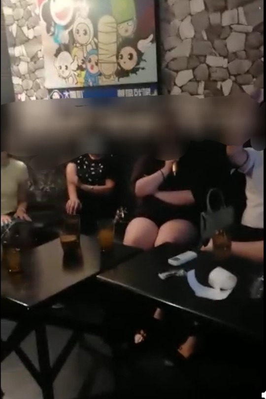
4- It's a karaoke room im leaving a photo under the readmore for reference. I kinda just based it off how i remembered it. Now that i think about it im not sure if there was a disco ball, but in my heart there sure is. The things on the table are microphones, but no one is singing right now. The song playing is "Eyes Without a Face" by Billy Idol, the one i linked in the post.
5- Nah i didn't use the knife, quite the opposite actually. I didn't like how one of the draings turned out, so i ripped the bottom half of the paper and drew at the bottom. Then i used my phone editor to blur the two pages together.
What ending scenes dym btw?
This place was inspired by the song "I Know The End" by Pheobe Bridgers. The place is sunset with thousands of billboards. Eyeballs and Lee sit on the titular billboard from the song as they chat.
When did Lee meet Wingtips or Eyeballs?
For Wingtips, its the usual one. Wingtips is a manifestation of Lee's imagination as a coping mechanism. Vae also act as a therapist and later a parental figure to Lee until the end.
For Eyeballs, after Lee dies, Eyeballs poses as Wingtips to torment him in Hell for eternity. However, something happens and leaves Eyeballs just as trapped in the dream-hellscape as Lee is. They kinda struggle to understand each other, as they are the only real people in the dream-hellscape
First comic

^ i think i sent the full vid in the discord before. Lmk if you want me to find it for you
Right that's it. Thanks for reading everything.
#whew#that took a long time to write#thanks :>#you are officially pardoned from any wrongdoings ever /hj#but seriously#thanks#im sorry im such a bitch#[to be tagged]#a rion#they're so Immortal Snail and You dynamic
2 notes
·
View notes
Text

(Heads up, I ended up writing an essay's worth of text. Keep that in mind before clicking "read more".) Found these old drawings/ocs from 2021-22-ish! They’re characters from a Deltarune inspired playing card world. Basically, there were four kingdoms based off of the 4 suits, and these guys were the aces/captains of the guards. The kingdoms were at war; the black/blue suits had an alliance and the red suits had an alliance. There were royal families and other characters, but I only drew the aces.

The first one I made was the ace of hearts! They were blind, but their spear emitted some kind of smoke that helped them to pinpoint the location of their enemy. Looking back, I’m not sure how. Maybe it just made people cough? For the heart themed character, they were the most standoffish of the aces. I imagine they’d be really sweet when you get to know them. I think they were my favorite. They also inspired the whole world that all these characters come from.

Number two was the ace of spades. When I made them, I had the idea that they couldn’t feel pain. After a quick google search, I was thinking about CIPA, though I did absolutely no research about it. Their armor was very protective and had panels on it that would detect any damage and beep to warn them about it. They were pretty reckless. When I actually made the drawing, I ran out of room on the page, so I cut out the character and background separately and glued them together. I think I might have shipped them with the heart character.

Third is the ace of clovers/clubs. Maybe the ace of clubs, and her name is Clover? I remember messing up the face and being really upset about it. Of the four drawings, she’s my current favorite, which is kind of ironic since I didn’t like it before. I just really like the pose. Her signature weapon was these little spheres that she could toss around, make float, and manually detonate. I think she was the calmest. She was also mute, but she talked through the bell on her collar. Thinking about it now, she was a lot more magical than the others.

And lastly, the ace of diamonds, which, uh… you can probably tell the issue. I’m kind of disappointed I never finished this. Going solely off of memory, he was a kid, he was energetic, he liked shiny stuff. He also had cool diamond-shaped knives, which was directly borrowed from Deltarune, more specifically the rudinns. As you might have picked up on, all of the aces had different physical disabilities, and the ace of diamonds was no different, although I can’t remember what his was. I thought it would be an interesting way to show the different sides and struggles of very strong characters, and that there’s no one way to be strong. I still think so, but I wish I did a little more (any at all) research.
Thanks for reading this super long ramble about my old ocs! I’m redesigning all of them, and the only one left is diamond kid. Stay tuned!
2 notes
·
View notes