#How to Create Photo Collage in Photoshop
Explore tagged Tumblr posts
Visit Tumblr Blog
Explore Tumblr blogs with no restrictions, modern design and the best experience.
Last Seen Tumblr Blogs


Fun Fact
Total funding amounts to $125.3M.
Text
How to Create Photo Collage in Photoshop
Unlock the secrets to crafting stunning How to Create Photo Collage in Photoshop with our comprehensive tutorial. Learn step-by-step techniques to seamlessly blend images, arrange layers, add effects, and personalize your collage. Perfect for photographers, designers, and creative enthusiasts looking to take their skills to the next level!
0 notes
Text
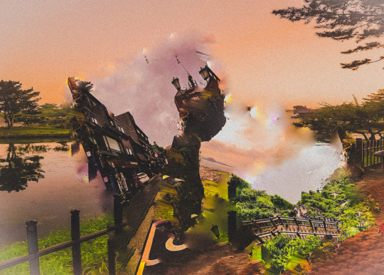
So Andrew Huang released a video about the usage of ai in his Book of Chances musical inspiration deck, and it basically boiled down to 21 minutes of "I don't knoooww guuuyyyys it's just so nuanced and I just don't know enough about it!", and in the video included a timelapse of the dude he hired creating one of the card images, which used a bunch of ai generated imagery that he then collaged into a larger piece. Andrew excused his usage of it because "maybe he just couldn't find the right stock photos" and "it made the process so much faster, you guys!"
And naturally, all of this really fucking pissed me off, so I did what any artist does. I recreated the image myself in only half an hour using free stock photos and basic Photoshop tools that are available in basically all free art programs. No ai necessary, done for free, in 30 minutes. I used 4 stock images with colour adjustments, brightness and contrast levels, overlay and screen layers, and a soft round brush that didn't use pressure sensitivity so even if someone didn't have a tablet they could do this with a mouse. Is it perfect? No, I made it only half an hour, what do you expect? But what if I spent an entire hour, literally twice the time, on it?
I also posted the full, real time video for anyone who wants to see how it was done. I realise that 30 minutes of silence is boring as hell, but you can supply your own music if you want. I just wanted to show the full process from beginning to end exactly how long it took.
Even ignoring the extreme ethical issues with ai, for the argument of "it saves so much time", generating images with ai can take several minutes for a single image, and that's after finding the right prompts. If you watch the video linked below, you can see that I had found all of my stock photos and positioned them on the canvas within the first three minutes, less time than it would take to generate one shitty facsimile of a free ass stock photo.
You can watch it here.
#not cryptid posting#art#illustration#photo bashing#I ALSO DIDN'T DEPRIVE A THIRD WORLD COUNTRY VILLAGE OF WATER MAKING THIS.
35 notes
·
View notes
Text
5 Free Software Tools to Create Stunning Images for Social Media and Blog Posts
Alright, guys, today we're diving into the world of image creation for social media and featured blog posts. Whether you're a seasoned content creator or just starting out on your blogging journey, having eye-catching images is essential for grabbing your audience's attention and driving engagement. But with so many image editing tools out there, which ones should you use? Well, fear not, because I've rounded up the best free software for creating images that will take your social media game to the next level. Let's dive in!
Canva: First up on our list is Canva – the ultimate graphic design tool for beginners and pros alike. With Canva, you can create stunning images for social media, blog posts, presentations, and more, all with drag-and-drop simplicity. Choose from thousands of pre-designed templates, fonts, and graphics, or start from scratch and let your creativity run wild. Canva's intuitive interface and extensive library of assets make it a must-have tool for any content creator.
Adobe Express: Next up, we have Adobe Express – a powerful design tool from the creators of Photoshop and Illustrator. With Adobe Express, you can create stunning graphics, web pages, and video stories in minutes, right from your browser or mobile device. Choose from a variety of professionally designed templates, customize with your own photos and text, and share your creations across all your social media channels with ease. Plus, its seamless integration with other Adobe products makes it a no-brainer for anyone already using Adobe's creative suite.
PicMonkey: Another great option for creating eye-catching images is PicMonkey. With PicMonkey, you can easily edit photos, create graphics, and design collages without any technical know-how. Choose from a wide range of filters, effects, and overlays to give your images that extra pop, or use PicMonkey's powerful design tools to create custom graphics from scratch. Plus, with PicMonkey's user-friendly interface and intuitive features, you'll be creating stunning images in no time.
Pixlr: If you're looking for a free alternative to Photoshop, look no further than Pixlr. With Pixlr, you can edit photos, create collages, and design graphics with ease, all from your web browser or mobile device. Choose from a variety of editing tools, filters, and effects to enhance your images, or start from scratch and let your creativity run wild. Plus, with Pixlr's cloud-based platform, you can access your projects from anywhere and collaborate with others in real-time.
GIMP: Last but not least, we have GIMP – the GNU Image Manipulation Program. While GIMP may not have the most user-friendly interface, it's a powerful open-source alternative to expensive image editing software like Photoshop. With GIMP, you can retouch photos, create custom graphics, and design stunning visuals for your social media and blog posts. Plus, with a little bit of practice, you'll be amazed at what you can accomplish with this free, feature-packed tool.
In conclusion, creating eye-catching images for social media and featured blog posts doesn't have to break the bank. With these free software options, you can easily design stunning visuals that will grab your audience's attention and drive engagement. So why wait? Start creating today and take your content to the next level!
#SocialMediaMarketing#BloggingTips#GraphicDesign#ContentCreation#VisualContent#DigitalMarketing#FreeTools#Canva#AdobeSpark#PicMonkey#Pixlr#GIMP#ContentCreators#VisualMarketing#SocialMediaImages#BlogGraphics#adobeexpress#photoshop alternatives
9 notes
·
View notes
Note
hi!! so i've considered making my own rp templates, you are a big inspiration! i was wondering how you started making them and what resources you used to start?? i have some knowledge about how to navigate google docs but i'm not sure how to format things very well or where to get fonts and assets
Hello anon! Thank you so much for saying that, and I'm so glad to hear you're looking to make your own rp templates. <3 Gonna put my reply beneath a read more because my response is a little long!
Honestly, I kind of just jumped into the deep end and started experimenting on Google docs, so telling you how I got started alone won't be a good point of advice!
A good friend (shoutout to vera!) told me that the essentials to master were tables and setting images to behind text. I had already known how to manipulate tables, so that was easy for me.
If you need help with learning how to manipulate tables, head over to my server, get the creator role from the reaction roles channel and check my extensive guides for how to work with tables there! (Feel free to reach out in the server if you're lost).
As for background images, I already had experience with Photoshop so I started with that primarily to make my collages. It was only later that I started experimenting with google drawings.
However, this is not necessary: it's entirely possible to create a nice template without worrying about background images or google drawings. I have many templates that I've made purely using tables and just some additional character photos! Just some examples are Nexus Edge (free), Smoke & Mirrors (free), Juniper (paid), and Neo-Noire (paid).
If you'd like, you can take my free templates and play around with them. Take them apart, recolour them or see how I achieved certain "looks" in Google docs.
I'm also constantly learning, and looking it up online is what I do. For example, if I wanted to see if I can do something, I might google "how to do X in google docs" and there may be already solutions online. If you're in my server, you can also make use of the creator questions channel to ask for help!
For fonts, you'll only be able to use google fonts. You can browse them here. You can look up how to use these google fonts in Google docs :)
As for assets that I use, I've always had this page linked in my full navigation with a list of places I find them. Make sure to be careful about licensing of the assets too.
Hope this helps! I know the advice is kind of all over the place, so feel free to ask if you have any more queries. And happy creating! ^^
5 notes
·
View notes
Note
How do u do these redesigns?
hi! firstly thank you for asking this, i Love questions
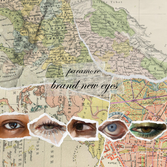
i mainly used canva, and the majority of the elements you see on them are copyright-free pictures available without the canva premium subscription. the rest are paramore photoshoots, some photos i found on tumblr, and a collage of mine that i made a few months ago.
it took me a lot of time to make them all, i spent hours looking for pictures that fit the vibe i wanted for each paramore album & inspired me. I think the riot! album was the one i struggled with the most, i'm still not entirely satisfied with it... to give you an idea of how i worked, here are some first drafts:
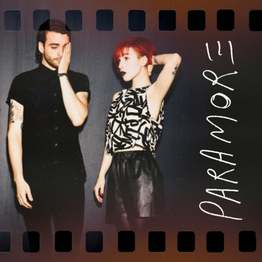
i had already picked the photoshoot for the self-titled redesign but it was much simpler, just the picture, a "film" filter, and the paramore logo (if you need me to show you how to make a logo transparent to use it somewhere else, just ask)
and for the brand new eyes one, at first i thought i was going to manually create all these "ripped" pictures of eyes (for the 5 eyes you see here, i picked full pictures of eyes, cut them using photopea, then added between 5 and 10 long pictures of ripped paper that i found on canva. that took me a while and i didn't even end up using it lmao). in the end i found a collage of eyes that i made in october/november and i just took a picture of that because it was way more harmonious. those eyes were from paper magazines. also you can see that when i gave up on this first idea i kept the maps background for my riot redesign.
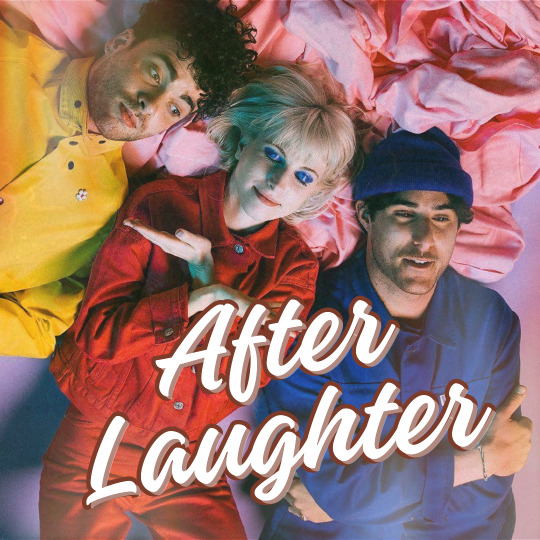

i looooved this after laughter logo that i made but overall it was too simple a design for my taste so i redid everything. the original idea was to have a kind of postcard vibe, as you can see on the back of the album, but i couldn't find a way to keep the picture and the text in a harmonious way, and by the time i found a solution i had started the finished version you've seen on my blog, so.
now for the detail that ties everything together: the text on the back. I simply copied word for word everything that's written on my copies of each album (i own all of them except for awkif, but it's easy to find online). i found the logos online & i took photos of the actual barcodes.
what else can i say? sometimes i tried to pick the same fonts as the original album cover, and i looked up fan forums who had already answered that question. i browsed tumblr a lot to find the various photoshoots i used. i played a LOT with the canva tool that lets you modify a picture, specifically the colors in the picture, in order to make everything harmonious. and when i needed to make something transparent, i used photopea (which is kinda like photoshop, but free)
do you have a question about an edit in particular? because i'd love to go into more detail if you're interested. if i have one advice to give, it's to go crazy with it: you can literally make anything you want. & if you ever make your own redesigns i'd love to see them!!
7 notes
·
View notes
Note
How the fuck do you draw like that? (compliment)
Hello :)
Actually, I don't.
A while ago I explained (w/screenshots) how I do them, and I'll try and show you how I create collages using screenshots/photos:
Canva I select the photos I want to see in a collage. Here I turned Aziraphale in b & w, and I sharpened Crowley.

To create a collage I have to work with layers, they're probably the most important thing when working on a collage. In this case I needed 1 layer for the bg, 2 layers for Aziraphale, 3 layers for Crowley and 2 layers for good omens appreciation society (signature). As you can see I removed the background from Aziraphale 2, only one thing I love about Canva, it works perfect!

To give Aziraphale 2 kind of a 3D look I blurred Aziraphale 1.

And the first result looked like this.

2. Lightroom
I love working with Lightroom, because it gives you so many opportunities! I use so called presets. They can be filter, colours, shadows, highlights and so much more. Over the years I created my own, but when I started working with Lightroom, I bought so called bundles (darks moods, bright moods, fall, summer a. m.). You really can do amazing things with presets!

And when I'm happy with the result I usually work with shadow, brightness, colours, sharpness, soften, hdr, vignettes until I'm happy with the final result :)

Sometimes I also work with Photoshop, but that's more on a rare basis.
I hope my little tutorial gives an inside on how I work on my collages. I don't call myself an artist because I don't draw but work with screenshots and photos only.
Love, Shen.
2 notes
·
View notes
Note
hii it's unorcadox ^_^ how does your editing process work!!! like how do you choose what images to use, how to combine them, how to get the right "feel" etc. 👀 very curious abt ur answer
Damn, great question! Also, love your edits, Orca! (also a bit jelous abt your productivity, wish i had so many great ideas) So i present to you: a wall of text! (cw really long!)
So, many people see a great base image and then immideately get an idea of what they wanna do w/ it. I'm not like that, i ususally have an idea of an edit in mind, and then search for sometimes a few hours for a base image that may work. I have a whole tutorial-worthy process of how i always find what i need, but i digress… Most of the times, tho, i get something better than what i had in mind. I love this process, cause it's like tresure hunting for me. (ofc it's not always like that, just most of the time. Since i have a giant collection of base images i may sometimes use them). I choose my images based on the mood i wanna portray. It's always supposed to be looking kinda dreamlike and unreal, but it can also be creepy, dark, bright, etc.
When editing my favourite style of edits - fake dreamlike places - I try to make them look as real as possible, regarding color, lighting, etc, while still making them look blatantly fake regarding the composition, subject matter, etc. Ofc i don't try to perfect my lighting, since it can take away the feeling i strive for, so it's kinda based on my own feelings idk. I get really inspired by the surrealists' painting. Artists like Brent Wong, for example. Liminal spaces are already weird, so why not make them even weirder, by making the geometry non-Euclidean and subject matter impossible in the real world. Also unlike surrealist painters, i have a luxiry of making the scene like "more real" by combining actual photos in photoshop. Ofc people have been making surreal art w/ 3d programs forever now, but it still doesn't give off the same feeling real picture does, yk.
Uhh... what was i talking about... Ah, yes! I firstly make a collage, that i have in mind by this point, and sometimes it just... doesn't work out! i had discarded so many great ideas, cause they weren't turning out good. But if it works, i add shadows and highlights. I look at real liminal space photos and try to really analyze them. Like, what makes them work? the color, the quality, the blurriness? Then i add effects that works to my edit. Every edit needs it's own level of compression, sharpness, blurriness... You just gotta feel it.
Really important step. I leave my edit for a few hours, so i forget how it looks, and then return later. All the imperfections, things that don't work, etc pop out immediately. I read somewhere that the process of creating and the process of analyzing are two completely different things, and i couldn't agree more. It's annoying when you have a finished edit, and you really wanna show it to the world, but you have to wait... But it's better, than being embarrassed later that you posted something unfinished and you can't fix it now.
Ofc i make text edits as well, but they basically serve the same purpose and not that interesting to describe, cause process is the same just with a few steps skipped.
There wasn't such question, but i still wanna talk about it, cause it kinda answers "how do you get the right feel". Well, why do i make edits? Well, the world sucks ass (i don't agree w/ this statement for the most part, like friends are great, nature is buitifull, but then there are parts that just... yk...) and for me weirdcore is a sort of an escapism. I can't traverse dreamworlds mindlessly, alone or come across magical events in real world, sadly. But I can make them however i would like them to look and feel, with my characters (like deer), and my own thoughts about them, that no one except me knows. It's kinda like i actually've been there, and i took a picture. Or hell, maybe i've never been here myself, but those deer were, or invisible creatures, that are not in the shot. And i know them personally, cause i made them, they are a part of myself! And it really helps, and i'm so glad these pictures resonate with so many more people here too! I had been making these pictures without realising why for a year. I had some thoughts and heard dozens of opinins of other pople, but i hadn't had a full picture. And then a video by SuperEyePatchWolf about liminal spaces comes out, and i get it now, it was really eye opening, for me at least. It explains really well why we love unreality so much.
26 notes
·
View notes
Note
heey <3 question for the creators: i wanna start doing edits (mainly headers and icons) but everytime i search for a png i see "for personal use only", in this case, creating resources for the fandom is personal use? or commercial? if not, could you suggest me a website with free pngs? thank you in advance!
this really depends on what you're searching for and how you're using it!
posting on tumblr is personal use but if you were to start selling copies or putting it on t-shirts as merch, that would be commercial use. a good rule of thumb for when you're starting out is not to sell anything you didn't 100% make.
i assume by pngs you mean things with a transparent background? a lot of times if this is a celebrity or character, people cut those out in photoshop or whatever editing app they use. sometimes people post those already cut out (like if you search the person's name + png), but chances are if you're looking for a specific photo, you'll likely have to edit it yourself (great news bc adobe has a bunch of tips here and there are hundreds if not thousands of tutorials on how to do this online!)
if you're referring to pngs that are just kind of accents or add texture to an edit, those can be found all over the place. @cruellesummer has an incredible set of collage kits that can get you started, but you can also search tumblr for things like "png pack" or follow resource blogs that gather a lot of different texture packs from different users (sometimes things might look like they're pngs but they're actually just pulled from textures, so it's helpful to look for those too! i have some masterposts that link out to a bunch of other resources that might be able to help here)
hope that helps!
13 notes
·
View notes
Text
In class we had four rounds called Tennis Rounds, in the first round we had to upload a few images from our gallery, in the second round we had to use someone elses photos and create a collage. In the third round we take someone`s collage and put our own spin on it. In round four, same thing, we take someone`s collage and put our own creative spin on it. I struggled a lot with Photoshop. At the same time, you can see how in each round I improved more and more. From using a template I downloaded into photoshop to then playing around with the layers, filters, gestures, and features in photoshop. What do you think?
2 notes
·
View notes
Text
how i do my drawing style (obv not every thing is for everyone and this is how i personally do it art are not rules but exploration)
i draw with my palm resting on the tablet, i cant do super precise movements with my hands so i use thick lineart and a bunch of stabilizer for that. if i need long lines i can just lift my hands. i use a 2016 samsung tablet after i switched from the horrible sliperry drawing tablet
currently i use a "pen" brush with opacity AND size jitter so it can sketch and line when i want. ON GREATER BLENDING MODE, this gives a marker sort of look (lines wont overlap)
canvas is 1000x1000 because my tablet is slow and also pixely crunchhhh
my sketches are shapes and dynamics first then anatomy second, in my process i find that treating the sketch as a "newgrounds funky shape artstyle" kind of thing makes things fall in place much smoother too so thats a bonus, and also obv i like it that way lol, its much looser and less stressful, eyeball is my guide. when done my way it looks "imprecise".
I grabbed my shapes/dynamics principles from some of what sinix does and the anatomy/gesture is like 2 bites of knowledge from anatomy guides (the ones who helped me with the style most were the ones who focused in dynamics) furry anatomy was by looking at art and photos, but 80% was just me messing around and finding out
generally i do my sketches in one layer because i softly erase instead of making a new layer (too much work and i cant do really precise strokes) this makes some soft sketchy lines a bit visible, i make a outline if i think the color is drowning the lineart
use curve adjustment to make soft strokes less visible and stronger strokes more visible, i do this because i really like how for me it creates more space for color/shading to fit in
either use 'enclose and fill' tool from krita or just make blocks of color by hands, i make a loot of layers in this process because i like to finetune the colors to my liking and to shade cleanly
currently the way i pick colors isnt too crazy, mostly its based on color theory ideas and my own taste as the judge, if i feel experimental i will try to make some "weird/wrong" color decisions to make it a bit more fun.
as for the color theory what i apply from there is mostly relations with hue saturation and value and my own personal understanding on how they interact together (quick example, for me increasing the saturation of a color "darkens" it a bit)
after this i paint/shade, i try to make it look fun, i use a basic round brush with opacity for more control
after this i make collages backgrounds on my computer WITH ALSO KRITA, my sources of images vary (wikimedia commons, tumblr blogs, pinterest, flickr)
the way i get this specific look is to mess around with some photo manipulation (curves adjustment blending modes), i like krita because it gives you a bajillion filters and blending modes
my favorite ones: "gradient map", "color to alpha (removes background)", "cross channel adjustment" "levels", "hsv adjustment", "curve adjustment" BLENDING MODES: "hard mix (photoshop)", all of modulo blending modes, "overlay", "hard overlay", "lighten", "darken", "dissolve"
mostly what i do on images is bump saturation on hsv adjustment (krita legacy mode on hs vadjustment makes colors a bit more distorted), cut some greens on levels, compress blues and reds, compress saturation, decrease the lightness range and adjust hue a bit if needed, mess with noise and layers. mostly i keep in mind to make the lightness range different from the subject so it doesnt melt together,
if you want more distortion compres with levels and use posterize
glaze on my windows virtual machine (i use linux lol) on high on low quality (this is to protect from theft but also gives a funky filter)
#art process#talking about how i draw#art style#style guide#photo manipulation#krita#art style guide
2 notes
·
View notes
Text
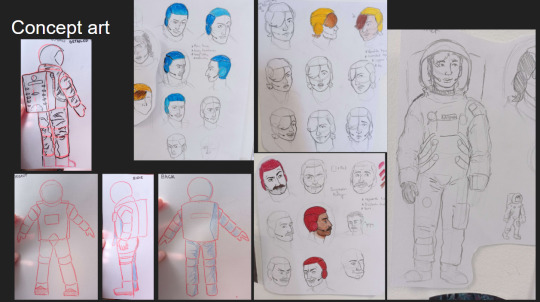
Animation
Reinvention in story telling
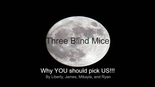
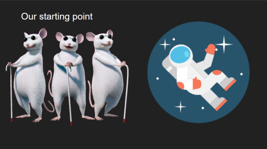
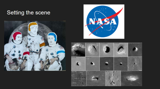
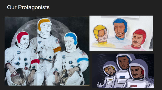
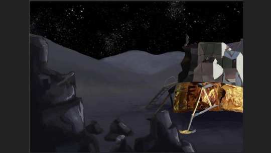
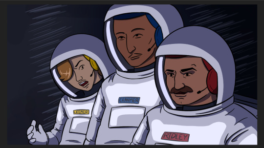
Three Blind Mice, Epic/Historical, Space Age (1957-present)
Week 3, 22-28/04/24
Monday
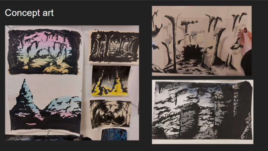
Did a zine workshop during the morning, I made a sad little zine with some bits of rough potential visuals for the project.
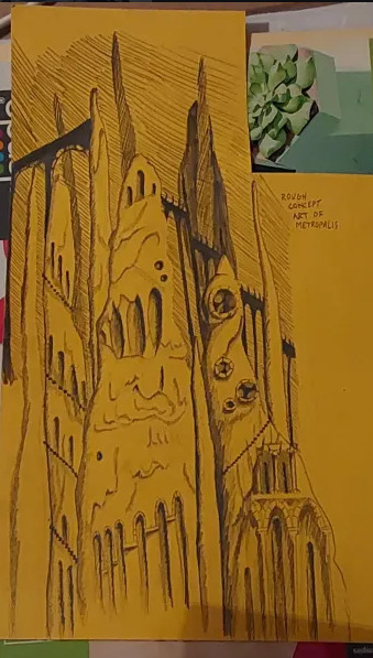
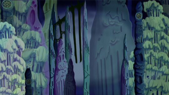
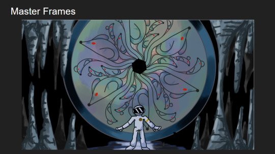
I then jumped straight into creating concept art and trying to figure out how to combine natural cave formations with architectural features. What I ended up doing that day was creating this rough pencil of some stalagmites and drawing arches and doorways on top of it.
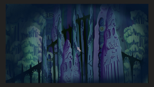
Using this as a starting point I went off and photocopied it a few times, which I then cut up and collaged together on a page to gain a rough idea of what this metropolis could look like.
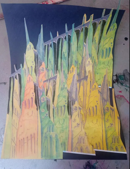
This is what I ended up with. I love how the buttresses came out but the perspective of the piece looks completely wrong, making it look cluttered without purpose. I tried colouring parts blue and pink to separate it a small bit, but I think the main issue is that all of the structures are the same size even at a distance, in future I'll have to make the ones in the back larger and more hazy looking whereas the ones in front smaller and more detailed. This was just an experiment so its not too important.
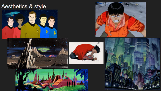
Later that evening I did a colour study of scenes from Akira to develop my understanding of cel shading, I also watched a few videos on the production of Akira. It ended up being very useful and I found myself very surprised with Akira's colour palette. I quite literally colour dropped the colours from the scenes and and did rough drawings of the scenes using them, I was really surprised to see that the colour I dropped was the same as the one in the scene. It was absolutely fascinating.
Tuesday
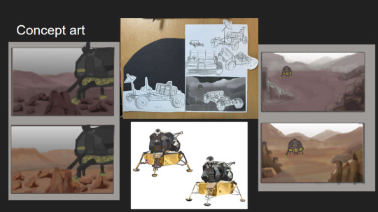
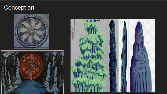
I further looked into combining architecture with cave structures by doing a quick study on Antoni Gaudi's building designs and did a study on different stalagmites.
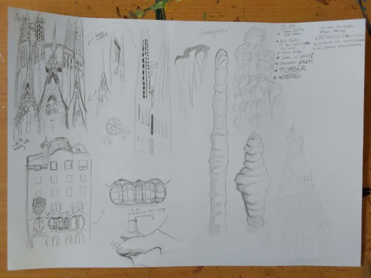
Looking at Gaudi's designs was interesting as he uses lots of organic shapes that almost look like they're melting in a way, and in other works like the Sagrada Familia he has lots of towers with unique features.
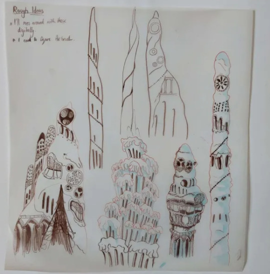
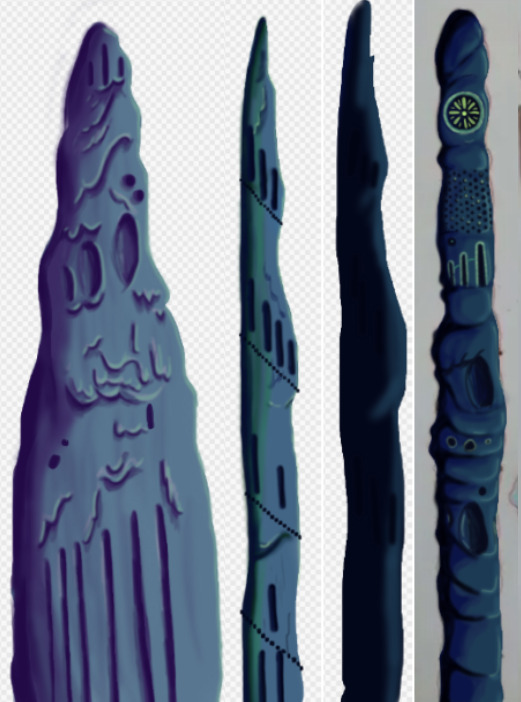
I tried combining these features to the stalagmites I studied to gain unique structures that would be believed to have belonged to an underground metropolis. I ended up with some nice designs, I worry a small bit that they might be too detailed but overall I'm happy with them, I still think these designs would have to be further developed but I don't have the time to do so.
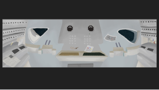
At the moment my plan is to individually recreate these digitally and then photoshop them together in different ways to gain the illusion of having more designs than I do.
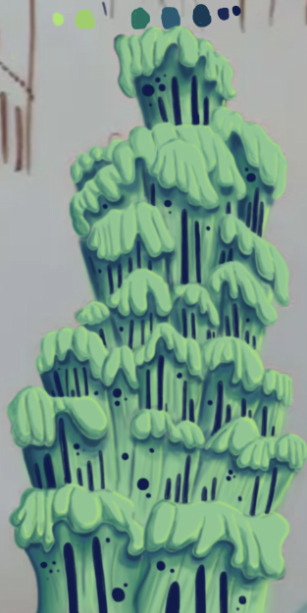
The photo is a small bit fuzzy but this was the first structure I recreated digitally. This took me around 6 hours to do, which was mainly because I've never done a proper digital piece before, so it took me a bit of time figure out what worked best and what short cuts I could take. I actually drew on top of a picture of my original paper sketch instead of redrawing it.
I created this solely using the air brush tool, and I love how it turned out, it looks so drippy. The only thing I can say really is that I wish I got it done a bit quicker, and that the values were much darker on my personal monitor.
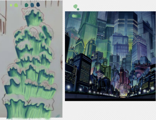
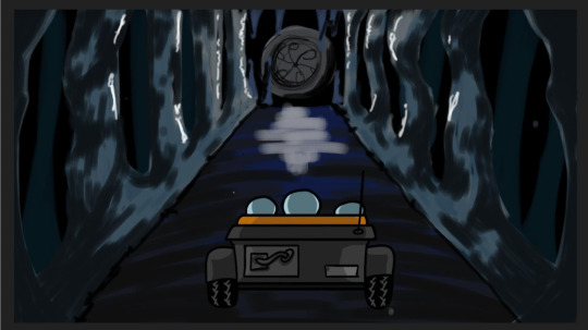
I used the background from Akira as a reference for the colours.
Thursday
I made 4 more structures, significantly much more quicker too. While I spent too much time on the first one it gave me the experience needed to bang these ones out quickly and more efficiently. These were also done using the airbrush tool. For the backgrounds we actually made it a point to solely use airbrush as a way to commemorate the animations from the 70's/80's.
Since most of my pieces were done I got started on piecing them together. I tried making the buildings further back bigger and transparent and the ones closer to the viewer bigger. This was as far as I got on Thursday. If I'm being honest I'm not happy with the layout. I was using the Akira background as a reference but then realised it wouldn't work as the light source in the background is from behind, in my background the light source is from the front. I knew I definitely had to redo the layout.
Friday
We did a pitch workshop with Paul and Yvonne and then as a team discussed how we would go about our pitch . We discussed who would say what, what we thought a funder would want to know before investing in a project, we worked out costs, how many episodes, how many animators it would take to animate it in a year and ect...
We also did a few rehearsals in the studio improvising our lines and timing ourselves to get a feel for it. We decided that I would open and close our pitch, introducing our Nursery rhyme, genre, & time period while also setting the scene for our animatic.

Before work I managed to redo my background, I thought this one turned out way better. The perspective looked way better than last time too. I feel like with more time I could develop this further but I don't have that time so this is what I have and I'm happy with it.
Sunday
youtube
I made the presentation for our project, and the team went on call to rehearse our pitch. We did this twice.
2 notes
·
View notes
Text
Cutout Pro: Making Design Easier with AI
Introduction
Cutout Pro is a new design tool that uses smart technology to help people edit images easily. It has many tools to make editing pictures simpler. One of its main features is artificial intelligence , which helps users work faster and more accurately. Let's explore what Cutout Pro offers and how AI makes designing easier.
What is Cutout Pro?
Cutout Pro is a handy tool for editing photos. Its main job is to remove objects from images. Whether you want to take out the background from a picture, make a collage, or add things to a scene, Cutout Pro can help you do it.
How AI Helps in Design Software:
AI is a big deal in design. It makes work faster and gives more room for creativity. In Cutout Pro, AI makes the tools better and changes how people use the software. By using special computer learning, Cutout Pro lets users automate tasks, get better results, and try new things in image editing.
Using AI for Better Picture Cuts:
Cutting out parts of pictures is a big part of design. Before, people had to do this by hand, which took a lot of time and sometimes didn't look right. With AI in Cutout Pro, it's now easier to get precise and consistent cuts quickly. Cutout Pro looks at pictures, figures out what's in them, and separates objects from backgrounds accurately, making professional-looking images in less time.
Making Work Easier and Faster:
In design, being efficient is important. Cutout Pro helps by making tasks easier and saving time. It can work on many pictures at once or connect smoothly with other design tools. This way, users can work smarter and get more done.
Exciting Editing Features with AI:
Cutout Pro offers many advanced editing options powered by AI. These tools help users do complex edits easily and accurately. Whether you're a pro or just starting, Cutout Pro gives you the tools to create with precision and control.
Getting Things Perfect with Precision:
In design, even small mistakes can make a big difference. Cutout Pro uses AI to get rid of errors and make sure projects look great. Whether it's refining edges or perfecting details, Cutout Pro has what you need for flawless results.
Working Well with Other Tools:
Today, designers often work together using different software. Cutout Pro fits right in, working smoothly with tools like Adobe Photoshop and Illustrator. This makes it easier to use AI across different design tasks and work together on projects.
Customizing Designs to Your Liking:
Every project is different, so Cutout Pro lets users customize the tools. You can set AI for specific jobs or adjust settings for better results. Whether you're a pro or new to design, Cutout Pro gives you the tools to make your ideas real.
Unlocking Creativity with AI:
AI opens up new ways to be creative. With Cutout Pro's AI features, designers can try new things and make unique designs. Whether it's for print, web, or multimedia, Cutout Pro helps users push boundaries and bring ideas to life in exciting ways.
Dealing with Challenges and Ethics:
AI brings a lot of possibilities, but there are challenges, too. Cutout Pro helps users navigate these challenges by giving tools to handle them. Whether it's understanding AI or thinking about the right way to use it, Cutout Pro supports users in their creative journey.
Looking Ahead to the Future:
The world of design is always changing, and so is AI. Cutout Pro is always improving to meet new needs and trends in design. From new AI applications to the latest design ideas, Cutout Pro is ready to lead the way in AI-driven design.
Showing Success with Stories:
Success stories show how AI can change design for the better. Cutout Pro shares these stories to show what's possible and how it helps users. Whether you're a freelancer or part of a big company, Cutout Pro offers tools to make design easier and better.
Thinking Ethically in AI Tools:
Using AI in design means thinking about ethics. Cutout Pro is committed to doing this right, with transparency and user consent. This way, users know their data is safe and that AI is used responsibly.
Saving Time and Money with ROI:
AI tools like Cutout Pro can save time and money. They help work faster and make better designs, which pays off in the end. By looking at the long-term benefits, users can see why Cutout Pro is a good investment for their creative goals.
Making User Experience a Priority:
Cutout Pro wants users to have a great experience. It's easy to use, whether you're new or experienced in design. By focusing on what users need and listening to feedback, Cutout Pro ensures everyone can create with confidence.
Keeping Data Safe and Secure:
Data safety is important, especially in design work. Cutout Pro uses strong security measures to protect user data and designs. With encryption and strict controls, users can trust that their work is safe.
Learning and Growing Together:
Cutout Pro offers lots of training and support to help users get the most out of AI. From tutorials to online communities, users have resources to master the software. Whether you're just starting or want to learn advanced techniques, Cutout Pro is there to help.
Improving with Feedback:
User feedback is key to making Cutout Pro better. By listening to users through surveys and forums, Cutout Pro gets ideas for updates. This way, the software grows with users' needs and stays ahead in the design world.
Conclusion:
Cutout Pro is a powerful tool for designers, made even better with AI. It helps users create amazing designs quickly and easily. Whether you're a pro or just starting, Cutout Pro gives you the tools, support, and resources to turn your ideas into stunning creations.
2 notes
·
View notes
Text
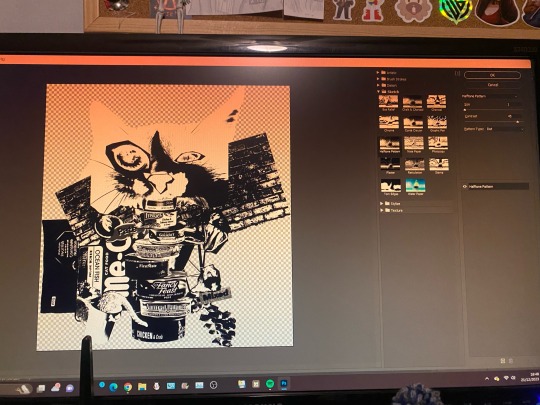
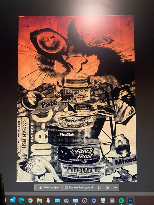
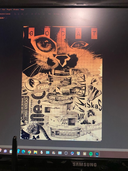
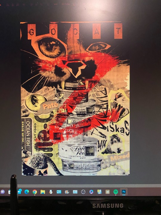
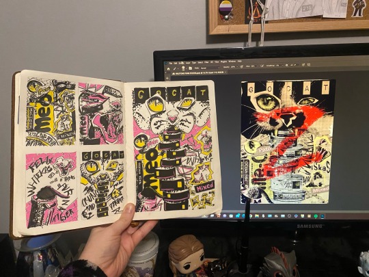

CHRISTMAS BREAK: Final piece work for Project 001: Identity and Place. After exploring my initial ideas and final idea for my punk halftone poster, I went ahead and collaged my final idea in photoshop, using copyright-free photos from Unsplash for a high resolution, ethical design. Once I had the collage ready, I followed a video tutorial online by “Blue Lightning TV Photoshop” on how to use Photoshop’s built-in filter gallery to achieve a punk, 70s-inspired halftone effect, which I manipulated and adjusted with colour, contrast and texture to create the grungy look I was going for. The process of making the poster was quicker than I expected as collaging the piece togerher was only a question of composition, however navigating the filter gallery and layer adjustments was new to me and a bit of a struggle. Hope to take this design to screenprint for a final elevation.
2 notes
·
View notes
Text
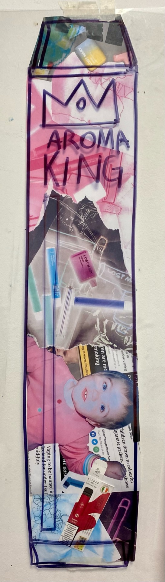
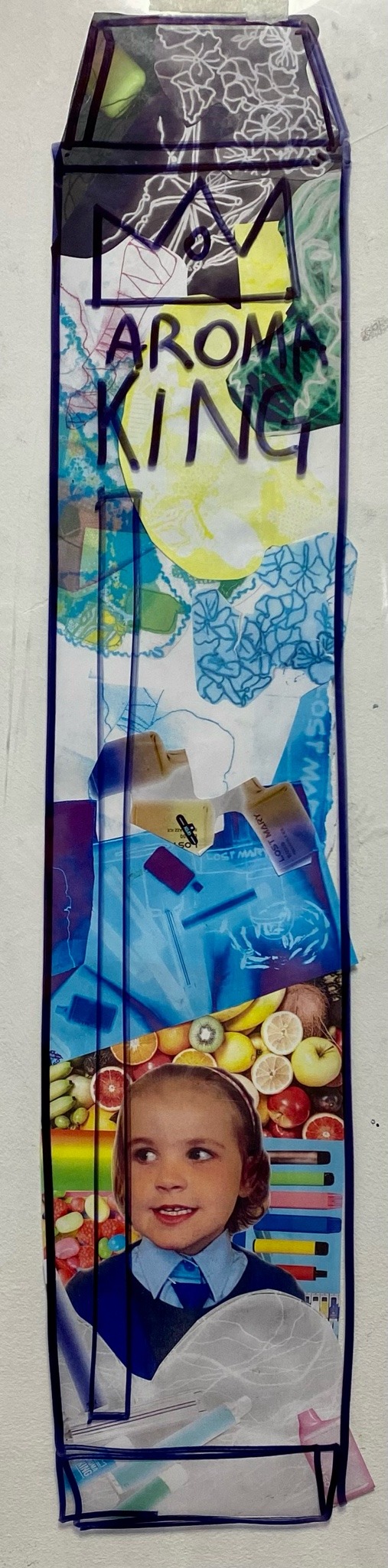
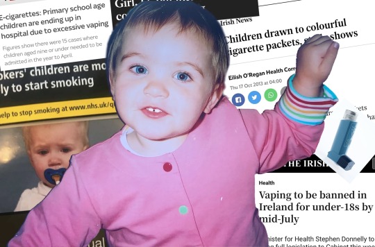
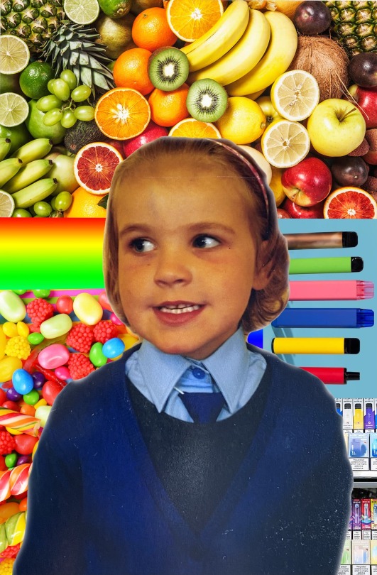
Distrupt/Reconstruct Workshop
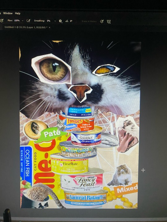
Using Adobe Photoshop, I created a photo collage of pictures of me as a kid to demonstrate how appealing vapes are to younger children and underage teens.
In the first collage I put together a range of recent newspaper headlines and articles in relation to vaping to act as a background. I then inserted an inhaler and a picture of younger me to highlight the contrast of innocence & immaturity VS the real life harm vapes cause.
In the second collage I wanted to experiment with vibrant, appealing colours that younger children admire. In the mix of fruits, sweets & rainbows I added in pictures of vapes which blend right into the cheerful looking mix in a 5 year olds eyes.
Using these collages as well as some other print outs I had of my work from the workshop, I created a paper collage in the shape of a large vape.
6 notes
·
View notes
Note
You've probably already been asked this before, but I was wondering how you create your collages?
Big fan, keep up the rad work 👍
So, I've got a collection of around 450+ hand-made textures that I've created and scanned in over the years. I'll make stuff with acrylic paint, ink, watercolor or sometimes I even scan in physical objects like pieces of thread. On top of that around 250+ photos I've taken with an eye towards using in a collage. I assemble everything in photoshop, and often import vector elements from illustrator.
The last piece I posted, At The Bit, has photographs of cracked paint from a warehouse in NE Minneapolis I used to work next to, lines of ink laid down with an old-school pen nib, xerox texture fragments from a dying photocopier I used in North Dakota in the 90s, some vector elements, and there's probably an acrylic piece at the very bottom layer for texture and contrast.
Thanks for checking my work out, I appreciate it.
4 notes
·
View notes
Text
Writing Initiative #1
Describe 1–2 media and/or materials you would like to explore;
For the word ackamarackus, I focused on the political innuendos we constantly see in the media—how manipulation and lies are used to sway a follower’s bias. Through collaging, I can combine different articles and media sources to build a layered insight into this theme.
A house made out of cards—or a house of cards—is another idea I want to explore for my 2D concept. A house of cards represents a fragile system, a plan so weak that it can collapse at any moment. In relation to ackamarackus, politicians often fabricate lies or exaggerate causes to protect themselves from the truth. A house of cards perfectly symbolizes how deception can be so fragile that the entire system crumbles under its own weight.
I want to take an abstract approach with this concept, using playing cards to create my own style. Once I’ve taken my photos, I’ll experiment with them in Photoshop or Illustrator to see how I can push the idea further.
Explain whether/how these reflect what you have learned about the word.
My ideas reflect what I’ve learned about the word ackamarackus because the term itself is all about nonsense, trickery, and deception. That’s exactly what I wanted to capture—how politicians and the media manipulate information to sway public opinion. By using collage, I can physically piece together different media sources to show how fragmented information is often reshaped to push certain narratives.
The house of cards idea ties into this perfectly. It represents how deception, no matter how carefully built, is always fragile. Politicians create lies or exaggerate causes to cover up the truth, but just like a house of cards, it only takes one wrong move for everything to collapse. That instability is the essence of ackamarackus—something that seems solid at first but ultimately falls apart.
Using playing cards also adds another layer to my concept. Cards are symbols of chance, trickery, and illusion, which makes them the perfect medium to explore these ideas. Once I’ve taken my photos, I’ll experiment with Photoshop and Illustrator to push the visuals further, reinforcing how truth can be distorted and manipulated—just like words in politics and media.
0 notes