#Finally making some progress on dynamic posing
Explore tagged Tumblr posts
Text
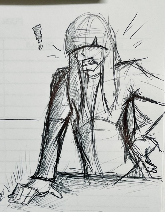
Another Skeptic doodle
#Kind of happy with this one#Finally making some progress on dynamic posing#mha skeptic#skeptic#tomoyasu chikazoku#meta liberation army#league of villains#my hero academia#boku no hero academia#work doodles#my art
35 notes
·
View notes
Note
Regarding your recent post, I'm not even shocked that a certain section of this fandom are still trying to pretend Assad fans are any more anti black than Sam fans. I've seen plenty of anti blackness from all corners of this fandom, from both Lestat and Armand fans. But somehow weirdos think Sam fans are woke and progressive in comparison? there were Samstat fans who wrote disgusting fanfic of Louis calling other black people 'gorillas' for fuck's sake and specifically to prop up Lestat. There were Loustaters who thought it was a brilliant idea to go to a slave plantation so they can pose for their OTP photos. The Lestat fans who gloated about Claudia finally getting what she deserved, until they decided to use her as a prop for lestat sympathy post s2. But it's convenient for them to focus all that energy and blame solely on Assad and all his fans, because it suits the narrative they've already developed in their minds.
When people were making rape jokes about Assad's character, I recognized some of those blogs. One of them was a Loustater who I distinctly remember talking about Assad derisively. Because according to this fan, he's supposedly replacing Jacob next season. Which is an insane take like these people do know who next season about right? It's supposed to be a TVL adaptation and Armand does have appearances in that story. But here's the thing, they don't mention Sam at all. Now why would they claim Assad (a brown actor who has already has been sidelined repeatedly in marketing and nominations) has more potential to replace Jacob and not Sam, who Rolin already stated was going to be the lead in s3? When AMC has already pushed for more samstat presence in s2?
Let's be real here, some of these people live vicariously through the Jacob/Sam dynamic and the validation they feel from it that they are resentful of obstacles to that. Even if it's another actor of color potentially sharing more scenes with Sam in the future. This is also why they took that rpf poll so seriously ("if you don't vote for my preferred coworker ship, you're anti black") It wasn't just this blog, literally other people who were downplaying the racism for the awards snubs were very similar in that they are very invested in jam conspiracies and/or more lenient towards Sam and other white actors on the show. This bias has been called out by several black fans who I follow.
IWTV fandom directs a very noticable amount of vitriol towards the cast of color on this show. And yes, this includes the Muslim brown actor who fans see as the source of all their problems apparently. Fans behave like they can pick or choose what is racism or not with the marketing and nominations. Jacob, Delainey and Assad have all been subjected to all kinds of nasty remarks that are racist and colorist before this season even began.
It is possible to care about both anti blackness and racism against South Asians. It's absolutely important that both are addressed. But I guess these fans think that only one of these issues matter while continuing to bootlick a white corporation. It's sad and transparent what's really going on here.


A SECOND IWTV FANDOM READ HAS HIT MY INBOX. I REPEAT A SECOND IWTV FANDOM READ HAS HIT MY INBOX. someone call the fire department y'all trying to burn down my house with this one hold on
first off. idk where all of you are coming from with these good good takes but keep making them and keep reading the hypocritical fuckers in this fandom for filth while you're at it bc you are right and true and correct. we have seen shit on all sides bc having your pet character to hide behind doesn't change the fact that your ass is racist, but there's something about the racism from so-called Sam fans that is like. how do you even come up with that. how do you look at what you just said and think that's ok to post. and most times it is about making the South Asian Muslim actor the big bad, just like how here in the US racist pasty ass motherfuckers hear 'terrorist' and immediately conjure up images of folks from the SWANA region/South Asian subcontinent. it's othering. he's not like us so we can use him as a punching bag and pin everything we think is wrong in the fandom on him
living vicariously through the Jam dynamic................................ anon truer words have never been spoken. i get it. maybe they latched on too hard to the unholy trinity of the Loustat + Claudia family in the early days of s1 before that went down the drain and mother and daughter headed off to Paris and so they love seeing Jacob and Sam interact for promos irl. for those Jam fans who might see this listen to me. i am holding y'all very gently rn. go outside and touch grass there is no fucking reason whatsoever for you to get so delusional about two coworkers/work besties that you will use that to give the corporation propping up the white half in content he is not meant to be submitted for over the other members of the cast a free-for-all pass. no. it's like using fly swatters in this place the amount of messages i've had to delete from my inbox this week bc they all start with some variant of 'but Sam' and i do not have the spoons to answer that foolishness again
jumping all around your ask in terms of the order in which i make these points so i apologize but heading back to the Loustat blogs that have it out for Assad for whatever reason (specifically the ones making SA jokes about Armand)—i remember seeing that post and just being instantly horrified. i'm talking cold sweats level of freaked the fuck out. just bc you think AMC is going to use the shift in main vamp focus to possibly give Armand slightly more screentime that means he's going to replace Louis and therefore you can now wish things i wouldn't wish on my worst enemy on him. what the actual fuck. in my mind there is a spectrum and this shit is on one end and the rabid Marius stans are on the other and they are both equivalently bad. those two are shaking hands in the center over ways to violate and overlook Brown bodies and ykw i'm tired of not naming names so i'll name the ones who made these statements in the first place (note: i'm putting them below the cut at the very end of this ask bc i don't want anyone to be triggered by that kind of vileness as a jumpscare when i still have things left to say. not worth it.)
ykw honestly the obvious attempt to get Black and South Asian IWTV fans to split down the middle over whose blorbo/actor experiences more racism is disgusting. it's just like when they're always trying to get the diaspora (mainly African-Americans + Caribbean people of African descent, although i have seen them get the West African brethren involved) to start infighting over stupid shit bitch when the cops pull us both over they're not going to ask for a geography lesson. they won't ask us if we immigrated or if our family's been here since before the fucking Civil War. they'll shoot us both and call it an encounter where the two of us were resisting and they feared for their fucking life, like they always do. kicking Assad to the curb to lift up Jacob or vice-versa is not going to get you brownie points with the other infinite amount of racists on this hellsite it'll just buy you time until they decide to kick you to the curb when you open your mouth (if you open your mouth) and point out anything about their blorbo + the way AMC is choosing to promote said blorbo. frankly not even bootlicking anymore we're deepthroating that shit all the way to the back no gag reflex. get up. your Islamophobic xenophobic posting and 'pick a side' propaganda is not the slay you think it is
(note: the Armand SA post in question is below this marker. if you think a trigger warning applies, it probably does. stay safe. don't open this shit if you can't handle it. i'll drop the usernames in the comments for extra precaution regardless)

i had to unblock their asses to get this and then i blocked them right back. fuck me for even having to see this again but i did it for a good cause
#inbox#q: anon#tv: interview with the vampire#interview with the vampire#amc iwtv#iwtv#assad zaman#armand#oh we eating today. we eating good today these takes are on point anons. now if more of you could find yourselves in my mutuals'#inboxes and not the ones that scream bloody murder when someone even thinks in Sam's direction it would be a good day#for me AND for them. i send you forth
49 notes
·
View notes
Text
A fond farewell to Miseinen, See Your Love, and Caged Again
It's actually insane how hot 2025 is coming in. Out of these three series, I was originally only watching Caged Again (hello, I'm moutheyes, and I'm a WeTV Originals acolyte), but thanks to the fine folks here who make nice gifs I gave in and jumped on the bandwagons for Miseinen and See Your Love.
Original script counter: 2 originals, 1 adaptation (a transnational one at that!).
For anyone still waiting to watch the Caged Again finale, I'll put that one behind the cut even though there aren't any spoilers. :)
Miseinen
Somehow both more quiet and more dramatic than I expected. Liked the confusion-separation-reconciliation of it all very much, the way the tumult of youth—feelings amplified by a lack of freedom, sense of suffocation, and the uncertainty of the future—smoothed out, giving way to more even ground where Jin and Haruki could restart their interrupted hearts. The beauty of their relationship was how they saw each other for who they really were, and accepted those initial rough draft versions, and that was enough.

At the same time, the commitment to realism resonated deeply: of course Haruki's trauma meant he needed time to heal away from everything else, and of course Jin's filial nature meant he'd always be torn between duty and desire. The way this extended to the special episode was especially poignant, showing the complex navigation of a now-stable relationship within their separate careers and semi-shared social lives. I also appreciated how they found outlets to express themselves when they couldn't find the right words to say face to face: the letters, the movie, the metaphors they both worked into their art. Both main actors had standout moments, and their chemistry was also top tier—the eyes and the hands! Also loved the moody palette with the constant contrast between cool and warm tones, and the opening song is a total earworm, absolutely unskippable.
Initial rating: 8.0
See Your Love
Okay, so 75% of this show was designed specifically to punch me in a soft and vulnerable place. Shaopeng—and his family—showcased some of the most thoughtful disability rep I've seen in Asian media, not just QL. His storyline was uplifting and affirming, but didn't shy away from his frustrations or hardships, either. The progression and deepening of Shaopeng and Zixiang's relationship is where I thought the script did great work with Zixiang in particular. His devotion to learning sign language and his commitment to doing everything possible to immerse himself in Shaopeng's world, ugh. For such a useless nepo baby, Zixiang was remarkably clear-headed about his own weaknesses, and even leaned into them—his cowardice, his lack of self-sufficiency—to bolster Shaopeng's own confidence. And in return, he gained strength from Shaopeng's resilience to face his own issues head-on. (Special shout-out to Shaopeng's dad, aka the taekwondo instructor the guys from LFCT needed...)

The show did a beautiful job with the central romance, but did leave a few crumbs on the table. The second pairing was deeply unserious and underdeveloped (very cute and appealing dynamic though, I guess there's always fic), and neither Jessica nor Zicheng posed real threats to the HEA. Zicheng in particular never felt like a major player; his local hired thugs were kind of just helpfully inept, and his eleventh-hour interference attempt needed more setup on the emotional front, although I did enjoy the actual confrontation scene.
Initial rating: 7.5
Caged Again
I don't know how they managed to infuse this wacky premise of a show—a panther and a penguin transform into teenage boys and fall in love—with the warmth of a big group hug, but the metaphorical storytelling was a wild success. All of the characters in the show have their own cage keeping them from what they truly desire, whether it's loneliness, trauma, neglect, grief, or pressure from parents and society. It's simple, it's universal, and that's why it works.
It didn't hurt that the cast was disarmingly endearing! Jay was a little ball of charm as Junior, our penguin, whose curiosity about life as a human was surpassed only by his audacity and sass. Ben played panther Sun with a lot of quiet restraint, which worked due to the character's backstory, and Nokia and Jaonine rounded out the main teenager group with a charming soft-bickering dynamic. Add in a colorful support cast featuring real-life couple Porsche and Arm as some needed father figures and queer role models, a Mole Goddess whose hobby was breaking the fourth wall, a school principal with an inner minx, and the world's most Done With Your Nonsense security guard, and every episode was a rollicking good time.

I thought the villains—a pair of animal traffickers—were afforded a bit too much screentime, since they also doubled as additional comic relief, but there was something genuinely heartbreaking about Junior's relationship with Son, the zookeeper whose betrayal leads to some real moments of pathos. (Is there anything to how close Son and Sun are in spelling/pronunciation?) Overall, though, this was an unexpected comfort show with careful character work and a great sense of humor—and another prime example of why I hunger for more original scripts!
Initial rating: 8.0
A very strong start to the year, hope the rest of 2025 can deliver like this.
#miseinen#our youth the series#see your love#see your love the series#caged again#caged again the series#wetv originals#2025: adaptations#2025: original scripts
35 notes
·
View notes
Text
November 2024 Check In

Hello, everyone!
Got some stuff to share! Our artists had a bit of a respite as we took a breather between the Moontail push, but we’re continuing back to work!
As stated previously, most of our art efforts have been towards accessories and mass illustration of the same things over again, so that legaves less “new” things to share, but we’ll be sharing what we’ve accomplished!
Accessory Illustrations
Necromantic Cloak
We’ve completed the Necromantic Cloak on all starter breed poses!
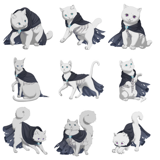
Illustration by Remmie, Tybaxel, and Hydde
And we have finalized colors!
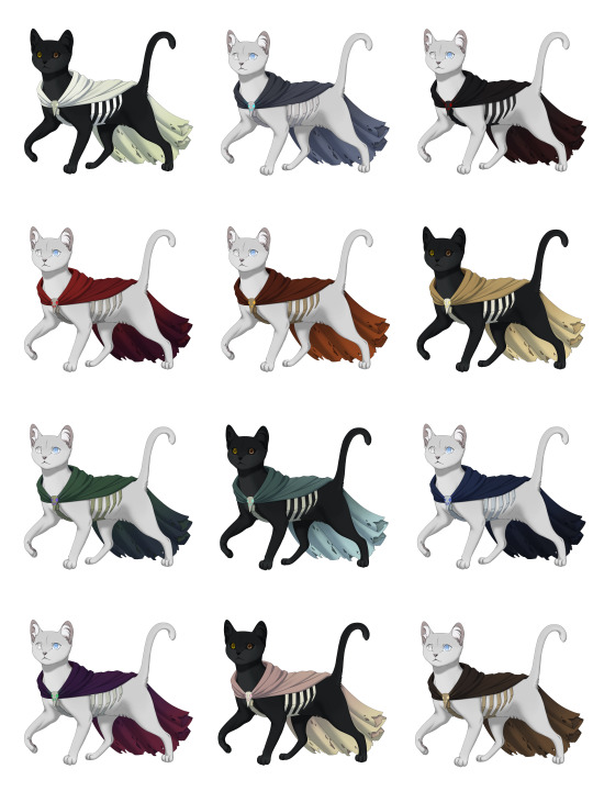
Color design by Emma
Creeping Thicket
We’ve completed the Creeping Thicket on all starter breed poses!
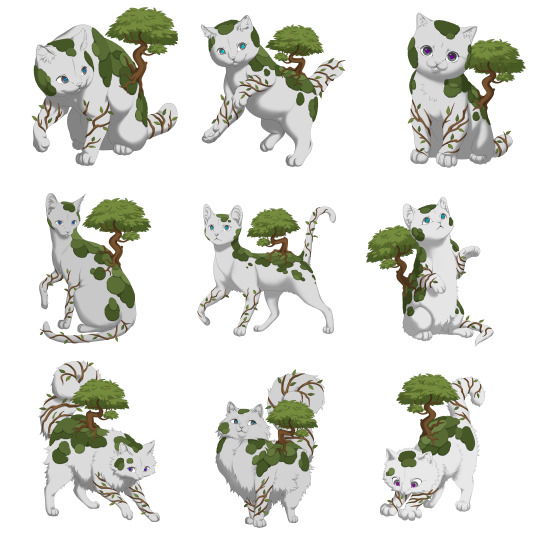
Illustration by Remmie, linework by Tybaxel
We are actively working on the colors for this piece, but we shared a preview of the work in progress earlier this month!
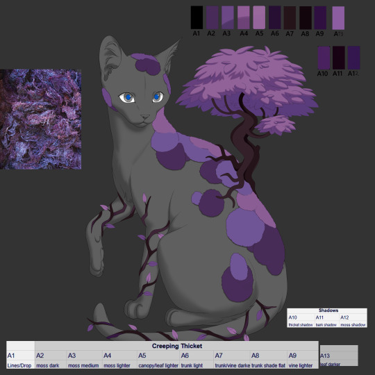

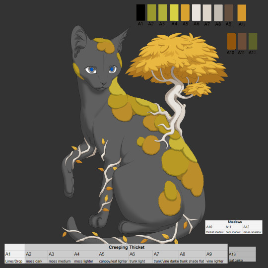
We have also decided to divide up the original item into two items: the Creeping Vine and Creeping Thicket.
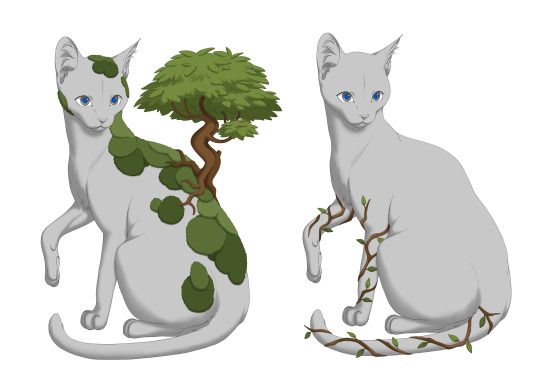
All Kickstarter backers who purchased a Creeping Thicket will receive both items!
We decided this after understanding that a division will allow for more variability and utility of the item.
Gilded Set
We have also divided this accessory into three items: the Gilded Teardrops, Gilded Collar, and Gilded Tailpiece, thus creating the Gilded item set!
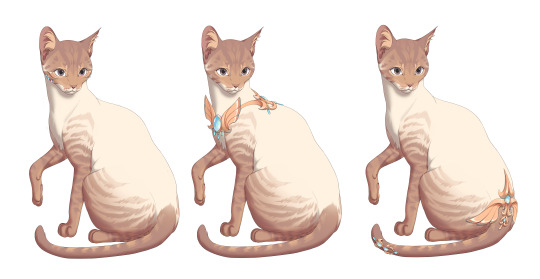
We’ve completed the Gilded set on all starter breed poses!
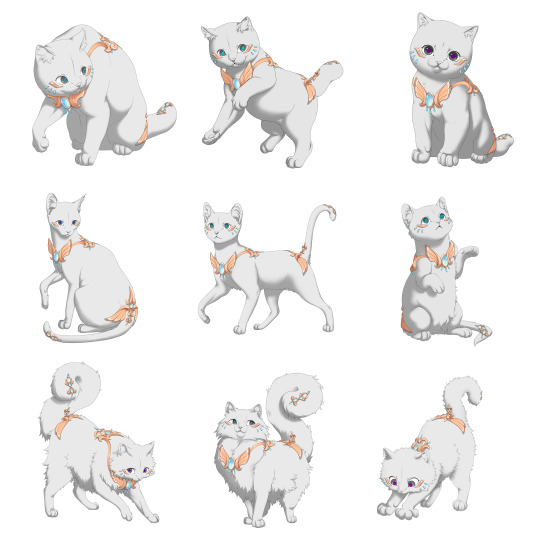
Illustration by Azarel
Regal Set
We’ve completed the Regal set on all starter breed poses!
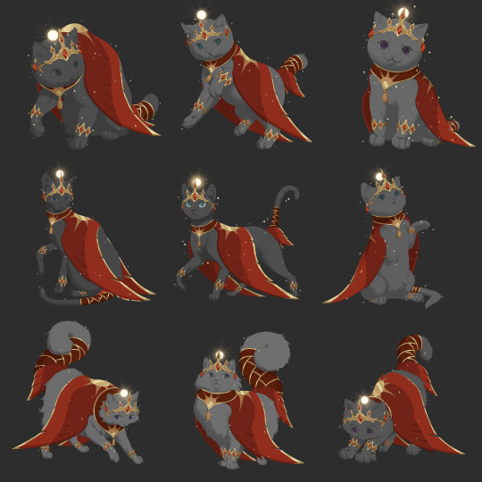
Illustration by Azarel
Backdrops
Grand Library
We completed the Grand Library backdrop!
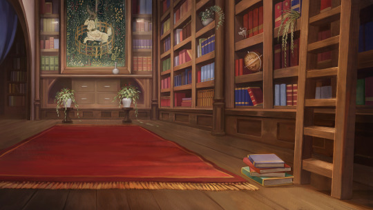
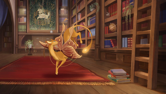
Composition by Runeowl and Giulia, final illustration by Asp
Cogwheel Outskirts Nighttime
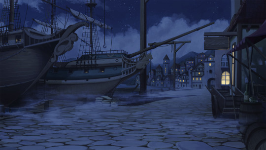

Nighttime edits by Giulia, original illustration by Kzart
Decor Check In
Previously, we shared decor which was attempted to fit into the backdrop style, intending for decor to fit seamlessly into a backdrop. However, after careful consideration and several iterations, we have decided that from now on, decor will by stylized like the cats and fauna.
Decor will be lined with soft-cell shading, and will not look blended into the backdrop itself. We found that with varying textures and shading unique to different backdrop environments, the aesthetics were unsustainable and problematic long term. We have begun production on decor which closer resembles the stylistic truth of cats, icons, and fauna, and we feel this direction will be much stronger in the long term!
Pelt System
And something big… a design for the pelt system! This design took a lot of work, as we wanted to make the process as seamless and quality as possible.
There is a lot of information to work with on this page, and we’re quite proud of how it’s turned out. We hope users enjoy!
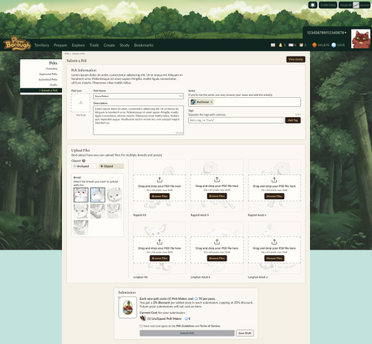
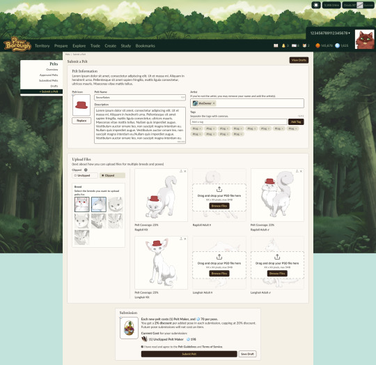
Users will be able to toggle on breed poses to upload, so as to avoid a long drop down. If a pelt is a commission, users will be invited to credit the proper artist.
In addition, we have an "add more" feature which will invite and allow users to submit more poses for their pelt even after the pelt has been approved and added into the game.
Submitting more poses at once offers a slight discount because it is easier on the mod team. But importantly, at any time users will be able to expand pelts into new breed releases. This will serve to prevent item and submission bloat!
One of the most exciting developments in this category has been our adaptation for pelts to utilize the dynamic layering. Using the PSD and layer system we already designed and implemented, users will be able to utilize it too for unclipped pelts!
Our system works by users paying an upfront fee for moderation approval, and then all further printing will be at a significantly cheaper rate. Creators will also be able to list their pelts for sale without printing, in which buyers pay the print cost as a tax, giving sellers more freedom.
We will be basing the cost of pelt submissions on our ability to pay moderators a fair rate. We are currently running tests to time and calculate our moderation efforts, so no prices are set in stone yet!
Development Check In
User Settings
We’ve completed work on user settings. Users can now change their icons to any cat they own, validate new emails, change their password, username, and Borough! Mundane, but hugely necessary advancements.


In general, we're currently working on the pelt system and general polish. We’ve also just begun implementing ways for users to pay for digital content, which is huge for us.
And with that, one more announcement regarding development support...
Trying out Patreon!
Many months ago, we discussed the option of opening up tertiary support efforts, such as "support bundles," as a way to continually aid and bolster development. We denied pursuing this avenue at the time, because we had to focus solely on development with the resources at our disposal already. We mentioned a plan to do something in the future when the time was right.
Since then, we've gotten countless questions on how people can support us after missing the Kickstarter, and how they may help contribute to our development.
We are at a point in our timeline now where we could utilize the support funds. Our scope is higher than it was when we first imagined the project, and while we've been able to manage expectations vs. the necessary additions to make our game the best it can be out the gate, we've decided to open up support for those who'd love to see more behind the scenes.
Introducing our Patreon!
! Not signing up will not harm the project! It does NOT void nor devalue your Kickstarter rewards, nor will we EVER be handing out retired goods through this platform !
Please do not feel obligated to signup if you are not in a place to! This is simply something we're pursuing as an additional avenue of support in a time where we can use it, especially for those who have asked how they can engage with the project while having missed the Kickstarter.
Like the idea of support bundles, we are offering something amidst the work. We'll be offering behind the scenes updates, showing off sketches, drafts, development shots, and the design process of content that is typically only shown in a finished or near-finished state for our public updates.
Simply put: see things before the public sees 'em!
We work every weekday, so there will always be something new to show. Get frequent posts of the lore workshopping, the design pipeline, UI/UX designs, compositions, and all the other juicy tidbits of behind the scenes.
We'll be thinking about what more to offer in addition, but the last thing we want is to introduce more retired stuff, or undermine the exclusivity of the perks promised in the Kickstarter. This is not Kickstarter 2.
However, if this Patreon offers a lucrative solution for us, we may be able to expand our expectations for breed releases, mechanic timelines, and content updates!
All content on this page is available at a low price, and higher tiers do not give more behind the scenes. Instead, we've priced higher options if users would like to be credited as supporters on the credits page of the game.
And Kickstarter backers will also be automatically credited from here on.
As a way to reward the highest tier, we will also feature exclusive community polling. This is different and more lowkey than the giant polls we have done in the past. Sometimes, we as a team have deliberations for small things; minor design choices, UI differences, or content that has generally been too inconsequential to burden the community with giant polls. As a way to engage and have some fun, we're taking these smaller discussions here!
Large polls which pertain to more serious and consequential topics, such as sweeping mechanic changes or big decisions that we specifically want community input on, will still be done publicly.
Lastly, it's unclear at this time what the fate of this page will be once we move into launch. We may repurpose it as a way to recruit beta testing for new updates post-launch, we may shut it down, and we may keep it exactly as is with behind the scenes exclusivities and previews before content hits the game. Depending on the pros and cons during slower development cycles, we'll have to make that call when we get there. But right now we're in full force on mass production, and we'd love to keep on that track!
Thank you everyone!
To summarize: We shared a large amount of accessory progress, backdrops, the pelt system, and what we're currently working on in development. In addition, we launched a Patreon to post sketches and early access content.
What to expect next update: Potential beta updates, further asset and development updates.
#paw borough#petsite#pet sim#development update#pawborough#kickstarter update#art update#indie game#pet site#apparel#pelts#ui ux design#patreon
44 notes
·
View notes
Text
Reflections of the Kenway Family

A fascinating aspect of the saga is how each Kenway encounters someone on their journey who mirrors another family member and their respective character arc.
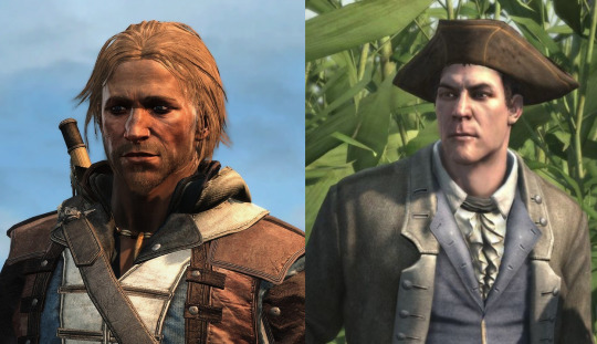
Connor meets Thomas Hickey — a man whose vanity and hedonistic greedy nature are very reminiscent of Edward and are a dark look into what he could've been if he had given entirely into his selfish desires. The way that Hickey's cynical nature contrasts with Connor's idealism is also a very similar dynamic to Edward's interactions with other characters such as Adewale, Mary Reed, Anto, and Ah Tabai.
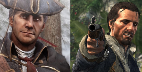
Edward meets Duncan Walpole - a disillusioned Assassin-turned-Templar, foreshadowing the fate that will later befall his son. Edward's act of killing Duncan and posing as an Assassin mirrors what Haytham will become in the future. Another notable parallel between them is the theme of betrayal.
Reginald Birch's betrayal of Edward transforms Haytham into a Templar, while Walpole's betrayal inadvertently turns Edward into an Assassin. Unlike Duncan, whose commitment to the Creed is nonexistent, self-serving, and morally compromised, Haytham's ideological convictions in the Templar Order are resolute, unwavering, and uncompromising.

Haytham encounters Shay - an idealist with unwavering convictions, dedicated to protecting the innocent at any cost. Shay serves as a dark reflection of what Connor might have become without introspection, failing to forge his own identity. This lack of self-discovery makes Shay's virtues easily manipulated by others. In contrast, Connor continuously grapples with the demands of the Assassin's Creed and the diverse intentions and motivations of the people he meets on his journey, questioning and seeking to understand the world around him. ______________________________________________________________ ['On Johnson's Trail' Transcript] Connor: I was hoping you could help me locate William Johnson. Samuel: Of course. I'm headed to a meeting with some men who should be able to help. Why don't you come along? It's good to see the people finally taking a stand against injustice... Connor: Says the man who owns a slave. Samuel: Who, Surry? I practice what I preach, my friend. She's not a slave, but a freed woman... At least on paper. Men's minds are not so easily turned. It is a tragedy that for all our progress, still we cling to such barbarism. Connor: Then speak out against it. Samuel: We must focus first on defending our rights. When this is done, we'll have the luxury of addressing these other matters. Connor: You speak as though your condition is equal to that of the slaves. It is not. Samuel: Tell that to my neighbor—who was compelled to quarter British troops. Or to my friend whose store was closed because he displeased the Crown. The people here are no freer than Surry. Connor: You offer excuses instead of solutions. All people should be equal and not in turns. ______________________________________________________________ ['The Midnight Ride' Transcript] Connor: I thought it might bring clarity. Or instill a sense of accomplishment. But all I feel is regret.
Achilles: Hold fast to that. Such sacrifices must never come lightly.
Connor: I had to do it. Not only for my people, but for all the others Johnson would have harmed. ______________________________________________________________ ['Alternate Methods' Transcript]
Connor: I have been reunited with my father, but do not yet know if this bodes well or ill. Our goals are aligned, at least so far as independence is concerned. But he continues to defend Charles Lee— the man who murdered my mother and burned my village... Still, he makes a point about Washington and those who back him. I hear much talk of freedom and equality, but it seems one must be a landed white man to benefit. What of someone like me? Or Surry? What role for us in this new world? Is my father right, then? There is so much I must consider and so little time in which to do it. ______________________________________________________________ In contrast to Connor, Shay falls victim to their own self-induced tunnel vision, becoming ensnared in fanaticism and operating under a pragmatic "ends justify the means" mentality that he turned against his own Brotherhood for harboring. This vulnerability renders him a perfect tool and pawn for the Templars, diverging sharply from Connor's path of self-awareness, principles, and independence.
#assassin's creed#assassin’s creed 3#assassin's creed rogue#haytham kenway#connor kenway#ratonhnhaké:ton#edward kenway#kenway family#assassin's creed black flag#shay cormac#duncan walpole#thomas hickey
58 notes
·
View notes
Text
Hey guys! Thank you so much for all the love you've given to my Sims versions of Merlin and the knights!
Since there's interest in my Merlin save I will be sharing some stories about what's been happening in that world. However, before I do I feel I need to explain the way I play this save since it's not your standard Sims 3 fashion. I typically play rotationally, spending a week with each family before moving on and using nraas story progression mod to keep everyone from aging while I'm not there. My nraas setup also keeps sims from changing their relationship status or progressing in their careers when I'm not playing them but they can meet new sims, make friends, declare enemies, and start up a bit of a flirtation on their own. I like coming back to a household and seeing what dynamics have formed when I leave them to their own devices, though I get the final say on what romantic interests they end up pursuing.
Now that's just my standard setup for most of my games. For my Merlin save I decided to add some interest by using Merlin characters for my own version of The Medieval Charter Challenge! For those unfamiliar The Medieval Charter Challenge is basically a sims 2 build-a-kingdom challenge where you start with a small settlement and slowly build your world up until you have a medieval city. There are a lot of rules including a tax system and class structures that I'm not going to go over but if you're interested you can check out the original rules here For those of you who are familiar with the challenge just know that I've tweaked some of the rules to fit better with the sims 3 and I don't always follow them strictly. I treat them more like guidelines than actual rules, especially since I'm using pre-established characters, some of which have magic which opens up excuses for all sorts of shenanigans. So if you see me doing something that doesn't follow the rules don't worry about it.
Mainly what you need to know is that I started with an empty world, 3 households who are not part of my rotation but are there to help populate the town (druid camp, knights barracks, and the Ladies' manor), 5 peasant families (du Lac, Smith, Hopper, Emrys, and Ealdor), 2 Yeomen families (Macken and De Grance), and the royal Pendragon family. As my save is currently I have 9 community lots, 3 peasant families (Hopper, Ealdor, Oliver), 1 yeoman family (Emrys), 1 Merchant family (du Lac), 1 Gentry family (Macken), 1 Noble family (De Grance), and the royal Pendragon family that have all dramatically changed as they intermarried, had kids, built up their businesses, and rose in the ranks.
My plan is to make a post on each of these families explaining their story. This will take time though as I plan to give you guys family portraits, before and after tours of their homes, any screenshots I happened to have taken while playing, as well as writing out the twists and turns of their tales. So please bear with me while I sort that out.
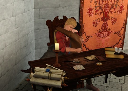
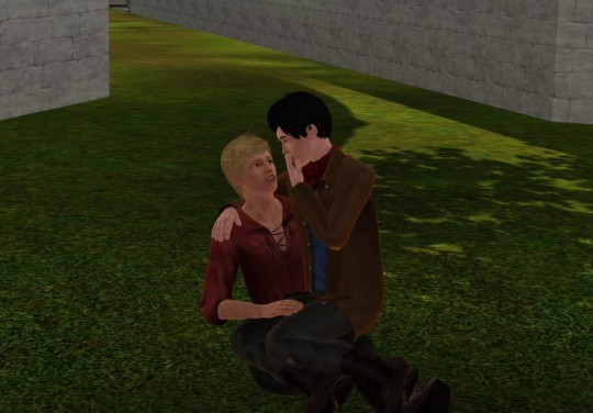
In the meantime here's some screenshots of some shippy poses I did with my sims that aren't part of the save
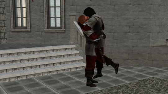
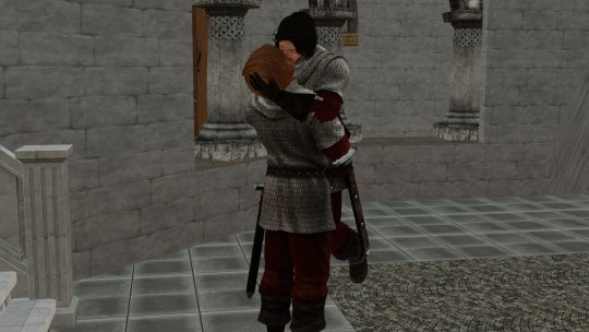
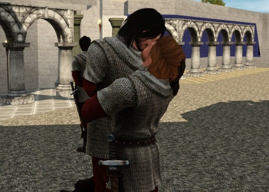
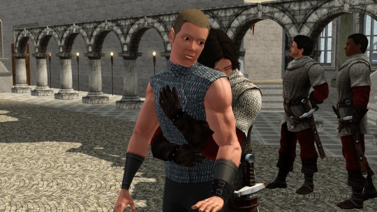
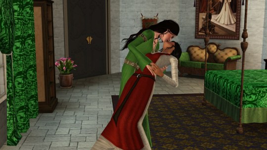
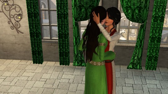
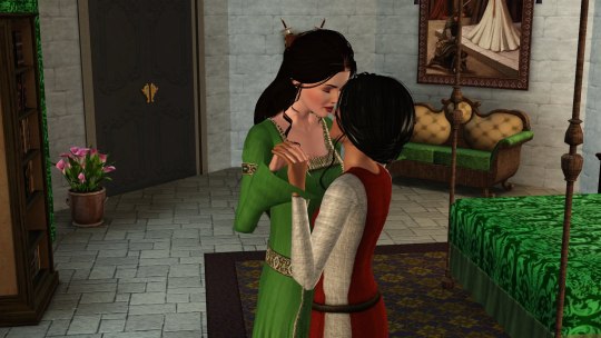
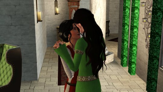
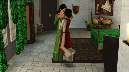
Tagging those who expressed interest in knowing more about my save (let me know if you want me to tag you in future posts about this): @tansyuduri @building-camelot @chairwiththreelegs
#fandom sims#the sims 3#ts3#sims 3#sims 3 medieval#bbc merlin#merlin#merlin emrys#arthur pendragon#merthur#sir leon#sir gwaine#leon x gwaine#leowaine#sir percival#perwaine#gwen pendragon#morgana pendragon#morgwen
40 notes
·
View notes
Text
Reverie Devlog - 2024 July - CHAPTER 4

Overview
It has been a while since the last update since before the release of Reverie Chapter 3, so we finally are making an update on what happened in the past 3-4 months.
What’s with the Inactivity?
First, let’s get the reasons for our inactivity (at least to public) out of the way:
Chapter 3 released around April-May, so that period would be redundant to cover in a Dev Log in that time period.
Around the same period, some people have had high school finals (like in my case, Stahl writing here), or college exams.
Despite that, there has been steady work done in the background by others in the team. The past few weeks have also picked up in activity as well, so things are moving in a positive direction.
Chapter 4 Info
Area
As it’s no longer a much secret since it's been speculated since forever ago: Chapter 4 takes place in dreamworld. The next area involves 1 major area, Sweetheart’s Castle; and 2 minor optional areas, Pyrefly Forest and Metro Depths. This info is relevant to development, as it changes the development process quite significantly.
The obvious benefit is that many assets can be reused and modified, especially for the castle. What will be done with it though, we’ll leave up to speculation. This applies to tilesets, maps, and even some sprites like enemies, leading to far less workload than Chapter 3 had demanded with the real world.
Gameplay
Gameplay wise, this will be where the “mid game” should start ramping up, so difficulty would start spiking here as well compared to base game. Normal mode would still be accessible for most players, but Hard mode would get more aggressive in terms of mechanics, and start to really pose a challenge. Regardless of mode, both would really push for players to learn emotion mechanics properly (I mean seriously, some people still played the entire mod without using emotions at all???).
For a rough overview for what’s coming gameplay wise:
Enemies throw ailments far more often
Some enemies nullify, absorb, or repel specific emotion damage innately
Charge skills and Telegraphed heavy attacks appear more often
Troops tend to appear in larger sizes
Considering feedback received from Chapter 2, it won’t be as tedious as Cattail fields, where enemy encounters tend to be spongy and slow-paced: leading to the next point;
Battles are generally more dynamic, going in a more aggressive direction: enemies are easier to kill, but so are you.
Area conditions that spice up the initial battle a bit
Progress
As of now, Chapter 4 is going relatively fine. There is a temporary knock down in activity from external factors, but we’re still able to keep a steady pace, which is what really matters in the long run. For easy viewing, the progress will be split into sectors:
Writing is going steady, it isn’t as difficult as the real world which has higher stakes, but it still matters to write in character.
Pixel art side of things is also going well. There is far less work needed in terms of pixel art, due to less of both sprites and maps. Basically, anything now is relatively easier than CH3.
Drawn art also is going fine, the majority of spriteworks are already done. As mentioned before in CH3 dev logs, half of the sprites were done before CH3 even started, so this is not new information.
Music is also similar to Drawn art in progress, the majority of songs having been completed beforehand. Though one major difference is that a decent amount of those assets became “outdated”, so we might need to work on replacing or recomposing. This also happened in the art side, but just not to the same degree.
And finally in RPGMaker work itself, there is also some progress made, though less than others as this would be the final step after all assets are completed. The work here so far is mostly implementing all the assets and organizing files. On top of that, we have also started working on cutscenes as well as enemies.
Final Notes
Overall, progress is going steady, despite earlier difficulties in terms of activity. All sectors are progressing in some form, which is a nice change of pace compared to CH3’s very lopsided work allocation.
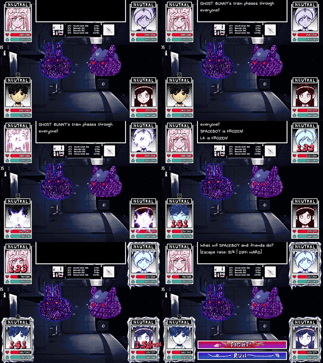
Thanks for reading this far, here's a preview of some work done so far!
52 notes
·
View notes
Text
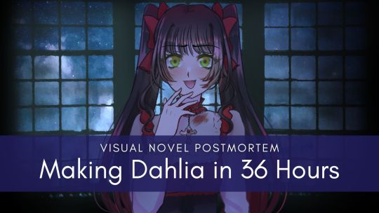
Hello visual novel fans and vampire lovers! It’s been a while since I last wrote a postmortem, so I hope I’ll be able to write this concisely (and coherently).
Dahlia was a short visual novel I created in under 36 hours for Velox Formido, a shortform visual novel game jam ran by robobarbie and Allie Vera. It’s inspired by Ludum Dare, one of the longest running game jams in the world where devs are tasked to make a game in 1 weekend based around a theme. I got my start making visual novels by entering Ludum Dare…which was 10 years ago, as of 2024!
I had my eye on this game jam for a while now, as this isn’t its first incarnation. I’ve been a bit burnt out the past year or so, not completely where I can’t make progress but to where I feel like my work has slowed down a lot more than my peers and feel I can’t make anything quickly. When I saw the jam was happening this weekend, I hopped on board once the themes were announced.
the themes
While Ludum Dare has a rigorous process of eliminating themes until it gets down to the final one, Velox Formido has it where there are 5 themes that win and participants have to use at least 2 of them in their entries. The final themes were…

Enemies with Benefits
Flower Symbolism
Doomed by the Narrative
Trapped with Someone
Forbidden Romance
I started crafting ideas as soon as the themes were announced, which was what the jam started- meaning the clock was ticking!
My first idea was a shounen rivals-esque sapphic story about two rivals meeting up for alone time. I started writing it immediately but moved on to another idea- being trapped with a vampire. I doubt I’ll ever use the first idea, so I’ve shared the snippet I was able to write for it here. Every new line is the other woman talking, so think of it as a quick back and forth.
Even though I had started on this idea, I wanted to write something more… mysterious. Frilly. Girls in cute dresses, to be exact. So I began potting an idea where a girl wakes up to find a vampire in her room, unsure if she’s had her fill yet or toying with her next meal.
the story
The “flower symbolism” theme was definitely my first pick, as I love the concept of it and played around with it in my last visual novel, Asphodelium. I named the characters Dahlia (beauty, change) and Camellia (admiration, longing). Dahlia represents a change in Camellia’s life, a sudden burst of newness. Camellia longs for something different, some way for things to change.
The other theme I picked was “trapped with someone”, as the premise is a girl stuck with a vampire in her room. I didn’t want it to be outright horror, but still a little creepy and tense.
Dahlia "I've had enough pitchforks stuck in my face for today." Camellia "And why is that?" Dahlia "Because your kind isn't too welcoming to my kind." Camellia "I was asking why you were here in the first place." Dahlia "Obvious questions get obvious responses. I needed a snack, of course." Camellia "And you chose my residence." Dahlia "Didn't you say this was your fathers?" Her words curl around the last word, like ivy growing against a trellis. She's clearly already had a "snack", but was it enough to satisfy her? Or am I the main course?
Both of them are somewhat young, but there is still the element of the unknown. This creature clearly already had a meal, but does she want dessert? Is she just toying with her food? Or is she truly delighted to find someone her age to talk to?
With the time constraints I wasn’t able to flesh out much of their dynamic, but I hope it was still an enjoyable taste! The story ended up being about 2.3k words long with 3 endings.
the art
I started doing the art about….12 hours before the jam ended. I love working with fullbody sprites as they offer me a lot more versatility with posing, but I knew I didn’t have time for that here. This time I went for 3/4ths bodies, namely just so I could cut it off at the end of their dresses. I spent about an hour on each of these.

With the time crunch I didn’t have time to do concepts for them- I just winged it! I knew I wanted Dahlia to have pigtails, though she was originally going to have a purple theme. Camellia was supposed to have proper curls in her hair, but because the game starts with her being rudely awoken, I went with messy waves instead. Think of it as bedhead rather than her actual hairstyle.
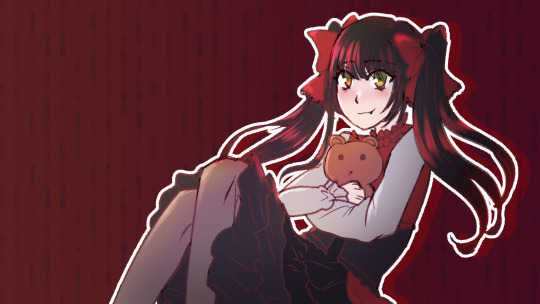
I also quickly did a main menu artwork towards the end of my crunch in about half an hour. It was originally going to be the cover art on itchio but Dahlia’s >:D sprite looks more striking.
For the backgrounds I went with free photos from Unsplash and edited them. Personally, I like the look of filtered photos as backgrounds depending on the aesthetics of the game.
I didn’t have time to edit the GUI aside from the textbox, which was NVL mode.
the presentation
Dahlia is stylized fully in NVL mode, with the textbox to one side of the screen. I love NVL mode for scenes focused on narration and setting the right mood.

I was considering making the game a different resolution, but because the NVL mode is to the side rather than the entire screen I wanted to make use of the widescreen resolution.
The game is set late at night, so each of the backgrounds had to be nighttime. To match with this, I tinted the sprites to match each of them. For example, the above tint looks like this:
transform nightcolor: matrixcolor TintMatrix("#8594d6") * BrightnessMatrix(0.03) image dahlia night = LayeredImageProxy("dahlia",nightcolor)
I wanted to try something more complex like a tint + another light source overlayed onto the sprite, but ran out of time.
Another part of the presentation I did was to have a variety of shots. I had a very limited about of art to work with (only changing mouths and eyebrows, no arm poses or eye positions) so I knew I had to be smart about how I composited the scenes.
One thing I’ve done in other visual novels was to have one character further away and have another closer to the camera but their sprite turned black. This allows me to give the illusion of depth without having a sprite of the back of each character’s head.

for instance, this is that technique in Canvas Menagerie
Doing this in Dahlia was a quick and easy way to make the visuals much more interesting rather than swapping between two mostly static sprites the entire game.
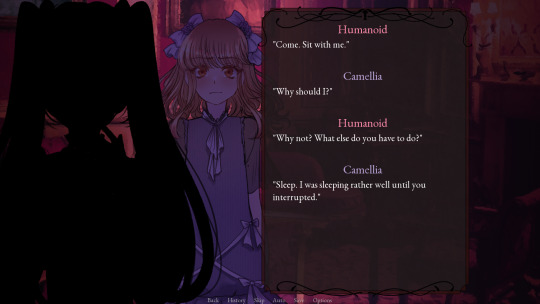
The way I do it in other games is on a per-sprite basis, meaning I set brightness and position each time. It’s hectic, really! But because of the time limit for this jam, I was able to come up with a much quicker way to set it up.
transform lefttt: zoom 0.5 xalign 0.3 yalign 0.05 transform leftttb: zoom 0.8 xalign -1.6 yalign 0.1 matrixcolor(BrightnessMatrix(-1)) xzoom -1
The lefttt transform is for the character in the back- in this example, that’s Camellia. The leftttb transform (b standing for “black”) is for the character in the foreground who’s shrouded- in this example, that’s Dahlia.
Basically, the leftttb transform sets the sprite to a bigger size than the farther away sprite, sets the position, and then makes the color completely black before flipping the sprite (because this should be us seeing them from behind).
I also did quite a few small animations in the game, such as Dahlia dancing around or bouncing up and down. You define it once as a transform and can reuse it again and again.
transform dance: ease 0.7 xoffset -59 linear 0.25 ease 0.6 xoffset 74 linear 0.19 ease 0.76 xoffset -70 linear 0.3 ease 0.7 xoffset 102 linear 0.2 ease 0.8 xoffset 0
If you’d like to see the code in action, then guess what- I’ve released the entire source code for the game on GitHub! Feel free to sift through it to see the components in action and copy some of the code for your own projects. All I ask is that you do not redistribute the game (i.e. download the code, make a build in Ren’Py, and redistribute that as your own game).
wrapping up
I’m pretty happy with how Dahlia came out. It’s short and visually distinct and helped “prove” to myself that I’m capable of making visual novels in a weekend still. I tried to avoid spoilers here, so if you haven’t played it already then give it a try!
— Arimia
#visual novel#visual novels#indie games#visual novel game#indie game dev#game jam#game jams#velox formido#postmortem#post mortem#game dev post mortem#my games#dahlia
20 notes
·
View notes
Text

A WIP flipbook animation of a scene from one of my D&D campaigns. This is the first thing I've ever animated, done over 3 days back in early December. It needs some tweaking, but I still think it rocks. It's a freezeframe so I could start with something small and work up to full movement.
Done using the Andymations flipbook kit. I dream of making an animated film just like they did in the old days using paper, pencil, ink, paint, and cells, but this will have to do for now.
This is just one of four hallucinated mutations that will surround this pose. I plan to add in two around this and one overlaid, and some more dynamic shots surrounding it (so you can see who's seeing things and have some emotional resolution)- I just had to pause progress because of finals and haven't yet got around back to it. But I have a history degree now, so that's fun!
This particular horror is inspired by the film When the Wind Blows, which influenced the clay-like bubbling and expression, and the anomaly in the series Arcane, which influenced the stretchy distortion. I recommend the latter, I cannot in good conscience inflict another with such great agony by recommending the first.
Here's some still frames and two of the other horrors to come:
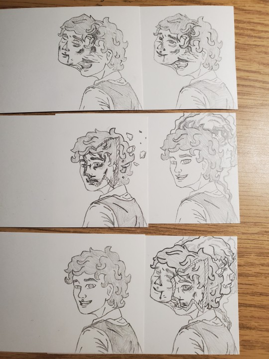
The others are inspired by Jacob Geller's video essay Fear of Cold (who's videos are incredible by the way) and in thus that shot in the Shining, and though not seen here- the artworks of Ivan Seal (yes, I mean those ones. Don't make me think about it).
The character is Atlas and belongs to @allymaddness101
2 notes
·
View notes
Text
Progress talk thread
I like to take a lot of backups as I draw so we I can show off my widdle Lilly wips!! I'm drawing again that means I get to talk about drawing again yahoo
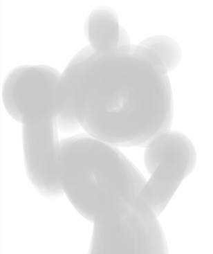
Lately when starting a drawing I've been trying to block out very rough thumbnails as seen above! I usually just start drawing like, the head, and trying to then figure out a body under neath and line by line it all ends up pretty similar to my past stuff because it's just not planned out! I don't know where the road is taking me!
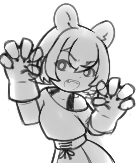
So by starting out and trying to throw together the general pose with just a blown up light brush I'm coming up with much more interesting piece! I can figure out the general shape of the entire piece and then start working on top. No making a shoulder then drawing the hand over it and then erasing the shoulder and getting frustrated because it just doesn't look connected right because I didn't plan it out… where does this drawing end? where's the limits?? where am I going?? So my current workflow involves
Make the dimensions of the piece roughly (just throw a coloured rectangle down) -> very roughly block out the shape of the body within it
This also has the benefit of inspiring me to fill in the blanks with a pose I didn't initially expect! The body is reversed from my initial vague idea because seeing the blobs made me go OH IT'D BE COOL IF I DID IT WITH THE BODY FACING THIS DIRECTION ACTUALLY LET'S MAKE THAT WORK!! If you look at the initial you can kinda see it looks more like she's looking down at you with the raised arm being the one facing you.

Anyways after doing my personal Holiday pic the other day, I was like, it would be cool to do a small run of postcards to send to people yahoo!! I checked the sizes of postcards and none were even close! They all had like an extra inch on of extra space on the bottom whoops! I free style my rectangle sizes when planning an illustration and I guess they're closer to square than the ideal rectangle! Whoops!
So for this one after getting the initial sketch down I thought, hey how close is this to 5x7? AND LO AND BEHOLD IT WAS THE SAME ISSUE!!! So I took filling out the extra space as a challenge. I'm trying to be more dynamic with my art after all!
I spent time adjusting the piece in sai2 using the transform tool with it's perspective skewing on. I wiggled and rotated and pushed n pulled and you get what you see above. A much more dynamic piece filling out the canvas!
The thing that took the most time in this phase was getting the skirt to a shape I found acceptable.
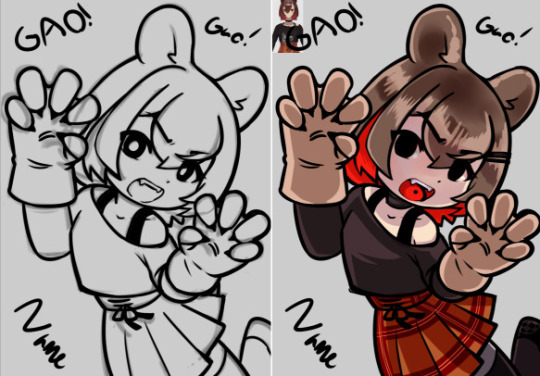
Up next was moving towards making it a finished piece!
Thick lineart is something I've been deciding if I want to stick with or not but honestly it's my natural state! I love thick lineart!! I grew up on manga I wanna see some black lines!!! In the future I wanna go back to colouring lineart as well but for now I believe I need to lean into my natural tendencies for thick lines!
I threw down my lineart to a mostly acceptable state, and brainstormed ways to fill the empty space surrounding Lilly. I found there was just a lot of empty space in the bottom left and I didn't really solve that in the final, but that's ok. It's something I'm trying to be aware of as I actually attempt illustrations. I want to finish pieces right now, I'm not in a place where I can let perfectionism slow me down.
Currently my layers are (face) and (lineart) I throw down some flat colours, a light layer above and for once I tried a shade layer too! It might of been a multiply layer. It was probably was. Anyways this is what I was happy with before moving forward with refining it. I'm currently going with more focus on like, backlighting/rimlighting because it's easier to make it work with my no context existing in da void illustrations haha.
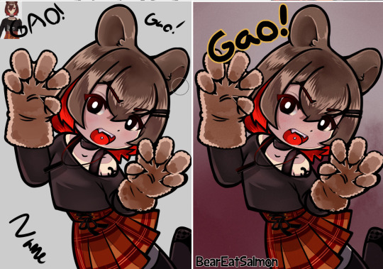
To refine it, right now, I'm playing around with mainly using one layer. So I slammed together my layers other than the face (I made that mistake with my previous piece and that's how we ended up with the eyebrow incident. I wasn't going to put myself in a place where I had to erase an eyebrow again) and started sculpting!
I think sculpting is the best way to describe it, really. It's a lot of slamming down chunky lines, and since the lineart is on the same layer, I'm constantly pushing colours out and finding the ideal shape of both it and the lineart. It helps me push my shapes even farther and let the colours take priority when they need to. Instead of them being separate things I worry about they're all just one big piece!
I was a bit worried about merging the plaid pattern down as well, but I did my best to get the skirt in a place I wasn't going to adjust much after the merge. That was the biggest priority of the previous step really.
It's a lot of fun! I recommend people try it! Try sculpting your lineart a bit!
I added the necklace accessory after since I knew trying to fit it in earlier would also be a pain in the ass haha. I'm not a one layer purist! I'm just having fun!
The background, I went in with no idea for a bg. So this is what we get. I think it works fine for this piece, it's a vtuber attacking you with big fluffy bear claws with no context other than that they are a bear and they're going to fucking get you. Red fits, Lilly has a very orange/red hued design and it's an aggressive attack so the mood works. I could of even gone harder and made it look a bit more splattery but I wasn't sure if I was going to fill up the bottom left space or not.
Looking back maybe I could fit in her name on a cool blood splatter there but I am not a graphic design major my brain is growing slowly in this department thank you
Also fluffy claw gloves usually have much less defined fingers but I couldn't make mitts look good with my initial plans so I stuck with my initial idea!!! Thank u.
Anyways follow Lilly [Twitch]
15 notes
·
View notes
Text
Devlog #2
Hello all again and welcome to devlog #2!
First up, we have tiles! While not the final look of them (to be honest I drafted them up to try them out, but I kinda dig the simplistic look?) they'll be what's making up the terrain in the game! After playing around with it for some time, I found it a hell of a lot easier to map out levels/rooms with these tiles than the old system I had in place.

Originally, what made up the terrain was Polygon2Ds with collision added on top of them and while it was easy to use, it made the terrain a bit to one-toned for my liking and made plotting out levels a bit of a nightmare because I could do any shape or angle or whatever with it, which sounds nice but... well a bit too much freedom can kill my creativity which is why the limitations of the tiles feels like the right balance.
Moving on to what's next: the curse I wrought upon myself. To be more specific? The story vs gameplay and my failure to plan ahead.
I'm not one to plan things out much, I tend to just go with the flow and address problems as they come into view, but that's been biting me in the ass for a bit now. You see, I sent out a test build about a month ago to some dev friends and I got some feedback which has stuck with me. "You need something in between when you arrive at Chloe's abode and when you meet Chloe." (Chloe being the mushroom-headed character). The reason it stuck with me is because I realized, while I had a story, I didn't really have much in terms of gameplay to smoothly fill in the beats in between. The problem with trying to shove gameplay into a story which didn't account for that, well... You can imagine it didn't go well. So here's my new plan. I'm scrapping the story I have so far and will be re-writing it with new gameplay in mind that'll hopefully flow together well. What kind of gameplay? well that's a tough call. I've been juggling ideas around in my head for weeks and none seem to stick, so far I've managed to get a swimming/floating kind of movement in game which seems fun, but I'll have to tinker around with it more before I can say it 'fits' anywhere. If anything, it was at least a fun exercise in the new state-based character controller I've made this time around for the player.

Well what about combat? That's always an easy one, well... I've shied away from that for some time as I thought combat would move the game in a direction of becoming like most other platformers out there where slapping in combat is a simple solve-it-all glue you can put anywhere. If I'm going to add in combat, I want it to be interesting, unique and of course, fun. I'll be experimenting with more movement options, possibility of combat, the use of items, etc. and will be sure to update next blog post with what I achieve.

Moving on from that, I've also been experimenting with dialogue! I've added on to my dialogue code and have added dialogue portraits which, I'm not sure how I feel about as of yet, honestly. I don't think I have enough to base my opinion on whether I'll keep it or not as I like having the dynamic poses of the overworld sprites. I might have it as a toggleable feature in future as to give players the option to view the overworld sprites or the visual novel-esq sprites.
I hope this devlog was an interesting read, I know I didn't seemingly make much in terms of progress, but with the circumstances I'm in it's been a bit of a bottleneck in productivity. I hope next devlog I'll be in a better spot to provide more to show.
14 notes
·
View notes
Note
Sorry for the length.
Tbh, the only mistake here is the perception of the viewers. Not all friendship are immense or beautiful. Sometimes it's just comradery.
You know why they specifically chose NAKAMA instead of TOMODACHI? Because tomodachi is much closer bond. The latter is not. You can be nakama with someone you're neutral with.
Someone on TLS shared this.
"expand...I'll add that nakama differs from tomodachi (the standard word for friends), and translates to something like close comrades who've shared sufferings / struggled / journeyed together. Like the LOTR fellowship or Ino-Shika-Cho type friends. But yeah, a very strong friendship, nothing romantic. Cloud's heart belongs to Tifa."
What does aerith and cloud have that is real and unique to them? Only two things. ZACK and saving the planet/fighting sephiroth. That's it. I'm sorry but, that's really it.
How come? When aerith was alive, cloud actually tried his best go befriend EVERYONE, in a cute way it could be that he doesn't want to be left out of the circle like when he was a stubborn kid. He's a kind person. But aerith doesn't let him be. He responds to her negatively because she keeps trying to make inappropriate advances on him. Making him act as her stand in boyfriend when he does not consent at all. Aerith took cloud for granted, not the other way around AT ALL.
Now, what does that platonic handhold that's an AC reference about? A line written there , still not sure yet, but it says, "you only think about is yourself, but I will be here for you" coming from aerith. I assume she's the one who held his hand like that. Now KEEP NOTE. Cloud thinks this handhold is platonic, maybe through madam m / the world of FF. I believe aerith still believed that what he did in her gsd is romantic, I really think so. But after being called a NAKAMA, she knows where she stands and the TRUE NATURE of that handhold from cloud. It is just cloud passing on support, giving her strength when she was mopping about Zack" that's why in that scene he looks at her in a way that says "it will be okay, be strong, you got this". Nothing shippy, like ZERO. So the same could be about that AC reference. She is here afterall to pass on what she can give to fight sephiroth and save the planet. Well I sure hope that final handhold comes FROM HER. Otherwise it won't make any sense.
Now, to address all the gsd. Some can say all HA are canon. It shows his progress with everyone. But Cloti gsd is the canon progression of the story.
But let's look here. During aerith's confession, if you get her HA gsd, cloud says "wanting to make more memories" instead of just Nakama. But personally, while that's cool and all, I just find it so out of character because his 2 main bond with her isn't enough to inspire this at all. So I can think it's from the player's perspective. They want to spend more time with her. Like fr, if he really did, how come he almost looks so sick of her in AC? Shouldn't he be glad and excited to see her again? Yet all it is , is just wanting forgiveness? Maybe they'll retcon AC but as of now, it's a bit out of nowhere.
Now, for my last point.
How does aerith become a friend here? Like at all?
-> Well, she said she wanted to get to know him= she realizes he thinks only of her as a comrade
-> "you only think of yourself" during that AC pose = finally awknowledging cloud's rude attitude in HER POV. Even tho she doesn't know he tried his best actually!!!! I guess she was uber BITTER with the word WEIRD. I assume she ignored his rudeness because she was escapist in denial that he can't be her Zack 2.0
-> She says shell be there for him after death, and like I said she should be the one to relay the handhold. This is just her being a comrade-in-arms, they have a huge battle. This is it.
That's it. I can't say it's a beautiful nor deep one, no offense to whoever wants to sprinkle this dynamic with so you can enjoy c/a platonically and have brownie points. I just don't buy it because she never got to be a decent friend to cloud AT ALL. While he's like mostly there because he feels sorry for her. Like no joke.
So what is it then? In his pov? I think it's like Zack. He's also not as close with Zack but his death was painful. Both of these deaths triggers a trauma of NUMEROUS afflictions of cloud. But this two is more painful because it was through specifically their deaths that made him have the life he always wanted with Tifa. Hence the survival 's guilt. So I can say that c/a bond is IMPORTANT, but not as deep nor beautiful. I'm sorry, it really isn't meant to downplay them. But just look at aerith's LSW line, it feels so detached af. Personally I think in AC, he was closer to Zack the most. He is cloud's idol and he knew him while he was real cloud, plus zack didn't try to get in his pants, nor only tried to be a friend after her died. NOPE.

Normally I'd delete this because it's filled with tons of spoilers, but it's just too on point and everybody should read it 👏👏👏
12 notes
·
View notes
Text
The Potential Dynamics of Aziraphale and Jesus
Season 3 prediction possibility—if “second coming” means a fully-grown Jesus and not a baby—is a ton of juicy dynamics between Jesus and the two. Crowley was already friendly with him, so I’m betting those two will get along like a house on fire. And now they have that whole “forsaken by a parent” angle to bond over. However, if we want a less obvious/slightly more subtle/more debatable possibility, it could be Aziraphale who will get close to him (given he’s the one handing the second coming) and have that good back-and-forth dynamic with him.
The thing about people like Aziraphale is that they will stubbornly die on the strangest hills when debating with people they’re close to. However, in the absence of these people, they find themselves on that other side, defending their loved one’s perspective when they’re not there to do it themselves (and because, deep down, they also share some of the perspective.) So I can foresee a Aziraphale/Jesus dynamic where Aziraphale is actually the Crowley of the two, and Jesus is the one who has to realize the toxic relationship he has with the mother who literally sacrificed him in the most horrific way imaginable.
It will not be as on-the-nose as Crowley and Aziraphale’s arguments, of course, but it would be such a neat reversal of roles to see Aziraphale hesitantly (but with more certainty as the season progresses) try to make Jesus see that he did not deserve what his mother did, and that she wasn’t right to push the burden of some false idea of “mankind’s sin” onto him. It would be a perfect way to show that progression towards that final step away from Heaven for Aziraphale, since it’s well known that the best way to learn something is to teach it.
And I’m going to pose somewhat of a hot take: despite how painful it is as a story beat, Aziraphale needs this time away from Crowley. This is because, when they’re together, Aziraphale’s reflex is to defend Heaven, and if they continued without any real change shaking up their life/relationship, it would always be to defend Heaven; Crowley’s perspective is a radical one, and Aziraphale is always desperate to steady a rocking boat. We can only imagine how unbelievably hard it would be to get out of a 6000-year-old groove, especially as a person with a certain level of unwillingness to admit being wrong.
But without that force to reflexively push against, he can finally have the room to come to the conclusion himself. And Jesus, I think, is going to be the person to push him to that conclusion, one way or another.
#good omens#good omens 2 spoilers#good omens 2#go2 spoilers#gos2 spoilers#good omens s2 spoilers#good omens spoilers#good omens season 2#good omens season 2 spoilers#gos2#good omens 3 prediction#good omens 3
17 notes
·
View notes
Text
Weekly update June 14 2024
I was extremely busy this week and I’m extremely tired tonight. I got a bunch of life things tidied up but didn’t do as much as I would’ve liked but still got some stuff done.
Artfight prep is the main thing, Josh’s thumbnail is done and his refsheet is also almost done, Romeo’s thumbnail is also almost done. I was going to finish it tonight but I’m very tired. Maybe after I eat and shower I might get a burst of energy and finish it up but seems unlikely. Now that I’ve figured out the trick to overcoming adobe’s shitty drawing tools I’m making good stride on animation stuff, and while the OEB video is not a high priority at all right now, I’m looking forward to how it’ll look. Fwiw the puppet I’m building for that is going pretty well as a low priority task, and building it was much faster than what it used to be so I’m pretty sure the animation itself will also go a lot quicker. Again no progress made on that this week, though.
Music: I’m learning a bunch of new mixing and sound balancing strategies and I’m hoping tomorrow I’ll have the energy to unleash them all. I’m going to re-mix OEB for sure, already redid instruments and set up instrument channels. Also hoping tomorrow will put me in enough of a music kick to finish up the other projects I’ve been sitting on. Everything I’m sitting on could use the new plugin chain, plus BMBO has lyrics done and needs a VPR, WOTW could use some VPR tweaking, RR also has finished lyrics now so I can get going on it’s instruments and VPR (and also pick out what voice to use), plus the ambient quickie could needs a melody recorded plus mixing, the pop quickie needs that too and lyrics, BATB lyrics are close to done but I keep procrastinating, the SOS medley needs some more instrument selections plus mixing, and a couple other miscellaneous songs, there’s a lot. I’m hoping I can get to bed early today and just unload on a bunch of those tomorrow, so I think I’ll try.
Other news: that AC game I’ve been on and off writing: finally sat down and started like, actual coherent notes. This is a good step because I do want to turn it into a prewritten module for other people to run. Main thing I did this week in the way of that was a proper description of the setting, to help character creation. Any of these other times I’m too tired to do anything I’ll try to pour into that, which should in turn motivate me to get visual stuff for that done too. I have done a few character tokens that haven’t been posted because again, I’d like the module to be free and any extras to be paid, rather than the whole thing being paid.
Comic: it’s going, albeit slowly. This whole week at work I tried to sketch out stuff while I was working, but for whatever reason the comic wasn’t cooperating. Probably because the poses and layouts are more dynamic than my splash art, so drawing them with a pen doesn’t really work out well. Once I import and fix the panels I did sketch, the comic will be around 24% done. I will attempt to smuggle in pencils next week, in order to get more done. Like all things considered being able to sketch while at work is definitely a help for my confidence in my projects, and I hope to continue it wherever I can.
Plan for next week is: tonight I go to bed early, tomorrow I go buckwild on music and get a bunch of stuff finished up, maybe finish up Romeo’s AF thumbnail or get the assets for someone else’s done. Sunday, I’ll try to finish up Josh’s AF ref and redo Romeo’s, and get as many assets for the other AF thumbnails done as I can. Monday at work I’ll try to sneak in a pencil, and I’ll get more comic sketching or OEB storyboards done, then Monday night I’ll continue making and/or animating those AF thumbnails. I’ll continue sketches at work where I can and animations during lunch as best I can, Tuesday night I’m introducing another friend to epithet erased, so good chance I’ll get writing for TTRPG done that night too, Wednesday night have a pathfinder game so I should be able to get some digital art done during that, more AF thumbnail assets or maybe comic work, and the rest of the week I should be able to continue sketches at work, and digital stuff in the evening. I might swap out some of that digital drawing with more music if I have the energy but at the moment seems unlikely. I’m getting stuff done, but tonight I’m taking a rest. I’ll try to post something tomorrow, worst case it’ll be a WIP, but really hoping I’ll have something good! Thanks again to everyone for being patient with me!
3 notes
·
View notes
Text
Interdisciplinary Project (Week 2) Blog 1: Project Progression
MUQADDAS AMAN
In this blog, I will detail my contributions to the project’s development, along with the challenges faced and the adjustments made to our original vision. I will also outline the changes implemented based on instructor feedback and discuss the group’s overall progress.

It always fascinates me how a single instruction or adjustment can shift the scope and vision of an entire project. While this may be a source of discontent for some, I believe it is the responsibility of a leader to unify the team and guide them towards the final goal, even amidst evolving challenges. With the latest updates and instructor feedback, I have worked to ensure that the team remains focused and motivated.
Two major developments have influenced the project’s direction: the idea proposal presentation and significant progress on key assets.
The Idea Proposal Presentation
Since my last blog, all project teams were required to present their concepts to the instructors, who evaluated the feasibility and potential of each idea. While some group members were initially apprehensive about the project’s ambitious scope, I remained confident in our vision and worked to keep morale high. Witnessing our peers’ presentations reinforced my belief in the uniqueness and creative potential of our work.
As the team lead, I took the initiative to present our idea, answer questions, and address concerns. One key revelation from the feedback session was that the dome, where the audience would experience the project, was smaller than we had envisioned. Furthermore, audience members would be seated, unable to turn around freely. This posed a challenge: our original plan assumed a more dynamic viewing experience, but now we had to ensure that every key event remained within the audience’s field of view.

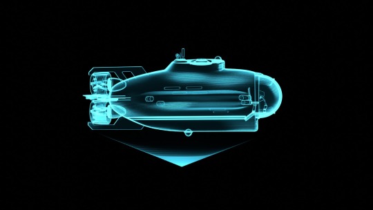
While this did not drastically alter our core vision, it required a fundamental redesign of the submarine’s layout. Instead of a traditional structure, we decided to incorporate a glass dome as the main body of the submarine. This design allows the audience to see the ocean depths from all 180 degrees, making the experience more immersive. Additionally, the final attack of the Leviathan monster, originally meant to occur at the front of the submarine, has been reimagined. Instead of a frontal approach, the Leviathan will now strike from above, ensuring that every audience member witnesses the climax of the scene.
Progress on Key Assets

With these design modifications finalized, the team set out to refine and enhance their respective contributions. I focused on completing the final version of the submarine’s console, ensuring that it could be mirrored so all audience members could view its details.

The console features several LEDs and monitors capable of displaying animations, including a sonar effect mimicking real-life submarine navigation. Initially, these lights were intended to guide audience attention to specific focal points, but given the updated dome structure, they will now play a more atmospheric role in enhancing the underwater environment.

Additionally, I worked on the basic structure of the submarine’s body, integrating the transparent glass dome concept. I plan to share this updated design with the group to gather feedback and further refine it before presenting it in the next class session.
Team Contributions
Each member of the team has been hard at work, making significant progress on essential components of the project:
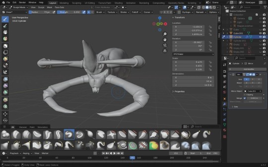
Aya Khoury finalized the general body structure and terrifying facial features of the Leviathan monster. This milestone has been particularly inspiring for the team, as it has solidified the creature’s menacing presence. I encouraged Aya to introduce additional creative elements to further differentiate our Leviathan from its inspiration in Subnautica.
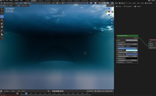
Maria Stoyanova completed the volumetric ocean environment. While computationally intensive, the result successfully captures the immersive feeling of being submerged in deep water. Maria also rendered an animated ocean surface that accurately replicates real-life ocean currents.
Wenzhou Tu developed four distinct versions of animated 2D fish, which move in a wave-like motion to simulate natural swimming behavior. Having completed this task, Wenzhou volunteered to work on sound design, taking inspiration from Subnautica to create an authentic underwater atmosphere.


Md Hasibul Huq Shanto has been progressing at a slower pace compared to the rest of the group. While he successfully developed the particle system to simulate the submarine’s environment, there is still a considerable amount of work left. However, Shanto remains motivated and determined to complete his tasks.
Final Thoughts
Despite the hurdles, our group remains committed to realizing our vision. Seeing each member bring their expertise and creativity to the table has reinforced my belief in allowing artists the freedom to explore ideas within a structured framework. The amount of progress we have achieved in just two weeks is a testament to the team’s dedication. I eagerly anticipate the final stages of development, where all our efforts will come together into a cohesive and immersive experience.
Sources:
Unknownworlds.com. (2024). Unknown Worlds / News. [online] Available at: https://unknownworlds.com/en/news.
0 notes
Text
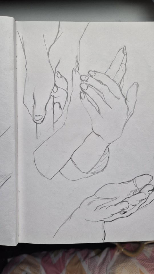
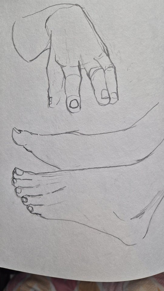
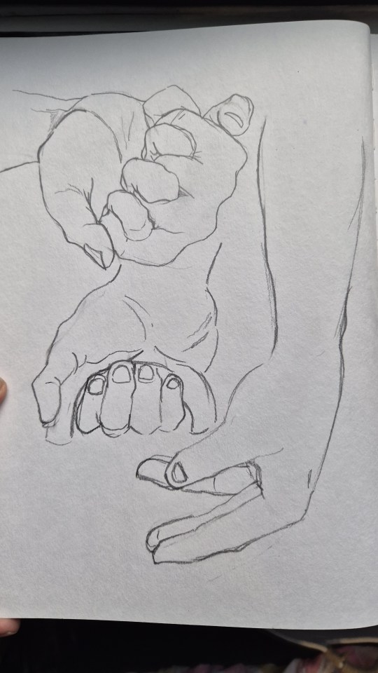
Post 1:
Hello, my name is Indranil Chakraborty. This is my blog to keep track of my progress, update my work and assignments while critically examining media that inspires me as well as the assignments and work that I create. On rare occasions have I been able to provide myself with constructive criticism without it turning into a rather negative spiral of criticism that eventually hinders my progress and demotivates me. For this very reason I have spent some time away from creating and I plan to change that in the coming weeks. I am still learning the ropes of maintaining a blog so kindly bare with me till I am able to establish a structure for the content that I post.
I would also like to establish some goals for myself to work on as the semester progresses (which definitely are subject to change) are as follows:
Be consistent and draw everyday
Attempt to study one creator every week as I believe this might be a good amount of time to understand and absorb certain aspects of their work such as line art, shape language usage of colour, so on and so forth. This will also include media such as articles, interview, process time-lapses, etc.
I would also like to study principles like anatomy and colour while doing other studies as well as and when I find time to do so
Finally, make sure that the self reflections and critical deep dives into my practice and study sessions are strictly constructive.
Its Sunday (20.09.24) here is some of the work that I have done after my practical class
Content Description:
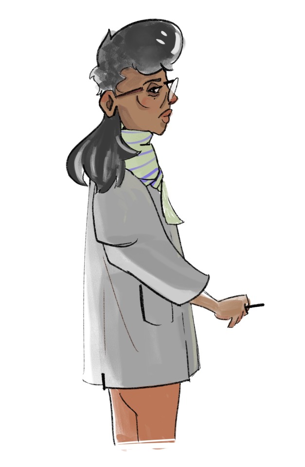
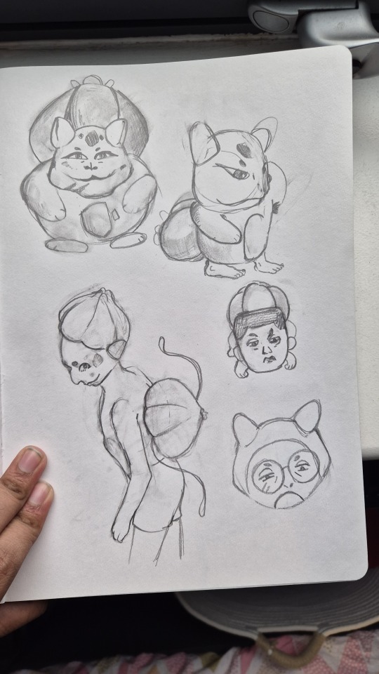
Over the last 3 days, I attempted to draw digitally, a medium that I am comfortable with and made two self portraits of myself. I have started a new sketchbook and not knowing what exactly to fill in my first page I went down the rabbit hole of Pinterest looking for inspiration that eventually lead me nowhere. I finally settled on drawing my Bulbasaur plushie that sits on my desk beside me after which I proceeded to practice a 1 hour session of learning the anatomy of hands and feet.
Critical Reflections:
After reviewing my work here are some criticisms that I would give myself:
The digital drawing show a lack of anatomy knowledge. The proportions of the face could be improved. The line weight of the self portrait could be improved in areas like the scarf worn since it does seem a little flat as compared to the rest of the drawing. Overall I feel that not enough intention was put into the illustration.
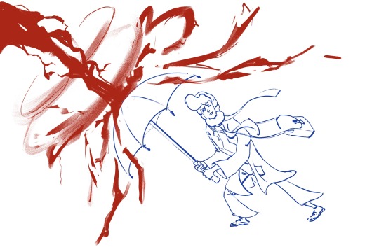
This sketch was just an ideation for the red vs blue prompt. I think it does get the idea across to an extent but only provides a faint detail as to what is happening in the scene. The arms of the character could be more anatomically correct. The left hand coming out of the sleeve seems displaced as compared to the position of the sleeve. The left shoulder should also be slightly higher. There are some dynamic aspects to the drawing that do show motion such as the flying scarf and the bag but the body of the character could definitely be pushed more.
for the traditional drawings, the Bulbasaur drawings do show some imaginative and iterative qualities. Being quick sketches they do not have the quality of detail. I could have also been more imaginative with the poses as they feel quite static with respect to the freedom I approached this page with. As for the hands and feet studies, I allotted myself about 5-6 minutes to complete each drawing. This was a very straightforward study of the subjects from the website https://line-of-action.com/practice-tools/hands-feet-practice . However it does feel like I approached the study from the perspective of being able to copy my subject rather than understand its shapes. I was unclear with the goal of the study which I think i should establish from the next study that I do.
1 note
·
View note