#Feature Contemporary Art
Explore tagged Tumblr posts
Text


the mspaint sessions
#featuring my friend#their paul doodle is the contemporary mona lisa i reckon#the beatles#THE PEETLES#john lennon#paul mccartney#ringo starr#george harrison#art tag
28 notes
·
View notes
Text

Use tiles to create artwork in your bathroom.
#bathroom tiles#tile backsplash#tile wall#tile art#bathtub#modern bathroom#contemporary bathroom#art feature#toya's tales#style#toyastales#toyas tales#art#home decor#interior design#architecture#april#spring#art house#artistic#creativity#creative#bathroom storage#bathroom style#home improvement#home design#home decorating
48 notes
·
View notes
Text
Quirky Accessory of the Week

Rubbery gold handbag with gold filigree and pearl framed canvas art print • Available at Pearl's & Swine
#art#fashion#contemporary purse#quirky design ideas#pearls & swine#unusual fashion statement#quirky accessory of the week feature
9 notes
·
View notes
Text

beware my wine rants
#hi im back and experimenting#ive had the gnarliest art block for the past like month and a half sorry! i made this to try to break out of it#for more context this happened on the night we got drunk and watched spiderman 2 (2004) and i looked up the soundtrack afterwards#and fell down a rabbithole bc switchfoot is on it#my dad used to listen to contemporary christian radio (probably still does) so i heard a lot of the more popular Christian hits of the 2000s#also christian stations will play what the fuck ever sometimes if a song can be read in even a little bit of a christian way#idk how christian the fray is (ig they did make 'you found me' but.) but ive heard 'how to save a life' on christian stations#and theres plenty of like. really lowkey christian bands. like switchfoot! and relient k!#most ppl alive in the 00s have probably heard 'dare you to move' just in nature. and christian stations loved that one#newsboys is on that spectrum somewhere i think. they did 'belly of the whale' for the Jonah a veggietales movie#and the dvd bonus features include the music video for that plus the video for 'a million pieces' which doesnt feel overtly christian to me#anyway! i hope everyone likes this vertical format! and the coloring. im still trying to adjust my style for that part#when csp says 'brightness' it does not nean 'color value' which is an issue for my new method#but yknow its a learning curve#furry#queer artist#smth smth#queer comics#trans artist
36 notes
·
View notes
Text
Quick animation practice🕷👁
#artists on tumblr#digital aritst#illustration#artwork#animators on tumblr#western animation#animated movies#animation#animatic#animated gif#animated#2d animation#2d animator#2d animated video#2d animatic#2d animated film#short film#animated feature#sketch#art study#peak animation#creepy art#surreal#weird art#weird girl#study art#art#anime#eyes#contemporary art
3 notes
·
View notes
Text


Currently thinking of Azurest South. It really is a beautiful building
#went to a contemporary art museum today for a class and there was an exhibit featuring art#inspired by and dedicated to Amaza Lee Meredith (architect who designed this building)#there was blueprints and progress photos as well as letters to Amaza from her students included in the exhibit that made me tear up a little#the one where a student referred to her as mom was the one that got me. you could tell so many thought highly of her#really made me happy to learn about the history of this building and Amaza herself#homos will live forever
4 notes
·
View notes
Text
Lucian Freud
Nacido en 1922, fue un pintor y dibujante británico especializado en arte figurativo y reconocido como uno de los mayores retratistas ingleses del siglo XX. Nació en Berlín, hijo del arquitecto judío Ernst L. Freud y nieto de Sigmund Freud. Su familia se mudó a Inglaterra en 1933, cuando él tenía 10 años, para escapar del ascenso del nazismo. Se convirtió en ciudadano británico naturalizado en 1939.
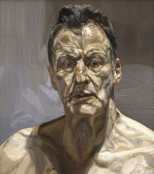
Reflección (Autorretrato), Lucian Freud, 1985
Freud estudió brevemente en la escuela central de Londres. Luego, con mayor éxito, en la escuela de Pintura y Dibujo East Anglian
En 1943, el poeta y editor Meary James Thurairajah Tambimuttu encargó al joven artista que ilustrara un libro de poemas de Nicholas Moore titulado La torre de cristal. En el verano de 1946 viajó a París antes de continuar a Grecia durante varios meses para visitar a John Craxton. A principios de los años cincuenta visitaba con frecuencia Dublín, donde compartiría el estudio de Patrick Swift. Siguió siendo londinense por el resto de su vida.
Las primeras pinturas de este artista, en su mayoría muy pequeñas, suelen asociarse con el impresionismo alemán (una influencia que él tendía a negar) y el surrealismo al representar personas, plantas y animales en yuxtaposiciones inusuales.
A partir de la década de 1950, comenzó a centrarse en el retrato, a menudo desnudos, excluyendo casi por completo todo lo demás, y a mediados de la década desarrolló un estilo mucho más libre. usando pinceles grandes de pelo de cerdo, concentrándose en la textura y el color de la carne, y pintura mucho más espesa, incluido el empaste. Chica con un perro blanco, 1951-1952 es un ejemplo de obra de transición en este proceso.
Los sujetos de Freud eran a menudo las personas de su vida; amigos, familiares, compañeros pintores, amantes, niños. Sus temas eran autobiográficos, todo tenía que ver con la esperanza, la memoria, la sensualidad y la participación, en realidad. Sin embargo, los títulos eran en su mayoría anónimos y no siempre se revelaba la identidad del modelo.
Freud pintó a otros artistas, incluidos Frank Auerbach y Francis Bacon. Una serie de enormes retratos desnudos de mediados de la década de 1990 mostraban a Sue Tilley, o "Big Sue", algunos usando su título de trabajo de "Supervisora de Beneficios" en el título de la pintura, como en su retrato de 1995 Supervisora de Beneficios Durmiendo, que en mayo 2008 fue vendida por Christie's en Nueva York por 33,6 millones de dólares, estableciendo un precio de subasta récord mundial para un artista vivo.
Obras
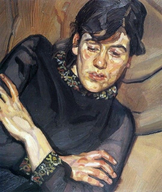
Bella, 1981
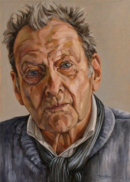
Autorretrato, 1985
#lucian freud#artist biography#lunas de alma#featured#contemporary art#arte contemporaneo#art history#expressionism#realism
8 notes
·
View notes
Text
Basquiat: A multidisciplinary artist who denounced violence against African Americans

John Harbour, Université Laval
The exhibition Seeing Loud: Basquiat and Music, currently running at the Montréal Museum of Fine Arts, demonstrates that the work of Jean-Michel Basquiat, which is usually associated with painting, also calls upon other media, including music — the main theme of this exhibition — literature, comic strips, cinema and animation, a much lesser-known aspect of his work.
Basquiat was born in New York in 1960 to a Haitian father and a mother of Puerto Rican descent. In the late 1970s, in collaboration with Al Diaz, he drew enigmatic graffiti under the pseudonym SAMO. The artist quickly made a name for himself in the New York art world (becoming friends with Andy Warhol and Madonna, among others). He then produced solo paintings and achieved international fame that continued to grow until his death in 1988.
At the time of the Black Lives Matter movement, Jean-Michel Basquiat’s work is more relevant than ever. It highlights racial inequalities and the lack of representation of racialized people in the media, but also the violence suffered by African Americans.

Love/hate for the cartoon
As a child, Basquiat dreamed of becoming a cartoon animator. When he became a painter, the television was always on while he worked in his studio, and regularly ran cartoons. These programmes and films were a great source of inspiration for the artist, who integrated several references to animation and comic strips into his paintings.
One of these works, which can be seen in the Montréal Museum of Fine Arts exhibition, is called Toxic (1984). The painting depicts a Black man with his arms in the air, with a collage in the background that mentions several titles of animated shorts made between 1938 and 1948.
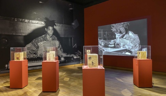
Could we say that the films are considered toxic by Jean-Michel Basquiat, despite his admiration for them? In fact, I think there is a certain duality in this picture: the artist loves the cartoon, but he hates it at the same time. The dictionary definition of the word “toxic” can mean someone or something that likes “to control and influence other people in a dishonest way.” The term therefore implies that the toxic element (the cartoon in this case) is dangerous in a way that isn’t apparent.
The violence of cartoons
The cartoon is often associated with childhood, pleasure, eccentricity.
This is a universe where anything is possible: in Gorilla My Dreams, directed by Robert McKimson in 1948, for example, the character Bugs Bunny talks, dresses up as a baby and imitates a monkey. It appears innocent. However, the cartoon can also represent the worst of humanity in a very sneaky way through the incredible violence it contains: the characters hunt each other, chase each other, hit each other, cut each other, kill each other and then start again. https://www.youtube.com/embed/G-fpqSdSnD0?wmode=transparent&start=0 Robert McKimson, Gorilla My Dreams, Warner Bros., 1948.
In Porky’s Hare Hunt, a film directed by Ben Hardaway in 1938 and quoted in Toxic, the character of Porky is injured by dynamite, abused even though he is in his hospital bed and tries to kill a rabbit. Basquiat, who consumed cartoons every day on television, knew that they were a reflection of 20th century American society.
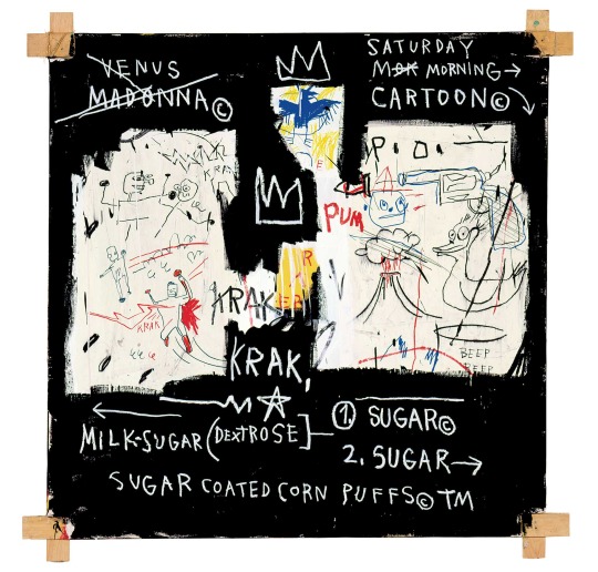
The violence that Basquiat denounces is so present in the cartoon that it seems, to a certain extent, to have become commonplace, like the violence seen on television newscasts (which he probably watched while he was painting).
Denouncing racial stereotypes
These cartoons are also violent because they often perpetuate racial stereotypes (not to mention the many stereotypes related to sexual orientation, gender, sex, body appearance, etc.).
Bob Clampett’s 1940 film Patient Porky, which is also mentioned in Toxic, features a scene in which a elevator attendant grossly and monstrously parodies a Black character. In Untitled (All Stars) (1983), Basquiat cites Max Fleischer’s 1920 film The Chinaman, which features a highly caricatured Asian character and Koko the Clown putting makeup on to impersonate him. https://www.youtube.com/embed/_WXrrOIWZKo?wmode=transparent&start=0 Max Fleischer, The Chinaman, Bray Studios, 1920.
By placing elements referring to animation in his compositions, Basquiat attempts to denounce a stereotypical and unfair worldview where racialized people are portrayed in an unrealistic way. Basquiat said that if he had not been a painter, he would have been a filmmaker and would have told stories where Black people were portrayed as human beings, not negatively.
So, the title of the painting Toxic carries several meanings. It refers both to the main subject (Torrick “Toxic” Ablack), but also to its relationship to popular culture and to animation, in this case.

This hypothesis is very likely since Basquiat produced several works denouncing police brutality against African Americans, including The Death of Michael Stewart (Defacement) (1983).
Basquiat died prematurely in 1988 at the age of 27. Other artists from the Black community, such as Montréal painters Kezna Dalz, aka Teenadult, Manuel Mathieu, and animation filmmaker Martine Chartrand have, in their own way, taken up his struggle and continue to fight for greater visibility of Black people in the arts.
John Harbour, Doctorant en littérature et arts de la scène et de l'écran (concentration cinéma), Université Laval
This article is republished from The Conversation under a Creative Commons license. Read the original article.
#art#race#jean michel basquiat#basquiat#contemporary art#painting#comics#cartoons#visual art#Black people#African Americans#featured
7 notes
·
View notes
Text
blue eye samurai is very fun but the central conceit is simply wrong. from 1547 black powder weapons were very much available in Japan and samurai fucking loved them
#the racial dynamic is also a bit off. europeans trading in japan in the 16th/17th century were not paler than japanese ppl on average#they were mostly portugese spanish and dutch and in contemporary art theyre depicted generally with darker features than japanese people#(probably because quite a lot of them were mestizos or african slaves)
3 notes
·
View notes
Text
'Gravity and Grace' by Shinji Omaki

In Gravity and Grace (2023), Japanese artist Shinji Omaki plays aronund with the existencial issue.
The installation, depicting magnificent vessels of flora and fauna, uses light to enpower shadows that cover the walls of the gallery.
#art#installation#sculpture#escultura#shinji omaki#2023#feature#featured#post#text post#text-post#contemporary art#exhibition#gallery#light#vessels#shadows#ljapan#floral#organic
4 notes
·
View notes
Photo
@a-captions-blog

FEATURED ARTIST: Karyn Olivier, Doubleslide, 2006. Installation view, The Studio Museum in Harlem, New York. Steel. 7 x 25 x 22 feet.
Courtesy the artist and The Studio Museum Harlem.
#it's like when those two performance artists met on the great wall of china before saying goodbye#except it absolutely wrecks ur genitals#karyn olivier#sculpturecenter#featured artist#2014#contemporary art#the studio museum in harlem#sculpture#queued
57K notes
·
View notes
Text


Hand Carved Stone Mushroom Water Fountain For Home Decor And Garden Decor
#home and garden#decor#home interior#decoration#handcrafted#interior#interior decorating#interior design#interiors#exterior design#home decor#garden decor#interior accessories#modern interior design#contemporary art#fountain#water feature
0 notes
Text
1K GIGI Prompts Collections 'Classical Bust: Vivid Contrast and Detail' 5882 Free 10 pages out of 1000 pages
Get Free 10 pages MTMEVE00560G_146_0001 – 1K GIGI Prompts Collections – Classical Bust, Vivid Contrast and Detail 5882 10PagesDownload 1K GIGI Prompts Collections ‘Classical Bust: Vivid Contrast and Detail’ 5882 series provides two documents, one document is 10 pages of prompts in 1000 pages, available for free download. One document is the complete 1000 pages of prompts, this is a paid…
#attire#broad brushstrokes#Canadian landscapes as backdrop#classical art#contemporary influences#emotive expression#emphasis on natural forms#facial features#green baseball cap#impressionistic influence#intricate details#modern touch#necklace#oil painting#realistic style#rich textures#sculpture#subtle play of light#traditional representation#vibrant orange background#vibrant yet controlled color palette#visual contrast#watercolor#white sculpture
0 notes
Text
hey i want to talk about how you should be promoting your work as an erotic author/illustrator
i'm writing this up because the marketing aspect of my work as an erotic author/illustrator is a science to me, and also because i'm the guy who gets unreasonably annoyed when i see other creators not properly advertising their work. you presumably want to make money off your work. this post will be written under the assumption you want to make money off your work but are doing a bad job at it. it will be very confrontational. if you read this and feel attacked you're right and i am attacking you.
this is geared toward selling erotic comics/writing/books/art as products. i will probably write more than one post about this subject so if i didn't touch on something you want to know more about, comment/send me an ask and i'll keep it in mind for the next one.
i will start with my first and least specific but most important point:
DON'T GET FUCKING CUTE
hi are you paying attention. i'm gripping you by the sides of your face. do not get fucking cute with what you are trying to sell. you are not a big enough property to get cute, nobody LIKES it when big properties get cute, and you are selling porn. you have to own this. you have to be up front about this. don't be tongue in cheek, don't be all teehee i wonder what this could be~, don't be secretive. you are selling a product. you have to fucking act like it. you are an adult selling pornography to other adults. i am GRIPPING your HEAD you NEED to understand this.
and to be clear when i say 'cute' i mean coy. i don't mean cutesy, as in the aesthetic. you can be as hello kitty pastel ten emojis a post uwu as you like when you're building your audience and generating hype. but when you start trying to sell, don't be vague, don't be sarcastic, don't mislabel your work as a joke and assume everyone is on it. because they're not.
you must always assume 75% of the people seeing the thing you are advertising have no fucking idea who you are. and that includes a huge chunk of the people who already follow you. they do not know who you are or what you've been working on for two months or why they should care about it. they just got here. somebody just reposted it. they are seeing it for the first time. most people are only looking at social media for a tiny chunk of their day. they are not keeping up with you. you cannot get cute about what you are trying to sell because nobody knows what it is until you tell them.
okay are you still with me. we are going to talk about clarity now.
YOU GOTTA TELL ME WHAT IT IS
good lord the amount of times i have gone to buy somebody's comic or book and had no idea what's actually in it or what it's about. who are the characters? why should i care about them? what do they do in it? what is the premise of this thing you want me to spend $5 on? why would you not tell me? i'm shaking you again. please i have to know what i'm buying i only have so much money to spend on porn.
porn, arguably more than any other genre, relies on knowing exactly what is in it. you do not want to surprise your readers with a kink they were unaware of! and on the flip side, you do not want to miss out on your target audience! if your book contains a hot spider babe laying eggs in an elf, you have to say so. not just so people who don't want to read about eggs know it isn't for them, but so the people who are egg crazy can see that and go "oh fuck YES i love EGGS here is my $5 and an extra $2 tip for catering to me specifically". a contents/features list is as much an advertisement as it is a warning!
as for re: who the characters are and why should i care, i'm sorry but you need to learn how to write sales copy. you have to write blurbs. you have to get good at the shit that goes on the back of a book. we all hate it but we have to do it. i want to know who the characters are and what the context is. i, personally, am not interested in contemporary stories as much as fantasy and historical. please tell me what genre this porn exists in so i know if it aesthetically appeals to me. pull some books off your shelves and see how they do it. hell man go look at mine.
while you're there, note that every single book of mine has a sample of what's in it. this feels like such a no-brainer to me but again! the amount of times i have gone to buy somebody's work and they don't show me what their work looks like! you gotta give me the first page or two! just enough that i know if i like the way your writing sounds, or the way you draw your comics! i don't know you! i am not going to trust that you're good at what you do just based on a cover. the cover is to get me to this step, it is not the only step. you have to show me that you're worth spending my money on!
to put it less cynically, you want to catch my interest. you want me to go 'oh i want to see more of this', you want me to go 'ahh i want to know where this goes!' you need to get me invested and craving more. earn my $5!!!
YOU HAVE TO MAKE IT EASY TO GIVE YOU MONEY
hey go look at your bio right now. go look at your pinned post. do you have a link to your patreon there? do you have a link to your itchio/gumroad/whatever? do i have to click more than once to get to the places you want me to go to give you money? why? why are you making me click twice? have we learned nothing from every website making you click an extra time when they make some stupid UI update and how much it pisses us off? i have already given up, i have forgotten you, i am not giving you my $5 today. put your links in the easiest places to get to them.
god literally as i was writing this post i went to go find somebody's itchio to see how they described their work and it was not anywhere on their profile. grabbing you and shaking you PUT THE LINK WHERE I CAN FIND IT. don't make it hard! make it easy! i am a dickhead sitting on the toilet scrolling, saw your post, and was interested enough to read further. but you made me go to your bio to find your linktree and oops i have already gone back to my timeline to look at the boobies in the next post. stop wasting precious bio space on DNIs and put your fuckin links there!!!
this is more for the twitter people, but: just put the link in the damn post. just say the word commission. just say it's for patreon. "wuh wuh the algorithm" it is not the damn algorithm it's that everybody hates advertising and nobody wants to retweet ads. putting slashes in the words doesn't do anything and you look like a fool. i have posted so much art that says it's 'a commission for ___" and it did exactly as good as any other art despite having the word commission in it. and by doing the slashes you just made it impossible for anybody to search your account for your commission information (which should be at the VERY LEAST in a post under your pinned tweet if you're not actively posting about them being open).
okay that went on a tangent i'm going to back to the point of putting the link in the tweet. put it in the first post. not in the first reply. don't tell them to go to your bio. put it in the post people are actually going to share. it's fine to put more information in the thread but people are only ever going to share the first post. so put the link there. you have to make it easy. putting links in tweets can hurt you algorithmically, even in the replies. so you're better off having it in the post that actually gets seen and shared. i don't want to open the tweet and scroll to get to your sales page where i ASSUME you will have put all the information anyway. put it in the tweet that just got retweeted by itself onto my dash!
also you have to share it a ton of times. i repost my shit every few hours when i'm trying to push a new product. as i said before people are not 24/7 looking at their timelines. they missed it the first time. they missed it the second time. they didn't get paid yet that week but they were after the eighth time and you reminded them again so they finally bought it. that i will still get sales every time i repost a book ad weeks after release says there are always people who missed it, or who only just showed up.
abandon your pride and shill. shills pay their bills. anyone who gets annoyed about it isn't giving you money in the first place. don't worry about looking like a sell out. don't apologize for plugging your own work. post about it often, post about it in different ways. post about it. post about it. you are not going to make money if people don't know you have something to sell them. if you want to make a career out of it, you need to act like it.
I DON'T HAVE A FOURTH POINT
kisses your forehead. i'm sorry for yelling at you. i've been making and publishing and selling adult art for the past two-three years and have got myself to the point where it pays my rent, and i got there by paying attention to what does and does not work.
please do your best to make money. i want you to make money.
as i said above i plan to write more posts on this subject, such as cover design, how to actually write sales copy, and best practices with running a patreon, but if there's things you would want to hear more about leave a comment or send an ask! i will probably be less aggressive on future topics. these are just things that have grinded my gears for a grip.
3K notes
·
View notes
Photo
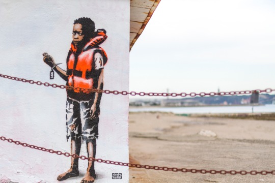
Hell to Hell: Goin’s Powerful Street Art in Cruz Quebrada, Lisbon Sheds Light on Refugee Struggles Goin, a well known street artist, has recently unveiled a moving and eye-opening artwork on Cruz Quebrada beach in Lisbon, Portugal. The piece captures the dehumanizing bureaucracy refugees face when they arrive at their destination, shedding light on this pressing issue. The artwork, titled “Hell to Hell,” was created using stencil technique and portray a […] https://streetartutopia.com/2023/05/05/hell-to-hell-goins-powerful-street-art-in-cruz-quebrada-lisbon-sheds-light-on-refugee-struggles/
#Featured#New Street Art#graffiti and public art#Photos#awareness#beach mural#contemporary art#Cruz Quebrada#goin#Hell to Hell#Lisbon#not banksy#Portugal#powerful message#public art#refugee crisis#Social issues#stencil art#Street Art#Vidar#STREET ART UTOPIA
0 notes
Text


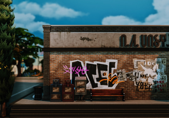


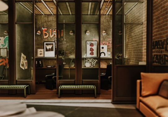
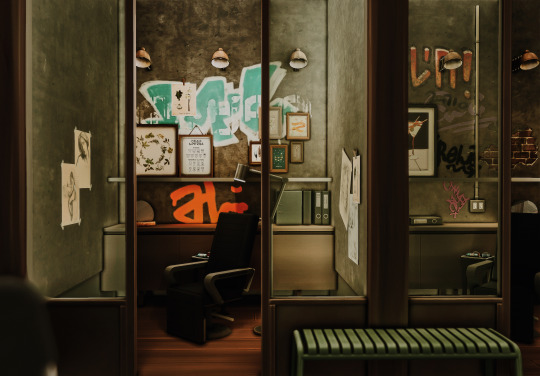

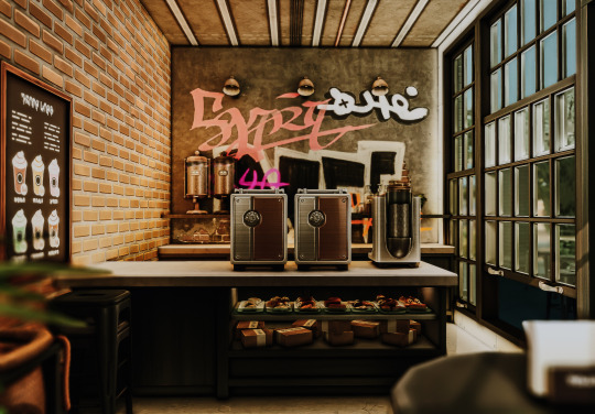

Ink Heart Tattoo Shop ♥ The Sims 4: Speed Build // CC
Ink Heart is a small industrial tattoo shop that combines urban edge with a welcoming vibe. The space features graffitied and exposed brick walls, giving it a raw and artistic feel.
➽ Speed Build Video
➽ Rheya's Notes:
● Hello my lovelies! It's been a while since I last posted a build. I'm still quite busy with school until end of August, so build releases are gunna be inconsistent. I will try my best to upload and will notify you all if anything changes. ● Anyways, for this build I used Cepzid's tattoo mod! I placed this build as a generic lot type, but you can also have it set as a cafe!
➽ Important Notes:
●Please make sure to turn bb.moveobjects on! ● Please DO NOT reupload or claim as your own. ● Feel free to tag me if you are using it, I love seeing my build in other peoples save file ● Feel free to edit/tweak my builds, but please make sure to credit me as the original creator! ● Thank you to all CC Creators ● Please let me know if there's any problem with the build
➽ Lot Details
Lot Name: Ink Heart Tattoo Shop Lot type: Generic or Cafe Lot size: 30 x 20 Location: I built this in San Sequoia, but it could be placed anywhere
➽ MODS
● Tool Mod by Twisted Mexi ● Functional Tattoo Chair by Cepzid Creations
➽ CC List
Note: I reuse a lot of the same cc in all my builds, specifically cc's from felixandre, HeyHarrie, Tuds, and Pierisim so if you're interested in downloading past, present, future build from me i suggest getting all their cc sets to make downloading a little easier! other creators include Sooky, Charlypancakes, Sixam, Thecluttercat, Myshunosun, awingedllama, Peacemaker, kiwisim4. This will also ensure that the lots are complete and are not missing any items upon downloading ! Joyceisfox ● Simple Live pt [4] S-Imagination ● Nota Living Room [painting] Simlicy ● Sketches Sooky ● Abstract Framed Art Wooden frame Xtc ● Graffiti Pack House of Harlix ● Bafroom ● Baysic ● Harluxe ● Orjanic pt [1][2] Bbygyal123 ● Aesthetic Collection ● Martini FelixAndre ● Berlin pt [3] ● Chataeau pt [2] ● Colonial pt [3] ● Florence pt [4] ● Grove pt [1] ● Soho [all] CharlyPancakes ● M&S Construction pt [1] ● Sleepy Head Collection ● Soak Harrie ● Klean [all] ● Kwatei ● Octave pt [2][3][4] ● Spoons pt [2] ● Jardane ● Livin Rum ● Kichen Lilac Creative ● Jewelry Collection [sign] Little Dica ● Rise & Grind Myshunosun ● Arrie [laptop] ● Gale Dining [rug] Peacemaker ● Creta [Plant] ● Post Modern living [artwork] Pierisim ● Autie Vera ● Calderone ● Combles ● David Apartment pt [1] ● MCM pt [1][3][5] ● Oak House ● Stefan bedroom ● Unfold ● Winter Garden pt [1] ● Wood Land Ranch Mlyssmakescc ● Pufferhead [wall art] Ravasheen ● Art Attach Graffiti Sixam ● Hotel Bedroom [desk] ● Teen room [wall light] The Clutter Cat ● Sunny Sundae pt [3] Syboulette ● Contemporary Haven [wall art] ● East Oak [wall art] Tuds ● 2nd Wave [chair] ● Cross [wall light]
● DOWNLOAD Tray File and CC list: Patreon Page ● Origin ID: anrheya [previous name: applez] ● Twitter: Rheya28__ ● Tiktok: Rheya28__ ● Youtube: Rheya28__
#ts4#sims 4#thesims4#sims#thesims#sims 4 cc#simblr#the sims 4 speed build#the sims 4 build#ts4 build#sims 4 cc build#ts4 sceenshots#build#builds#sims 4 build#sims 4 tattoo shop
2K notes
·
View notes