#FREE RESOURCE
Explore tagged Tumblr posts
Text



06 - Greenery
For Desktop View
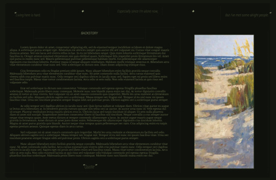
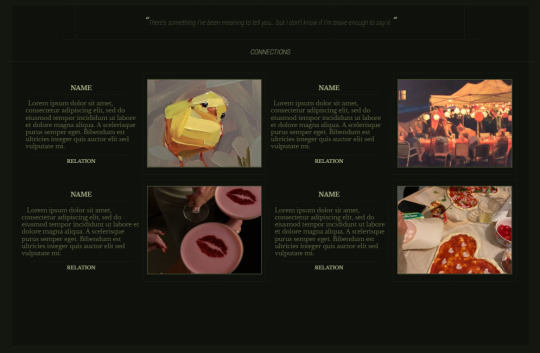
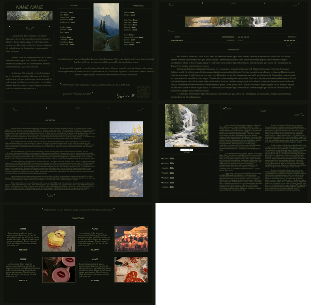
A FREE Google Doc themed with a nature/green aesthetic. Completely green for all you green lovers out there, this doc is sure to grow your garden... of grass. First page intention is to look like the back of a book. . . failed. And yes, that QR code leads to my carrd. Feel free to change it! Five pages, ten minimal pictures, focus aimed on information.
I find giving Google Docs for free to be much more reasonable than credit/payment, it's text on a document and encourages writers. Feel free to edit/copy/use as you wish!
To make your editable copy: File > Make copy
To edit images: Right click > Replace Image
To edit drawing features: Double click drawing > Right click > Replace Image
To make shareable: Share > Change access to "Anyone with link"
FIND THE DOCUMENT HERE
#google docs#discord roleplay#discord rp#roleplay#roleplay resources#character template#google docs template#minimalist template#oc template#roleplay docs#free google doc#free template#free#free resource#free resources
170 notes
·
View notes
Text
If you're a history nerd like me and want to read up on the topic of sex work in 18th and 19th century France, this is the book for you! Contemporary Prostitution: Study of a Social Question (1884) by Leo Taxil and translated by Jack Parker.

This book was never translated into English until I did so just over a year ago, so that other people could read the letters from real sex workers included and all the data about sex workers from someone who was arguing for the decriminalization of sex work back in 1884!
Get a PDF copy here and pay what you want, including claiming a copy for free if you don't have the money.
I'm Jack, the translator for this work, and I am a sex worker activist who happens to be bilingual in English and French. Between the slang, historical language, and the amount of euphemisms used for a profession as stigmatized as prostitution is, this took a long time but was well worth it!
I started reading La Prostitution Contemporaine with the expectation that I would be infuriated by the sexist and whorephobic commentary within it, but that it would provide me with context about the 1800s and the view of prostitution in that time period. While I was right that the stigmatisation of sex workers is rife within this work, I also found a fascinating and complex description of all the specific troubles sex workers face. I found that, despite still discussing sex workers as engaging in immoral behaviour and being decidedly homophobic and sexist, Léo focuses majority of his criticism on the police and on those who control sex workers.
Taxil makes repeated arguments in favour of police abolition, the decriminalization of sex work, and improving workers rights and eradicating poverty so that people are not pushed into sex work by a need for money.
This work contains commentary about lesbianism in the Victorian era, and lesbianism within brothel environments. It provides amazing insight into the homophobic views people had in the time period, as well as specific information about the lives of lesbian sex workers. There are scathing critiques of the morality police from the time period, particularly with regards to their treatment and registration of sex workers! It is rich with citations from other authors about how "maquerelles" and madams and "souteneurs" all interacted with sex workers and what those sex workers' lives were really like. The book is also one of the only works from the time discuss male prostitution, with an entire chapter dedicated to it and mentions in several chapters throughout the book.
Would love for more people to read this history that I worked so hard to translate!


#anti swerf#sex work is work#books#reading#history#free resource#while throwing a little money my way would be great I'd just love for more people to read this
58 notes
·
View notes
Text
Sebastian Stan - Falcon and the Winter Soldier
By clicking the links below you will be taken to pages with 617 gifs of actor Sebastian Stan in his role as James "Bucky" Barnes in Falcon and the Winter Soldier. All of these gifs were made by me so don’t claim as your own, post in a separate post, or post in your own gif hunts. If you would like to crop these into gif icons please message me first as you MUST credit if you redistribute. Credit includes tagging me in your hunt, and including a link to this post on your post.
Please do not add this pack to masterlists without contacting me first.
I recommend being familiar with the source material before opening this pack.
Do NOT respond to this post with explicit messages. I can see your tags so that includes in them.
Please make sure you have read my rules before you message me about editing.
You can find the rest of my gifs of Sebastian here.
Please reblog if you use or are a RPH and spread the resource around.


part 1 // part 2
#sebastian stan#sebastian stan gif hunt#sebastian stan gif pack#rph#gif hunt#gif pack#gifhunt#gifpack#gh: sebastian stan#gp: sebastian stan#gif hunt: mine#marvel resource#free resource
44 notes
·
View notes
Text
Gearrscannán ar YouTube
Short films on YouTube
(Don't worry, everything has English subtitles in the videos themselves)
Fán https://youtu.be/e3xnvkMp_1Q?si=i-4pmljDbzA8bRtu
Created by the incredible @nibmoss, an absolute queen (Bánríon). It is a short sapphic story about 2 best friends who end up together and it is my favourite short story ever!!! It is also my favourite piece of Irish media in existence!!! I love it!!! It is incredible!!! BEYOND AMAZING!!!
Yu Ming is ainm dom https://youtu.be/JqYtG9BNhfM?si=jnZjP4LozqOhNxkI
This is a classic. Ive had 4 different teachers show me this over the years, and my first year Irish class studied it exam style. It was the first piece that we studied and everyone LOVED it, people were quoting it all the time. Every second conversation had someone using a line from it. It's a crows pleaser and simple to listen to even without the subtitles provided. It also has a great storyline about a man who is fed up with his life in China and learns Irish to move over here, and well (bhuel) , I won't spoil the plot twist for you
Lipservice https://youtu.be/4QP0eEhhTSo?si=1DLvo_ECRhwGI5s8
It's the day of the oral exams and everyone is terrified (bhí imní an domhain ar gach duine), people are rehearsing in the bathrooms and speaking French instead of English, the stuff that half of them come out with is absolutely gas, this one is such a bit of craic, I was in stitches. And the bit at the end is so sweet. Is breá liom an gearrscannán seo agus beidh mé mo scrúdú béil i dhá bhliain 🙈🙈🙈 (I loved this short film and I've my speaking test in 2 years🙈🙈🙈
Filleann ar feall https://youtu.be/Tay7eMxas2k?si=q3ksVJVYJ7E_xxoa
IT'S CILLIAN MURPHY AG CAINT AS GAEILGE!!! You can't beat a bit of Cillian, he's a national treasure. And this is 2000 Cillian, he's so young (this was before I was born) he's in the Gaeltacht for his holidays with a grumpy friend, on a job to sell some Putchín, and he is everyone's favourite sweetgeart, a bit of a himbo, and a respecter of old ladies. Agus deir duine sa sna tuairimí (a person in the comments said that it's like Breaking bad, but with an Irish teacher that instead of a chemistry one (I've never seen Breaking Bad, so I don't know how true that is, but I do know that this was AR FHEABHAS!!!
Rúbaí https://youtu.be/jjYx5v2BUWo?si=tFu1ektBvHNkoQFB
This is a short story about a little girl (cailín beag) who's class is about to make their 1st Holy Communion, but she doesn't believe in God (ní creideann sí i nDia). She's everyone is trying to convince her that god is real and she's just like "nope, read a bit of Darwin, he's great, I'm off to collect worms", even to the priests face and towards the end there's a bitter sweet twist which gives a LOT of background. This was a nice, easy watch, the little girls was so cute, there were a couple of laughs (cúpla gáire) and the vocab was nice and simple
Gaiste https://youtu.be/Xr-V7vg_Y2Q?si=cMMNqPLkmtugbg8t
Very simple vocab, good message, kind of like a fable, big "One of us is Lying" vibes. Nice short film overall
Fíorghael https://youtu.be/t3Kv4fZ2SOE?si=bHibiFJyRUcvZ-TZ
This ones a bit older, but it's still a good bit of craic. You need to wait a couple of minutes to get into it, but the end is brilliant (Caithfidh tú cúpla nóiméad a fanacht chun dul isteach ar, ach tá an chríoch go hiontach)
Sylvia https://youtu.be/fi_4aweOP4w?si=ZCfUAfYaD73IVn8r
There are plot twists, and then there plot backflips, this was the later. This is so weird, but I really enjoyed it at the same time
Ciúnas https://youtu.be/cGfuQ-HeTmk?si=WRPGmo-UNQ0bw9mA
There's not much dialogue, but all of it is very casual, so you still get to pick up a few words that you wouldn't find in a textbook. The storyline is quite sweet, but please be careful watching because it although it centres around her family's love for her, it is set on the way home from the hospital after she tried to end her own life
#ash’s originals#Gearrscannán#resources#online resources#free resource#youtube#irish langblr#irish language#ag foghlaim gaeilge#gaeilge#as ghaeilge#langblr#Studyblr#Adhd studyblr#Spoonie studyblr#This is such a great way to study when you have no spoons#It requires like 0.05% energy for me#So I love doing it
129 notes
·
View notes
Text
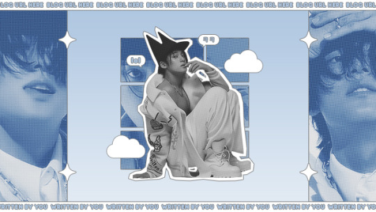
* ( ❀ ˆ꒳ˆ˵ ) ♡ Ꮺ 𝗧𝗜𝗡𝗬𝗧𝗢𝗪𝗡𝗦 — 𝖲𝖴𝖯𝖤𝖱 ੭

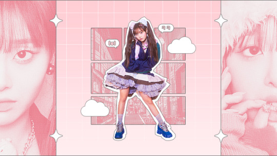
— introducing super , the latest psd template from tinytowns ! this template is supposed to be used for headers or pinned graphics + has been lightly inspired by comics + njz 's music video for hy.pe bo.y ❀ moderate photoshop knowledge is required to edit this template effectively , but it's really all just clipping masks + stroke layers : you are free to reach out at any point through ask for help ❀ download link is in the source code + under the read more along with some credits ❀ the font used is arista 2.0 alternate + has been linked below ❀ please like + reblog if you found this resource useful ❀ EDIT : updated 06/06/23 for no bars ver psd , prev + download under the cut ( ˘͈ ᵕ ˘͈ ♡) ~
❀ DOWNLOADS.
super template - here
super template ( no text bars ver. ) - here
arista 2.0 alternate - here
note: please be careful with the above link , i cannot remember where i actually got this font but i believe it was this source . if that's too much of a risk for you , i'd also recommend the font poppins which can be found here !
❀ EDIT.
coco from the future here letting you know that you must keep the top + bottom bars in order for your header to size correctly in the tumblr dashboard ! you can hide the text but don't remove the bars <3
UPDATE : bars issue solved with a resized version for people who want to use super as a header but without the bottom + top text bars. download this version here + look at the preview below !
❀ CREDITS.
sparkle icon - Sparkle icons created by SeyfDesigner - Flaticon
cloud icon - Cloud icons created by Freepik - Flaticon
halftone pattern - sonicspeed123
#supportcontentcreators#photoshop#free rpc#free rph#rph#rpc#photoshop templates#muse template#photoshop template#header template#pinned template#ps template#template psd#template#resource#rph resource#rpc resource#free resource#free psd#rph template#rpc template#tinytowns#m: templates#m: resources#m: resource
419 notes
·
View notes
Text
do you like free zines and hate the rise of fascism? then this zine is for you!


i made this zine, "zines are the future", as a way to spread the word about why zines are so important right now in our current sociopolitical climate. i wanted it to be easily accessible, so, you can get the printable PDF for FREE!
you can find the zine here! you can either pay $0, or throw me a tip if you feel like it. but just you reading and having this zine in general means so much to me regardless <3
if you want to keep up with me more, find me on substack! i share zines i get from other people, events i go to, general updates, and my own writing as well! i'll also be posting another free zine soon :)
#art#queer artist#zine maker#zines#zinester#zine#colorado zine#queer art#mutual aid#free zine#pay what you can#pwyc#free art#free resource#antifascist
28 notes
·
View notes
Text
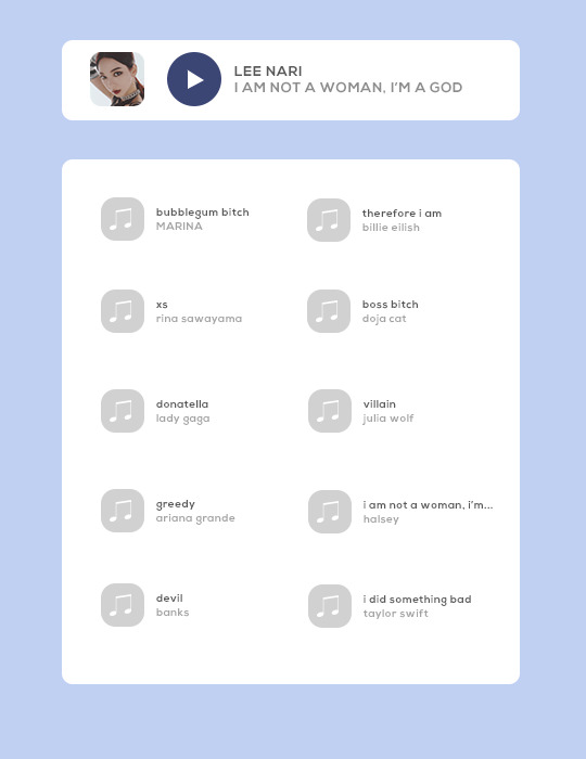

template: now playing...
this is a fully customizable playlist template. feel free to use it for any of your musical needs, and edit it as you please!
DETAILS
* font used: keep calm * this includes both the ten song and five song versions of this template. * please do not steal, copy, or use this template commercially * see here for full rules * please credit me if you use this by linking to this blog or my payhip * please like and/or reblog if you use this (or like it!) * customize it to your heart's content, so long as you still credit me * this is a free template; share it with your friends! (but please still credit me) * feel free to send me a link of what you make with this 💓 * don't hesitate to message me with any questions or problems you run into!
🌻 download for FREE on payhip!
#playlist template#playlist psd#dailyresources#hisources#rp resources#rp template#rp psd#roleplay resources#roleplay template#roleplay psd#free rp resources#roleplaying resources#rp playlist template#rp playlist psd#free resource#templates#*zena#*zena:templates#*zena:free
362 notes
·
View notes
Text
𝐅𝐫𝐞𝐞 𝐔𝐬𝐞 𝐃𝐢𝐯𝐢𝐝𝐞𝐫𝐬 𝐟𝐨𝐫 𝐀𝐥𝐥

@gatheredfates has had me playing with dividers for the bulk of the evening. She's inspiring like that!! But it has made me want to overhaul the matching ones that I've been using for literal years! I wanted to make some somewhat non-character centric ones that everyone could use if they were so inclined to do so.

So if you like these and want to use these to break up your blog pages, go for it!
(Credit when you use these is appreciated, but not required)

The above images are only samples of the many dividers I've made at this point. There is a full gallery in the links below that I'm continuously uploading. Please feel free to use them as much as you like!!

#free resource#divider#tumblr graphics#graphics#free#if ppl like these I'll make more of them later maybe!#jk I added more#I'll probably just keep adding on to this post so that I'm not spamming my blog over and over.
298 notes
·
View notes
Text


I need to start posting here more, so here is a quick dump of all the FREE holiday/winter PSDs available on my DeviantArt. Links under the cut.
—— —͙ – - ⳑⲓⲛⲕ⳽
Merry / x
Candy Cane / x
Icepick / x
Winter Skies / x
Frostlight / x
Winter Whimsy / x
#psd#psd coloring#resource#free resource#deviantart#graphic design#premades#edits#holiday#christmas#winter#december#editing
15 notes
·
View notes
Text
youtube
Frutiger Cosmeo Overlay package


9 notes
·
View notes
Text
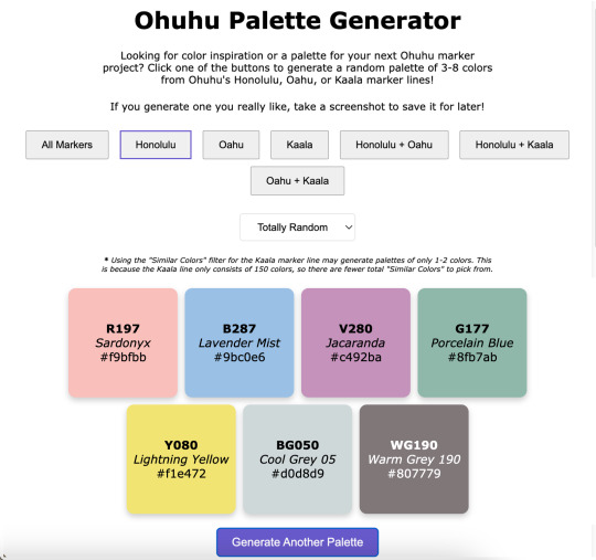
Ohuhu Palette Generator
----------
Hey look, I am actually capable of finishing & posting something!
What can I say? Life was just too chaotic the past couple of months and something had to give. Art posts were unfortunately the easiest thing to cut. 😅
Anyway. I have managed to chip away at a few projects in between other things, and this in particular was kind of a spur-of-the-moment decision I spent most of January working on: A very basic website where you click a button (or two) and get a random assortment of Ohuhu marker colors to then use however you see fit! ✨
If you are interested in listening to me ramble about how exactly we got here, that's what the "Keep Reading" button is there for. 😉
Like My Art and Want to see more of it? Here's All My Links! ⭐️
----------
Well Sparklers, this is certainly not how I expected to start off 2025 (nor did I plan to end 2024 as silently as I did as far as art posts go), but here we are! 🤗
Quick Recap: I made a very bare-bones website that will generate palettes of randomly selected Ohuhu markers colors for you!
I've probably said this somewhere before, but it bears repeating: I've been slowly but surely chipping away at various projects behind the scenes, a couple of the bigger more involved ones being related to yes, Ohuhu markers. [And for the record, no I really didn't forget about OhuHueVember, this past November just turned out to be one of the most chaotic and busiest of my entire life, and unfortunately putting art posts on Pause was what made the most sense at the time, and then December was just naturally busy what with Christmas and Family and all.]
A few days into the New Year, while I was taking a break and scrolling social media, since I am pretty deep into the wider Ohuhu Community at this point, I saw a kind of post that I've seen a few times before: Someone asking about generating color palettes of Ohuhu markers for coloring (as in adult coloring books). Usually, the "answer" to this is to use an existing color palette generator (of which there are many) and just manually match your markers to the colors, but that's not usually as easy of a solution as people are looking for.
I think there's at least one generator out there that can tell you Copic marker (and maybe Prismacolor pencil?) matches for the colors it generates, but it hasn't quite caught up with the boom in popularity that Ohuhu has had, so instead of matching to the color itself, you'd just be trying to match to the Copic color instead, which I would argue might actually be harder to do, even with some community resources that are out there.
The point is I know in the Coloring Community, people tend to like easy solutions and there really wasn't one for this specific problem. And I've known this for a while—since the first time I saw a post asking for something like that, which was many, many months ago (maybe even a year or more), but yet for some reason this most recent, totally inconspicuous post sighting was the straw the broke the camel's back and made me finally snap:
Surely there has to be something out there were you can put in a custom list of colors and it'll randomly spit like 5 of those colors back out at you. There are all kinds of random generator tools out there, surely at least one could do something like that, couldn't it?
So down the rabbit hole I went.
There wasn't a terribly straight line that lead me here and I went back and forth to a few things a few times, so I'll just give you a list of the highlights that had the most influence in how we got to this point:
I tried just about every keyword combination I could think of for "custom palette generator," "make your own palette generator," "make random color palettes," "color randomizer," etc. Even if it wasn't terribly fancy and the absolutely barest of bones of the concept I described. No real luck there, but it's very possible I just totally missed something.
I eventually checked Flippity.net because I love their Flippity Manipulatives tool (for digital Mini-Magnets), and their "Flippity Randomizer" would have worked except it has a very strong default color palette for what the final randomizer looks like. While it still would have been totally functional otherwise, I know the strong color mistmatch could very well be a dealbreaker for some people to not want to use it at all. (And, to be fair, the final Flippity links tend to be...long and suspicious looking if you've never seen one before.) You can use images with the Flippity Randomizer, but the thought of having to make 300+ separate small image files that would also need to include the color names and numbers directly in the image and then also put them in order in a Google Sheet sounded torturously tedious (even for me), so I filed that idea away as "Plan C" and kept looking.
Flippity did give me the idea to try looking for more generalized randomizers that could be re-purposed for what I wanted since theirs' was originally for making sentences. Through that, I finally stumbled upon perchance.org
Perchance all by itself was a big step in the right direction because it's entire purchase is making your own generators and you can use existing Perchance generators as a starting point to make new ones.
So imagine my delight to learn that there have been a few color generators already made with Perchance, and buried among them even a couple of Ohuhu ones!! 😃
But you'll notice my final generator isn't running through Perchance. Suffice to say, I know just enough about coding to be a menace, but not enough that I could truly say I ever really "know" what the heck I'm doing. My "coding experience" consists of:
Messing around with CSS and Journal Skins on deviantArt, back before the Eclipse update when those were still Things™
Many half-hearted attempts to make a Blogger blog, all of which were eventually deleted and lost to time
Creating and Maintaining Fandom Wiki pages (and, within the last couple of years, a whole Wiki for my own personal use)
Relatedly, I briefly tried messing around with some code on Toyhou.se but that ended up going nowhere
Playing with a premade theme here on Tumblr to make my page look nicer
And anyone with real coding experience might gather from that list that I certainly don't have the skills to build anything from scratch, but I can generally fumble around with existing code and figure out how to change things to make the end result look the way I want. So, as I said: I know just enough to be a menace.
This means that I started off by spending a lot of time hopping back and forth between different palette generators that had already been made with Perchance and Google while trying to combine various elements I liked in a way that ran smoothly...and also trying to not "break" anything so it would run at all.
I kept hitting walls with Perchance because, as I eventually figured out, I kept finding solutions and suggestions that were for "regular" HTML coding, not Perchance's specific variety.
After some Googling, this led me to move over to Glitch.com so that I could use regular HTML code but also still see the "live" results alongside the code, which was something I really liked about Perchance (and was familiar to me from Tumblr themes).
I also thought I'd end up making posting the final site through Glitch too, but we'll get to why that didn't happen in a bit.
The primary culprit that had me switch from Perchance to Glitch was the fact that I realized the code would be so much longer and probably what would be considered "messier," and I would guess more difficult to update at a moment's notice if I had to manually type 300+ color number codes, names, and hastily-selected hex codes (just to have a visual representation of the color) in there, let alone if I decided to basically do that twice to cover both the Honolulu and Oahu lines.
I keep a few different spreadsheets for Ohuhu markers already, so I wondered if there was a way to get the code to reference something like that instead to keep the code itself "cleaner" and maybe make edits/additions to the color list easier in the long-term. And lo and behold—There is! You can, apparently, paste in "CSV" Google Sheets links in a specific way into the code and it'll look at those instead of having to type everything directly into the code itself. I did have to make three separate spreadsheets—One for Honolulu, one for Oahu, and one for Kaala—but I was able to copy and paste a lot of the information I already had in my other spreadsheets into those, so overall that was still way easier than the alternative! The catch is that, as I alluded to, there might be a way to do that using Perchance, but the results I was finding were all for regular HTML code and I really did not feel like chasing down Perchance-specific instructions. So to Glitch I went.
Moving to Glitch did have the additional bonus of me being able to paste in the widget for my Ko-fi Page, which I only thought to do because I got a Ko-fi notification in the middle of working on the code and while I was checking that, I remembered: "Hey doesn't Ko-fi have like an HTML thingy you can put on your website?" [They have two, actually!] Anyway. I got what I'd already been working on moved over to Glitch, which was most of the basic set up for the page; I was just using a placeholder list of colors from OhuHueVember so I could get the Categories and page layout taken care of first. Then I did kinda the same thing—I set up the basis for the spreadsheets I'd need using the OhuHueVember list as placeholders since I already had hex codes picked out for them and wanted to make sure the whole spreadsheet thing was actually going to work before I went any farther.
Once I did verify that method was working, I got to take a very tedious detour and actually fill out the spreadsheets with the proper information. As I said, I was able to paste in a lot of what I needed from my other spreadsheets—The number codes and names for all the colors—but it was that last piece of information I needed for each color that ended up taking the longest: The hex codes. Since I wanted to have this thing at least functional sooner rather than later, I did not have time to go through and meticulously curate matching hex codes for each color like I did for OhuHueVember, and technically I couldn't have done that even if I wanted to for the Oahu and Kaala lines since my collection is all Honolulu. So I relied mostly on quick eyedropper color-picking from swatch photos from my collection and photos/images online for the rest.
From that, I know a lot of the hex codes are not good matches, but again: The point was to get everything functional first. Especially since I was able to switch to using spreadsheets to store the information, I can always (and intend to!) go back and update the hex codes to better matches later on.
Still: Once I got all the hex codes filled out, the most basic version of the generator was in fact functional! 🎉
That by itself was super exciting and I had to spend several minutes generating palettes just because I could now...But me being me, and not always knowing when to quit when I'm excited about a project...I wanted to do more, especially now that I was working in regular HTML coding.
So I spent the next couple of days trying to figure out how to add a Filter so people could narrow down the types of palettes a little more. My very first thought was Pastel, since I know soft/pastel palettes tend to be kind of popular in coloring communities, and then I figured if I was going to do Pastel, why not include bright "Vivid" pastels and dark "Moody" ones, too? [And a little later on I ended up adding a "Neutral" filter for greys + earth tones too, just because I could.]
Getting the little dropdown button in there for the Filter wasn't actually that bad, but getting it to actually filter like it was supposed to was another story. I lost count of how many times I accidentally broke the whole generate (mostly buttons not working like they should) while trying to get the filter to cooperate with me. 🫠
I did eventually....mostly get both the filters and the marker line buttons to work at the same time after enough trial and error, though.
And originally, this was the point in the story where I had to explain that I did run into issues with having "Kaala" + "Similiar Colors" in the dropdown selected at the same time causing the generator to freeze up about 7 out of 10 times, even though everything else was working fine, and I couldn't figure out how to fix it to save my life. 🙃
But! Shortly after I started writing this description I took a procrastination break and I went back in to try and clean up some of my notes I'd left in the code to tell the different sections apart...And I couldn't help myself. I had the code in front of me, so I started fiddling with it again.
Finally I hit the right keyword search I needed and was able to find a solution that actually worked and I could mostly just copy and paste in without breaking anything else in the process! 🙌
As I had suspected, the problem mostly stemmed from the fact that there are just a lot less Kaala colors to pick from—150, vs. the over 300 for either Oahu or Honolulu. So sometimes the generator would try to pull 3-8 "Similar Colors" and it just...couldn't because there weren't 3-8 colors that fit the "Similar" range it was calling for.
So I put in a few lines that basically force it to just use whatever colors are available even if it's not the intended 3-8...This does mean (as noted in the preview image and on the site itself) now you'll sometimes get just 1-2 colors with that specific combination (Kaala + "Similar Colors") but I think that works a whole lot better than the entire page bugging out.
But so, okay! Generator is (mostly) working as intended and I even added some extra things I hadn't originally planned on—I even got really crazy and tried adding some SEO things to the code because I found a template and you hear so much about how important that is now [I can't tell if it's really working or not, but it's in there)—Great! But there was one last thing that was bothering me...
Glitch has a limit of 1000 active hours per month on a project, and that includes both hours I spend editing the code and time people spend actually using it. Logically, do I really think I need to be worried that my very basic site that will only appeal to a very niche community within a niche community will come anywhere close to actually hitting 1000 hours of activity in a month? No.
But I also know this is the internet and sometimes you post things and they get way more attention than you expect (as sort of became the case with Ohuhu markers themselves), and to be fair I have no statistics whatsoever on the kind of time people usually spend on palette websites, so I really have no way to know if 1000 active hours is even an unrealistic expectation or not, in either direction.
Between that and past experiences with "Oh, I'll worry about that limitation later when it actually proves to be a problem," I decided to look into other options that wouldn't be limited by hours, and after a cursory look around, GitHub is probably way more complicated than what I really need, but it felt like the obvious choice. At least I'd actually heard of it before!
I can't edit the code "in real time" like I can with Glitch (at least not without signing up for a subscription, I don't think), but so far I can still edit in Glitch and just copy & paste the updated code into GitHub, so that'll work for me. And it might be for the better anyway since that's another layer between my trial-and-error editing and the final site, so if I go back and try to change or add to the site in the future (which I very well might) and I accidentally break more things, it won't effect the "live" site people are actually using. 😅
I must admit I kind of want to keep toying with the site to see just how far I can push it...And it's given me some ideas for other projects, too, but I have to draw the line in the sand somewhere so people can actually use it and it's not just a private project I tinker with sometimes for all eternity 😆 😊
At least I did accomplish what I originally set out to do + a few extra things, so I don't feel like it's really "missing" anything and it should be plenty usable even if it's not totally perfect. (And I'm speaking mostly of the imperfect hex codes when I say that, for the record.)
Like I said at the beginning: This is definitely not how I expected to start the year off, but I'm really happy with the end result and I'm cautiously optimistic about where/how things might go from here.
In any case, I hope any of your Sparklers that chose to try it out like/enjoy the generator too...Or at least that you got some enjoyment out of my rambling about it here. 😆 (Which I'm assuming you have if you managed to get this far....)
The Ko-fi widget is there on the final site, but I would like to get better at promoting myself and my work so it bears repeating: If you do like the generator and feel like sending a little monetary support my way, my Ko-fi Page has a few different ways you can do that. And if it means anything to anyone: My Ko-fi Supporters got a little early preview of the generator before today and if I add anything to it in the future, they'll probably get an early look at that too. 😉
I think that's going to do it for me here today, though. It's been a while since I made a "big" public post so I have to go get re-acquainted with my cross-posting process...Which I'm not really looking forward to, but oh well—has to be done!
I look forward to seeing you Sparklers again (hopefully) very soon...! 👋
----------
Website created by me, MysticSparklewings
The Generator/Website is not officially affiliated with or sponsored by Ohuhu
----------
⭐️ Like My Art and Want to see more of it? Here's All My Links! ⭐️
#mysticsparklewings#xxmysticwingsxx#ohuhu markers#alcohol markers#copic markers#limited palette#palette challenge#color challenge#art supplies#art resources#resource#free resource#cool websites#coloring tools#adult coloring#coloring challenge#colors#art inspirations#palette generator#markers#art tools#color palettes#ohuhu.
8 notes
·
View notes
Text

MAGAZINE PSD
insp ( x )
this is a free psd. please click the source link to be directed to the template.
you will need photoshop to use this.
for personal use only! do not resell or redistribute
you may edit this template as much as you'd like
please do not claim as yours and credit when using this template
please like or reblog if using
if you have any questions, please reach out to me via tumblr asks!
106 notes
·
View notes
Text
Sophie Skelton Outlander Season 4
By clicking the links below you will be taken to pages with 1,443 gifs of actress Sophie Skelton in her role as Brianna Fraser in season 4 of Outlander. All of these gifs were made by me so don’t claim as your own, post in a separate post, or post in your own gif hunts. If you would like to crop these into gif icons please message me first as you MUST credit if you redistribute. Credit includes tagging me in your hunt, and including a link to this post on your post.
Please do not add this pack to masterlists without contacting me first.
I recommend being familiar with the source material before opening this pack. This pack only contains moments from the 1700's and no modern resources. It does NOT included any gifs from that scene.
Please make sure you have read my rules before you message me about editing.
You can find the rest of my gifs of Sophie here.
Please reblog if you use or are a RPH and spread the resource around.


part 1 // part 2 // part 3 // part 4 // part 5
#sophie skelton#sophie skelton gif hunt#gif hunt#gif pack#rph#sophie skelton gif pack#gifhunt#gifpack#gh: sophie skelton#gp: sophie skelton#gif hunt: mine#free resource#period resource
61 notes
·
View notes
Text

Some free kitty brushes I made!
#my art#furries#doodles#furry#furry art#furry fandom#safe fur work#clean fur#furry artist#clip studio paint#free brushes#brushes#free resource#artist#tutorial#big cat#cat#feline#drawing#drawing resources
19 notes
·
View notes
Text
* ( ❀ ˆ꒳ˆ˵ ) ♡ Ꮺ 𝗧𝗜𝗡𝗬𝗧𝗢𝗪𝗡𝗦 — 𝖠𝖫𝖦𝖮𝖱𝖨𝖳𝖧𝖬 ੭

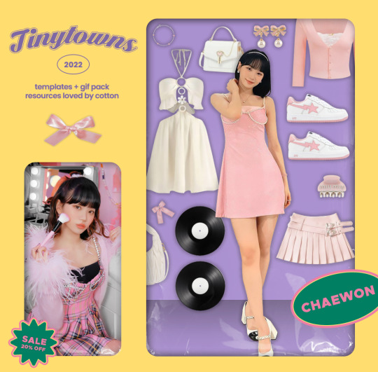
— introducing algorithm , the latest psd template from tinytowns ! in this mini - drop you will get the algorithm template, a duplicate of kpop girl group IT/ZY's graphic promos for their upcoming jpn release of the same name ❀ it looked relatively simple to create , so i went ahead and remade the graphic into a temp with a couple of personal changes ( mainly to the left window as it was just text & looked somewhat boring in an already text - heavy graphic , though the option to switch to that is still available ) ❀ experience in photoshop is recommended for this template in order to work comfortably with drop shadows & strokes ❀ download link is in the source code + below the read more is the fonts used & some necessary credits ❀ please consider a like + reblog if you found this useful ( ˘͈ ᵕ ˘͈ ♡) ~
❀ CREDITS.
based on these promos - here
pngs of clothes + accessories taken from multiple pinterest sources
highlight overlays found here , which has a link to the og creator - here
❀ FONTS.
poppins - found on go/ogl/e fonts
dark larch - found on da/font
clarity city - taken from this pack here
any questions? feel free to send me an ask !
#supportcontentcreators#photoshop#free rpc#free rph#rph#rpc#photoshop templates#muse template#photoshop template#graphic template#ps template#template psd#template#resource#rph resources#rpc resource#free resource#free psd#rph template#rpc template#tinytowns#m: template#m: resources#not me JUST realizing they switched up the spelling to a stylised version .. man
121 notes
·
View notes