#Double Exposure: Community Portraits
Explore tagged Tumblr posts
Text
Musings: Murdoch & Photography - Analog Horror Edition™
I was just thinking about Murdoch and how his exposure (haha, photography pun!) to the nature of the town is potentially even more horrifying with the added layer of his main occupation, aka being a photographer.

------ SPOILERS BELOW CUT ------
His interest in photography probably came first. But at the point where we meet him in the story, regardless of routes, his passion is an integral part of his character, and I think it's safe to say that it is inseparable to his investigations and larger quest to ''fight back'' against the influence of Echo. These two things feed each other, and probably have for the longest time.
And seeing his mental state, in his own route, and how is he basically ''shut in'' the red room to develop photographs for hours on end sometimes? That can't be good for him. Now, think about the fact that outside of his own route where he has Sam to talk to, or Cliff's route where he is away from Echo, we don't see him that often and he's left to his own devices? Especially in Nik's route, where we basically don't interact past the prologue and Powder Room encounter (as of Build 28). I'm getting very worried for him.
How just a mere second of him seeing something in a photo, or thinking he's seen something, could affect him. Regardless of routes, I can see him spiralling into paranoia, or despair, or manic fits in that fucking room. Now add the lack of clear communication about Echo and its nature, and the fact that he can get into ''work addict mode'' to sastify his family's whims? Yeeeeah. You could make the case that's it been years, and he is used to it, expecting it even. But that's an habit he had to develop to live in Echo. I don't think I need to point out exactly why that's bad. No wonder the dude gets high with Ralph on a regular basis? My lord.
That must be hard but like, I can see him thinking, on particularly bad days, that the photos being clear signs to tell the town's fucking with him to be the cherry on top of everything bad the town has to send him this way. Like, what a fucking irony, that his hobby, his job, his passion, can potentially be used ''against him'' by the supernatural forces of Echo. Of course it's useful, and it gives him insight onto what might be happening, important information, even. But it's a double edged sword. The town can cut him just as deep with just one (unsettling) change in a photo, if not more, than what he personally can dish out.
It's alarming to think about. He really is one of the people the more at risk of Echo's malignant forces.
For more precision about all of this, and as a final note as of now: there's reasonable doubt, for me, about whether or not photos are ''active'' or ''passive'' things in Echo.
We don't have a definite answer on this, and we probably won't have any imo (and it's not a bad thing too, I'd argue it's best our minds are left in speculation to some degree for a story like TSR.) So far it seems photographs are ''passive'' and ''impartial'', in the sense that they're just objects. Objects that capture light (what really happened VS what we think happened), basically finger prints of the town's influence, and tools to use for our characters.
But I can also see the town using the photos in nefarious ways, especially if they have ''auras'' of dead people on them. Think of Murdoch's younger brother, Seamus, and how his photo changes. Now think of how we know (from both visual novels Echo and TSR) that Echo can basically ''reproduce'' basic strokes of what a person used to be when they were alive. I'm not saying that's what happening in the scene where we are introduced to this very specific photo. But with that in mind, I do think it's odd, at best, that we witnessed the displayed portraits on the wall change earlier in the route, without some kind of emotional investment for those specific people with characters present in the room with our narrator and POV character, Samuel. Also note that those specific portraits changing before our eyes - well it's happening in the wider context of Samuel's mental state and inner monologue. Aka, he's in a bad place - survival mode, thinking of tempering with evidence (photos of Jack's corpse and the site where Jack was found). It could just denote the influence of the town on Samuel, which would work. But it could also be something else on top of that. Sam has had ''the veil lifted from his eyes'' because he's killed a man (in the mines, important detail), and perhaps because he ''contributed to the pile of offerings which feed the cursed soil'', so to speak. (I don't think it's stated in Murdoch's route, but it is observed, numerous times, that the earth beneath the town is bad, in a literal and metaphysical sense. And it is implied that there is a ritualistic element to killing people in the mines. See Mary Applegate and as a whole, the complete, still cryptic, exchanges we hear when we are with Melissa's POV). Perhaps, then, he is able to see what the town usually conceals or reveals in small portions to the rest of the masses. Doesn't negate that the town is using that to get to him (''hello there'' quote during that passage).
Either way, YEAH something's up! Seems like those could be a gateway for Echo to potentially fuck with people too... A little portal, of limited influence, but still something that can be twisted to fit the Entity / the Supernatural forces' designs.
14 notes
·
View notes
Text
Assignment Two: Final Images
Hidden Intimacies
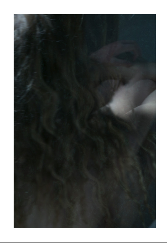
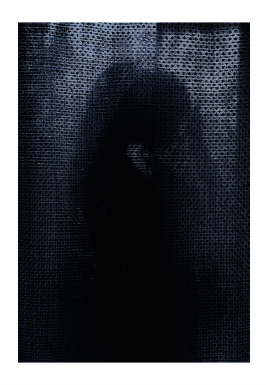
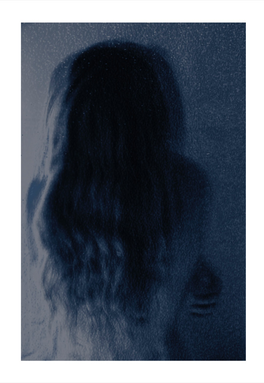
I went with these three composite images for my series titled 'Hidden Intimacies'. I think the name encapsulated my idea of forming a relationship with oneself through solitude.
Positioning Statement
The idea of solitude is something that I have always resonated with, through both my consumption of art and my personal experiences. The concept of my project titled ‘Hidden Intimacies’ explores the relationship with the self, and the melancholic peace that comes with solitude. My goal for this assignment was to use photo manipulation in service of encouraging self-connection and reflection in a state of seclusion. I have done this through portraits of my flat mate Ruby, that intend to tell not a story about her but rather present her as a state of being.
In a capitalist world that is becoming so digitally connected, it is hard to escape the constant pressures to perform; whether that is at work or to uphold a social status. Forming relationships with others is an integral part of our existence, and many of these relationships are ruled over by conventions that require us to behave in a certain way that may not be true to oneself. Even when we are physically alone, cultivating a relationship with oneself has become less important to us than scrolling through social media, or messaging other people 1. The reason why I wanted the concept for this project to be about the relationship with the self, is because I find that in a state of solitude, the pressures of everyday life and the desire to perform evaporate. Through cultivating a relationship with myself, I have found peace in self-reflection, despite a sense of loneliness. I think it is important to appreciate solitude in such a fast-paced society, which is why I have chosen it as my concept for this project. Whilst it can have negative connotations and is a complex idea, “I never found the companion that was so companionable as solitude” 2
I found that I could best express my idea by photographing my flat mate Ruby in the bathroom of our flat. The setting of a bathroom itself is one of privacy and intimacy, and I found that using a subject that I had a personal connection with made the process of shooting easier e.g. she was comfortable showing her skin on camera. This was especially important, as I wanted to make these images as intimate as possible, as if the viewer is peering into moments that are only visible to the person experiencing them. Using skin as a site of vulnerability is a technique I used to help give this effect. Joyce Tenneson’s Illuminations3 was a large inspiration for this project, particularly with the way that I manipulated my photos in post. Her use of double exposures is something I tried to replicate by layering multiple images, in slightly different poses. Her images also have a soft focus, which I took inspiration from by using the blur tool and motion blur in my images. I found that these techniques in my images suggested movement and communication with oneself, leaning into the idea of the relationship with the self. This is also a stylistic component that is present in all three photographs in this series.
After learning about photo manipulation over the semester, my position on it is that it must have an intention, and it is a positive thing if it is used to support a statement or idea. Even to go so far as to ‘trick’ viewers can be justified if the trickery is done for a productive reason. Reading about Jonas Bendiksen’s The Book of Veles4 helped me to form this opinion, and I applied this to my project. Particularly with my center image, it is ambiguous whether the photo has been manipulated or not, and multiple readings could be gained from the image. According to feedback from my peers, it looks like a composite image of one person’s movement layered, and to others, it looks like one photo of two people in an embrace. I decided to lean into this ambiguity, as I think it serves the purpose of exploring the intimate relationships we can form with ourselves, despite it only being one person. Each of my images has cold, blue tones, which is something I added through colour balance and adding a gradient in photo shop. In a way, this is also a form of ‘trickery’, as it fools the audience into experiencing an emotion – my intention being one of both peace and melancholy. I have learned that manipulation and trickery is inherent to the process of an artist conveying a concept, and I have embraced it in this assignment.
I really enjoyed exploring a concept that felt personal to me and is something that I believe other people could resonate with. I hope it makes an impact on viewers and encourages people to recognise the importance of being in touch with oneself. I believe a passage from Virginia Woolf’s To the Lighthouse5 best sums up my concept for this project, “To be silent; to be alone. All the being and the doing, expansive, glittering, vocal, evaporated; and one shrunk, with a sense of solemnity, to being oneself, a wedge-shaped core of darkness, something invisible to others... it was thus that she felt herself; and this self having shed its attachments was free for the strangest adventures.”
Bibliography
Aesif, Aena., and Mahajan, Isha. “Mapping Solitude: An Exploratory Study of the Concept of Solitude in a Hyper-connected Modern World.” Confluence: Journal of Interdisciplinary Studies 5, (2019): https://cjids.in/volume-v-2021/mapping-solitude-an-exploratory-study-of-the-concept-of-solitude-in-a-hyper-connected-modern-world-2/mapping-solitude-an-exploratory-study-of-the-concept-of-solitude-in-a-hyper-connected-modern-world/
J. Koch, Philip. “Solitude.” The Journal of Speculative Philosophy 4, no. 3 (1990): 181-210. https://www.jstor.org/stable/25669958?seq=2
Miller, Jessica. “Fake news: how Jonas Bendiksen hoodwinked the photographic community with The Book of Veles.” Amateur Photographer. February 14, 2022. https://amateurphotographer.com/book_reviews/fake-news-how-jonas-bendiksen-hoodwinked-the-photographic-community-with-the-book-of-veles/
Tenneson, Joyce. Illuminations. Bulfinch, 1998.
Woolf, Virginia. To the Lighthouse. London: Hogarth, 1927.
0 notes
Text
PHOTOGRAPHER 1: VIVIAN MAIER


Vivian Maier was a New York and Chicago-based photographer throughout the 1950s. She was well known for her self-portraits and street photography. She was described as a free spirit by the children she babysat/nannied for while in Chicago and I can see this through some of her self-portraiture work.
The top left photo uses the bright daylight reflecting against the mirrored window lights Vivian up as the clear subject of the image. The mirrored window gives a double-exposure effect - makes the city seem quite fast-paced.
The top right photo uses a big depth of field for this image but the focus is Vivian in the man's mirror. The bigger depth of field provides deeper details of Vivian's surroundings. Again using reflection to illustrate the self-portrait. The composition is off-centre and candid giving her 'free spirit energy' to the photograph.
In the bottom left photo, a more shallow depth of field has been used to focus the attention on Vivian in the mirror. The light source is much darker in this photograph compared to the others, making the photograph communicate a more moody and mysterious tone.
The bottom right photograph shows the use of a double exposure idea showing the outside street being lit by the sunlight alongside the interior LED light lighting up the two women and the interior of the building. Vivian is just shown as a silhouette and this portrays a very intriguing tone that sparks interest in the viewer. There are almost two scenes in one image.
0 notes
Text
Exploring the World of Smartphone Photography: Tips and Tricks
Introduction
In an era where smartphones have become extensions of ourselves, it's no surprise that they have also evolved into powerful tools for photography. From capturing everyday moments to creating stunning art, smartphone photography has taken the world by storm. In this comprehensive guide, we will explore the world of smartphone photography, uncovering a plethora of tips and tricks to help you elevate your mobile photography game.
The Rise of Smartphone Photography
Smartphones have revolutionized the way we capture and share moments. We'll delve into the rise of smartphone photography, discussing its impact and influence on the photography world.
Understanding Smartphone Cameras
Before diving into the tips and tricks, it's essential to understand your smartphone's camera capabilities. This chapter will guide you through the technical aspects of smartphone cameras, including sensor size, megapixels, and aperture.
Choosing the Right Smartphone
If you're serious about smartphone photography, the choice of your smartphone matters. We'll provide insights into selecting a smartphone with an exceptional camera, discussing brands and models renowned for their photography features.
The Power of Composition
Composition is the backbone of a great photograph. We'll explore the fundamental principles of composition, such as the rule of thirds, leading lines, and framing, and explain how to apply them to smartphone photography.
Lighting Techniques
Mastering lighting is crucial for any photographer. We'll discuss various lighting techniques for different situations, from using natural light to experimenting with artificial lighting.
Mobile Editing Apps
No smartphone photo is complete without a touch of editing. We'll introduce you to a range of mobile editing apps, from beginner-friendly options to more advanced tools, and guide you on how to use them effectively.
Creative Smartphone Photography Techniques
This chapter will introduce you to creative techniques like long exposure, light painting, and double exposure, providing step-by-step instructions to achieve these effects with your smartphone.
Smartphone Photography Accessories
Enhance your smartphone photography with the right accessories. We'll discuss essential gear like tripods, external lenses, and stabilizers, helping you choose the best additions to your kit.
Advanced Tips and Tricks
Once you've mastered the basics, it's time to explore advanced tips and tricks. This chapter will cover techniques like HDR photography, panoramas, and using the manual mode on your smartphone camera.
Mobile Photography Genres
Discover various photography genres you can explore with your smartphone, from portrait and landscape photography to macro, street, and astrophotography.
Showcasing Your Work
Your journey in smartphone photography is incomplete without sharing your work. We'll discuss how to build an online presence, create a portfolio, and engage with the photography community.
Smartphone Photography Challenges and How to Overcome Them
While smartphone photography offers convenience, it also comes with challenges. We'll address common obstacles and provide solutions to overcome them.
Smartphone Photography Ethics
In this digital age, it's essential to be mindful of photography ethics, such as respecting privacy and seeking permission. We'll explore the ethical considerations specific to smartphone photography.
The Future of Smartphone Photography
Smartphone technology is continually advancing. This chapter will give you a glimpse into the future of smartphone photography and emerging trends.
Conclusion
Smartphone photography has evolved into a dynamic and creative field. With the right knowledge, techniques, and a keen eye, you can capture stunning images with your smartphone. Whether you're a novice or an experienced photographer, this guide has something for everyone. So, grab your smartphone, explore the tips and tricks, and embark on a journey to discover the incredible world of smartphone photography.
If you're passionate about smartphone photography, consider sharing your best shots on social media or photography platforms. Join photography communities and engage with fellow enthusiasts. Remember, the more you practice, the better your smartphone photography skills will become.
0 notes
Text
Botanical Bliss: Pre-Wedding Photoshoot in KL with Edwin
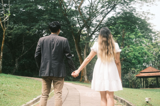
IvanYolo I had the pleasure of conducting an absolutely mind-blowing pre-wedding photoshoot with Edwin, hailing from the lovely city of Singapore. And where did we decide to shoot this masterpiece, you ask? At none other than the magnificent Perdana Botanical Garden located in Kuala Lumpur, of course! As a travel photographer, I personally relish the opportunity to take photos in nature, as it allows me to enjoy some relaxation and inner calmness.And the outcomes you ask? Well, I have to admit, I am quite pleased with what I managed to achieve. My aim was to make the photos appear as dreamlike as possible. After all, it was Edwin's pre-wedding shoot, and we all know how important capturing those perfect shots can be.The shoot lasted a full 3 hours, which gave me ample time to capture every single moment of joy, love, and excitement for Edwin and his lovely wife-to-be. As is my usual style, I alternated between my Fujifilm X-T4 and my beloved Contax G1 film camera. Given that it was a rather overcast day after a heavy downpour, I managed to get some stunning still footage by using a diffusion lens filter, overexposing the shots, and using the Downtown Bloom & Ethereal Street recipe (which works great in an urban city, IMHO) but due to nature greenery, I've decided to convert it to Fujicolor Pro 400H recipe instead.
Pre-Wedding Photoshoot with Fujifilm X-T4
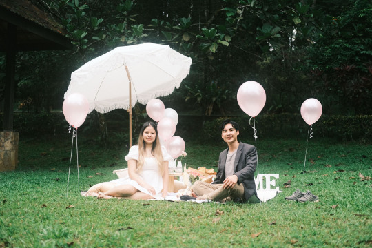
Fujifilm X-T4, Fujinon XF35mm F2 R WR - Botanical Garden KL I absolutely love the stunning result of the pre-wedding outdoor shoot, particularly how the color scheme blends together effortlessly to create a truly ethereal and dreamy atmosphere. From the gentle play of light and shadows to the soft textures and greenery environment, every element perfectly complements the happy couple, adding a lovely and enchanting touch to their pre-wedding celebration.Edwin had a picnic before his pre-wedding photo shoot. He wanted to take some pictures for the picnic theme he had planned. It was a little tricky with the lighting conditions as it was gloomy, but I was really grateful when the sunlight came out after the rain.During the photo shoot, which lasted for three hours, I made sure to capture as many shots as possible. I also drew inspiration from the ideas I had saved on my Pinterest board and incorporated them into the session. Prior to the shoot, I made sure to do my homework and prepare a list of posing ideas for couples so that I would have them at my fingertips during the shoot.This meticulous planning ensured that the photo session was a success, allowing me to capture unique and memorable shots that truly showcased the subjects in the best light. By always being prepared and thinking ahead, I was able to achieve stunning results and provide my clients with photos that will be cherished for years to come.
Shooting Pre-Wedding with Film Camera
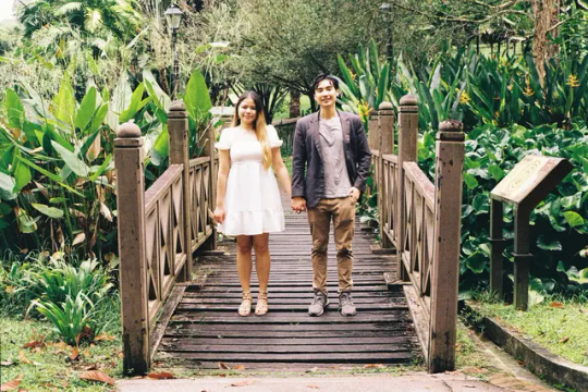
Contax G1, Carl Zeiss Planar T* 45mm F2 - Botanical Garden KL My recent experience with a pre-wedding photoshoot using a Contax G1 and Kodak Gold 200 film is truly enchanting. Film photography is an art form that requires precision, skill, and patience - qualities that you definitely possess. The Kodak Gold 200 is also one of my first film roll ever used since I started with film photography projects.The Kodak Gold 200 has long been a favorite among photographers for its unique look and versatility in different lighting situations. And the Contax G1 is a remarkable camera that is loved among the film photography community for its exceptional portrait and commercial capabilities. I find the film camera is really suitable for this type of shoot, especially for creative portraits that every film photographer is trying to achieve, which is the dreamy cinematic scenes in Wong Kar Wai's Hong Kong movies.As usual, I'm unable to finish the roll and left it for the color double exposure project. I chose to use Kodak Gold 200 - a film that I have long admired for its ability to capture the warmth and vibrancy of sunny outdoor scenes. Despite its versatility, I find that this film lends itself especially well to outdoor shoots and produces a beautiful, warm film tone characteristic that truly enhances the visual effect of my work.
Final Thoughts
As a skilled and experienced personal travel photographer in Kuala Lumpur, I truly believe that being able to master different shooting styles is an essential quality that allows me to capture the essence and beauty of every moment in a unique and captivating manner. Through the use of different techniques and creative approaches, I am confident in my ability to create stunning and memorable images that will not only exceed your expectations but also leave you in awe.I have developed a deep passion for photography and a keen eye for detail, which allows me to adapt to every shooting environment and situation and it's all about trial and error. It is best to be a versatile photographer that able to do casual shoots, pre-wedding photoshoots, fashion shoots, or cinematic styles, and explore my creativity to ensure that the moments are captured flawlessly and professionally.
Gallery
Fujifilm X-T4, Fujinon XF35mm F2 R WR - Botanical Garden KL Fujifilm X-T4, Fujinon XF35mm F2 R WR - Botanical Garden KL Fujifilm X-T4, Fujinon XF35mm F2 R WR - Botanical Garden KL Fujifilm X-T4, Fujinon XF35mm F2 R WR - Botanical Garden KL Fujifilm X-T4, Fujinon XF35mm F2 R WR - Botanical Garden KL Fujifilm X-T4, Fujinon XF35mm F2 R WR - Botanical Garden KL Fujifilm X-T4, Fujinon XF35mm F2 R WR - Botanical Garden KL Fujifilm X-T4, Fujinon XF35mm F2 R WR - Botanical Garden KL Fujifilm X-T4, Fujinon XF35mm F2 R WR - Botanical Garden KL Fujifilm X-T4, Fujinon XF35mm F2 R WR - Botanical Garden KL Fujifilm X-T4, Fujinon XF35mm F2 R WR - Botanical Garden KL Fujifilm X-T4, Fujinon XF35mm F2 R WR - Botanical Garden KL Contax G1, Carl Zeiss Planar T* 45mm F2 - Botanical Garden KL Contax G1, Carl Zeiss Planar T* 45mm F2 - Botanical Garden KL Contax G1, Carl Zeiss Planar T* 45mm F2 - Botanical Garden KL Share This:
Subscribe Newsletter
Receive latest news about photography projects, Fujifilm recipes releases, and blog updates. Sign up today! You Might Also Like Related Posts Read the full article
0 notes
Text
Projects: Ming Smith
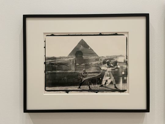
I visited The Museum of Modern Art (MOMA) to see the Projects: Ming Smith exhibition by Ming Smith. The gallery showcased approximately 40 of her works, taken from the 1970s to the 1990s, and was organized into around 7 clusters of works, each categorized by different subtopics or series. Ming Smith uses photography as a tool to create political and poetic dialogues related to blackness.
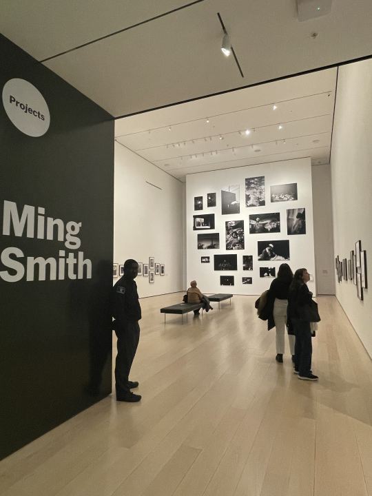
One of my favorite works from the exhibition was "Womb", 1992. Its photographic style is characterized by a dreamlike and surreal quality achieved through the use of double exposure. At first glance, the work appeared chaotic to me due to the two layers, with two boys (maybe)practicing martial arts in the foreground and a pyramid looming in the background. However, upon closer inspection, I noticed a second layer showing a portrait of a woman, which I believe is Ming's self-portrait. The title, composition, and layers of the work added an uncanny quality that made it even more interesting.
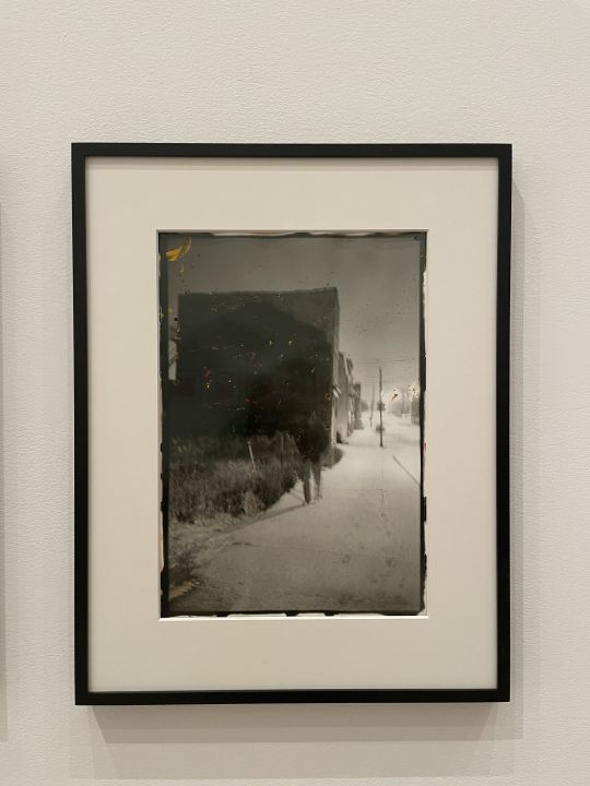
Another work that caught my attention was "Invisible Man, Somewhere, Everywhere." The piece features colorful oil paints on gelatin silver print and uses light and shadow to create a sense of ambiguity that blurs the lines between reality and fantasy. Ming Smith documents the daily lives of black people in her community. It is not well-staged or done purposefully, but captures a casual vibe or mod. It is also interesting to see she draws random red, yellow, and blue oil paints on the black and white print. As she stated that she tends to capture the feeling of painting and make photographs on an artistic scale.
Overall, I found that Ming Smith's style involves capturing moments naturally within her community, rather than staging highly orchestrated photos. Her work aims to convey a particular expression, mood, or atmosphere, and she succeeds at this through technical innovation such as long-exposure and high contrast. Her work is highly expressive and emotionally charged, challenging me or other viewers to see the world in new and unexpected ways. Additionally, she showcases different personalities within the black community and demonstrates her appreciation for their identities and black culture.
Hanning Ma
0 notes
Text
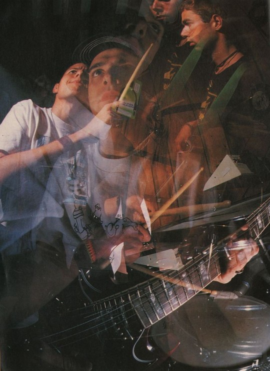
..."And everything I do is Funky like Lee Dorsey!"
10 notes
·
View notes
Photo
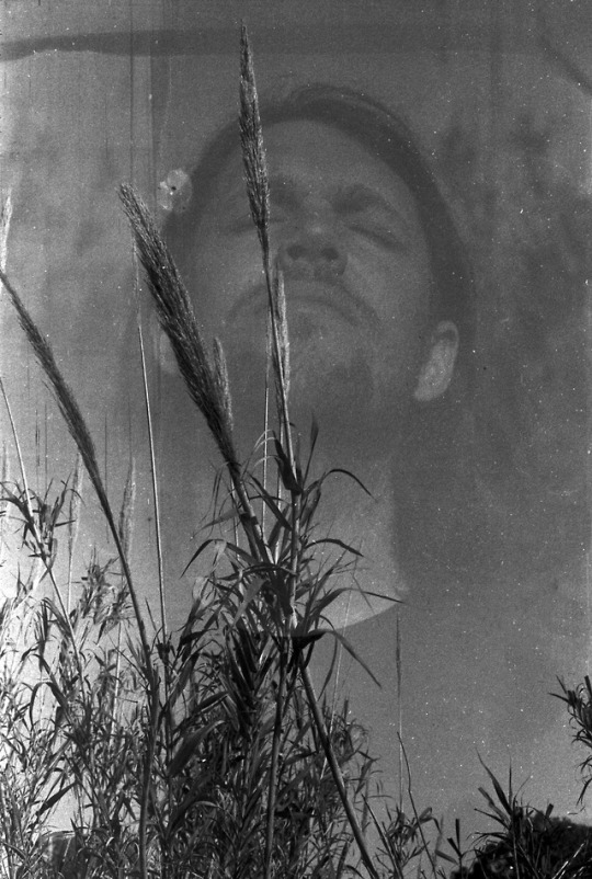
Experimenting more with double exposures on Svema expired film (1998)
#portraits#portrait#portrait photography#human figure#double exposure#35mm film#35mm#malta#35mm photography#film photography#film community#film#svema#iso 100#canon#stay broke shoot film#film is not dead#black and white#black and white film#expired film#black and white photography#bnw photography#black and white portrait#film portrait#nature#bliss#multiple exposure#experimentation#experimenting#documentation
2 notes
·
View notes
Photo
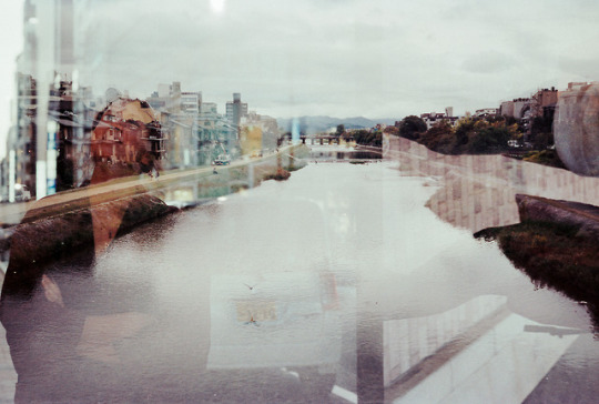
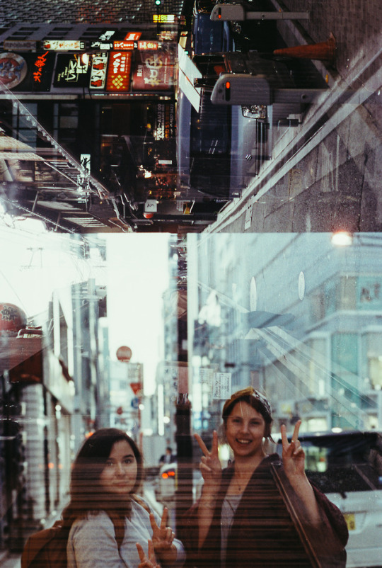
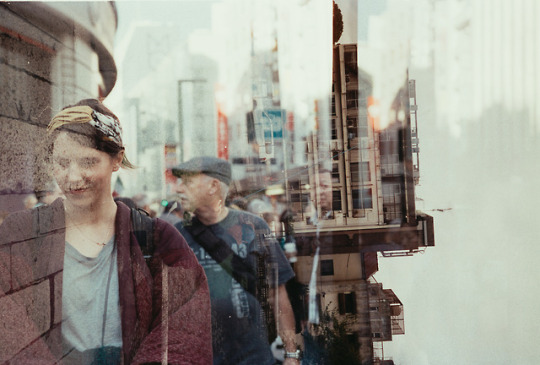
accidental double exposures: pieces of hiroshima, tokyo and kyoto
portra 400 nikkor 50mm f/1.8D
#double exposure#kodak portra 400#portra 400#portrait#portrait photography#Tokyo#hiroshima#kyoto#Japan#visit Japan#analogue#analogue photography#analogue love#The Analogue Project#analog#analog photography#the analog club#the film community#Film is God#stay broke shoot film#i shoot film#i shoot kodak film#analogue vibes#back 2 the base
4 notes
·
View notes
Text
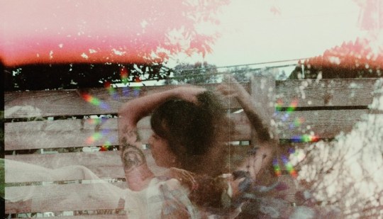
Mayra Penaranda sits in a coffee shop in Seattle, Washington talking to me on a zoom call about the development of her photography and who she is as a creator. In her words she is above all, an artist. Born in Miami,Mayra began working in photography and mixed media at the age of 14. After graduating high school she would attend college in NYC where she spend the next 7 years experimenting and building upon her craft. Her next stop after college would be Seattle, Washington where she lives now.
Currently Mayra has been experimenting with the outdoors and nature. Overall Mayra describes her work as “experimental processes in photography and film.” She adds a range of elements that combine textures, collages, and movement as well as altering negatives or tampering with the photo using fire or liquids. Her photographs bring a sense of nostalgia for me. Like the feeling of being in love with somebody for the first time.
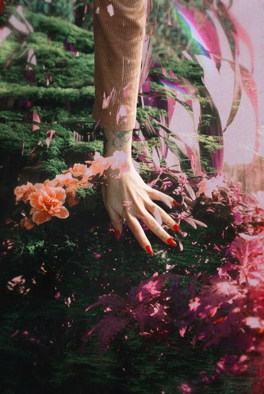
What was the first project that sparked everything? “For my final project there I did this black and white long exposure photography series where I just took a bunch of self-portraits and I essentially asked my classmates to submit anonymous questions to me that I would answer and pair them with the images and I love the idea of taking a photograph and adding something else to it whether that’s text at the time or later like I do now more layered work. That was the first time I thought I could convey something deeper or communicate or process something or create something apart from just the photograph.”
Do you have any plants or pets?
“I have a 2 year old hound dog named Odin, who is just as weird and anxious as me. I’m proud to say I went from killing every plant I tried to own to owning several and even propagating plants, so there is hope out there for anyone else who is this way. We can grow and take care of living things! I hope to have many children some day and I hope they don’t think my art is cringe and like my cooking.”
Why do you do what you do?
“I do what I do because it’s the only way I’ve ever felt comfortable expressing myself. Art is almost kind of ironic and safe in a lot of ways, being direct is almost too much for me even though I find myself making art that’s pretty emotionally revealing, I love concealing it in layers of colors and film grain and flowers.”
What makes you happy?
I love purples, blues, purples, pinks, reds, and oranges when I’m happy and black and white when I’m sentimental
What scares you?
I’m scared of tsunamis and waking up very old one day with no home filled with food, love, art, kids, animals and laughter.
Any upcoming projects?
I’m currently working on a series of experimental film self portraits called, Floral Lovescapes II. I use different double exposure techniques and alter my film physically with liquid mixtures or an exacto knives to create different floral landscapes/“lovescapes” that I later rescan and wrap up in a psychedelic pink bow in Photoshop. This series is an homage to the Earth and documents my journey of reconnecting with myself and the world around me and I’m super excited to share it this upcoming Spring/Summer.
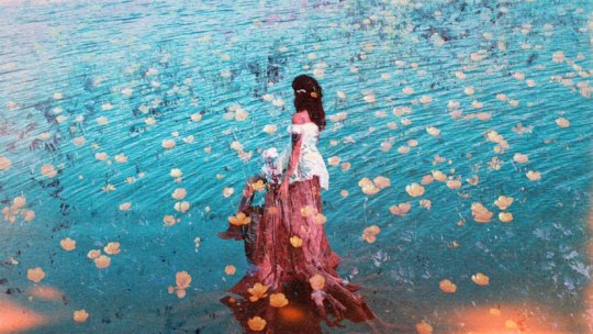
Mayra is excited to branch out to new communities with her photography. She will be featured in the RedRoom Gallery in Los Angeles, California. Join her January 6, 2023.
https://www.instagram.com/mayrarae/
5 notes
·
View notes
Text
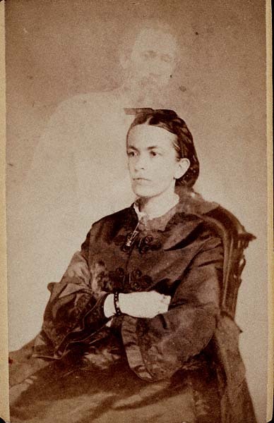
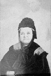
William Mumler’s Spirit Photography
William Mumler was an American Spirit Photographer. He was a jeweler in Boston and an amateur photographer. One day as he was developing a self-portrait he spotted the shadowy figure of a young girl floating behind his image.
Mumler at first thought it was an accident, it was just a trace of an earlier negative made on the same plate. But he changed his mind when friends and family told him the young girl looked like his deceased cousin.
This photo came to the attention of the American spiritualist community and was proclaimed the first photo ever taken of a spirit.
Mumler didn’t disagree. Instead he became the world’s first spirit photographer. Expert photographers in Boston stated they believed these photos were not tampered with.
Mumler’s new business became a success, in part because it was just after the Civil War and many people were seeking proof their deceased relatives still existed in some form.
So Mumler’s was basically preying on their desperation.
His British counterpart William Hope acquired photos by telling his clients he needed them to communicate with the dead during his séances. In contrast, Mumler would just break into people’s homes to obtain them.
Later, his girlfriend, a medium, was able to acquire them for him.
Mumler became wealthy and moved to New York to continue his business. The spiritualist community supported him wholeheartedly while his critics accused him of fraud.
Once in New York it was discovered that several ghosts in Mumler’s photographs were actually people who were still living. In 1869, the New York police sent an undercover agent to investigate him. They then charged him with fraud.
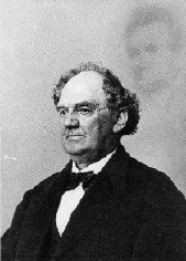
At his trial expert witnesses were brought in to testified that Mumler had created his photos with the use of double exposures. The notorious showman P.T. Barnum even testified against him.
A photo taken of P.T. Barnum with the ghostly image of Abraham Lincoln floating in the background was introduced as evidence to show how easy it was to create fake photos.
Despite the condemning evidence presented, Mumler was acquitted. His defense team was able to bring in a large number of witnesses that stated the images in the photographs given to them by Mumler were real.
Mumler moved back to Boston and continued producing spirit photos. But his business was no longer lucrative. In 1871, a lady using the name “Mrs. Lindall” visited him.
She was actually Mary Todd Lincoln and Mumler took the now famous photo of her with Abraham Lincoln floating over her left shoulder. Mumler stated afterwards that he had no idea that Mrs. Lindall was the former first lady and wife of Lincoln.
Mumler’s faked photo is the last one taken of Mary Todd Lincoln before she died in 1882.
Mumler wrote an autobiography in 1875 but his career was in ruins by this time. He stopped producing spirit photos in 1879 and according to most accounts he died penniless.
#William Mumler’s Spirit Photography#spirit photography#paranormal#ghost and hauntings#ghost and spirits#haunted salem#myhauntedsalem
10 notes
·
View notes
Photo
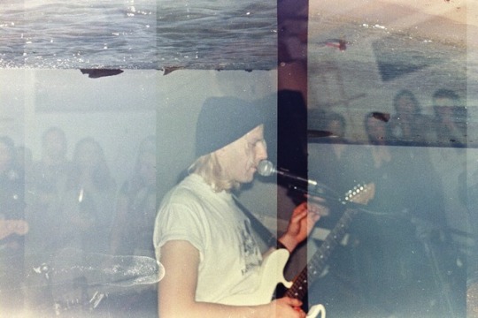
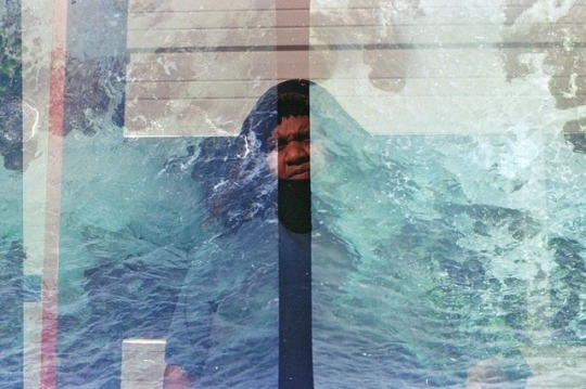
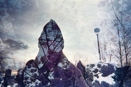
Ben, Dre, Jenessa.
#disposable camera#expiredfilm#double exposure#35mm film#film community#film photography#seattle#portrait#analog
52 notes
·
View notes
Photo

Dagmar Keller / Martin Wittwer
Whilst looking for inspiration for the type of images I wanted to take in everyday life, I came across a series of photographs Passengers by Dagmar Keller and Martin Wittwer who were drawn to passengers on an old bus at a bus station as they passed through Poland.
The passengers were behind stained windows that were covered in ice. It gave the appearance of a painting. What I like about these images was that they were unplanned and not staged. What I also liked was how they explored not just the people on the bus, but the surroundings as well. This was the quality in photography that I was looking for. The playfulness and exploration.
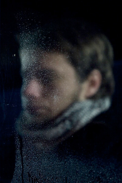
Image Reference
Keller, Dagmar./Wittwer, Martin. Passengers, #21. https://www.kellerwittwer.de/selected-works/passengers/
Passengers, #21 – This image to me makes me wonder what he is thinking, what emotions he is feeling and where he is going on this cold night. The black of the night makes the viewer focus on the subject directly and because there is ice on the window and the subject cannot be seen clearly, it makes the viewer use their imagination.
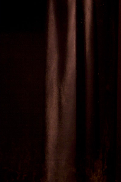
Image Reference
Keller, Dagmar./Wittwer, Martin. Passengers, #94. https://www.kellerwittwer.de/selected-works/passengers/
Passengers, # 94 – The photographers explored the surroundings of the bus stop. It appears to be a curtain but who knows where it is. I like the way the light hits the curtain and it may seem random in the context of all the other images, but it shows me the playful quality I am after as an influence to my own work.
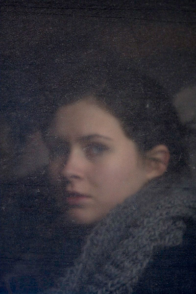
Image Reference
Keller, Dagmar./Wittwer, Martin. Passengers, #8. https://www.kellerwittwer.de/selected-works/passengers/
Passengers, #8 – This image is a bit clearer and looks like a painting. There is a look of pain in her eyes. Has she just left someone and catching a bus to get away? Is she regretful? Again it is in the imagination of the viewer.
Dagmar Keller and Martin Wittwer have collaborated since 1997 and their work includes photography, film and video. Their inspiration comes from urban social stories and the hopes and dreams of the people that live there.
References
Keller/Wittwer. “Selected works.” kellerwittwer. https://www.kellerwittwer.de/selected-works/passengers/
u-jazdowski. “Dagmar Keller & Martin Wittwer (Germany).” https://u-jazdowski.pl/en/programme/residencies/residents/archiwum-rezydentow/dagmar-keller-martin-wittwer
Rinko Kawauchi
Rinko Kawauchi was born in the early 1970’s in Japan and became interested in photography while studying graphic design. She has a very soft style of photography which she emphasises with soft colours. Her work and aesthetic is to have an almost dream like quality and will mostly shoot ordinary things.
Why her work is of interest to me is that she does not second guess herself and runs by instinct. If she feels compelled to photograph something, she will and not ask herself why. She rarely will include people in her images and is interested in images that move her rather than just look good.
She puts a lot of thought into her compositions and one of her main conventions is juxtaposition. She wants the viewer to imagine what is going on. She also commonly makes use of cropping and prefers to use natural light.
What I found interesting about Rinko is that she does not like to take multiple images and then select the best one later. She will purposely take her time and get the shot she had in mind.
References
Andia, Lucy. “ 10 Things You Should Know About Rinko Kawauchi.” Culture trip. 10 Things You Should Know About Rinko Kawauchi (theculturetrip.com)
Artsy. “Rinko Kawauchi.” https://www.artsy.net/artist/rinko-kawauchi
Ibasho. “rinko kawauchi.” Rinko Kawauchi - Overview | IBASHO (ibashogallery.com)
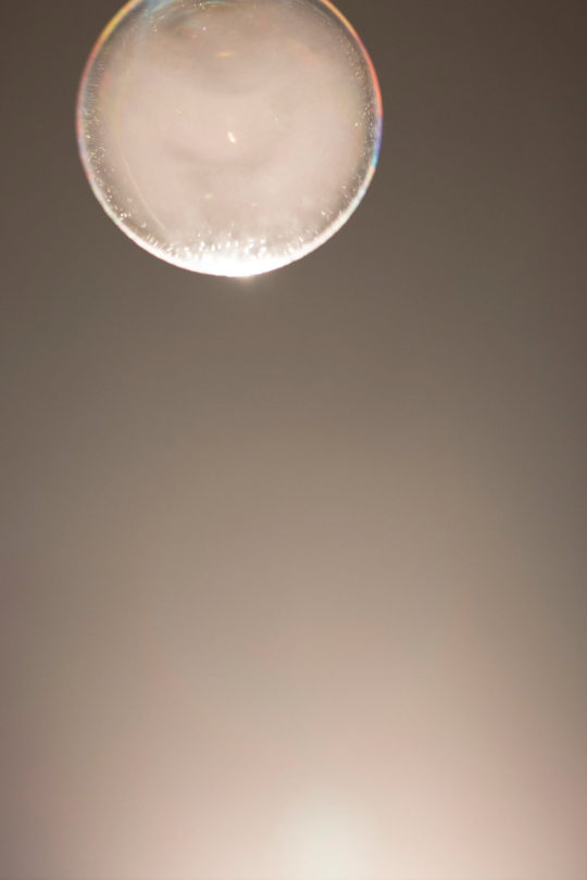
Image Reference
Kawauchi, Rinko. Halo. 2017. http://rinkokawauchi.com/works/172/
This image follows Rinko Kawauchi’s conventions of cropping and natural light. What I like about it is that it is off centre and the lighting gives it a dream like quality. I like the rule of thirds quality and the juxtaposition quality of the light shining from below where you would think it would come from the moon itself.
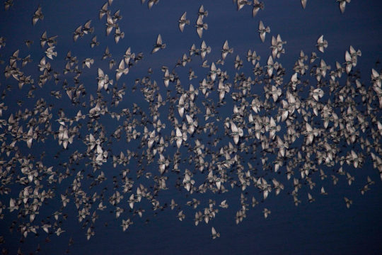
Image Reference
Kawauchi, Rinko. Halo. 2017. http://rinkokawauchi.com/works/172/
I like this image as you would expect there ordinarily to have some other feature to concentrate on but in this case it is just the birds. It feels very serene and makes me imagine what it must be like to be one of those birds. Me imagining this just highlights one of her aims which is to make people use their imaginations.
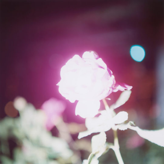
Image Reference
Kawauchi, Rinko. Illuminance. 2011. http://rinkokawauchi.com/works/194/
The use of depth of fielld and the overexposed lighting add a strange quality of beauty to this image.
Lieko Shiga
Born in Japan in 1980, Lieko Shiga has become a rising star in Japanese photography mainly due to her going against the grain of what other Japanese photographers do and being so expressive. What I find fascinating about her work is that she has no one particular style. She will integrate her own personal experiences and encounters into something surreal and she will do this by any conventions she can find including lighting tricks or double exposure of her images.
She is best known for her Spiral Coast project which was inspired when she was invited to become the towns photographer when she moved to a small community (Kitakama) in Japan. Her community was hit by a tsunami in 2011 and the town was flattened and over half the residents died.
Through her imagery, Shiga managed to capture not only the history of the village from before the tsunami, but also the spirit of the village. She cleverly did this by mainly shooting at night which gave the desired uncertainness. The images had a certain vagueness like it is a memory and she managed this by using a flash that does not reach the whole frame.
The deepest part of her work I find is her concept of photography itself. Shiga feels that photography is more than capturing a moment in time, Photography to her is not the past, present or future, but instead there is just space. There is no time. Shiga views herself as the camera as she bases most of her work on personal experiences. Photography therefore takes on a physical form. This is the sort of aesthetic I want to incorporate into my work. I want my camera to capture the qualities of what I see.
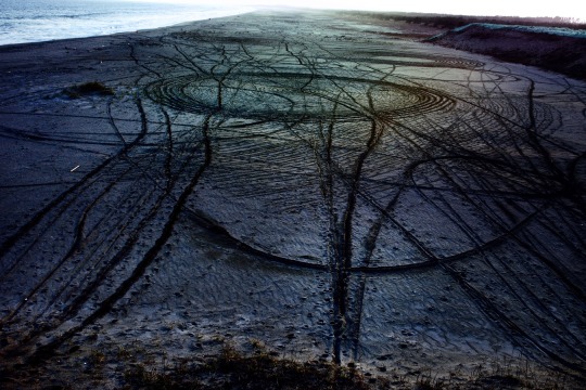
Image Reference
Shiga, Lieko. Blind Folded Pilot. 2012. https://www.liekoshiga.com/works/rasen-kaigan/
I love the texture of this image. You can almost image cars running up and down this beach and doing wheelies. What fun they must have had. After all, the beach is about fun. This is capture here. This would be my interpretation of this image but when you see the title Blind Folded Pilot it takes on another meaning. Now you can see someone lost and trying to find their way. Ironically this setting was staged by the photographer and she used a stick to make her patterns and lines.
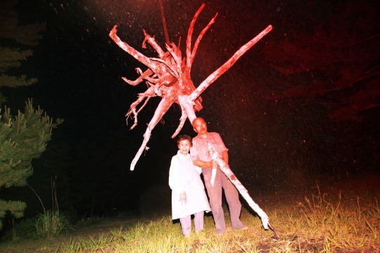
Image Reference
Shiga, Lieko. Portrait of Cultivation. 2012. https://www.liekoshiga.com/works/rasen-kaigan/
One of Lieko Shiga’s conventions is to place random items next to people she is photographing and this is an example of this. This image is of the chief to her village. Behind the subjects is a massive tree root and she Lieko would never admit how she did it but it appears as though the tree root passes through the body of the chief. the red colouring of the root and over the chief is of significance as well as it would symbolise the blood.
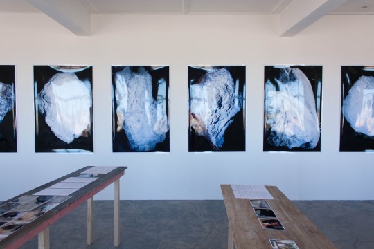
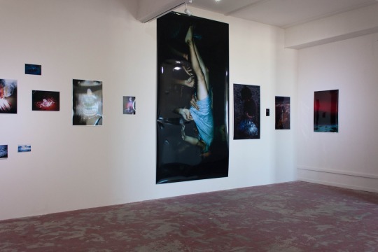
Image Reference
Shiga, Lieko. (Installation view). n.d. Photo credit Daegan Wells
How Lieko’s work has been exhibited in shows. I prefer the bottom image as this has visual diversity.
References
Artsy. “Lieko Shiga.” Lieko Shiga - 36 Artworks, Bio & Shows on Artsy
Badger, Gerry. “Lieko Shiga-RASEN KAIGAN/album (SPIRAL COAST/album).” 1000 words. https://www.1000wordsmag.com/lieko-shiga/
Maddox, Amanda. “A Japanese Photographer’s Encounters with Natural Disasters.” Aperture. https://aperture.org/editorial/lieko-shiga-amanda-maddox/
The Physics Room. “RASEN KAIGAN: THE SPIRAL SHORE.” http://www.physicsroom.org.nz/exhibitions/rasen-kaigan-the-spiral-shore
Irina Rozovsky
Irina was born in Russia in 1981 has exhibited work in galleries worldwide and now resides in Georgia, US. Her belief is that the camera is a third eye and believes a photograph can be taken anywhere and anytime. A lot of her work has been based around rootlessness, migration, diaspora and personal versus political freedom this was inspired mainly though her migrating from Russia to America when se was seven years old.
Ten years ago Irina was invited to a friend’s birthday party on the lake in Prospect park in Brooklyn. Irina had been to this park many times, but it was the first time on the lake. Looking back at the park from the boat she was on changed her perspective of the park and the people that visited it. It was as if the world stood still for her and she was compelled to begin a ten-year journey of photographing the people that frequented the park as the park covered many different areas of Brooklyn such as the wealthier side to the poor areas. There were people from all different cultures, religions, and ethnicities in different areas of the park and Irina spent the next 10 years visiting the park and taking photographs and she felt like she got something new and exciting every time she returned.
She spent her time discussing what she was doing with the people she was photographing, and subjects seemed to fully embrace her vision. She named her project In Plain Air and this has been an inspiration to my latest work. I have always tended to stage my photographs but what I want to do during this assessment is shoot my images in their natural form. The subjects do not need to be glamorous or use props that are in theme. I will find objects that are of interest to me and look for interesting ways to photograph them and in such a way that an otherwise dull and everyday object, can become interesting and a become a piece of art.
Irina Rozovsky I have noticed shoots from different angles which can change people’s perspective on issues. Her projects can run for varying times from a few weeks to several years and she will not move on until she feels she has captured the true essence of what she is there for. This to me shows the connection she has with the project and how she can run on instinct.
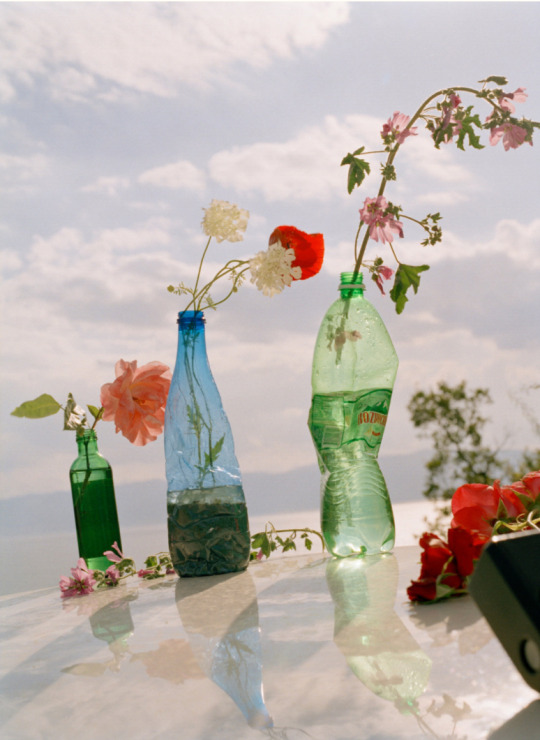
Image Reference
Rozovsky, Irina. Untitled, (from Mountain Black Heart). 2015-2016. https://www.irinar.com/mountain-black-heart
There are so many things I like about this image. I like the angle she has captured this from. I like how the reflection on the sand looks like glass. I like the irony of the flowers (as a living thing) are in plastic bottles which kill so many creatures in the sea. This is a statement that I’m sure she wants to get across.
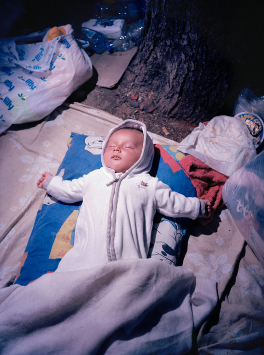
Image Reference
Rozovsky, Irina. Untitled, (from Mountain Black Heart). 2015-2016. https://www.irinar.com/mountain-black-heart
The innocence of a child sleeping, oblivious to all the mess and turmoil going on around them. Whether this image was staged or not, the message is clear.
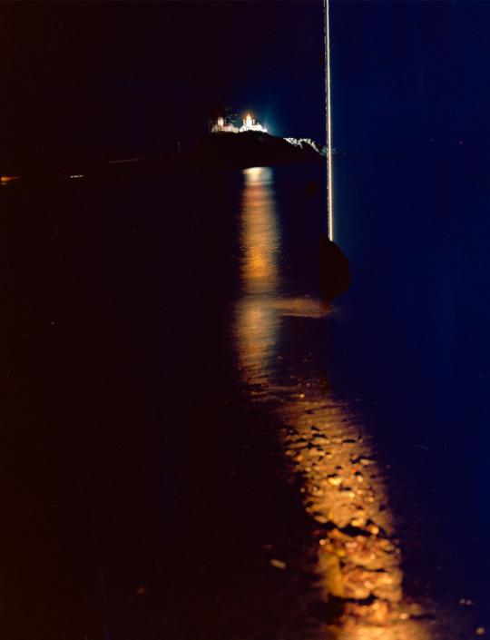
Image Reference
Rozovsky, Irina. Untitled, (from a rock that floats). 2014. https://www.irinar.com/a-rock-that-floats
Photographs made in the US, 2014 – present. Chromogenic color prints of various sizes.
I love the way the light reflects on the water and how it leads your eye to the buildings in the distance.
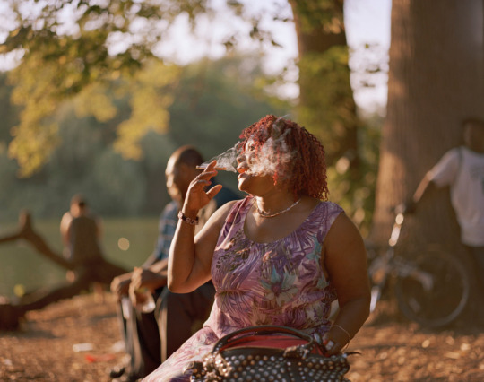

Image References
Rozovsky, Irina. Untitled (from In Plain Air). 2011-2016. https://www.irinar.com/in-plain-air
Capturing everyday life in Prospect park in Brooklyn where all walks of life occupy. Rozovsky liked to capture all people who visited the park which ranged from wealthy to the not so wealthy.
References
Feinstein, Jon. “PLACELESSNESS.” Daylight. Irina Rozovsky: The Politics of Placelessness | Daylight
Rozovsky, Irina. “The world in one park: Irina Rozovsky's best photograph.” The Guardian. The world in one park: Irina Rozovsky's best photograph | Photography | The Guardian
Syracuse University. “Irina Rozovsky.” https://calendar.syracuse.edu/events/2020-oct-20/irina-rozovsky/
3 notes
·
View notes
Text
Artist feature: Helena Baka
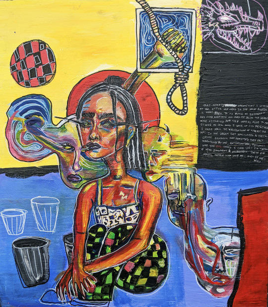
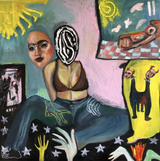
Artist Helena Baka shares with LFF about her inspiration as an artist through trauma, experiences, identity, femininity and more. All images and text (c) Helena Baka, helenabaka.com.
Where are you from and how did you get into art?
I’m from Elmwood Park, Illinois, but I’m currently living in Milwaukee, Wisconsin. Both of my parents were born and raised in Albania and immigrated from there before I was born, a few years after the collapse of communism. I’ve loved art since I was a child – I used to draw princesses, my favorite television show characters, Sanrio characters, and self-portraits. This was probably because both of my parents were artists - my father is a painter, and my mom used to make little angel Christmas ornaments and draw mermaids for my sister and me (although she stopped doing that very early on once she became a paralegal). All my life I had been surrounded by my dad’s oil painting landscapes of Albania hanging on the walls of our home, so I think I wanted to be just as good as him.
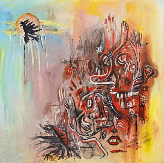
It’s been hard to be upfront about this, but my mom committed suicide when I was only 16 years old, and that was really the beginning of my painting practice because I started to draw inspiration from my traumas, dreams and experiences after that. Now, my work is motivated by my cultural identity and the distance I’ve experienced with my Albanian culture while growing up American. Lots of my current work shines on aspects of my identity, both relating to culture and femininity. I also have been exploring the relationship between sculpture and painting in my work because I’m fascinated with how bending the rules of traditional sculpture and/or painting can possibly make either of those fall into either category.
I have a few impetuses for creating; much of it derives from the need to tell my story, to use my practice as a form of therapy, to take risks and experiment with both familiar and unfamiliar mediums, and to educate my audience on whatever topic evokes strong emotions from me.
Tell me about your most recent exhibit.
4th Midwest Open at Woman Made Gallery in Chicago is the upcoming show I’m featured in, and I’m really excited for it because it’s going to be filled with so many different types of work featuring many artists of diverse backgrounds. It’s a chance to showcase the voices of women and nonbinary people in a space that is not male-dominated, which I think is so important because spaces like these are rare to find in the art world.
I hope when people see my work, it can spark some curiosity and self-education of what and where Albania is, and that it’s not just some impoverished Eastern European country that never made it into the footnotes of western history textbooks. My work touches on themes of loss, displacement, and frustration with one’s identity, as well as learning to accept and embrace who you are; that it’s okay not to fit into the mold of who or what you’re “supposed” to be. So, I hope at the end of the day, anyone who views my work can see a little bit of themselves in it, too. Most importantly, I want to be the Albanian woman artist role model that I never got to see growing up.
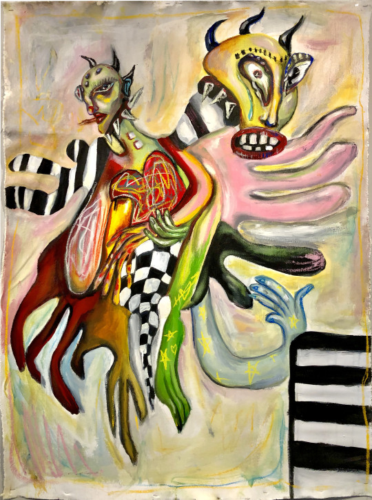
Does collaboration play a role in your work?
Although I have always worked independently in the studio, I’ve found collaboration beneficial to my practice through exposure of others’ ideas and methods of production. Being in my last year of art school toward my BFA, I have grown used to surrounding myself in an environment of plenty of working artists, and that alone inspires me to create, too. I think the act of critiques and even showing in-progress work has been a collaboration between me and whoever is critiquing my work, because most of the time I’ll come out of it with fresh ideas handed to me by another person. It works the same way vice-versa.
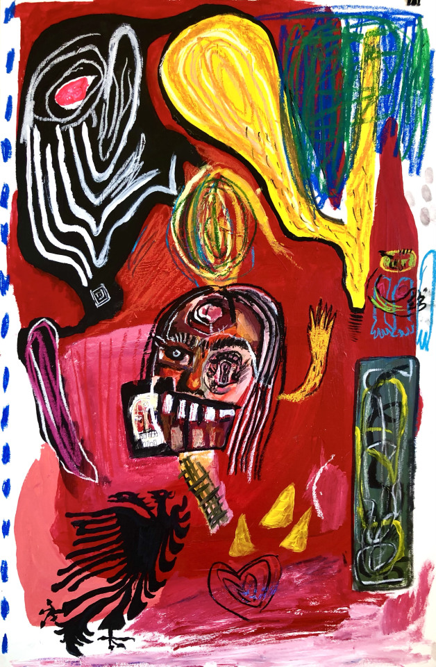
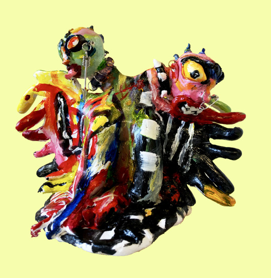
I once had my first ceramic sculpture fall apart in the kiln, and through a collaborative effort of mending it with my friend who was very familiar with working with plaster, my sculpture was repaired and I gained new insight toward this specific material and potential future uses in my practice. My work could never have progressed the way it has without the exposure of different ideas, methods and materials that other artists use.
What do you think about making work right now with the current political climate?
The political climate we’re living in right now has brought on so much outstanding work that has been made by BIPOC creators. Through the darkness of the pandemic, a corrupt, unfitting president in office, systemic racism, police brutality, and all of the tragic deaths we’ve experienced in 2020 from these events, one of the few instances of light the world gained out of these tragedies was the art made by black folx and BIPOC. From music to writing to visual art, BIPOC’s voices have been uplifted and encouraged on every accessible platform, and I continue to see more and more spaces made exclusively for these communities in the art world. Art really makes a difference in impacting our ways of thinking and beliefs, and I believe that if we continue to make BIPOC creators and voices a priority after Black Lives Matter is no longer a trending topic, there could be huge changes in the art world that provide even bigger opportunities for BIPOC creators, such as solo/group exhibitions, publications, grants and rewards, and leadership positions, if not more.
Is feminism relevant to your work?
Absolutely! I would categorize much of my work as feminist pieces because it discuss the contrasting distance and pride not only between myself and my cultural identity, but with my female identity as well that has been challenged and taken advantage of throughout all my life by others. Sexism, misogyny perpetuated by both men and women, double standards, and body image dysphoria as a consequence of these things have all been themes I’ve had to work through in my life and practice.
I can’t speak for every womxn or nonbinary person, but most who are or have once been feminine presenting in their lives have experienced a hypersexualization of themselves and their bodies through the media, culture, and the overall tainted perspective of the patriarchy we’ve been trained to look through. Instead, my work inevitably sees through the lens of the female gaze, where there is no objectification or negativity associated with the female/feminine body or experience, and instead the viewer is presented with this sort of chaotic, distortion of the faces and bodies of my characters, who are often abstract depictions of self-portraits.
What’s the best advice you have received about being an artist?
Strive to make work better than the last and only compete with yourself. Never measure your talents and successes to someone else's.
helenabaka.com
instagram: @artbug666.
~

Les Femmes Folles is a volunteer organization founded in 2011 with the mission to support and promote women in all forms, styles and levels of art from around the world with the online journal, print annuals, exhibitions and events; originally inspired by artist Wanda Ewing and her curated exhibit by the name Les Femmes Folles (Wild Women). LFF was created and is curated by Sally Brown Deskins. LFF Books is a micro-feminist press that publishes 1-2 books per year by the creators of Les Femmes Folles including the award-winning Intimates & Fools (Laura Madeline Wiseman, 2014) , The Hunger of the Cheeky Sisters: Ten Tales (Laura Madeline Wiseman/Lauren Rinaldi, 2015 and Mes Predices (catalog of art/writing by Marie Peter Toltz, 2017). Other titles include Les Femmes Folles: The Women 2011, 2012, 2013, 2014, 2015 and 2016 available on blurb.com, including art, poetry and interview excerpts from women artists. A portion of the proceeds from LFF books and products benefit the University of Nebraska-Omaha’s Wanda Ewing Scholarship Fund.
Submissions always open! - Check out the 10th anniversary call here:
https://femmesfollesnebraska.tumblr.com/callforart-writing
5 notes
·
View notes
Photo
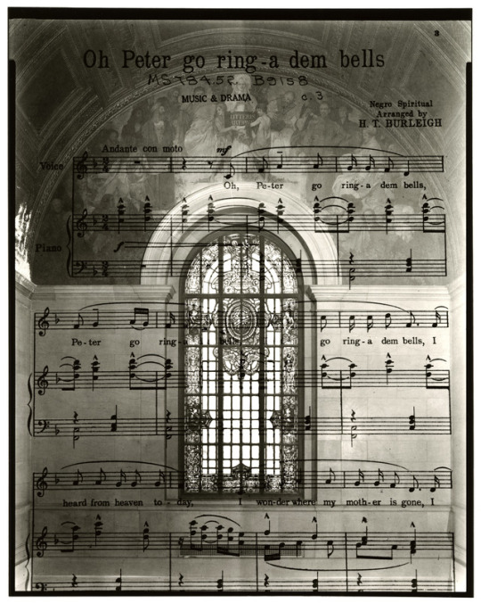
Here, an exposure of a one hundred year old piece of sheet music, exposed again over the north wall fresco and stained glass of the Grand Staircase.
Oh Peter Go Ring Dem Bells Negro Spirituals Arranged by H. T. Burleigh, 1917 Sheet Music Archive, Music Room The Detroit Public Library, 3/10/17
Graphic Arts and Prose Fresco Edwin Blashfield and Vincent Aderente, 1922 Painted Glass Window Frederick J. Wiley, 1922 The Detroit Public Library, 3/10/17
Marco Lorenzetti
#detroit#detroit public library#documentary#book project#lterature#books#library#archives#sheetmusic#negro spirituals#double exposure#film#kodak#TriX#darkroom#contemporary photography#deardorff#large format#community space#portraits#cass gilbert#edwin blashfield
125 notes
·
View notes
Text
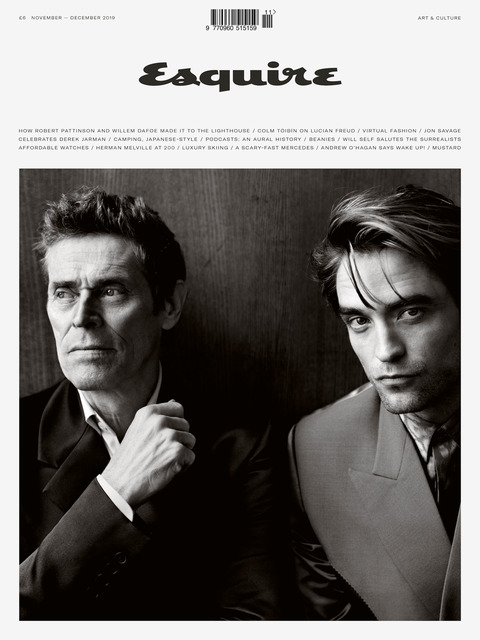
How Robert Pattinson And Willem Dafoe Made It To The Lighthouse
Out of a swirling fog emerges the prow of a boat, knifing through a foaming sea. Two figures, shadows in the murk, stand silhouetted on the foredeck, confronting the horizon, their backs to us. Presently an island swims into view. No more than a crag, really: lonely, battered, forbidding. Then a lighthouse can be made out, blinking in the gloom.
Now we see the men head-on, a striking dual portrait in high contrast black and white: a double exposure. They are wearing sailors’ caps, greatcoats, and hefting wooden trunks. One is younger, taller, moustachioed. The other, more deeply crevassed, sports a wild beard, out of which pokes a small wooden pipe, like Popeye’s. Theirs are, by any standards, remarkable faces, extreme faces, unyielding as rock yet sculpted with great delicacy, skin stretched tight over jutting bones: sharp noses, strong jaws, deep set eyes. And, oh, the cheekbones! And would you look at all those teeth?
Before anything else — before they are handsome faces, or expressive faces, or famous faces (they are all of those things) — these are photogenic faces. On first inspection they appear impassive, almost blank. And yet an air of foreboding is struck. The older man’s features are fixed in a roguish grimace. The younger man is wary, tense. These might be the faces of a father and son, or brothers separated by decades: hard, thin, stern faces, built for hard, thin, stern lives. Lives filled with mean disappointments, festering resentments, blood feuds. Here are men who have seen trouble before and will see it again. Maybe they’re looking for trouble. Maybe they’ve found it. Is this a dual portrait — or the portrait of a duel?
Whatever has thrown these men together in this place — fate, karma, the thirst for adventure, the desire for escape (in the case of the characters, but perhaps the actors, too?) or (in the case of the actors specifically) the need to stretch oneself artistically, or to challenge oneself physically, or the reputation of the director, or a really good script, or all of these things — one senses they are aware already, as they square up to the stinging reality of their circumstances, that they may have got more than they bargained for. What we can be sure of from the off: there will be weather. There will be conflict. And there will be acting.
The film is The Lighthouse, the second feature film from the 36-year-old American writer-director Robert Eggers, who made a stir with his debut, The Witch. Eggers, who is based in Brooklyn but grew up in rural New Hampshire, is a man possessed of a rare and creepy gothic sensibility. The Witch was an arthouse horror film, a twisted fairytale with the insidious power of a nightmare. It concerned a family of 17th-century puritans banished to the woods of New England, and it involved possessed children, birds pecking at human flesh, and an unholy bond with a goat. It cost $4m to make and earned that money back 10 times over, making Eggers not just a critical darling, but a coming man in commercial cinema.
For The Lighthouse, Eggers is reunited with A24, among other production companies, and with much of his crew from The Witch, including his director of photography, Jarin Blaschke, and composer Mark Korven, who between them do as much as anyone to set the eerie mood. His co-writer is his brother, Max Eggers. The actors were new to him.
Those faces that I have been at pains to describe, then, belong to Robert Pattinson and Willem Dafoe. They play lighthouse keepers on a wind-slapped, rain-lashed rock off the Atlantic coast of North America. The year is 1890. Pattinson is, or appears to be, Ephraim Winslow, the taciturn apprentice. “I ain’t much for talkin’,” he says early on — a statement, like so many in this film of shifting and unfixed identities, that turns out to be not entirely true.
Dafoe is Winslow’s irascible, peg-legged senior partner, Thomas Wake, an experienced “wickie” and a cruel taskmaster, obsessively enraptured by the beacon he tends. “The light is mine!” he declares, mad-eyed. Wake consigns Winslow to the bowels of the building, where the younger man stokes the fire and swabs the floors and nurtures his grievances, while indulging in some quite epic, mermaid-focussed masturbation. Winslow and Wake are to spend four weeks alone on the island before they are to be relieved. But when a storm blows in, the odd couple are stranded — maybe, or maybe not, because a violent act on Winslow’s part has brought down a curse upon them. Slowly, and then in spasms of ultraviolence, they unravel.
The Lighthouse is a twisted buddy movie, a surreal black comedy, a psychological thriller set at the hysterical pitch of Grand Guignol. It was filmed in the spring of 2018 on sound stages in the city of Halifax, Nova Scotia, on Canada’s Atlantic coast, and on location on the tiny fishing community of Cape Forchu, nearby. (“People tend to spend up to 45 minutes here,” Google Maps tells us of Cape Forchu. This fact might, or might not, amuse the filmmakers who spent weeks there, battling Biblical conditions. “It snowed in May,” notes Dafoe.)
With the exception of the Moldovan model Valeriia Karaman, who makes a number of brief, though memorable, appearances in her debut film, Pattinson and Dafoe are the only members of the cast, and their seesawing power struggle is the film’s entire focus, with point of view switching sides like a sail boat’s boom in a storm. Its success or failure rests heavily on their shoulders.
Pattinson and Dafoe are big stars, both. They are also men from different generations, different backgrounds, different countries and traditions. The Lighthouse was not an easy film to make for a number of reasons — the remote location, the raging weather — but not the least of the filmmakers’ challenges were the contrasting approaches of the two actors.
“They really did have incredible chemistry on screen,” director Eggers tells me on the phone, “but it was chemistry through tension. I know there’s been discussion about their different acting techniques and the trying conditions on set…” He pauses. “That couldn’t have been better for the movie.”
If you happened to be out and about in Halifax, in the early spring of 2018, you may have noticed a slender young loner stalking the streets day after day, muttering to himself. Noticed him, and felt concern for his emotional wellbeing. Had you followed him, and listened closely, you might have heard the same words repeated over and over again, in a gravel-voiced near-grunt: “Woyt poyn, woyt poyn, woyt poyn…” Come again? “Woyt poyn, woyt poyn...”
“White pine,” the slender young man enunciates into my voice recorder, 18 months on, in the accent of a nicely brought-up southwest London boy, rather than a 19th-century working man from a highly specific part of Maine. White pine — I’m sorry, woyt poyn — is one of the trees which his character lists when telling his colleague of his past misadventures as a lumberjack. Pattinson developed the accent with the help of a dialect coach and by speaking to a contemporary Maine lobster fisherman on the phone. “It’s one of those accents where if you say one syllable wrong it’s suddenly Jamaican, or something,” he says. “So it took ages.”
Pattinson arrived early in Halifax, before his director and co-star, to psych himself into the role of the saturnine Ephraim. Having approached Eggers after seeing The Witch, in the hope that they might at some point work together, Pattinson had declined the director’s first suggestion, for a part in a more conventional, mainstream film that the director was then developing.
“He said he was only interested in doing weird things,” Eggers says. “So when The Lighthouse came around I said that if he doesn’t find this weird enough, I guess we’ll never work together.”
It’s true, Pattinson says, that at that time, in 2016, he “wanted to do the weirdest stuff in the world.” (Mission accomplished, Rob!) Still, he spent a good deal of time agonising over whether or not to take the role in The Lighthouse. “I remember reading it and I thought it was very funny, but I was also thinking, ‘I don’t understand how the tone would work?’”
When Dafoe signed on, Pattinson was excited. “I knew Willem could bring that kind of anarchic energy,” he says, “but I really didn’t know how I would do it at all.” Dafoe, he says, in one of his many moments of self-effacement, “has one of those faces where he can literally sit in any room in the world, doing almost nothing, and it’s fascinating to watch. Whereas I sort of blend in with the chair I’m sitting on.”
Before filming began, the pair spent a week in rehearsals. Pattinson dislikes rehearsing, preferring to do his experimenting on camera. “It was very, very frustrating,” he says. “I just couldn’t achieve what they wanted me to achieve in that room. Robert [Eggers] was getting furious with me because I was just sitting there, completely monotone the whole time. He could not stand it.” Pattinson tells the story with no rancour whatsoever. He knows it sounds funny, but it wasn’t at the time. “I just don’t know how to perform it until we’re performing it. By the end of the week, I’m thinking, ‘I’m going to get fired before we’ve even started’. I definitely feel like, with the rehearsal period, we were quite angry with each other by the end of it. Literally, we’d finish for the day, I’d fucking slam out the door and go home.
“I knew that there was diminishing expectations of me throughout the week of rehearsals,” he says. “I definitely became an underdog. They’re like, ‘Wow, this was a big mistake. He’s really shit.’”
Pattinson and I talk on a sweltering August morning, in the comfort of a private members’ club in west London, near the flat he’s rented for the summer on Airbnb. (He’s in town to shoot Christopher Nolan’s new sci-fi spectacular, Tenet, about which he is permitted to tell us, with fulsome apologies, precisely nothing.) Rather than swigging kerosene and chaining tobacco, as in the film, he orders a banana smoothie, and when he’s finished that, an apple juice. Occasionally he sucks on a Juul.
Pattinson is 33. He grew up in affluent Barnes, the son of a dealer in vintage cars and a model booker. More or less untrained — unless you count some teenage am-dram — at 19 he was cast as Cedric Diggory, the hero’s doomed frenemy, in Harry Potter and the Goblet of Fire. But his Hollywood breakthrough arrived in 2008. Twilight was a teen B-movie, but it became a pop cult phenomenon, spawning four sequels of diminishing charm, making an otherworldly $3.3bn worldwide and creating megastars of its leads, Pattinson, who played a sexy vampire, and Kristen Stewart, who became his girlfriend on screen and IRL, as they say, before, in an unseemly frenzy of prurient salivating, she became his ex-girlfriend.
While for some he may always be the pallid tween heartthrob, in the six years since the final instalment of Twilight, Pattinson has worked hard to reinvent himself. His post Young Adult years have been cussedly uncommercial and impressively adventurous. In that period, Pattinson has worked with some of cinema’s most fêted directors: David Cronenberg, Anton Corbijn, James Gray, Werner Herzog, the Safdie brothers. Most recently, he was an intergalactic castaway in High Life, an enjoyable, if bonkers, dystopian sci-fi from the French director Claire Denis.
“Even in the Twilight years I never said, ‘Oh, he’s just a pretty boy,’” says Robert Eggers. “I always thought there was something interesting about him. I could tell that he wanted to be a great actor. And in the past years it’s been very clear that he is.”
The attraction of more avant garde or outré material, Pattinson says, is it allows him to let rip in a way he never could in real life. Pattinson compares the experience of acting in a film like The Lighthouse with joyriding. “A lot of the movies I’ve done recently, you literally feel as if you’ve stolen a car and you’re kind of careening through stuff.” (Such are the fantasies, perhaps, of a boy who grew up with a father who imported American sports cars for a living.)
In person, Pattinson is a mild-mannered English actor, albeit a slightly eccentric one. On set, however, “because you’re playing a mad person, it means you can sort of be mad the whole time. Well, not the whole time, but for like an hour before the scene.”
What does he mean by being mad? “You can literally just be sitting on the floor growling and licking up puddles of mud.”
This sounds figurative. He really means it. On The Lighthouse, in the scenes in which his character is meant to be drunk on kerosene (there are quite a few of them), he was “basically unconscious the whole time. It was crazy. I spent so much time making myself throw up. Pissing my pants. It’s the most revolting thing. I don’t know, maybe it’s really annoying.”
It’s hard not to speculate that yes, it might be really annoying. “There’s a scene,” Pattinson remembers, “where Willem’s kind of sleeping on me and we’re really, really drunk and I felt like we’re completely lost in the scene and I’m sitting there trying to make myself gag and Robert [Eggers] told me off because Willem’s looking at him going: ‘If he throws up on me, I’m leaving the set.’ I had absolutely no idea this whole drama was unfolding.”
In some ways, Pattinson concedes, all this acting out is a reaction to his terrifying early super-fame. He speaks of himself in the second person when talking about it. “For a long time you’re very self-conscious in the street. You’re hiding a lot, so [on set] you have an excuse to be wild. It’s like being an adrenaline junkie. And also, when you don’t know how to do something, why not just run headfirst into a wall? See what happens. I haven’t got any other ideas.”
On The Lighthouse, he spun in circles before each take, to make himself off-balance. He placed a stone in one of his shoes, to increase the already considerable physical hardship. He can see — from my disbelieving laughter, apart from anything else — that all this strikes non-actors as funny, even preposterous. It may be that it sounds this way to some actors, too.
The most famous story (possibly apocryphal) of an encounter between an adherent of the Method — in which actors don’t so much pretend to be someone else as try to temporarily become them — and a more traditional, outside-in actor, who puts on costume and makes believe, is Laurence Olivier’s withering put-down of Dustin Hoffman, when they were working together on John Schlesinger’s Marathon Man. At some point, Hoffman, a graduate of the Actors Studio, confided in the great English Shakespearean that, in order to bring the correct verisimilitude to a scene in which his character has not slept for three consecutive nights, he had forced himself to stay awake for the same period. “My dear boy,” Olivier is said to have smoothly replied, “why don’t you just try acting?”
Eggers says that any suggestion of that kind of relationship between Dafoe and Pattinson is wide of the mark. “The idea that Dafoe is outside-in and Rob is this method actor, that’s not the case. I think maybe they lean the tiniest bit into those directions but they’re both combinations of things.”
ESQUIRE: https://www.esquire.com/uk/culture/a29300396/robert-pattinson-willem-dafoe-interview/
90 notes
·
View notes