#Double Arch framed by Cove Arch
Explore tagged Tumblr posts
Text
Double Arch seen through Cove Arch, Arches National Park, Utah, USA
© Jeff Foott
Minden Pictures

Picture a red horizon and bright blue skies. That’s how you’re greeted by Arches National Park in Utah! This unique landscape began forming 65 million years ago, when an ancient dry seabed occupied the spot where these incredible arches now stand. Over time, the forces of nature shaped the sandstone, forming mind-blowing structures. And there are quite a few! There are more than 2,000 natural stone arches, the largest concentration in the world. In today’s image, we can see two of them: Double Arch, framed by Cove Arch. The largest arch in Double Arch spans an impressive 43.9 metres and soars 34.1 metres into the air. In 1929, this natural treasure was protected as a national monument, and on this day in 1971 it officially became a national park.
#Jeff Foott#Minden Pictures#Double Arch seen through Cove Arch#Arches National Park Utah USA#This unique landscape began forming 65 million years ago#There are more than 2000 natural stone arches#Double Arch framed by Cove Arch#The largest arch in Double Arch spans an impressive 43.9 metres and soars 34.1 metres into the air.#In 1929 this natural treasure was protected as a national monument#1971 it officially became a national park.#artists photographie#art#original art#original photographer#photographer#art style#art work#colors nature#art colors#natural history#park national#de tot#fotos art#xpuigc#xpuigc bloc
11 notes
·
View notes
Text
A-Frame in the Woods (Base Game +CC)


First floor:


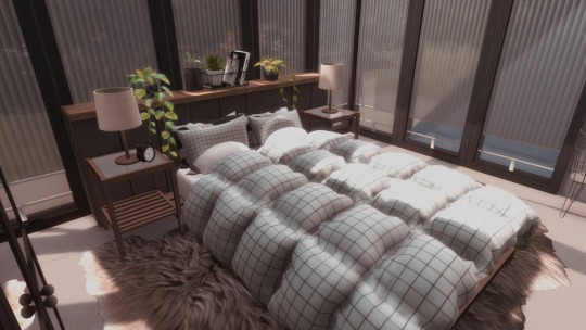
Bedroom:
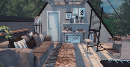
Art/Music Studio:
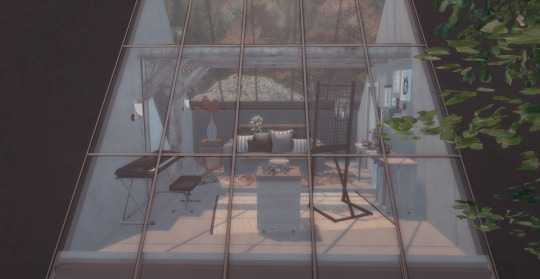
Outdoor area:


Floor plan:
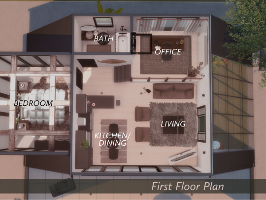

A base game A-Frame style home tucked away in Cavalier Cove, Brindleton Bay. It has one bedroom, one bath, a mini office and an art/music studio with balcony in the attic. The outdoor area is spacious enough to fit in a tiny pool and an outdoor tub.
About the lot:
Size: 30x20
Value: 48,359 simoleons
Type: Residential
Location: Hindquarter Hideaway, Brindleton Bay
List of CCs used:
Alf-Si • Birch 01 & 02
ArtVitalex • Rhodos swing seat double | Zwickau plant
Minc • Sunset arch (part of a set)
Mutske • Banks door private short wall 1x1 | Banks door sliding mid wall 2x1 | Ivy horizontal 14, ivy horizontal 11 | Pilton arch single 3x1 | Preston window 2 1x1
[NICKNAME] • outdoor hot tub set | Today’s house set | Vaporwave pool set, Vaporwave living room set (love seat & living chair)
NynaeveDesign • Avery pothos, Avery flowerpot | Lyne wall light, lyne path light, lyne mailbox
Onyxium • Arlington sofa single
Padre • Homestead heath small potted yucca
Pilar • Fashion curtains3 | Heidi rug
RVSN • Bidet As It May shower tub curtain combo
Severinka • Construction beams | ECO living matting | Oasis bedroom floor lamp
SIMcredible • Athena easel | Chlorophyll dining area, Chlorophyll plants | Dual channel rug 2 | Gardening foyer plants – seedling in bag | Modern tribal plant and books | Pump up the volume keyboard | Sea foam rug | Warmy 2020 holiday collab bookcase
Soloriya • Rita Studio, Rita Studio part two
Syboubou • Cecile office set | Lamina glassy room divider (medium) | Modern horizontal fence
Ung999 • Kitchen anukoi plant | Kitchen jen set part 1, part 2, part 3
Winner9 • Asuna set, Asuna decorations | Hypnotique rug
Wondymoon • Antimony set | Chromium tabletop plant | Cycnus wall decor | Rhenium plant | Titanium wardrobe with mirror
Thank you to all amazing CC creators ♥
DOWNLOAD
Tray files: [CURSEFORGE]
#sims 4#sims 4 build#the sims 4#sims 4 cc#ts4 build#ts4 custom content#sims 4 screenshots#ts4 screenshots#sims 4 custom content#showyourbuilds#simskittyyybuild#ts4 download#sims 4 lot#ts4#ts4cc
28 notes
·
View notes
Text
Ratatouille | JJ Maybank

(GIF is made by me. Credit if used)
Summary: JJ Maybank is a clever little rat. Always stealing and never getting caught. Until, he finds himself in the presence of your own home and you finally catch him.
Note: It’s been a hot minute since I’ve released something so it might be a little iffy but, i really hope you enjoy it + feedback is appreciated
"Have you heard about the little rat who keeps stealing our food? Just the other day, my finest roast chicken was taken. I bet it's those dirty Pogues." Mrs Andrew's who resident three doors down complained to a few other figures, who slyly had there eye on your mother's newest trinket.
"You should take it as a compliment, Mrs Andrew's. It means your cooking is divine." You endeavour into her daily rant hoping she could see this in a different light.
Mrs Andrew vexed at your attempt to see the light in this particular theft, " That piece of chicken costs me 30 dollars. I don't pay for my food to be taken, young lady."
You threw your head back, squaring your shoulders with charismatic movement whilst hearing Mrs Andrew's bicker about a false accusation that you might be seeing a Pogue. As the daily neighbour meeting elongated into hours of constantly whining, you decided to seek refuge into a certain Cameron.
You constrain your body to accompany Rafe, your trusted advisor and best alcohol dealer. "Rafe. I need alcohol, pronto."
Rafe disapproved your request, seeing you suffer was a blessing and a curse to his sicken mind, "Mrs Andrew's giving you a hard time?" You nodded, freely motioning your head to rest into his chest.
"She's claiming I'm sleeping with a Pogue because I defended the 'rat' that steals her god damn chicken." Even the mention on the claim provoked you making you feel slightly uncomfortable that you had that potential to sleep with a Pogue.
"Don't you fancy the Maybank kid?" Rafe's eyebrow furrowed knowing too much about your personal life.
"I don't fancy him. I just see him delivering my groceries." Rafe prompted attacked your false claim by falling your emotions further.
"So staring at him for three minutes straight and, finding it hard to say 'thank you' really gives the ' I don't fancy him' vibe."
You awarded Rafe with the finger, gravitating away from his presence before you do something you'll regret.
✿✿✿✿
"JJ, A chicken? Really?" Kiara was slightly miffed by the actions that her best friend accomplishes the night before. JJ rose from his worn-out deck chair that somehow stayed afloat giving the circumstances of the holes present.
"What are you on about, Kie?"
Kiara watched JJ fumble his way towards her, his walk was mistaken for zigzags which only met she had to handle a drunk JJ. "You stole Mrs Andrew's chicken and many more things."
JJ remotely failed to make a face to the name, shrugging his shoulder he twirled away from Kiara, "Mrs Andrew shouldn't be so worked up about a fucking chicken. If I did take the chicken, shouldn't she take it as a compliment?"
"You didn't have to steal it, JJ. You could have just asked me and I would have gotten you groceries." Kiara abbreviated JJ's response, hoping the statement she announced stayed in JJ's mind the next time he decides to steal.
Stealing for JJ was like breathing. He didn't need to, of course - but, he needed to survive. It was like a curse his father placed when he turned to alcohol for pleasure. His friend tried to make him stop, but he couldn't break the curse. He always saw stealing as the only sensible way to survive in the Cut. In this Pogue life, you worked two jobs and were lucky enough to earn a tip. JJ wasn't going to rely on just an hourly income for himself and his drunken father, he needs cash, immediately.
It started with small items, food to help him function for the day. But, as he successful outsmarted Heyward, he thought bigger and placed his icky nose on the other side of the island known as 'Figure 8.' Figure 8 was JJ's dream, a dream that one day he would go full Kook and have a golden statue of himself.
"Noted." JJ bluntly responded but Kie wasn't remotely sure if JJ even took anything she told into account.
JJ watched the sea, lost in the rhythmic percussion of the harsh waves crashing onto the sand. His eyes watched the sunset, spreading into its last ounce of orange rays before twilight awakes. His lips bear the semblance of a smile, just enough to show that he knew what house he wanted to enter, whatever the consequences he was adamant to have another decent meal. JJ landed in Figure 8, a town he knew well from his kleptomaniac days. Since he got the heads up that Mrs Andrews was on the hunt, he vowed to take the beachfront.
His stomach commences into a harsh growl, the pain was noticeable and so was a house. It was three downs up from Mrs Andrews, a typical white framed fence with artificial flowers and wide backyard. JJ's wandering eye teleported him towards the gate, a gate he began to familiarise when his hand touched the newly painted wood.
"Mrs Y/L/N House..." JJ whispered to himself. When JJ's movement came towards the garden he noticed the door left ajar, a scent rushed out of the house and suffocated JJ's nostrils making his belly flip with joy. He knew he couldn't get into trouble due to the door being already open which was odd for Figure 8. JJ approached the door and scanned the ghost-like kitchen to see if anyone was awake.
No one was seen.
JJ pushed the door and it swung open with ease, a blast of air-conditioned of a cold streamed past him, with light jazz escaping through the night. He tiptoed inside, squinting his eyes shut as he didn't want to draw attention to himself. He shamelessly headed from the double magnetized fridge covered with pictures of you and magnets from different states.
"Why do Kook's have beautiful children?" JJ murmured, haltingly placing his hand over the handle letting the momentum of the fridge open revealing a whole stack of food.
"Tempting. What do you fancy tonight, JJ?" He asked himself, fiddling around with the products making sure everything was neatly stacked the way he found it. JJ took out a plate of half-eaten cheesecake, along with a bottle of coke with some fruit on the side.
"I found dessert, but I need dinner. C'mon pretty girl, what did mama make ya?" JJ eyes darted around the island, checking if there were pots present or even a plate visible to him.
"Bingo." JJ teethed with joy as he noticed a pan neatly resting on the stove. "Come to JJ."
As JJ swayed his arching body towards the stove, he smelt the rich scent evaporate around him causing him to gag a little, "This has to do..."
JJ tasted the dish, it looked like someone effortlessly threw random vegetables onto the pan and called it a day. "This is fucking disgusting."
"Tell me about it." You chuckled, repelling the smell of your mother's failed attempt of Ratatouille, and amazed that a boy with the same age demolished the meal in three gulps. "Of all things you could eat, you choose that?"
JJ froze insight, ceiling his eyes shut with a combination of a curse word leaving his lips, "Please don't call the cops."
"I wasn't planning too, Maybank." He was stunned by your response and the mention of his surname.
"How do you know me?" JJ dumbly interrogated the girl, trying to form a vision but the darkness around them forbade him.
You chuckled, as JJ tried to figure out a time where he would have met you."You deliver my groceries every Sunday. You are friends with Pope Heyward, I usually give him a can of beer whenever he is alone."
"Beer girl? No fucking way."
You bowed letting out a quiet laugh. "I'm guessing you are the person who stole Mrs Andrew chicken? and, If you really are that hungry I can make you mac n cheese?"
JJ hurled when the name entered the room, "The ungrateful bitch. She should be glad I stole her chicken. She's hella of a good cook, better than your ma's."
"Anything is better than my mother's cooking. I sometimes ride down to the Wreck for a decent meal. Mr Cerrera's food is the best." You praised the Cerrera's talent whilst you attempted to make Mac n Cheese for the hungry boy.
JJ sent a smirk to his fond smile, "I'm best friends with their daughter. Even though, I'm not their cup of tea... I still get scraps that ungrateful Touron's don't finish."
You envied the Pogue life, even more now as JJ began to blabber on about his adventures of surfing during the hurricane's, going to Mrs Crain's and Rixon's Cove. You liked being a Kook, you had everything you wanted and more but, something was missing. You had friends, Rafe mainly when he wasn't trying to get into your pants and his sister, Sarah but, It wasn't nearly as great as JJ's friends.
"You okay there?" JJ snapped your train of thoughts, placing his hand over yours.
You gave JJ a cramped smile as he took charge of stirring, "Yeah. I was daydreaming."
JJ didn't say a word, knowing it wasn't just a daydream thought. "Cute. How about you come and hang out with us? As for us, I mean the Pogues? But, If you want to hang out just us two..." You cut JJ with a light kiss to his cheek causing a heat of pink to arouse him.
"Taking that as a yes."
You laughed, scooting him away from the stove. "You are my guest. Sit down and I'll give you your food."
JJ did as he was told, hearing your bossy attitude take charge aroused him. "Yes, chef."
You delivered JJ his meal, watching him devour as if it was his last. The small moans escaping from his lips gave you confidence that you weren't a bad cook. "JJ, slow down. It's not going to run away."
"I think you have scored the best cook of Mac n Cheese. I'm definitely coming here, again."
You were meaning to question the boy on how he cleverly entered your house, "How did you even get inside? The alarm was on."
"Simple. the back door was open slightly. Someone must of-" JJ stopped when a gasp escaped your lips.
"Fuck. I forgot to close it." JJ chuckled at the clumsiness of your mind. He managed to figure you out in 10 minutes, which he didn't mind doing.
"It's okay. Maybe you forgot for a reason?" JJ tried to flirt his way into the situation, but you were more infuriated with yourself.
"You saying we were destined to meet, Maybank? I thought a Pogue and Kook don't get along or date." You translated the rules of the two tribes made by Rafe and, JJ.
"Fuck the rules. I tend to break them." JJ shrugged looking around as he proved his point.
"I see. Well, my mother is making spaghetti bolognese tomorrow? I'll leave you a plate outside." You winked, gathering his empty plate.
"And if it all fails, I'll treat you to a nice dinner at the Wreck. My treat..." JJ rambled not wanting to leave your house but, he knew he had too.
"You mean, free food at the Wreck?"
JJ pouted at the response. He was hoping for a simple nod.
"It's a date, Maybank."
masterlist | taglist
#outer banks#outer banks imagines#jj maybank fic#jj maybank x reader#jj maybank imagine#jj maybank fanfiction#jj maybank fluff#rafe cameron x you#outerbanks imagine#obx fluff#jj maybank#rudy pankow#obx one shot#jj is remy#disney x obx#outerbanks masterlist#rafe cameron#obx jj maybank
534 notes
·
View notes
Text
Different Kinds Of Decorative Moldings
A decorative molding can be defined as any continuous projection that is utilized to improve the feel of a wall. In ancient Greece, we were holding first used to throw water away from the wall. The contours, measurements, and projections of moldings vary greatly. Frieze One type of molding - the frieze (or frieze board) - was basically suited for the Parthenon on the Acropolis. The frieze is known as a part of the Greek architectural style. The Parthenon was designed for the goddess Athena. The frieze moldings which were used were intended to tell the story of her triumph over Poseidon to become the patron from the ancient city that's now Athens. The frieze panels certainly are a compilation of designed pediments which can be stuffed with the photos of Athena's birth and rise to power. Today, a frieze board may be the flat panel just underneath a crown molding or cornice. Often, low relief is used to this particular panel for additional decoration. Today, frieze moldings are most common being a area of a decorative molding that follows the neoclassical architecture or decorating style. You will need a pretty high ceiling (the least 9 feet), and it is smart to stain or paint the frieze along with the crown molding precisely the same color. The frieze is an excellent strategy to visually bring the ceiling down to make the room appear cozier. Crown Molding Crown molding is among the most popular sort of cornice molding. Crown molding is generally a single-piece of decorative molding, installed at the top of a wall, with an angle to the adjoining ceiling. However, I know of crown molding assemblies of 5 or even more pieces in elaborate settings. Crown molding often carries a profile that projects from the ceiling and along the wall, adding a refreshing appearance into a room. It is used towards the top of cabinets or built-in furniture. Introducing such a decorative molding into a easy room offers a historic character how the room wouldn't otherwise have. Crown molding can also be used in combination with other moldings to provide details to fireplace mantels and shelves. (For which it's worth, this is the most popular architectural feature). Crown molding can be a form of Cornice Molding. The definition of "cornice" describes molding installed along the the top of a wall or over the window. If this therapy is made from multiple pieces of molding, it is called a "build-up cornice." Another type of cornice molding may be the Cove Molding. Cove Molding Cove molding is incredibly comparable to crown molding, with similar application overall performance. The real difference backward and forward influences profile. Cove molding carries a concave profile (which bows inward) while crown molding includes a convex (outward) profile. While crown is most at home in traditional settings, Cove moldings are equally comfortable in country, as well as contemporary settings. You do not normally see multi-piece assemblies of cove moldings. It is possible to occasionally see it "beaded" at top and bottom to get a little accent. Entries, formal areas, formal dining rooms, and master bedrooms usually receive decorative moldings with ornate or traditional patterns. Kitchens and other more functional regions of the property could be where you will discover the greater style of the cove molding. Over time, coves and crowns have become much smaller, but a majority of still bear the shapes and styles with the original Greek and Roman designers. Chair Rail Molding A chair rail is a decorative molding that divides a wall horizontally, usually about 32" to 36" higher than the floor. They protect the walls in places that damage might occur from people arising away from chairs. For that reason, the more traditional chair rails have a nosing from the center, with curved and beveled surfaces that taper to the wall above and underneath the nosing. Today, chair rails remain a common detail in traditional interiors. They serve the decorating effect of unifying the various architectural information on a room, including door and window trim, and fireplace surrounds.

Chair rail doubles as a cap for wainscoting or any other wood paneling. This decorative molding adds a sense detail and charm while achieving continuity in the room by unifying the different decorative elements. Panel Molding Panel molding, commonly termed as a picture frame molding, appears like a substantial empty frame, and is often section of designs on walls of old Colonial and, Georgian, and Early American homes. The placement of the molding ought to be over the chair rail height and about Ten to twelve inches below the ceiling. How big this type of decorative molding, measuring 1" to 3" in width, should be proportionate on the ceiling height in the room. Such as the other moldings, panel molding adds feeling of charm and delicate detail to some room. Wall framing appears on the Georgian period of American architecture, when plaster began to replace wood panels on the walls. Panel molding is yet another easy way divide walls into large, good to look at units, minus the same expense of full wall paneling. Another using this versatile molding is to trim openings created by wider planks which can be assembled as rails and fashions. Often, the centers of these frames are left open. By making use of panel moldings round the perimeter of the opening, you create the design of images frame. When this decorative molding is painted inside the same color because the surrounding walls, you achieve a sculptural quality to a wall, adding texture and shadows. If moldings are painted in contrasting colors, they're able to build a striking three dimensional appearance, giving depth and dimension. This sort of treatment methods are popular for staircases and entries. Baseboard & Base Molding Baseboard molding protects the base of the wall from ware and tear, while hiding openings and other irregularities the place that the wall meets the ground. Base moldings provide floor line a higher profile, and is as elaborate or simple as you wish. Whereas it really is easy to set up chair rail on the level plane, baseboard (like crown) might be tricky in case your floors (or ceilings) are certainly not level. For this reason, I recommend getting a professional woodworker for your installing these moldings. As one remedy to uneven floors, it is possible to put in a "shoe molding" over the bottom front edge to give the baseboard a finished look. Something different you're able to do with baseboard (along with with the toe kick of your respective kitchen cupboards) is incorporate accent lighting. It is not in keeping with the pure traditionalist, however it is quite a nifty approach to have accent lighting around the perimeter of an room. You couldn't do this until they come up with small LED rope lights nowadays. Rope lights can be found in different lengths and hues, and is easily installed behind baseboard. Only make a notch inside the back side of the baseboard, at the very top, and run the rope lights into the notch. This can be often found in commercial spaces, but has become put in entries and hallways - particularly in contemporary homes. Flexible Moldings For those who have a curved wall or arch, you are able to probably have a good craftsman produce a curved molding for around Thrice the expense of an upright molding. Or, you can purchase a flexible molding for around around the same price as the straight one. These allow you to install moldings onto curved surfaces or arches, with no delay and tariff of getting them made from wood. The stock profiles (you'll find hundreds) are identical on the rigid versions and they are generally compatible so far as paint finish is involved. For more details about moulding.vn visit this useful website.
1 note
·
View note
Text

Bolling Haxall House
AKA, The Woman’s Club
211 East Franklin Street
Built 1858
VDHR 127-0033
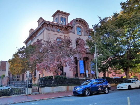
October 2019
Mary Wingfield Scott brings it!
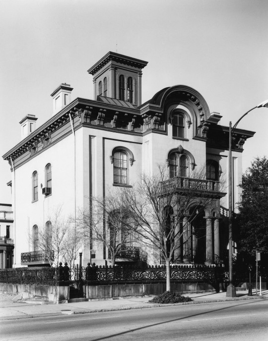
(VDHR) — 1971 nomination photo
The Haxall house is a three-story, Italian Villa style structure of sandstone colored stucco, scored to imitate ashlar. There is a projection for the full height of the building in the center of the entrance facade.
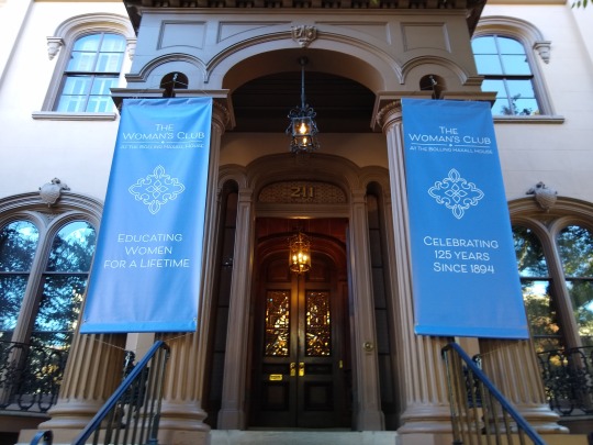
October 2019 — showing raised portico
On the first floor level is a raised portico with arched openings, supported by four fluted columns with capitals composed of a simple necking, an egg-and-dart patterned echinus, and a flat abacus. The portico has a panelled entablature with a dentiled cornice. Two large pilasters flank a recess which leads to the front door. The recess is framed by an elliptical arch, sidelights, and pilasters. The front door frame repeats this design in walnut. The door itself is a double one with cutglass and walnut panels.

October 2019 — showing basement windows, semi-circular balcony, & eyebrow windows
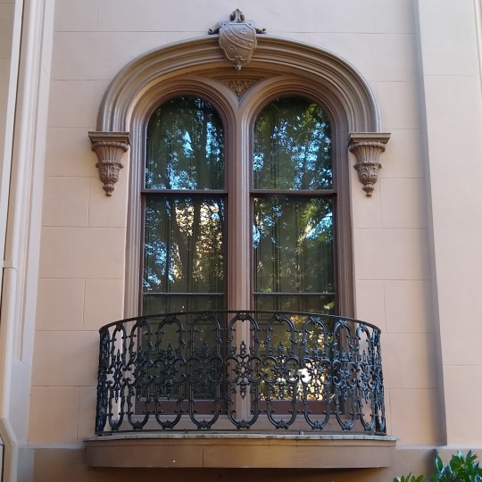
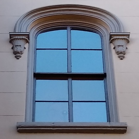
The fenestration of the entrance facade is symmetrical. The basement windows are half-sized with elliptical arches and are devoid of ornament. The windows on the first floor arc double-arched units with cast iron hood mouldings, decorated with coats-of-arms in the centers and pendantls at each end. There are semi-circular balconies with iron railings at,.the bases of the windows. The second floor windows are single-arched with the same hood mouldings, but without the coats-of-arms. They have simple trim and stone sills. The two windows in the projection correspond to the height and treatment of the first and second floors respectively.
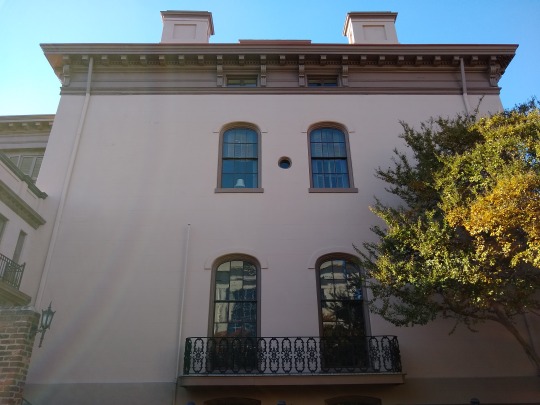
October 2019 — showing dentiled cornice
The house is crowned by an elaborate, double-bracketed, dentiled cornice. The fenestration is continued into the cornice by "eyebrow" windows framed by single brackets. At the top of the central projection, the cornice arches to form a semi-circular pediment. The right wall of the house is blank except for two narrow, semicircular arched windows on the first and second floor levels which are flush with a wing which projects at this point from the house. The windows in both the main body of the house and the .wing are semi-circular arched with hood mouldings, simple trim, and· stone sills. The cornice continues around the main part of the house, but not into the wing. The end wall of the wing is stuccoed "ashlar" and is blank.
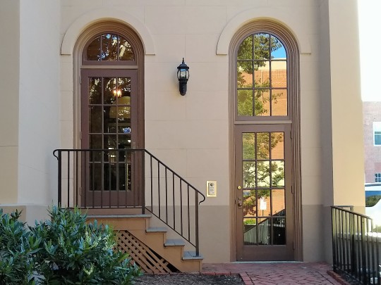
October 2019
The left facade is fenestrated in the same manner as the front of the house with a half basement window, single-arched windows on the first and second floors, and an "eyebrow" window in the cornice. The windows are spaced in the center of the facade so as to form pairs. On the first floor level, there is one long semi-circular balcony for both windows. All the windows have simple hood mouldings and stone sills. The cornice continues. The auditorium entrance joins 'the house at the end of this side.
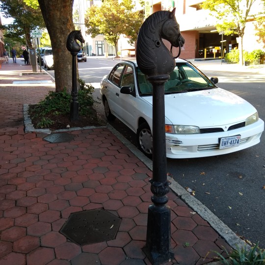
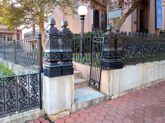
October 2019 — showing evil hexagonal bricks & horse hitching posts
The sidewalk in front of the Bolling Haxall house was originally paved in hexagonal bricks. These unusual paving blocks were regarded as evil by some members of the Richmond populace, and nurses would lead their charges into the gutter rather than have them traverse the bricks of ill omen.
Today, there are two cast-iron, horse-head hitching posts in front of the house. These once stood on Capitol Street where they were used for the horses of the state legislators. There is a fine cast-iron fence set in granite around the fronof the house. This iron-work is believed to have been cast by George Lownes, who did a similar, signed fence in Hollywood Cemetery.
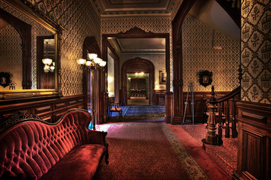
(Richmond Weddings)
The first floor of the interior of the Haxall house consists of a long entrance hall running the length of the house from the front door to the back porch. To the right of the entrance is an octagonal-shaped library, and to the left is a double parlour, separated by sliding doors. Beyond the library on the right-hand side is the semi-circular stair hall with sculptural niches and the walnut stairway added during Dr. Willis' residence. At the top of the stairwell is a stained-glass dome. At the rear of the house is a second hall with a fireplace, as well as three, large double doors which originally opened onto the porch and now lead to the auditorium.
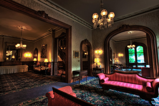
(Richmond Weddings)
The plan of the second floor is similar to that of the first, except that the partition has been removed between the double parlour in order to form a larger room for parties and meetings.
In addition to the double-spiral, walnut staircase and the dome preserved from Dr. Willis' day, the panelled walnut wainscoting which he added to the walls of the entrance and stair halls also remains. The doors and door frames that face into the entrance area are panelled and carved in walnut.
October 2019
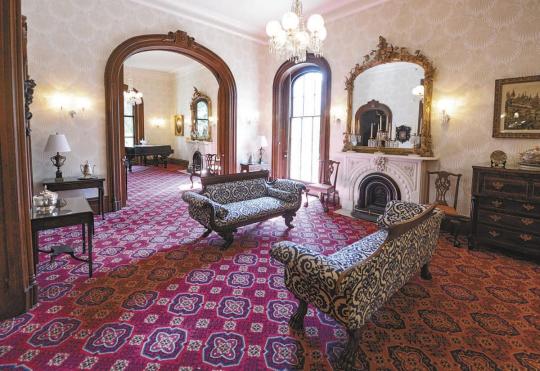
The octagonal library on the first floor has been restored to its nineteenth century appearance. The original, carved, pink marble mantel is complemented by a patterned ceiling painted in subtle browns, beiges, pinks, and greens. The walls are painted in shades of brown, beige, and white to imitate panelling. There are walnut, glass-front bookcases in four of the corners of the room.
(Richmond Weddings)
The double parlours have elaborately carved, white marble mantels. The doors and windows have white trim with small colonettes at the sides leading up to a cartouche in the center of an elliptical arch. This same design is used with slight variation for all of the door and window frames on the first floor.
There is a cove moulding around the top of all the first floor ceilings and plaster work around the bases of the crystal chandeliers. The second floor is much simpler in its decorative treatment. The three fireplaces are all of white marble in a simple design. The frames of the doors and windows are squared-off, not arched as on the first floor, and have only a plain moulding.
October 2019
When repairs and redecorating of the club were undertaken in 1961 and 1962, the walls of the octagonal-shaped library were discovered to have been painted to simulate paneling in the nineteenth century. The ceiling also yielded evidence of painting in an elaborate design. The walls were repapered at first, but in 1965-1966, Miss Mary Wingfield Scott made it possible for the library to be returned to its original decor.
October 2019
In 1965-1966, the House Committee of the club supervised major structural and redecorating repairs to the house. The cupola was strengthened and repainted, deteriorated cornice mouldings and dentils were replaced, and the exterior of the building was restored to its original sandstone color (obtained from iron filings) with the stucco finish scored to imitate ashlar. Curved iron details over the windows were discovered, and the cast iron balconies around the windows were made visible by the removal of box bushes.

(Pinterest) — Old Dominion Nail Works, February 1948
Bolling W. Haxall was the fifth son of a prosperous mill owner, Philip Haxall. The former Haxall began his career as a clerk in the Haxal Mills and became a partner in 1842. He had a wide range of business talents 'for he was also the president of the Old Dominion Iron and Nail Works and had an interest in the Richmond and Petersburg Railroad. His obituary in the Dispatch of June, 1885, referred to him as “a most energetic successful man of business, whose advice was often sought and highly valued. His house is a testimony to his material success and to the taste of the time.
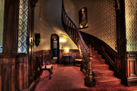
(Richmond Weddings) — showing walnut stairway
Haxall sold his house to Dr. Francis T. Willis in 1869 and I moved to the block west, across from Linden Row. Dr. Willis made several changes in the house. He added a beautiful walnut stairway and frescoed walls with hardwood wainscoting on the main floor. His eye for beauty led to tragedy, however, for his daughter, Emily, a sleepwalker, was killed in a fall down the curving staircase. In despair, Dr. Willis sold the house in i900 to the Woman's Club, which had: been formed by Mrs. L. L. Lewis in 1894 for the literary culture of its members; for their intellectual, social, and moral development, and to strengthen their individual efforts for humanity.
To pay off their mortgage, the ladies of the club rented the second and third floors of the house and the outbuildings as apartments In 1916, the burgeoning enrollment of the club required the addition of an auditorium to the back of the house. This partially destroyed. the rear porches on two floors.
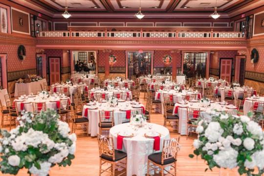
(Richmond Weddings) — auditorium
The auditorium was enlarged in 1924. 1928 saw some major changes on the interior of the Bolling Haxall house. A partition was removed from.between the double parlour on the second floor in order to make a large assembly room- The third floor was converted into studios with a separate entry and stairway, and a balcony was added to the auditorium. (VDHR)

October 2019 — trees giving us the finger
Yet as wonderful as the Women’s Club truly is, it has clearly been targeted by the Insidious Tree-Architecture Conspiracy, that dread cabal that has conifers everywhere laughing at the human species. What can you do but shake your fist in silent rage?
(Bolling Haxall House is part of the Atlas RVA! Project)
5 notes
·
View notes
Text
Extreme Makeover: 6 Before and After HDB Transformations
People have always loved a good old, dramatic makeover. (Admit it, we are all guilty of watching an episode of Extreme Makeover once in our lives.)
And nothing's more epic than seeing a rundown space turn into a picture-perfect feature! These 6 gorgeous spaces take the cake when it comes to jaw-dropping home overhauls. Not convinced? Check out their amazing before and after transformation shots!
1. Ciseern: Punggol Walk

Renovation Cost: $113,000
Is this cosmopolitan suite a hotel room, fancy penthouse or landed property? How about none of the above? In fact, this humble BTO was built up from scratch.
Living Room

Before: Designers had to work on a (literal) clean slate. Here, the bare, tiny windows hardly lets any light in, causing the space to look dark and cramped.

After: To provide a richer tone, a bronze and gold colour scheme was used to match the HDB provided flooring. Different forms of lighting, from hanging pendants, cove lights and spotlights were utilised to counter the dimness of the original space.
Wet/Dry Kitchen


Before: Prior to being done up, the L-shaped kitchen area was exposed to the main door foyer and living area.


After: Here’s proof that a statement feature goes a long way - the trellis wall-to- ceiling feature frames the main door and connecting kitchen. Meanwhile, unsightly DB box by the door is concealed with a snazzy mirrored piece. The open-plan kitchen doesn’t skimp on storage space, with small corners and cubbyholes installed throughout the bar counter to place items.
2. Crescendo Interior & Lifestyle: Bedok

If you want to talk about gritty industrials, this flat’s original layout was the real deal. And by that, we mean really grimy - think grubby wall and floor tiles that haven't been scrubbed for ages, white walls with stains; and an enclosed, elongated layout that remind us of dingy, claustrophobic factories.
Living Room

Before: When you have metallic louvred windows and grilles - that’s when you know your flat is old. With only a single opening, the living area appeared closed in and shorter than let on.

After: To brighten up the space, the designers repainted the walls and ceilings with a fresh coat of creamy white, and finished with spot and track lights. Surprise, surprise - this once stumpy looking apartment is even able to accommodate a platform!
Kitchen

Before: How does a sickly kitchen look like? This - an unfortunate choice of pale green with yellowed tiles brought out the most in those dirt stains and blemishes. Also, it was overkill (and kind of creepy) to have three doors in a single space.


After: Breaking up the initially stuffy space, the wall between the kitchen and living area was hacked and replaced with see-through sliding doors. Meanwhile, the two bathroom doors were patched up with cement-screed looking tiles.
3. EC Vision: Jurong West

Renovation Cost: $80,000
This sleek and snazzy 5-roomer has improved in leaps and bounds from how it first looked like. While its initial state wasn’t horror-show worthy, the thoroughly lived-in family abode was definitely in need of a style update from the 90s (and some extreme spring cleaning).
Living Room


Before: Here is Singapore’s most iconic interior theme, the 'no style' style! Loose, mismatched furnishings, bare walls, save for a cheesy cornice that (honestly) doesn't fit into any decor at all.


After: Some people hate the thought of having extensive built-ins they can move or dismantle, but they are a great solution for storing clutter away. Here, the wall partition cum TV console doubles as a cabinet from the back, and joins with the rest of the carpentry, including a study table and recessed bench. Now, that’s what we call multipurpose!
Kitchen


Before: Where shall we start? Be it the gaudy tiled floral motifs, outdated pink and cream kitchen cabinets or the indoor bamboo hanger hanging above the dining table, there’s so much jammed into this space - it is giving us visual anxiety.

After: Obviously, some things had to be done away with (such as the bamboo poles). The wet and dry kitchens were then combined into one undulating, L-shaped space. Also, the tacky cabinetry were replaced with stylish wood-laminate versions.
Master Bedroom

Before: The 'no-style' theme continues on in the bedroom, as practical (but highly unappealing) items are haphazardly placed about.

After: From loose furnishing to this - a built-in wardrobe was constructed, running across the entire wall and providing space to store stray bric-a-brac. The bedroom also feels calm and classy, with creamy undertones dominating; the addition of cove lights helps to give the space a posh feel.
Guest Bedroom

Before: Like the master bedroom, this simple-looking space is mainly composed of loose furniture, with no particular theme in sight.

After: A refreshing aquamarine hue takes centre stage in this guest bedroom. Clean lines in stark whites pair wondrously with this colour, creating a neat space that's bright and modern.
4. The Interior Design Enterprise: Choa Chu Kang Crescent

Renovation Cost: $85,000
Know the phrase ‘too much going on’? Likewise, this woody, insta-worthy HDB didn't used to be filled to the brim with too much features. Case in point: the drab cornices and arches, patterned floor tiles and clutter - so much clutter.
Living cum Dining Room

Before: Despite the huge square footage in this conjoined space, badly chosen decorative features like the window sill, checkerboard tiles and grand false ceiling combo make for a small and sloppy space.


After: This newly refurbished space certainly didn't carry on with the traditional theme, but it does keep most of its layout intact. Some changes include building a short partition and patching up the walkway to the kitchen.
Kitchen

Before: An indoor-window concept is cute, but the matching countertops and window sills are not. Also, if you are wondering why the counters run in jagged lines - don’t worry, we are equally perplexed by this safety hazard too.


After: The countertops are tapered back into simple, straight lines. The new homeowners decided to retain the cute windows, but everything else is done up in contemporary, wood-effect laminates.
Master and Guest Bedrooms


Before: Is this an optical illusion? In an unfortunate design decision, the jagged built-in wardrobe looks as if it’s falling apart. The rest of the bedroom is sparsely decorated, with plain-looking beds taking up the rest of the tiny space.


After: Combining the two adjacent bedrooms by hacking the wall in between, the master bedroom now encompasses a private study/lounge and sleeping quarters. The mind-boggling wardrobes from before were replaced with a walk-in wardrobe (a.k.a. where it used to be the walkway).
Bathroom

Before: While the old bathroom looks thoroughly clean, those garish floor tiles and clunky bathroom fittings had to go.

After: Talk about unrecognisable! Who would have thought that thin, tiny scrap of space could fit in a decent bathtub? It also comes to show how the right bathroom finishes are everything - bronzy slate tiles provide the perfect a ritzy, upscale feel.
5. Starry Homestead: Tampines

Renovation Cost: $40,000
Don’t worry, there’s enough room to lounge, prance or even play some mini golf! Even so, it is hard to imagine now that this roomy HDB once looked as if it couldn't even fit anything more than a 3-seater sofa.
Living Room

Before: The main culprit? The lack of ample natural light. Due to the far-set windows on both ends, insufficient light filtering in resulted in the living room looking extremely cramped.

After: Even if your room is really cramped - the key is working with what you’ve got! Without any extensive hacking, the living room looks opened up, thanks to space enhancing white walls, bright lighting and minimal furniture.
Kitchen

Before: Admit it- this kitchen isn’t terrible per se. In fact, a bit of cleaning up, and the kitchen space will look as good as new! A pity though, that it doesn't fit into the new home’s clean, minimal theme.

After: If it works, why fix it? Though the old cabinetry was cleared out and fitted in with a more matching, pale wood cum dark blue theme, the kitchen’s original layout was kept in this new space.
Master Bedroom

Source: Property Guru
Before: Bulky furniture, like the old-fashioned wardrobe and bed, along with obstructing pillars clog up the bedroom, making it appear much smaller.

After: Taking space saving to another level, the newly refurbished snooze area contains no loose furniture, nor messy decor pieces or items. Instead, the centrepiece is the bedroom's extensive platform, which houses the mattress as well as a ton of handy storage drawers underneath.
Bathroom

Before: It was no mean feat on the previous homeowner’s part in fitting in everything (toilet bowl, sink and shower) into this tiny bathroom space. But just one question - why the pink WC?

After: Needless to say, the pink WC was out. Instead, to keep in line with the rest of the house, marbled tiles and bathroom fixtures in classic whites are matched with stylish wooden cabinetry, while cove lights all around help to create an illusion of width.
6. Story Of Us: Hougang

This clean, futuristic abode is hope for drab resales everywhere. A 180 degree turnaround, this creative, absolutely stunning space decked in stylish wooden slats and panels, once was a worn, tired looking space that had seen years of wear and tear.
Living Room


Before: Void of all furniture, the stained walls and floors in an unappealing shade of orange reveal an oppressing landscape, obscuring the living area's vast amount of space.


After: White - the modern home’s go-to colour! Matching any type of style and material, especially woods, a white-washed brick overlay was used to give the living space a hint industrial texture.
Kitchen

Before: Major throwback vibes on this retro-looking kitchen! While the white tiles look relatively clean, the countertop and sink are splitting at the edges with rust creeping in. Yikes.


After: Understandably, the old, rotting carpentry was taken out and replaced with brand new wooden cabinets. The new cooking space also houses this home’s ultimate standout - a wooden slatted ceiling feature in geometric motif.
Your extreme makeover starts here!
We can help - request for a free quote here, and we can match you up with 5 interior firms, based on your budget and style. All recommendations made by Qanvast will be covered under the Qanvast Guarantee, up to $50,000.
Not ready to renovate yet? Download the free Qanvast app from the App Store or Google Play to browse and save home ideas, costings and reviews of firms in Singapore. It’s never too early to start your research.
About Qanvast: Create a space you love today with Singapore’s first mobile platform. Qanvast (pronounced as ‘canvas’) connects homeowners to trusted home professionals. Browse for reviews, renovation prices and portfolios from interior designer firms in Singapore at your fingertips.
1 note
·
View note
Text
Nomo Studio carves curved patios and terraces into Menorcan holiday home
Curved walls and arching ceilings enclose indoor and outdoor living spaces arranged over several stepped levels at this villa in Menorca by architects Nomo Studio.
Curved House's elevated setting in the high-end residential area of Coves Noves provides it with views towards the sea and the nearby town of Port d'Addaia.
Top image: the holiday home has a cubic shape. Above: the home was built around an archaeological site
The client bought an undeveloped lot and asked Nomo Studio to design a summer villa containing four bedrooms, with a covered outdoor area linked to a small pool.
The 600-square-metre site presented several challenges, including a steep gradient. It also contains an area of archaeological importance that needed to be conserved.
Openings in the facade create terraces
Nomo Studio responded to the sloping plot and small building area by creating a house with a compact footprint that is carefully shaped to avoid the restricted area.
"The curved shape of the house started as an answer to try to avoid the protected area on the site," architect Karl Johan Nyqvist told Dezeen.
"By curving the house on the ground floor we could avoid the archaeological site but still maximise the footprint. We then continued with the same language in three dimensions."
The walls and ceilings of the house are arched
The property resembles a cube with sections removed, as if by intersecting with giant spheres. The resulting curved and double-curved geometries lend the external and internal spaces a distinctive character.
In order to achieve the internal programme requested by the clients within the building's small footprint, the living areas are arranged over six stepped levels that incorporate several patios and terraces.
The kitchen has an open-plan design
"Light slits between the slabs enlarge our vision of space and create one single continuous open area," the architects explained.
"The same technique is used in order to bring natural light into the basement, completely transforming its perception."
The house can be entered from the streets on either side at different levels. From the upper street, a bridge with curved stairs and a rope handrail traverses the steep slope, while from below a set of steps winds around the circular pool.
The main entrance leads into the bedroom level, which is connected to the main living spaces below by a wide metal staircase with a wooden balustrade.
Large windows overlook the landscape
To one side of the entrance hall, a large patio with glazed walls on two sides provides a protected semi-outdoor space suspended above the concrete floor.
The patio allows bright sunlight to flood into the interior and incorporates openings that frame views of the sea. The versatile space can be used for stargazing or open-air film screenings.
A patio enveloped in glass is suspended within the home
The main living areas on the lower level are spanned by 12-metre concrete beams. Sliding glass doors allow this space to be opened up to the adjacent porch and pool area.
"The day area is conceived as one large unfolding space, framed by the bold gesture of an upper and lower arch," added Nomo Studio.
"Under its double-curved, four-metre clear height ceiling porch one feels protected from neighbouring views, focusing on the garden and sea views."
Glass partitions create a spacious feel
The interiors feature a palette of concrete, terracotta and wood, along with white walls and turquoise curtains. The natural hues, textures and use of indoor plants enhance the connection with the garden and surrounding landscape.
Nomo Studio was founded by Alicia Casals and Karl Johan Nyqvist. It has offices in Barcelona and Stockholm delivering projects across various fields including architecture, urbanism, graphic design, product design and social research.
The home has an exposed concrete base
The studio has worked on several properties in Menorca, including a house comprising a series of stacked, angular boxes and another home featuring facades that combine local stone with smooth plaster.
Photography is by Adriâ Goulá.
The post Nomo Studio carves curved patios and terraces into Menorcan holiday home appeared first on Dezeen.
0 notes
Text
The Caban – Bangor University
Heading into Bangor once again on a rainy afternoon, I noticed this unusual looking sculpture at Bangor University.
It is called The Caban. Seems like the locals don’t really like it.
Unveiled in 2016. It was sculpted by Joep van Lieshout.
Something to do with Quarrymen.
This view from near Storiel.
Main Building of Bangor University.
Grade I Listed Building
Road University College of North Wales Main Building (Original Courtyard Ranges only)
History
The University was founded in 1884 after the city of Bangor was chosen as the University’s North Wales site. First established of the former Penrhyn Arms Hotel; the present Penrallt site was donated in 1902.
Built 1907-11 by Henry T Hare, architect of London; chosen following a competition assessed by Sir Aston Webb and with other entrants including W D Caroe. The designs were modified by the University (Isambard Owen in particular) to take full advantage of the site. Contractors were Messrs Thornton and Sons of Liverpool; cost ca £175,000. Foundation stone laid by Edward VII on 9 July 1907; opened 14 June 1911.
"Collegiate Tudor" style with Arts and Crafts influences; Hare also carried it "generally of late Renaissance character". Designed around two courtyards, the larger of which was never completed (later enclosed with ranges by Sir Percy Thomas 1966-1970). The entire scheme is linked and focused upon the cathedral like central tower. Buff coloured Cefn stone in snecked courses with freestone dressings and flat buttresses; slate roofs with parapet and stone chimney stacks. Mullioned and transomed windows with leaded lights. Tudor style down-pipes etc dated 1909. Metalwork by William Bainbridge Reynolds of London. The building was described in his obituary as Hare’s finest work.
Exterior
Starting at the NW Hall range facing College Road. 2-storey, 6-window front with advanced end pavilions; altered to right by addition of modern entrance block closing the NW side of the SW courtyard. Steep roof, crenellated parapet and bellcote with lantern and spirelet. Tall segmental headed hall windows, double-transomed and with panel tracery; projecting flat roof ground floor with entrances to either end, deeply recessed doors. Left hand end pavilion had central stepped buttress flanked to 2nd floor by 2 segmental headed windows with unusual tear-drop oculi; right hand pavilion is lower with dentil cornice over 3-light window.
The original main entrances if on the SW gable end of this range. Broad gable with Tudor octagonal end turrets and Baroque niches containing statue of Lewis Morris to apex. Central segmental headed 4-light double-transomed and panel traceried window with flanking buttresses. Advanced below is a triple arched porch with panelled pilasters, coasts of arms and Latin inscription dated 1911. Enriched spandrels over recessed entrances with double doors and lugged architraves to each. Shaped gables at right angles to either side, to the advanced end bays of the adjoining ranges; commemorative tablets with garlanded borders below each gable. At the top of the steps up to the entrance are cast-iron square, tapered lamp standards with bracketed octagonal lamps and openwork ornament.
The spinal/administrative range, together with the Library, forms an :-plan group to the E side of the SW courtyard. The former has an 8-bay, 2-storey front, the advanced left hand bay as above, parapet is balustraded over cross frame windows with architraves to 1st floor and semicircular pediments to ground floor. Baroque entrance to centre with small-pane circular window over door.
The 2-stage tower to right has crenellated parapet and taller stair turret to SE side; splayed corners. 2 segmental-headed double-transomed windows flanking ogee niche to each face; niches contain statues of Welsh historical characters over coats of arms.
The Library at right angles has a 9-window front with central royal coat of arms; 2 bays are advanced with tall 1st floor oriel windows. Crenellated parapet and gabled and panelled buttress pilasters. Arched headed lights, square headed 1st floor windows and segmental headed ground floor windows and entrance which has open pedimented doorcase, lugged architrave and double doors. Plaque with Latin inscription.
Gable end to Penrallt Road has full height buttresses, extruded corners and small attic windows. Central 2-storey splayed bay with horseshoe shaped high arch above containing recessed 3-light window – no leaded glass to this elevation.
The 3-storey SE side of the Library overlooking the city had 1 9 bay front, (stylistically foreshadowing Sir Edwin Lutyens at Castle Drogo). Attic to the advanced and gabled end bay with Baroque scrolls over stepped buttresses; 2nd floor has statute flanked by cross frame windows under overall label. Symmetrical to right with a repeat of the courtyard elevation as above with the addition of a slightly swept out ground floor with single light windows and entrances below the oriels; 1st floor windows set in splayed recesses. Forward to right beyond the tower is the SE range of the NE courtyard. This has a gabled SW end with slate hung attic to left and chimney breast to right, the latter with open-pedimented tablet. 2-storey porch facing Penrallt road entrance with part balustraded parapet, tapered buttresses on chamfered corners and round arched entry with multipane fanlight – swaged shield over.
The main 3-storey and attic SE elevation is symmetrical with an especially collegiate feel to it. Tapered cross range gable ends advanced at the end advanced at the end of 10-bay range, the ground floor of which is arcaded and the central 4 bays open, forming a loggia; storey chimney stacks and flat roof attics over parapet. 2nd floor cornice extend to edges of end pavilions over shield; splayed broad buttresses. Lintels over 1st floor windows and broad ground floor windows, bowed to centre and with high parapets containing UCNW monogram, 1st floor double transomed windows between have lugged architraves and open pediments. Stilted arch arcade windows and part glazed doors to ends of loggia.
The NE end of this range is a repeat of the SW gable end. Advanced to its right is a 3-window bay with boldly tapered end pilasters; double transomed 1st floor windows. 9-bay tall roofed range beyond set into the hillside; largely 2-storey and attic with higher attic to south-eastern 3 bays, also with double transomed ground floor windows. Dividing pilasters to remaining bays. Segmental headed entrance to NW end bay and a smaller one lower down. Octagonal bellcote. The gabled NW return elevation is partly screened by the broader gable end of the hall range. This has a stronger Arts and Crafts feel to it – 4-light gable window, crenellated broad end pilasters with narrow lights (?stair projection) and grills to lower windows.
The enclosed NE courtyard is terraced with similar detail to that on the exterior of each range. The Hall range is at the top and has an ivy clad ground floor projection. The inner side of the SE range is symmetrical; lower gabled projection with polygonal corner turrets, lateral chimney breasts and frontis-piece with 3-light transomed window over scrolled inscription and round arched entrance. Six 2nd floor and three 1st floor segmental headed windows to either side; projecting ground floor. To SW the range is dominated by the tower’s 6-storey NE face; including splayed oriel with crenellated parapet and recessed plain Venetian window; lowest stage splayed out. Twin gabled 3-storey block projects to right of the tower matching similar projection opposite (NE range).
The 4-tier terrace has rubble walls, freestone copings and ball finials.
Main doors open onto a part groin vaulted entrance hall with original 3-lamp light fittings and brass War Memorial tablets by F Osborne and Co Ltd of London. Straight ahead is the 150 ft long Pritchard Jones Hall. 9-bay arches coffered ceiling with panelled ribs and strapwork ornamented ceiling panels, apsidal dais end; coats of arms over windows, panelled dado and other fine woodwork detail etc. Gallery raked over the entrance hall with panelled screen front and segmental open-pediments to the 3 doorways, Original brass light fittings (octagonal). Main staircase lies to SE in groin vaulted stairwell – marble topped ‘closed’ stone balustrade; stained glass window. Open pedimented and carved doorcase at top leads to hall gallery. To SE run 2 tiers of groin vaulted corridors with panelled ribs (not glazed until after 2nd Work War). 1st floor has various bronze oval plaques, panelled doors and cornices and similar pedimented doorcase at SE end leading to back stairs; plainer ground floor corridor. Stained glass windows at SE end by Dudley Forsyth of London 1910, the classical subject and signed "Architectus Dedit" with the monogram of a hare. Short arms of the passages lead off to the Library, that to the 1st floor contained a porcelain museum. The finest single room is the Council Chamber on 1st floor – segmental vaulted ceiling with panelled Jacobean plasterwork and coats of arms of the Welsh Princes full height wainscoting, segmental pedimented doorcases and ashlar fireplaces and overmantels with panelled and fireplaces. Also contains 2 busts by W Goscombe John, one of William Cadwallader Davies and another of Sir Isambard Owen.
NE range has smaller hall with coved ceiling ridges. SE range has metal staircase with barley twist uprights to courtyard side. Library range contains the ground floor Lloyd Reading Room which Hare had intended to be a museum and the 1st floor Shankland Library with segmental vaulted roof with square panel-lining and 36 heraldic shielded in oak frames. Two bays are screened off (corresponding to those with external oriels) and have broken Baroque pedimented openings – 1 bay also has wooden gates. Splayed oriel over entrance with similar doorcase.
Reasons for Listing
Architecturally, one of the most significant public buildings of the period in Britain and historically, the foremost institution in Wales to pioneer the academic development of the Welsh language.
Posted by ell brown on 2018-08-25 18:35:09
Tagged: , Bangor , Wales , United Kingdom , Great Britain , Gwynedd , Bangor, Gwynedd , Caernarfonshire , tree , trees , Waterloo St, Bangor , Waterloo St , Stryd Waterloo , Bangor University , Grade I Listed Building , Grade I Listed , Road University College of North Wales Main Building (Original Courtyard Ranges only) , former Penrhyn Arms Hotel , Henry T Hare , Edward VII , Collegiate Tudor style , Arts and Crafts influences , late Renaissance character , College Rd , College Rd, Bangor , Penrallt Rd , rain , raining , sculpture , The Caban , Joep van Lieshout , Quarrymen , Storiel , Ffordd Deiniol
The post The Caban – Bangor University appeared first on Good Info.
0 notes
Text
Top 10 Architectural Homes of 2019
Top 10 Architectural Homes of 2019
Architecture
by Lucy Feagins, Editor

Photo – Ben Hosking. Styling – Marina Breit.

Photo – Ben Hosking. Styling – Marina Breit.

Photo – Ben Hosking. Styling – Marina Breit.
A Concrete Blanketed Sanctuary In Melbourne’s East
It’s no surprise this Hawthorn House by Melbourne architecture firm Edition Office has been featured in countless architecture awards since its completion.
Drawing inspiration from monolithic masonry buildings and the work of Pezo Von Ellrichshausen and Juliaan Lampens’ brutalist Vandenhaute Kiebooms House, the architects responded with a deceptively simple and singular solution. The resulting home combines a striking pair of large, heavily textured concrete shrouds, with a lush outdoor terrace and garden.
Revisit the original story here

Photo – Tash McCammon.

Photo – Tash McCammon.

Photo – Tash McCammon.
A Home Of Pink Terrazzo And Endless Archways!
This Adelaide home designed by Sans-Arc Studio is a breath of fresh/colourful/brilliant/fun air! (And it nearly broke our Instagram account back when we first featured this home in April!).
The project synthesises diverse inspirations, from the owners’ passion for all things art deco, to their colourful collections of Italian and Czech glassware and German pottery.
Located in an austere suburb with mostly cream and brown brick homes, this property forms its own identity through the use of plaster and arches, playing off the large trees and greenery in the backyard.
Revisit the original story here

Styling – Alex Bennett. Photo – Luc Remond.

Styling – Alex Bennett. Photo – Luc Remond.

Styling – Alex Bennett. Photo – Luc Remond.

Styling – Alex Bennett. Photo – Luc Remond.
A House That Channels Modern Mediterranean, In Byron Bay
With its textured white exterior, striking archways, tiled roof and deceptively modest front facade, this home wouldn’t look out of place in the Mediterranean.
But would you believe that this now dreamy family home by Those Architects was actually once a nondescript 1980s brown brick house, with cheap tiled flooring and generic aluminium windows?
The design intent was to ‘reinvent’ the 1980s, with the aesthetic of a ‘subtropical suburban bungalow morphed with a modernist sensibility.’ Mission accomplished!
Revisit the original story here

Photo – Tom Ferguson.

Photo – Tom Ferguson.
A Forever Home That Celebrates The Past
This project in Rose Bay sensitively and playfully brings a new identity to an existing California bungalow.
Architect Ricci Bloch designed the renovation, reconfiguring the internal planning to transform the front of the home into a zone for sleeping and working, and the rear for entertaining. An open but distinct kitchen was designed, and a greater connection to lush garden facilitated.
The material palette takes inspiration from a Palm Springs modernist aesthetic, while highlighting the pre-existing extended horizontal lines of the original home.
Revisit the original story here

Photo – Prue Ruscoe.

Photo – Prue Ruscoe.

Photo – Prue Ruscoe.

Photo – Prue Ruscoe.
An Amazing Mid-Century Home Gets A High-Tech Makeover!
Without disrupting the original façade, 8 Squared have doubled the size of this mid-century home, originally designed by architect Glynn Nicholls (son of Eric Nicholls – Walter Burley Griffin’s Australian business partner) in 1959. The property faces secluded bushland on Sydney’s Middle Cove, providing magical water views of Sugarloaf Bay, framed by parted gum trees.
The interior design by Studio Gorman is just as impressive, combining ‘50s elements alongside the latest technology to take this home into the 21st century and beyond.
Revisit the original story here

Photo – Rory Gardiner.

Photo – Shantanu Starick.

Photo – Shantanu Starick.
A Whole World, All Under One Roof
The Longhouse in Daylesford by Partners Hill would have to be one of the most unique homes ever featured on The Design Files!
This 110-metre-long shed contains internalised agricultural, hospitality and residential functions under the one (incredibly long) roof. It’s a place for living, learning and entertaining, as well as nurturing animals and fresh produce, with its own microclimate.
Revisit the original story here

Photo – Adam Gibson.

Photo – Adam Gibson.
From Bush Shack To Bruny Island Stunner!
Once an understated shack, this property in Tasmania’s remote Bruny Island is now a four-bedroom home by Dock 4 Architects where the landscape takes centre stage.
The A-line structure continues the original form of the shack to gently mimic a tent form. Strong internal lines create framing devices, capturing different views looking back to ‘mainland’ Tasmania and the silhouette of kunanyi/Mt Wellington.
Revisit the original story here

Photo – Josh Robenstone. Stylist – Victoria Merrett.

Photo – Josh Robenstone. Stylist – Victoria Merrett.

Photo – Josh Robenstone. Stylist – Victoria Merrett.
A Total Transformation For This Pocket-Sized Heritage Home!
This converted home in Melbourne’s Kingsville is by one of our favourite up-and-coming architecture practices, Olaver Architecture.
The heritage residence has been converted into a generous, outward-looking family house that defies its compact site. The final design is characterised by countless clever design solutions making the contained block feel spacious.
Revisit the original story here

Photo – Christopher Frederick Jones.

Photo – Christopher Frederick Jones.

Photo – Christopher Frederick Jones.
A Subiaco Home With A Green Heart
You might remember this Perth home as the winner of the residential architecture category at inaugural TDF Design Awards!
Vokes and Peters have created a home that blends indoors and out, offering both privacy for the residents and connection to the surrounding community. The home is subtly radical in its creation of an innovative form, while remaining respectful to the neighbourhood aesthetic.
Revisit the original story here

Photo – Derek Swalwell.

Photo – Derek Swalwell.
Enhancing The Past In Studley Park
This mid-century home in Melbourne’s Studley Park was originally designed by influential Russian-born Australian architect Anatol Kagan, who was committed to designing buildings that had a positive impact on society.
The 1950s family home has recently received a sympathetic, contemporary renovation from Kennedy Nolan, who refreshed the architectural beauty of the property, while re-zoning the layout to reflect a contemporary mode of living.
Revisit the original story here
0 notes
Text
Nomo Studio carves curved patios and terraces into Menorcan holiday home
Curved walls and arching ceilings enclose indoor and outdoor living spaces arranged over several stepped levels at this villa in Menorca by architects Nomo Studio.
Curved House's elevated setting in the high-end residential area of Coves Noves provides it with views towards the sea and the nearby town of Port d'Addaia.
Top image: the holiday home has a cubic shape. Above: the home was built around an archaeological site
The client bought an undeveloped lot and asked Nomo Studio to design a summer villa containing four bedrooms, with a covered outdoor area linked to a small pool.
The 600-square-metre site presented several challenges, including a steep gradient. It also contains an area of archaeological importance that needed to be conserved.
Openings in the facade create terraces
Nomo Studio responded to the sloping plot and small building area by creating a house with a compact footprint that is carefully shaped to avoid the restricted area.
"The curved shape of the house started as an answer to try to avoid the protected area on the site," architect Karl Johan Nyqvist told Dezeen.
"By curving the house on the ground floor we could avoid the archaeological site but still maximise the footprint. We then continued with the same language in three dimensions."
The walls and ceilings of the house are arched
The property resembles a cube with sections removed, as if by intersecting with giant spheres. The resulting curved and double-curved geometries lend the external and internal spaces a distinctive character.
In order to achieve the internal programme requested by the clients within the building's small footprint, the living areas are arranged over six stepped levels that incorporate several patios and terraces.
The kitchen has an open-plan design
"Light slits between the slabs enlarge our vision of space and create one single continuous open area," the architects explained.
"The same technique is used in order to bring natural light into the basement, completely transforming its perception."
The house can be entered from the streets on either side at different levels. From the upper street, a bridge with curved stairs and a rope handrail traverses the steep slope, while from below a set of steps winds around the circular pool.
The main entrance leads into the bedroom level, which is connected to the main living spaces below by a wide metal staircase with a wooden balustrade.
Large windows overlook the landscape
To one side of the entrance hall, a large patio with glazed walls on two sides provides a protected semi-outdoor space suspended above the concrete floor.
The patio allows bright sunlight to flood into the interior and incorporates openings that frame views of the sea. The versatile space can be used for stargazing or open-air film screenings.
A patio enveloped in glass is suspended within the home
The main living areas on the lower level are spanned by 12-metre concrete beams. Sliding glass doors allow this space to be opened up to the adjacent porch and pool area.
"The day area is conceived as one large unfolding space, framed by the bold gesture of an upper and lower arch," added Nomo Studio.
"Under its double-curved, four-metre clear height ceiling porch one feels protected from neighbouring views, focusing on the garden and sea views."
Glass partitions create a spacious feel
The interiors feature a palette of concrete, terracotta and wood, along with white walls and turquoise curtains. The natural hues, textures and use of indoor plants enhance the connection with the garden and surrounding landscape.
Nomo Studio was founded by Alicia Casals and Karl Johan Nyqvist. It has offices in Barcelona and Stockholm delivering projects across various fields including architecture, urbanism, graphic design, product design and social research.
The home has an exposed concrete base
The studio has worked on several properties in Menorca, including a house comprising a series of stacked, angular boxes and another home featuring facades that combine local stone with smooth plaster.
Photography is by Adriâ Goulá.
The post Nomo Studio carves curved patios and terraces into Menorcan holiday home appeared first on Dezeen.
0 notes
Text
Nomo Studio carves curved patios and terraces into Menorcan holiday home
Curved walls and arching ceilings enclose indoor and outdoor living spaces arranged over several stepped levels at this villa in Menorca by architects Nomo Studio.
Curved House's elevated setting in the high-end residential area of Coves Noves provides it with views towards the sea and the nearby town of Port d'Addaia.
Top image: the holiday home has a cubic shape. Above: the home was built around an archaeological site
The client bought an undeveloped lot and asked Nomo Studio to design a summer villa containing four bedrooms, with a covered outdoor area linked to a small pool.
The 600-square-metre site presented several challenges, including a steep gradient. It also contains an area of archaeological importance that needed to be conserved.
Openings in the facade create terraces
Nomo Studio responded to the sloping plot and small building area by creating a house with a compact footprint that is carefully shaped to avoid the restricted area.
"The curved shape of the house started as an answer to try to avoid the protected area on the site," architect Karl Johan Nyqvist told Dezeen.
"By curving the house on the ground floor we could avoid the archaeological site but still maximise the footprint. We then continued with the same language in three dimensions."
The walls and ceilings of the house are arched
The property resembles a cube with sections removed, as if by intersecting with giant spheres. The resulting curved and double-curved geometries lend the external and internal spaces a distinctive character.
In order to achieve the internal programme requested by the clients within the building's small footprint, the living areas are arranged over six stepped levels that incorporate several patios and terraces.
The kitchen has an open-plan design
"Light slits between the slabs enlarge our vision of space and create one single continuous open area," the architects explained.
"The same technique is used in order to bring natural light into the basement, completely transforming its perception."
The house can be entered from the streets on either side at different levels. From the upper street, a bridge with curved stairs and a rope handrail traverses the steep slope, while from below a set of steps winds around the circular pool.
The main entrance leads into the bedroom level, which is connected to the main living spaces below by a wide metal staircase with a wooden balustrade.
Large windows overlook the landscape
To one side of the entrance hall, a large patio with glazed walls on two sides provides a protected semi-outdoor space suspended above the concrete floor.
The patio allows bright sunlight to flood into the interior and incorporates openings that frame views of the sea. The versatile space can be used for stargazing or open-air film screenings.
A patio enveloped in glass is suspended within the home
The main living areas on the lower level are spanned by 12-metre concrete beams. Sliding glass doors allow this space to be opened up to the adjacent porch and pool area.
"The day area is conceived as one large unfolding space, framed by the bold gesture of an upper and lower arch," added Nomo Studio.
"Under its double-curved, four-metre clear height ceiling porch one feels protected from neighbouring views, focusing on the garden and sea views."
Glass partitions create a spacious feel
The interiors feature a palette of concrete, terracotta and wood, along with white walls and turquoise curtains. The natural hues, textures and use of indoor plants enhance the connection with the garden and surrounding landscape.
Nomo Studio was founded by Alicia Casals and Karl Johan Nyqvist. It has offices in Barcelona and Stockholm delivering projects across various fields including architecture, urbanism, graphic design, product design and social research.
The home has an exposed concrete base
The studio has worked on several properties in Menorca, including a house comprising a series of stacked, angular boxes and another home featuring facades that combine local stone with smooth plaster.
Photography is by Adriâ Goulá.
The post Nomo Studio carves curved patios and terraces into Menorcan holiday home appeared first on Dezeen.
0 notes