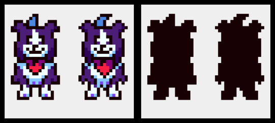
#Don't look at the proportions and the background. its fine
Text

They r TRANSGENDER and they are SILLY
#spilled ink#Evil Lovecore#Sweetheart#Infinity#RAHHH I don't have a song for this one. sorry#Stares at them. I love them#Ik I've been focusing on Static a lot but like. gestures at these two. girlfaves#Don't look at the proportions and the background. its fine
15 notes
·
View notes
Note
for pokemon reviews, have you done diglett/dugtrio and their alolan forms?

Diglett is what I'd consider to be a quintessential Gen 1 design—no frills, barely any detail, just a wack-a-mole creature with a face. Visually, it's honestly pretty bland, but it helps compensate for this with its "gimmick", if you can call it that: you never see its entire body, with it being perpetually stuck half underground at all times. What the lower body even looks like is a meme in and of itself, even referenced by PMD:
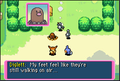
However, I'd also consider this a result of Gen 1 design, and not in a good way this time. Diglett poking halfway out of the ground worked fine on a Gameboy game, because there were no backgrounds, or anything you could define as "ground" in general. But in recent games, Diglett and its dirt keep being rendered as separate from the ground, which really kills the entire concept. I'm not a game dev, but shouldn't it be possible to make it so the dirt part of Diglett's model automatically picks up the ground texture of wherever it spawns? It's 2024, I feel like we can do better than this. Or hell, just don't model in the dirt mound at all if that's too hard to do.


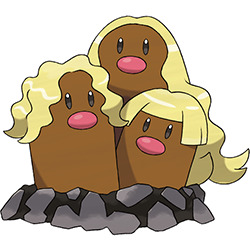
I'm not really that big on Dugtrio, just because this style of "copy/paste the same Pokemon twice" is... well, pretty boring. I'm not even opposed to the idea of multiplying Diglett to evolve it (it kind of ties back into the wack-a-mole thing, and really, what else would you do with it), but the design could've changed more in the process—different faces/expressions, different colors, different body lengths, that kind of thing.
For example, when their lookalikes Wiglett evolve, they change their position relative to the ground, change color, and change facial proportion. It's not a lot, but it's enough to differentiate the two, which is what I feel is missing here.

Speaking of being boring, Alolan Diglett is mostly just regular Diglett but with three blond hairs added. To its credit, I do get what they were going for progression-wise here, and it does change as much as it can about the base design; different, much more saturated colors and dark gray dirk and rocks resembling that of the volcanic minerals in a place like Alola, which is a nice touch. Still, I feel like you could've just skipped this one and done the Cubone thing, with regular Diglett just evolving straight into Alolan Dugtrio, and not really lost much.
I do find myself liking Alolan Dugtrio just a little more than the original. This might be a hot take, but if the original is going to be slightly silly, I'd rather just take the version that goes all the way with the silly. It also fixes the progression issue I had with regular Dugtrio, changing A. Diglett's individual hairs into long flowing surfer-dude manes.
As alluded to in the 'dex, the "hair" here isn't hair at all, but actually metallic whiskers. This in turn is a nod to Pele's hair, a type of volcanic formation found in Hawai'i, which is technically not also hair but is actually glass.

I like this concept, but at the same time, something about the line never quite sat 100% right with me. I think it's because Pele's hair doesn't really have anything to do with the Diglett line to begin with (I thought it maybe formed on the ground, but from what I understand it's actually partially airborne). Like, A. Marrowak turns into a fire dancer because of the bone, A. Vulpix is an arctic fox, G. Corsola is bleached coral, etc. Whether it be visually or conceptually, there's generally a connection between the original 'mon and the new theme, whereas here it just feels kind of random. You could technically slap that hair on any Pokemon and have it make as much sense, though it at least fits Dugtrio from a visual standpoint.
As a whole, Diglett is a fun 'mon with standard visuals but a neat visual quirk, even if it doesn't translate well into the games. Dugtrio is fairly bland, A. Diglett is fine but still kind of bland, and A. Dugtrio at least cranks the silliness up to 100.
Between all three Diglett and Diglett-related 'mons, I think I like Wiglett the best; it's a little plain and could've gotten the eel thing across better, but it has a fitting concept and evolves in a distinct way, which is something I like the actual Diglett line is lacking a bit.
53 notes
·
View notes
Text
A little guide on how to use Lolibrary to research for handmade lolita fashion:
We've talked about EGL coord mood boards, where you collect a bunch of images that you think will help you communicate your ideas and surround you with inspiration. When you're asking for help with lolita ideas, presenting a mood board immediately lets everyone know a lot about what you're trying to make and the route you're trying to take to get there.
I also use the technique for researching as well, but you have to approach the process of what exactly you put on the board slightly differently.
For example, today I wanted to make a skirt for a friend. I know that this friend wears a lot of sweet lolita, and a lot of Angelic Pretty. I also knew what fabric I had. So, off we go to Lolibrary. If you're new and you've never been there, it's your new favorite website. It documents lolita fashion history and it's such a powerful resource that I don't think any other fashion out there has.
Lolibrary has a very elaborate search system. When I'm looking for advice on how to construct something, I like to put in search parameters so that I have a like 15-30 pages to look through. You want it specific enough that you're looking for the thing you're looking for, but not so specific that there's only four results.
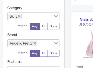
In this case, I knew I wanted something inspired by Angelic Pretty, and I knew it was going to be a skirt. So, that's our search terms, and we get about 30 pages of results. If you don't have 15+ pages of results, you're probably going to want to widen your search a little. You can specify multiple categories like "Skirt, JSK, OP, or Salopette" which will find you results that are any of the four in there. You can search Angelic Pretty but also Baby the Stars Shine Bright and MAM. You are researching, so you need to have enough results to research.
Right now, we're differing from a mood board in that we are not collecting things that we want. We are looking at what exists.
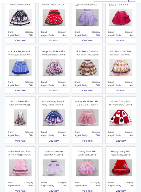
So here I have a whole page of skirts. We now need to narrow it down into skirts that sort of look like skirts made with the fabric like the fabric we have. Wow, that's a sentence.
So now, in a background tab, I open every single result that looks like it was made with fabric with a similar fabric to mine. In my case, it was all-over prints of a certain size. And I just keep going. I'm not even looking at the skirts yet. I'm just opening tabs.
Once I have like 60+ tabs open and Firefox is questioning its life, I start copying the main picture off each listing and slapping them all onto a board. I like to make a big canvas (like 1500x1500) in GIMP and then just dropping the pictures on there. The whole idea here is just to be able to see all the results at once. However, I usually will sort of start lining them up a little bit.

For example, on this one, I started sort of putting more complex designs in the top right, and simpler designs in the bottom left. If I saw that something was constructed very similarly to how another skirt was constructed, I would sort of try to put them next to each other. However, I really don't get too caught up in the "it has to be right" process here. The entire purpose of this is so that I can then close those 75+ firefox tabs and save my browser.
And now that everything is on one page, we can start looking for patterns. What things do I see a lot on this page? I see a lot of 3-flounce skirts. I see a lot of skirts with a lot of tiers and lace and detailing. And I see a lot of skirts with a ruffle on the bottom and a little bow on the waistband. From this, I can look at how much fabric I have, how long I have to make this, and how much work I want to put into this garment today.

And now that I have these skirts, most of which have similar construction in some aspect (don't look at the very top or very bottom ones. They don't know what they're doing here), I have multiple options to look at for the fine details of what proportions I should be looking for in both "how wide should this ruffle be" and "how big should this waist bow be". Prior to this search, yeah, I know a lot about how a lolita skirt could be constructed, but this taught me a lot of nuance of how Angelic Pretty constructs their skirts that have a relatively large all-over print.
Someone told me that my print I had felt very Emily Temple Cute, and while I love that brand a lot, it's not my friend's style. So making sure I was referencing Angelic Pretty skirts and not Emily Temple Cute skirts can help me confirm that I'm making something my friend will wear more than something I would wear.
So anyway, there you go. The secret is all in finding that initial search, specific enough that you don't have 100 pages to go through, but open enough that you do have like 15-30 pages to go through.
69 notes
·
View notes
Note
OH GREAT ONE! Please. . . Can you please give us a tutorial on how to make Pixel Character sprites on Asepeite? You do them so beautifully. . . *Sheds a tear*
please don't call me "oh great one" even as a joke; don't put me on a pedestal. I'm just Some Guy.
anyway there are plenty of cool tutorials on youtube, just search stuff like "pixel art tutorial" or "pixel grass" or "pixel trees" for specifics
but what i'd recommend as my top rule: experiment! make more art! Have fun! just make things and you'll naturally improve
but past that, for some more tangible advice:
look into stylization. pixel art NEEDS clarity and simple shapes to work. you can achieve this by thinking of the shapes (thus the importance of stylization) and by doing simple math or consistent "scales" of going down or up in number. see how the second line goes from looong to long to short shorter then a dot vs. how the left one just does things randomly, there's no scale here. it shows purpose and confidence when you use more math-based art. see how the circle uses the scale/ math vs. this blob where i purposefully didn't?
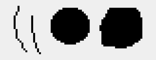
keep the linework clean:

aesprite has a feature called "pixel perfect" which prevents jaggies, which are these clumps of pixels as you can see on the right.
keep the art consitant. don't use blur effects or gradients, i'd say that's more so for VERY rare circumstances and should only be approached from a more experienced hand. (ie, bigger background pieces and used sparingly)
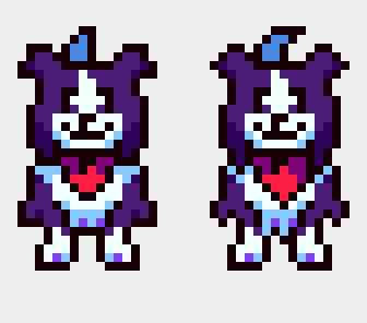
how you draw the shapes/angles matters a lot as well.
left, i kept things more "blocky" and less "sharp" I also simplified the shape (note the fur on the side of the legs) is more clumped together while the other has a larger emphasis on separating them and making them sharper. overall, the right one is a lot more complex which I don't want for a character who is moving a lot, and seen from a smaller size. its a SMALL cartoon! i want it to be clear to the viewer without any details to muddy things.
note how by making the sideburn fluff more jagged removes some of the room for the white fur. you only see ONE shaded white/blue pixel on the left, which adds more contrast and emphasizes that spot. there's less of a clear distinction between he had and the body.
here's the silhouettes, you cans see how the body on the left is more clear in what part is what. Tail, ear, head, body and legs. the other one, sure, i know what those are, but its less distinct.

add "weight" to the shapes. have one side of the shape be bigger in proportion. note how the head has a wider bottom than the top, even from the jaw to the tip of the head. the overall body is bigger than the head as well.
symmetry is important and your life savior in pixel art. but not EVERYTHING should be symmetrical. look at the head stripe, mouth, chest fluff, and handkerchief. have one side favored or the other and not a perfect head-on position creates this asymmetry as well a more "organic" view of the character. (typically you want to avoid direct head-on looks unless it's for 3d modeling or character reference sheets, otherwise your character won't feel as "alive." it's not natural to stand perfectly 1-1 facing the camera perfectly)
note on legs and bodies: you can't always get an accurate symmetry based on the head size. depending on if it's an odd or even number of pixels wide, it'll affect how the body becomes symmetrical to it. in this case, there's a pixel difference that prevents a gap. note how the middle looks like a SUPER thick line because there's no room for a single pixel line. my solution was to have her favor one leg over the other, which works nicely as it adds a more weighted interest to the right leg while her bangs favor the left, creating balance. toby's solution to this problem was to give the humans one wider leg and it haunts me.
another example of this is toriel

toriel's side mouth would be fine if it was a consistent choice and other characters did it (sonic is famous for this stylistic choice) but because she doesn't even match her family regarding this, it stands out and confuses people. i originally, and many people I've met have thought this was her nose. EVEN THO you can see her mouth open when speaking in-game.
btw even tho this also haunts me, i don't mind it as much cause i know this is a result of early game development inconstancies born from inexperience. its a cute quirk honestly, even if it was an easy fix. i actually ADMIRE that toby doesn't go and retroactively fix things, and instead prioritizes making new things with the information of how to do better now. its very easy and exhausting to go back and fix things rather than move on. mad respect for that.
38 notes
·
View notes
Text
IDW'S SONIC THE HEDGEHOG, SPRING BROKEN SPECIAL - THOUGHTS

A while back, it became pretty clear that the abundant specials IDW has been releasing for the past year have had a certain... "commonality" about them. Endless Summer, A Very Chaotix Halloween, Winter Jam - the Four Seasons theming read loud and clear. Now, up until a couple months ago, I'd assumed the 900th Adventure Special was meant to be the stand-in for Spring in this lineup, so I was a bit surprised when Spring Broken was announced to round the seasonal specials off. I was interested to see what kind of send-off they'd give this little gaggle of stories.
This time around, we have pencils by Adam Bryce Thomas and colors by Leonardo Ito. These two are a really great combo, as I think Ito's emphasis on simple, soft color palettes compliments the very manga-esque style Adam brings to the table. This style, however, leaves me a little confused as to why he, of all artists, was the one pulled for this story.
ABT tends to be at his best when working on big, over-the-top action sequences. His work really sells the sense of adrenaline the series is trying to convey in its tensest moments. That being said, the story here is... fairly mundane? The characters spend a day at the fair and solve a mystery about flowers. Heck, the entire last couple pages are entirely dedicated to showing the characters enjoying the attractions once all is said and done.

There's not really a ton here in the way of high-stakes plot that would really give Adam a chance to shine.
That being said, there's still enough here that you can see his art style noticably developing a bit in a manner akin to Evan Stanley's. Namely in the way he draws Sonic himself.

It might just be my imagination, here, but I could swear Sonic's quills are longer and come to a more distinct point than the way Adam usually draws them. We know Evan has been taking strides to incorporate elements of official 2D Sonic art into her artstyle, perhaps this is a sign that Adam has been doing the same. Beyond that, I think I'm noticing some more fun and stretchy facial expressions on some of these characters, too. When it comes to the way faces are drawn, I've always found that ABT has a tendency to stay pretty on-model, but here I'm seeing a bit more expressive warping of the facial proportions than I'd expect out of Adam.
Where Adam really knocks it out of the park here, though, is with the background character designs.

Adam's always good at drawing up unique OCs, and there are tons of 'em here. Having so many characters with so many looks and still having a consistent style to them all goes a long way toward helping the world feel just a little more lived in. Another cool bit of background work he contributed is this central figure that pops up in a few places around the festival.

Also I just noticed that Cream and Vanilla are here. Neato.
When asked about this figure on Twitter, ABT said that she's intended to be a sort of Nature Spirit, and that the festival pays reverence to her. She's never mentioned in the story, but it's a neat little detail to see the more spiritual side of this world's cultures.
As I said before, the story, written by Josh Trujillo, is not too incredibly exciting. The majority of the plot centers around the mystery behind the annual Flower Contest, which itself is really three mysteries, all of which are wrapped up pretty quickly. Really, it seems to be less about the mystery, and more about how these characters spend their free time in a sort of slice-of-life fashion. This is fine, and it shows us some neat character interactions we don't normally get to see, like Jewel and Espio or Amy and Nite, but it's also something we've been getting a lot of lately.
It almost makes me wonder, with the amount of miniseries and specials they've been putting out there recently, if it wouldn't be possible, and maybe a better use of resources, to just run a dedicated sister series devoted to telling side stories like Sonic Universe did for Archie.
I'm not the first person to make this point, but perhaps then we could get more big, exciting plots full of stakes and gravitas in the main book. Who knows.
All in all, Spring Broken didn't particularly blow me away. I'd say it's a nice break from the norm but... it's not. It's exactly the kind of story we've frankly been getting in surplus as of late. I'm ready for things to move again, ready for the non-stop, blood-pumping action of Sonic the Hedgehog! There are some cute moments here and there that I do appreciate, but I just wish they could have come at a different time.
Issue #70 drops in about 22 hours for me, so with any luck, that will scratch my itch for more exciting Sonic stories for a bit.
'Til then, thanks for reading!
5 notes
·
View notes
Note
Hello lémurblogs I have a question, how do you make your drawings? (๑'ᴗ')ゞ
Hello! It depends on each drawing. Generally, I sketch on paper and bring the scan into Clip Studio where I adjust the levels (make the whites brighter and blacks darker without losing too much detail) and redraw anything or adjust proportions with the transform tools. I apply color on top with layers set to Multiply, Overlay, and/or Soft Light.
An important step for me is taking at least a day to look at it with fresh eyes. If I'm stuck, it also helps to check how it looks on my phone. And lately adjusting the Color Balance has been my friend.
My process is pretty messy and I often don't have a plan; I just feel around to see what's good for a drawing and do it a little differently each time. For example I don't plan to color, shade, or add a background to 90% of my drawings, but they end up that way bc something will feel missing, so little by little stuff gets added.
I followed a strict pipeline as a teenager ("sketch this way, do line art that way, color like this") and ended up dreading digital art, so I took a step back. Now I give myself permission to be as messy, lazy, and improvised as I like. I'll draw or edit all on one layer even though that's not what people teach, bc it actually works for me.
I also find it useful to strike fast and finish as 'quick' as I can. Because it's natural for me to have drawings that become months or years-long WIPs. and that's fine! but it can't be everything I'm working on or I get discouraged.
Oh, and drawing on post-it notes really helped me complete those small illustrations for madaparty! It was such a life-hack when I realized it'll help me complete small ideas in one sitting. I love drawing compositions, but forget about them on a big sketchbook page where lots of little drawings have no borders, so the small post-its really helped. It also helped me think more with metaphor or staging, rather than getting lost in anatomy poses and being too literal.
#also i am Team Slow Artist. it's ok to go slow.#but realizing what i can do in only 10 minutes also helped build my confidence!#and make projects less intimidating#replies#nervousdreampizza#thank you for asking!#i hope some of this is an answer you were looking for. it was nice to self-reflect#I'm a huge FireAlpaca fan btw which is free#but it's important to me to have brushes that make me excited to draw#and I don't remember if FireAlpaca is good for that#also: my relationship to drawing has been painful these last several years#i started drawing things i loved again this last fall. which feels insane#before that i definitely wouldn't have been able to do madaparty
6 notes
·
View notes
Text
that post is getting long and unwieldy so I'm starting it again
pt 5: koi tower and misc end pics

this was in the books! I don't think the tent was quite that magnificent in the drama

aw there's the lotus pond

iirc there were actually peacocks at koi tower, so wwx and jc's nickname for jzx made more sense. sorry it's on its side :/

WHAT is going on with those proportions. why is wwx's shoulders so wide but his head is so skinny. wtf
overall koi tower is....fine to look at. I definitely think they nailed the tacky showiness of it and the scale is perfect for the magnitude of the sect's power

comb details!

and this looks like another map?

damn.

bm family dinner!

why does this shot look so good compared to literally every other one. his pose. the wind in his hair. the dramatic background. the lighting. the rest of yi city is there too in the same setting but xy's looks
so fashionable and powerful and mysterious...

the last few pages were a lot of wx scenes, mostly from CR era oddly enough. but this was one of the last ones and it just pierced my heart. i LOVE that scene. I'm so glad I got this book just for the exclusive concept are and the costuming details, but this last is going to be one of my favorites even though it was in the show just the scene it represents
4 notes
·
View notes
Text
Positively Pleasant ‘P’ Words Tag Game

Upon predicting the password to procure the pined after prose, I’m pondering the paradoxical feeling of pride and perturbation. Perhaps this puzzlement proves the philosophical predicament of whether perpetually pushing for pleasurable pursuits only pollutes our ability to perceive the peace provided from our passing progress. Maybe proportional precaution is needed to prolong preoccupation before its purpose pales against the prize.
(AKA, I found the word, but now there’s no other side quests to focus on. 😂)
My words: Past, Power, Present, Pull, Print
Your Words: Quick, Quiet, Quirky, Quaint, Quote
(@mrsmungus - Apologies if there are goose eggs; I tried to pick ones I could find myself, but it’s ‘q’ - we knew this time would come.)

Past
“I don’t understand. He’s smart, and funny, and has so much potential… Why is he making choices to sabotage himself, and… I just… ” she let out a frustrated shout, unable to put the rest of her thoughts to the adequate words.
They walked for a bit longer in silence until Nick stopped her with a hand on her shoulder. He pulled back out his pad and wrote out another note, slower, more thought put into this message.
‘The world isn’t kind. You fight back against it or blend in until it becomes who you are too.’
She nodded with a sigh. The idea was insightful, and she couldn’t argue with it; it actually made a lot of sense the more she mulled it over. Harold had many times made the comment about his past, how he had been regarded, his treatment from peers and even family. Maybe that was who he became now too, but she truly hoped not.
Power
Further dream discussion took off. Were there drugs that could help? Could there be a way to block this? There were no answers, only another point nobody had touched yet, one which Glen felt a need to chime in on: did they want to?
"It seems to me, we're getting set up in a tug of war. Whether it's good vs evil, judgment day, powers higher than us playing a game, who's to say… What is clear to me: there's a protagonist and an antagonist forming, and these dreams, they’re giving us background. We take that away… well then, we're just opting to play the game blindfolded. Now, can’t speak for any of you, but personally I'd like to read the premise before making moves. Maybe, I don't know, maybe there’s something useful buried there."
Harold scoffed at the idea. "So you're saying what? Our dreams are relaying vital information so we can, what, fight for God or the Devil?"
"I'm saying I don't know. But I’d like to.” Harold scrunched up his face, still not giving it any real consideration. Glen took a couple more puffs from his vape, and pressed on with a light chuckle, "I think I know what your problem is, Harold."
"Glen…" Stu tried to give a warning to not poke the bear. Glen never knew how to listen to that instinct however.
Present
(Possible gore tag, but I had to. It not only has Present, but Past and Pull too.)
Maybe Hayden did have a history in medicine; as she stated, there was no way to know. But to do an invasive surgery without even remembering those past experiences? That wasn’t even touching the fact there was only a small possibility it was there in the first place.
That was just the basic facts. The little things, the barely visible shimmer of light in the cavity, the way muscles and skin seemed to move away or pull together on their own milliseconds before Hayden’s hands got there, how these events coincided with a distinct drain to her... If he wasn’t already looking for irregular things, these would have been dismissed. Tricks of light. But they were too far into the unknown to turn back now, and his eyes were open.
He wanted to ask her about everything. Not necessarily the past; she would only give him the same sad smile and shrug as she always did. But her thoughts at the time… Did she see what he did? Did she know?
The ordeal was clearly taxing on her, so he was fine to leave it on the back burner for now, but he couldn’t unsee what he saw. By the tree earlier, she wasn’t completely present. His mind equated it to a dimmer switch and she was set to low. If she wasn’t actively on his mind, he would have completely overlooked her sitting there. The differences between the girl he met on the trail that first day, and the one sitting by that tree; he couldn't explain it, but he would certainly not forget it.
No, she was a puzzle with too many missing pieces, but he was good at filling in blanks.
Pull
(I had a decent excerpt from earlier in Chapter 9 - one of my personal favorites for reasons - but then I went down a little further and noticed there are FOUR uses of Pull in this Harold dream. FOUR! I feel I need to now post this in shame for my lack of variance.)
Harold pushed himself up off the pavement. Blood lingered in his mouth, and he spit it off to the side of the road. The asshole with a beard threw a punch, but Harold felt a pull backwards.
Beard tried to steady himself as a gun appeared in Harold's hand. He held it up and pulled the trigger. One threat down. Scruffy douche bag to his right was an easy target. Another neutralized. One more to go.
A shot rang in his ears, but it missed by a mile. He spun and quickly pulled the trigger on the third assailant; three for three.
"Feels good, doesn't it?"
Harold nodded. Moving to hand the gun back to Flagg, he noticed the man's expression had changed, eyes adopting a red glow and his smile widening. His hand now moved over Harold’s own, taking aim for him. The movement was quick, fluid, and when the dark man pulled back, Harold’s aim was now set on Redman. "Keep it."
Looking back one last time, Harold could now longer see the denim clad figure, but he could still hear his voice. "You may find a use for it."
Harold went to tighten his grip on the item, but his hand closed further into a fist. The gun was gone, but as he slowly relinquished his grasp, a black stone with an unnatural shine revealed itself in his palm. A real smile found its way onto Harold’s face.
Print
(I was decently worried about this one. There are only two times this has showed up, and one was literally the last section of Spiral, so guess this is all I got…)
Sitting at the desk, she made herself comfortable and grabbed a pen. Nobody could really miss one blank book in a cottage full of hundreds, and she felt like doodling. But this one was not longer blank. Quickly scanning the pages, she noticed it was all observations she had. Specifically about Glen.
When she closed the book and turned it over, she noticed his name beautifully written along the spine. Standing in a rush, she began to scan the room again. Another book lay next to Glen's; 'Stuart Redman' was written in bright lettering.
She backed away and noticed the previously blank canvas on the wall was now an acrylic painting of Kojak; the signature H.F. was printed in the bottom corner. Another hastily done paper sketch of her, Glen, and Kojak was pinned next to it.
Turning to her left, she stopped dead in her tracks when she noticed the dark painting sitting on the floor by the door. Blacks, grays, and two bright red eyes. 'Flagg' scrawled across the bottom in blood red calligraphy.
#pondering the possibilities broke my brain#time for a break#mouse's tag games & reblogs#riding the train to alliteration station
4 notes
·
View notes
Text
An Interruption
This was supposed to be their anniversary vacation. A small rural town with a fantastic brewery scene and cool summer evenings. Last night, they were on a patio, sipping drinks and laughing the night away. Tonight, however, purple flames rained down from the sky.
Lucian's glass fell from the table and shattered against the cobblestones as he scrambled out of his seat. Immediately he was by her side, shielding her with his body, his voice murmuring a chorus of 'move, move move,' that blurred into the background. The rest of the brewery was in similar chaos as people scrambled out to the streets.
But not Senna. Not her, because she knew this purple fire, and the spark of annoyance in her chest far outweighed any rational thinking. She spun around her concerned husband and began marching toward the massive footfalls that shook the streets. She didn't summon her weapon, not yet. Lucian, however, had already pulled his pistols from his coat pockets and was pointing them at anything that moved.
"Just our luck. We need a plan. This isn't mist, luckily, but it's definitely some kind of powerful magic." Lucian said.
"The bastard thinks he can just march on in here, during the one time you're willing to take a vacation. . ." She hissed under her breath.
"You know-?"
They rounded the corner and the sight of a towering mechanical creature stomping cut off his line of thought. He aimed towards the mech and in only a couple seconds he had zeroed in on the most apparent weak spot- the glowing core containing a strange-eared shadow. It was turned away from them, for now.
Senna reached over and pushed his barrels down towards the ground. "Let me chew him out first, then you can blow his stupid mech to smithereens."
"And you think I'm going to let you walk up to that thing?"
She surged forward anyway. "VEIGAR, YOU LITTLE SHIT."
The mech swiveled around, its footsteps shaking the cobblestones she walked upon. She could see the little wizard inside casting an intense series of spells to keep the structure within his grasp, the joints of the machine crackling with dark energy. Upon fully turning to face her, it seemed his focus slipped, causing the shoulders to sag, causing him to nearly drop the enormous staff and similarly proportioned book.
"Oh hello, Senna!" A comparably meek voice called out from the mech. "Here to bring a some darkness to help with my conquest? I was somewhat low on resources, I could use your help-"
"Veigs, you're in serious trouble!"
The figure inside the mech rolled his eyes. "Don't give me the 'good guy' lecture again."
"You're interrupting my anniversary!" She snapped. "I was having a lovely dinner with my husband! Now look what you've done!"
"But- but I've been planning this siege for weeks!" He protested. "That's not fair! You should have-"
"And my anniversary only happens once a year! You're ruining our vacation- do you know how hard it is to get this man to take time off?" She gestured back to Lucian, who was standing slack-jawed but with his aim still on point.
Veigar slackened and his mech followed suit. "I could threaten to burn his whole village down unless he spends more time with you?"
"Thanks but no thanks. How about you just get out of here and quit causing such a mess?"
"I can't do that. I've got my troops moving in here as I speak. Do you know how hard it is to call off an entire operation like this?!"
"Is it too much of a challenge for the mighty and powerful Lord Veigar?"
Instantly the mech stiffened again as the figure within renewed his spellcasting. "Of course not, but you'll owe me for this one!"
"You still owed me from last time, so how about we just call it even?"
"Fine! Fine, fine fine!" Veigar stomped as he turned the mech around, causing the ground to shake.
Lucian lowered his pistols and could only give a disbelieving look. Senna pinched the bridge of her nose.
"Don't ask. I'll explain later. Let's just. . . finish our dinner?" She spoke.
"But-" He gestured one of his pistols in the general direction of the retreating mishmash of an army.
"Please?"
He nodded, and, slowly, he slid his pistols back into his jacket. She held her hand out, and he took it. His grip relaxed as they walked back to the now-empty brewery. Their meal was just where they'd left it, if a little cold. His drink was still shattered on the floor but her glass was still mostly full. She sat down and took a big, long sip. Deep, malty, full-bodied. She slid it over to him with a shrug.
"I think it's pretty good. One of the better ones of the night." She said. "How about we buy a bottle? You're going to need it."
#fanfiction#original content#veigar#senna#lucian#senna x lucian#my favorite league couple! about time they graced my blog!#legends of runeterra#based off the legends of runeterra interactions#chaotic bastard somehow befriends chill lady; more at 7#maybe someday I'll make up a backstory as to how I think they might have met#big 'WHERE'S MY SUPER SUIT' vibes going on in this one though
33 notes
·
View notes
Text
Spring '21 anime list: What I tried, what I'm watching, and first impressions!

Shaman King (2021)
I hadn't heard about this show until the reboot was announced, and it seems neat so I'll give it a shot! Hesitation isn't quite the right word, but I am watching cautiously because there's a lot about early 2000's anime that should stay in the early 2000's. I'm prepared to take a certain amount of product-of-its-time-ness, but only so much.
I really like its unique visual style. It feels like it's got a similar vibe to Soul Eater and TWEWY with its chunky proportions and face design, and the squash-and-stretch animation really lends itself to comedic moments. I feel like there are some eminently cosplayable designs in my future.
Character-wise, it's only been one episode but I'm taking a liking to Yoh. Based on the OP I hope that Ryuu will be an early-antagonist-turned-loudmouth-friend like JJBA's Okuyasu or Sk8's Shadow. That's one of my favorite character tropes.
The World Ends With You the Animation
My friend is a huge TWEWY fan, so our group was really looking forward to this anime. I saw a little of the gameplay when the Switch version was released, up to the end of episode 1's plot. I know it's going to be excellent story wise, and I already may be planning on making cosplay of that Reaper with the skeleton hoodie.
I love a unique visual style and an awesome soundtrack, of course TWEWY already had that coming in. The CGI Noise are a little clunky, but allow for some really great fight sequences. The characters' CGI models are nearly seamless with the 2D. It feels like the plot is moving fast, but according to my friend they just skipped some fetch quests and puzzle solving that wouldn't have been interesting to animate.
I'm really looking forward to this one each week!

Dragon Goes House-Hunting
One of those "eh, we'll give it a shot" shows. A bunch of us have been eyeing real estate lately, so at the very least it's topical. If done right, the concept could be fun!
We spent most of the episode HATING the dragon's character design. Its proportions are just...awkward in every way. The neck is extremely short and thick and leads into a human-muscled torso, the arms are tiny twigs, and the legs are a little too human and a little too thick to be anything but unnerving. It's bad.
Oddly, except for the dragon, the rest of the creature designs are pretty great! In contrast to a lot of anime, they let them be really non-human and had a good design sense. The humor was solid, the Monster Hunter references were on point, and the character interactions were fun. The OP is GREAT, too!
We'll be continuing this one! If you can make your eyes stop hating you for forcing them to look at the Monster Factory reject of a dragon, I'd say give it a shot.
You Can Make A Mug Too
Now that Yuru Camp is over, we wanted another lighthearted anime that might teach us something while it's at it. You Can Make A Mug Too was one of our picks to sample because one member of anime night has recently acquired a kiln.
My impression is an approving but unenthusiastic "Fine, really." You can definitely tell it's an anime made to bring in tourism to the town it's based in. The characters don't really grab me, but they set up a solid emotional backbone for the story. The production quality isn't stunning, I was hoping for some nice pottery wheel animation but didn't get any.
It's probably a decent show, but we won't watch any more because of the next one on the list.
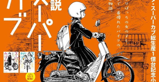
Supercub
Going straight from You Can Make A Mug to Supercub was like going from store-brand ice pops to fresh gelato. I can already tell this is my favorite anime of the season, hands down.
First, the production quality is excellent. The backgrounds are beautiful, the score is understated but well done to the point that Debussey's Clair de Lune felt like it had been made for the scene it was used for.
More than the production quality alone, this anime's direction is exceptional. It takes 'show don't tell' and uses it perfectly, using body language and soundtrack and shot composition to communicate as much or more than the sparse dialogue. Like, they made my heart skip a beat with nothing but color grading. THAT kind of exceptional.
I haven't spoken much about the plot because I really have no idea where it's going to go. Will we fill in why Koguma is so alone, or will we only move forward to seeing her connect? Will the past of that Supercub come back to haunt her? This feels like an anime that can and will absolutely wreck me, but at the starting line all I can say is I'm READY.
If you only watch one thing this season, watch Supercub.
Continuing anime:

My Hero Academia Season 5:
This season is interesting because for the first time, I think I'm going into it with almost zero spoilers (Dabi's real name is the only one I have). The only plot spoiler I thought I had, that Hawks was somehow working with the League of Villains, was revealed at the end of episode 1. I really enjoy going into things blind so I'm looking forward to this season!
However, the OP is the most disappointing thing out there. Nothing about the song, animation or composition is memorable or even noteworthy. Bones and MHA have access to all the money and talent in the industry and they best they can do is "Fine, I guess".

Yuukoku no Moriarty season 2 (Split cour):
I really enjoyed Moriarty's first season, but the second part of a split-cour always has the risk of running off the rails. What I enjoyed most about the first cour was the reverse-whodunit formula: Here's a terrible noble and the people they hurt, how does Moriarty get rid of them while making it look like an accident? The end of cour 1 started to focus heavily on Sherlock and I don't want the show's namesake to end up sidelined.
Knowing Irene was coming, I was really hoping for a Scandal in Belgravia that follows the books...at all, where the end of the story is that Irene escapes with the photo (except this time aided by the Moriarty brothers). Few or no Sherlock adaptations actually want to engage with the sexism of the era or today's, and just want to paint her as a blackmailer or temptress instead of a woman holding onto the power to protect herself. The beginning was extremely promising, but that went off the rails pretty quick. I still haven't yet seen an adaptation of Irene Adler that I like.

Zombieland Saga: Revenge
I watch this show because it's fun and ridiculous, and I get to hear Mamoru Miyano having the time of his life in the recording booth. I love this show because it always ends up surprising me with its solid emotional backbone. It looks like this season is shaping up to be more of the same!
What blew me away was this episode was the first time I saw a CGI dance sequence that I LIKED. Ever. The characters used different mocap so they weren't eerily in sync, the song and dance itself was well made and supported by excellent camera direction and shot composition, there were 2D cuts to closeups of the dancers as well as audience, and they actually pushed facial expression!
It's a good time. Give it a shot.
#seasonal anime#spring anime#spring anime 2021#shaman king#twewy#twewy the animation#dragon ie wo kau#yakunara mug cup mo#supercub#bnha#yuukoku no moriarty#zombieland saga revenge
55 notes
·
View notes
Text
Kevin Zhang - Poster Report
Today, I'll be taking a gander at two posters from the exact opposite ends of the "graphic design good-ification" spectrum.

Back in the olden era of 2010, little child me was taken to EXPO 2010 in Shanghai, China. It was an amazing expo filled with buildings crazed designers given a blank check could conjure up. Most of the buildings still look super futuristic today. While most of the exhibits have been teared down, a few of them still stand. The Chinese Pavilion still towers the land with its epic engineering un-conventions.
But something that stuck out to me-even back then-was just how bad the graphic design was throughout the whole expo. The poster I selected is probably the best example, but I still think it looks messy. It has all these different fonts on it that just don't gel well together. You have the top left logo with its geometric EXPO and SHANGHAI CHINA typeface that looks good, but a "Better City, Better Life" quote follows directly next to it. The sizing of the quote, coupled with the Chinese line, completely overemphasizes itself next to the EXPO logo. Then you have the text at the bottom right denoting the name of the expo and when it take place, which looks fine, until you realize it's a repeat of what the top left logo says exactly! The middle calligraphy I can't really fault, but it also doesn't come with am English translation...
Then, when we ignore the typeface shenanigans and see the actual designs of the poster, oh boy. It looks properly elementary. The colors look wack, every single person look like they haven't been lit in a similar way, and you wonder if they're standing on grass or algae. Then you see that blue thing guy in the front, which just destroys the whole thing even more.
This poster had a very simple goal. Show the Chinese pavilion, show the expo 2010 logo, done. It's a perfect example of how to do a simple thing in an overcomplicated trash way.
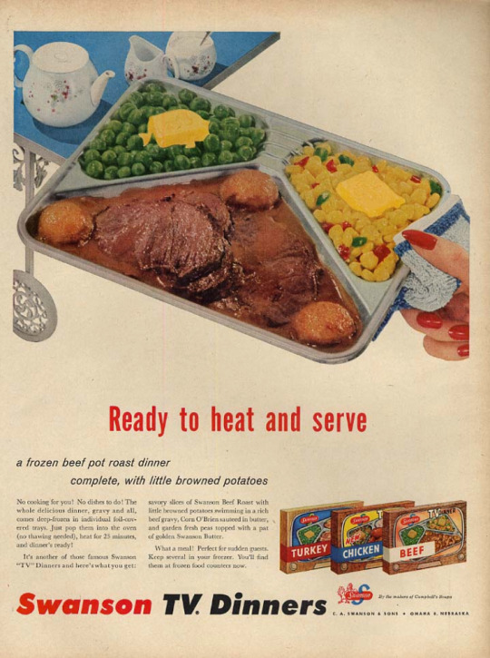
So with our eyes totaled from the previous poster, let's get them healed by a Swanson TV Dinner. These things still allude me today, as something that I'll always think about eating, always dream about eating, but will never buy (or eat) given it's appearance in a local trader joes.
But man, the poster really makes it look superbly appetizing. Frozen food rarely come out of the wave looking non-dog-food like, but the filmic color palette and the overall "composition" of the food make it look like some 3 star Michelin star meal. Combined with the tinted yellow background, the poster makes the dish look homely and dinner like. And despite the long quote shoved into the poster, including the long ad read, everything just looks well proportioned. You know your eyes are supposed to start at the "Ready to heat and serve" part, gliding down-leftward to the long passage, and ending at the "Swanson TV" logo and the different TV dinner flavors.
If this poster was a TV Dinner that tastes as good as the photo, the EXPO 2010 poster is an expired 7/11 Ceasar salad.
0 notes
Note
Hello! I was wondering do you have any tips on improving environment or background drawing? I feel like I know how to go about studying to improve drawing figures, for instance looking at anatomy and proportions and how light hits a form however with backgrounds I feel like I don't know where to start, whenever I do a study I feel like I'm just copy it without retaining anything. ( I appreciate you may be too busy to answer this, if so thats ok, have a nice day! )
[pergunta sobre estudos e paisagens, tradução para Português no final]
I have many tips! Without more details I'll give you a broad answer. It might contain stuff you already know. I hope that's fine!
You can start by acknowledging that when you're comfortable enough with one subject (as characters), but not with others (as environments), the first, and second, and fifteen attempts at the new subject may look terrible. Yes, this situation sucks! You're experienced enough to realize those works aren't your best, but you lack subject familiarity and a personal approach to achieve the expected results. Hitting that invisible wall is highly frustrating. Acknowledge it’s not your fault, those unsatisfying paintings are not a proof of your failure as an artist or student, they're nothing but a by-product of learning process. You have no choice but weather those feelings if you wish to bring your entire skill set to a uniform level.
The good news is that you can tailor your approach to your current skill set: If you're used to paint characters you can treat your background as a character, as a group of characters! Treat that tree in a forest full of other trees as a character in its own right, complete with little details and quirks. Carefully depict the color changes happening on its weathered back, the greener base due the moss, how its silhouette gracefully twists, its branches interweaving with the next tree. Give it your undivided attention while you're working on it, don't treat it as just background noise.
Now that you have a strategy to deal with the components of the scene you need to think how you'll conduct your studies. Studies are essentially copies, therefore a successful study is an accurate copy of your subject, right?
I hereby commit the temerity of saying that's wrong.
Study: Application of the mind to the acquisition of knowledge, as by reading, investigation, or reflection;
You'll learn something when striving for perfect reproductions, but it won't be what you were hoping to learn. You'll train your muscle memory, your brushtrokes/gradient/line art accuracy, you'll improve your spatial location and maybe even perspective visualization. These all belong to the "mechanical" skill set of artists, not the "theoretical" skill set. Accurate lines will help your sketching, they'll make the piece aesthetic pleasant, but they won't enable you to create good backgrounds because you need to understand backgrounds in first place. Understanding takes place before you have the chance to use your perfect lines. But alas, every time you're just accurately copying stuff you're developing your mechanical skill set instead!
I'm very fond of using mechanical skill in this context. It describes perfectly what happens when you're pouring your entire being into creating a perfect reproduction: You stop asking questions. You stop trying to understand what's going on in the image because you allocated all of your energy to the technical side of the process; to the shapes, color gradients and positions. When you're busy playing the seven errors game you're not reflecting about the content of the image, you're reflecting about its 2D representation on paper.
Make of learning something new about the natural and architectonic world your new study end goal from now on.
I like to use this image because it's a real-world example of back when I hadn't the faintest clue of how approach environments.
They were 30-45 min paintings. My goal was to not do perfect copies but learn something, anything from each painting. For that I purposely used big brushes whenever possible, no color picker, and didn't care if it happened to look like unreadable crap in the end.
The first painting taught me that my perception of greens was fairly bad and shadows are important to give depth to unconventional POVs. I learned that snow can be so blue in the second painting. The third hinted at the saturation role in depth. The fourth confirmed my idea that shadows weren't just base color + black. You don't have to experience a revelation, you only need to learn a small thing at a time and spot patterns.
After this set of studies I painted an original environment applying what I observed. That way I assured myself I understood what I noticed and also trained my mechanical skills. That's my method for studies: Quick copies, an original, rinse and repeat.
The other thing that helped and still helps me is building a visual library. That's why I came to Tumblr! I have a secondary blog where I collect a lot of references for landscapes, clothing, cultures, everything and anything that catches my eye. That way I get better acclimated to the world diversity of... everything, and I have where to go to open my mind before starting a painting. I research before working on landscapes because I want to make sure they don't end looking all the same, and the natural world is so big and complex I can't possibly store all this information in my mind alone.
Wrapping up:
Treat your environment components as characters in their own right.
Develop a different study approach, better focused on your true end goal.
Expose yourself to the subject you're studying and research before starting.
Bonus:
If depth is giving you grief, allocate some extra time to study perspective.
If volume is getting into the way study basic shapes as well (spheres, cubes, soft concave, curved surfaces, etc).
If the environment feels too flat and plain or too "draw on" and unrealistic you might have issues with your level of details. Usually you'll add more details near the focal points and gracefully decrease it the farther you go. Think of LOD in games:

(Courtesy of Traction Wars)
P: Oi! Eu estava me perguntando se você tem alguma dica para melhorar meus desenhos de ambientes e fundos? Sinto que sei como estudar para melhorar minhas figuras, por exemplo olhar para anatomia e proporções e como a luz interage com uma forma porém com fundos não sei por onde começar, sempre que faço um estudo sinto que só estou copiando sem aprender nada. (eu entendo que você pode estar muito ocupada para responder, se for o caso sem problemas, tenha um bom dia!)
R: Tenho várias dicas! Sem ter mais detalhes te darei uma resposta geral, que pode conter coisas que você já sabe. Espero que não se importe com isso!
Você pode começar reconhecendo que quando está confortável com uma área (como personagens), mas não com outras (como paisagens), a primeira, e a segunda, e a quinta tentativas podem sair horríveis. É, essa situação é uma droga! Você é experiente o suficiente para saber que esses trabalhos não são os seus melhores, mas você não tem familiaridade e uma abordagem pessoal para atingir os resultados esperados. Se chocar com essa barreira invisível é bem frustrante. Reconheça que não é sua culpa, que esses resultados insatisfatórios não são prova da sua falta de habilidade como artista ou estudante, que eles não são nada além de subprodutos do processo de aprendizagem. Você não tem escolha senão lidar com esses sentimentos se você quiser elevar suas habilidades em diversas áreas para o mesmo patamar.
A boa notícia é que você pode ajustar sua abordagem de acordo com suas habilidades atuais: Se você está acostumado(a) a pintar personagens você pode tratar o fundo como um personagem, como um grupo de personagens! Trate essa árvore em uma floresta repleta de outras árvores como uma personagem, completa com pequenos detalhes e peculiaridades. Mostre a mudança de cores acontecendo em seu tronco desgastado, sua base mais verde devido ao musgo, como sua silhueta se torce graciosamente, como seus galhos se trançam aos galhos da próxima árvore. Dedique sua total atenção à ela enquanto trabalha nela, não a trate só como ruído de fundo.
Agora que você tem uma estratégia para lidar com os componentes da cena você precisa pensar em como estudará daqui em diante. Estudos são essencialmente cópias, portanto um bom estudo é uma cópia exata do original, não?
Cometerei a temeridade de dizer que isso está errado.
Estudo: Aplicação da mente para adquirir conhecimento, através de leitura, investigação ou reflexão;
Você aprenderá algo quando se dedicar à reproduções perfeitas, só não será aquilo que você estava tentando aprender. Você vai treinar sua memória automática, a precisão de suas pinceladas/gradientes/linhas, você melhorará sua noção espacial e talvez até pré-visualização de perspectiva. Todas essas coisas pertencem ao grupo "mecânico" de habilidades, não ao "teórico". Linhas te ajudarão a esboçar, elas deixarão o trabalho atraente, mas não são elas que te permitirão criar bons fundos pois você precisa entender fundos em primeiro lugar. A compreensão acontece antes que você tenha a chance de usar suas linhas perfeitas. Só que cada vez que você cria cópias perfeitas você está desenvolvendo suas habilidades mecânicas ao invés da compreensão!
Adoro usar a expressão habilidade mecânica nesse contexto. Ela descreve com perfeição o que acontece quando você se dedica completamente a criar a mais perfeita reprodução: Você para de pensar. Você para de tentar entender o que está acontecendo na imagem pois você alocou toda sua energia para o lado técnico da coisa; para as formas, gradientes e posições. Quando você está ocupado(a) jogando o hogo dos sete erros você não está mais refletindo sobre o conteúdo da imagem, você está pensando sobre a representação 2D dela no papel.
Faça de aprender algo novo sobre o mundo natural e arquitetônico o seu objetivo principal.
Gosto de usar essa imagem pois é um exemplo real da época na qual eu não fazia ideia de como abordar pintar ambientes.
São pinturas de 30-45min. Para aprender alguma coisa, qualquer coisa a cada pintura eu deliberadamente usei pincéis grandes sempre que possível, nada de color picker, e me forcei a não me importar se elas acabassem ficando uma porcaria ininteligível.
A primeira pintura me ensinou que tenho dificuldades em discernir verdes e que sombras são importantes para dar profundidade para pontos de vista não convencionais. Na segunda aprendi que neve pode ser surpreendentemente azul. A terceira me mostrou indícios do papel da saturação na profundidade da imagem. A quarta confirmou minha ideia de que sombras não são só cor base+preto. Você não precisa ter revelações incríveis, só aprender pedacinhos de informação e padrões.
Depois desses estudos pintei uma paisagem original aplicando o que observei. Dessa forma me certifiquei que entendi o que percebi e treinei minha técnica. Esse é até hoje meu método para estudos: Estudos rápidos, um original, repete.
Outra coisa que me ajudou e ainda ajuda é construir uma biblioteca visual. É por isso que parei no Tumblr! Tenho um blog secundário onde coleciono referências para paisagens, roupas, culturas, tudo e qualquer coisa que me chame a atenção. Dessa forma me acostumo melhor à diversidade global de... err, tudo, e tenho onde ir para abrir minha mente antes de começar a pintar. Também gosto de pesquisar antes de trabalhar em paisagens pois o mundo natural é tão grande e complexo que é humanamente impossível guardar toda essa informação na cabeça. É uma forma de evitar pintar acidentalmente sempre a mesma coisa.
Resumindo:
Trate os componentes dos seus ambientes como personagens.
Aborde estudos de uma forma diferente, focada no seu objetivo real.
Se esponha ao que está estudando e pesquise antes de começar.
Bonus:
Se profundidade está te dando dor de cabeça, guarde um pouco de energia para estudar perspeciva.
Se volumes estão te atrapalhando também estude as formas básicas (esferas, cubos, superfícies côncavas e convexas, etc)
Se o ambiente parece muito chapado e sem graça ou muito "desenhado" e artificial você pode estar tendo problemas com seus níveis de detalhe. Normalmente você detalhará mais as áreas perto dos pontos focais e reduzirá suavemente conforme se afasta. Pense em LOD (level of detail) de jogos:
(Cortesia de Traction Wars)
113 notes
·
View notes
Note
The first thing the Player would do upon realizing the girl they ran into on Destiny Islands is, in fact, Strelitzia, they would get on their hands and knees and beg for her forgiveness. Why? Because they would blame themself for what happened to her, since the only reason Lauriam was able to kill her is because they didn't join the Dandelions. Don't worry, Strelitzia would set the record straight, and assure them that, even if her death was somehow their fault, she'd forgive them anyway.
Player’s probably like the one person Strelitzia has no grudge against too so seeing them constantly blame themselves for her death would probably cause her a lot of pain. ;w;
Okay so, let me explain something, since it seems I may have accidentally confused you about one plot point, Players wouldn't know that Strelitzia was the intended Union Leader until Back Cover revealed that Ava had chosen her, since the game would show her approaching both of them while Lauriam is comforting Strelitzia. Thus, Strelitzia receiving the Book of Laws in Back Cover would be a Wham Shot of epic proportions. We'd eventually get her death scene from Lauriam's POV in game.
Oooooooooh, okay, that’d make the scene work a lot better. Definitely be a shocker for sure.
Even after coming to terms with her own death and resurrection, Strelitzia would sometimes have nightmares about that fateful encounter in the abandoned warehouse. As soon as she's done screaming, she'd either hide, or sob in the arms of whoever was woken up by said screaming. She would not be able to feel safe enough to go back to sleep if there wasn't somebody she saw and trusted in the room with her.
Here's another thing, I don't think ever get used to Strelitzia's nightmares. I mean, they'd prepare for them after the first time (where they'd think that Strelitzia's life was in actual danger), but they'd be both random and infrequent. But they would never leave Strelitzia to suffer on her own. She'd usually wake up with at least Aqua having stuck around to make sure she doesn't feel alone. But those nightmares would not be pleasant for anyone. Good thing the Player's Pet eats bad dreams.
So, when the Player does get out of the Unchained State and get the chance to personally know Strelitzia, her mental state would improve significantly. I mean, aside from FINALLY getting some much needed closure on her character arc from the MMO, the Player's pet would eat her nightmares (allowing her to get some much needed sleep), and then there's the fact that being able to help the Player with their own trauma might help Strelitzia feel more useful as well.
Player stays with her after TAV bring up that this happens a lot. The trio all look out for her and so when they hear Strelitzia and know that Player is the best person to help they just immediately get them to stay with her. Otherwise Aqua lets out her mom tendencies and definitely stays with Strelitzia
So I've been thinking about Strelitzia's theme, and I was thinking that maybe a slower and more mournful rendition of "Scythe of Petals" would be more appropriate, with a piano replacing the organ, and the more intense parts of the track being either cut or downplayed. It would probably play during "Innocence and Mourning" as she's fading away, presuming that "Sora's Sacrifice" doesn't play instead.
Sora’s Sacrifice should be exclusively for Sora, so she should have maybe her own unique sadness theme playing in the background.
So, I just thought of something cute, Strelitzia and Lauriam Trick or Treating as part of a Halloween event. For Lauriam, I'm torn between a grim reaper and a tonberry (Final Fantasy enemy known for using a knife to brutally stab its victims to death). For Strelitzia, on the other hand, I'm thinking maybe a zombie, Ring/Greivance styled ghost, or a dark angel with spiderwebs. Note that all the costumes I suggested kinda foreshadow what eventually happens with them.
Halloween event with the five Union Leaders, Strelitzia, and Player all going Trick-or-treating and each time the knock on a door all they get are Heartless so they’re just like “Gdi where’s my candy.” The event ends with the seven of them knocking on a door and finally finding the Foretellers and candy. Bonus points if some other extra wielders partake Those costumes are good for them.
Player dresses as whatever you throw them in, as per usual. Ephemera dresses up as a black cloaked figure to foreshadow him being the leader of the group. Ven dresses up as Vanitas. Skuld dresses up as a Prophetess of some kind, both as a reference to her name and her role of holding the true book of prophecies. Blaine is the obligatory Disney reference and is wearing like a Beast costume or something. (Somebody has to do it.)
Rest I’m answering in this ask under a read more since it’s getting long
Okay, Strelitzia's Nobody, the Specter, would be born from Strelitzia's body (dispersed across the Unchained State) and Lauriam's soul, due to Strelitzia soul (or life energy) having departed when she died. This is why Marluxia can fuse with the Specter, it holds half of his life force.
Makes enough sense.
Okay so, Strelitzia wouldn't actually be able to see anything once she enters the Unchained State after dying. She'd be able to sense all the hearts of everyone in there, and recognize Ven's, the Player's, and Lauriam's hearts, she would be completely numb, blind, and deaf until she "touches" Lauriam's heart and gains somewhat filtered access to his five senses. His own mind would create a phantom form of Strelitzia in order to make sense of what she's trying to communicate to him.
Strelitzia and Lauriam gotta have conversations in this time period, like without Lauriam revealing that Strelitzia’s death is his fault and he apologizes a lot because he’s still super remorseful in the beginning. And meanwhile she’s just happy he found her and that he’s taking her spot as a Union Leader because it’s going to somebody she trusts and this actually starts causing a deterioration of his own mental state because like...she trusted him still, she still loves or at least cares about him after he killed her, even if he would’ve made the same choice again the guilt of still having to live with his best friend’s ghost is just eating him alive.
Strelitzia would wear a different outfit in KH3 than what she wears in game, partially because her outfit, while perfectly good for 2D sprites where she can jump around all she wants without any wardrobe malfunctions, or Back Cover where camera angles are perfectly fine, in KH3 she'd have to wear something on her legs because, let's be honest, keeping her modesty would be rather difficult in her canon outfit in a fully 3D game. Her outfit would still be primarily white though.
Honestly if the renders still had an issue I’d just assume they’d fix this by like...putting on purple leggings, something that matches her color scheme and wouldn’t look out of place on the model. I don’t think they’d need to though, none of the other characters in dress like things have needed one before.
1 note
·
View note
Last Seen Blogs


