#Deyan Sudjic
Explore tagged Tumblr posts
Text
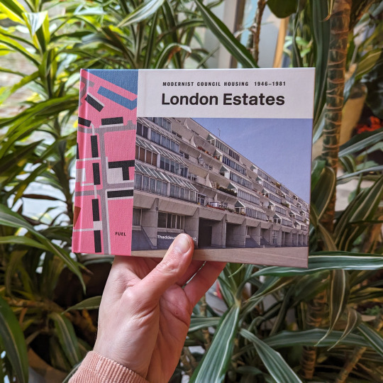


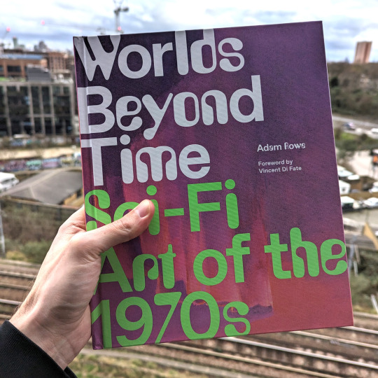
Some wonderful books I've enjoyed reading lately.
8 notes
·
View notes
Text
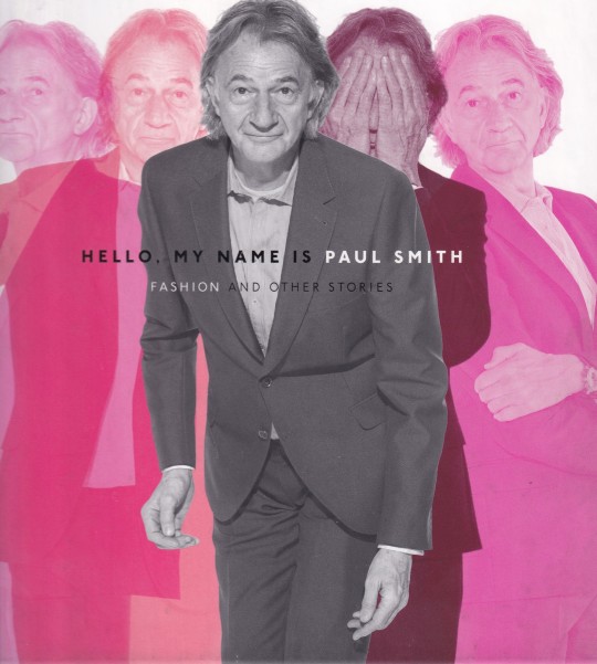

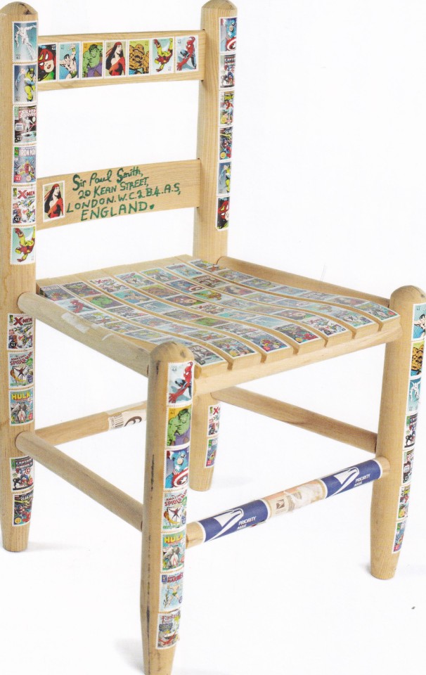
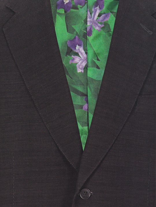
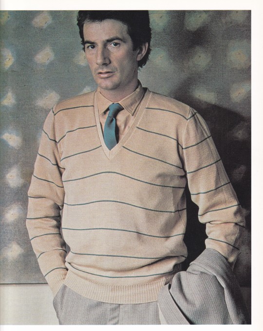
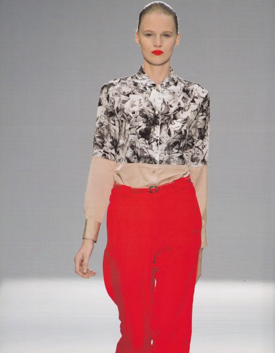
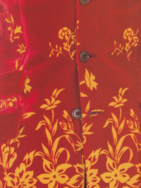
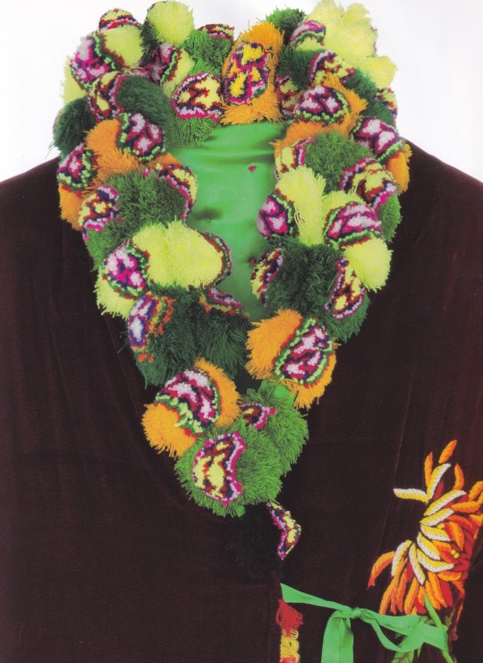
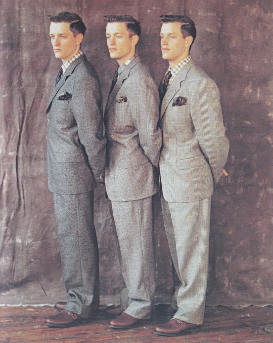
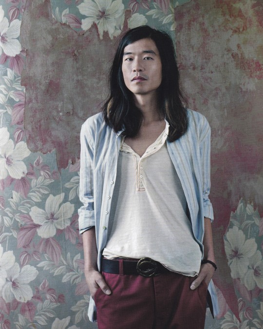
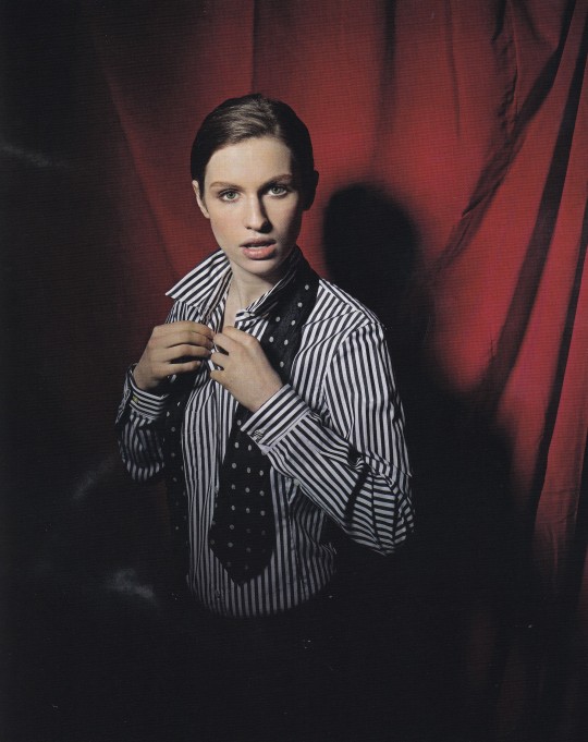
Hello, My Name is Paul Smith
Fashion and Other Stories
Paul Smith, Deyan Sudjic, Donna Loveday
Rizzoli, New York 2013, 272 pages, 27x36,4, ISBN 978-0847841585
euro 56,00
email if you want to buy [email protected]
This handsome volume celebrates over forty years of the playful and trendsetting English fashion brand and retailer Paul Smith. Always in fashion, Paul Smith is not only a preeminent fashion designer but also an international retail trendsetter who perfected a classic style that exudes a sense of English tradition combined with humor, playfulness, and mischief. This marriage of sophistication and the unexpected has given birth to a style and identity that—forty years and many collections later—remains charming, personable, and effortlessly hip. Published in association with the Design Museum, London, which is hosting a major exhibition on Paul Smith in the fall of 2013, this volume celebrates not only the line’s fashion history, collections, and collaborations but also the inspirations and obsessions that have helped to transform a small bedroom-sized shop into an innovative global forum for culture and style. Paul Smith is a full-on bright and rich visual experience, illustrated throughout with documentation of its diverse creative community and design inspirations, including Martin Parr, David Bowie, and Henry Moore, to name a few. Using hand-drawn designs, archival photographs, gorgeous original photography, and engaging essays, this colorful catalog weaves together a compelling visual tale of Paul Smith’s prestigious projects and creative processes—from behind-the-scenes to on the streets—that built this multifaceted empire of cool.
14/03/24
6 notes
·
View notes
Text
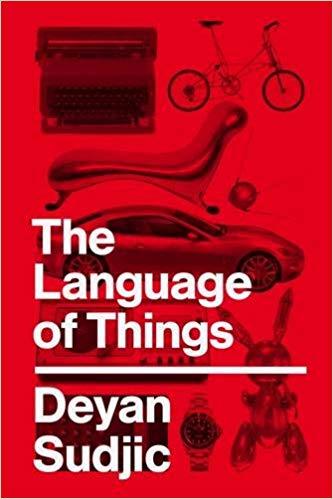
Pourtant, comparez votre ressenti lorsque vous bu vez de l'eau fraîche au bord d'un torrent qui éclabousse les rochers, à l'expérience plus banale qui consiste à boire dans un gobelet de l'eau du robinet. A condition que ce geste soit non pas une nécessité quotidienne inévitable mais un choix délibéré, la gorgée d'eau de source est plus intense, plus forte émotionnellement: vous tenez là l'expérience, pourrait-on dire, de loin la plus luxueuse des deux.
La fabrication contemporaine du luxe, dans un monde où l'eau coule à flot des robinets, repose sur la création d'objets qui parviennent artificiellement à reproduire l'expérience de l'eau pure du torrent.
Deyan Sudjic, Le langage des objets.
0 notes
Text
https://www.turnerlibros.com/libro/b-de-bauhaus/
Una classe magistral sobre disseny, arquitectura, forma, objectes i consum al segle XXI
Amb l'A d'Autèntic. Així comença aquest llibre, que és més que un diccionari: una guia essencial per entendre el món modern. Per què Warhol és autènticament fals, com es creen les identitats nacionals, i què és aquesta estranya mania de col·leccionar. També explica perquè Grand Theft Auto és un gran invent o per què els apartaments de Hitchcock no podrien existir. I no és una autobiografia, però ofereix al lector la visió personal d'un dels experts més reconeguts del món en el disseny i les seves manifestacions.
https://www.coam.org/media/Default%20Files/fundacion/biblioteca/catalogo/docs/2019/bibliografia-centenario-bauhaus.pdf
0 notes
Text
Antonio Citterio e Deyan Sudjic in conversazione al Design Dialogues #4 all'IIC di Londra

Di Redazione In24 @ItalyinLDN @ICCIUK @ItalyinUk @inigoinLND Design Dialogues all'Istituto Italiano di Cultura di Londra, il 21 settembre l'architetto e industrial designer Antonio Citterio in Conversazione con Deyan Sudjic, direttore emerito del Design Museum di Londra. Design Dialogues #4: Antonio Citterio in Conversazione con Deyan Sudjic Nel cuore di Londra, il 21 settembre 2023, l'atmosfera carica di aspettativa per l'incontro tra due grandi nomi del mondo del design per una conversazione unica e imperdibile: Antonio Citterio, celebre architetto e designer italiano di mobili ed industrial design, seduto a colloquio con Deyan Sudjic, Direttore Emerito del Design Museum di Londra. L'Italia e il Regno Unito hanno una lunga storia di interazione nel mondo del design, con una reciproca influenza che ha dato vita a innumerevoli capolavori. Dall'arrivo di designer britannici a Milano per lavorare con Olivetti all'impatto di giganti del design italiano come Vico Magistretti ed Ettore Sottsass sulla scena del design londinese, la connessione tra le due nazioni è stata sempre feconda. La serie "Design Dialogues", curata da Deyan Sudjic, si propone di esplorare questa ricca relazione e le sue possibili direzioni future. Ogni conversazione all'ICI London affronta un aspetto diverso del panorama del design, partendo dal ruolo del design nei musei e spazi espositivi, per poi esaminare il suo impatto sui media, la produzione e l'educazione. Antonio Citterio, noto per la sua estetica sofisticata e innovativa, condivide con il pubblico la sua prospettiva unica sul design contemporaneo e le sue radici profonde nella tradizione italiana. Deyan Sudjic, con la sua vasta esperienza nel mondo dei musei e del design, arricchisce la conversazione con una visione illuminante sul futuro del design. Nel 1987 e nel 1994 Antonio Citterio ha ottenuto il prestigioso riconoscimento Compasso d’Oro-ADI. Fondatore dello studio “Antonio Citterio Patricia Viel and Partners”, oggi “ACPV ARCHITECTS Antonio Cittterio Patricia Viel”, dal 2006 al 2016 è stato professore di Architectural Design alla Accademia di Architettura di Mendrisio (Svizzera) e nel 2008 è stato insignito del titolo di “Royal Designer for Industry”, dalla Royal Society for the Encouragement of Arts, Manufactures & Commerce of London. Nel 2017, ha ricevuto da Casa Artusi il “Premio Artusi”. ... Continua a leggere su www.
0 notes
Text
Juegos de seducción | Íñigo García Odiaga
“La arquitectura ejerce una profunda fascinación en los individuos más egoistas, que se desviven por usarla para glorificarse”
esta es la conclusión a la Deyan Sudjic en su libro La arquitectura del poder.
Contaba Peter Eisenman con cierta sorpresa, cómo durante la presentación de un proyecto ante el alcalde de Nueva York éste le dijo:
“Pero conseguirá el efecto Balboa, ¿no?”.
El alcalde se refería a lo que se conoció como el efecto Guggenheim, a la repercusión mediática, social y económica que la construcción del museo bilbaíno desencadenó.
[...]
0 notes
Text

Comme des Garçons: Monograph (1990). rei kawakubo and deyan sudjic
516 notes
·
View notes
Quote
It is the quintessentially minimal chair: a seat and back made of clear acrylic, supported by anodised aluminium legs. The acrylic is almost invisible, existing only as the atmosphere in which a tumbling cascade of roses can survive, weightless and apparently effortlessly. Producing the chair, however, was the exact opposite of effortless. The primary ingredient is acrylic resin, a material that comes in liquid form in four gallon drums. Kuramata’s team of craftsmen made a mould for the liquid in order to transform it into a usable solid sheet. Liquid acrylic is like water, and needs the addition of just the right amount of hardening agent, a procedure that requires considerable skill. If there is too much hardener, the acrylic goes cloudy and opaque as it solidifies. Working by trial and error, Kuramata’s team found a method of pouring acrylic to half the depth of the mould, putting in the flowers, waiting eight hours for the acrylic to harden and then pouring in the rest to the top of the mould.
Deyan Sudjic, referring to the Miss Blanche Chair, How designer Shiro Kuramata helped change views of Japan, Financial Times, June 21, 2013
#quote#design#chair#chair design#proudct design#Shiro Kuramata#Kuramata#Japanese design#Deyan Sudjic#Sudjic
22 notes
·
View notes
Text
Authenticity
'Authenticity’ is a word that makes no promises about performance. It might not necessarily involve beauty, but it does suggest an irresistible combination of sincerity with authority.
In the world of mass-produced objects, these are highly desirable qualities. Even if they are slippery and hard to define, grasping them is essential to an understanding of the nature of design. Authenticity is a guarantee that an object really is what it purports to be. The more authentic it is, the more secure we can feel about its price, if not its value. But when factories make large numbers of identical objects over long periods of time, a gap opens up between what might be called the original and the authentic.
In other contexts, authenticity is measured by the degree to which the physical remains of an object have survived, no matter how decayed they have become.
Authenticity can have mutually contradictory definitions. It can be found in the making of a faithful replica of what an object once was, or in the careful maintenance of what that object has become as the result of the passing of time. For an artist, authenticity is a question about the very nature of things. With mass production, the point is usually not one of originality, but of what is fake and what is not. For a designer, authenticity has taken on a paradoxical aspect. An authentic design might be understood as a design which is more than merely not a fake. It is also an object which is unselfconscious, one which is not shaped by a desire to please or to seduce. This is a quality which depends on responding with a certain sincerity to the practical questions that are raised by providing a serviceable solution to a technical problem. Yet design is a highly self-conscious business, one that can barely help itself but attempt to manipulate the emotions. The very involvement of a designer in the creation of an object militates against this kind of authenticity. Design cannot but have the most knowing of views of the world. Even to acknowledge that a designer is pursuing the quality of authenticity is to undermine that objective. Striving for authenticity signals its antithesis. Designers cannot help themselves. The harder they try to achieve authenticity, the more they drive it out. But the quality fascinates them.
When price is no limit, and choices are made not by consumers, but by expert specialists, then objects take on a different character.
Authenticity for a designer is a quality that comes from attempting to understand how design communicates a sense of sincerity, and then faking it. Nowhere is this more apparent than in the field of graphic design. Gotham is a typeface designed by the American typographer Tobias Frere-Jones, initially in response to a commission from the American edition of GQ, the fashion glossy for men, for a font that could give the magazine a sharp new look. Frere-Jones’s former company, Hoefler & Frere-Jones, describes Gotham’s origins in its sales catalogue in loving detail which betrays the artifice that lies behind it. Every designer has admired the no-nonsense lettering of the American vernacular, those letters of paint, plaster, neon, glass and steel that figure so prominently in the urban landscape. Gotham celebrates the attractive and unassuming lettering of the city. Public spaces are teeming with handmade sans serifs that share the same underlying structure, an engineer’s idea of ‘basic lettering’ that transcends both the characteristics of their materials, and the mannerisms of their craftsmen.
These are the cast bronze numbers outside office buildings that speak with authority, and the engravings on cornerstones whose neutral and equable style defies the passage of time. They’re the matter-of-fact neon signs that announce liquor stores and pharmacies, and the proprietors’ names painted majestically on the sides of trucks. These letters are straightforward and non-negotiable, yet possessed of great personality, and always expertly made. Gotham is that rarest of designs, the new typeface that somehow feels familiar. Gotham inherited an honest tone that’s assertive but never imposing, friendly but never folksy, confident but never aloof. These are precisely the qualities that Barack Obama’s team were looking for when the campaign for his first presidency got underway in 2008. You could see the Gotham font on his banners at the Democratic convention, with their boldface promises of ‘Change We Can Believe In’, as a deliberate attempt to convey those qualities. Obama wanted to appeal to the values of a vanished America. Gotham is the font that reflects what was used by the New Deal when the Hoover Dam was built. It is the font of the New York Parkway system, and the law courts and federal buildings of the 1930s. It is a signal of an America that engaged with the world, and which believed it could make that world better. When the font that inspired Gotham was young, America was actually building dams, high schools and national parks. Obama’s programme could not run that far, but his typography gave America a subliminal message about itself. A message that could be understood as reflecting an awkward mismatch between substance and presentation. But at least Obama’s use of Gotham had a genuine political agenda. He wanted what he was promising to be real, even if he could not make it so. Idealism is not so clearly a part of the personality of Starbucks, or of Crest toothpaste, who have both put Gotham to work in the wake of Obama’s first victory. When Gotham is used by an inspirational politician with a gift for oratory, the qualities it is understood to reflect are being underpinned and reinforced. When it is adopted by coffee-shop chains, those qualities are undermined and diluted because in the end the qualities of any typeface come from the associations that it triggers, rather than any inherent meaning. Frere-Jones himself has used the metaphor of clothes for fonts. Perhaps it is true that clothes do need to be suited to the personality of the wearer, but it is also possible that they serve as a form of disguise. Another way to look at fonts would be to consider them in the same way we understand an accent. Some fonts and some accents are associated with authority; others are not. The uses of the Gotham font went from Obama’s vision of hope to the cynical expression of commercial self-interest.
It was not the first time that typography had gone through this kind of transition. In the last years of the Soviet Union, when Western distilleries had been producing vodka with glossy labels and slick packaging for decades, there was a sudden interest in the commercial uses of authenticity. Instead of the evocations of double-headed eagles that had decked Smirnoff’s labels, it became a fad to give vodka manufactured in Warrington and New Jersey the appearance of a more authentically contemporary Russian origin. That meant crude, rather than slick. Colour printing out of register came to be seen as a sign of authenticity, and so of quality, rather than its opposite.
Ref: Deyan Sudjic. “B Is for Bauhaus, Y Is for YouTube.”
#Deyan Sudjic#book#B Is for Bauhaus#Y Is for YouTube#design#authentic#original#authenticity#originality#artist#graphic designer#typography
1 note
·
View note
Photo
0 notes
Text
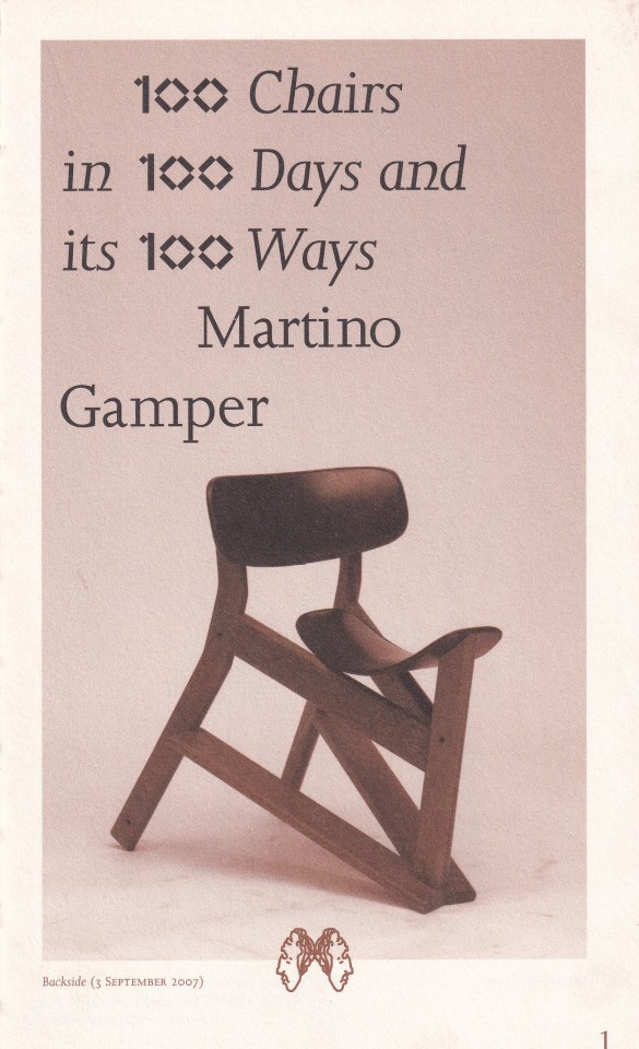
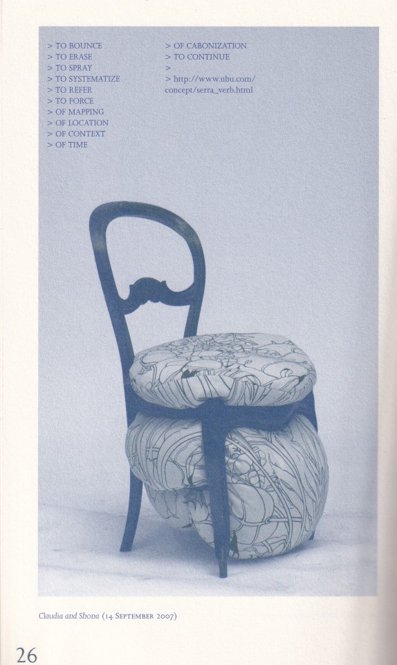
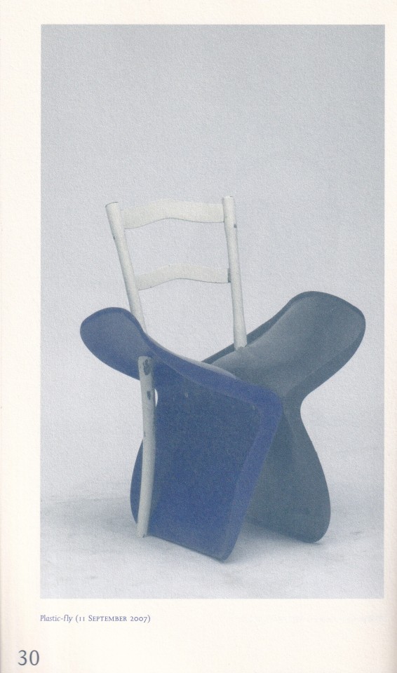
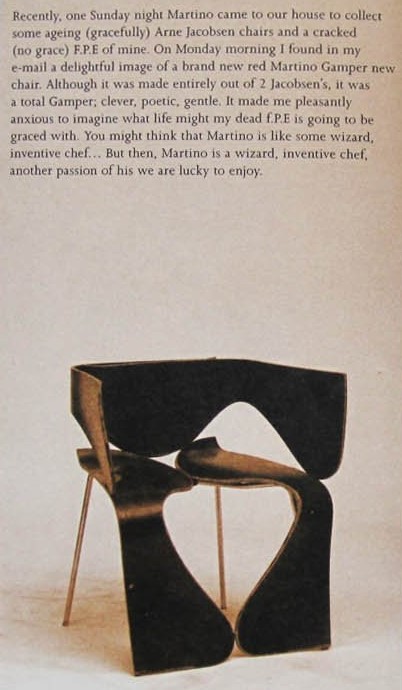
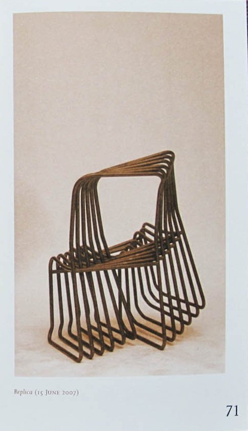
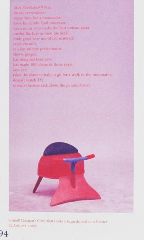

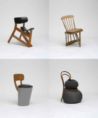
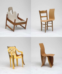
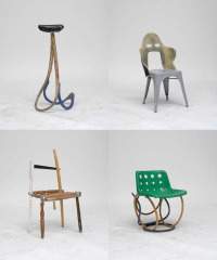
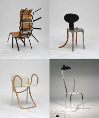
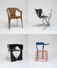
100 Chairs in 100 Days and its 100 Ways Martino Gamper
Martino Gamper, Emily King, Kate Kilalea, Alex Rich, Deyan Sudjic, Michael Marriott, Ron Arad, Kajsa Stahl
Design: Åbäke
Dent-De-Leone, London 2022, 100 pages, 10,20x17,00cm, softcover, ISBN 9781907908774
euro 50,00
email if you want to buy [email protected]
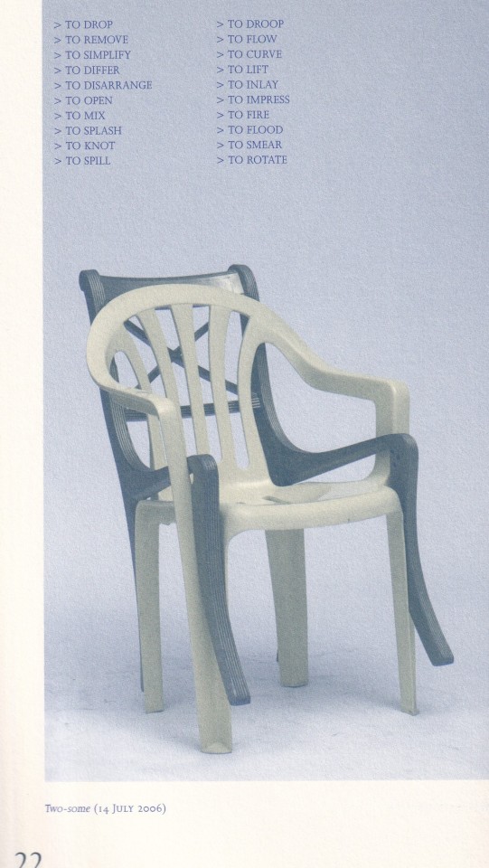
Martino Gamper says, 'There is no perfect design and there is no über-design. Objects talk to us personally. Some might be more functional than others, and the emotional attachment is very individual.' Some ten years ago, the London-based, Italian-born furniture designer initiated his project, 100 Chairs in 100 Days. He made a new chair a day for a hundred days by collaging together bits of chairs that he found discarded on the street or in friends’ homes. Blending found stylistic and structural elements, he generated perverse, poetic, and humorous hybrids. The project combined formal and functional questions with sociological and semiological ones. Or, as Gamper put it: ‘What happens to the status and potential of a plastic garden chair when it is upholstered with luxurious yellow suede?’ The project was all about being creative, but within restrictions—being limited to materials at hand and the time available, with the requirement that each new chair be unique. Gamper's ‘three-dimensional sketchbook’ brought him international recognition. The project was exhibited in London in 2007, at the Milan Triennale in 2009, and at Yerba Buena Center for the Arts, San Francisco, in 2010.
14/12/23
4 notes
·
View notes
Text
Menos arquitectura, más ciudad
Menos arquitectura, más ciudad
Este 13y 14 de Junio, en Baluarte de Pamplona, tomará lugar el V congreso de la fundación Arquitectura y Sociedad. En esta ocasión el tema central es la ciudad y se titula “Menos arquitectura, más ciudad” entre los conferenciantes este año se encuentran:
EDUARDO MENDOZA, MANUELA CARMENA, IWAN BAAN, FARSHID MOUSSAVI, SALVADOR RUEDA, JAN GEHL, LEONARDO PADURA, JOAN CLOS, DOMINIQUE PERRAULT,…
View On WordPress
#belinda tato#deyan sudjic#dominique perrault#EDUARDO MENDOZA#Farshid Moussavi#iwan baan#JAIME LERNER.#Jan Gehl#Joan Clos#LEONARDO PADURA#MANUELA CARMENA#salvador rueda
0 notes
Text
(...)o tym właśnie marzyli pionierzy amerykańskiego marketingu w latach trzydziestych ubiegłego wieku. Chcieli za wszelką cenę przekonać świat, że zwiększona konsumpcja pokona wielki kryzys. Earnest Elmo Calkins, pionier reklamy, ukuł pojęcie "inżynierii konsumpcyjnej ". W Consumer Engineering: A New Technique for Prosperity [Inżynieria konsumpcyjna :Nowa technika na rzecz dobrobytu], wydanej w 1932 roku, pisał, że "towary dzielą się na dwie kategorie: te, których używamy, takie jak auta lub maszynki do golenia, oraz te, które zużywamy, jak pasta do zębów czy krakersy. Zadaniem inżynierii konsumpcyjnej jest sprawić, byśmy zużywali także towary, których teraz po prostu używamy". Apple wprowadził te idee w życie, i to w momencie, gdy zaczynaliśmy rozumieć, że naturalne zasoby ziemi nie są nieskończone. Nieustającemu cyklowi konsumpcji przydał modnego blichtru, czemu cynicznie przyklasnęli nie panowie w firmowym garniturach, ale hipsterzy w czarnych dżinsach i T-shirtach.
Deyan Sudjic - "Język rzeczy"
0 notes
Photo
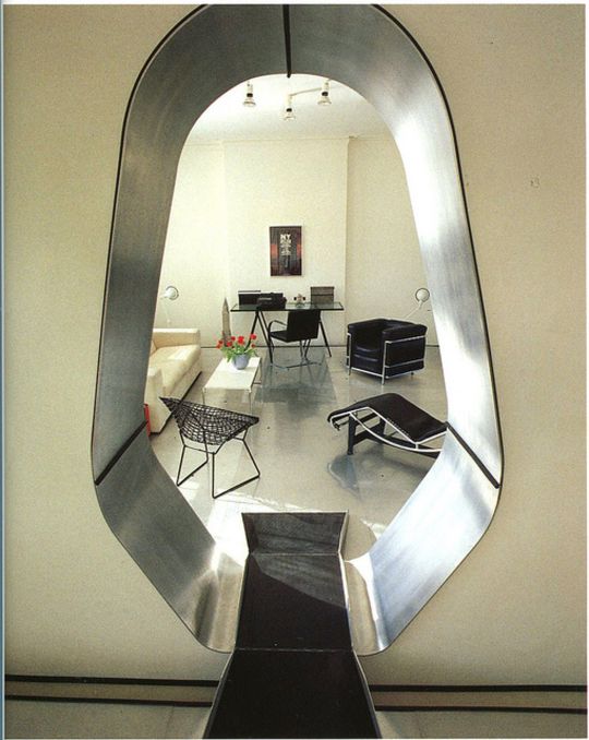
Deyan Sudjic's London Spacecraft, 1985
174 notes
·
View notes
Photo

1980s bedroom featured in The Lighting Book by Deyan Sudjic
53 notes
·
View notes