#Design Consistency
Explore tagged Tumblr posts
Text
Master Grid Layouts in Web Design: Achieving Design Consistency
Explore how grid layouts can enhance design consistency in web design. Learn the principles of responsive grid systems, best practices for layout design, and how to apply web design patterns for a cohesive user experience. Perfect for UX/UI designers aiming for a balanced and visually appealing website.
#Grid Layouts in Web Design#Design Consistency#Web Design Principles#Responsive Grid Systems#Layout Design Best Practices#Web Design Patterns#Consistent Design Frameworks#UX/UI Grid Layouts
0 notes
Text
Fast Building Company
Extending your home is an exciting venture that can provide much-needed space, add value to your property, and create a more comfortable living environment. However, without careful planning and consideration, a house extension can quickly become a stressful and costly project. Discover essential tips to ensure your house extension is successful and meets your expectations. Get more carpentry tips at Fast Building Company.
1 note
·
View note
Text
does anyone have like an anti aesthetic. like something you look at and can recognize as a complete fashion/interior design/artistic movement and understand it but it makes you shudder seeing it. i am not talking like “its morally bad” “its poorly structured” like just sheerly devoid of joy for you actually invites a repulse response.
#also if it wasnt clear this isnt ‘its bad its lazy’ there is a level of like#completion consistancy i am thinking for with this#personally i really do not enjoy the like. vintage chic long red nails fur coats noir esque aesthetic HOWEVER 💥💥💥#i can recognize that it is put together it is Intentional#i feel like a lot of people are going to say minimalism on this so LET ME SAY 🫰☝️ i recognize that minimalism is Considered an aesthetic#but i *PERSONALLY* do not consider it an aesthetic i consider it the void of one#it is a lapse in aesthetic or personality in the same way a silence in a song is still technically a ‘beat’ but no music is played#however the importance of Space or Breath in design is more akin to a purposeful silence in music#because that silence matters in the same way rhythm and breath in design do#so i guess minimalism is more comparable to like. white noise. the sound of a fan#very little effort and there is a comfort in it i suppose but its not. A Design. okay#TO ME 🤫#if minimalism has one hater its me if minimalism has no haters im dead
27K notes
·
View notes
Text
Responses to the most frequent comments on my Dungeon Meshi/TAZ crossover doodle
Laios and fair food
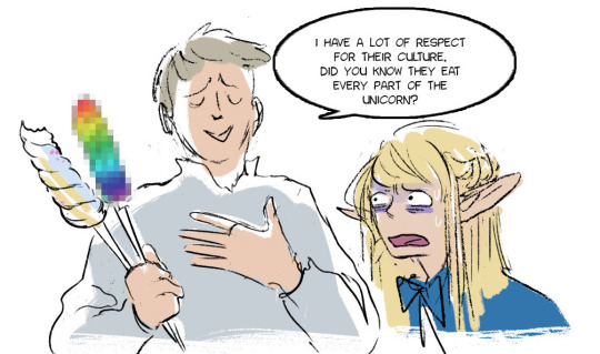
2. Taako cooking for real

3. Encounters with plants
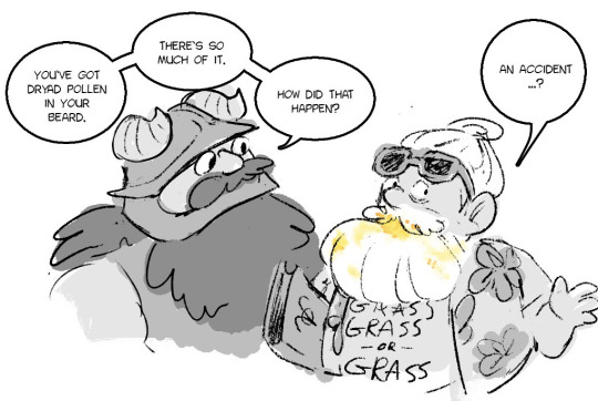
(hello, in the manga, the pollen comes out the mouths)
bonus
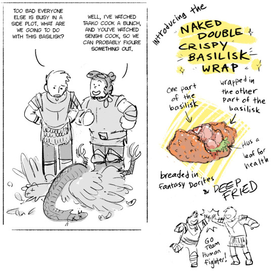
#i never really drew taz fanart except Merle in a Grass Grass or Grass tshirt was my twitter icon for a long time#dungeon meshi#the adventure zone#i know it's not a popular piece of media any more but i enjoyed it when i listened to it and i still think of it fondly#even though i never had a very consistent idea of character designs
12K notes
·
View notes
Text

haven't posted in a while, who is surprised (not me) anyways GHRGEGFAFSBTAHFSGSRE HOT DOOR WOMAN
#i can't keep my designs consistent cus i change opinions every two seconds#but uuh she's a spiral avatar i can allow her that#also i just wanted to try out a new brush but. yeah. i liked the brush as you can see#tma#the magnus archives#tma fanart#tma helen#helen distortion#helen richardson#tma the distortion#kuprum drew stuff
4K notes
·
View notes
Text


you're in love, love.
#AUGHHHH NARILAMB SAVE ME#consistent lamb design challenge failed (again)#my art#cult of the lamb#cotl#narilamb#cotl lamb#cotl narinder
1K notes
·
View notes
Text


Just the foxhole girlies hanging out and being besties 🧡
#my art#2021#consistent character design? never heard of her#aftg#tfc#renee walker#danielle wilds#dan wilds#allison reynolds#all for the game#the foxhole court#renison#you can just assume that in all my foxhole fanarts renee and allison are dating k bye
2K notes
·
View notes
Text

I’m EXTREMELY hyped for the new Ultraman Rising movie so I designed shirts for my fam and I to wear for the premier!!
It’s literally my favorite trope of all time and features a giant pink lizard baby, I am smitten
#ultraman rising#Netflix#Shannon tindle is one of my favorite artists/directors/writers for animation#he consistently knocks it out of the park#(pun intended)#my art#fanart#character design#sketch#art#Emi#Emiko#Ken Sato#Ultraman
3K notes
·
View notes
Text
At some point Joel stopped being a minecraft youtuber and instead he became Something That Lives In My Brain. I have no other explanation as to why I recreated the lost kitten video with him.
Anyway individual images (+some design choices) under cut:


Third life Joel gives me I don't know how the game works yet vibes. He looks anxious towards his (off-frame) dog, before his final battle (he will die in 5 mins).
Last Life Joel's beard? I pretend I do not see
You can't see it :( but in double life he's meant to be wearing etho shirt

#smallishbeans#life series#traffic smp#3rd life smp#last life smp#double life smp#limited life smp#secret life smp#wild life smp#lu-dlc art#you can see how hard I find it to draw consistently#but when i realized I had already inked most of them#haha typo on the design sketches
1K notes
·
View notes
Text
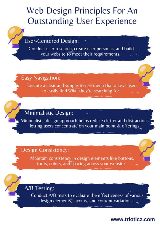
In today’s digital age, a web page is often the initial point of interaction between a business and its customers. To know which layout, and design suite to your website, consult a reputed Website Development Company in Coimbatore or a Web Development Company in Chennai and know the best for your business.
#A/B Testing#Accessibility for Everyone#Attractive Imagery and Visuals#Design Consistency#Easy Navigation#Minimalistic Design#Quick Loading Times#Responsive Design#User-Centered Design#Visual Hierarchy#Web Design#Web Design Company#Web Design Principles#Web Development
0 notes
Text


Time
#homestuck#homestuck fanart#hs fanart#blooby posting#Dave strider#Aradia Megido#He will never have a consistent Dave design
2K notes
·
View notes
Text


apple season
#my art#tloz#a link to the past#someone close to my school has a rly big apple tree they invite ppl to come in and pick from and I'm already making grabby hands#link#zelda#I was trying to work on my consistency in terms of designs and stuff way back when but like I can't see those csp files rn so rip#they get to have new outfits that's just whatever I thought was fun to draw at the moment thumbs up emoji#I have not actually read the manga but I am taking the orchard I want it too#with a couple way big trees it's what happens when ur out travelling I guess idk idk I'm a cringe city person#Blabbering in tags is So back
2K notes
·
View notes
Text
ALL OF THEM!
added the few more cards I wanted and slightly modified the first ones so they could match better :3
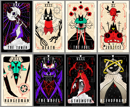


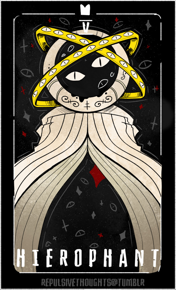


#cult of the lamb#cotl#cotl fanart#cotl goat#cotl narinder#cotl leshy#cotl heket#cotl kallamar#cotl shamura#cotl lamb#cotl mystic seller#cotl tarot cards#repulsiveart#ngl the research I did for this was what took the most effort#I really wanted to make the characters fit the cards as much as possible#I think the most difficult to match was shamura as I really wanted to keep the inverted meanings for the bishops consistent but alas#they fit the whole destiny thing better if upright#also ended up being my fav design jksjsks
2K notes
·
View notes
Text


class swap design masterpost for convenience (from top to bottom: bard!riz, cleric!gorgug, sorcerer!kristen, barbarian!fig, artificer!adaine, and rogue!fabian)
#dimension 20#fantasy high#fhfy#fhsy#fhjy#riz gukgak#gorgug thistlespring#kristen applebees#figueroth faeth#adaine abernant#fabian seacaster#my class swap stuff! oh yeah I think I got a tag for that I'll call that#fh class quangle#gna slowly go back and get that tag on relevant posts too. for organization's sake#even tho I didnt really intend this blog to be that kinda blog lmao. we were all just gonna be out here dealin with that at our own pace#anyways uh! they! u know all the lore for the designs already I put em in tags. but otherwise this also collects like the#color keys kind of for these. mostly the things that change between designs#doing this did make me realise half of these are a Lot more consistent in color keys than the other half lol#like kristen's palette stays pretty much the same. and fabian's. the hit's mostly in the construction#a lot of this is overall like an exercise in remembering what high schoolers would actually wear and how to work in Costume pieces#on this point at least I straight up have No relevant recollection lmao all the basic education establishments I went to have uniforms#and outside of school I was. well kind of a shorts and tee guy. so#on that topic I feel like fabian's is the furthest stretch lmao. like if a guy in high school wears the same bright yellow raincoat#to school every day that's like. people would Not like that guy. fabian really is saved by being cute and a rogue#he will still have stans when he's deep in his fishing arc in junior year he's the manic pixie dream bf#anyways uh. things to do! stuff to get done. sleep first tho. have a good night lads#I have not caught new nsbu yet! seems I mostly catch them like two to three days late nowadays.#so please uhh. don't reply on my posts with nsbu spoilers? we are all excited and having fun but that's rude#ok thank u. signing off for the day have a good night#!!
2K notes
·
View notes
Text
snow day/tsot/fantasy au redesigns for my au ✨
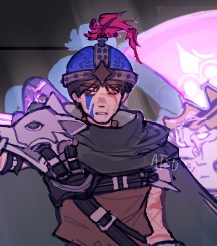
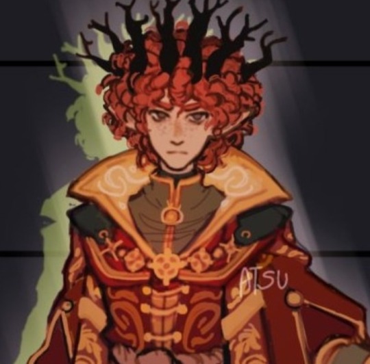
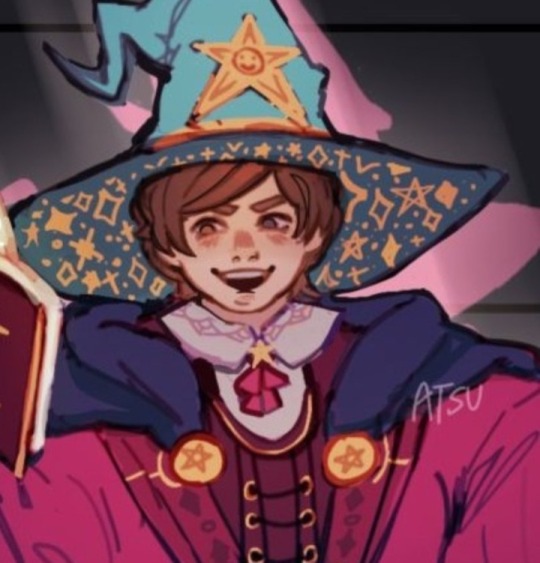
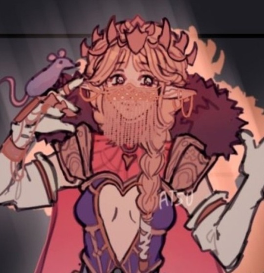
im not finished with profiles yet soo ill just put this here 🏃🏃🏃
#stan marsh#kyle broflovski#eric cartman#kenny mccormick#south park#south park au#south park stick of truth#south park snow day#south park the stick of truth#character redesign#man their color pallettes dont even fit each other my artstyle is so messed up#literally can't be consistent for once 💔#this took me like two months#and it's just the character designs#also did you know i listened to their snow day themes while doing this#kyle's theme is such a banger
2K notes
·
View notes
Text
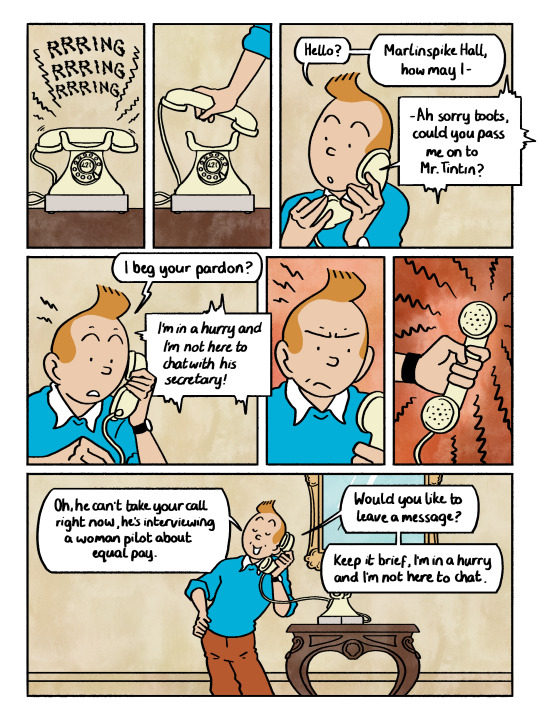
another random headcanon about how tintin sounds! he has a soft high pitched voice and sometimes gets mistaken for a woman over the phone (this never happens in canon but in adaptations he often has a higher pitched voice as he's a younger character. i like to think he keeps his voice even after he enters adulthood)
i did a comic about accents over here
#tintin#adventures of tintin#fanart#comic#i was going through my books for reference and the phone design is consistent!
3K notes
·
View notes