#ColumnChart
Explore tagged Tumblr posts
Text
Sorting Data in Column Charts: Best Practices in PowerPoint and Excel
Data Visualization: Top Questions Answered
1.How do I edit a column chart in PowerPoint?
To edit a column chart in PowerPoint, click on the chart to select it. Then, use the Chart Tools on the toolbar to modify the design, layout, or format. You can right-click the chart to edit data, change the chart type, or adjust individual elements. Double-click the chart to open Excel for detailed data editing.
2. How do I animate a column chart in PowerPoint?
To animate a column chart in PowerPoint, select the chart, go to the "Animations" tab, and choose an animation effect from the gallery. You can customize the animation settings by clicking on "Animation Pane" and adjusting the timing and order. Use "Add Animation" to layer effects and preview your animation to see how it looks.
3. How do I make columns in Google PowerPoint?
To create columns in Google Slides (often referred to as Google PowerPoint), insert a text box by clicking on "Insert" > "Text box." Then, enter your text. To format it into columns, select the text box, click on "Format" > "Columns," and choose the number of columns you want. Adjust the text box size as needed.
4. What is column chart in PowerPoint?
A column chart in PowerPoint is a graphical representation of data using vertical bars. Each bar represents a category or value, making it easy to compare different data points visually. Column charts are useful for displaying trends over time or comparing quantities across various categories, enhancing the audience's understanding of the information presented.
5. How do I sort a column chart in PowerPoint?
To sort a column chart in PowerPoint, first click on the chart to select it. Then, right-click on the data series or axis you want to sort. Choose “Select Data,” and in the dialog box, adjust the order of the data series or categories. Alternatively, sort the data in Excel before importing it into PowerPoint for a more organized chart.

Visit: VS Website See: VS Portfolio
0 notes
Photo

Are you tired of sifting through never-ending spreadsheets and data tables? Column charts in Data Studio are an excellent way to visualize your data and make informed decisions quickly. In this step-by-step guide, we'll show you how to create a column chart in your Data Studio account. Step 1: Log in to your Data Studio Account Open a web browser and navigate to your Data Studio account. Log in with your Google credentials. Step 2: Select a Data Source On the left-hand side of the screen, click "Create" and choose "Report" from the drop-down menu. Next, select a data source that contains the data you want to visualize. Step 3: Add a New Page Once you've connected to your desired data source, your workspace will open. Click the "+ Page" button on the bottom left to add a new page. Step 4: Add a Column Chart On the new page, click the "+ Add Chart" button on the toolbar, and select "Column Chart" from the drop-down menu. Drag and drop the chart onto the workspace. Step 5: Customize the Chart Once you've added the column chart to your Data Studio report, you can customize various components, such as the chart title, x-axis, and y-axis. You can also choose to show or hide your data based on specified metrics and dimensions. Step 6: Save and Share After you've customized your chart, save your report, and share it with your colleagues or stakeholders, so they have access to your visualization. That's it! By following these six easy steps, you can create a beautiful and informative column chart in Data Studio. At Cratos.ai, we understand the power of data visualization and how it can drive meaningful insights for your business. Click here to learn more about our platform and start making data-driven decisions today! #DataVisualization #ColumnCharts #DataStudio #Cratos.ai 📈📊🚀
0 notes
Text
How to Make Chart in Excel [Easy and Practical] 2021

In this article, we will discuss how to make charts in Excel from various types of charts in excel, such as Graphs charts, bar charts, line charts, pie charts, and others. As you all know, Microsoft Corporation as the owner of the Excel application has made many improvements to its applications. This is evident from the many versions of Microsoft Excel that are sold in the market. However, is the way to make a chart in Excel the same in different versions? The answer is yes, almost the same. The only difference lies in the Excel ribbon menu used. But basically, the way of making it is the same. Then, do you already know how to make charts in Excel? If not, you are lucky to have found this article.

How to make charts in Excel from various types of charts in excel But before that, it would be better if you know the function of each type of graph so you don't use it wrong.
About Microsoft Excel
Microsoft Excel is a useful and powerful program for data analysis and documentation. It is a spreadsheet program, containing a series of columns and rows, where each intersection of column and row is a "cell". Each cell contains a data point or piece of information.
Types of charts in excel
Did you know that each type of charts in Excel tends to have a different function? Also, learn excel formulas to make it easier for you to process data. So here, there are types of charts in Excel that we have mention below for you and if you want to know about the full explanation on the type of charts in Excel then read the full article below. - Column Chart - Line Chart - Pie Charts (Circle Chart) - Bar Charts - Surface Charts - Stock Charts Here are some explanations about the type of charts in Excel that are suitable for certain data. 1. Column Chart (Chart Column) A column chart is a data visualization where each category is represented by a rectangle, the height of the rectangle is proportional to the plotted value. Column charts are also known as vertical bar charts. This type of graph is very suitable for comparing data or showing a change in data over a certain period of time. For example, a chart of brand preference with the type of cola.
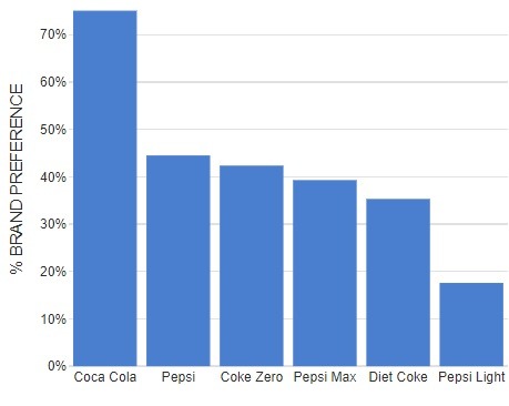
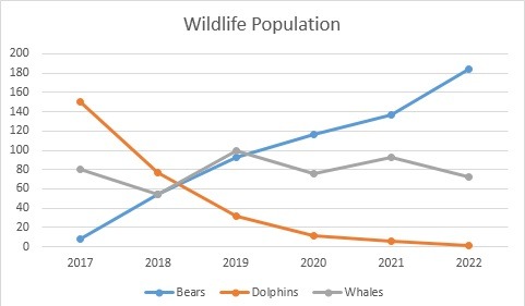
Column Chart-Image source: displayr.com 2. Line Chart (Figure Line) This chart is suitable for displaying continuous data and is very effective in identifying a pattern or trend. Therefore, it is common for people to use these graphs to display data trends at certain time intervals. For example, to display the Wildlife population.
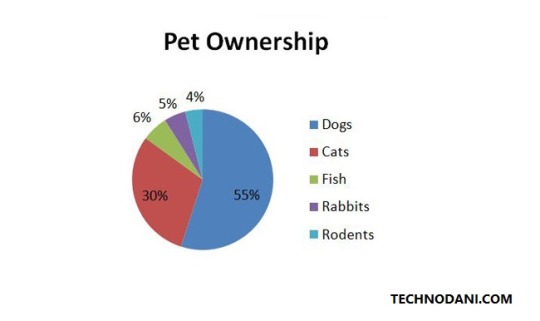
Line Chart 3. Pie Charts (Circle Chart) Next up is the circle chart type. This circle graph is used to show the proportion of an item in the data. Usually, the value of the items in the data is shown as a percentage. For example, the percentage of Pet ownership.
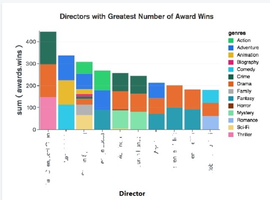
Pie Charts 4. Bar Charts This graph is usually used to compare several items. For example, to graph about Directors with the greatest Number of Award Wins.
Bar Charts 5. Surface Charts (Graph Surface) This type of graph is very suitable to be used to find the optimal combination of two data sets. For example, in a topographic map or to illustrate the effect of Rainfall (CM) by city Long and Lat.
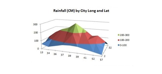
Surface Charts 6. Stock Charts (Graph Stock) Next are stock charts or stock charts. Usually, this type of chart is widely used to describe fluctuations in stock prices. However, not only for describing stocks, but you can also use this type of graph for scientific data, for example, to show temperature fluctuations.
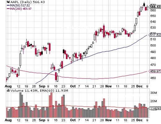
Stock Charts
How to Make Various Types of Charts in Excel
- Open your Microsoft Excel on your System. - Select "Blank Workbook". This means that you will create new data on a blank Excel sheet.
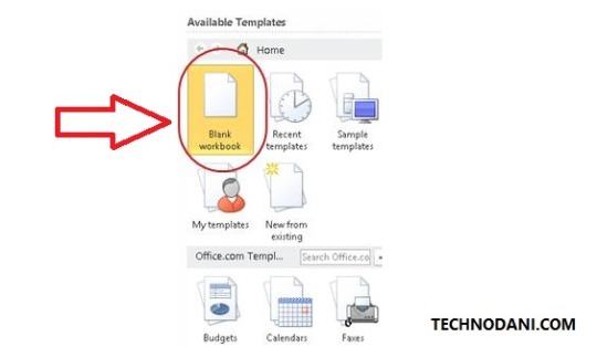
How to Make Various Types of Charts in Excel - Enter the data for which you want to graph. For example, here is made the sales data for several types of cars from January to April. - When all the data is ready, block all the tables you want to chart and select "Insert" from the menu. Now, on the "Insert" menu there are many types of charts that you can choose from. If you are confused about which one, you can try clicking "Recommended Charts".
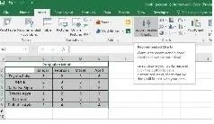
How to Make Various Types of Charts in Excel - The "Insert Chart" window will automatically appear. In this window, you can see the recommended chart forms and all the chart types available in Excel. The sample chart will also automatically fill in the data from the table that you have created.
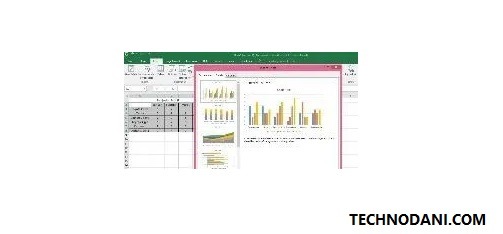
Insert chart - If you feel that the chart options on the "Recommended Charts" tab are not suitable, you can select the "All Charts" tab. You can see all types of charts in Excel on that tab. After selecting a suitable chart, press "OK".
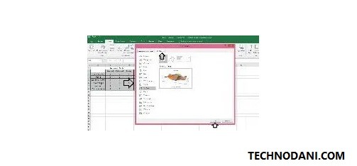
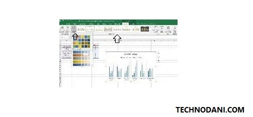
All Charts - After pressing "OK", your chart will automatically appear along with a menu to design it. On the "Design" menu, you can choose the color you want to use along with the table forms. Try them one by one and choose according to your needs.
the process of making charts in excel - In the example table, the chart generated automatically by Excel has no title so it says "Chart Title", you can edit it by hovering over the text and pressing it.
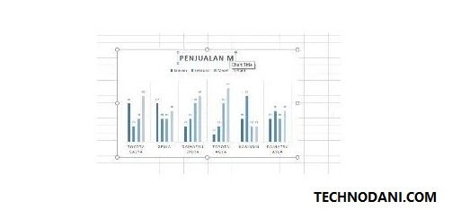
Chart Title - Apart from editing the chart title, you can also change the existing content on the chart through the table that has been created. Once you edit the data in the table, the graph will automatically update the data. You can see the result as an example below.
how to make a chart in excel finished
How to Make a Chart in Excel
Graphs or sparklines in Excel are great for showing trends in a series of values, such as highlighting minimum and maximum value cycles, economic cycles, sales results, and more. In addition, it is also great to use sparklines when you don't have enough space to place a large chart. Adding sparklines to the data you are working with will further clarify what is contained therein. Here's how to add sparklines. - Select a blank cell where you want to place the sparkline.
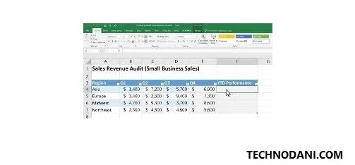
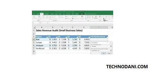
How to Make a Chart in Excel - empty cells - Select "Insert"> "Sparkline". After that, select the sparkline type you want to create such as rows or columns.
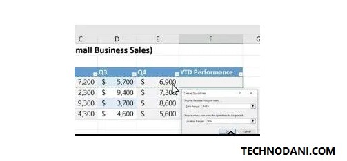
select the sparkline type - Then, select the cells in the row or column you want to chart and press "Ok" when you're done.
select the cells in the row - If you want all the data in the table to have sparklines, you can simply position the cursor in the lower-left corner of the cell that already contains the graph. When the black plus sign (+) appears, drag it down. Then, automatically all your data will have a sparkline.
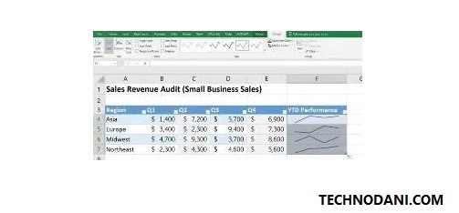
How to Make a Chart in Excel - After all, sparklines have been created, you can also customize the design by pressing the "Design" menu. In the design menu, you can choose the color of the graphic, the shape of the graphic, and so on according to your needs.
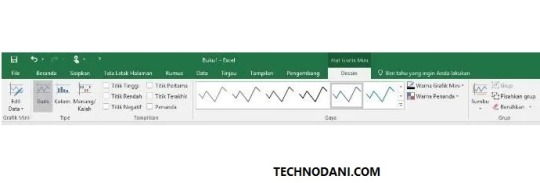
Sparkline design Related Article: How To Draw A Graph In Microsoft Word In 2020 Easily
How to Make a Chart in Excel with 2 Data
- Open Excel and create the data you want to graph. This time we will make an example of temperature comparison data that is measured with different tools.
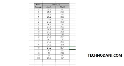
temperature comparison data - Then, place the cursor outside the table and click the "Insert" menu. Then select the desired chart type. In this example, the chart with the type Scatter will be selected.
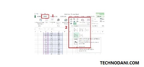
select the chart type - After that, a blank chart will appear on the worksheet. Click on the graphic and open the "Design" menu. Choose "Select Data".
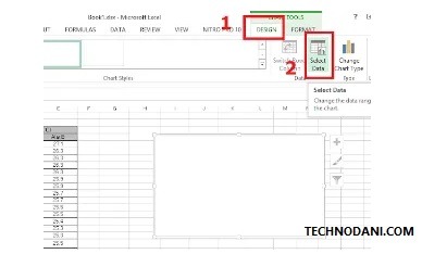
Click the graph - Then "Select Data Source" window will automatically appear. After that, press "Add" and enter your data. In series name, fill in the name of the data, fill in series X with values on the X-axis, and series Y fill with values on the Y-axis. After that, click "OK".
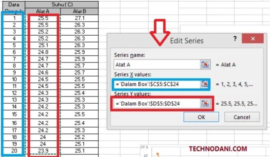
Select Data Source - Do the same for the second data.
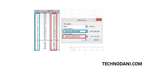
Insert second data - After all, data has been added, click "OK" on the "Select Data Source" window and the chart will appear on your worksheet.
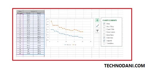
Select Data Source Else watch the video tutorial on how to make Graphs in Excel or How to Make a Chart in Excel.
Conclusion
Well, guys, Graphs in Excel are very widely used by people to explain the data they create. With graphs, people tend to find it easier to read data because it contains text and images. Hopefully, this way of making charts in Excel can help you. Also Read: What is ping test in Games, Internet Speed Test 2021 How to Reduce Photo Size on Computer, Mac, and Android 2021 How to Repair External Hard Drive Corrupted and Unreadable Fix Win & Mac 2021 Read the full article
#BarCharts#chart#chartappearance#chartformatting#chartsinexcel#chooseadesign#CircleChart#ColumnChart#create#createadatatable#different#education#excel#excel2007tutorial#excel2010#excelchartexamples#excelcreatecharts#excelfordummies#exceltutorials#fetchdataintothechart#graph#graphs#how#howto#howtocreateachartinexcel2010#howtocreateachartinexcel2016#howtocreateagraph#howtocreateagraphinexcel#howtocreateapiechartinexcel#HowtoMakeaChartinExcel
0 notes
Link
Column Chart (Uses, Examples) | How to Make Column Chart in Excel?
0 notes
Photo

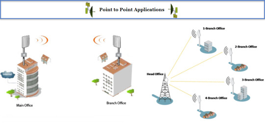
POINT TO POINT ALIGNMETN #map { max-width: 100%; height: 365px; margin-top: 2px; border-radius: 12px; background-color: #f2f2f2; color: white; } #container { background-color: #cccccc; border-radius: 12px; padding: 6px; max-width: 100% } #elevation_chart { background-color: #cccccc; border-radius: 12px; padding: 2px; margin-top: 2px; margin-bottom: 2px; margin-right: 2px; } #display-panel { background-color: #f2f2f2; padding: 2px; border: 1px solid #999; font-family: 'Arial','sans-serif'; font-size: 13px; font-weight: bold; line-height: 32px; text-align: center; max-width: 98%; border-radius: 12px; } #latlngA { width: 130px; text-align: center; font-size:11px; color: blue; } #latlngB { width: 130px; text-align: center; font-size:11px; color: blue; } #azimuthA { width: 35px; text-align: center; font-size:11px; color: blue; } #azimuthB { width: 38px; text-align: center; font-size:12px; } #DistAB { width: 35px; text-align: left; font-size:11px; color: blue; } #HeightA { width: 35px; text-align: left; font-size:11px; color: blue; } #HeightB { width: 35px; text-align: left; font-size:11px; color: blue; } #Obstacle { width: 35px; text-align: left; font-size:11px; color: blue; } hr { display: block; margin-top: 0.1em; margin-bottom: 0.5em; margin-left: 2px; margin-right: auto; border-style: double; border-width: 1px; color: lightgrey; }
INPUT :
A: Lat,Lng Height (m)
B: Lat,Lng Height (m)
Height obstacle: (m) such as tree,building,..
RESULT :
➥ Azimuth (°deg) A ➪ B : B ➪ A:
➥ Dist A ⇔ B: Km
* Tips: Right Click on map to get Lat/Lng
(adsbygoogle = window.adsbygoogle || []).push({});
Elevation Profile will show after Path Profile is created


SEE MORE TELECOM TOOLS: OTHERS RF TOOLS
google.charts.load('current', {packages: ['corechart']}); google.charts.setOnLoadCallback(drawChart); var labels = '123456789'; var labelIndex = 0; var color1 = ["#ff0000", "#3333cc", "#00ff00", "#ff9900", "#cc0099", "#ffff00", "#00ffff", "#009933", "#ff0066"]; var color1Index = 0; google.load('visualization', '1', {packages: ['columnchart']}); var obstacle = 0; var heightA = 1; var heightB = 1; function initMap() { var map = new google.maps.Map(document.getElementById('map'), { zoom: 4, center: {lat: 12.793639, lng: 104.830108} }); var infowindow = new google.maps.InfoWindow; //add draw tool var drawingManager = new google.maps.drawing.DrawingManager({ drawingMode: google.maps.drawing.OverlayType, drawingControl: true, drawingControlOptions: { position: google.maps.ControlPosition.RIGHT_TOP, drawingModes: ['marker', 'circle', 'polygon', 'polyline', 'rectangle'] }, markerOptions: { icon: 'https://4.bp.blogspot.com/-s75nbkxOCUo/V7v2jFfc-cI/AAAAAAAAG94/xQC6oQFiLwcw0NcuwW86J5Y3xciqtXvJACLcB/s1600/icon-tower-gif.gif', clickable: false, draggable: true }, circleOptions: { fillColor: '#ffff00', fillOpacity: 1, strokeWeight: 5, clickable: false, editable: true, zIndex: 1 } }); drawingManager.setMap(map); //end draw tool //Path Profile click document.getElementById('submit').addEventListener('click', function() { geocodeLatLng(map, infowindow); }); // end // right click get location on map google.maps.event.addListener(map, "rightclick", function(event) { var lat1 = event.latLng.lat(); var lng1 = event.latLng.lng(); // populate yor box/field with lat, lng //alert("Lat,Lng = " + lat1 + ", " + lng1); contentString = 'Lat,Lng = ' + lat1.toFixed(6) + ', ' + lng1.toFixed(6) ; //contentString = 'Hello'; myLatLng = {lat: lat1, lng: lng1}; var infowindow = new google.maps.InfoWindow({ content: contentString, position: myLatLng }); infowindow.open(map); }); // end // Create an ElevationService. var elevator = new google.maps.ElevationService; } // end initMap //function get input data function geocodeLatLng(map, infowindow) { var inputA = document.getElementById('latlngA').value; var latlngStrA = inputA.split(',', 2); var latlngA = {lat: parseFloat(latlngStrA[0]), lng: parseFloat(latlngStrA[1])}; var latA = parseFloat(latlngStrA[0]); var lngA = parseFloat(latlngStrA[1]); var inputB = document.getElementById('latlngB').value; var latlngStrB = inputB.split(',', 2); var latlngB = {lat: parseFloat(latlngStrB[0]), lng: parseFloat(latlngStrB[1])}; var latB = parseFloat(latlngStrB[0]); var lngB = parseFloat(latlngStrB[1]); var HeightA = document.getElementById('HeightA').value; var HeightB = document.getElementById('HeightB').value; var Obstacle = document.getElementById('Obstacle').value; obstacle = parseInt(Obstacle); heightA = parseInt(HeightA); heightB = parseInt(HeightB); map.setZoom(10); map.setCenter(latlngA); var image = 'https://4.bp.blogspot.com/-s75nbkxOCUo/V7v2jFfc-cI/AAAAAAAAG94/xQC6oQFiLwcw0NcuwW86J5Y3xciqtXvJACLcB/s1600/icon-tower-gif.gif'; var marker1 = new google.maps.Marker({ position: latlngA, center:latlngA, label: 'AP-1', map: map, icon: image, clickable: false, title: 'Access Point' }); var marker2 = new google.maps.Marker({ position: latlngB, center: latlngB, label: 'AP-2', map: map, icon: image, clickable: false, title: 'Access Point' }); var path1 = [marker1.getPosition(), marker2.getPosition()]; var heading1 = google.maps.geometry.spherical.computeHeading(path1[0], path1[1]); var path2 = [marker2.getPosition(), marker1.getPosition()]; var heading2 = google.maps.geometry.spherical.computeHeading(path2[0], path2[1]); var distanceAB = google.maps.geometry.spherical.computeDistanceBetween(path1[0], path1[1]); if (heading1 < 0) { heading1 = 360 + heading1; } if (heading2 < 0) { heading2 = 360 + heading2; } document.getElementById('azimuthA').value = heading1.toFixed(2); document.getElementById('azimuthB').value = heading2.toFixed(2); document.getElementById('DistAB').value = (distanceAB/1000).toFixed(2); var path = [ {lat: latA, lng: lngA}, {lat: latB, lng: lngB} ]; // Create an ElevationService. var elevator = new google.maps.ElevationService; // Draw the path, using the Visualization API and the Elevation service. displayPathElevation(path, elevator, map, heightA, heightB, obstacle); } //end function get input data function resetMap () { var labelIndex = 0; document.getElementById('azimuthA').value = ""; document.getElementById('azimuthB').value = ""; document.getElementById('DistAB').value = ""; document.getElementById('elevation_chart').textContent = "Reset, please run it again!"; initMap(); } https://ift.tt/3p44KGj
0 notes
Photo

Excel: Mastering the Implicit and Explicit Features of Microsoft Excel
3DReferences
AbsoluteReference
AdditionIcon
AdvancedFilters
AdvancedUserFunctions
AppearanceofCells
AreaChart
Auto-fixingColumns
Auto-fixingRows
BarCharts
BasicFormatting
BlankRows
BubbleChart
CalculatingValues
CalculationsonSpreadsheets
CellFormatting
CellSecurity
ChangeMargins
CloseWorkbook
ColumnChart
ComboChart
ComparingColumns
ComparingLists
ConditionalFormatting
COUNTIFSFunction
CreatingBorders
CreatingRelationships
CreatingTables
CrossReferencing
CustomLists
DataAutofill
DataModelling
DataSet
DataSorting
DataTables
DataValidation
DisplayingFormulas
DoughnutChart
Drop-DownLists
DynamicArrays
ExcelEffects
ExcelGraphics
ExcelSecurity
ExcelTemplates
ExcelThemes.
ExcelWorkbook
ExecutionOrder
ExportingWorkbook
File–levelSecurity.
FilteringData
FiltersinExcel
Flash-FillinExcel
FontColours
ForecastSheet
FormatPainter
FormulaBar
FreezingPanesinExcel
FuzzyMatching
HeadersandFooters
HLOOKUPFunction
ImportData
INDEXMATCH
InsertRowsandColumns
InsertingImages
IntegrityofWorksheets
LineChart
MacrosinExcel
MergingCells
MicrosoftExcel
MultipleCells
MultipleRows
NaturalLanguageQuery
NavigatingExcelWorksheets
ObtainingData
PageFormat
PieCharts
PivotCharts
PowerQuery
PrinterSettings
PrintingSpreadsheet
Quick-AnalysisTool
RadarChart
RelativeReference
RelocatingColumns
RelocatingRows
ResizingChart
RichDataTypes
SaveaNewWorkbook
SaveExistingFile
ScatterChart
ShowValue
SpecialValues
StandardShapes
StartingExcel
StockChart
SUMIFandSUMIFS
Sum-ofFormula
SurfaceChart
TablesSlicers
TypesofCell
TypesofCharts
UsingFormulas
UsingTables
ValueIntegrity
VLOOKUPFunction
WorkbookSecurity
WorksheetLayout
#ExcelSecurity#formulabar#microsoftexcel#naturallanguagequery#pivotcharts#printingspreadsheet#quickanalysistool#relativereference#showvalue#stockchart#woksheetlayout
0 notes