#Chrome wheels
Explore tagged Tumblr posts
Text


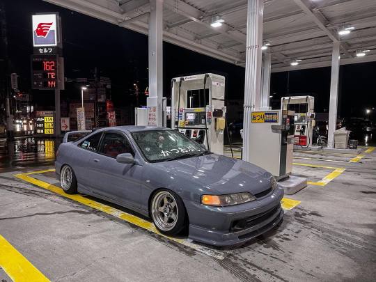
全く変わり映えしてない
26 notes
·
View notes
Text


#gas#truck#vintage#vintage truck#old#old truck#custom build#custom made#custom truck#car show#show truck#black truck#red interior#chrome#chrome wheels
15 notes
·
View notes
Text


GS300 slammed on Weds Bazreia wheels
#car photography#car show#lexus#gs300#slammed#bagged#3 piece wheels#weds wheels#weds bazreia#chrome wheels#vip stance
15 notes
·
View notes
Text


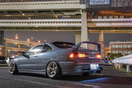
#honda#integra#integra type r#honda type r#type r#integra dc2#dc2#dc2 type r#stance#japan#daikoku futo#gris#grey#chrome wheels#work wheels#meister cr01
24 notes
·
View notes
Text

Taken in 2011
#car#tuner#modified#sports car#import tuner#modified car#tuner car#superstreet#nismo#nissan#350z#nissan 350z#z33#nissan fairlady#fairlady#fairlady z#nissan z#chrome#chrome wheels#aesthetic#throwback thursday#tbt#throwback#vq#vq35#vq35de#modified cars#sports cars#tuner cars
1 note
·
View note
Photo

~ Jewel Tones ~
1K notes
·
View notes
Text

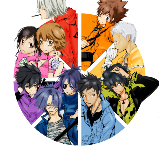
vongola colour wheel: 8/8
— support, miura haru, sasagawa kyoko
#sasagawa kyoko#miura haru#khr#katekyo hitman reborn#khredit#khrgraphics#my shit#gokudera hayato#sawada tsunayoshi#sasagawa ryohei#lambo bovino#yamamoto takeshi#rokudo mukuro#chrome dokuro#hibari kyoya#manga colouring#manga coloring#khr colour wheel#khr color wheel#colour wheel challenge#color wheel challenge#colour wheel meme#color wheel meme#COMPLETE!!!! ITS COMPLETE!!!!!!!#we started this in June and she’s complete babyyyyyy!!!!#I’m so happy I could finally finish this. finish something on here#and I think it turned out so good too!!!#the little flower things on the girls are those colours#to represent their possible flame colours which I’ll never change. lightning and mist#ANYWAYS THANK YOU ALL AND I HOPE YOU LIKE IT
505 notes
·
View notes
Note
Hi!! I just wanted to say that the way you draw characters/use colors in your art is an absolute dream, I've never seen anything prettier. Do you have a specific way you pick/use colors, or any advice for coloring? You inspire my art so much, and I'd love to learn how to color like you someday :)

@braventheninth gonna reply to both of you here hope that's cool!
aaaah thank you so much I'm really honoured to hear you both like it and that it inspires you anon !! ;v; I don't actually know much about art theory-wise, aside from very basic colour theory that I always forget so most of my choices are pretty instinctual and based on my own preferences!
i can do my best to explain my thought process though! uuh it is. lots of text though just as a warning.
one thing I tend to do with almost everything is pick what kind of colour mood I'm going for! usually, since I love orange and also warm feelings, I'll aim for some kind of warm tone and when doing that I try to slide every colour I pick towards the warm end of the colour wheel. Blacks and whites are especially good for this! As a general thing I almost fully avoid picking any colours along those edges of the colour picker

instead I'll move all my colour choices a nudge into the square for the colours towards the tone I want (in this case warm) (the white is there be warm too I just forgor to type it).

and since I wanted warm colours for this drawing I desaturated the blue of Brain's pants so it would fit in better. I once heard someone say you should always pick one main colour and saturate fully and the further away from it on the colour wheel you got, the more desaturated your colours should be. I don't really do that bc I like my colours to stay bright but I do keep it in mind to mess around with sometimes.
I'm not always great at keeping this consistent, but I think it usually makes for pretty decent results... Other things I keep in mind are that when I pick the colour for my shadows I always make a little slide on the colour wheel towards the opposite tone of what I based my main colours on. oh and picking the right base colours ?? no clue tbh I always put every colour on it's own layer and then I spend a couple minutes adjusting them all seperately until I feel like they go well enough together. I usually avoid the bottom to right section of the square fully, bc I find they often get oversaturated and muddy, but that's just a personal preference I guess.
also since I enjoy the way coloured lineart works for my stuff I tend to mess around with layer settings for my lineart! usually the end results will look something like this:

where the clipped layer is clipped on to my colours folder. lineart is the only place where I just use plain black since I'm gonna change it with these layer settings later. it often still shows up as black for darker colours (and especially blues?) but it keeps a slightly coloured edge that I enjoy. if the blacks of the end result don't look good, messing around with the layer opacity usually changes stuff up. sometimes I'll also erase part of the lineart from one of the layers as a way to adjust.
I think what might be more relevant though, is the way I've been picking my colours for most of my recent posts though, which is. very differently. and also quite dependant on the fact I've been drawing on Tegaki! Tegaki has a limited colour palette that looks like this

only the 6 colour slots next to the bottom greyscale can be replaced by your own colours. As shown here I only bothered to add something to half of them; mainly the beige-ish colour I like to use for whites, a brown that I never use bc it's ugly with everything else here and a purple? that I only Think I added. both the brown and purple suffer from being too desaturated for the rest of the palette, which makes them stand out in a pretty bad way when used tbh.
I have. absolutely no idea what I'm doing with colours on this site though ngl. I think it just automatically pushes you to be a little more chaotic with the choices? a simple example is the green I picked for Link's tunic here doesn't really have any good, easy choice for shading imo. most of the "darker" green tones just feel more saturated, and it sticks out pretty bad as a shading colour for the more muted green I picked for the tunic. Removing those, the choice was either a mossy green or a blue.

and while the mossy green is still green, it feels far too dark a shading colour compared to what I picked as shading for the rest of the drawing. The blue has the added bonus of being closer to the purple I used for the black-ish parts.
I think my point is that it's really easy to push yourself to make some fun new choices when the tools you're using limit you a bit in a way? Looking at it now, I'm also seeing that the hands were lined with very different colours. I remember just thinking that I couldn't be bothered to find the exact same purple I used for the first hand so I just went with the first thing I landed on, that being a pink. But now I think it works pretty well since the one hand is lifted a bit more into the light and that goes well for a bright colour like pink. happy accidents and all that right ?
I am fully just yapping at this point 🧍 but the point still goes for most things drawn on this site.

like there was no reason to add the blues or reds or pinks to the heather here but I only had so many purple shades to work with. it might be less realistic but I don't think it would've come out as well if I had stuck to only the purple shades from my reference photo.
This ended up way way too long and I have no idea if any of it made sense or was helpful at all, but it was surprisingly fun to reflect on my own choices a bit more! especially since I often just do whatever I feel like I think it's helpful to sit back and consider what instinct actually tells me it's the right thing to do.
in an attempt to do something actually helpful uuh I recommend messing around with 2 specific things and switching around with them a bit; namely limited colour palettes (like 1 or 2 main tones imo) and then just going absolutely ham and just using whatever colour for everything (make them orange! put some blue and purple on the bark! leaves can be blue if they want to! (go more ham than I did tbh))

I think just messing around does so much for making some kind of sense of colours even without Knowing how they work. it's easy to say we should all study, but personally I'm pretty bad at it and it's more fun to just trial and error it... errors do happen a lot though omg do they happen, but that's helpful for figuring stuff out too!
#ask#when I called myself Yappinator 2000 on bsky this is exactly what I meant shfdiuhsdf#feeling a little sick and should've probably slept early instead of figuring this out but it was rly fun and relaxing actully!#considering how bad I've slept recently ending the day with lots of quiet pondering might be just what I need haha#I should probably get the triangle colour wheel so I can lessen all those colours I don't like to use but I'm too used to it being like thi#too tired to have imposter syndrome too tired to overthink whether I make sense. it's quite nice actually#I hope at least some of it will be helpful or fun :)#almost started overthinking anyway I am pulling myself back by the scruff and off to bed#sleep well everyone whenever you do <3#also. totally no secret tegaki agenda here totally 👀 it's totally not like I think everyone should at least try that site haha no waay#it's only full of cool and nice people just like here and you can draw silly comments to each other#and also runs better on chrome than firefox wink wink......... spleepy time..........
28 notes
·
View notes
Text
we’ve seen the mclaren chrome wheels, we’ve seen the dropbox rear wing, everybody get ready for the GOOGLE DOCS STEERING WHEEL
#product placing too close to the sun#every time i see those chrome wheels i giggle#mclaren#f1#oscar piastri#lando norris#so deeply unserious
22 notes
·
View notes
Text


Valentin Da Silva | 174/?? ⚙

#Cyberpunk 2077#Valentin Da Silva#Aldecaldos#Masc V#Nomad#Screenshot#Virtual Photography#DON'T @ ME I couldn't find a wheel emoji that shows up on fucking chrome#anyway uwu he boutta get layed down on that tire pronto
57 notes
·
View notes
Text

🍊
#lowrider#lowlow#lowridermag warzone#lowrider culture#Monte#Monte carlo#orange#spokes#wire wheels#good and chrome#chicago#VSCO
265 notes
·
View notes
Text

土曜の昼間に乗りたい気分
#nissan#silvia#s14#s chassis#cars#jdm#ssr vienna courage#chrome wheels#automotive#japan#stance#drift car#zenki
87 notes
·
View notes
Text


#gas#dailydriver#slammed77#adventure time#beach#water#trees#rock beach#out doors#out door#out side#2door#truck#gmc#gmc pickup#lowered#lowered canyon#2wd#Chrome wheels
2 notes
·
View notes
Text

Mid 60's Ford Falcon Sprint
#ford#falcon#sprint#60s#vintage#classic#car#interior#blue#chrome#dash#steering wheel#hi-fi fotos#hallewell
13 notes
·
View notes
Text

#luxury car#car rims#fast cars#fast life#fashion#big wheel#chrome hearts#luxury#lifestyle#jewlery#Accessories#rings#tags#magazine
11 notes
·
View notes
Text

3 notes
·
View notes