#CMYK color model is weird...
Explore tagged Tumblr posts
Visit Tumblr Blog
Explore Tumblr blogs with no restrictions, modern design and the best experience.
Last Seen Tumblr Blogs


Fun Fact
Users from the US are the majority of Tumblr visitors.
Text
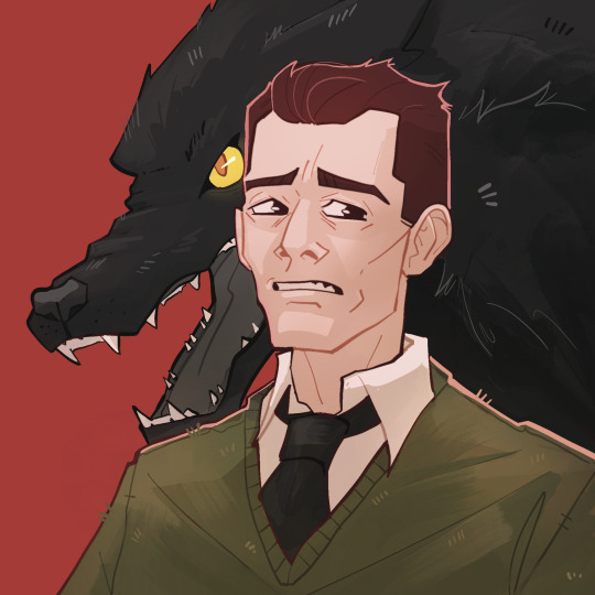
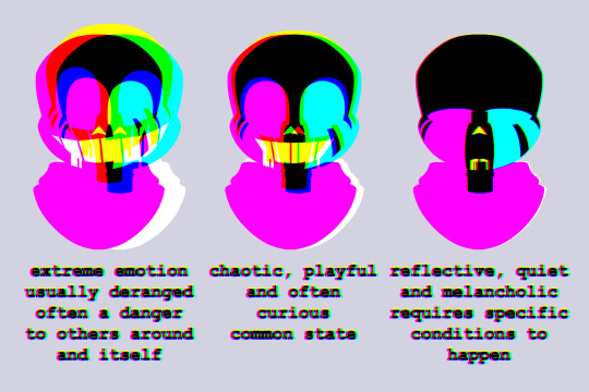
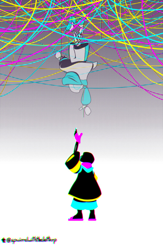
#I'm gonna do backpack pins with these drawings#it won't be for sale if it is important#moral orel#clay puppington#danielle stopframe#adult swim#CMYK color model is weird...
249 notes
·
View notes
Text
A tool I find generally pretty useful for thinking about and classifying superhero systems is the Wild Talents Axes of Design, a worldbuilding tool from an RPG that I have not and most likely will not ever play. The system categorizes and ranks superhero settings on four axes:
The Red Axis measures Historical Inertia, how much the existence of superhumans causes the timeline to diverge from our own. A high-red setting represents the standard implausibly-recognizable like-reality-unless-noted world-outside-your-window model. A low-red setting is a total alternate history.
The Gold Axis measures Superhuman Inertia (talent inertia in their internal jargon, but we've all got our own names for these assholes.) This one measures how closely superhumans hew to classic paradigms of heroism and villainy, as opposed to branching out into other societal roles or life outcomes. A high-gold setting is the prototypical endless monthly game of cops and robbers; A low-gold setting would be something like Wild Cards or Top 10, where career superheroes are a rounding error (or even a downright oddity) compared to people with powers.
The Blue Axis measures what they term The Lovely and the Pointless- essentially how much weirdness exists outside the superheroes themselves, or, more practically, how unified the setting's cosmology and power sources are. High-Blue settings are the bizarre and irreconcilable genre kitchen sinks full of aliens, gods, magicians, one million ways to get superpowers and three different kinds of time travel. Low Blue settings would be The Boys, Worm, or Wild Cards- any setting where there's a discrete reason that superhumans happened and nothing supernatural going on outside of that point of origin.
The Black Axis measures Moral Clarity, which is about what it sounds like. High Black Settings are the cartoonishly-clear-cut battles of good and evil, low black settings are omnidirectional amoral clusterfucks where the participants have superpowers.
(The joke, of course, being that if you crank all four colors up all the way, you end up with a full CMYK print, and a reproduction of the aesthetic of classic golden and silver age superhero faire.)
Obviously this isn't a perfect system- it suffers from the perennial, probably inevitable issue that the four of these don't granulate equally well but they feel the need to articulate five nodes for each of them, just to keep it neat- and consequentially it sometimes feels a little like they're struggling to justify why some of the arrangements that they're describing are meaningfully distinct from the nearest tick up or down the axis. I'm also not entirely sure how it integrates this fifth axis I think is pretty important- the question of the degree to which the public is aware of superhumans at all.
But it does provide some interesting and useful language for quick-and-dirty compare and contrast work. Watchmen is Low Blue, Low Black, Mid-Red High-Gold. Invincible is High-Blue Mid-Black High Red Mid-Gold. Worm is Low-Blue-Mid-Black-Low-Red-Mid-Gold. I don't even stand by these ratings necessarily, I just think it would be super neat going forward if I were able to throw out a phrase like "High-Blue interpretation of Superman" and successfully convey that it means we're finally gonna get to see Superman fight a wizard in live action, for example. I think there's slept-upon terminology available to us here
342 notes
·
View notes
Text
cutely slides in the yap post about their Sans AU that was previously accidently posted and jumps out of a window 😊
I've posted some art of my kid, but haven't given their name(I did) or any other info. I will eventually make a proper info post on them, but for now...
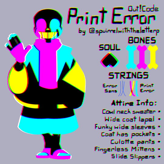
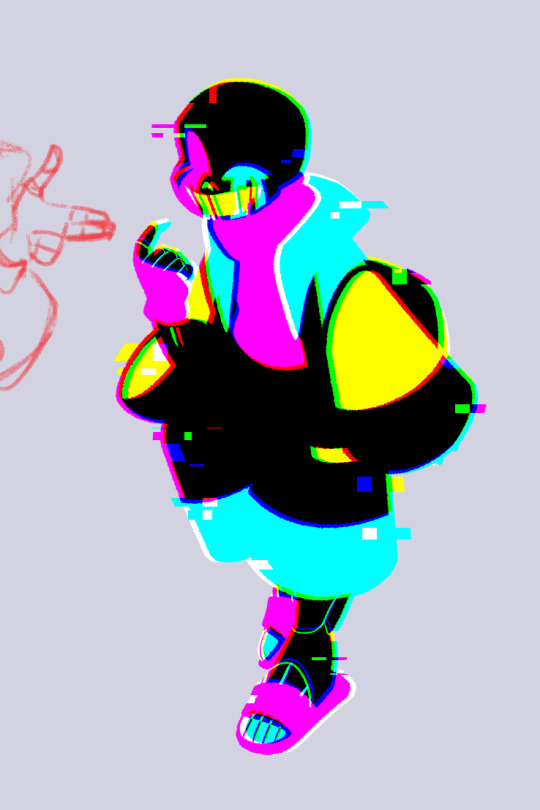
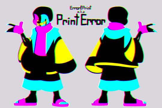
this booger right here is Error Print Sans, or just Print Error (or Error Print)
an absolute feck ton of words under the cut that's me just throwing up my thoughts ⇓
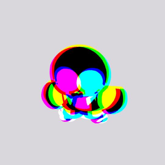
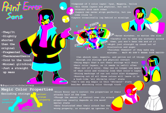
they originally started out as a passing thought that was just Error!Sans but CMYK colors, which evolved into a whole different character who didn't even have anything CMYK going on and I forgot about them for around two or three years until I re-entered my Undertale/UTMV phase recently. seriously disliked the character and the direction I took them in so I decided to start from scratch, took the original CMYK concept, and Print Error was born
am still working out their lore. I have ideas for some events that led to their current state, though how they got into the Anti-Void or why their attire changed after becoming an error is still beyond me
I called them Print Error because inkjet printers use CMYK ink and they're an error (very creative ik) they also feel weird being called just Print but they don't know why
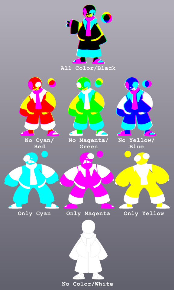
even though I made its design with the CMYK color model in mind, its more CMY than CMYK due to actually not having any black, the way its body works just makes it look like it has black↴
Print Error's being is composed of 3 overlapping color layers (cyan, magenta, yellow) that each depict how much of that magic they have. less saturated colors means less magic left, and running out of all three colors will leave Print Error in a mindless "no color" or "all white" state where they can't use any magic unless they absorb color through physical contact
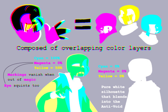
the alignment of Print Error's layers reflect their mental state. more misaligned layers means more mentally unstable or intense Print Error's emotions. more aligned layers means Print Error is more "there" in their own chaotically fragmented way, but layers rarely ever align too closely...
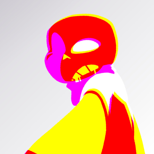
Their body is not affected by lighting, which means they stick out like a sore thumb with their bright colors and vantablack bones (it's already hard enough to just make the effect, shading them would just be an absolute nightmare 😭)
Print Error's strings are much thicker than a typical error's and come from both its eyes and mouth. Print Error can additionally absorb CMY colors from objects/beings with its strings
Print Error's attacks (bones, gaster/printing error blaster blasts) come in cyan, magenta, and yellow, which all have their own properties, but Print Error can't control what color their attack will be half of the time
Print Error is cold to the touch but has thermoanesthesia, so it doesn't know its a walking ice cube. its confused why others react so weird when coming in physical contact with it
Print Error does not understand social cues and personal space. they're often in a chaotically playful mood, though not always
Print Error is morally grey and can't tell the difference between good and bad, everything is neutral to it... apart from mistakes
Print Error's thoughts are inconsistent, usually jumping from one topic to another, having multiple thoughts at once, or not having any thoughts at all. it usually "lives in the moment", often going with the flow
Print Error's fragmented mind kind of leaves them absent minded most of the time, getting easily distracted and forgetting things like it's nobody's business. though they can often hold their focus if they're intrigued by something
even with a horrible memory, Print Error can remember things at random, though often it's something that it was previously intrigued by, or just something completely random. either way its gonna forget not even 2 seconds later
Print Error deeply believes that any mistake, no matter how small, can be catastrophic, causing them to have a sort of perfectionist mindset. they try to avoid making any mistakes, and punish themself over any mistakes they do make (leaving out details)
if Print Error witnesses someone else make a mistake, there's a chance their mind might not register it, but more often than not, will get seriously exasperated at the person for making a mistake and might even crash out of frustration. not because of the mistake itself, but more so out of fear for the person, though Print Error doesn't recognize the feeling nor reason behind it
though they do heal quicker than usual, it's a double-edged sword as it subconsciously encourages Print Error's more self-destructive behavior
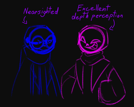
I originally had Print Error have excellent depth perception, until I thought of Print Error seeing everything in the same layered effect others see them in. definitely gonna explore that idea!
there are many more ideas I have for Print Error but I don't know how to "coherently" include them so those are gonna be revealed over time 😉

If anyone wants to ask anything about Print Error, feel free to ask! I would love to answer any questions about them and I got nothing but time!
been stressing over this post for like two weeks and I just set a deadline so I wouldn't tweak things till the heat death of the universe
was heavily inspired by @ossiethegreat's Static Hue/Error!Color post to make my own rant on my own kid, so there might be some similarities cuz I am oh so ✨️creative✨️. link to the post because I absolutely loved reading its ideas and I love Hue
I AM SO SORRY OZ IF YOU DID GET A NOTIFICATION FOR THE UNFINISHED VERSION OF THIS POST THAT WAS NOT SUPPOSED TO HAPPEN I AM SO FRICKING SORRY 😭😭😭
I really tried to explain my thoughts and I feel like I failed in certain areas 😭 I struggle with explaining my ideas and especially the more in-depth ones, so some things might change if I find better ways to explain them
I definitely plan to share more of this gremlin, and especially if more than one person is interested in them!
also found some older drawings of Print Error I made previously but didn't share, so I'm sharing now because I don't think I would have shared these at any point in the future
also a lil lore one 👀 which I like but also don't like
#undertale au#undertale au oc#sans au#sans au oc#sans oc#utmv oc#utmv au#utau oc#utau au#undertale sans au#undertale sans oc#heck why not#ima create some tags for them too#Error Print Sans#Print Error Sans#Error!Print
133 notes
·
View notes
Text
I CANT TAKE IT ANYMORE

I’ve held my tongue for too long about my feelings on madhouse but fucking hell!
Unless by some fucking act of arceus or universe hands me the fucking concept art that went into this horrible webcomic- I got room to rip and tear!
This is:
Goblin’s Valid Autopsy of Lily Orchard’s PokéMadhouse
Before we go forward!
Hi. I’m Gobbo or Bri (pick ya poison), I’m a current student at Savannah College of Art and Design (as for campus I ain’t saying nothing) Im working on my bachelors in Animation and minoring in Creative Writing. My Concentration starting as 2d animation later switching it to Story and Concept in animation (back in 2021). I started in 2019 and it’s… 2024 now. Don’t judge me! I’ve been mentored by comic artist, storyboarders and many more in the industry! I’ve taken storyboarding and a plethora of writing classes to have enough qualifications under my belt to properly discuss the shit writing, lacking worldbuilding, disorganized plot hole ridden lore/arcs and horrible inconsistent art. So let’s not waste another moment and dive fucking in!
Story:
I’m not using Lily’s self review tvtropes to cover this. It’s disingenuous ego stroking at full blast.
We follow the highs and lows that are the “will they won’t they” relationship between the stated as sisters, Lily and her Gardevoir, G (yes that’s her fucking name). In a Sunday newspaper comic page esc structure. With bits and pieces of trivia and lore that rarely comes up if not to push and pull sympathy points for lilys self insert as she gets assaulted and violated in physical and mental ways. An arc being called “Violate” and later following the would be time span for gestation of a baby that would then become the labeled cryptid child.
I’m gonna be real there’s no point in reading it because the moment something big happens out of the blue there wasn’t a page missing to explain it which god fucking dammit Lily do I need to give you one of those brainframe sheets or outline templates if you decide to write a story? Because I’ll gladly provide them!

How do you consider yourself a fucking writer at all with your fundamental lack of care for lore and story like- for fucks sake woman it won’t kill you!
Characters
Lily
G
Mikayla
Marah
Bonnie
Mismagius
Other hardly seen or used Pokémon that get thrown away out of nowhere
Countless stolen ocs
And Dr Ponytail (yes that’s the fucking name of one of the “antagonists” and I’ve reread it so many times and found nothing!)
Lily has her “antagonists” being either ex friends or partners or someone who tries to call out bullshit! Fucking hell, the way Lily has g written it’s hard to not see HER AS ONE!
You have all these characters and you neglect so many of them to focus on making your favorite Dollies kiss and scissor or do nothing!

You don’t punish actual rapists either like legit what do you do when your Pokémon who’s been raised like a sister your whole life admits to mindfucking you in a weird soul bond type deal (that you wrote the explanation of yourself), then out of fear swaps dna of a Pokémon of her CRITICALLY ENDANGERED SPECIES can match with to save it with your own dna to baby lock you to staying together, what’s the thing you decide to write?
Case in point: stick an entire cactus up your urethra Lily.
I need a break from this… I’m moving on to the art misdirection.
Lily you are the one commissioning these panels from Mikayla. Meaning you are telling her how to draw these making you the literal art director of this shitty comic!
You want my advice?
USE MODEL SHEETS
Like holy shit. I need to copy paste my spiel about what it is one second:
Make a turnaround for your character(s)!
(Excluding front and back you need to make left and right versions of the rest!)
Front
Back
over-the-shoulder
3/4 view
profile
expression sheets
color pallet reference
(if it’s online/digital rgb if it’s for print it’s cmyk)
include the hexcodes for artists if it’s a small production!
lineup for height and scale for comparison to:
other characters
backgrounds
props
etc.
elements of the world + floor plan in small settings
action poses
hair guide (trust me it’s important)
these are the elements every artist who wants to tell a visual story be it animated or comic always needs:
✨A PITCH BIBLE✨
And Lily, if you’re making any story that is
A. Tied to an existing property
B. Has real world/geopolitical/historic relation
C. Needing a basic understanding to science
Do everyone and yourself a favor
AND DO YOUR FUCKING RESEARCH IN MLA FORMAT INSTEAD OF SOMEONE ELSES OPINIONS AND YOUR ASS OF HOLDING BULLSHIT!
Class
Dismissed
Your homework is to get these books:
#sillygoblinantics#lily orchard’s pokemadhouse#lily can’t art direct#lily orchard is a bad writer#analyzing madhouse
78 notes
·
View notes
Text
I’m going to rank his ten albums-not counting side projects, scores, compilations, or releases like A Pact Between Strangers that could debatably be called albums because of length but are EP releases in every other way.
R Plus Seven. His best album in my opinion. He’ll probably never top it. Yes, it’s sterile, but it’s extremely colorful and it’s a lot of fun. I think of toys. Like blocks and bead mazes. A very synthetic album, but it has a quality to it that I’d actually describe as angelic.
Russian Mind. My love. First album of his I ever heard. I think it’s the best of his Rifts-era releases. And Grief and Repletion is actually the first track he ever created, back in 2003.
Replica. Comes to me at night and in the early morning hours. Very lonely, very weird, very druggy album. I feel it’s his most intimate in a way.
Zones Without People. He went for it there, completely. Cliche description but yes, that’s his sci-fi album. Very nocturnal as well.
Returnal. Often thought of as his “transitional” album. I actually think it might be his most interesting. If someone is unaware of his noise background, Nil Admirari will very much throw them off. Also has a similar overall vibe to Zones Without People.
Betrayed in the Octagon. His first release (as OPN, at least). Very important to me, was one of the first albums of his I heard.
Garden of Delete. The most emotionally significant album of his for me, but musically, I don’t rank it as high as a lot of his other work.
Again. A lot of fun, very colorful, but fairly melancholic at points.
Magic Oneohtrix Point Never. Took a while to grow on me, but his most vibrant work. Very surreal, reminds me of the CMYK color model but with lime green thrown in.
Age Of. Has tracks that are incredible on their own, but absolutely my least favorite release of his, and the one time in his career I think he truly got too full of himself.
2 notes
·
View notes
Photo
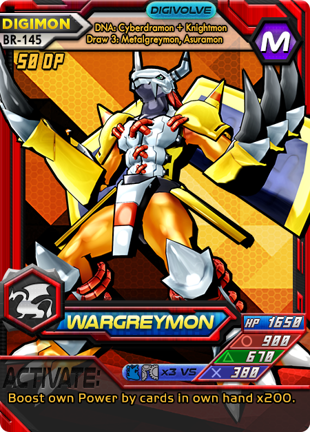
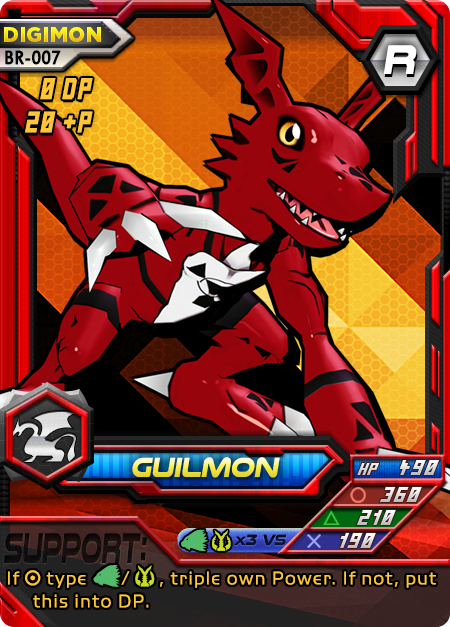
Continuation of fixing starter deck art! Again, players should have a good first impression to lead them into the rest of the good impressions :3
Wargreymon - So boring before! But now he’s dynamic, about to charge up that Gaia Force. I did a lot of shading fixes to this one after my wife posed it. I tried to get as much depth from darks to lights as possible everywhere, without putting in the same insane work I did for the Dracomon.
Guilmon - Before, it was absolutely comical. Low-res t-pose lol. But the shiny new Guilmon is cool and cute. This was a tough pose because we wanted a more feral Guilmon but the model is rigged to be...weird? It’s hard to describe the way Toei-style models are rigged. They work closer to stubby humans than the demons and animals being depicted.
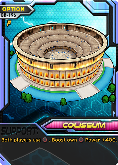
Coliseum - I’ve waited a long time to fix this one. After finally understanding some things about 3D modeling, I was able to isolate a real example of a Digimon coliseum and use that. I made some texture and color edits so it would stand out even more.
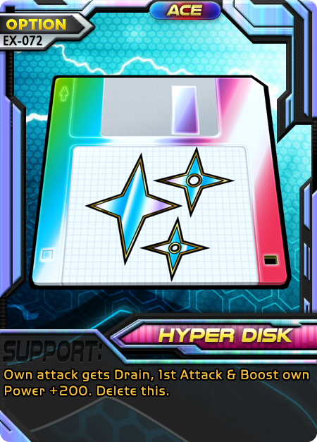
Hyper Disk - Gone are the days of using 2D CG, this is an actual 3D diskette model. The rainbow is now CMYK compatible so prints won’t look as ugly.
#digimon#digimon card#Digimon card game#digimon game#digimon tcg#card game art#card game design#wargreymon#guilmon#ウォーグレイモン#ギルモン#digimon battle evolution
2 notes
·
View notes
Text
The Dancing Men
Before Reading
Warnings: Suicide mention and stalking.
Tangent: If you watch BBC Sherlock, you need to read this story to understand Mary.
“Now, in my opinion, Dupin was a very inferior fellow. That trick of his breaking in on his friends’ thoughts with an apropos remark after a quarter of an hour’s silence is really very showy and superficial.” - Holmes on Poe’s Dupin, STUD
After Reading
Tangent: A, E, H, I, N, O, R, S, and T are the most common letters in the English language, at least American English. R, S, T, L, N, and E are what you get in the “Wheel of Fortune” bonus round. The dancing men are an example of a simple cipher, not a code (Khan Academy).
Tangent: “At last the violet rim of the German Ocean appeared over the green edge of the Norfolk coast…” That ocean isn’t purple. It also isn’t a wine-dark sea. It’s more likely to be like the indigo you see in a rainbow.
Humans tend to have three cones to detect color: one for short wavelengths, one for medium wavelengths, and one for long wavelengths. These approximately correspond to blue, green, and red. We call these the three primary colors of light. They are the three primary colors because of the three types of cones. We perceive daylight as white. It has the full spectrum of visible light. Mixing pigments together is subtractive: the more colors you add, the closer to black you get. Mixing light together is additive: the more colors you add, the closer to white you get. That’s how you get printers using a CMYK model (cyan, yellow, magenta, and key tone [black]) while computer screens (such as this one) use blue, green, and red.
[Keep in mind that I’m writing this in English and my first language is English]
The way we divide the spectrum of visible light and give those divisions names is dependent on language and culture. I say red and pink and not red and light red. (Blue-Green color distinction in language) I learned ROYGBIV: red, orange, yellow, green, blue, indigo, and violet. Nothing has color; we perceive the wavelengths the thing reflects. Plants are usually green. The chlorophyll absorbs red and blue light and reflects green. Color is how we describe a small piece of the electro-magnetic spectrum. Bees have a different range of the spectrum than we do. (How Bees See and Why it Matters) We can perceive red better than they can, but that doesn’t mean it’s any less or more real than the ultraviolet they can perceive. It’s just a different range.
I would describe the color pourpre (French) as red-violet and the color uaine (Scots Gaelic) as blue-green. Tyrian purple, the dye from the Mediterranean made from snails, is close in color to pourpre.
Some colors are very weird. Purple is what you get when you mix red and blue pigments. Red and blue are on opposite ends of the visible light spectrum. Purple is a non-spectral color; it can’t be perceived using a single wavelength. There’s also blue-yellow and red-green which are considered impossible colors. It’s like trying to balance a light switch between ON and OFF. They’re best explained by opponent process theory. It’s also why, when you stare at yellow shape for a long time and you look away to a white wall you see the same shape but in blue.
Dates: Queen Victoria’s Golden Jubilee was June 6, 1887. One year ago, was the Jubilee and the marriage. This sets DANC in 1888. One month ago, was the end of June. About a week ago, it was Tuesday. Hilton Cubit visits Baker Street.
The next morning, a second message appears. Three days after his visit, a third message. Six days after his visit, a fourth message. That night he stayed up to two in the morning with only moonlight illuminating. This would make you think it’s a full moon but, that night cannot be Monday July 23, 1888 because there was a total lunar eclipse. The next full moon wasn’t until August 7.
A fortnight or so after Cubit’s first visit, Hilton Cubit returns to Baker Street. Two days later, the final urgent message arrives. Holmes and Watson travel to North Walsham the next morning. Now it is late July or early August 1888, immediately before SIGN.
#SHCanon2020#sherlock holmes#the dancing men#the adventure of the dancing men#the return of sherlock holmes#DANC#long post#sherlockian#holmesian#watsonian#sherlock#bbc sherlock
1 note
·
View note
Text
The gorgeous future of 3D printing
MIT Media Lab’s Mediated Matter group has invented a new way to 3D print any object, regardless of how complex it is, with color and shape as detailed as a photograph. It’s the equivalent of traditional CMYK printing, but in 3D. The results are stunning.
Until now, we couldn’t print certain types of data models in 3D. The interconnected neuronal tissue in the brain or an interstellar dust cloud, for example, have many scattered structures that float in space with no connection to other structures. This poses a problem for 3D printing: A 3D-printed object typically needs to have all its parts connected–so complex objects with weird topologies were impossible to make until the Media Lab came up with this method.
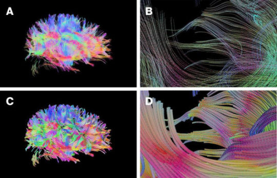
[Image: MIT Media Lab/Mediated Matter Group]
A new paper published in the May 2018 issue of Science Advances, describes the method, and it works like this: Rather than trying to build stand-alone objects, it uses different materials to create a solid transparent block in which the photorealistic object is encapsulated. That way, something like the stars and clouds in a nebula can be printed “floating” in 3D space.
These floating dots that form the 3D object trapped inside the transparent material are called voxels. Voxels are just points in 3D space, little dots that result from the division of an object into a 3D array. Each little dot that forms a volume has assigned three coordinates (X, Y, and Z), which place the dot in a 3D space. The process is similar to traditional 2D color printing. But instead of printing on a piece of paper, you’re printing out layers that get stacked on top of each other. When it’s done, you get a full-color, 3D-printed model encapsulated in a clear block, like a Jurassic bug forever trapped in amber.
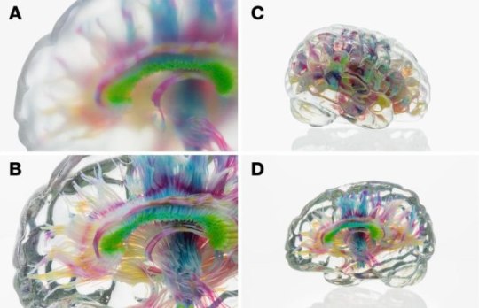
[Image: MIT Media Lab/Mediated Matter Group]
The technique allows you to create photorealistic 3D representations of anything you can imagine–imagine the face of someone captured in 3D with a stereo camera and printed this way, with every single hair and pore clearly defined. It also has significant potential in education and scientific visualization: While you can look at a 3D representation of data in virtual or augmented reality, looking at a real physical model is an experience that is hard to beat.
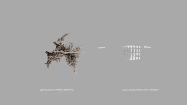
[Image: MIT Media Lab/Mediated Matter Group]
The gorgeous future of 3D printing published first on https://petrotekb.tumblr.com/
0 notes
Note
YO Cadence and Big Mac look good dude finally Big Mac gets to not be ignored and finally Cadence actually looks like a woman of color thats fucking cool I can’t wait to see Honey too when you get around to her not to insult Miks art but Honey always looked weird when she drew her. She didn’t know how to get the character right in her art. Children aren’t her forte
I think the one thing that really hindered the character art of madhouse was the blatant lack of reference sheets for the cast.
I’ve talked about this before but to summarize here for the specifics of the matter:
When you are making a serialized story that has drawn visuals, you need to have a character model sheet!
It not only helps the artist(s) working on it but adds to the visual continuity and scale between the world and character(s).
Seeing how most of the madhouse story was structured after those newspaper comics you’d ask your dad to get in the mornings, you’d think Lily (the art director of the story) would at some semblance know this. Sometimes the look of the characters change over the years but that’s a given with the changing decade for most of these long running comic strips!
From Garfield to Dennis the menace to Calvin and Hobbs, they’ve all had character sheets!
There’s a running issue that’s driven me up the wall in madhouse and that’s the inconsistent heights of characters like Bonnie.
So I’ll break down the key elements for a good character sheet:
Expressions
Action/movement poses
Color palette (specifying if RGB or CMYK; including hex codes for the digital artists is really helpful!)
Alt outfits (optional)
Turnaround (front, 3/4 quarter LR, profile LR, over the shoulder LR, back)
Height/lineup (next to the other character/s)
+ shape breakdown
+ hair tutorial
This in the industry is also known as:
The pitch bible!
But ye hope this tangent helped or did something for ya
#sillygoblinantics#just goblin things#sillygoblinantics’ original content#bonnie’s day out#sillygoblinantics asks#gobbo’s story and concept tidbits#artists on tumblr#rewriting lily orchards pokemadhouse#redesigning pokemadhouse#lily orchard critical
9 notes
·
View notes